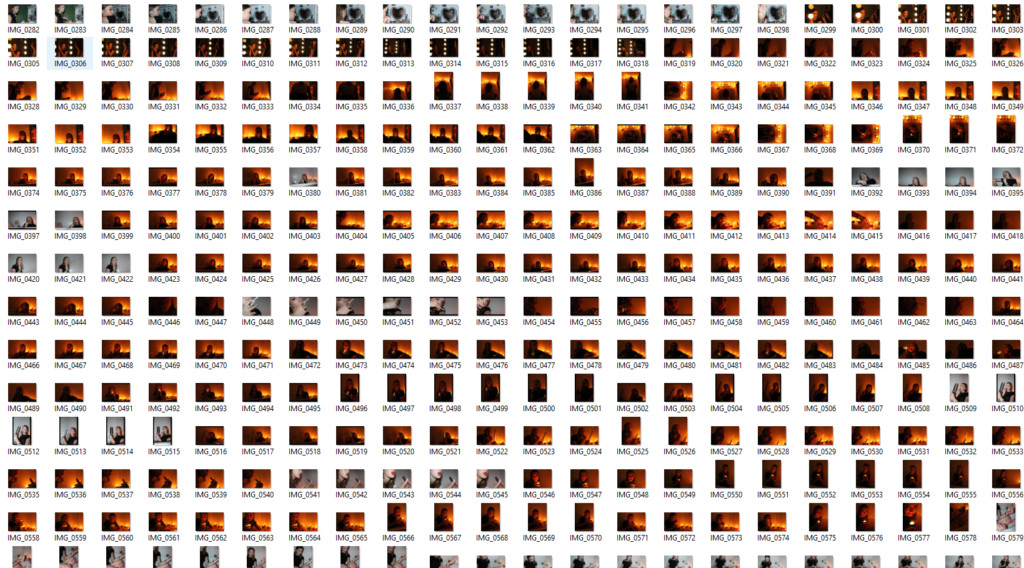
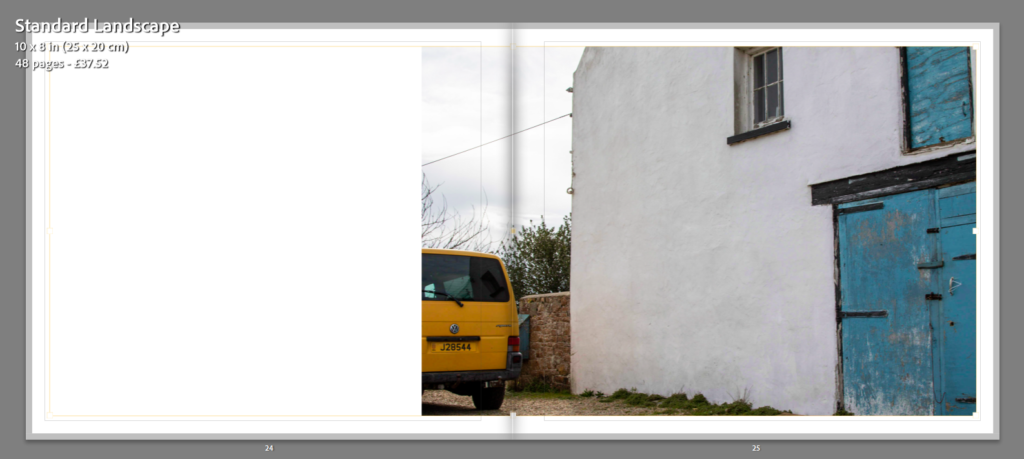
The process of making my book was reasonably simple as I have made a photobook previously for a past project. I ensured I learnt from my mistakes I made with the last book, to create a display of my work that I am proud of. To start the formation of my book I planned shoots and took mostly staged images as this allowed me to be clear about what I was trying to portray. Following that, I imported my images to Lightroom and began selecting/sorting through my most successful photographs and started my editing process there.
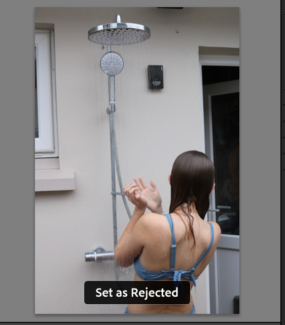
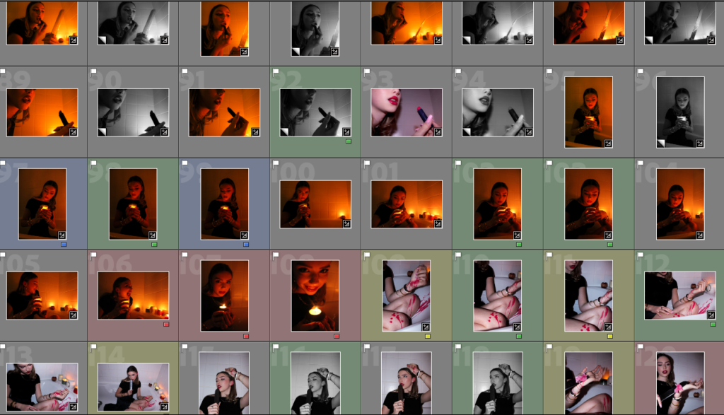
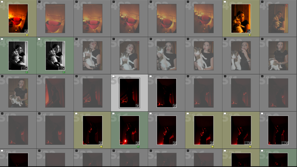
X key = Reject Image
P key = Pick Image
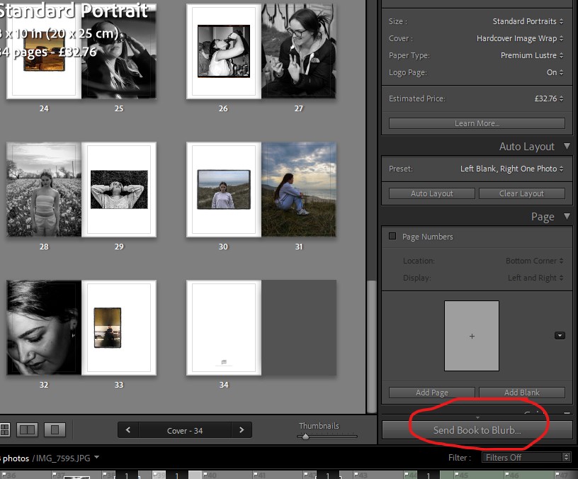
Once my initial editing was complete, I moved some of my images onto photoshop to do some final touch-ups and experiment with different aesthetics. However, I ended up not using my experimental images as I couldn’t find a consistent style that would run throughout my book. Once my favourite images were selected I pressed the ‘book’ button on Lightroom and tested out different layouts to see which composition was the most efficient and appealing. I tried multiple different layouts before I was happy with how it looked and then exported my photobook to Blurb ready to order.
My Images:
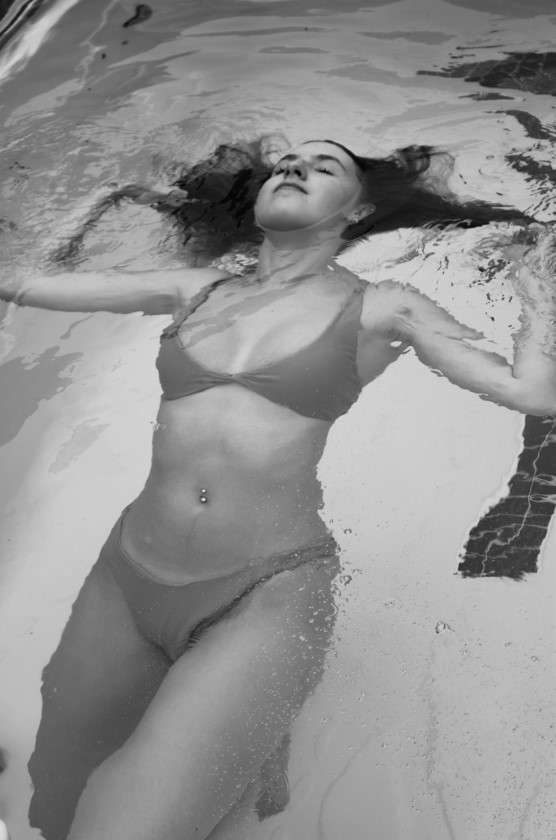
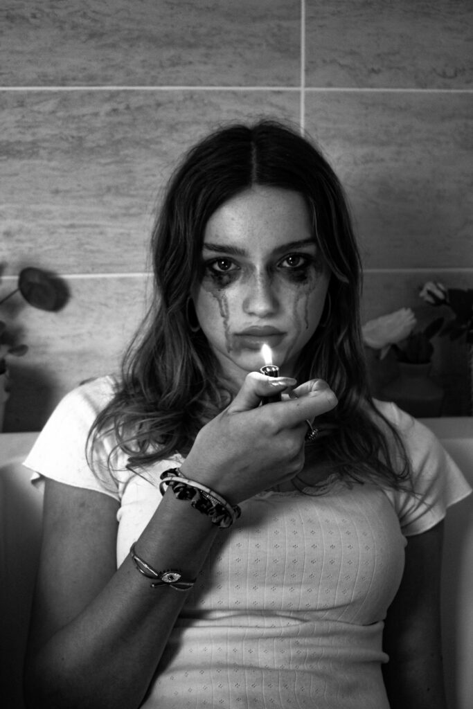
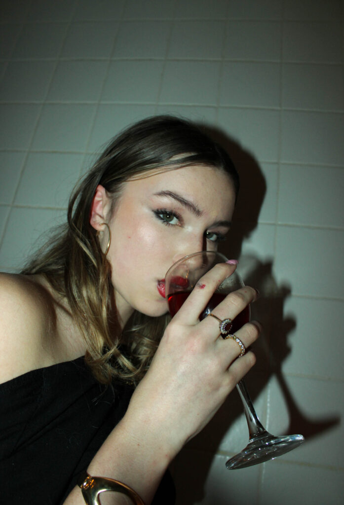
Overall, I think the majority of my outcomes, from this project, were successful setting me up nicely to create my photobook. I especially enjoyed this project as it enabled me to be more creative with my shoots than usual. I experimented more with my shots as the majority of them were staged, for example doing a shoot of in a pool and creating a dramatic look using makeup of tears running down a girls face.
I edited all of my images on Lightroom as, in my opinion, it has all the features for a successful initial edit, while any further altercations were made using photoshop.
Virtual Gallery:
To display some of my most successful outcomes I created two virtual galleries that present how my images would look if they were in an exhibition.
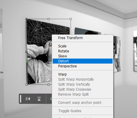
The process of creating a virtual gallery involves exporting the images to Photoshop, as well as your downloaded image of a gallery, and using the gallery as a background, adjusting the images to fit within the frames on the walls as if they were originally there. I find it easiest and most effective to do this with the Distort tool as it allows you to change the angle of the image as well as move the corners around.
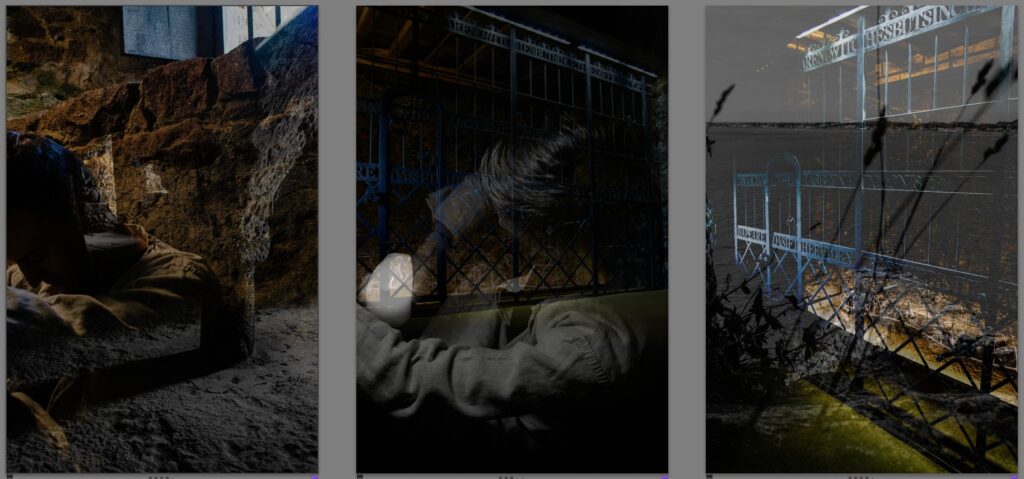
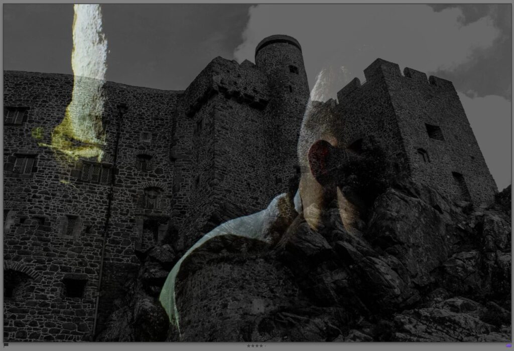
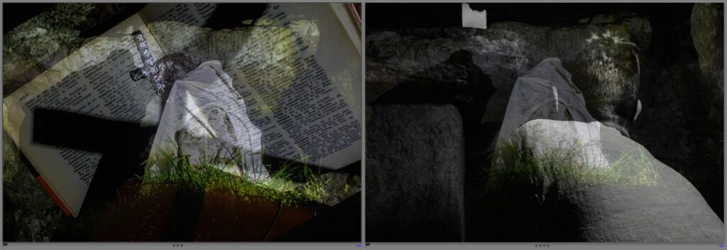
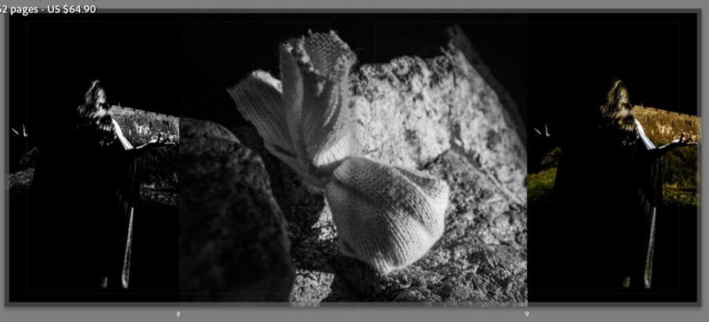
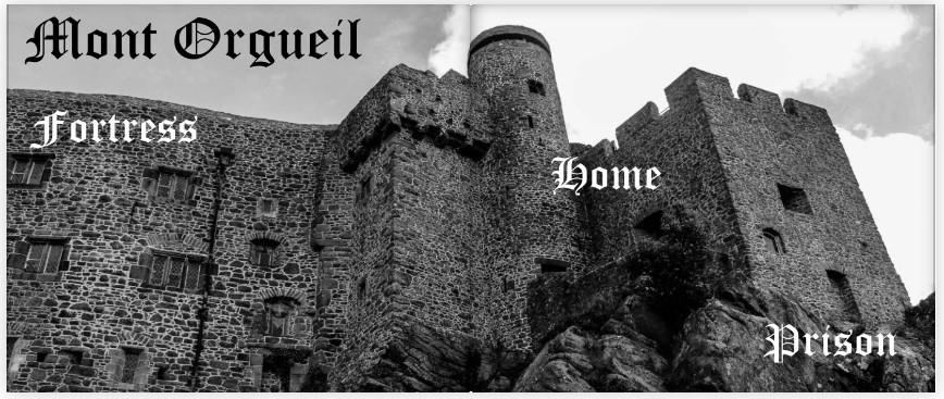
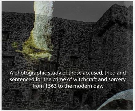
The images above display a range of solo photos as well as montages, each chosen for how they display the castle as a prison during the time of witches. The double exposure montages communicate that the masked figure is the prisoner and the misery expressed by the actor after being held in the castle dungeons on merely water and bread for months, awaiting his trial and indefinite execution.
Typology
Royal Square (Market Place)
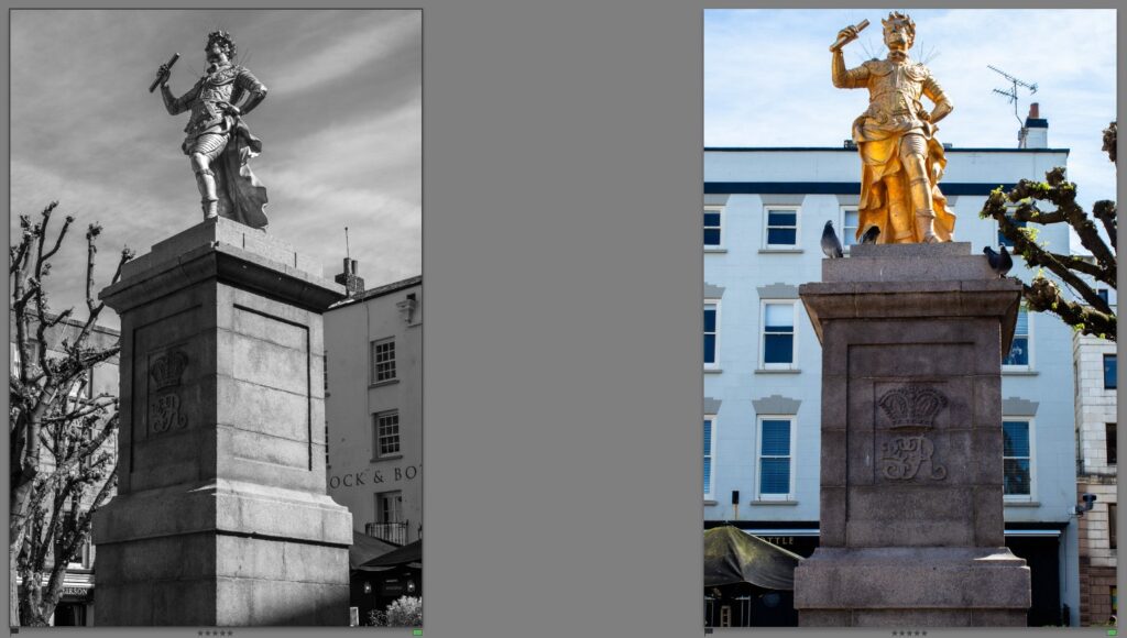
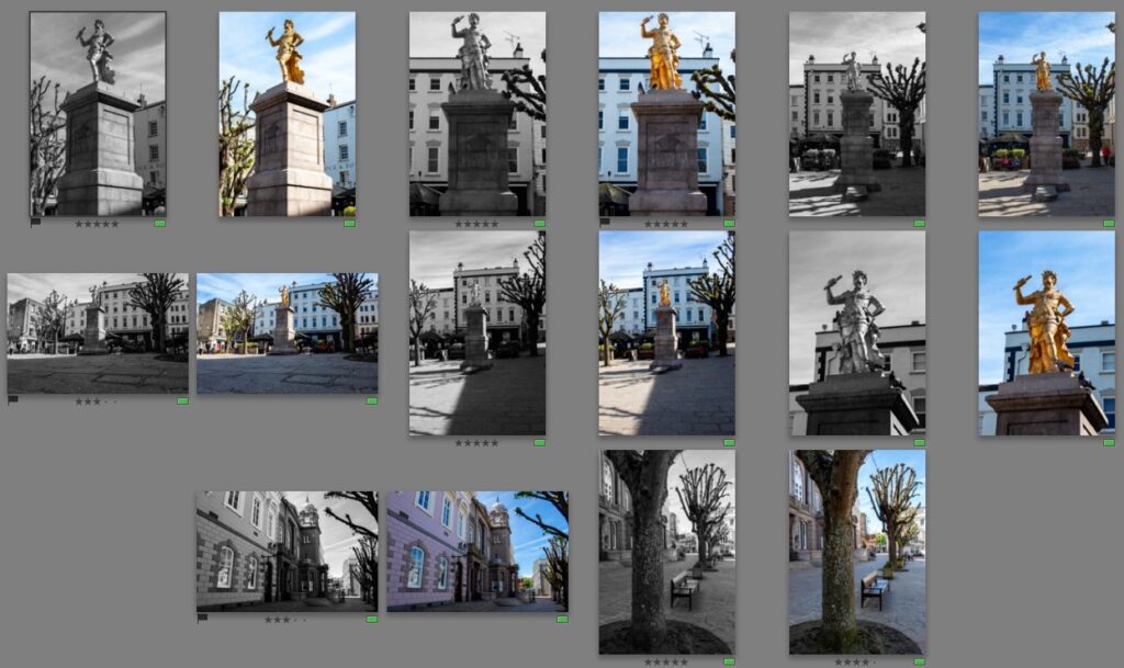
The royal square was the site of all witch executions. The images I have chosen to print and display are all monochrome except for one. The singular colourised image communicates the joy felt amongst the community as they watched witches being burnt but also displays the freedom of the executed’s spirit as it is ‘freed’ from oppression. The monochrome images resemble the darkness and severity of the actions of the towns people and Cour de Cattel, those who accused and murdered many innocents out of fear.
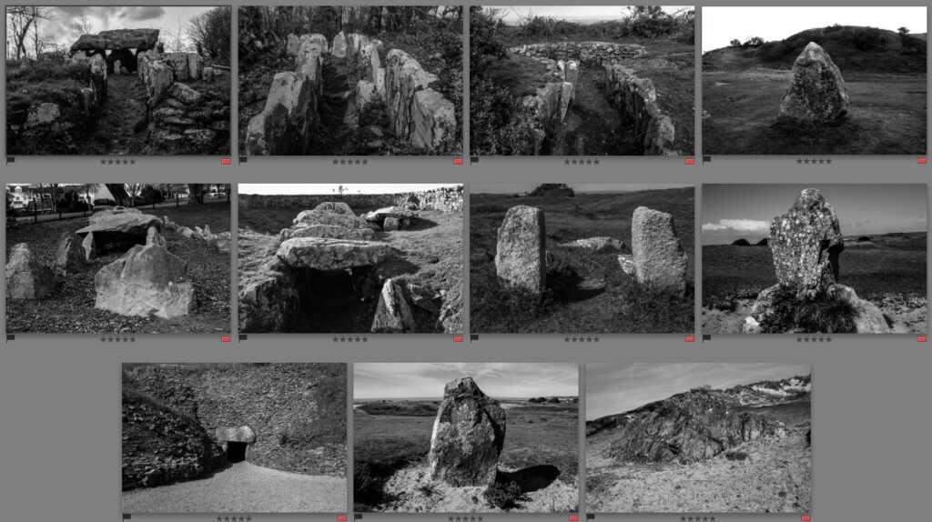
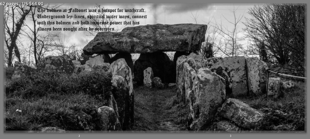
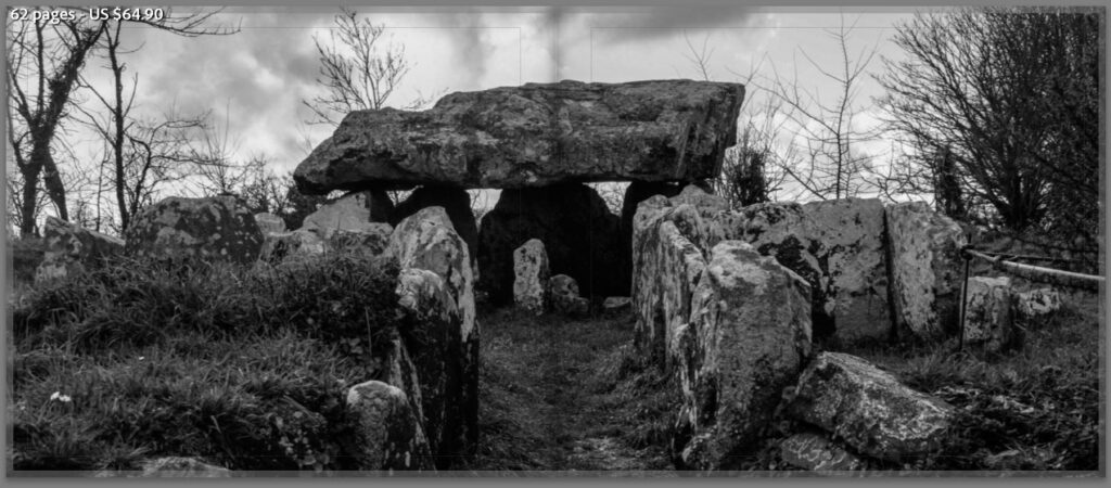
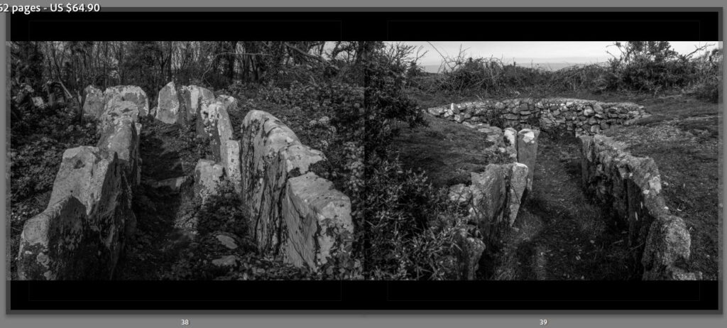
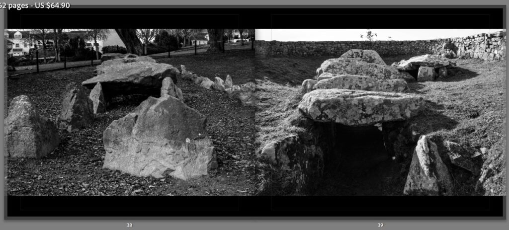
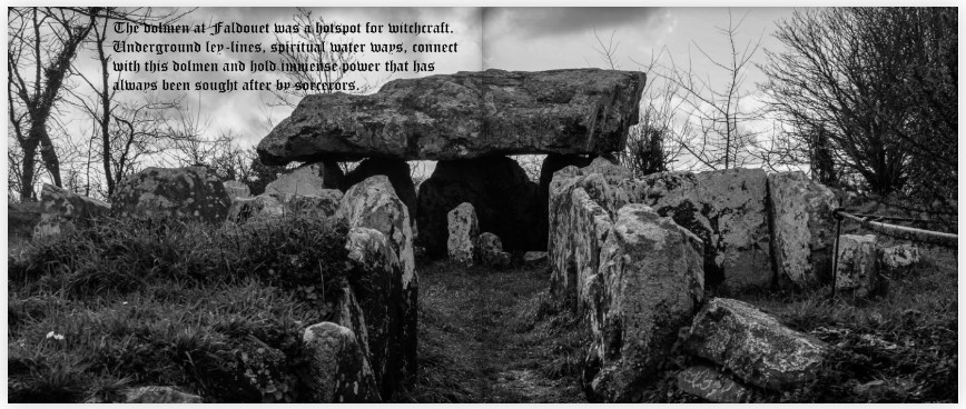
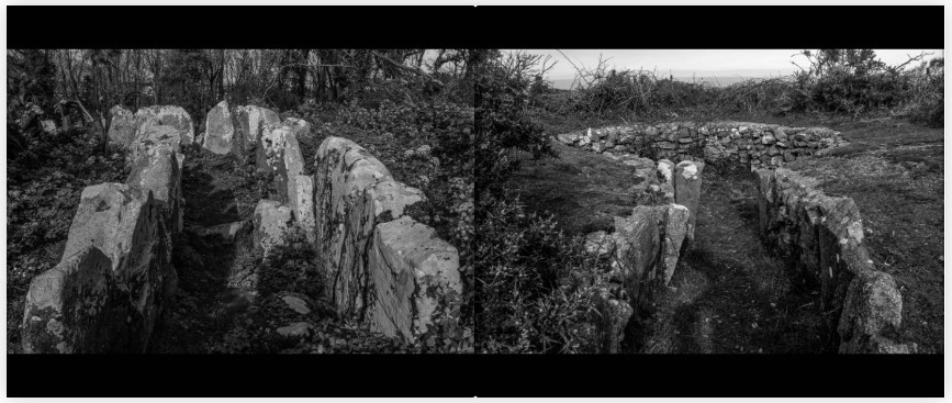
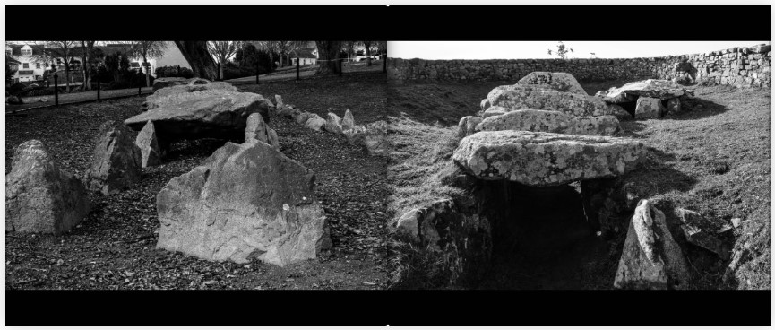
Faldouet Dolmen
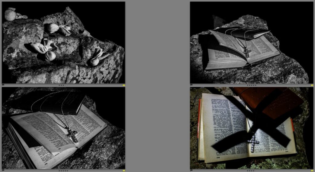
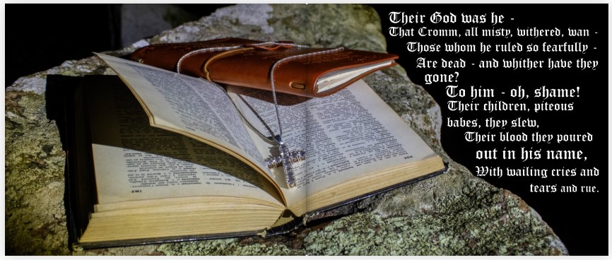
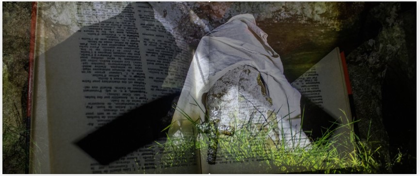
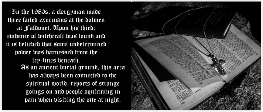
These Images detail the rituals conducted by witches at the dolmen and display some of their techniques and curses that they bestowed onto people. The images of the bibles and crosses with an upside-down shadow cross communicate the failed exorcisms of the site and seem like an important part the dolmens witchy story.
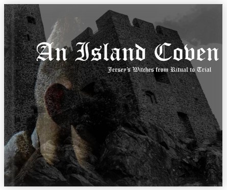
Image Wrap + Title (An Island Coven: Jersey’s Witches from Ritual to Trial)
Title Page:
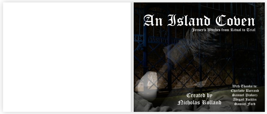
Image + Title + Created by: + With Thanks
Section 1: Faldouet Dolmen – Ritual
Possible Images:
Typology
Section 2: Mont Orgueil Castle: Fortress, Home, Prison
Possible Images:
Typology
Section 3: Royal Square – Trial and Execution
Possible Images:
Typology
Typology Images:
Info Page: Bibliography
Back Cover:
Image Wrap + Blurb
Page Layouts
Cover Choice
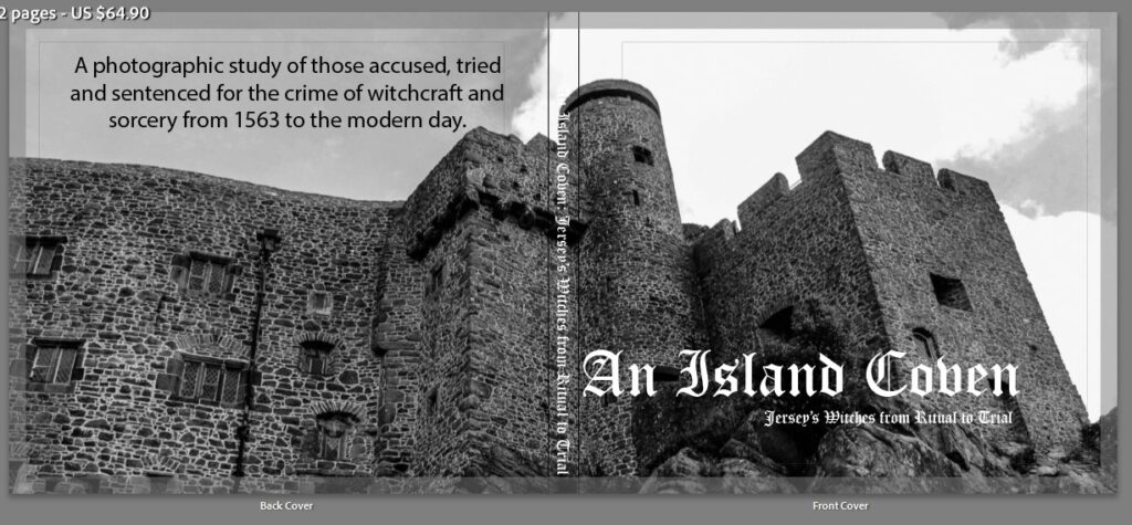
I knew that the cover of my book needed a title and some kind of information about the book on the back. The question was which image do I choose?
The image above fits the story but focuses on the castel. It also disallows a clear title that can easily stand out – especially on the spine. After this I knew that I wanted to create some kind of overlaying image that can communicate more than one specific idea.
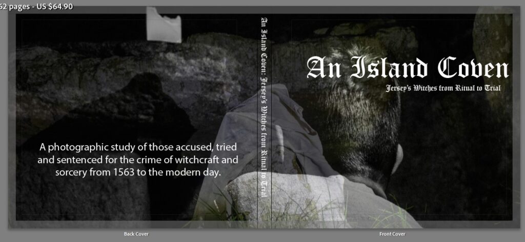
This image works and all the writing stands out but I think it is better suited for the section on the faldouet dolmen, and the rituals conducted by witches.
The final outcome of the cover is shown above. I chose this specific image where one photo overlays another as it communicates this idea of loneliness and the hell that 66 people had to endure after being accused of witchcraft.
Faldouet Dolmen: Beginning
I chose to use a single image to establish the section of the book and by using this image, it not only begins the section about witches rituals, it also starts the typology study that runs through the book and can be used to separate each section.
I knew that I wanted the book to be creative and emotive, but also informative so it was essential that I added some kind of written aspect throughout that detailed the information that I want to present throughout the final outcome.
Faldouet Dolmen
The images below associate with the first section and I knew that presented alongside written pieces of information would communicate a clear story of the rituals that were thought to be enacted by witches.
Info to Include
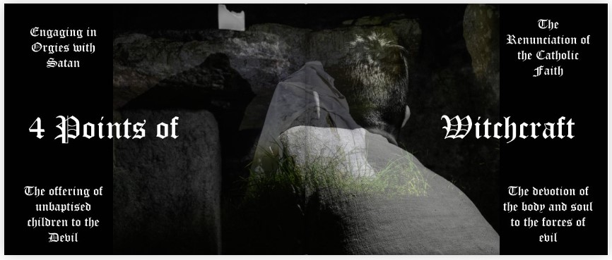
4 Pillars of Witchcraft as detailed in the Malleus Maleficarum
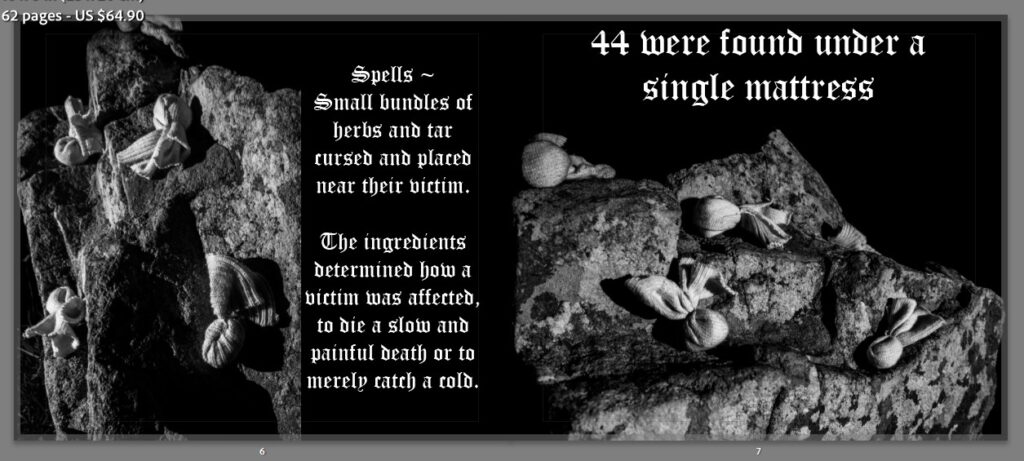
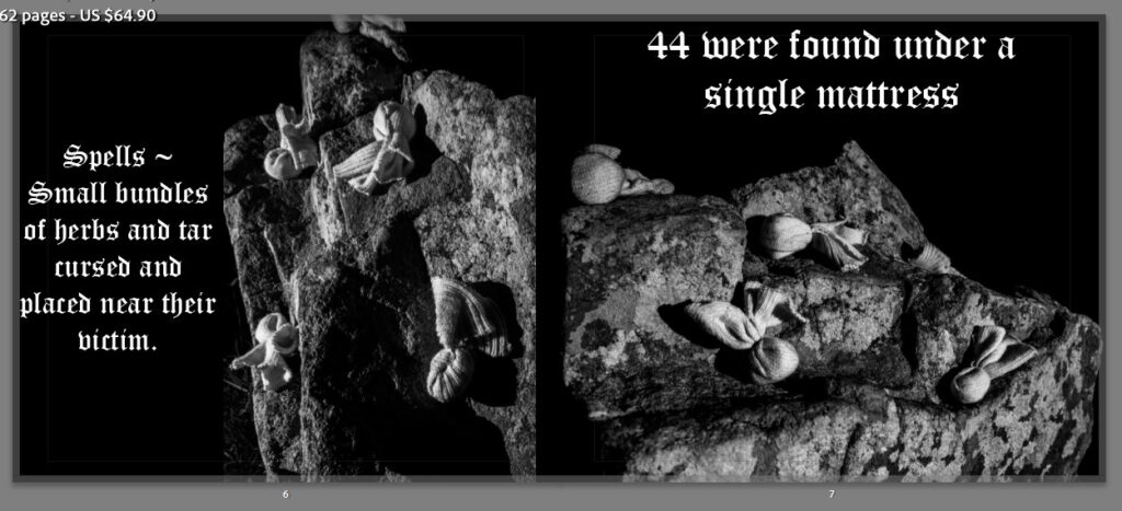
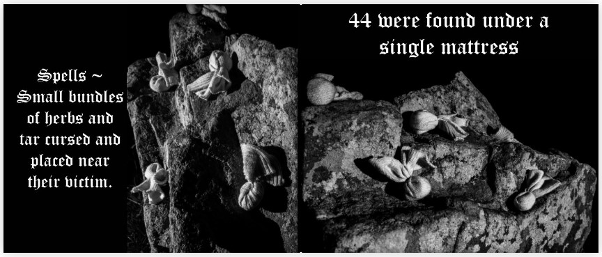
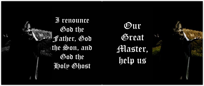
Spells – the truth behind them
Poem about sacrifice from ‘These Haunted Islands’
Modern day reports about the Dolmen
The first image below was an initial mock up for one page spread in this section. Simply using two images and some information about what they show. However, I found this to be a bit clunky as the information seems like too much. I want to create a more creative approach so the information should be succinct and to the point. I therefore removed some of the writing and moved around the format to produce the second image which is the final page spread used in the book.
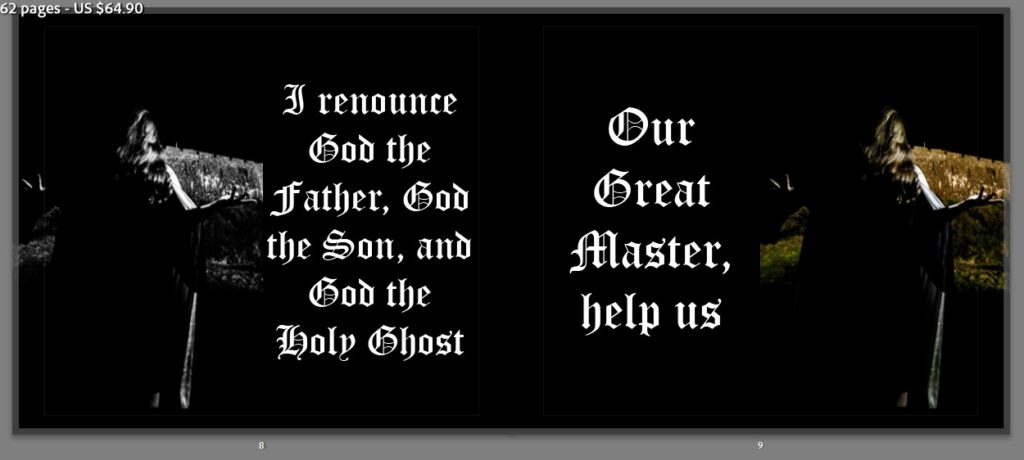
The next too page spreads show a before and after my initial thoughts. The writing in the final outcome works well with the two images that surround it. It communicates the willingness of a witch to follow Satan and renounce their christian faith. The first spread however has a central image that simply has no story behind it. With the page before containing the information about spells, this image seems out of place. So I decided to remove it.
Mont Orgueil: Beginning
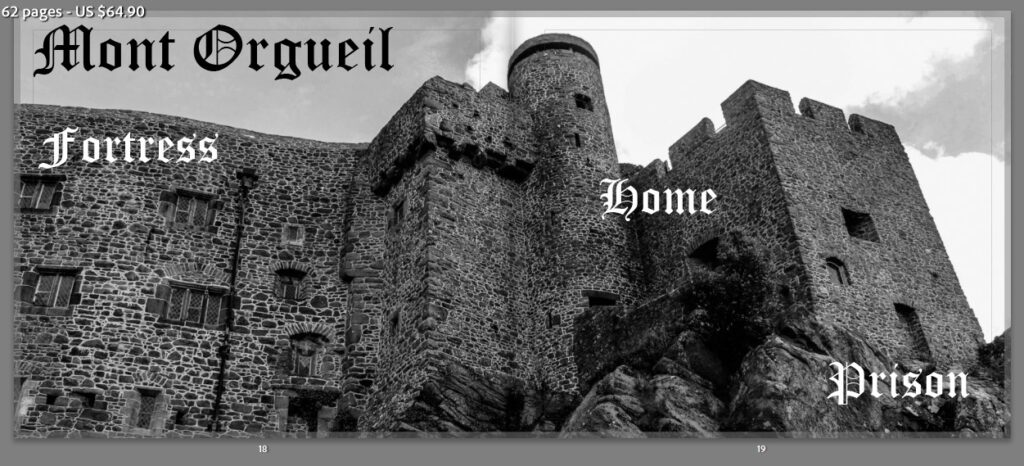
The establishing image for this section is simply of the castle itself. The words that accompany get straight to the point that this section is about the imprisonment of those accused.
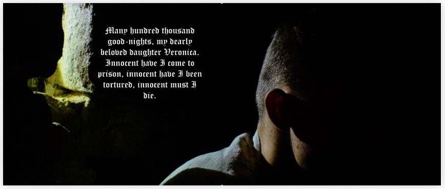
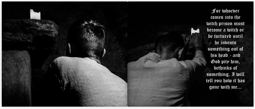
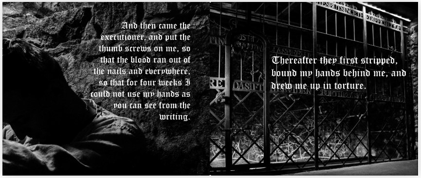
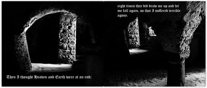
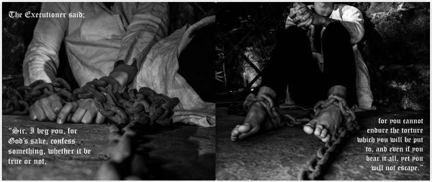
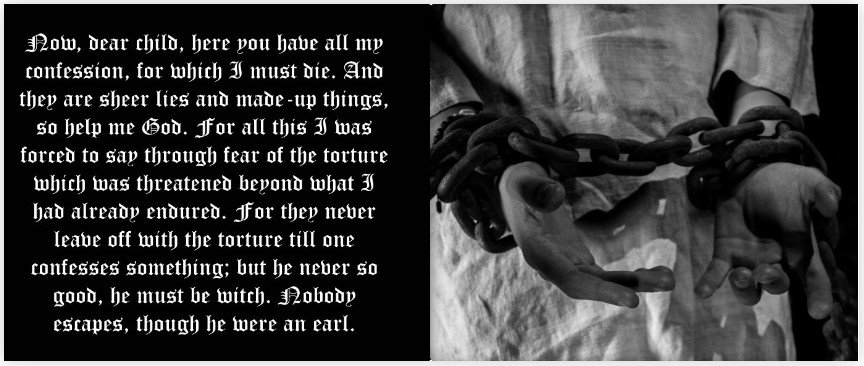
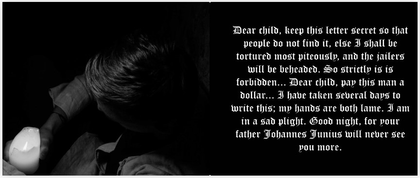
Mont Orgueil
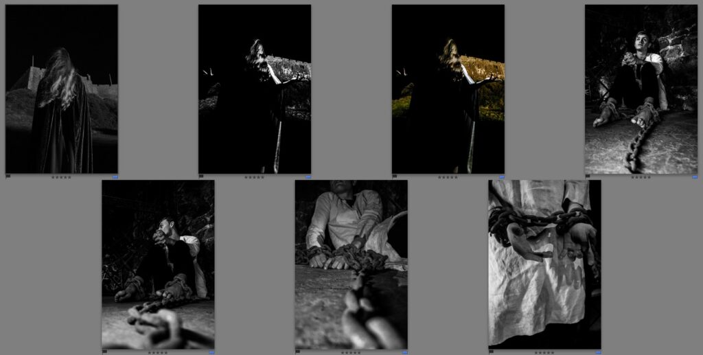
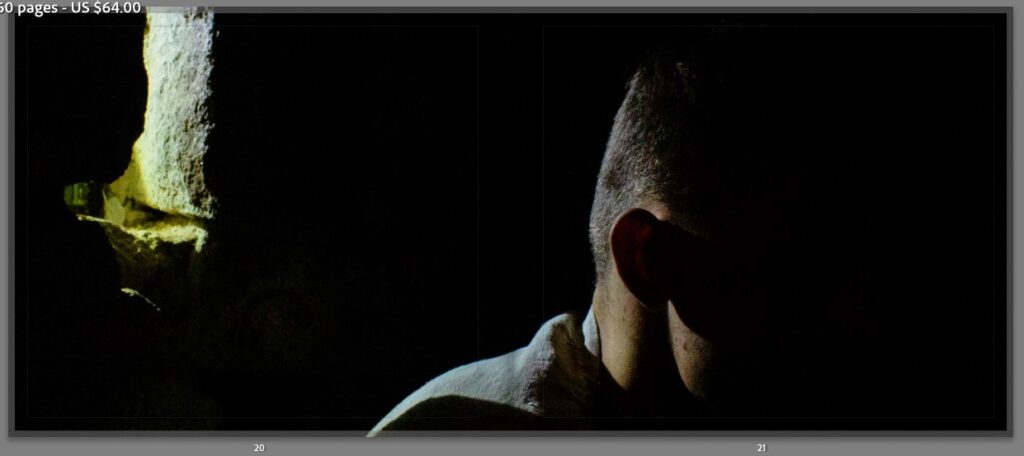
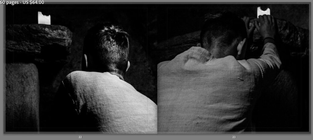
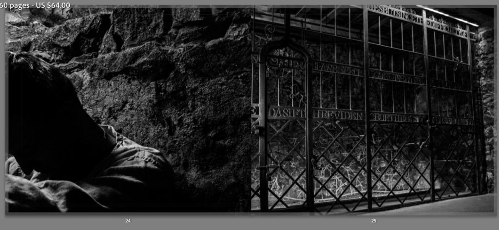
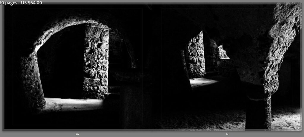
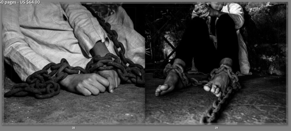
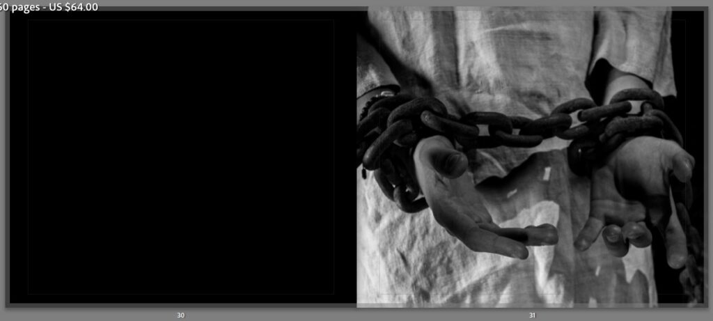
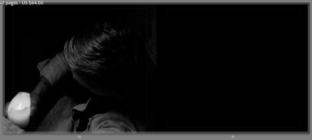
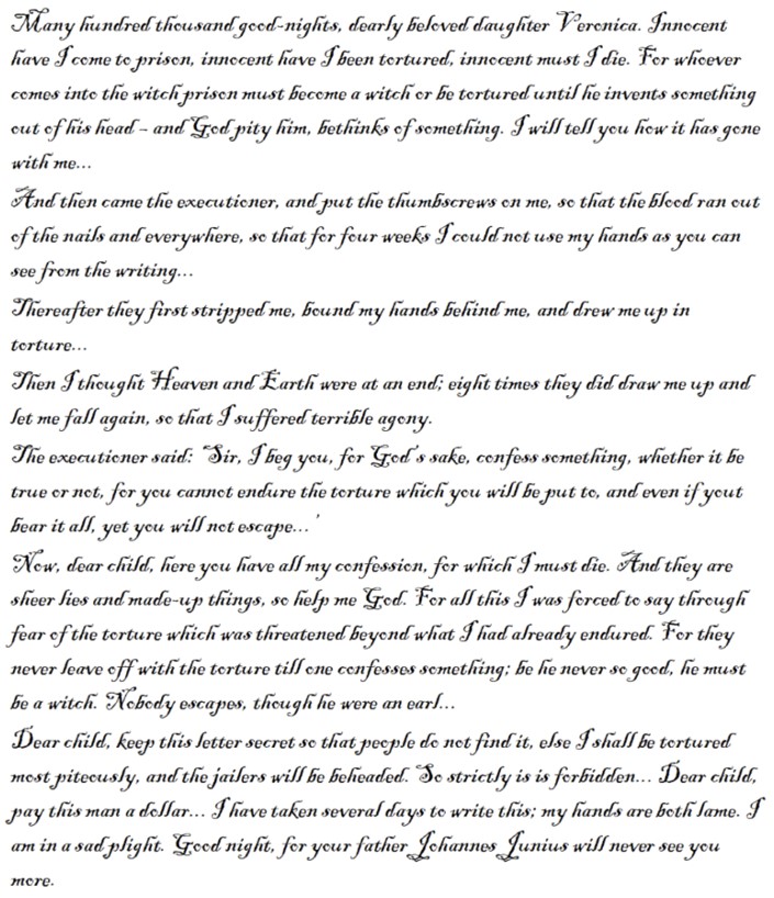
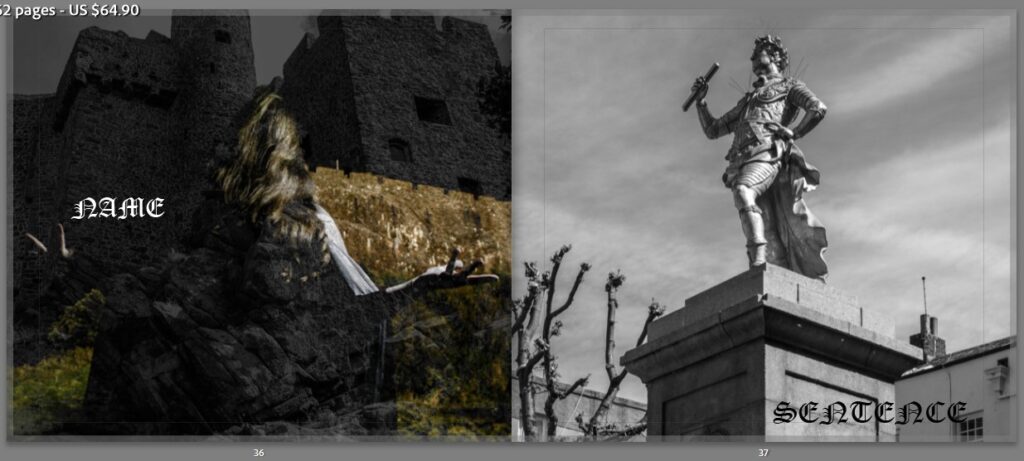
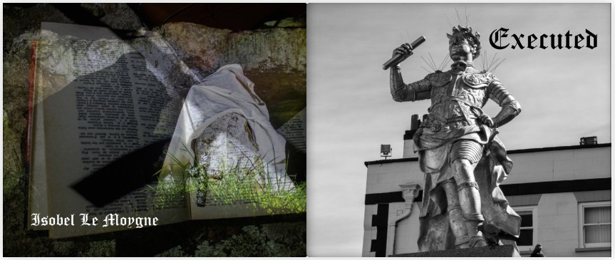
In my research I found a letter from a prisoner held in the tower. It was written to his daughter the night before his execution, and I deemed that this chapter of the book needed no other information. The images that I decided to use would show no face and simply a singular figure in chains or lit with a single shaft of light. Establishing images that show the castle dungeons interlace with the portraits as the letter continues through the section, telling its story.
LETTER
Royal Square: Beginning
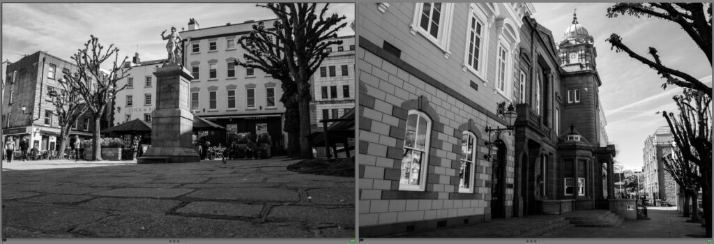
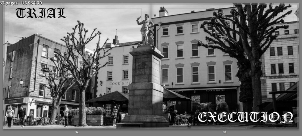
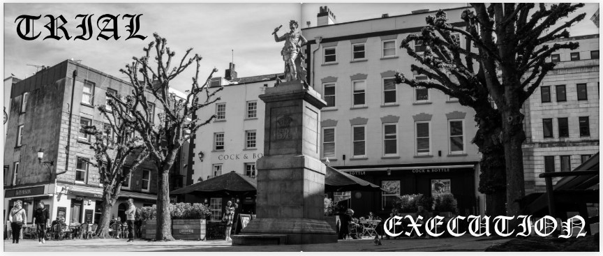
The establishing image for this section is a simple monochrome landscape of the royal square. The idea for the sections title came from the phrase ‘Trial and Retribution’ adapting it to become ‘Trial and Execution’. I decided to not include the and as the only place that I could think to place it on the page spread effectively was in the middle where it would have been lost anyway. I therefore decided that only two words should be used and that is what is scene on the final spread.
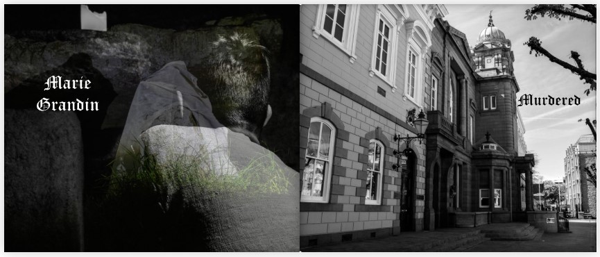
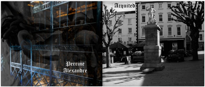
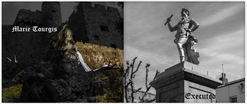
Royal Square
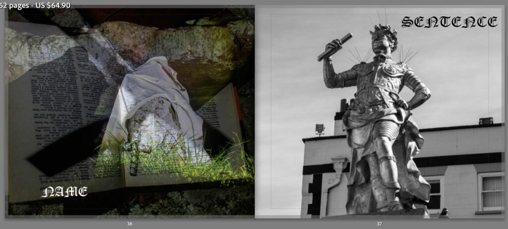
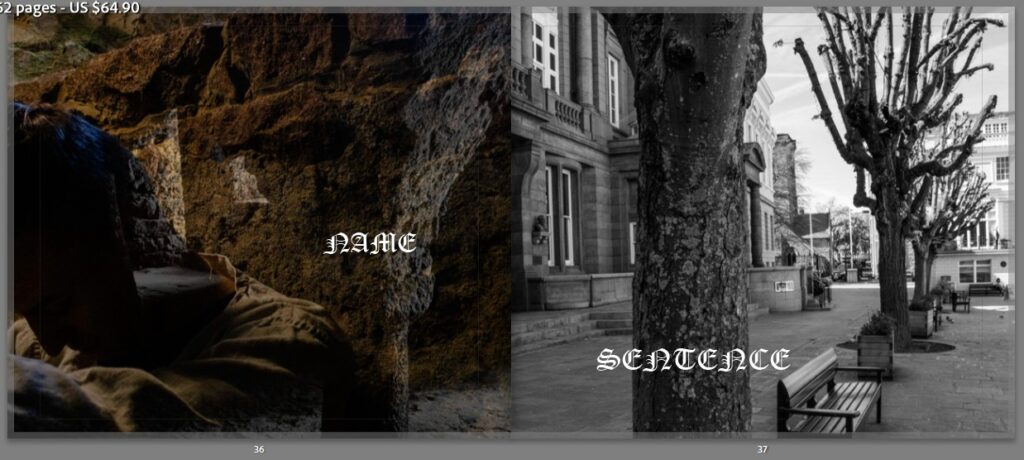
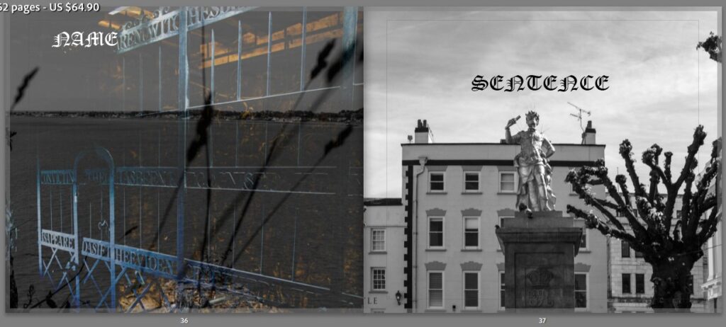
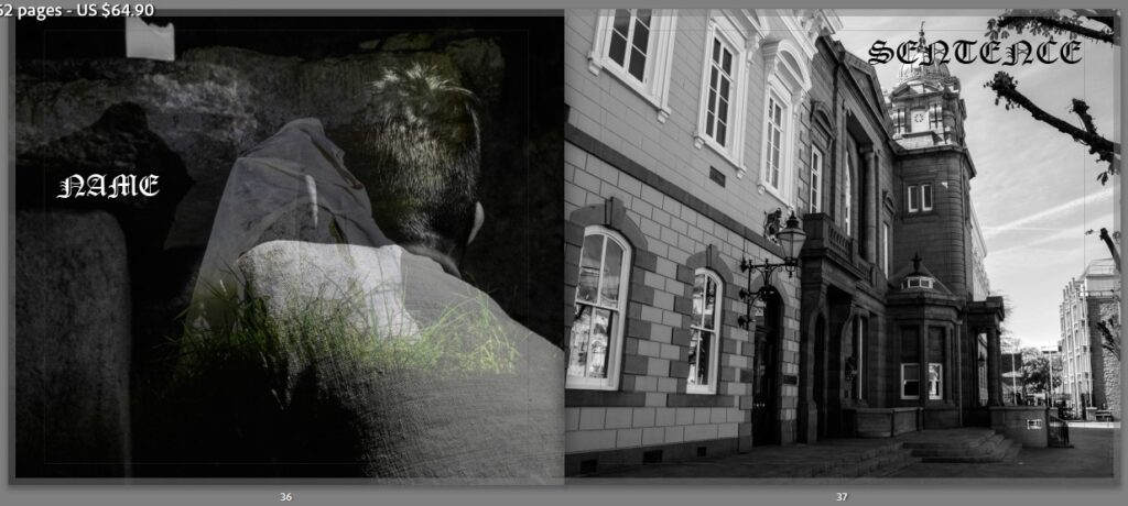
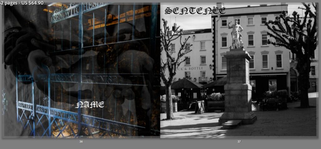
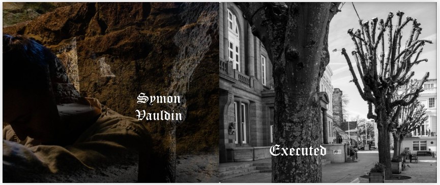
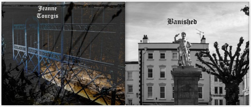
I was unsure what to do with this section. The trials were an essential part to the story so had to be included within the book but the challenge was finding an effective way to present them. I found a specific court record in the archives detailing a witches confession. I then thought of the different sentences that were carried out and looked into each trial. The final presentation came from the idea of pairing an image associated with the witch, whether its of the ritual or a prisoner in the castle and to pair a name with that image. On the other side of the page spread, I then used an image of the royal square where the trials and sentencing was held. I then simply wrote the corresponding sentence given to each name; be it execution, banishment or pardon.
Section Separations
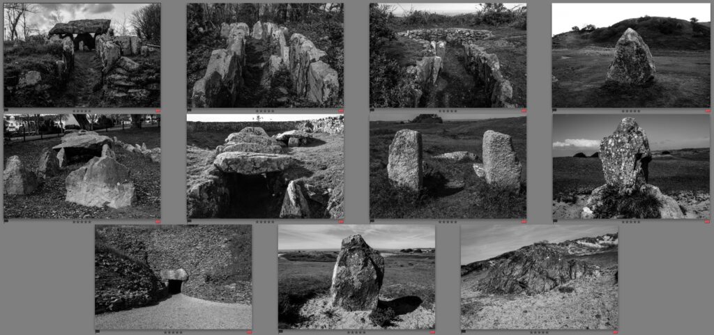
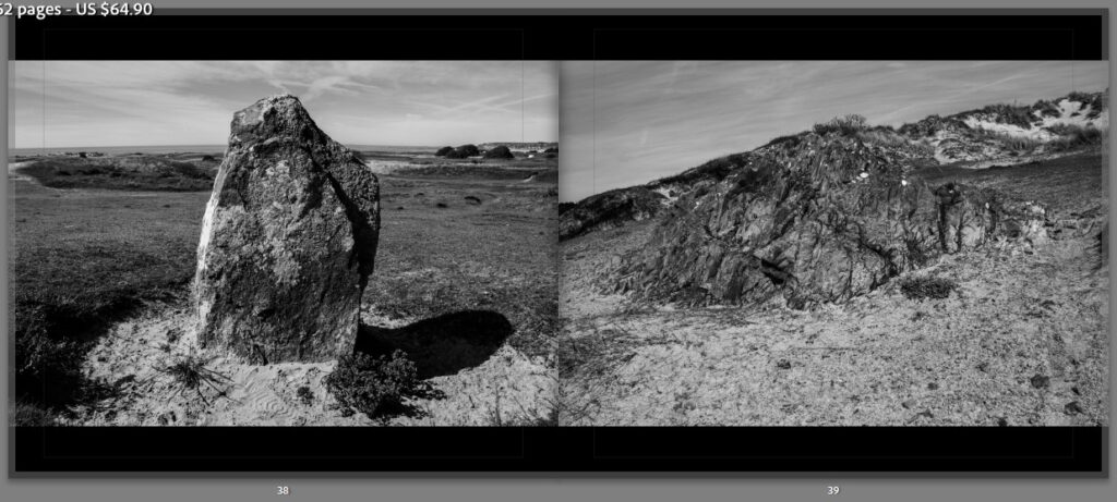
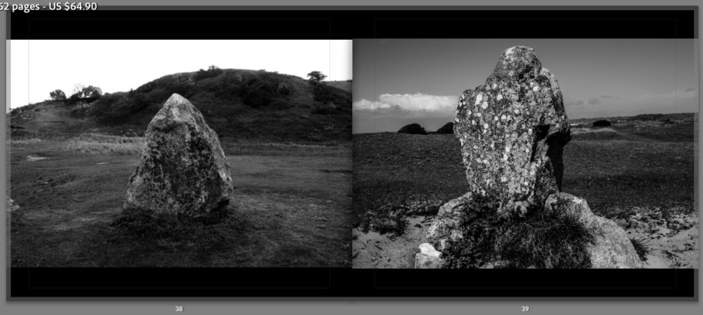
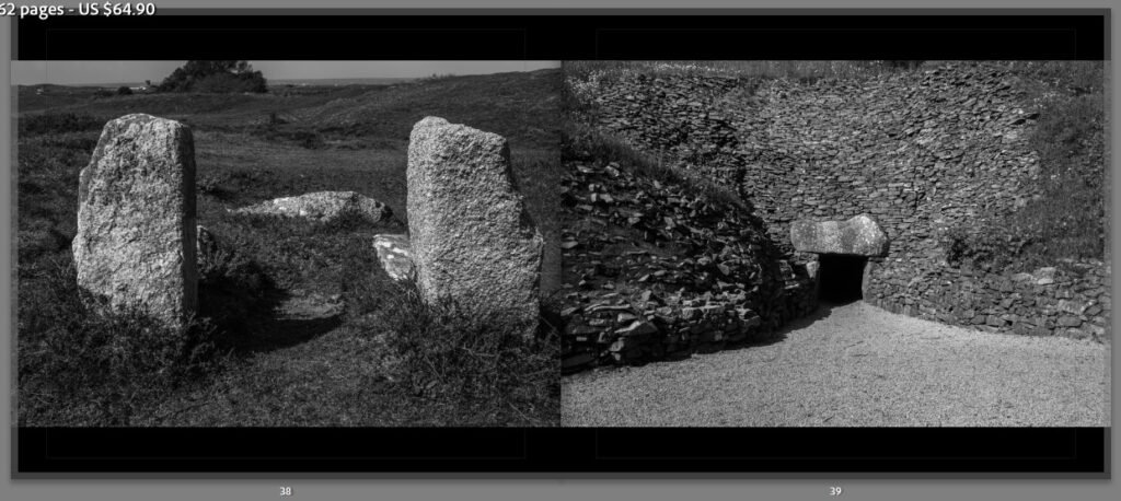
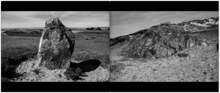
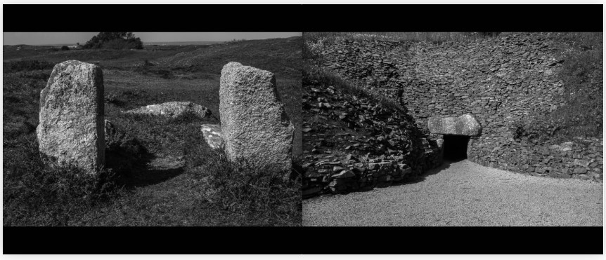
To separate each section, I wanted to use a typology study of dolmens and megalithic remains that fell upon ley-lines. These ancient burial and ritual grounds established a basis of pagan beliefs and during the 16th Century, were directly associated with witchcraft and satanism.
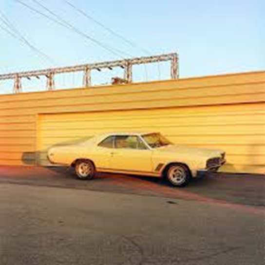
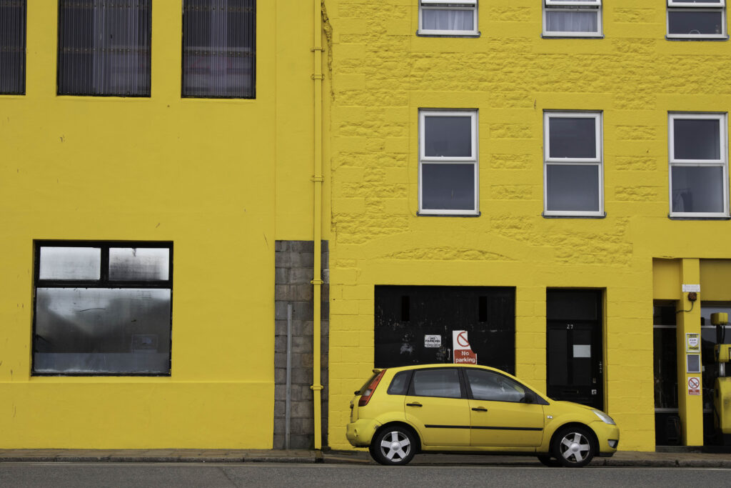
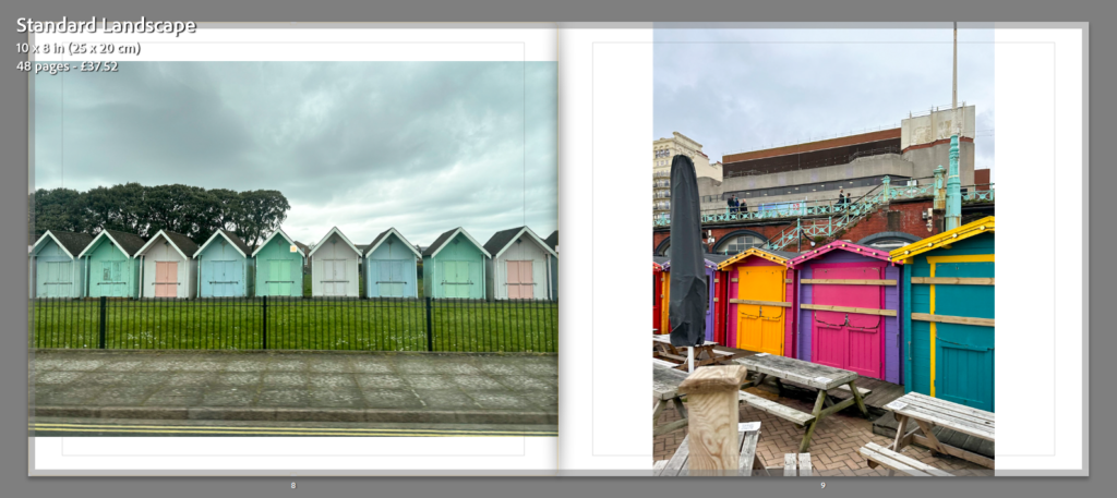
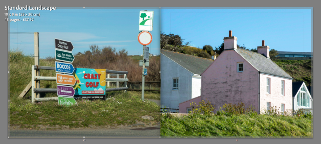
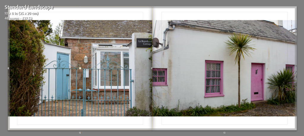
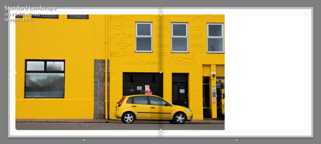
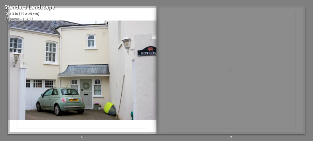
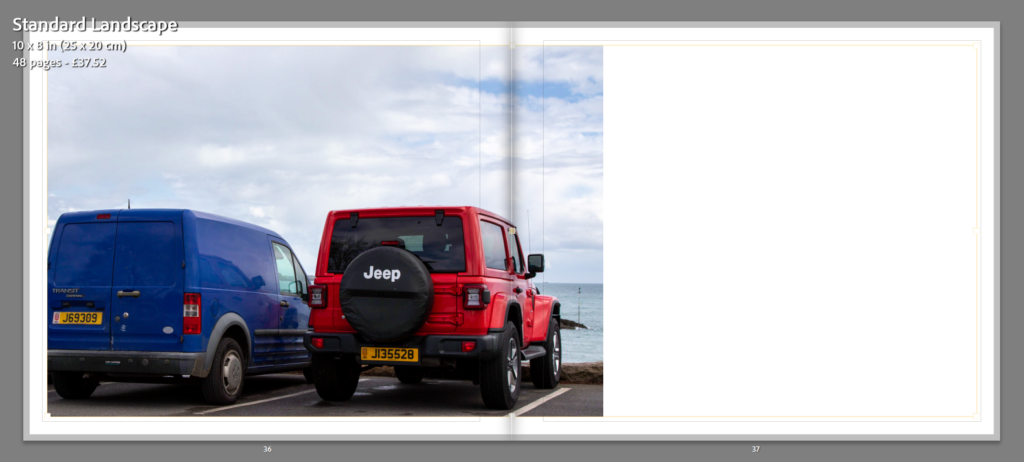
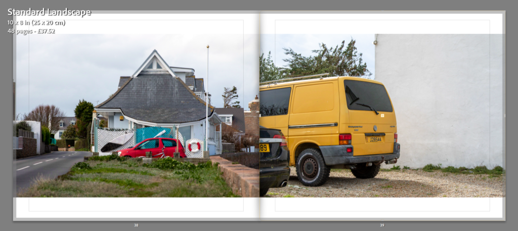
At the beginning of my project I knew that colour was something I wanted to explore and base my project around. With the theme being Observe, Seek and Challenge I thought that focusing on colour would fit in well. From looking at inspiration, I found that William Eggleston was going to be my main artist to follow. He took many images of colour mainly around Southern United States, which made me want to do a similar thing but in Jersey. Even though Egleston’s images were from a long time ago and with less technology, I was still inspired by him to make more modern versions of his images and showing what I could find over here and comparing it to his images being in America. Along side this, I chose to take images that weren’t directly inspired by him or Saul Leiter who I also looked into, but sights that were full of colour in Jersey which people may not notice on a regular basis.
William Eggleston’s imagemy image
what went well:
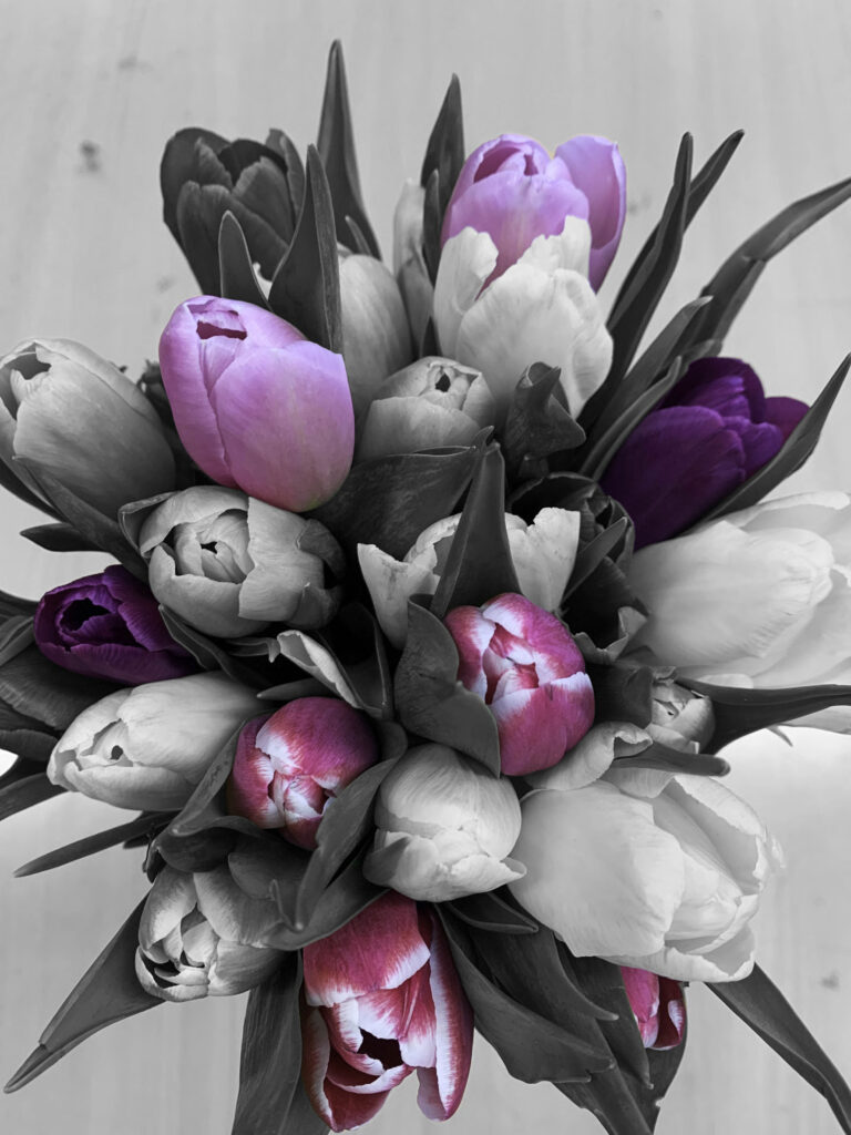
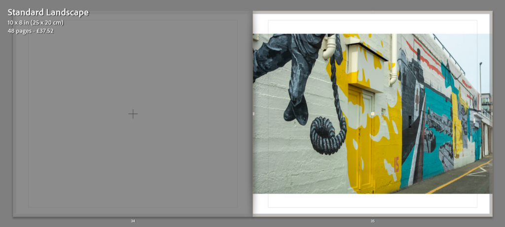
As a whole, I think that most of my project went well. I think that one of the main things was the amount of colour I found in the style of my inspiration, which really helped make my project clear and stand out to viewers. Secondly, I think that the range of image I produced make my project have a wide variety of no only colours but also objects. Many of my images are focused on building/ houses and cars, but I have also included other things like nature and boats which Jersey has lots of. I also chose to make some experiments using two of my images on photoshop. I selected certain areas to keep in colour and made the rest of the image black and white. I think that whilst these may not be inspired by either Eggleston or Leiter, they add to my project and make the colours in the image stand out and draw the viewers in. Again I also think that my final print turned out well and also my photobook. I believe my photobook is the best part of my project as it sums up what I was basing it all on and how I have been heavily inspired. The contrast through out my book makes the image clear to focus on and shows the viewer what the main part of each image is through the way I have laid them out.
my imagemy experiment
possible improvements:
On the other hand, I think that as all projects, mine could have been improved. Even though I wanted to show a more modern look on colour photography I still think that I could have made more images that were solely focused on Eggleston’s and especially Leiter’s. I think this would have improved my project and showed the viewers how things have change from when they both used to take images compared to now. However, I do think that this could add to my project to show just have fast the world is evolving and not only technology but also buildings and cars etc. I think to improved my project I could have looked further into Jersey and found more colour which would help my project.
overall:
Overall, I am very happy with how my project turned out and think that it presents a more modern version of colour photography well. From this project, I hope people can see that colour has such an impact on out lives and has just become another thing that we see everyday contrasting to how people saw it back then especially in images.
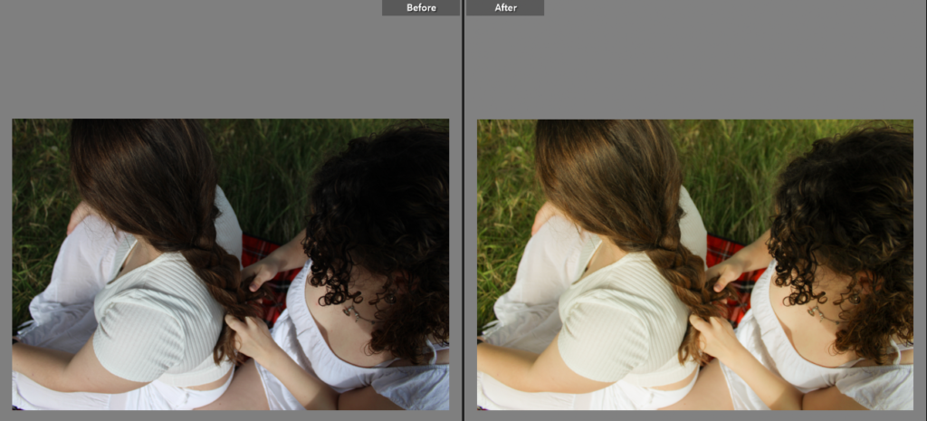
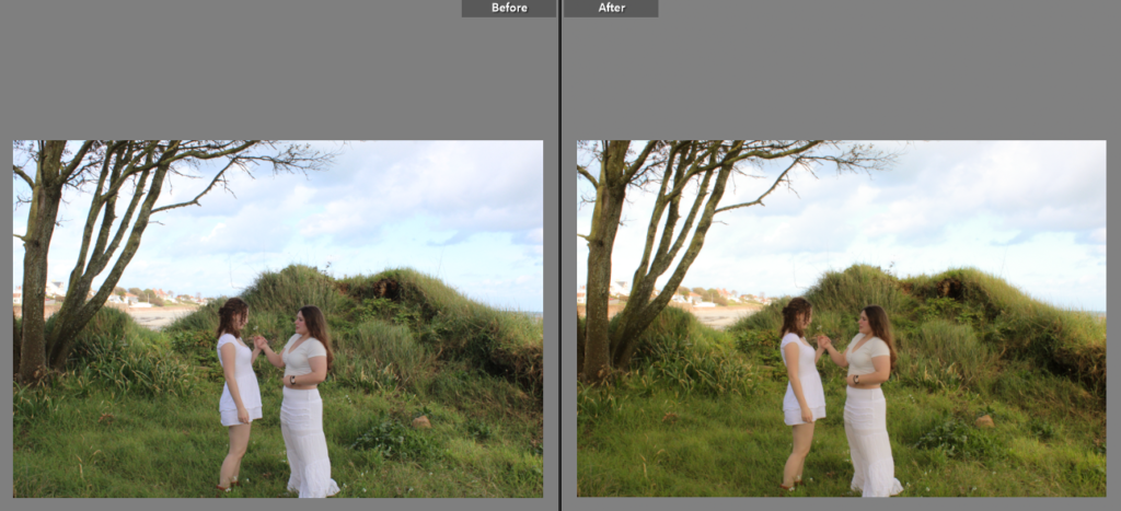
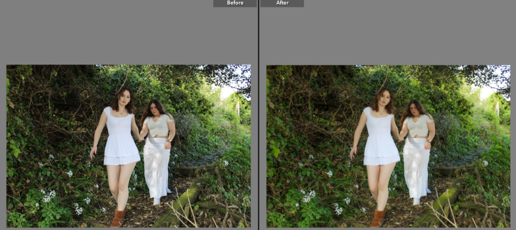
I’ll be taking pictures of a couple of my friends.
WHAT
I want to create images of my friends laying together on a blanket. I’ll be taking some inspiration from Justine Kurland and her ‘Girl Pictures’ project.
WHERE
I’ve chosen to use an old natural trust site located between Pontac and Le Hocq beach. It’s a grassy area which overlooks the beach.
WHY
I want to show different aspects of femininity, as I have researched different gazes. I want to explore these and show contrasting ideas of what it means to be feminine. This photoshoot will reflect more lighter feminine aspects, portraying typical traits of femininity.
HOW
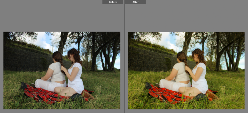
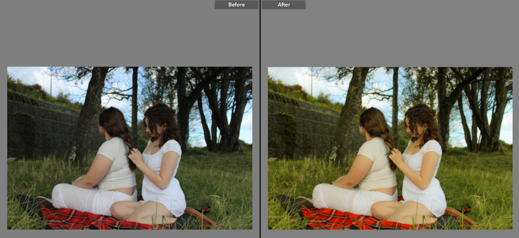
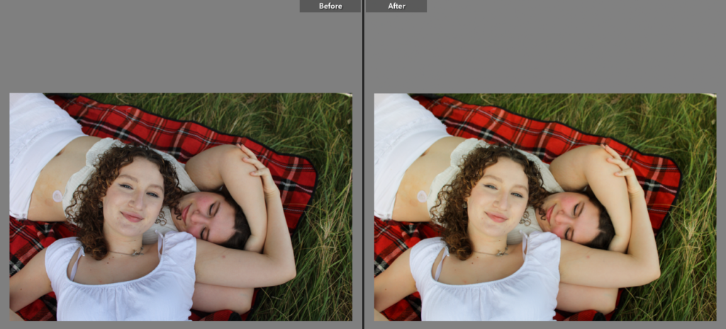
I’m going to use a camera to capture photographs of them; exploring nature, plaiting hair, relaxing, being intimate, etc. I’ve asked them to where all white (preferably a skirt or dress too) in order to create themes of innocence and purity, a typical stereotype in the male gaze.
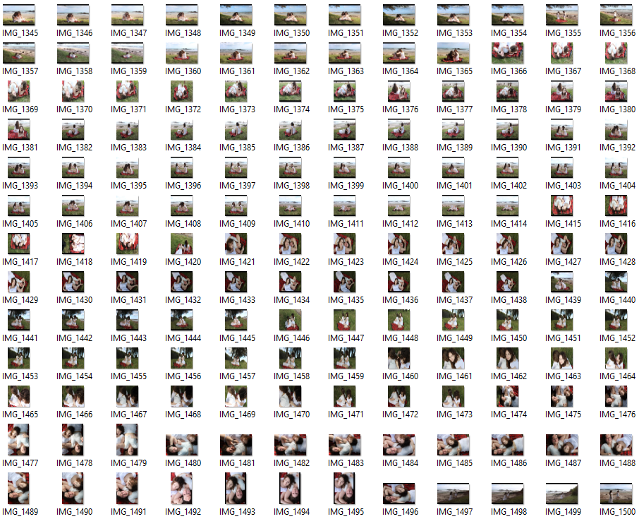
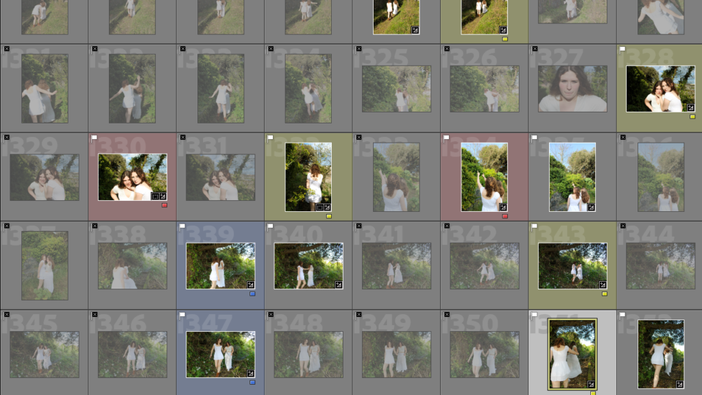
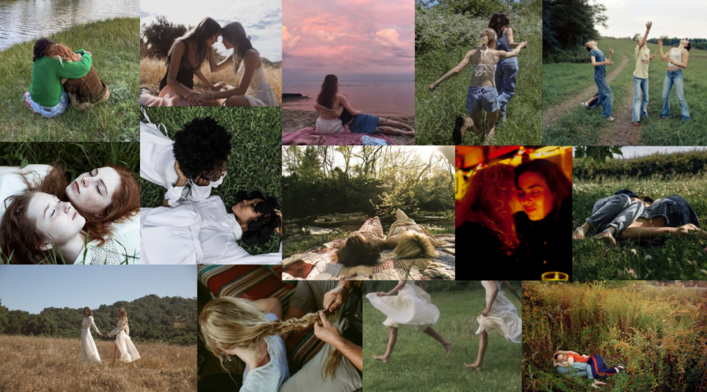
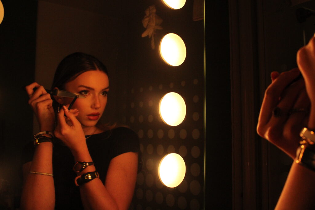
I took around a total of 600 images during this photoshoot, successfully being able to capture what I planned and creating good outcomes to use for my photobook.
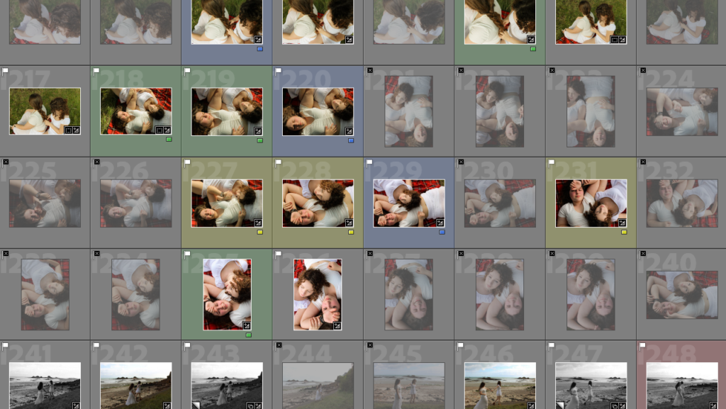
IMAGE SELECTION:
Here shows some evidence of my selection process. I typically like to use the colour ratings opposed to the stars. This is the rating code I use with the colours:
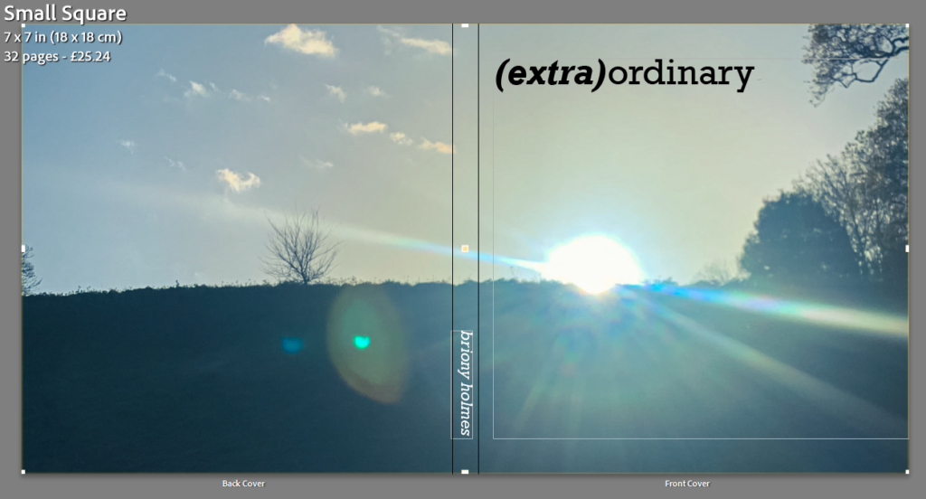
I decided to make my book square shaped with a hardback to fit with the photos that I took.
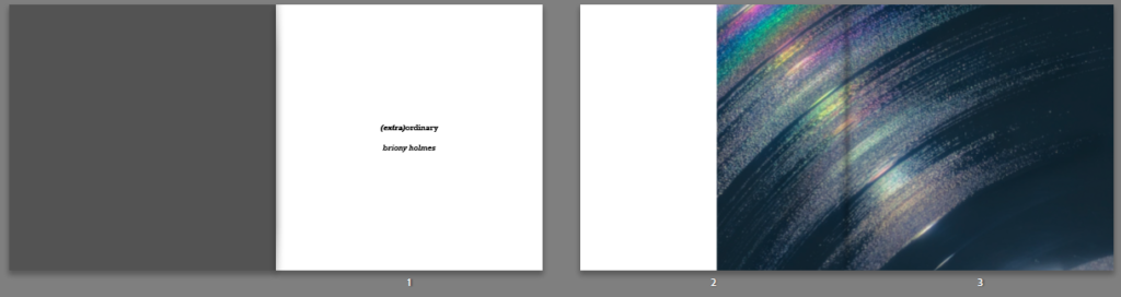
Cover
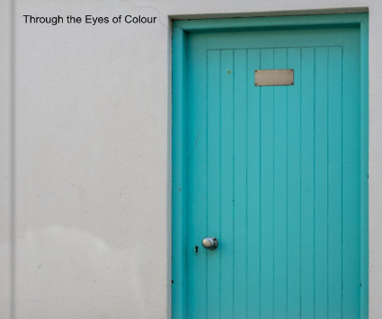
I decided on the title (extra)ordinary as it separates the two words ‘extra’ and ‘ordinary’ which I think it think sums up my project quite well. I really liked the simplicity of the image I chose for the cover image as it was abstract while still being casual. I knew I wanted the cover image to wrap around onto the back so this was the perfect image as I liked how the sun rays span across the whole image.
Pages
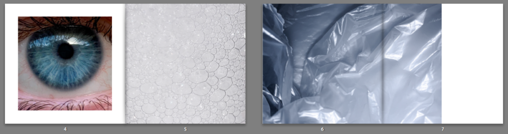
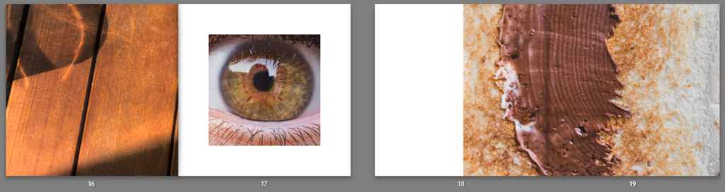
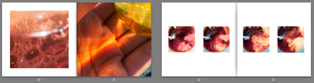
With each page I tried to match the pictures based on similar colours or shapes but making sure not to put images that are too similar together as I wanted there to still be some form of juxtaposition in them. I also didn’t want to put images together that would be next to each other in an everyday setting, this is because I want it to be almost random and unexcepted. My favourite concept was with the eyes as I knew the possibilities were endless. I ended up decided on pairing the blue eye with a close up of bubbles as I liked how they shared a similar shape (circular), the juxtaposition came with the eye having 2 big circles whereas the bubbles has multiple small circles. Similarly, with the brown eye I wanted to focus more on similar colours with the juxtaposition being the difference in shapes (straight lines vs circles).
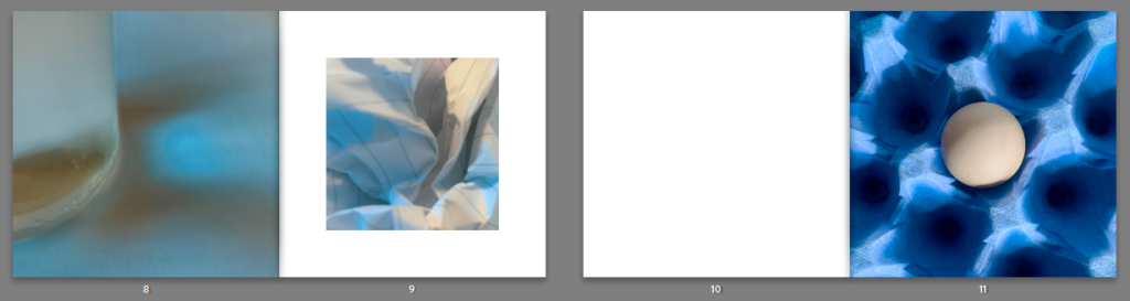
When designing how my images would appear in the book, I wanted there to be some standardisation with some unexpectancy. I did this by having every other double pages (on the left of the images below) follow the same structure: medium square (e.g. page 4) with a full bleed (e.g. page 5) and then a full bleed image (e.g. page 8) with a small square (e.g. page 9) and it continued in that order. I created the irregularity through the other double pages (on the right) which either featured a double page spread, singular square image with nothing next to it, or a row of 4 images which created a timeline of movement.
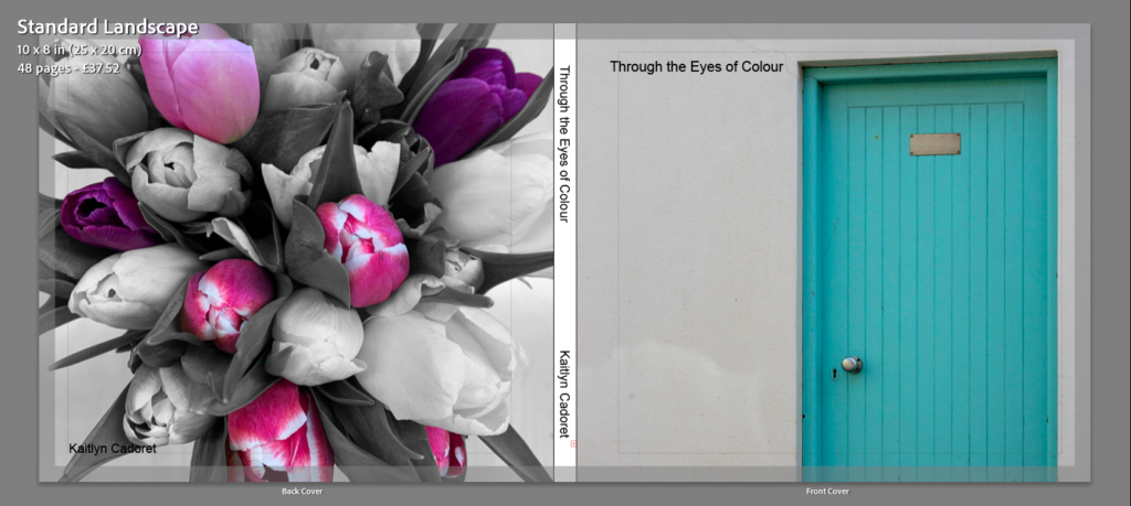
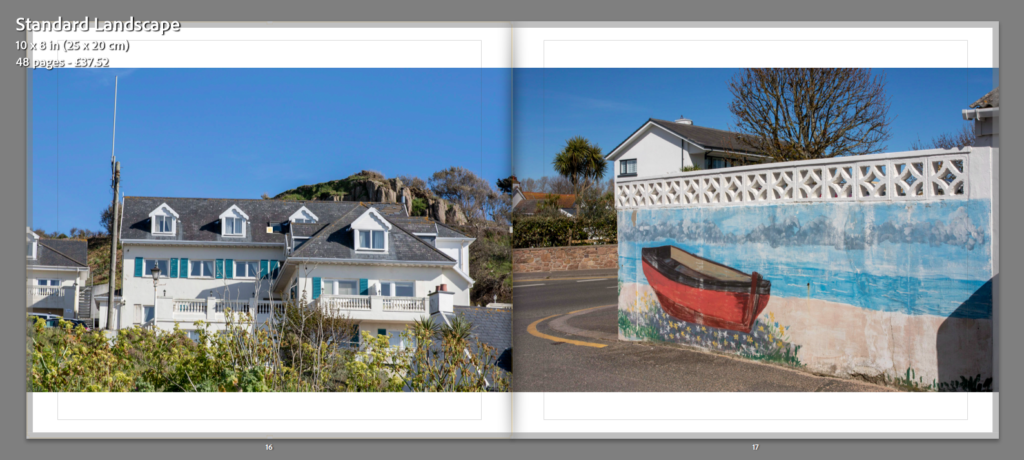
Once I had picked out my final images that I thought were my best and I wished to use in my final photobook I moved them all into one collection and began making my book. I wanted to make sure that the way I placed my images together would work and that there wasn’t too much of one colour at a time. When it came to the front and back cover I wanted to make sure that I used to bright and contrasting images to draw people in. I think the images I chose work well as one is a warmer tone and the other is cooler. I also think as they are so bright and colour are almost opposite they work well. I think they the way I have laid them out works well and that the colours aren’t too much but they contrast nicely together. Once I was happy with how they were laid out, I began to think of a suitable title that would describe my book nicely. I chose to call it ‘Through the Eyes of Colour’. I think that this name fits with my book and immediately tells the viewer what my book is all about which is one of the main things I wanted to achieve. As a whole am am very happy with my project and I think that my final book is a very clear way of showing viewers what I focused my project on.