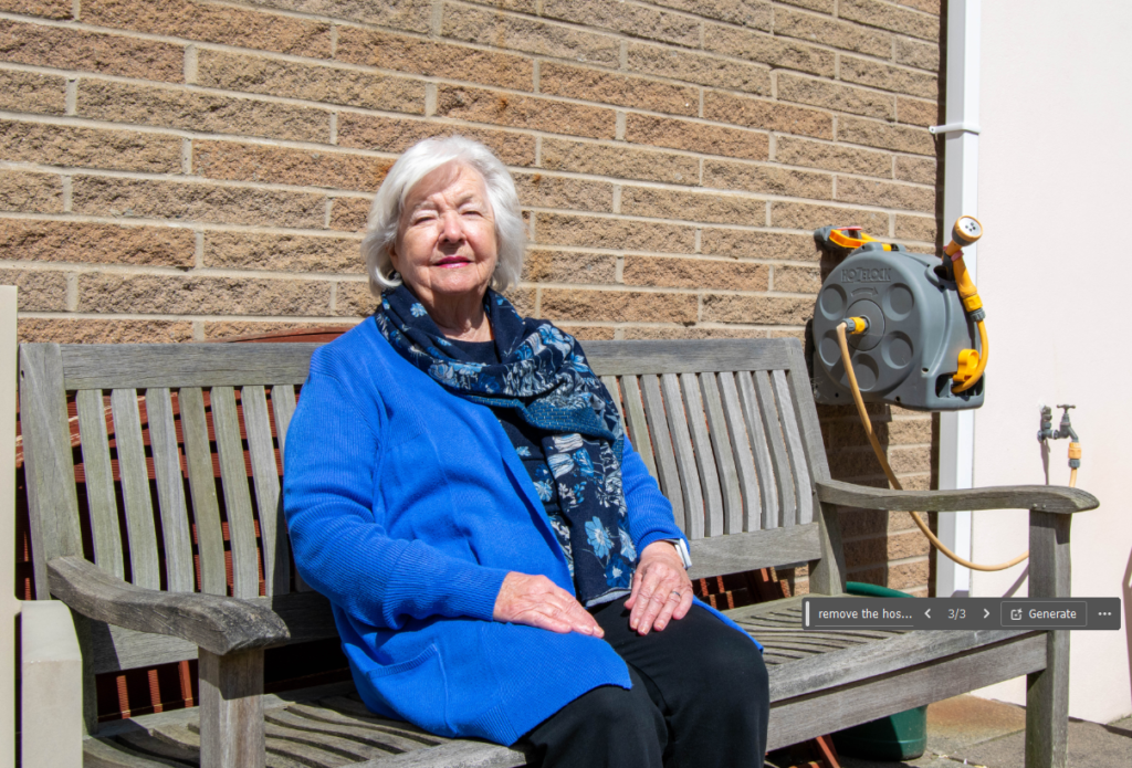
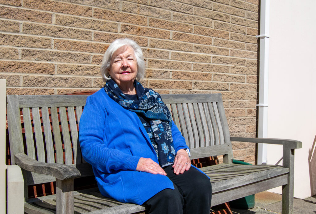
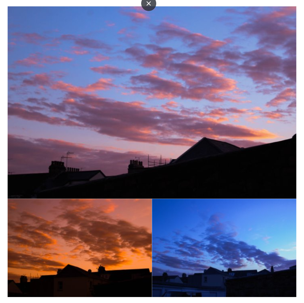
My photobook layout is inspired by Tamara Liechtenstein and her book created on Blurb, with one photo per page, with some photos on a double page spread, however instead of having a white boarder I am going to do a mixture of sizes and fittings, come of the images are going to be full bleed whilst others have a white boarders around it. I have created my photobook this way as I believe it will hook the audience in, as there is different shapes and sizes as it isn’t just one size and just landscape photographs compared to Tamara Liechtenstein’s book although the images are what has inspired me to create this book I find the layout too simplistic and repetitive as there is no differentiation through out the book therefor I have broken that in my book by changing it up and doing different sizes and landscape and portrait photographs.
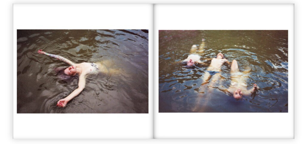
My photobook is based on femininity and the male gave which is a theory created by Laura Mulvey. The male gaze refers to the way women are objectified by the camera lens in Hollywood movies because men are in control of the production process and make decisions that appeal to their own values and interests. The audience, including women, are then positioned to accept this narrow representation. However even though my images follow the idea of the male gaze however, I challenge this idea as I am a female taking these photographs, which suggests it isn’t only just males who see females in a certain way other women do the same to observe and sometimes even challenge them self’s to look the way other women look in photographs. The femininity part of the book is that the girls in my book have the confidence to pose in front of the camera and portray the conventions of women being beautiful and elegant which I believe reflects well on my photographs.
3 words to describe my book: Femininity, girl hood, exploring.
One sentence to describe my book: exploring femininity through the male gaze, and glorifying girl hood.
A page from Tamara Lichtenstein’s book.My photobook layout.
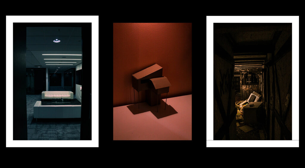
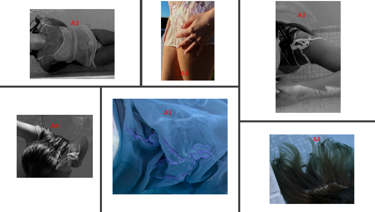
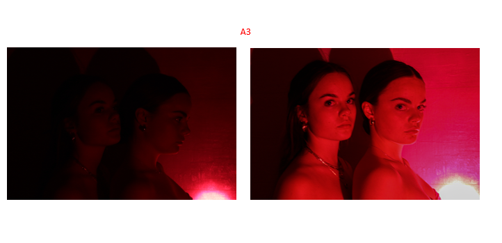
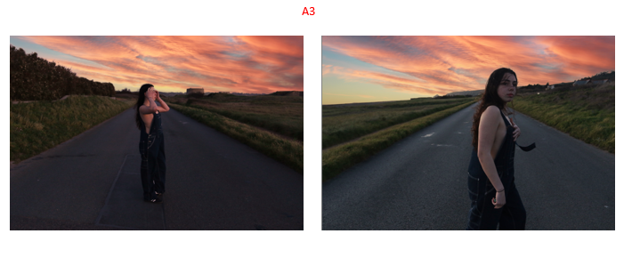
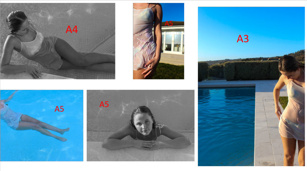
This Print is going to be an A3, single image when I am mounting up with a black boarder around the image.
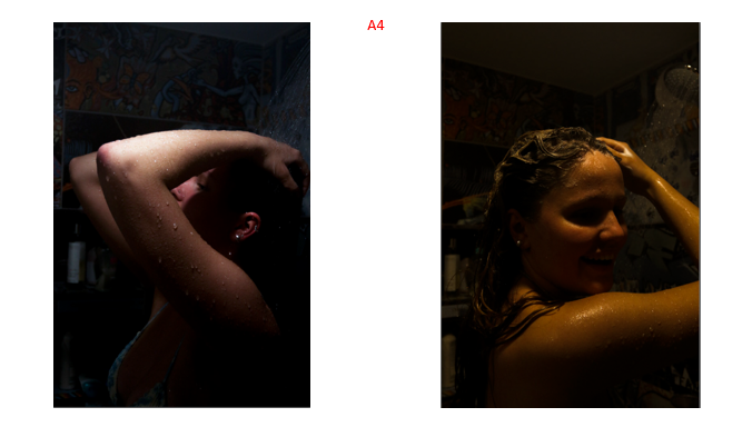
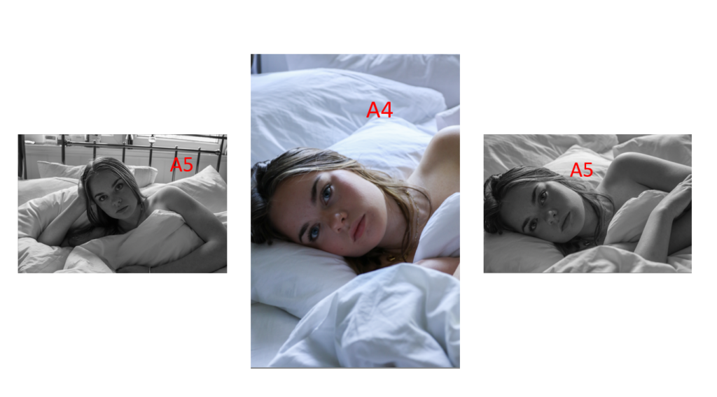
This one is an A4 image, where I will do the same thing as the A3 image, but smaller.
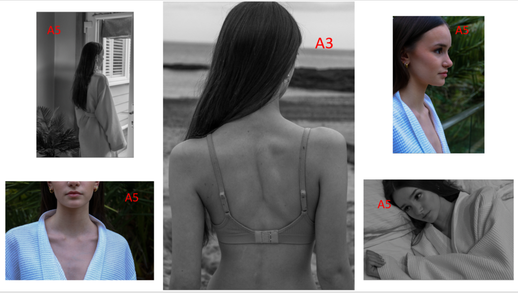
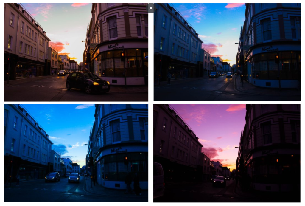
All 3 of these images are A4 and will be mounted onto a black card background, where the 2 images on either side with have a boarder in order to make sure the image is visible, except for the middle image which is visible anyway without a boarder.
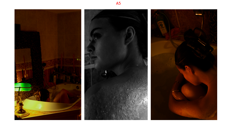
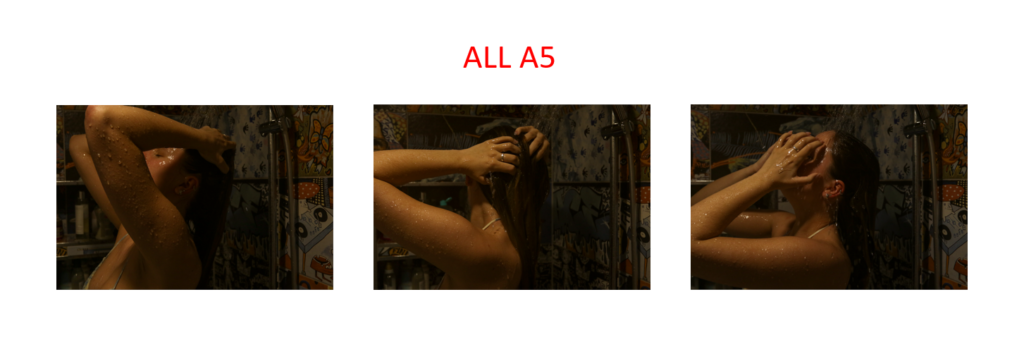
These 2 images are A5 and will be mounted onto a small black piece of card which will have outlines for each of the images to make sure they are properly visible.
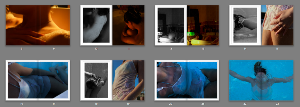
I have selected these images as my A5 prints as I feel as though they will be useful when breaking up the bigger photographs, making the final layout feel less cluttered.
A4
I chose these images for my A4 prints due to them showcasing the main colour scheme of my project, being a lot of muted tones and greyscale. I think that theses will help to bring out similar tones in the other images, linking them together when mounting.
A3
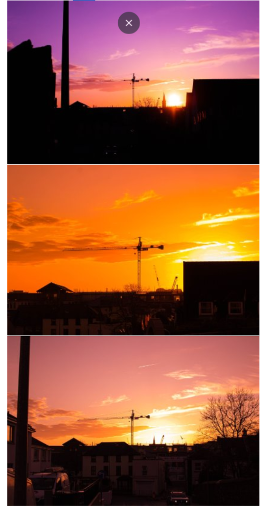
Lastly, these are my A3 photos. The main idea behind making these images the biggest was in order to display the shoots that are involved in my project.
I have created layouts on how I want to frame my photographs and the sizes they are going to be printed out in, i made this using PowerPoint placing each image into position.
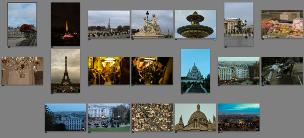
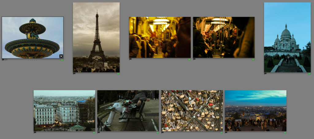
When working in Lightroom on the outcomes I have recently worked on, I reminded myself of the initial plan for the project, which was to start with archive images of the previous summer where I have done a lot of travelling which would link nicely to my own idea for this project. However because I had these images of my film camera it took longer then expected to get it developed. However in the meantime, I looked for alternative images. This is how I came across Paris photoshoot which the images were taken on a school trip to Paris earlier in November.
Because this was a photoshoot done before the exam, I had already selected the best photographs, which are shown bellow.
Final images
I have shortened my selection, and slightly edited them further, however the images already had some work done on them. I would want to present these images with my other trips, like the most recent one; Norway, as well as combining other archival photographs once I get prints from the developed film.
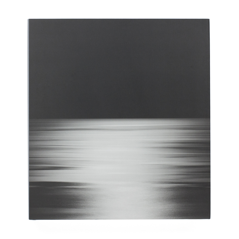
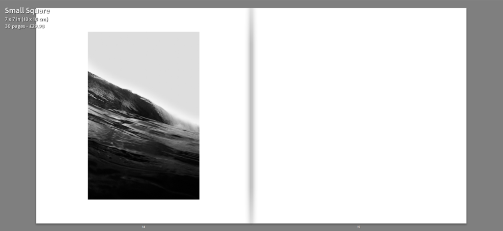
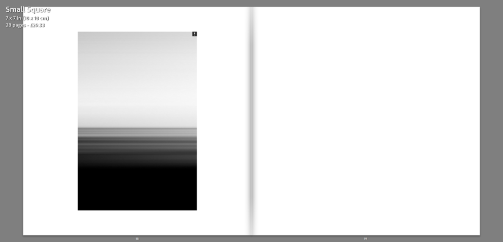
For more than four decades, Hiroshi Sugimoto has been photographing seascapes around the world. “A sharp horizon line and a cloudless sky- here began my consciousness.” writes Sugimoto, “From there my thoughts race to the origins of human consciousness itself. The sea reminds me that within my blood remain traces of human evolution over hundreds of thousands of years.”
His Seascapes series began in 1999. Photographed with cartographic precision, each image shows sea and sky bisected by a seemingly infinite horizon. Rather than taming the subject through repeated documentation, the series grows more awesome and sublime, until the images reveal only the transient atmospherics—the thickness of fog or stillness of the water.
Water and air. These primordial substances, which make possible all life on earth, are the subject of Hiroshi Sugimoto’s Seascapes series. Sugimoto has called photography the “fossilization of time,” and the ‘Seascapes’ photographs simultaneously capture a discrete moment in time but also evoke a feeling of timelessness.
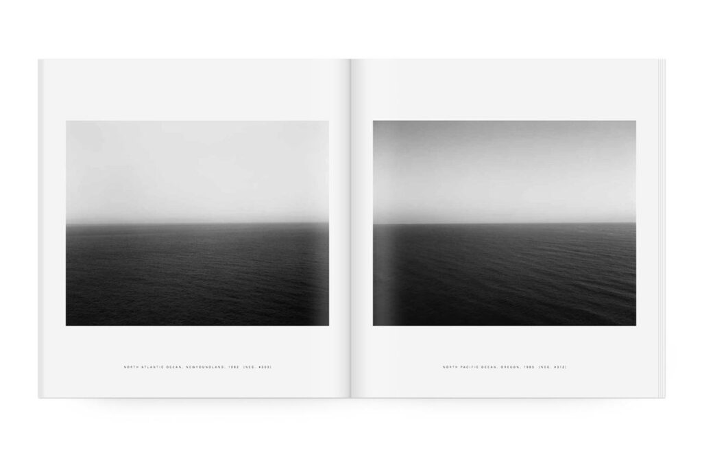
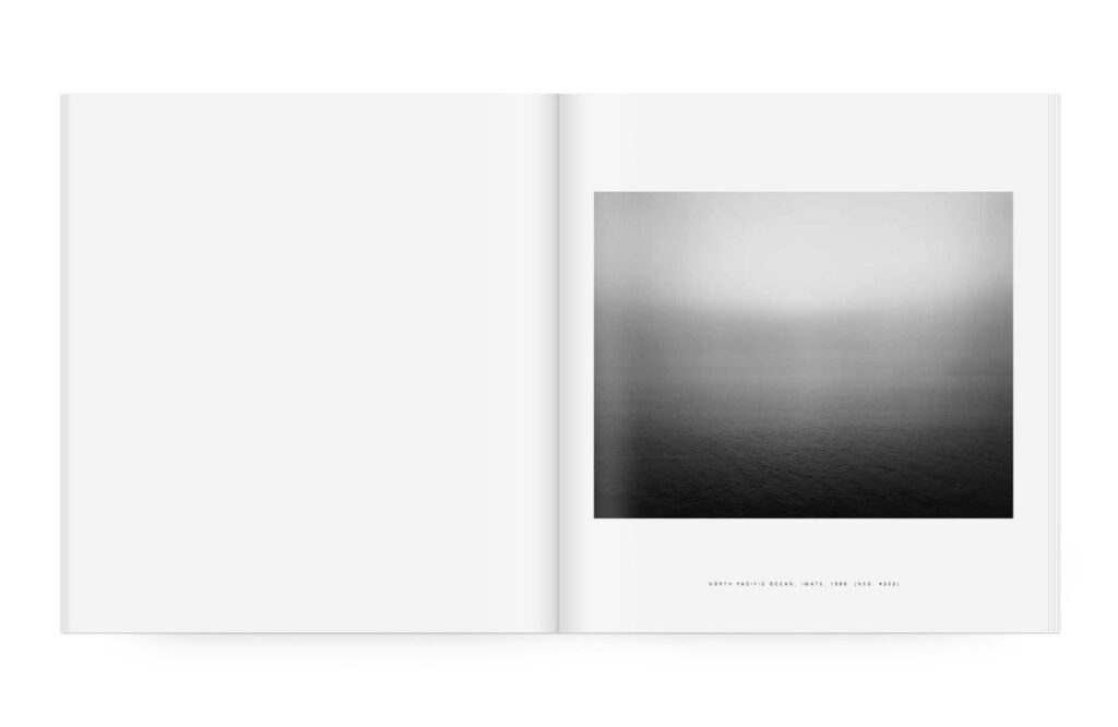
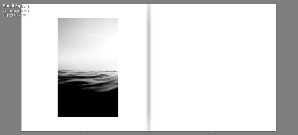
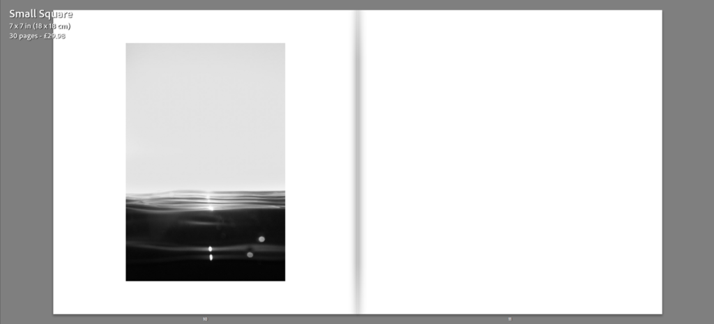
This volume, the second in a series of books on Sugimoto’s art, presents the complete series of over 200 ‘Seascapes’, some of which have never before been reproduced. All are identical in format, with the horizon line precisely bifurcating each image, though at times the sea and sky almost merge into one seamless unit. Each photograph captures a moment when the sea is placid, almost flat. Within this strict format, however, he has created a limitless array of portraits of his subjects.
In “Seascapes” by Hiroshi Sugimoto, the layout is intentionally minimalist to enhance the impact of his photographs of the sea. The simple design allows the images to speak for themselves, capturing the essence of the vast ocean and its timeless beauty. The clean layout helps create a sense of tranquillity and contemplation, drawing the viewer into the serene world of Sugimoto’s seascapes.
My Layout
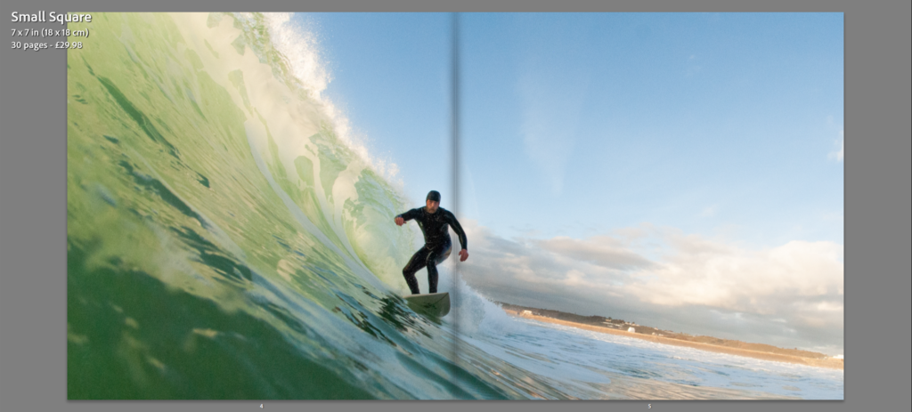
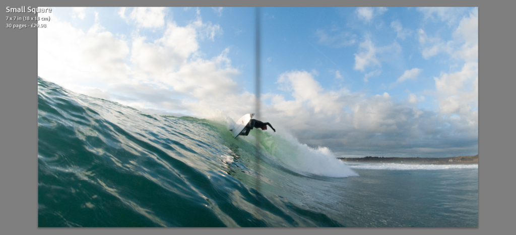
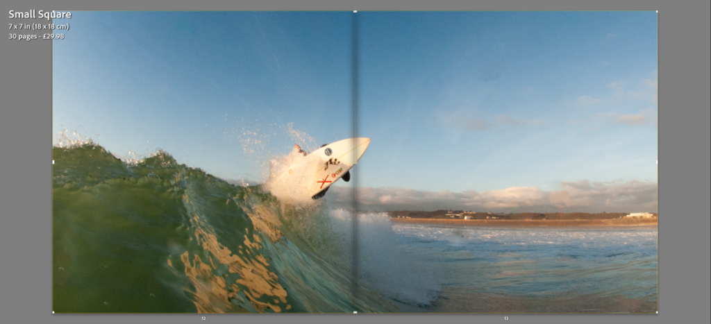
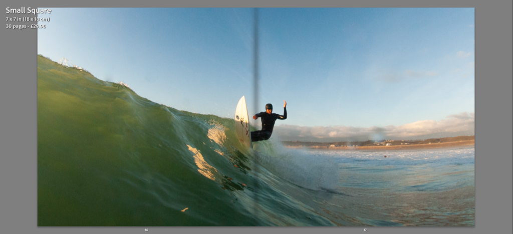
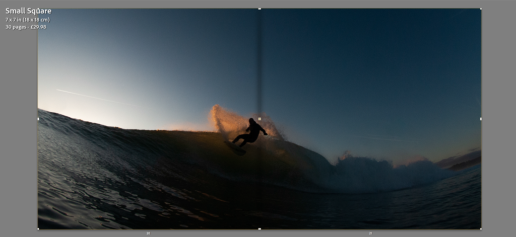
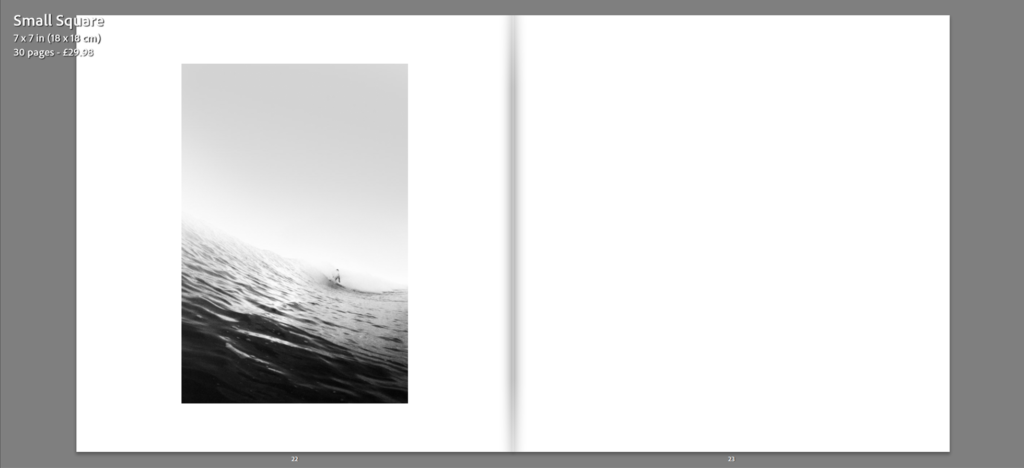
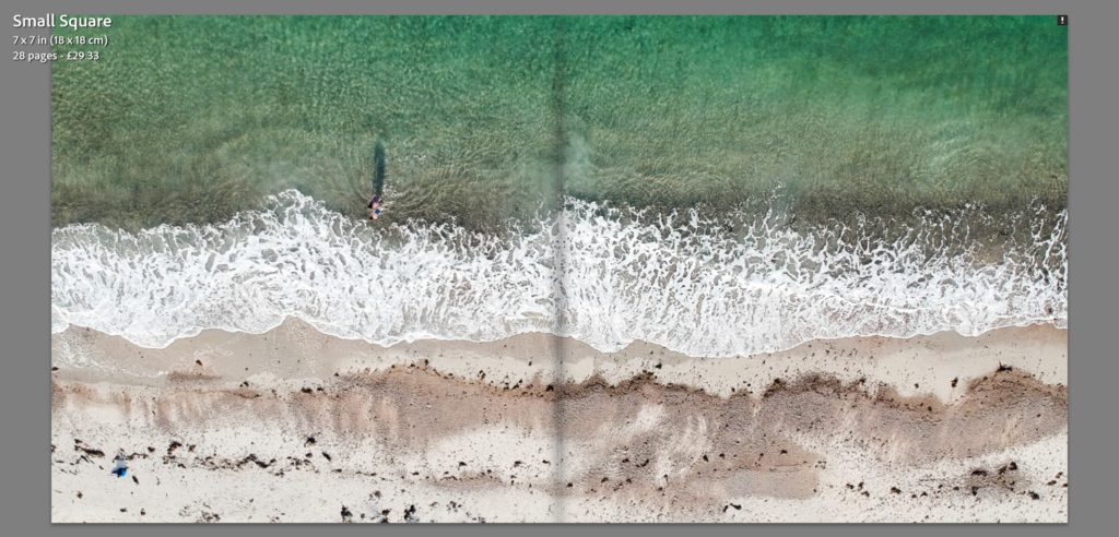
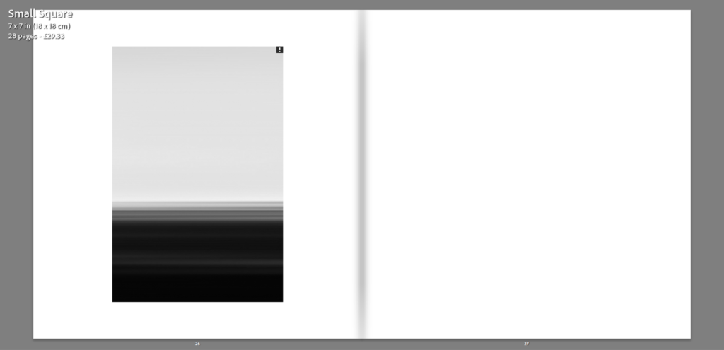
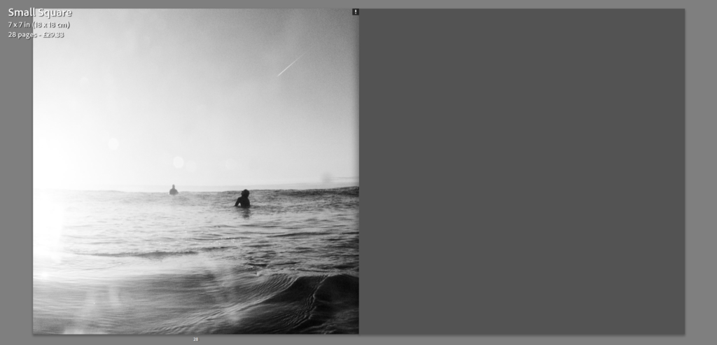
To evoke a similar feel to the works of Hiroshi Sugimoto, the layout of specific images, the ones having taking inspiration from Sugimoto, will be similarly set out to the ones featured in ‘Seascapes’, with a clean, simplistic, uncluttered design. By keeping the design simple, the focus remains on the image, along with continued theme of minimalism. Other, more complex images will be lay out across a double page spread allowing the image to be displayed on a larger scale, enhancing the sense of detail.
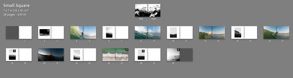
Book Settings
Paper and ink – Premium lustre paper
Format, size and orientation – Small Squares 7 x 7 in (18×18 cm)
Binding and cover – Hard cover image wrap
Title – ”Surfscapes” – taking inspiration from Hiroshi Sugimoto’s ”Seascapes”
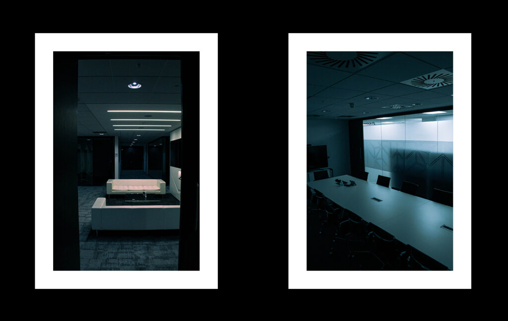
For both of these collages I will be presenting them on foam board which will be white and placing the images on with spray mount to ensure that they do not lift at all.
Triptych:
For both of these layouts I will be creating Window Mounts for. I will be doing this by using a piece of card and using a bevel knife to create the angled cuts, by using this it will create a soft white boarder around the images.
Some ideas for laying out my photos on foamboards, all these photos (including a few more as singles) have been selected to be printed and laid down on board in combination with my book, which will feature all photos.
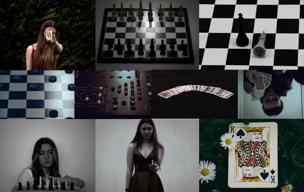
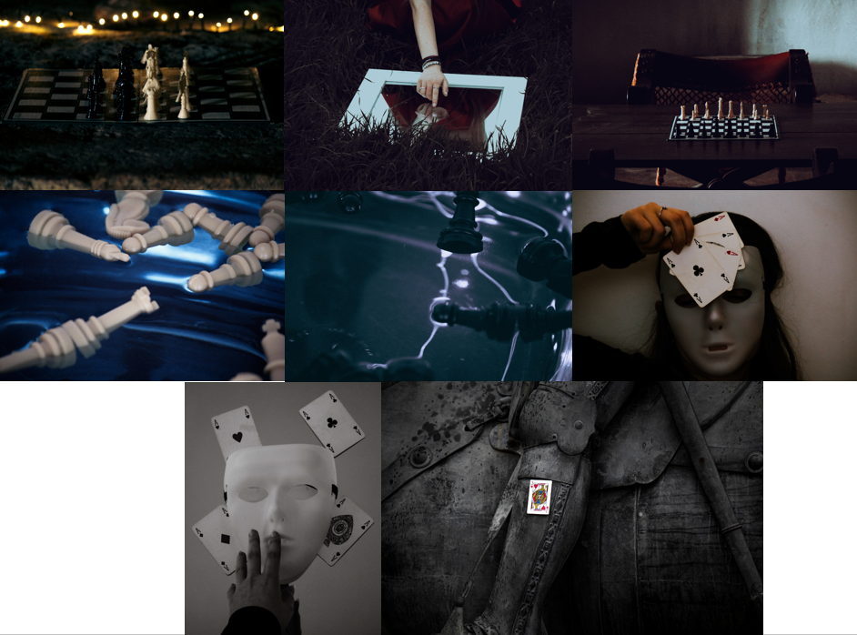
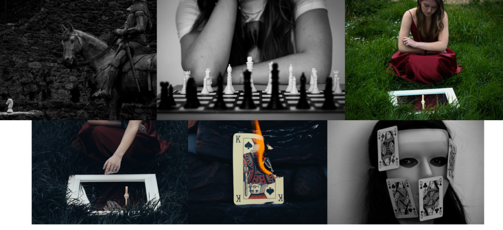
The story told through my photos is of a girl who becomes so immersed through the game she’s playing that she starts to feel as though she a part of it. The images depict the different emotions she has, such as with the mask symbolising how she’s trying to deceive her opponent or the castle photos representing how real the game feels to her.
At the start of the book I used my portrait photos, in order to show that she’s playing a game, before connecting them to my mask images which implies that she is hiding her intent from her opposition. The story continues by moving onto the castle photos as well as the photos of herself dressed up, suggesting that she has become so immersed and involved in the game that she feels as though it a sperate reality with the mirror helping to highlight this through the use of reflection. Nearing the end of the book I decided to use the photographs that include the cracks in the wall, showing how the game is coming to an end and reality is breaking back through. I wanted to leave the ending of her story up to interpretation by using the burning card as my final image, which could symbolise that either she’s lost with the king being in check, hence the flames, or her opponent has lost and they flames represent their defeat.
What I like most about my photobook is that there is more than just one story that can be seen through it, while I have the story that I based the layout on, it could be viewed as a way to link to gambling as for many people who struggle with addiction surrounding games, often do so due to how immersed they feel.
Evaluation
Did you realise your intentions? – My intentions towards my book differed slightly from the beginning of creating it. At the start of this project I wanted to go a more strategic route, showing certain moves in different games. However, as I was producing my photos and creating my photobook I realised that my images had the potential to tell a story if used in the correct way, ultimately leading to my final outcome.
What references did you make to artists references? – I made quite a few links to my artist references with 4 out of 6 of my photoshoots being dedicated to recreating their works in my own style to match the theme of my project. Overall, I think that my artists helped to shape the way my project turned out, both visually and contextually.
How successful was your final outcome? – I think that my final outcome was successful as I managed to convey the story across in a way that’s both interesting and visually appealing to the viewer. If I were to make any changes to it I would most likely include more images as well as some text to maybe describe the story at the end.