For this photoshoot I wanted to experiment more with flash to create more abstract images, more similar to Rinko Kawauchi’s work. I tried many different ways of photographing one object to try and create the most unusual perspectives that elevate them.
Overall, I think my best images are very strong and illustrates the theme of my project perfectly. I really like the uniqueness of each picture and how they all tell a slightly different story while still being an accurate representation. This photoshoot focuses a lot on colour but also on movement which was something I hadn’t considered before. I think my strong images not only capture everyday objects but more simply, everyday life.
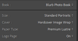
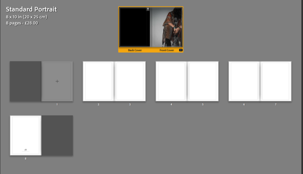
After picking the orientation of my photobook, I picked what image I would use for my title page.
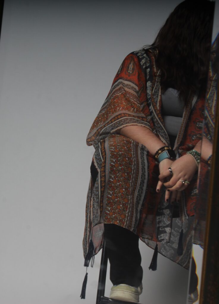
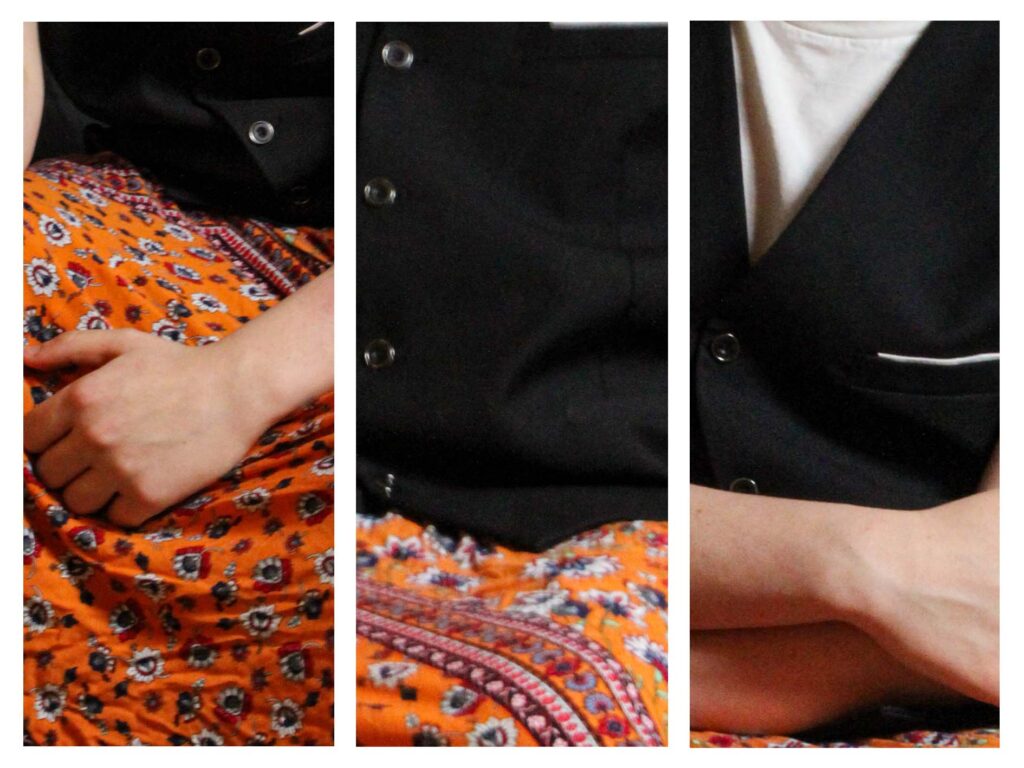
I ended up picking this image as it represents the avoidance of showing identity, the theme I have picked for this book.
Initial layout with just title page.
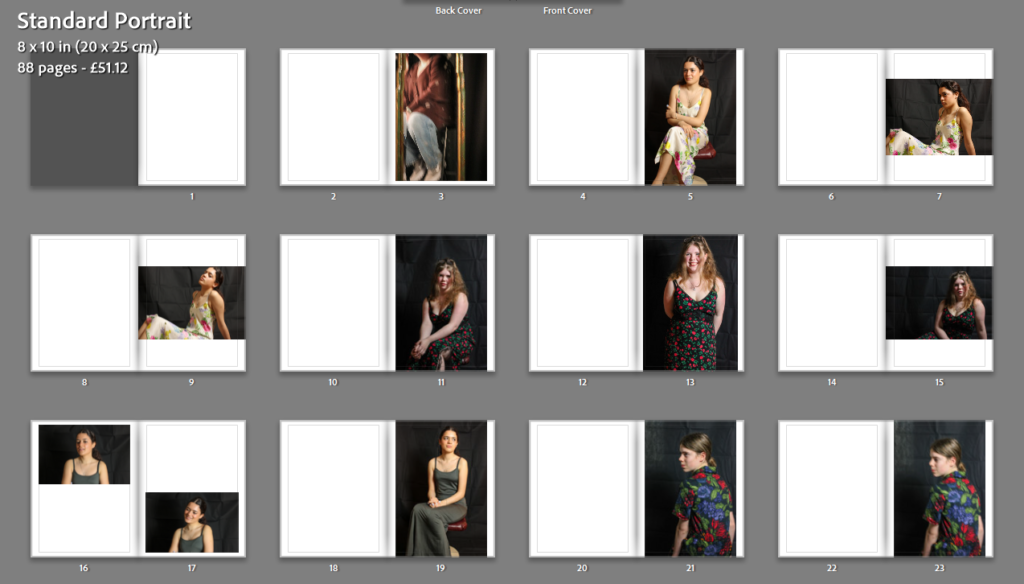
After choosing my title page, I clicked auto-layout, this makes sure that all the images are in the book and after removing the images I had decided wouldn’t be in the book, I had 88 pages.
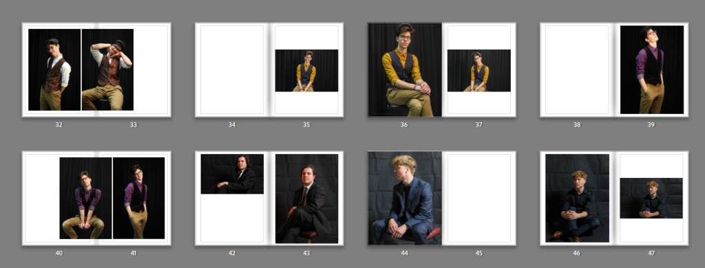
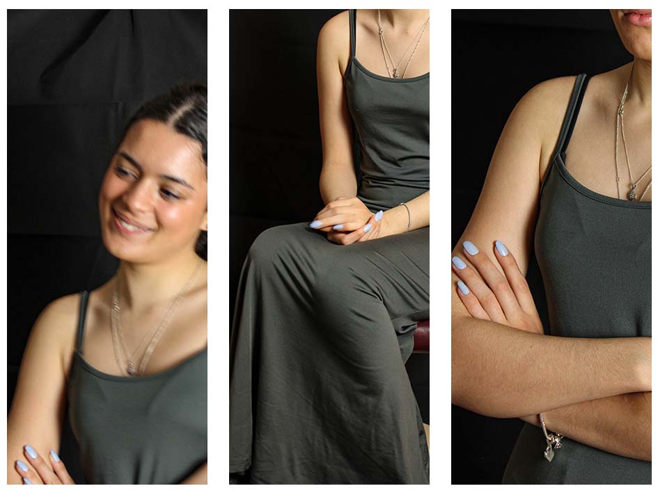
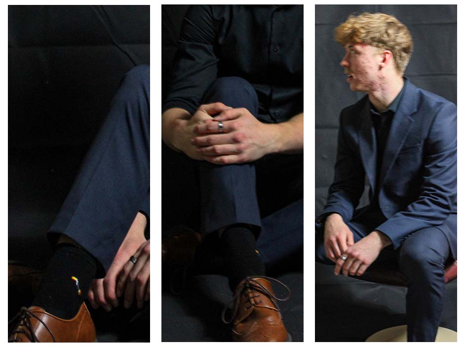
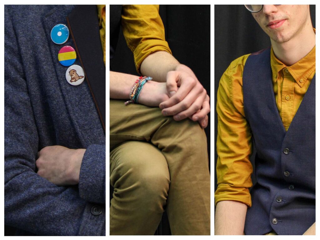
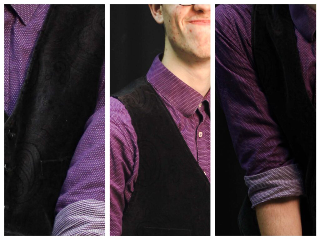
I then sorted the images into the “narrative” I wanted, showing the gender spectrum through each set of images.
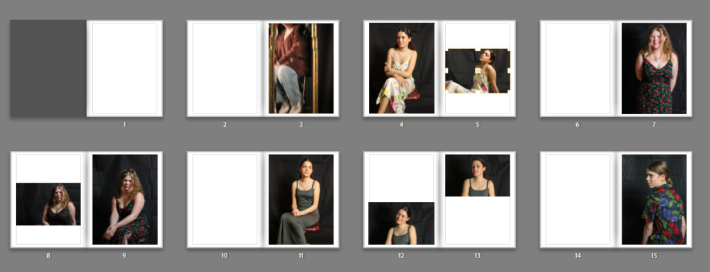
Layout after a few changes to auto-layout version.
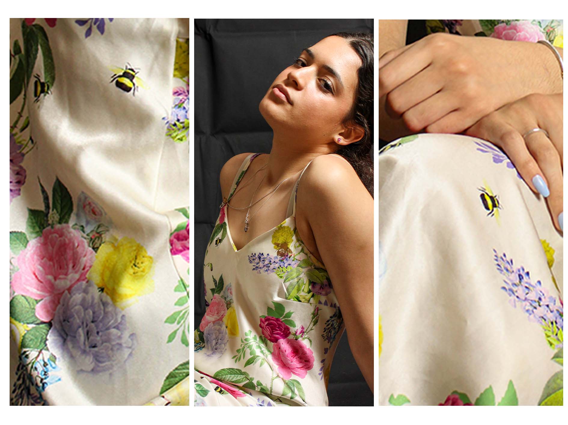
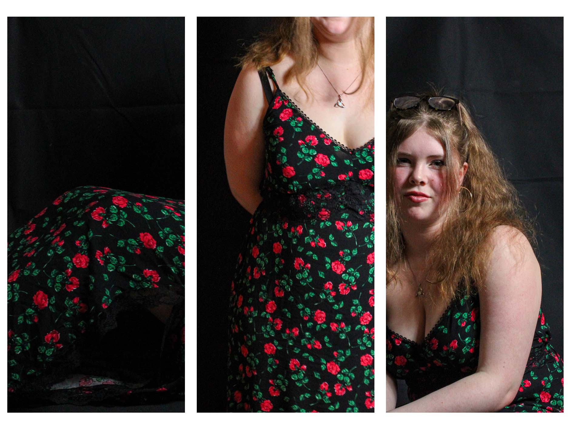
“Femininity” section of the book
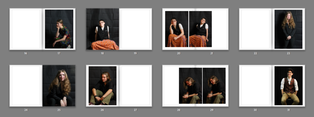
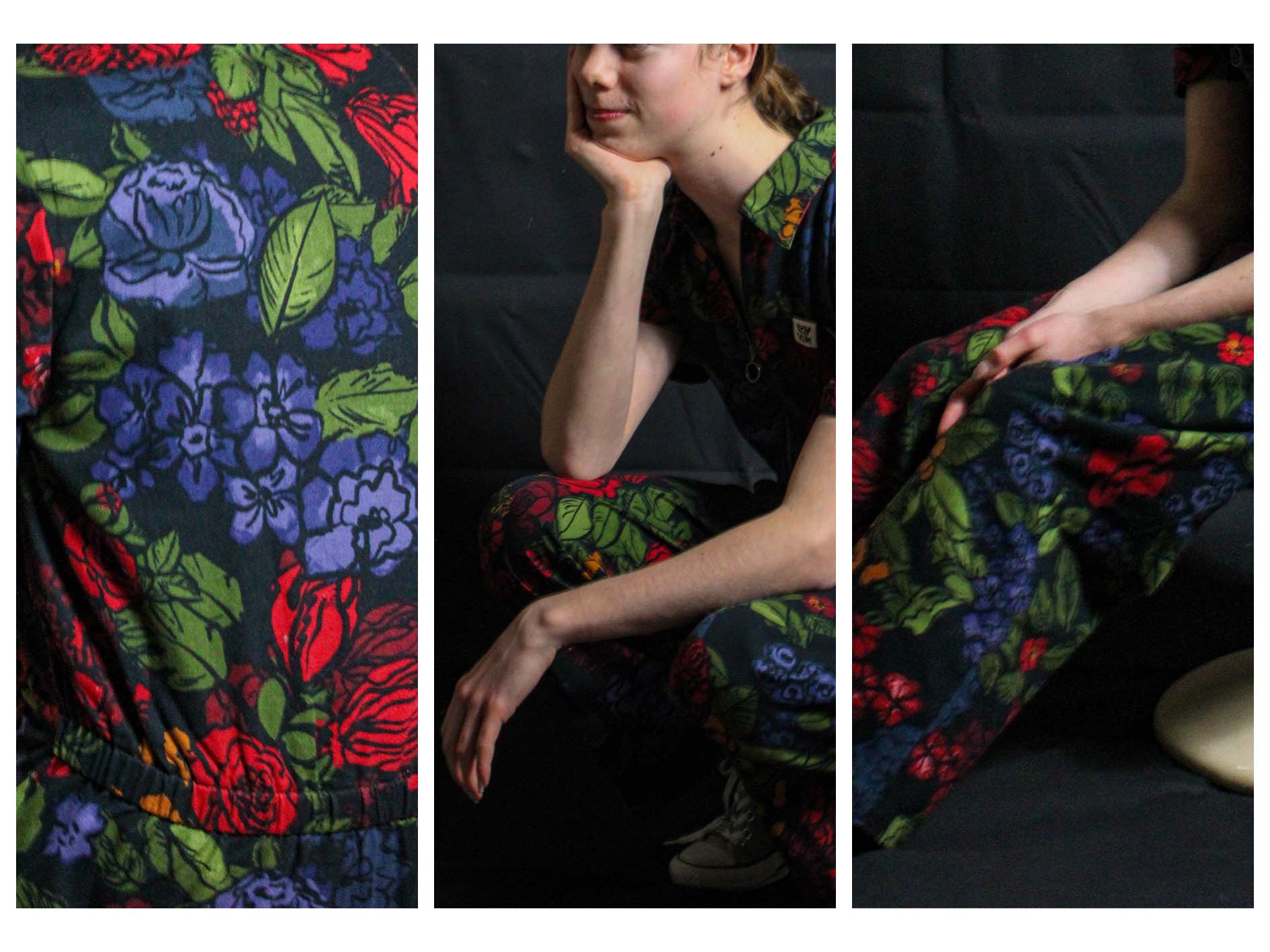
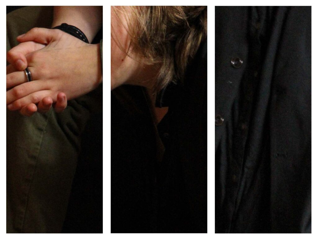
“Androgyny” section of the book
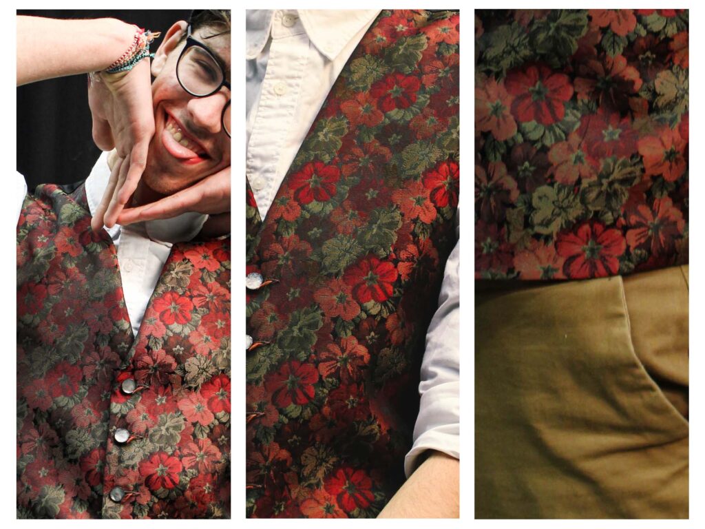
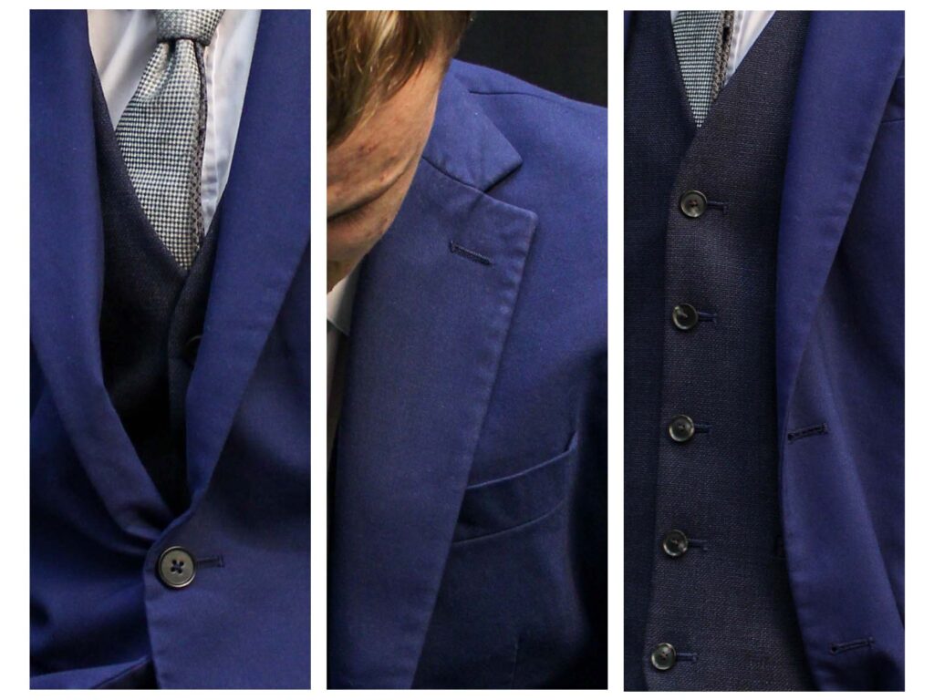
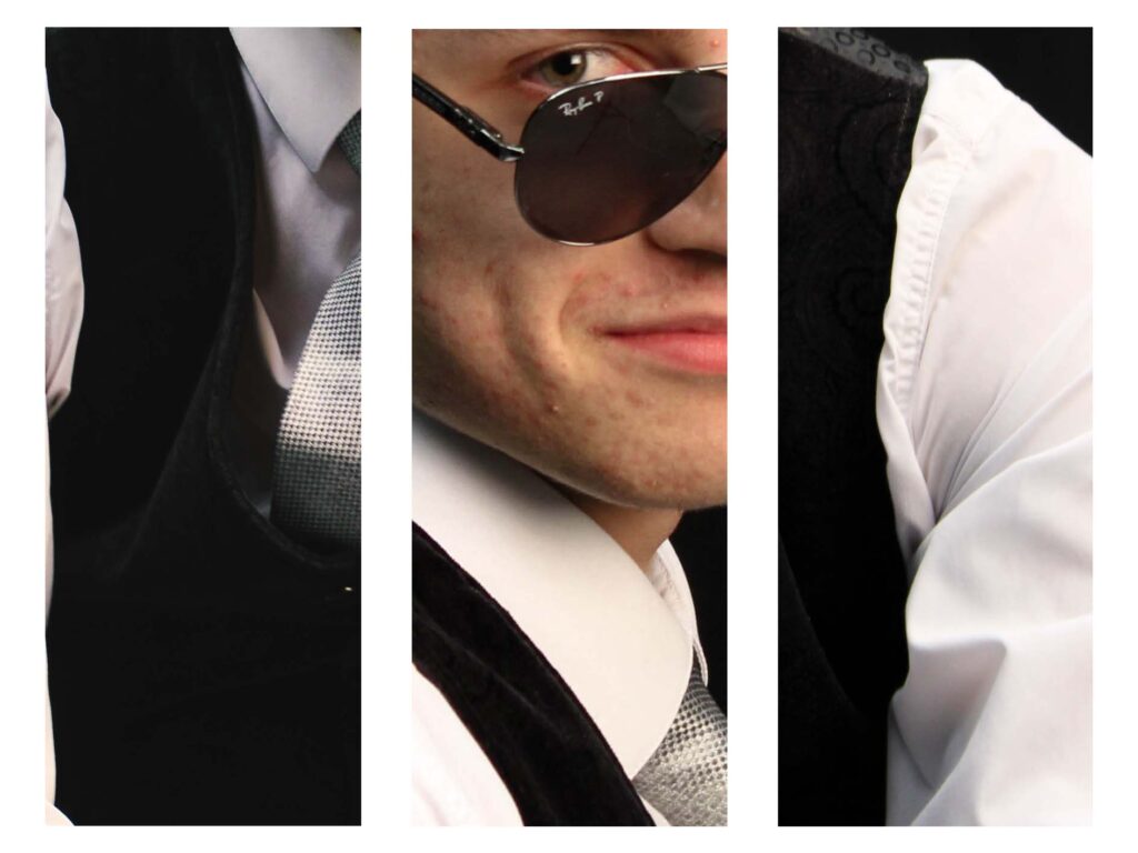
“Masculinity” Section of the Book 1
“Masculinity” Section of the Book 2
When planning the ideas for this book, I decided that I would start and end the book with images of myself with my face hidden “masking” my identity. This was with the intention of showing that I am still struggling to find my identity and want it hidden.
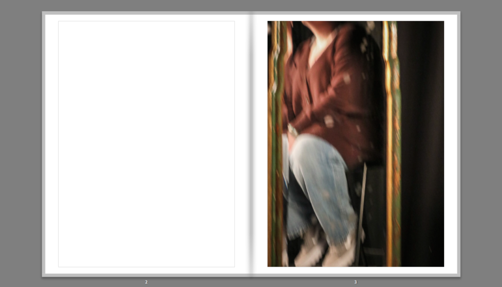
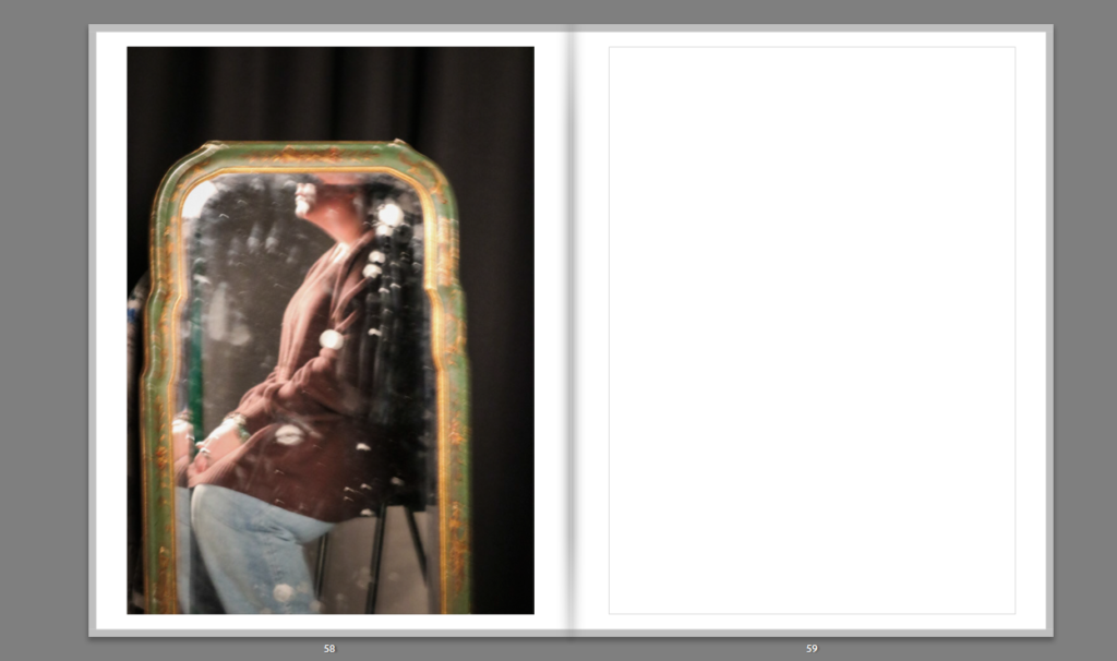
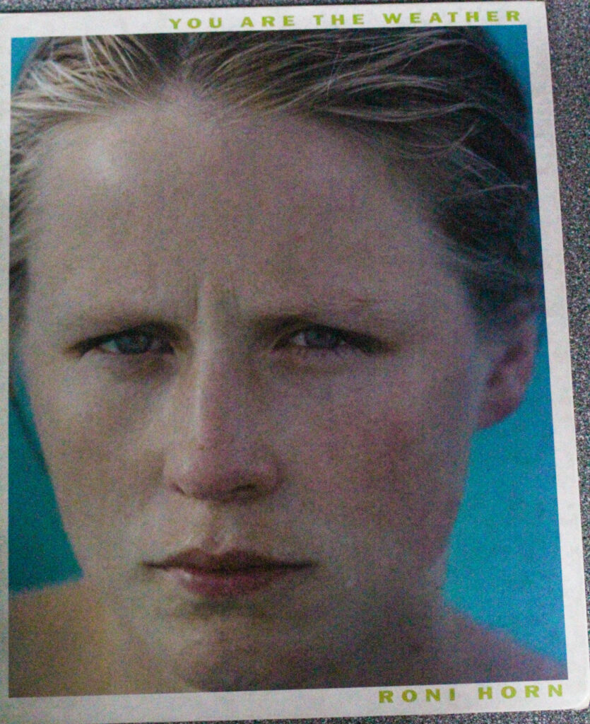
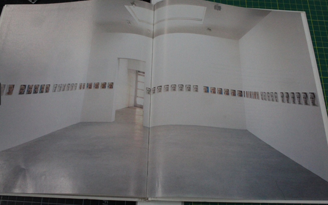
You are the Weather, 1994-95, is a four-wall installation of 100 photographs of Margret Haraldsdottir Blondal bathing in the naturally heated waters in Iceland throughout July and August 1994.
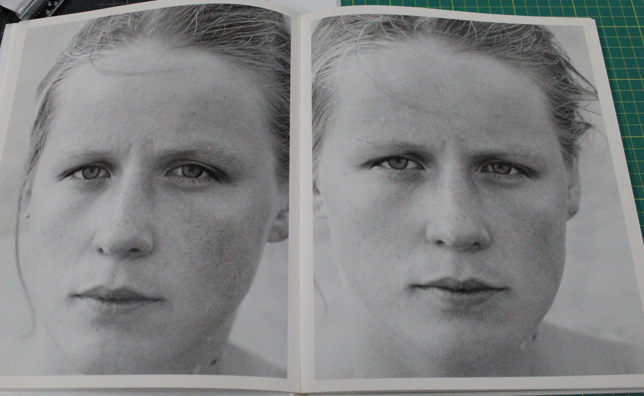
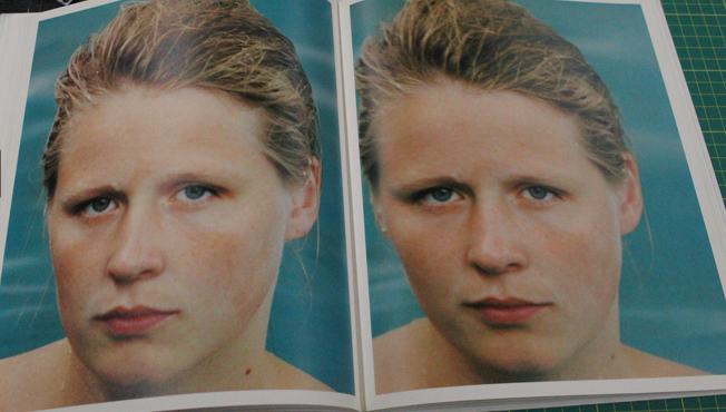
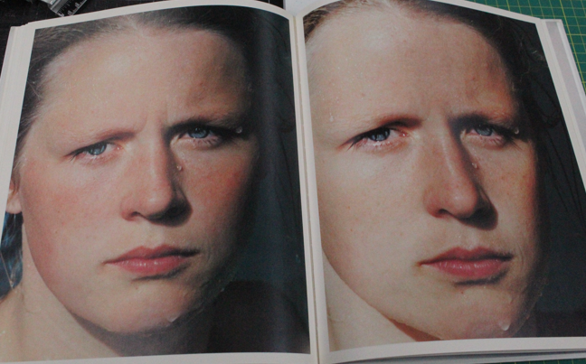
All the images in this book are similar to the one on the front cover, showing Margret bathing in the hot springs but only showing her face, some of the images are in black and white and others in colour.
I think this book really represents one of the themes I’m exploring during this project, the female gaze, as the images only depict her face and not her entire body, essentially removing any opportunities to sexualise the subject. I also think this links to the female gaze and it shows the natural beauty of the woman, unlike in the male gaze, where women would have a “superficial” beauty.
What is the “female gaze”? The female gaze is a way of speaking and listening, rather than the action and chaos that fills a screen. As well as, looking through the lens of both desire and detail that take place in a women’s cinema. Allowing there to be this connection to desire, but in a way that isn’t just purely sexual, as there would be in the male gaze. I also think that the female gaze can be viewed in a few different ways. The female gaze is how women view themselves. That there is finally this ability to look in, rather than just the reflection of how society has wanted to see us. There is also the definition of the world being viewed from a female gaze, meaning more feminine without the purpose of benefiting men.
“We worked daily, mostly outside, and regardless of the changeable, often unpredictable climate that frequents the island.” – Roni Horn
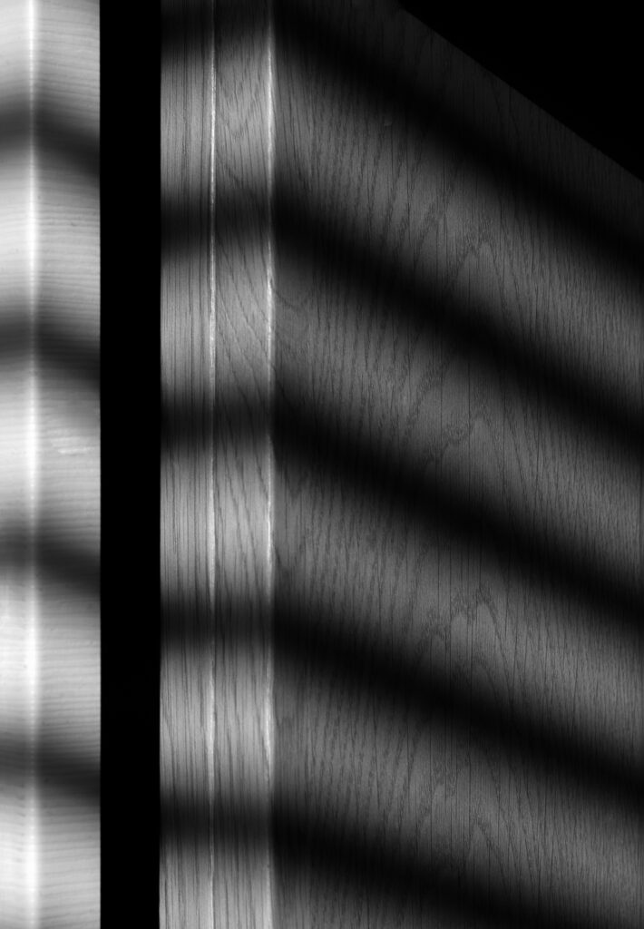
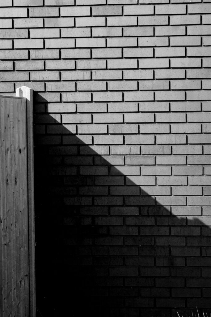
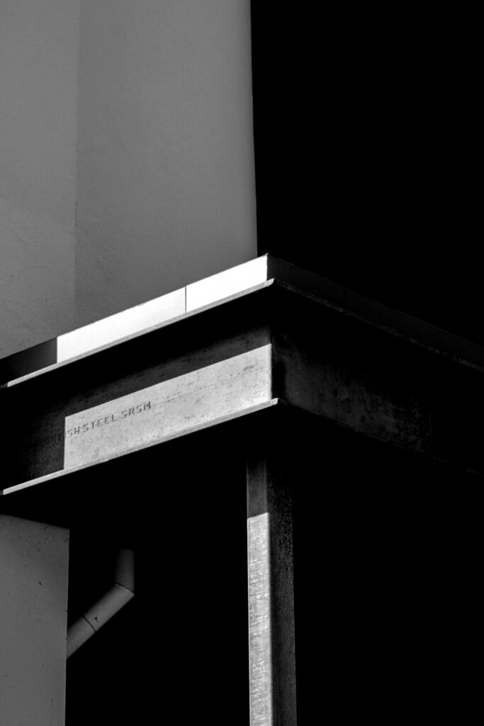
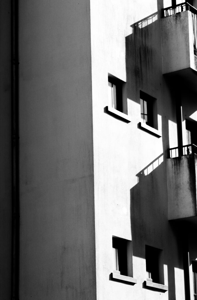
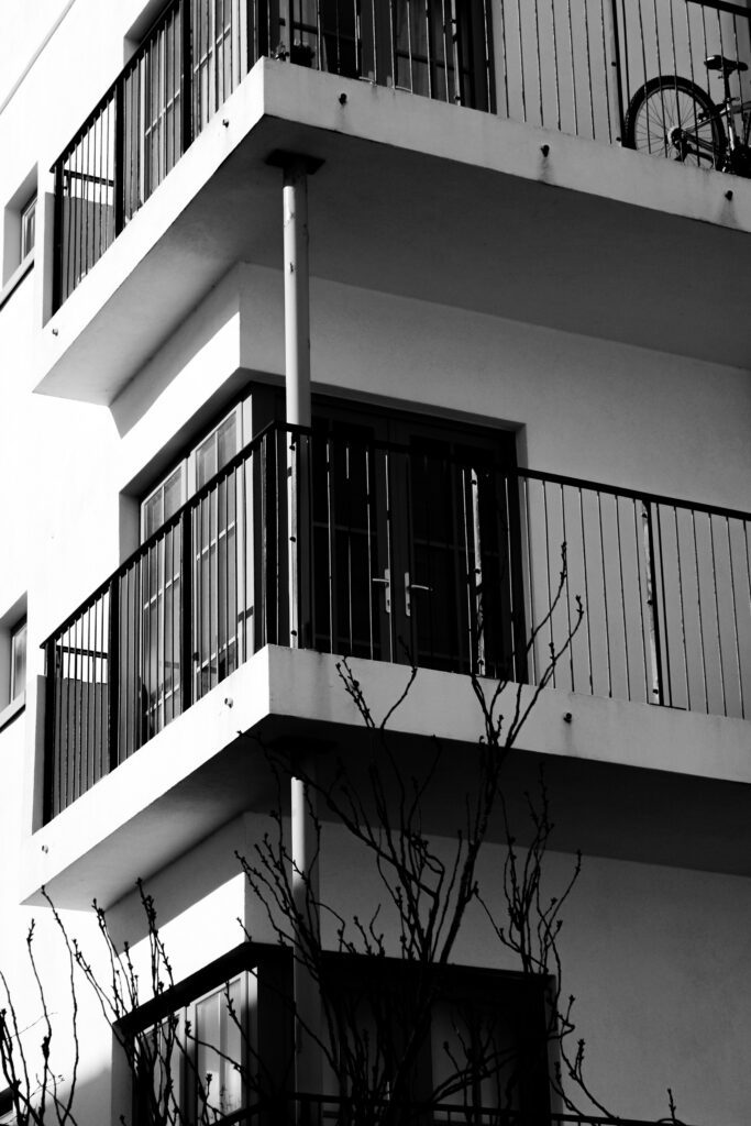
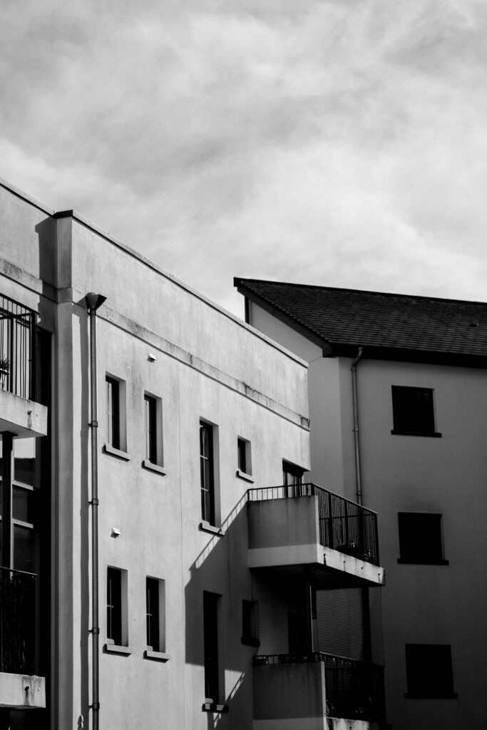
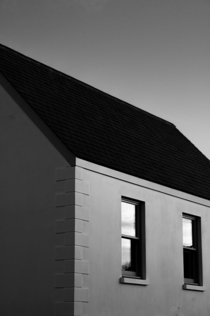
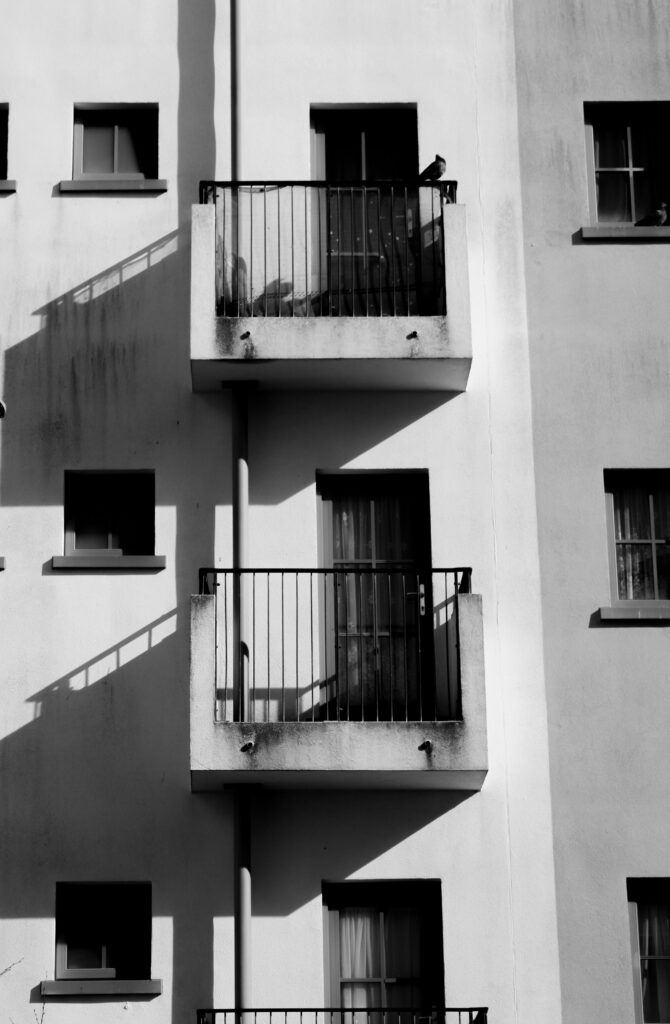
Using my inspiration of Ray Metzker and Sean Tucker, through there use of shadows to capture depth and drama whilst leaving an untold story in which the viewer can interpret in their own way, I produced a series of images that implemented portions of my daily life by photographing buildings around where i live and grew up, however my focus for the project was to capture and document the art of shadows using natural sunlight to find interesting images where it is shown how shadows are an imitation of light. Throughout my different photoshoots i have become more immersed into the use of shadow to create art and i believe my final set of images are some of my favourite pieces of work yet, as i personally enjoy and admire this style of work.
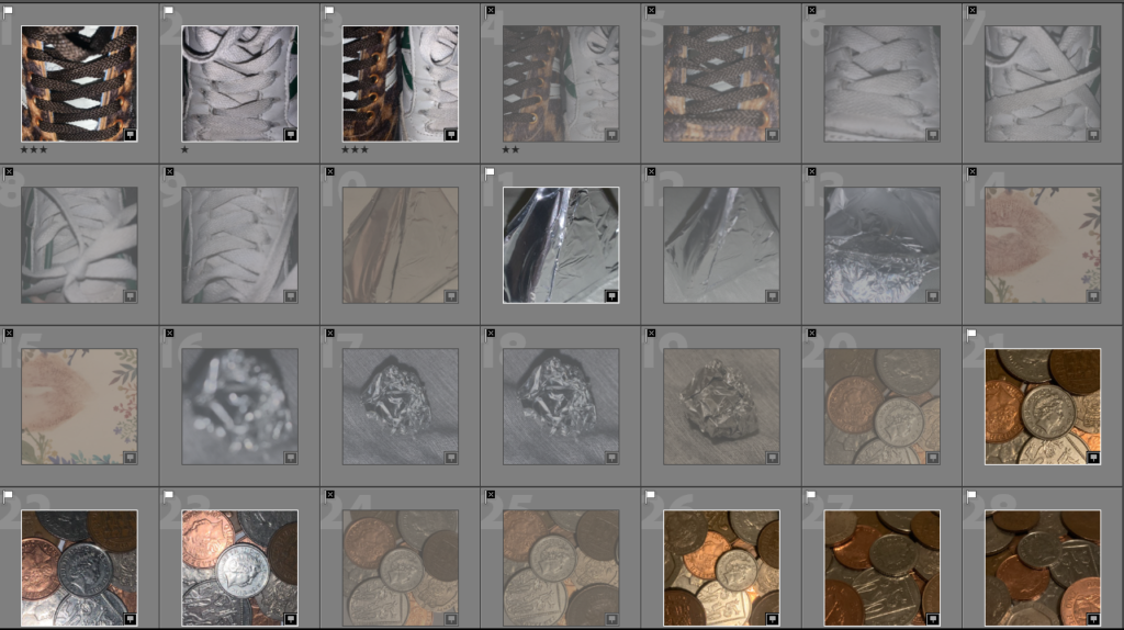
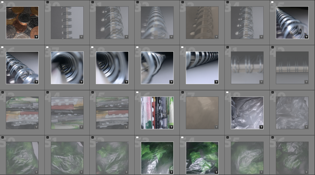
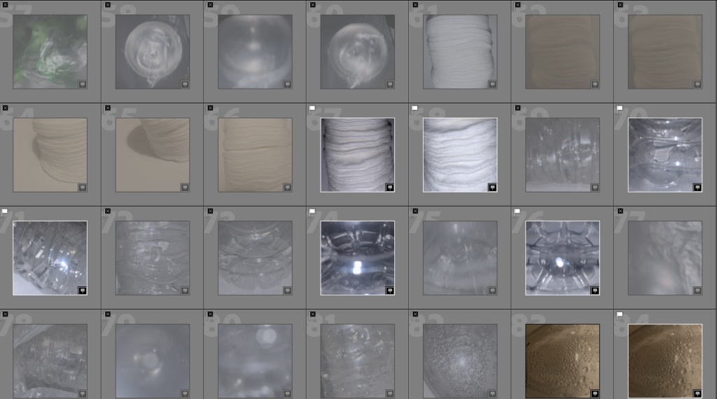
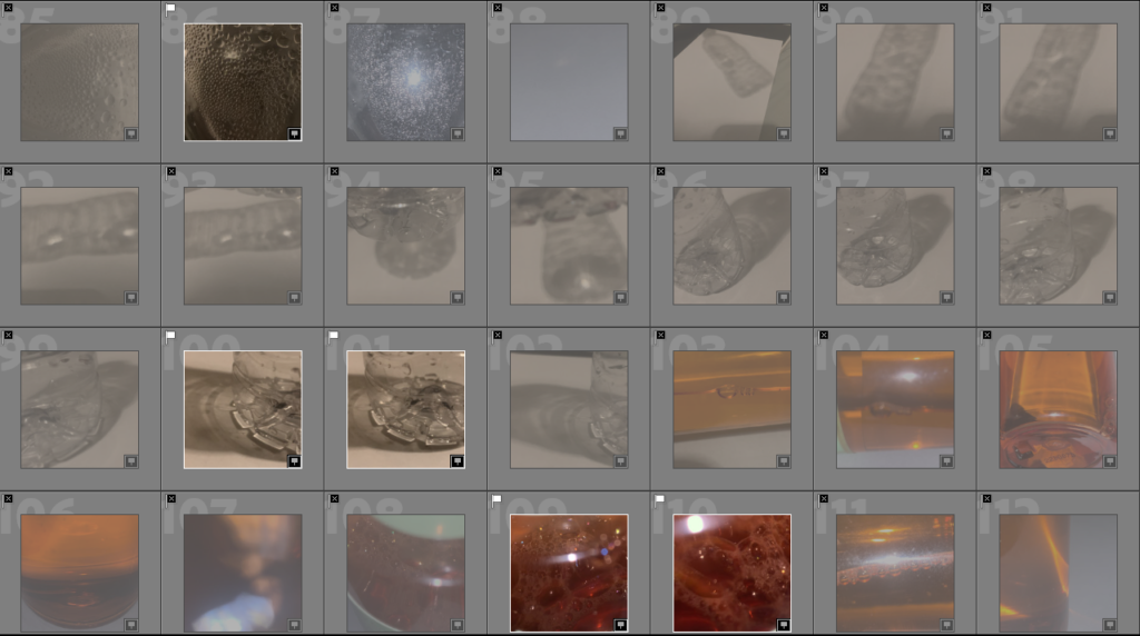
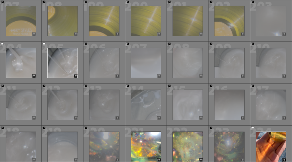
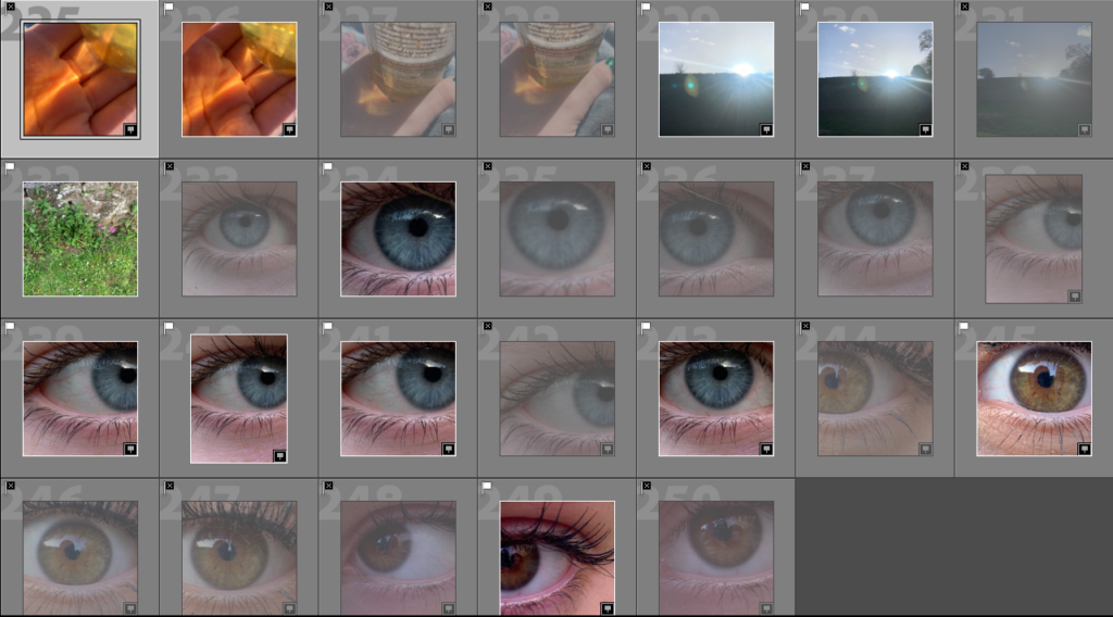
I flagged all of the photos that I liked and to pick the photos that I wanted to use as my final images I flagged green whereas the photos I was still unsure about using in my final outcome was flagged yellow
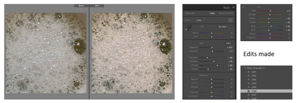
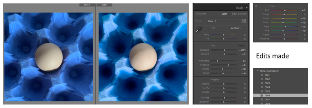
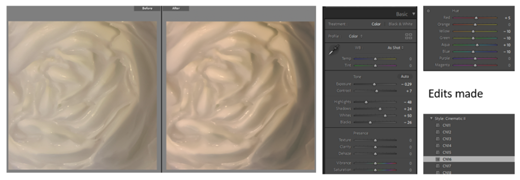
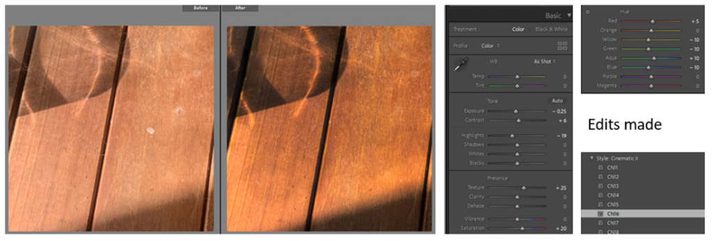
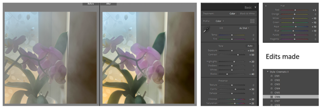
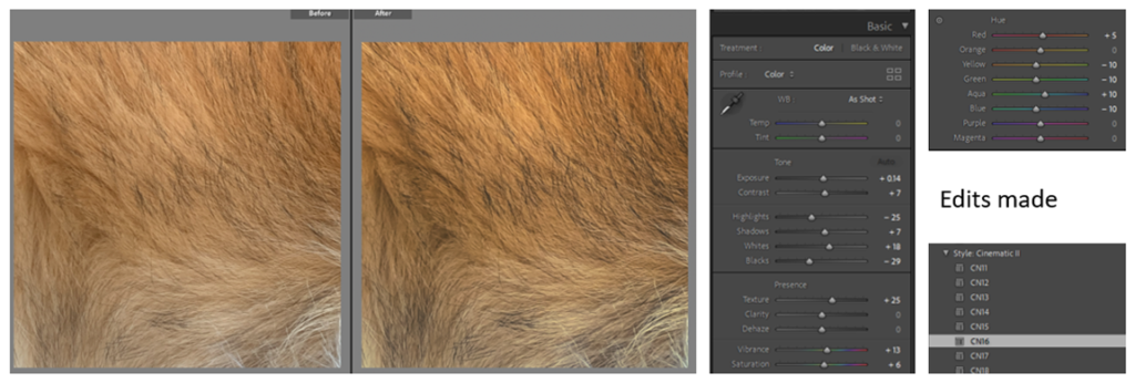
before & after
to edit my images I increased the contrast and decreased the exposure to make the colours more vibrant and stand out, this effect exposes a more comforting and warm style showing the bright colours. I applied all of this to every photo I chose for my final.
I started off the editing by cropping all the pictures into squares as this is the layout I want all of my images to have. I then started adjusting the different levels (exposure, contrast, highlights, etc) and added a pre-set (CN16) before then editing specific areas using the brush tool to enhance all aspects of the images. On certain images I also used the spot tool to get rid of small imperfections that I didn’t like.
FINAL EDITS
Overall, I think the editing has brought the colour and dimension out even more in these photos. These edits directly link more with my artist reference William Eggleston through his use of vibrant colours and strong contrasts.
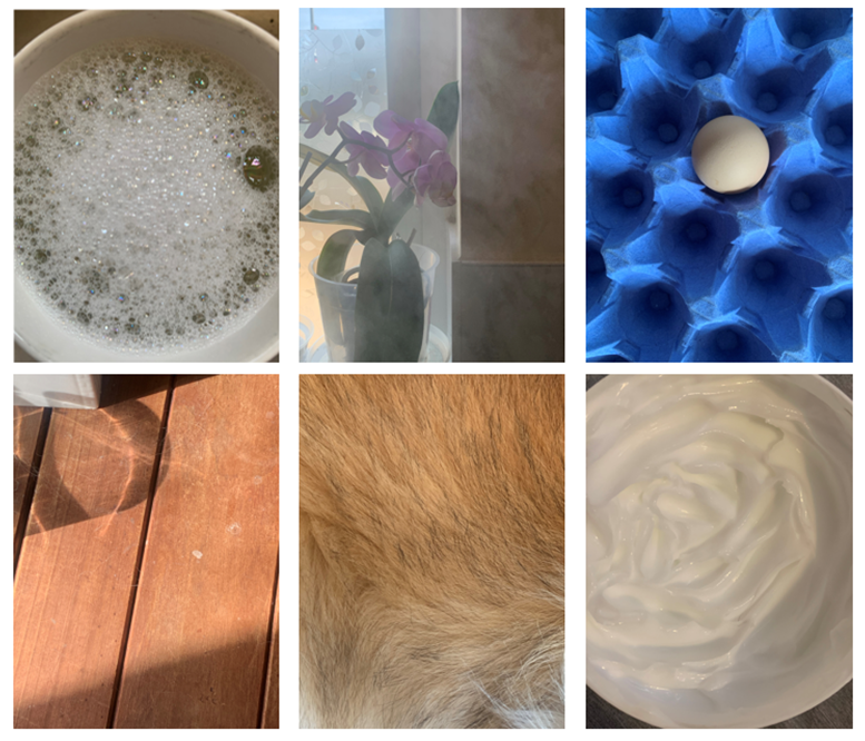
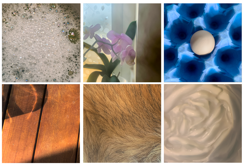
My plan for this photoshoot was to focus more on texture and shapes rather than colour. I once again mostly stuck with the kitchen theme as I thought this was the area that would have the most dynamic range of possibilities. I did the photoshoot in broad daylight as I thought the naturalistic light would look better than artificial.
Overall, I think there are quite a few images that I wouldn’t use but the ones that I will use are very strong and some of my favourites so far. My two best shots from this photoshoot I think are the egg and bubbles ones as I think they have a lot of depth in them (both through colour and shape) while still not losing the simple-ness that my project aims for.
I have put together some ideas for how I am going to present my printed images in photoshop. I have kept images from the same shoot together as I feel as they suited each other best. I have decided to present my images on white foam board before placing them on black card.