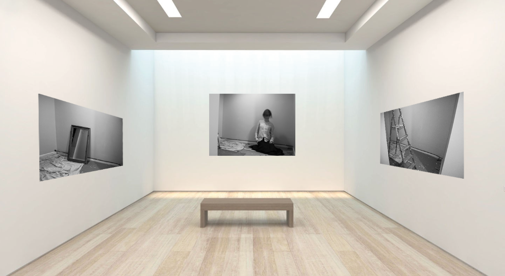
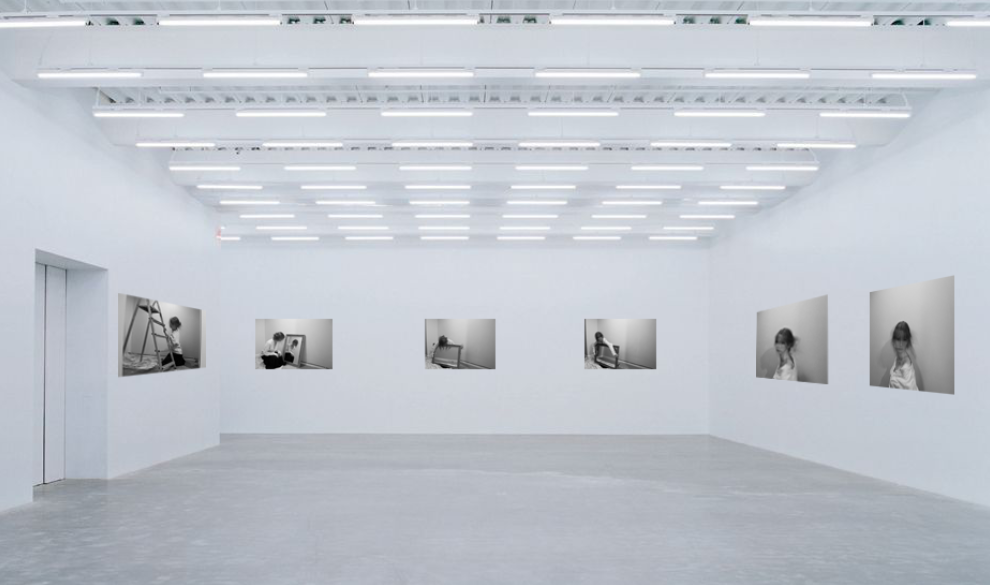
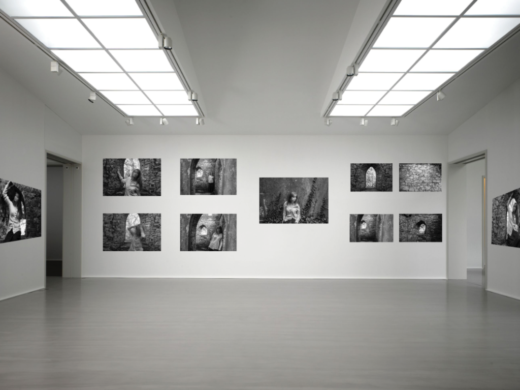
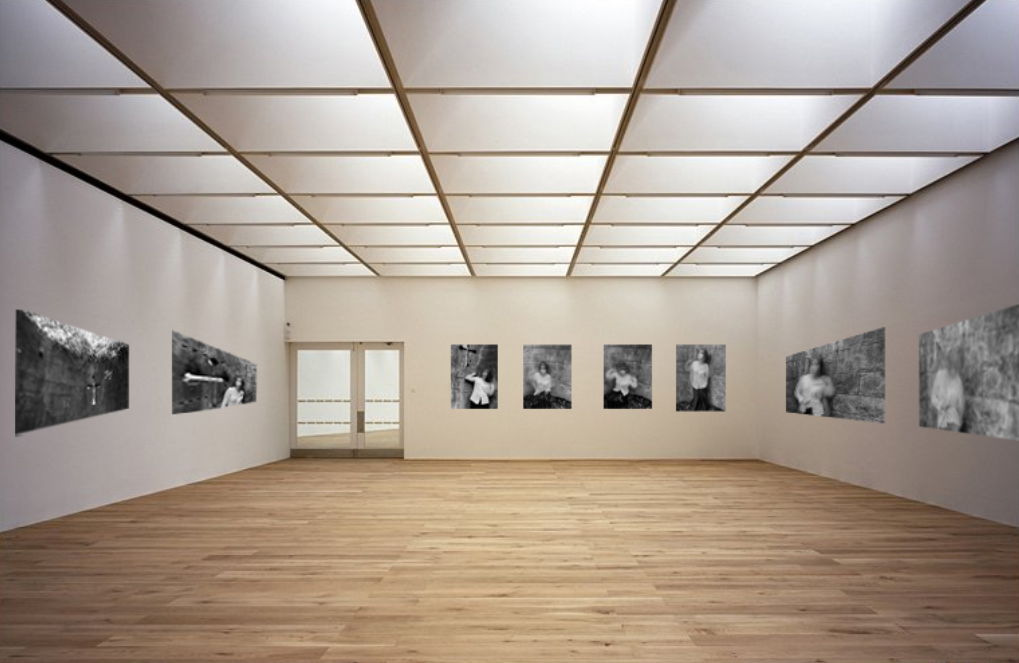
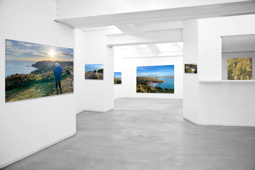
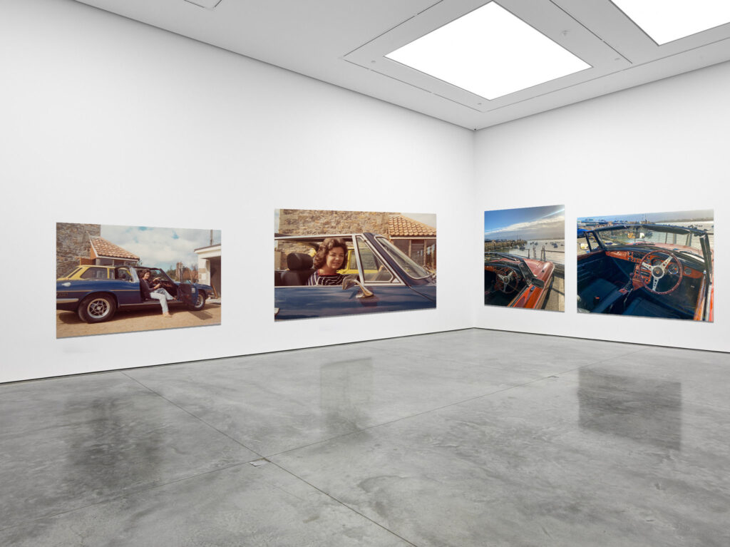
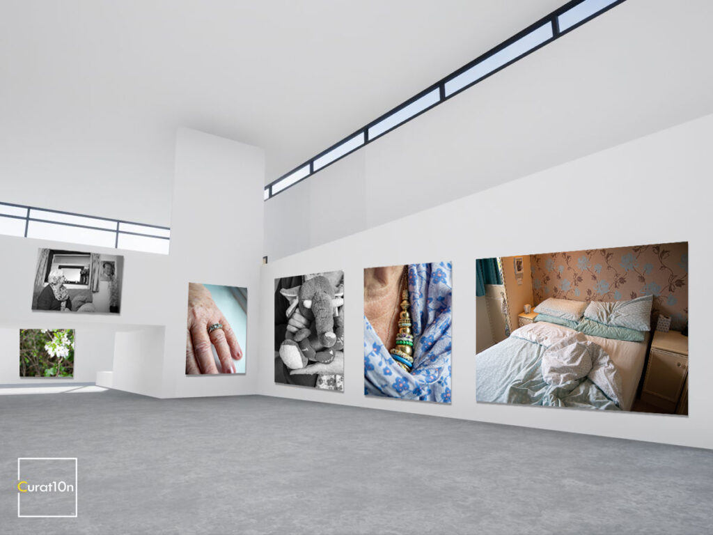
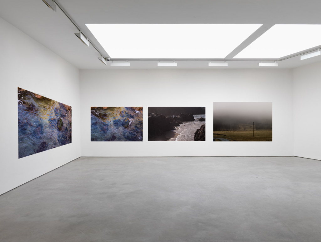
I tried to present as many photographs as I could, arranging them in a simple way that would look organised and allowing each image to stand out. I choose the simplest white space galleries to allow there to be minimal distractions. I think these galleries are quite successful, and I am glad I made two for some photoshoots, avoiding the photos looking clustered together.
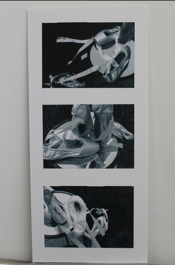
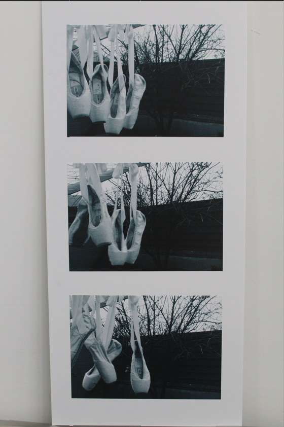
Overall, i feel the work i have produced and how i have responded to the themes is successful and thorough. By firstly being able to give myself a proper understanding regarding the theme: Observe, Seek and Challenge i was able to allow myself to be creative and almost quite flexible with the theme. As id say the theme could be interpreted in almost anyway which usually i would find quite challenging however in this case i gave myself plenty of time to plan and prepare for the exam. By doing careful research surrounding female stereotypes and The Male Gaze i was able to pick out two artist references: Nancy Honey and Cindy Sherman. Unlike past projects i decided to try my best to recreate Sherman’s images as i could get technical with it and creative. Sherman’s aim when taking her photographs was that it was performative – linking to Judith Butlers theory of gender performativity. This meant over exaggerated makeup, props, ect.. i found this interesting so my response to her was trying to identically recreate some of her most famous images which after assessing my final outcomes (in my photobook) id say have successfully done. My overall response to Cindy Sherman’s work is displayed in the photobook rather than being mounted up as i think it looks more interesting being able to take time to open the book and not only see my images but re visit Sherman’s ones herself, and to see how it can influence other photographers such as myself to carry on her work. if the images were on their own without any context i don’t think they would have as much meaning to them. My response to Nancy Honeys work was quite vague however thoroughly done, i took careful time and really analysed her work technically, visually, contextually and conceptually. Although points were challenging such as gathering loads of images i found it rewarding and gave me more ambition seeing my pictures come together naturally. To create my own response specifically around the theme Observe, Seek and Challenge i decided to delve into what i used to enjoy, ballet, and linked it with femininity… as my other images had been of people i chose to do more of a object shoot and focused on the ballet shoes. This fits with the theme as i have observed carefully and seeked a specific area. I really enjoyed doing this photoshoot with the ballet shoes as i could get very creative with it, the ribbons, the worn out soles of the shoe (which made the images quite interesting – represents how it was in the past due to the shoes being small and clearly used however not presently used).
I managed to get most my pictures completed early on as I’ve learnt from past projects that leaving it too late or without a proper plan resulted in poor responses to the project. I was able to give myself time and gain more knowledge about what my intentions for this final project was. This made the process enjoyable id say as i gave myself a chance to be creative. I also focused on the technical, visual, contextual and conceptual factors a lot more for this project compared to past ones where I’ve found myself going off course. By focusing on those factors i was able to understand my artist reference (Cindy Sherman) work way more and recreate her work to a good standard.
If i could change anything it would be that i could’ve captured more photographs surrounding dance/ ballet (rather than just the shoes) as it would’ve made my intentions with the project more clear, however, this would have been difficult due to finding models who can dance and can demonstrate the specific conventions that i would’ve needed to create successful images regarding this style. Although, with the time given i think i have demonstrated thorough understanding on the theme and both artists Nancy honey and Cindy Sherman, I’ve also shown my ability to gather various different images and have presented my outcomes differently and suitably. This is the strongest piece of work i have done out of my photography course and i had a passion and ambition when completing it.
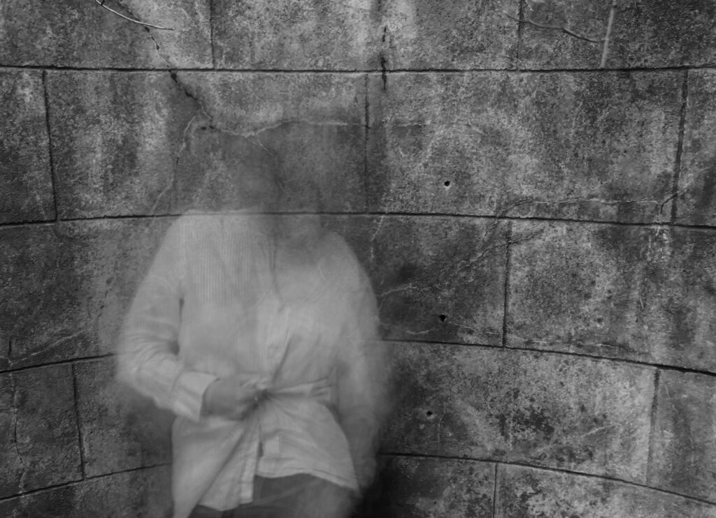
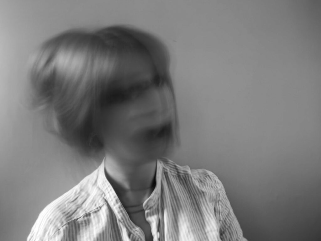
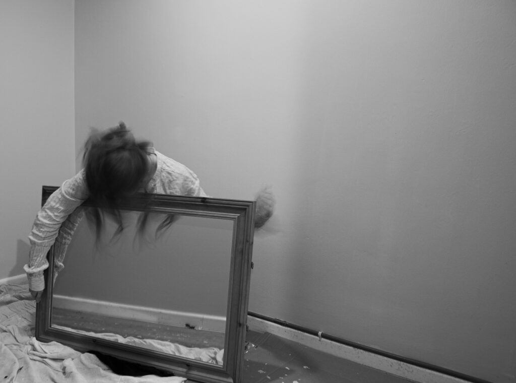
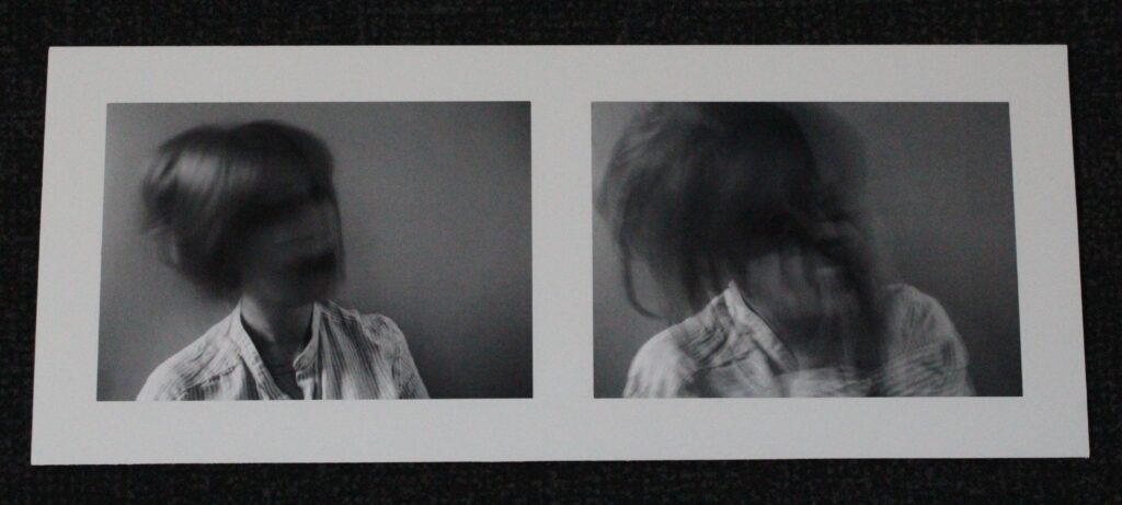
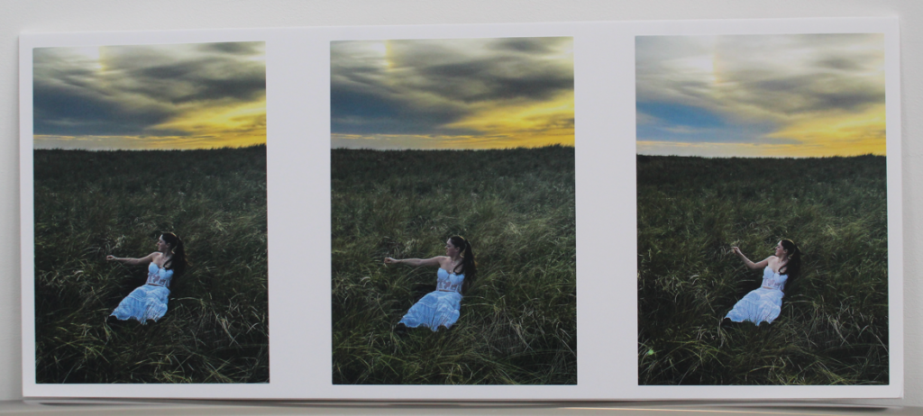
Overall, I think I created a successful response to the theme of Observe, Seek and Challenge. I think this theme could go in any directions, yet I am glad that I went with my idea of madness and femininity. My project showed evidence of these words, especially since I wanted to focus on seeking the true meaning of hysteria and challenging the views surrounding the once extremely misogynistic diagnosis. I think the research I did is proof of the observe part of the theme. This proves my understanding of the theme and I believe my interpretation of it was successful. I believe the artists I chose, especially Francesca Woodman, were a suitable choice, which allowed me to complete some effective photoshoots inspired by them. I think my photographic responses are effective, the settings on the camera (slow shutter speed) working well to create the effect I wanted to create. They link in well with both my artists yet are still original and in my own personal style. The editing process was also successful, and I think editing each photo into black and white was a good decision since it added a fluidity to the final presentation of my photobook. I also enhanced the contrast and increased the amount of black in the portraits, which made the images more refined and overall obtain a better appearance.
I think my final outcome was a well put together photobook, that showed all my best images in a effective layout. The text I included adds a lot to the overall book and acts as a introduction of my project as well as being a short summary of my research. Each photo flows well into the next therefore I think the arranging and sequencing was another successful aspect. My decision to keep the layout simple, with white space present on every page was effective, since it keeps my photobook simple so that each photo stands out.
However, I do believe I could improve certain areas of my project. Firstly, I think my response could have been enhanced if I had taken more photographs/ completed more photoshoots. The reason for my limited amount of imagery (only summing to around 250 photos) is due to the complexity of my self- portrait photoshoots. Since I had to set up the tripod and timer, each photo took quite a lot of time and effort to create. This is something I didn’t consider and perhaps wasn’t as successful as it could have been. On the other hand, I think I could have taken landscape images of another place with significance to my project, as then I would have even more photoshoots and examples of my work. I think if I had more time I would add even more text to my photobook, as I like the idea of a mixed media outcome.
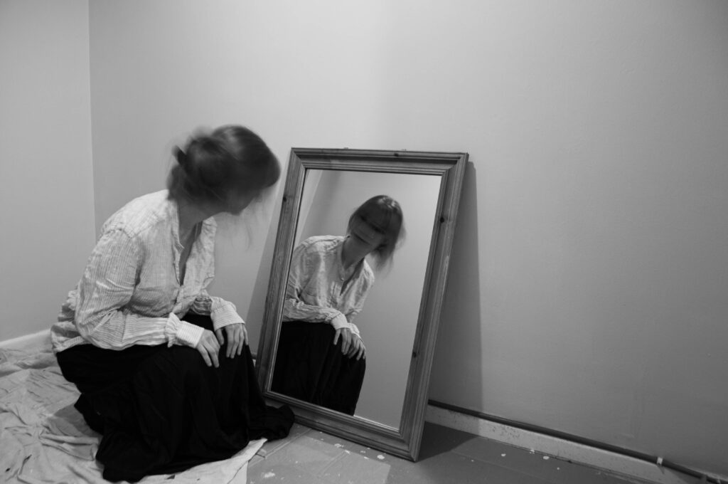
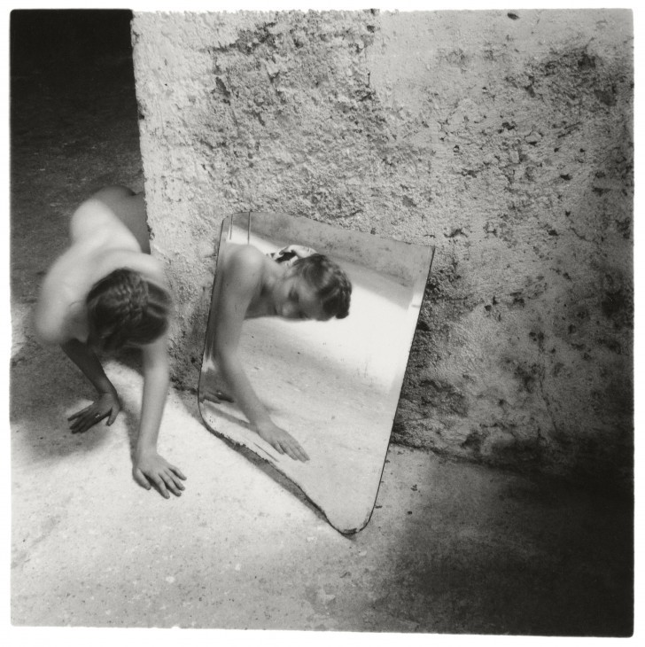
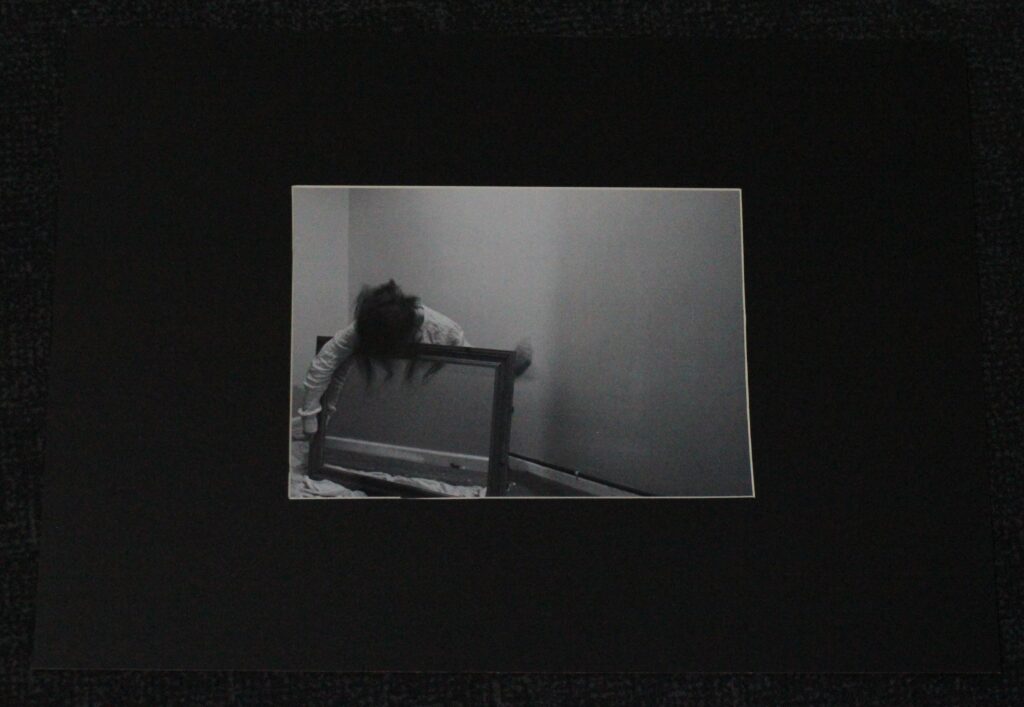
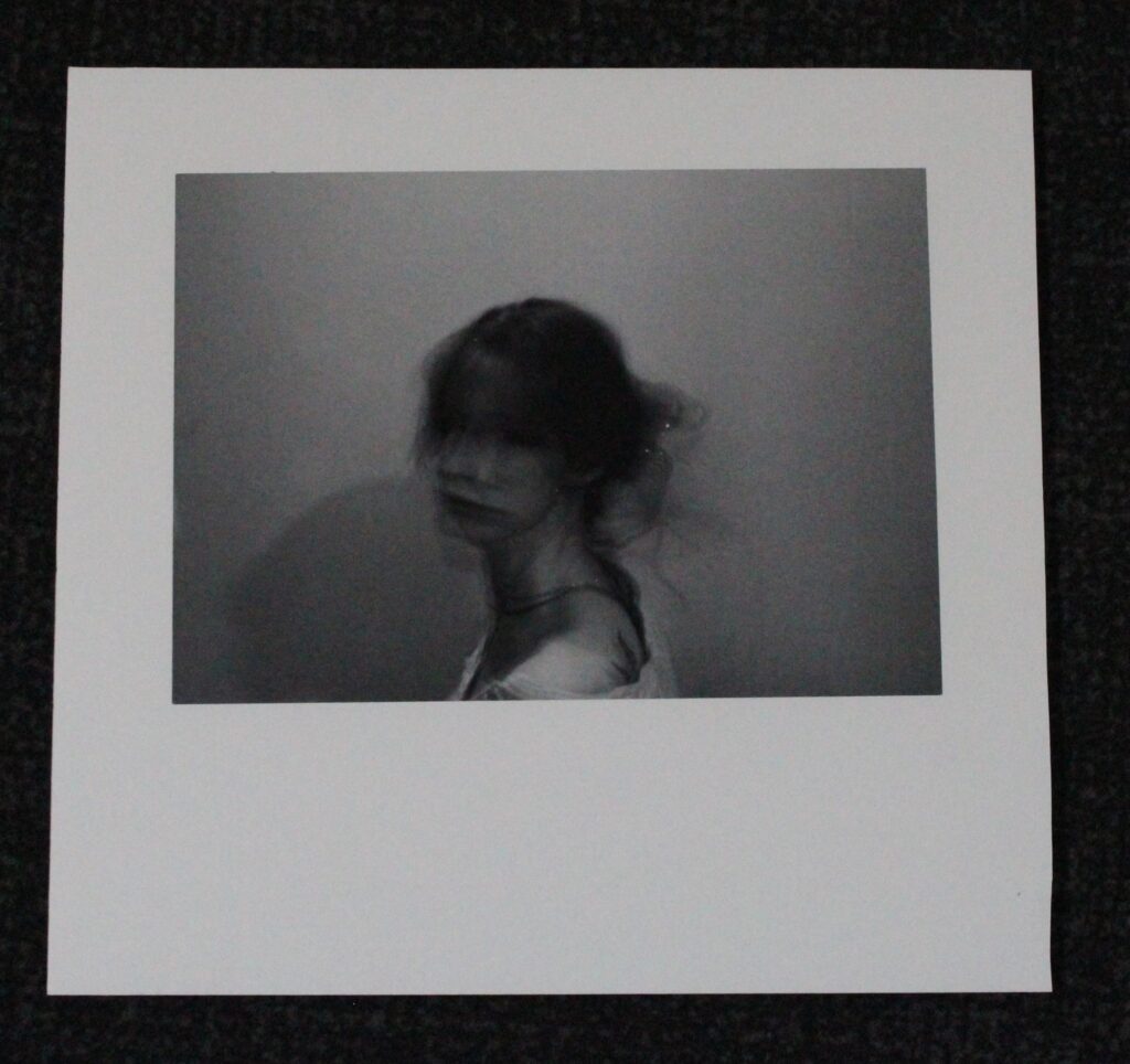
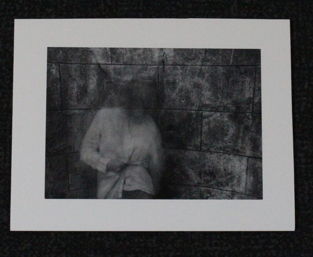
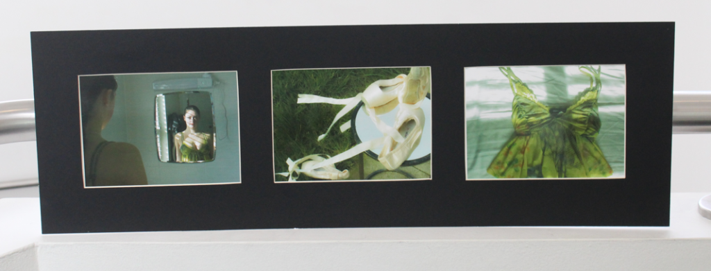
Firstly, the composition of both photos is quite similar, the place meant of the mirror against the wall creating a similar effect. Both mine and Woodman’s faces are turned away from the camera, only the reflection revealing our faces. Both photos utilise a similar shutter speed, applying a slight blur to capture the movement in the photo- in this case it being the face. Despite Woodman coming round from a dark corner and me simply kneeling in front of the mirror, I think both photos have an unnerving feeling to them. I do think her photo is much more interesting, the textured wall indicating age or abandonment and the questions surrounding the dark corner she is emerging from causing her image to be much more effective. This highlights why her photos are so unique and effective, her personal touch being abstract poses and places. Moreover, she is nude in her photograph, an aspect of her work I couldn’t recreate. The nudity in her work holds a lot of significance, perhaps indicating her confidence when in front of the camera and her ability in making her photos extremely personal. I do think my simple outfit was effective, not taking away from the picture as well as being quite timeless, a big factor I considered in my photoshoots, since I didn’t want my clothes to be a flashing indication of when my photos were taken. In terms of editing, making my image black and white allowed me to enhance the tones in my image, deepening the contrast and therefore make my work match the style of Woodman.
In terms of my exploration of hysteria, the disturbing look of both photos acts as an indication of the unnerving nature surrounding hysteria, especially when it was believed to be a result of a woman’s ’empty womb’. The slow shutter speed helped me obtain the look of being ‘hysterical’ since the blurriness is a portrayal of this abstract feeling.
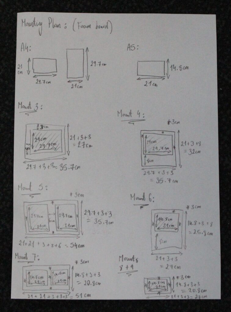
I think these mounts went well and are an another effective way of presenting my work. The layout I decided on and planned out was the one that I stuck with for all my mounts and they all worked.
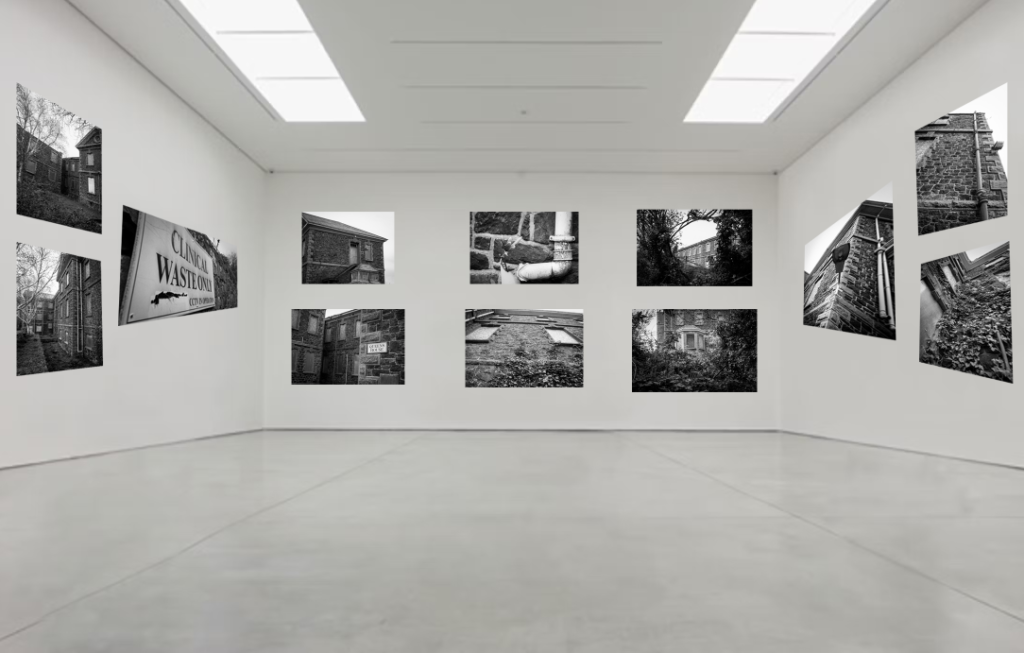
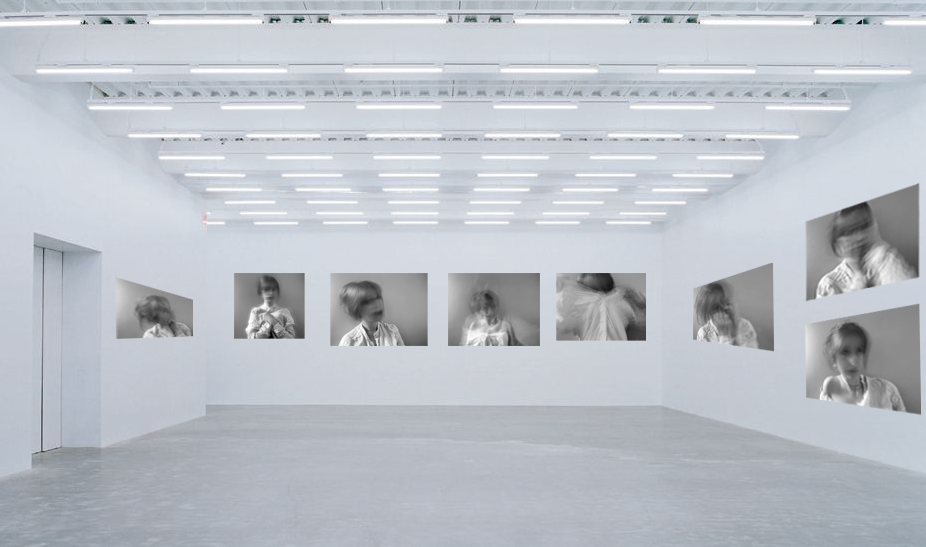
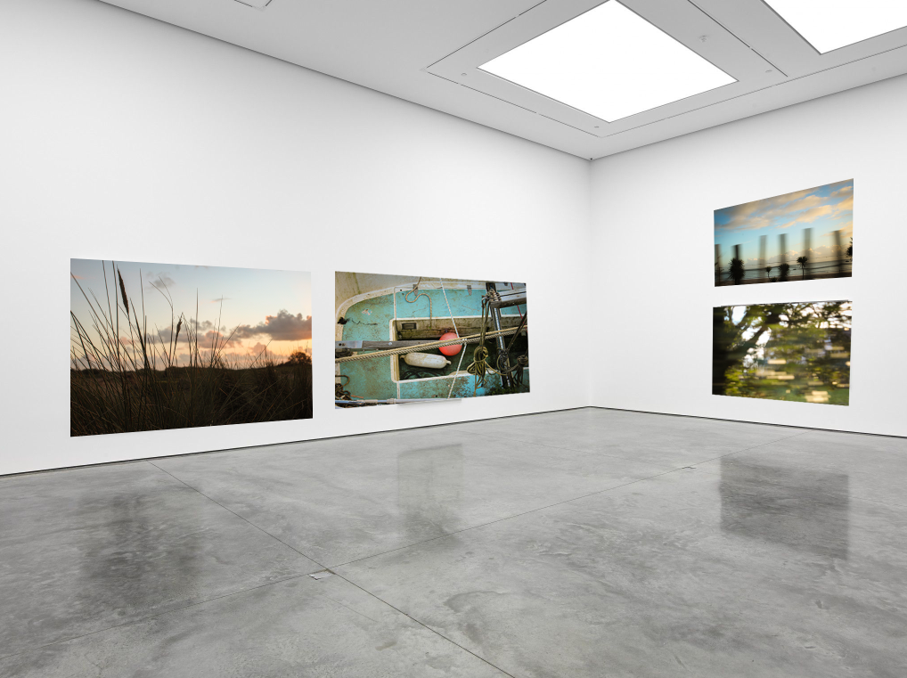
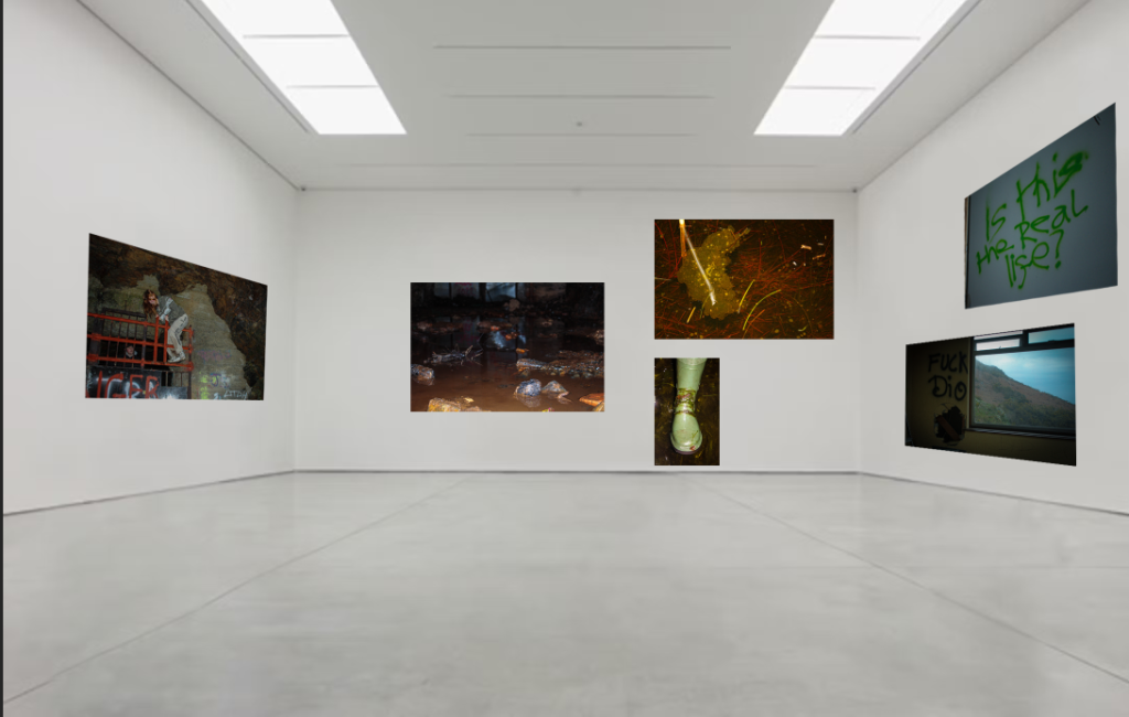
In Adobe Photoshop I have created 3 Virtual Galleries. These galleries are separated to show the images with ones of similar colours and atmosphere. I grouped ones of darker colours together and ones of lighter colours together. these are some of my favourites from each photoshoot. The images I have in my photobook which are archival images, I didn’t display purposely because they are older and not taken for this exam module.
To create a virtual gallery I have opened up a gallery template, and opened my desired images. Then using Ctrl+A I selected the image, then Ctrl+C, I copied the image, then in the gallery window, I pasted the image, Ctrl+V. Using Ctrl+T to transform the image, I right clicked on it and selected distort. Then by grabbing each corner I adjusted them so that they matched the perspective of the gallery.
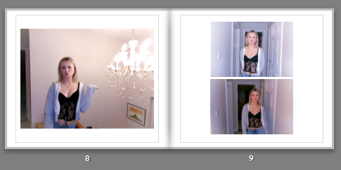
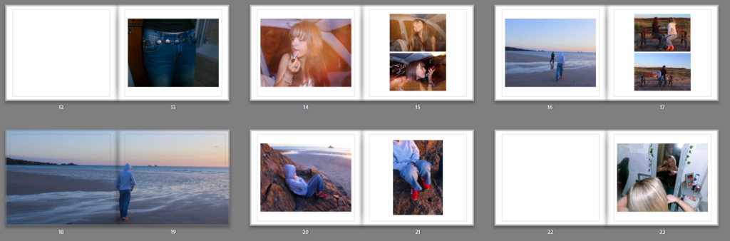
As clearly shown in the screenshot, this is a double page from my photobook. Here you can see a clear layout of images, from the same photoshoot. Even though the images are very similar, they seem to compliment each other well, through the editing style. This slide is showing a narrative of the blonde girl, which highlights the stereotypical femininity radiating through the page, from the editing and clothing style. In my photobook there are a few slides which highlight certain girls in the book, where there are multiple photos that compliment each other.
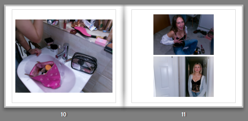
This double page in the photobook is supposed to reflect an idea of getting ready, and girls applying make-up and reinforcing stereotypes. However in later editing of the photobook I changed the bottom, right image to a girl straightening her hair, in order to make the narrative flow slightly better. The left image of the makeup bag is used as a filler image, however still supporting the idea of observing femininity, through makeup and the pink colours which often have connotations of femininity.
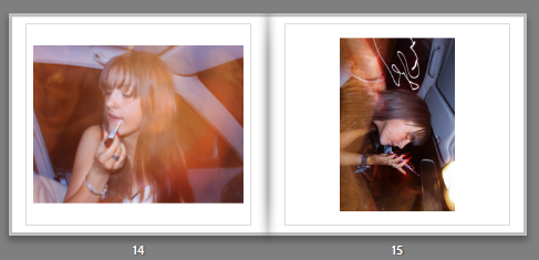
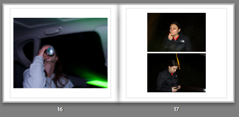
When placing this images together, it clearly had a different aesthetic to my other images, I wasn’t able to take many images in the dark so therefore the two pages that contain night photography and equally spaced apart in the correct order. Later I was able to find another image that worked and added a second image to the right side, in order to keep the layout of the book the same. When creating the book, I knew I wanted to keep these images together, as the composition works with the aesthetic and the abstract lighting.
This page, I struggled to find an image that would work with the other images, what I needed was another picture of the girl smoking or a group photo which I was later able to add an image of two of the girl lying on the road. This therefore allowed the narrative to flow better, showing girls ‘seeking‘ nature and girlhood.
CHANGES MADE:
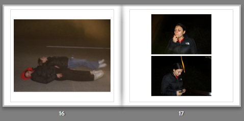
This screenshot shows the change in photo, from the previous screenshot. The image works better then the previous one as it is in a outside location, however it would look better if the image came out darker, so it would look more similar to the other images. As well as the image being on the right side of the page, which is were filler images are usually used it gives a nice contrast to the dark surrounding in the other images.
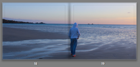
For the middle of the book I put in a bleed image, this is so there was a defined place in the book to show the middle. I chose an image from the beach photoshoot as it looked more calm and serene contrasted next to the other images. In order to make the bleed image work within the photobook, I also added images from the photoshoot in the previous pages and the page after. This is so the photobook contained more than one images from the shoot and for it to have a narrative within the storybook, while also trying to portray the exam theme ‘Observe, Seek, and Challenge.’
Overall i created five final outcomes – alongside my photobook which i am yet to order… i am happy with the way i have presented my images as i feel i have done it in the most appropriate and suitable way for these particular images.
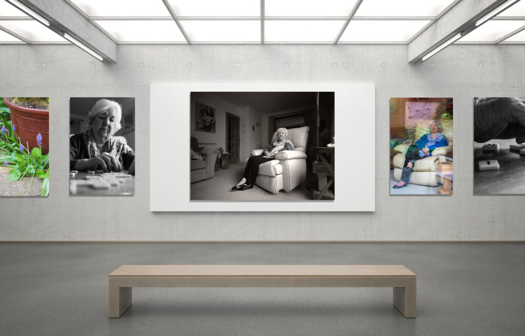
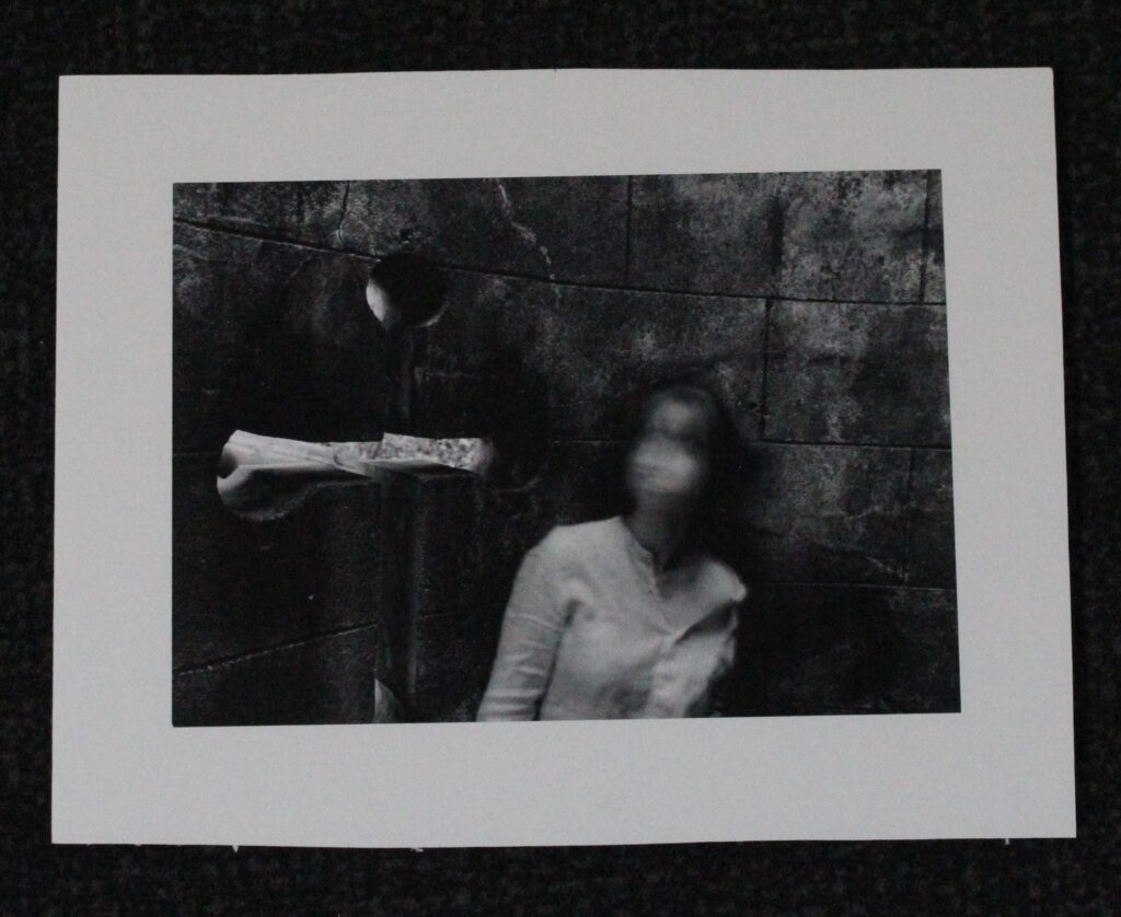
I decided to mount these images up on phone board as i like the contrast of black and white. Considering the background of the pictures had came out particularly black i feel the images stand out and are more visible with the foam board.
I decided to mount these images up on phone board as i like the contrast of black and white. Considering the background of the pictures had came out particularly black i feel the images stand out and are more visible with the foam board.
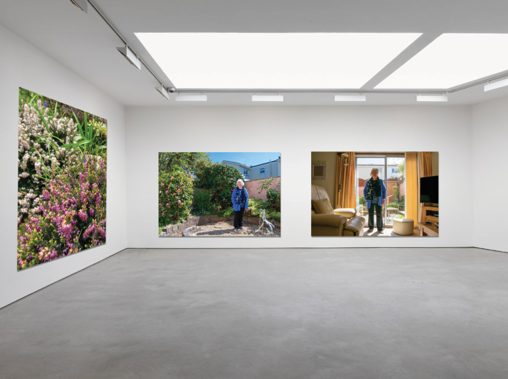
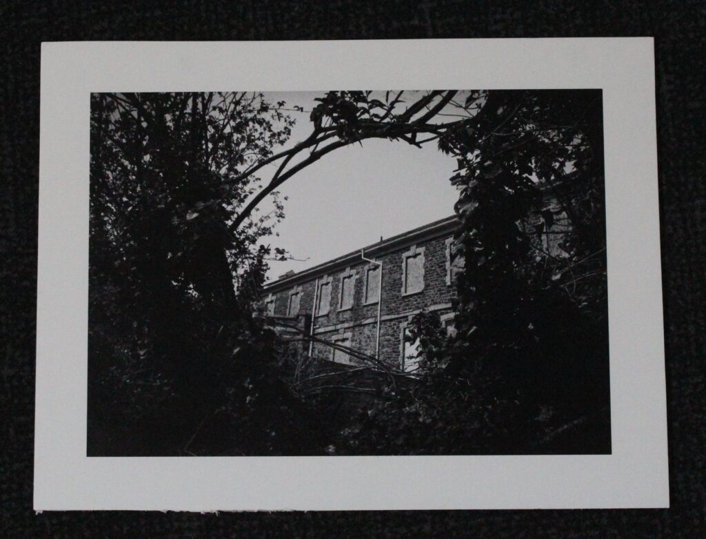
I chose foam board for these images as it looks simplistic and the sky blends in well with the white compared to if i had it on black i feel as though it would be quite harsh.
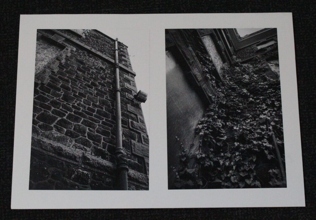
To recreate Nancy honeys style i wanted a well kept, neat tidy layout when it came to mounting these images. Rather than them just being quickly stuck onto foam board. Black suits the colour theme for these images anyway and frames them well.
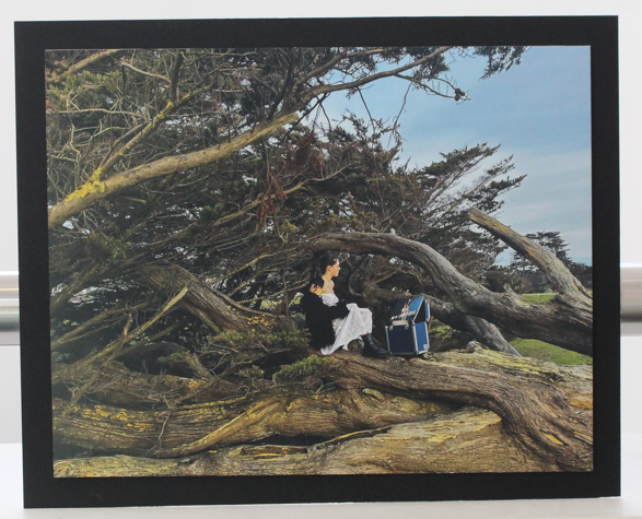
I stuck this image on foam board first before then sticking it onto black card. I wanted it to stand out a bit more and create levels as the image itself has a lot of texture and depth. The tree and branches almost swallows up the entire image and can look too busy/overwhelming. That’s why i think having the picture stand out on the foam board with a small black border perfectly mutes and tidies the framing of the image making the image appear kept together and even factors of simplicity.