Category Archives: Uncategorised

Filters

Author:
Category:

Rinko Kawauchi – Photoshoot 1

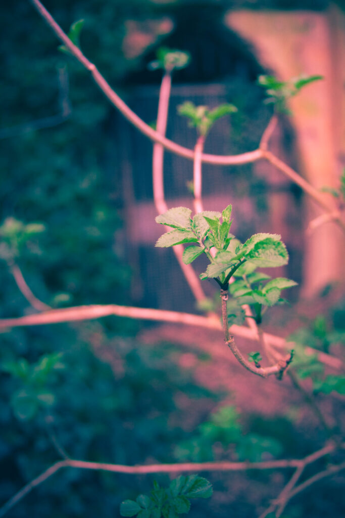
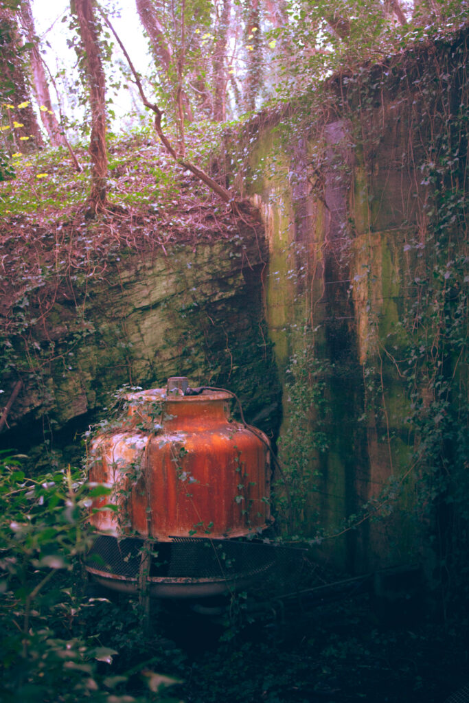
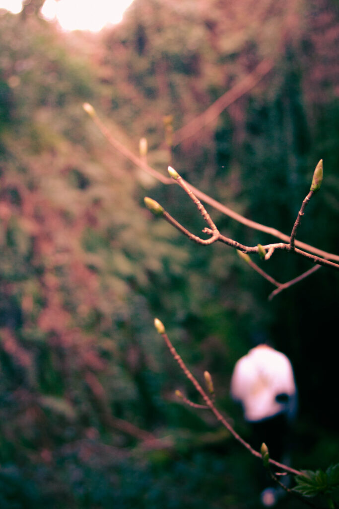
I walked through a small area in St. Peter’s valley, shooting images of different structures that were more or less abandoned, or have been almost reclaimed by nature. For this shoot, I wanted to focus on Kawauchi’s style of developing bright, low contrast images focusing on the natural forms of the plant life and animals around me.

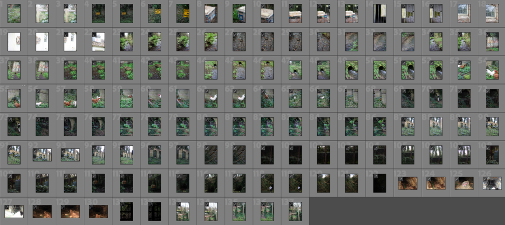
After putting the images into Adobe Lightroom Classic, I started editing through which photographs I believed honed in on Kawauchi’s style the most.
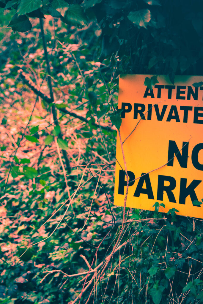
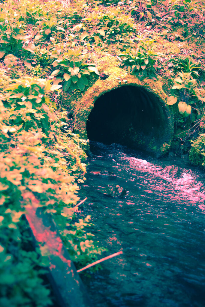
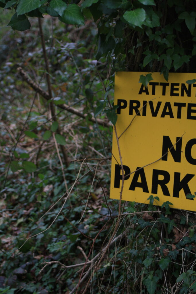
These are my final six images from this shoot. I had a pretty similar approach to each photograph, and wanted to establish an idea of surrealism from reality through my colour palette.
For this first image, I immediately knew that I wanted to increase the intensity of the colour palette, particularly the yellows, without it becoming too overpowering or dominant.
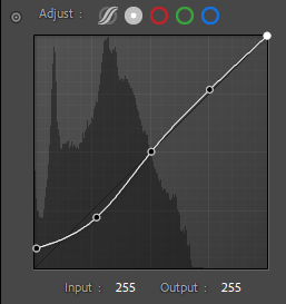
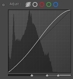
I started by making adjustments using the tonal curves, increasing the output of the blacks in the point curve, to achieve a more muted, lower contrast in my composition, before adjusting the parametric curve, and increasing the lights to bring some more brightness to the image.
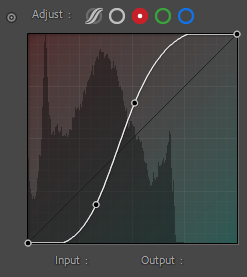
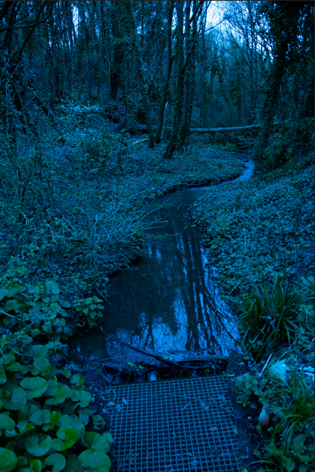
I also experimented with the colour channels, playing with red and blue with these photos to create more drama and make the natural colours of the plants a stronger focal point, which was particularly successful in the shot of the stream coming from the pipe, tinting the foam in the water a pinkish colour.
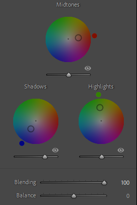
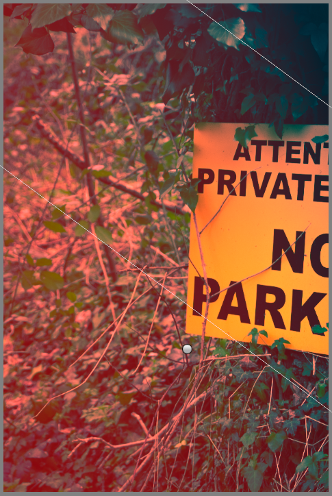
I then started colour grading, typically using a red or orange for the midtones, a deep blue for the shadows, and a red or green for the highlights, all of which were then adjusted using the blending slider to achieve the desired effect. To establish some contrast using lights and shadows, I used graduated filters where the light sources were present, playing with basic adjustments until I was left with a subtle, but more visually appealing gradient from light to dark across the whole piece. I repeated this by doing the opposite with the darks to contrast this, adding a slight vignette to bring it together.
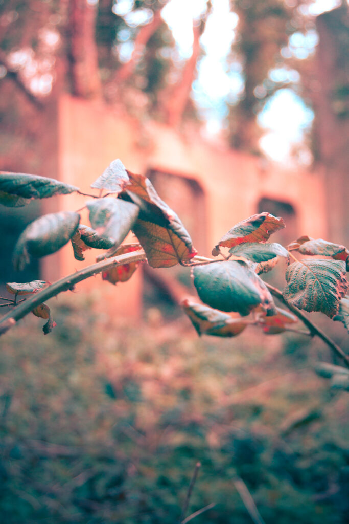
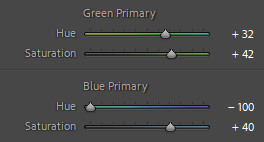
For this photograph, I experimented with the calibration window to adjust the hues of the blues and greens, which ended up turning the leaves different shades of orange and blue.

Case Study – Rinko Kawauchi

– Rinko Kawauchi

Rinko Kawauchi is a Japanese photographer whose work focuses on ordinary life, the delicacy of natural forms and the beauty of ordinary moments. Her work is often recognisable through the nostalgic haziness of her images, something achieved through lower contrasts in settings with intense natural lighting which creates a poetic sense of serenity.

– Rinko Kawauchi

Kawauchi acts as the observer in her photographs, shooting scenes as they play out naturally, establishing emotional authenticity, in turn strengthening the effect of the viewer’s own emotional response. Take this image of Kawauchi’s daughter, for example, as it shows a moment of her playing or exploring in the outdoors, in what appears to be a wooded area. This image in particular portrays a moment of pure childhood innocence, a nostalgic feeling that everyone can relate to in one way or another, whether it’s from their own childhood, or something they recognise in their own children, it’s the memories that stay with someone for their whole life. Compositionally, Kawauchi uses the rule of thirds and a shallow focus to centre her daughter within the image as the subject. Like with a lot of her work, this piece too has a very soft colour palette, namely using lighter blues and darker greens, a low contrast and an emphasis on the natural lighting, which brings out the feelings of nostalgia surrounding the photograph that Kawauchi is known for.

– Rinko Kawauchi

In my own work, I find that, much like in Kawauchi’s work, I dwell on the concept of nostalgia, preferring to shoot with warmer tones and with natural lighting. I want to develop a photoshoot more in the style of Kawauchi’s work, shooting in soft, intense natural lighting, and focusing on delicate natural structures as they are; purely observing.

Observe, Seek, Challenge – Statement of Intent

– Rinko Kawauchi

With this project, I want to explore the world around me, the more intricate details of nature, overlooked areas that have plenty of stories to tell, and to bring it all together in a photobook. I want to play with a variety of different styles of photography, such as street photography, timelapse photography, landscape photography, and maybe some portraiture where possible. I’m starting my project with a wider area of study, looking at a larger number of photographers and refining it to a select few toward the end of the project. I’m interpreting the theme as three separate ideas, which I intend to either bring together, or to focus on a singular idea by the end of the project. I want to develop photoshoots that hint towards ideas of observation, seeking, and challenging as their own themes, before combining them in my final photoshoots.

Challenge – Ideas

  • Stereotypes (gender, race, age, religion, class)
  • Authority (government, people in power, protests)
  • Photography (compositions, lighting, camera settings)
  • Myself (experiences, behaviours, ideas)

To challenge something is to rebel against it, something that is often done by a lot of photographers and artists. When I think of the word ‘rebel,’ I often think about activism against some form of authority, whether small or large. Artists often express rebellion through subliminal messages in their work, or bold messages such as through graffiti. The style of graffiti in itself represents youth culture, something I align with, and something that I could consider searching for and finding images of. In my own work, I see myself challenging other people’s opinions and views on certain groups of people, particularly youth, but also my own views, as they change and adapt through my own experiences. I’m keen on the idea of going against what others think, as I often trust my judgement the most – for better or worse – which could actually be an idea in itself for this project, going against who I am and what I do, although this may become too complicated. Alternatively, I’m also interested in directly challenging various stereotypes, instead of the natural subtlety that usually ends up in my work. Whatever I decide to challenge, I want to do it through juxtaposition, presenting both the ‘order and disorder’ of what I decide to shoot.

– Nicholas Goodden

Nicholas Goodden is a photographer that has a unique way of presenting graffiti in his photographs, desaturating his images, but leaving the colours within the artwork he shoots as it bends with the landscape around it. It could be argued that as Goodden only takes images of the work, and doesn’t explicitly do it himself, he’s merely observing the work through the camera lens, although I feel that by photographing this, he almost provides a platform for the message of the artwork to spread further, which could be considered to aid and further challenge this. Personally, I find his use of limiting the saturation in his images to a specified area to create a focal point interesting, and feel that it shows a more unique, interesting part of the world that’s often looked over as more destructive, which I could recreate in my own work.

– Simone Bramante

I could also challenge compositional standards of photography, through both the use of angles and technical aspects, which could leave for some interesting and unique final images. A key way that I would want to execute this would be through the use of angles and framing. I could take portrait images of people to where they’re just unnaturally off-centred in the image, even off to the edge completely, and play around with angles, such as extreme worm/bird’s eye. Regardless, this gives me the chance to experiment with different settings and what can work compositionally, without necessarily conforming to typical photography standards.

Seek – Ideas

This image has an empty alt attribute; its file name is image-137-1024x430.png
– Paul Upward
  • Self-discovery (new/old experiences)
  • Familiarity/comfort (places I often visit/stay)
  • Community (parish meetings, events, church)

To “seek” is to look for something. To represent this aspect of the project, I want to try seeking self-discovery, familiarity, comfort, and community through different means. Self-discovery is more about experiences and how one responds to them, which could be expressed through uncomfortable imagery of different staged situations, and dramatised recreations.

This image has an empty alt attribute; its file name is image-136.png
Henri Cartier-Bresson

I could seek familiarity and comfort through the concept of childhood nostalgia, which is a topic I’m familiar with from past projects, so I could look back on old photographers to develop on that work further, such as Henri Cartier-Bresson. I can portray concepts of community by photographing larger gatherings of people, such as for events or regular meetings, such as church on Sundays, etc., although I don’t feel as though this could have as much artistic value for my project.

Observe – Ideas

Rinko Kawauchi - Simon Lee Foundation
– Rinko Kawauchi

To introduce the project, I want to observe and find beauty within the mundane as a starting point before further developing it, as I want to share my focus with each word of the exam prompt as individual ideas. I could do this through street photography, although I feel it would work better to work with smaller areas for a composition, to appreciate smaller textures up close, similarly to the work of Rinko Kawauchi, who I could use as an inspiration and someone to study on as the project develops.

– Bart Koetsier

Other photographers that I’m interested in studying for this part of the project include Rolf Van Roojj, and Bart Koetsier. This is because they often act as simply an observer, not interacting or staging their surroundings, just capturing moments on the street as they see them.

Observe, Seek, Challenge – Ideas

For this project, I want to focus on the prompt as separate categories, as I feel that there’s more to explore with each individual word as opposed to the three of them together.

– Derek Clark

Observe:

  • Watching (people, cars, moving objects)
  • Change/growth (plants, developments, construction, landscape)
– Rob Whitworth

I could present the idea of “observe” through street photography, or even a time-lapse through a short film like Godfrey Reggio’s Koyaanisqatsi (1982). I’m more interested in using street photography, as it’s something that I’m comfortable with, and I can gather a large number of images, although I also believe that it may feel too generic, whilst a time-lapse would be something new for me to learn. If not a film, I could create a large reel of photographs showing the development and growth of something. Alternatively, I could observe the change of Jersey’s landscape, using some of the photo archives at the Société Jersiaise and recreating some of their images in the modern day. I could also observe life through an anatomic perspective, similarly to the work of Suzie Fitzharris, using photoshop to create X-ray style imagery.

– Suzie Fitzharris

Seek:

  • Self-discovery (new/old experiences)
  • Familiarity/comfort (places I often visit/stay)
  • Community (parish meetings, events, church)

To “seek” is to look for something. To represent this aspect of the project, I want to try seeking self-discovery, familiarity, comfort, and community through different means. Self-discovery is more about experiences and how one responds to them, which could be expressed through uncomfortable imagery of different staged situations, and dramatised recreations. I could seek familiarity and comfort through visiting places from my childhood, such as parks, playgrounds etc., although I would have to be careful around these areas as to not violate people’s privacy. A way around this, however, could be by visiting these places later in the day when they’re quiet or empty, or even at night, to contrast the familiarity of it.

– Nicholas Goodden

Challenge:

  • Stereotypes (gender, race, age, religion, class)
  • Authority (government, people in power, protests)
  • Photography (compositions, lighting, camera settings)
  • Myself (experiences, behaviours, ideas)

To challenge something is to rebel against it, something that is often done by a lot of photographers and artists. When I think of the word ‘rebel,’ I often think about activism against some form of authority, whether small or large. Artists often express rebellion through subliminal messages in their work, or bold messages such as through graffiti. The style of graffiti in itself represents youth culture, something I align with, and something that I could consider searching for and finding images of. In my own work, I see myself challenging other people’s opinions and views on certain groups of people, particularly youth, but also my own views, as they change and adapt through my own experiences. I’m keen on the idea of going against what others think, as I often trust my judgement the most – for better or worse – which could actually be an idea in itself for this project, going against who I am and what I do, although this may be too complicated. Alternatively, I’m also interested in directly challenging various stereotypes, instead of the natural subtlety that usually ends up in my work. Whatever I decide to challenge, I want to do it through juxtaposition, presenting both the ‘order and disorder’ of what I decide to shoot.

Evaluation

Case studies

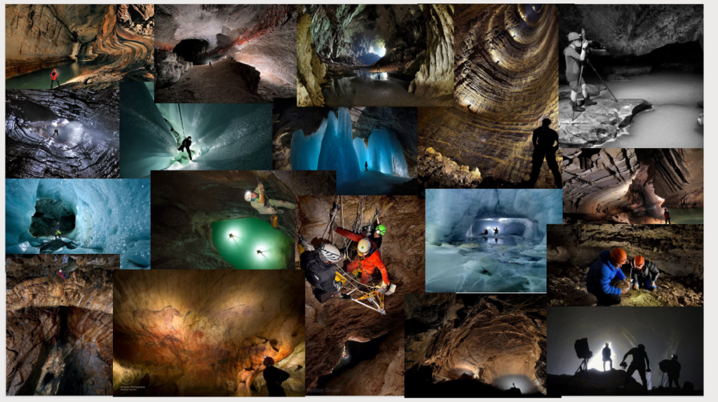
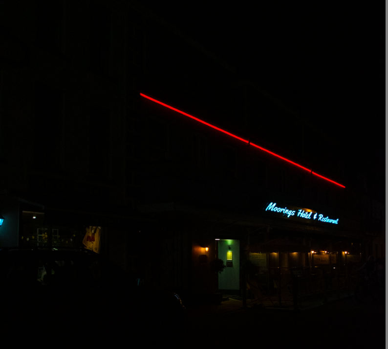
When evaluating my work there’s a big range of aspect to evaluate I did 4 case studies before actual doing any of the work and I think my image only look like 2 of the artist I picked I did want to do night photography at the start of this however I changed my mind because I hadn’t done to much daylight photography so in that aspect I think I did ok but my work is unique I guess and doesn’t follow other artists that I know.

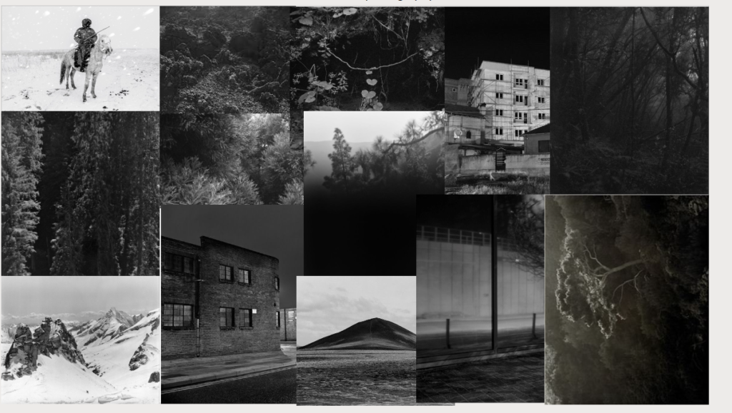
2 of the 4 mood board that I created for the case studies the one on the left is Awoiska Van Der Molen and the one on the right is Robbie Shone.

Photoshoots

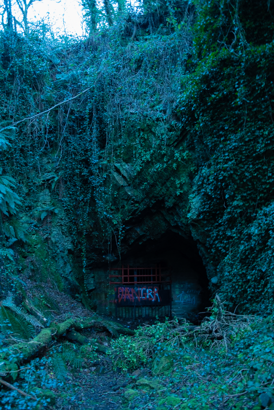
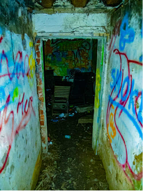
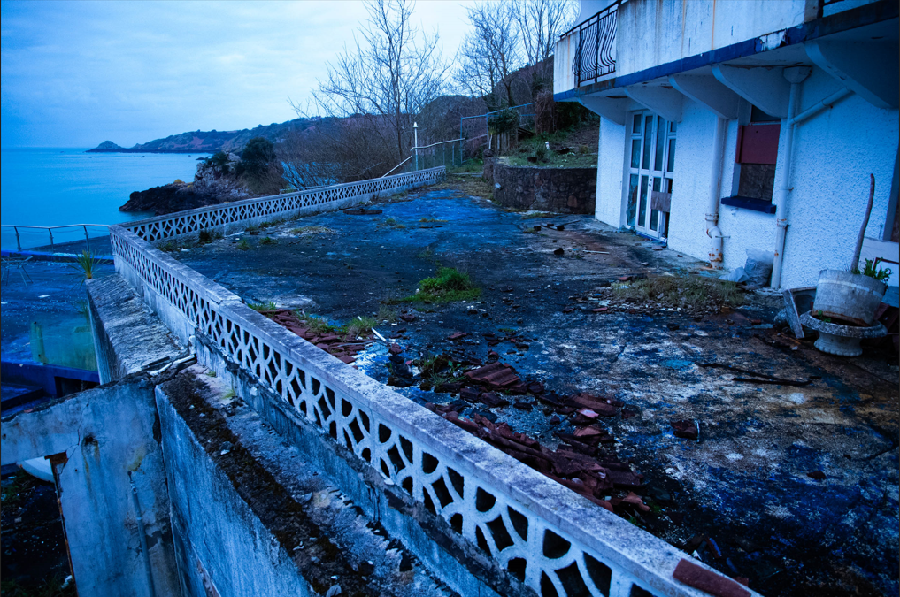
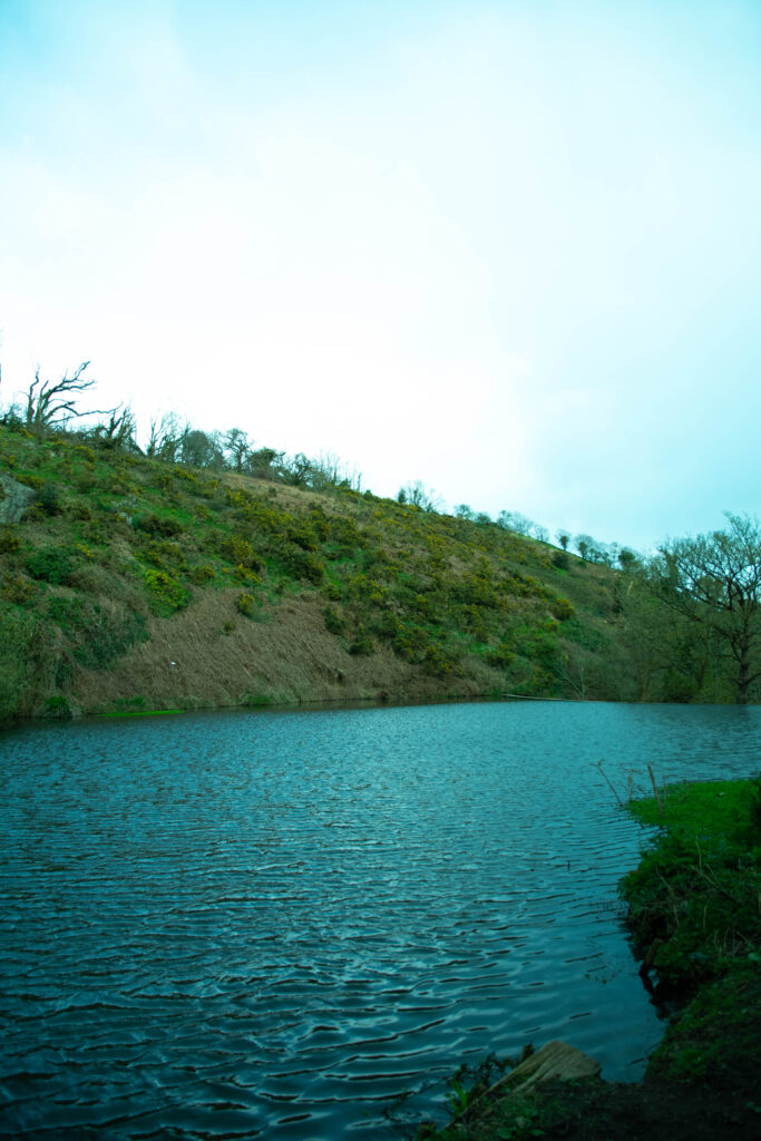
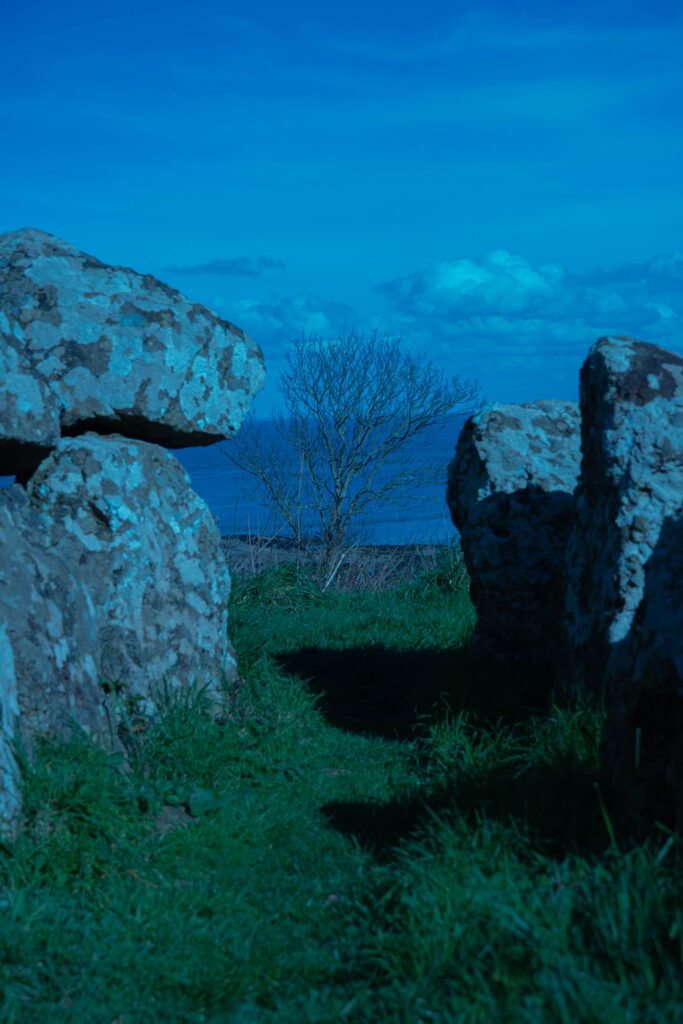
I did 6 photoshoot some I took more photos than others and some that I used more photos than more than other the photoshoot where fun and weren’t really planned however they still turned out great and the photos that have been selected for the photobook an the printed photo turned out really good in editing.

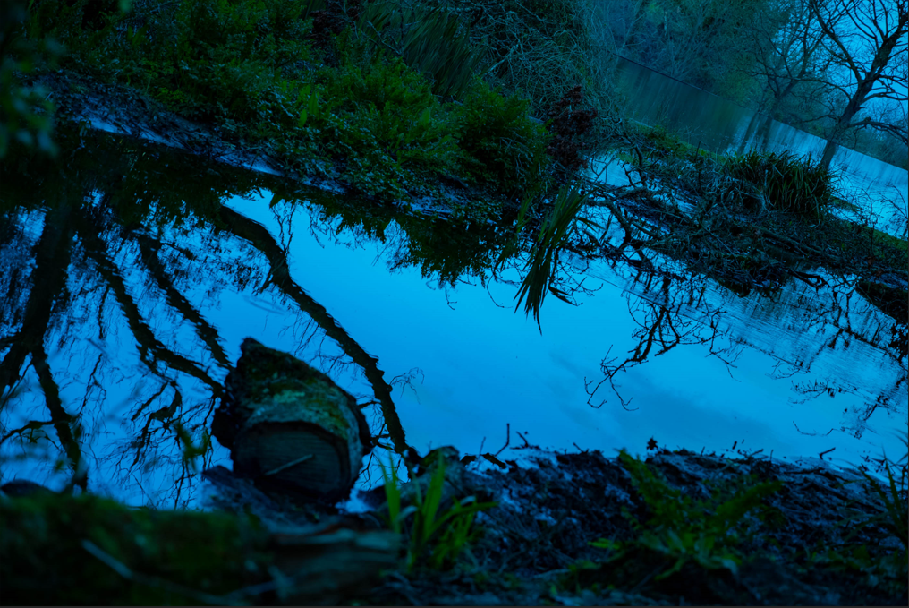
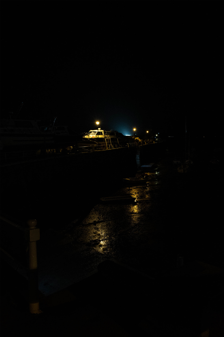
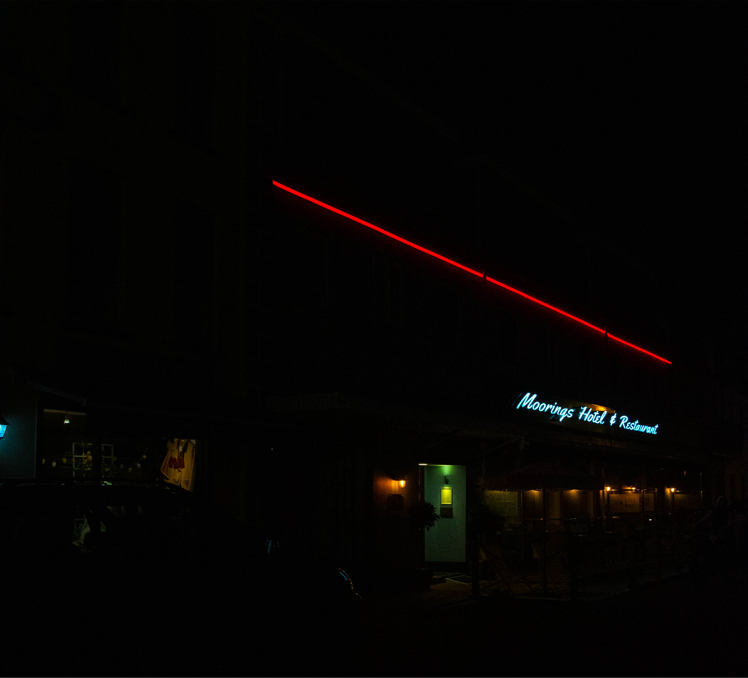
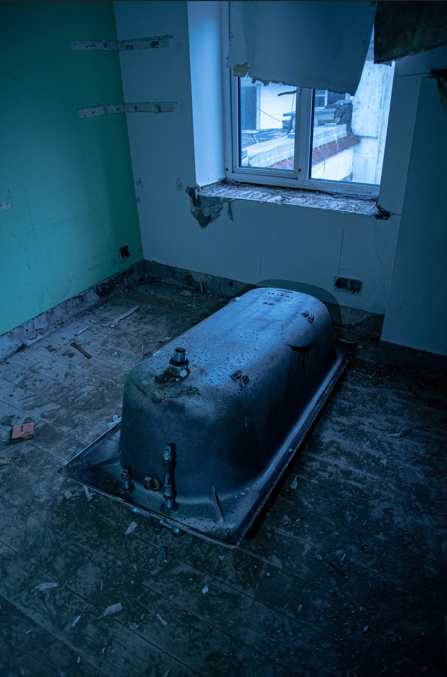
Here’s 1 photo from every photo shoot you can see that there all different themes and feel with the each different photo everyone of them has their own unique feel.

Photobook

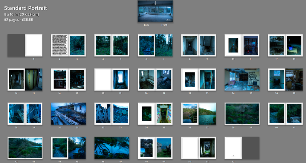
When creating the photobook at the start I did want to do night photography however my ideas shifted and I went towards daylight photography when choosing the layout for the photobook I went with the order that did the photo shoots with so the first set of images are from the first photo shoot and the last set are from the one of the last photoshoot not the last photoshoot as that one was night photography and this book isn’t about night photography, the photo book is about abandoned things and places that have been “left alone” which is the name of the photobook its a bit cliche but it does suit the theme of the photobook and I quiet like how the photo book looks and feel I think it turned out great and I really like how the photo book turned out it and I excited to see it in real life.

Here is a link to the photobook – Left Alone

Printed photos

the photos that I had printed turned out alright I am not to happy with the way the night photography turned out however the rest of the prints turned out good all I did with the prints is put them onto some foam board the ones on the foam board look good and I am happy with the way they turned out.

last evaluation

with this whole project I learnt alot about how to take photos that looked good whilst also learning how to edited them to make them compliment each other in a photo book I tired to get the sort of feel of some of the artist case studies i did whilst also getting my own unique style into the photo I also took photos o things I like and what I think looked nice I believe my night photography photo reseblibe Liam Wongs kind of art style maybe a bit darker but still resembles his style. and the forest pictures also kind of resemble Awoiska Van Der Molen’s work however my pictures are not in black and white the reason for this is because I don’t like how overused black and white photo are use and the destail that can be missed out on by using black and white photos however I do get some photo will only look good in black and white and that’s the only time I will probably use black and white on one of my photos, I think this project is one of my best works yet I think that photobook turned out great and should definitely be better than my first one and the final image turned out good and I am proud of what I have produced and made for this project.

PRINTS FINAL OUTCOMES + PRESENTATION

FINAL PRINTS MOCK UP ON PHOTOSHOP: WINDOW MOUNT

A4 Window Mount
A3 Window Mount
A3 Window Mount
A3 Window Mount

EVALUATION OF FINAL OUTCOMES:

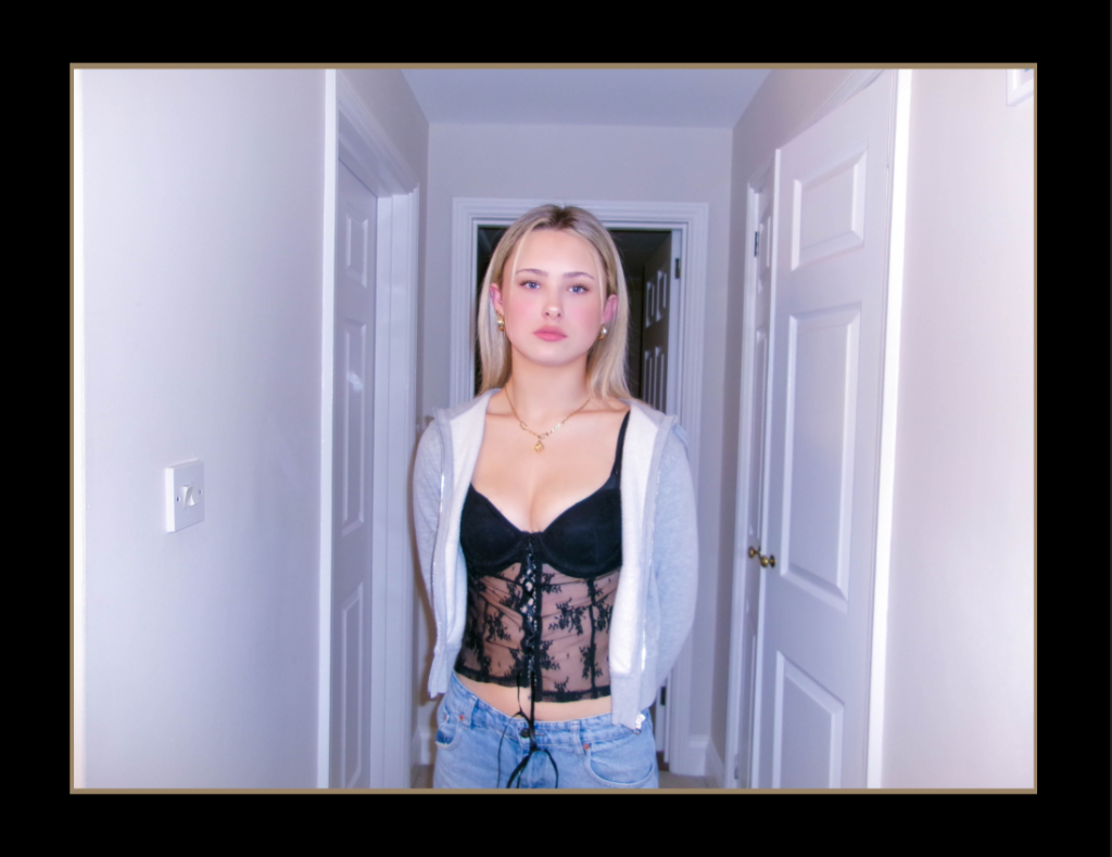
For my final outcomes; in print form, I wanted to do singular window mounts. I wanted to do window mounts because it clearly focuses on the images allowing the audience to focus on the photograph. I decided to do individual window mount in A3 so that the audience looking at the photo appreciate the editing and the message of girlhood, and this utopian teenage girl world. After reviewing the window mounts and my final outcome I am pleased with the way the images look through the window mount. In terms of picking the images I picked my strongest images or images that clearly show the theme observe, seek and challenge. However in future projects I would possibly try to explore how to display my work with multiple images instead of one.

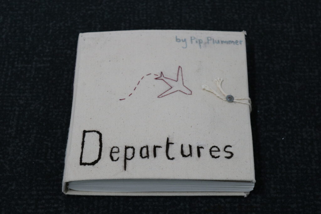
Final evaluation of ‘Departures’

OBSERVE, SEEK, CHALLENGE

I feel that, overall, my final outcomes were very successful. They look professional and I feel that they are an accurate representation of the time and effort I have spent on them.

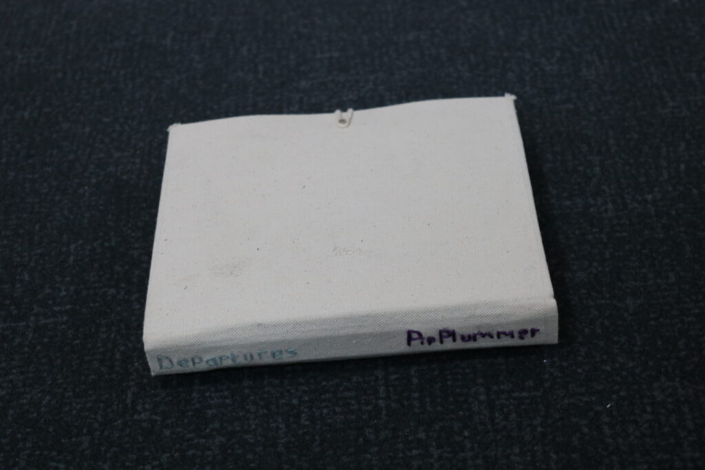
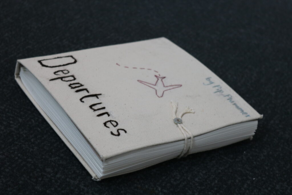
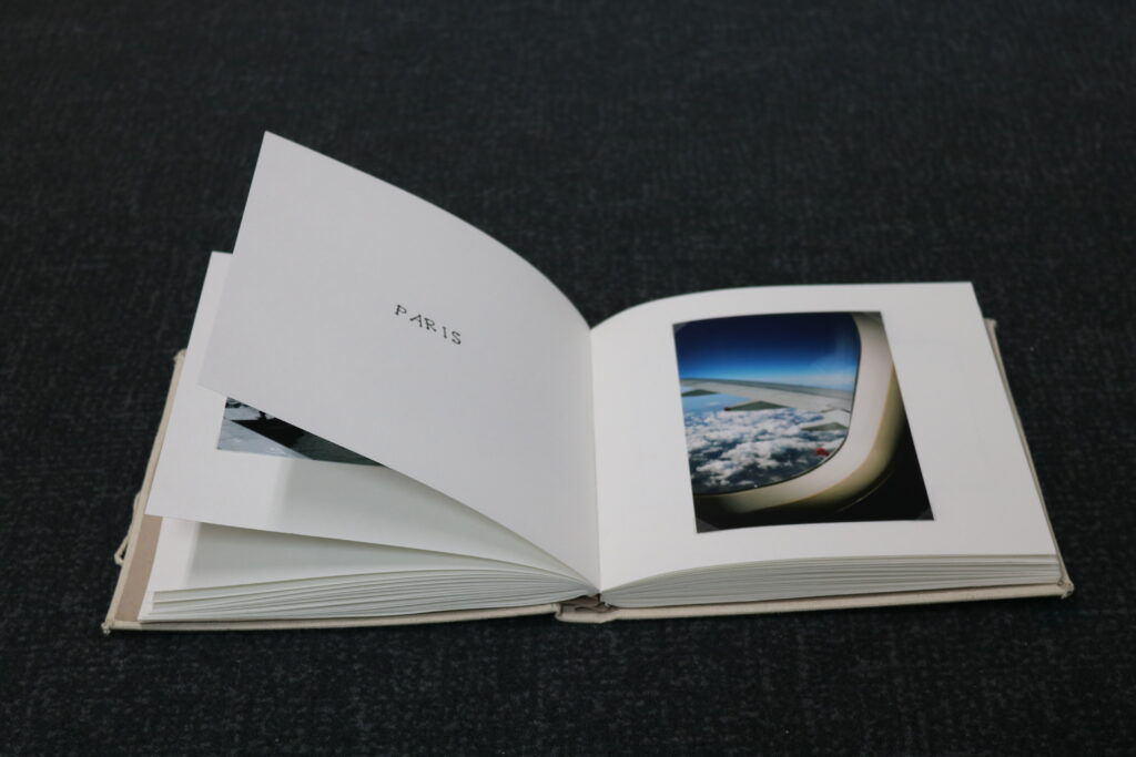
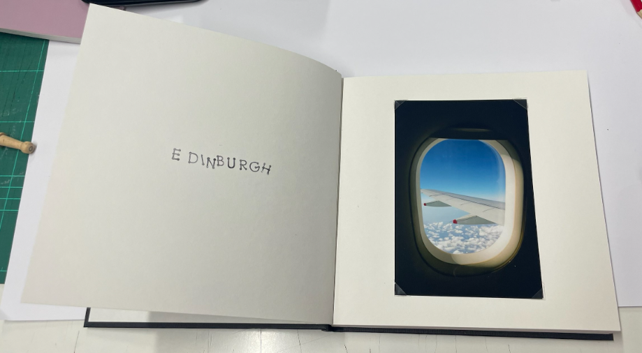
The photobook is valuable because I handmade it myself, and the challenges I came up against in making it only seemed to create opportunities for me to make it better. The final book is successful because I made careful choices in my final selection, and the large number of images in it does not make it boring, as the chapters dividing each location make it constantly engaging. Furthermore, The high-gloss images add to the excitement and the feel that this is a book made by a travelling photographer who takes pride in their work.

My prints are successful because their simplicity makes for a focus on the images themselves, rather than framing. This is the main reason that I usually choose not to frame my images, only mounting them on foamboard. This makes for a professional, streamlined look in my opinion. I also chose only to print images from my New York shoot so as not to confuse the viewer with a collage of different and distinctive places, making it more focused and therefore clearer in intent.

Therefore, overall, the outcomes appear professional, cohesive, and simplistic, as I had hoped. However, it can be said that my original plans had less appeal, and my vision wasn’t realised. I do feel that this is a blessing however, as I am much happier with the final outcome than I fear I may have been if my original plans had come to fruition.

I think that, aside from final presentation, I did realise my intentions to an extent. The images I created were, whilst still strong, not necessarily as people-focused as I would have liked. My chosen artists are, of course, street photographers who focus on the inhabitants of the cities they photograph, and, whilst I did manage this in some ways, I think that it could have been clearer across more images.

Therefore, I feel that, in terms of meeting the styles of my artist references, I could have been more successful in some areas. Some images could be likened to their work, but it is certainly true that a lot of them are more environmentally focused.

I feel that the brief of ‘Observe, Seek, Challenge‘ was met, as I have suitably ‘observed‘ but also ‘sought‘ the subjects of my images. I ‘challenged‘ myself by going out into more unfamiliar places in order to capture these images. The multi-national dynamic of my work makes for an escapist element that couldn’t be replicated from home. I am therefore happy with the theme I have chosen.

I chose to name my book ‘Departures‘ as it would align with the theme of plane travel and the excitement of arriving at an airport and knowing that you are soon going to arrive in a new and exciting place. This also aligns with the increasing levels of colour in the images as you go through the book. The destinations get further away and become more colourful, making the journey exciting.

If I could do the project again, I would likely plan better to ensure that my idea was cohesive and possible, but I do believe that, overall, I have been successful in my outcomes. I am proud of the images I have taken and the way in which I have presented them, and I have enjoyed the opportunities to learn new skills along the way, feeling that it has made me a more rounded learner and creative artist.