Category Archives: Uncategorised

Filters

Author:
Category:

Project Evaluation

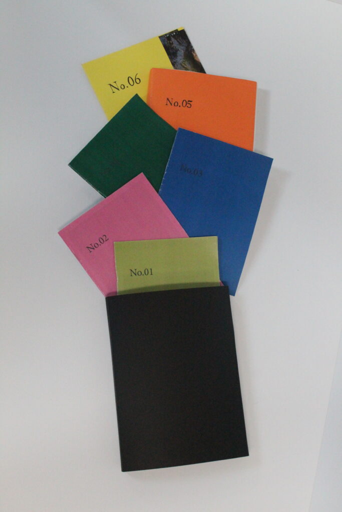
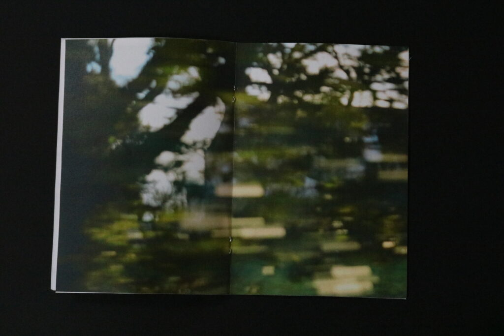
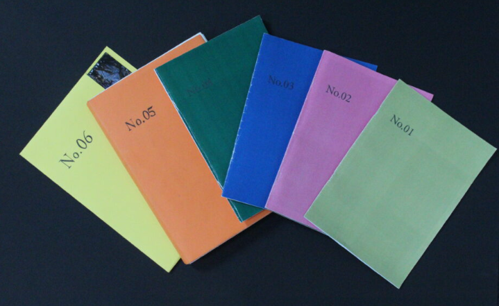
As I started the project with outcome that are displayed in the zines, I wanted to discuss their efficiency to not only the key themes; Observe, seek, Challenge, but also my own theme that responds to the main one, which is exploring, adventure and travel. I think with all of the photoshoots I was challenged to explore as much as I could from familiar environments, therefore for most I positioned myself in different surroundings which I was not familiar with. This including, frogging and exploring the hotel and tunnel. By not knowing these areas I wasn’t aware of what to expect, therefore the photographs produced were unexpected and this is what showed my adventurousness. Through the actual outcomes produced they not only document each trip, but they show curiosity through them. If it is explored by angles, subjects, different points of view, they are very experimental and reveal that. I especially like how well photographs shot in motion turned out. They represent movement through the blurred nature, but they are successful at showing travel. They are initial for the point of the story to prove to the viewer that this is one of the key elements of my project. I think that within these outcome, they are successful at showing not only snapshots and things I have found along the journey but also showing how I got there and the transport I took, as without any kind of transport traveling with be near-impossible.
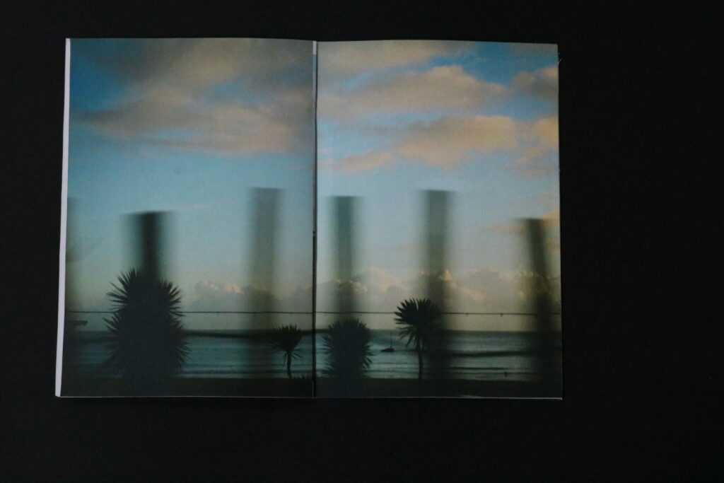
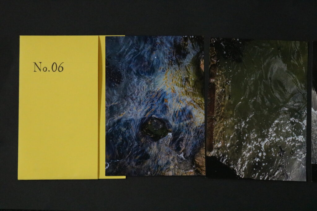
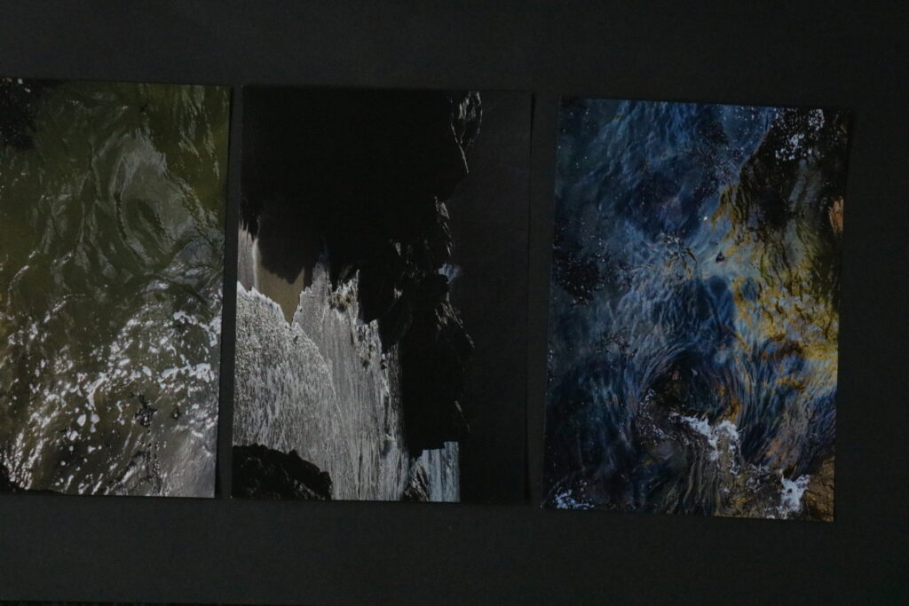
When it came to the folder which include a set of 4 prints. What motivated me the most about these outcomes, was the spontaneous nature of the photoshoot itself. This unplanned practice is so often associated with traveling or exploring. However what I like the most is how the order of the photographs shares a story, I specifically used a similar image twice to show the meaning behind a passive moment. That once the wave comes in it will go back and this idea of time constantly moving forward. I would want this idea of time constantly moving to inspire, and encourage viewers to look around, this idea is reinforced with images of the surroundings being in between the waves. The idea behind the format of this display is inspired by Murice Van Es, where in his project I spoke about before, he also used different methods of format where one of it is a similar folder to mine.
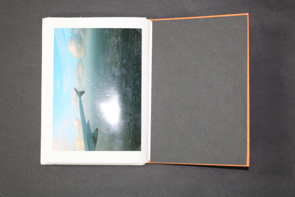
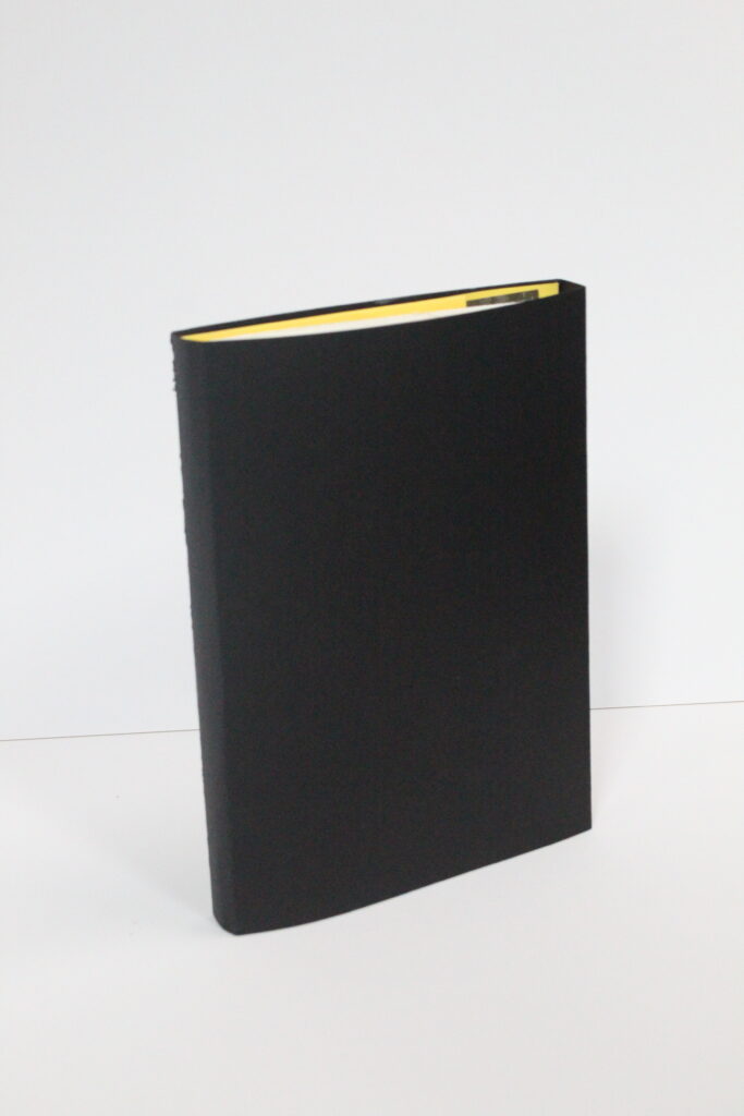
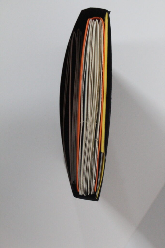
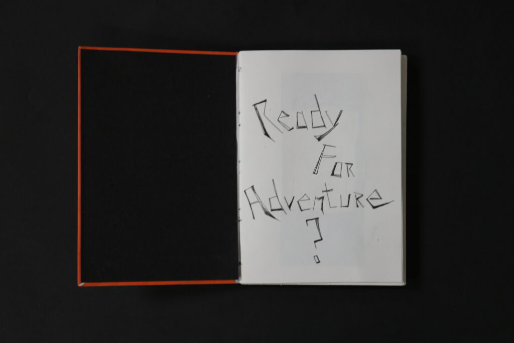
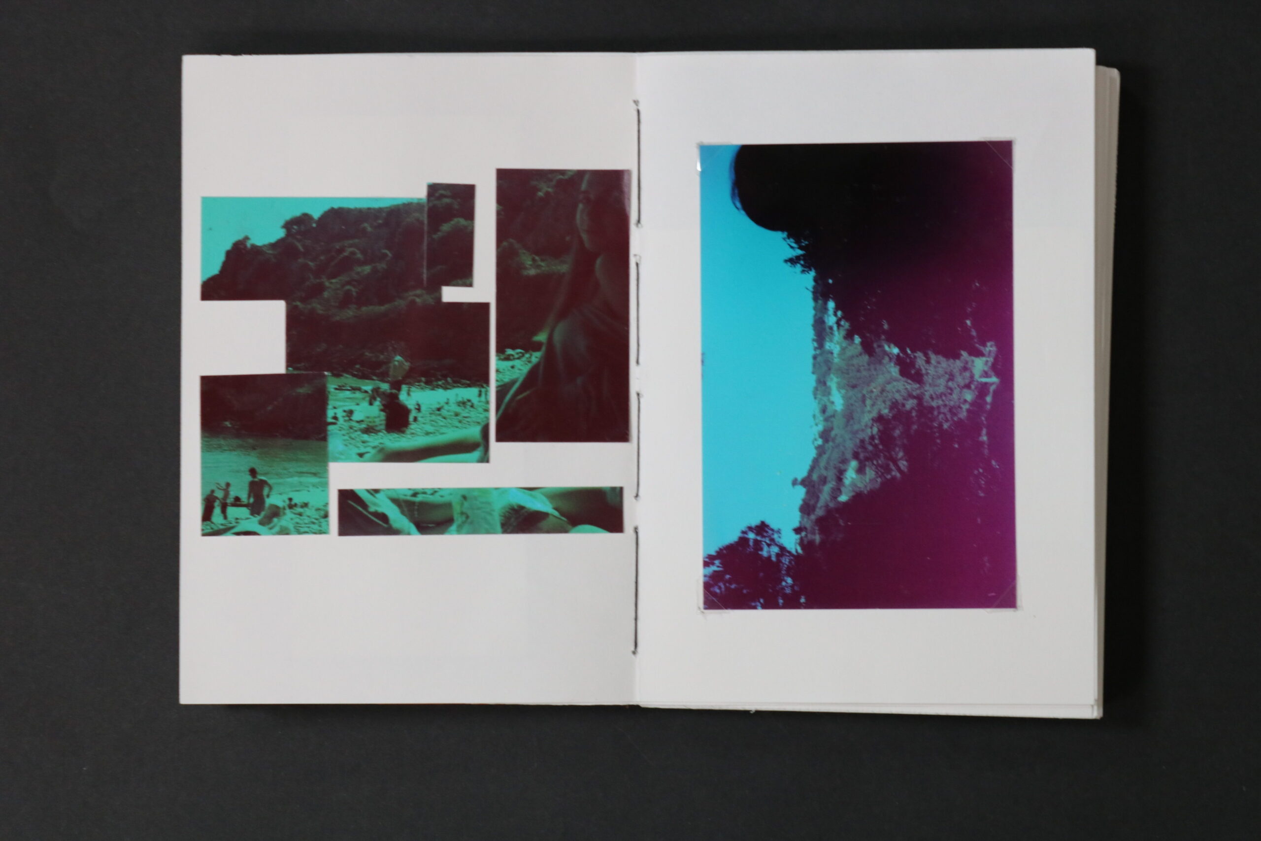
The biggest outcome, with a great amount of images within it, is a hand made book, consisting of photographs of 4 different occasions, representing adventure, travel and exploration. This book is a collection of various trips, however the layout put the narrative together, by having the images displayed in the order of events. Starting by showing more archival images, and ending with the most recent. I think the book also has many connotations, explored through the montaging of the images as well as the layout. The layout tells a story, throughout the book. Even the question on the inner page is an indication of the contents inside it represent. Pictures from Norway, like through a moving Train or bus are especially successful, as well as the ending page of a plane. To me it represents an unfinished journey, and that it will forever go on, but to some it might represent an end of it, coming back home. Another thing that went well when it came to the book is how well the images represent what it is about, as well as the question at the beginning building up on the idea. However what I am less happy about is the stitching I have done as the gap in between the groups of pages shows the string as well as the cover, this is because I haven’t tightened it hard enough for it to be firm and more stable. Regarding the technicality of the photographs or the layout, I think because of the difference of each group of images, together they might seem more random due to the book not following a theme of similarly edited photographs, and the colours of each image might seem all over the place when compared to another one, however I also think that because of this differentiation, it is easier to see different atmosphere each trip holds, and because of that this travel through place to place is seen by traveling from photographs within the book.
To conclude, I am happy how the main themes set by me is visible with each outcome. As I said before The reasoning for representing travel, movement and exploration, links heavily to ideas of : Observe, Seek and Challenge. Due to these elements becoming a natural practice while exploring new areas and traveling to different places we are unfamiliar with. With each of my different presentation outcome I was able to focus more on each photoshoot, trip etc. and by grouping them together not only it shows each photoshoot in greater detail, but also makes the viewer physically travel from one outcome to the other. I think the idea affirmed by studying the book “now will not be with us forever” by Maurice van Es, inspired me greatly to produce this type of layout, which fitted perfectly with what I was presenting. Therefore this project has been great to explore due to the guidance I got from studying and analysing similar work, as well as the production of the images which was the most enjoyable and fun , as through focusing on topic of travel, which is very important and personal to me, I challenged myself to get out of my comfort zone, and follow the same or similar practices as if I was on holiday or in a different area I’ve never been to. Overall I think feeling awe and sublime as often as possible has a great impact on anyone’s health, as sometimes we need to feel amazed to improve mental health and happiness. Therefore this project had a personal impact on me as well as allowing me to focus on producing the best to my ability photographic outcomes.
Observe, Seek, Challenge – Evaluation

Overall, I feel that this project was challenging in the sense that it was quite difficult to interpret at first, and I had trouble connecting ideas to make any kind of start, which slowly changed as the ball rolled and I broke down the theme into three separate parts. This enabled me to achieve a wide variety of different compositions, both in style and concept, whilst still contributing to the project. I experimented with several new methods and techniques within both my photography and post-production, and I feel that I’m a lot more equipped and knowledgeable in my work now as a result.

Rinko Kawauchi definitely had the largest impact on my work and how I shoot photographs, technically and stylistically. Kawauchi’s work taught me to focus less on the larger picture and to focus on a smaller part of it, to capture the smaller parts and ‘systems’ behind each scene. As a result of this however, I feel that I was able to execute my Simone Bramante-inspired shoot perfectly, using natural lighting and the surrealist composition created through the use of the bin liners to my advantage.

I’m also happy with how I presented my work as final outcomes, using window mounts and different formations to present some of my photoshoots as a singular outcome, but also by linking two separate images together. My favourite outcome was organised similarly to the two images above from my Bramante shoot, where the subject from the image on the right-hand side looks in the direction of the other, linking the two together. Additionally, the use of colour within the image is a nice contrast of warm and cold tones, which pairs well with the golden hour lighting.

Virtual Gallery

This set of final outcomes are from one of my Rinko Kawauchi-inspired photoshoots, following the theme of ‘observe’ through watching nature as it is, without human intervention.

This triptych is from my final images from my Simone Bramante-inspired photoshoot, following the theme of ‘seek’ through looking for a solution/raising awareness to the plastic pollution crisis.

This last set of four pieces come from my Nicholas Goodden-inspired shoot, following the theme of ‘challenge’ through graffiti and street art.

I also wanted to create some final outcomes from the Paris Photo 2023 trip from last year as I hadn’t made any from them yet.

Simone Bramante – Photoshoot

Brahmino – Simone Bramante – Photographer, Creative Director
– Simone Bramante

In response to Bramante’s work, I did a photoshoot with Wiktoria, aiming to achieve a similar composition to that of her work with plastic drapings. Using this for inspiration, I hung up different coloured and textured bin liners on a clothesline, along with some plastic packaging, which I thought looked relatively similar. I cut a slit in each liner, leaving enough room for Wiktoria to be seen through it, and we experimented with different poses and angles that would work with the natural lighting.

After editing and sorting through each image, I was left with a series of dramatic, interesting compositions. My main focus for editing with this shoot was the availability of natural light in each photograph, and how it played on Wiktoria’s face and the creases in the plastic.

These were my final 6 compositions for this shoot. Each one has its own sense of mystery surrounding it, as a result of the plastic obstructing Wiktoria’s face, creating this own other world that she’s almost ‘looking through’.

For this image, I wanted to develop on simply what was already there, doing basic adjustments and only really bringing more warmth to the image.

The shoot was done around golden hour, so the natural lighting already left a golden impression on the composition, which I wanted to accentuate through the use of colour grading. I used orange tones for both highlights and midtones, not overdoing it but just enough to warm up the image, and I used blue tones in the shadows, which complimented the already blue bin liner in this particular shot. I then calibrated the colours to dullen them a bit, mainly to give the orange hues more prominence, but also to create a softer overall look.

To finish off the image, I added the vignette and used linear gradients to increase the contrast from the lights to the darks from each corner.

Case Study – Simone Bramante

– Simone Bramante

Simone Bramante, an Italy-based surrealist photographer, is noted for his intense use of colour and dreamlike atmospheres he established within his images. My interest in Bramante’s work derives from both this and the gentle nature of a large number of his photographs, similar to Kawauchi’s.

Brahmino – Simone Bramante – Photographer, Creative Director
– Simone Bramante

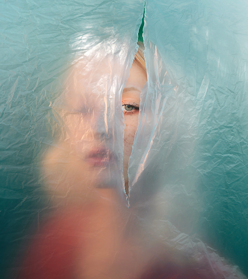
Take the above image for example. Bramante presents a young woman peering through a tear in a wall of thin near-transparent plastic, immediately suggesting surreal ideas of her looking into/out of another world, or that the subject is looking for something. The only portion of the subject we can clearly see in focus is a sliver of her face – an eye, part of an eyebrow, and some blonde hair. The rest of the composition is hidden behind the plastic, blurred by it, but not too blurred to where the viewer can’t make out basic details, such as the colour of her clothes and lipstick – both a bright red – or the rough shape of her face and hair.

– Simone Bramante

In my own work, I want to create a photoshoot that responds similarly to these specific images, of people looking through plastic sheets, nets, etc., and to achieve similar colour palettes to Bramante.

Nicholas Goodden – Photoshoot

– Nicholas Gooden

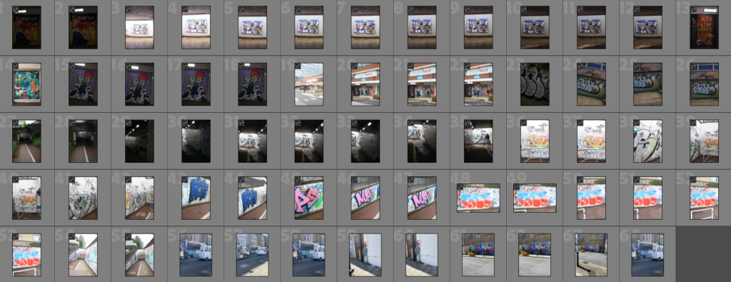
I spent a few days in the UK, and took it as an opportunity to photograph some graffiti in different cities. Norwich is a city covered in art instalments and graffiti, where I found myself taking the most images. The pedestrian underpasses, in particular, bore plenty of work from local artists and university students, hired by the council in most cases – otherwise, people had put their own work up, tagging the walls wherever they could find free space.

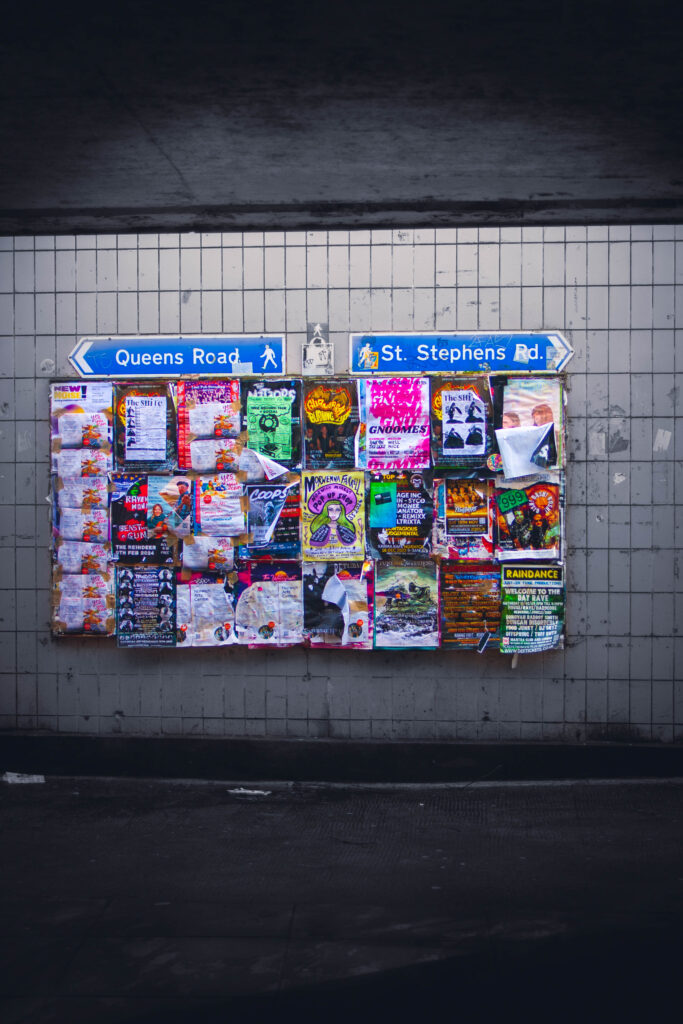
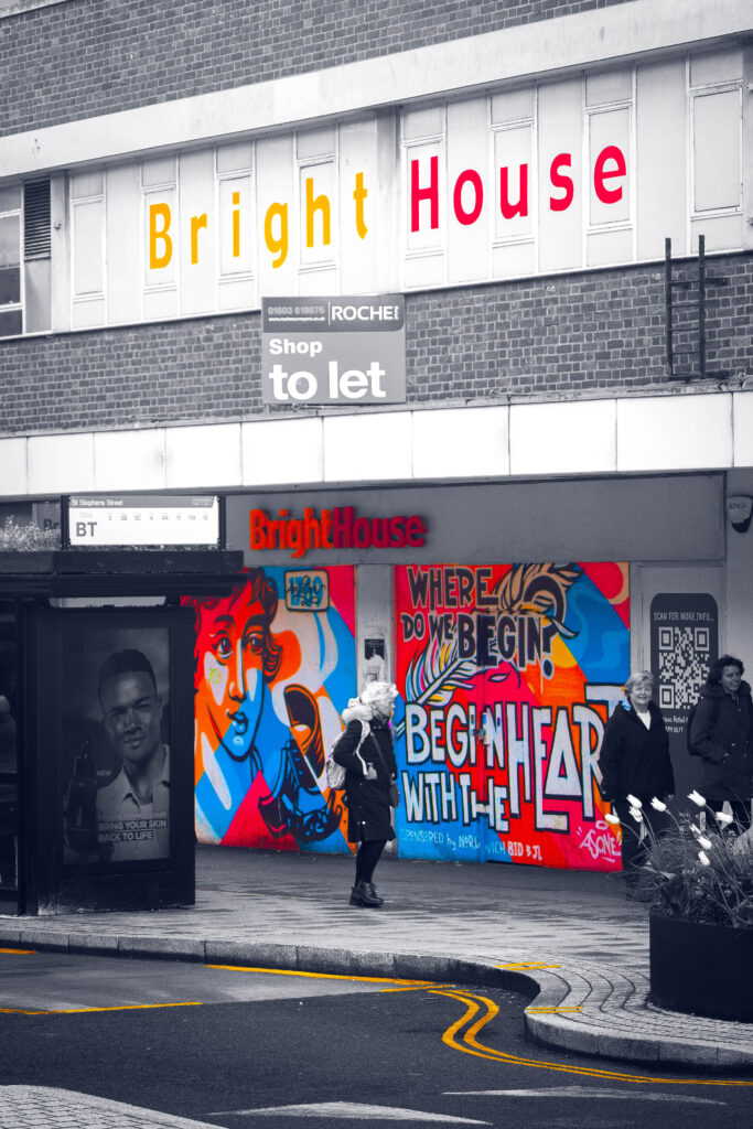
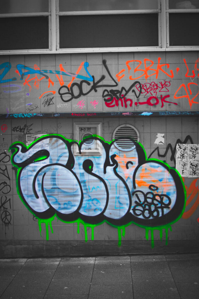
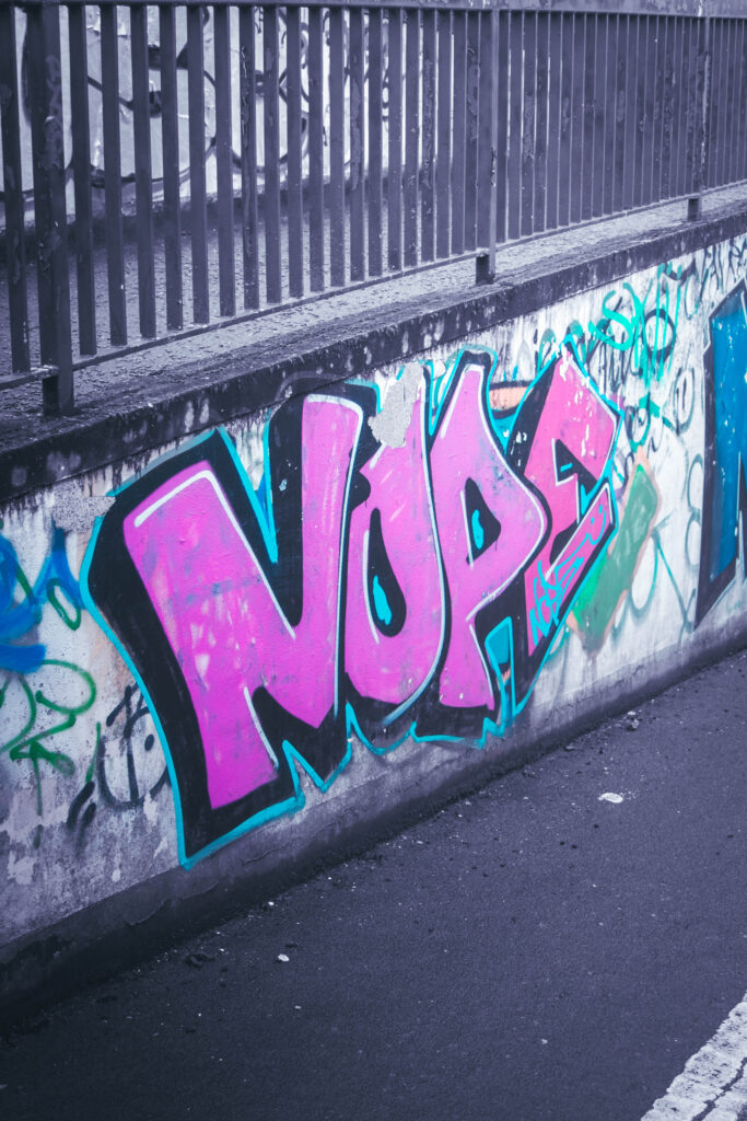
After sorting through my photos, I kept a small number of images that I felt could be edited to fit the style of Goodden’s work. The idea was to make the graffiti the focal point of each composition, by desaturating the rest of the image and increasing the saturation on the art itself. Because of this, it was difficult to find an image where the background was dull enough or where the graffiti was colourful enough to separate from the rest of the scene.

These were my final 4 images from this shoot. I ended up just using my images that I took in Norwich, as the other cities/areas I visited – Clapham, Brixton, Central London – I didn’t shoot from better angles and only used my phone as I passed by.

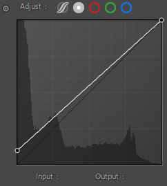
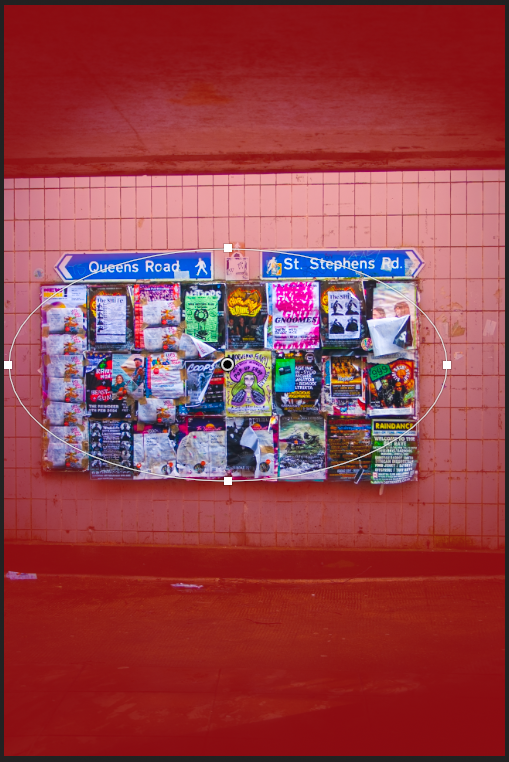
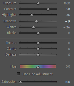
For this first image, I felt it would be easier to work with as I experimented with working out Goodden’s editing techniques, learning how to keep my focal point saturated whilst leaving the rest of the image in monochrome. I first adjusted the point curve of the photograph, increasing the output of the blacks to lighten the darkest areas of the composition, and lower the overall contrast, before completing any basic adjustments. I started with the image in black and white, so that I could see how the background would appear once desaturated, before moving it back into colour.

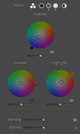
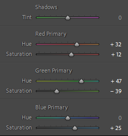
I didn’t want to overcomplicate the colour grading for this piece, as it would impact the entire image and I didn’t like the look of it. I adjusted the midtones toward blue slightly, which gave the image a soft blue tint when the monochrome filter was applied. I then calibrated the rest of the colours in the image, which I had more freedom with as it would only affect the noticeboard once the rest of the image was desaturated. I wanted to make the colours on the noticeboard more prominent, which I did by calibrating pinks and greens to a more saturated tone, which left me with these really nice neon colours on the noticeboard. I felt the neon colours were fitting as the noticeboard displayed a lot of advertisements for music events and concerts, often to do with the punk scene.

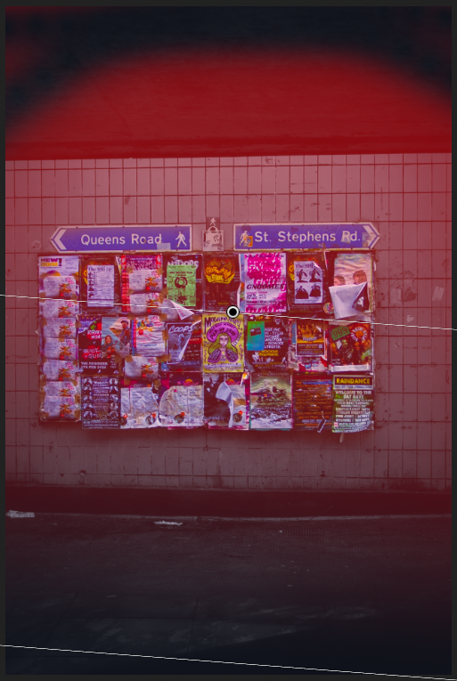
To finish off my composition, I added a vignette, and used the linear gradient tool to increase the strength of the light source, and to darken the darkest areas of the image, in order to create more contrast.

Case Study – Nicholas Goodden

– Nicholas Goodden

Nicholas Goodden, otherwise known as Nico, is a London-based photographer and drone videographer. Considered “A total Swiss army knife, able of covering any visual requirements thrown his way” by Beavertown Brewery Creative Director Nick Dwyer, Goodden’s work holds an incredible amount of range to it, from dramatic monochrome compositions to intense, vivid long-exposure photographs on the streets of London.

– Nicholas Goodden

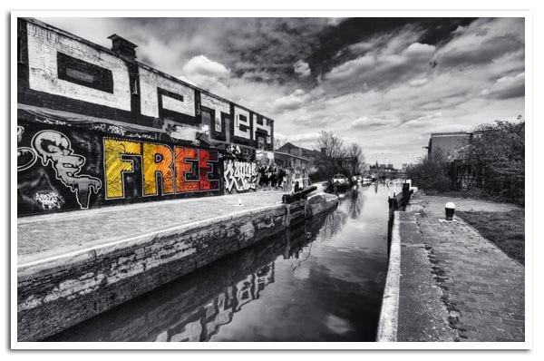
My interest in Goodden’s work is his black and white pieces, where he always leaves some part of the composition in highly saturated colour, either he drawing over it in post-production or leaving the original colour. Take the above image for example, displaying a small riverside walkway, the left-hand side bearing a wall covered in graffiti, Goodden’s particular focus being the word ‘FREE’ painted across the wall. The immediate connotations of this word, and the fact that it’s the only part of the image with any colour, imply restrictions within maybe the photographer’s own life, or generally speaking society as a whole. The use of highlighting the graffiti in the image may also further the message of the original artist, who might be challenging the government by painting there illegally. It suggests freedom through art and self-expression, and a monotony in everyday life that needs to be broken out of.

– Nicholas Goodden

In my own work, I want to attempt recreating Goodden’s stylistic conventions within the work he’s done using black and white, as I think it would be a challenge for me to replicate, but also graffiti and vandalism as a subject presents the concept of ‘challenge’ perfectly, as more often than not the artists want to protest something.

Case Study – Bart Koetsier

– Bart Koetsier

Bart Koetsier’s work, particularly his street photography, maintains a strong sense of drama, that often feels straight out of a film. His photographs depict various scenes around Paris, from picturesque compositions of people and their dogs, to grittier, morbid imagery of people passed out on the streets late at night. The common theme throughout all of his photographs is that Koetsier remains the observer, simply providing the angle for the audience to look through.

– Bart Koetsier

In the above image, a couple is pictured facing each other, having a conversation sat on a railing, against a backdrop of a vast city scene. Compositionally, the use of the rule of thirds is well executed, centring the woman’s whole body in the photograph, whilst the man is off to the right-hand side, although his positioning is mirrored by the tree to the left. The railing and cityscape fills the bottom third of the image, whilst the horizon and sky occupies parts of the central and upper thirds. The photo is shot from a 90 degree angle, displaying the side profile of both people as they face each other. The colour palette is monochrome, with dark, dramatic greys and blacks dominating the lower half of the composition, and softer lighter tones in the upper. The couple, in conversation, both use very open body language, although the man appears more relaxed, and face each other head on, interested in what the other has to say. The woman wears a lighter outfit, whilst the man appears to wear a darker outfit. Whilst it can simply be assumed that the composition portrays a couple, the juxtaposition of their clothing could relate to many different ideologies and conflicts, such as good vs. evil, and potential religious ideals. The piece also develops a healthy contrast between nature and manmade structures, the two people potentially representing how humans build over natural environments.

In my own work, I enjoy creating dramatic pieces that involve people, such as in my street photography from the St. Malo trip, but I think that it’s still something that I can improve on with this project.

Rinko Kawauchi – Photoshoot 3

For this photoshoot, I visited St Catharine’s woods in the evening to shoot the natural scenery at golden hour, focusing on both smaller details and the bigger picture within each photograph I took, showing the structures of different plants and aspects of the ecosystem.

After editing through each image, removing the compositions I didn’t like or felt weren’t interesting enough, I was left with a small collection of photographs that I could further adjust.

For this shoot, I wanted to focus on capturing the earthier, more natural tones in my images, and developing on this in the editing, primarily increasing the saturation of the reds and greens.

For this image, I wanted to bring out the natural blue hues of the light reflecting on the stream without taking away from the scenery around it.

I experimented with the tone curves, increasing the output for the blacks, and slightly adjusting both the temperature and red channels until the stream had a nice blue hue to it, and the rest of the composition had a natural-looking warmth.

When colour grading, I wanted to develop further on what I’d already done, using oranges and blues to strengthen the colour palette, adjusting the vibrance as to not oversaturate the image. After, I calibrated the primary colours within the composition, being careful not to overdo it as to make it look unnatural but not leaving the image too dull.

To add the finishing touches, I used the linear gradient tool to increase the strength of the light source within the image, and to further darken the darker sides, to create a better contrast that wasn’t too obvious. Lastly, I added a slight vignette to bring a stronger focus to the centre of the image.

Rinko Kawauchi – Photoshoot 2

I went up to an abandoned hotel in Bouley Bay, where I took photos of the exterior as I walked around, finding an open entrance that brought me up and around to a deck that sat above the second floor, where there was another entryway for me to go inside. I explored most of the building, including the basement, and several rooms that were either mostly furnished, or full of waste and knee-deep in random litter, shooting photographs as I went.

I ended up with a collection of images ready to edit, making sure to weed out the compositions I didn’t like, anything unfocused, or anything that felt too uninteresting.

After playing with the basic adjustments, I did some colour grading on each image, experimenting with different combinations of tones and intensities to achieve a more dramatic, but not too fantastical overall image.

I intensified the primary colours too, adjusting both the hues and saturation to develop deeper, richer colours in each composition.

Using the tone curve tools, I again increased the output of each photograph to around 25 on the point curve, to create a more faded look on the image and lowering the contrast, which I feel makes it easier to have more freedom with my pieces to achieve a specific look.

To finish off each image, I used linear gradients to adjust exposures and other small basic adjustments to establish a stronger sense of lighting and shadow.

From this shoot, I was left with these 6 photographs as my best and final images. I was aiming for a softer colour palette in most of these, as I wanted to create a sense of nostalgia about the memories of the building and the people who spent time there.