All posts by Wiktoria Markiewicz

Filters

Author:
Category:

Project Evaluation

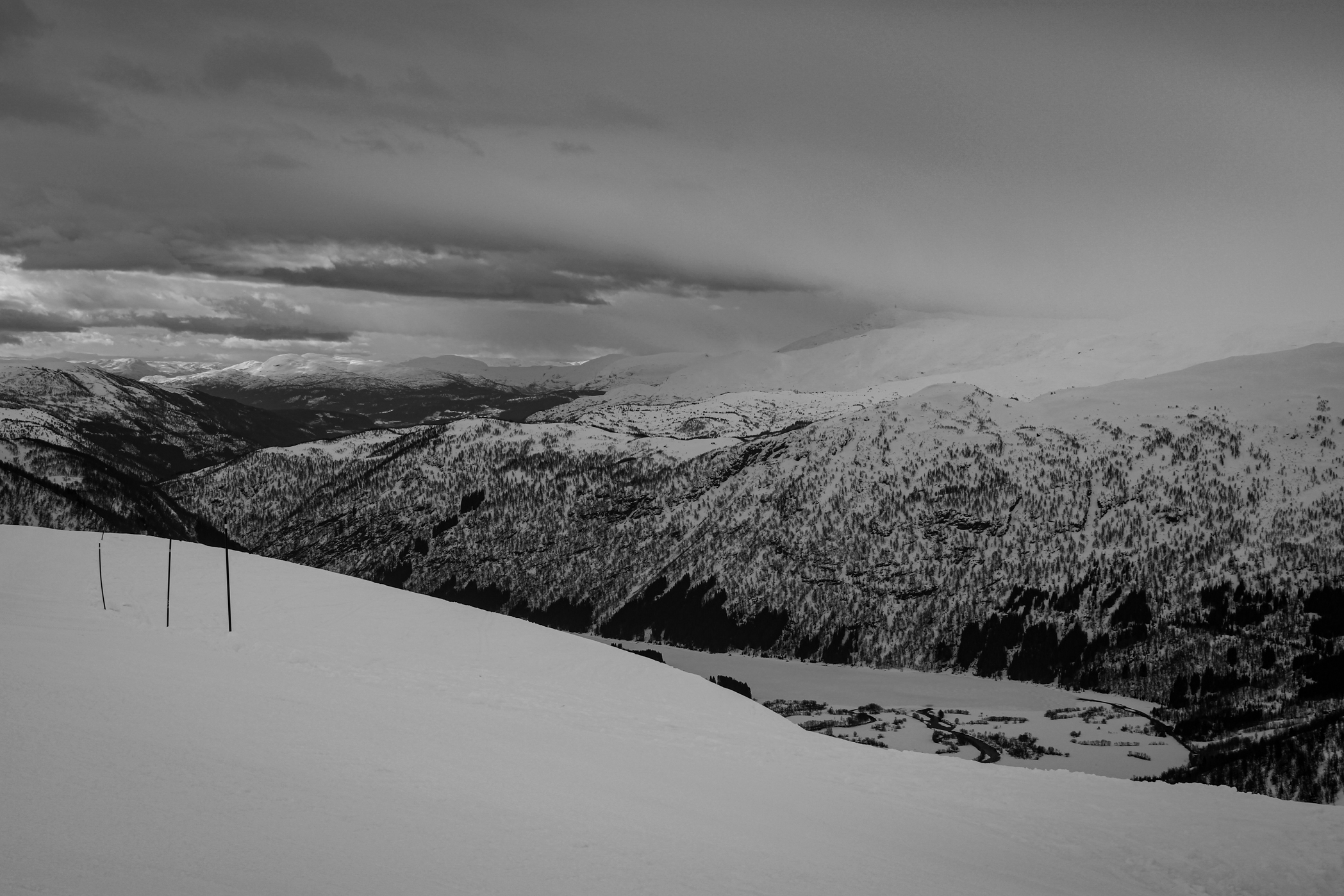
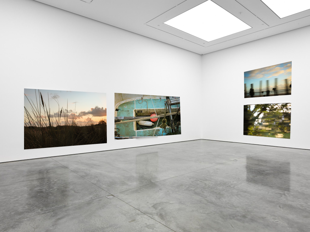
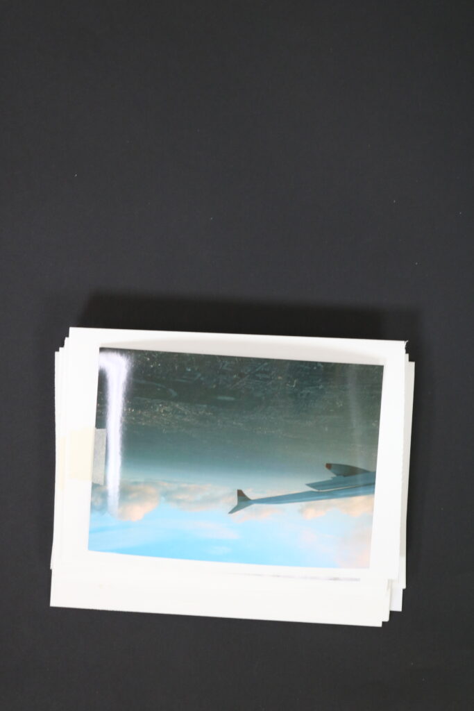
As I started the project with outcome that are displayed in the zines, I wanted to discuss their efficiency to not only the key themes; Observe, seek, Challenge, but also my own theme that responds to the main one, which is exploring, adventure and travel. I think with all of the photoshoots I was challenged to explore as much as I could from familiar environments, therefore for most I positioned myself in different surroundings which I was not familiar with. This including, frogging and exploring the hotel and tunnel. By not knowing these areas I wasn’t aware of what to expect, therefore the photographs produced were unexpected and this is what showed my adventurousness. Through the actual outcomes produced they not only document each trip, but they show curiosity through them. If it is explored by angles, subjects, different points of view, they are very experimental and reveal that. I especially like how well photographs shot in motion turned out. They represent movement through the blurred nature, but they are successful at showing travel. They are initial for the point of the story to prove to the viewer that this is one of the key elements of my project. I think that within these outcome, they are successful at showing not only snapshots and things I have found along the journey but also showing how I got there and the transport I took, as without any kind of transport traveling with be near-impossible.

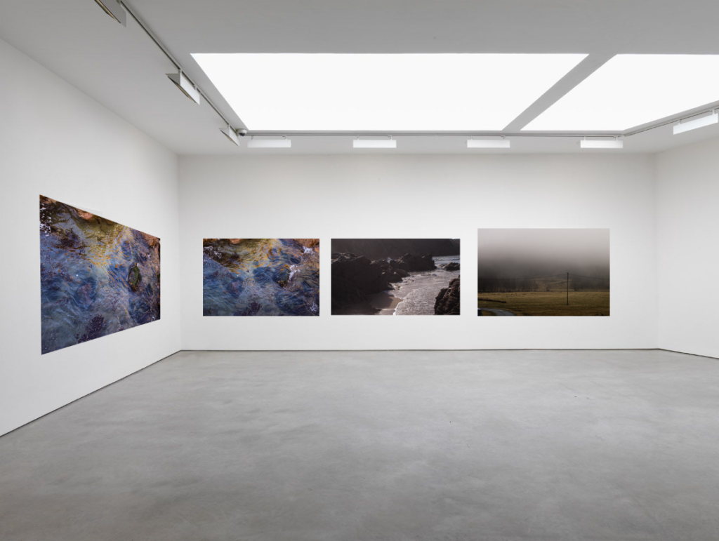
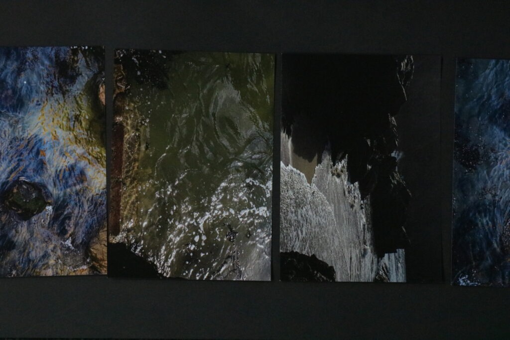
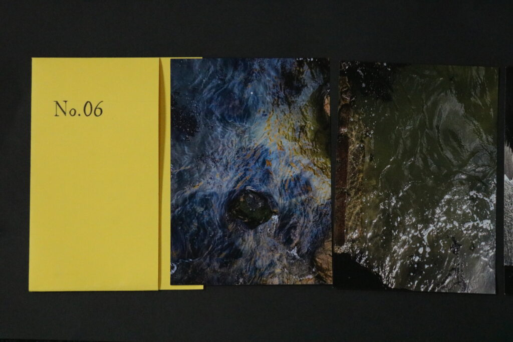
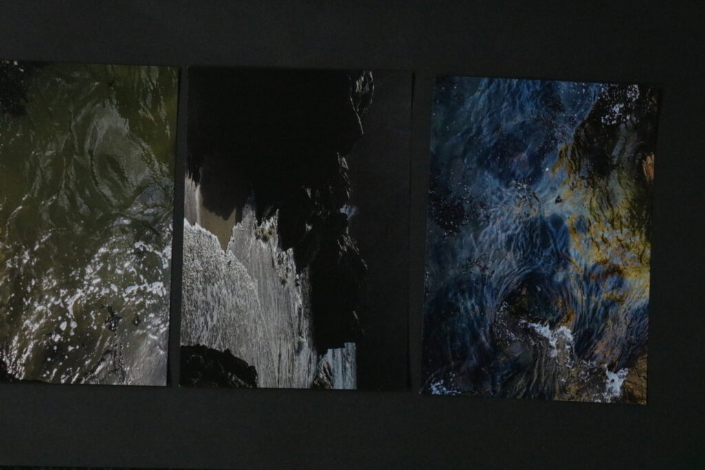
When it came to the folder which include a set of 4 prints. What motivated me the most about these outcomes, was the spontaneous nature of the photoshoot itself. This unplanned practice is so often associated with traveling or exploring. However what I like the most is how the order of the photographs shares a story, I specifically used a similar image twice to show the meaning behind a passive moment. That once the wave comes in it will go back and this idea of time constantly moving forward. I would want this idea of time constantly moving to inspire, and encourage viewers to look around, this idea is reinforced with images of the surroundings being in between the waves. The idea behind the format of this display is inspired by Murice Van Es, where in his project I spoke about before, he also used different methods of format where one of it is a similar folder to mine.

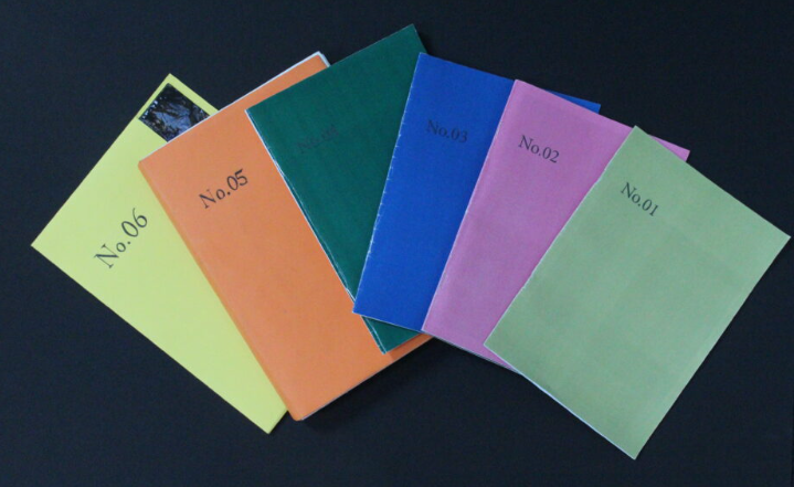
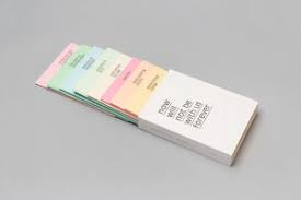
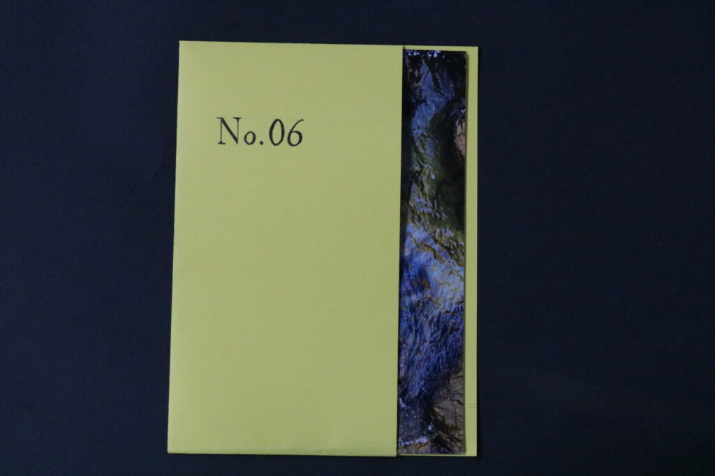
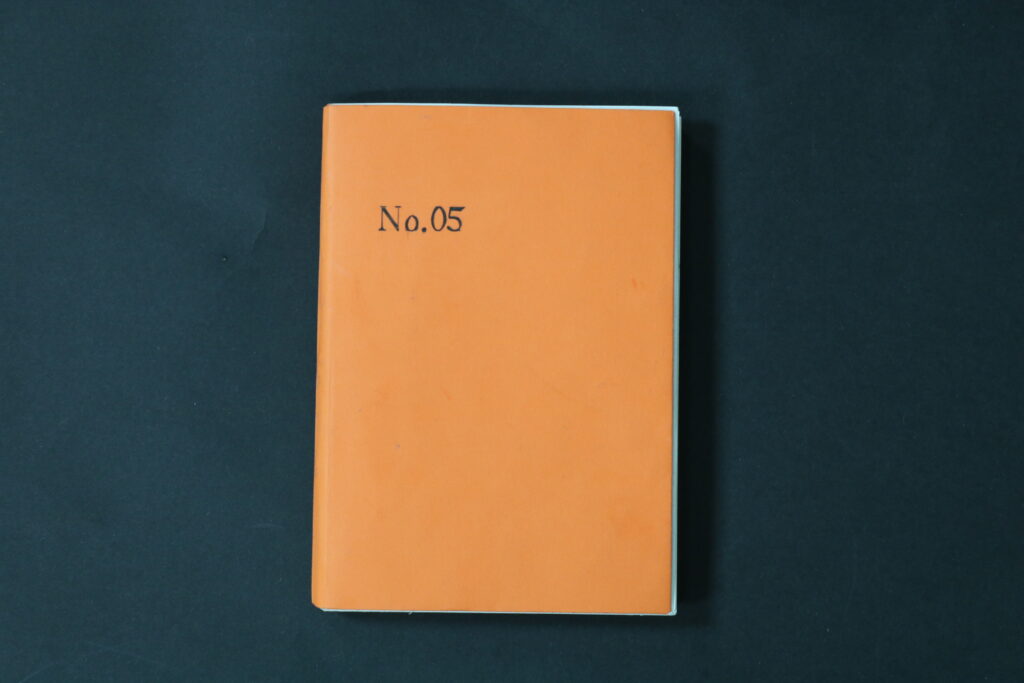
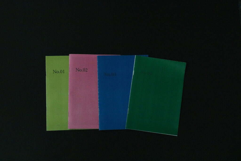
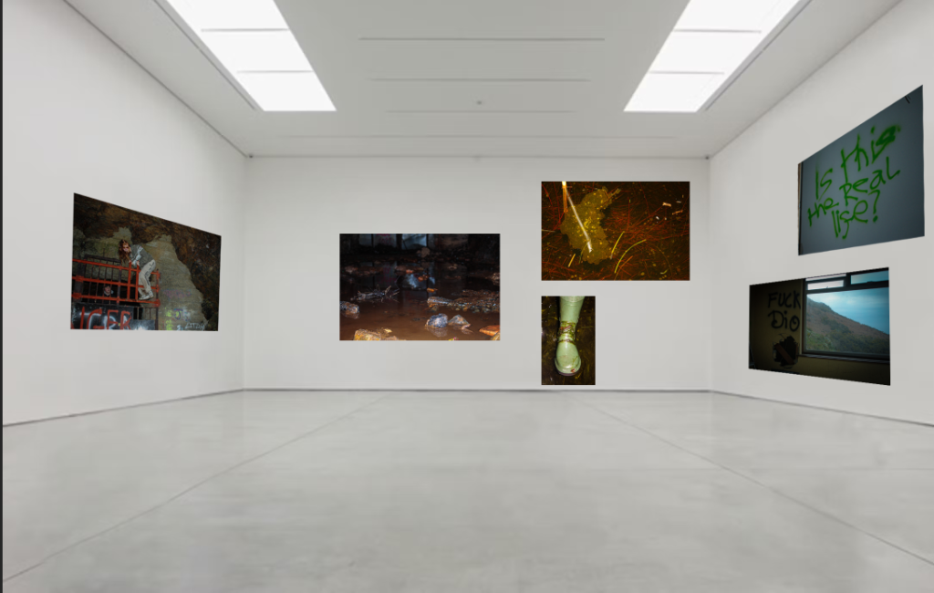
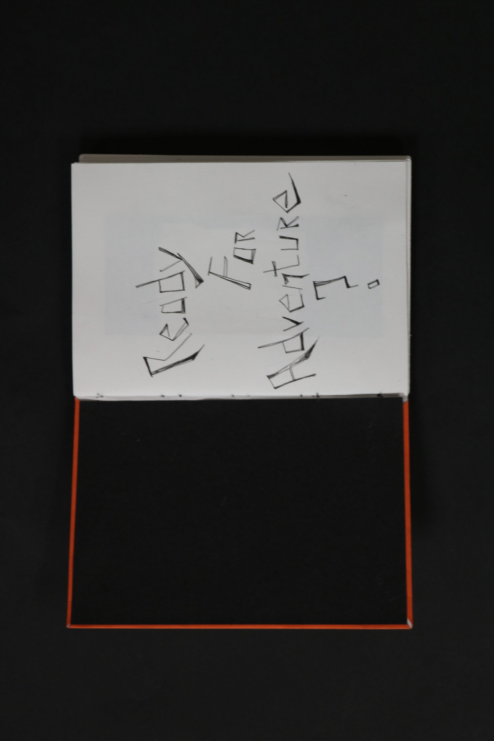
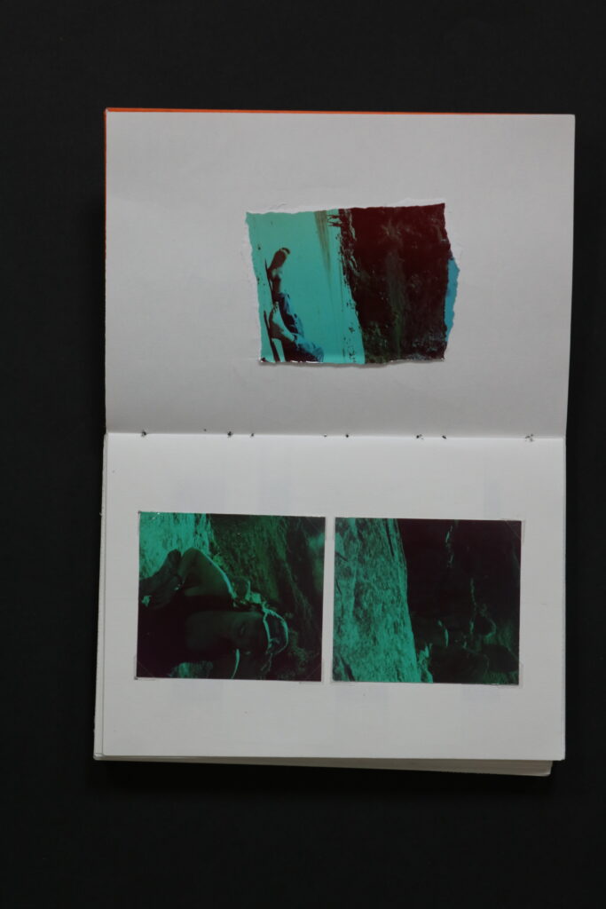
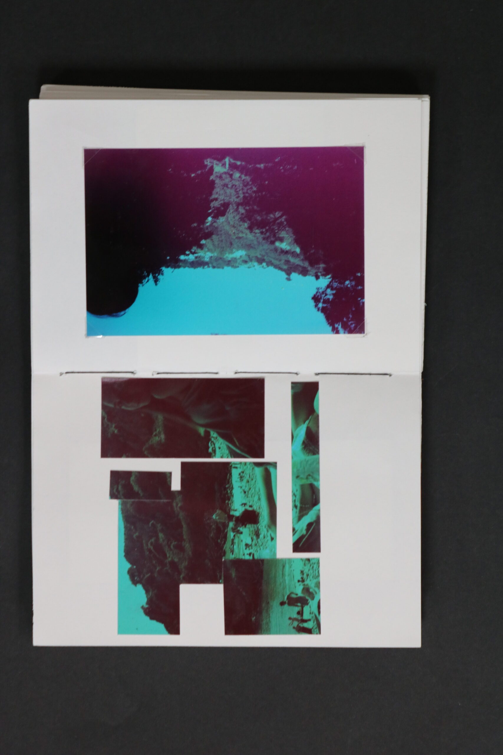
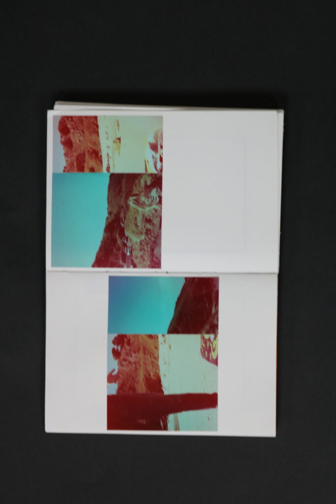
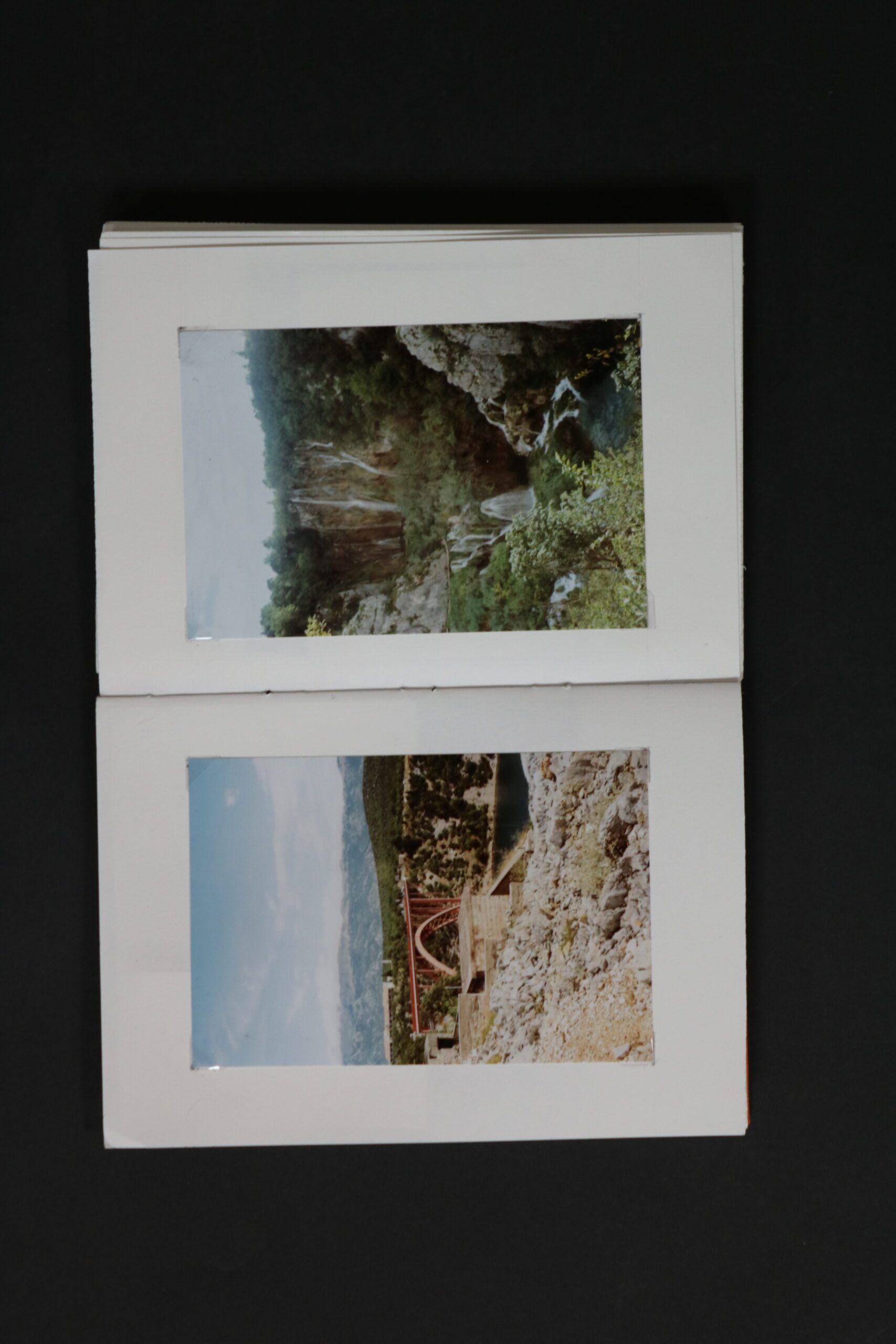
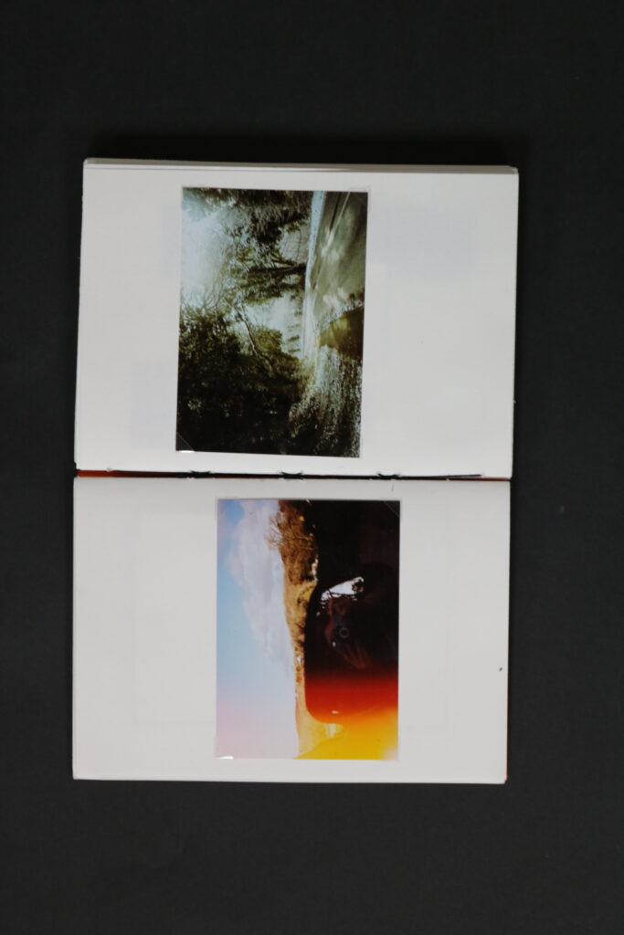
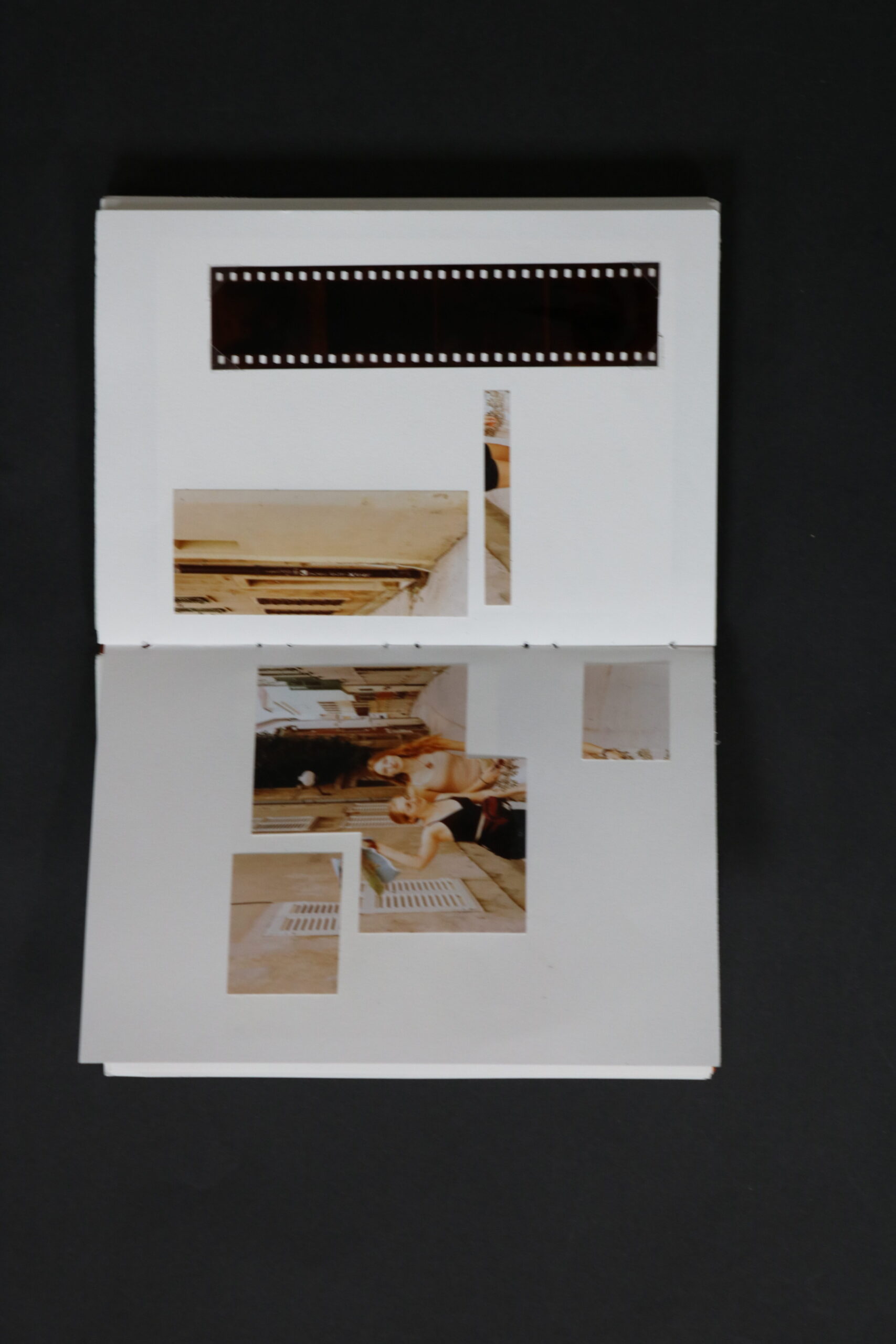
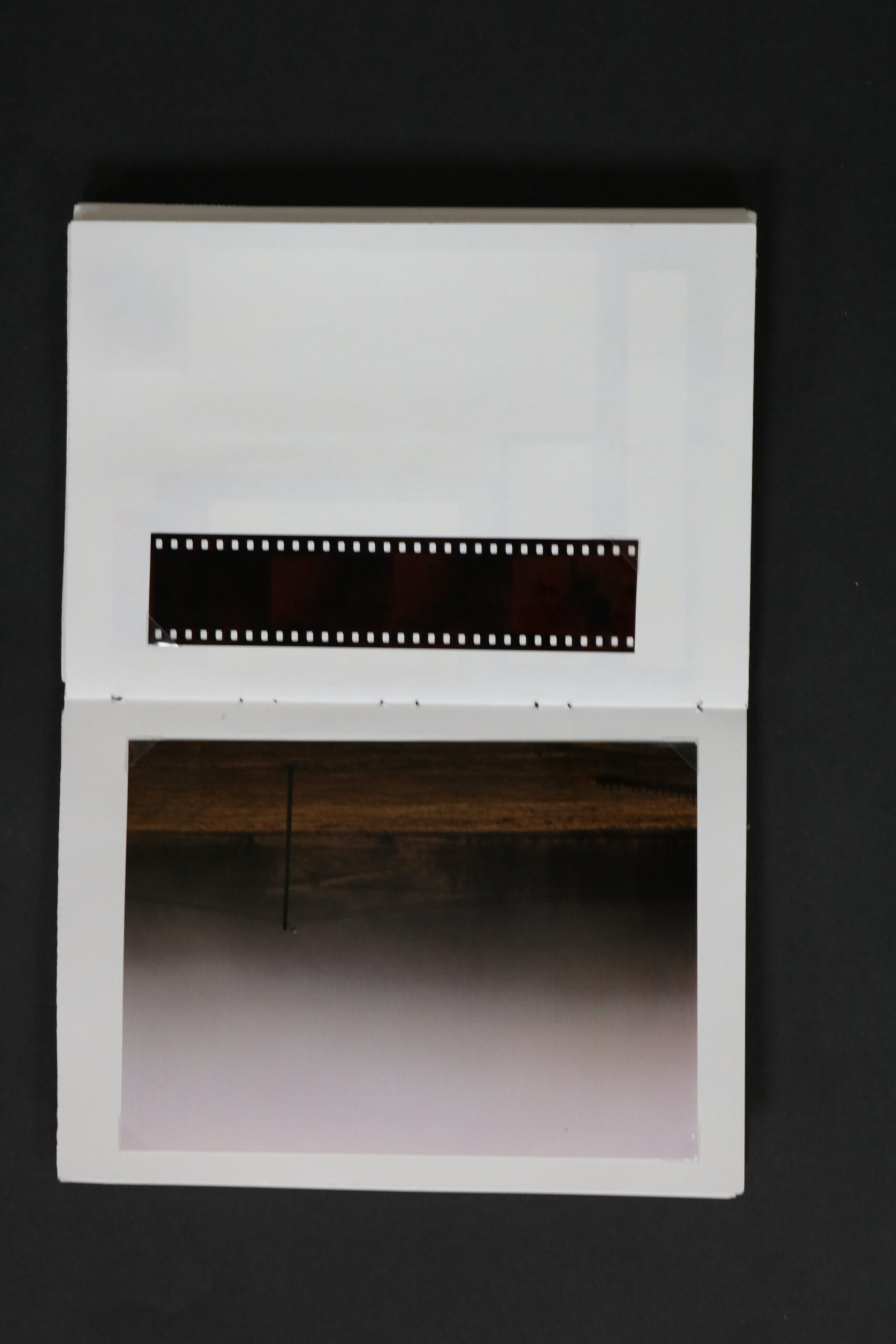
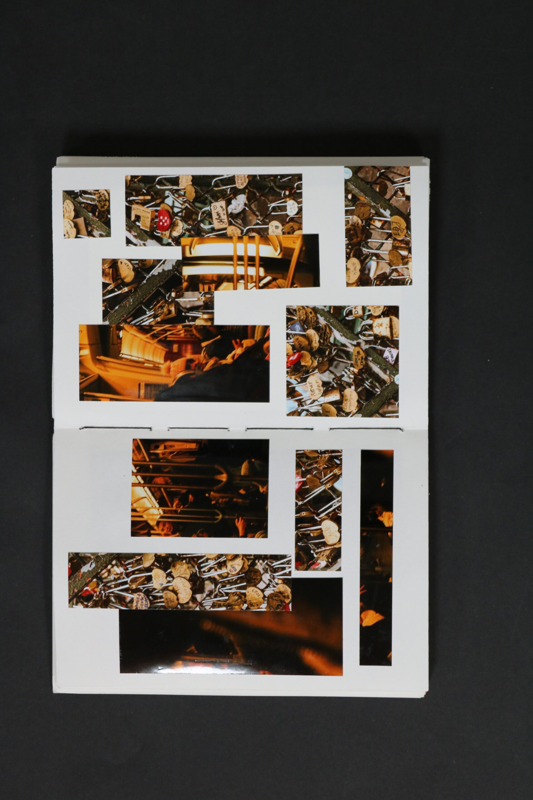
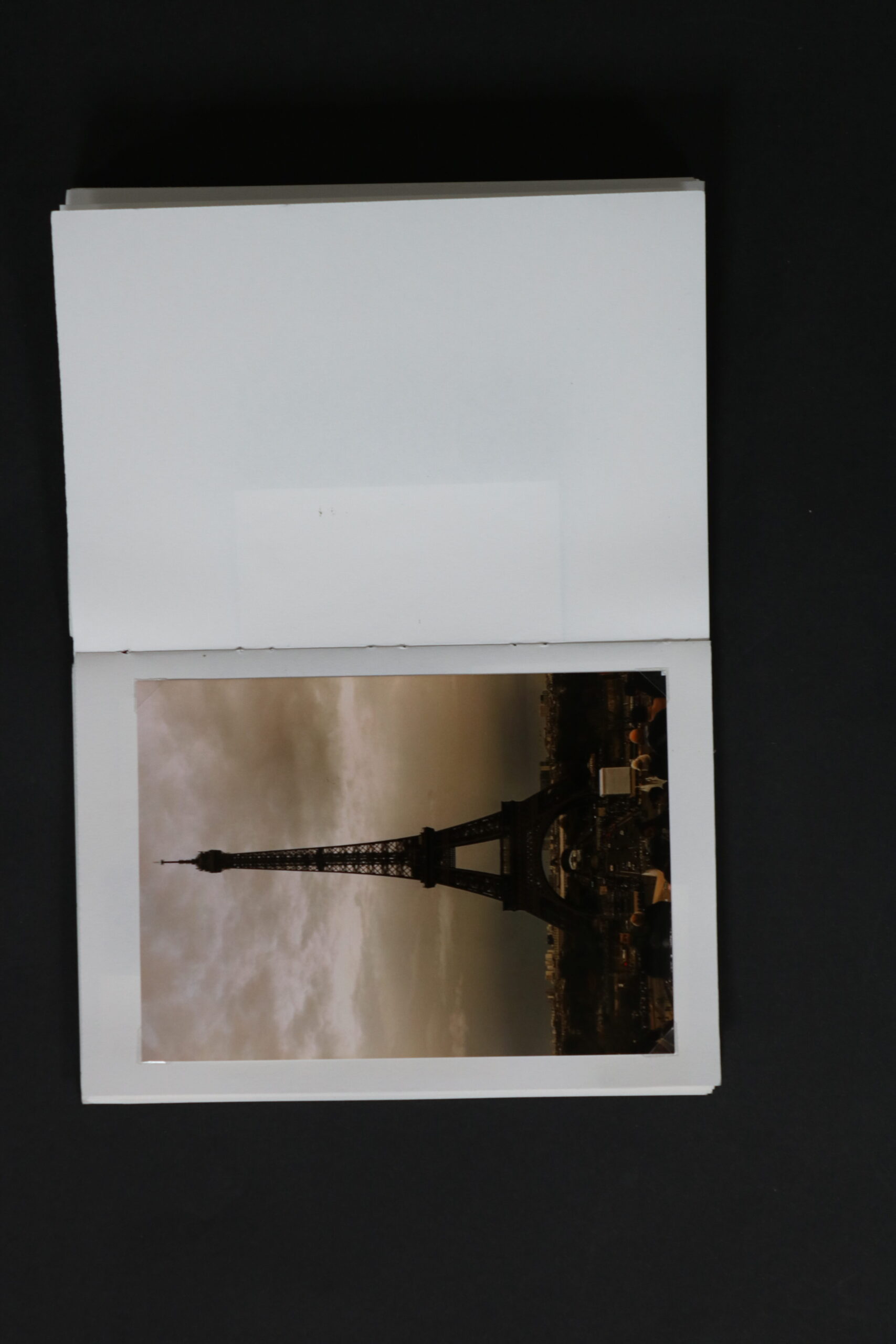
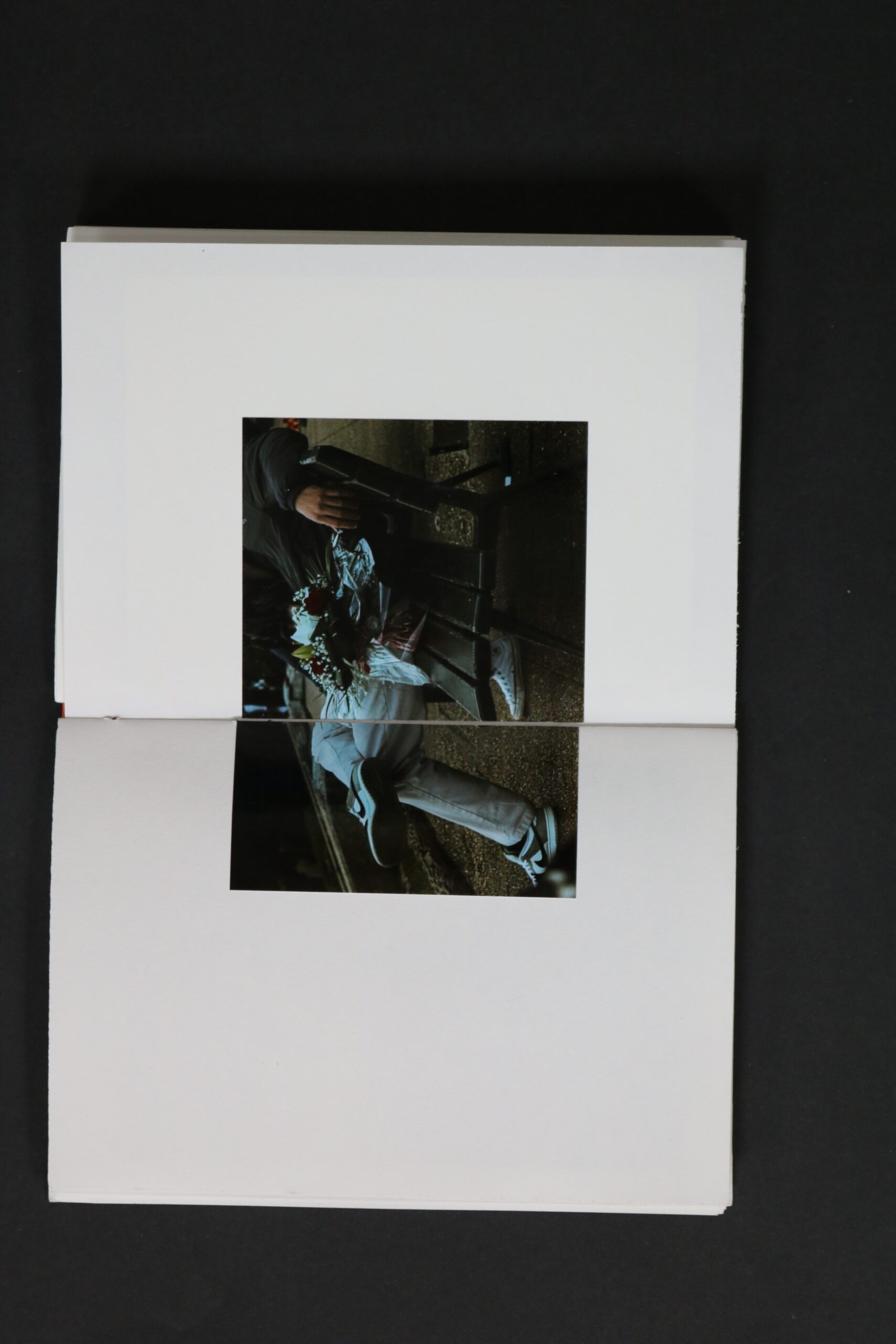
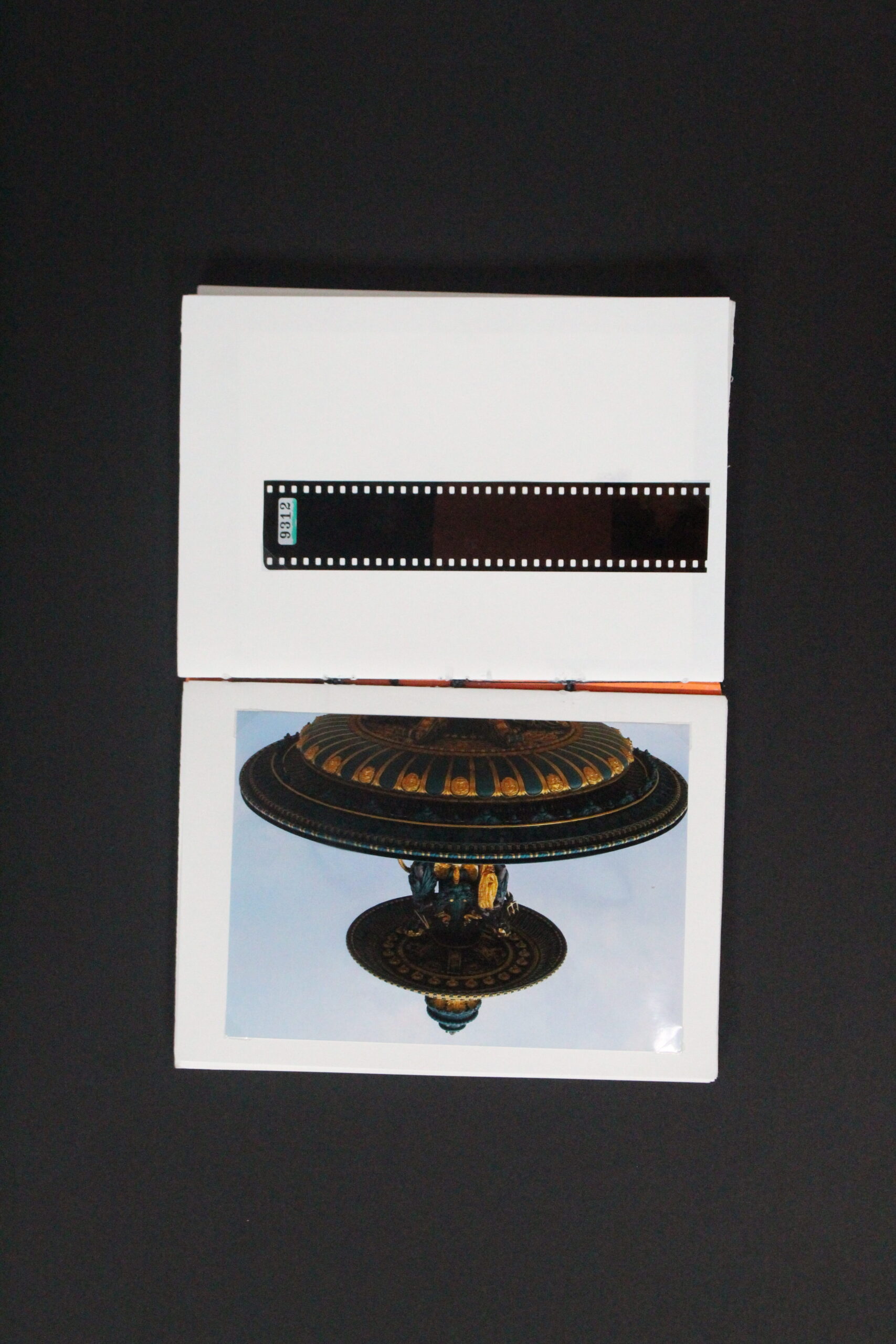
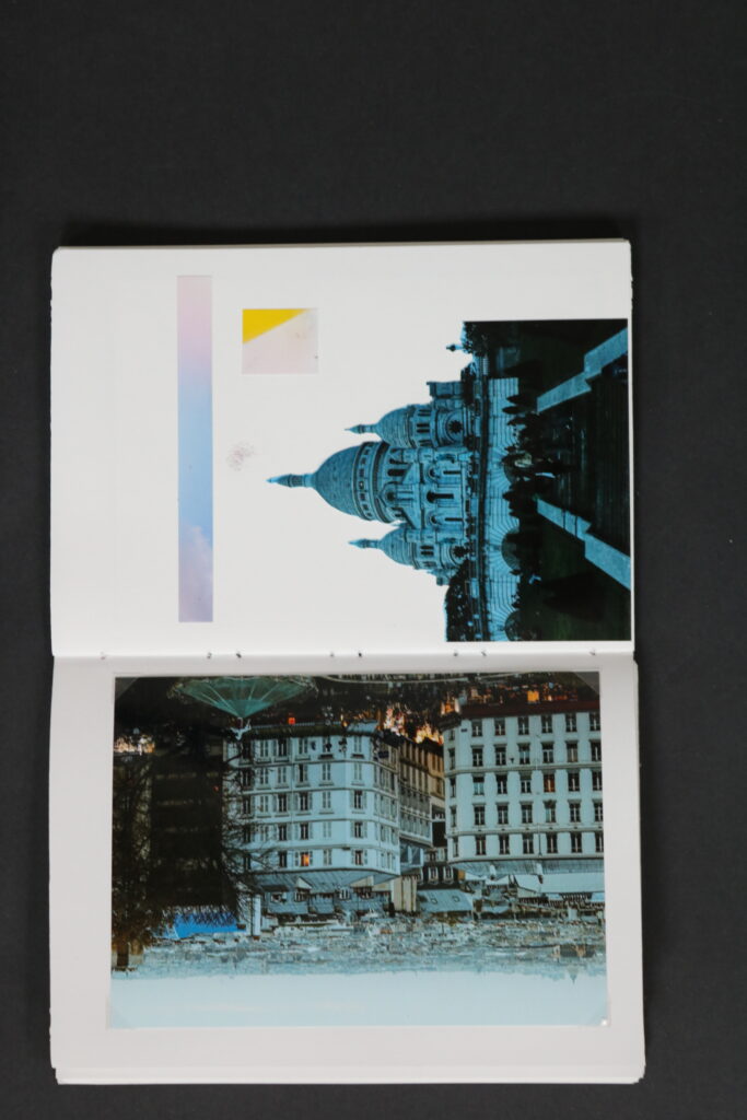
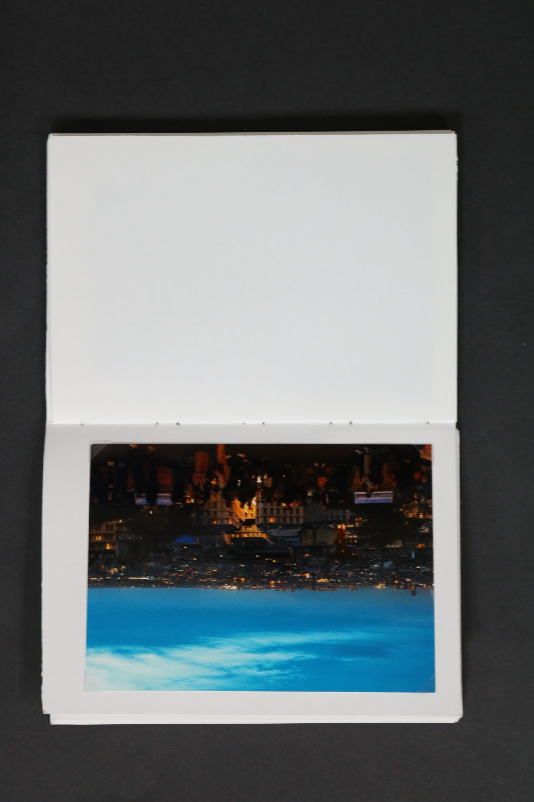
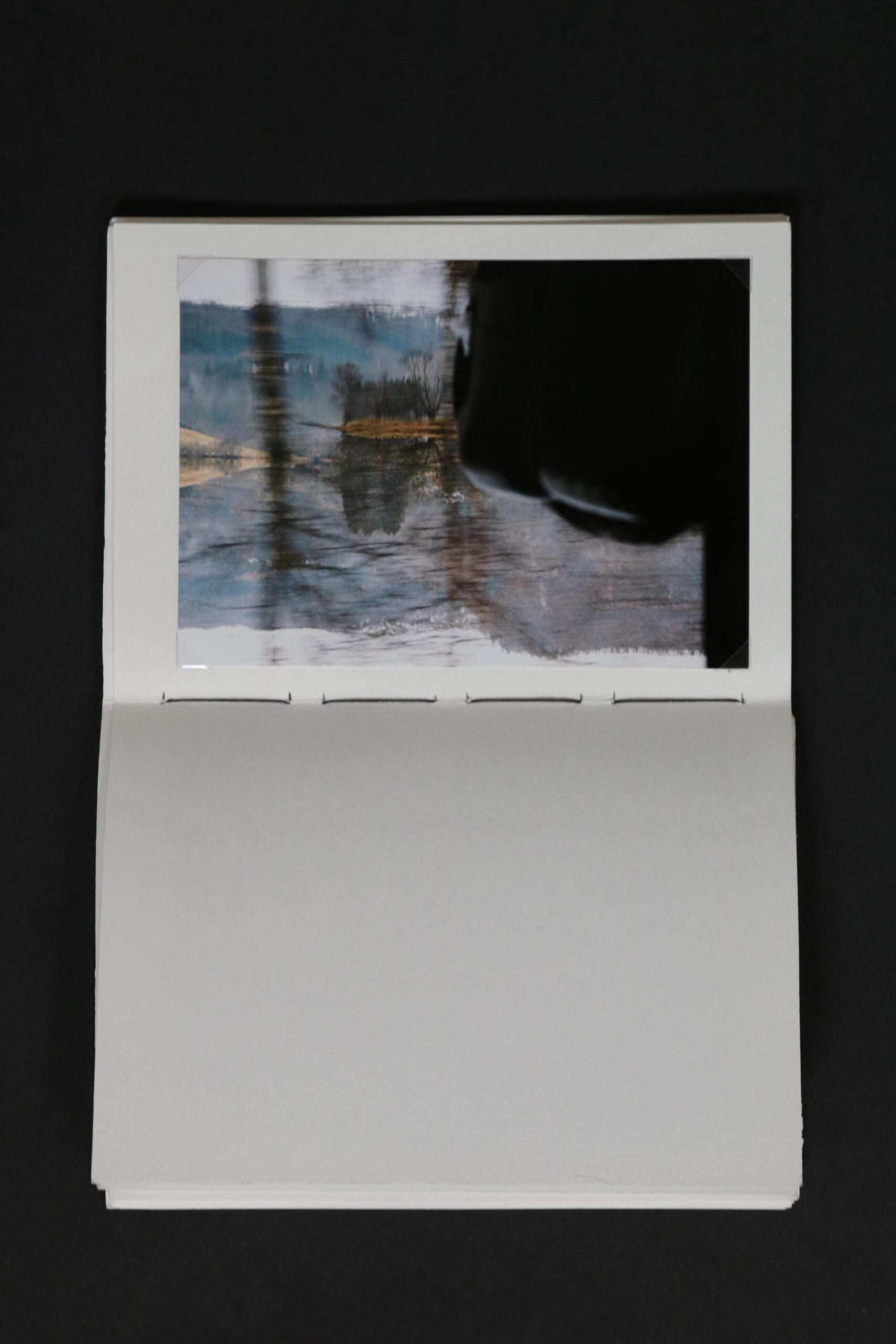
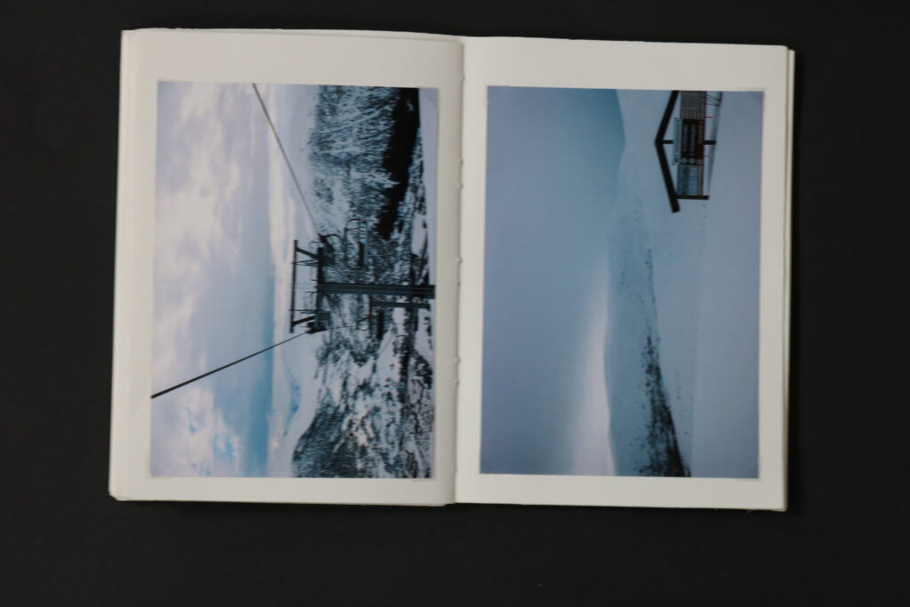
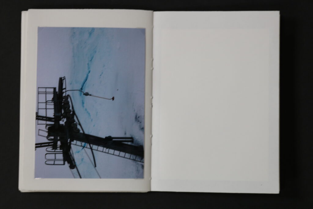
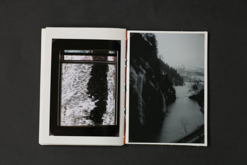
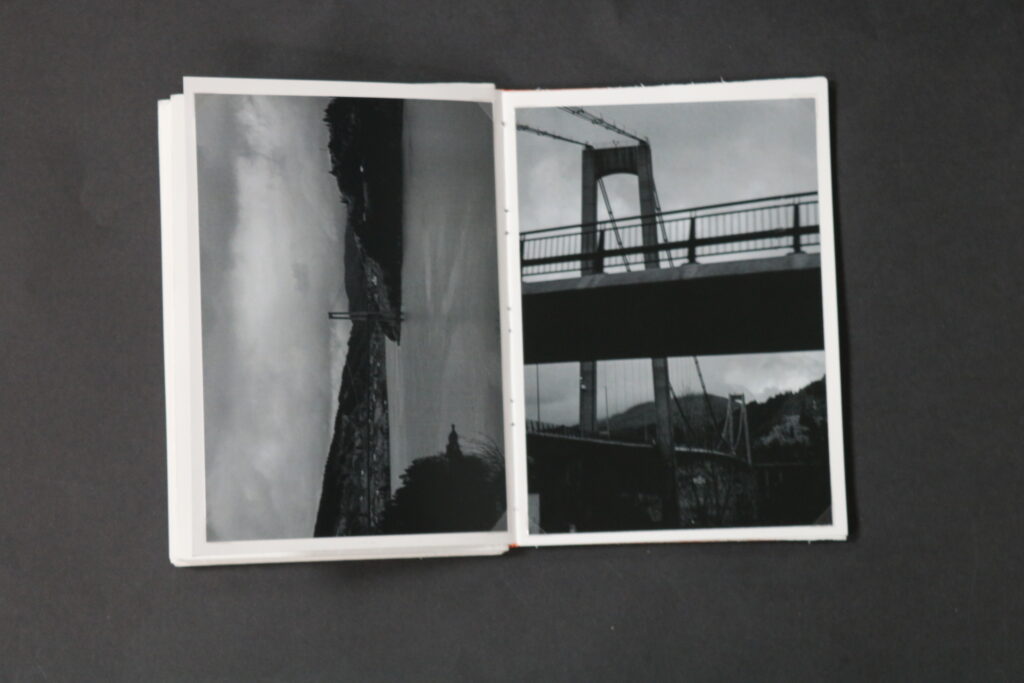
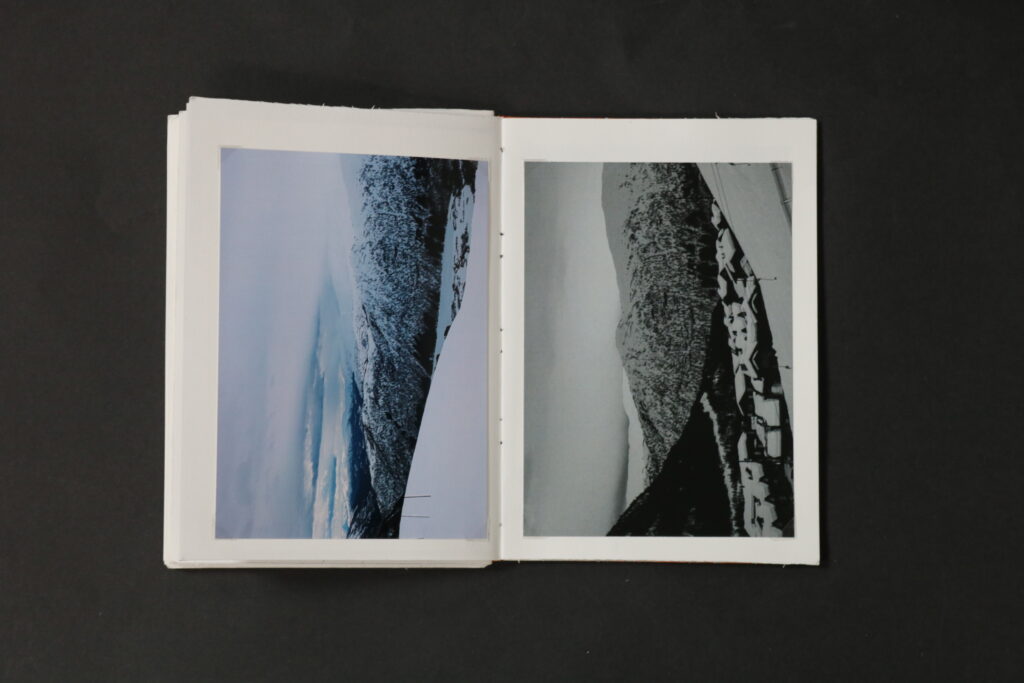
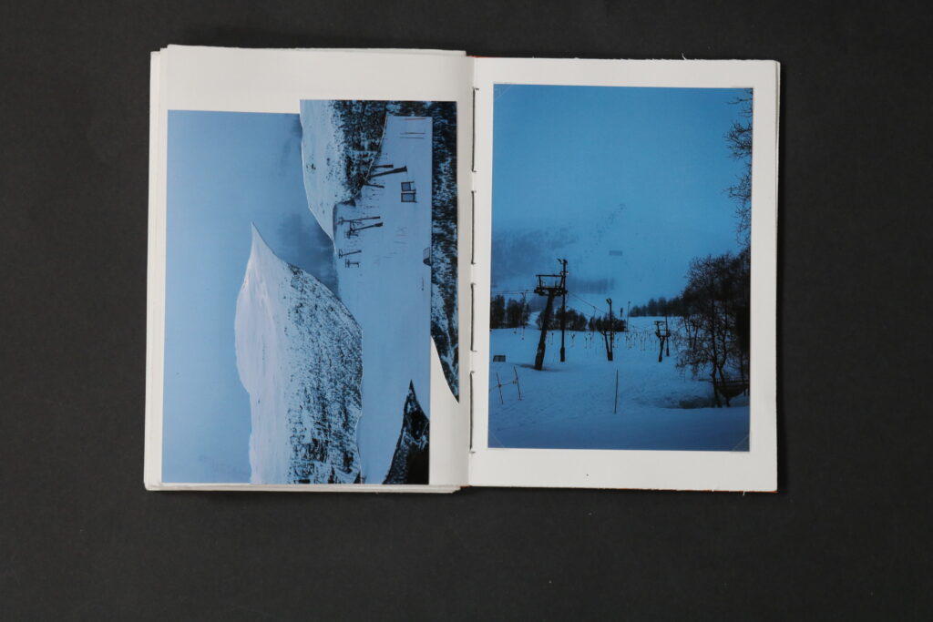
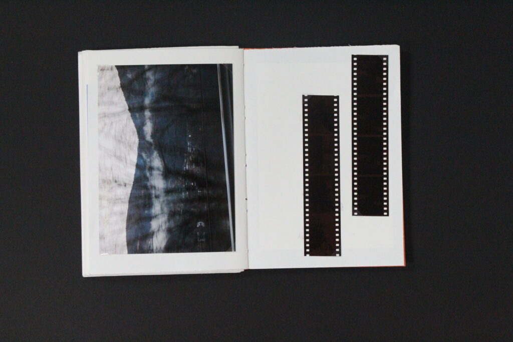
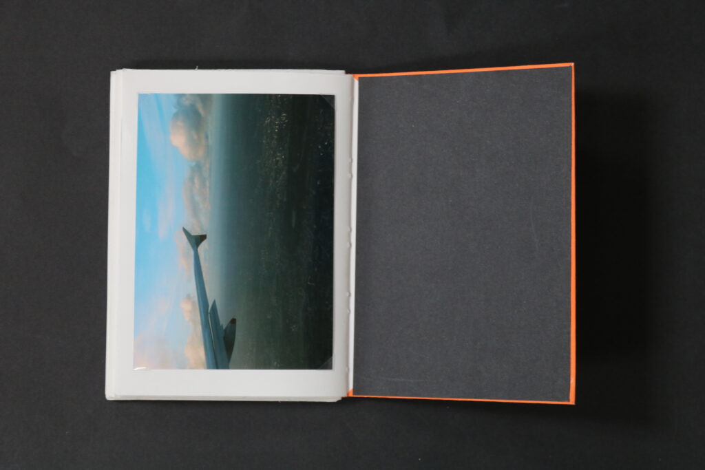
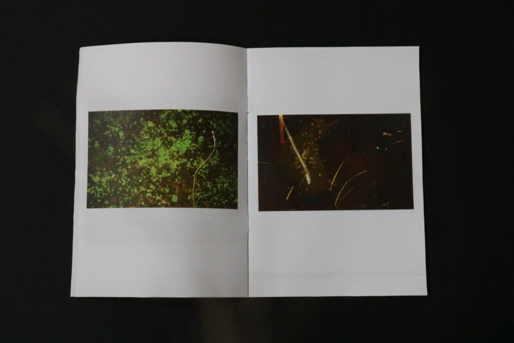
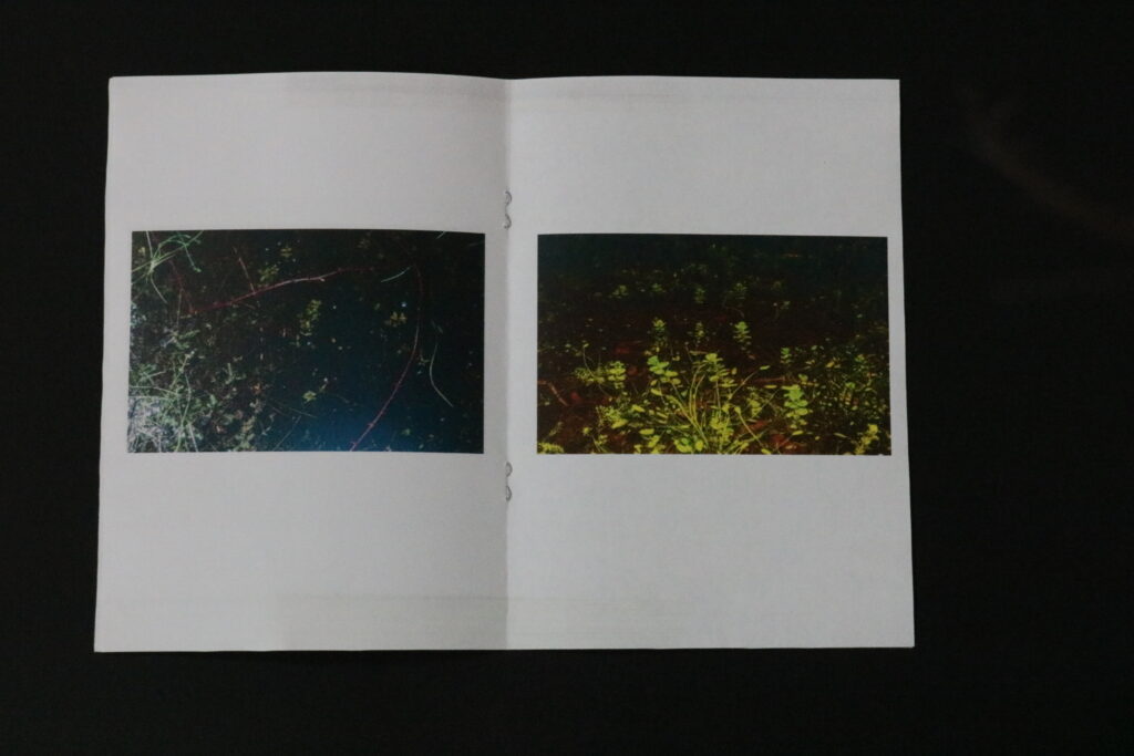
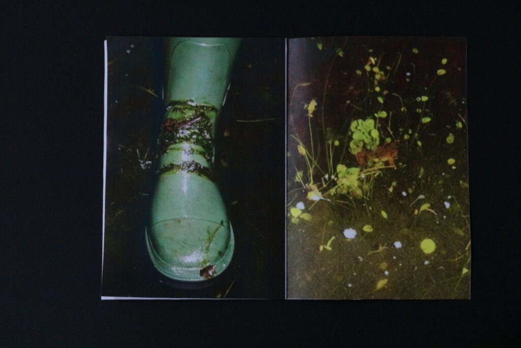
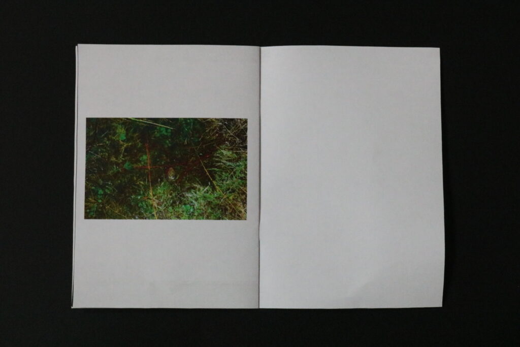
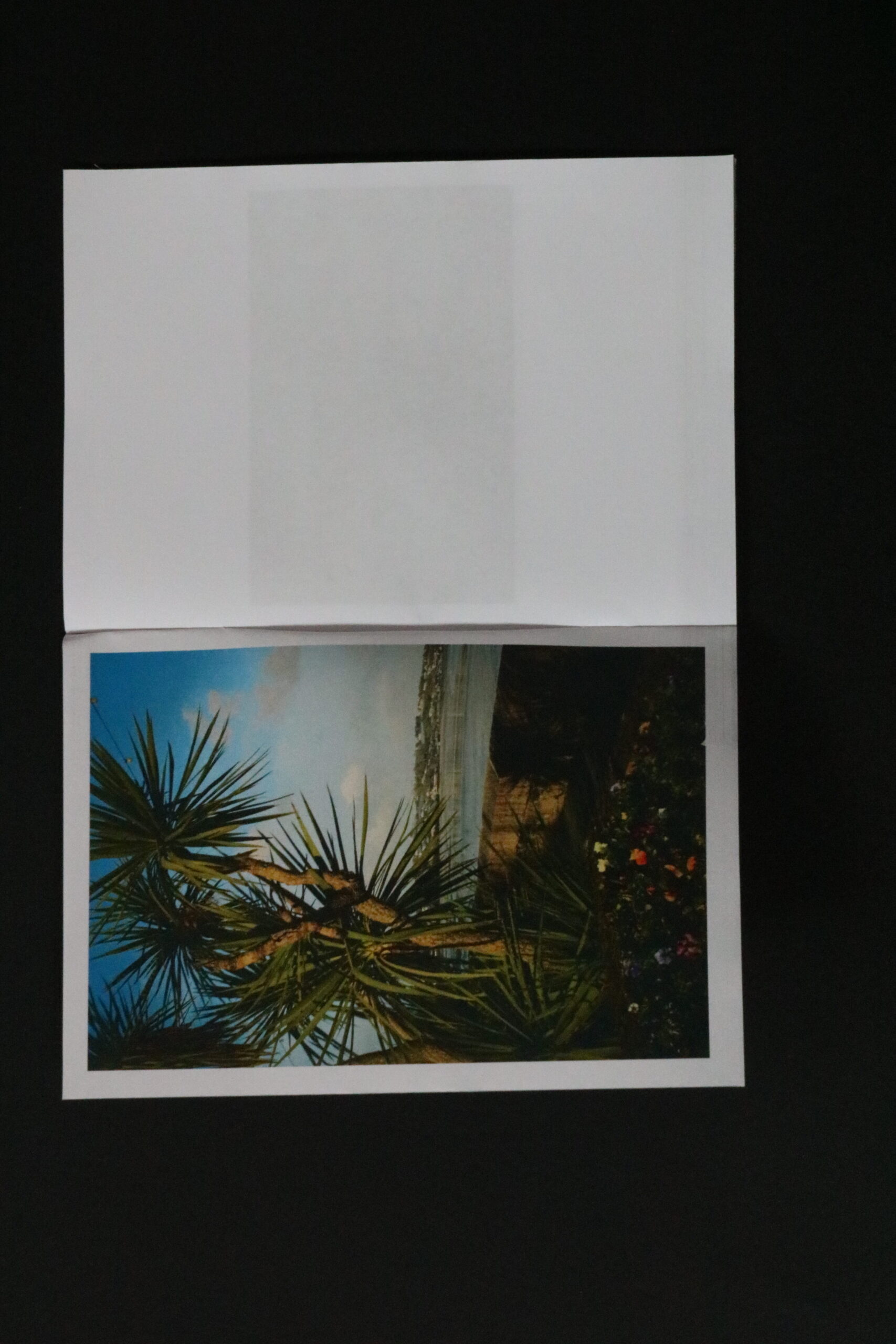
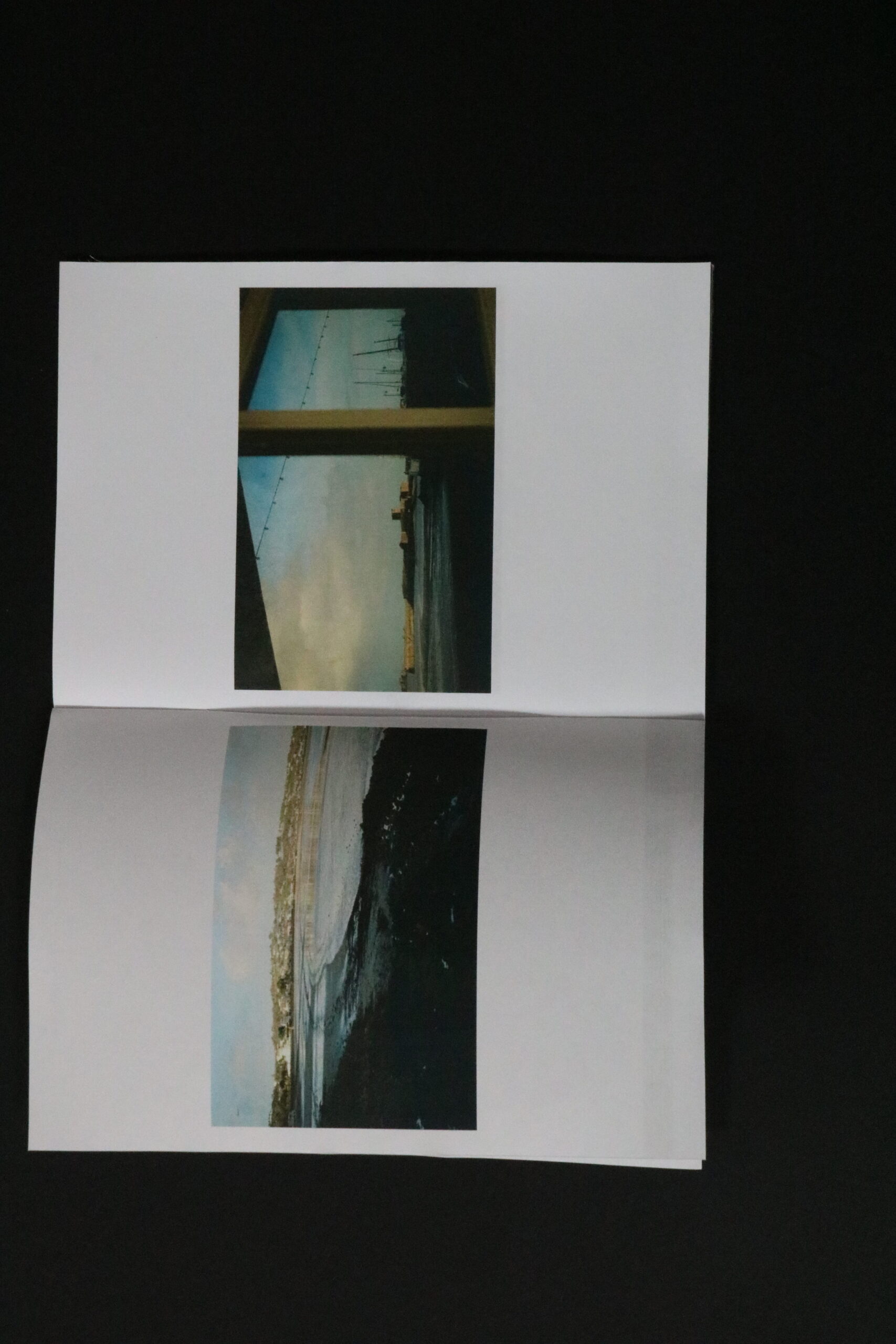
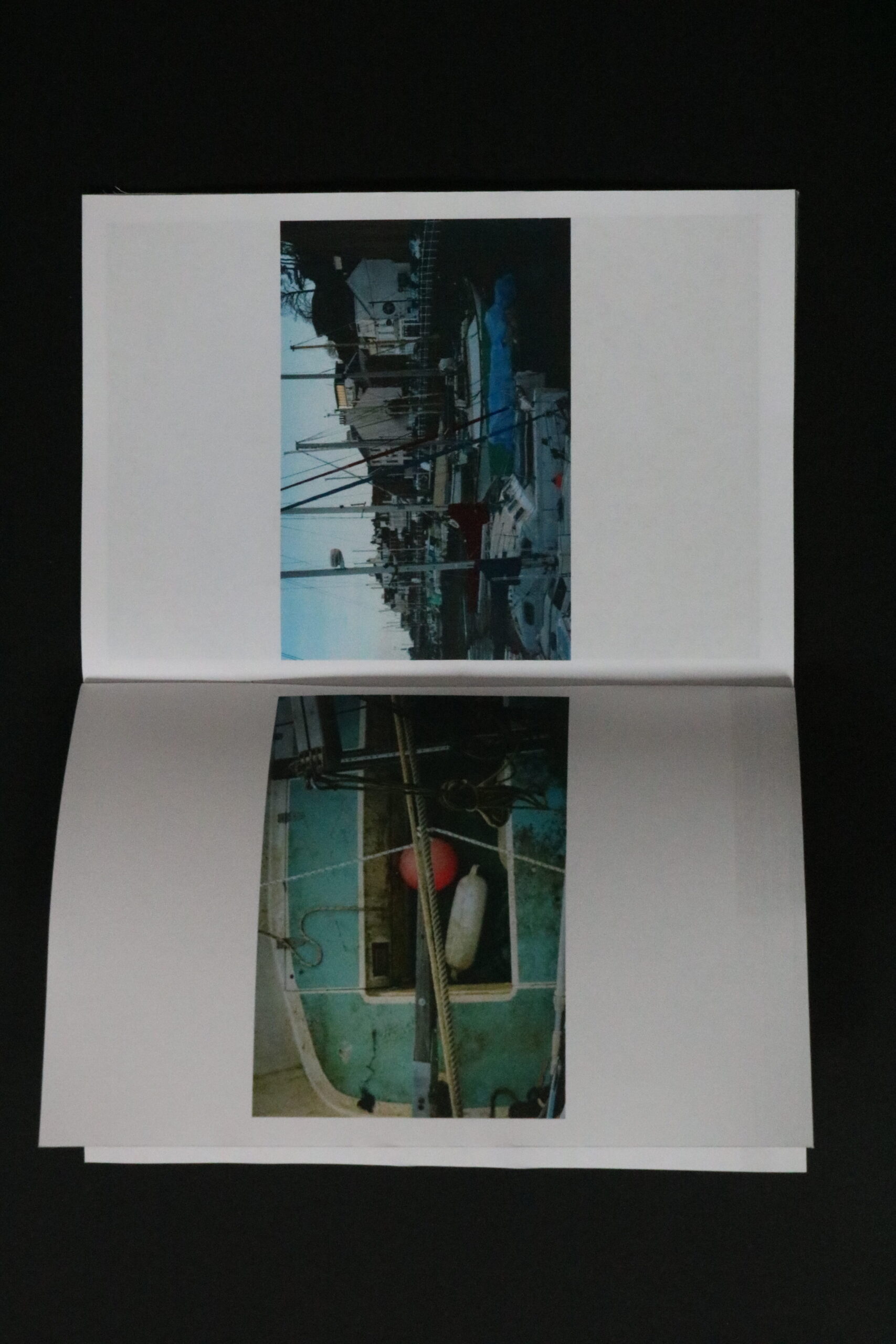
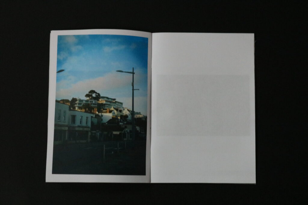
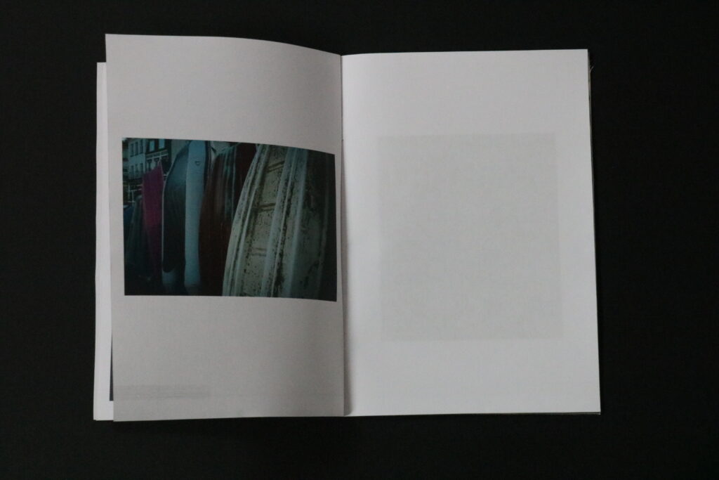
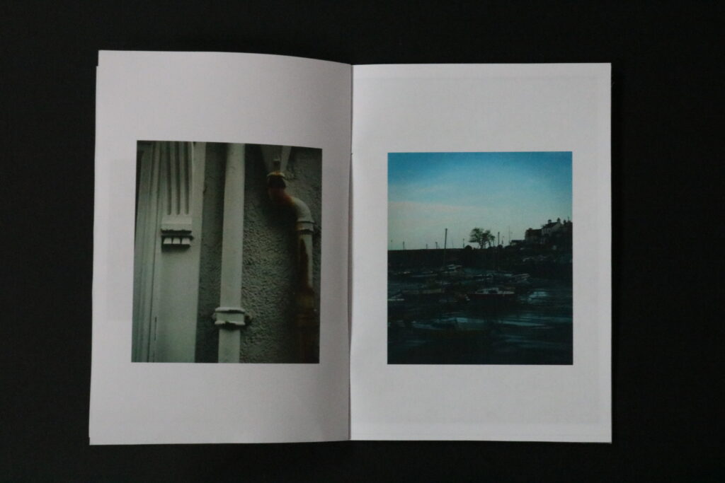
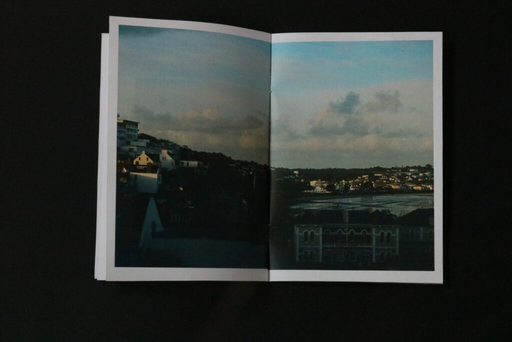
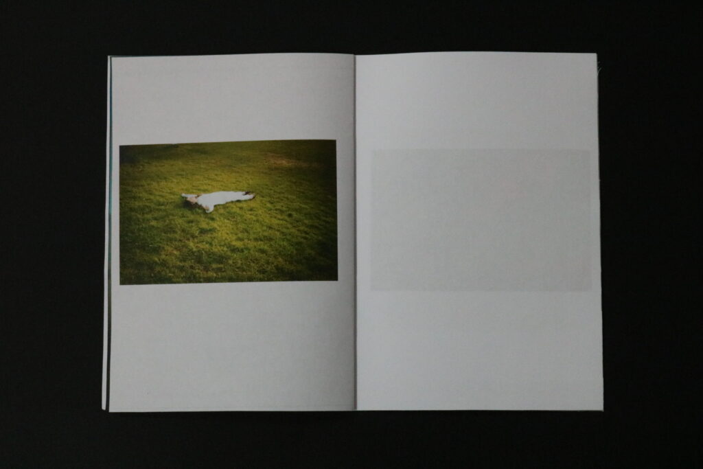
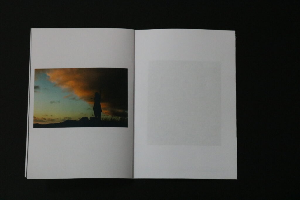
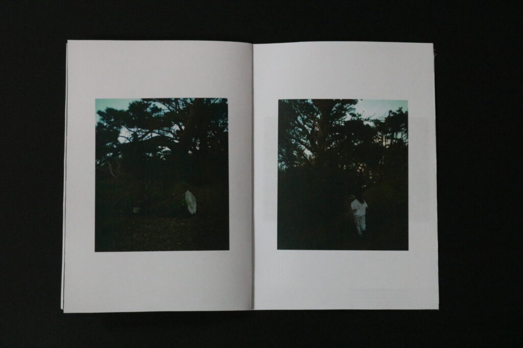
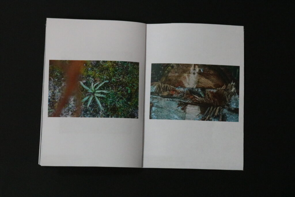
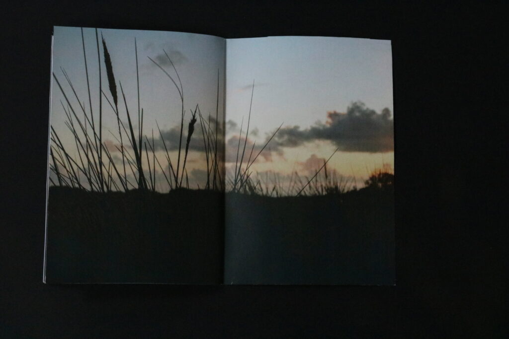
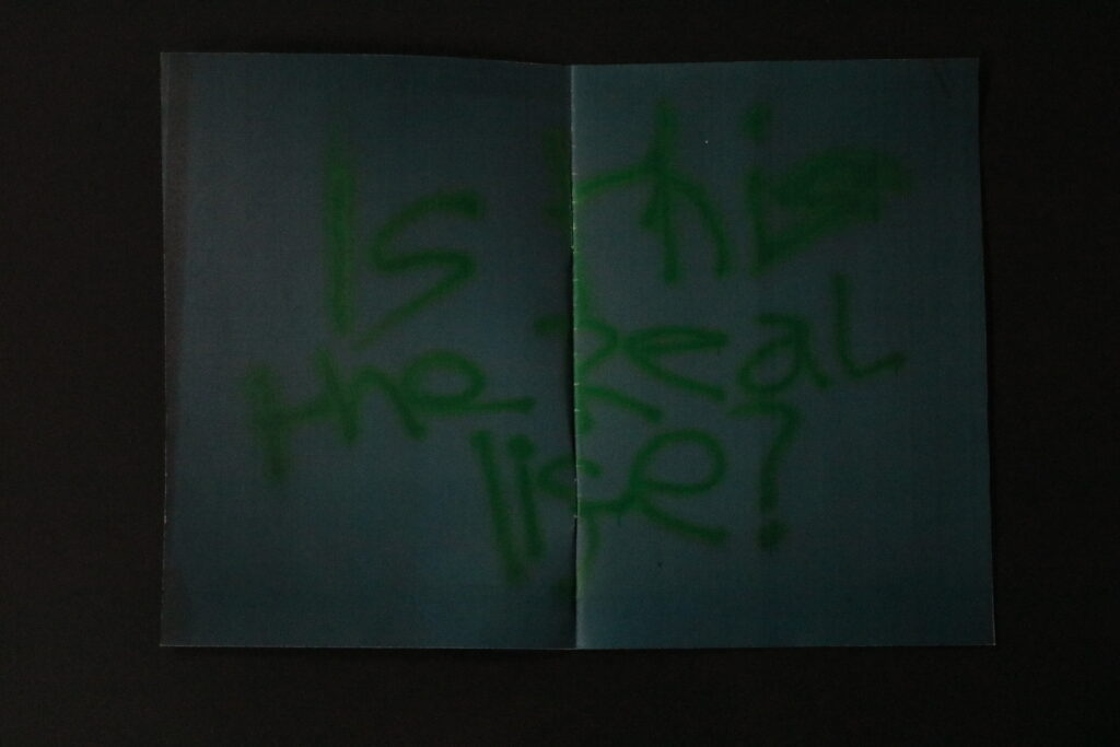
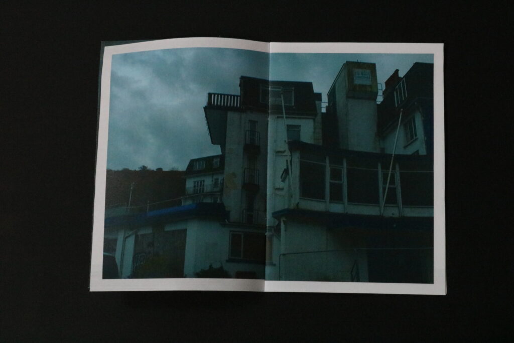
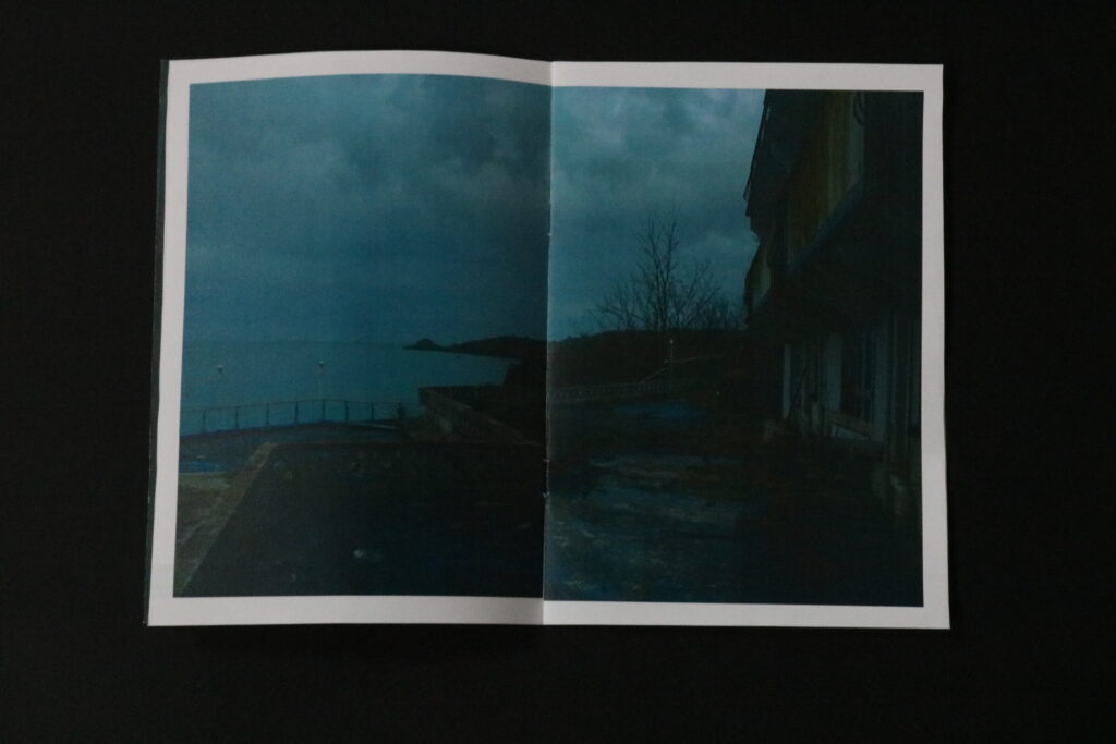
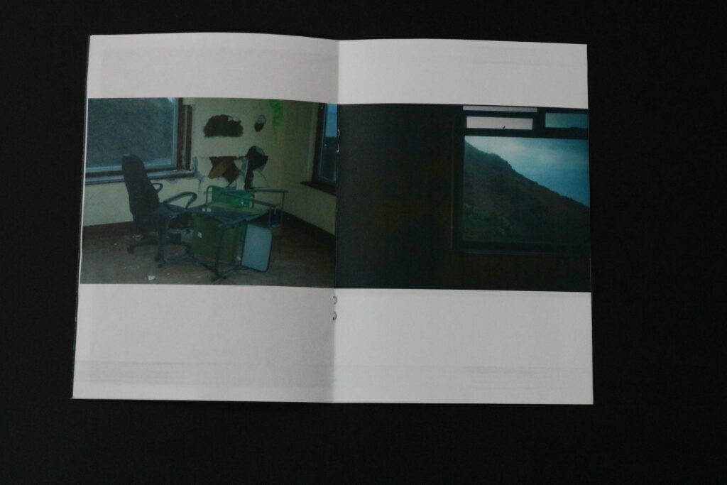
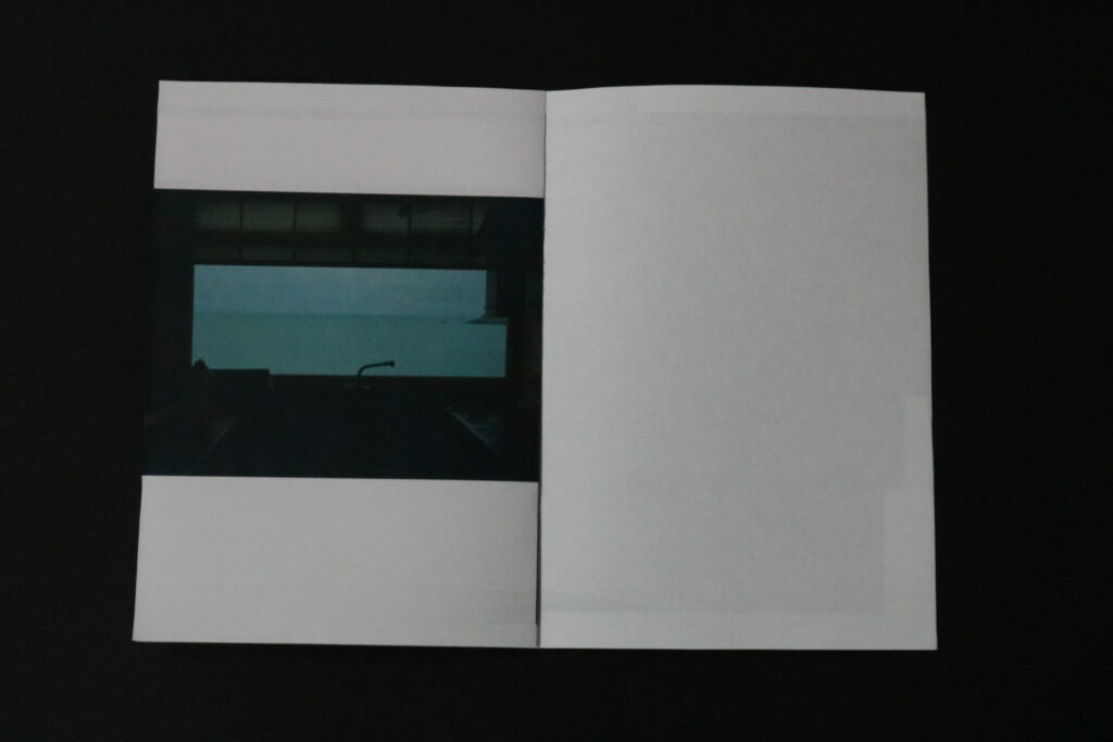
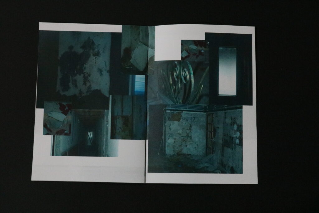
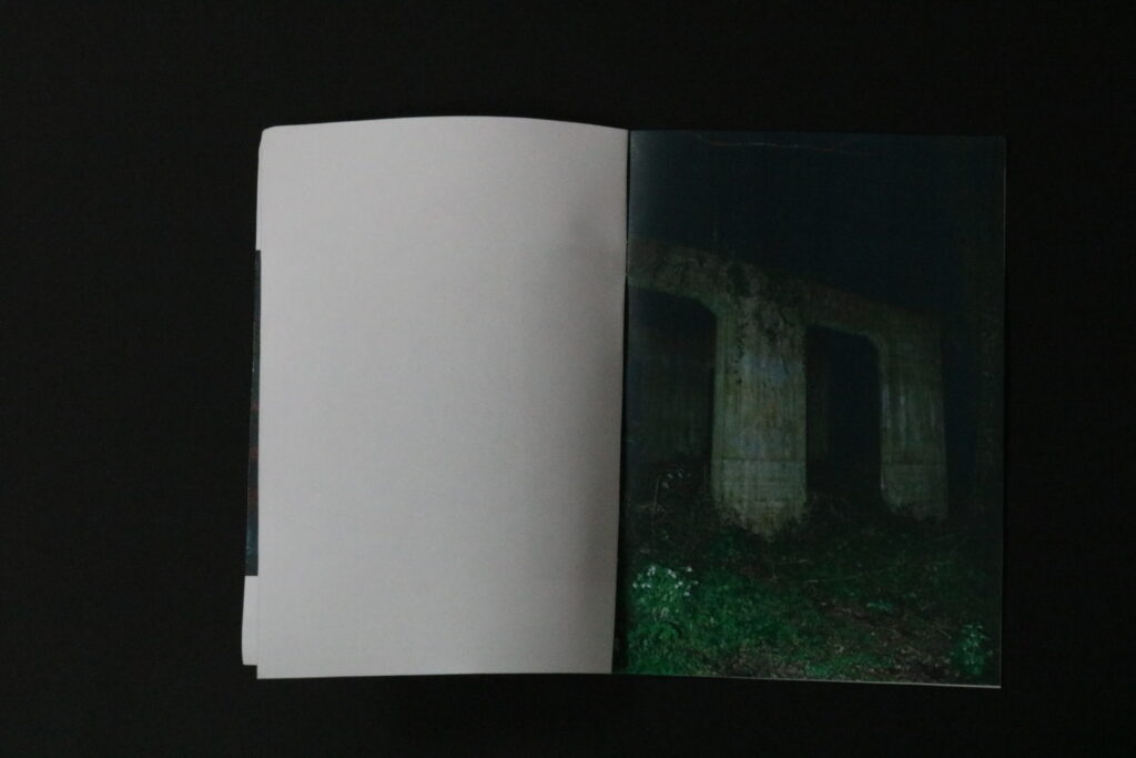
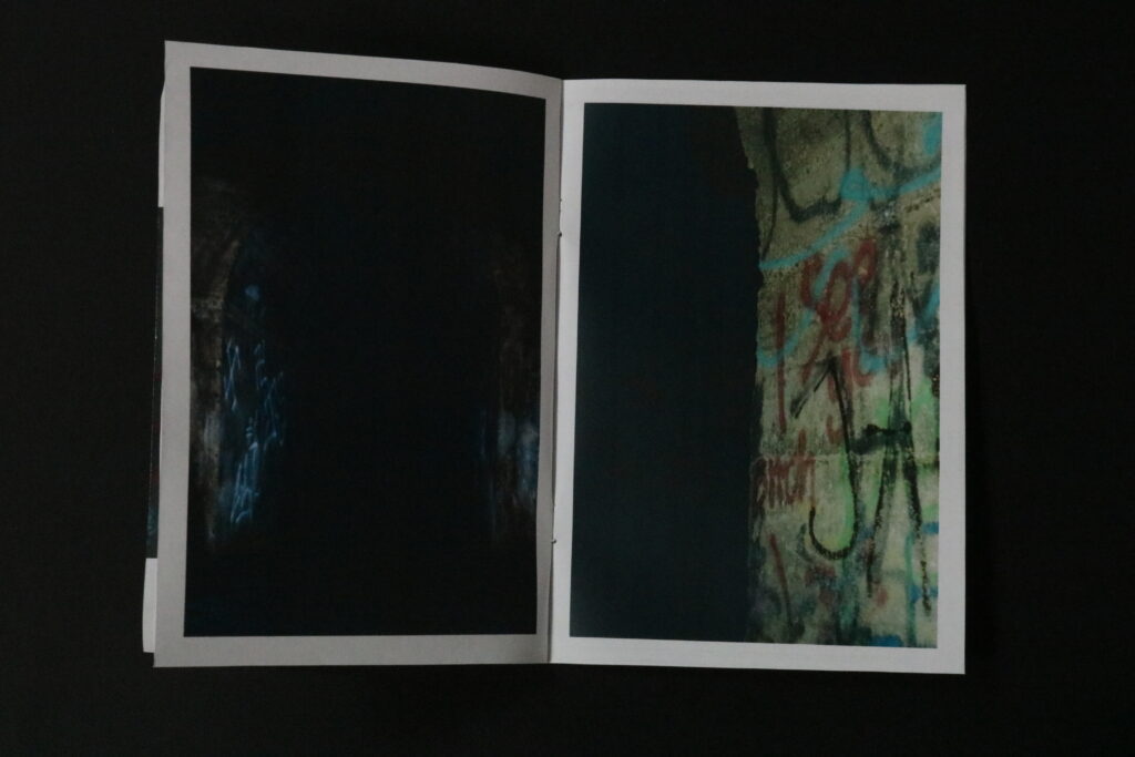
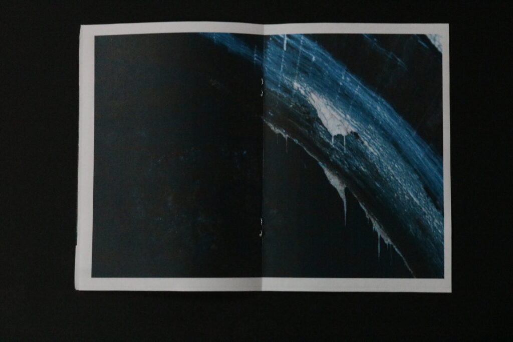
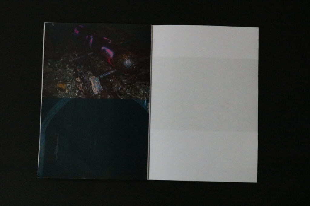
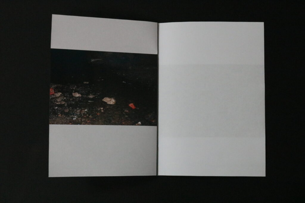
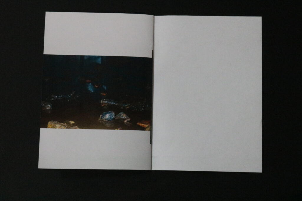
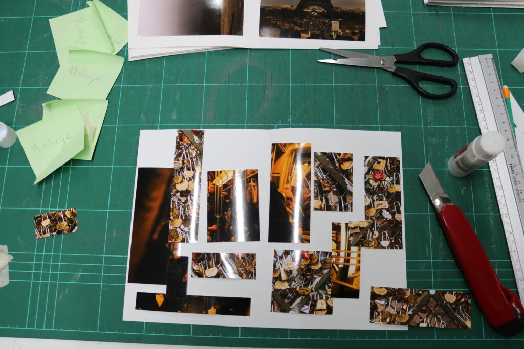
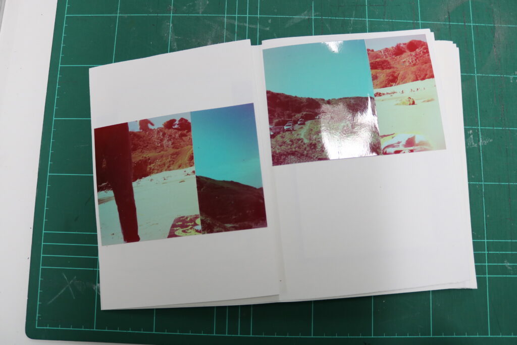
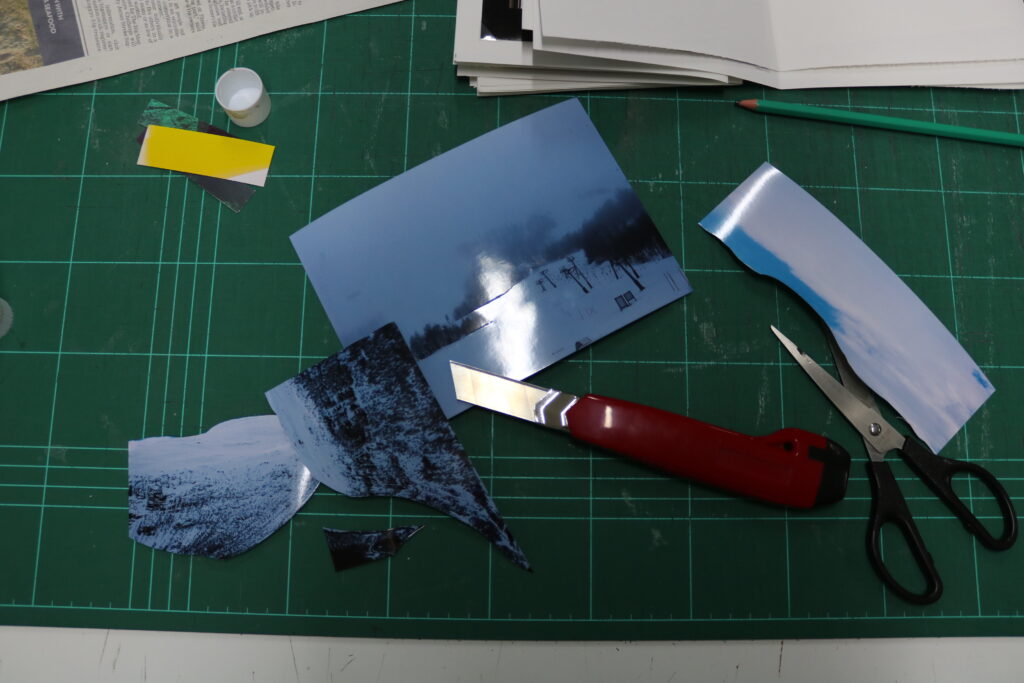
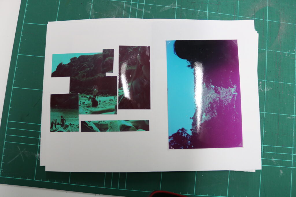
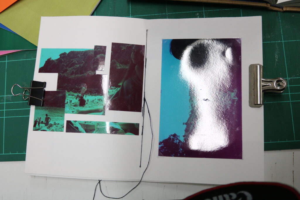
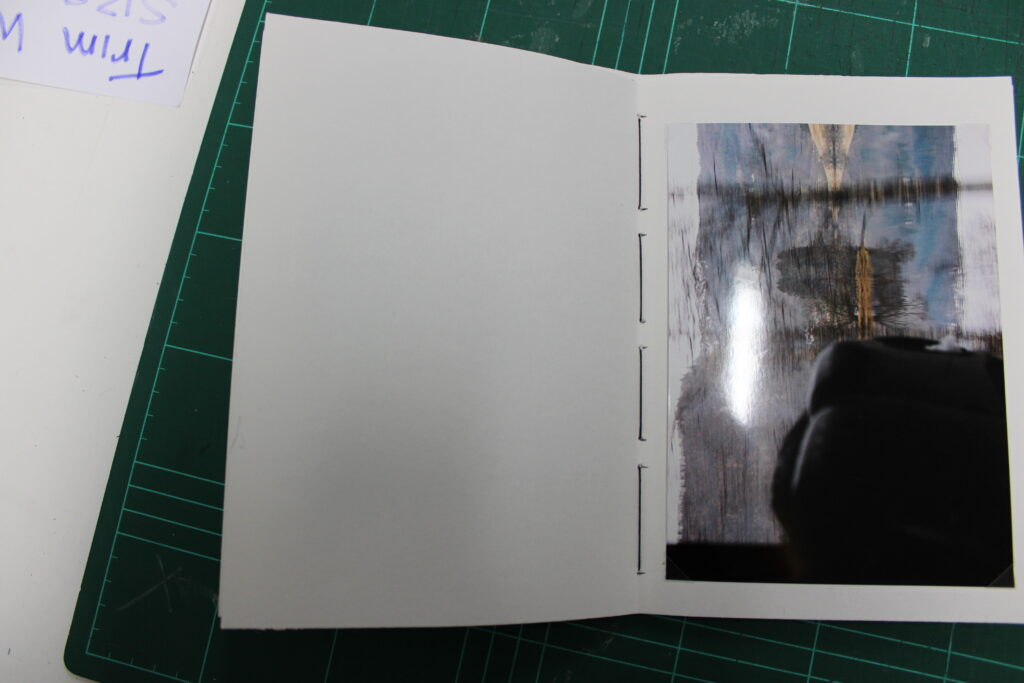
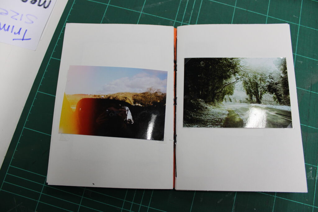
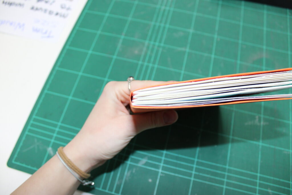
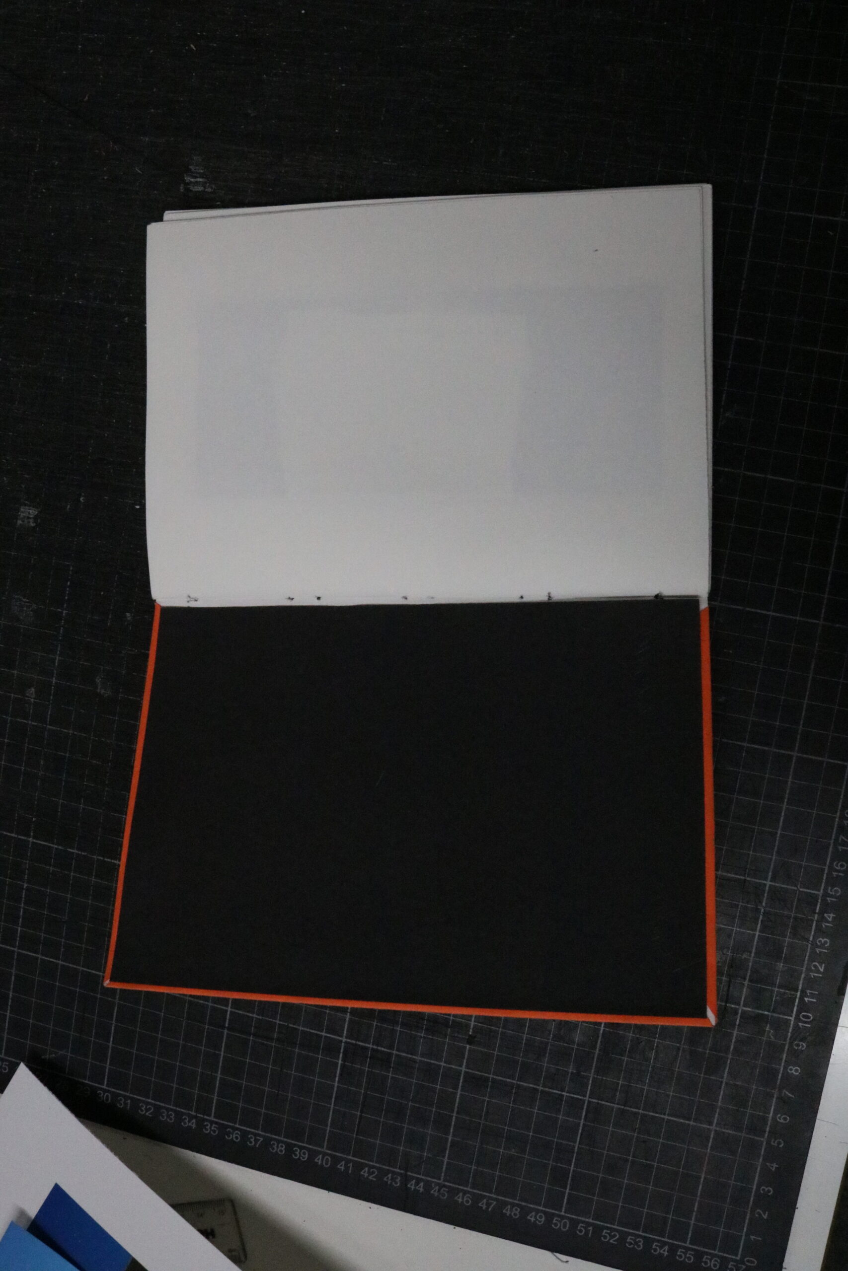
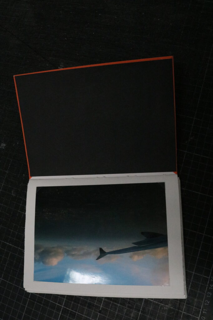
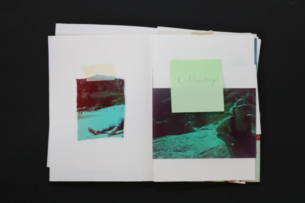
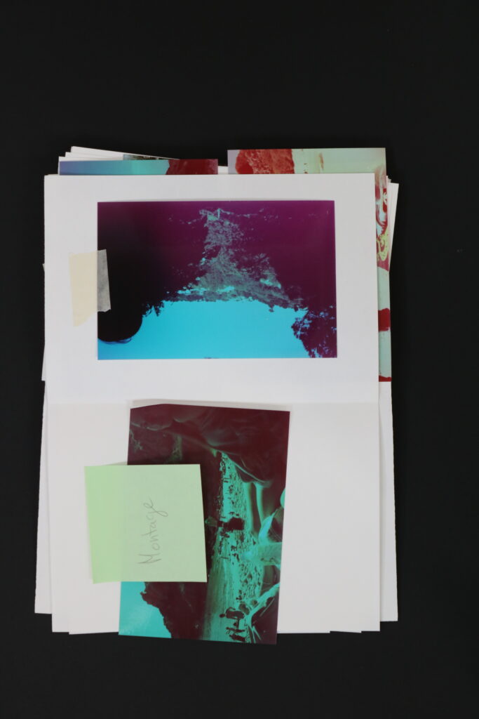
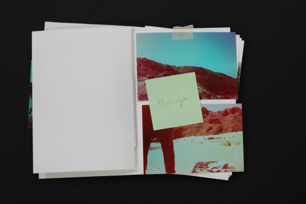
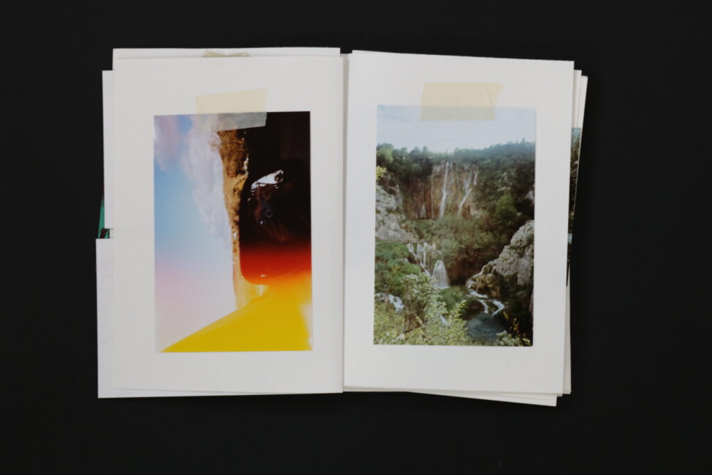
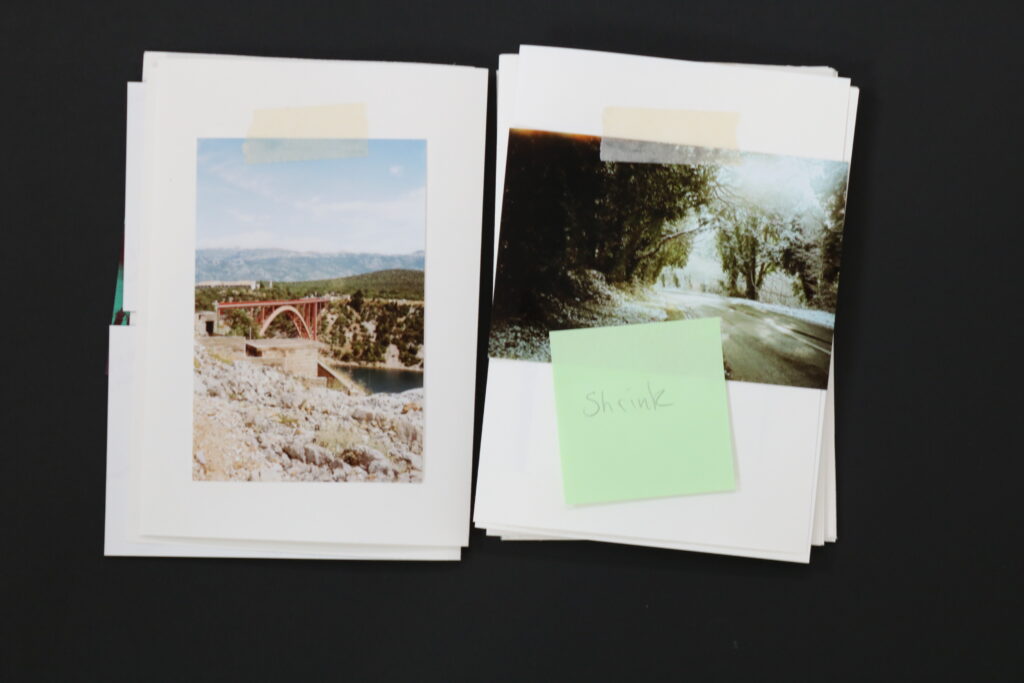
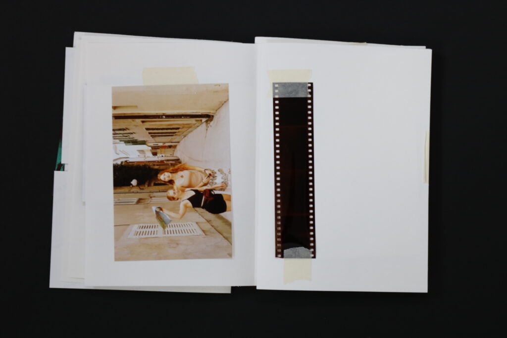
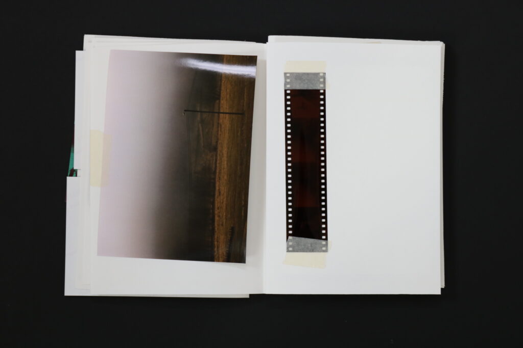
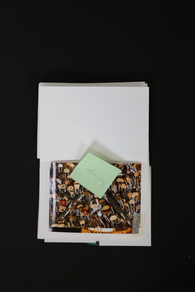
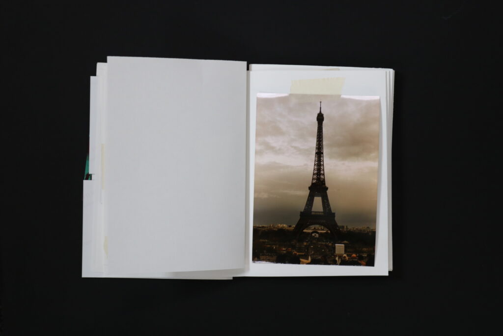
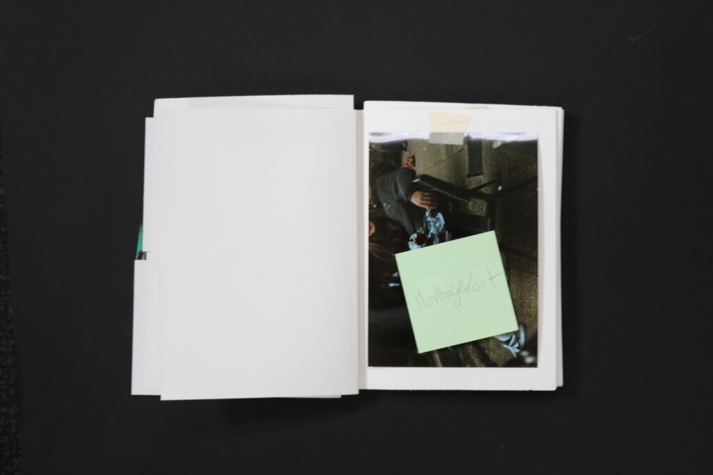
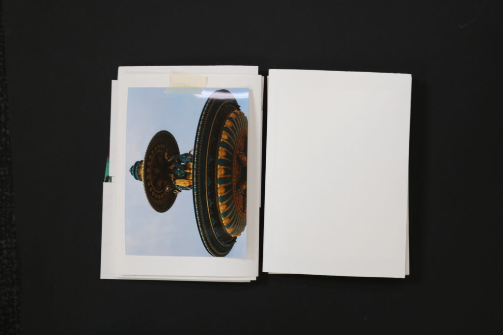
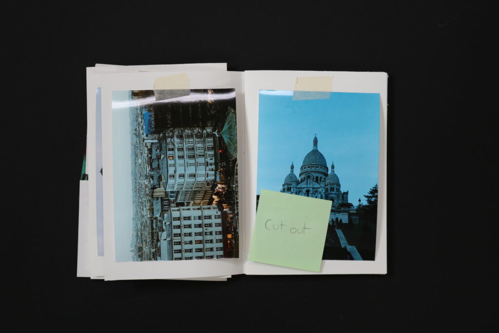
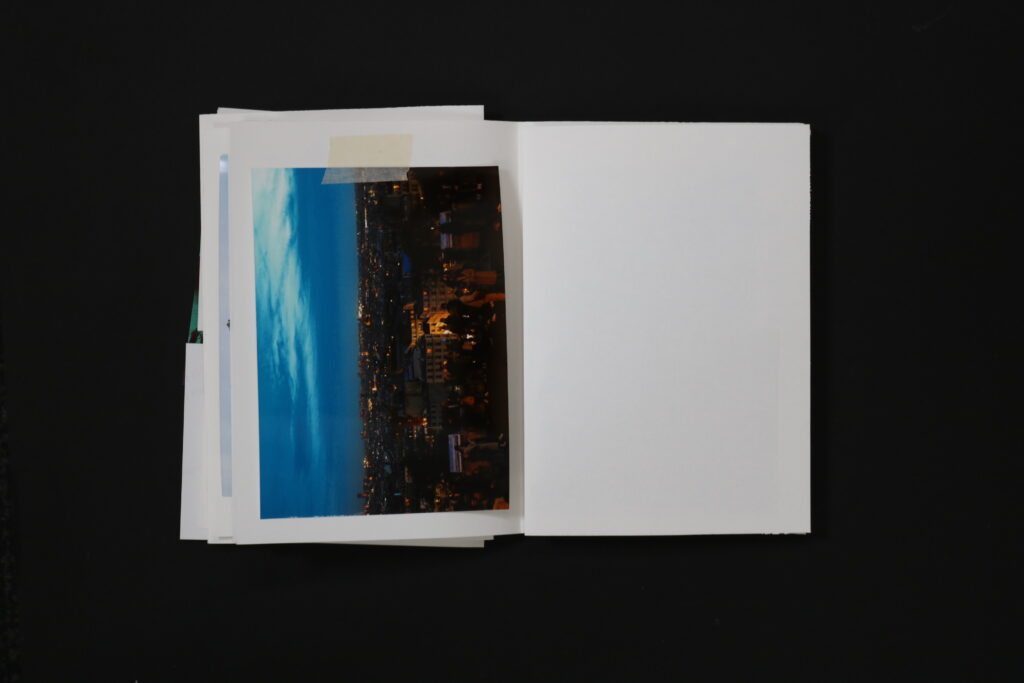
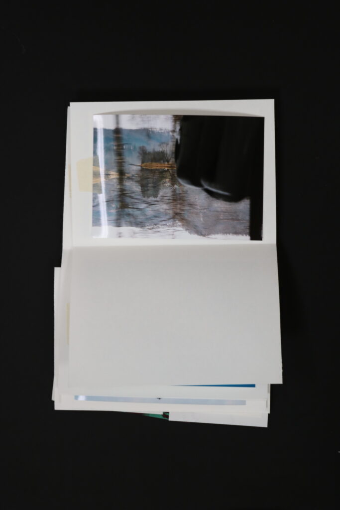
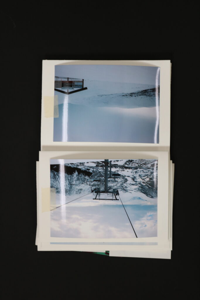
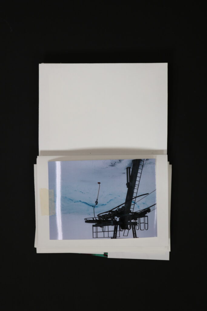
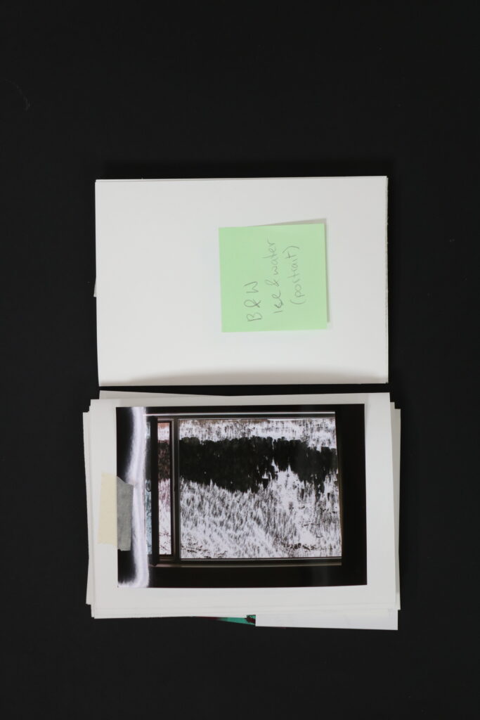
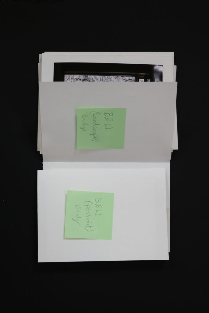
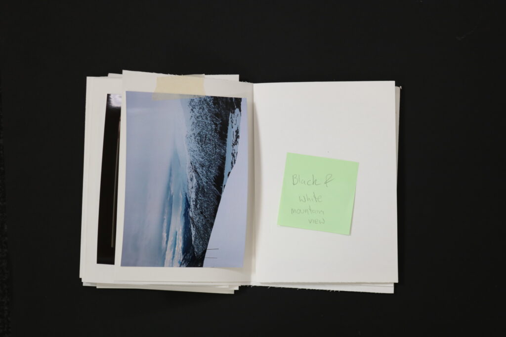
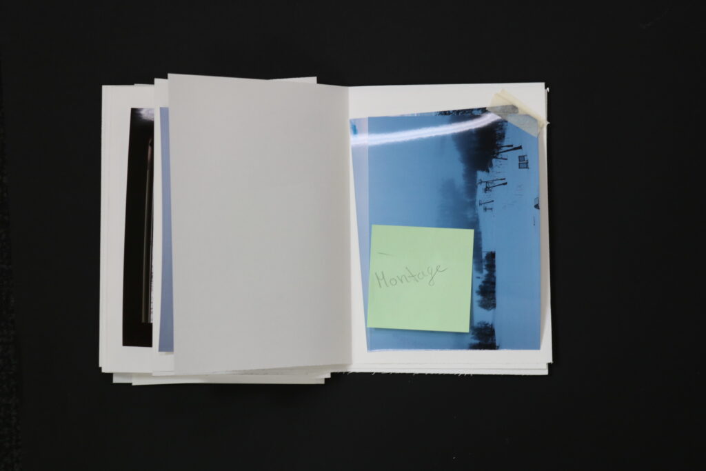
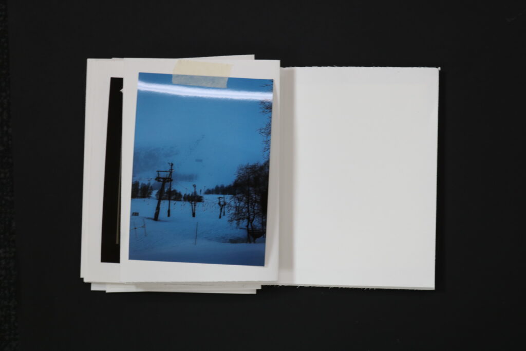
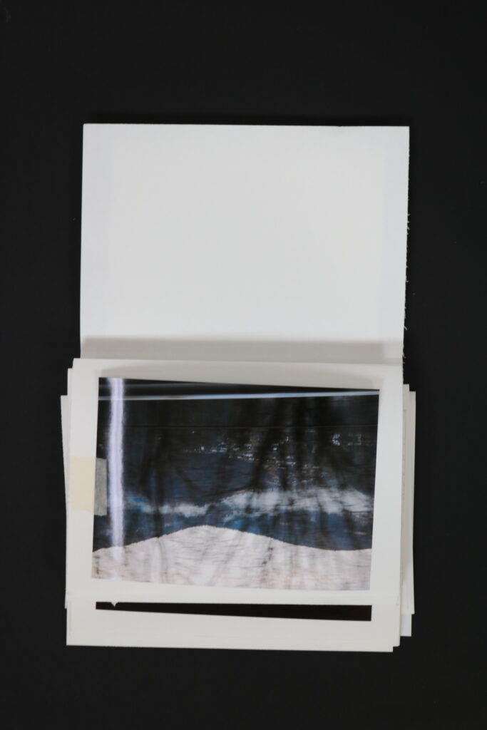
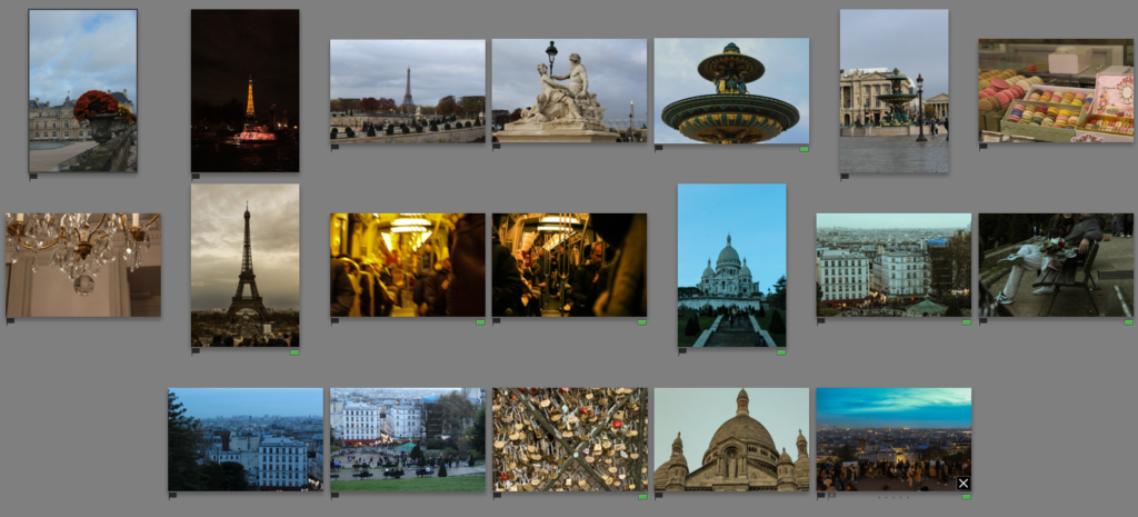
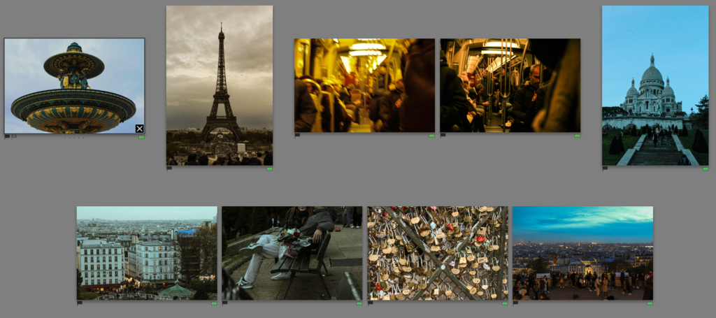
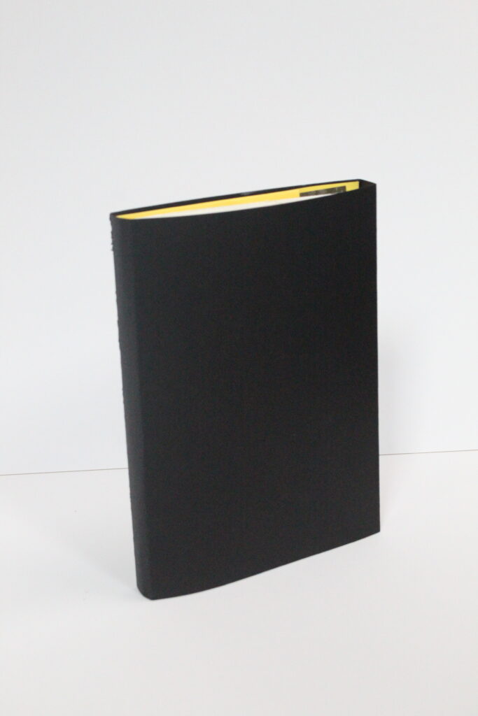
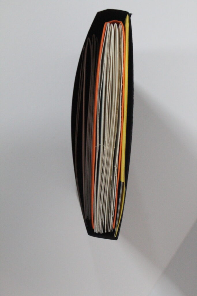
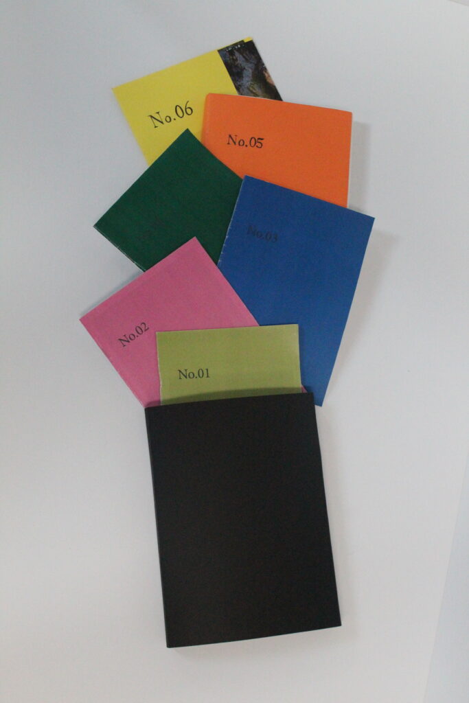
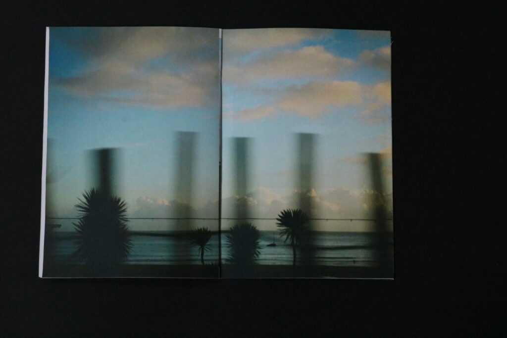
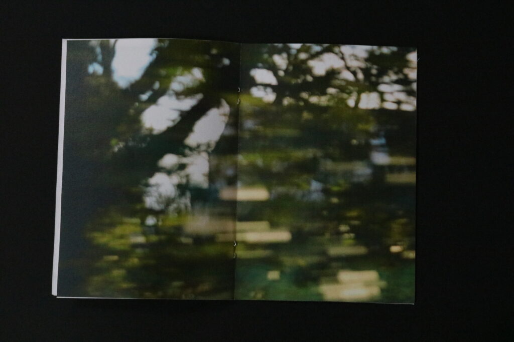
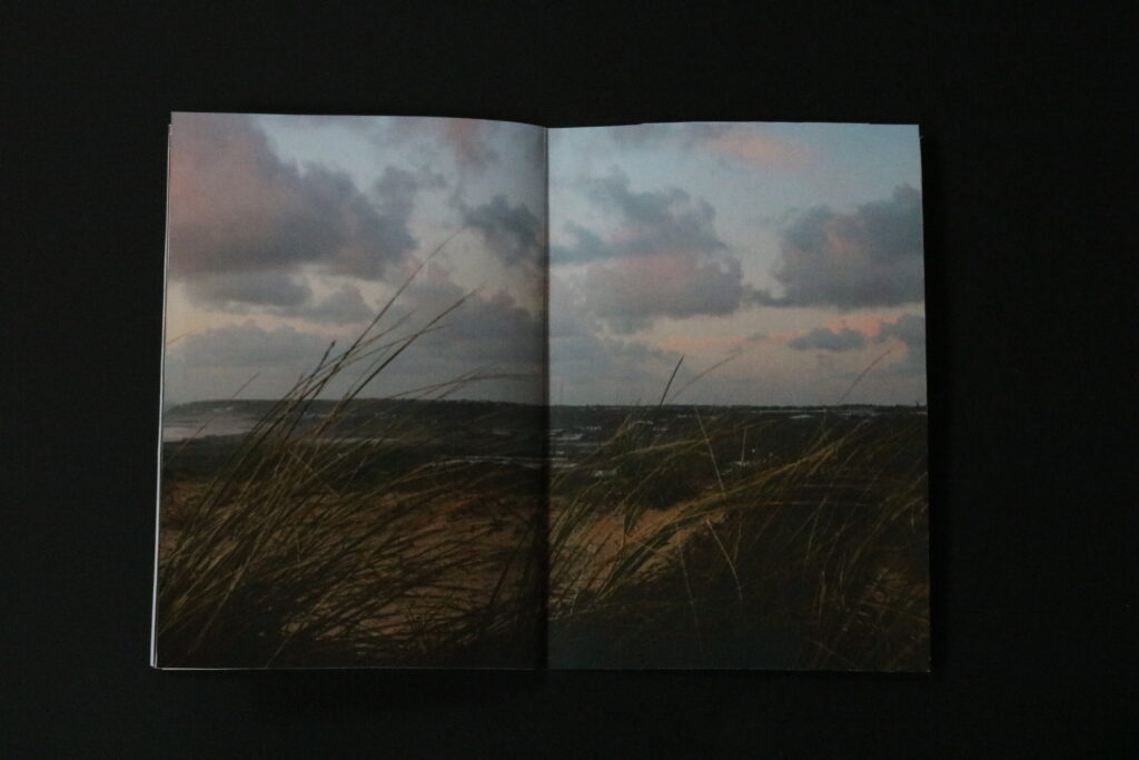
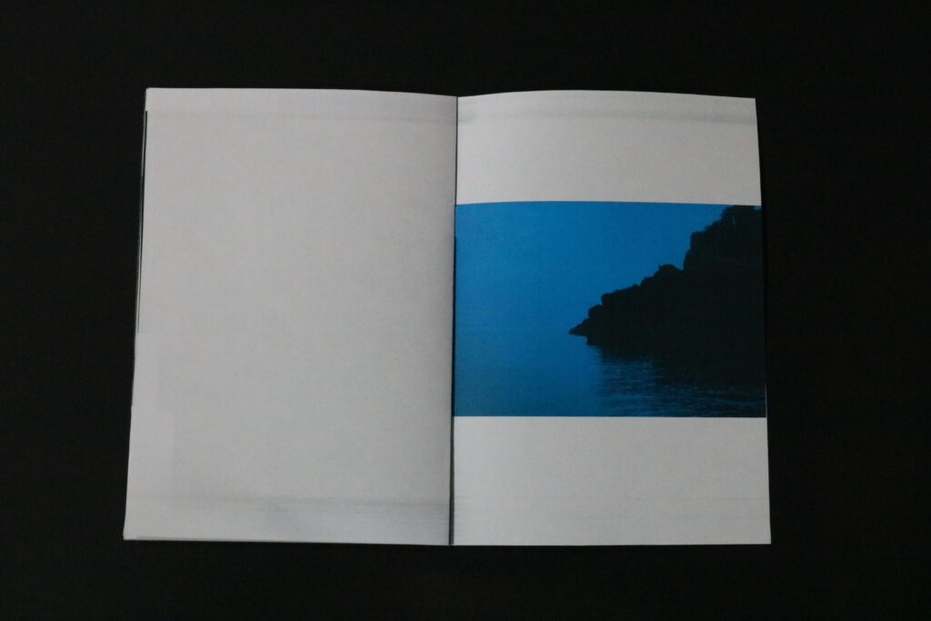
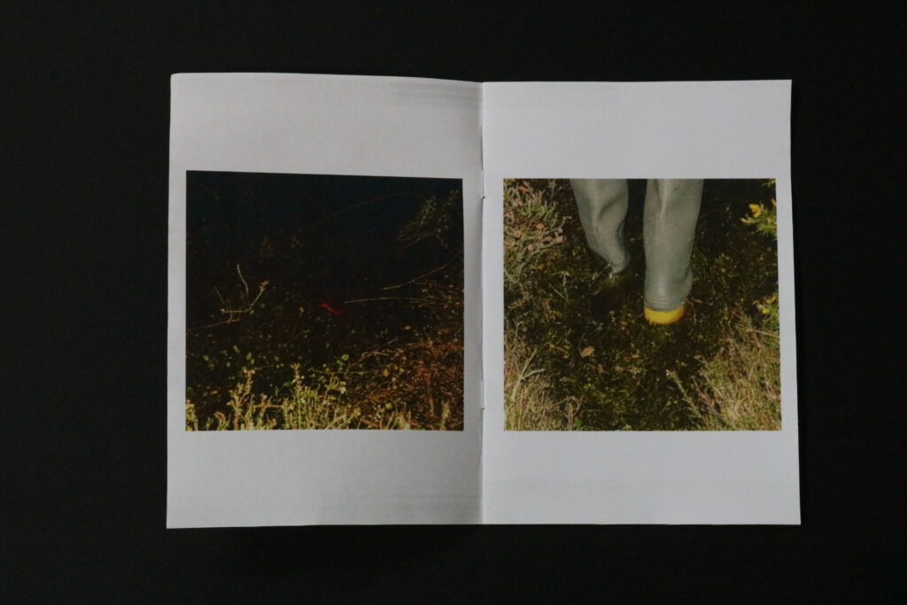
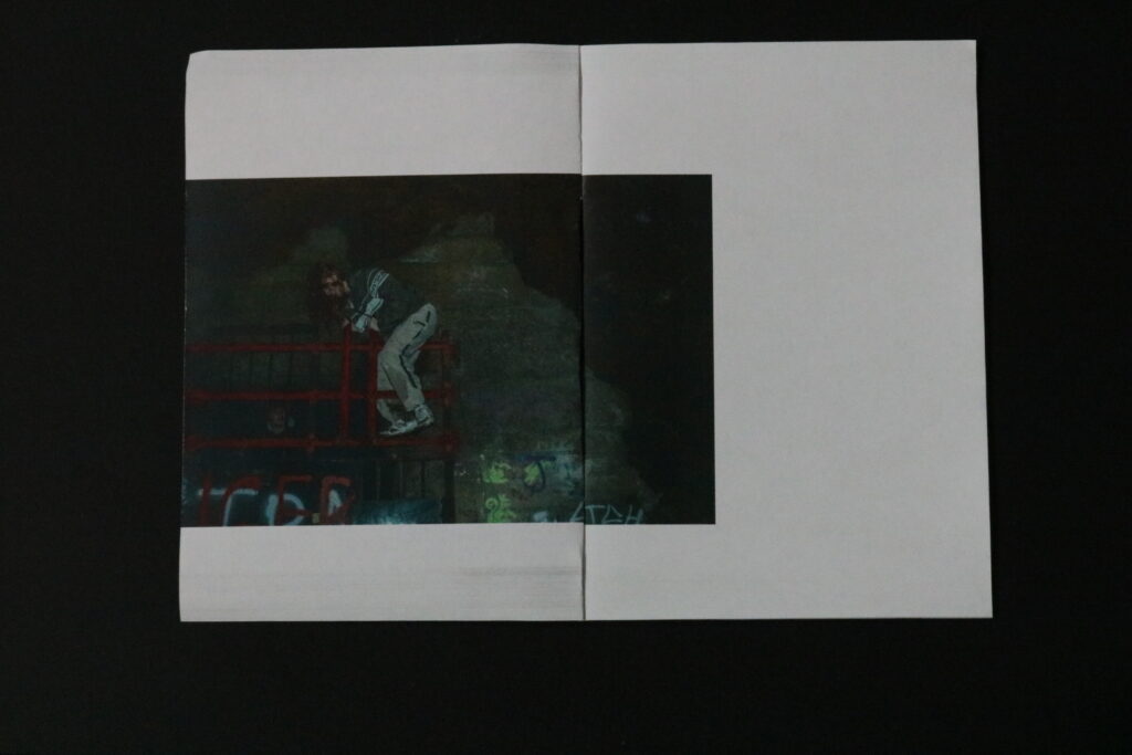
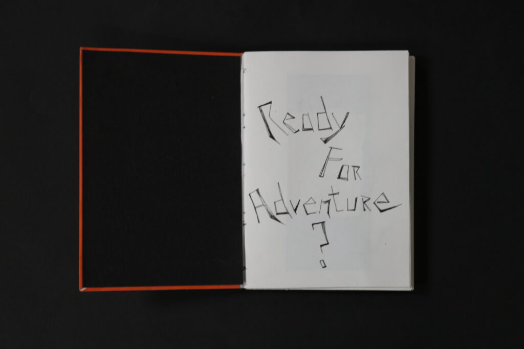
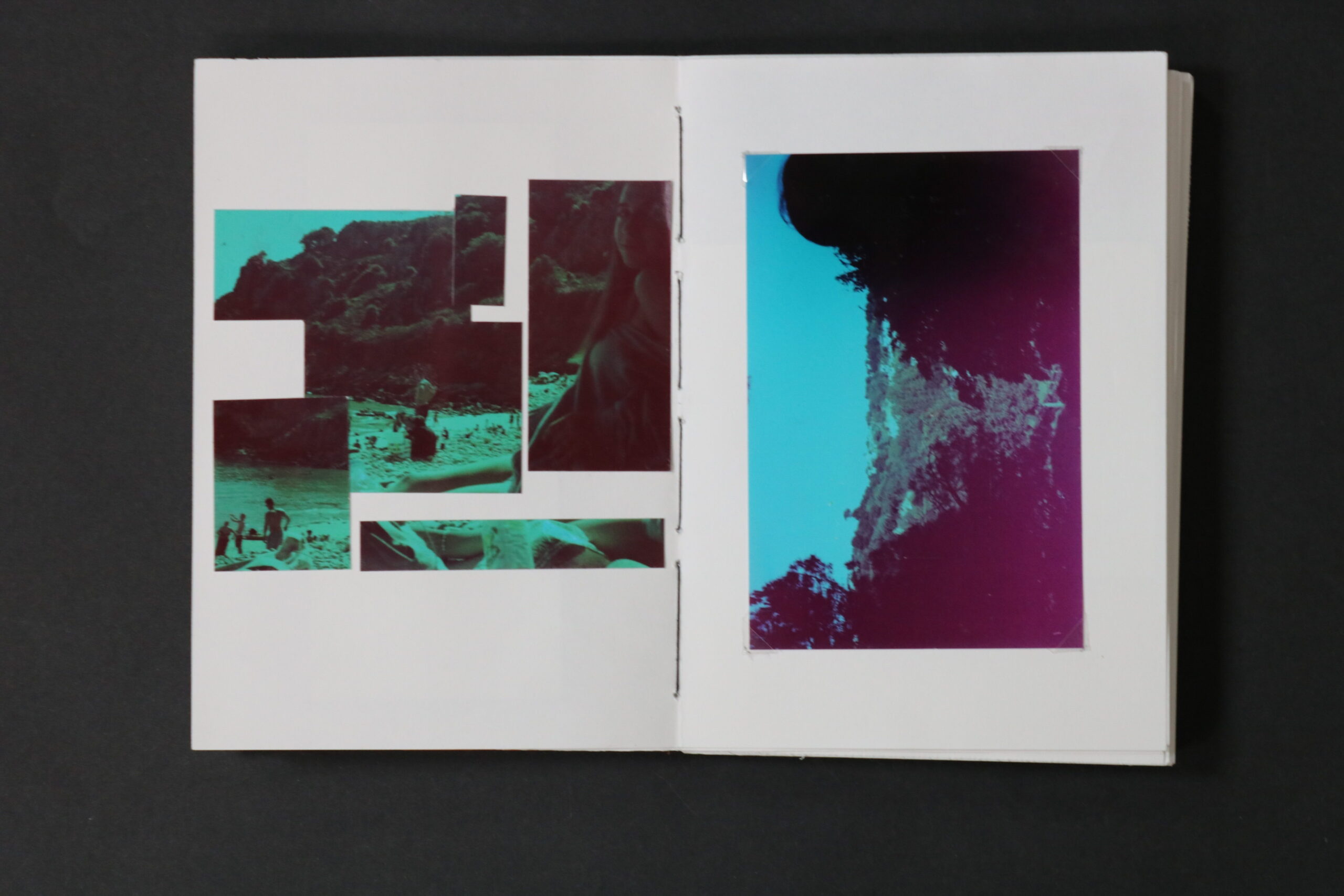
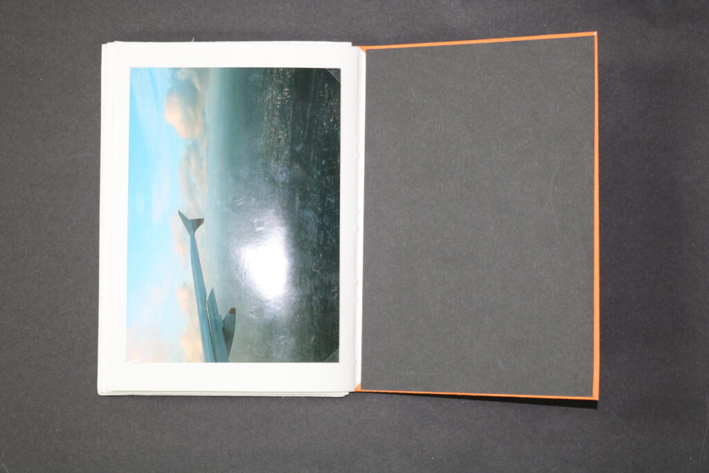
The biggest outcome, with a great amount of images within it, is a hand made book, consisting of photographs of 4 different occasions, representing adventure, travel and exploration. This book is a collection of various trips, however the layout put the narrative together, by having the images displayed in the order of events. Starting by showing more archival images, and ending with the most recent. I think the book also has many connotations, explored through the montaging of the images as well as the layout. The layout tells a story, throughout the book. Even the question on the inner page is an indication of the contents inside it represent. Pictures from Norway, like through a moving Train or bus are especially successful, as well as the ending page of a plane. To me it represents an unfinished journey, and that it will forever go on, but to some it might represent an end of it, coming back home. Another thing that went well when it came to the book is how well the images represent what it is about, as well as the question at the beginning building up on the idea. However what I am less happy about is the stitching I have done as the gap in between the groups of pages shows the string as well as the cover, this is because I haven’t tightened it hard enough for it to be firm and more stable. Regarding the technicality of the photographs or the layout, I think because of the difference of each group of images, together they might seem more random due to the book not following a theme of similarly edited photographs, and the colours of each image might seem all over the place when compared to another one, however I also think that because of this differentiation, it is easier to see different atmosphere each trip holds, and because of that this travel through place to place is seen by traveling from photographs within the book.

To conclude, I am happy how the main themes set by me is visible with each outcome. As I said before The reasoning for representing travel, movement and exploration, links heavily to ideas of : Observe, Seek and Challenge. Due to these elements becoming a natural practice while exploring new areas and traveling to different places we are unfamiliar with. With each of my different presentation outcome I was able to focus more on each photoshoot, trip etc. and by grouping them together not only it shows each photoshoot in greater detail, but also makes the viewer physically travel from one outcome to the other. I think the idea affirmed by studying the book “now will not be with us forever” by Maurice van Es, inspired me greatly to produce this type of layout, which fitted perfectly with what I was presenting. Therefore this project has been great to explore due to the guidance I got from studying and analysing similar work, as well as the production of the images which was the most enjoyable and fun , as through focusing on topic of travel, which is very important and personal to me, I challenged myself to get out of my comfort zone, and follow the same or similar practices as if I was on holiday or in a different area I’ve never been to. Overall I think feeling awe and sublime as often as possible has a great impact on anyone’s health, as sometimes we need to feel amazed to improve mental health and happiness. Therefore this project had a personal impact on me as well as allowing me to focus on producing the best to my ability photographic outcomes.

Evaluation Against artists

Maurice Van Es

As I used Maurice Van Es’ project “now will not be with us forever” as inspiration and guidance regarding the format of my own responses. The aspects of his project that I show in my own response is mainly the colours and different ways of displaying the images, like collectively grouping the images from photoshoots together and having different zines, that are presented together to show the whole outcomes of my project. Both of mine and his follow a similar colour scheme for the covers of his outcomes, however the colour scheme he followed, the colours are much lighter and colourful, more pastel rather than mine, which are vibrant yet still colourful. This is because I though the vibrancy of them relates to the content of what is revealed on the inside. There are mainly similarities when it comes to the format of the folder as he also produced a small one to gather his prints, the similarities are also seen between the zines as majority of the outcomes he made were also zines. However the differences are between the book outcome I have made as he mostly presented his images in the zines rather than a book. this meant that when it came to sawing and producing the book I couldn’t draw inspiration from him as he didn’t produce one. I also stuck to a theme of titles, but numbering each outcome rather than giving it a title of what may be inside, like he has done.

Ansel Adams

As I analysed Ansel Adams’ work, I wanted to compare my responses to his work against one of his own photographs. I thinks there is a big resemblance on the format of the photograph, this is regarding the subject and colours of my image. when looking at the photographs side by side his has a much grater contrast in the lights and darks of the image, this is due to more sun his picture which dramatized the contrast between the 2 colours, and makes his photograph appear more sublime. regarding my own image it is much darker, with softer tones due to minimal contrast. regarding the format mine is more zoomed out then his. Although my photograph was inspired by Ansel Adams’ work, it might not look exactly like one of the images he produced, however the main topic of romanticism that Ansel Adams explored is visible through my own work. This is evident in the style of the images, not only this one but other landscapes. Especially the prints in black&white.

Gallery

In Adobe Photoshop I have created 3 Virtual Galleries. These galleries are separated to show the images with ones of similar colours and atmosphere. I grouped ones of darker colours together and ones of lighter colours together. these are some of my favourites from each photoshoot. The images I have in my photobook which are archival images, I didn’t display purposely because they are older and not taken for this exam module.

To create a virtual gallery I have opened up a gallery template, and opened my desired images. Then using Ctrl+A I selected the image, then Ctrl+C, I copied the image, then in the gallery window, I pasted the image, Ctrl+V. Using Ctrl+T to transform the image, I right clicked on it and selected distort. Then by grabbing each corner I adjusted them so that they matched the perspective of the gallery.

Final prints presentation

Using a bright coloured, thicker paper, I have made a folder which fitted the 4 photographs, which were printed and showed my best outcomes from the Plemont photoshoot. How I have created the folder through roughly measuring around the prints how much space I needed for them to fit, and leaving a little loose space so it isn’t too tight, then before I cut, I made sure I knew where the bend was so that on the other half( front) is left with a lot of space on the sides, so that the sides could fold, and when glued they would stay together with the other (back) piece. I then wrote No.6 as the title to match the rest of my outcomes.

Evaluation

After seeing Maurice Van Es’s book “Now Will not Be With us Forever” I was intrigued by the section which was a folder for a couple images, where the prints could be taken out and unfolded. I didn’t follow this idea exactly, however, I was working in groups of photographs, where they were presented by grouping outcomes from each photoshoot together. As this was an unplanned photoshoot and I didn’t produce many outcomes, I though that it was perfect to display them in a folder. If I presented more prints in such folder it might bore the viewer and they wouldn’t want to see them all as it isn’t an easy to display and see format compared to a book or zine where it is easier to flip a page. I like the order of the Photographs as this has another connotation of travel and journey, the 1st and last image appears the same but it is actually taken of the rock before and after the tide came in, this shows how everything comes and goes and we need to cease the moments we have. I think this challenges the viewer to become more present with reality and observe their life through a more open approach.

Final Book

To represent my final outcomes which were in the book, I took pictures of every page, one by one, so that they are in the correct order.

Evaluation

To me the first pages, the cover and the inner first page have a lot of clues about what is the book about, as well as the project. The title, No. 05, is drawn to match the font and fit with the rest of the zines. Same with the colour of the cover, the bright orange is done so the intensity of the colours matches, as most of the colours of the zines are florescent. Together they all fit into this playful theme, almost childlike. As I said before the thread and the inner cover match as they are intentionally both black, which to me fits well with the orange as well as the title. When opening the book the first thing the viewer seen is a question: Ready for Adventure?, this is hand written in a spikey, scribble-like format. I chose to write this in this format as I thought that the messiness of it suits the lifestyle of traveling and exploring, where most is unplanned and experimental. The title invites the viewer inside the book, and giving clues of what it is truly about. Because of this text it is easier to put the pieces together to what the theme of the book might be.

I think the book also has many connotations, explored through the montaging of the images as well as the layout. The layout tells a story, throughout the book. This book is a collection of various trips, however the layout put the narrative together, by having the images displayed in the order of events. Starting by showing more archival images, and ending with the most recent. The montage of some of the images, to me, shows this curiosity and seeking for something, as the images are in pieces and “incomplete”, it is like the viewer is invited to puzzle them together, to explore them, exactly like it was necessary for me to explore in order to produce the images.

In summery, every image challenges to observe it through a curious mood, to me the book is quite experimental as I have never done a hand made book which involved me to saw the pages together, but not only being an experiment it is a book documenting my journeys. It shows the viewer to have a different outlook on the world and I wish it motivates one to seek their goals, for this instance if it be traveling.

Final Zines

As part of my final outcome I have previously designed in InDesign The layout for mostly each photoshoot I have produced prior to my trip to Norway. For these outcomes, which were explorational and adventurous, I printed them from the layout created in InDesign. Once I had all the pages printed I folded them in the middle and stapled them in the middle. then sing a ruler and a craft knife I cut off the white border which was best visible against the coloured covers, and my zines were completed.

Bellow I have represented how the final layout of these zines turned out, both externally and internally, showing the contents of each one, page by page.

No.01 (frogging)

No.02 (sand dunes and St. Aubin)

No.03 (Hotel)

No.04 (tunnel)

Evaluation

Overall I am happy with every zine and how it turned out. It was a simple and quick way to present my outcomes. As I had a large number of photographs I wished to present I am happy I chose this method of presentation as It made it easier for me to group the best outcomes from each photoshoot together. I had a feeling that if I presented all of them together in a single book, the images wouldn’t relate to each other as much, as every photoshoot has a different atmosphere to it. I like how each zine focuses on a different subject, but overall the theme of exploring is evident through the pictures. Each photoshoot challenged me in different ways, like when photographing in darker places like the tunnel and hotel, I had to dramatically change the setting to where I was photographing, in contract of photographing the sand dunes and St. Aubin, where the lighting was dramatic due to the sun setting and there was a high contrast in light and dark values. Therefore I have been challenged to not only explore but to see the world around me through a different lens, though all the photoshoot I noticed that exploring, and seeing something from a different or new perspective, has a great impact on physical and mental wellbeing. Regarding the themes : observe , seek and challenge, I wouldn’t have produced successful outcomes without observing the environment around me through a different motive, and seeking adventures with exploration along side it.

Book making

Once the plan was produced on how I was going to tackle and fit the photographs onto the paper, I have worked page by page, in order of the beginning, where the images that were cut up , I have stuck with glue, and images that had no notes on them , to be fitted in using photo corners.

To get perfectly straight cut pieces, I used the strip cutter, then before sticking the pieces in a random pattern, I planed and played with the arrangement until I was happy with it.

As I mainly used the methods of cutting the images into cubic shapes, this process being used to combine images or just on one photograph, I also experimented with a cutting knife when cutting out irregular shape, such as the photograph combining method shown above.

Once all the photographs were secured in the book, I needed to combine these pages together using simple sowing methods. Firstly, I used clips to keep the pages in place, then I have measured 1.5cm from the top(A) and bottom(B), marking it with a pencil, I then figured out the middle of the page by dividing the length of it by 2, from there I measured 5mm on each side, leaving me with 2 marked spots(C+D) ,which the length apart was the middle of the page. I then figured I needed 5.5cm (E) from the top as then if the gap between 2 dots was 1cm, the next mark needed to be 1cm from 5.5 mark (E) leaving me with mark (F). This meant that for it the distance of these marks were perfectly in between A and C. I then repeated the same process , however starting from the bottom. Marking out between B and D.

I was finally left with the order of : A, (E+F), (C+D), (G+H) ,B

This meant I would be left with 3 visible lines of thread/stich, and that from the side I start from, the thread will also leave.

I used a sharp-end tool to poke the holes in the place I have marked, and made sure to slightly bend the book so that I was getting to the centre of the crevice.

The order of how I actually pulled the thread through was : starting at D, the working down to G+H, coming out through B and back to the top through C, then working up to F+E and when it came out through A I tied this string with one that I started from, which was D. This order made the book stronger and had a tighter tension, which made the book more stable.

The image above shows how the stitching looks on the outside, but the image bellow shows the inside of the sticking, going through the middle of the 3 page stack.

What I had to do then combine this group of page, 4 groups, by sticking them together of the outside side. to do this I threaded the thread through the gaps formed on the other side, which were 1cm, then I tied each one tightly. This combined the stack of all pages together, meaning it acted out like a book rather than a collection of zines.

The last thing I have done was to add a cover, to which I chose a bright orange coloured paper, which was thick but not a card. I measured around the pages how much of it I needed and then I left a little more room for the paper to rap around the end pages.

Once I stuck the paper(cover) onto the inside page, I wanted to get rid off the gaps the folded pieces have created, therefore I used a black card and stuck it onto the inner cover, which also strengthened the cover and tidied up the inner look of the book. I chose black to match the thread I have previously used.

Book Plan

One I gathered all of the prints I wanted to use for a physical book. I have firstly went through all the photographic prints I own, this meant I looked at all archival images and selected ones that I thought best relate to the theme of travel and adventure. The book is divided into 4 main areas:

  • Film Photographs from around 4-5years ago, these are the ones which have more blue/green hues.
  • Film Photographs from around 1-2yeards ago, these document my trip to Croatia last summer.
  • Digital Camera Photographs, which document a trip to Paris, done in November last year
  • Digital camera photographs documenting traveling to Norway, done 2weeks ago, for the exam

I divided the book into these 4 categories so that I could show them in the correct order of events. I needed to pan the layout of these images, therefore I have used masking tape and sticky notes to roughly plan the order of images. on sticky notes I wrote if I should collage/ Montage or alter the images.

The idea behind altering those images was due to me not wanting an organised order of images, but instead wanted to be creative and show my creativity through the alterations. I think altering images brings out the adventures side of them, they appear more exciting, interesting and new, which are the main qualities people get by traveling and visiting new places. I wanted the photographs to represent this adventurous nature.

When it came to the paper joining and how the book is going to look like, it was the first thing I have done, Because then I could attach the order of the images, since I knew the correct order of pages. What I have done is got 3 pieces of A4 to fold in the middle and for one to go inside the other one. in books a number of 6 is very common, however because I was working this thicker paper it was best to half that amount to 3, leaving me with 6 pages, which meant 12 faces. I have repeated this 4 times and was left with 4×12 faces. however I had to be mindful to leave the first and last as well as the 2nd page from the start free, as this is also a common practice in books.

Bellow is the layout plan I have done before attaching the images onto the pages. When planning out this layout I made sure to pay attention to:

  • the space for the images I wanted to include, sent to the print folder, which haven’t arrived yet, than how much space I should leave if I am planning to do a certain alteration to the images,
  • how often I follow through with altering the images,
  • how I plan to alter them, if its by cutting, bonding together etc.
  • and one of the most important was the actual layout of the pages ( sheets of A4 paper). – how I am going to fold it and bond them together with thread

Paris Archive

When working in Lightroom on the outcomes I have recently worked on, I reminded myself of the initial plan for the project, which was to start with archive images of the previous summer where I have done a lot of travelling which would link nicely to my own idea for this project. However because I had these images of my film camera it took longer then expected to get it developed. However in the meantime, I looked for alternative images. This is how I came across Paris photoshoot which the images were taken on a school trip to Paris earlier in November.

Because this was a photoshoot done before the exam, I had already selected the best photographs, which are shown bellow.

Final images

I have shortened my selection, and slightly edited them further, however the images already had some work done on them. I would want to present these images with my other trips, like the most recent one; Norway, as well as combining other archival photographs once I get prints from the developed film.

Zines making

I made four different zines, combining photographs from each photoshoot in each zine.

When it came to the structure and layout of the photographs, for each zine I tried to follow a narrative pattern so the images could tell a story over a series of events. For every structure of the zine, I tired to keep it symmetrical as well as experimental. I wanted the photographs when next to each other to have the same size, and for the other photographs carrying through the book to follow a pattern when it came to sizing.

I have used InDesign and the square tool to draw a frame for the picture to be placed in, I was able to copy and paste that same frame to have an exact size image on the next page. Once the photo was inserted inside the frame I right clicked onto it and selected fit frame proportionally, this stretched the photograph to the frame. I repeated the process with different frame sizes for all the zines experimenting withe the frame sizes and their rotation and layout.

Frogging

St. aubin and sand dunes

Hotel

Tunnel