All posts by Pip Plummer

Filters

Author:
Category:

Edits for photoshoot #8 – St Malo

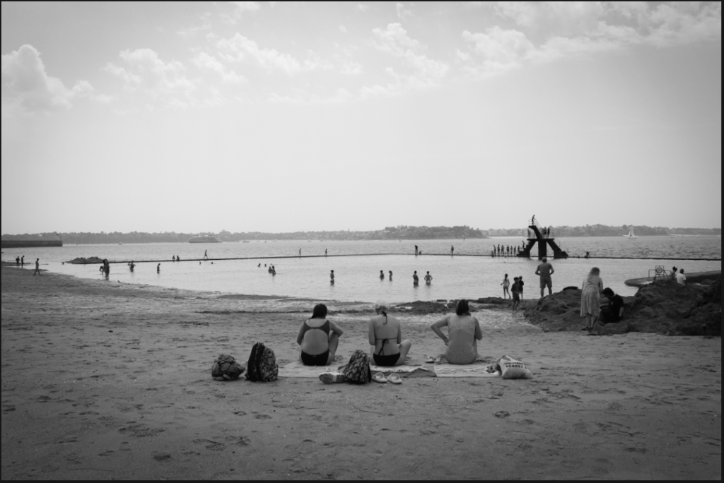
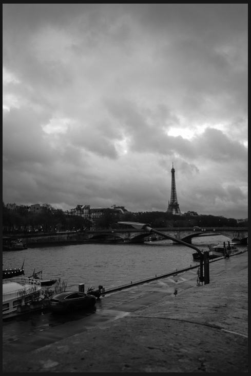
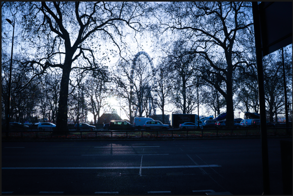
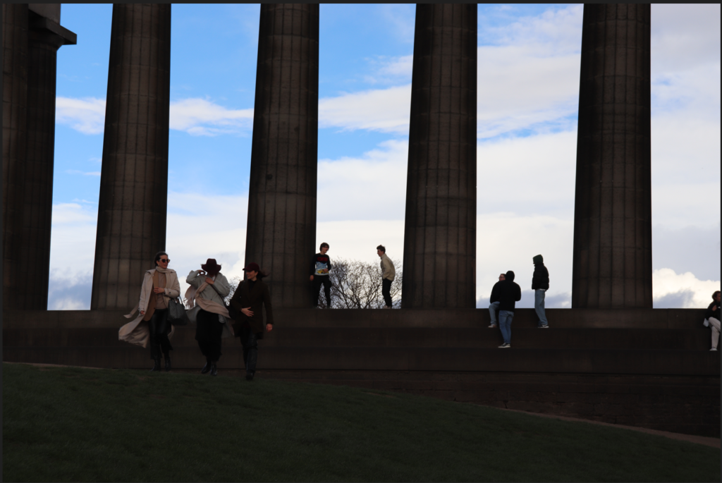
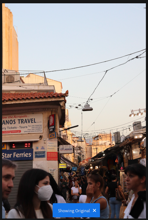
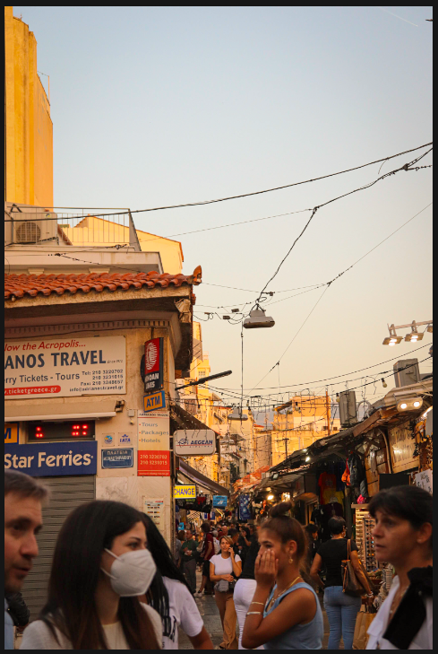
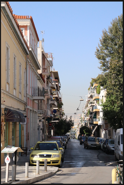
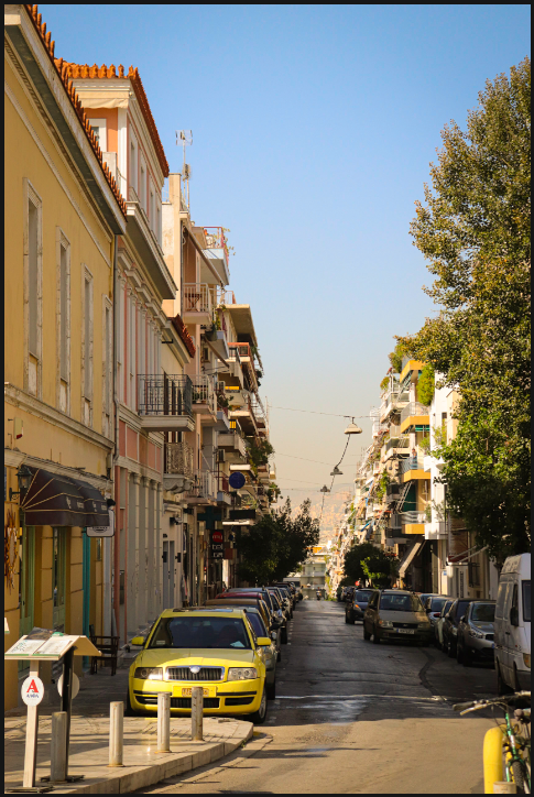
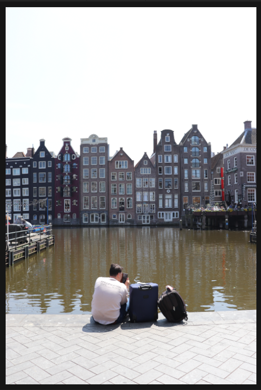
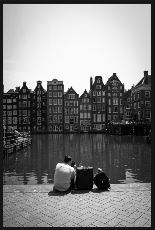
For these images, I decided to edit them all in Black and White to emulate the style of my artists and the history of the town. I increased contrast to highlight the light and shadow created by the high city walls. These images were largely successful as the touristic nature of the town pairs nicely with the sunlight, and I certainly captured some characters.

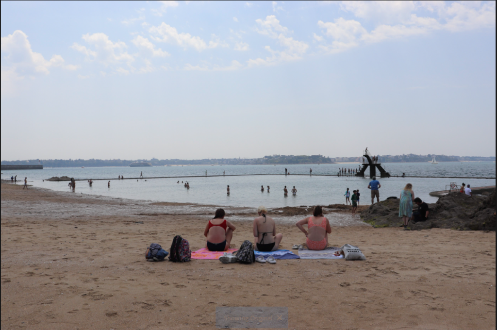
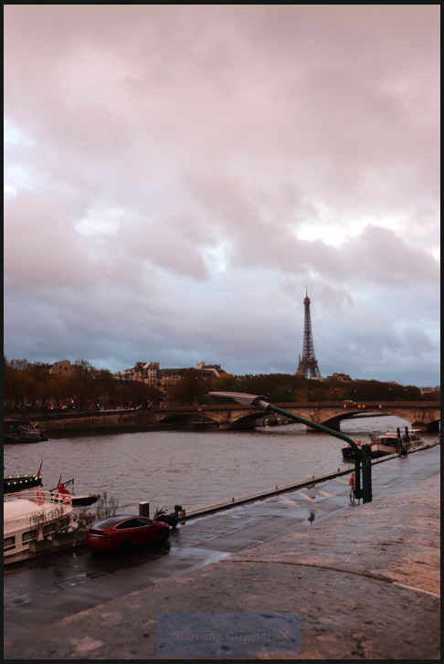
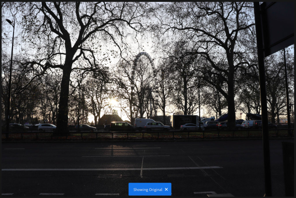
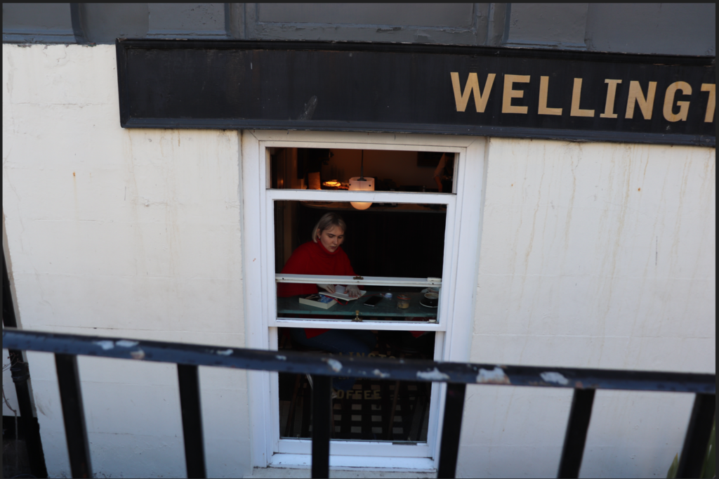
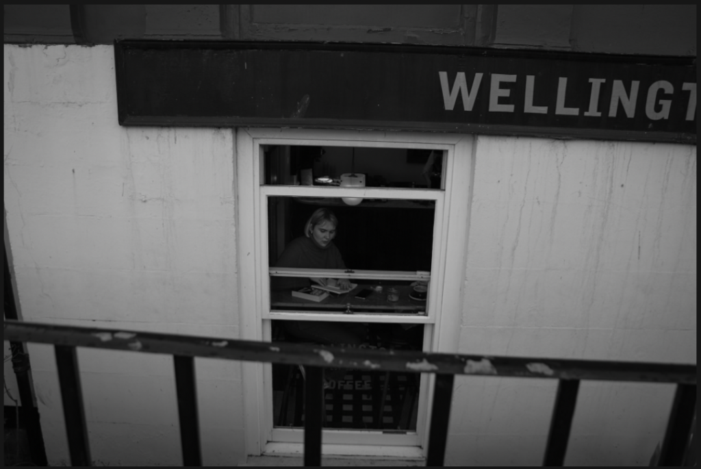
This image is slightly cloudy and it is clear that the scene is stereotypically British/Northern French.

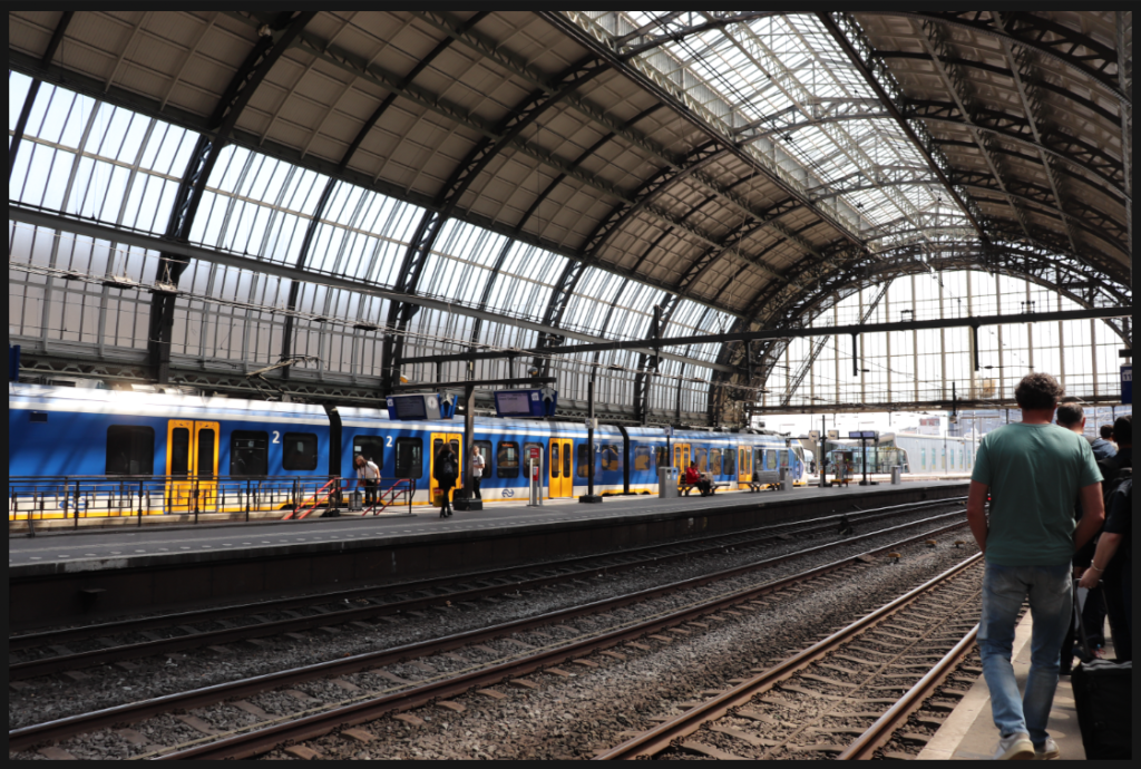
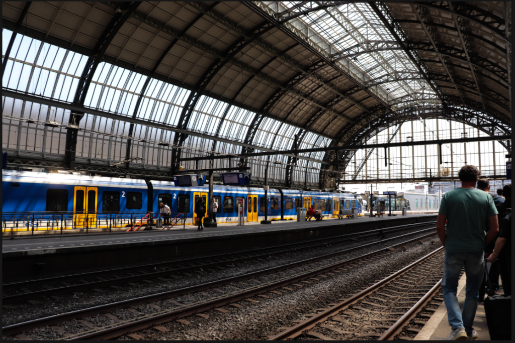
I wanted to edit it in a similar way to my other images, which I had edited with the style of my chosen artists in mind. Therefore, I used a black and white filter and increased contrast and vignette to create a more cinematic and meaningful shot.

Edits for photoshoot #7 – Plane

For these images, I increased warmth a little to remove the coolness of the light and allude a little to the excitement and positivity of a plane journey to your destination. I think this created some really strong outcomes that will work well as intersections for each chapter.

The original image, whilst having good lighting, is slightly bland in colour due to the cold morning sunshine.

Therefore, to edit, I increased warmth and brightness to create a more inviting image. The warmth suggests the possibilities of what a holiday may hold and the excitement of the traveller.

Edits for photoshoot #6 – Paris

When I took these images, the weather was largely grey and cloudy so I wanted to ensure that this did not make them boring. Therefore I used the Black and White tool in a lot of them, similar to the style of my artists who have photographed the city fairly widely. In the post-rain sky, there were a lot of blues and purples and I wanted to make sure these were highlighted, and for images taken by night, I wanted to highlight the skyline and its tiny distant lights. I am happy with how this turned out but I do think the weather could have been better at the time.

The original image is nice because of its colouring but I felt that it would benefit from a black and white filter to make it more dramatic, especially after rain.

I think that the final outcome is good because its contrast creates a dramatic cloudscape and has a cinematic feel to it.

Edits for photoshoot #5 – New York

The images I have chosen from this shoot are some of my favourites. I was very lucky to get a majority of sunlight for my trip and so the scenes are full of light and blue skies, which is very important in image making in order to capture colours. I therefore wanted to focus on the colours in the city, with the vibrance tool, instead of the traditionally black and white street photography of New York. I think, especially with the Autumnal colours and crisp blue skies, that this has been effective and I am happy with the results.

The original image is good because of the light, but I think that it could do with a little brightening and increased saturation.

The final image is subtly different, but better as it is brighter and more lively in my opinion. You can see the clearness and crispness in the cold air.

I think the original image is good, but the presence of the graphic adverts and lights of Times Square suggests a vibrant and bright environment, so I wanted to increase this with both vibrancy and saturation.

I think the final image achieved this. The screens are bright and their light shines over the people below.

Edits for photoshoot #4 – London

There were very few images that I decided to edit from this shoot and I chose to edit them by lowering the temperature slightly to show the wintry scenes without just leaving them as grey. I think that the lack of images from this city means that there is a chance that I am not going to include it as there would just be too much of a disparity.

I think the original image was good but in order to fit in with the other images from London, I had to decrease temperature and create more of a contrast between light and dark.

I like the way this came out because I think it looks cinematic and wintry.

Edits for photoshoot #3 – Edinburgh

When editing these photos, I wanted to capitalise on the gothic, dark nature of the city and its architecture. The drama of the landscape is amplified by the high contrast, sharp shadows, and faint vignette. I feel that I have certainly created this effect and I am happy with the outcomes. They exemplify the feel of the city and its buildings.

This was the original image. This is too dark and needs to be more exposed.

I therefore increased exposure and added a black and white filter. I think that the outcome is suitably moody and dramatic.

The original image I liked because of its darkness and I was debating whether to keep the colour or not because I liked the red of the girl’s jumper.

The final image, however, in order to be in keeping with the black and white edits of the other images, did turn out black and white. I also made it a little darker to add atmosphere.

Edits for photoshoot #2 – Athens

A lot of these images are charming because of the colours in them. The sandy, warm tones of the architecture alludes to the exotic nature of the city and transports the viewer back in time to when these ancient buildings were originally built. Therefore, I chose to edit these images accordingly and to use a black and white filter fairly minimally. To create this effect, I used much the same edits throughout – lowering exposure slightly and increasing shadows to create an even tone, adding saturation very slightly and warming the image, and adding a slight vignette and increasing texture a little. I’ve included some examples below.

This is the original image. I felt that the colours were a bit bland because of the shadow so I wanted to brighten it as well as make the people’s faces clearer.

In the final image, you can see that I have increased exposure and warmth to make a brighter and more vibrant composition.

In the original image, I liked the light and composition but I think it needed more vibrancy again

Therefore, I again increased contrast and warmth which made a more warm image.

I copy and pasted edit settings for a lot of these images as I felt that they worked well for most of them.

Making selections

I have begun to make selections across my photoshoots to find the ones that are worth editing, as I have nearly 2,000 images and cannot possibly edit them all.

Using the ‘Flag as picked’ and ‘Flag as rejected’ tools in Lightroom, I am able to pick out the images I would like to edit, which I can then filter later on. I am choosing the best images based on their aesthetic quality and their relevance to my overall intentions.

For Amsterdam, I picked a total of 54 images for editing.

For Athens, I picked a total of 80 images for editing.

For Edinburgh, I picked a total of 21 images for editing.

For London, I picked a total of 16 images for editing.

For New York, I picked a total of 59 images for editing.

For Paris, I picked a total of 32 images for editing.

From the plane journeys, I picked a total of 24 images for editing.

For St Malo, I picked a total of 43 images for editing.

For York, I picked a total of 30 images for editing.

That makes a total of 347 images.

Edits for photoshoot #1 – Amsterdam

When I edited these images, I wanted to make sure I didn’t detract from the vibrancy of the colour in a lot of them. For these images, I mostly increased contrast and made them brighter. For the images that didn’t have this level of vibrancy, (due to overexposure, underexposure, etc.) I made them black and white and increased contrast to make them more dramatic. See below for an example of one of the colourful images vs a less colourful one.

This was the original image. I wanted to preserve the lovely colours in the train and so increased contrast and decreased exposure just a little.

I like how this highlighted the rays of sunlight by adding contrast between light and shade.

This image was clearly overexposed and needed to be made black and white as it lacked the colour I wanted.

So, I increased contrast, decreased exposure, increased shadows, and decreased highlights. I also added the slightest vignette that is only a little noticeable.

I like the way these turned out and this is why I continued relatively the same pattern throughout all of my edits.

Making selections

I have begun to make selections across my photoshoots to find the ones that are worth editing, as I have nearly 2,000 images and cannot possibly edit them all.

Using the ‘Flag as picked’ and ‘Flag as rejected’ tools in Lightroom, I am able to pick out the images I would like to edit, which I can then filter later on. I am choosing the best images based on their aesthetic quality and their relevance to my overall intentions.

For Amsterdam, I picked a total of 54 images for editing.

For Athens, I picked a total of 80 images for editing.

For Edinburgh, I picked a total of 21 images for editing.

For London, I picked a total of 4 images for editing.

For New York, I picked a total of 59 images for editing.

For Paris, I picked a total of 32 images for editing.

From the plane journeys, I picked a total of 24 images for editing.

For St Malo, I picked a total of 43 images for editing.

For York, I picked a total of 30 images for editing.

That makes a total of 347 images.