All posts by Pip Plummer

Filters

Author:
Category:

Final evaluation of ‘Departures’

OBSERVE, SEEK, CHALLENGE

I feel that, overall, my final outcomes were very successful. They look professional and I feel that they are an accurate representation of the time and effort I have spent on them.

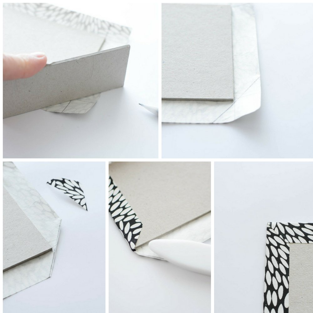
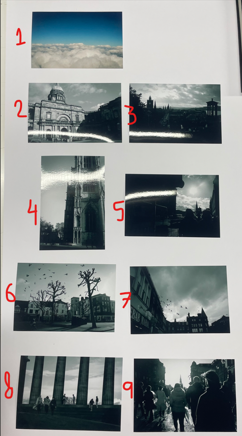
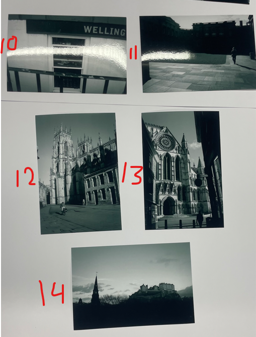
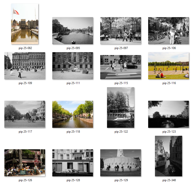
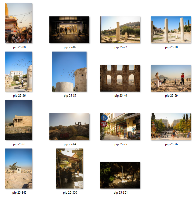
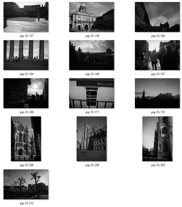
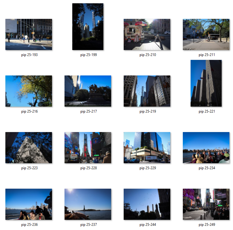
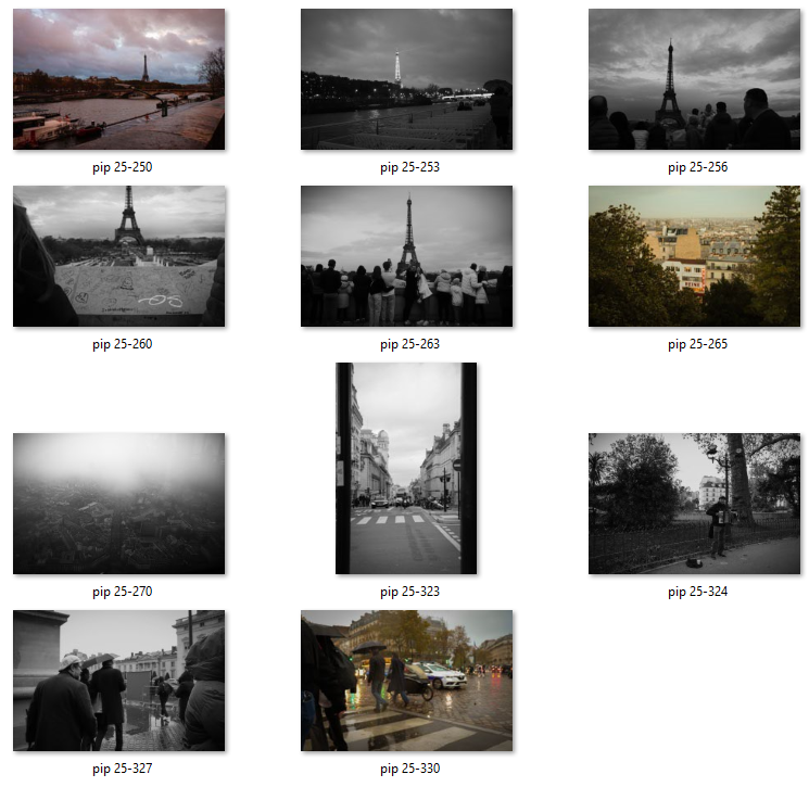
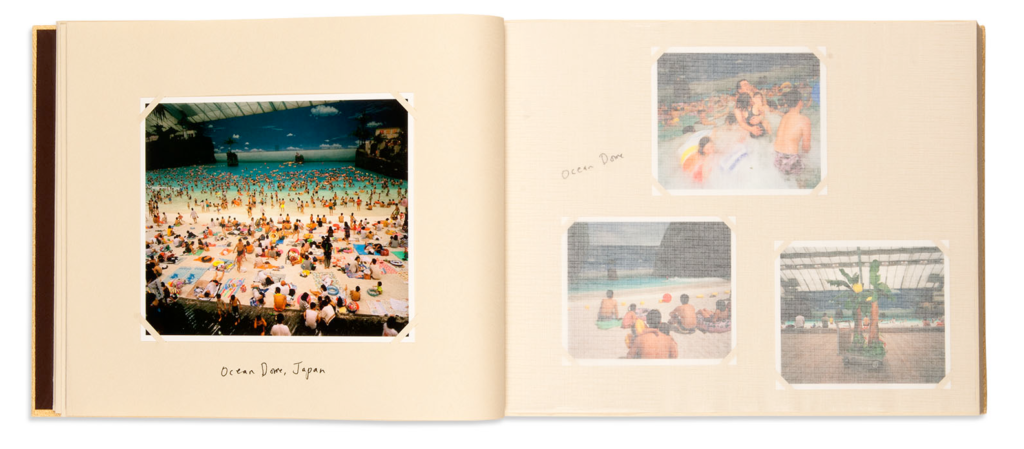
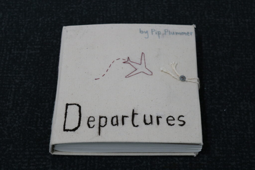
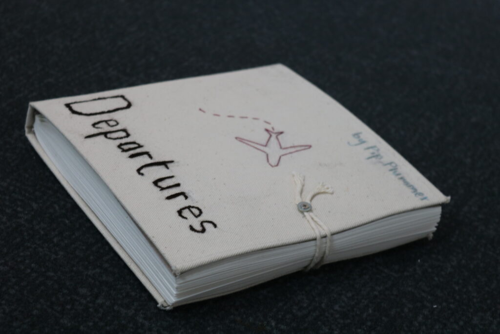
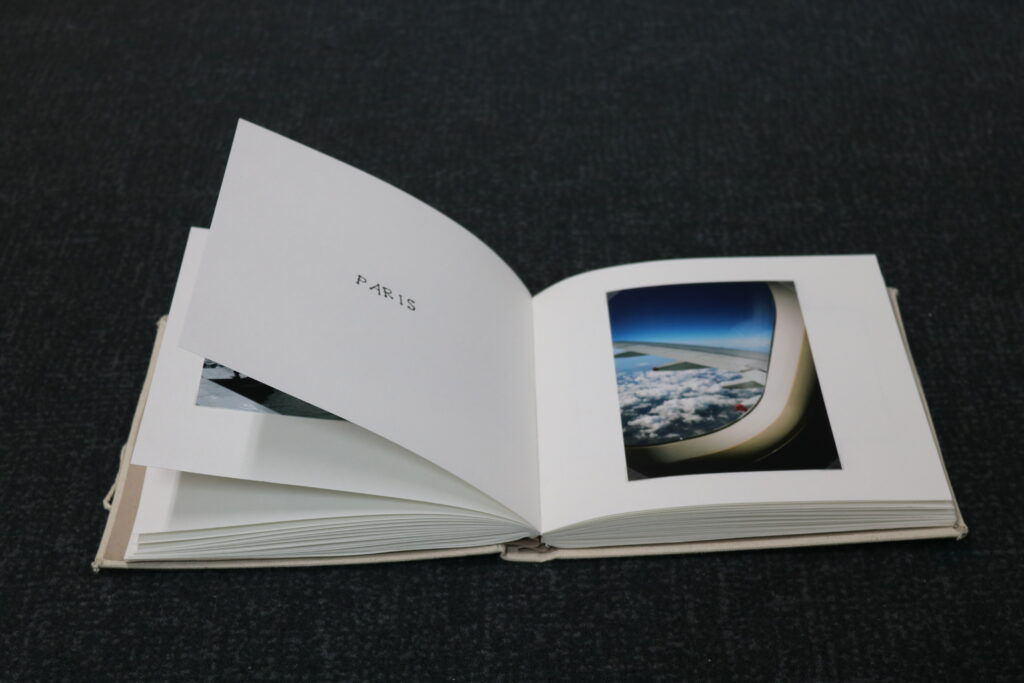
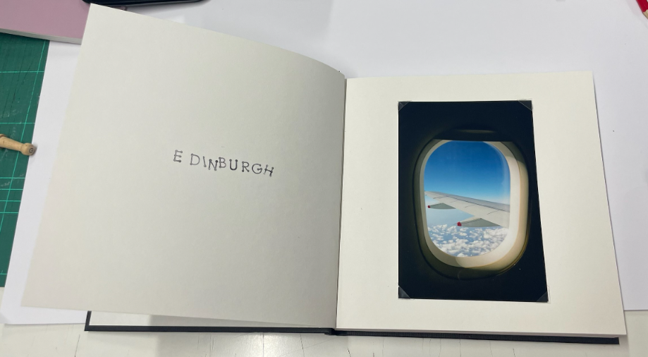
The photobook is valuable because I handmade it myself, and the challenges I came up against in making it only seemed to create opportunities for me to make it better. The final book is successful because I made careful choices in my final selection, and the large number of images in it does not make it boring, as the chapters dividing each location make it constantly engaging. Furthermore, The high-gloss images add to the excitement and the feel that this is a book made by a travelling photographer who takes pride in their work.

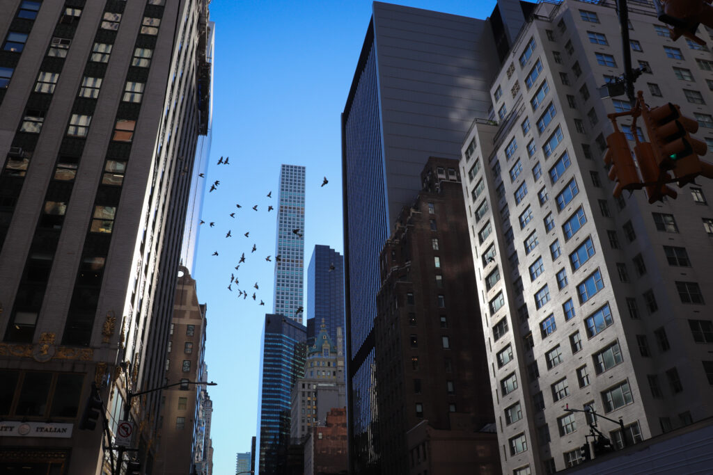
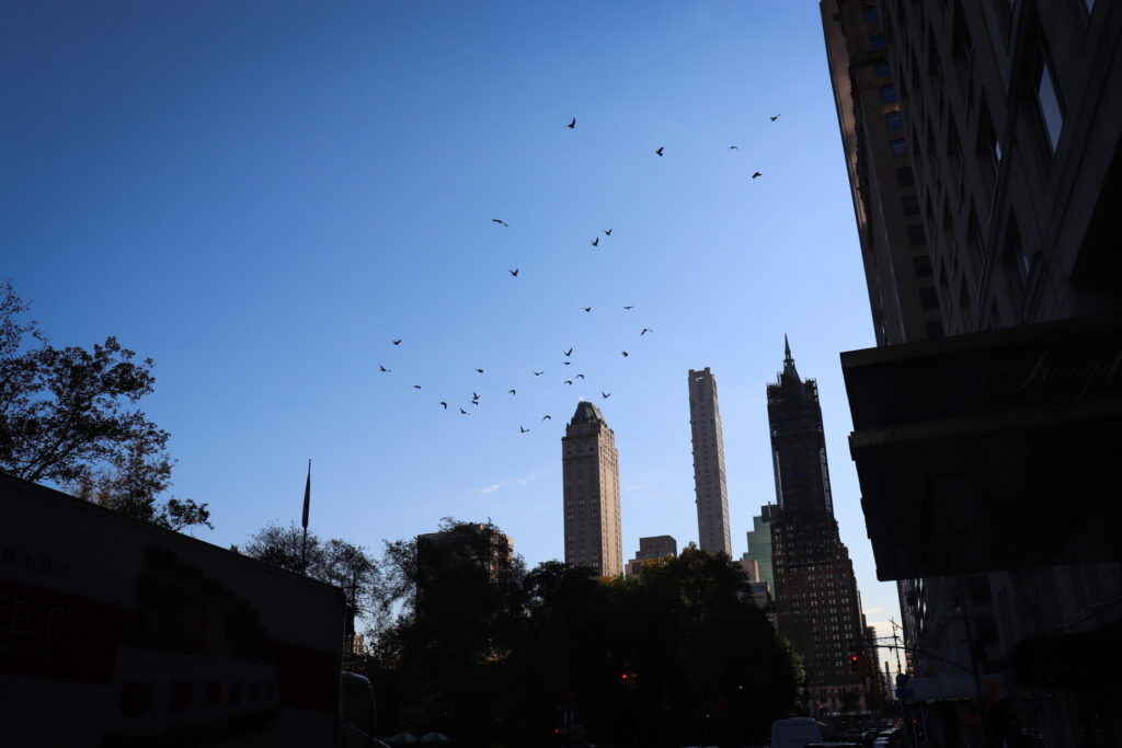
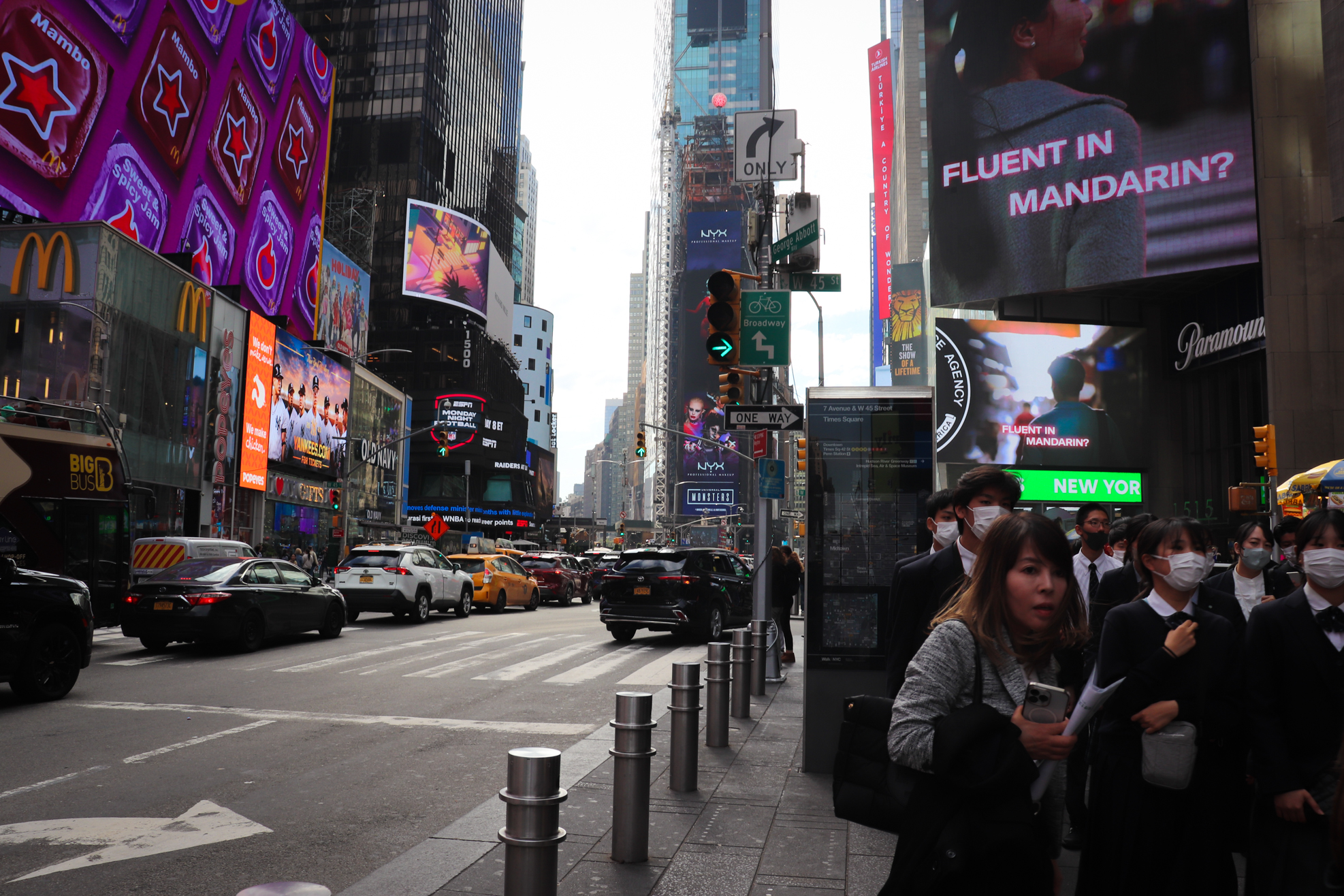
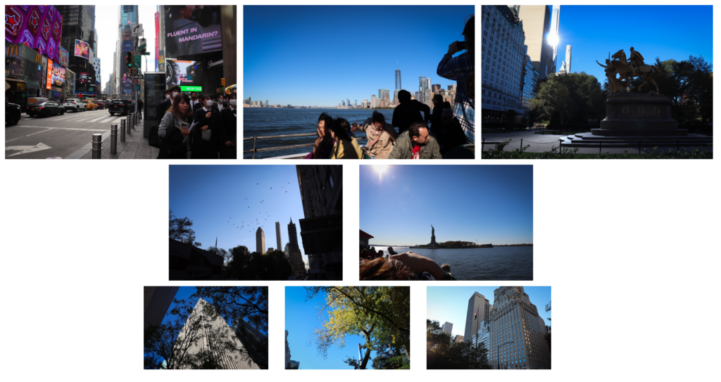
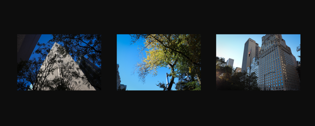
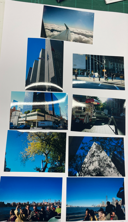
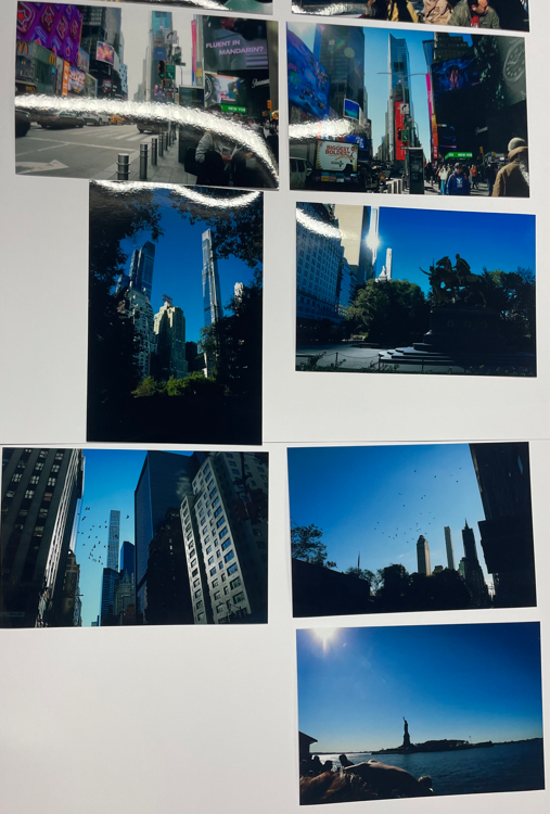
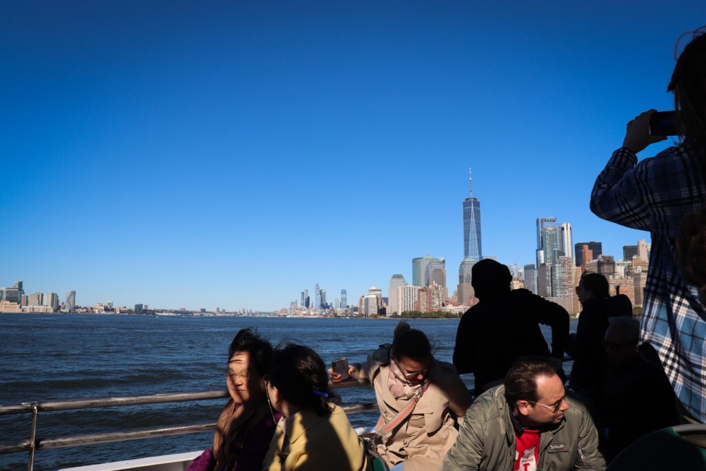
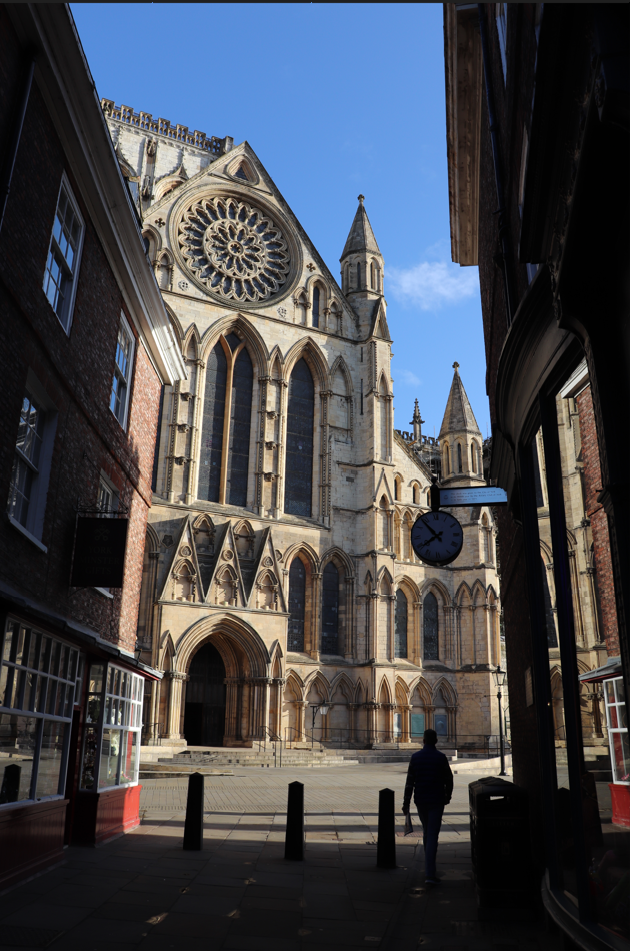
My prints are successful because their simplicity makes for a focus on the images themselves, rather than framing. This is the main reason that I usually choose not to frame my images, only mounting them on foamboard. This makes for a professional, streamlined look in my opinion. I also chose only to print images from my New York shoot so as not to confuse the viewer with a collage of different and distinctive places, making it more focused and therefore clearer in intent.

Therefore, overall, the outcomes appear professional, cohesive, and simplistic, as I had hoped. However, it can be said that my original plans had less appeal, and my vision wasn’t realised. I do feel that this is a blessing however, as I am much happier with the final outcome than I fear I may have been if my original plans had come to fruition.

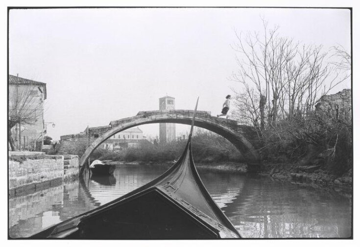
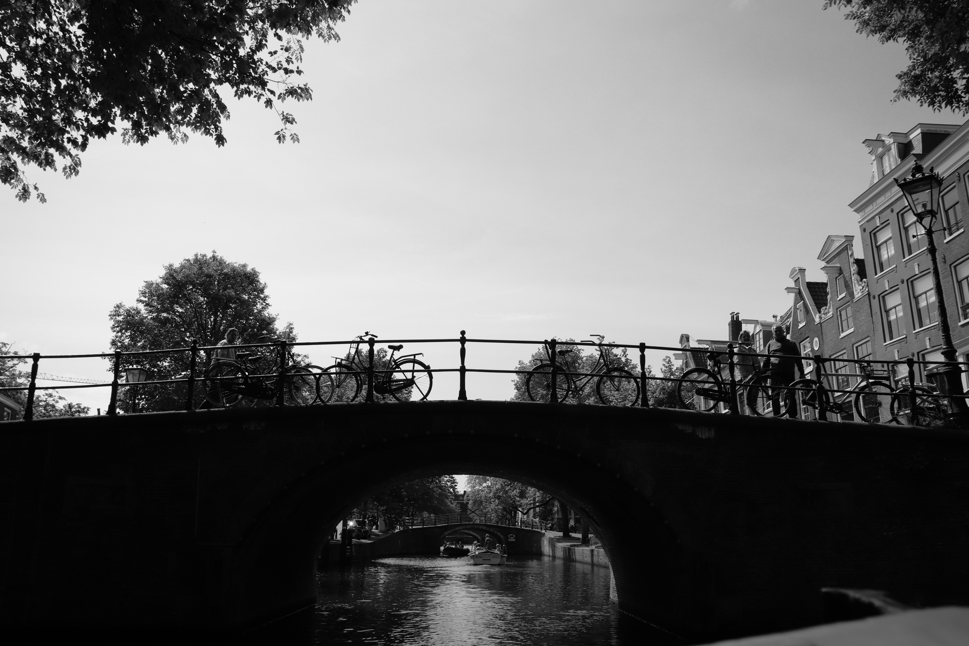
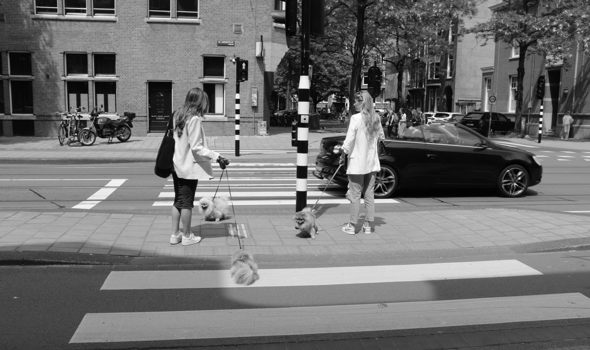
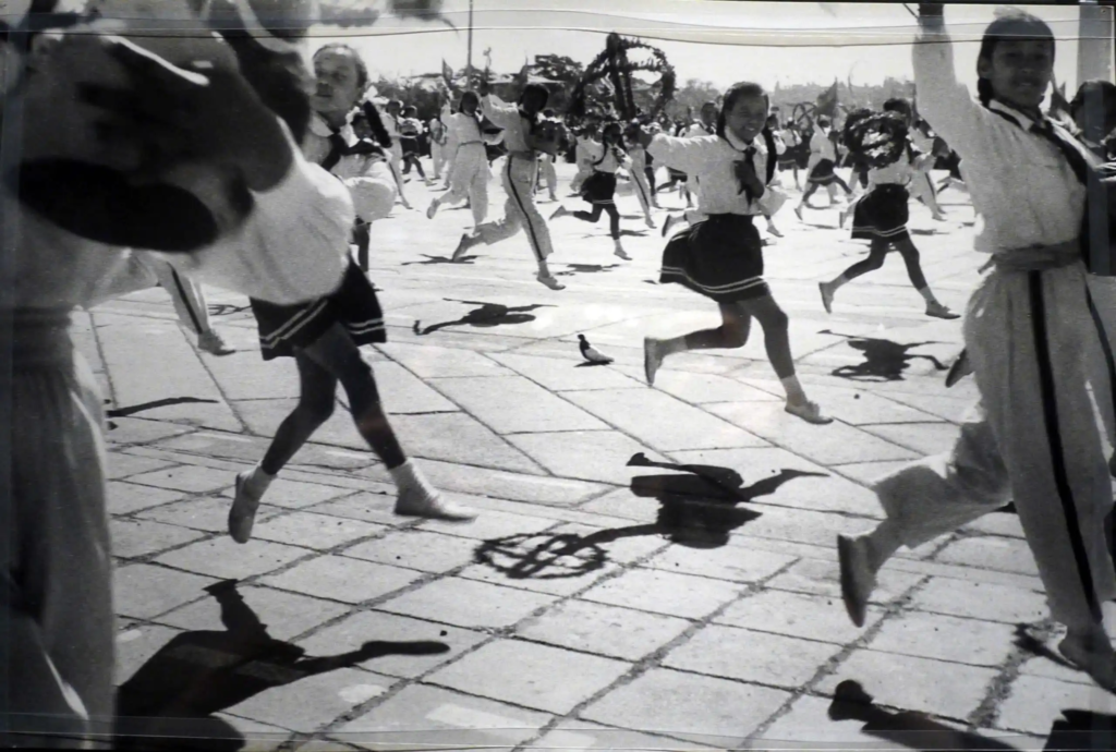
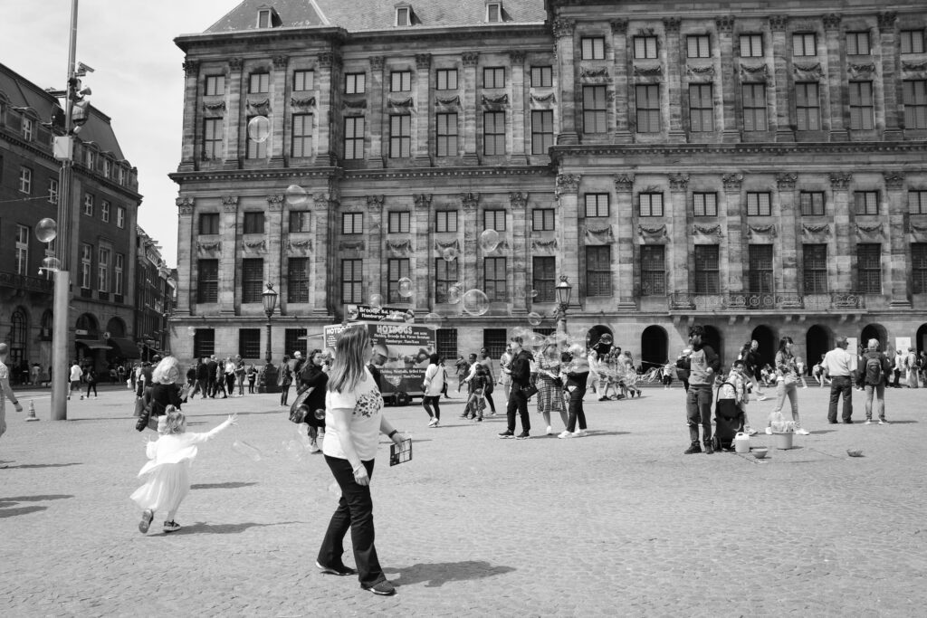
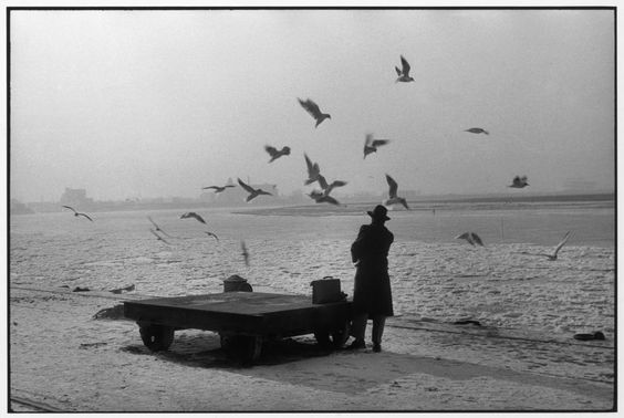
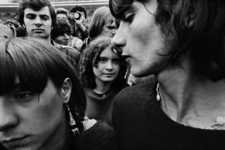
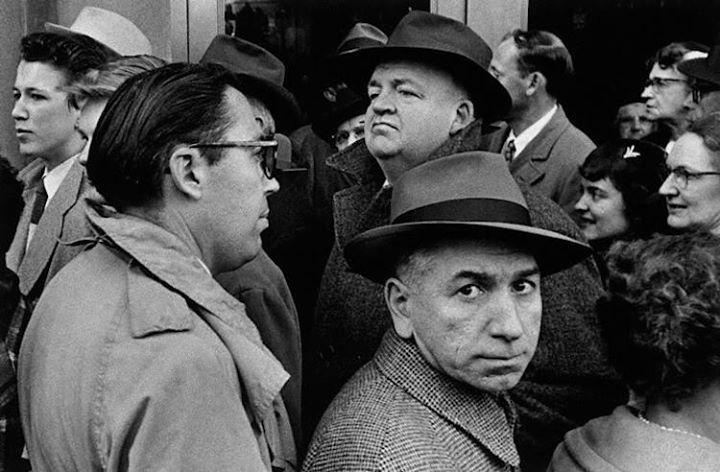
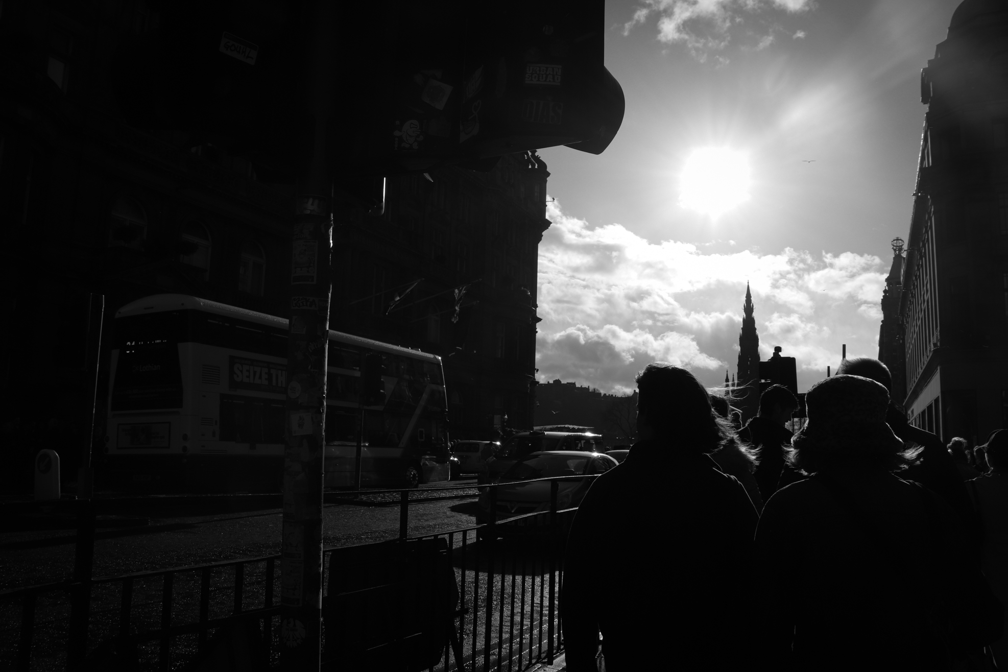
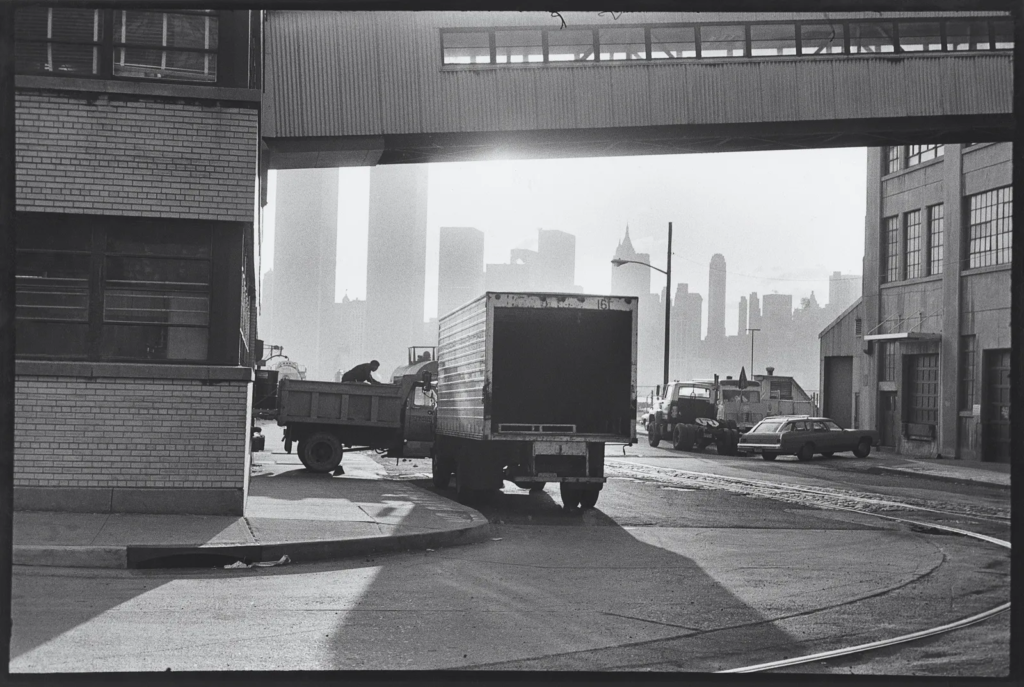
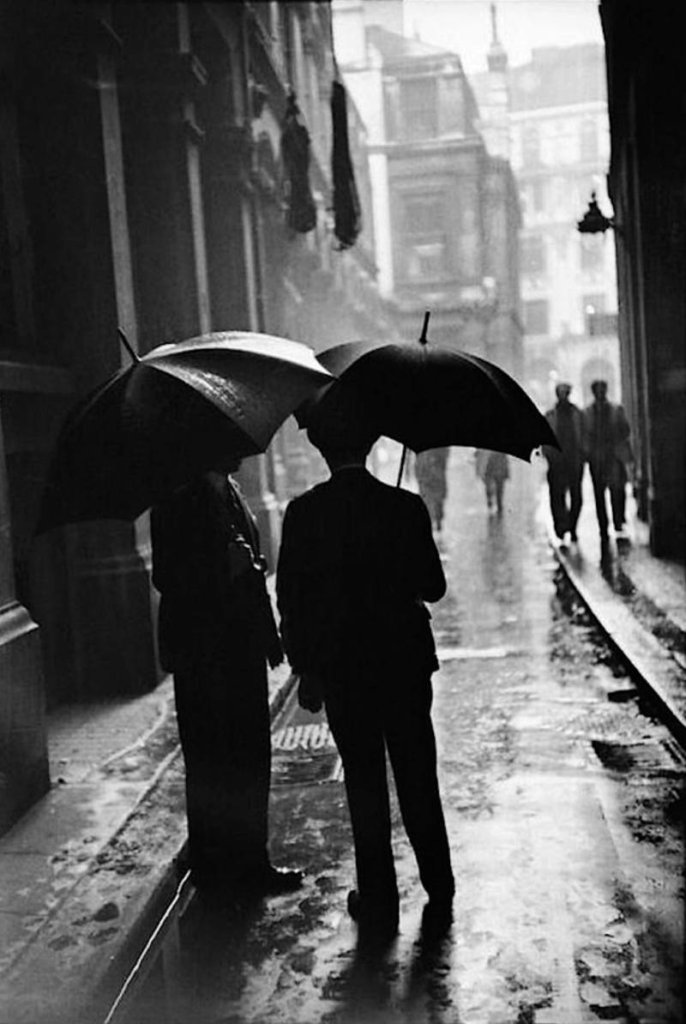
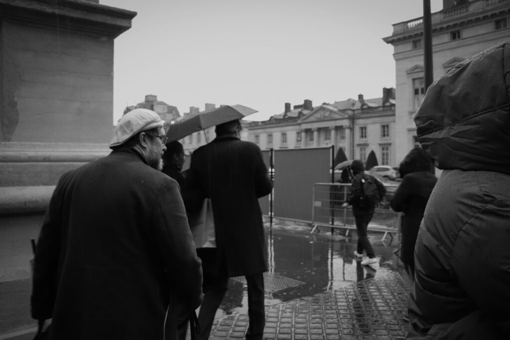
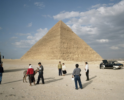
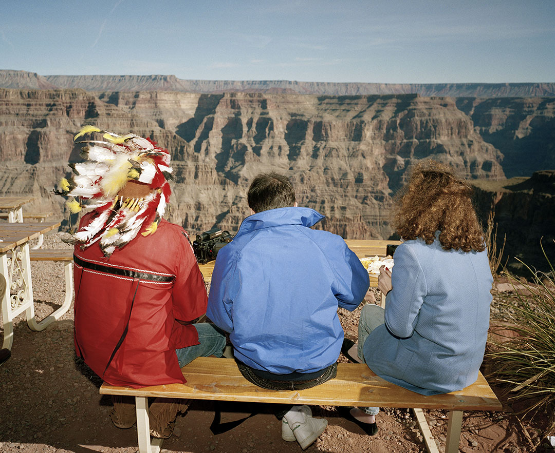
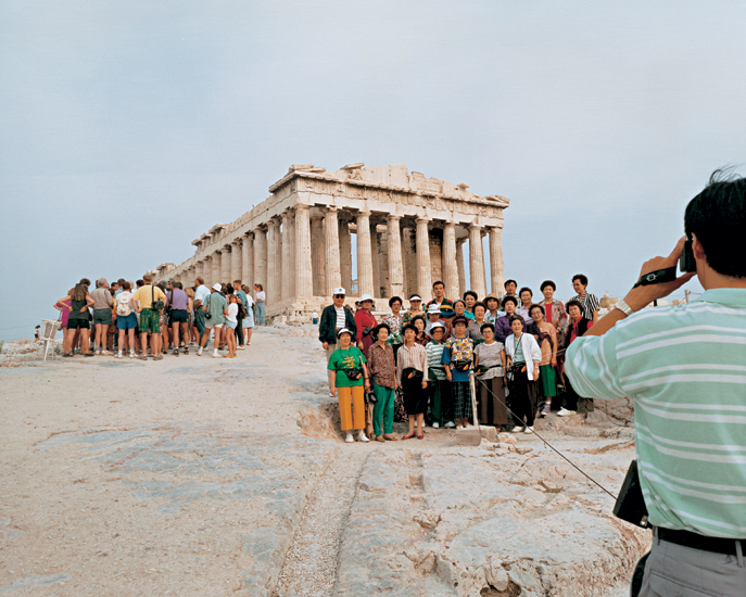
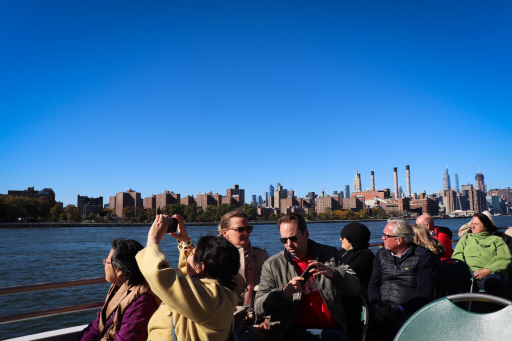
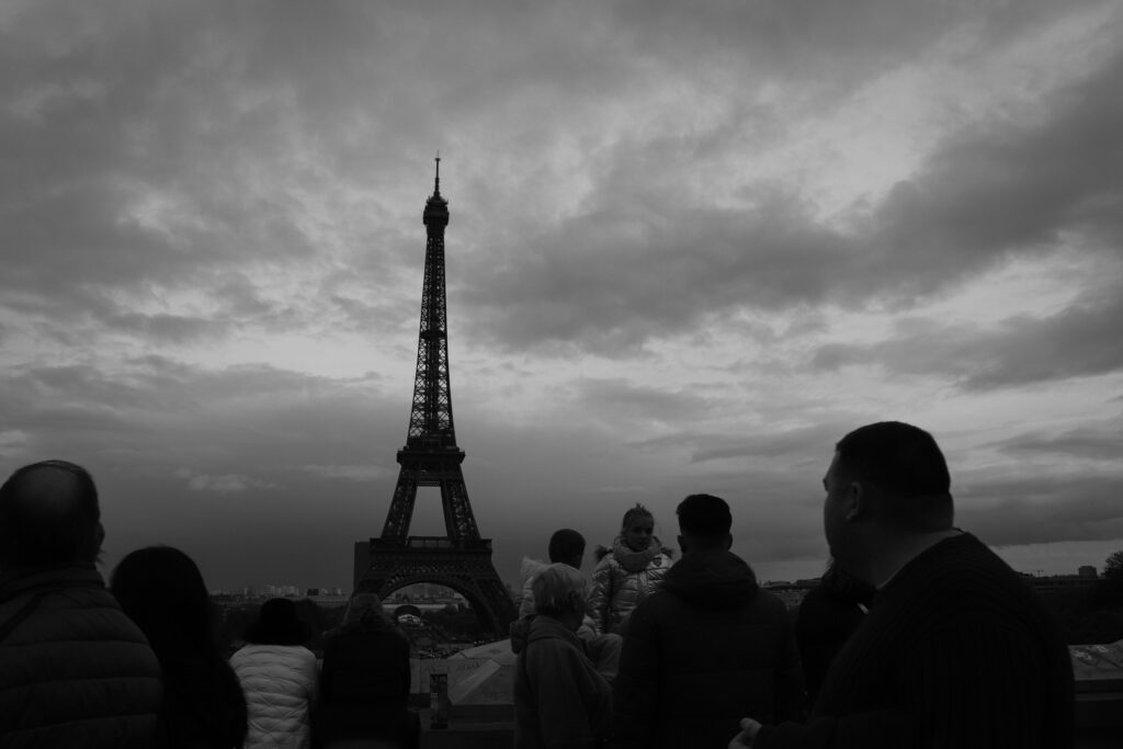
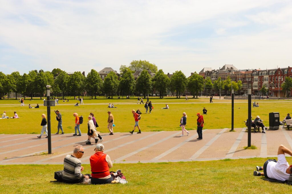
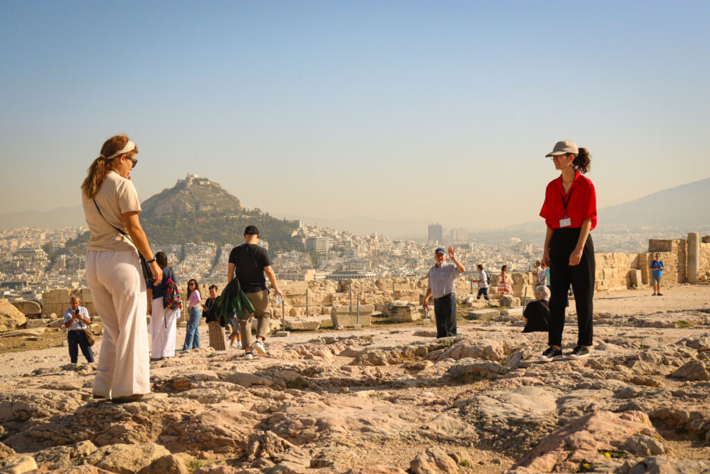
I think that, aside from final presentation, I did realise my intentions to an extent. The images I created were, whilst still strong, not necessarily as people-focused as I would have liked. My chosen artists are, of course, street photographers who focus on the inhabitants of the cities they photograph, and, whilst I did manage this in some ways, I think that it could have been clearer across more images.

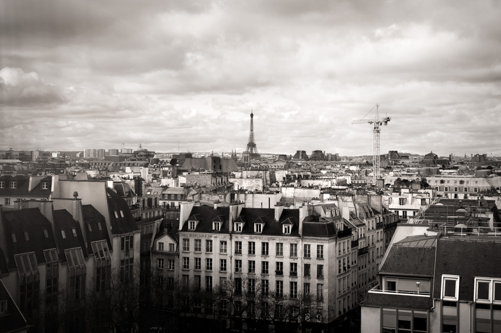
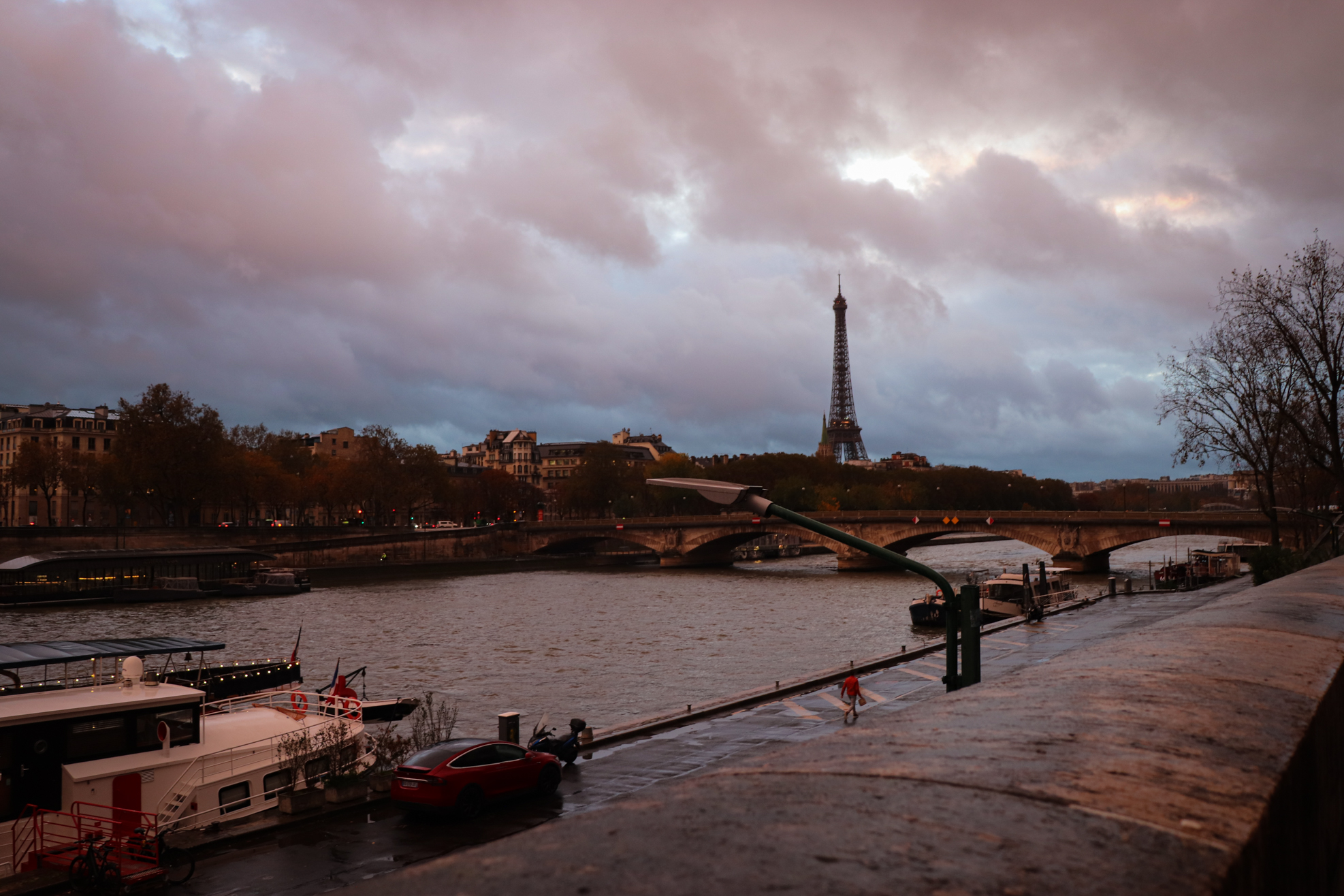
Therefore, I feel that, in terms of meeting the styles of my artist references, I could have been more successful in some areas. Some images could be likened to their work, but it is certainly true that a lot of them are more environmentally focused.

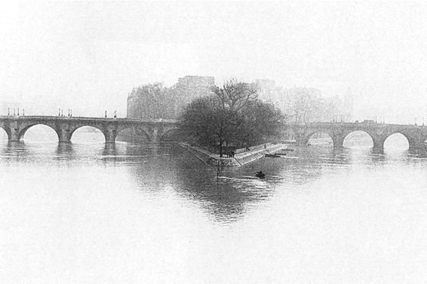
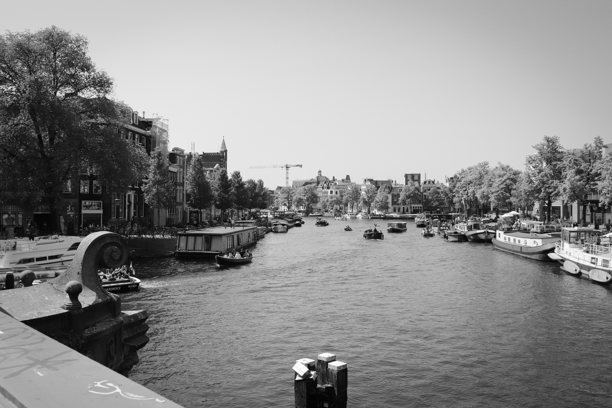
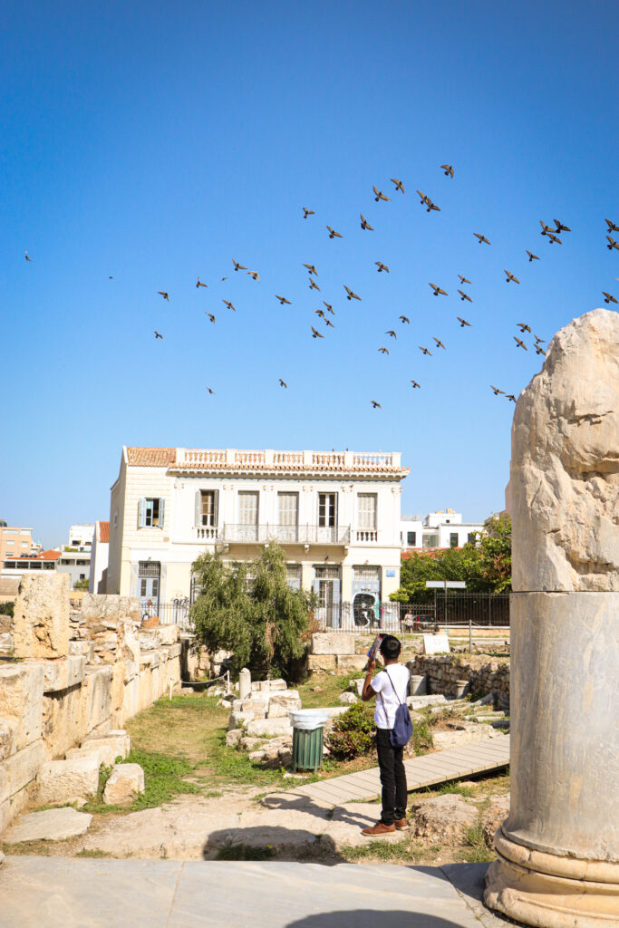
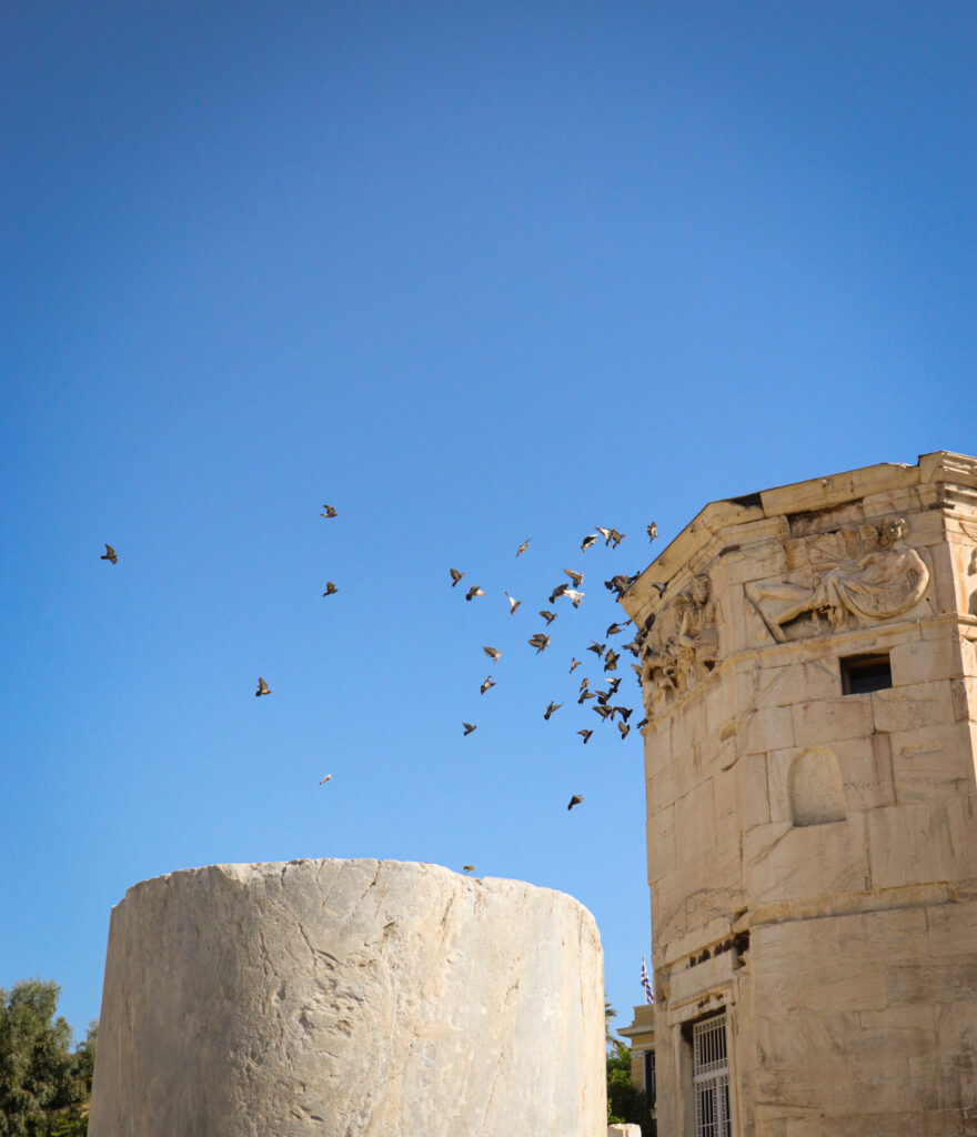
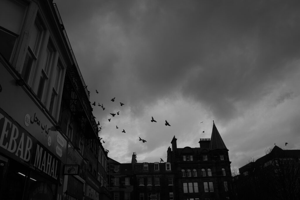
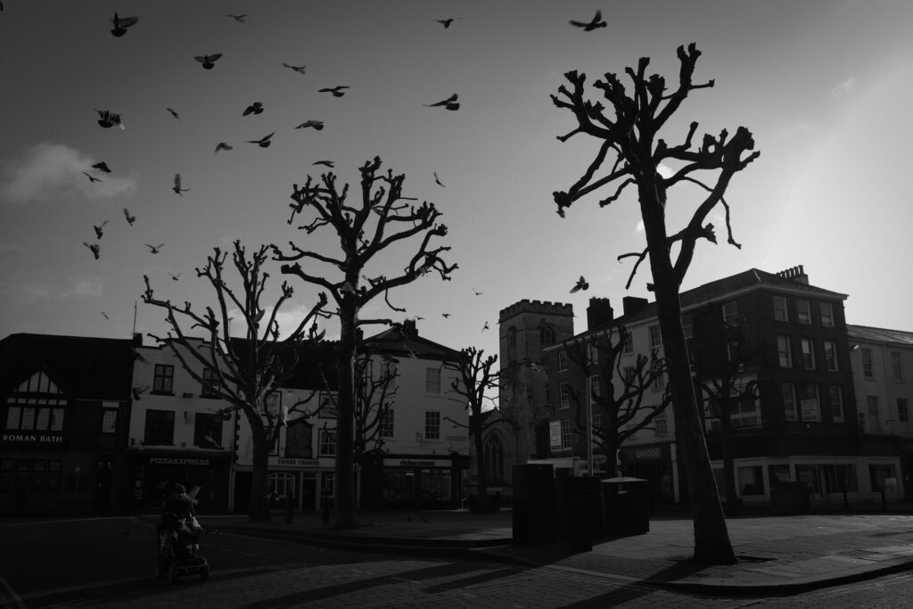
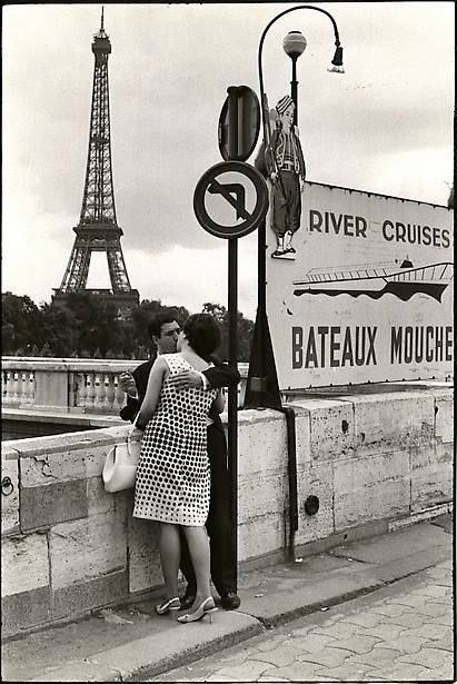
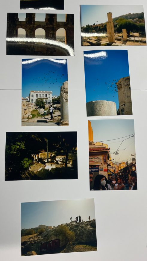
I feel that the brief of ‘Observe, Seek, Challenge‘ was met, as I have suitably ‘observed‘ but also ‘sought‘ the subjects of my images. I ‘challenged‘ myself by going out into more unfamiliar places in order to capture these images. The multi-national dynamic of my work makes for an escapist element that couldn’t be replicated from home. I am therefore happy with the theme I have chosen.

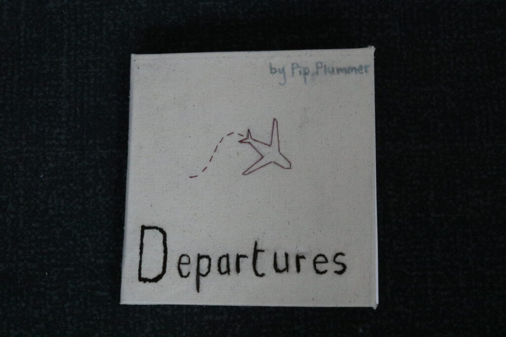
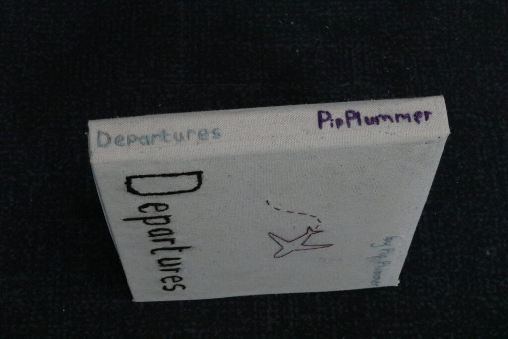
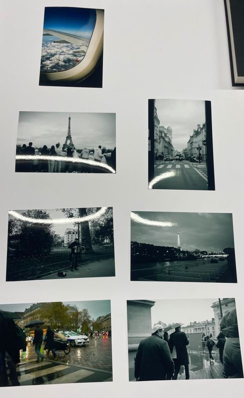
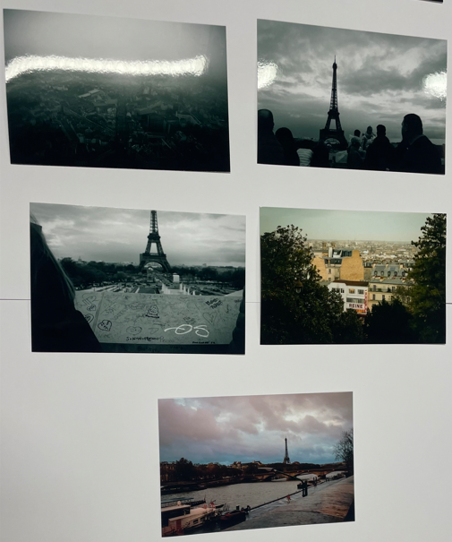
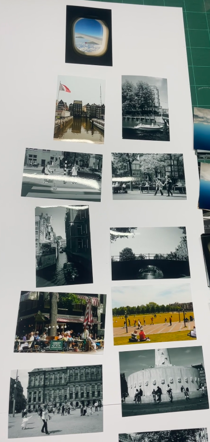
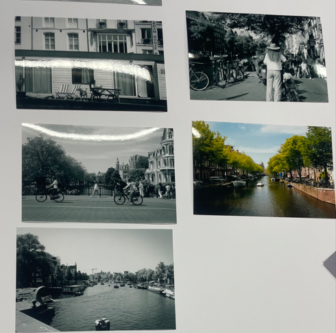
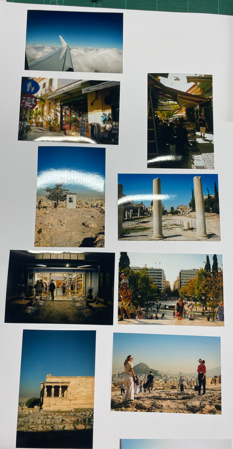
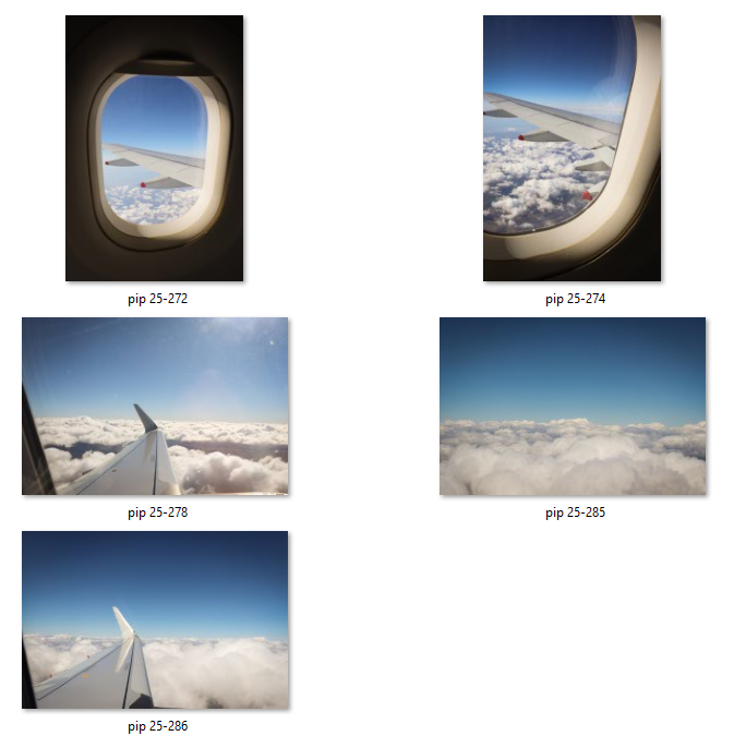
I chose to name my book ‘Departures‘ as it would align with the theme of plane travel and the excitement of arriving at an airport and knowing that you are soon going to arrive in a new and exciting place. This also aligns with the increasing levels of colour in the images as you go through the book. The destinations get further away and become more colourful, making the journey exciting.

If I could do the project again, I would likely plan better to ensure that my idea was cohesive and possible, but I do believe that, overall, I have been successful in my outcomes. I am proud of the images I have taken and the way in which I have presented them, and I have enjoyed the opportunities to learn new skills along the way, feeling that it has made me a more rounded learner and creative artist.

Comparison: artist references versus my outcomes

Making my photobook – Departures

Instead of creating an online photobook, I decided fairly early on to handmake mine. First, I selected a sketchbook with a black hardcover to present my images in and began sticking them in using photo corners. I also used the stamps to write the name of each city, as planned.

I then realised that the book I had chosen unfortunately had too many pages and would seem unfinished if not filled.

This was the original book I chose. I liked the square shape and the simplicity of the black cover and white pages. I felt that it would allow more attention on the images themselves.

Therefore, as a solution, I decided to make a cover myself and cut the pages out of the book I had used. To create a cover, you need a kind of hard cardboard called greyboard and fabric/paper to cover it.

Once I had cut the greyboard into three pieces that would represent the front and back covers and the spine (using the original book as guidance), I needed to decide what I was going to cover the book with. I chose to use canvas, as I felt that this would add to the homemade feel of the piece.

I then decided that it would be interesting to embroider it with my lettering, to make it both long lasting and more homemade. I have never tried embroidery/stitching so it was an interesting experience to learn and I found it quite therapeutic. Whilst this was of course rather time consuming and not something I had intended to happen at all, I think that the final outcome is better than the original may have been, as it is certainly more personal and there was a lot more effort that went into it.

My plan was to stitch in my title – Departures – to the front cover and spine, along with my name. Then, I added a small plane with its trail behind it, using various online clip art for inspiration and guidance (example on the left).

Before I sewed it, I drew each piece on using a pencil. I felt that I wanted to use red thread for the plane and its trail because it would be eye-catching and bright, and I think that this worked well.

After I finished sewing, I needed to glue the greyboard to the canvas in this way, so that I could fold up the edges on the inner page.

Then, I added my cut out pages from the original book into the new cover, and created an end sheet using brown paper. This meant that the whole book could be held together.
I also added two small screws, one on the front cover, and one on the back. This would allow me to attach a small piece of string to act as a fastening loop and hold the book shut. I think that this increased the homemade look of the book and alludes to an old-fashioned diary or travel journal. You can see an example on the left.

creating my virtual gallery

In order to create my virtual gallery, I used Photoshop and the gallery images provided. I inserted each image into the gallery and then, for the images placed on the walls, I used Ctrl+T and then right-clicked the image to select ‘Perspective‘. This would help to create the illusion that it was being seen from the perspective of the viewer.

I think this went well, though I would have liked more wall space in which to add more pictures.

The final gallery.

mock up for my final physical outcomes

These are the 8 images I have selected for printing. The largest ones are in A3 size, the second largest are A4, and the smallest are A5. I plan to mount every image on foamboard and group the three A5 boards on a piece of black cardboard to act as a triptych.

The other 5 images I will mount on to black cardboard separately if there is enough, but if not, I will leave them as stand-alone foamboard mounts.

Final order of images

This is my configuration of pages that I plan to put in the book. I have chosen this order because the locations get progressively further from Jersey and also simultaneously seem to become more and more vibrant. I put a plane image between each country as well, to create the effect that the reader is travelling with me. I plan to put a page between each country also, where I can add a simple title for each, using stamped letters.

I will use similar stamps to these to write the names of each country. This will create uniformity and simplicity, to ensure the attention is on the images.

Making final selections

I have made my final selections for printing. I am no longer including images from York, St Malo, Jersey, and London. This will allow me to simplify my idea and therefore have higher quality of work. I have narrowed the total number down to 76. I am going to look into buying a picture album that will accommodate this many images, but if I cannot find one, I will need to trim this down further.

Ideas for final presentation – Small World and Life’s a Beach by Martin Parr

I will present my images in a handmade photobook instead of a Blurb photobook as I feel that this will create a more personal and nostalgic feel. I will stick in my physical prints using photo corners.

Therefore, I will need to make my final selections soon so I can print everything and purchase the appropriate book. I will print the images about A6 size and arrange them variably on each page in the centre of each.

In order to decide the order of everything, I am going to arrange all my prints in various orders on a table so I can see what looks best and in what configuration. I plan to arrange the images in separate cities, as they often have similar colour themes across each, and perhaps with cover pages in between that I can customise.

Small World by Martin Parr

I have drawn comparisons between my work and that of Martin Parr’s project Small World (published 2007). This book explores tourists in an affectionate case study of their stereotypes and intricacies.

Some of my images have a similar colourful and playful aspect to them I feel, and capture similar subject matter.

Therefore, I intend to replicate the simplicity and colours of his publication in my photobook, as I think his images are intriguing and endearing.

Life’s a Beach by Martin Parr

I am also going to take inspiration from Parr’s 2012 publication Life’s a Beach, as he uses photo corners in this book to make a more homemade and rustic feel.

The book is also created with the Japanese stab binding technique, which adds to this, seen below.

Jersey shoot #1 – town

I managed to take a small amount of images in town and I think they aren’t as good as I would like. This was because of the lack of crowds around. I plan to go out and take more images in other locations such as St Ouen’s bay and Corbiere lighthouse.

Edits for photoshoot #9 – York

Overall, there aren’t many images that I have selected from this shoot due to the emptiness of the city in the early morning. However the morning light meant that sharp shadows and silhouettes characterise these images. Therefore, when editing these, I decided to use Black and White and increase contrast for the shadows. I think these are strong images, however, there are very few, meaning there is less likelihood that I can use them.

The original image is strong, however I wanted to use the extreme contrast between light and shadow and the intensity of these shadows to create a dark and moody image.

To do this, I used a black and white filter and increased contrast, vignette, and texture. I am happy with the outcome and applied similar settings to the other images.