All posts by Megan Hawthornthwaite

Filters

Author:
Category:

Presentation ideas

These are my presentation ideas for my printed images. I want to make sure I chose a range that can link to each other, and when they are presented that they make sense. I am also going to print some collages of my grandad’s scrapbooks and archives.

Images for print

I want all my images to be presented the same so that they are organised, and similar. To do this I am gong to place them all on white foam board so they have a white frame, then I will place them on black card.

A5

I chose to place a new image in the middle of two archived photos because it reflects the change, and they are similar. At a first glance I don’t think it’s obvious, but it makes a good juxtaposition of time.

A3

A5, A4

A4

A3

A3

A5

A4

Shoot 5

Contact Sheet

These are the images I have flagged and chosen to edit

When editing these images, I chose to place her on the right third to create a better composition than if she was slightly too far to the right. Larry Sultan did this in his work and it inspired me to try it.

Image before editing

I struggled to edit this image because of it shadows and under exposure. However, after making three virtual copies and comparing and contrasting what was best to adjust, such as exposure, lifting shadows and lowering highlights, I came to this edit as a conclusion. I still don’t think the image is quite right because there is so much backlighting, however I find it cerates a vignette around her and the lighting adds a sense of drama, similar to Sultan’s images.

I wanted to take an image of this elephant, however I struggled to find a way to frame it because it is so small. I decided that photographing it in my gran’s hand would be the best because it shows whose it is, and links to my other hand images.

I took this image to compare with another image of my gran sat on this bench with my grandad. I think it is nice to show how she is still happy even though he is no longer here, and I may start with the photo of them both, and end with this one. The lighting was natural in this, so for editing I focused on correcting the exposure, adding a small amount of shadow for the depth, and brightening up her jumper with colour correction.

All images – I won’t be using ever image here, but the images that fit best on the pages and with other photos.

Photoshop editing:

I experimented with turning everything black and white, apart from the elephant. However I don’t like it.

This edit is more subtle as only the background is black and white. I will try it with my other image.

I prefer it with this image because you can see more of a difference when the background is black and white.

Dialogue

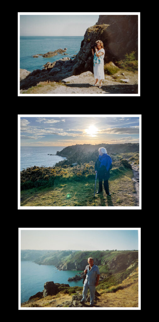
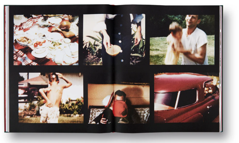
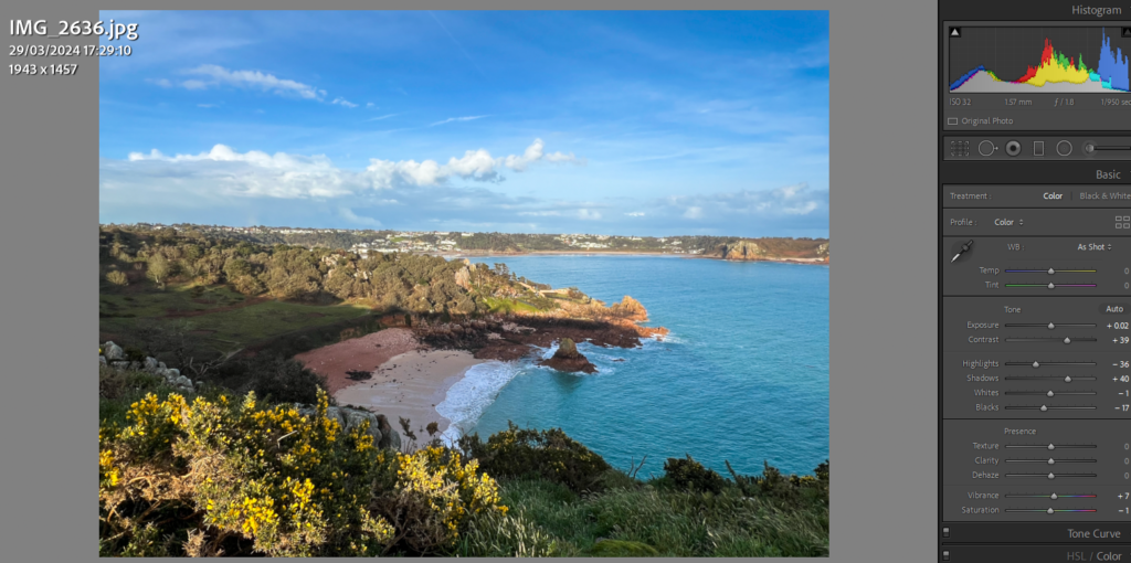
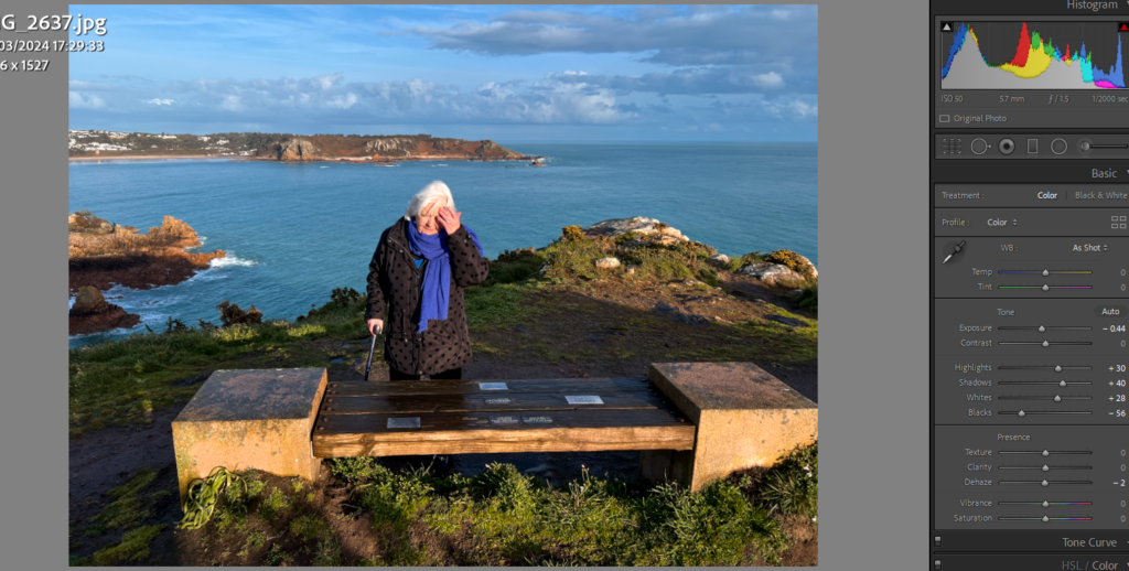
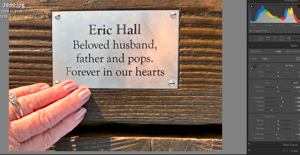
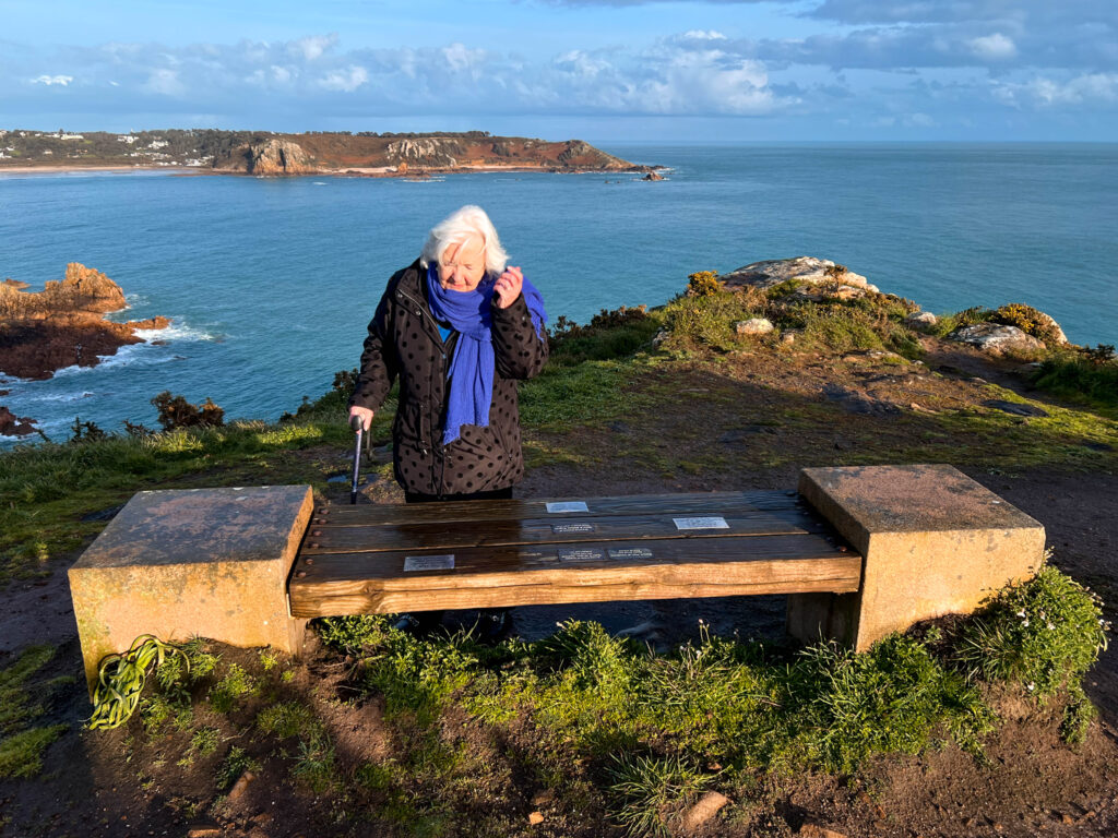
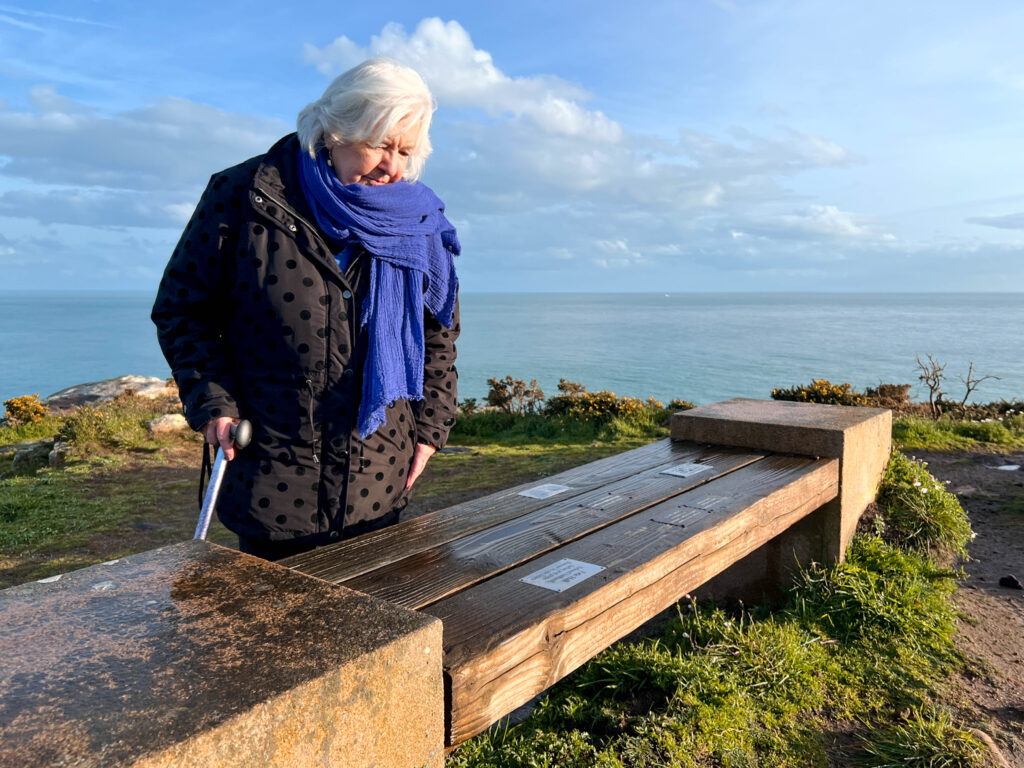
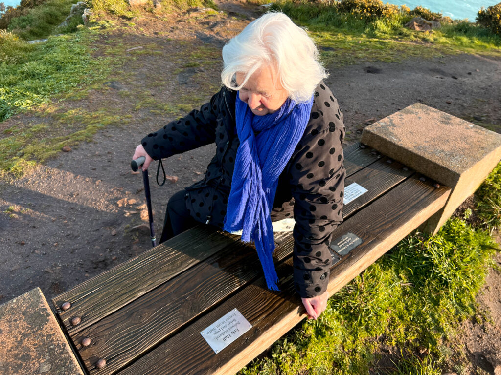
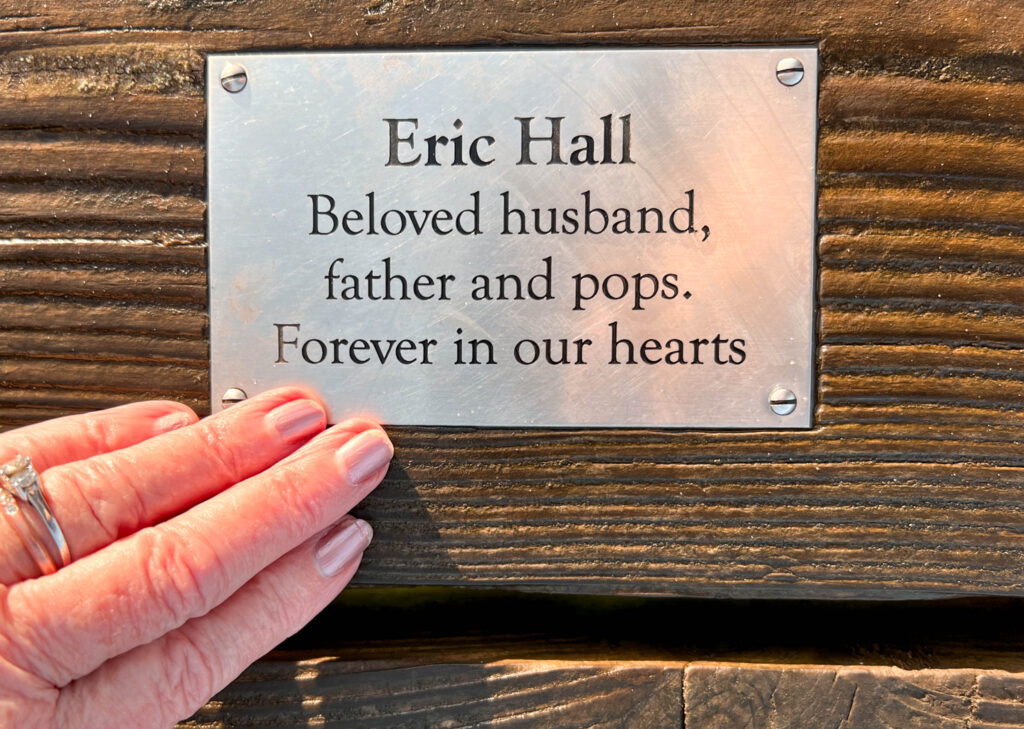
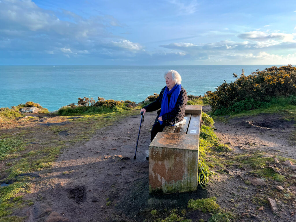
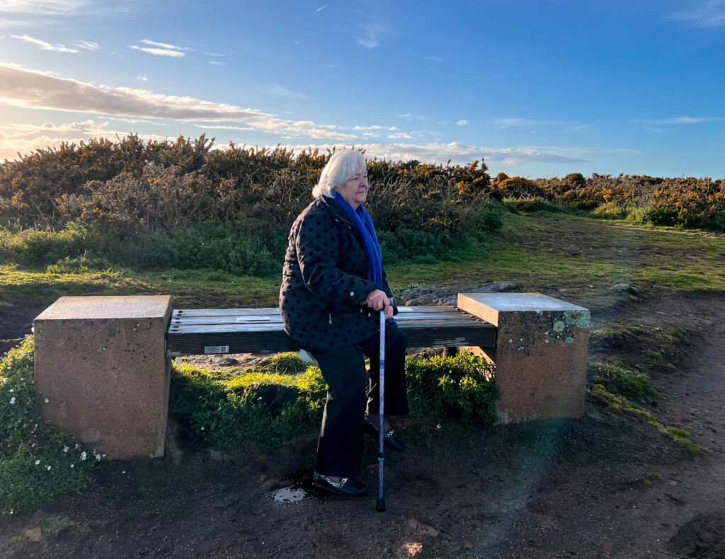
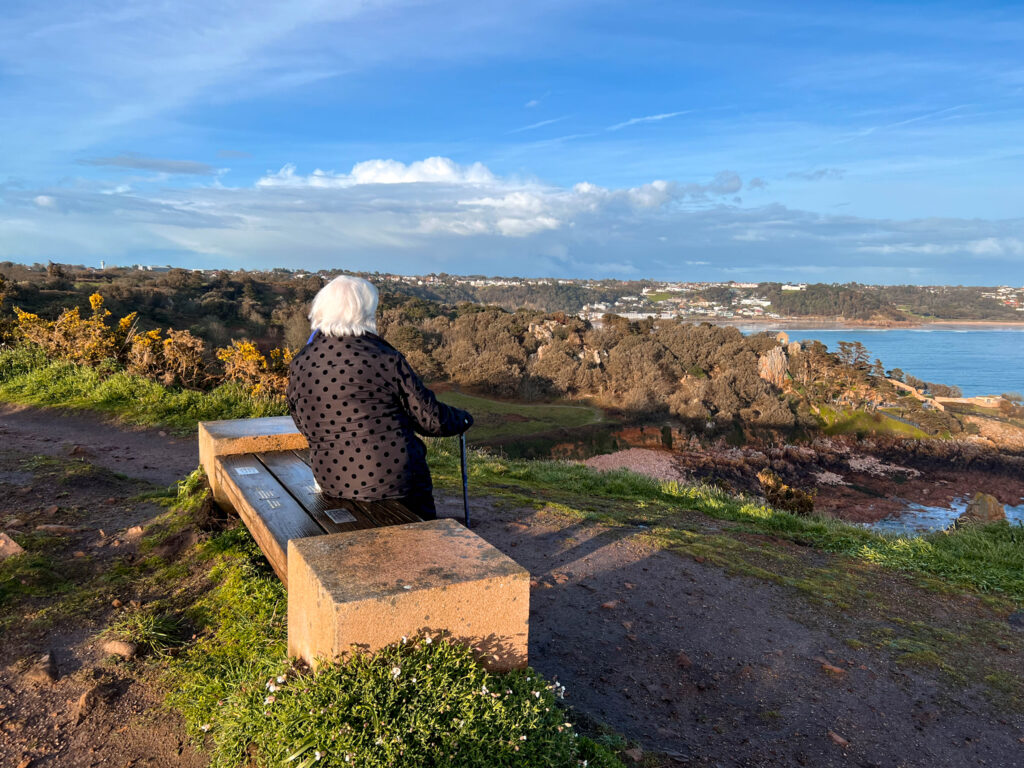
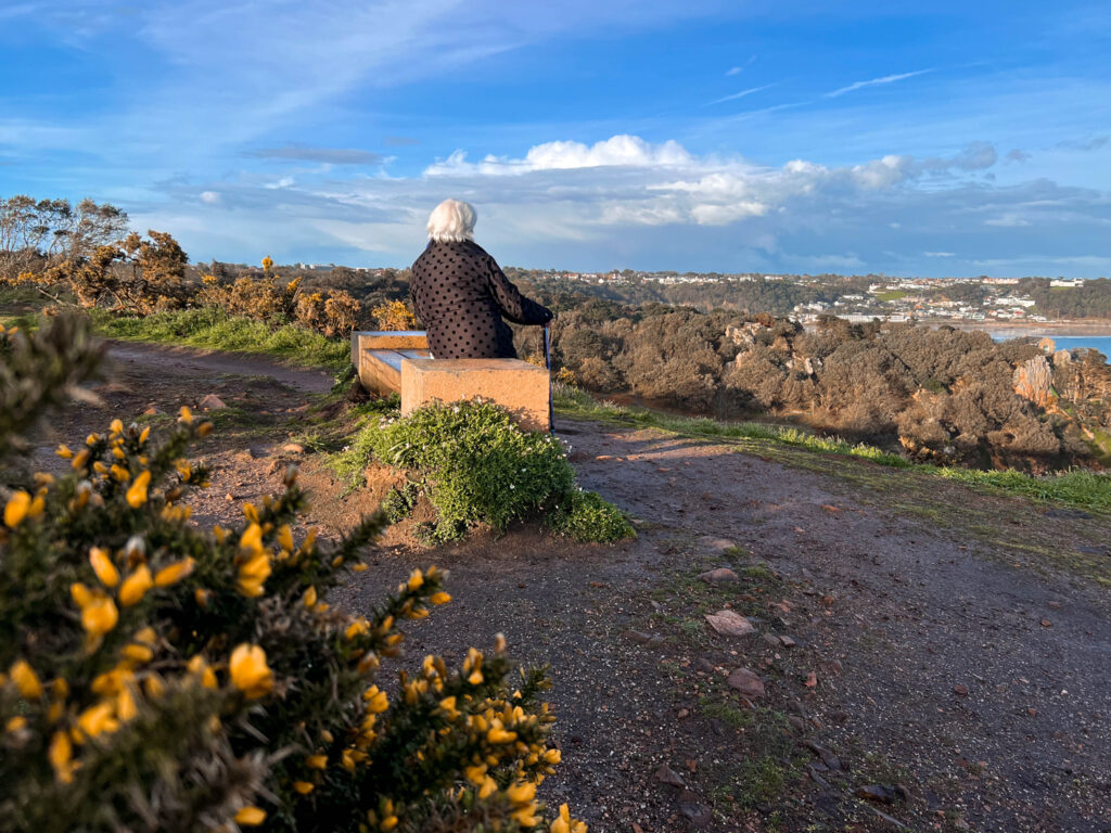
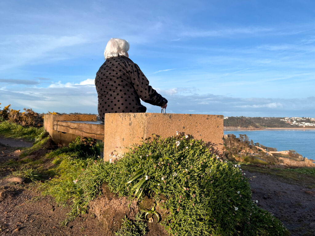
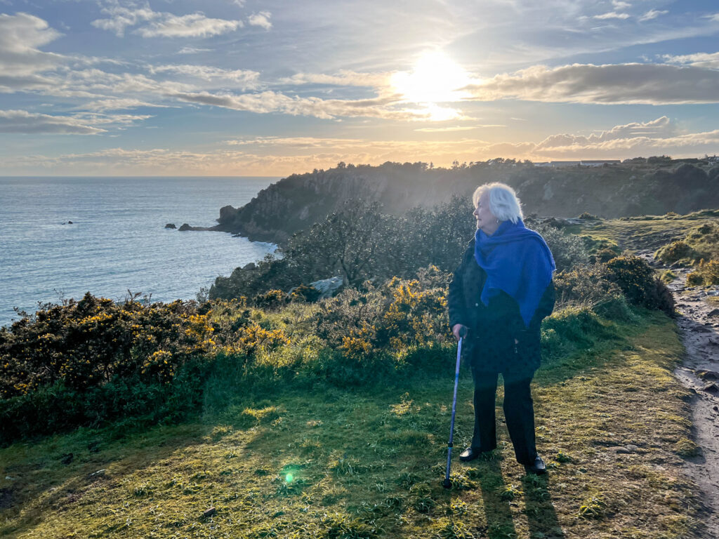
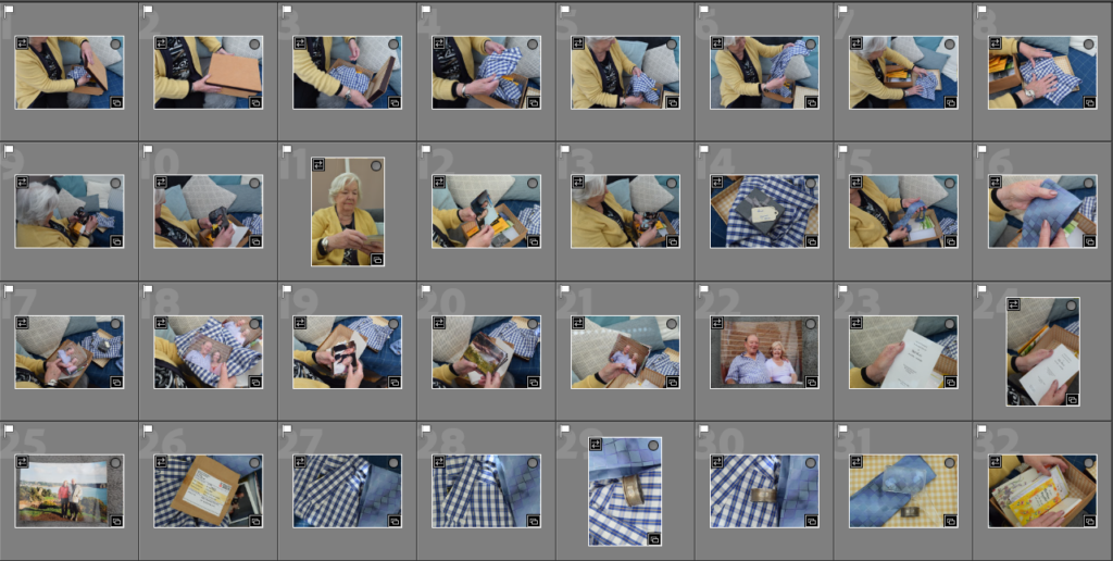
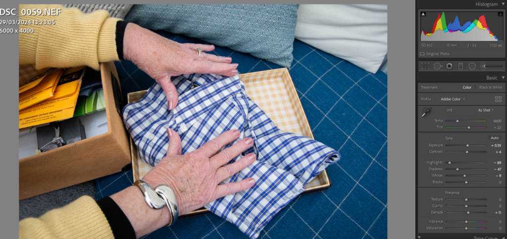
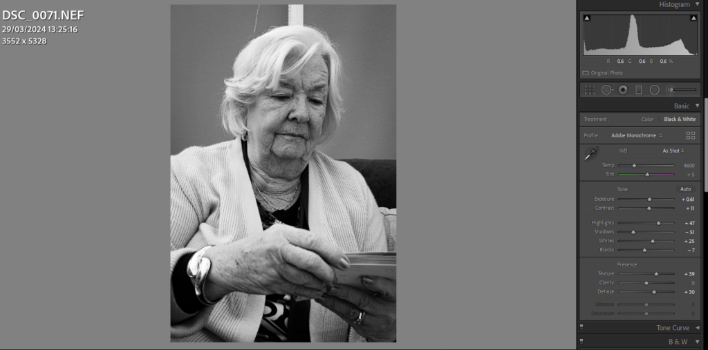
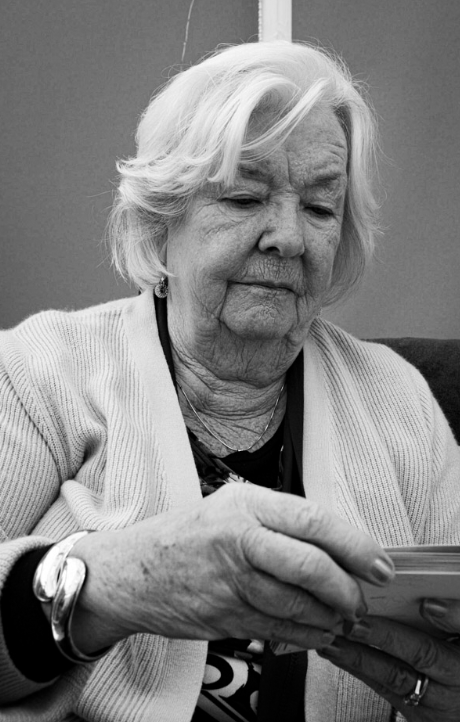
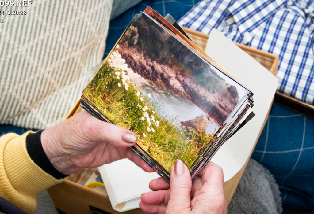
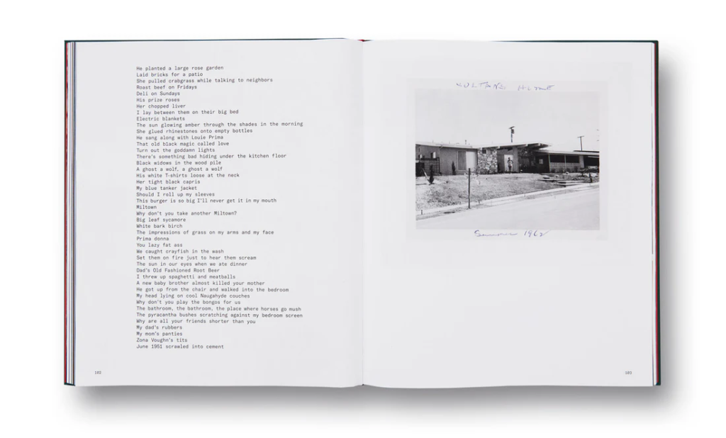
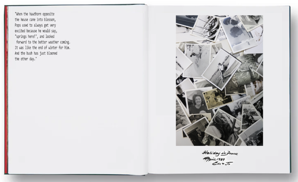
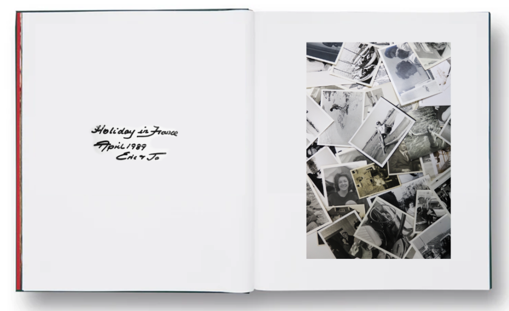
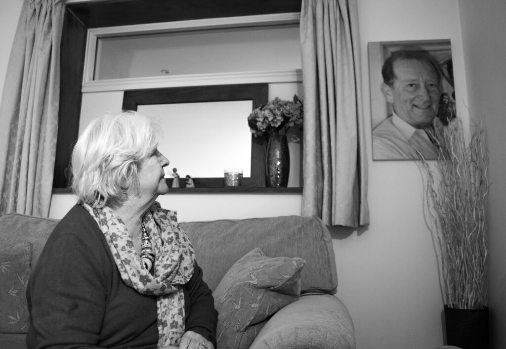
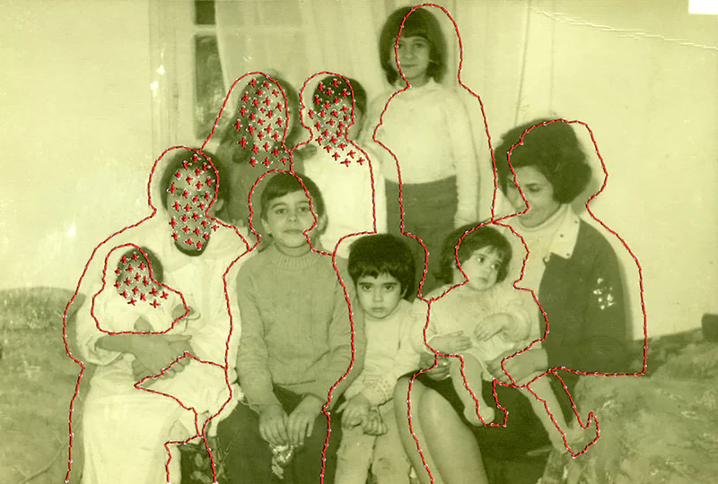
I have interviewed my gran to learn about her and my grandfather. I recorded the conversation and have written it down to put into my photobook. Like Larry Sultan, I want to include writing, and using my gran’s point of view gives an in depth story.

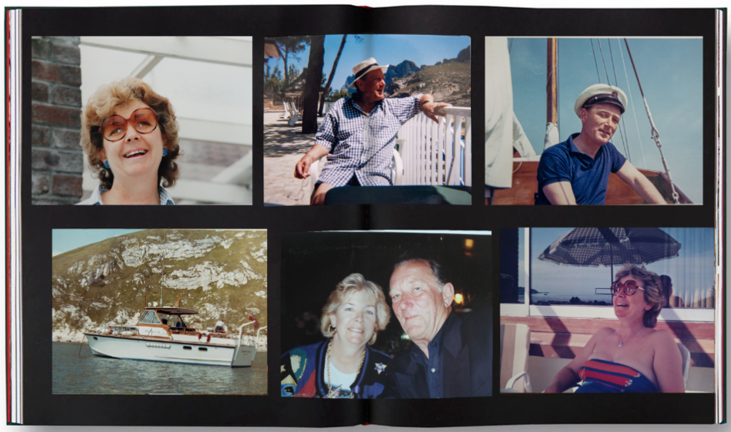
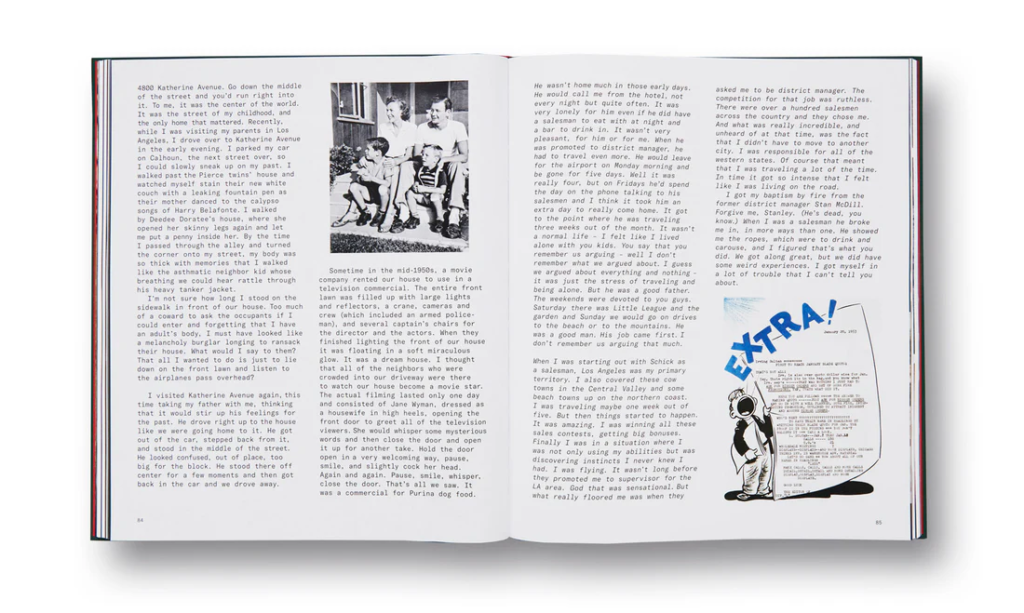
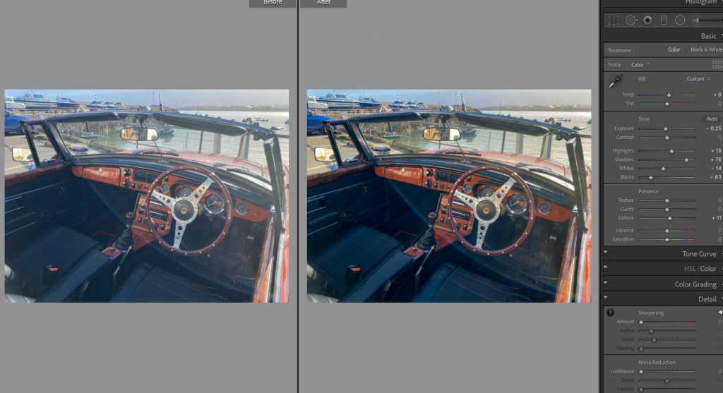
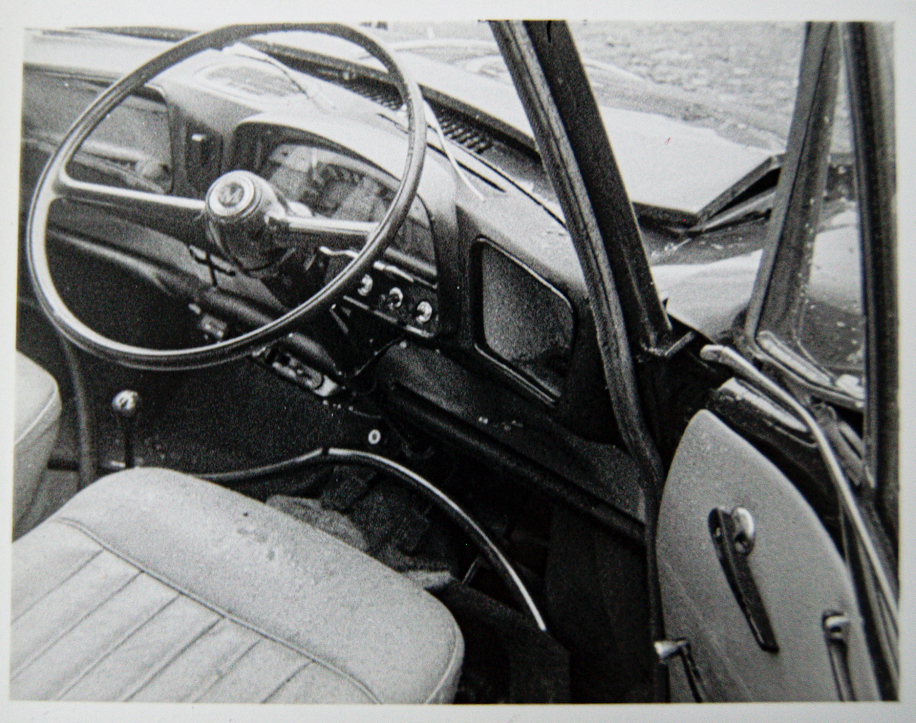
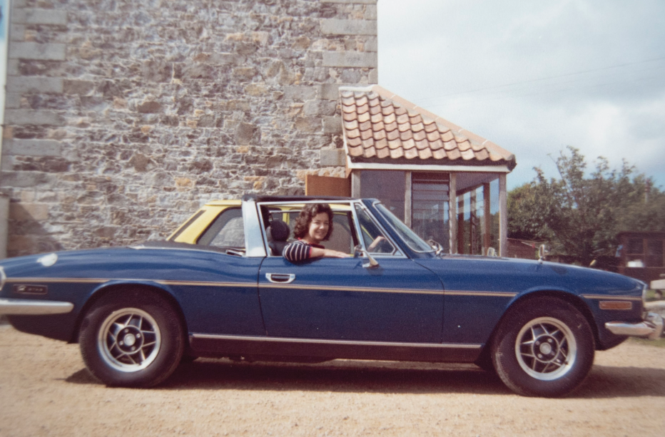
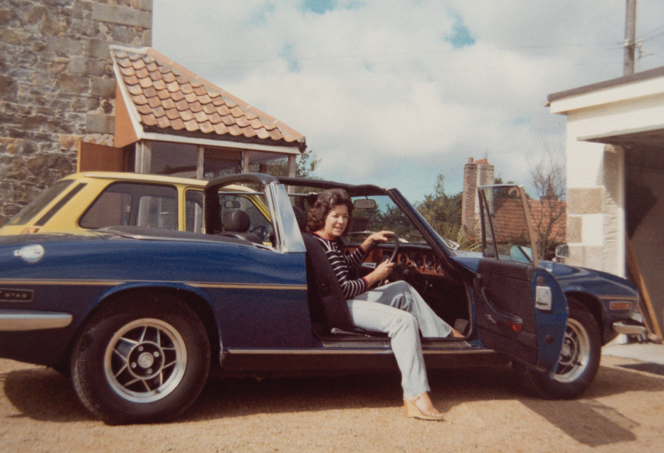
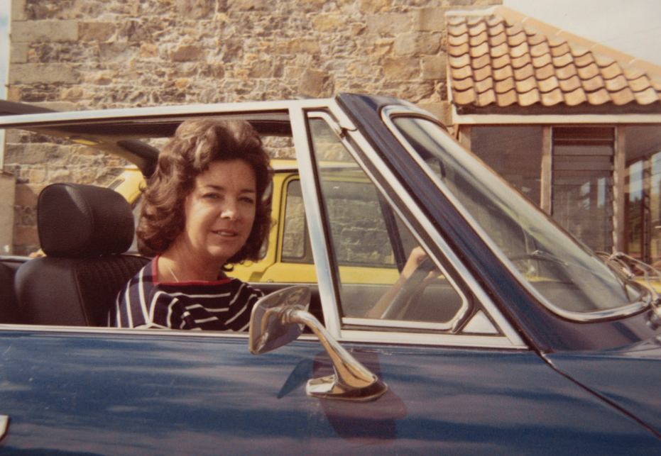
“After the war pops joined his father’s garage in Bath, it was called Bath Garages Limited, and I went to work there, and that’s how we met each other.”
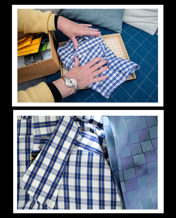
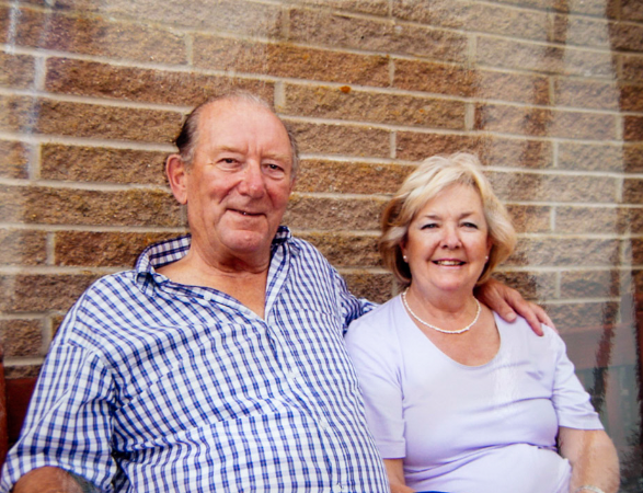
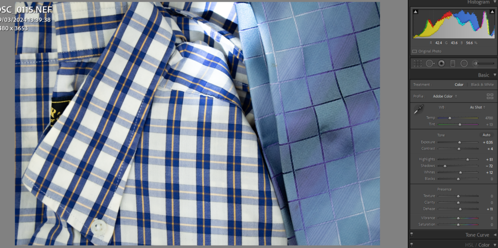
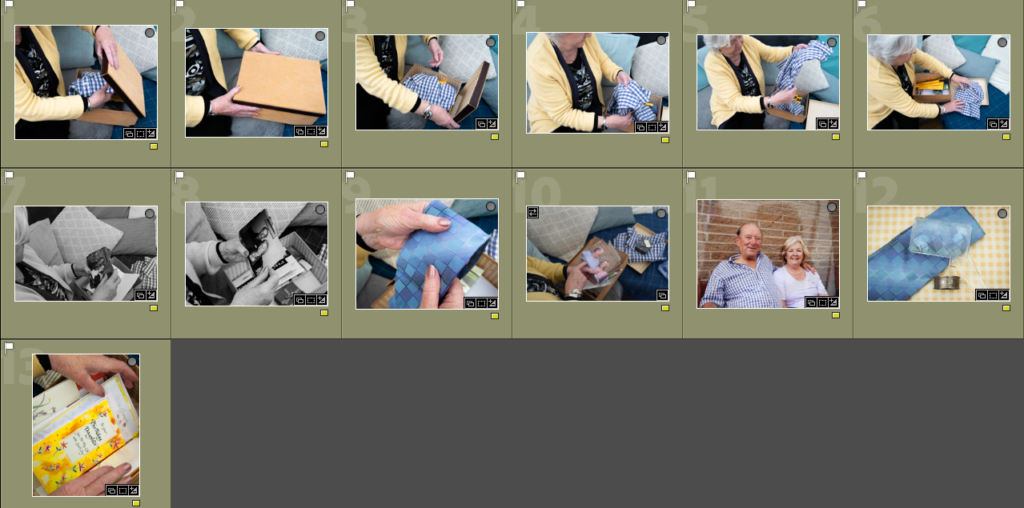
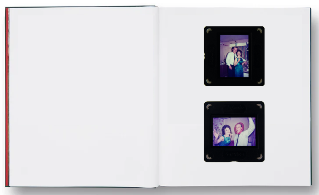
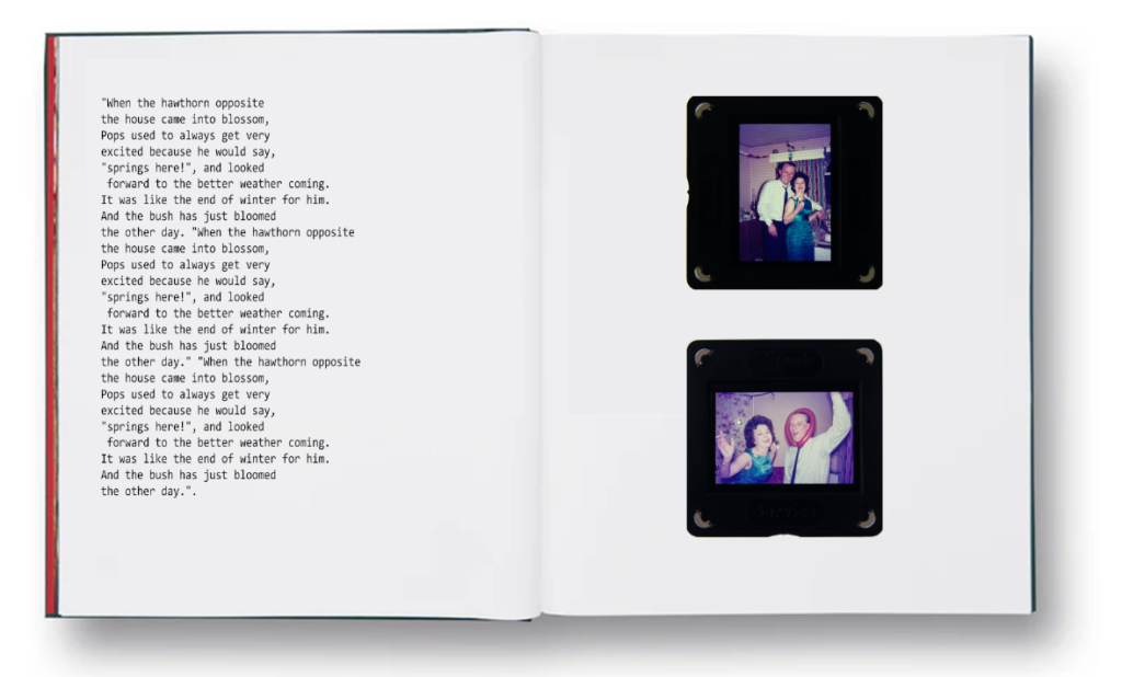
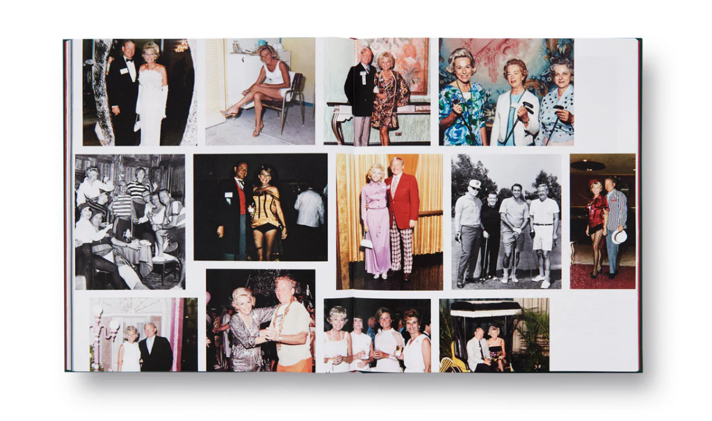
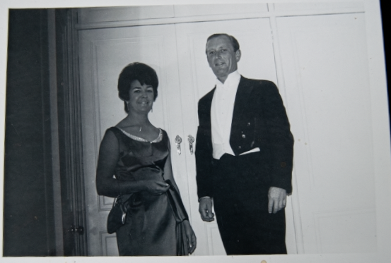
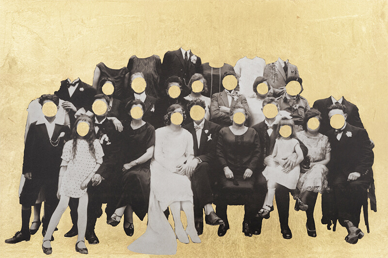
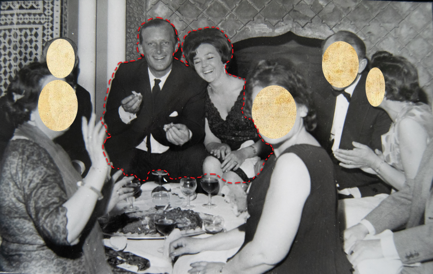
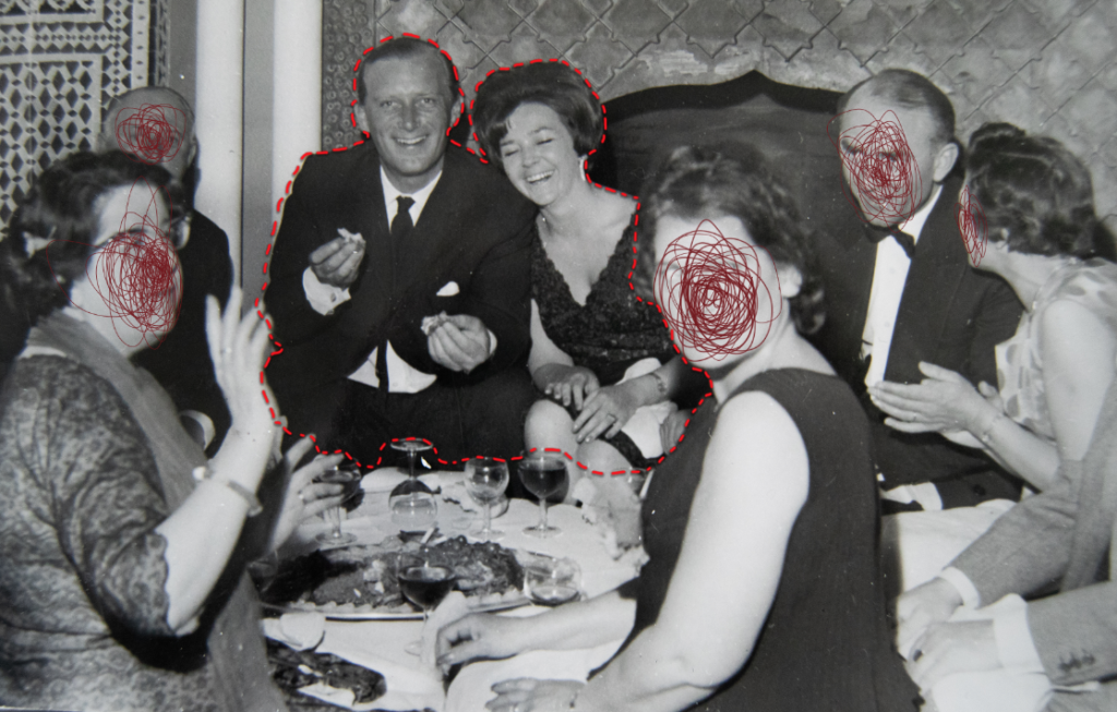
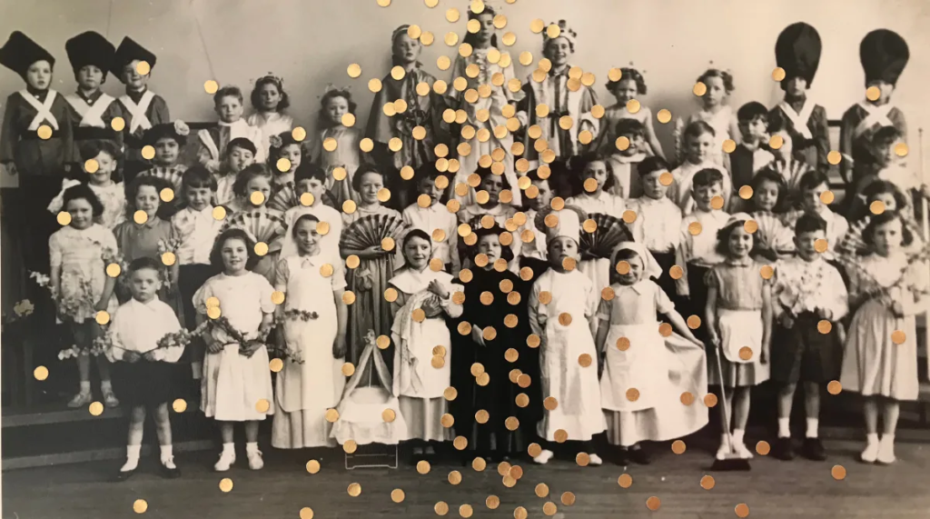
wedding

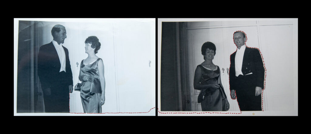
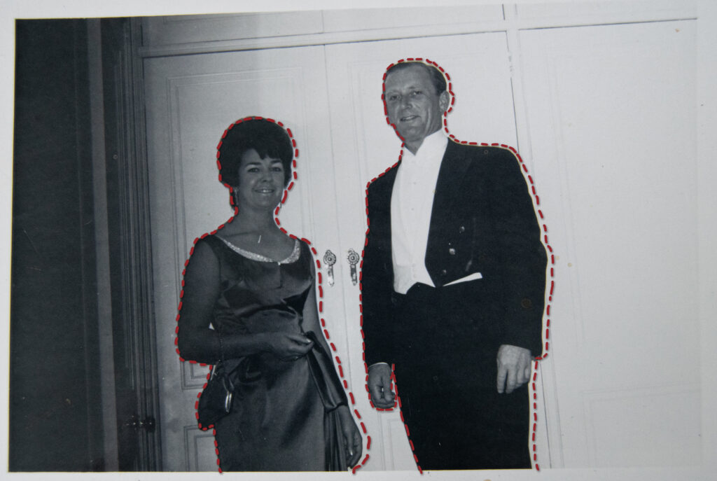
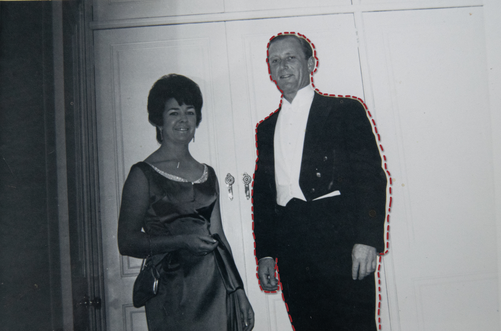
“So we met in 1962 and we fell in love. We moved in together in 1963  and got married in 1965. We just had a small wedding, four friends, in a registry office. And we went out for a quiet meal after, and checked into our hotel, and his best man and my maid of honour, came up to our room and we were chatting, and his best man left his wallet behind. Pops couldn’t attract his attention as he was walking to his car, so Pops threw a toilet roll out the window and it went flying through the air. I was so cross with him about it. and I think I remember my maid of honour winding up the toilet roll so it didn’t make a mess.”

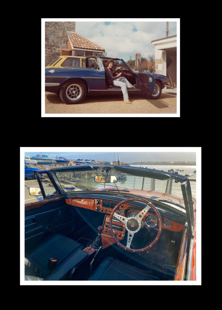
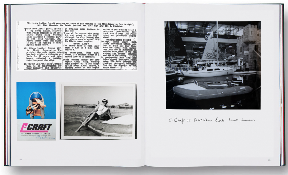
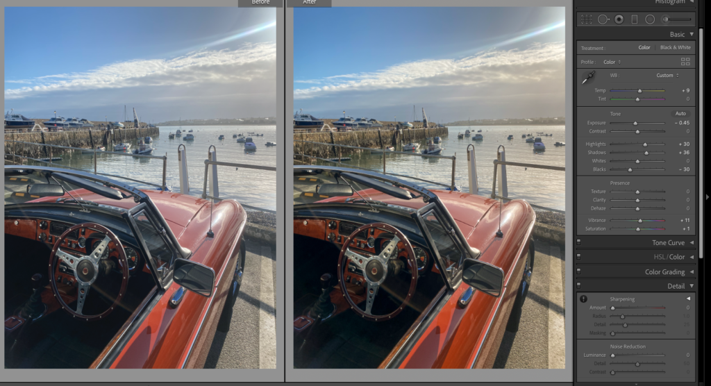
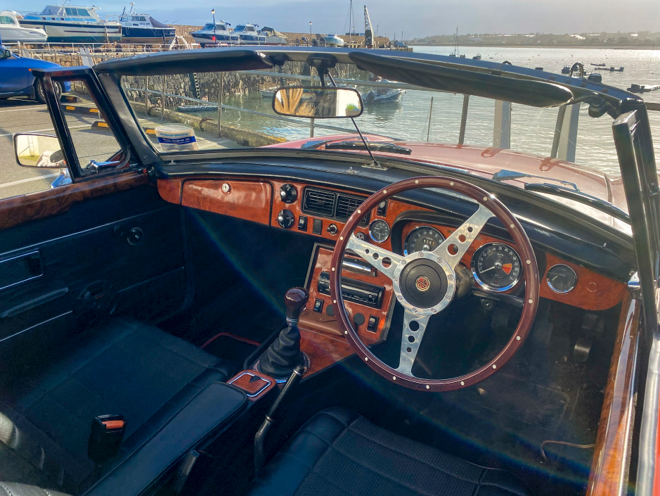
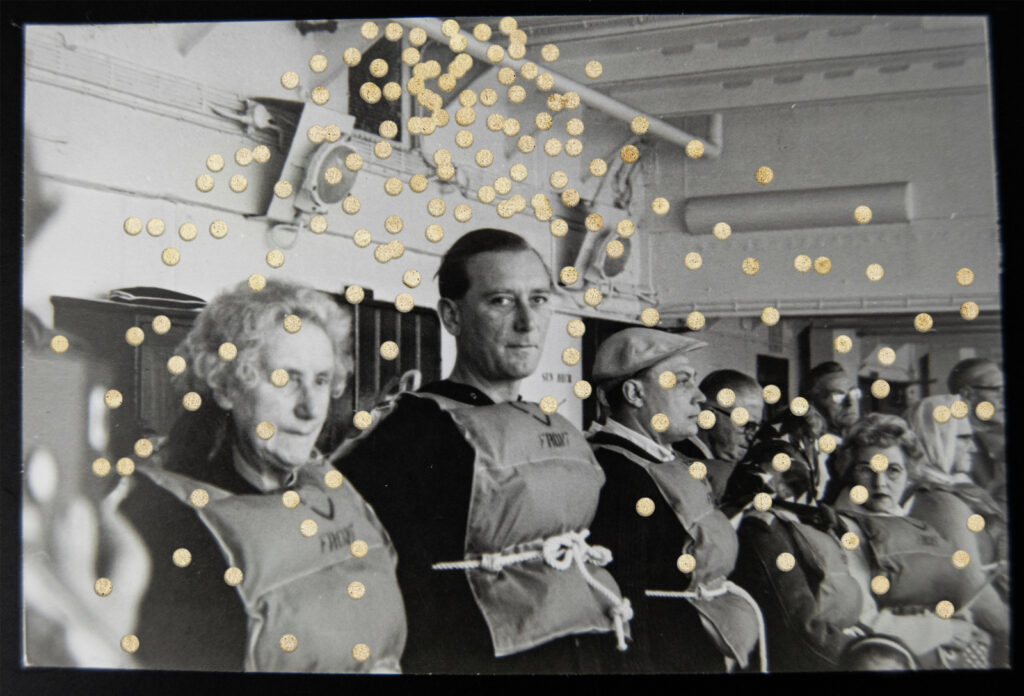
“During the first six years we were married we did lots of traveling and holidays, and for the first 6 years he joined his father’s firm. His father had a desire to sell and Pops bought it. The garages also had a small boat company where they sell rowing boats and sailing boats, which came with the garages. Pops heard of a Norwegian man who was Building inflatable boats, and he was building them in his lounge because he didn’t have any property. So Pops let him use the space in his garage and build his boats there, which became the C-Craft over time.”

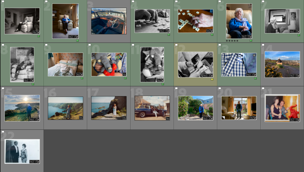
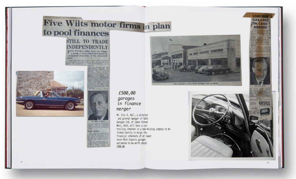
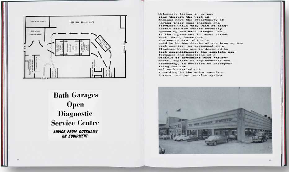
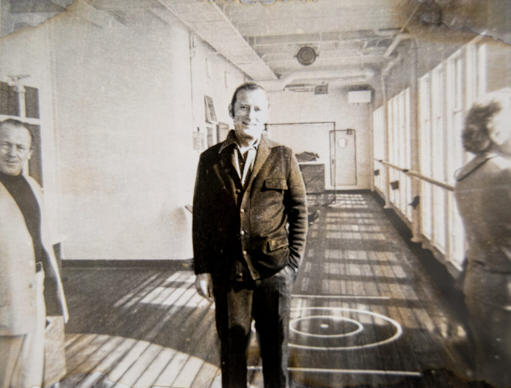
“They were very successful years for pops, he worked really hard and he ended up with fourteen dealerships from Bath right through Swindon, and he expanded buying dealerships from Bath to Weymouth. We had a boat in Weymouth, welI he had it when I met him, which was called a Girl Pat: half motor half sailboat. We used to go down every weekend we could, in the better months, to live on the boat for just a couple of nights. He was able to call in some of the garages on the way down. It was, you know, a lovely life really, but you work very hard and the garage business became very successful. Also, the boat company became very successful. Both of them did. Pops had an offer to buy out the garages, but it was the right thing to do. He was going to get quoted on the stock exchange, but the night before we were due to be floated on the stock exchange, a bigger company offered to buy us out.”

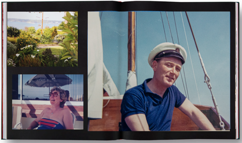
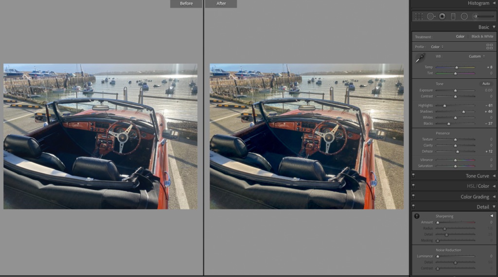
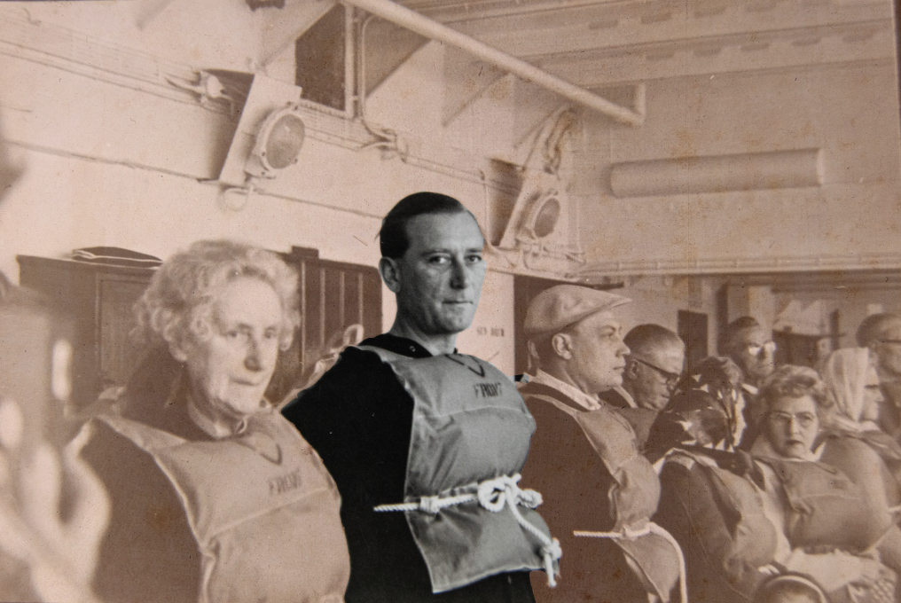
“During the first six years when he was busy with the motor business and the boat company, we did several cruises and had a lovely time on the cruises, enjoyed life a lot. We went to Motor Boat Shows, and had stands at them and it was quite a fulfilled, fun life. But hard work as well for him, it was lovely. Anyway, we decided we would like to start a family after six years and we had twin girls, and when they were five that’s when he decided he’d like to move to Jersey. Of course because he sold the garages, the distributorships and the boat company. He had done business with cars importing cars from Jersey and Guernsey and he always liked Jersey. So he came and had a look around and spoke to different people, and we found we couldn’t get into Jersey unless we had a business to come into, and that’s reported for business or bought a business to come into. He managed to come across a man who owned a manufacturing company. It was a very small company, but it was enough. They made tableware, placemats, vases and napkin Rings, all sorts of things. We had to buy into something that was going to make money for Jersey, and it was good for tourists. Then we found out that he decided to leave the company… for personal reasons. Then he was approached to do soft drinks on draft, which he got to do Soda Stream type soft drinks in bars, where you pour a pint, like cabana soft drinks. He took on an agency for that, there is something else, I can’t remember what, he did several things over here.”

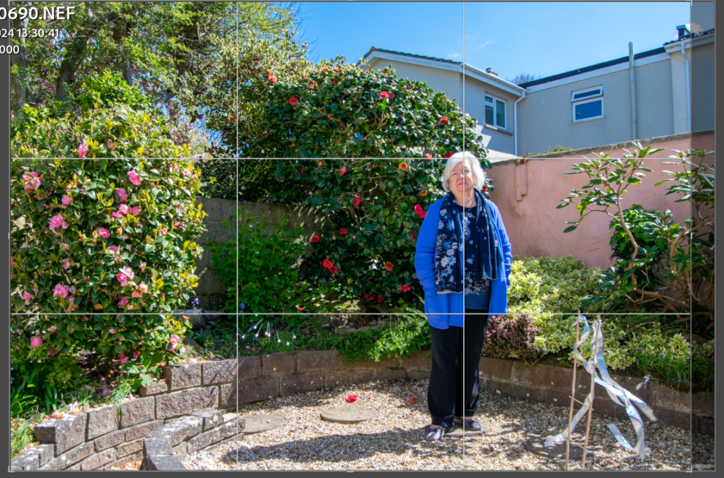
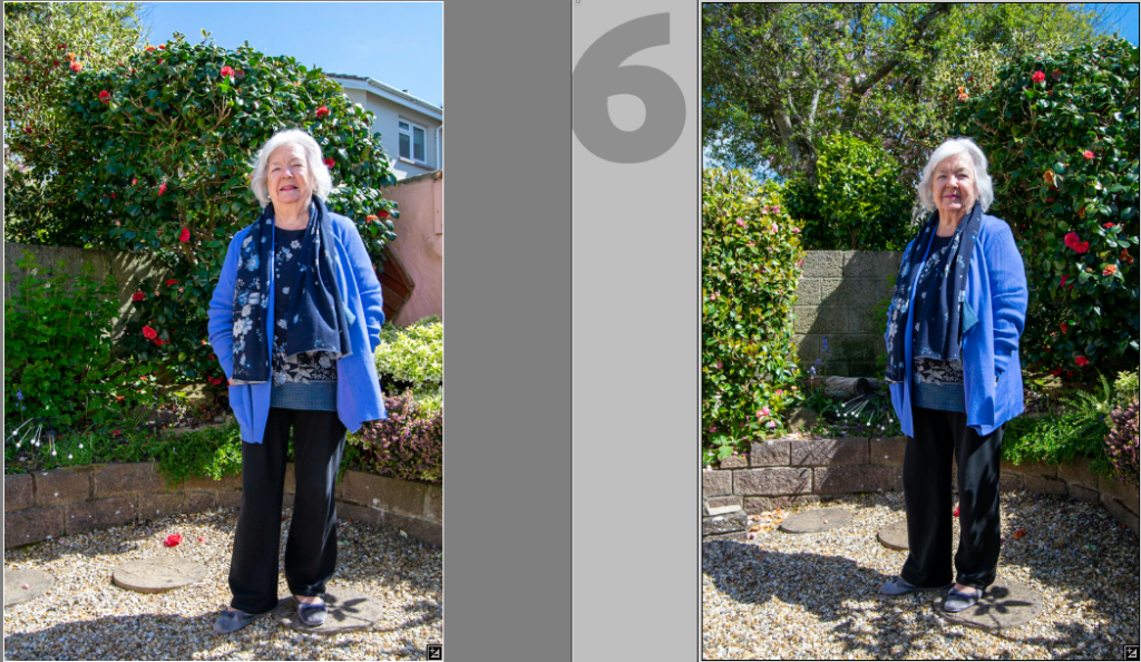
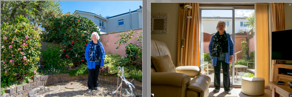
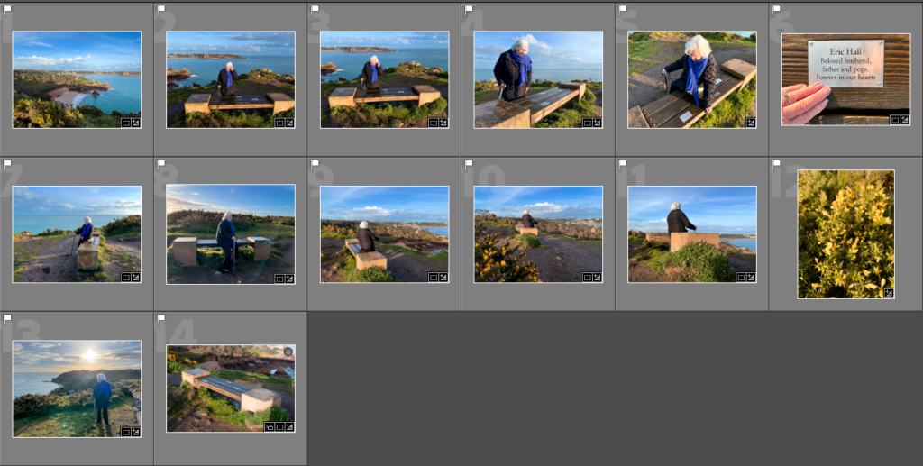
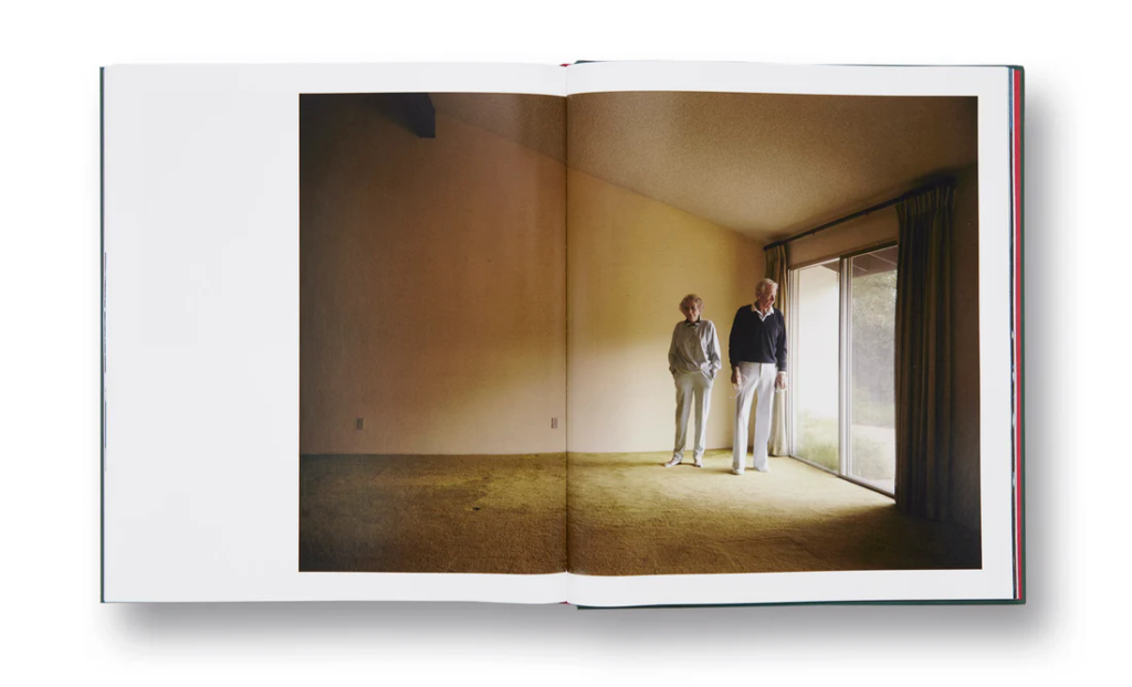
“We moved here when the twins were five, in 1974. We had our lovely Twins and grew up here and are now adults, married and have children of their own.”

Boot

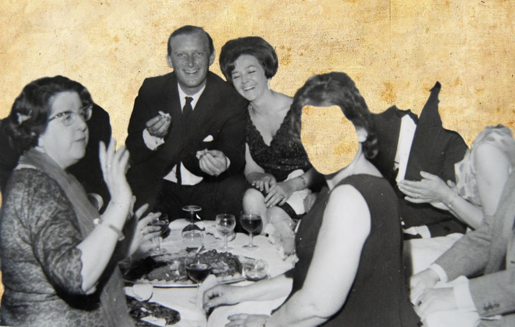
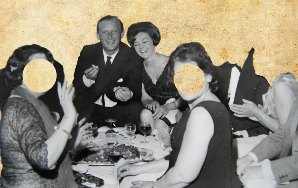
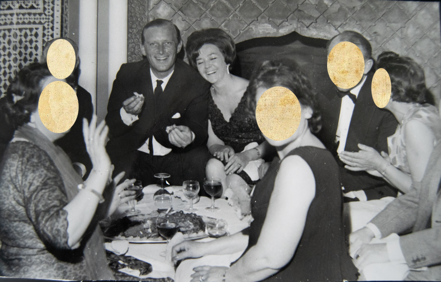
“We were on a cruise once and there was an elderly Australian couple. They were trying to see all of Europe and Britain, and met them cruising around the Mediterranean. When he got off he was visiting England and all around Scotland. The couple came to stay with us for a few days on their travels, and we took them out for a drive and the husband saw some sheep in the field, and he looked to them and he said, “oh look loads of sheep” and he said  “I’ll bet you I know all the names too”. He had thousands upon thousands of sheep himself  in Australia, and this little flock we were looking at were about, sort of 30 sheep. It was hilarious how it was such a small flock. Anyway, we kept hearing him call his wife, “come on you old boot, move your arse you old boot!”, he used to say to her. Pops picked up the expression “you old boot”, and he used to try to call me it, but I would say “don’t call  me an old boot”. But it became quite an affectionate thing because we had happy memories of the time with them. That’s why he bought me that little brass Boot. 
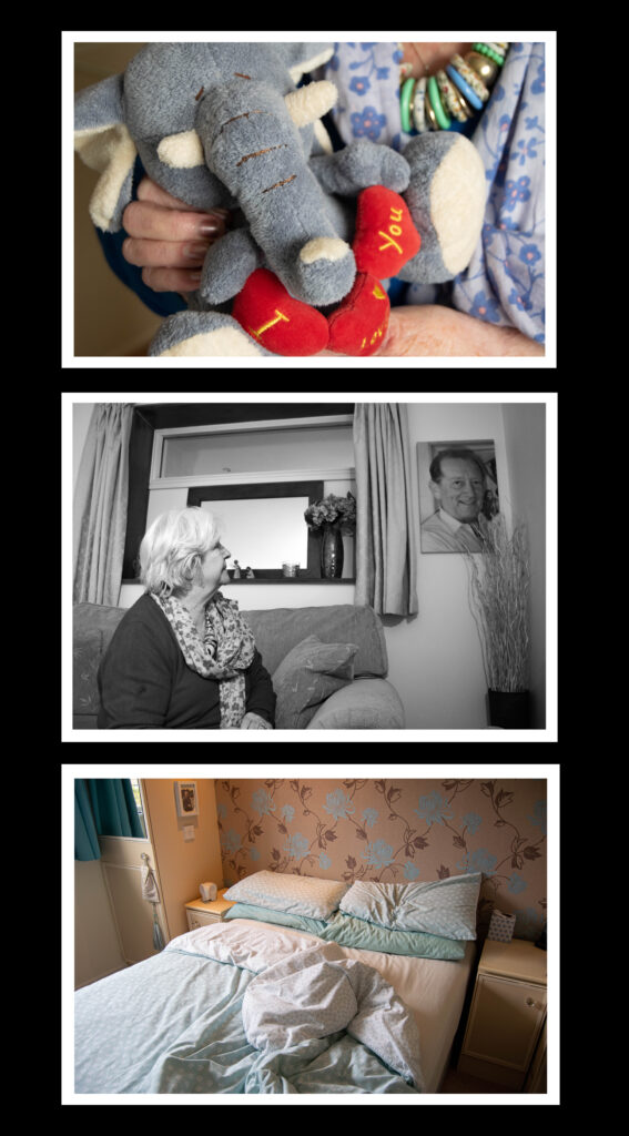
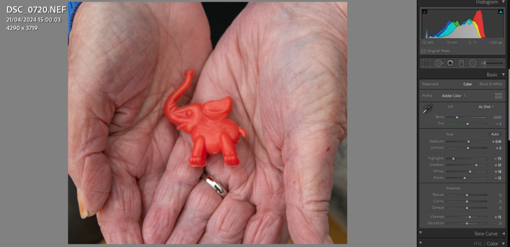
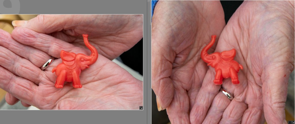
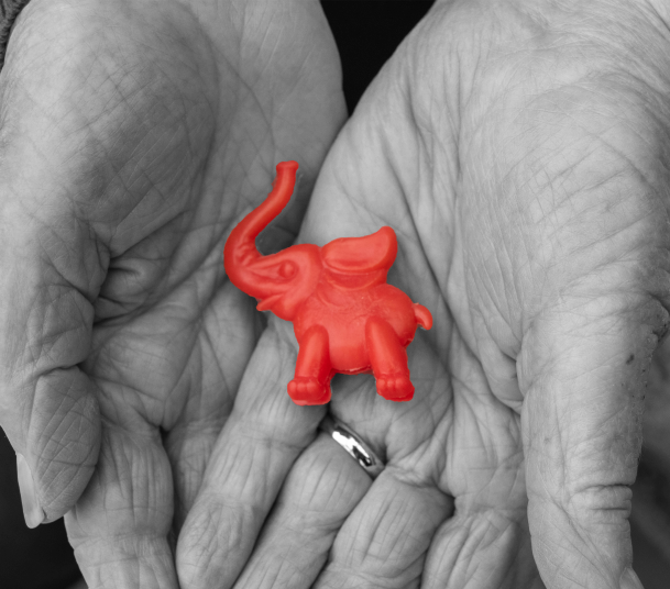
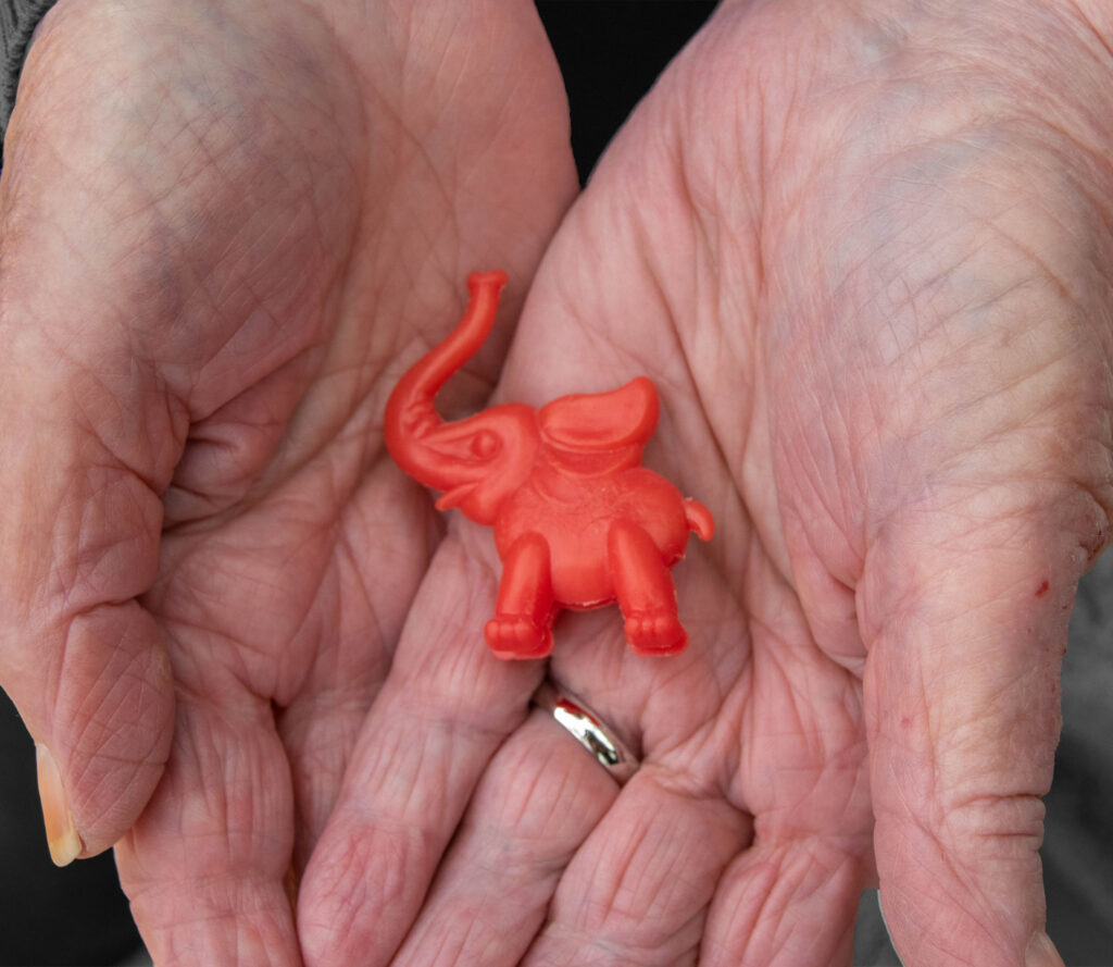
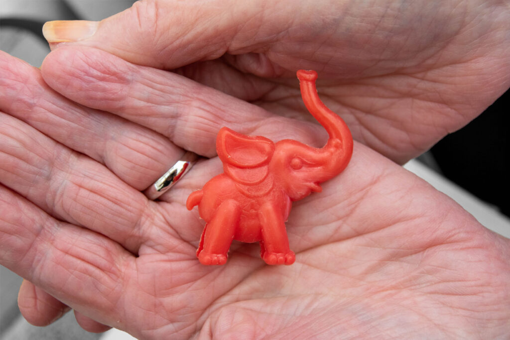
Elephants

“The elephant thing between us, well that was our symbol. When I was with him in the early days, we went to London to a Boat Show, or something, and we walked around to Hamleys Toy store. It was very popular in the day, a great big toy store. They had live monkeys and things like that, exotic animals. Anyway, we went in there and he ended up buying this silly Gray elephant toy, and everywhere we went the elephant had to go with us. Pops was such a clown, and when we would go to the bar to have a drink, the elephant had to come with us, that was the first  elephant. The first elephant Fell To Pieces he was so old. Every time he would order a drink he’d say, “can I have two gin and tonic please, and one for the Elephant”. But he used to drink it, and it was so funny because the barman would look at him as if he was  crazy. We would March around London and he would take the elephant everywhere with us, and that’s how we became stuck on elephants. One of our local pubs in Bath we would drink occasionally at, they had these little plastic animals and, he chose one for me, a red elephant. You stick it on your glass and its legs went over the edge of the glass so you couldn’t get your drinks muddled up with anyone. I’ve still got it after all these years. And from then on he gave me elephants, all the cards that he gave me had elephants on them. Even our girls used to often get them too.”

Deconstructing a Photobook

Photobook: Larry Sultan’s ‘Pictures From Home’

Research and deconstruct photobook used as inspiration. Comment on different design element such as: feel of the book, paper, binding, format, size, cover, title, design, narrative (if appropriate), editing, sequencing, image and text.

Pictures from home was published in 1992, around the time that Ronal Reagan was president, and wanting to reinforce the traditional family values in America. This photo book is a visual memoir made up of snapshots form home movies, his own images, and his own writings. Sultan said that he “wanted to puncture this mythology of the family and to show what happens when we are driven by images of success. And I was willing to use my family to prove a point.” because “the institution of the family was being used as an inspirational symbol by resurgent conservatives.” However, the book did move from this original motivation, to a more personal and self-questioning piece of work. It resulted in leaving him confused about its true meaning, but he came to the conclusion that it was because he wanted to stop time. “I want my parents to live for ever.” he stated. He took the images over a decade when visiting his parents who were living in Palm Spring, and in the final chapters of their lives. They seemed to live the idealised American Dream, making compositions interesting, vibrant and have an overall wealthy motif.

The book is a hardcover, making it strong, and the title is letter pressed. This almost adds to the idea that he is photographing the wealthy, because hardcovers make a book feel more expensive; and they are. The cover is a deep green, which links to the vivid greens in his images throughout the book. The inside page is a vibrant red which connects to the opening image of him as a child, with a red hula hoop. It adds a childish note to the book, possibly suggesting how he has tension with his father. In the Guardian article it states ‘Throughout, Sultan’s often painful reflections – on his upbringing, his parents, his photography, and the wisdom of this project – are undercut with his father’s more macho, matter-of-fact monologues on the same. The tension between the two is the classic generational tension between father and son; the one seeking affirmation of his work, the other baffled by it.’

The book varies from still from home movies, to his recent images, to his writing. Each page is different, however he makes it link throughout by using similar layouts for each of these subjects. For example, he tends to place an archived image next to his writing, his new images landscape at the top of a page, and his stills from movies in a collage.

Examples:

He tends to use darker backgrounds for old images, possibly adding to the reflection that these memories are in the past.

Image analysis

My Inspiration

Sultan’s photobook has inspired me to vary my usage of archived and text, adding in notes from my grandmother’s memories of my grandfather. I also have been inspired by his simple layout for his new images. I am going to create some collages similar to his as well.

Shoot – Beauport

Contact Sheet

I flagged the images I wanted to edit – these are the selection

I chose images which I may want to use – I won’t use every image in my photo book because I don’t want a repetition of images throughout. However, having this variety means I can compare and contrast which images go best and make the best composition in the book.

I created a preset for all my images to achieve the same tones and exposures throughout. I then went back and adjusted anything that was over saturated or the lighting wasn’t bright enough.

Here are some of the edits:

Final Images

Shoot 4

After studying Larry Sultan’s work I decided to photograph my gran in a less staged manner. I got her to look at old images and memorabilia. Whilst taking the photos I was aware that I needed to make the archived images visible, so I have the choice to present it with a similar image that I have made.

Contact Sheet

Selected/ flagged images

After editing them I selected them yellow and green. I will use some of the green ones in my photobook.

Best Images

I like the composition of this image presenting my grandfathers old shirt, and my nans caring movements when laying it out.

I feel like I could present this with archived images next to it, to suggest what she is looking at. I may use images of her and my grandad when they were young, as if she’s reminiscing.

This image will connect well with my photoshoot from Beauport. It is an image from where his ashes were scattered, and my gran visits there often. By placing this next to one of those images it is like I am transporting the viewer into the archived image, and into the present time.

I like the pattern juxtaposition between his tie and shirt. It is more abstract compared to my other photos and I think it could break up the frequency of portraits quite nicely.

Archive Layout in the style of Larry Sultan

I began by placing a download of this page of his book in Photoshop. I am going to place my images over his as a practise run to see if I like the design with my archives.

I wanted to use coloured images, similar to Sultan. His images have some subtle vibrancy so I chose to include coloured images with similar colour tones.

To create this I took the size of the images Sultan had used, and cropped mine to that size. I then organised the images into place and added a slight shadow down the middle to make it look like the book still.

I want to vary the images, and include some of my gran too because I feel like it may be too centred around my grandfather.

I like this although I prefer the collage of my grandad, I am going to incorporate my gran in a different layout of Sultan’s.

I like this collage because it shows the change in time quite ambiguously. There is a young image of the grandfather, then my gran slightly older, then I contrast the portraits with a landscape. It is a picture of the gardens where my grandfather passed, show it unobviously presents the loss of him and change that time causes.

I also like the way he lays out his writing, and I have created some rough ideas on how I am going to incorporate this into my photo book to add context to my grandfather’s life. He owned a car garage and a boat business and kep scraps from the newspapers. I have edited some of these in photoshop in a similar way to Sultan.

Some of the backgrounds were yellowed newspaper, so in Photoshop I lowered the saturation, increased the brightness and contrast and then pasteurized it. I then readjusted the contrast and managed to make the writing stand out on a white background. They didn’t fully fit the shadowed page I am experimenting on but it is a rough idea.

I focused one of these on his boat company and the other on his car garage company. I chose to include archives of my gran and an old car. I think they compliment the composition and are subtle, similar to the ambiguous link between Sultan’s images and his archived.

I created another idea, completely focused on archival material from his scrapbooks. I used a similar font to Sultan because I find it quite retro looking, linking into the overall look of the archives.

For this layout I included dialogue that I took from a recording of my Grand talking about my grandad’s interest in the hawthorn bush. I don’t like this layout because I think the composition isn’t right, and the images on the right don’t connect to the dialogue.

I quite like this layout, and it has given me ideas about naming the book ‘Holiday in France April 1989 Eric and Jo’. If I don’t I think I will use the same front or writing style for it. I quite like this as an opening page.

I quite like this basic composition as a page because the images are so colourful they make the page spread simple but interesting. I think if I did a page like this I would only do 1 or 2. I would put my new images after it such as this one because it presents a juxtaposition in the situation.

I put some example text next to it and like the look of it. I will need to record more dialogue of my gran to do this.

Pictures from Home Larry Sultan

This is one of the most significant American photobooks of the 1990s‘ Parr + Badger Vol. II

Pictures From Home was one of his projects that took a decade, featuring his mother and father as the main subjects. It is a pendant to his parents, and was published in 1992. Over the years from the 1980s to the 1990s, Sultan frequently returned home to Southern California. Being a narrative collage, this photo book holds various mediums. It includes contemporary photographs, film stills from home movies, parts of conversation, and his own writings as well as other mementos. Sultan has created it to leave ambiguity in understanding the difference between the documentary and the staged.

I like the way that Sultan has collected memorabilia from archives, similar to my project, and linked the two so they become one. I want to include a small level of this in my work, however I still want to present the difference. I am influenced by his ability to capture his parents doing daily tasks in the moment, but still managing to make it look staged. I find there is a sort of environmental photography linked with this, presenting the subjects in their environment and having them look at the camera. I feel like I have done this in my work, however it could be improved by placing my gran in situations where she is completing an activity or daily task.

As a result of looking into Sultan’s work I have been inspired to photograph my gran looking at archives and old objects with sentimental meaning of my grandfather. My gran tends to enjoy revisiting old memories through photo books so I will photograph her doing so.

I have also been inspired by the way he lays out his archived images in Pictures From Home. These page has particularly inspired me to experiment with a layout like this.

The pages including his writing and memorabilia has given me ideas on how to include my grandfathers scrap books, possibly rewriting the news paper articles or enlarging the images and reorganising it to fit a page in Photoshop. I will experiment with this later.

Shoot 3

Contact Sheet

I flagged the images I wanted to edit

I wanted to edit them with a retro look, so I increased the temperature a bit.

Basic Edits

I brought the highlights up and lowered the whites, similar with the shadows and blacks. I then added dehaze to add more strength and depth to the image. After then adding temperature I felt like the images looked retro, but are obviously new.

I have done this to link with these archived photos, that include a similar looking car.

I want to choose the best composition that includes the boats (because my grandfather owned boats and I can make this comparison too) and the car. I also need to decide which of the archived images I will compare them with.

The best two

I don’t think this image has as good of a composition, although the boats are visible.
I think this is the most similar to the black and white archived image,however the boats aren’t fully visible – I think this one is a better composition.

COMPARISON

After comparing the images I am still unsure of which to choose, so I will decide when putting my photobook together.

Carolle Bénitah

I want to edit some of my archived images in the style o f Benitah because I find her work can present feelings and storied through her editing process. I am going to experiment with her ideas in my own style to present loss and highlight my grandparents in images. Here is some of Benitah’s work that has inspired me:

Rather than prints, I am going to experiment in photoshop because it leaves more room for experimentation and I can produce multiple outcomes.

I selected the images I want to use for these edits in Lightroom using the colour selection, and rating them green.

Basic edits

The two main things in the images that I focused on was blacks/ whites and detail. I didn’t edit them too much apart from correcting the amount of shadow and highlights. I then sharpened the images a bit, adding some noise reduction to reduce grain. I also added texture and clarity to define some images and make the details more prominent. Whilst editing I had to think about the quality for printing, and I know (from my previous prints) that adding too much clarity/ texture/ sharpening can cause the image to look worse when printing.

example of basic image

I began editing an image in photoshop in the style of Benitah, focusing on the different shapes she uses to cut out the faces, the tones of red, and how she constructs her edits.

inspiration image

I tried removing the face using the quick selection tool to cut completely along the lines on the face. However I felt this didn’t look right and tried circles – like Benitah.

I selected circles, and selected ‘create layer via cut’ to show the background through. However I feel like this would work better with an image with more faces in, so I experimented more.

I tried adding the red thread sewing technique that she uses, but with the pen tool. I added a drop shadow to make it slightly more realistic.

I tried drawing with a darker red on their faces, and made it coe from the wine glass. I have seen Benitah do this a few times in her work, giving the ‘string’ a place where it has come from. I like this edit more than removing the faces, and feel like it fits the tones more.

More edits- I experimented with different editing for these images until I found a final result that I liked. I want to keep some subtle because when putting the book together overall I don’t want it to be too much.

quick select subject, create layer via copy, new layer, colour fill – red, low opacity, bring copy layer forward.
place image over old paper, erase chosen areas.
Draw a row of ‘x’ in pen, duplicate to make a large amount, combine layers, duplicate the combine layers, erase area over subject.
place image over old paper, erase in dots, add a drop shadow to look like leftovers from a hole punch – similar to Benitah’s work. I decided the paper was too saturated so I lowered the saturation.
Carolle Benitah’s work

For this image I’m not sure if I should have the thread around just my grandad to emphasise his loss, or if it creates a better composition with them both outlined.

I want some basic edits so I made this image look like burnt paper – inspired by Jessa Fairbrother

I edited this image of my grandad and his sister, attempting to focus the image on him, however I don’t like the edit and I decided it doesn’t link to the project.