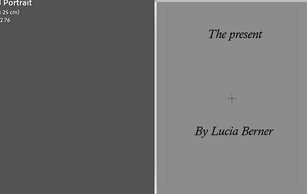
How my final images fit into the theme of Observe, Seek, Challenge
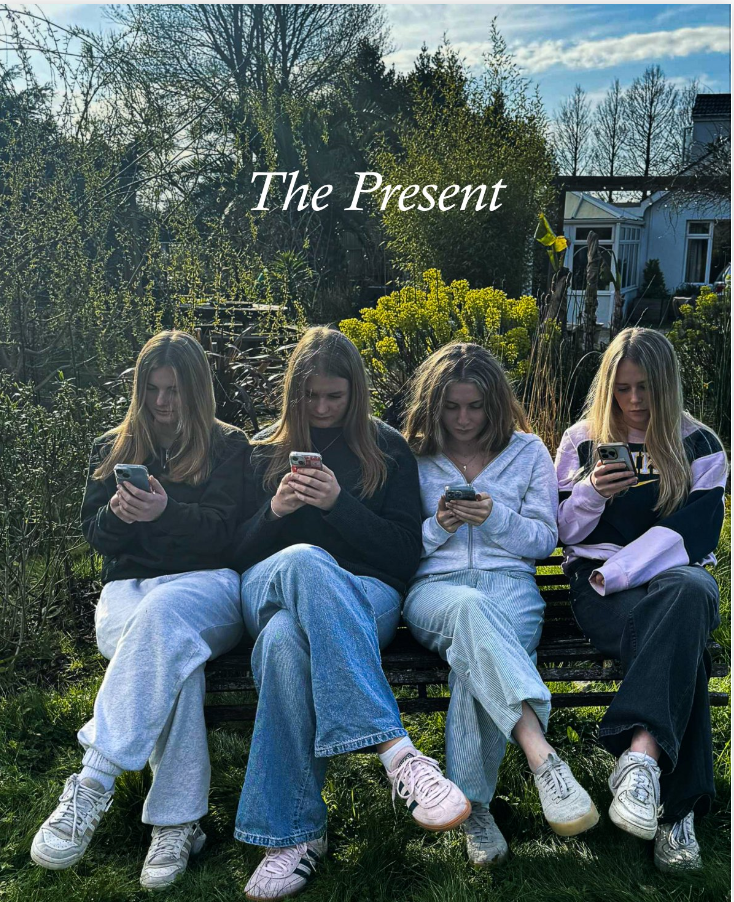
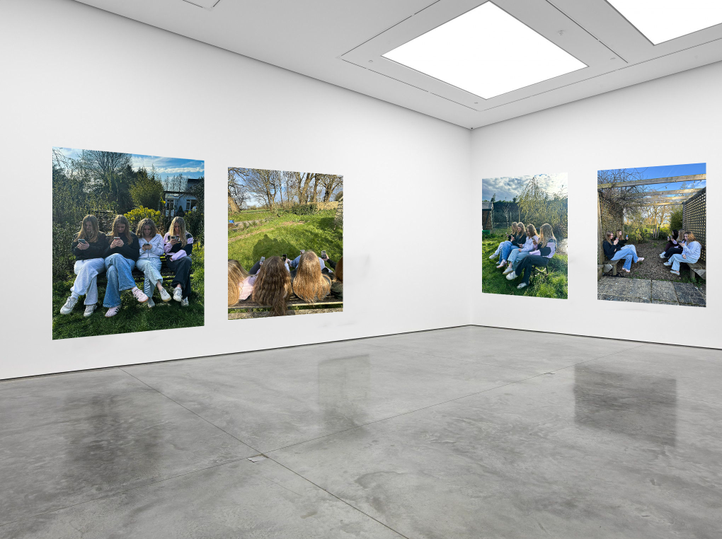
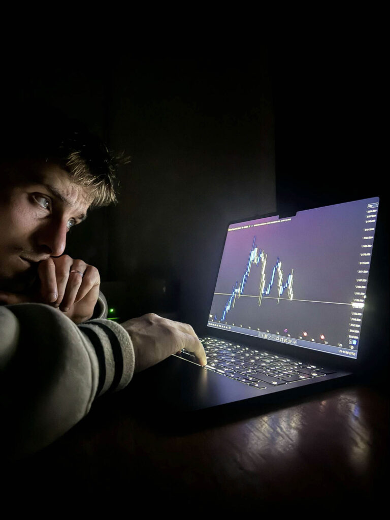
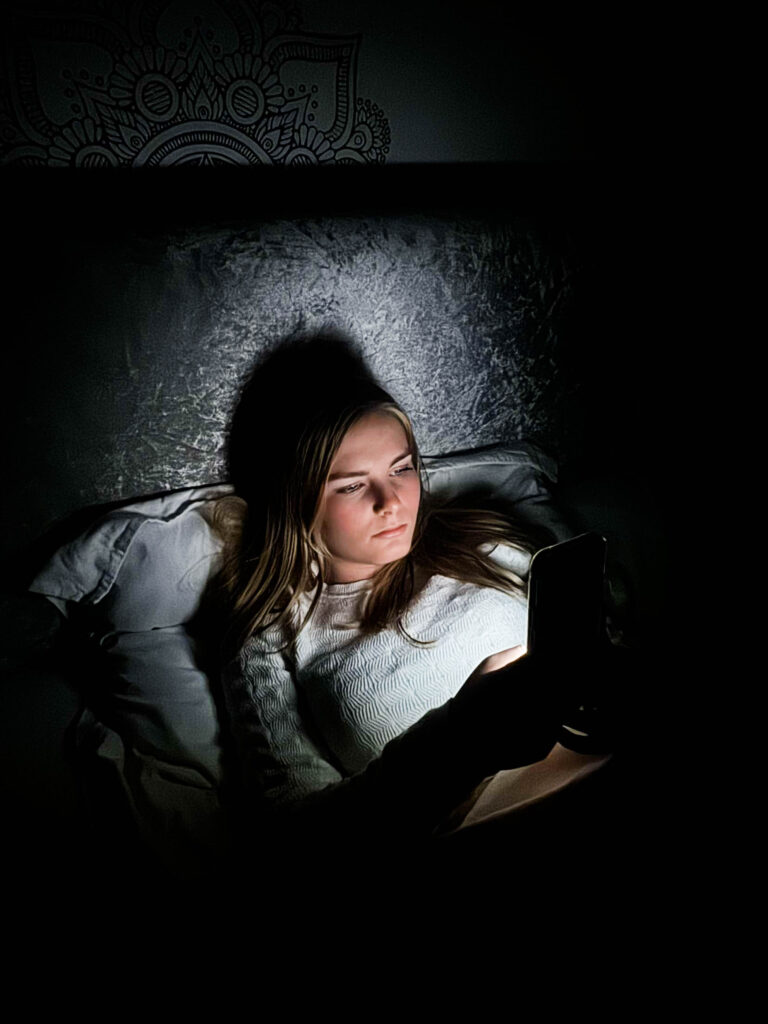
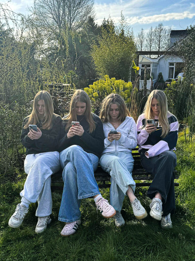
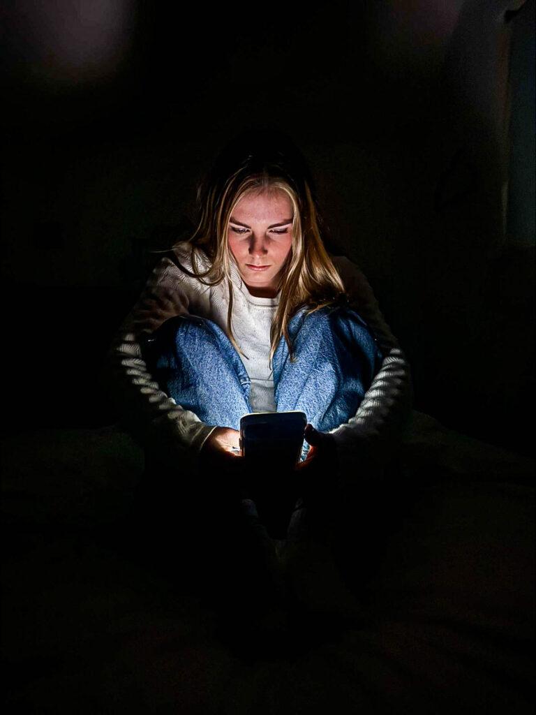
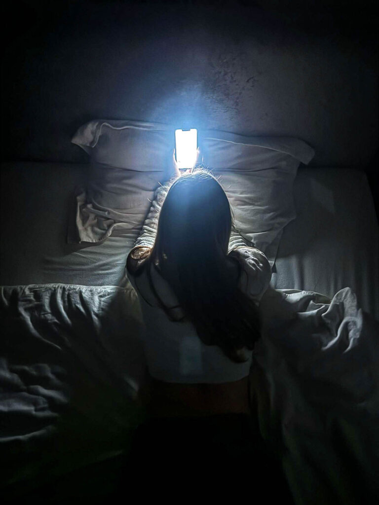
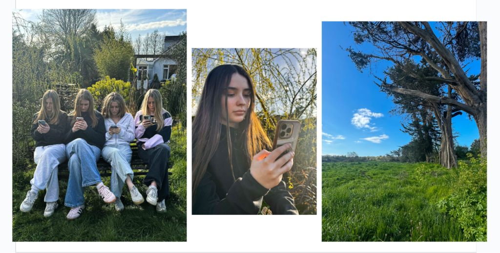
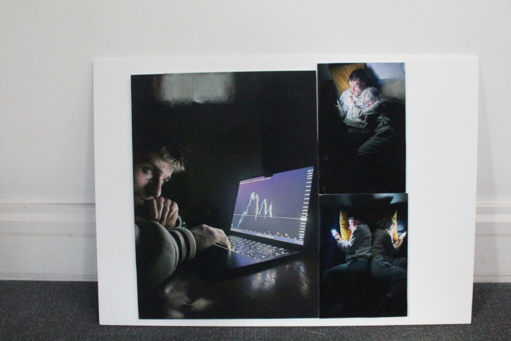
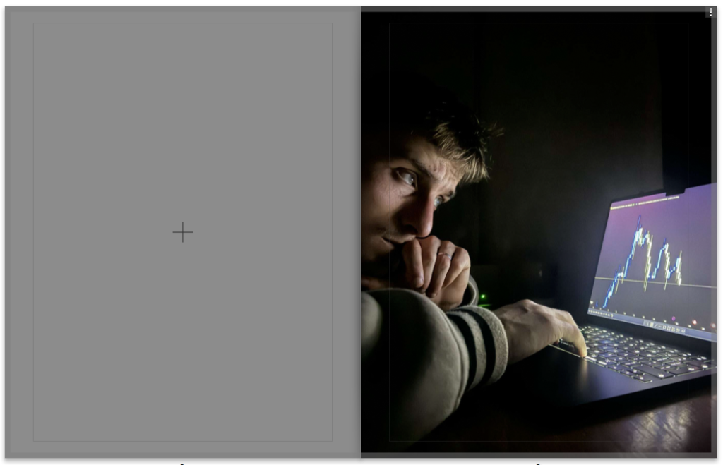
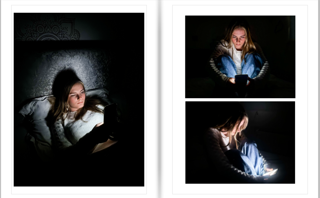
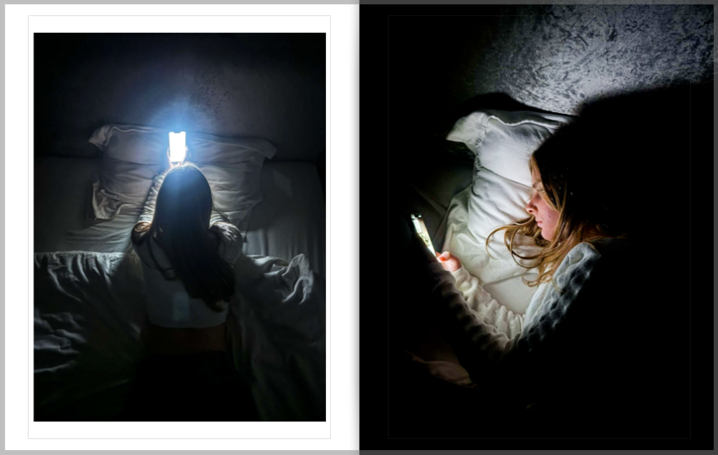
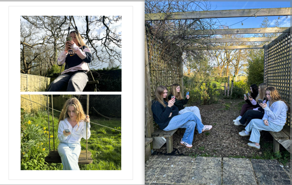
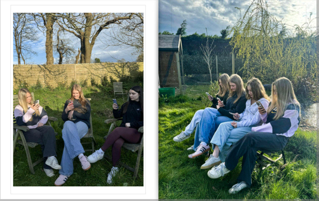
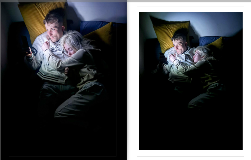
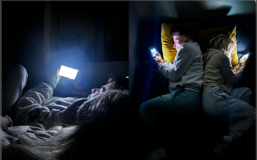
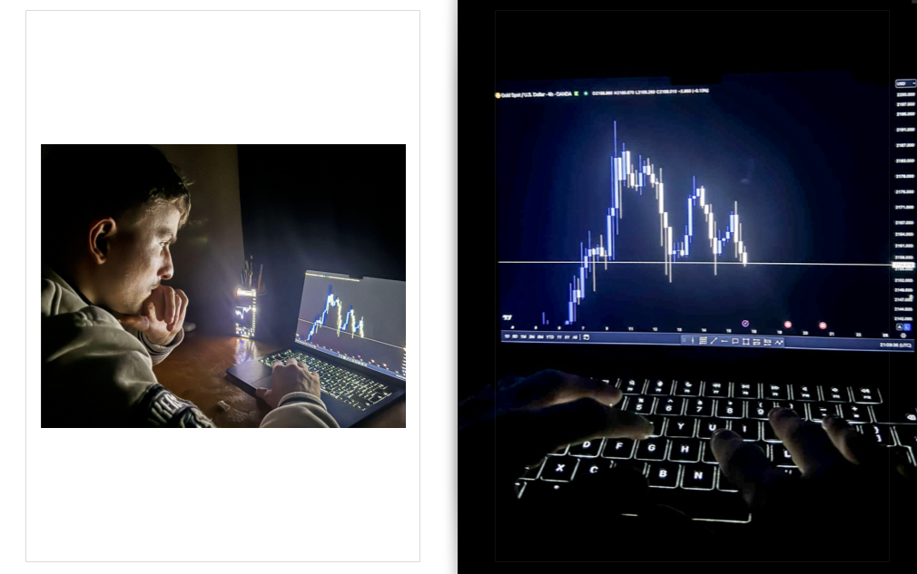
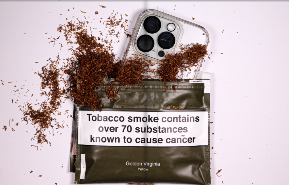
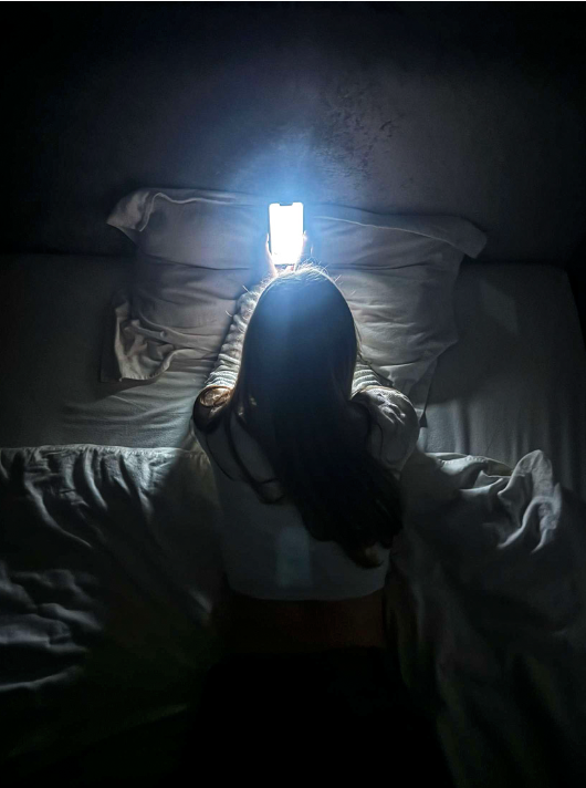
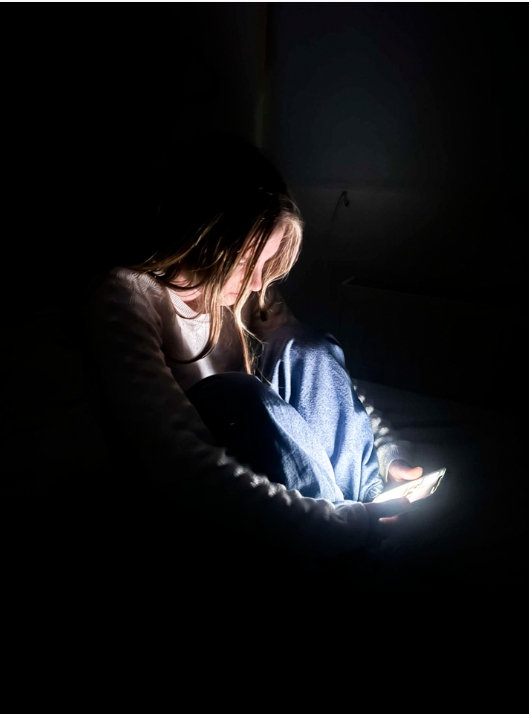
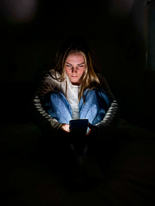
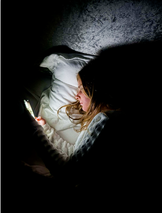
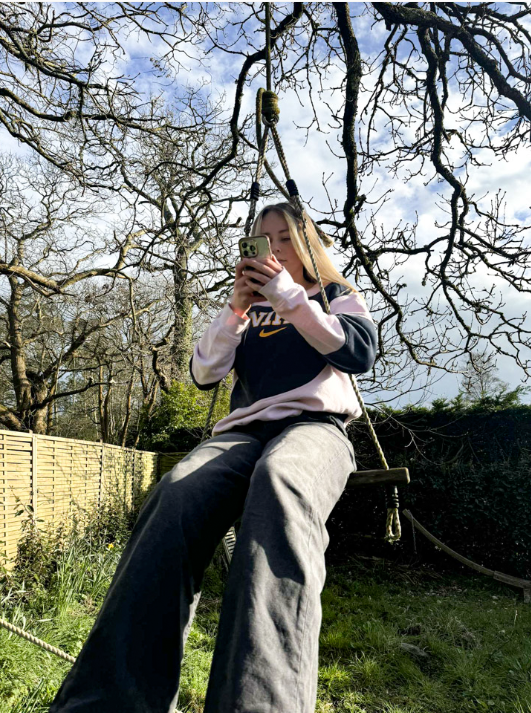
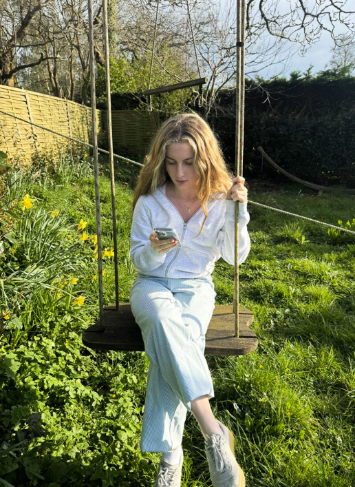
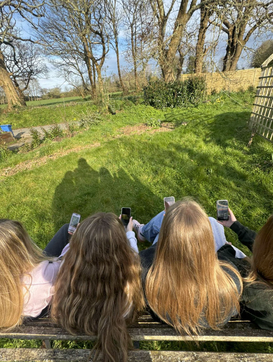
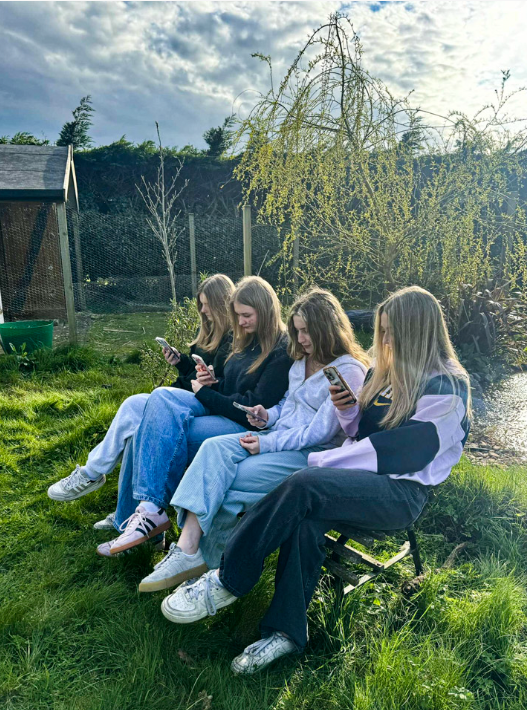
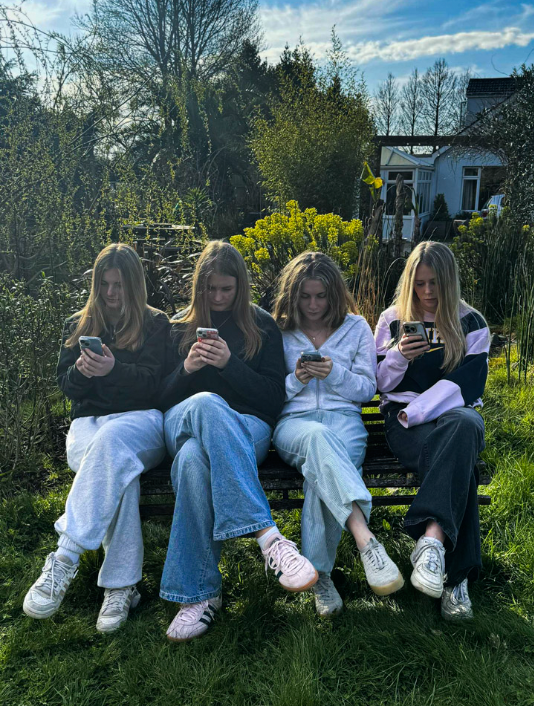
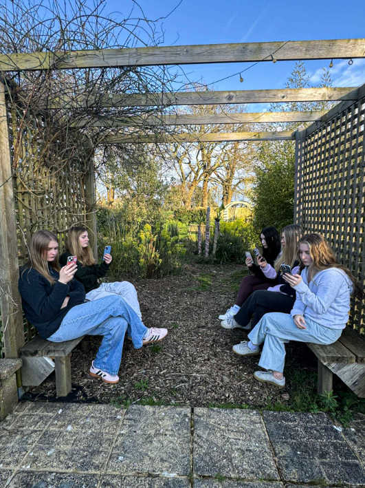
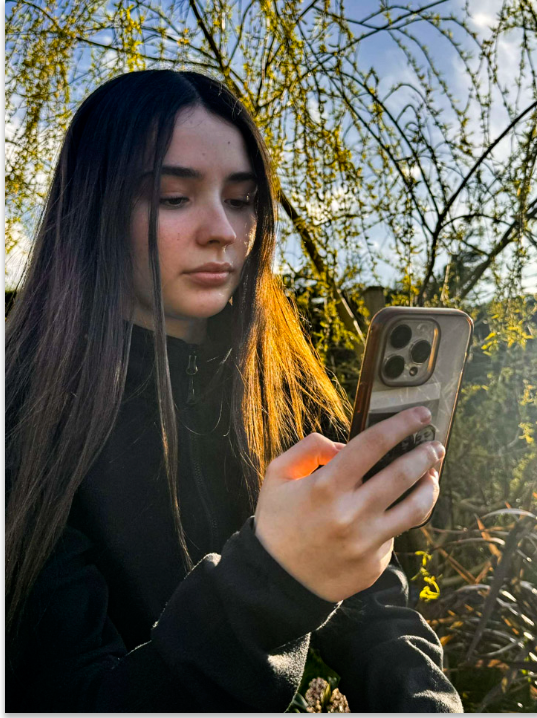
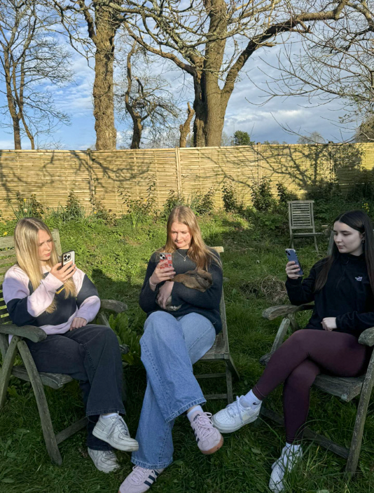
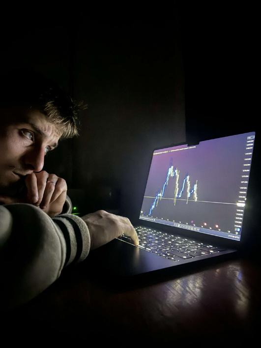
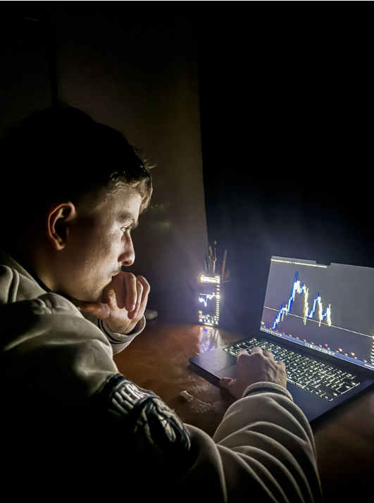
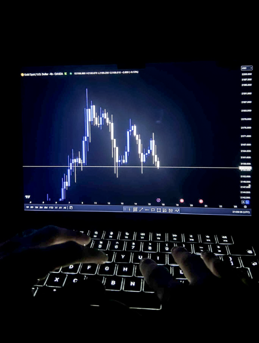
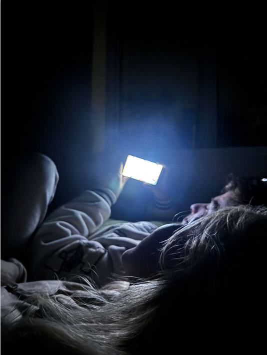
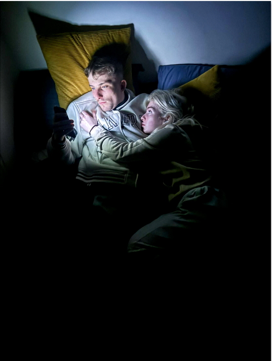
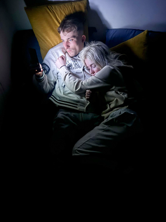
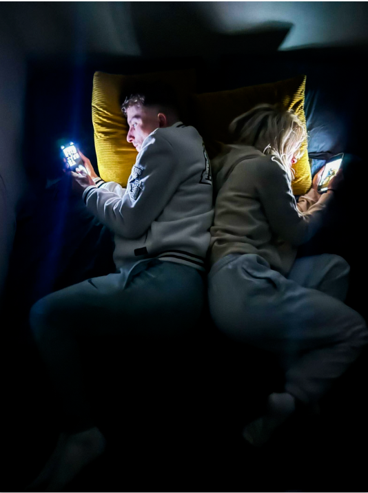
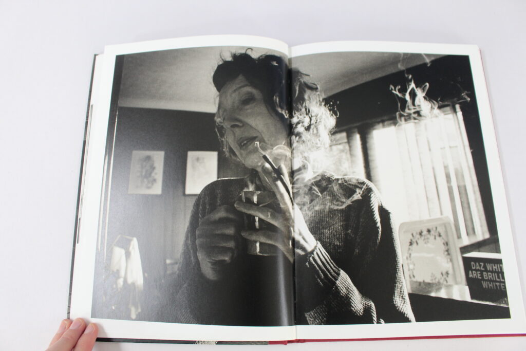
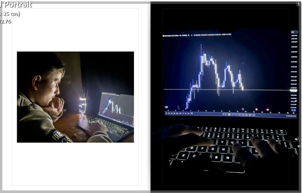
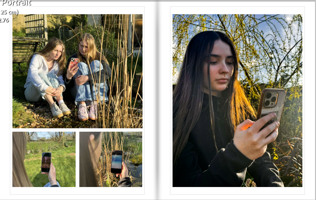
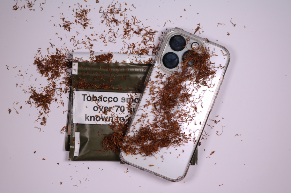
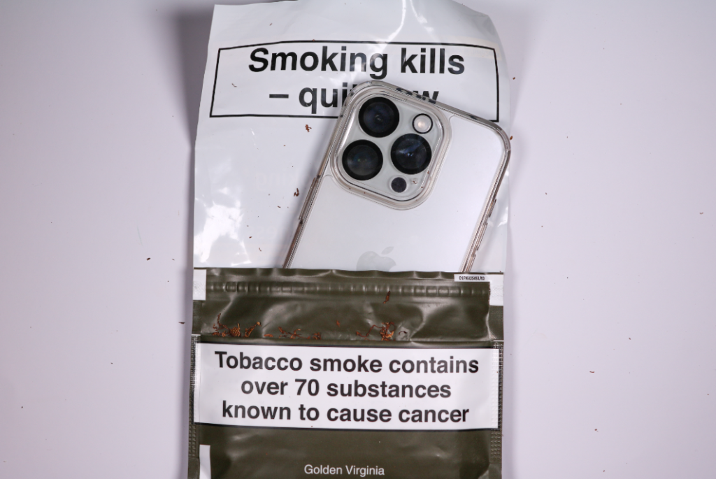
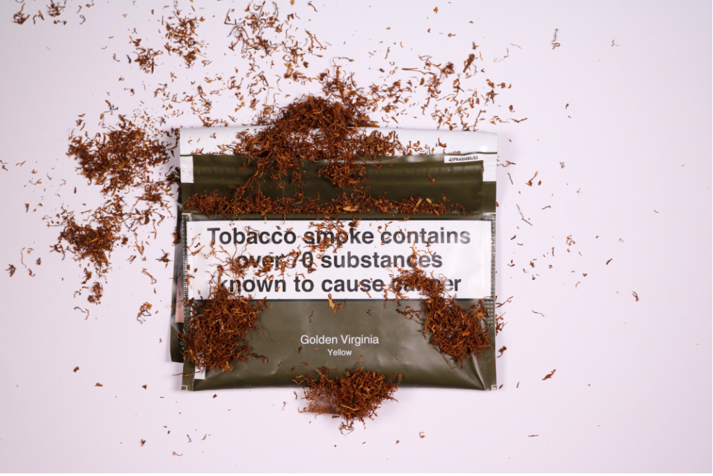
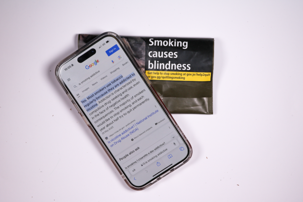
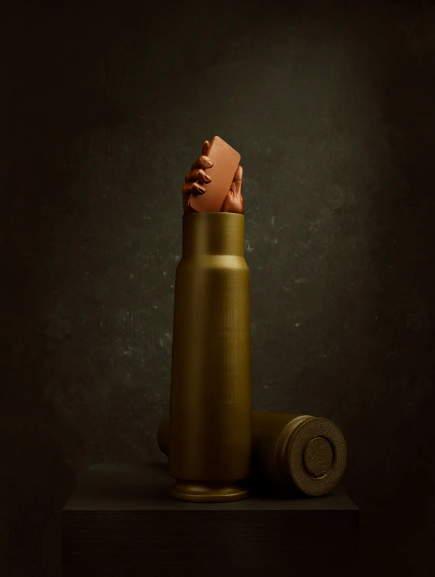
Observe: Observing the use of technology around us.
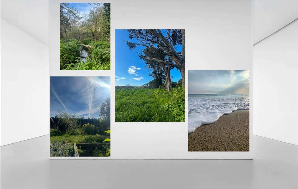
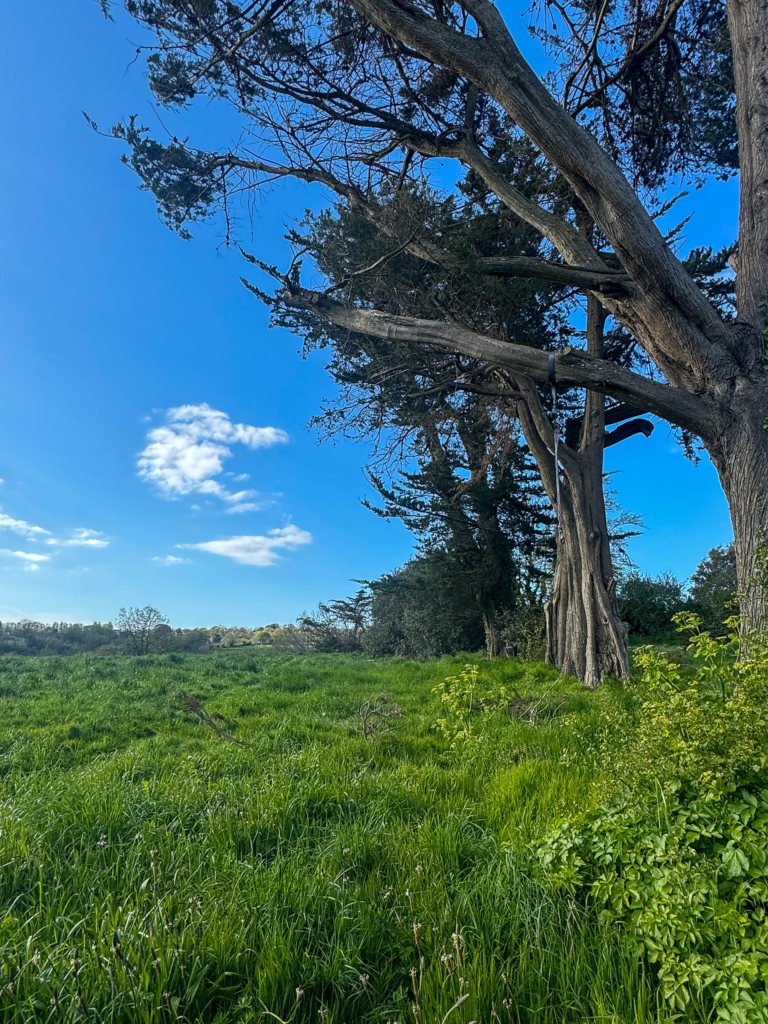
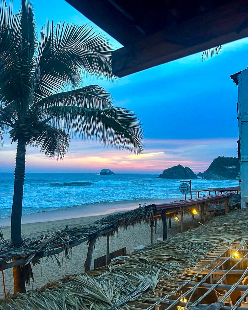
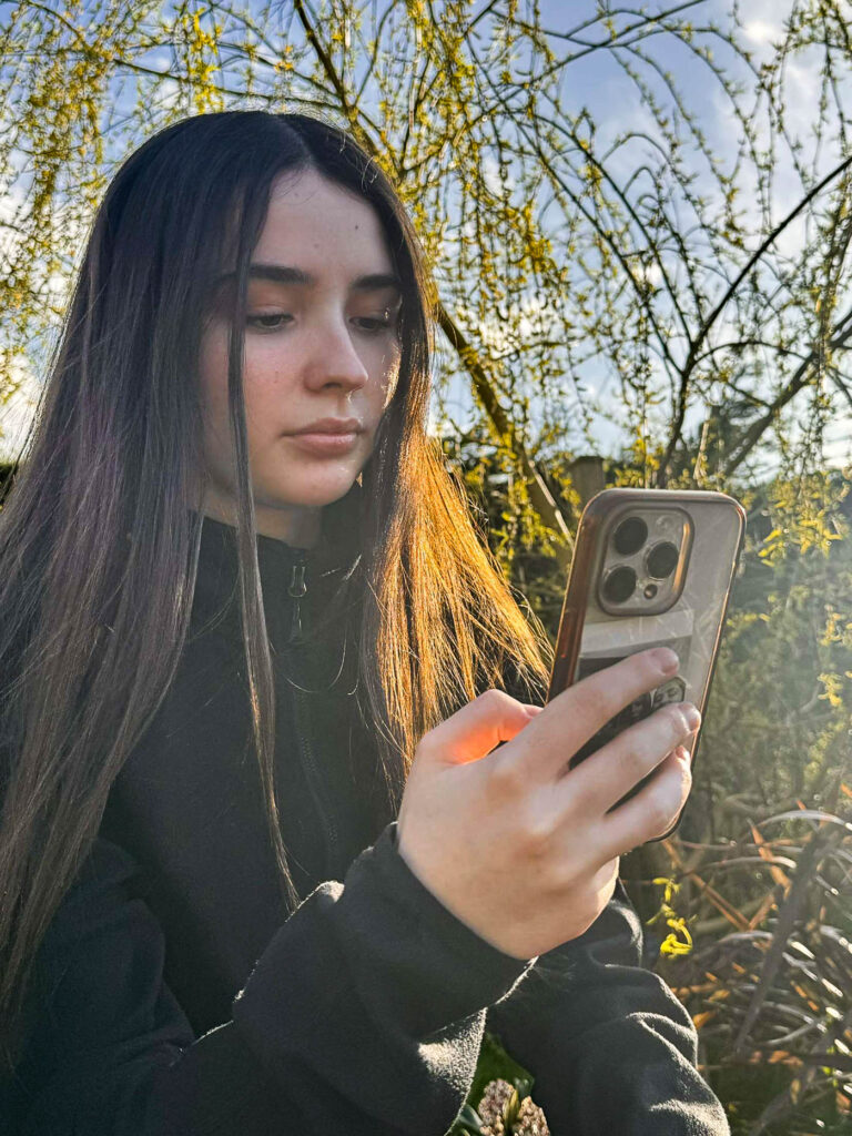
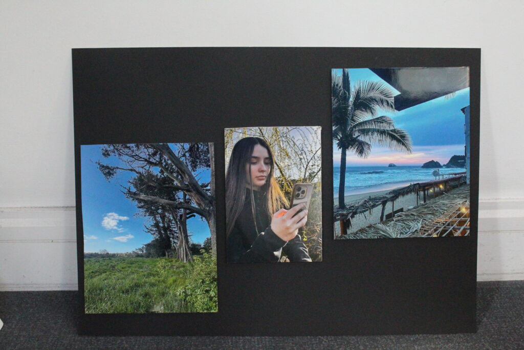
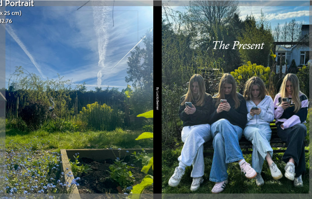
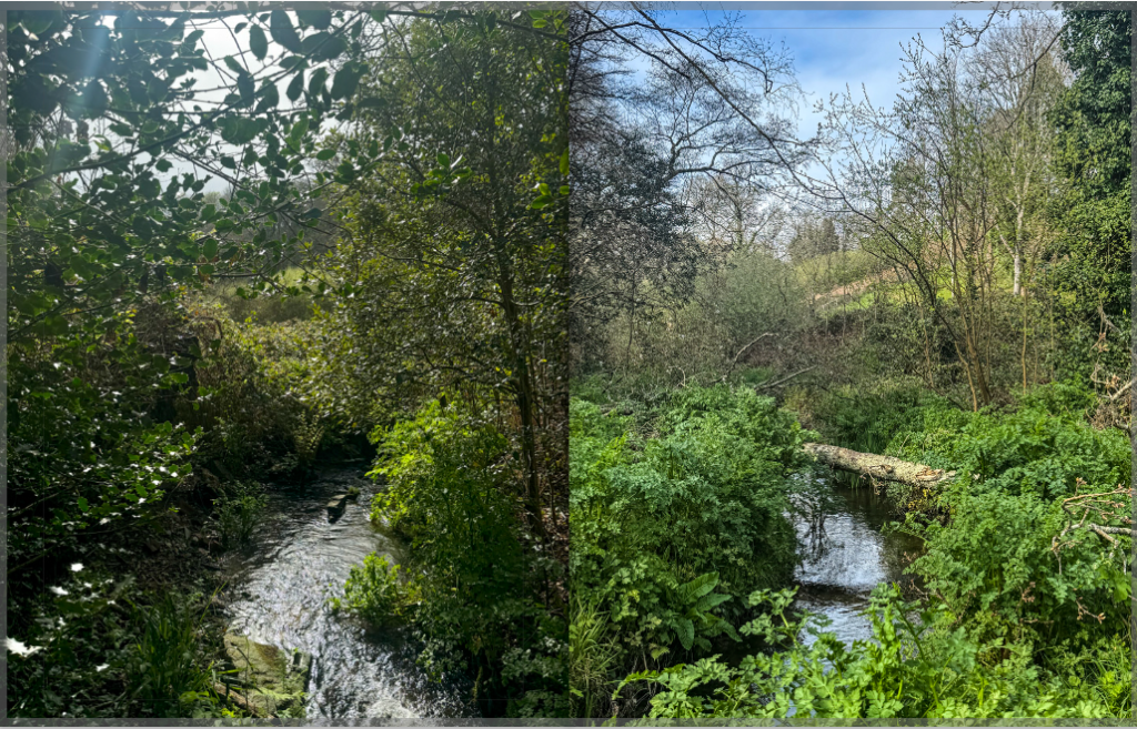
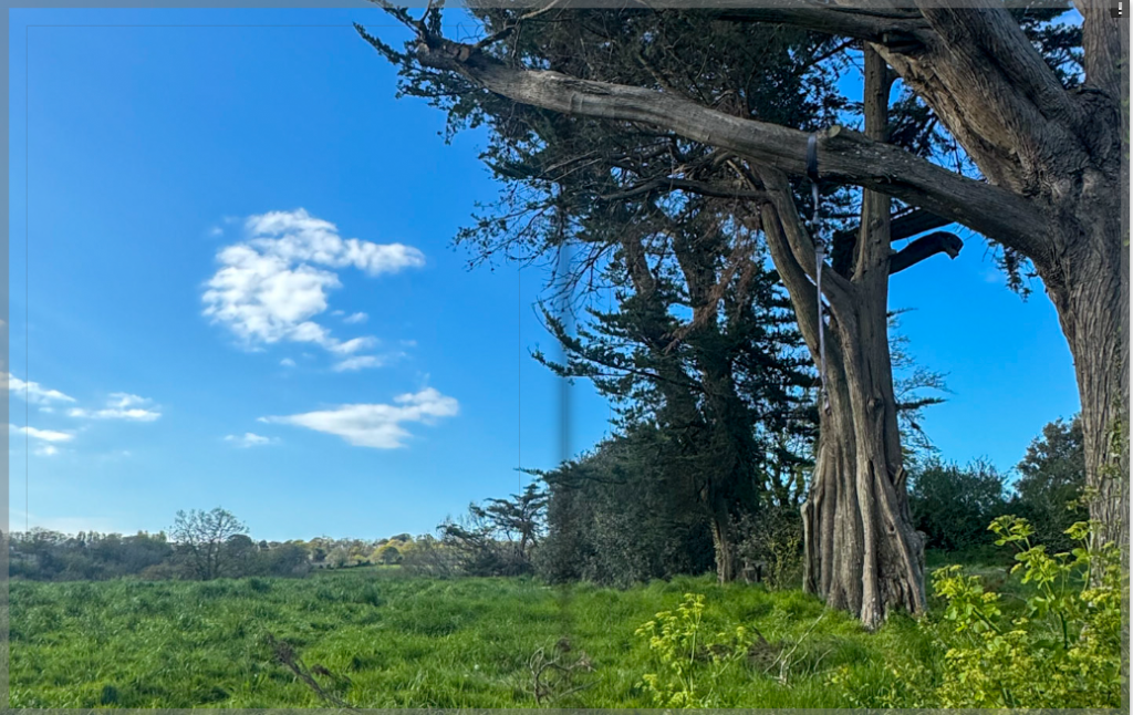
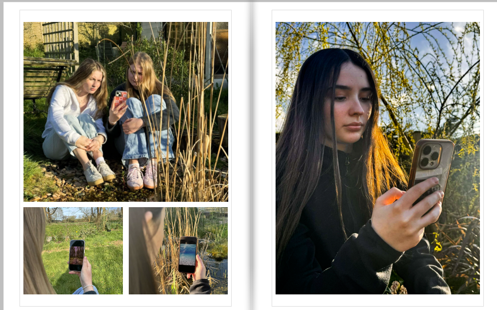
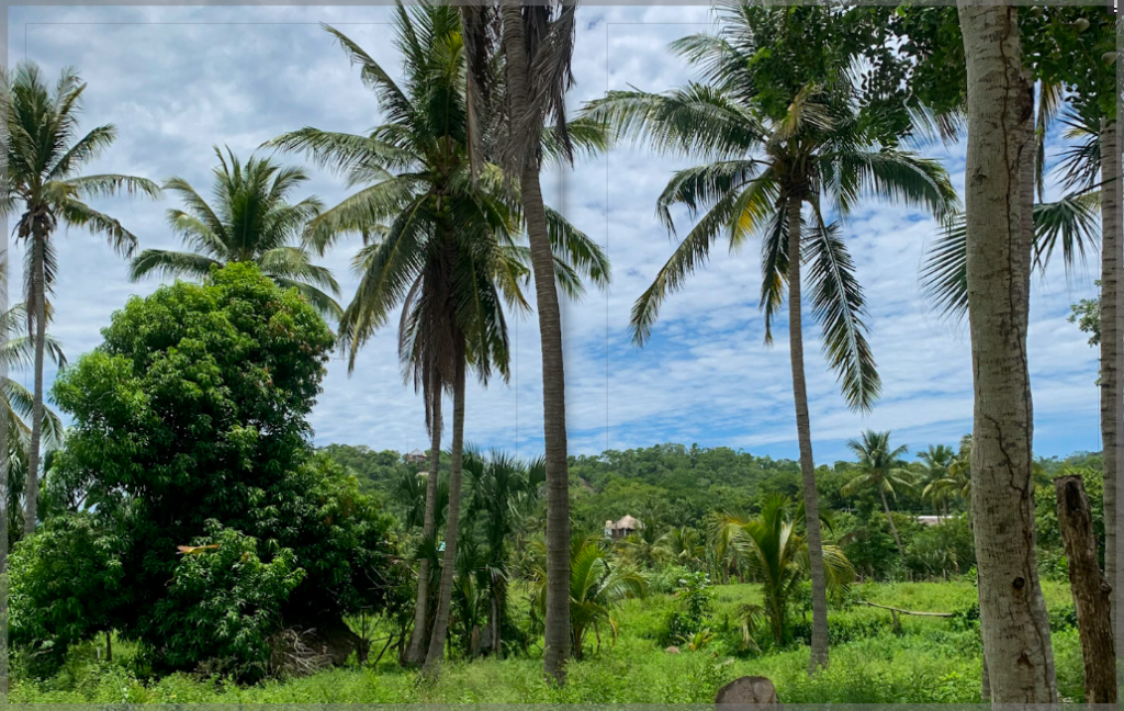
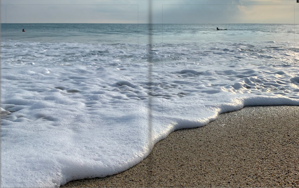
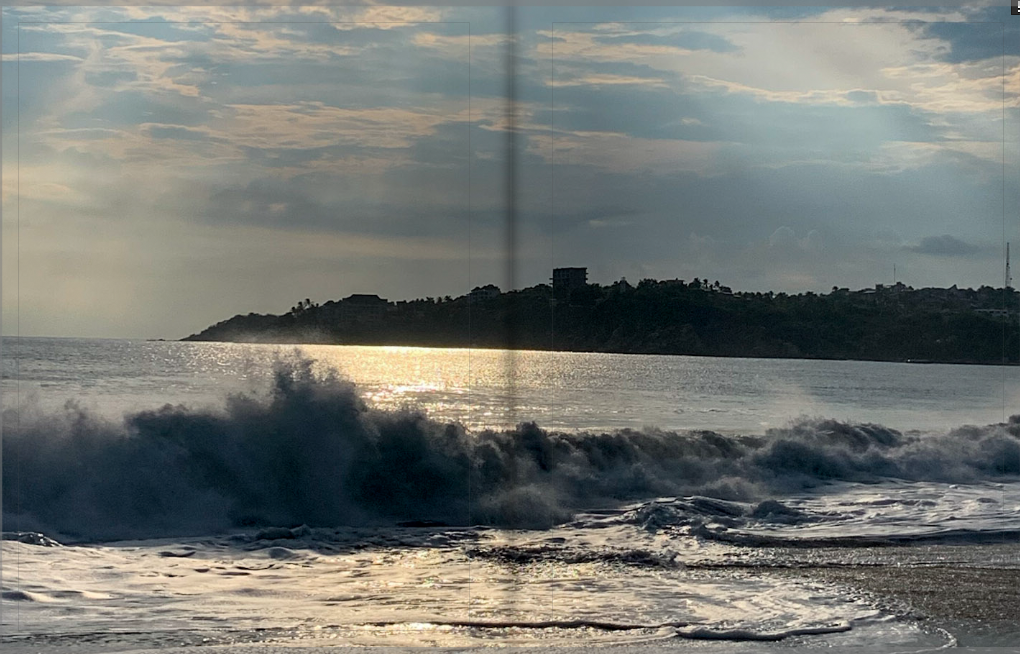
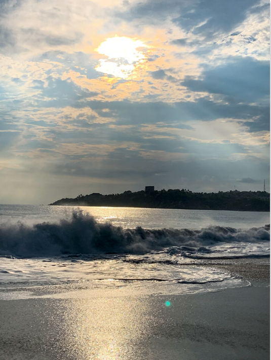
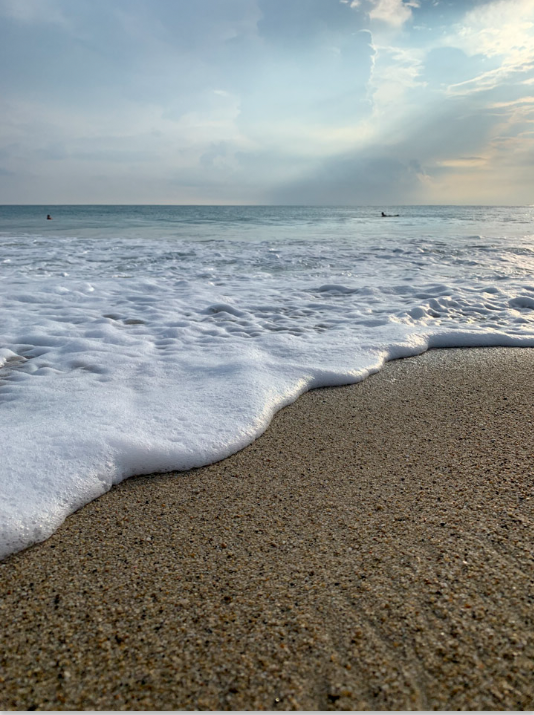
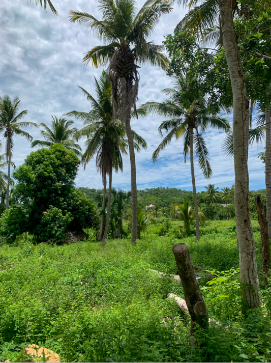
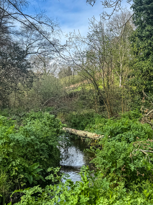
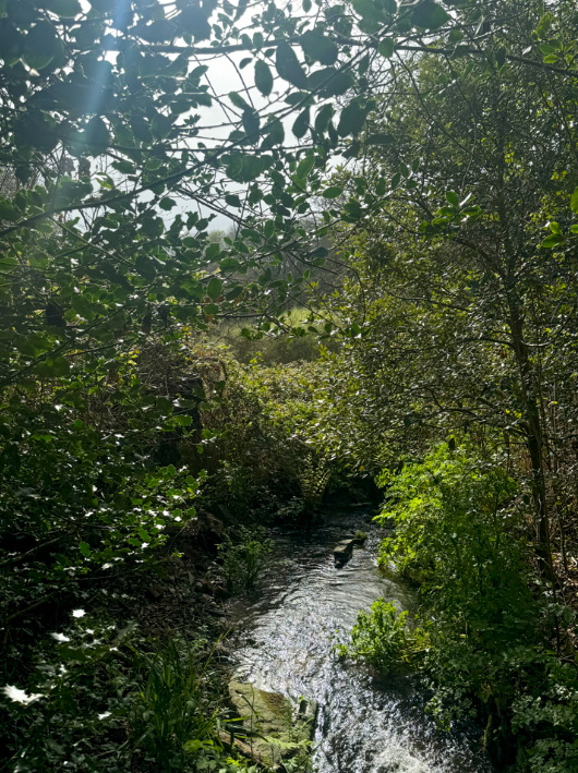
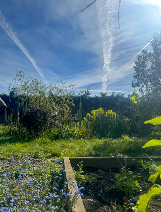
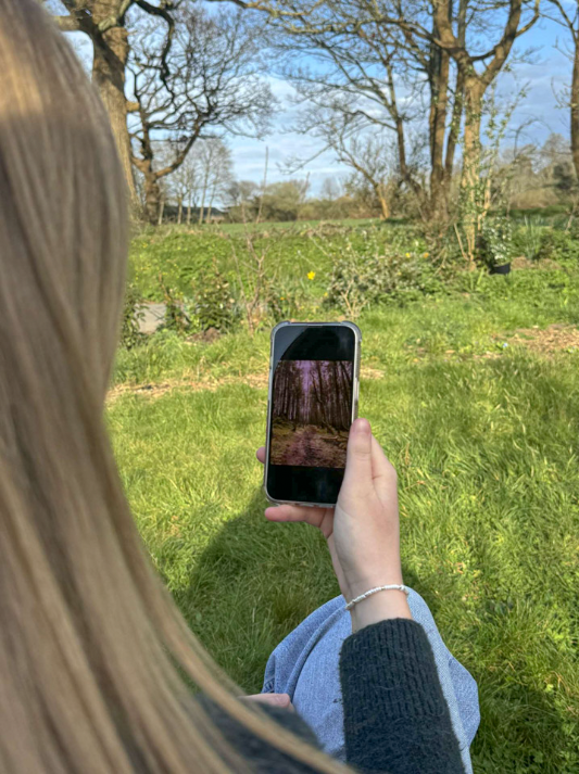
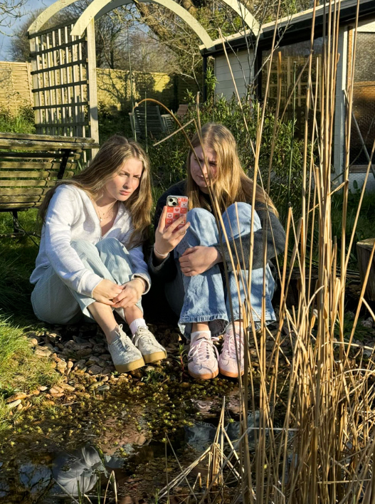
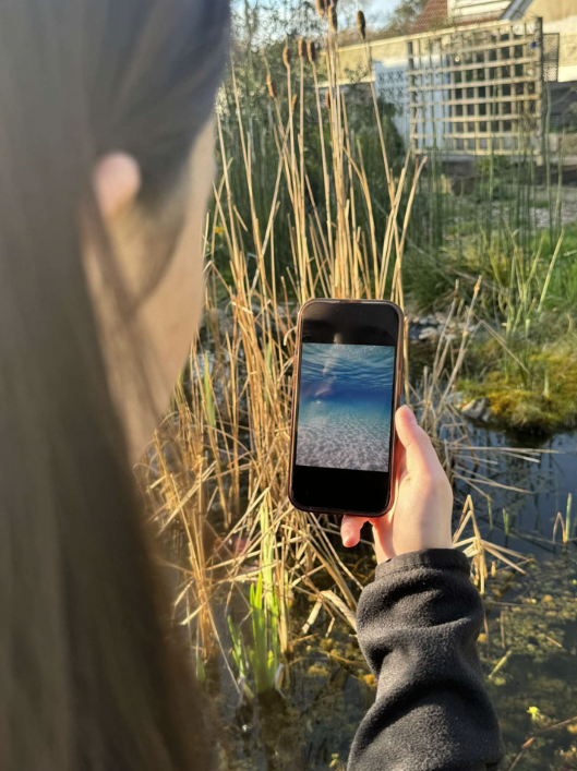
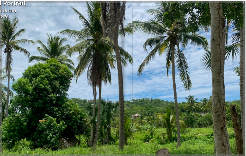
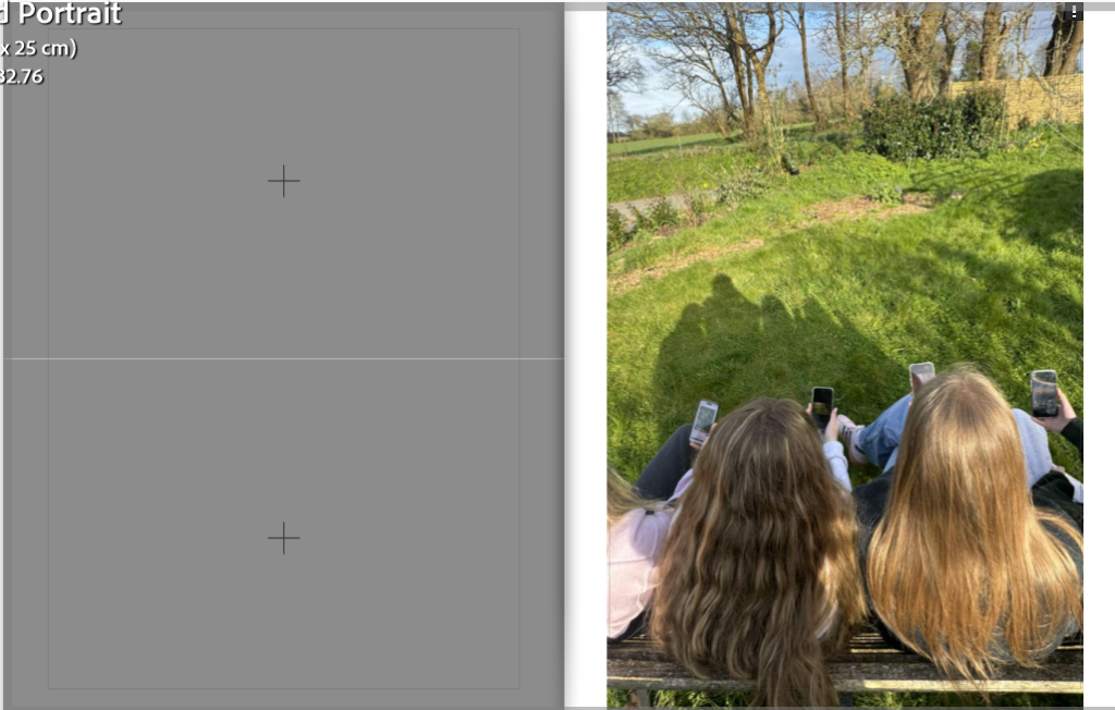
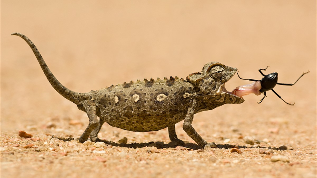
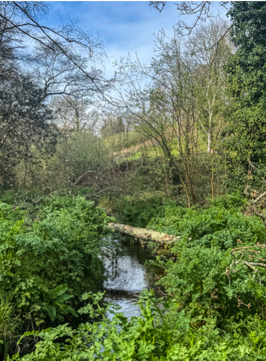
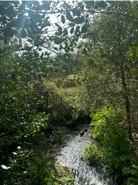
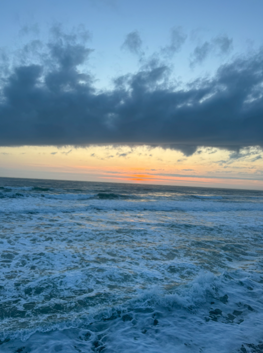
Seek: Seeking nature in this world of technology
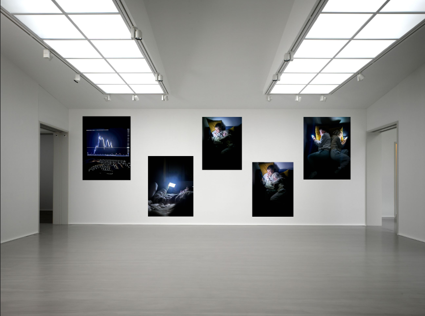
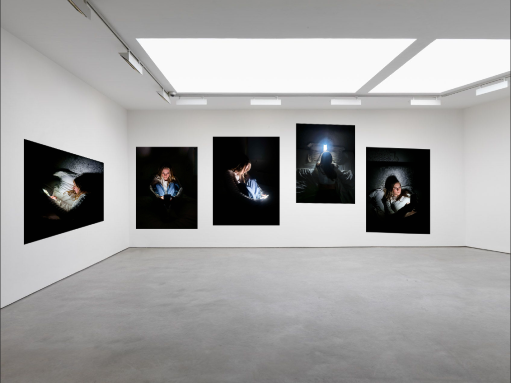
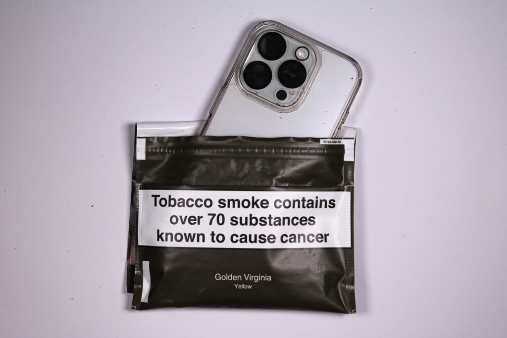
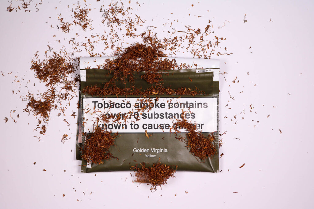
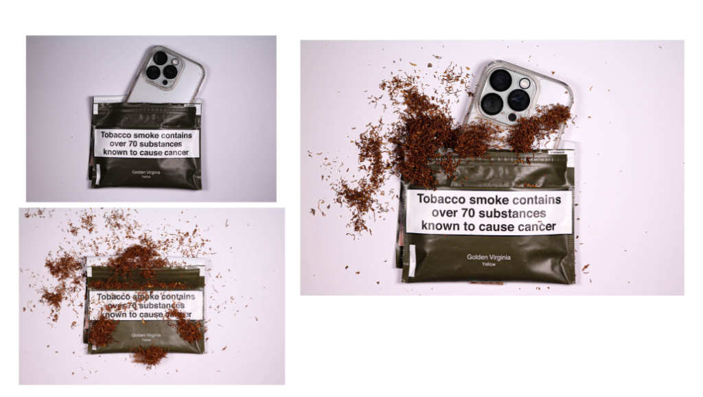
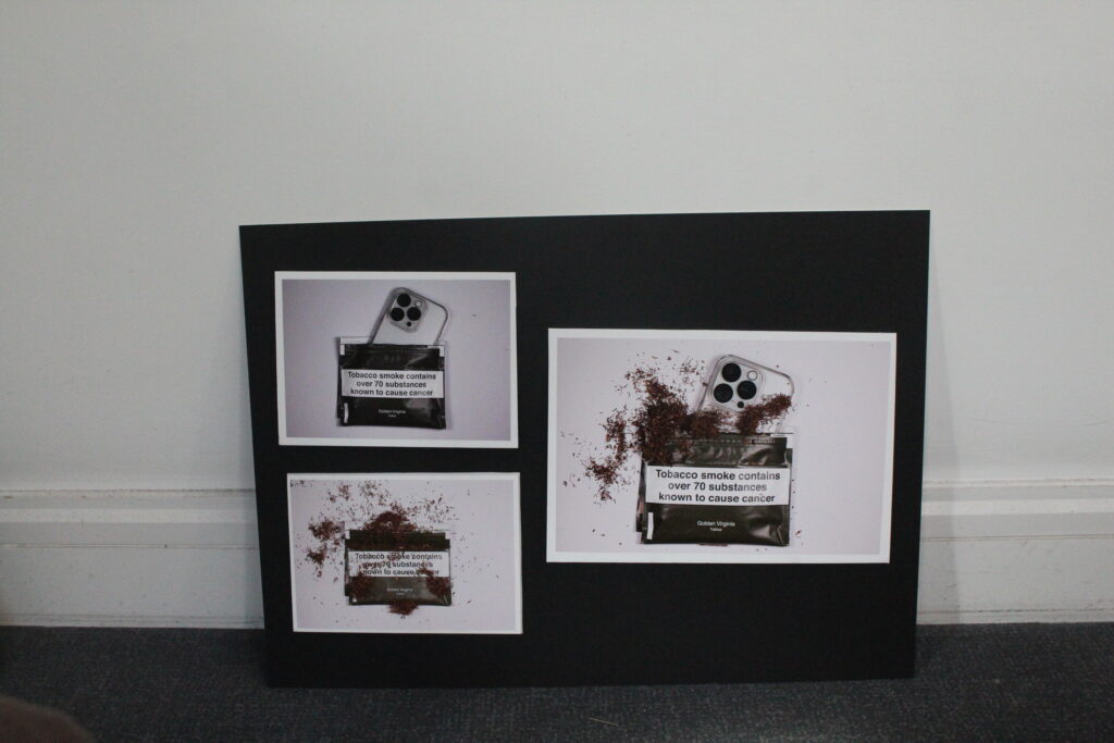
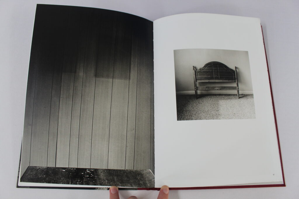
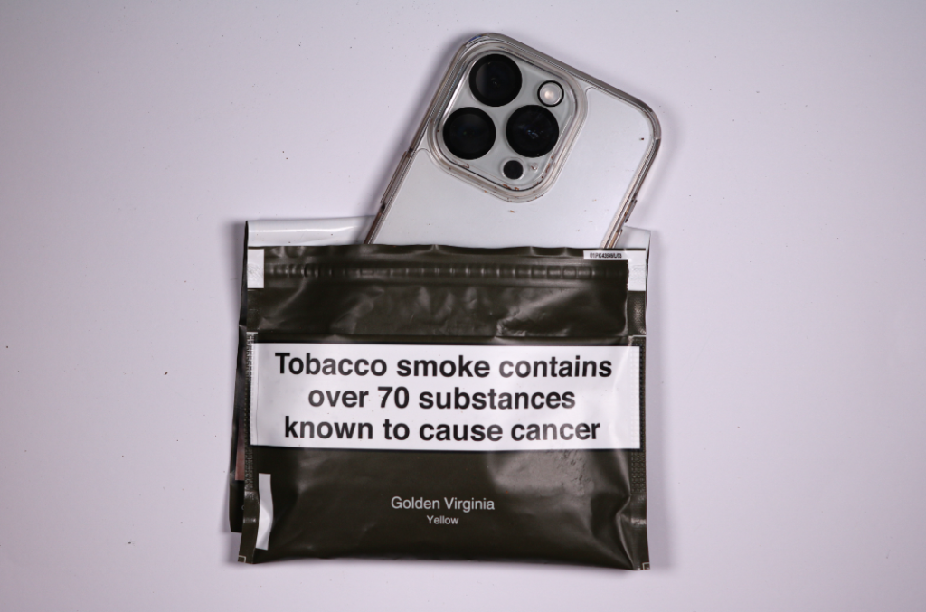
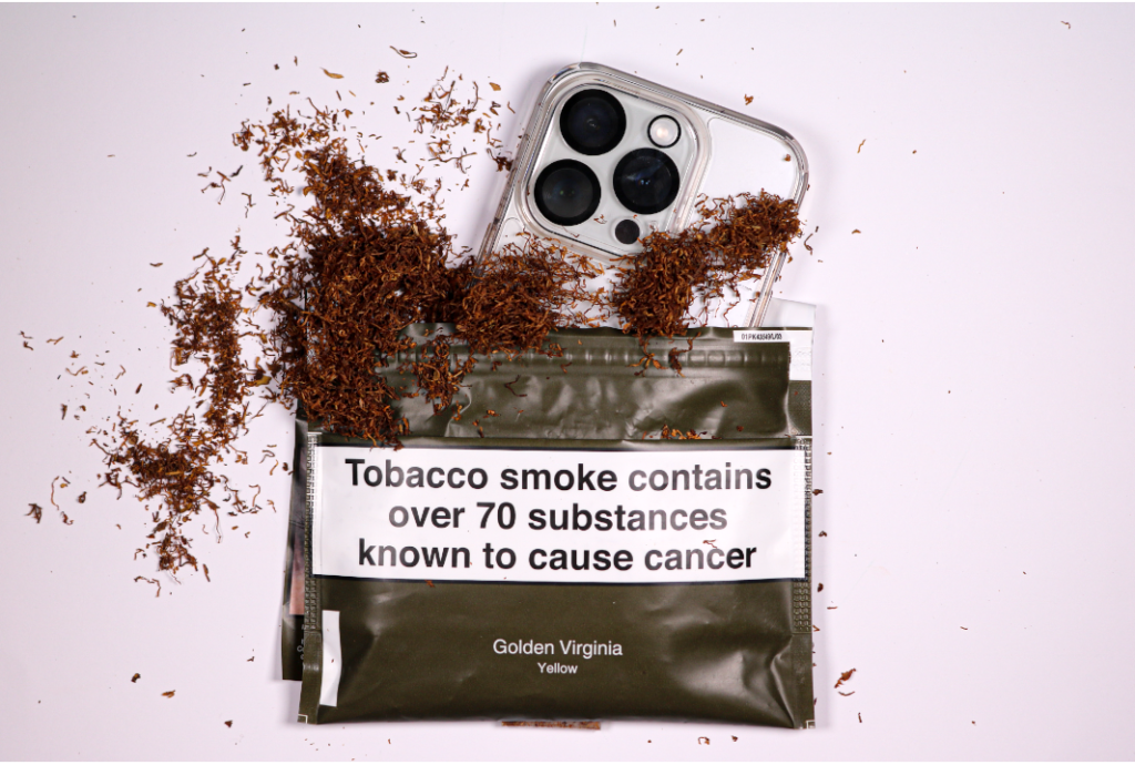
Challenge: Challenging technology addiction
How I feel
Overall I am very satisfied with how my project developed. The photobook really is a visual representation of the story that I wanted to portray and it has also been really eye-opening to me due to my in depth research about the negative connotations when it comes to technology. Not only did I chose to focus my study on technology vs nature to help other people understand about this problem but also to create some clarity with myself about my future of constantly using technology.
How they turned out
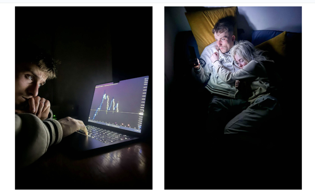
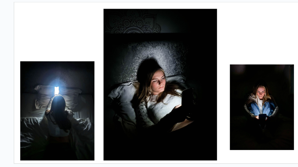
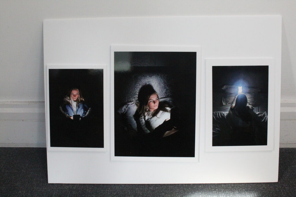
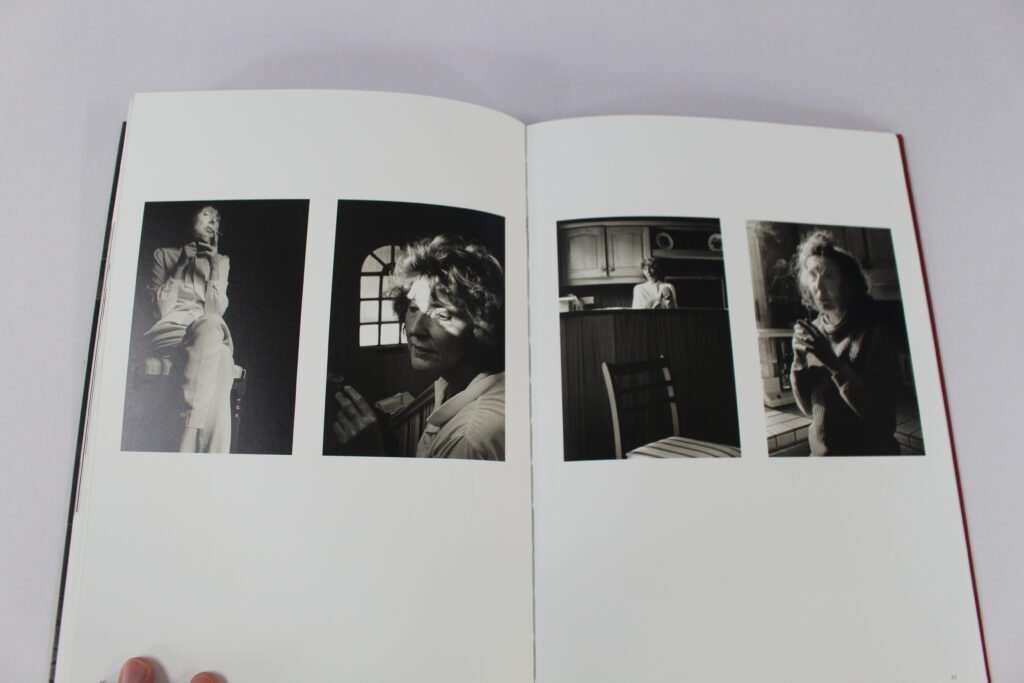
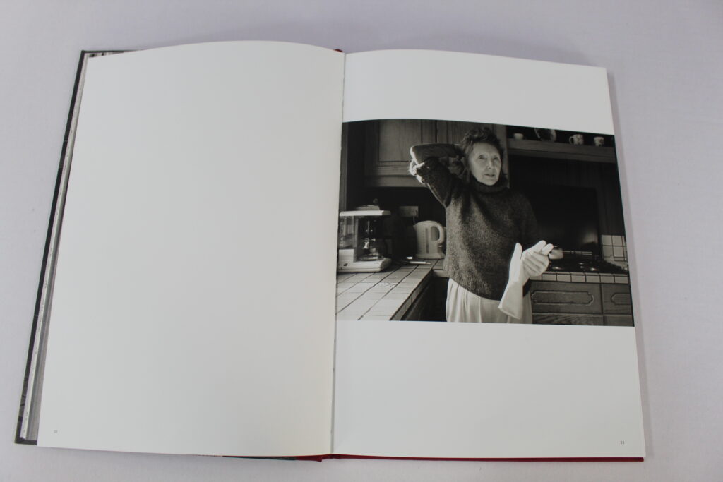
My final images look professional and I am glad that I chose to do many photoshoots to really show the effects of technology on older and younger people which very much helps me elaborate my point.
What was challenging
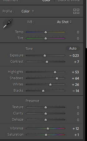
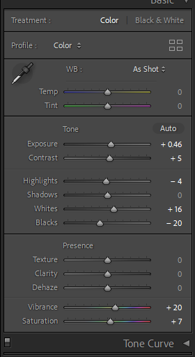
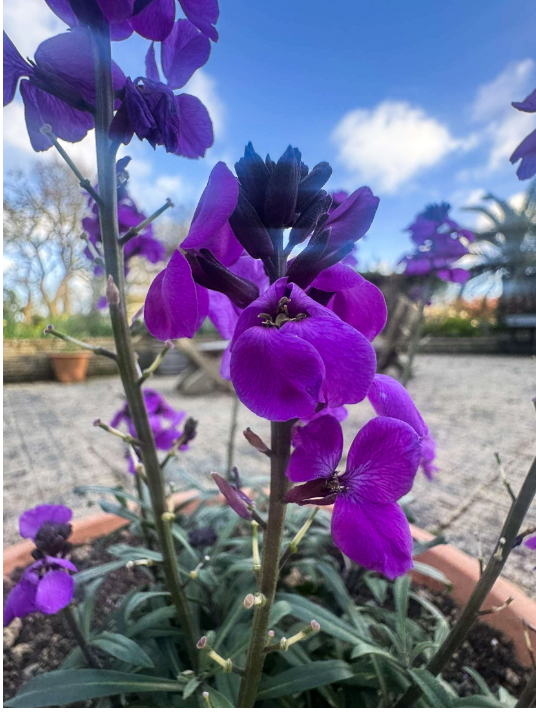
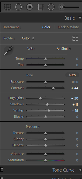
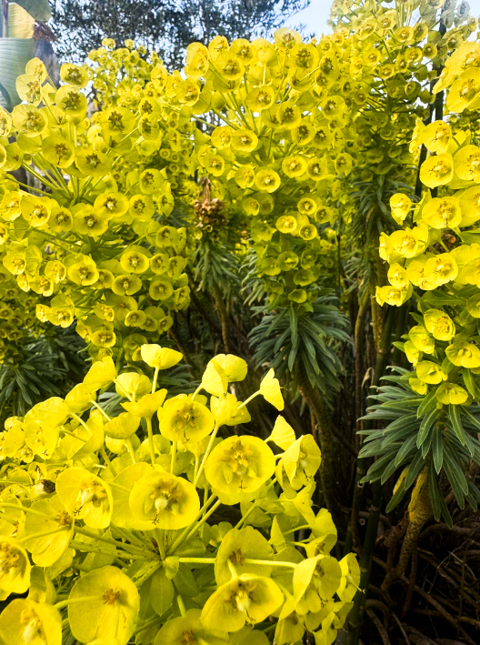
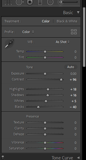
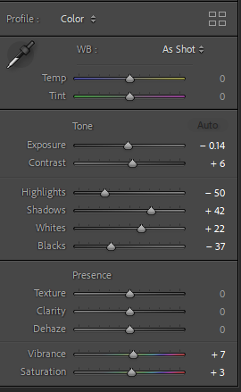
However I did face multiple challenges with this project which isn’t always a negative factor due to me just needing to use more creative ideas to go around these obstacles. One major obstacle was the weather in Jersey. This greatly impacted my project due to a lot of my images representing nature needing to be archive images, this is because In my photobook I wanted to create a powerful contrast between my images of technology which I wanted to present with negative connotations with a darker and more dystopian feel where as for my nature images I wanted them to be bright using the natural light from the sun and the vibrance of plants but due to the season that I did my photoshoots in It was often raining with a lack of sun and a lack of nature due to many luminous plants being killed in the winter. Another major obstacle That I faced was while developing my photobook some of the images where not as high quality as I would of liked them to be which meant I needed to make some sacrifices. Such as I couldn’t use a lot of my archived images due to them being shot on an older iPhone and some of the more powerful images that I wanted to be on a double page spread in my photobook I had to make them cover only one page or they would of printed out pixelated. Also on my front cover I couldn’t use the image that I wanted and felt would best describe my photobook as a whole from looking at it due to it again not being the right image size.
Artist references
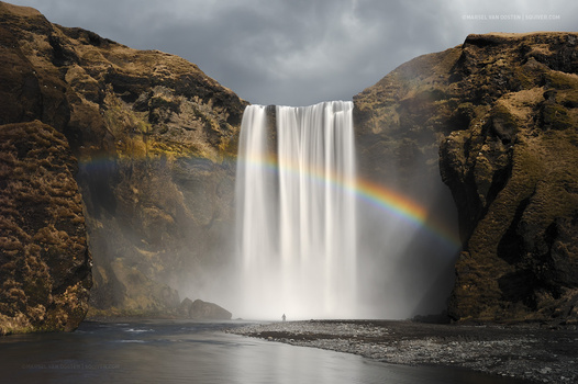
Something I also regret looking at is the limited amount of photographers who tried to capture the same style that I was aiming for since it consumed a lot of my time trying to find artists to find inspiration from. Though on a positive note I am very happy with some of the photographers that I manged to find such as Andreas Varro and Eric Pickersgill due to our similar ideas and I found their work really captivating and inspiring which Overall gave me multiple more ideas of photoshoots than I originally had. I really admired how Andreas Varro created his work to portray a dystopian, unnatural world within his images while trying to prove a point of what our future could look like if we keep going in this direction. Where as I really liked how Eric Pickersgills main focal point of the image which was portraying technology just for it to not actually be in the photo. Almost trying to create a visual representation of how our body’s look while using devices and how unnatural it actually seems.
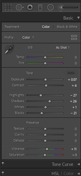
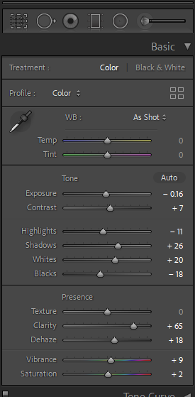
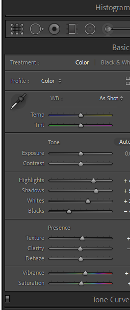
Developing this photobook has also helped me understand Lightroom classic a lot more than previously when developing my old book. I wasn’t very satisfied with how my photobook on nostalgia turned out as I had limited photos to captivate what I wanted to so seeing my photobook online now has installed me with much more confidence then I had previously about making photobooks and just my general photography skills.