This is my final photobook: Through the Eyes of Colour
This is my final photobook: Through the Eyes of Colour
process:
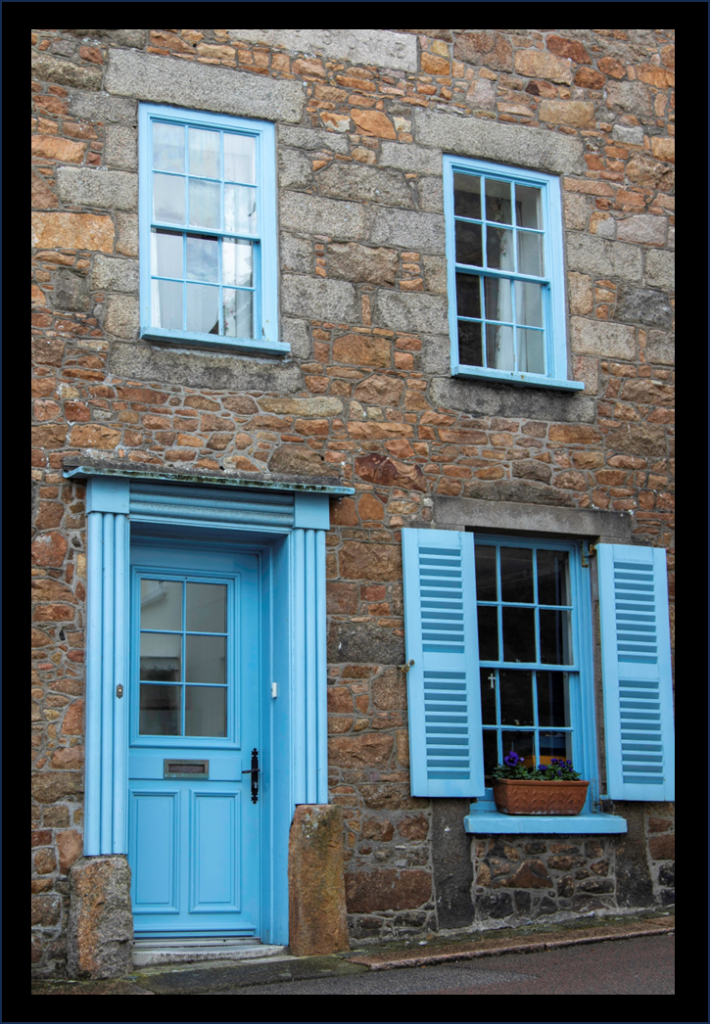
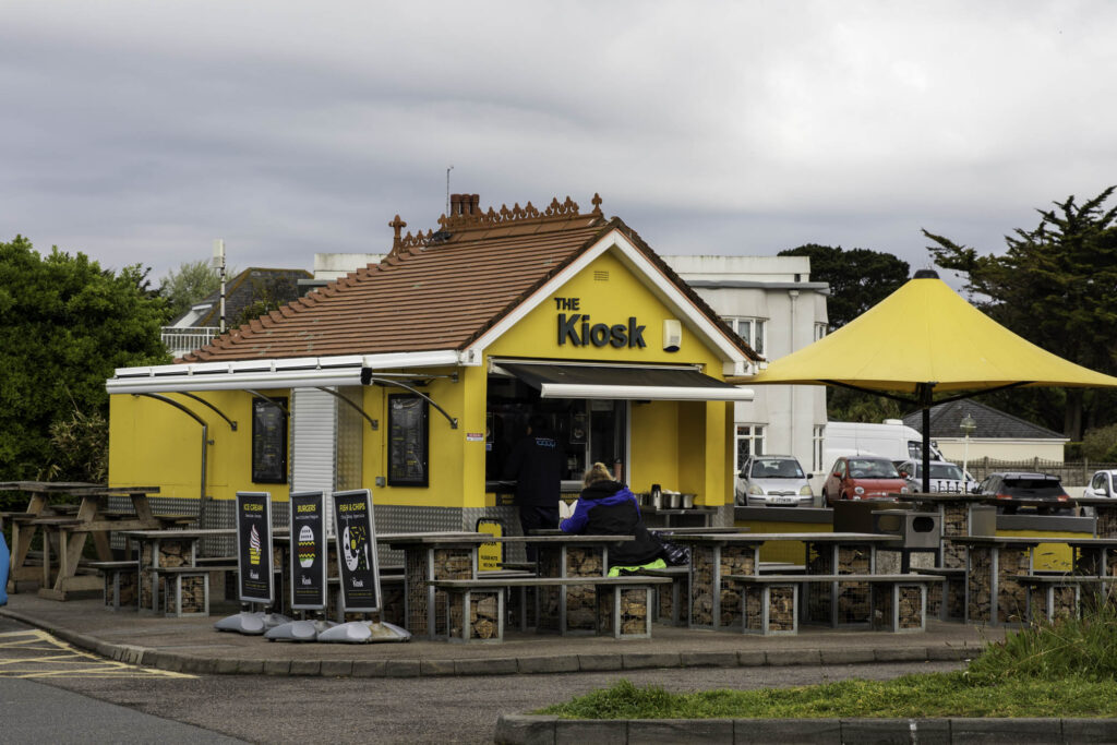
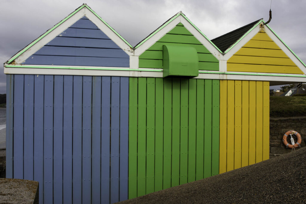
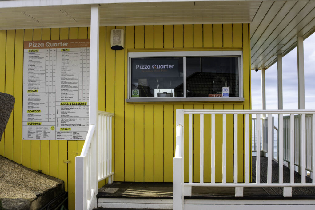
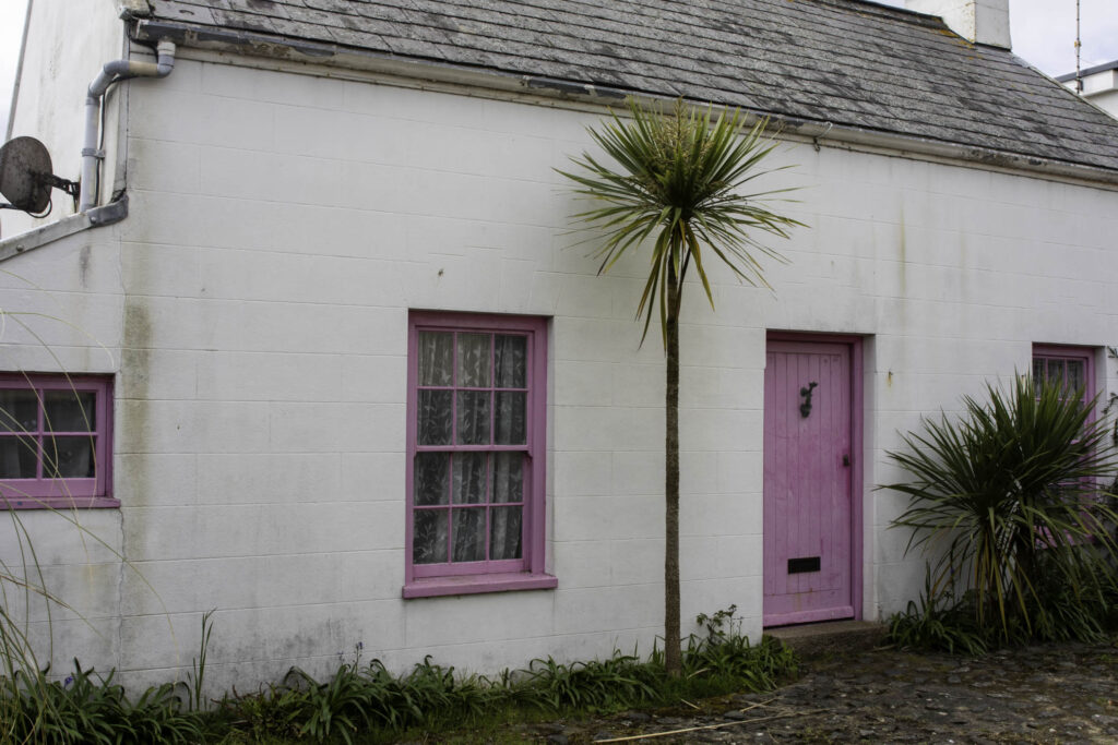
At the beginning of my project I knew that colour was something I wanted to explore and base my project around. With the theme being Observe, Seek and Challenge I thought that focusing on colour would fit in well. From looking at inspiration, I found that William Eggleston was going to be my main artist to follow. He took many images of colour mainly around Southern United States, which made me want to do a similar thing but in Jersey. Even though Egleston’s images were from a long time ago and with less technology, I was still inspired by him to make more modern versions of his images and showing what I could find over here and comparing it to his images being in America. Along side this, I chose to take images that weren’t directly inspired by him or Saul Leiter who I also looked into, but sights that were full of colour in Jersey which people may not notice on a regular basis.
what went well:
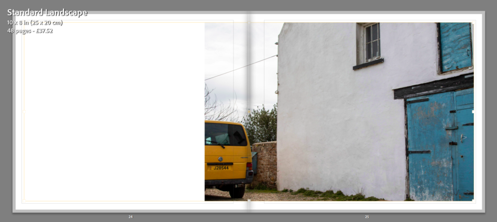
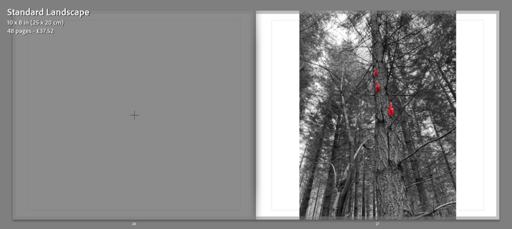
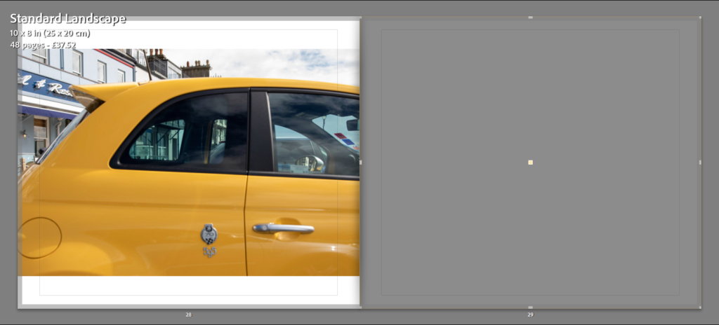
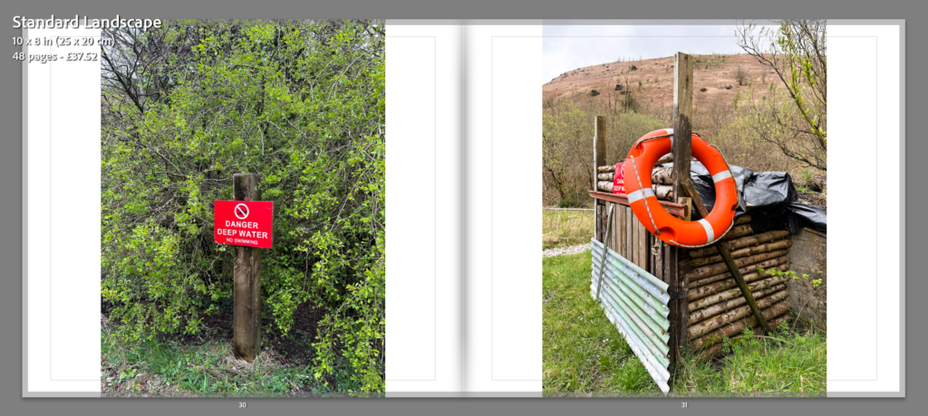
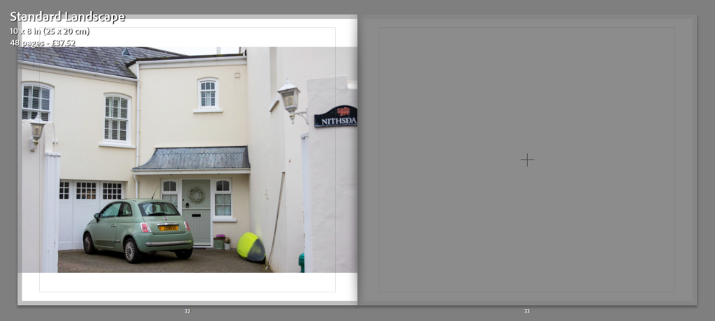
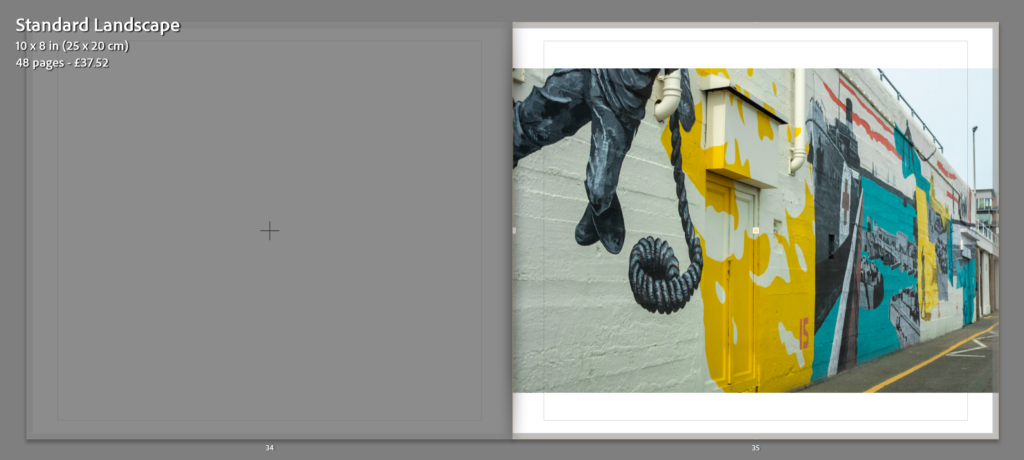
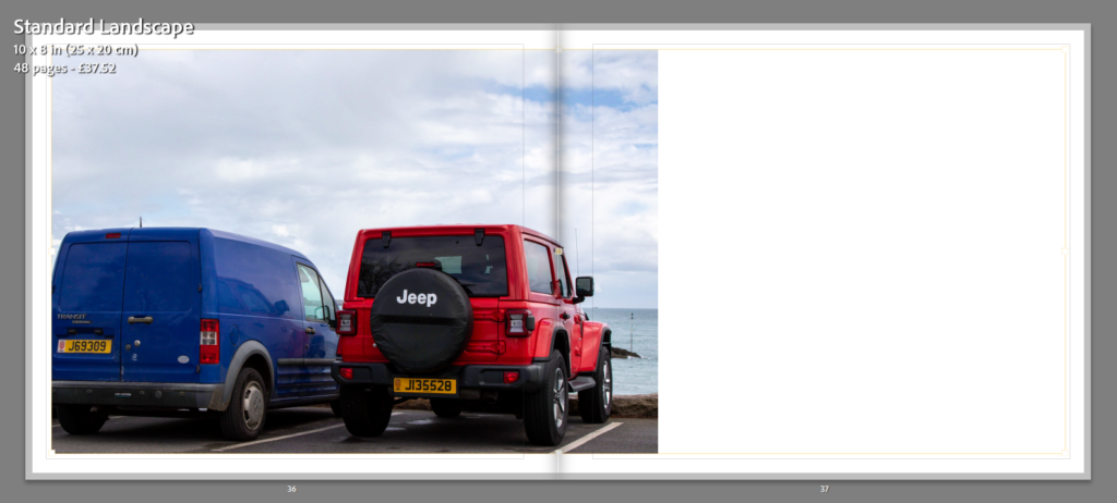
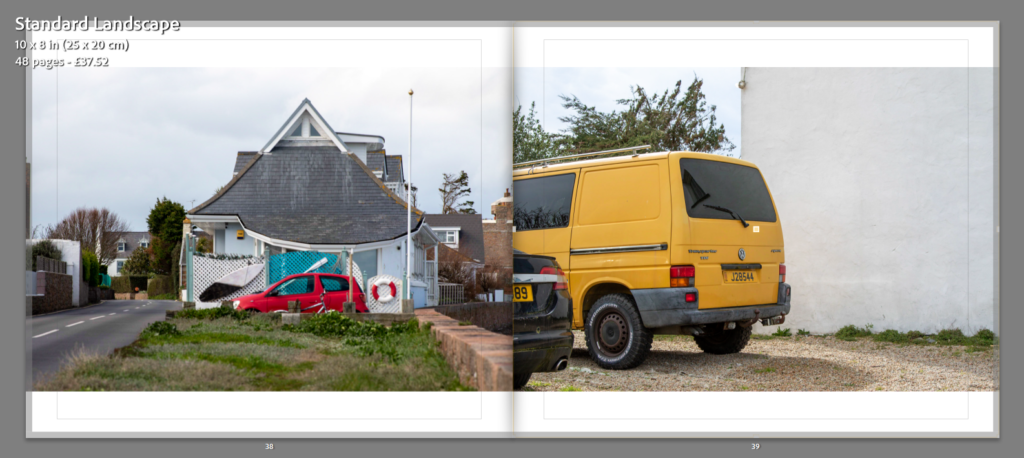
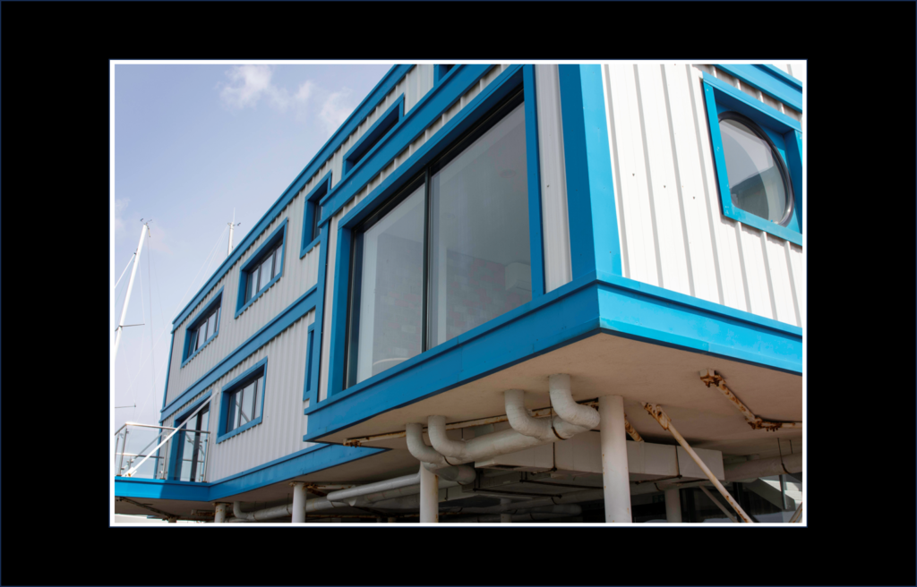
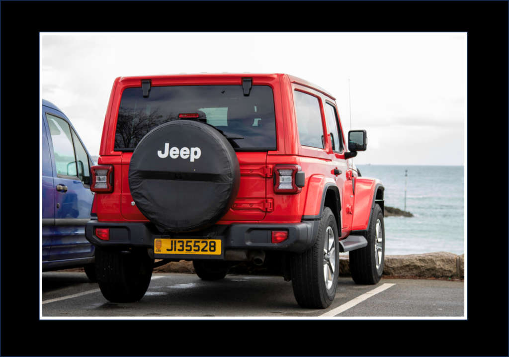
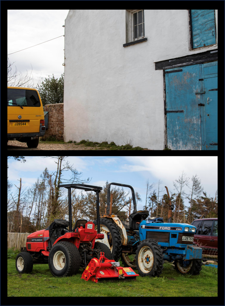
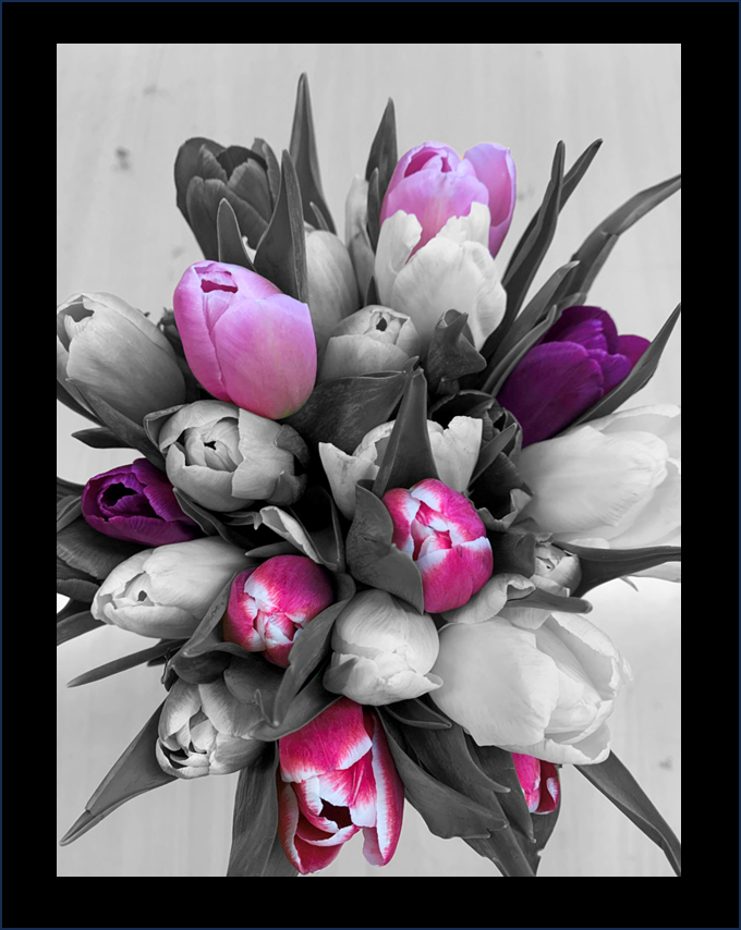
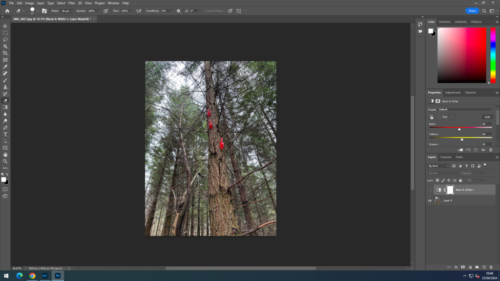
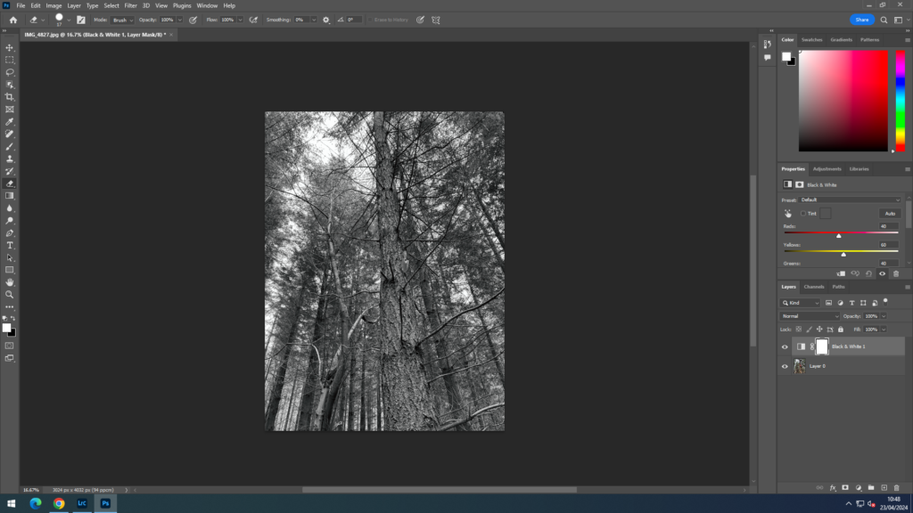
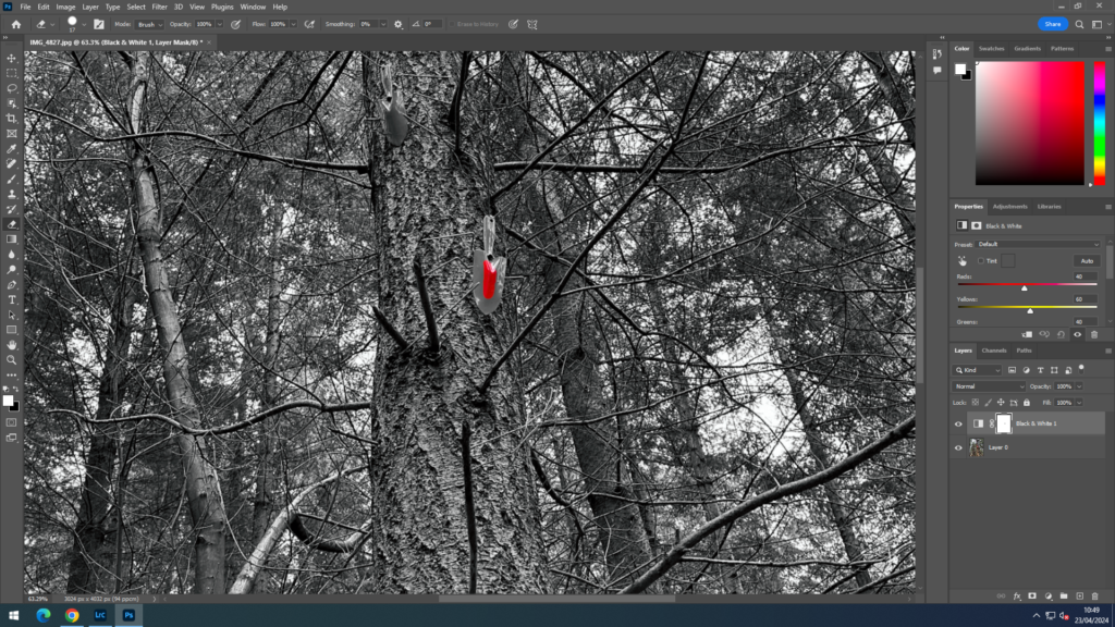
As a whole, I think that most of my project went well. I think that one of the main things was the amount of colour I found in the style of my inspiration, which really helped make my project clear and stand out to viewers. Secondly, I think that the range of image I produced make my project have a wide variety of no only colours but also objects. Many of my images are focused on building/ houses and cars, but I have also included other things like nature and boats which Jersey has lots of. I also chose to make some experiments using two of my images on photoshop. I selected certain areas to keep in colour and made the rest of the image black and white. I think that whilst these may not be inspired by either Eggleston or Leiter, they add to my project and make the colours in the image stand out and draw the viewers in. Again I also think that my final print turned out well and also my photobook. I believe my photobook is the best part of my project as it sums up what I was basing it all on and how I have been heavily inspired. The contrast through out my book makes the image clear to focus on and shows the viewer what the main part of each image is through the way I have laid them out.

possible improvements:
On the other hand, I think that as all projects, mine could have been improved. Even though I wanted to show a more modern look on colour photography I still think that I could have made more images that were solely focused on Eggleston’s and especially Leiter’s. I think this would have improved my project and showed the viewers how things have change from when they both used to take images compared to now. However, I do think that this could add to my project to show just have fast the world is evolving and not only technology but also buildings and cars etc. I think to improved my project I could have looked further into Jersey and found more colour which would help my project.
overall:
Overall, I am very happy with how my project turned out and think that it presents a more modern version of colour photography well. From this project, I hope people can see that colour has such an impact on out lives and has just become another thing that we see everyday contrasting to how people saw it back then especially in images.
final layout:
evaluation:
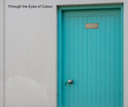
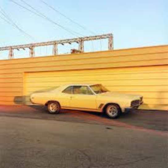
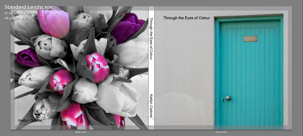
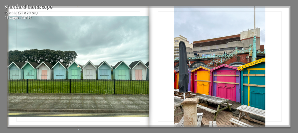
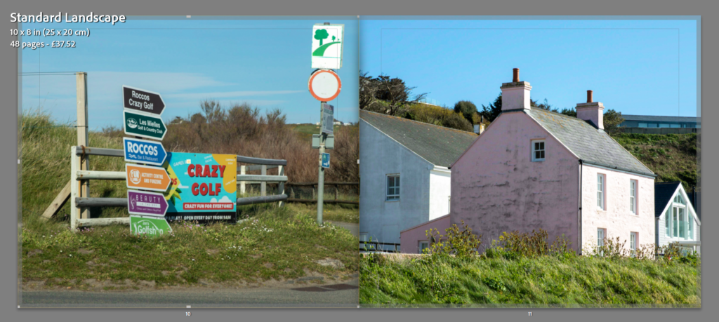
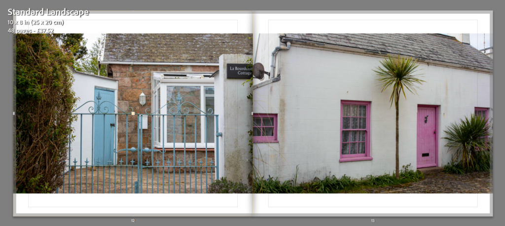
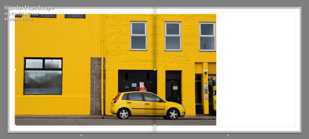
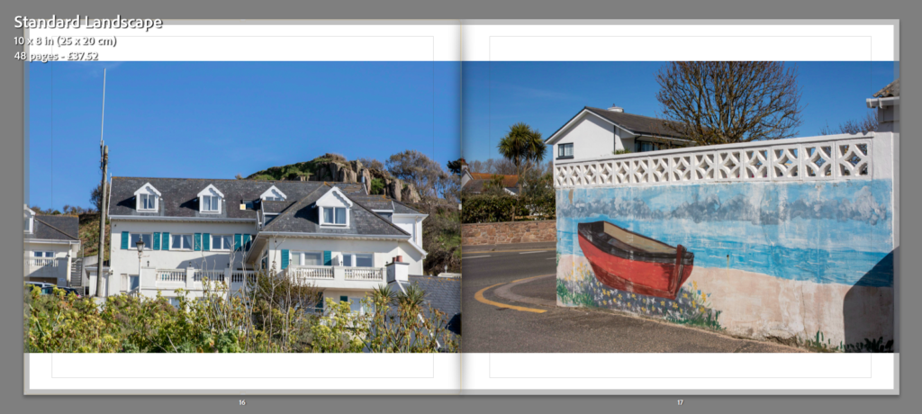
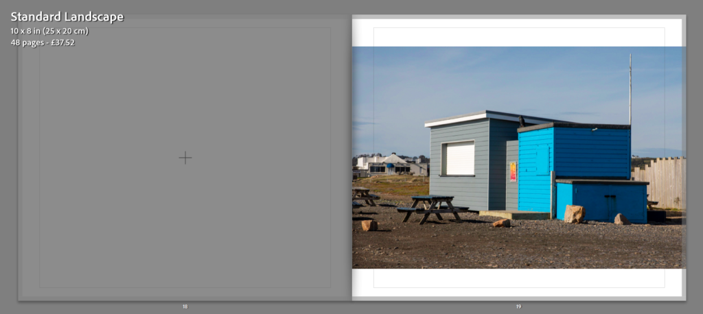
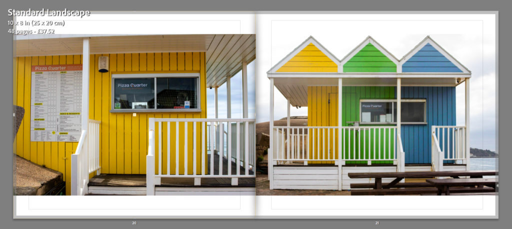
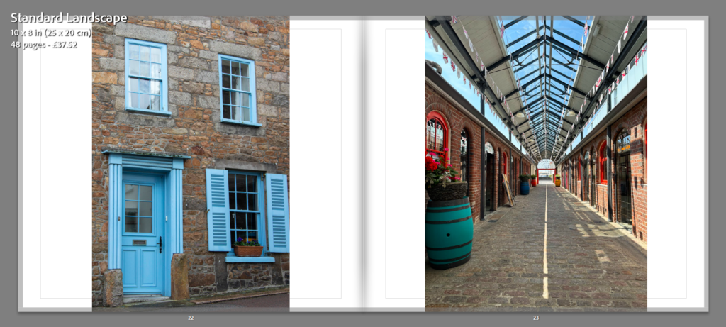
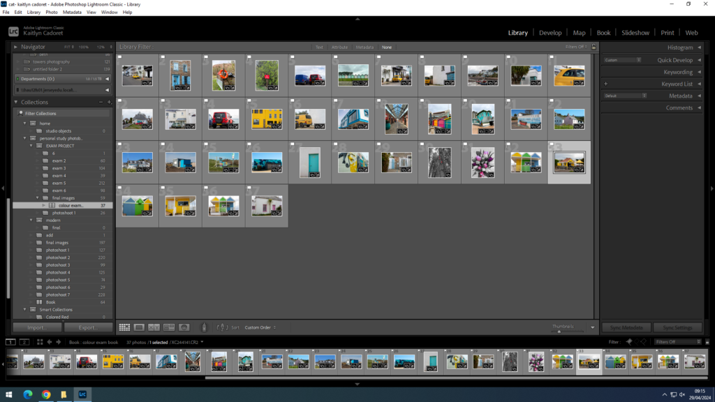
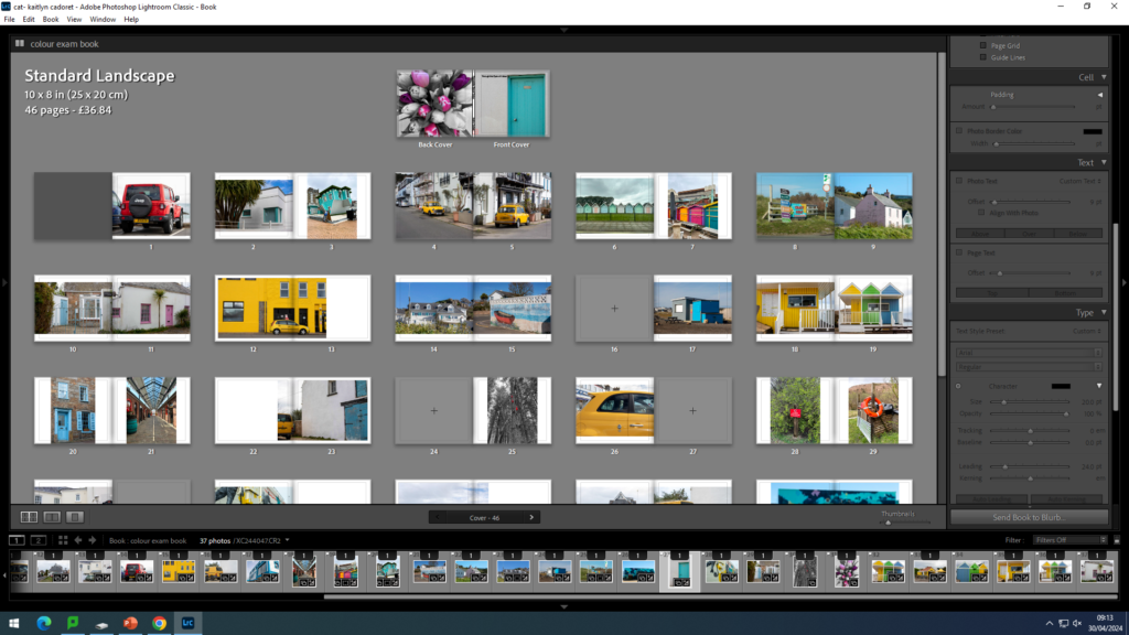
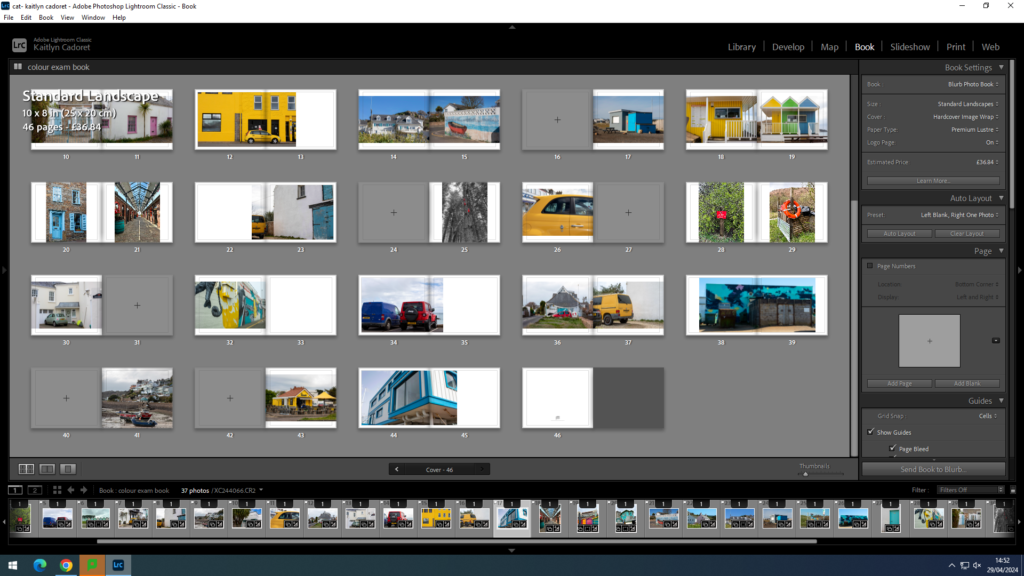
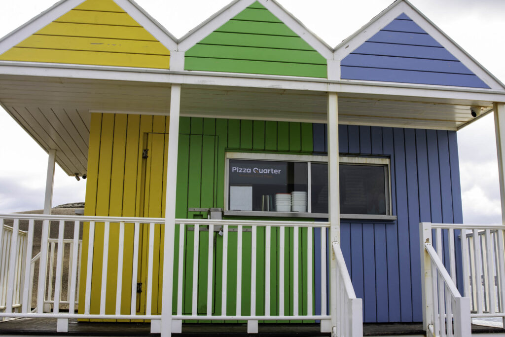
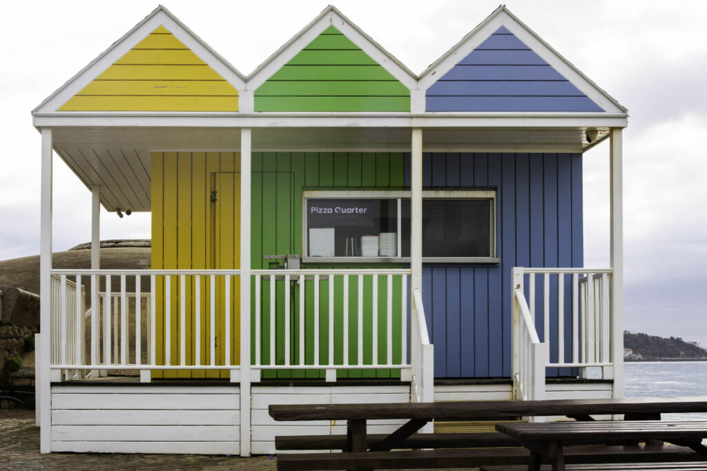
Once I had picked out my final images that I thought were my best and I wished to use in my final photobook I moved them all into one collection and began making my book. I wanted to make sure that the way I placed my images together would work and that there wasn’t too much of one colour at a time. When it came to the front and back cover I wanted to make sure that I used to bright and contrasting images to draw people in. I think the images I chose work well as one is a warmer tone and the other is cooler. I also think as they are so bright and colour are almost opposite they work well. I think they the way I have laid them out works well and that the colours aren’t too much but they contrast nicely together. Once I was happy with how they were laid out, I began to think of a suitable title that would describe my book nicely. I chose to call it ‘Through the Eyes of Colour’. I think that this name fits with my book and immediately tells the viewer what my book is all about which is one of the main things I wanted to achieve. As a whole am am very happy with my project and I think that my final book is a very clear way of showing viewers what I focused my project on.
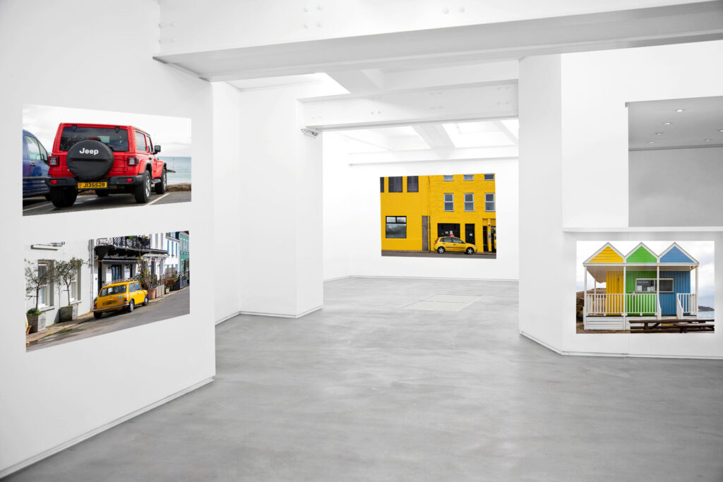
As part of my project I have presented my images in three ways, a photobook, final prints and a virtual gallery. I think that the images I have chosen to place in my virtual gallery work well together with the contrast in colours making it engaging against the white walls. Whilst I am happy with my images I don’t think that I have presented my images in the best way. I think that if I had more time I would have presented them in a better way and generally took more time to present them. I also think my images don’t quite fit together as three of them all contain yellow and one doesn’t which makes it look a little odd. Overall, I do think my images are of good quality however the way I presented them could have been improved.
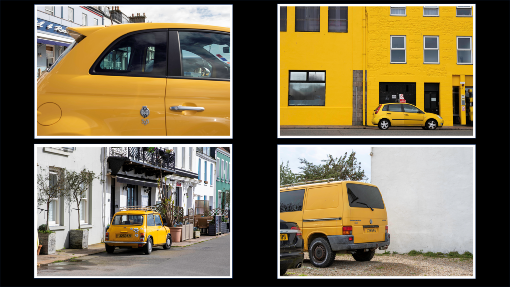
Along with making a photobook, I chose to make some final prints for my project as another way of presenting my work. I make a total of six final pieces using ten of my best images and think they turned out well. I think that I used a variety of my images to show a snippet of my project as well as showed a variety of colours and ways to present them. I am happy with how each of my window munts turned out and think that the first one with the four images is my favourite as it is very bold and draw viewers in catching their eye immediately. I think that the last three also turned out well and as they are simple it allows you to focus solely on the image and its colour as opposed to how it has been presented.
mini mock-ups:
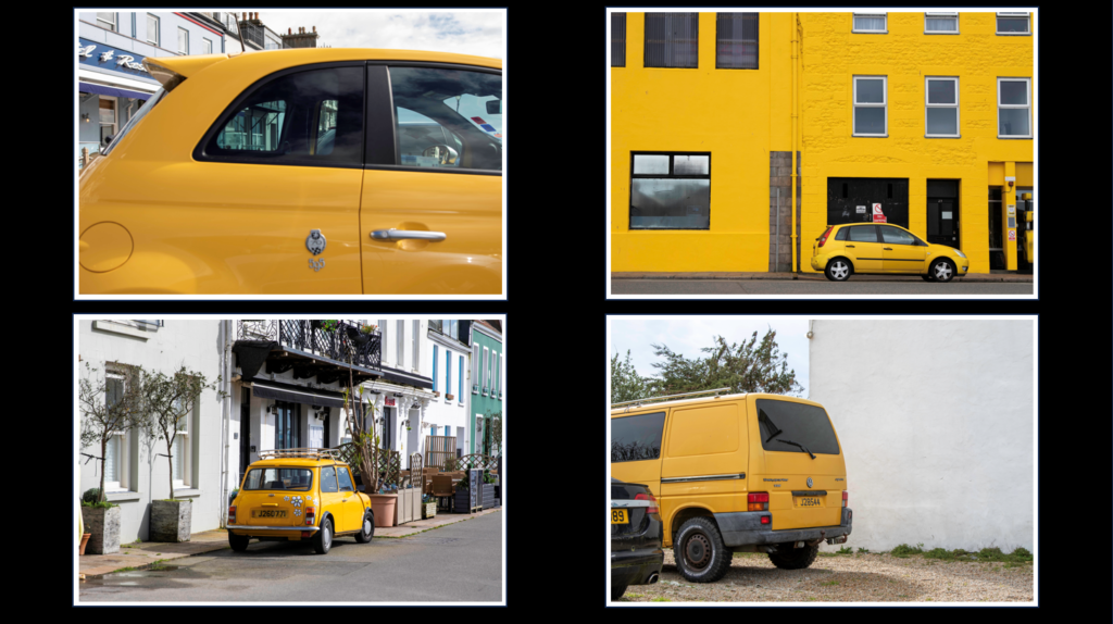
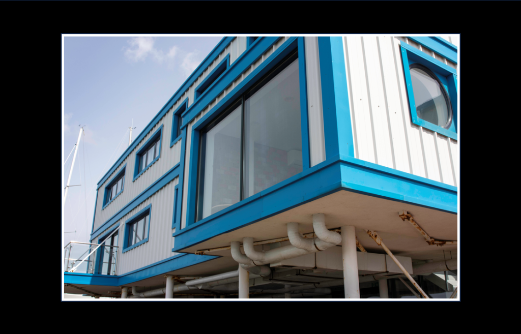

For my first three final prints I chose to make window mounts for them by taking a piece of thick black card and made measurements on the back to ensure that my image would be centre and that the cut out was the perfect size. I then used a ruler and an angled knife to make the cut outs and then used masking tape to hold the images in place on the back. I think all three of these turned out really nicely and the frames make the images stand out more.

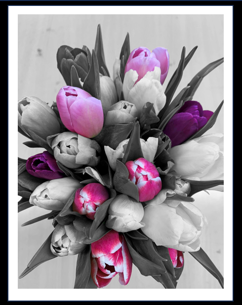

For my last three final prints I used spray mount to stick them onto some foam board and then used a ruler and craft knife to make sure they were cut out straight. On one of them I left white boarded as I thought it made the flowers stand out more and pop. With the other two I cut them right to the edge of the image. After that I then used double sided stick tape to back them on the same black card as the window mounts. I think all tree of these turned out well and they really focus on the colours in the images which I like.
final images:
layout:
Narrative: What is your story?
Describe in:
colour, history, bold
My book is a way of showing that we seem to take colour for granted and don’t appreciate it as much anymore.
Through my book, I hope to show that as colour has become such a regular thing in our everyday life, we don’t think of it the same way as people used to back then. I think that when colour film first came about it was such a big thing for not only photographers but also people generally. Now it isn’t seen as a big ting as technology is evolving everyday and taking images in colour is something everyone one can do whether it is on a phone or a camera etc. I am hoping that my images a have produced make us realise how beautiful colour is and also makes people spot things they maybe haven’t seen before when on a walk or driving. I have also took like on my lay out of my book so that not only do the images fit together but the colours within each image contrasts with one another. Personally, through out my project I discovered many hidden gems from housed to restaurants of bring colours/ containing bring colours that I did not know where there. Hopefully, after viewing my book, other will be able to look out more and discover new places and appreciate the colour in our world.
Design: Consider the following
When designing my book, I wanted it to look neat as there was a lot of colour, however I also wanted the colour to be the main component that everyone focuses on. I chose to use ‘Premium Lustre’ paper so that my images have a nice finish on them and makes the colour bright. To go with this I chose to have a hard back cover with an image wrap meaning the two images on the front and back cover with be printed straight onto the cover. For my title, I wanted to use something that describes my project so viewers immediately have an idea of what it is about. I decided to keep the text minimal in my book and only have it on the front and back cover. I chose to do this so that viewers aren’t distracted from my images and can take the colour in fully, as well as adding their own interpretation along the way. This also means that my images can be bigger filling more of the page so that the detail throughout them is clear.
For my first final print I am going to print out four of my images on A4 glossy photo paper. I am then going to take a piece of black card and am going to measure my images ad the card to place the images an equal distance away from each other. Once I have my measurements I am going to use an angled knife that attaches to a ruler to cut out four squares in the card which will have a white boarder around them because of the angled knife. I will then use masking tape to hold my images in place, facing through the cut outs.
For my second final piece, I am going to follow the same method as my first, however this time I am going to print just one image out on A3 glossy photo paper meaning I will only need to make one cut out.
For my third final piece I am again going to follow the same method as my first and second, however this one will be on A4 glossy photo paper. I have chosen to do them different sizes as I think that some of them will be more clear in a bigger size, however some of them will look better a bit smaller as they are all ready very bold.
For my fourth final piece, I am going to print out two of my images which I think go well together on A5 glossy photo paper. I am going to use spray mount to mount them onto a piece of foam board and then double sided sticky tape to mount them onto a piece of black card. I am also going to do that same method for my fifth however, it will be printed on A3 glossy photo paper and my sixth final pieces which will be A4 glossy photo paper.
Fifth final piece
Sixth final piece
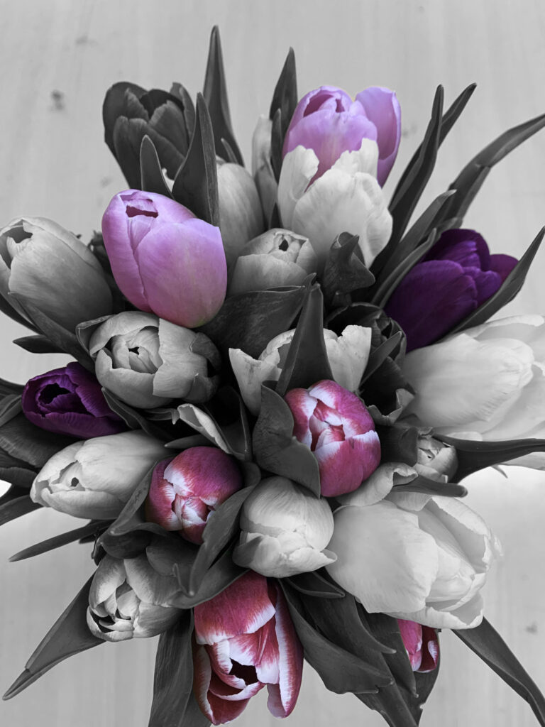
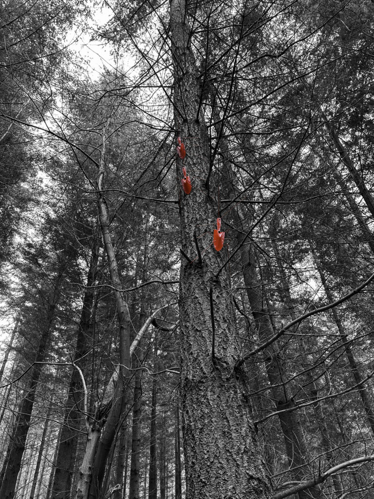
For my first experiment, I took one of my images and opened it on photoshop. I then duplicated the layer and made the top image black and white. I then used the rubber tool to begin rubbing out the top layer where I wanted the image to be in colour.
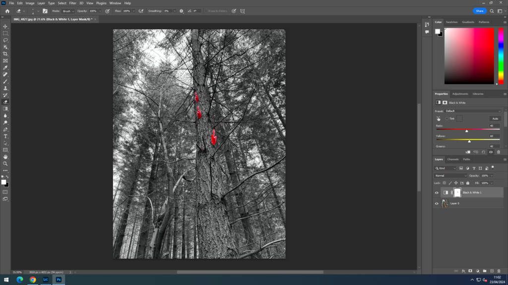
final image:
For my second experiment, I used the same process.
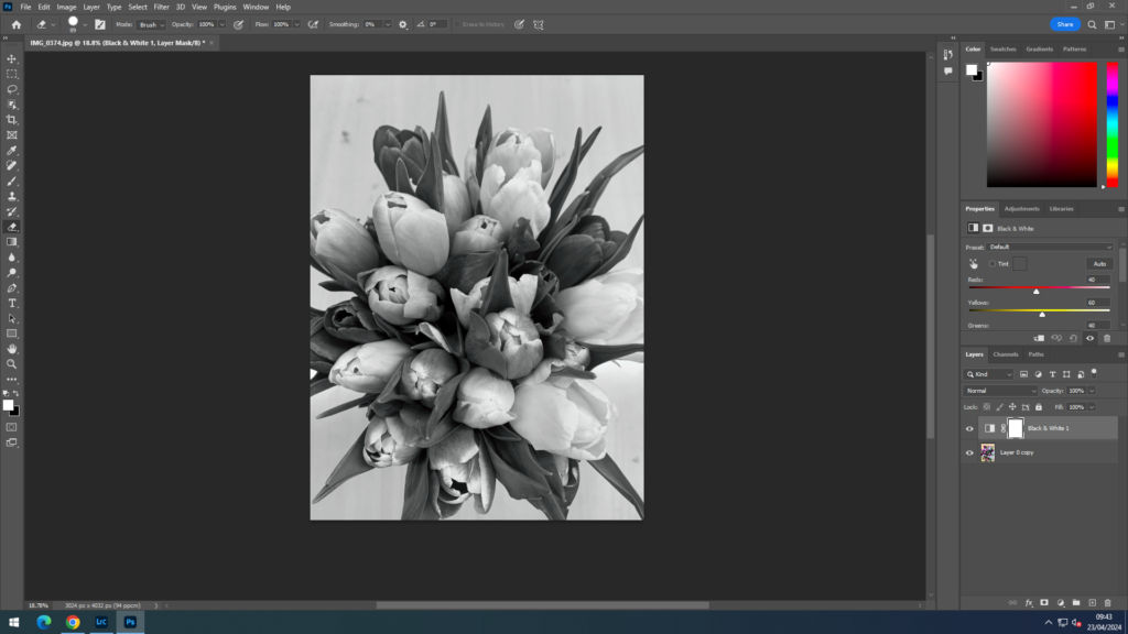
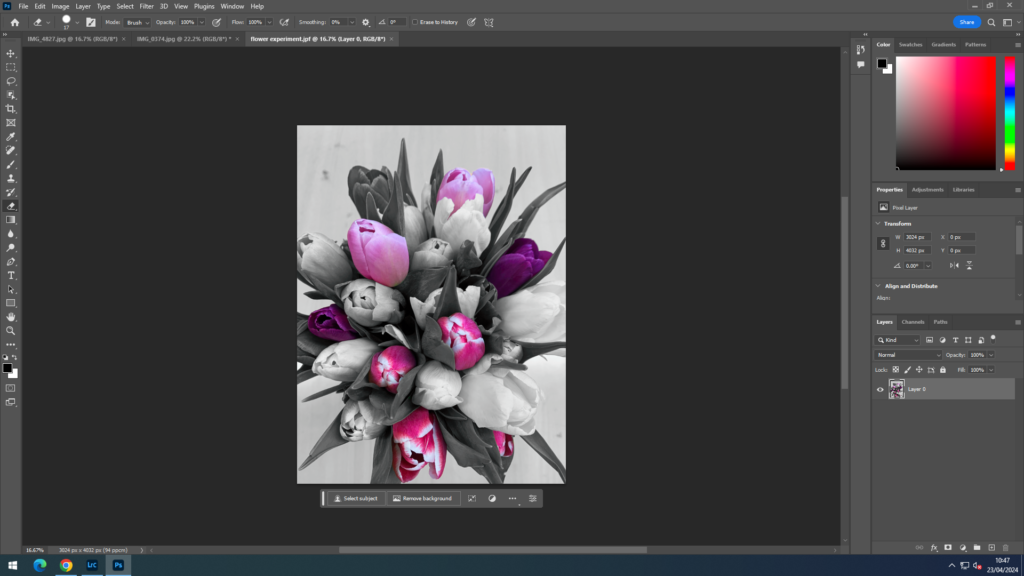
Final image:

1. Research a photo-book and describe the story it is communicating with reference to subject-matter, genre and approach to image-making. 9 what it is about, i.e., landscape, how images were made)
As a part of making my own photo book I have looked at Pamela Roberts’ book called ‘the genius of colour photography’. She made the book to gather a large range of colour photography, looking into the autochrome and many other early processes all the way to current processes. Colour photography has been developing since day one and now we can see just how much it has changed looking through Roberts’ book.
2. Who is the photographer? Why did he/she make it? (intentions/ reasons) Who is it for? (audience) How was it received? (any press, reviews, awards, legacy etc.)
In the book Pamela Roberts has looking into many different photographers such as William Eggleston, Saul Leiter and many others. I think this book is made for people who have an eye for colour and who appreciate the colour in images.
3. Deconstruct the narrative, concept and design of the book and apply theory above when considering:
the book has a glossy finish which I think works well with the different colours especially the image on the front cover.
The images in the book also have a glossy finish which I think makes them stand out more and engage the viewer.
The book has a soft cover which has a flap on the inside of the front cover which has more information about the book.
it has a card cover with a glossy finish and the image on the front is printed straight onto it.
The title of the book is very straight forward and to the point, it describes exactly what the book is and why you may want to read it.
I think the story is told through images and text to make it clear to the reader/ viewer and for those who may only just be learning about it now.
Many of the images are presented in a large size to make the detail more clear and visible which I think I will do in my photobook too.
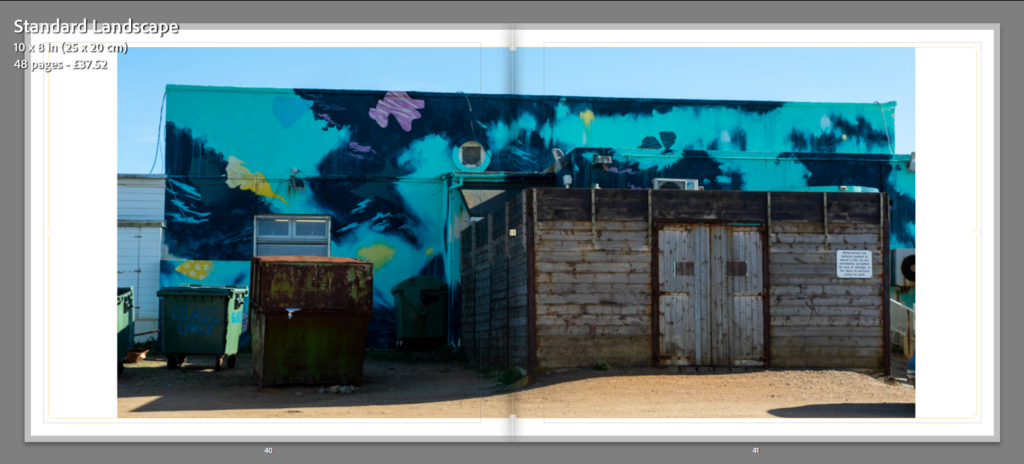
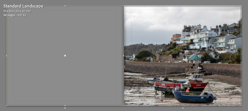
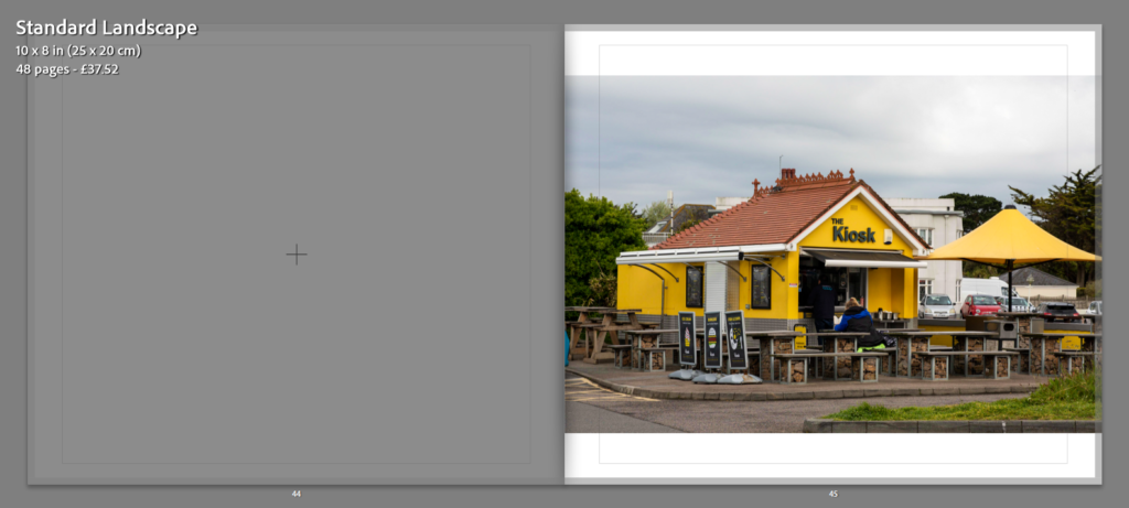
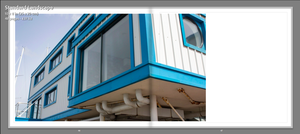
For my sixth and final photoshoot, I had a very clear idea of where I wanted to go for my images. As this was my last shoot. throughout the course of my project I had seen many things that I wanted to photograph. This last shoot was to capture any of those which I thought would add to my project and make it complete.
final images:
Overall, I am very pleased with this shoot and think that these final images add to my project to complete it. I think that they all hold bright colours which is what I was looking for and within the images the colours contrast. As a whole I am happy with the images I managed to take but still think there were other places I could have gone and different images that would have worked well.