Here is the link to my Photobook: Hysterikos
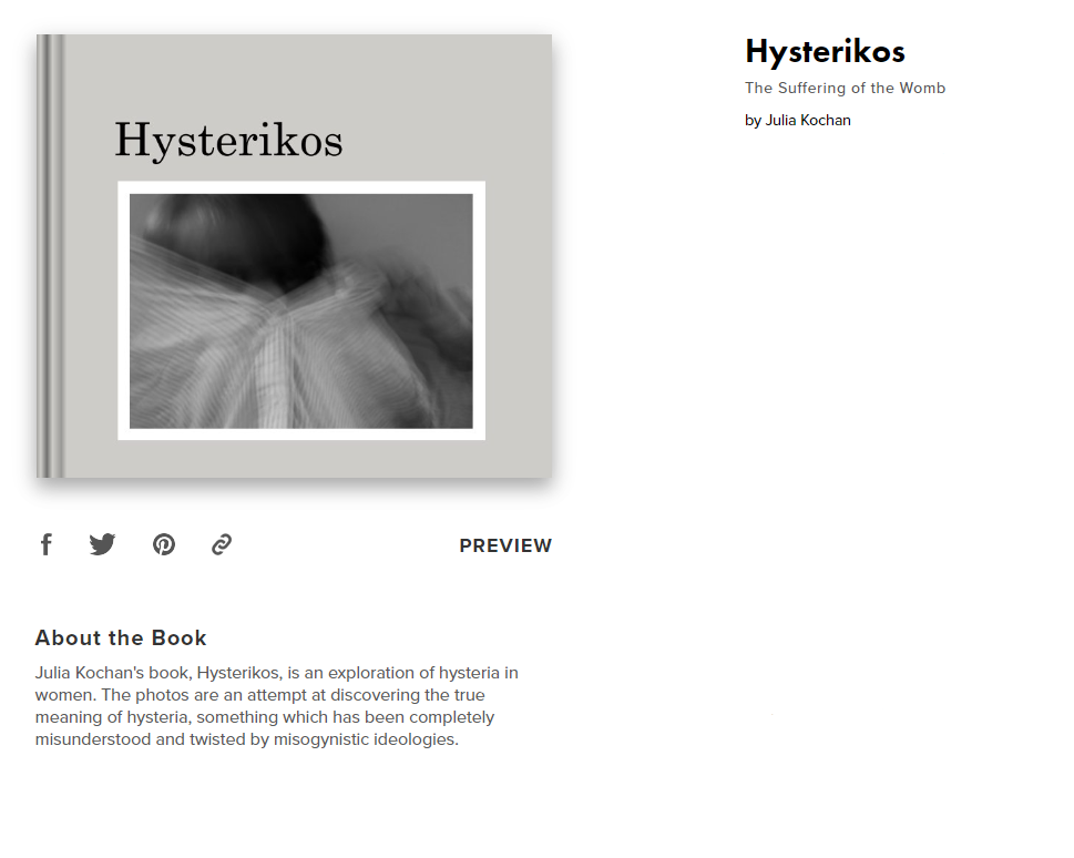
Here is the link to my Photobook: Hysterikos

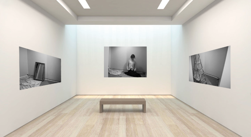
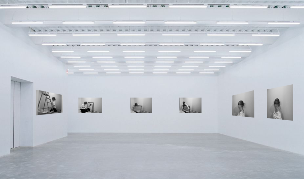
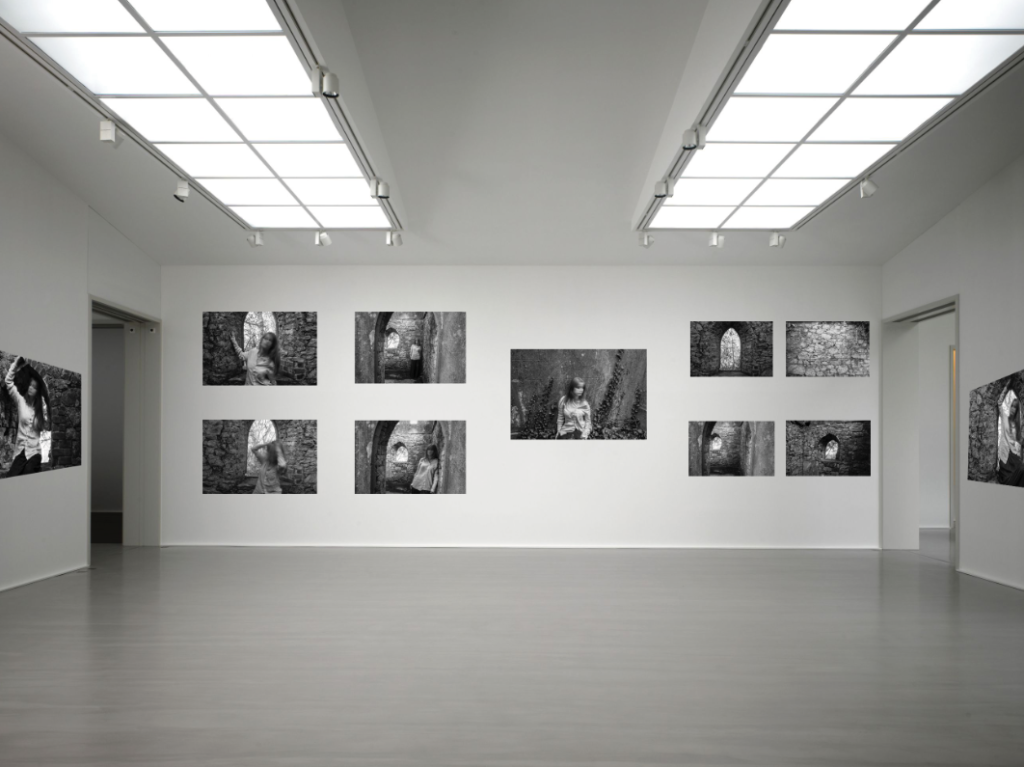
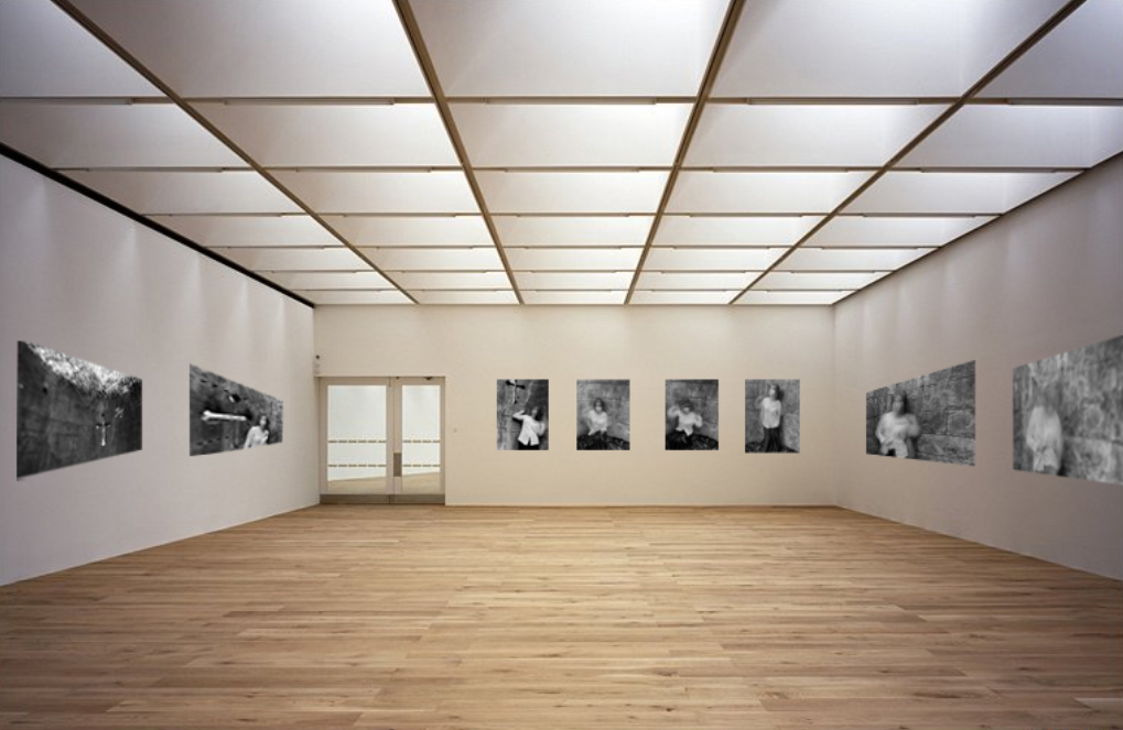
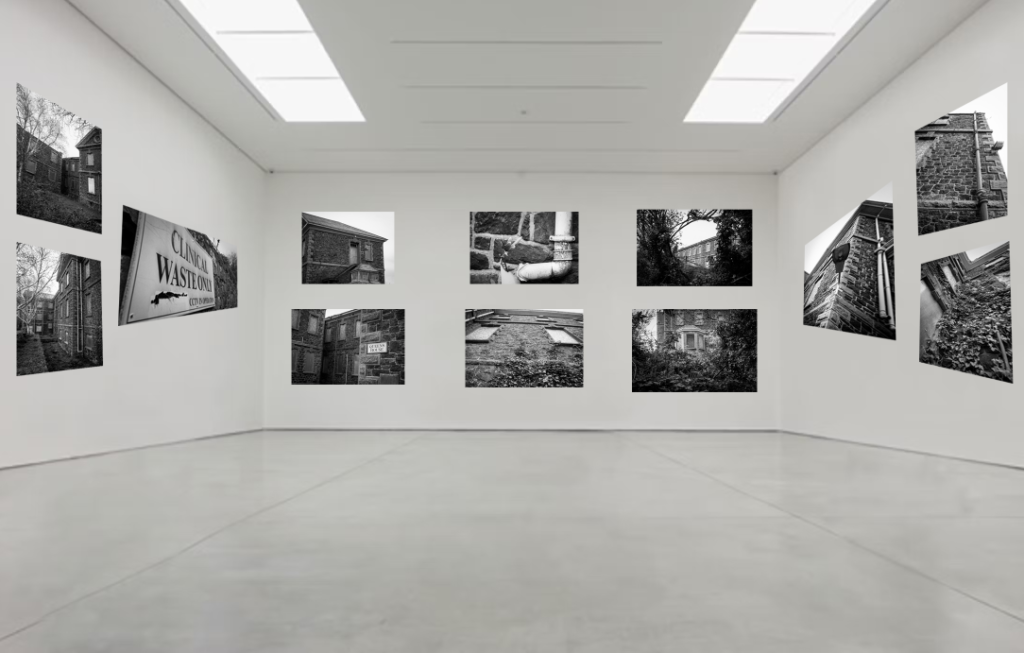
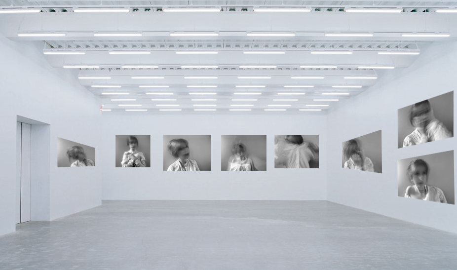
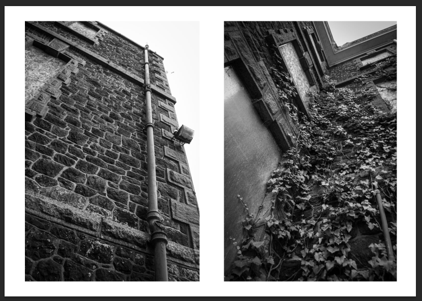
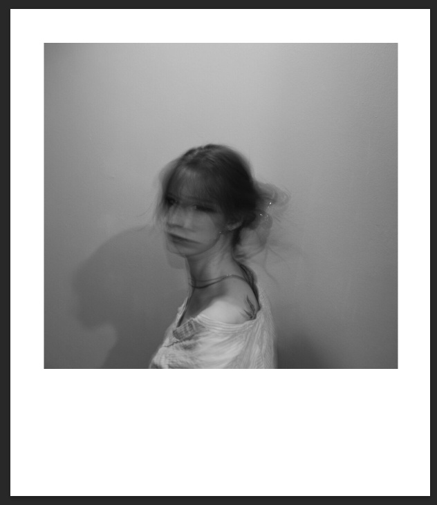
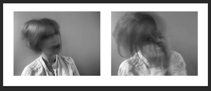
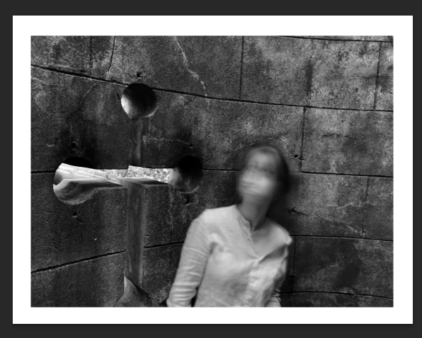
I tried to present as many photographs as I could, arranging them in a simple way that would look organised and allowing each image to stand out. I choose the simplest white space galleries to allow there to be minimal distractions. I think these galleries are quite successful, and I am glad I made two for some photoshoots, avoiding the photos looking clustered together.
Overall, I think I created a successful response to the theme of Observe, Seek and Challenge. I think this theme could go in any directions, yet I am glad that I went with my idea of madness and femininity. My project showed evidence of these words, especially since I wanted to focus on seeking the true meaning of hysteria and challenging the views surrounding the once extremely misogynistic diagnosis. I think the research I did is proof of the observe part of the theme. This proves my understanding of the theme and I believe my interpretation of it was successful. I believe the artists I chose, especially Francesca Woodman, were a suitable choice, which allowed me to complete some effective photoshoots inspired by them. I think my photographic responses are effective, the settings on the camera (slow shutter speed) working well to create the effect I wanted to create. They link in well with both my artists yet are still original and in my own personal style. The editing process was also successful, and I think editing each photo into black and white was a good decision since it added a fluidity to the final presentation of my photobook. I also enhanced the contrast and increased the amount of black in the portraits, which made the images more refined and overall obtain a better appearance.

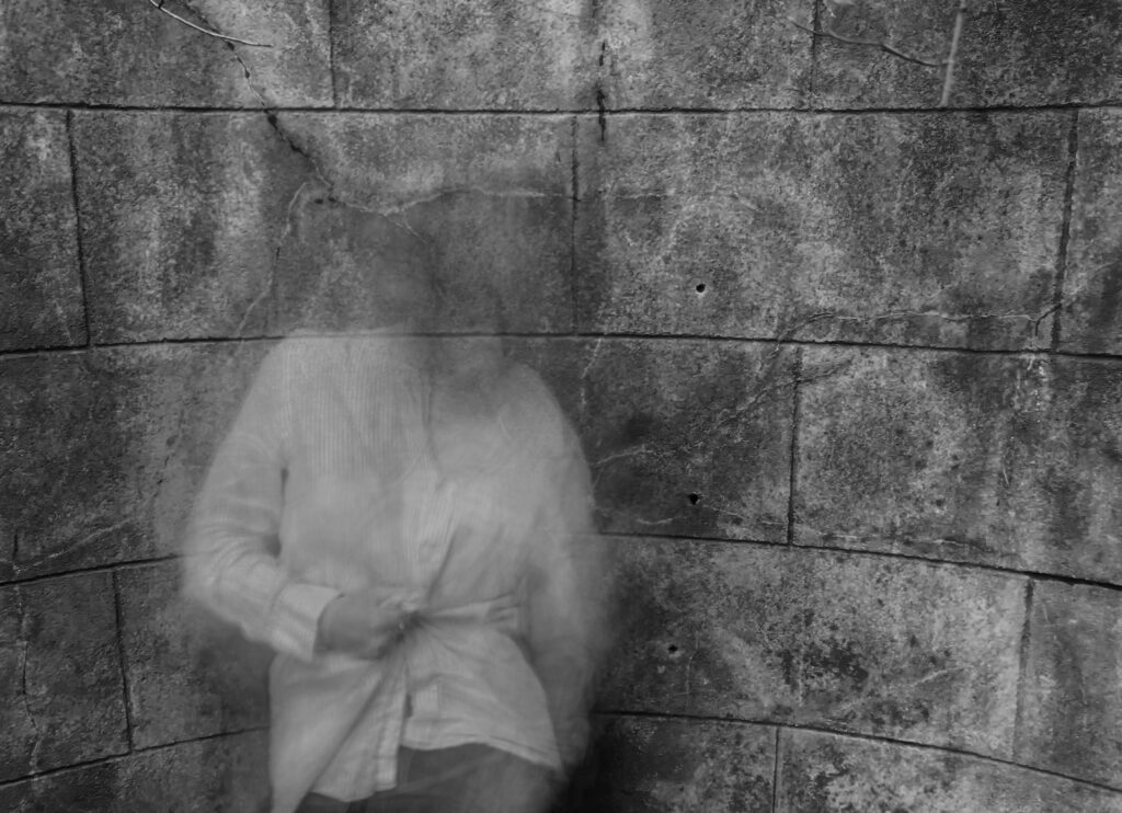
I think my final outcome was a well put together photobook, that showed all my best images in a effective layout. The text I included adds a lot to the overall book and acts as a introduction of my project as well as being a short summary of my research. Each photo flows well into the next therefore I think the arranging and sequencing was another successful aspect. My decision to keep the layout simple, with white space present on every page was effective, since it keeps my photobook simple so that each photo stands out.
However, I do believe I could improve certain areas of my project. Firstly, I think my response could have been enhanced if I had taken more photographs/ completed more photoshoots. The reason for my limited amount of imagery (only summing to around 250 photos) is due to the complexity of my self- portrait photoshoots. Since I had to set up the tripod and timer, each photo took quite a lot of time and effort to create. This is something I didn’t consider and perhaps wasn’t as successful as it could have been. On the other hand, I think I could have taken landscape images of another place with significance to my project, as then I would have even more photoshoots and examples of my work. I think if I had more time I would add even more text to my photobook, as I like the idea of a mixed media outcome.

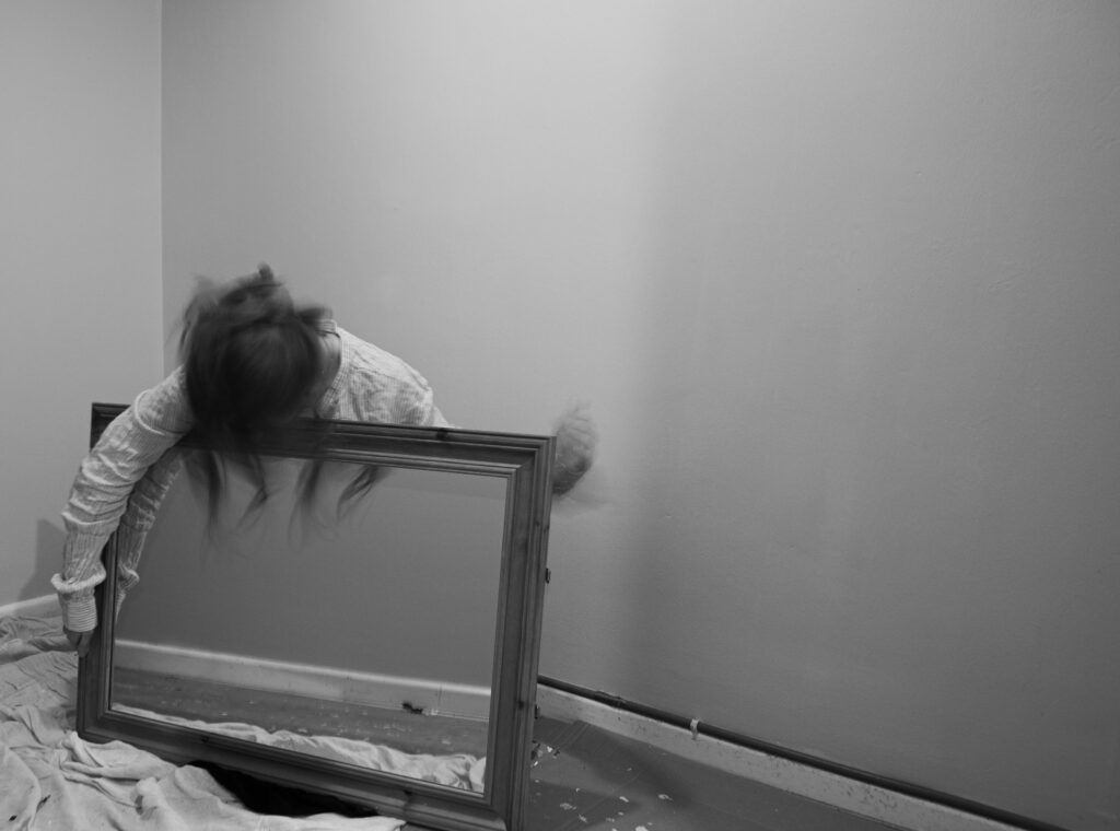
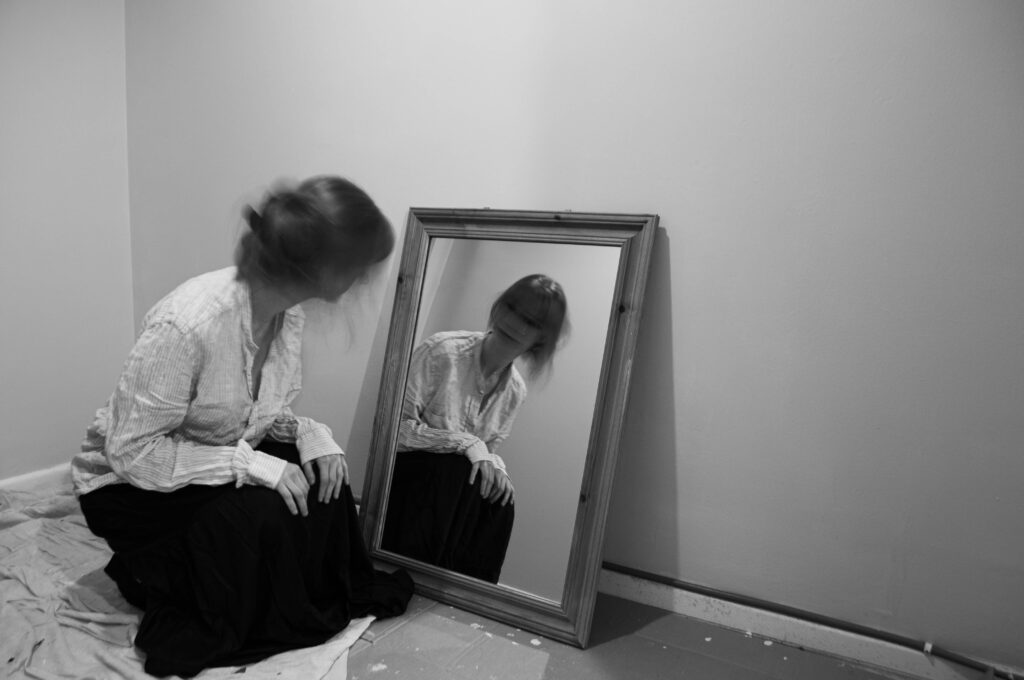
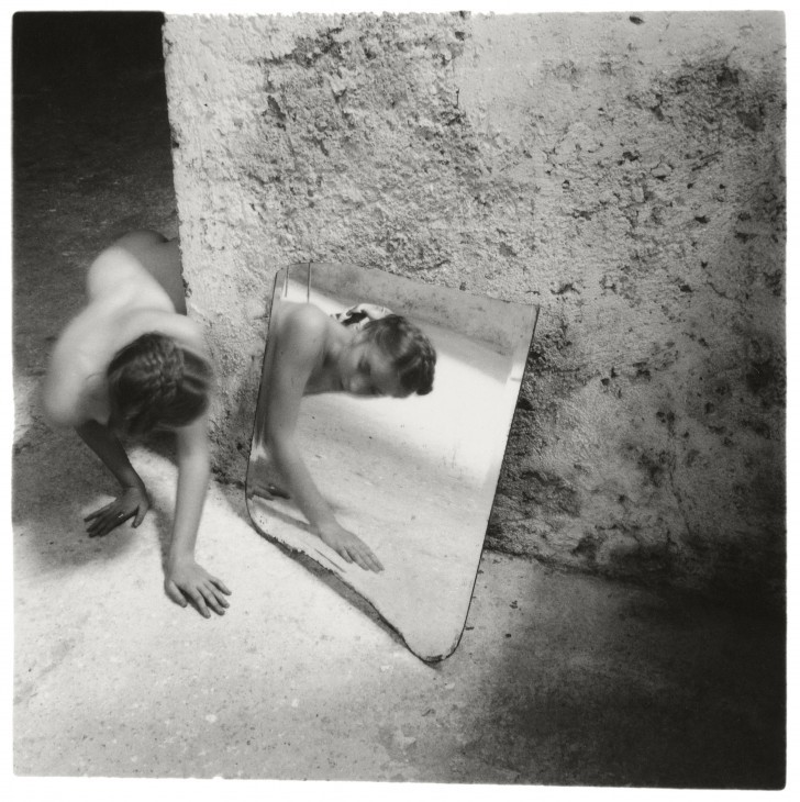
Firstly, the composition of both photos is quite similar, the place meant of the mirror against the wall creating a similar effect. Both mine and Woodman’s faces are turned away from the camera, only the reflection revealing our faces. Both photos utilise a similar shutter speed, applying a slight blur to capture the movement in the photo- in this case it being the face. Despite Woodman coming round from a dark corner and me simply kneeling in front of the mirror, I think both photos have an unnerving feeling to them. I do think her photo is much more interesting, the textured wall indicating age or abandonment and the questions surrounding the dark corner she is emerging from causing her image to be much more effective. This highlights why her photos are so unique and effective, her personal touch being abstract poses and places. Moreover, she is nude in her photograph, an aspect of her work I couldn’t recreate. The nudity in her work holds a lot of significance, perhaps indicating her confidence when in front of the camera and her ability in making her photos extremely personal. I do think my simple outfit was effective, not taking away from the picture as well as being quite timeless, a big factor I considered in my photoshoots, since I didn’t want my clothes to be a flashing indication of when my photos were taken. In terms of editing, making my image black and white allowed me to enhance the tones in my image, deepening the contrast and therefore make my work match the style of Woodman.
In terms of my exploration of hysteria, the disturbing look of both photos acts as an indication of the unnerving nature surrounding hysteria, especially when it was believed to be a result of a woman’s ’empty womb’. The slow shutter speed helped me obtain the look of being ‘hysterical’ since the blurriness is a portrayal of this abstract feeling.
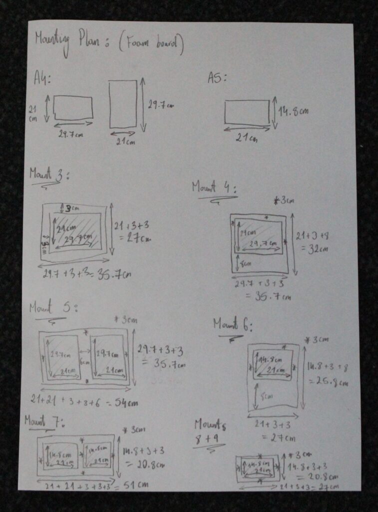
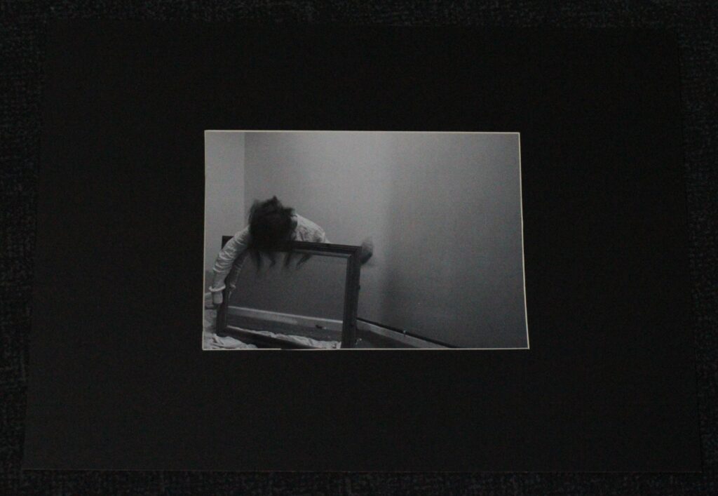
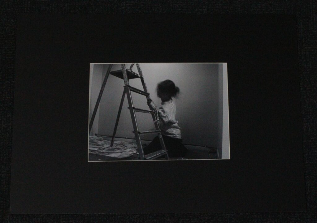
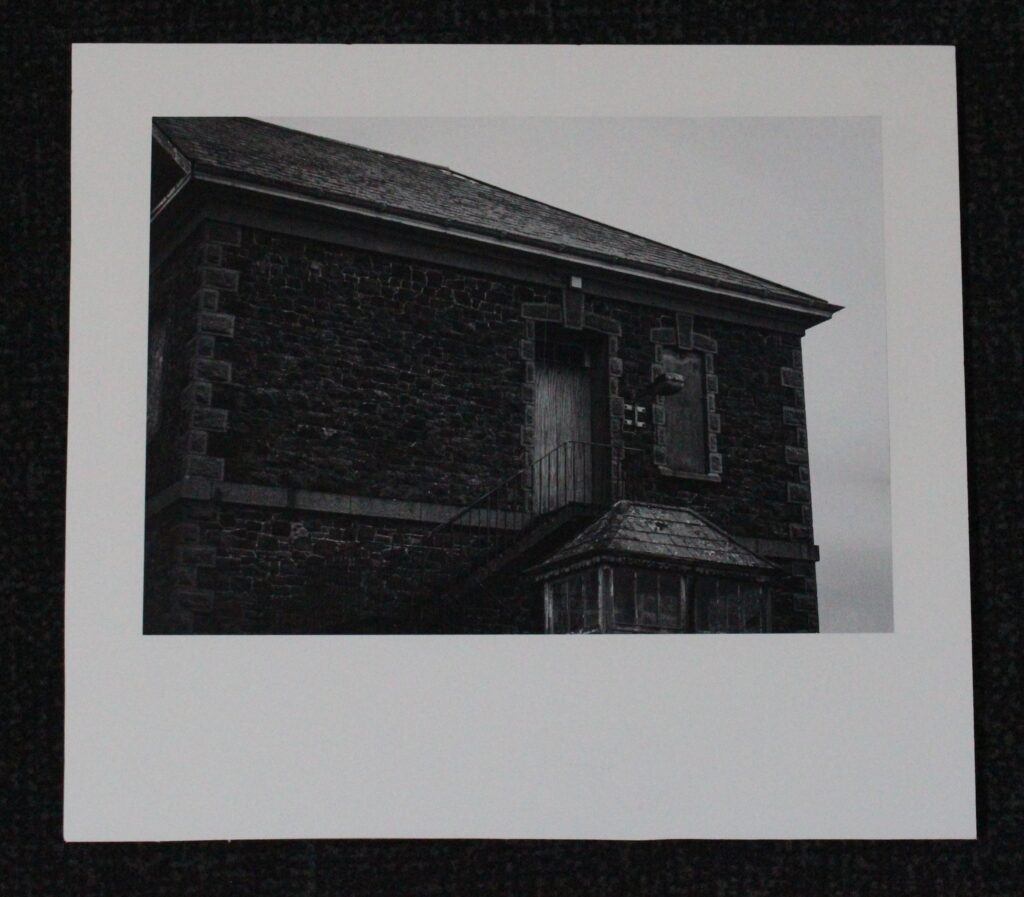
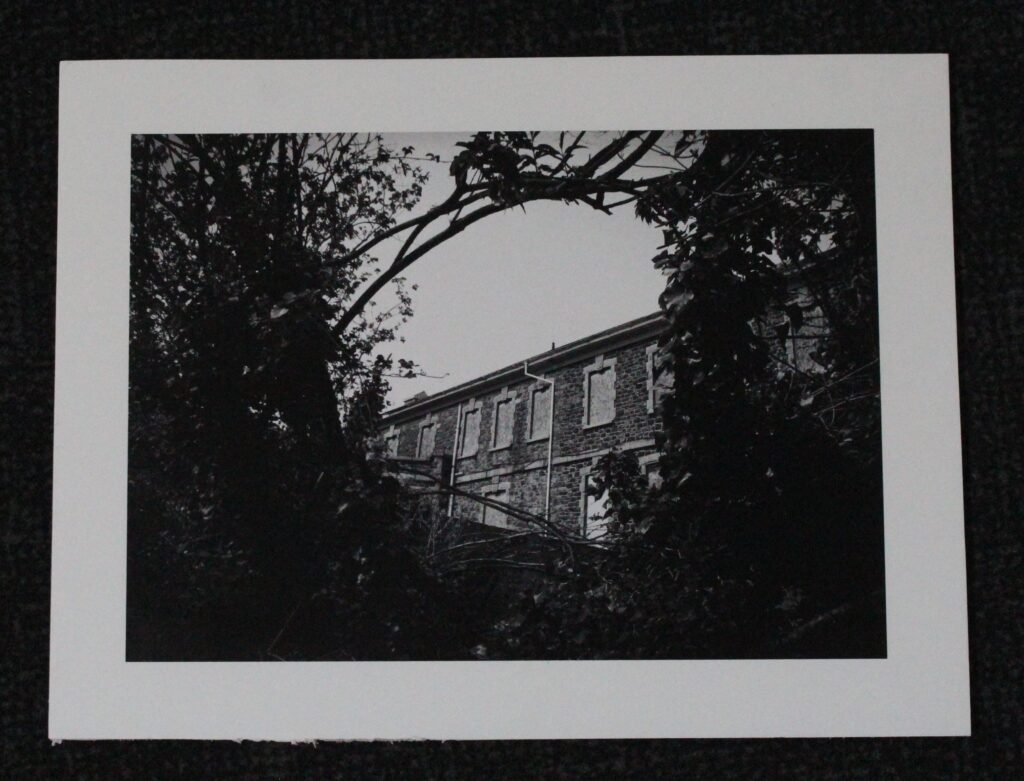
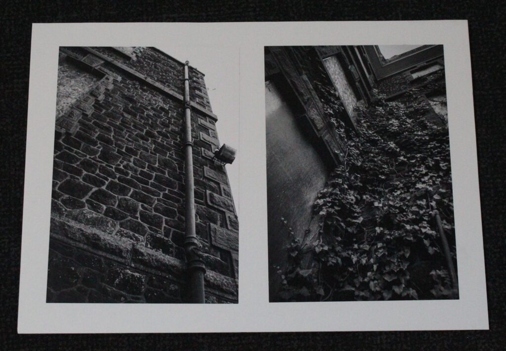
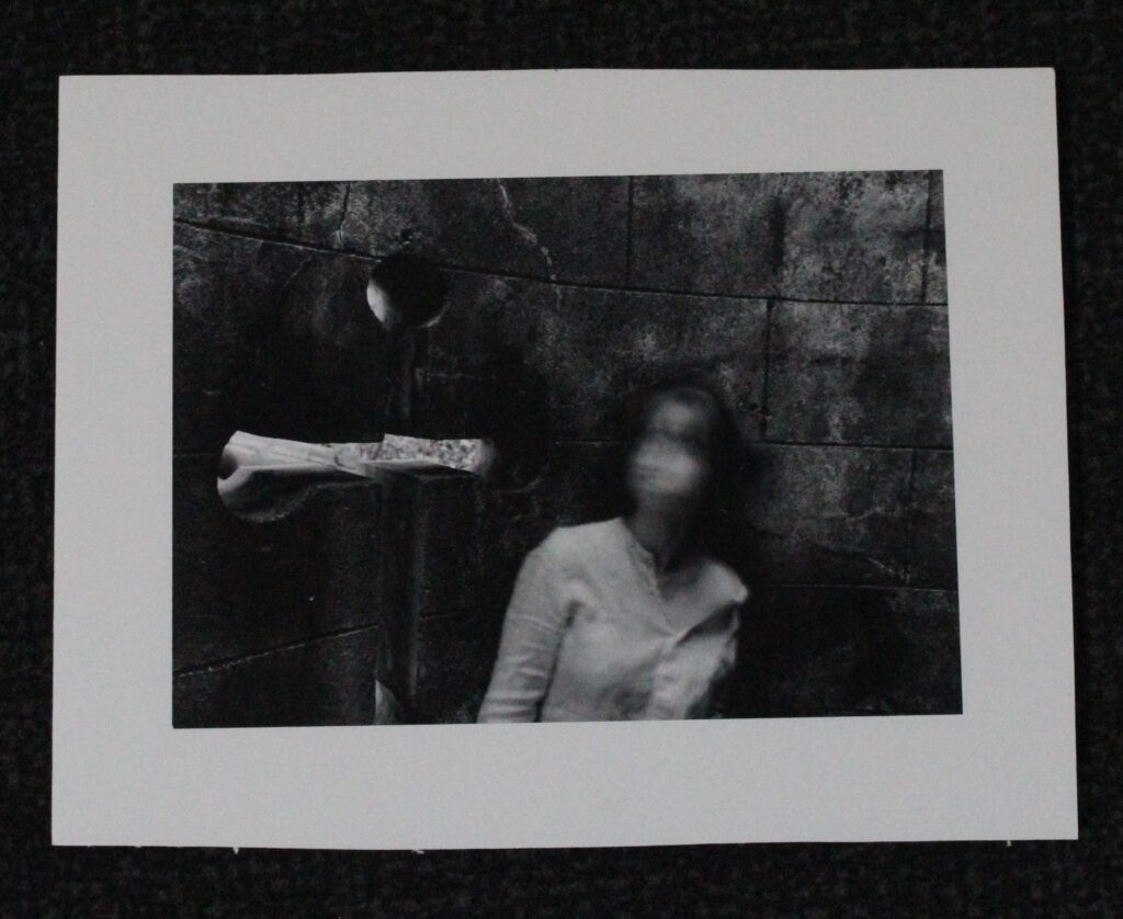
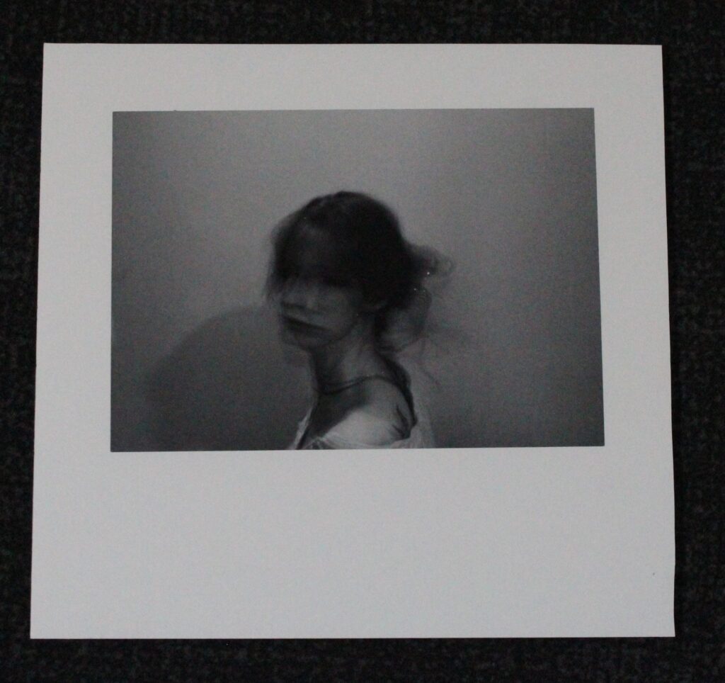
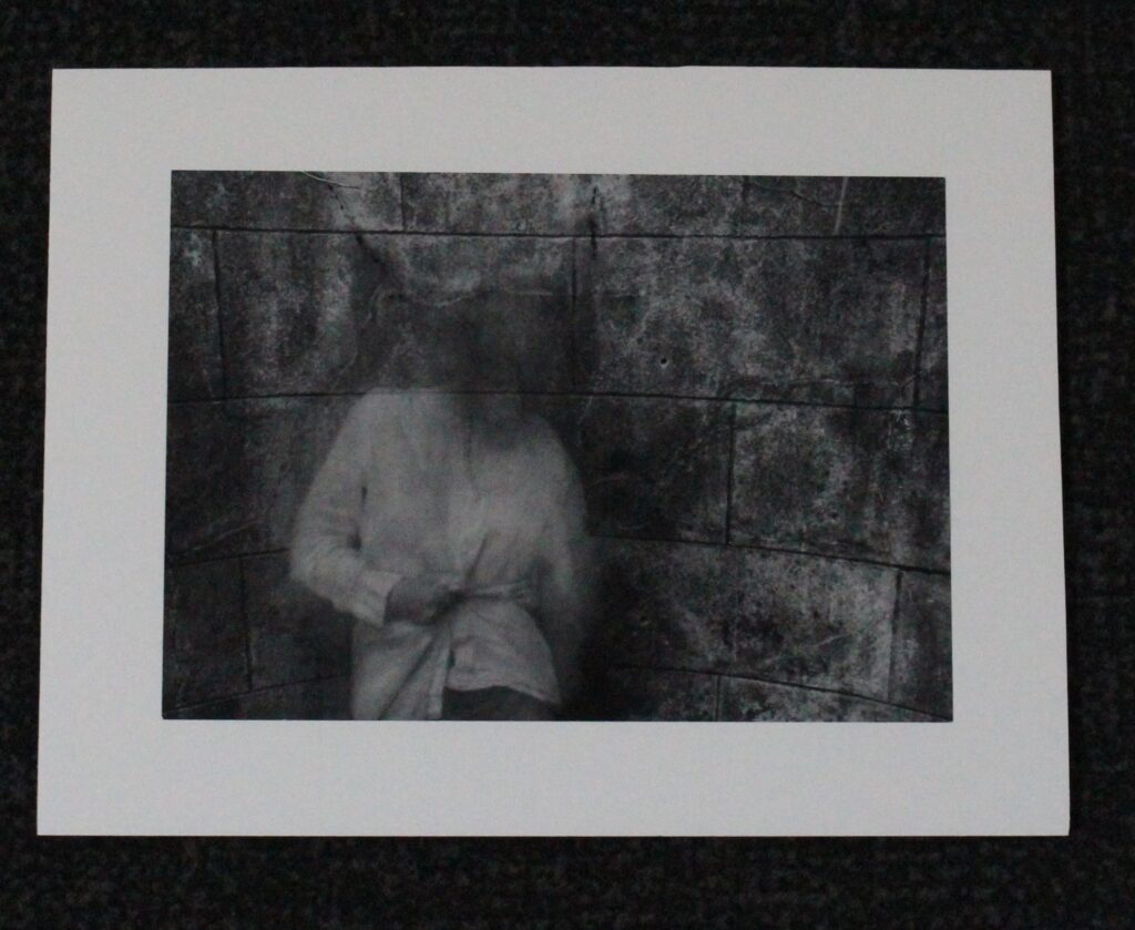
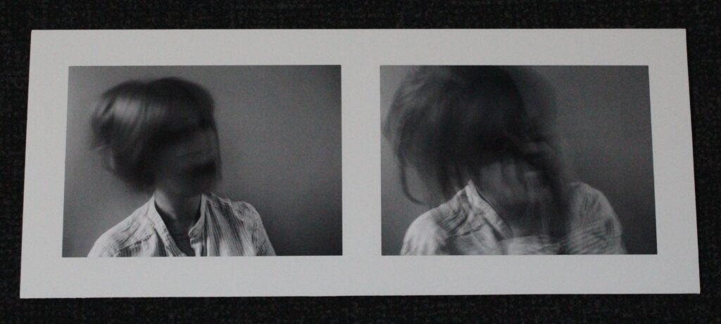
I think these mounts went well and are an another effective way of presenting my work. The layout I decided on and planned out was the one that I stuck with for all my mounts and they all worked.

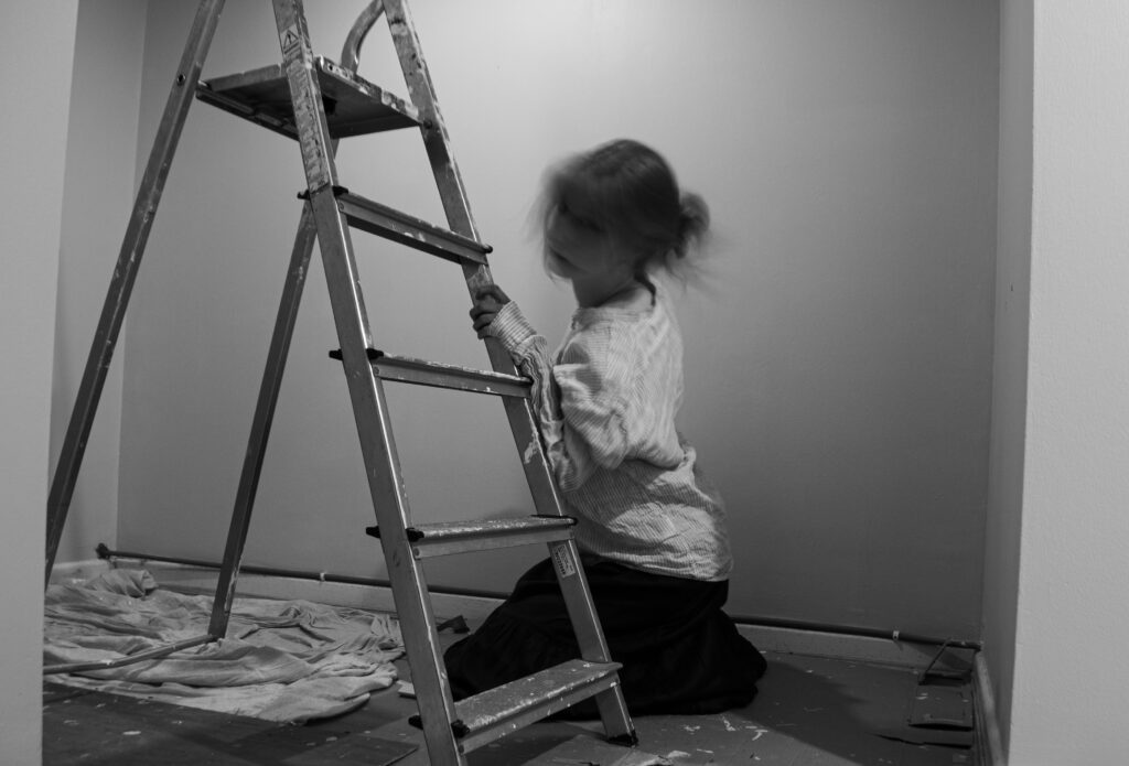
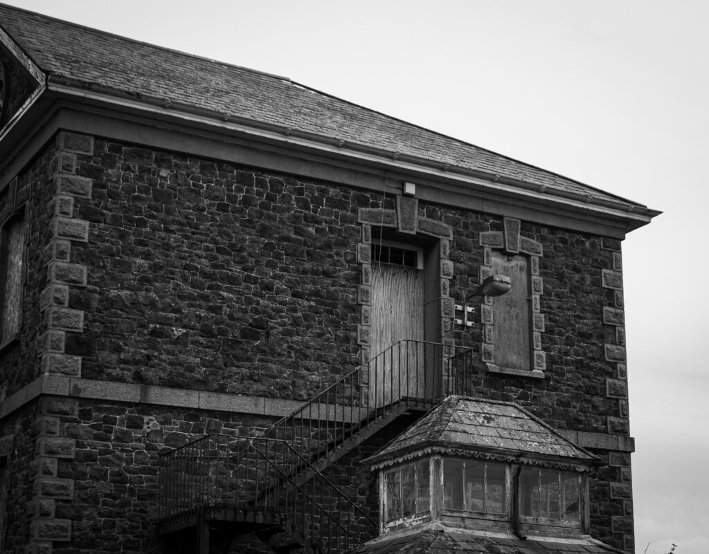
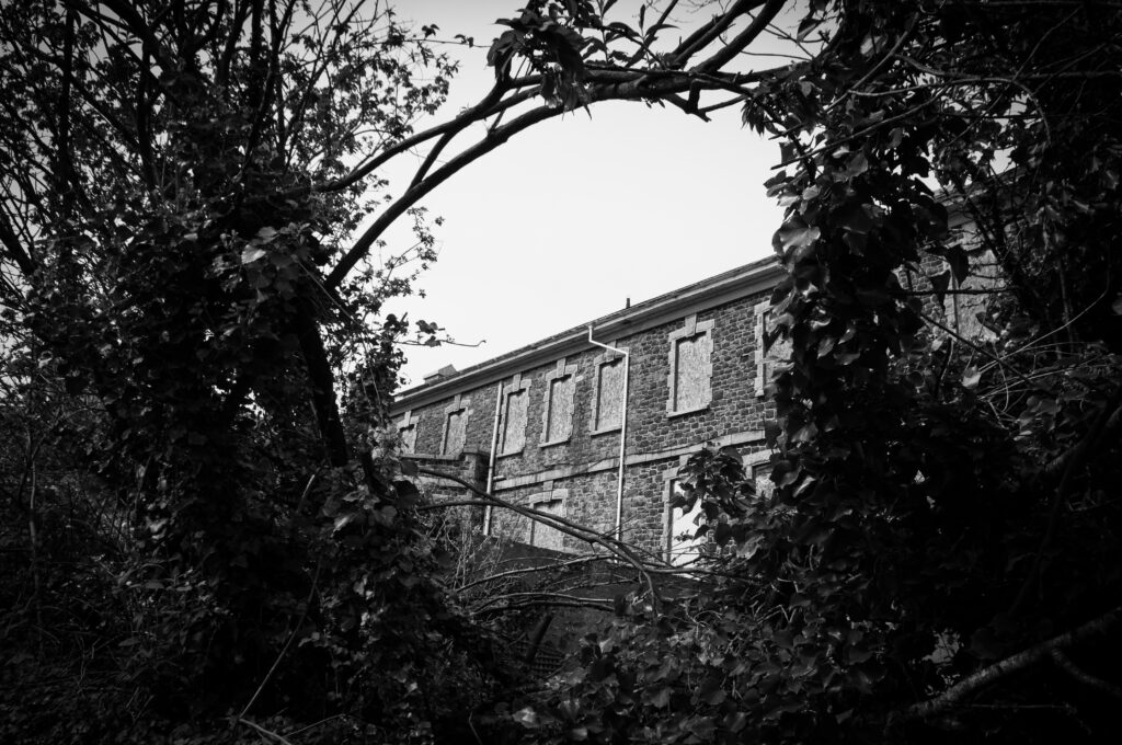

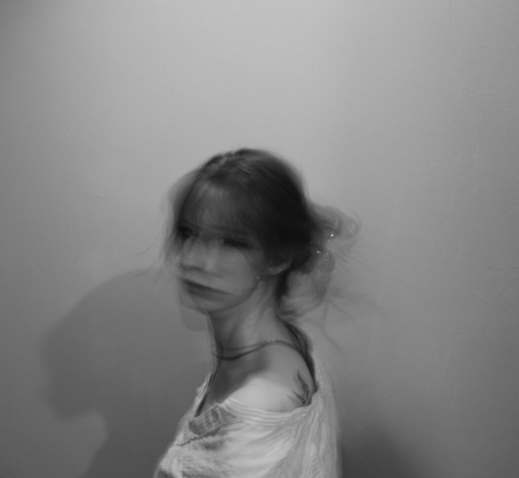

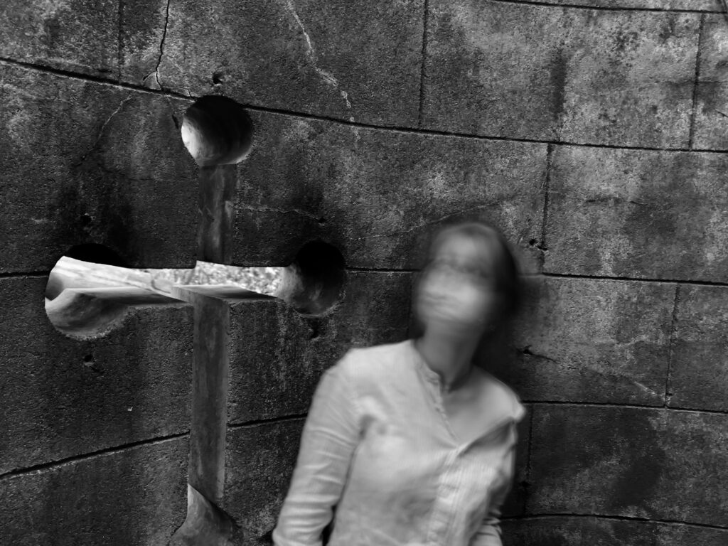


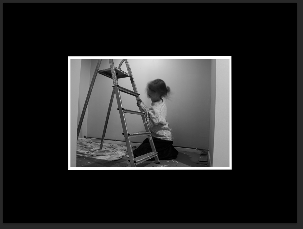
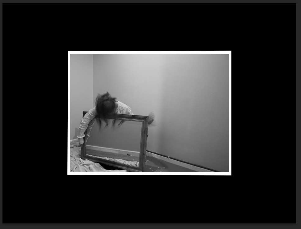
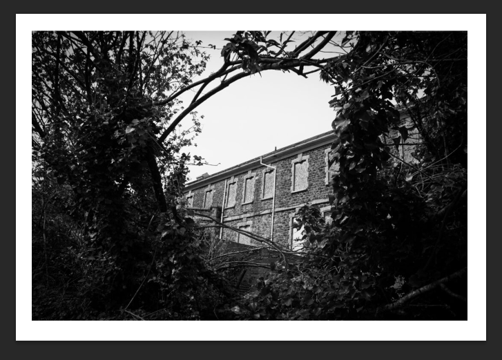
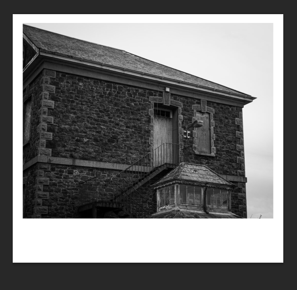
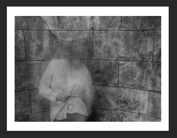
Narrative: What is your story?
Describe in:
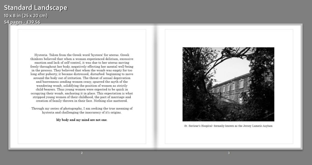
Hysteria. Taken from the Greek word ‘hystera’ for uterus. Greek thinkers believed that when a woman experienced delirium, excessive emotion and lack of self-control, it was due to her uterus moving freely throughout her body, negatively effecting her mental well-being in the process. They believed that when the womb was empty for too long after puberty, it became distressed, disturbed: beginning to move around the body out of irritation. The threat of sexual deprivation and barrenness sending women crazy, spurred the myth of the wandering womb, solidifying the position of women as strictly child-bearers. Thus young women were expected to be quick in occupying their womb, anchoring it in place. This expectation is what stripped young women of their childhood, the pact of marriage and creation of family thrown in their face. Nothing else mattered.
Through my series of photographs, I am seeking the true meaning of hysteria and challenging the inaccuracy of it’s origins.
My body and my mind are not one.
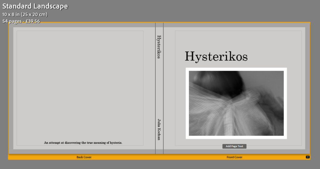
For this idea, I wanted to keep the cover simple, with one of my faceless pictures present on the front cover.


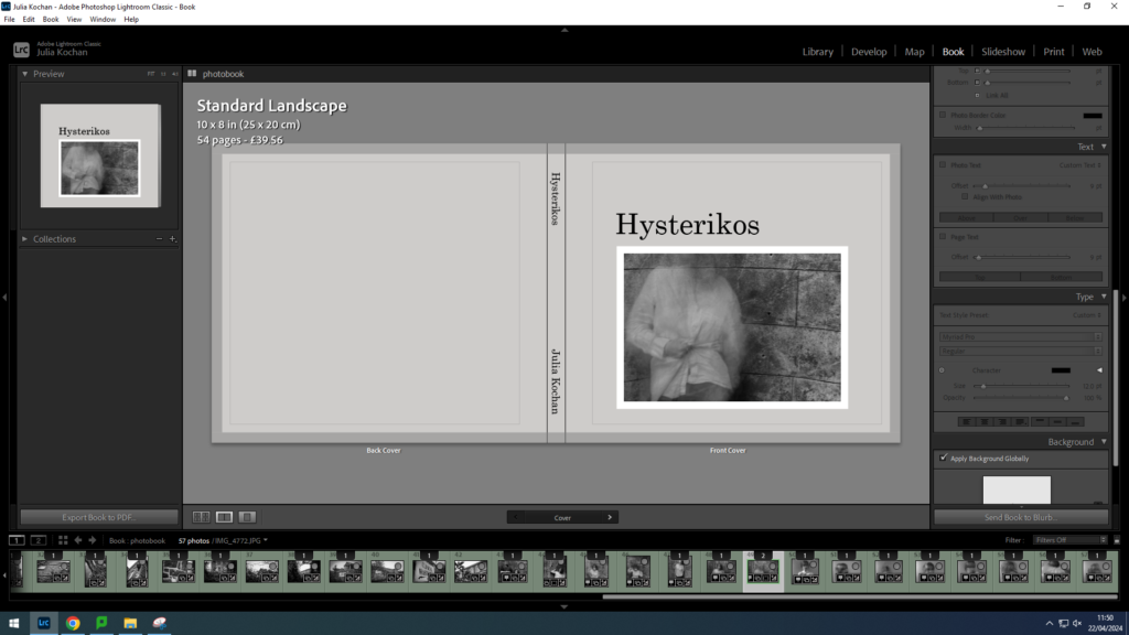
I experimented with a double spread for my cover however I don’t think this is a suitable or effective idea for this photobook.
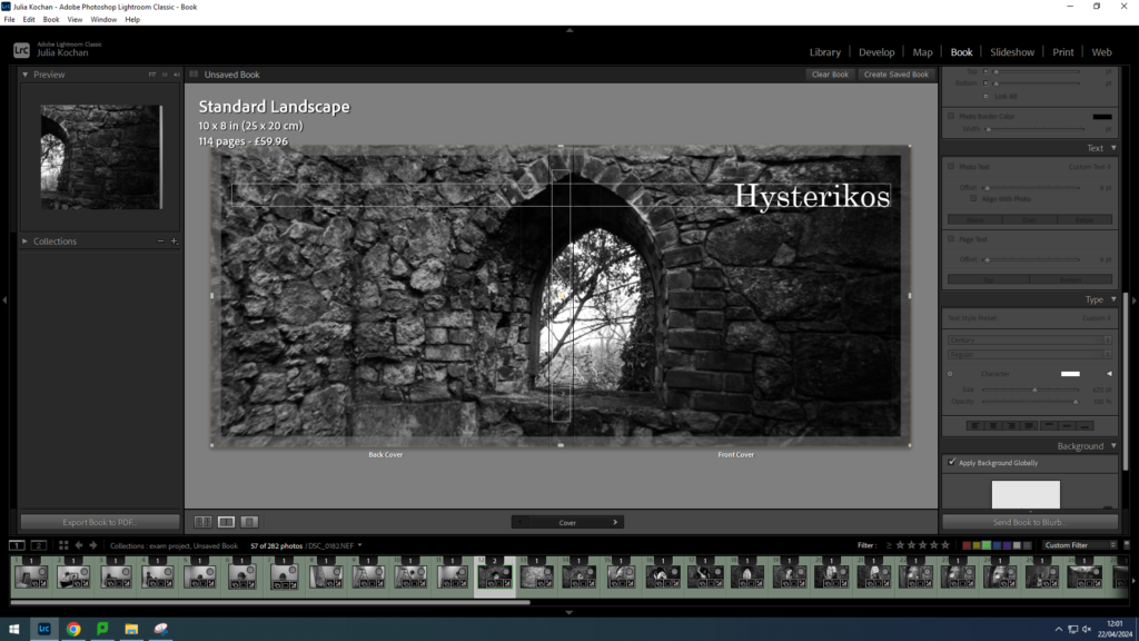
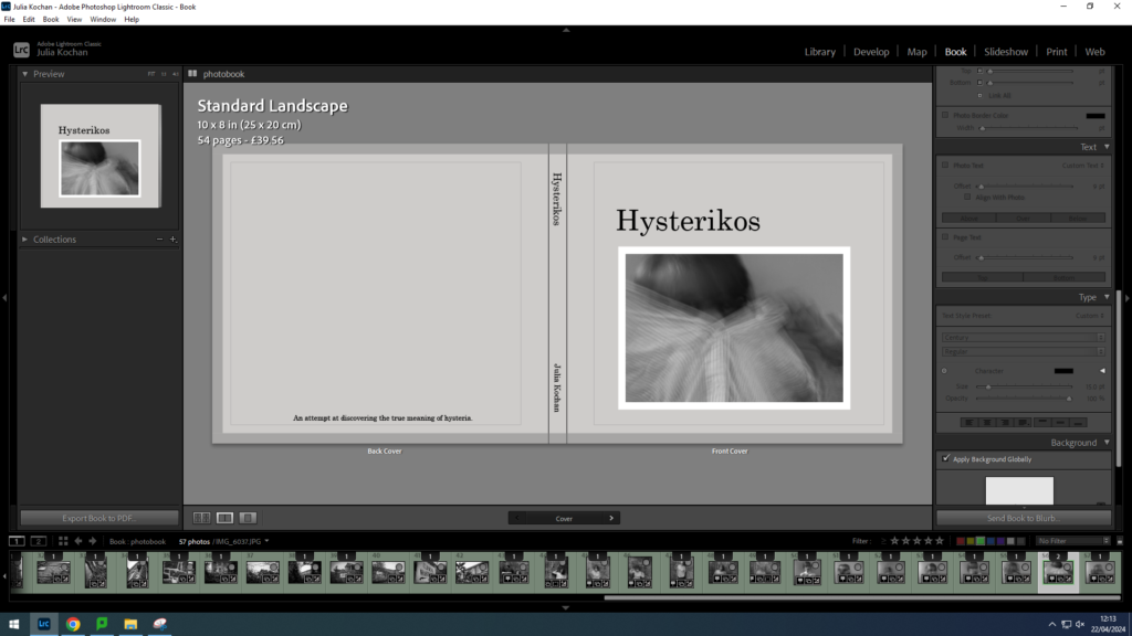
I decided to go with idea 1 for my final cover, sticking with the initial picture I put. I chose this faceless image to give a taste of what my photobook contains without giving away too much. I made the title clear and aligned it with the edge of the image. For the spine, I simply put the title and my name (in a slightly smaller font). However, I added a sentence to the back cover, acting as a short blurb, reading: An attempt at discovering the true meaning of hysteria. This adds a purpose for the back cover while still maintaining simplicity.
I decided to lay my photos out in order of photoshoot, with landscape photos separating them. For instance, I put photos from my first photoshoot first, with photos of the hospital appearing on some spreads. After I put photoshoot 4 and lastly photoshoot 2. This way it is organised with very different pictures every so often. I have decided to only do one picture per page, keeping a clean and simple layout throughout.
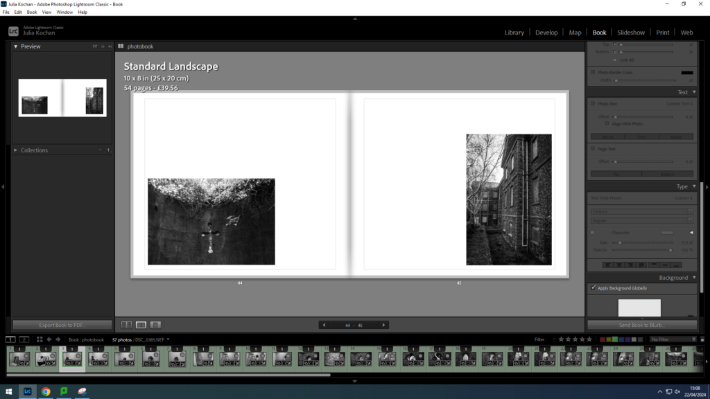
I decided to try out different layouts throughout, keeping the arrangement simple however placing the photos in different areas around each page. For instance in the spread above, I decided to put the first image in the bottom left corner and the second image in the bottom right corner.
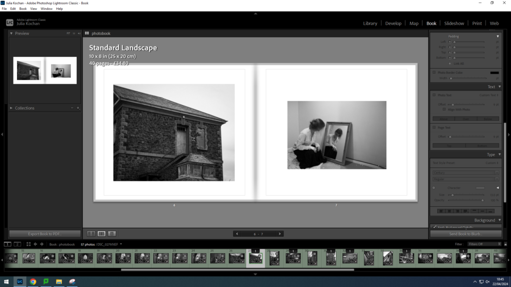
I did also do some more traditional layouts, putting each picture in the centre of the page. This layout is showing a image of the hospital contrasting with a self-portrait.
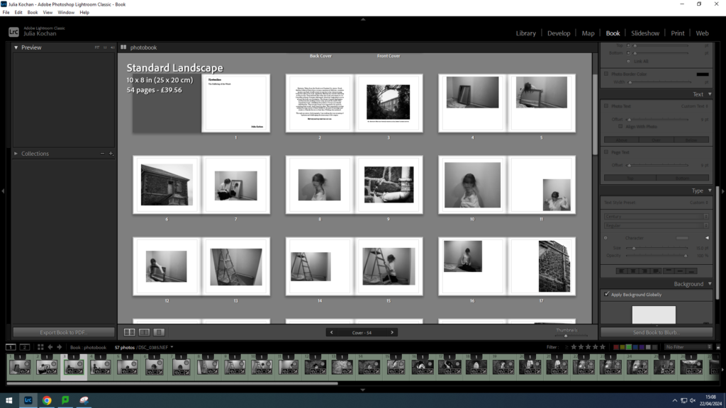
This is a screenshot of the layout so far- presenting a mix of photographs from photoshoot 1 as well as some landscape images scattered throughout.
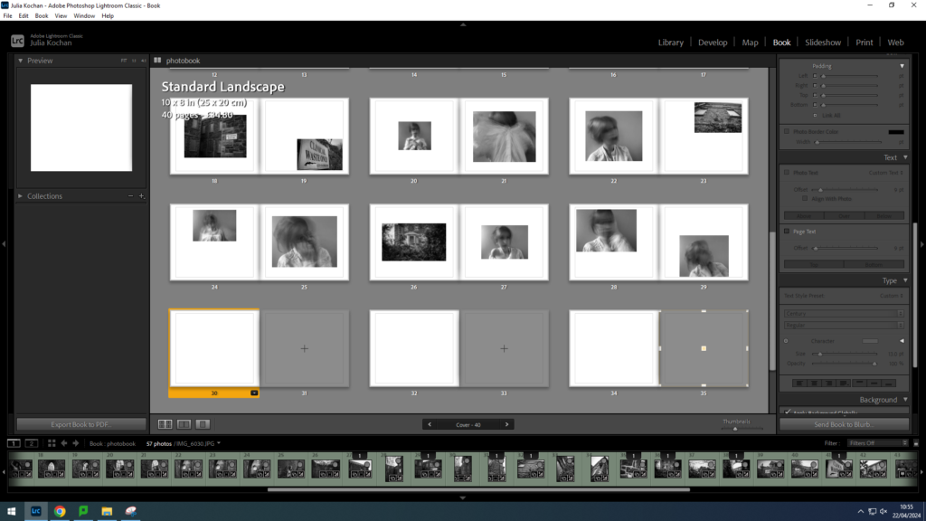
A screenshot of the layout of photoshoot 4, beginning with a spread of landscapes.
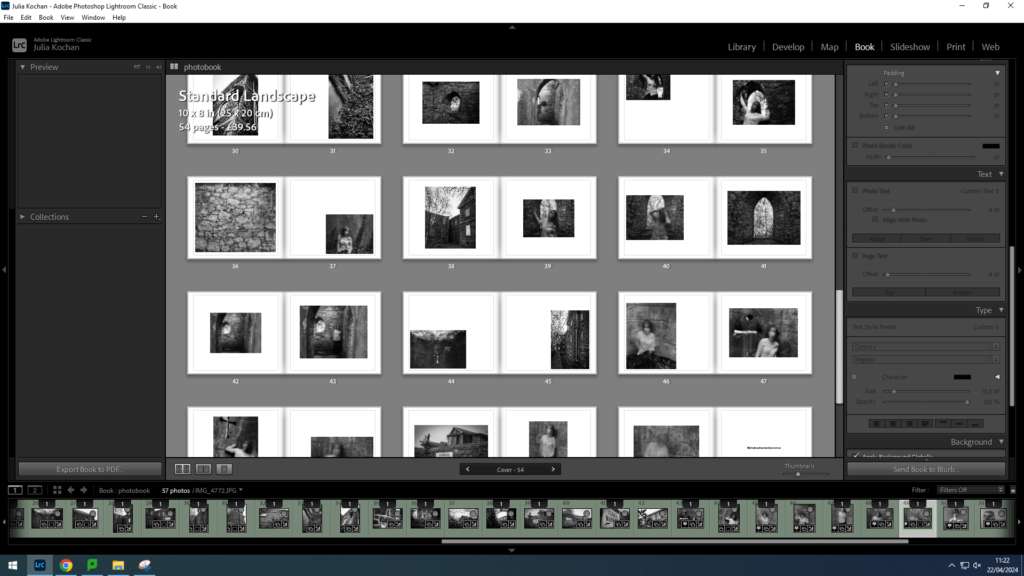
A screenshot of the layout of photoshoot 2, beginning with a spread of landscapes.
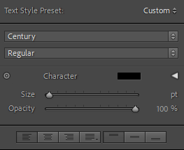
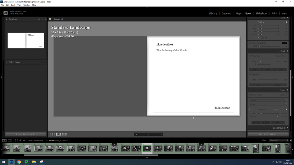
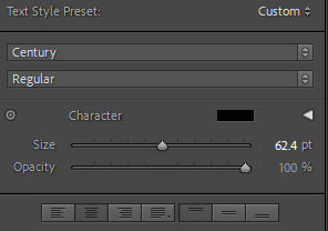
The first page of my book is going to be the title page. I decided to keep the text small and in the corner. The title, Hysterikos, is size 25, the translation size 18 and my name size 19. I also made the translation a grey, to indicate that it is not part of the main title.
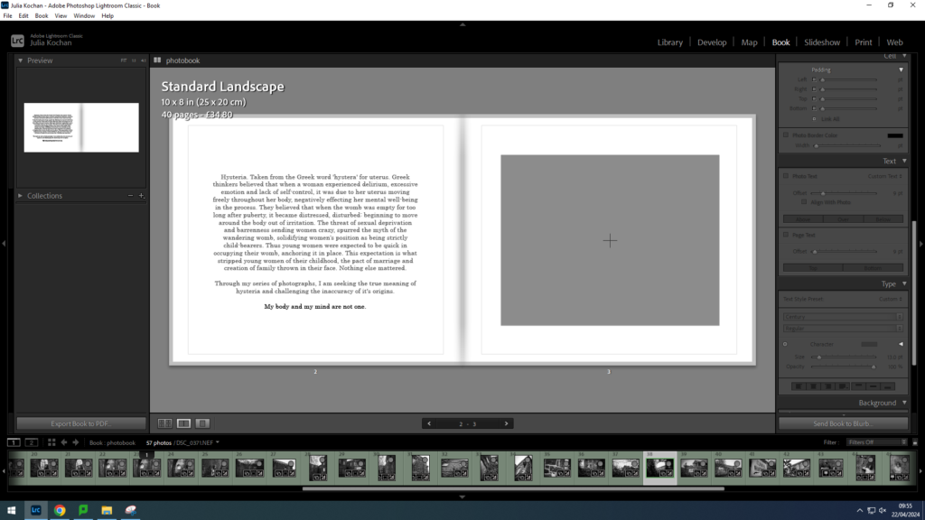
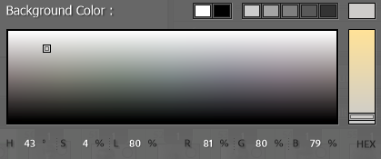
I wanted my second page to have the main body of text- a short introduction to my project. It will be accompanied by a photo on the second page. I decided on size 15 so that it would be easily legible without taking over the entire spread. I decided to write the text in grey, except the last sentence which is in black since I wanted it to stand out.
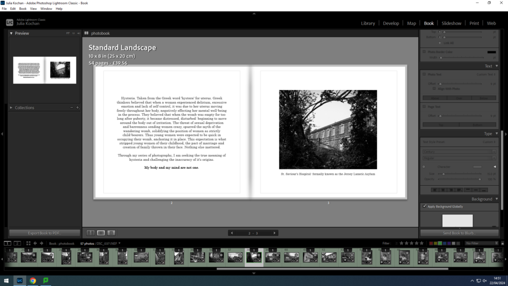
On the opposite page, I inserted the first picture- which I decided to caption with the name of the place- hopefully giving insight to the significance of the place when considering my project. I wrote this in grey and size 13 so that it wouldn’t be distracting.
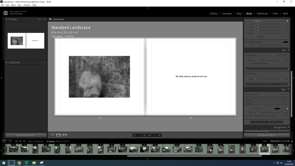
I also repeated the last line on the final page, once again in black and size 13. This will act as the ending, reemphasising the message in my photos.
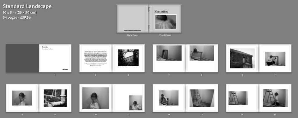
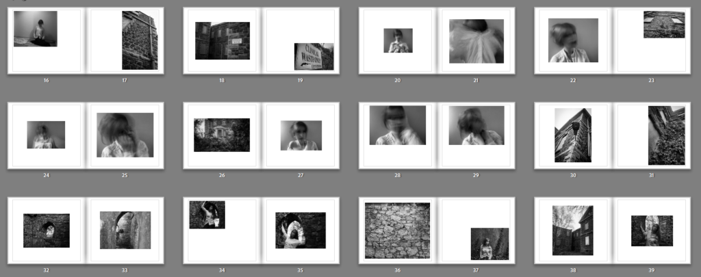

I ended up with 54 pages and I think my layout is effective. The pictures are quite abstract so I think it was a good decision keeping the layout simple. I made sure to try to arrange the photos in many different positions around the page, yet still keeping it to only one photo per page. I think the sequencing worked well, as I separated each photoshoot with the landscape pictures from photoshoot 3. Other than that, I decided to lay them out in the order of photoshoot 1, photoshoot 4 and lastly photoshoot 2.
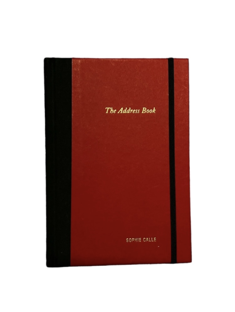
The Address Book was originally published as a serial in the daily newspaper, Libération in August 2- September 4, 1983. It is a narrative photobook taking us through her journey after finding an address book on the Rue des Martyrs, Paris; photocopying it and anonymously sending it back to the owner. Calle decided to contact some people listed in the man’s address book, whom she refers to as Pierre D, in attempt to find out more about the man through other people. This resulted in a fascinating mix of photographs and text, retelling the story she gathered about the man. Unfortunately, after Pierre D. threatened to sue, Calle agreed not to republish the work until after his death. I like the way this photobook utilises text to support the narrative and the indirectness of the photos.
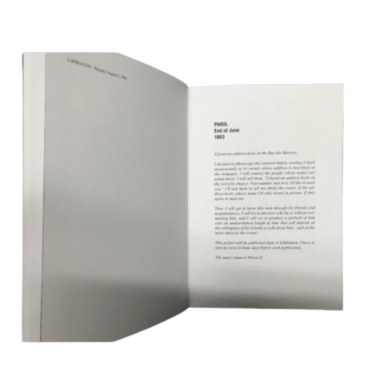
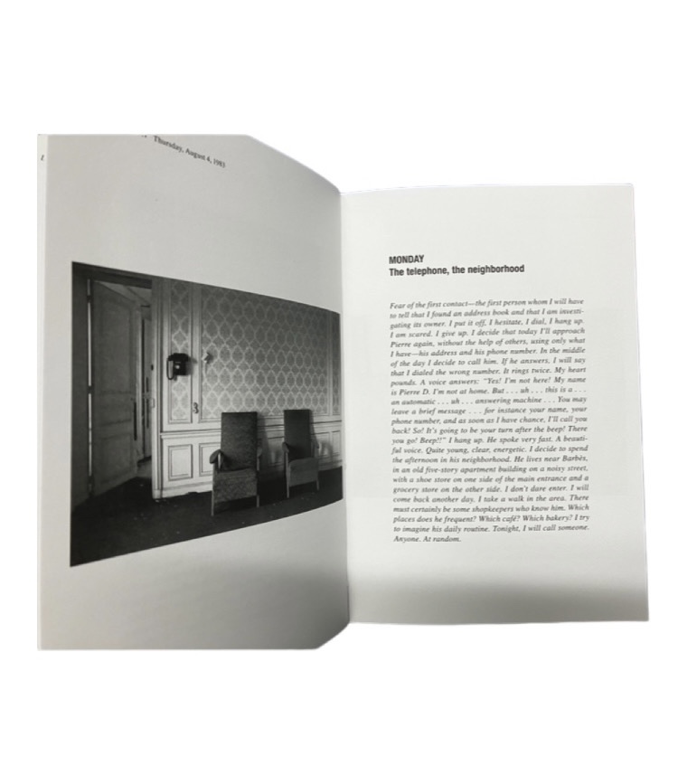
The small red book is filled with abstract images paired with narrative text, which I think is very interesting. It is a hardback that is 5.25 x 7.5 inches with 104 pages, including 26 black and white images and 2 coloured images. This version of the book was printed and bound in China.
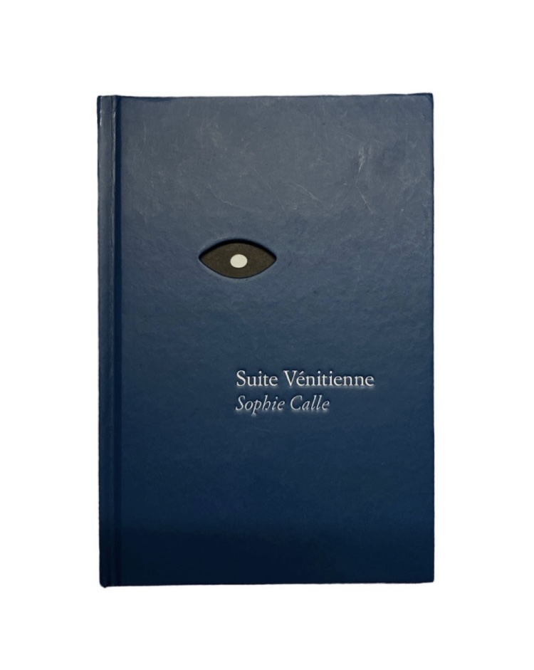
Suite Vénitienne was published in 2015 and is based on a project that Calle began in January 1980. It started with her deciding to follow a man in Paris, and although she lost sight of him in a few minutes (like most people she followed), she ended up meeting him once again at an opening. During their conversation, he revealed his planned trip to Venice, where she followed him. The book captures her journey, presenting us with detailed images from her stay in Italy. The comparisons between the text and images create an interesting insight to her thoughts at the time.
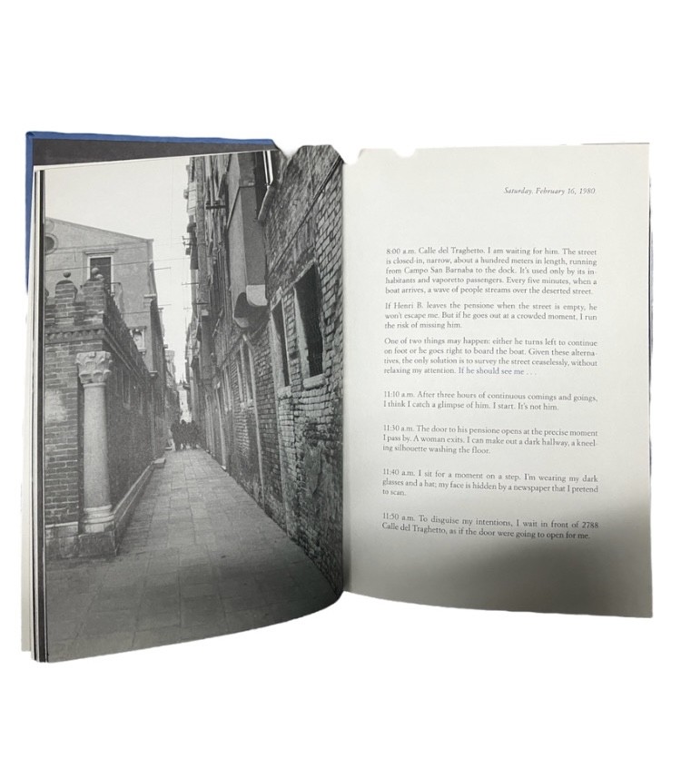
This is a small blue book is filled with juxtapositions between text and photos. It is a hardback that is 5.5 x 8 inches with 96 pages, including 56 black and white images and 4 coloured images. This version of the book was printed and bound in China.
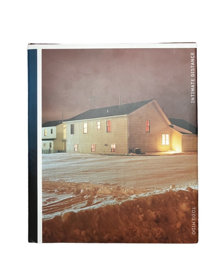
Published on November 9, 2016, this photobook presents us with a interesting contrast between landscape pictures of suburban houses taken at dusk and suggestive portraits of young women. This collection of 250 photos, the fruit of 25 years of work, presents the eminently cinematographic work of the American photographer with images as magnetic as they are strange. This book is made up from 274 pages and its dimensions are 10 x 1.14 x 11.77 inches.
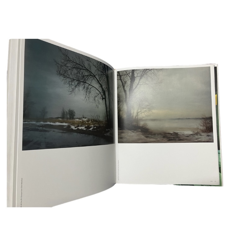
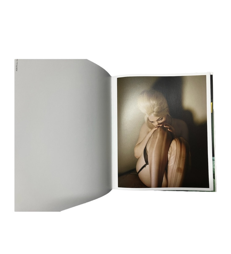
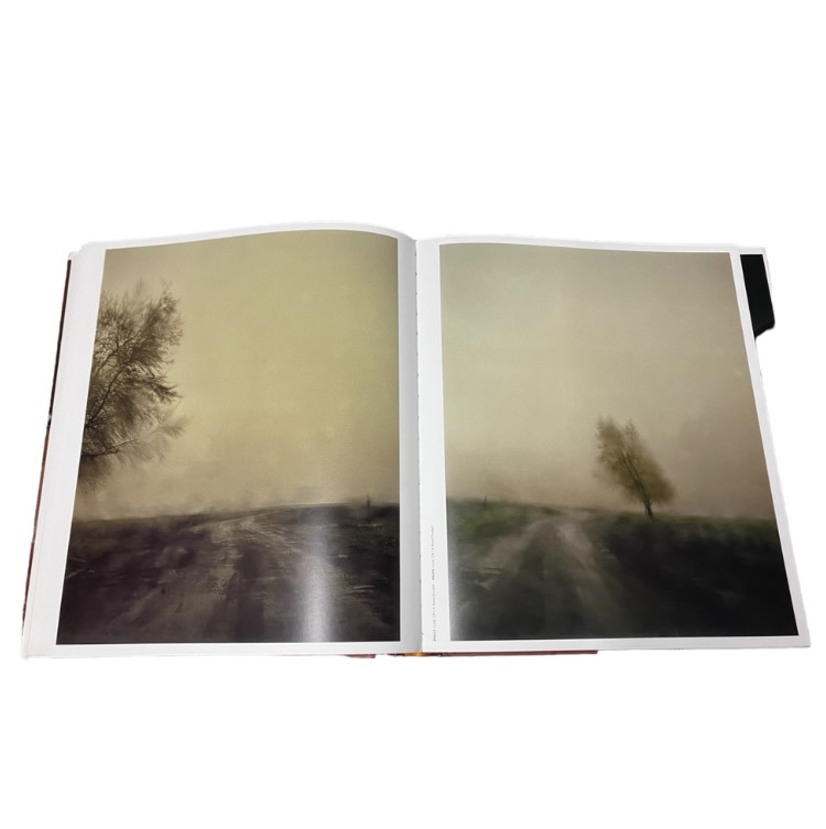
It is interesting to see the way the photographer arranged such opposing images in a singular book, yet still creating a functional and effective sequence. Each photo has a similar theme in terms of lighting and tones, which causes them to all fit together. My photos are all edited into black and white, therefore this would help with the sequencing of my photographs. This book shows how important it is for every photo, especially ones present on the same spread, to have a visual link.
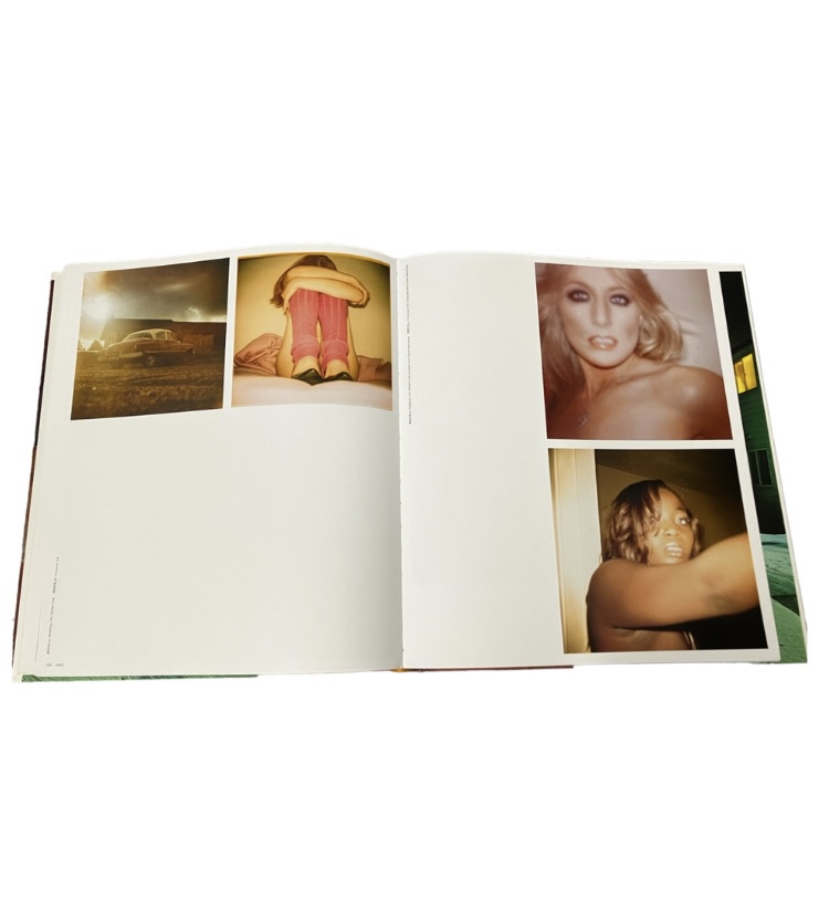
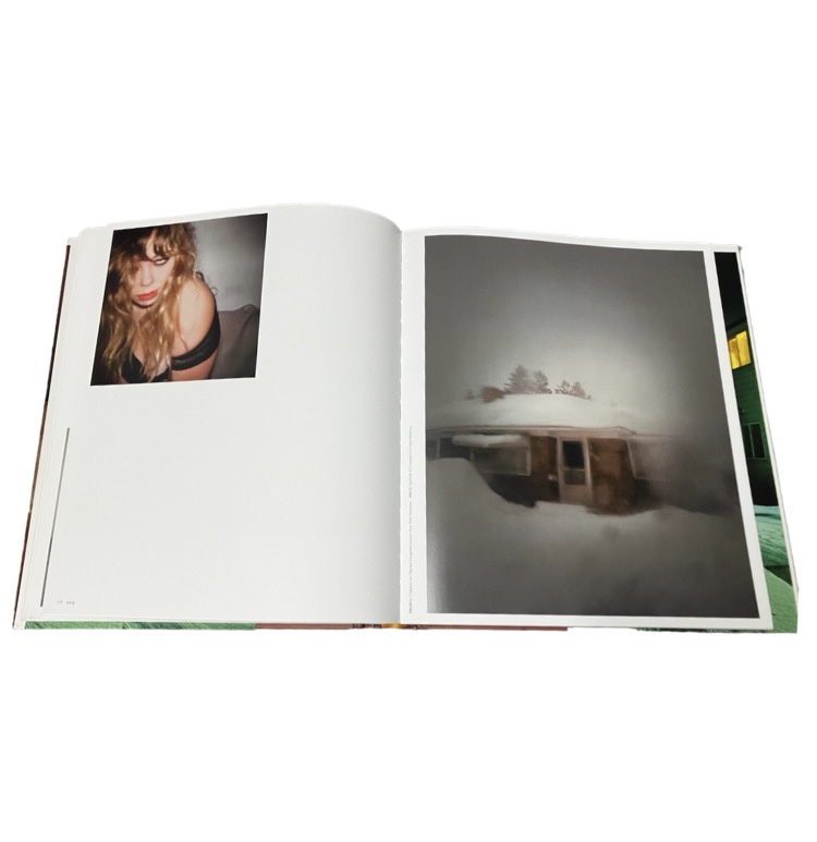
The pages with both portraits and landscapes causes there to be a direct juxtaposition between photos, which is something I could do in my own photobook. Although having different themes, Hido’s book and my project could have a similar layout, due to there also being a mix of landscapes and portraits in my selection of images.
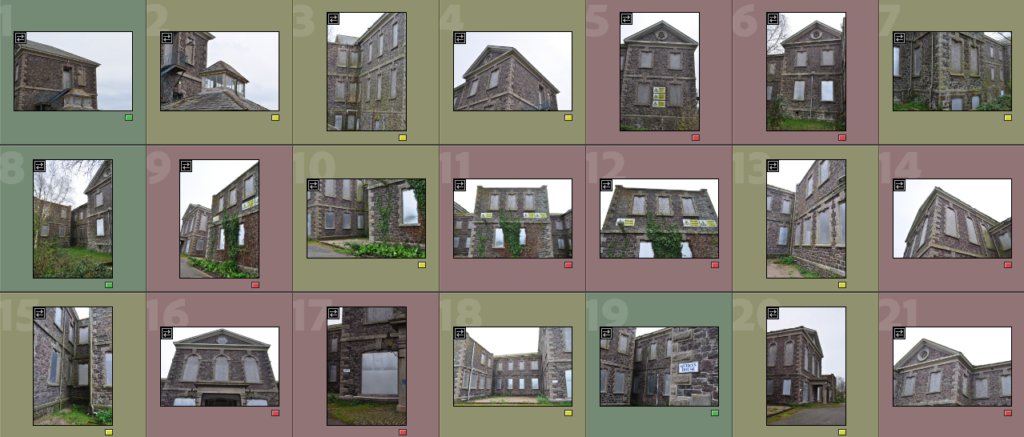
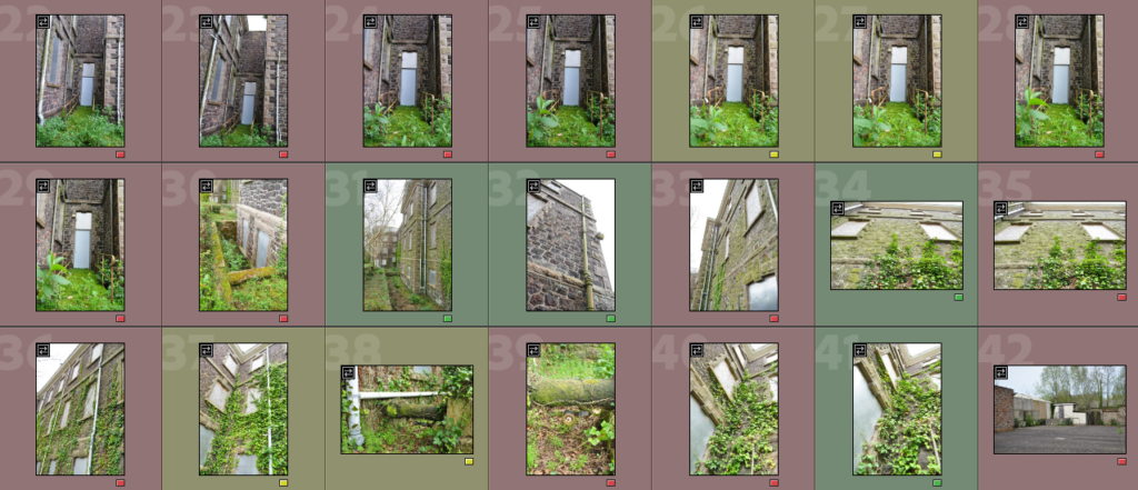
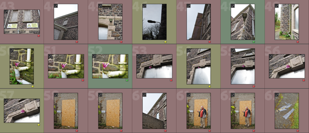
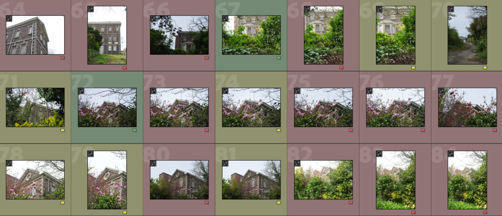
green- will edit, yellow- might decide to edit (if more edits are needed), red- won’t edit
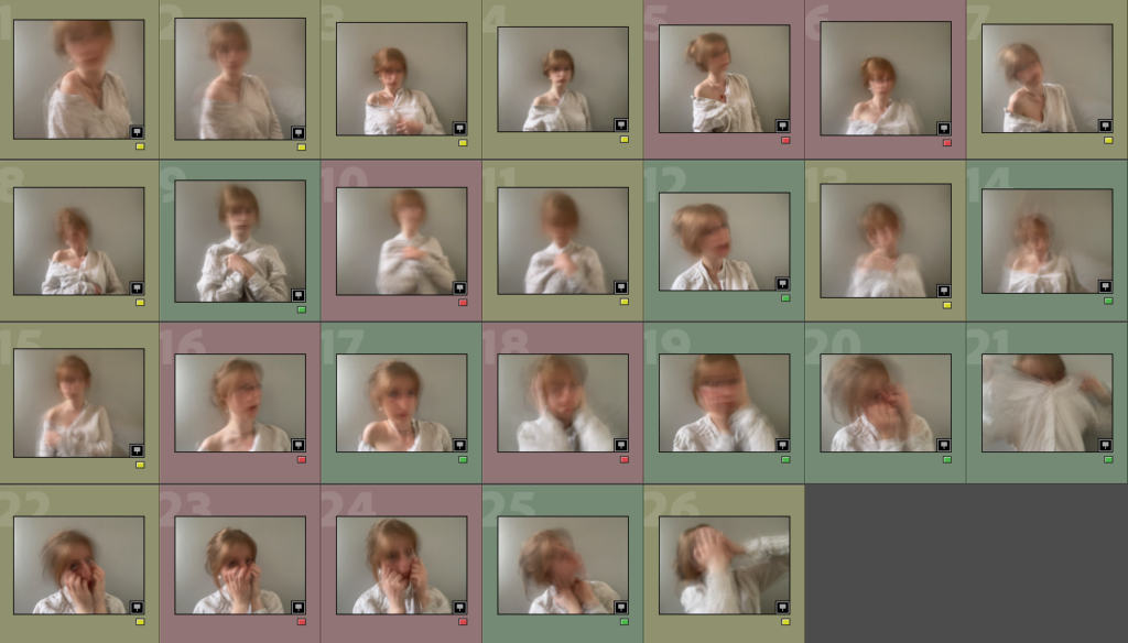
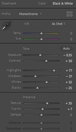
I made every picture black and white, lowered the exposure, creating a gloomier mood. I enhanced the contrast of the images by changing the contrast, highlights and shadows as well as slightly increasing the texture and clarity of the photographs.
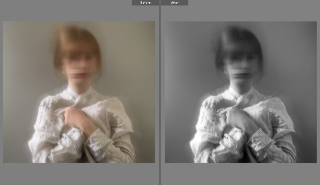
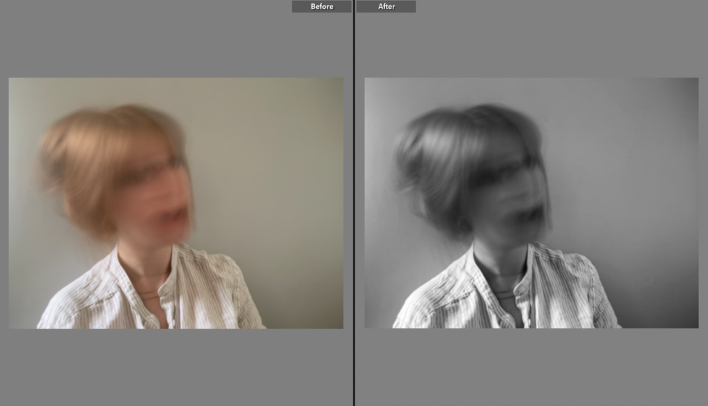
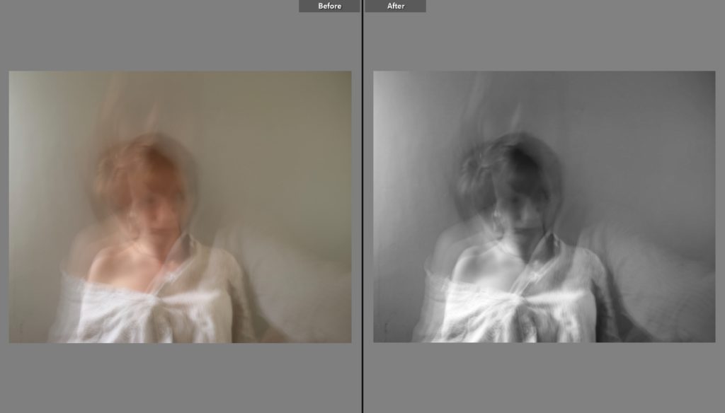
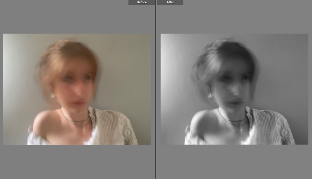
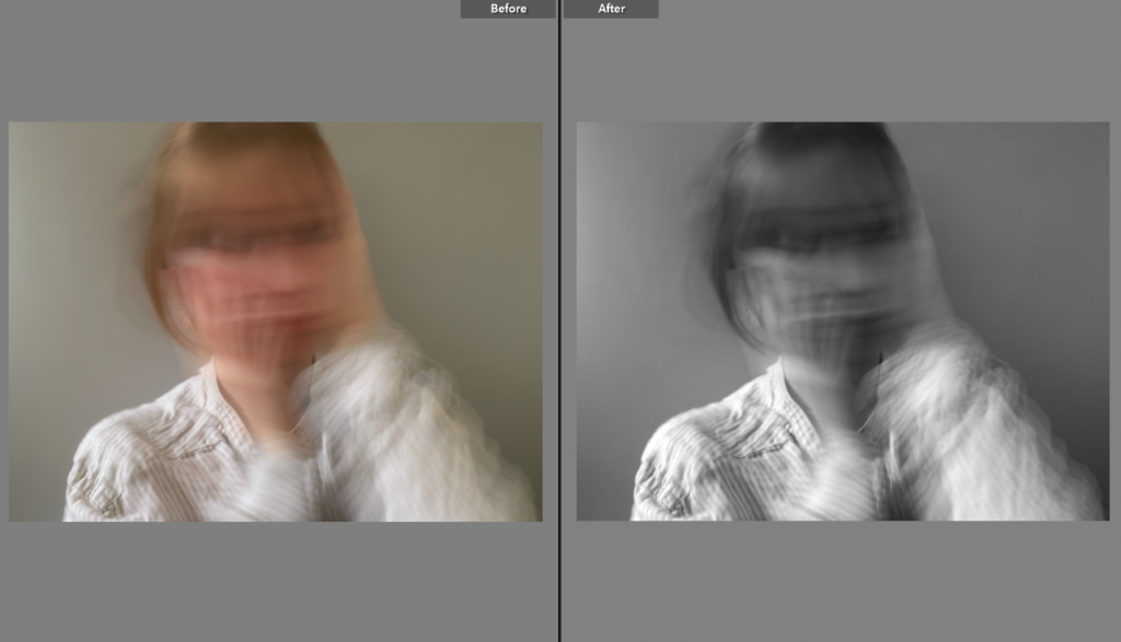
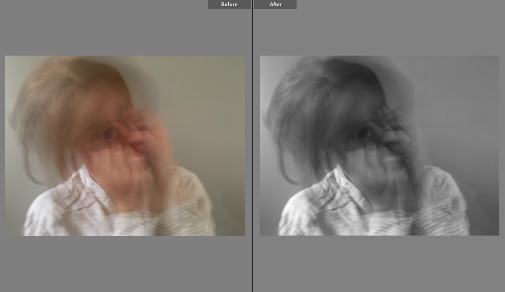
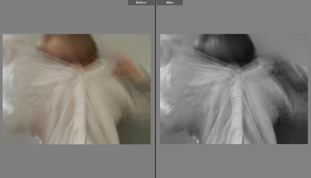
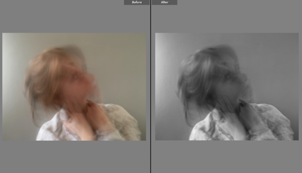

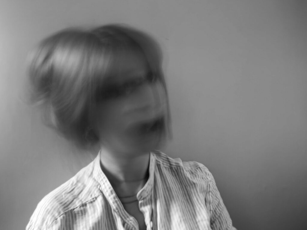
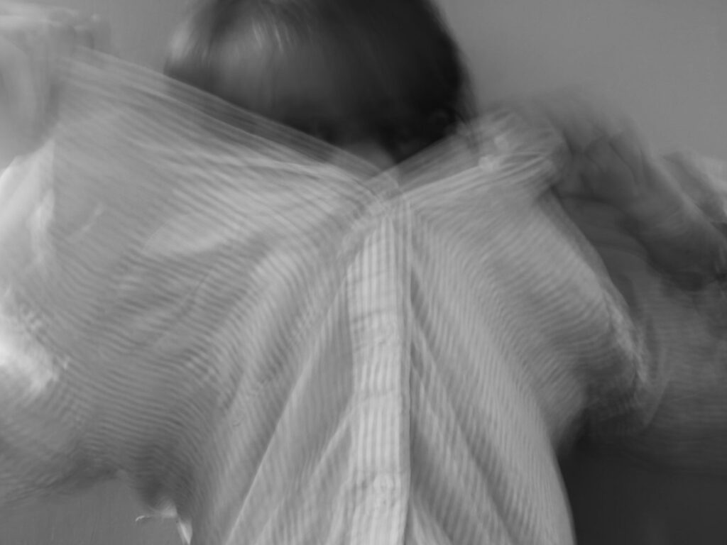
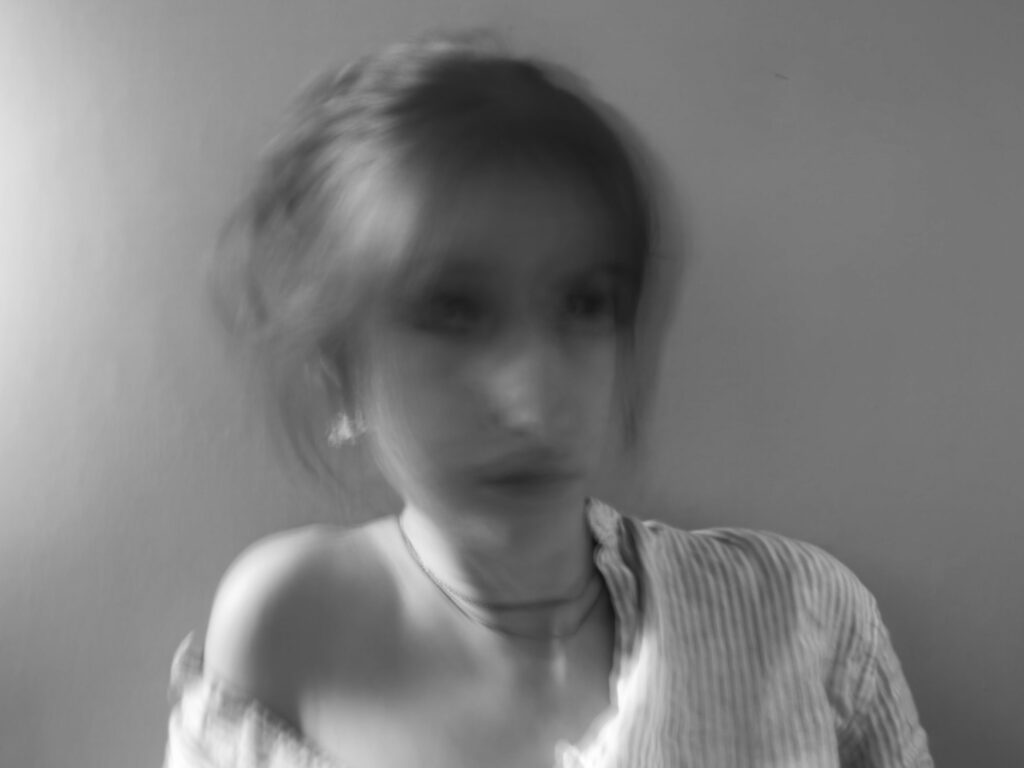
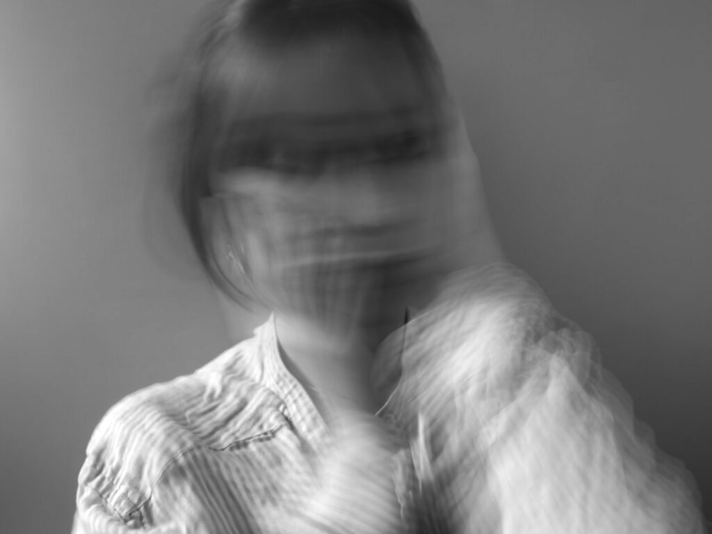
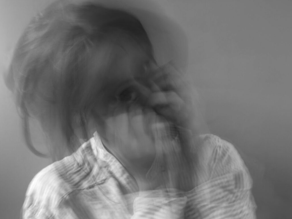
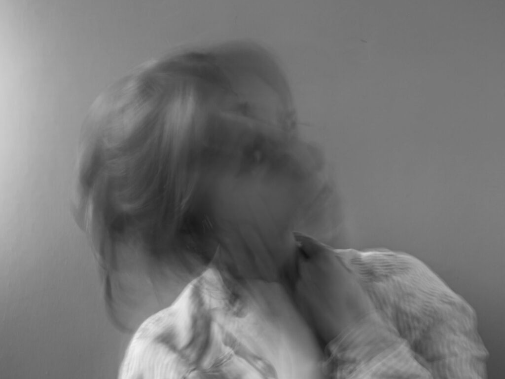
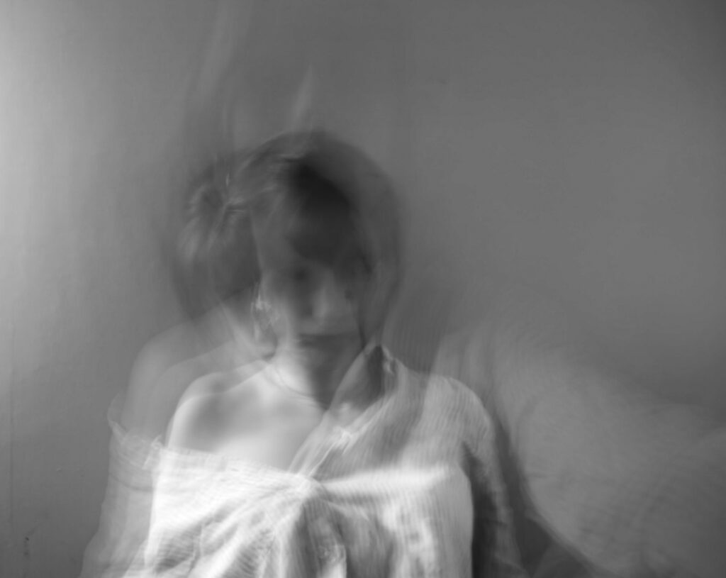
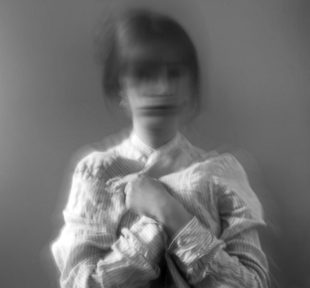
I think the editing was effective, since it improved the quality of the images as well as made them much more similar to my inspiration, Francesca Woodman. The increasing of the contrast made the details stand out even more which caused the pictures to gain more grain and texture.
green- will edit, yellow- might decide to edit (if more edits are needed), red- won’t edit
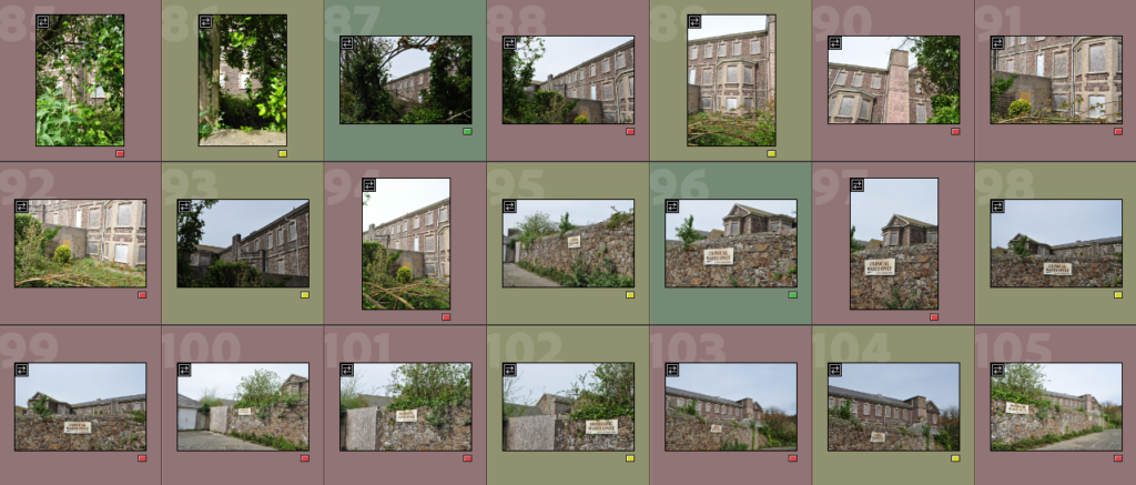
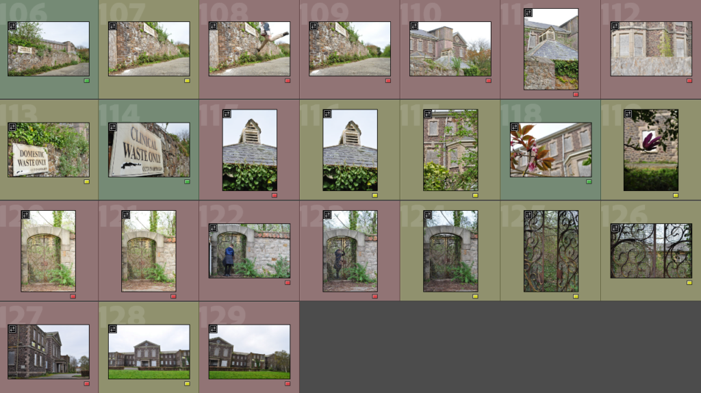
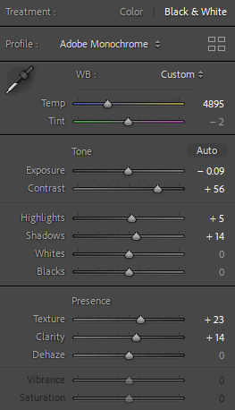
I increased the contrast, texture and clarity of the image, after making it black and white.
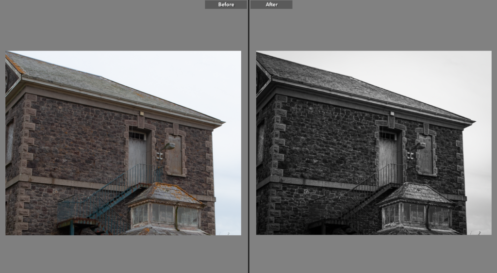
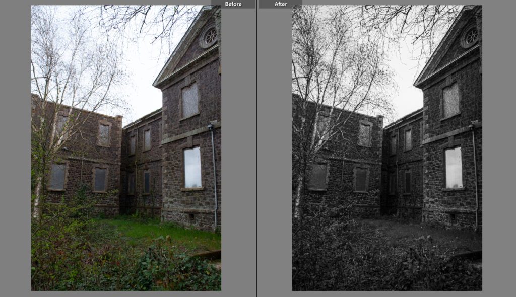
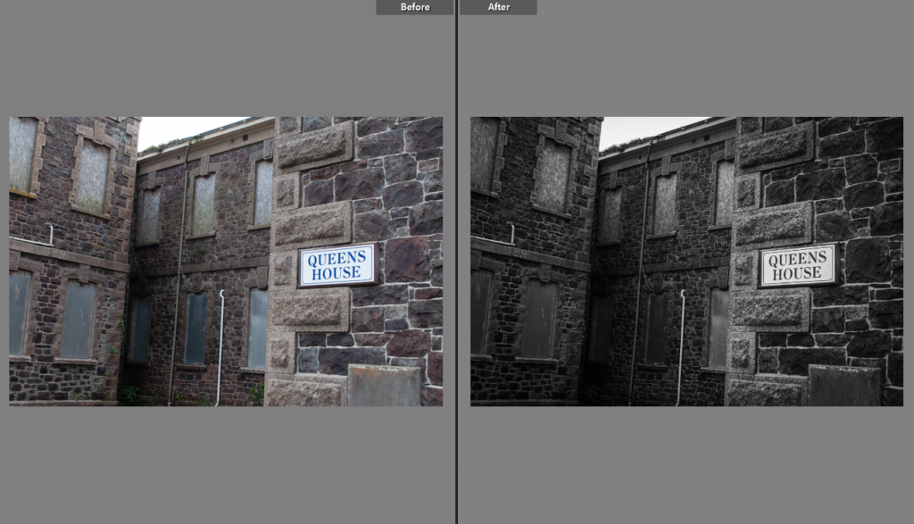
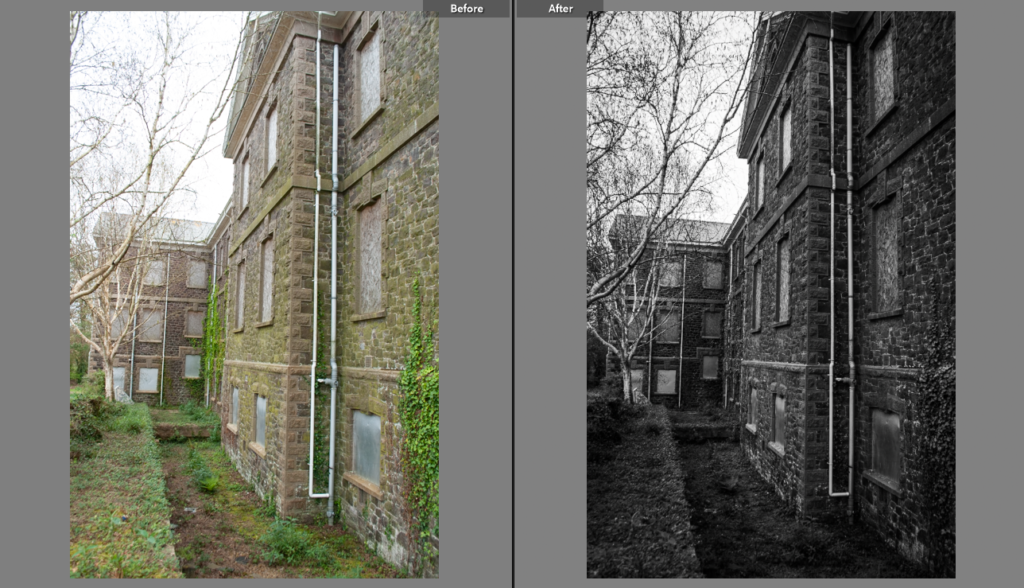
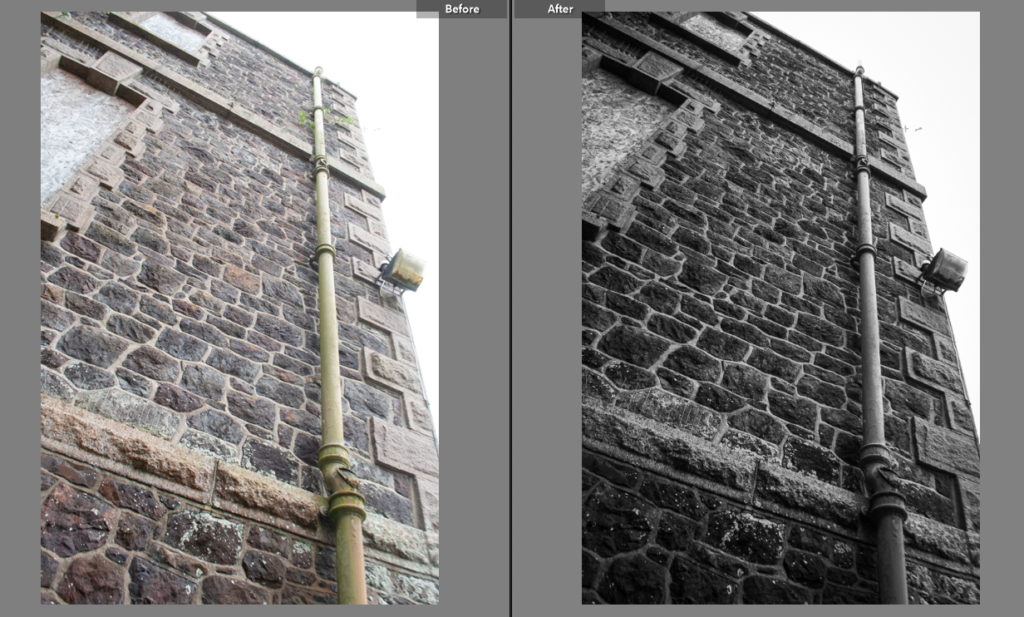
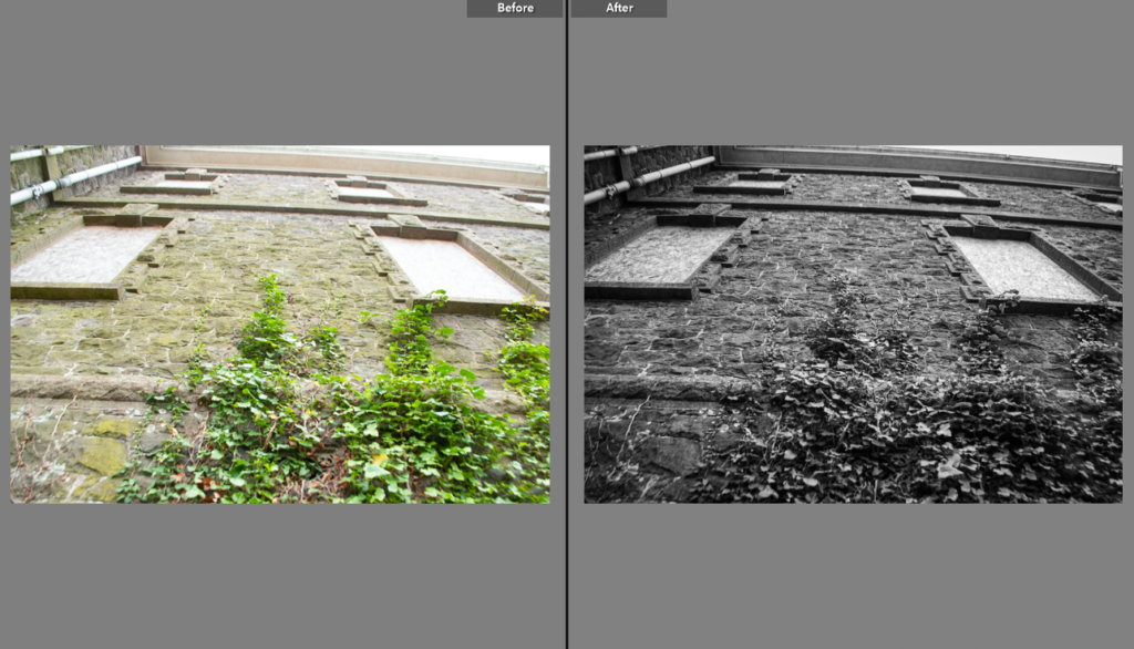
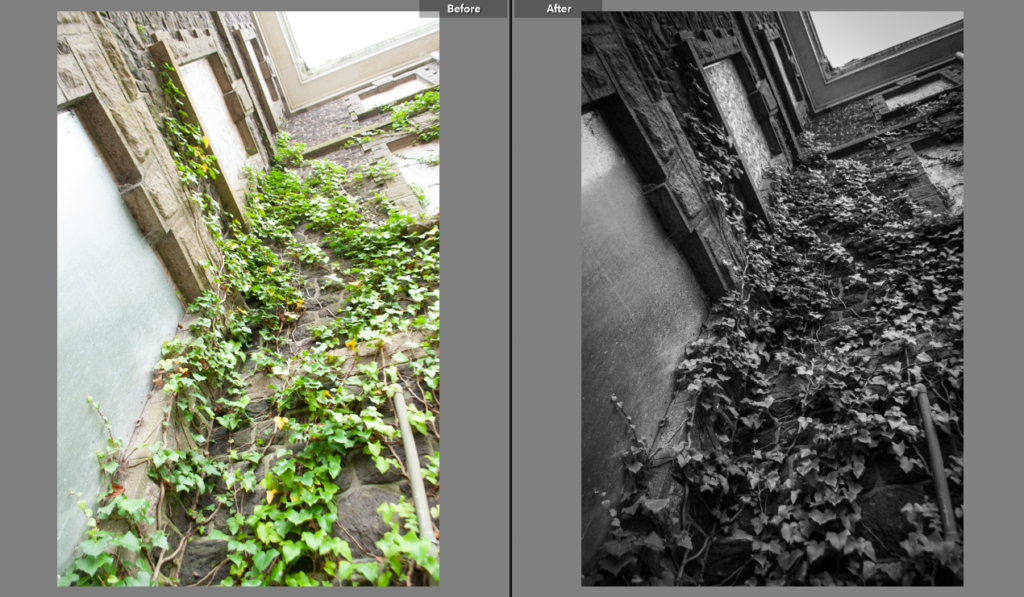
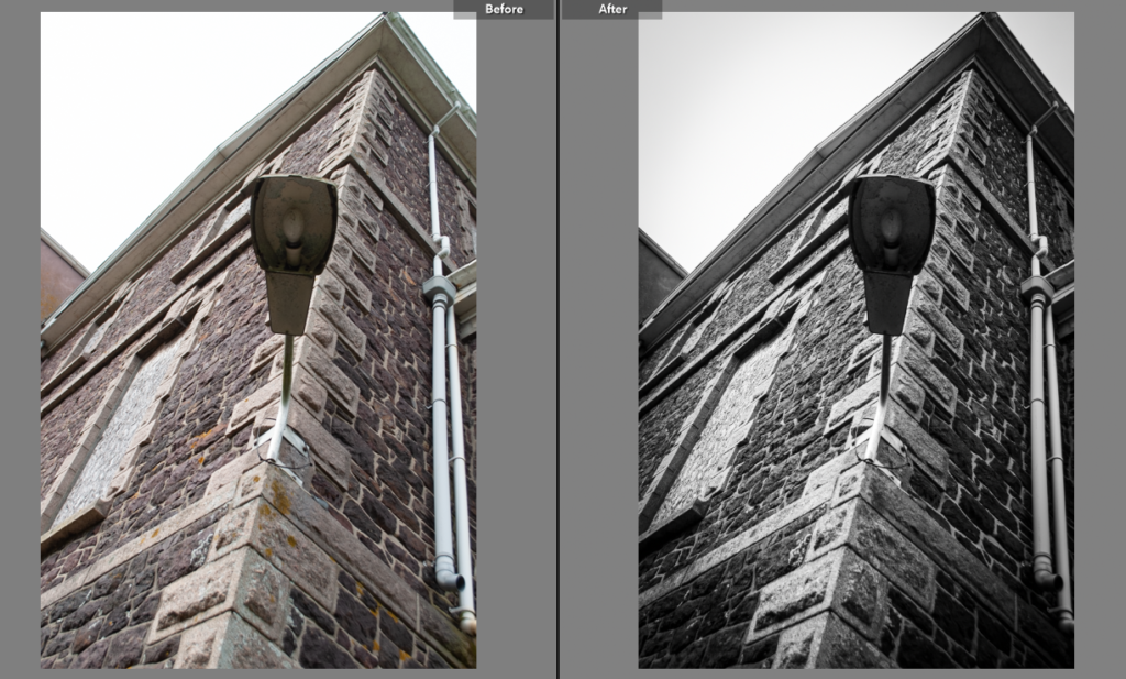
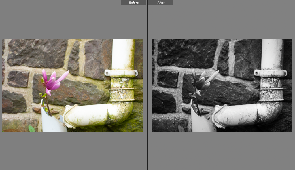
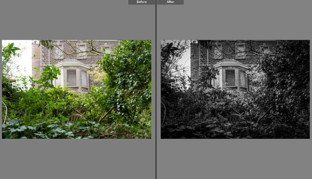
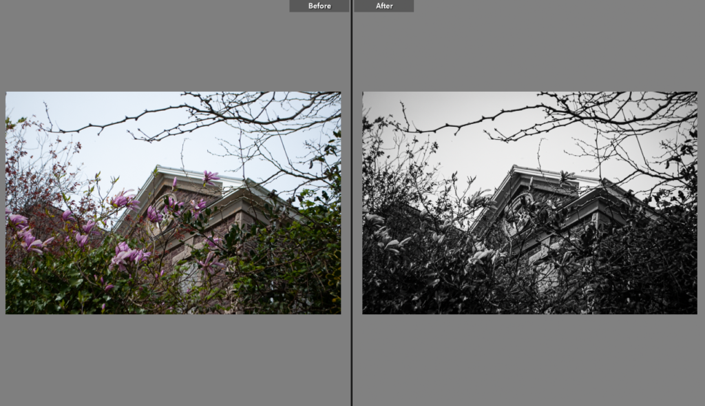
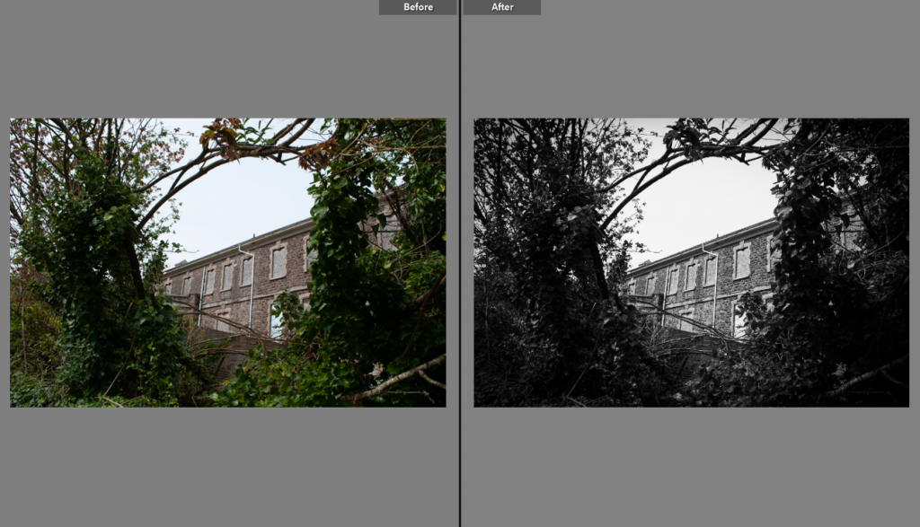
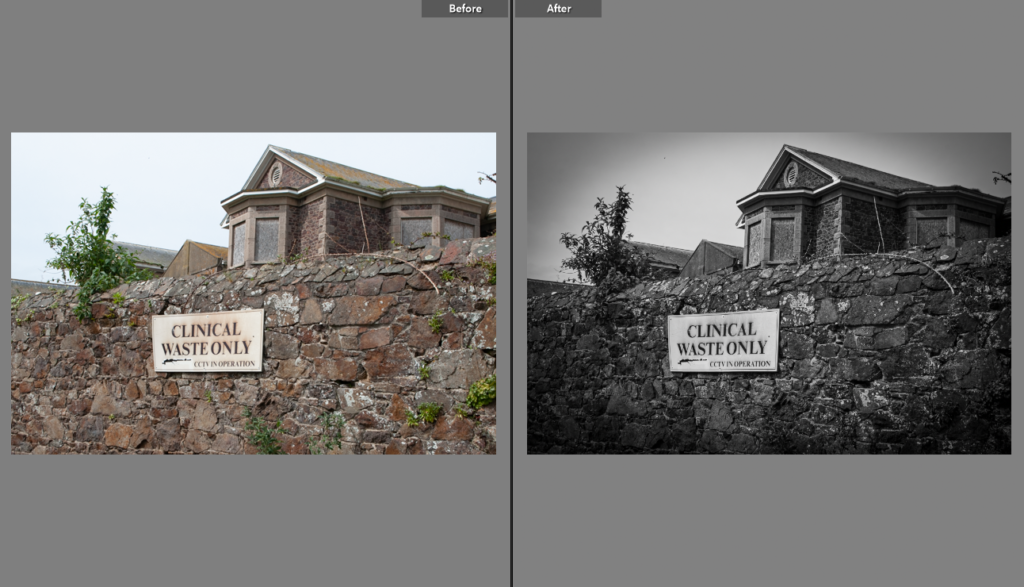
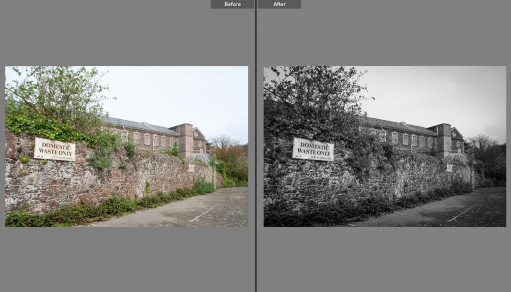
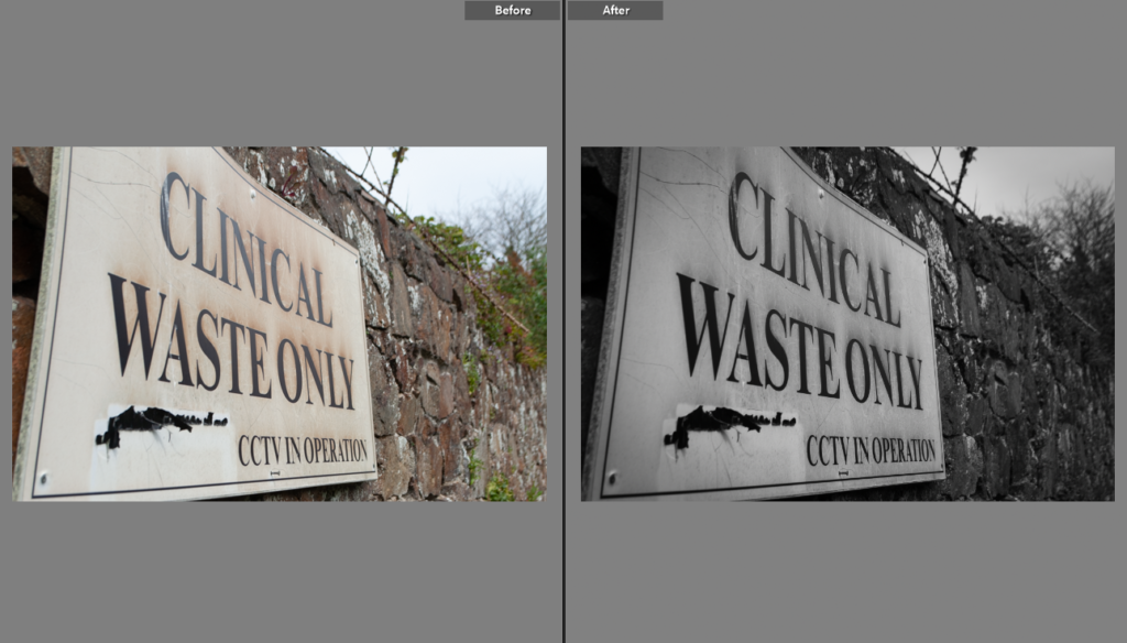
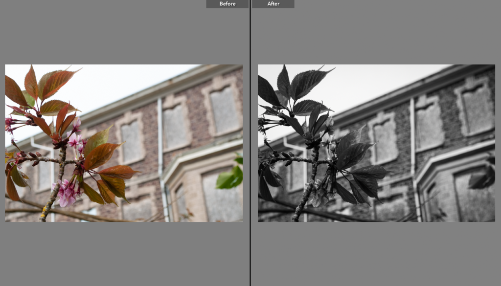
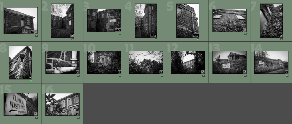
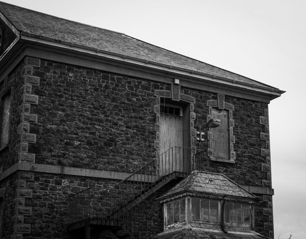
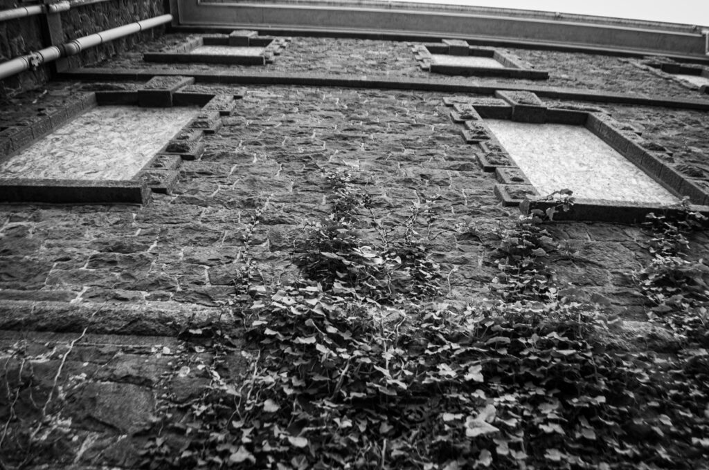
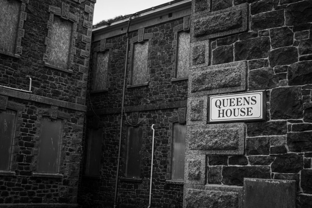
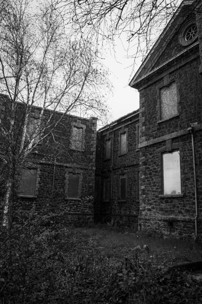
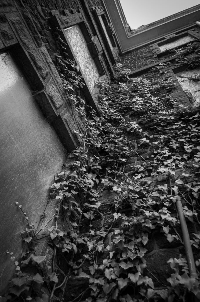
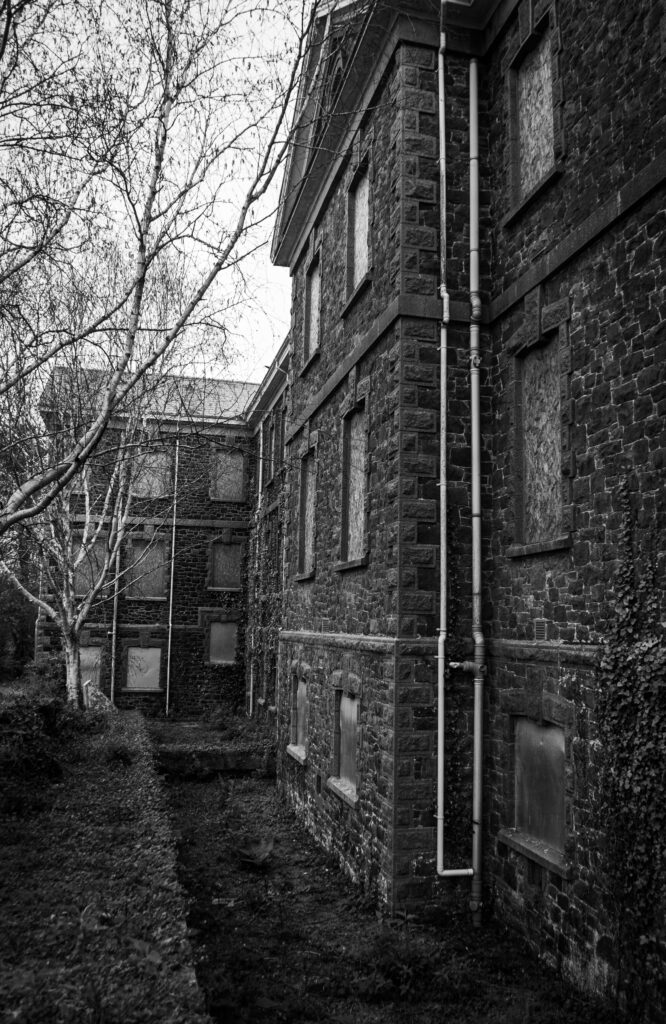
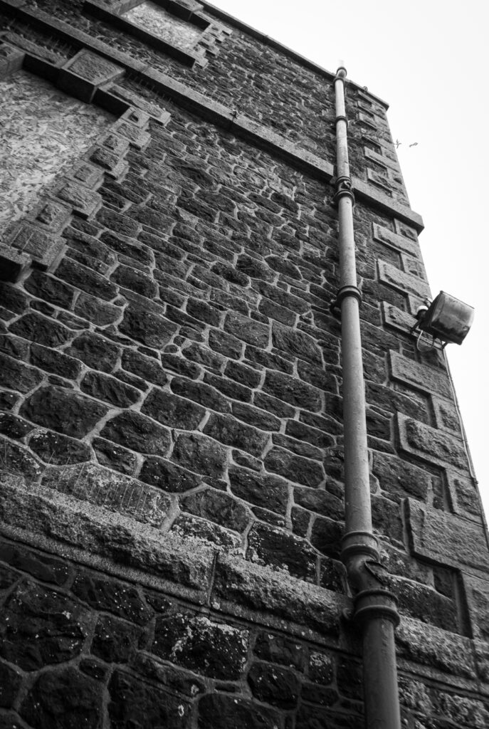
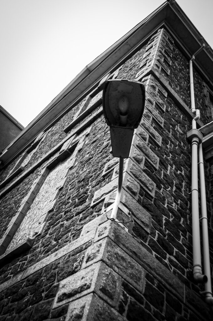
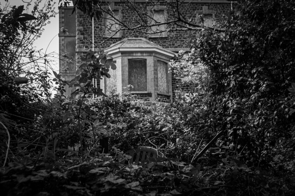
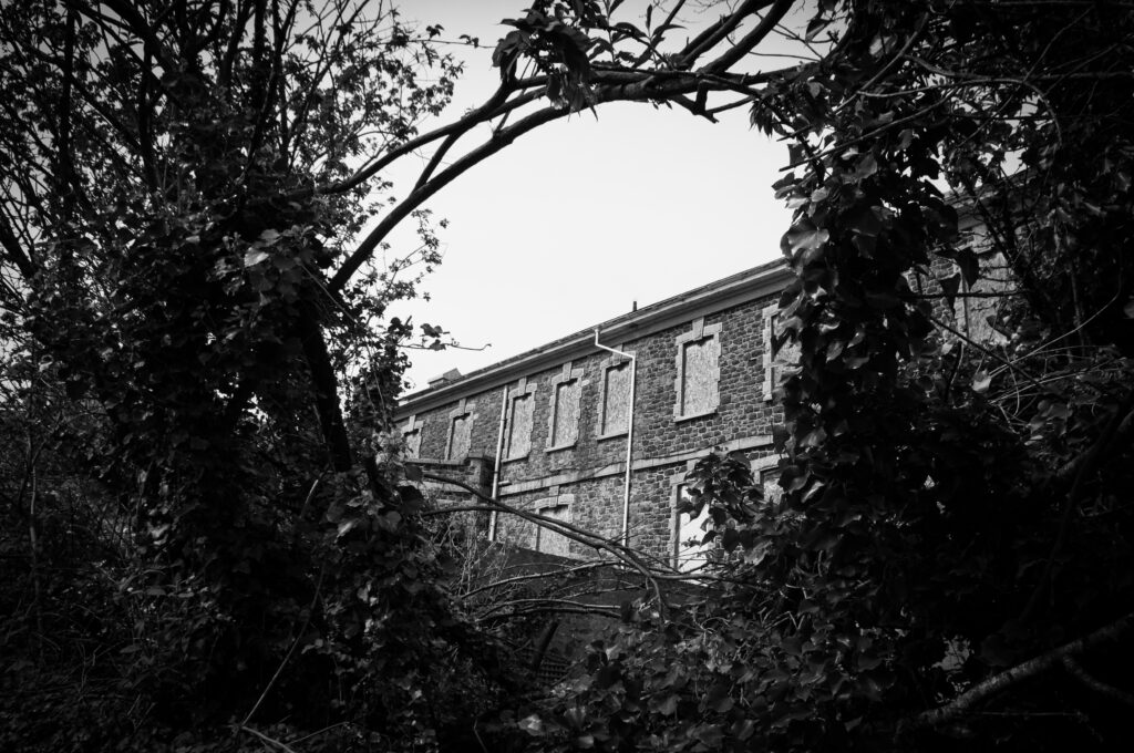
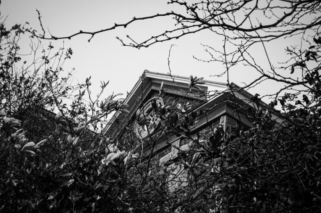
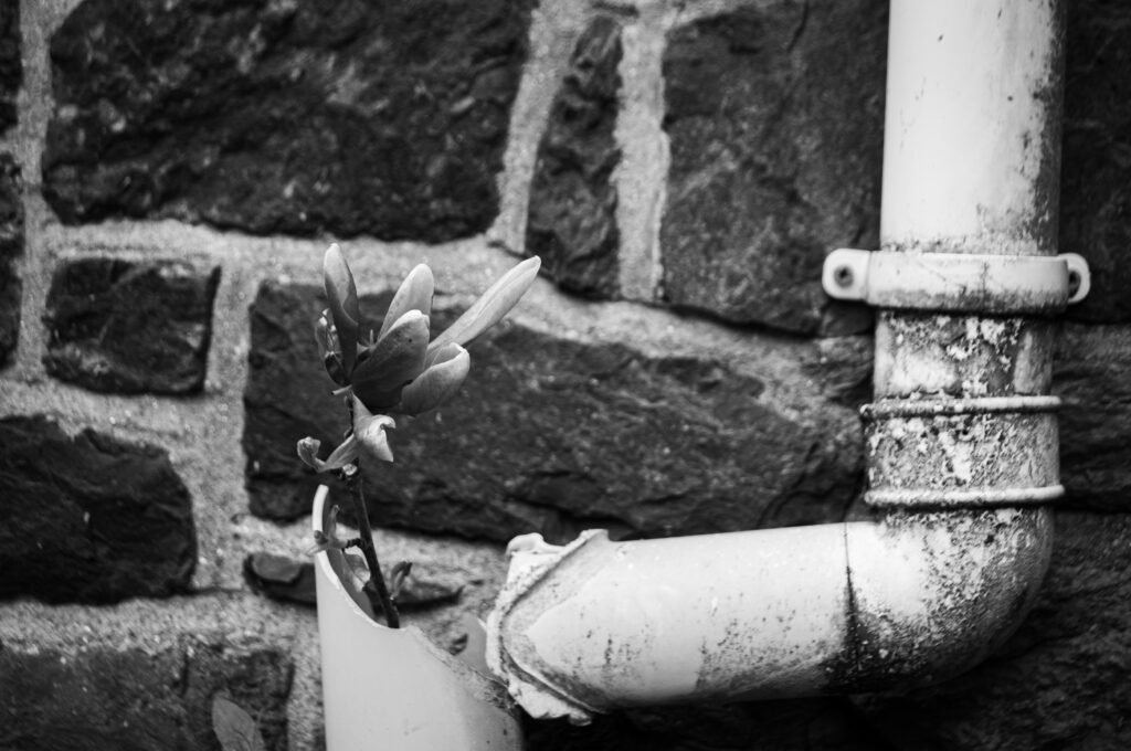
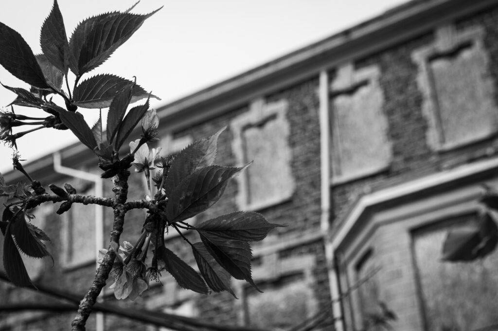
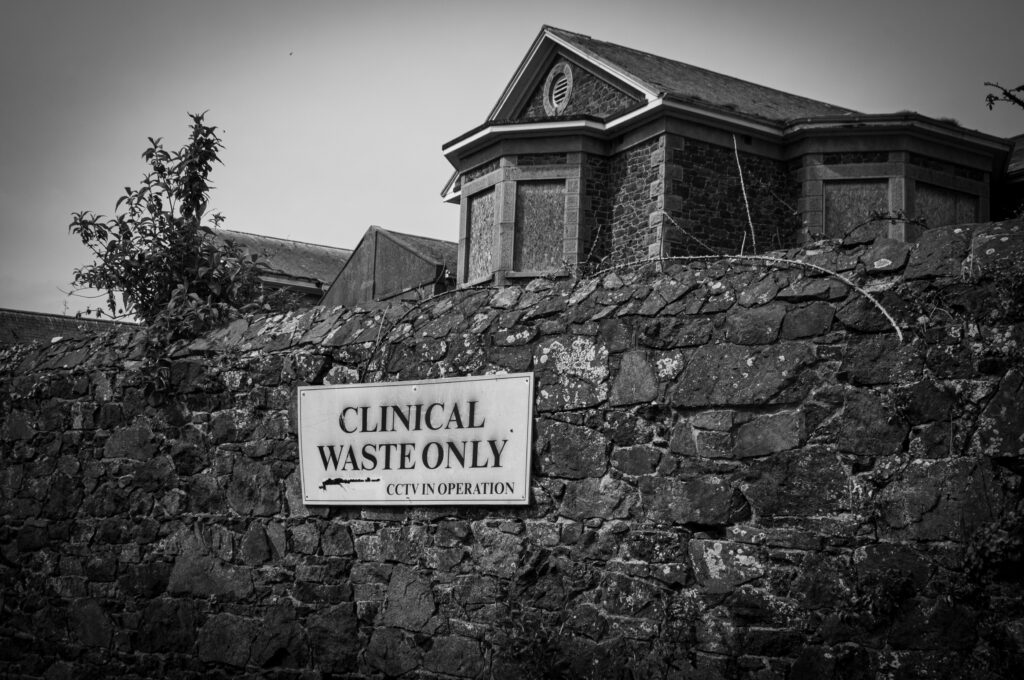
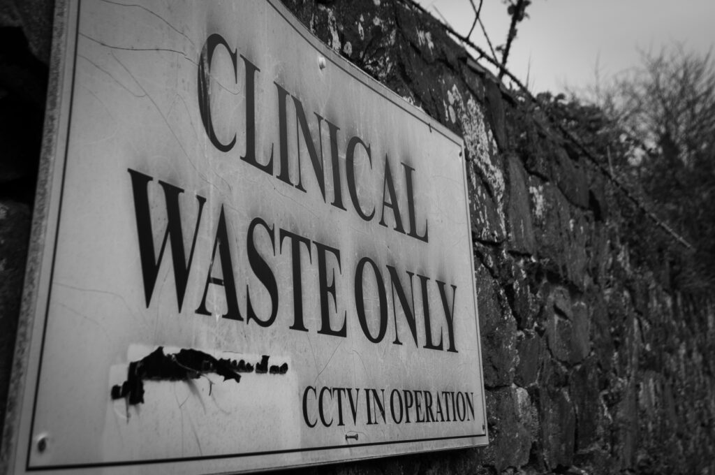
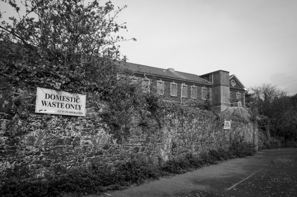
I think these edits are effective, as the black and white causes the photos to look sharper and not be as distracting. My inspiration, Matt Emmett, mostly created coloured images but I still think the overall style of the pictures is the same.