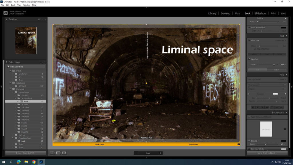
Here is a link to my photo book: Liminal Space
All posts by Jude Gosselin
Filters
Evaluation of My Work
The Final work I have produced, that being prints and photo book, have turned out much differently than I had expected but better than what I had initially thought. For example:
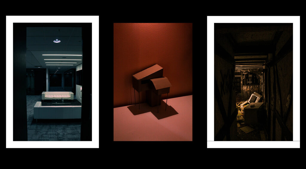
My format of laying out my prints went well, and my choice in images for these 3 frames link well together, as I didn’t use the same environment repetitively, there are 3 different types of subjects and liminal spaces I present here, and mounting them up went well, with all of them looking unique and good.
Not only that but the overall composition of the prints I chose, give a good glimpse at what to expect in my photo book, whilst also including good depth of field, dark and light areas, cold feeling and tones. I like how it conveys a slight sense of fear through its emptiness and cold feeling, it shows eeriness, and familiarity in some images.
My initial intentions, where to capture more hotel like areas, and playgrounds whilst including some birthday styled settings, which I personally found unsettling, however creating my own models and capturing more office environments, not only linked to my artists and the idea of liminal space, but can be easily relatable a lot of people in the world, especially for people nearing my age group, with a lot of people going to offices when they leave school, or after university. Through this I found out what worked best for my photo book, which was that its better to keep the images consistent in the office rather than a scatter of different types of areas that show liminality. This keeps the narrative more understandable, and interesting as if you are the one going through this office seeing all of these weird areas you wouldn’t have seen, but through this edited lens which makes it even creepier.
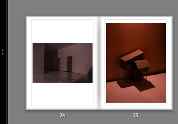
I did make an attempt to do a similar style to Thomas Demand’s work in how he developed his images. This was by creating the environment from scratch, using cardboard and other paper materials, which would eventually in his case look like an office building or a weird house. These 2 images where one doing a similar method to this:
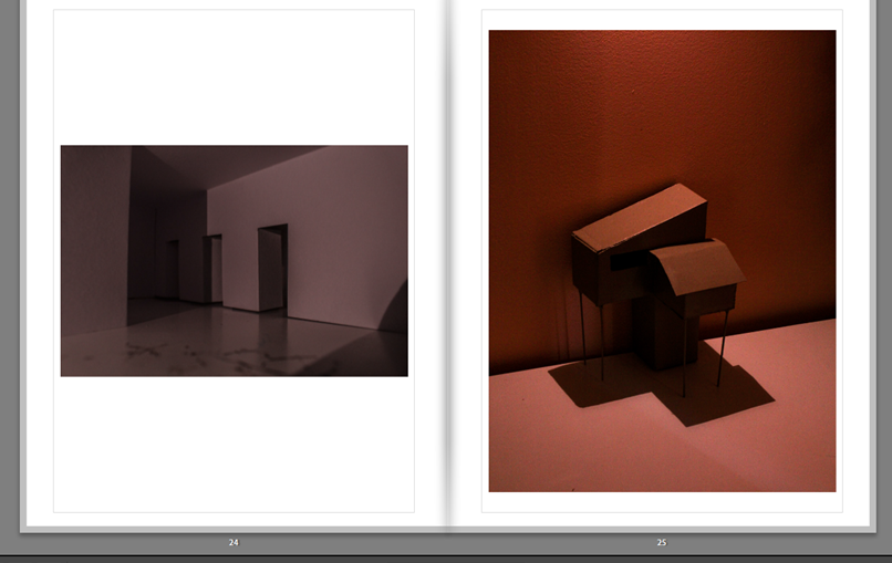
The image on the left was a piece of paper folded and cut into a way which makes it look like a hallway with doors open and closed from a certain angle. The second image being a type of house on stilts which was made out of cardboard and a bit of wood for the stilts, both are hand held size, and I had been using different types of angles and especially lighting to see which would suit the images best in my opinion. Similar to Thomas Demand and James Casebere’s work this capture of an environment shows mostly emptiness and liminality but with my own twist, of style, lighting, and setting.
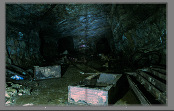
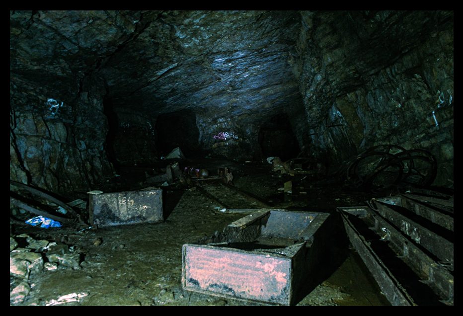
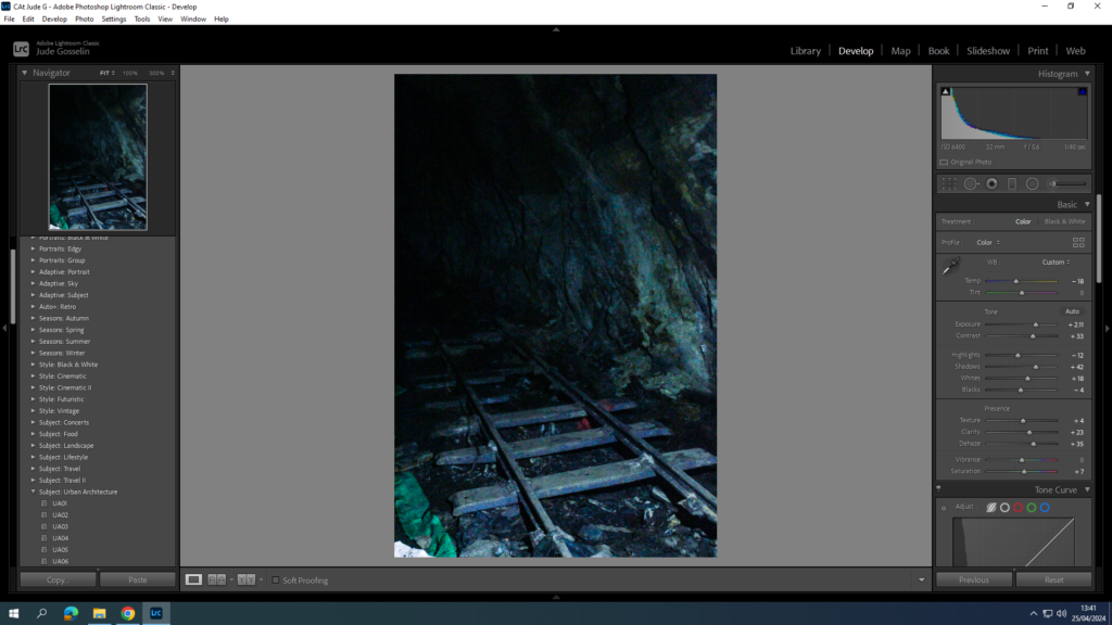
As a whole my work came out well, and the aesthetic and style of image I was aiming for links well to this idea of liminal spaces, and the work that I had a initially wanted to create wouldn’t have been produced as well as I did with this one, it would have been messy, and caused me to have different types of aesthetics to each my images, which would have lost my style to the images. What I would have liked to do differently is to have taken images of different types of offices, but using the same context and environment, but different types of set ups which would be in different offices, this would have made it a bit more unique in how each these offices liminal spaces would have presented a slight change in feeling. Another thing I would change is how I imaged some of the areas I was in, for example the cave, I didn’t have enough lighting, showing how unprepared I was for it. But also the settings on the camera to capture more of the background, where I should have used a higher F stop to really express quality everywhere in the cave.
In conclusion my final result in the photo book and my prints ended up going well, choosing 52 of my best images out of around 1500 images if not more over my 10 photoshoots, created this well produced book, well composed images, using a wide range of features for what subject and area they where taken in, like the shading, colour contrast, black and whites, and directions, I am happy with what has finally come out of this project.
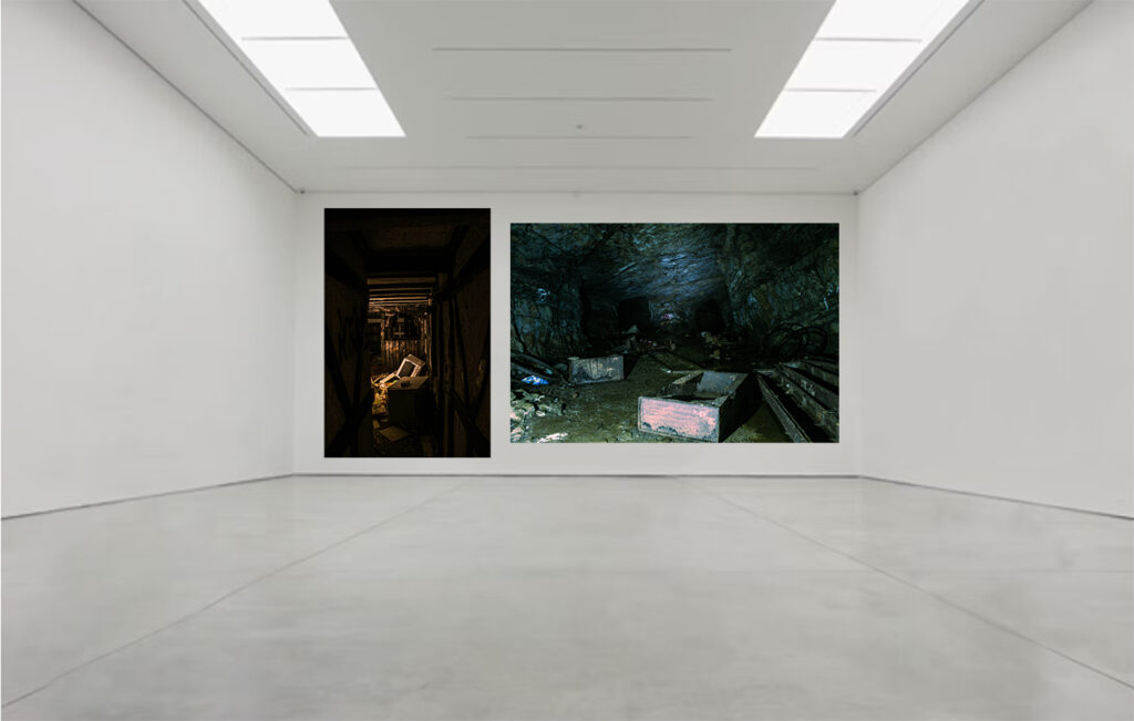
Mock Prints
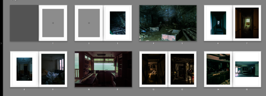
This Print is going to be an A3, single image when I am mounting up with a black boarder around the image.
This one is an A4 image, where I will do the same thing as the A3 image, but smaller.
All 3 of these images are A4 and will be mounted onto a black card background, where the 2 images on either side with have a boarder in order to make sure the image is visible, except for the middle image which is visible anyway without a boarder.
These 2 images are A5 and will be mounted onto a small black piece of card which will have outlines for each of the images to make sure they are properly visible.
Virtual Gallery
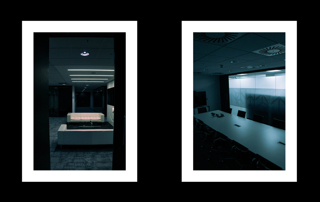
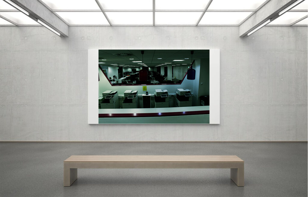
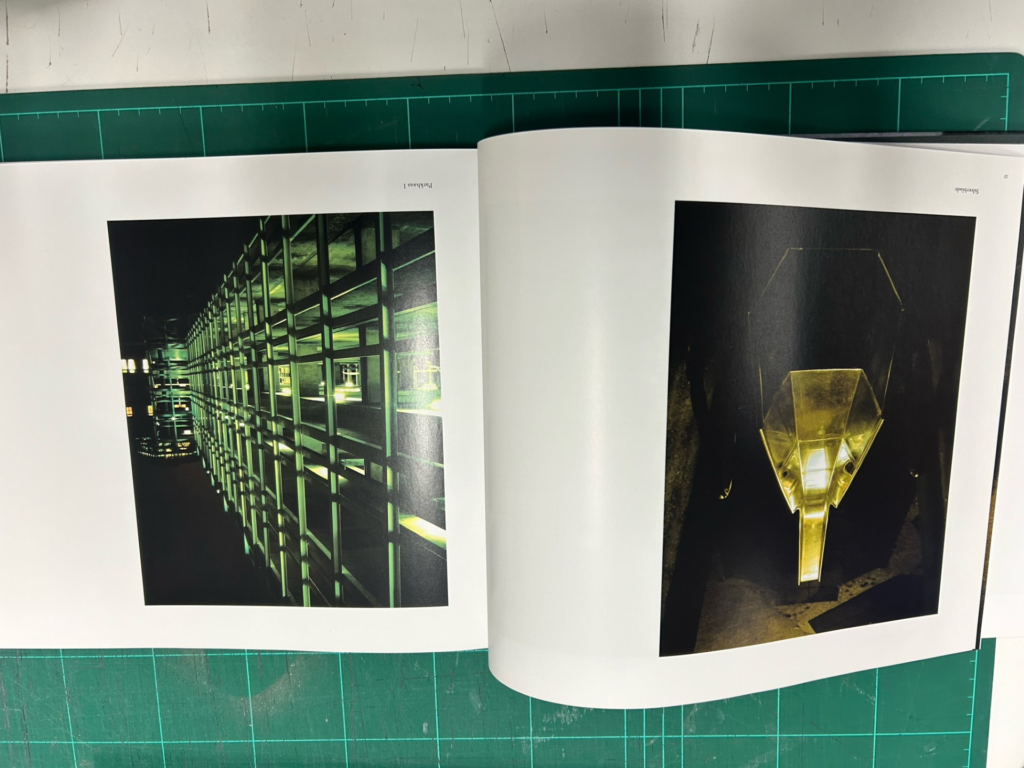
These are personally my most eye catching images, which show strong texture and colour grading. I contrasted these two images on here because one has a perspective of observing through a hallway, like a frame, and the other has a wider point of view which observes fully though the lens. Both of them include a type of style to the image, and are using similar subjects of broken decaying equipment, both include high contrast between the lights and the darks.
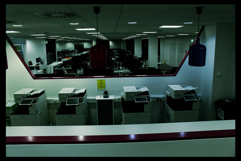
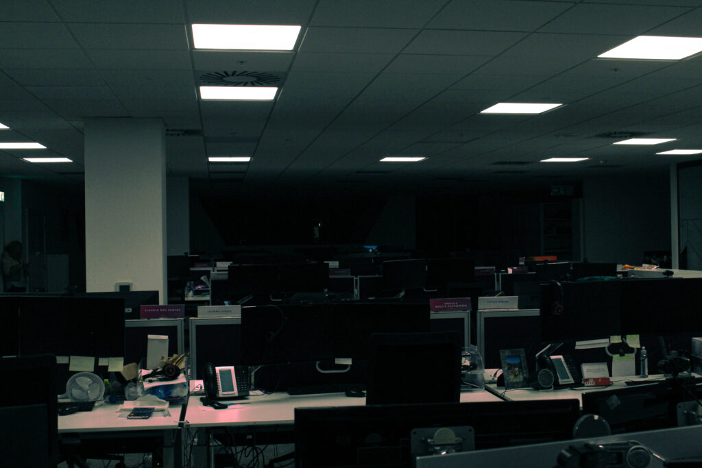
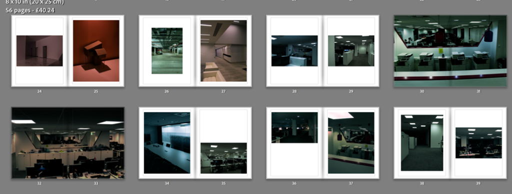
I like this one because of its intense contrast between light and dark colours, but also how the depth of view is strong and uses repetitive features, like the printers, desks, and lights. The depth of view gives a very disorienting feel to the image, but because of its dark features at the end of the office, it can create an unsettling feeling for people.
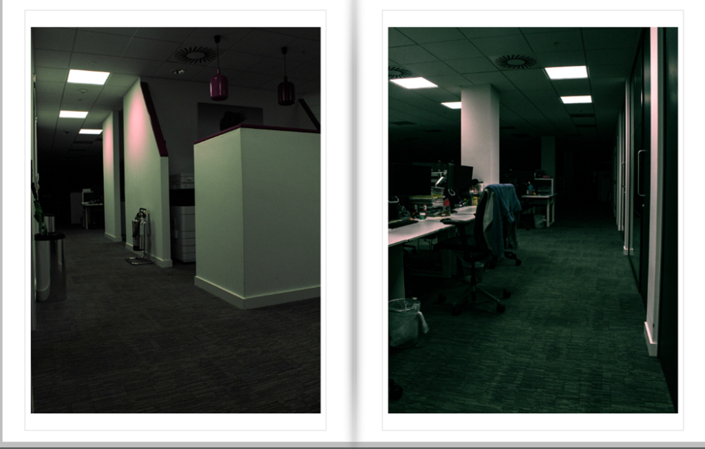
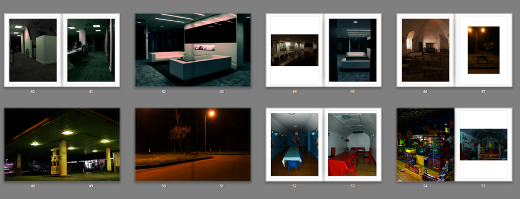
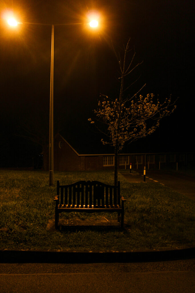
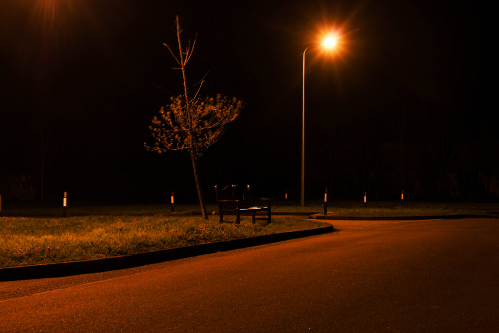
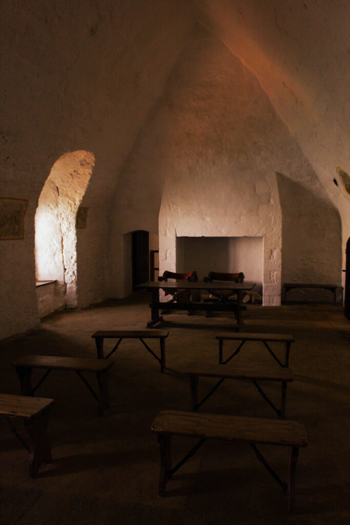
These Images contrast each other very well with their feeling they present. Both I believe are capturing the environment perfectly, where the cold image shows an empty conference room, and the warm image shows an empty church like, dome environment. They both contrast in the type of lighting they use, the cold one with artificial, and the warm one with natural lighting.
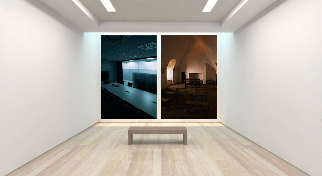
These images work well because of its use of lighting, and high contrast. I think that in the colder image it shows more of a professional area, and uses high contrast and depth through a “window” like view. And the other is very docile, has lots of shadows, in an empty area, as if it is, and isn’t supposed to be there at the same time.
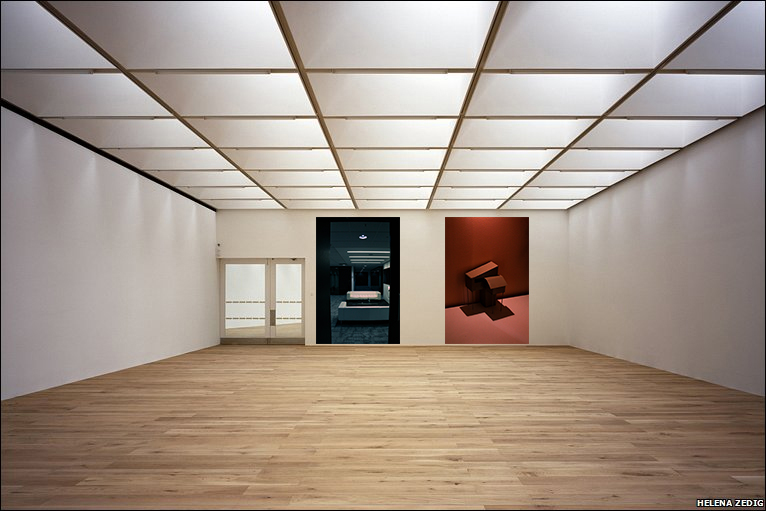
Photo Book Final Layout + Evaluation
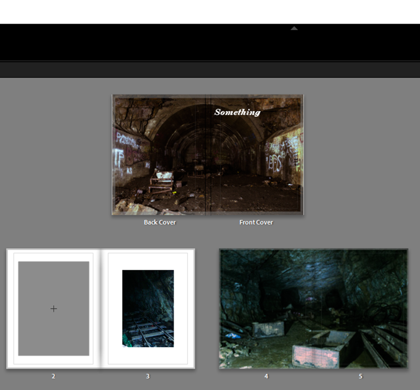
For my front cover I chose to stay with a simple look with the title being bold and clear for what it is. I also think the font suits the name well but isn’t fancy or over complicated which suits the theme of liminal space.
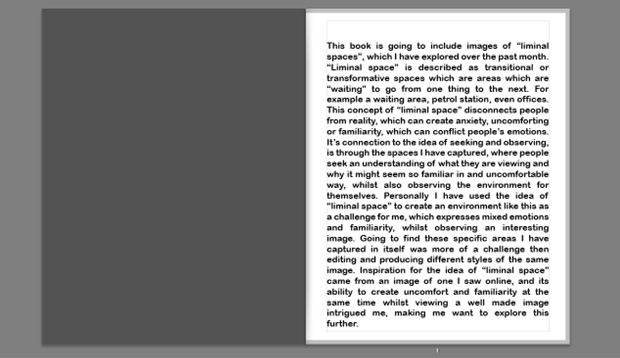
I then decided for my first page I would give a description/introduction to what my photobook is going to present and how it relates to the theme of “observe, seek and challenge”.
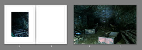
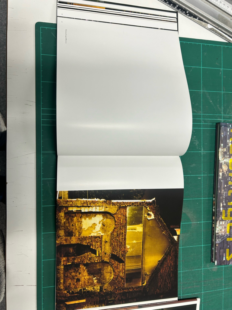
This leads into the old, empty, abandoned areas which starts off with the caves where not many people have recently been in to see or even know about its existence. This is to show Old liminal spaces where people used to explore decades ago and even use during WWII, and is perfect because the areas I Imaged where transitional which show depth.

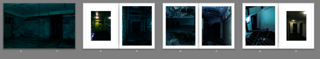
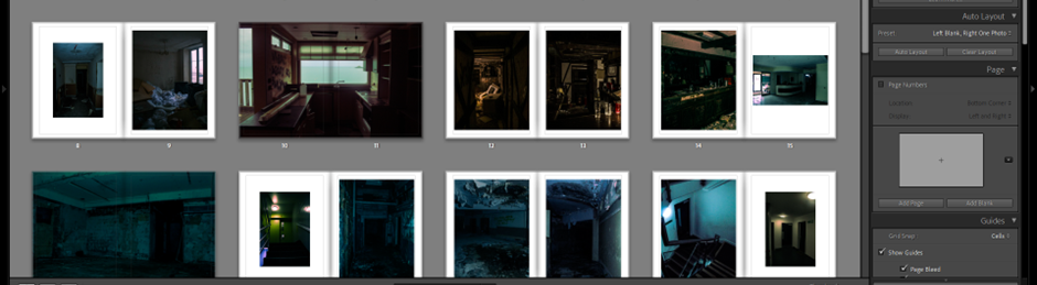
My idea of my photo book layout is to have it seem like you are the photographer wondering through interesting spaces, where you start with the oldest most untouched, to then gradually transition into the newer, more common areas. Places like this abandoned hotel had broken rooms, rubbish left everywhere, and showed a trace of people, or templates for where people used to be, which I liked a lot and found the space in itself very uncomfortable but interesting.
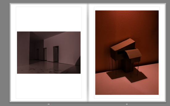
I also had inspiration from some other artists like Thomas Demand who created models and photographed them in very unique ways, so I created my own and wanted to try different angles and lighting to capture a sense of liminality, the first image looking like a hallway, but is a bit of folded paper with some doors cut into it, and the image on the right where I made a model of a type of house out of cardboard, and wooden sticks.
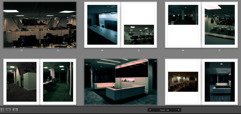
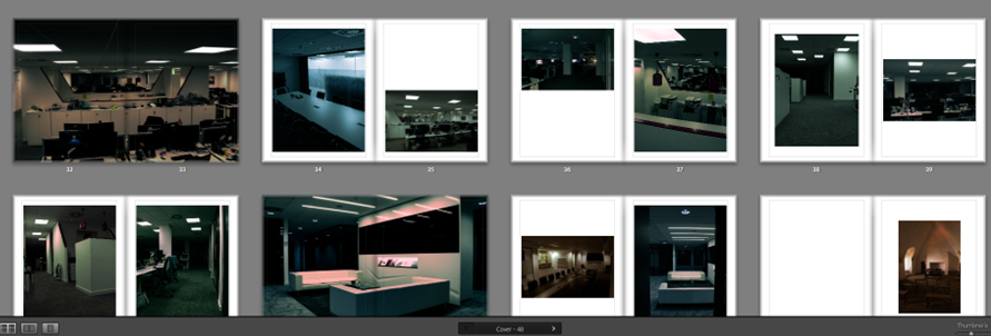
I used contrasting layouts which use warm and cold images opposite each other, with some warm and warm, and some cold and cold. I like thought about where the readers eyes go to and from when they open the next page, and used specific images which would make someone’s eyes flow on the page, especially in the office buildings, it switches up some of the layouts so it doesn’t seem boring.
Overall I Like how my photo book is laid out because of how it transitions from older areas to newer and modern areas, meaning in itself the photo book is being a liminal space as a “state of being” . Moreover, the templates I have used for each of my images work very well, as most of them are bold and eye catching, and the ones which are smaller, are more interesting for the viewer, as it makes them look closer, but also feels nice to look at. My choice in the double page spreads are well used because of the bold more ominous images are right in your face which puts you more into the “situation” I was in.
How I Developed my Images
For example this image was originally dull, dark, and doesn’t have anything really clear to look at in the image.
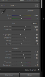
By exposing and contrasting the images features a lot more, with adjustments of highlights and a bit of clarity the image started to look visible and more aggressive. This was one of the type of styles I was aiming for:
Here I used the same features as I did with the first photoshoot edits, as I did this throughout most the images. The other type of style I was aiming for was, a soft, grainy, hazy feeling.
By increasing sharpness and “noise” of the image it created a type of “memory” affect, where you would have an unclear look and feeling about what the image is or where it came from, but is recognisable.
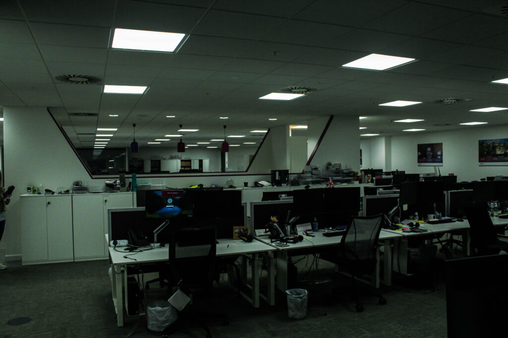
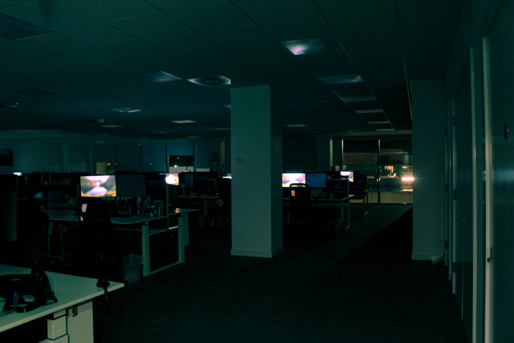
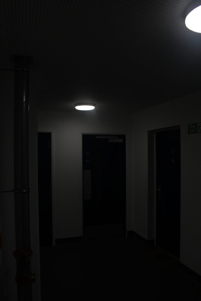
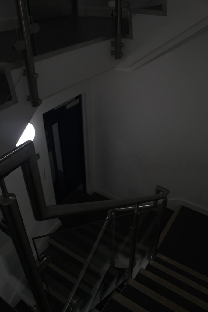
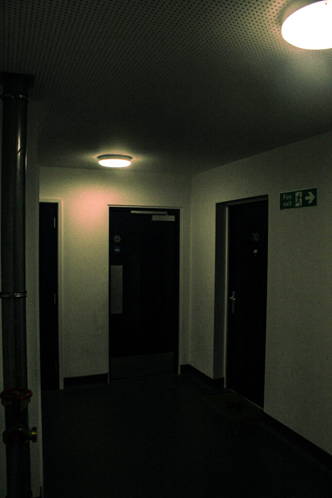
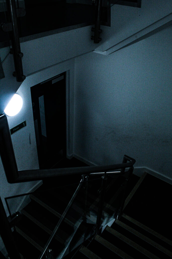
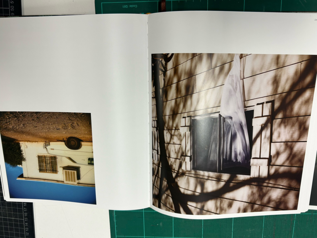
My images switch from abandoned areas which aren’t accessible, to slightly more accessible familiar places like office buildings, which people don’t really see during the night or closing hours, which will make the space seem uncomfortably familiar because of its empty essence.
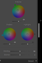
A theme of editing that I held consistently in my images was a type of “vintage” or “Distant memory” style, by simply using high contrast, and making the Mid-tones slightly green, and the shadows slightly baby blue. This would create a cold vintage look. However with my warm images:
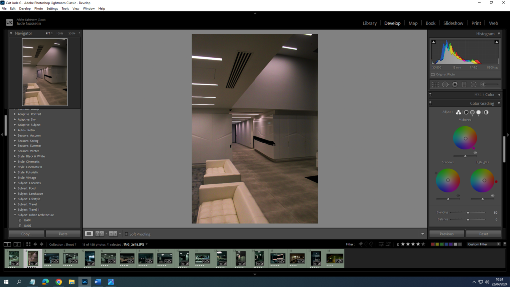
I would use more Red, pink, and orange colours for the Mid-tones, shadows, and highlights.
Photo Book Design So far
Front cover:
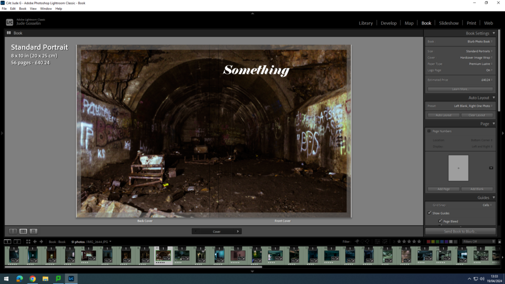
so far I am finding a suitable font and name for my book. I have chosen this type of image, as I think caves with a lot of mess attracts peoples eyes into what they are looking at, and where they might have or have not seen it before.
I have used a good consistency of page designs whilst not having a clustered look. I kept the nice look of warm and warm images or warm and cold which contrast each other and work well together.
All the images I have used here use the same context as each other, for example what subject is in the image and what is included in the images, like the use of lines and their direction. My choice in double page spreads was to do with how strong the image is.
Overall how Lay out my images and what type of images I used, work good together, and I like how they all flow with how the reader is viewing them.
The Narrative of my photo book “Liminal space”
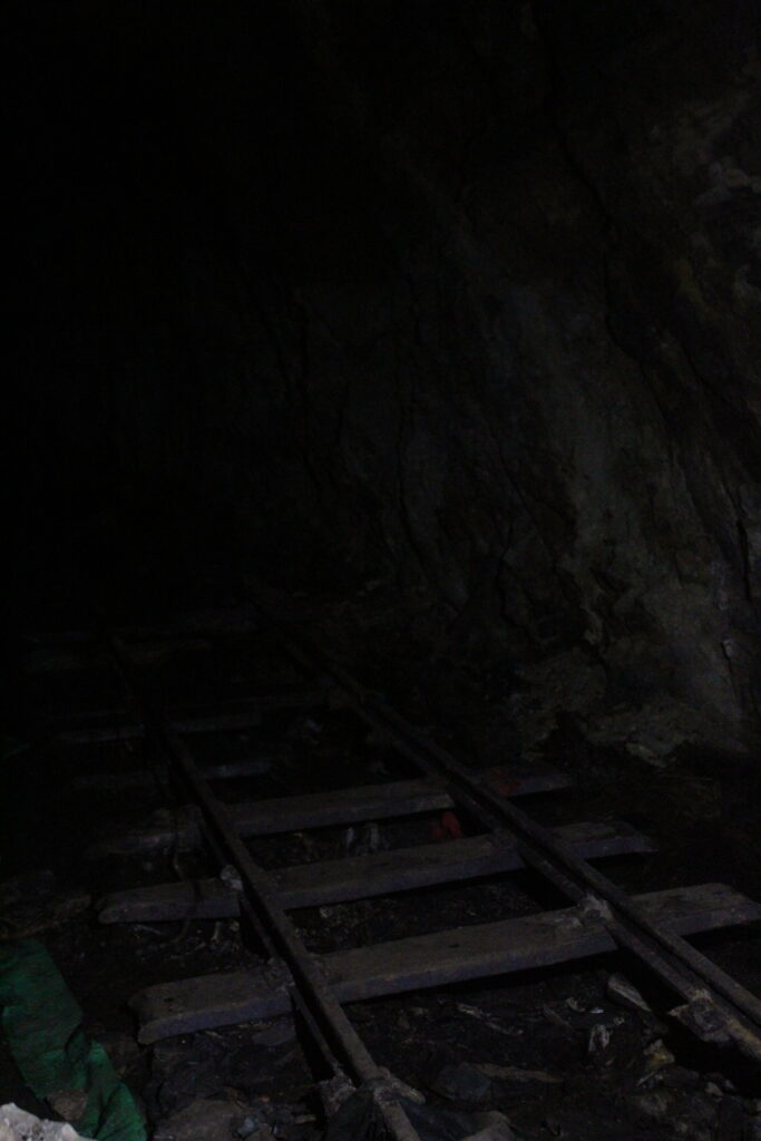
The aim for my photo book narrative is going to begin with the front cover presenting a dark environment which shows half of a tunnel on one side and the other half as the back cover, this dark and confusion of the front cover, which includes spray paint on some of the cave walls which attract people eyes and want to know more. I want to start the book with including areas which aren’t easily or at all accessible to people, as a good way of showing people the liminal space where people have once been.

This is where the story line concept will begin, in a dark, cold, ominous cave, which will begin with a broken old rail road which leads you into the darkness. This is supposed to cause confusion, and for people to become more interested in what other pictures there are, which will lead people further into the book.
There will be a common theme of emptiness, but also familiarity within the images because I want to lead the images from abandonment and emptiness to a close familiarity with places that people use a lot but are as if people had just disappeared, where caves are common in jersey along with abandoned areas, however little people know about it.
I aim for my images to convey a sense of interest to people but also an uncomfortable and familiar effect. Which links even closer to “liminal space”, as its emotional effect on people is to present uncertainty and also a slight sense of nostalgia or familiarity within anxiety. Like a cluster of emotion sparking off at different or the same time.
My story line will be a never ending one where there is no real beginning or end in the environments / areas I am capturing, rather it will show the places we pass by and don’t think about again till we see it, like the hidden past. Images like these sculptures I have made will be very familiar because of its shapes but also have never been seen before by people.
Lastly, the images of a vacant office will be shown, as a way of representing where commonly most people, (especially in jersey) will be placed for a big majority of their life.
I find the concept of liminal space interesting because of its ability to be everywhere, but for it to FEEL more like a liminal space, you have to adjust the environment, or the image of the environment. It also interests me how liminal space is seen through emotional transitions, and can be represented within or because of the image.
The overall aim for this type of layout is to present the reverse of decay within liminal space, and how we seek nostalgia to go into the past, This is why the narrative starts in a cave, because it is a very old area which has been there for a long time untouched, and then slowly go to abandoned areas which are slightly less older environments, to then an office which is where people are most of their middle aged life, and gradually to a play area where people would visit as a kid.
Photobook layout Inspiration
Rut Blees Luxemburg and Todd Hido:
I specifically like Blees’ work because of its Connection between my work which is the use of something that is in-between each other, for example, blees’ captures stairs which everyone uses, but composes it in a way which shows its history and the space around it, similarly my work does the same thing with different environments showing its common interaction with people, but its emptiness is shown, where it is in less of the “spot light”.
Some of Rut Blees Luxemburg’s books include a lot of good presentation of images, with the way she proportions them on her books, but also how some of the images composition connect well with the image next to it.
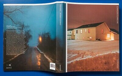
Similar to Blees’ work Todd Hido creates imagery during the night and captures the environment around him which he deems fit for his theme. MY interpretation of his photo books is a common theme of loneliness through the environment, like this image of a house in a lonely environment. And how he lays out his book with sometimes a title for the image.
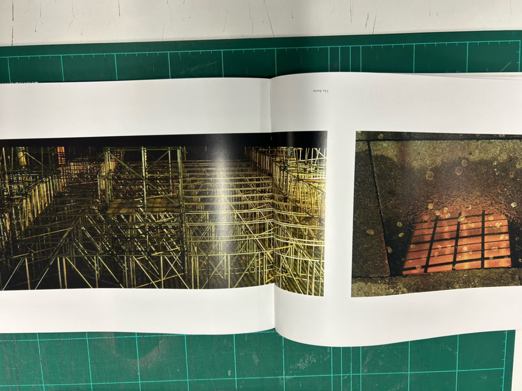
Image layouts like this I like because of its consistent use in lines, and dark environment and similar feeling of the image, like a warm feel.
Here Todd Hido shows a connection between windows and doesn’t use big contrast to the feel of the image, which I like a lot.
I like this style of image a lot because of its theme in an empty environment like a room, with an obvious of hidden subject within the image, which shows a sense of familiarity or loneliness.
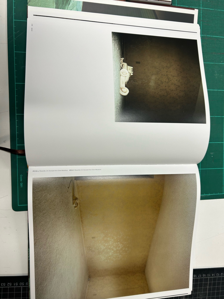
Connections with images like this is what I will be aiming to do, because it holds a theme in both the pages, this one is the theme of something broken, as it shows a small broken subject and the n a big one.
Shoot nine
Shoot nine was a lot about the space and environment, rather a narrow hall way its more of a deserted textured place.