All posts by Izzy Williams

Filters

Author:
Category:

Evaluation

Photoshoots

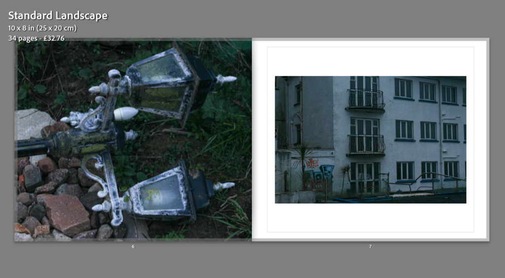
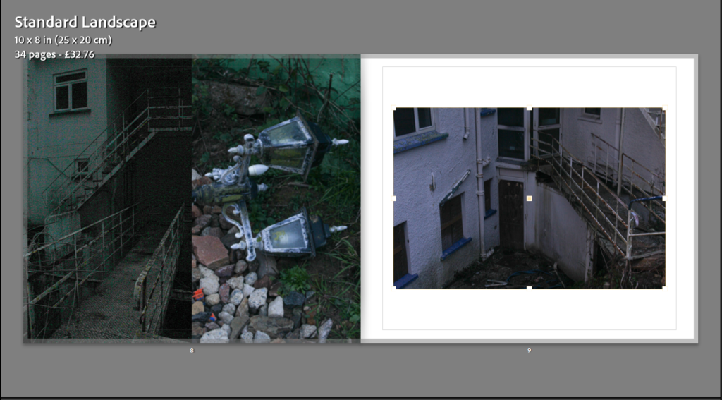
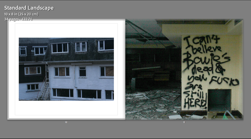
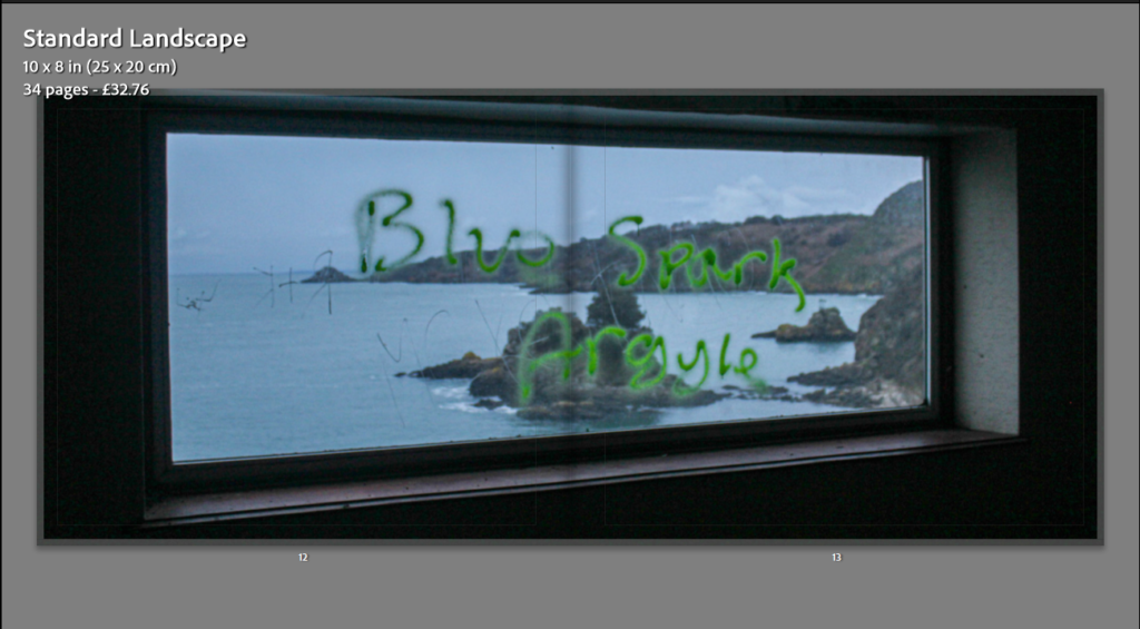
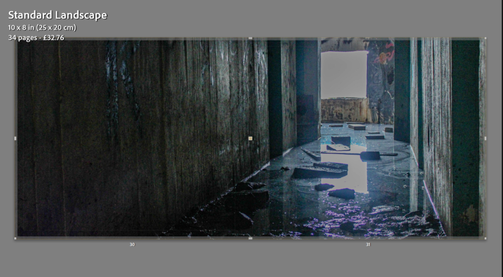
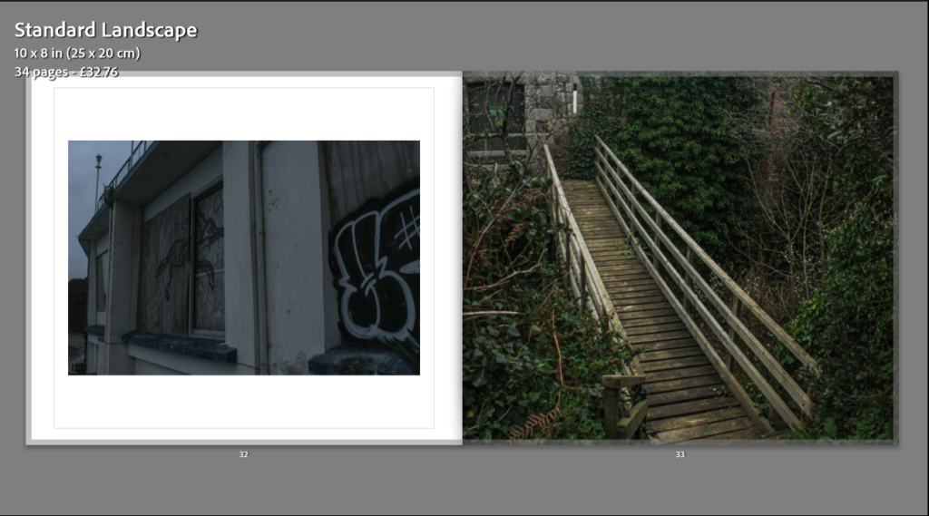
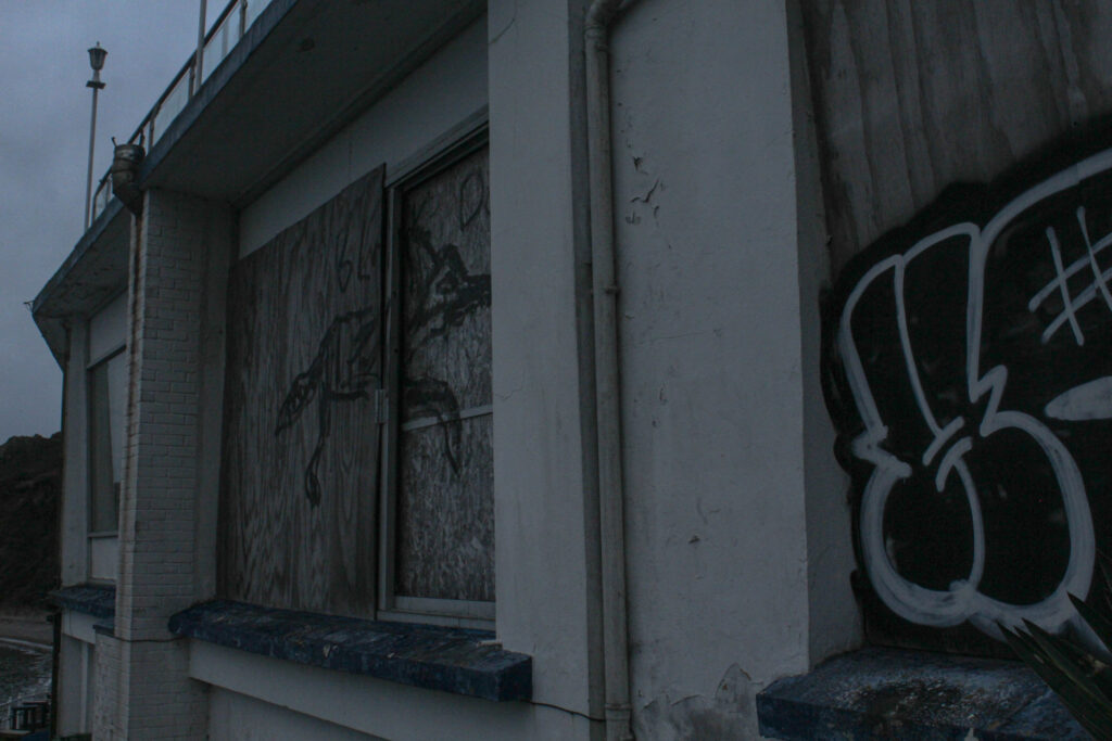
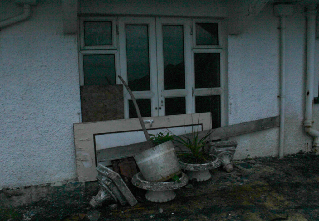
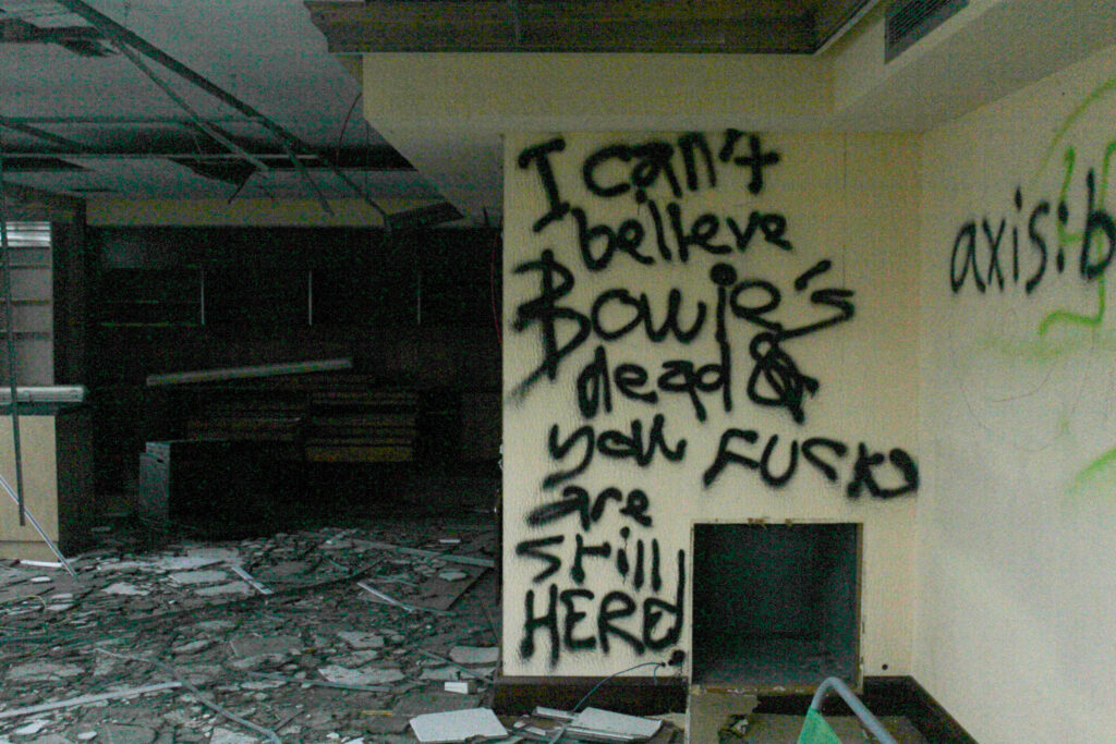
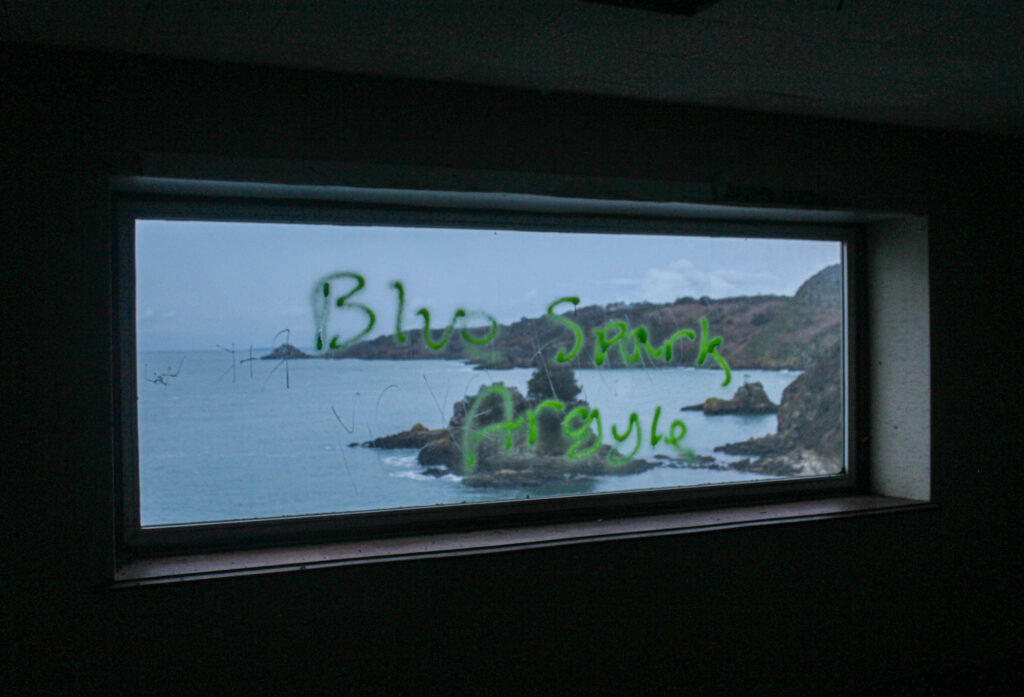
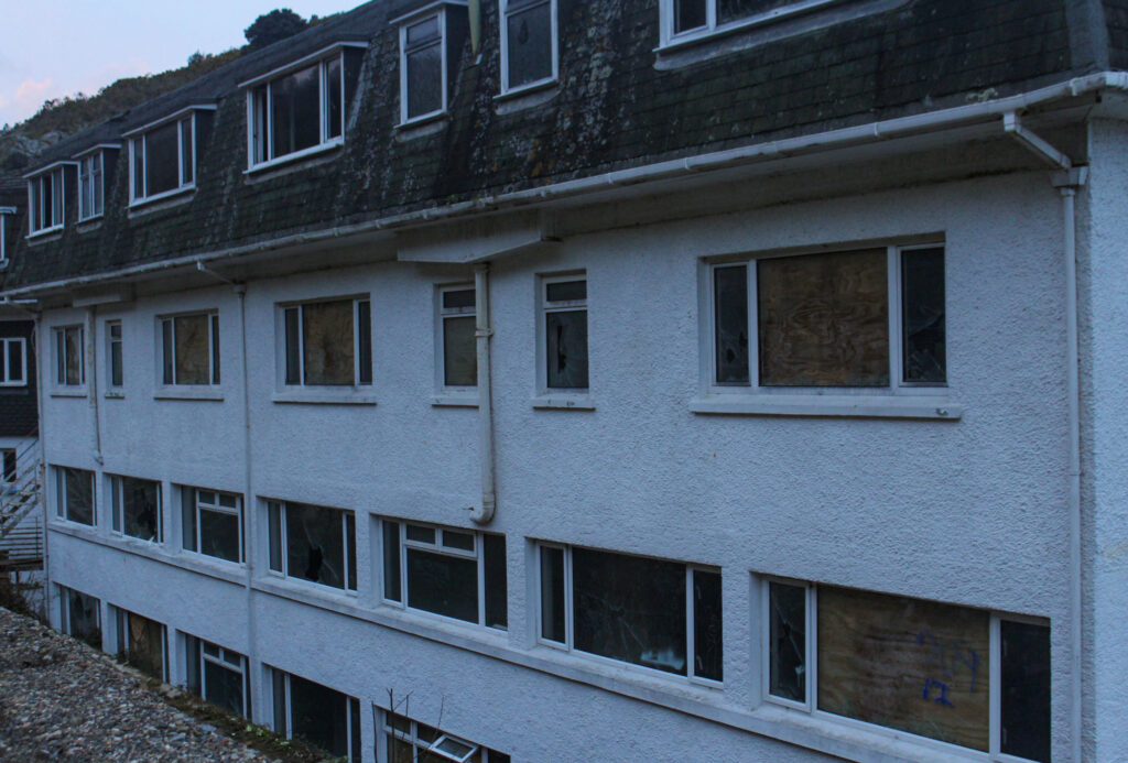
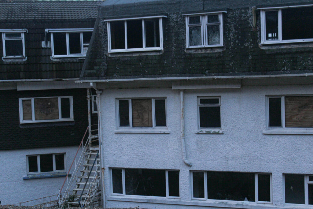
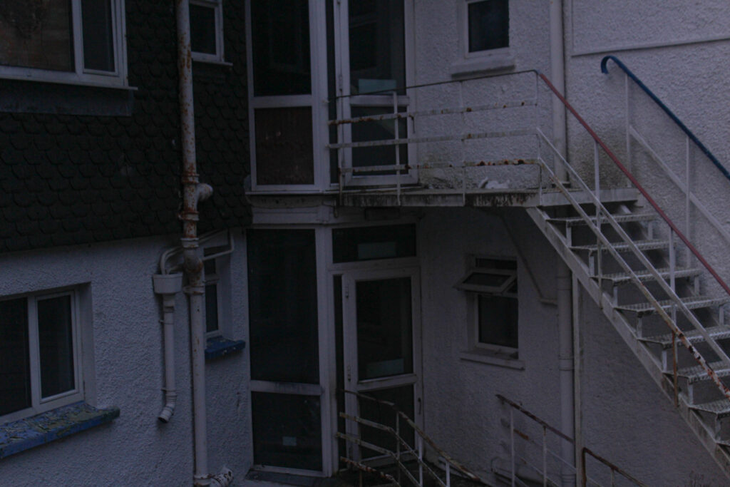
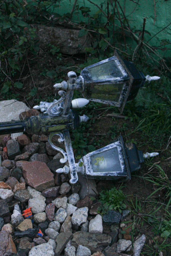
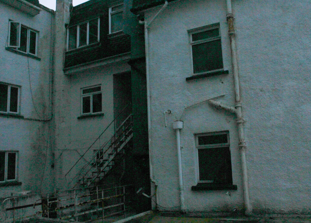
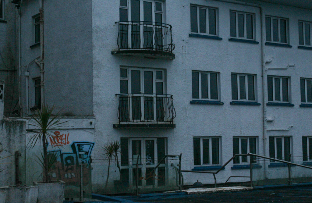
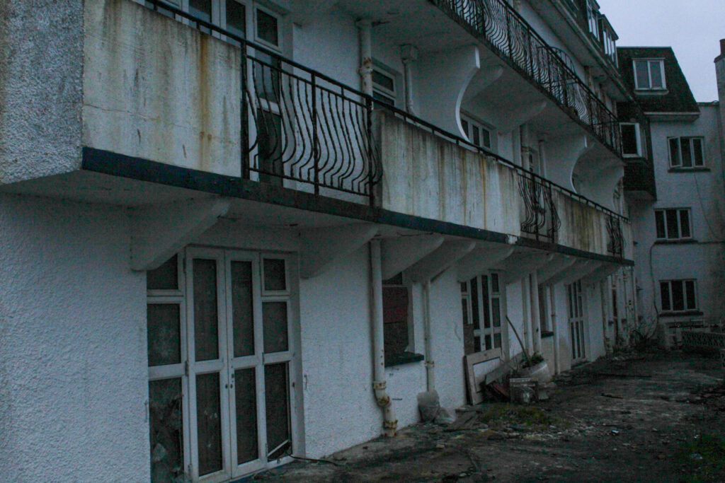
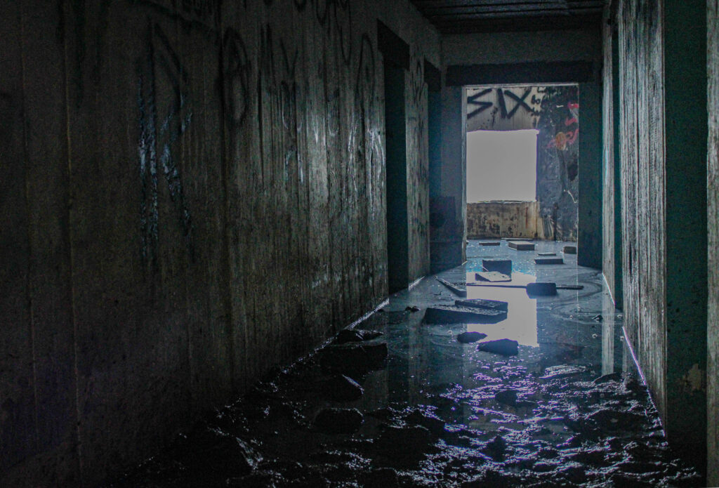
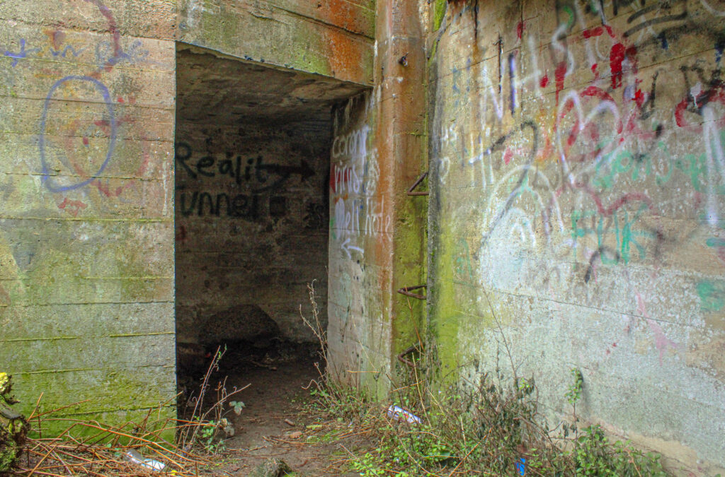
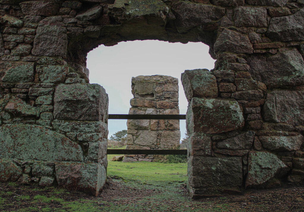
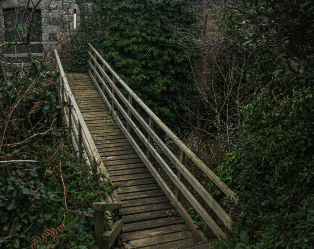
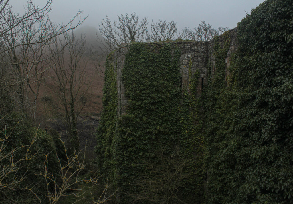
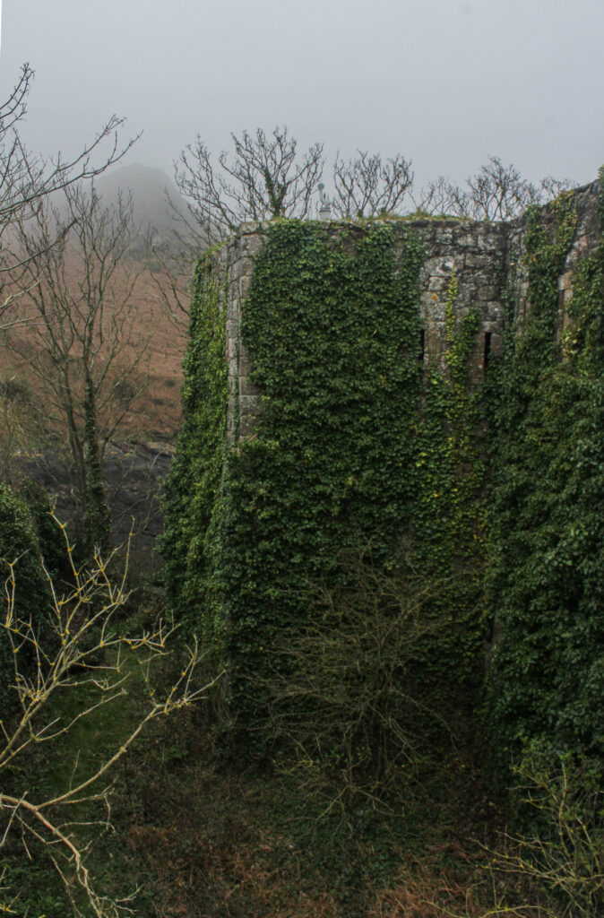
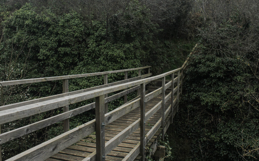
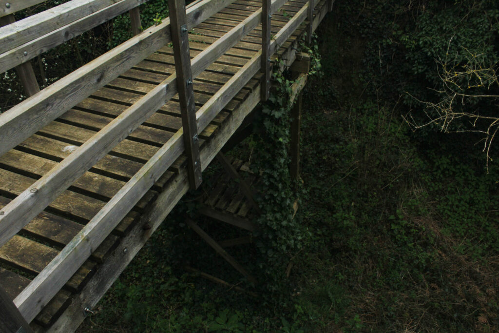
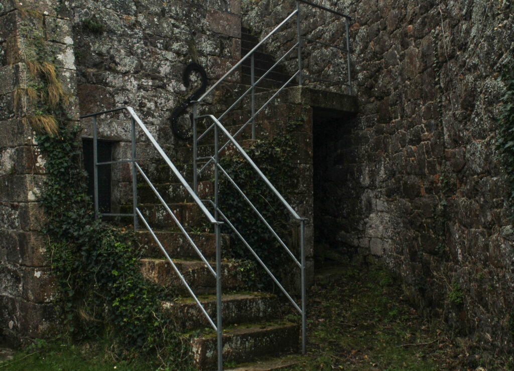
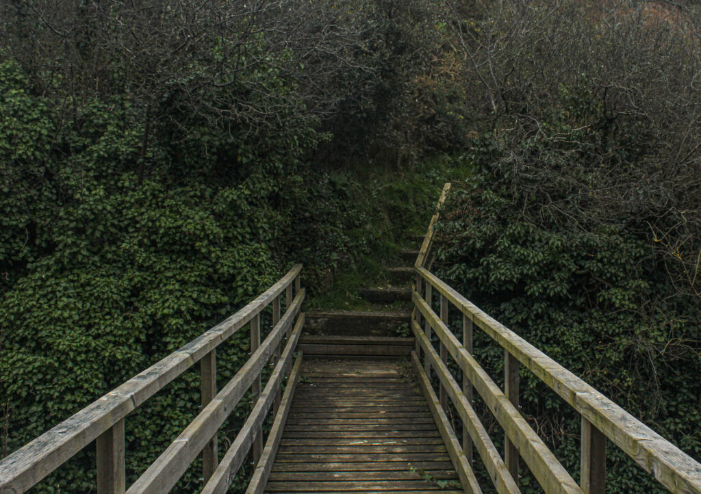
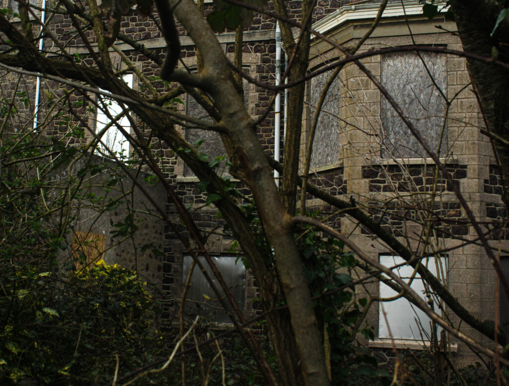
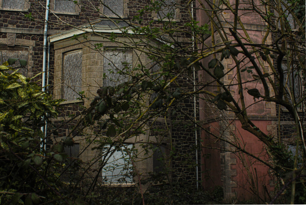
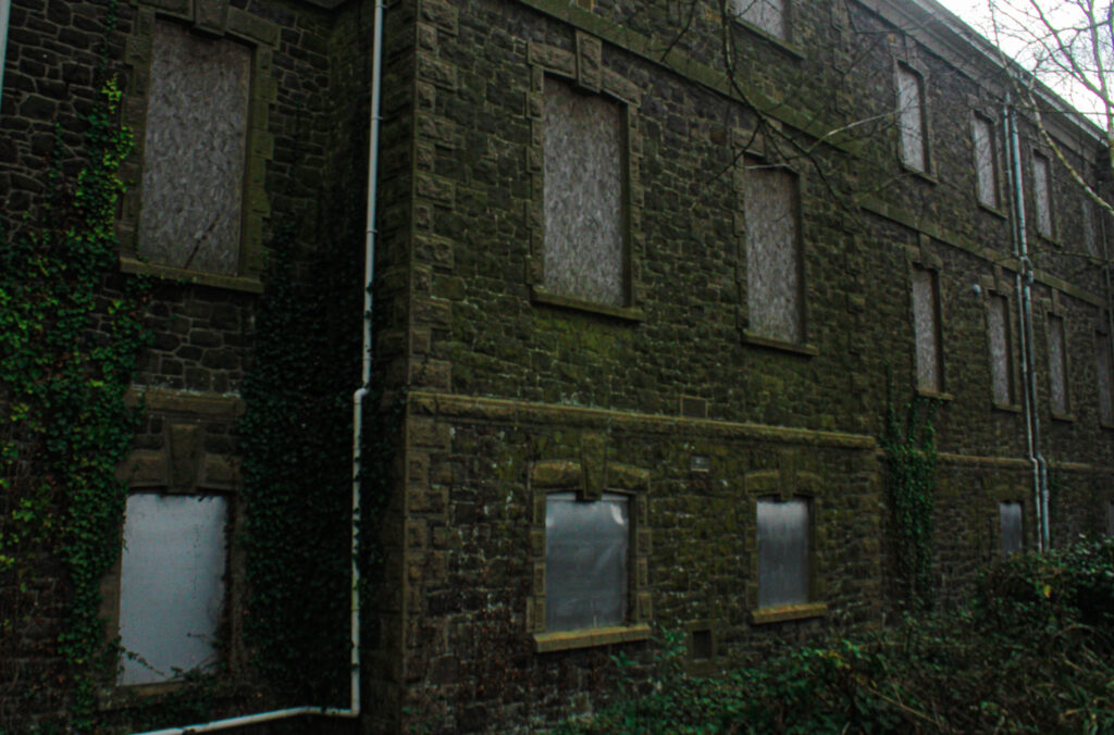
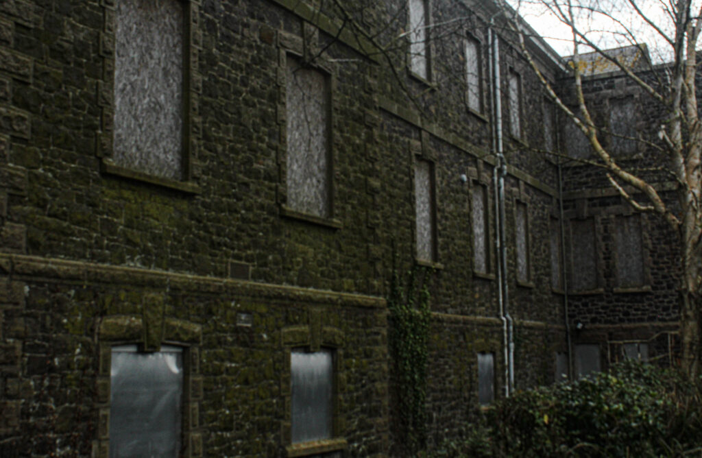
Overall, I think my project was really successful. When first given the themes of observe, seek, challenge I thought it was difficult to find inspiration as those topics are very broad; they can be interpreted in many different ways. However, after doing research on all three and educating myself on all the topics I could do regarding the themes, I decided to choose the theme ‘seek’. I was drawn in by the idea of ‘seeking the unknown’ exploring and taking photos of places that we might not usually visit in Jersey, places that have been abandoned. I managed to follow my theme of ‘seek’ throughout my work and carry out a number of photoshoots in different locations all with worthy photos. Although the plan for my project was originally quite challenging as I had doubts about the number of places and subjects Id be able to take pictures of in relation to derelict, abandoned buildings and areas; It allowed me to explore Jersey and find out about these places that I didn’t even know were there. This was the main aim for my photobook, to show viewers the side of jersey that has been abandoned and left to kind of rot in both an eerie and beautiful way.

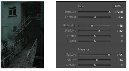
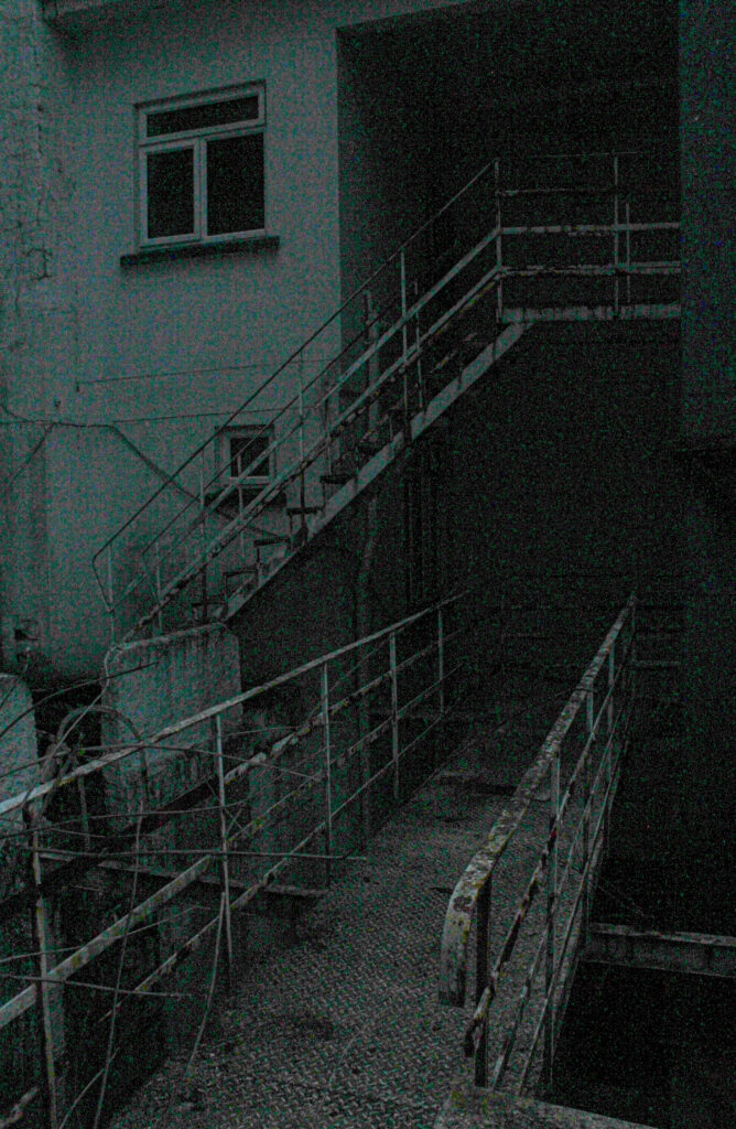
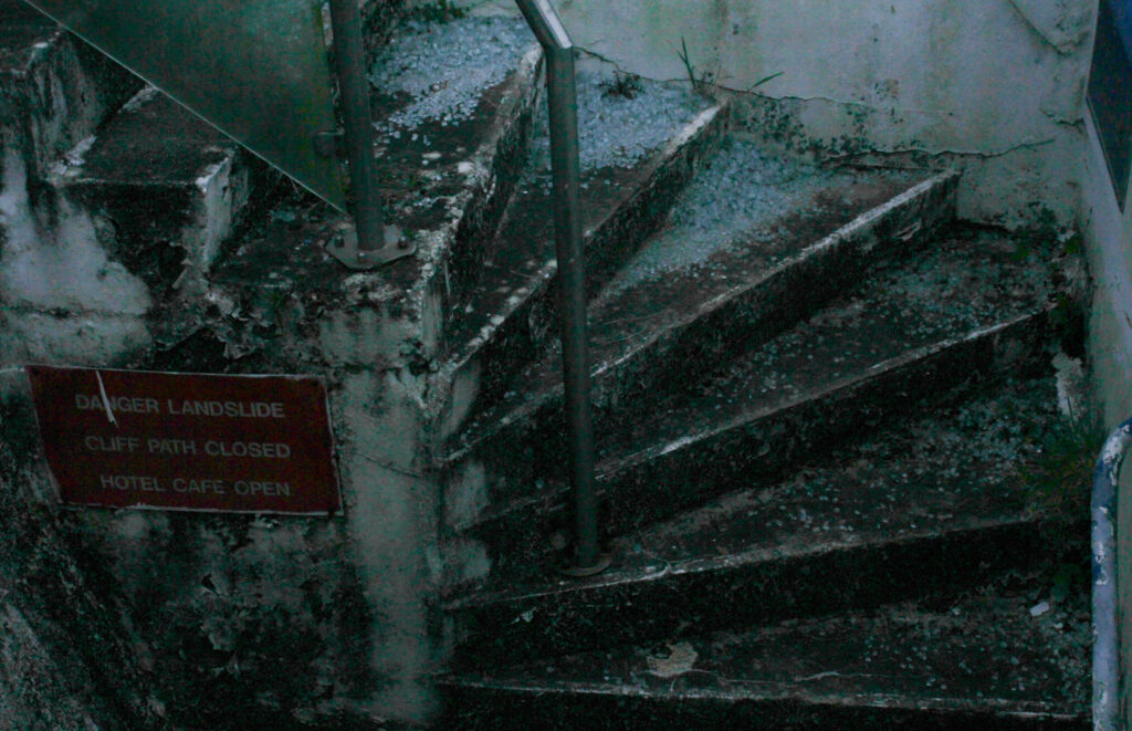
As well as there being a numerous amount of photos that were worthy of being final images, there was also a lot of images that were ruined in different ways. The biggest negative impact on my images was the weather, a few of my photoshoots were carried out when the weather was very overcast and dull, causing my images to be not very interesting colour and tone wise but also underexposed. Another mistake I made (only on one photoshoot) was having my camera on the wrong aperture setting, this made nearly half my images from that shoot either very black or fully black; I managed to save a few by adjusting features of the image such as the exposure, whites, blacks, shadows and changing the saturation of certain colours. However, even though that was an issue it didn’t effect my project on a whole as I had many other photos from different photoshoots and also I took enough photos in the photoshoot that happened to.

Photobook

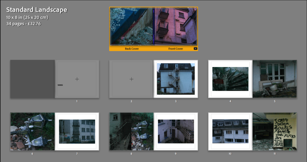
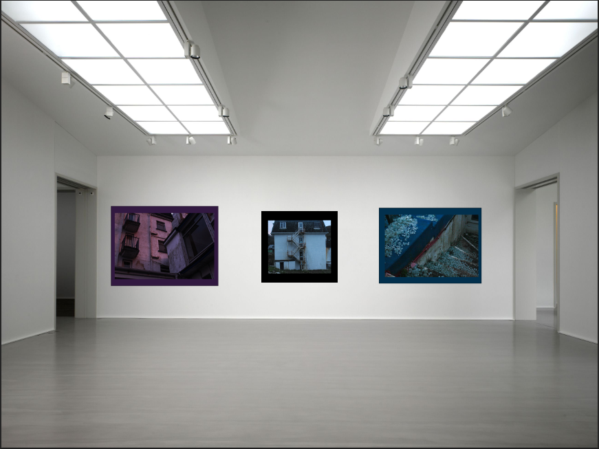
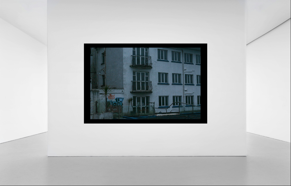
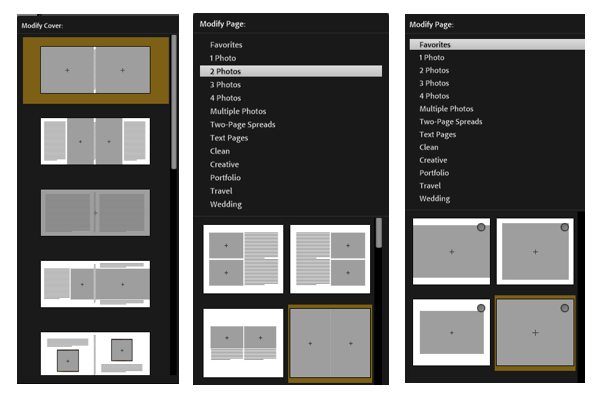
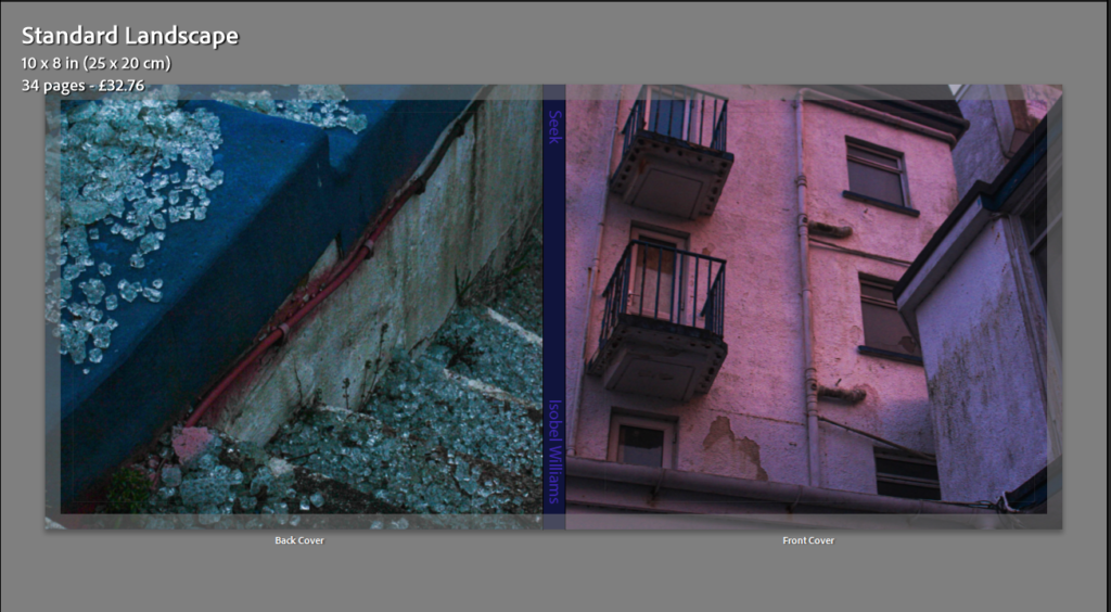
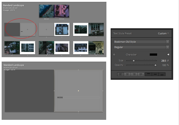
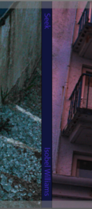
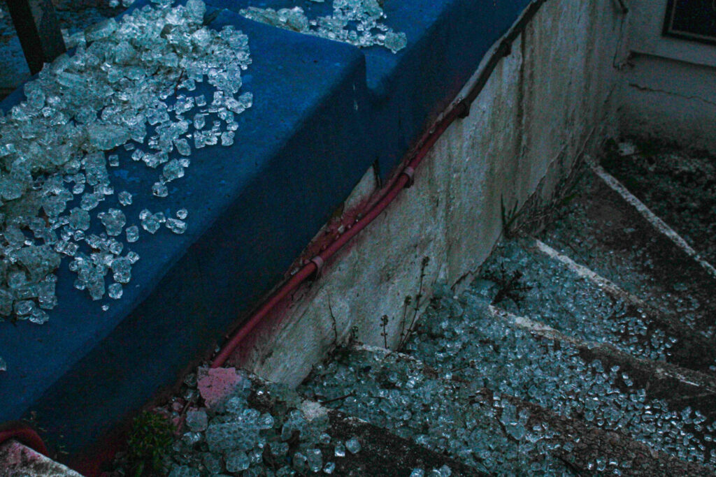
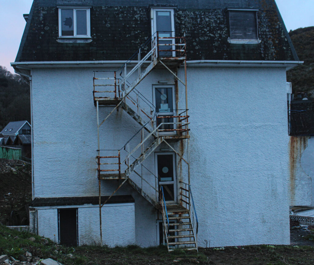
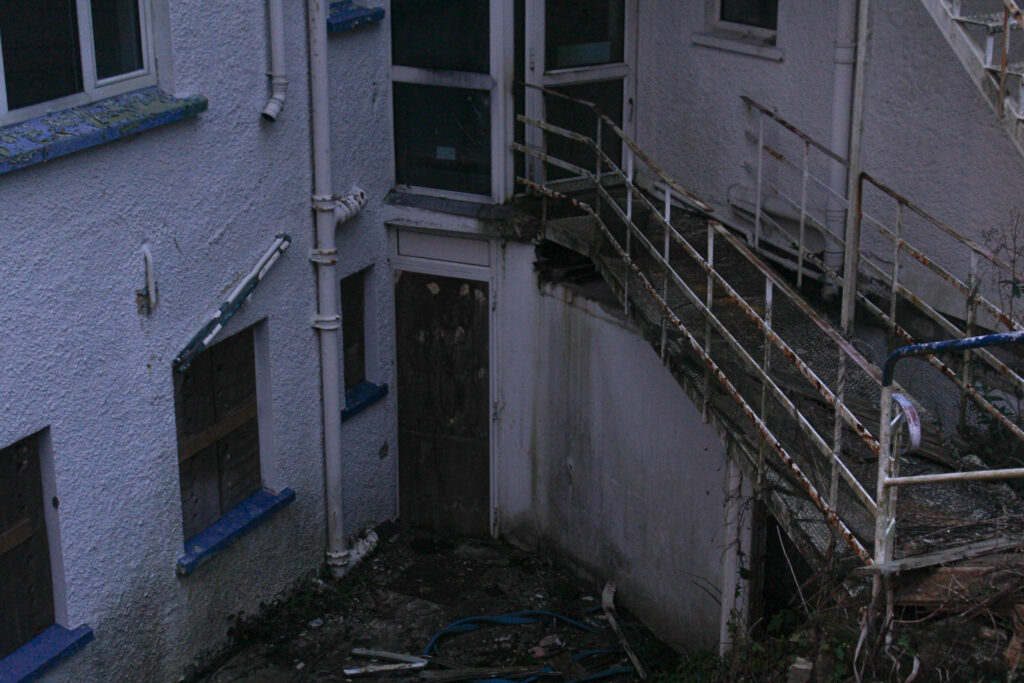
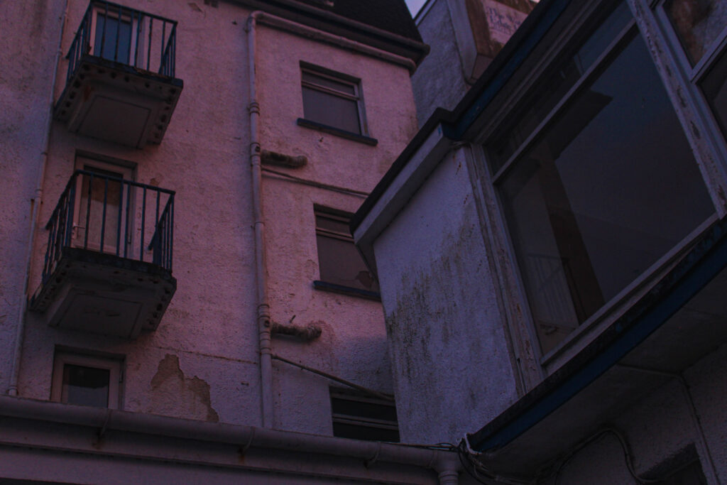
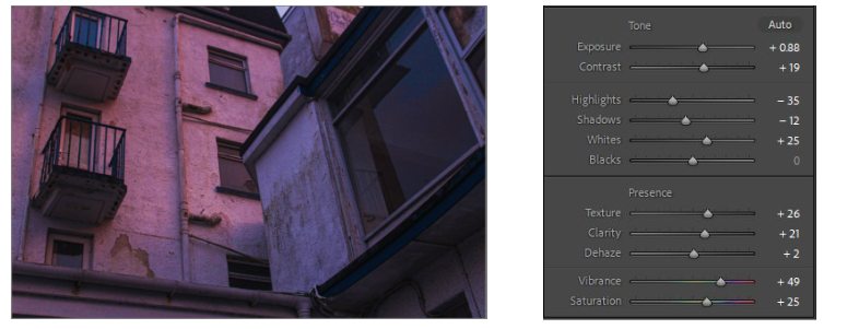
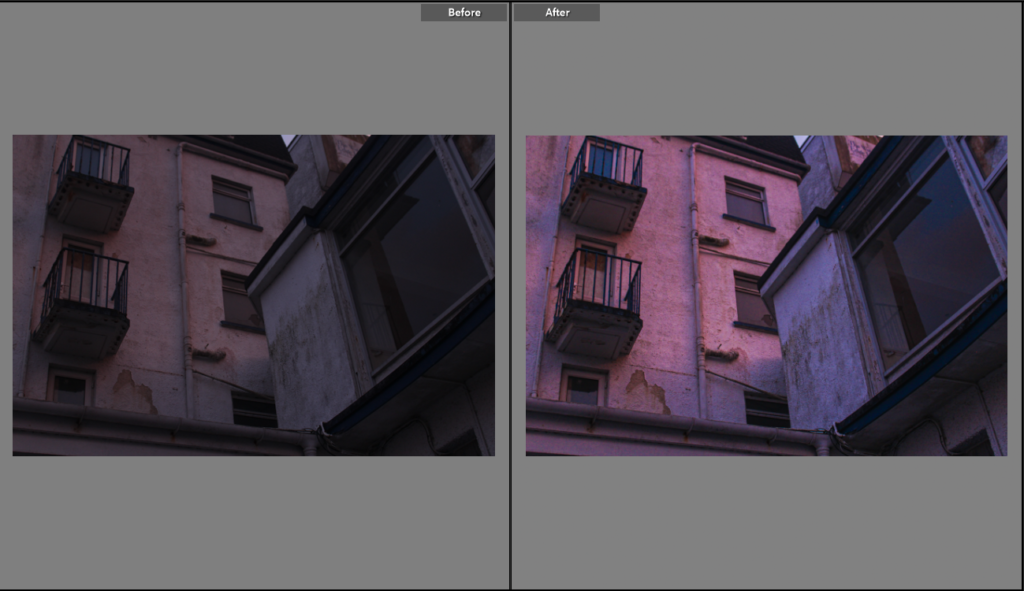
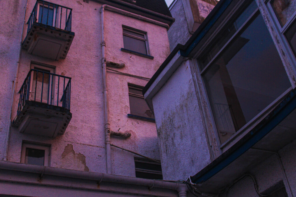
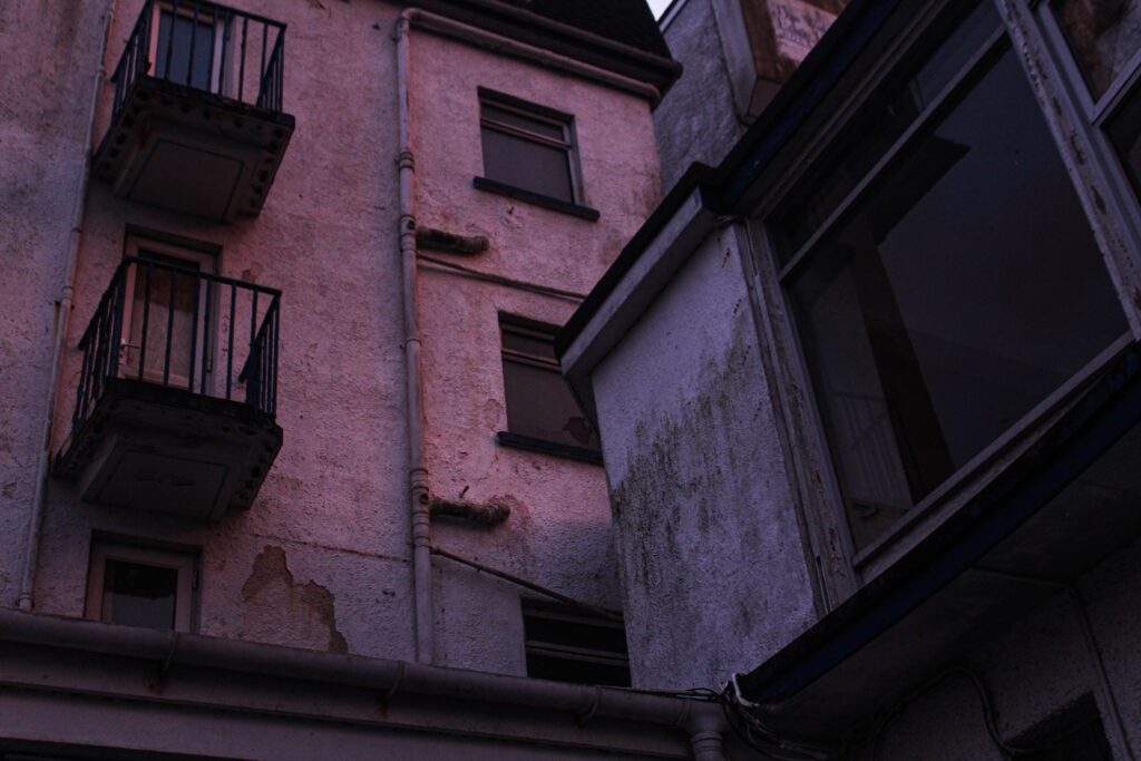
My photobook on a whole, I think, was very successful. All my images fitted into the templates efficiently and if they didn’t I was able to manipulate and change the image size on the page to fit well. I like the outcome of the front and back cover, I think this is one of the most important features of the book as it is the first thing you look at, your initial thought on the book. I chose the front cover image carefully as I wanted the perfect image. I decided to choose the most colourful image I had as I wanted my book to stand out, as well as it being bright it also demonstrates what the rest of my book is going to be about. It displays the side wall of an abandoned hotel, the image contains a few windows of which are either smashed or breaking and also rusty railings. The colour and brightness comes from the sunset which was shining onto the side of the building creating a pink hue across the photo. I decided to make the back cover image another quite colourful image to draw attention, but also displaying smashed glass. I wanted to link it to the front cover. The front cover is showing the abandoned building, with all the smashed windows from an outside point of view; and then the back cover is showing a close up of smashed glass so it kind of follows on from the front cover. I decided to make the colour of the spine a dark purple colour, this was because the main colour of the front is pink and main colour of the back is blue, therefore, making it purple just allowed it to blend in a bit more. I then put the title of my book (‘seek’) and my full name on the spine but in a slightly lighter colour then the background of the spine. This was because any brighter colours were overpowering.

References

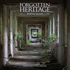
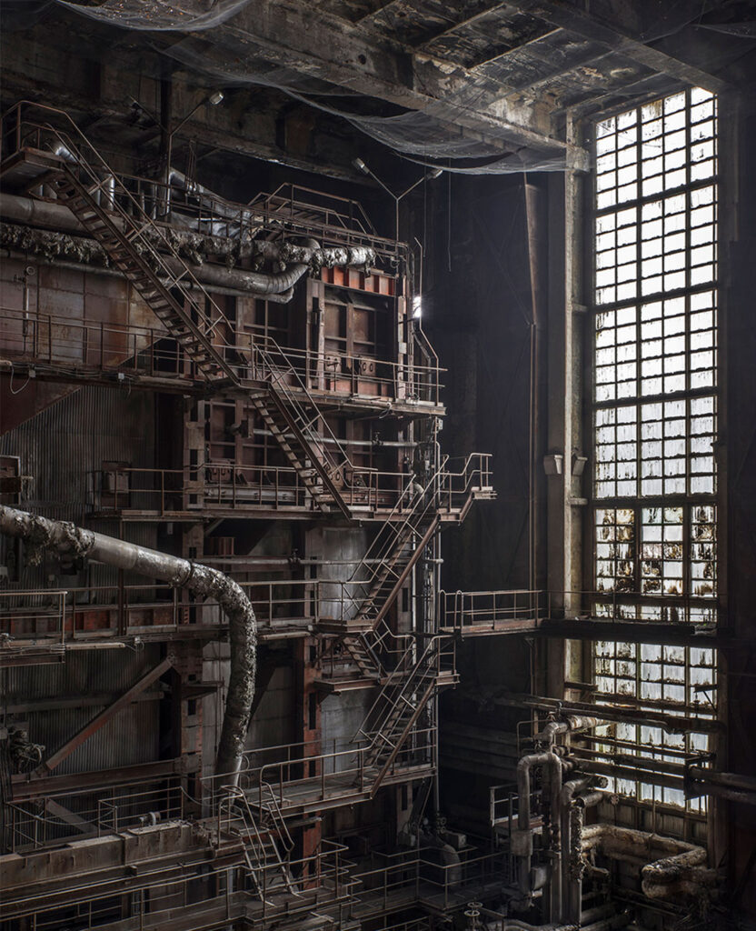
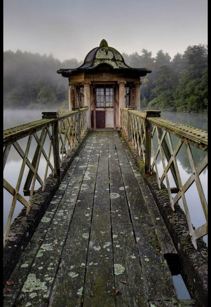
I was heavily inspired by the work of Matt Emmett and I think I foreshadowed his work a lot in mine. I wasn’t trying to take images that looked exactly like his I just often found similarities as I took inspiration from him. A few of his images I sort of tried to recreate, only when I found myself in situations were my surroundings looked similar to those of Emmett’s photos. I also found the composition of all Emmett’s work very capturing, the different angles and techniques he used, getting into certain positions to take the photos so there were some repetitive motifs in his work such as shapes, lines, colours. I tried to do this in my work but I was working with more lowkey derelict places compared to his of places from around the world.

Virtual gallery

I used these templates to create my virtual gallery.

As these were just templates and weren’t made on the virtual gallery website, due to exam conditions, there was no option to ass a frame to my image. I improvised and used the rectangle shape drawing tool to create boarders around my images. After creating them and placing them in the correct position, I then dragged my chosen image on top; I also changed the colour of some of the boarders to add some more contrast, some of them blended in a bit with just the black background.

Photobook deconstruction

Style:

I decided to make a hardback photobook as my images are all documentary and I thought that with the overall outcome it would be more fitting to my theme.

Concept:

I want my photobook to show the unseen, more underground sides to Jersey that people don’t know or have forgotten about. The aim of my photos was to show viewers these places and how they have been left but also to show the brighter sides to them, how nature has taken over the majority of buildings like this and brought more life to them. I was strongly inspired by the works of Matt Emmett, he photographs derelict, abandoned buildings and places from all over the world; although it was challenging as I didn’t think there was many abandoned places in Jersey, after researching and exploring there is actually lots of places here that have just been left. This is also why I chose the theme of seek because it relates to exploring and finding out about these places, seeking the unknown.

Layout:

Here is a preview of the layout for my final photobook. I tried to display my images differently from page to page to make it more interesting to the eye. Throughout the process of creating my book I used one of three options, of presenting my images on a page, all the way through; this was one image, two images, or one image as a double page spread. I had multiple options for the layout of my images, which I have screenshot and displayed below.

My photobook

Front and back cover

Page 1

Pages 2&3

Pages 4&5

Pages 6&7

Pages 8&9

Pages 10&11

Pages 12&13

Pages 14&15

Pages 16&17

Pages 18&19

Pages 20&21

Pages 22&23

Pages 24&25

Pages 26&27

Pages 28&29

Pages 30&31

Pages 32&33

Page 34

After constructing my photobook, I decided to add text to the front cover and first page. I did this by inserting text and using the tools I’ve shown above on the right to change the colour, size and font of the text. I made the spine of the book this dark purple colour as it blended more with the more popular colours of pink and blue from the front and back page; when I added text to the spine ( the title and my name) I edited it to be a slightly lighter purple then the one on the spine. This was because any other colours like white were too harsh. I decided to make the first page blank and add the title of my book as a title page when you first open my book. This is just to bring my book together.

Reason behind my photobook

Matt Emmett- Forgotten heritage

‘Forgotten Heritage’ is a photography project that uncovers the brutal beauty of abandoned Buildings and derelict industry. Emmett displays all his images that I have previously studied and are inspired by. Emmett shows a vast variety of images, from abandoned buildings and sites in the middle of forests and jungles; surrounded by the beauty of nature that has began to take over these sites, to derelict work industry buildings, rusty and broken down.

The front cover of his book is eye catching. In that image he used the repetitive technique of shape to draw viewers in. He has carefully positioned himself so that he’s central and can get the perfect composition. The natural lighting in the image creates an illusion of the square shape running right the way down this creepy hallway. This technique forces a focal point that falls at what looks like the smallest square, but also the end of the hallway; it leaves viewers wondering what is at the end of this path, what is beyond?

Forgotten Heritage is a documentary book, he reports real life settings, using photos, these derelict areas for the rest of the world to see.

I was inspired by the book when designing my own photobook, not only because I used Emmett’s work to base my work off of, but also the layout and design of his book. There is no text in his book from page to page, just his straight up photos. I like this as it is forward, there are no distractions just a display of all his work, as mine is as well. I like the fact he doesn’t try to show the dark side of these places, he almost try’s to show that although these places are very derelict, there is also a lot of beauty to them. I think I successfully did this in my work by taking images such as, the abandoned hotel with the bright sunset reflecting off the wall, or a derelict heritage sight with bunches of colourful green leaves covering and surrounding it.

Photoshoot 4

This photoshoot was carried out at the abandoned hotel at Bouley Bay. This was perfect material for my project as there was smashes glass, broken railings, smashes windows. rusty metal, boarded-up doors, graffiti, random furniture that had been left and more. This was my most successful photoshoot out of them all, however a massive problem was that half the time I had my camera on the wrong setting. This was because I was taking photos both inside and out and forgot to adjust the aperture to fit the setting and lighting. Therefore, a lot of my images were either heavily under exposed to the point where I couldn’t temper with it in Lightroom or just fully black. Although that happened, I still had a good few successful images that will make final outcomes.

Contact Sheet

Final Outcomes

Although a lot of my images were underexposed here are all the successful outcomes which I’ve edited and experimented with.

The two images above were completely black when I first transferred them onto light room. Ive shown below the before and after as an example of how just changing the elements to an image slightly can change the whole thing. Exposure is the main element in this image and as shown, I increased it fully along with the shadows and whites. I did this to bring more light to the images.

This Image was very blurry so I increased the texture to stop this slightly. Although the outcomes are very grainy and have this green, aqua haze over them, I really like the outcome and I think it sort of looks like images of footage from a security camera; which correlates with my theme of seeking, eerie abandoned buildings perfectly

Editing process

Here are some examples of the editing process I went through to create some of my final outcomes.

This image was also very underexposed so I increased the exposure and also experimented with exaggerating the colours and tones a bit. I changed the colour green’s hue and liked the outcome of the bluey haze over the image so I did the same with the aqua colour to get this outcome.

I took this image as the sun was setting, that explains the pink lighting in the image. I like this as it contrasts the rusting, run down building which is not a very pretty thing, with the bright pink light from the sunset which is usually seen as an aesthetic feature.

I didn’t do as much to this image as the others as the quality was high, but the image on a whole was quite dull. Therefore I increased the whites, clarity and exposure. By decreasing the highlights a bit, this enabled the image to look smoother.

Comparing my work to Matt Emmett’s

This image I took (right) reminded me of the image on the left, taken by Matt Emmett, when I developed and edited it. I think the significant similarity is the metal barrier stairs that are rusting and appearing unstable. Both were taken in abandoned, run down buildings. Emmetts photo is a lot lighter then mine, he has more natural lighting coming in which brightens the tones of the image. As mine was edited to be brighter then it originally was, it appears quite grainy and has darker tones. I like that you can’t fully see the background, I think it adds depth and contrast to the lighter parts of the image. When I increased parts of my image such as the exposure, whites and highlights, it also changed the tone of the image; through tempering with a few things it created this aqua haze over the image. This to viewers may look like not as good quality, compared to Emmetts image, however, I think it makes it more interesting and eerie.

Final Prints

Below are the 9 images I have sent off to the print folder, I have six images in A5, two in A4 and one in A3. I plan on making two boards presenting my images with the different sized images in different layouts.

My plan is to make two outcomes with images. Both of which will be mounted up on black board, one will have the first 5 images below on. This is because they were all from the same photoshoot, taken in the same area and also all have the same theme of this abandoned building so I feel it makes sense to put those together. On the second board will have the last 4 images shown below. These are more rural places, they aren’t from the same photoshoot, however they all have a common feature which is nature and showing how its taken over these places.

I decided to print these images as I feel they are the most successful from my shoots and strongly represent my theme of seek in multiple ways. Also, as the theme of my project was abandoned/derelict buildings and places, a lot of my images were either very green coloured, as nature tends to grow over these places; or just dull in general. However, these images were the brightest and most interesting out of them all, therefore I’m boarding up these ones.

Final Images

After analysing, editing and reviewing all my image from the photoshoots I’ve carried out, I’ve gathered the successful outcomes from each shoot and now have my options of images for my photobook.

Final Images- contact sheet

I plan on making my photobook 30-35 pages long. Therefore, I may not use all of my chosen final images but it also gives me more options to choose from. A few of the images are very similar anyway so this may help to have more of a variety of different images.

Photoshoot 3

This photoshoot was carried out at L’Etacquerel Fort, a Jersey heritage site. Built in the mid-19th century on a cliff side overlooking Bouley Bay, the fort isn’t abandoned, however it does show clearly how over time nature takes over buildings. It displays vines of leaves that are crawling up the building and overgrown bushes, over walls, that haven’t be attended to, although I originally wanted to base my project around mostly abandoned and derelict buildings, I thought this resembles that in a different way. After-all, it has technically been abandoned from its original purpose when built in the mid- 19th century.

Contact Sheet

The weather was foggy and overcast on the day I did this photoshoot. This effected the lighting and tones in my images as I was working of purely natural lighting. This caused my images to all be quite dull and not reach the highest potential of quality they could have. However, I think the distant fog and grey tones added an eerie feel to the images. It emphasised the derelict theme I’m going for. People usually connect the thought of abandoned buildings to sinister maybe even supernatural places, fog and mist portrays these themes quite well.

When taking this photo, to have the outcome of a good composition, I placed myself carefully. From this angle I was able to capture the three main elements of my surroundings, the fort, the bridge and the trees. The bridge falls into the centre and is also the brightest feature of the image, this creates an immediate focal point; as a viewer it is the first thing you are drawn to look at. The overcrowding trees add depth to the image, they are of a darker colour and tone then everything else; they sort of add a natural vignette around the image. I think this image successfully represents my theme of ‘seek’, where does the bridge lead to? With the contrast of the overgrown trees showing how this area has been left to rot.

The two images above are very similar, almost the same. The difference being one was taken on a landscape scale and the other portrait. I like them both as final outcomes, however I will make the decision of choosing just one of them during my photobook image selection process. I think the composition of the portrait image is stronger as it displays a full top to bottom view of how the overgrown foliage has taken over the building, however I like the tone and layout of the landscape image. It is clearly layed out as the foreground on the right of the emerging leaves, mid-ground is the top of the remaining building submerged in the leaves and the background being the misty sky over the hills in the background.

I have put these two images next to each other to compare them in a way as I’m not sure if both of them are worth being final outcomes for my photobook. They have both been edited to enhance certain parts of the image. I like the left image as the bridge starts from the bottom left corner and flows throughout the image to the top right corner as it gets further away. The image on the right I like the composition as it was taken from above, birds-eye view.

Comparing work

My Image:

Matt Emmetts image:

I chose to compare my image with this one of Matt Emmett’s as I think they resemble each other in a few ways. Firstly, the most obvious element being the old, mossy bridges in the centre of both images. In Emmett’s photo, the bridge leads to a very run down, rotting hut. It appears abandoned and worn out. On the other hand, in my image, the bridge ends and leads to a flight of stairs. In Emmetts image there seems to be a backstory to the image because of the leading bridge to the hut, whereas my image is more discreet, not showing where the stairs lead to. In Emmetts image, the surrounding background consists of a misty lake with the sky reflecting onto the water, bringing a lot more lighter tones in. My image is covered in the dark green leaves which create darker tones.

Photoshoot 2

Abandoned hospital

I went to St Saviours abandoned hospital to attempt to capture how nature has taken over the building over time. This was challenging as it is a restricted area so I just had to take pictures from outside/ far away and work with what I could.

Contact sheet:

I didn’t manage to take many photos as the weather was very overcast and the images just appeared cluttered from a lot of angles. However I regret not taking lots as I would of had a range of images to choose from.

Although I didn’t have a lot to choose from, these are the images I chose to edit, I used the flagging system on Lightroom to separate the images I thought had potential to edit and those that didn’t.

Image Analysis

These are the outcomes from this shoot. I wont necessarily use all of these in my final photo book they are just the outcomes from this specific shoot.

I think the compositions of these images display the theme of my project well. I positioned myself so that the camera would be looking through the trees through to the abandoned building; portraying the theme of seek. I like how the foreground is of the branches and leaves, however the camera has focused on the background of the building as that is my aimed focal point of the images.

The tone of this image correlates with the theme of my project. Abandoned places have usually been taken over my nature and naturally rotting. This building was covered in a layer of moss, which I then tempered with in the editing process; I increased the hue, saturation and luminance of the colour green (as shown below) to enhance the vibrancy in the image.

Evaluation

Overall, this photoshoot didn’t go exactly as I planned, there wasn’t many successful outcomes and the weather effected my images a lot. However I did get those few outcomes which I think fit my theme perfectly and represent the overall theme of seek well.

Photoshoot 1

This was the first photoshoot I carried out so I was experimenting with a few different places and angles to find what I really want to focus on. I went down to Corbiere and took images in and around a bunker and also of the old quarry stone crusher, which is abandoned.

Contact sheet:

Out of the images I took I analysed every one and have chosen to edit these ones. I think, looking at them before the editing stage, some will be successful outcomes and a few can be used as filler images; such as the picture of the ‘KEEP OUT’ sign.

Final Images:

This is the final outcome of images from this photoshoot.

Editing Process:

Due to the overcast weather on the day I did this photoshoot, the lighting in all the images are very dull. The whole sky was white and cloudy and therefore just reflected off the ground in my images. This particular image was bound to be under exposed anyway as it was taken inside a dark bunker, however I like the composition of the graffitied walls, the rubble amongst the puddles of dirty water, oil floating within it making that swirly effect on the right hand side. The square of light at the end of the path/ tunnel creates a focal point.

I increased the exposure and turned down the ‘highlights’ and ‘whites’. This brought more brightness to the image, however the quality of the image isn’t all great so I plan on going back to see if anything will improve.

I think this image draws a viewer in as it is very colourful and saturated. As shown, I lowered the shadows in the image and tempered with the colours’ hue, saturation and luminance. I believe this image successfully portrays my chosen theme of ‘seek’

This is an example showing how changing little things in an image can make a significant difference. I like the perspective of this image, how the camera is in focus of the background and not the right hand side foreground. To amplify this I increased the texture and clarity, this created the focused parts of the image to be more clear and detailed.

Comparing my work to Matt Emmett’s work

When I studied Matt Emmett’s work, This particular photo of his caught my eye. I like the composition and how he used symmetry to create a focal point at the end of the tunnel. I took inspiration from this image and tried to recreate it in my own way. Inside the bunker was puddles of water and old broken rubble within it, it immediately reminded me of Emmett’s photo when I saw the setting. I experimented with different angles, and I tried to take the image so that the square of natural light at the end was centre of the image; however this was impossible due to the layout of the walls. The lighting and quality of my image is not the best anyway due to how little light was able to get into the bunker, but I like the composition and maybe could improve the image another time.

Overall evaluation

On a whole I think this photoshoot went okay, I used it more for experimenting as it was my first photoshoot and therefore I think only a few are worthy of being final images. The weather being overcast effected my photos a lot, it was the only form of lighting I had and therefore caused my images to be quite dull and underexposed. For my next photoshoots I am going to try to take theme on brighter days.

Statement of Intent

Our exam project themes are Observe, Seek, Challenge. I’ve chosen to study the theme of Seek and explore abandoned and derelict locations. My interpretation of the theme seek will be trying to find and pick out places that have been left to sit by themselves, places that aren’t put to use anymore. For example the bunkers around Jersey, the abandoned hospital, the derelict places along the railway walk. I’ve chosen to photograph these things as I think it’s interesting to seek these places but also fid out the background history of them; why have they been abandoned? How long have they been sat there? Who left them like this?

Above is a mood board of photos that would be ideal for my project. I am taking inspiration from images like this, however, it may be difficult to have as interesting outcomes as those images as Jersey doesn’t have a lot of places that are particularly ‘abandoned’. Although, there is quite a few derelict areas such as, from all the bunkers that aren’t in use anymore to houses that have either not been finished getting built or have no one living in them and are boarded up. These sorts of locations I plan on photographing and experimenting with different angles ect.

In terms of composition for my photos, I will be carefully framing my images from different heights and angles, however I won’t be arranging anything as I want to photograph places how they have been left; showing the conditions they have been abandoned in. As my photos will be all based outside, if not outside then inside a building, either way I won’t be using the photo studio for any of my images. Therefore, my photos will all be taken in natural lighting, no staged images.

I plan on leaving all my images in colour, rather then in black and white, however I will edit my images to correct parts of them. Ideally, I want to present my final images in a photobook.