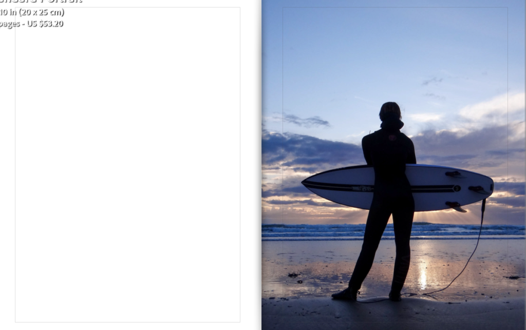
Here is the link to my photobook: Chasing Waves
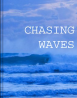
Here is the link to my photobook: Chasing Waves
Overall, I am very happy with how my project turned out. I feel as if my photobook really captures the feeling of the surf aesthetic and culture and demonstrates the bond my sister has with surfing.
Whilst making my photobook I overcame many challenges as at first I found it hard to put the photos in an order that flowed and told a story. I also found it hard to narrow down the images I wanted to have in my photobook as I originally wanted images from each shoot but sooner realised that the book flowed better once I had removed certain images. The book started to come together once I had managed to get the images in the order and layout I wanted. After completing the photobook I realised that the book told more of a story than I first thought. I personally think the final out come of my book is successful as there is a clear flow to the book as it consists of a range of images and layouts throughout. I made sure to keep the layouts simple but not repeat them too often to prevent the book being boring. I also think the way I have presented my images within the book links to the theme of surf culture and shows my sisters journey and passion for surfing.
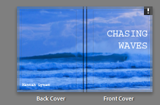
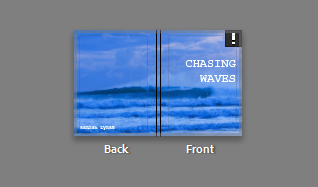
I decided to name my book ‘Chasing Waves’ because it is essentially what my sister does as she always wants to be in the sea surfing.
Mounting up my prints was time consuming, even though I had made mock-ups of how I was going to present my images, as I was very precise with the sizing and placement of my images to make them look professional. I decided to present all my images in a similar way on foam board and black card as I feel the simplicity of presenting my images in this way lets the images speak for them selves. When deciding what images to mount together I wanted them to all link together which is why I made mock-ups of how I was going to mount my images on photoshop. Overall, I am happy with the way I put my images together as I feel they all link with one another and present my sisters love for surfing.
I think that I partially realised my intentions when making my photobook once I had overcome the thought of needing to include images from all my shoots in the book. Whereas I 100% knew my intentions when mounting up my images as I had pre made mock-ups.
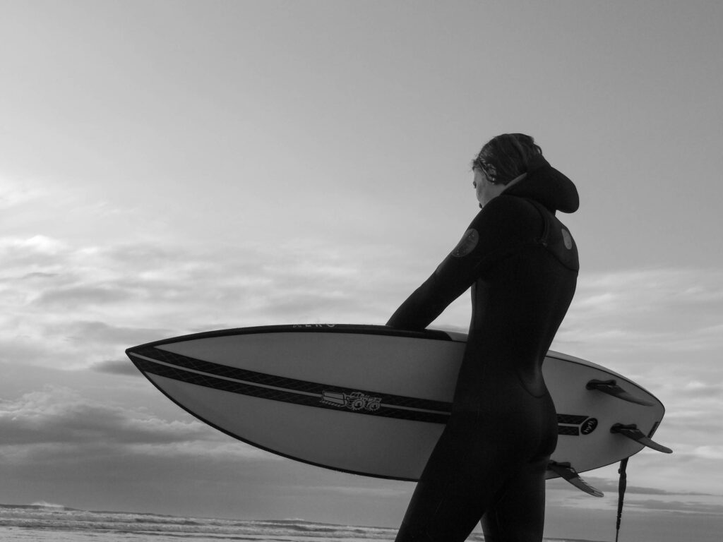
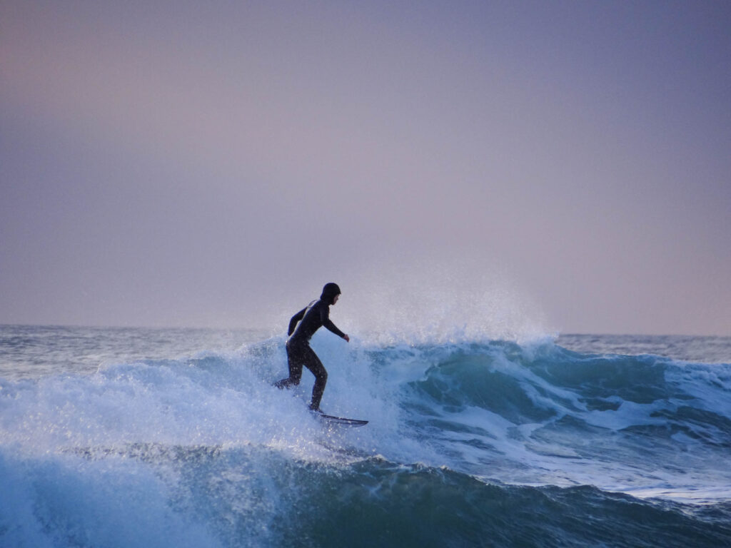
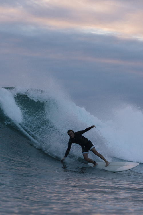
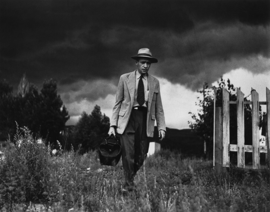
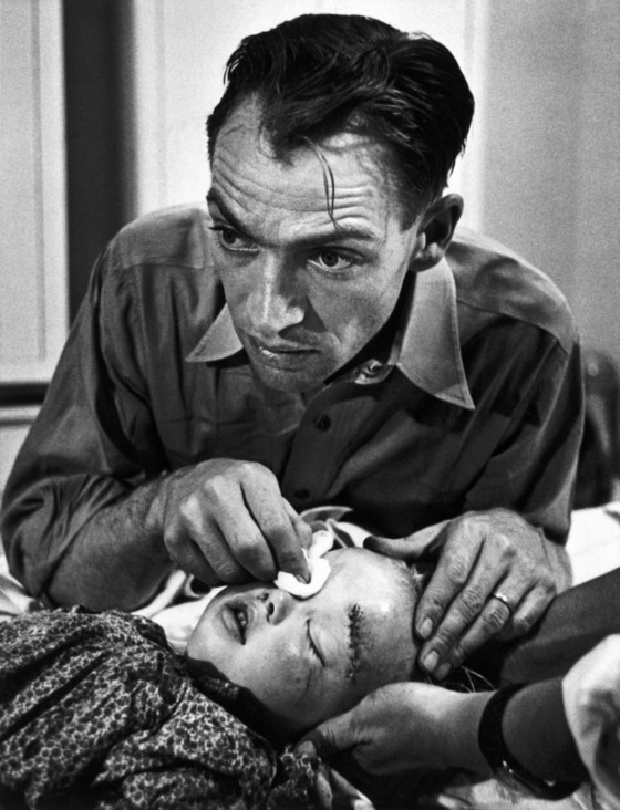
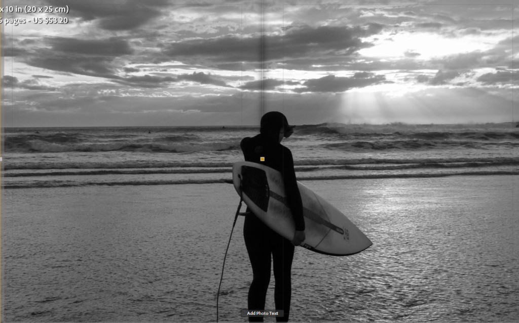
When I first started this project I struggled with finding photographer to link my work to. I found the work of Thomas Lodin and W. Eugene Smith and was inspired by the work they had done and wanted to used their ideas within my project. I think that I made good references to all my case studies in particular W. Eugene Smith. When studying ‘The Country Doctor‘ it was clear that Smith took a range of different images such as establishing shots, detailed shots, environmental portraits, formal portraits, observed portraits, relationship shots and person at work shots. I took this on board when carrying out my photoshoots and made sure that I also got a variety of different shots.
There were some connections to the work of my artist references but I feel as if I could of made more links to the work of Thomas Lodin if I had the equipment he used to take his in water images.
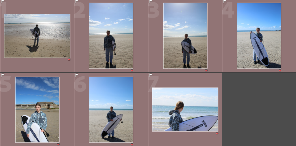
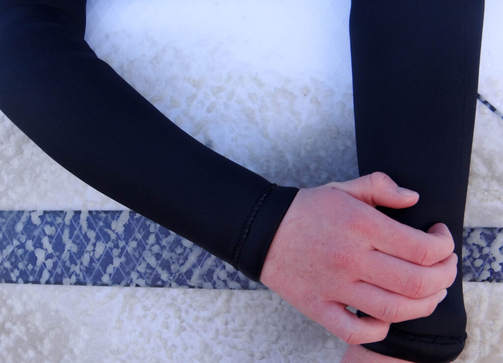
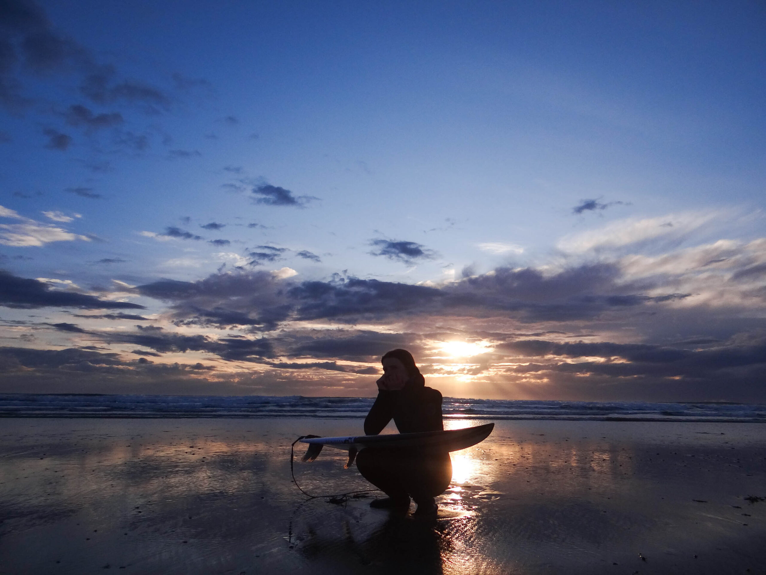
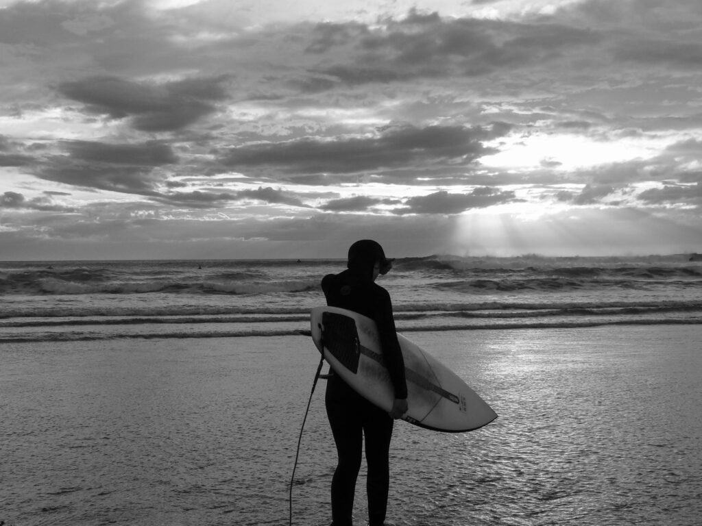
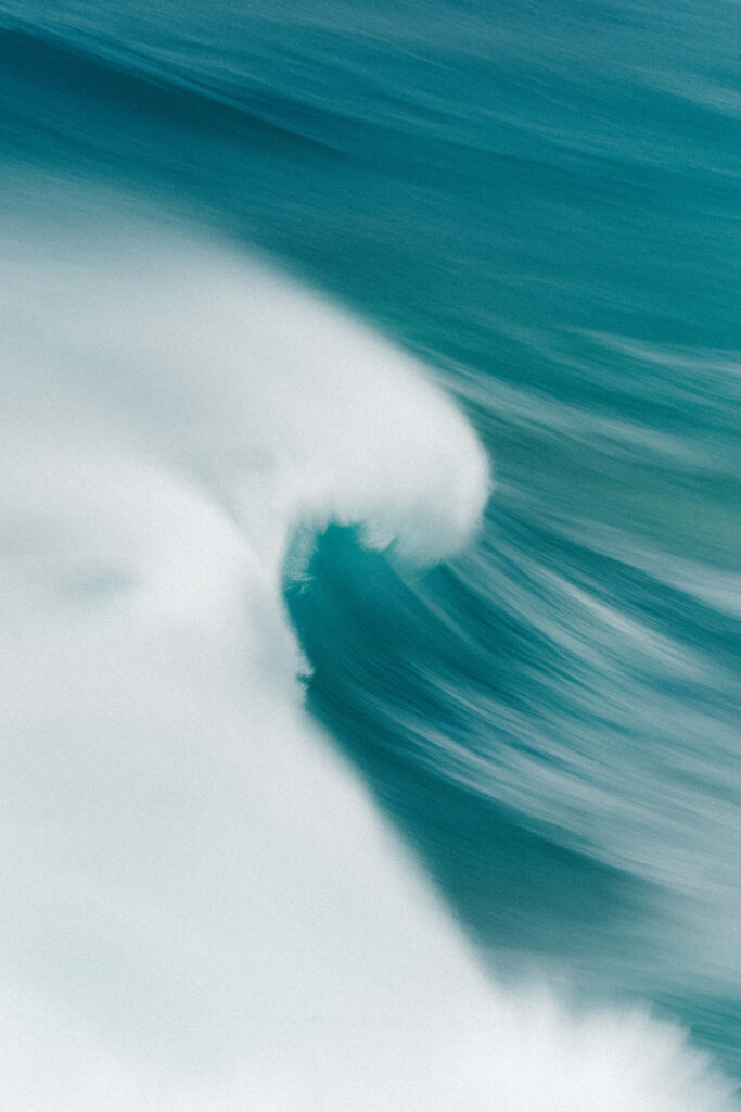
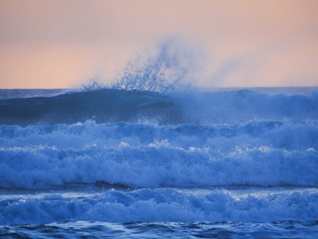
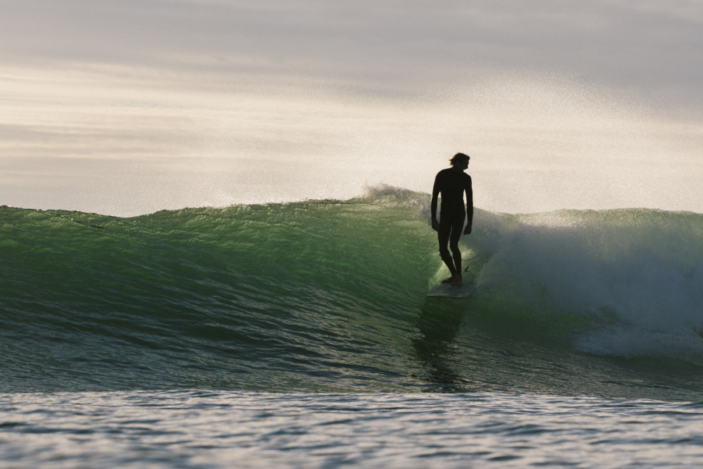
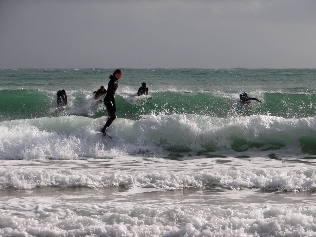
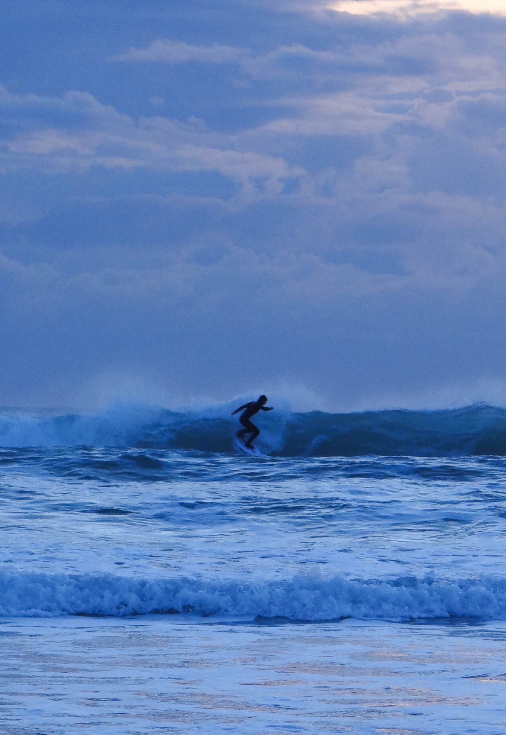
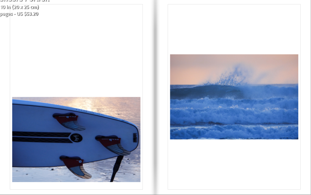
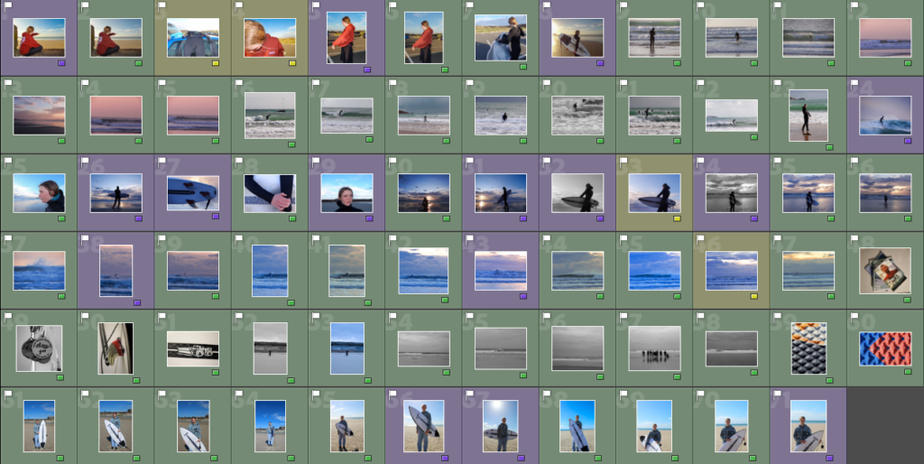
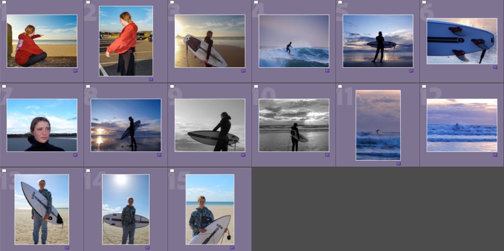
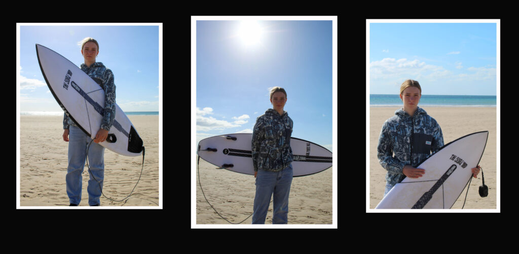
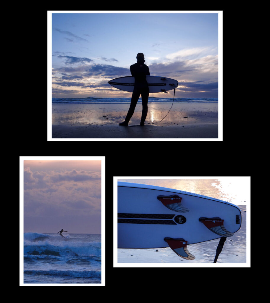
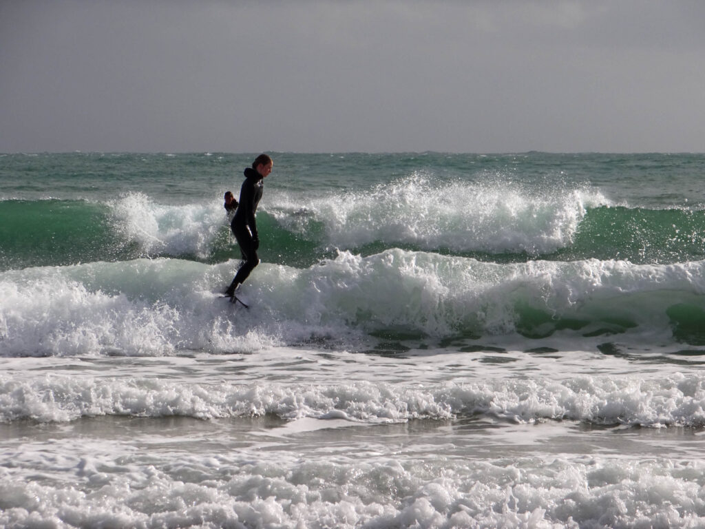
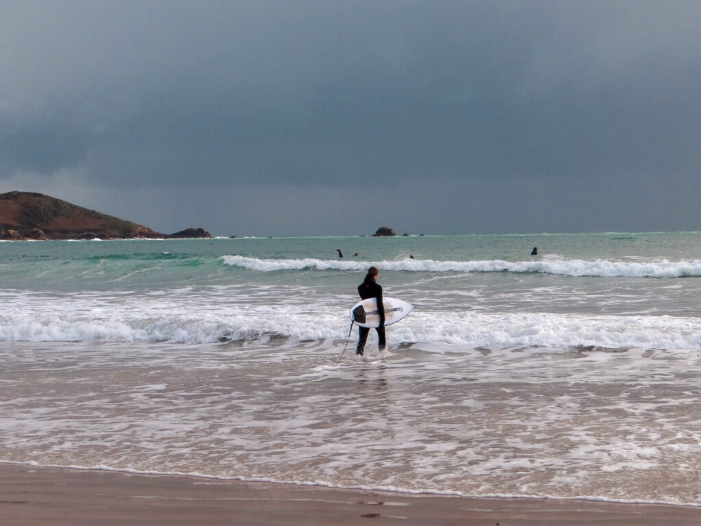
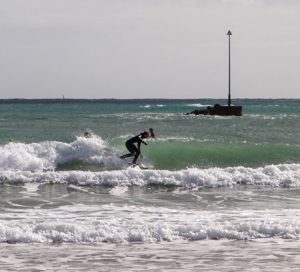
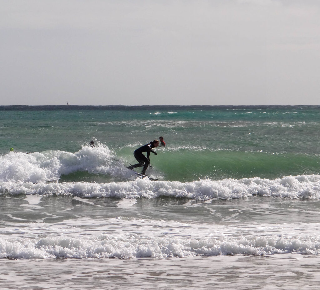
Examples of the different types of images I took
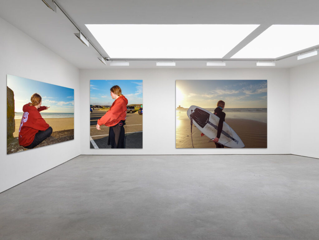
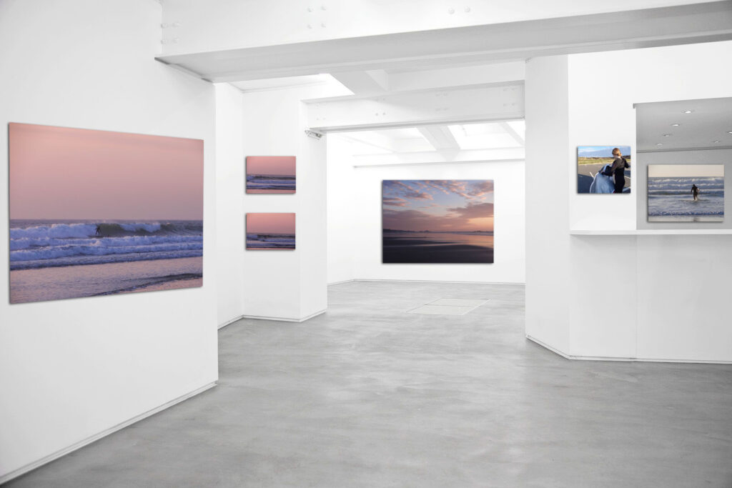
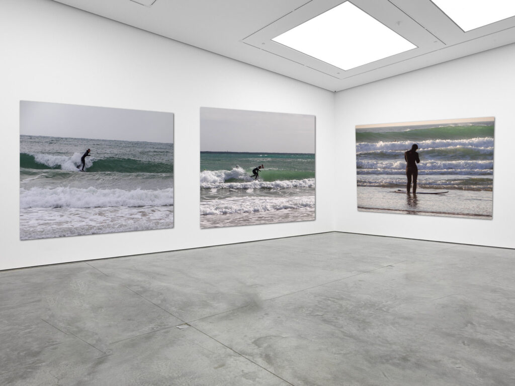
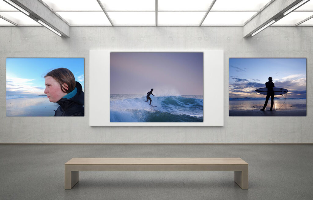
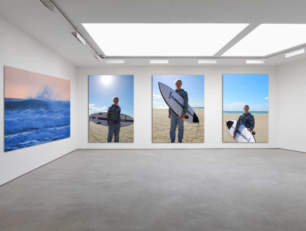
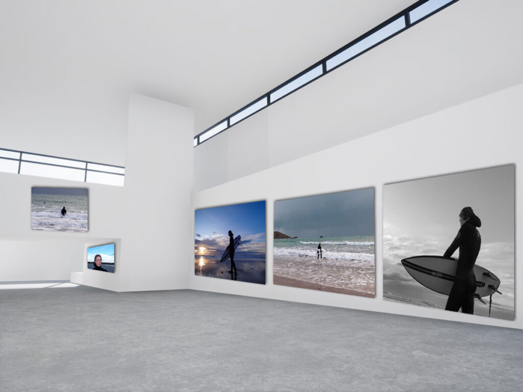
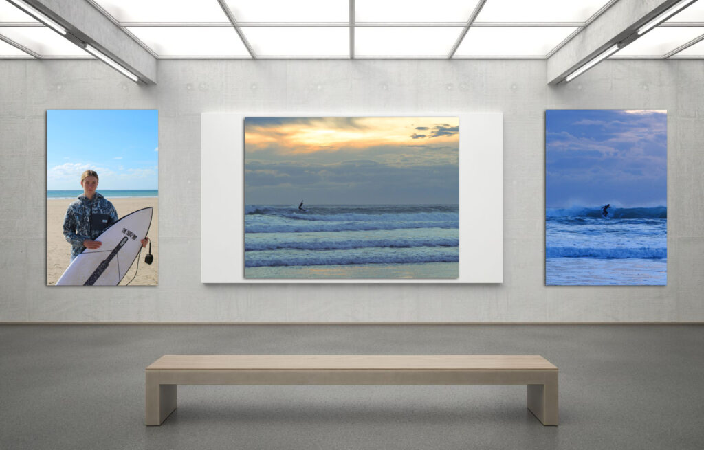
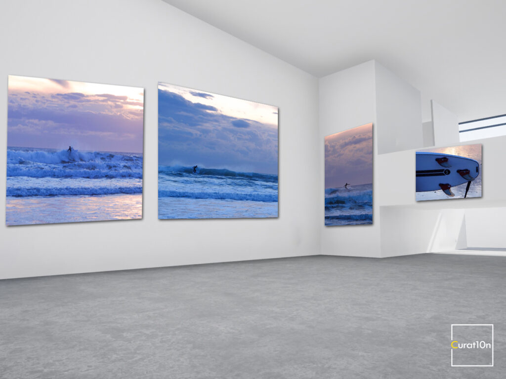
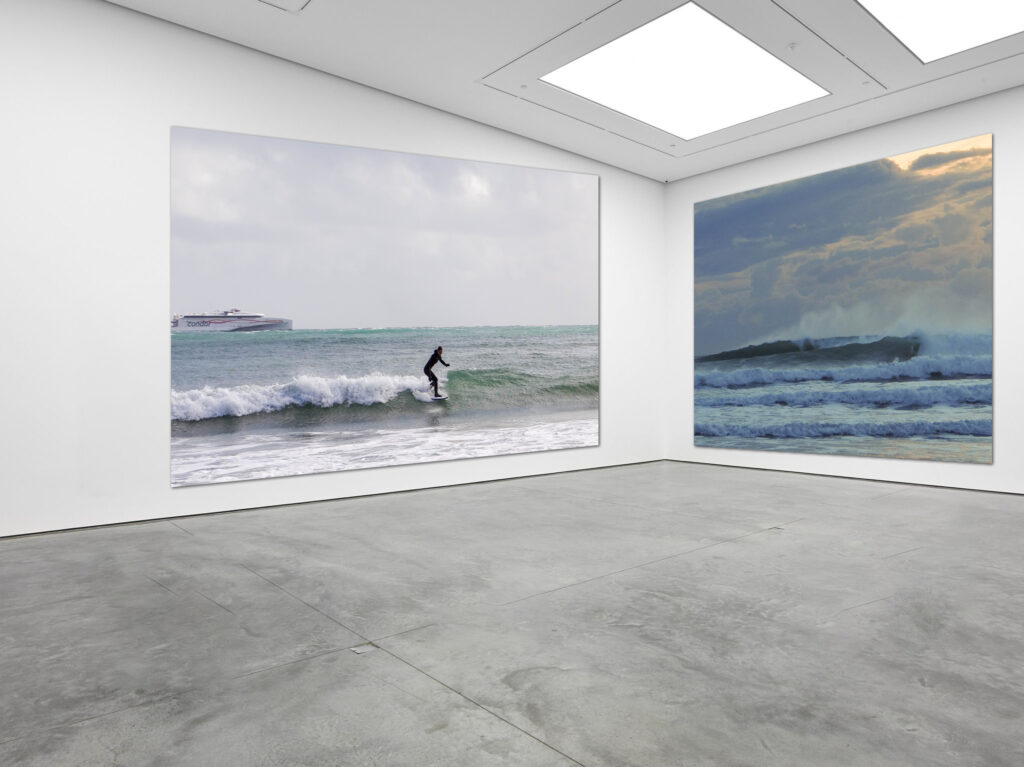
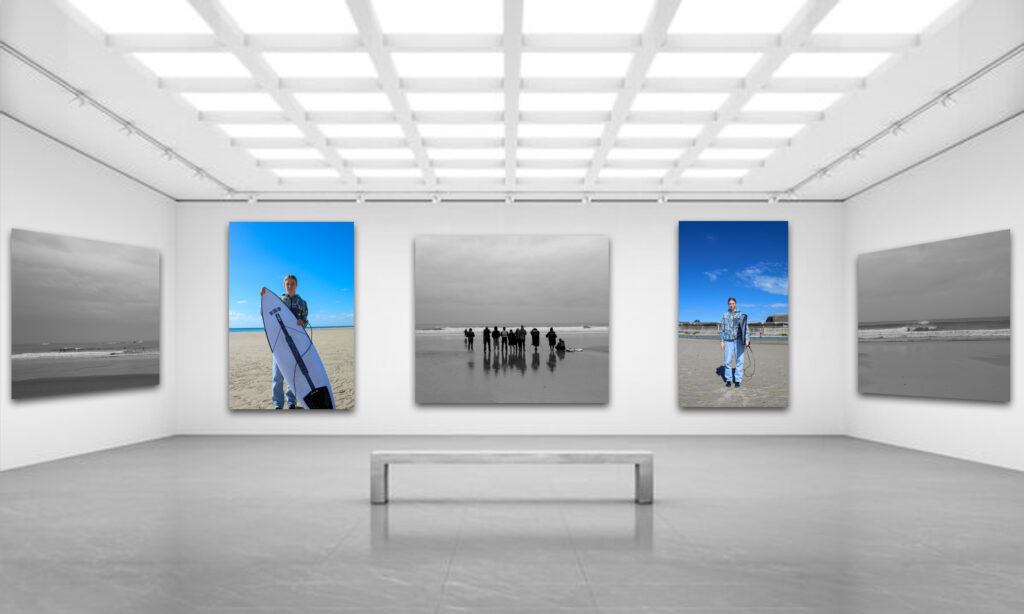
When putting together my virtual galleries I had to carefully choose where to place my images and what images I wanted to group together, similar to when mounting up my images. I tried to group images from the same shoot together as they had strong connections with one another. I also experimented by grouping images from different shoots together as they linked well and could tell a story when being looked at by the viewers.
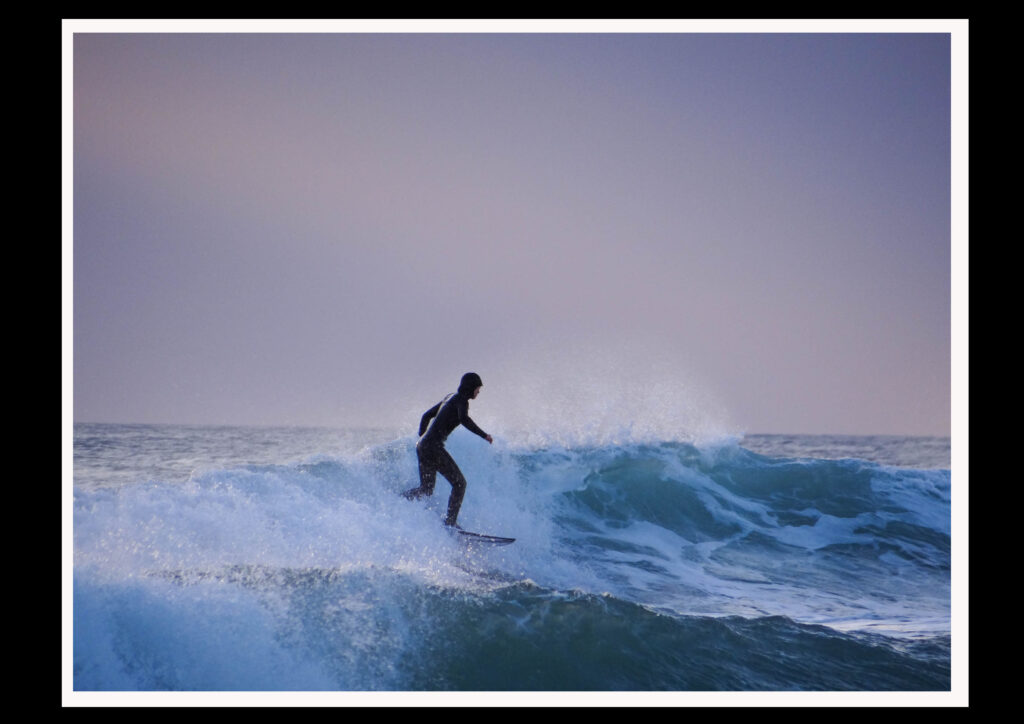
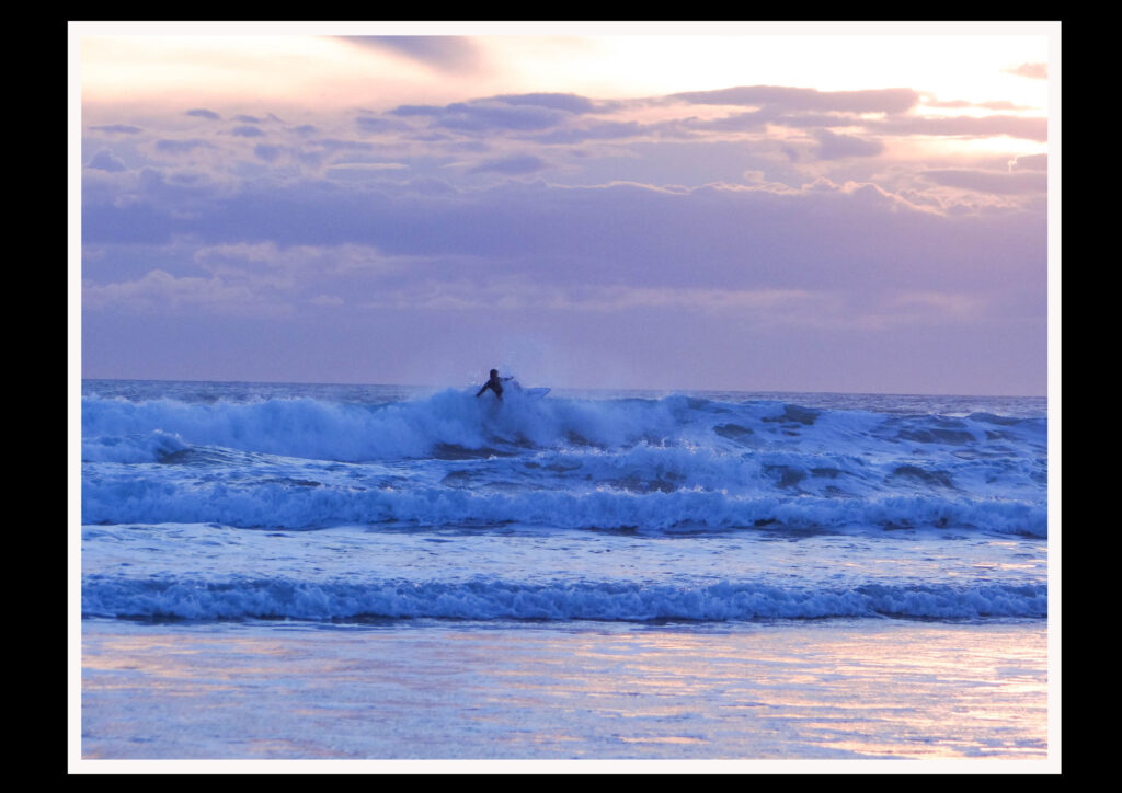
If I was to do this project again I would like to experiment with taking in-water shots to enable me to get more interesting and close up action shots. However, I do feel as my outcomes have been successful and that I have learnt a lot within the process of making my photobook. I surprised myself with some of my images as you don’t know if you’ve managed to get the shot you wanted when the surfer is on the wave until you come to edit them. Therefore I am pleased with the images I have taken and how I have presented them.
I think I managed to recreate the work of my case studies well. Although my images aren’t identical to my case studies work I have captured similar compositions.
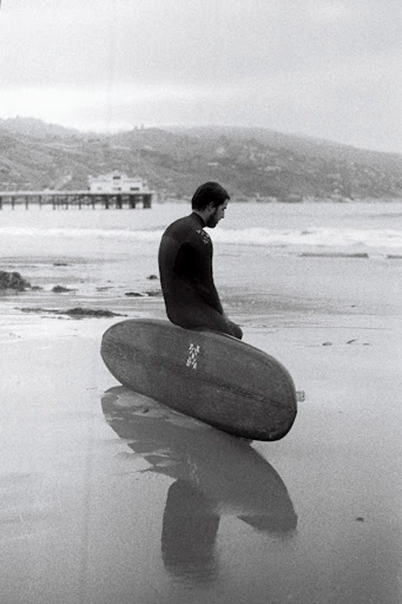
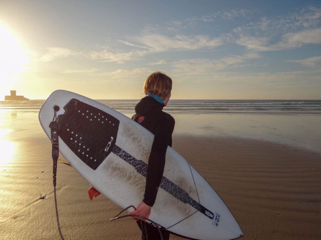
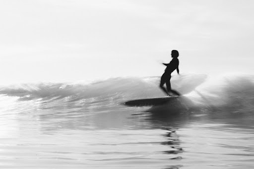
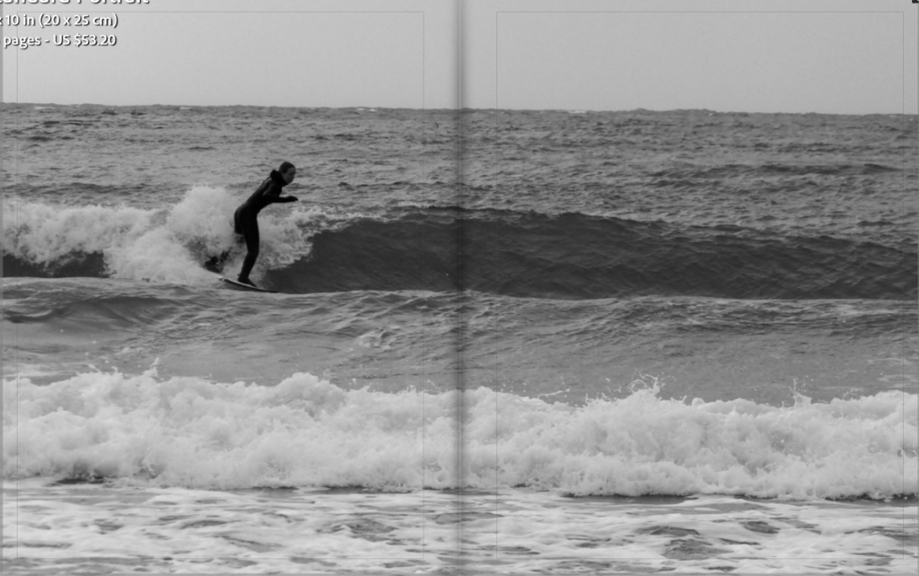
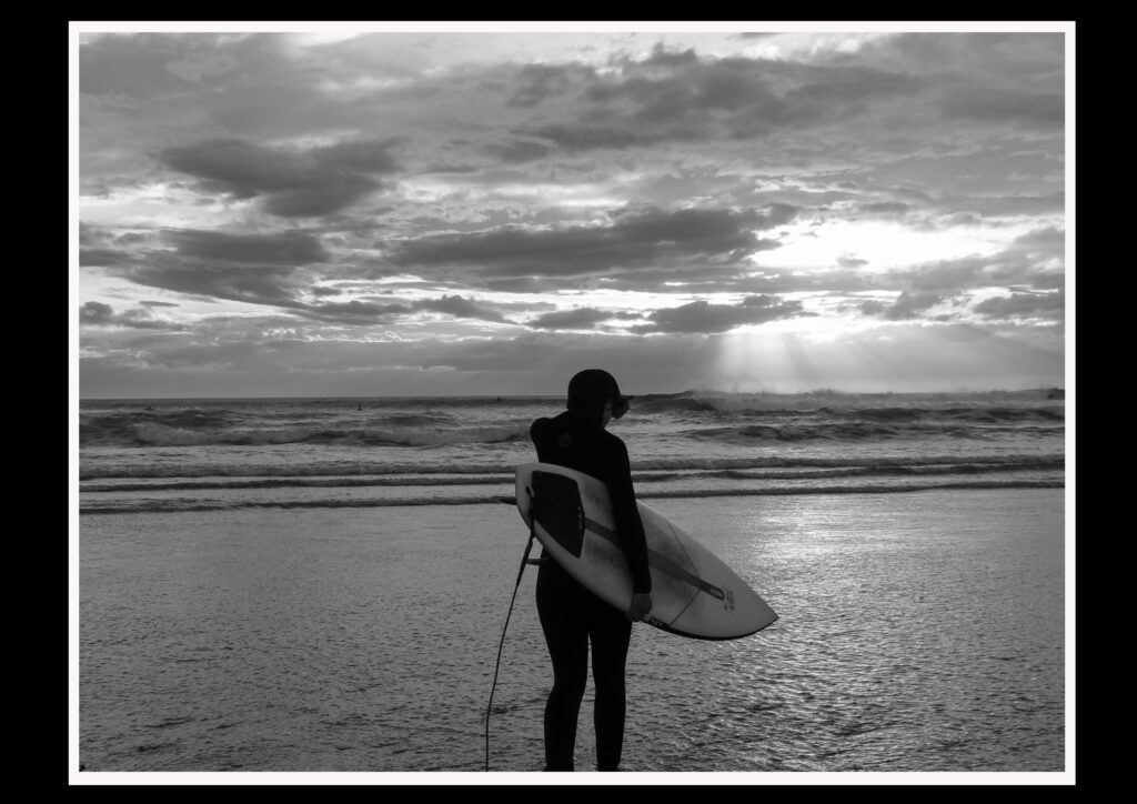
There are many similarities within this image such as the position of my sister however I took my image at a low down angle whereas Lodin took his image at a higher angle.
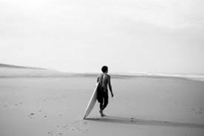
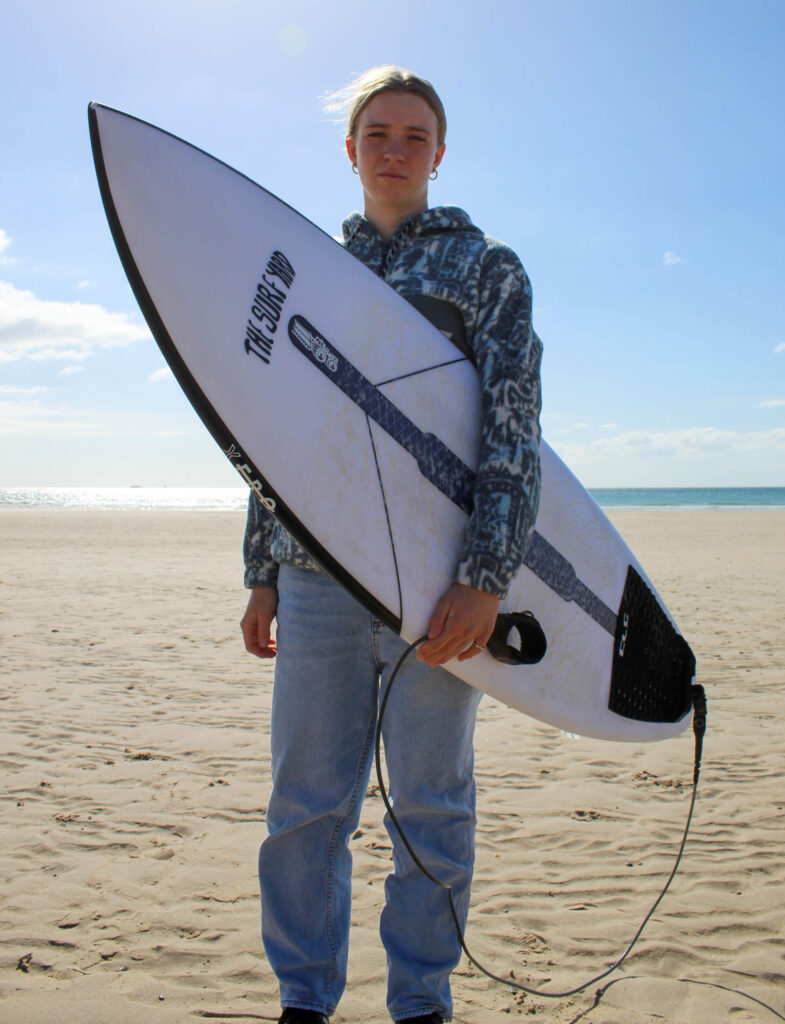
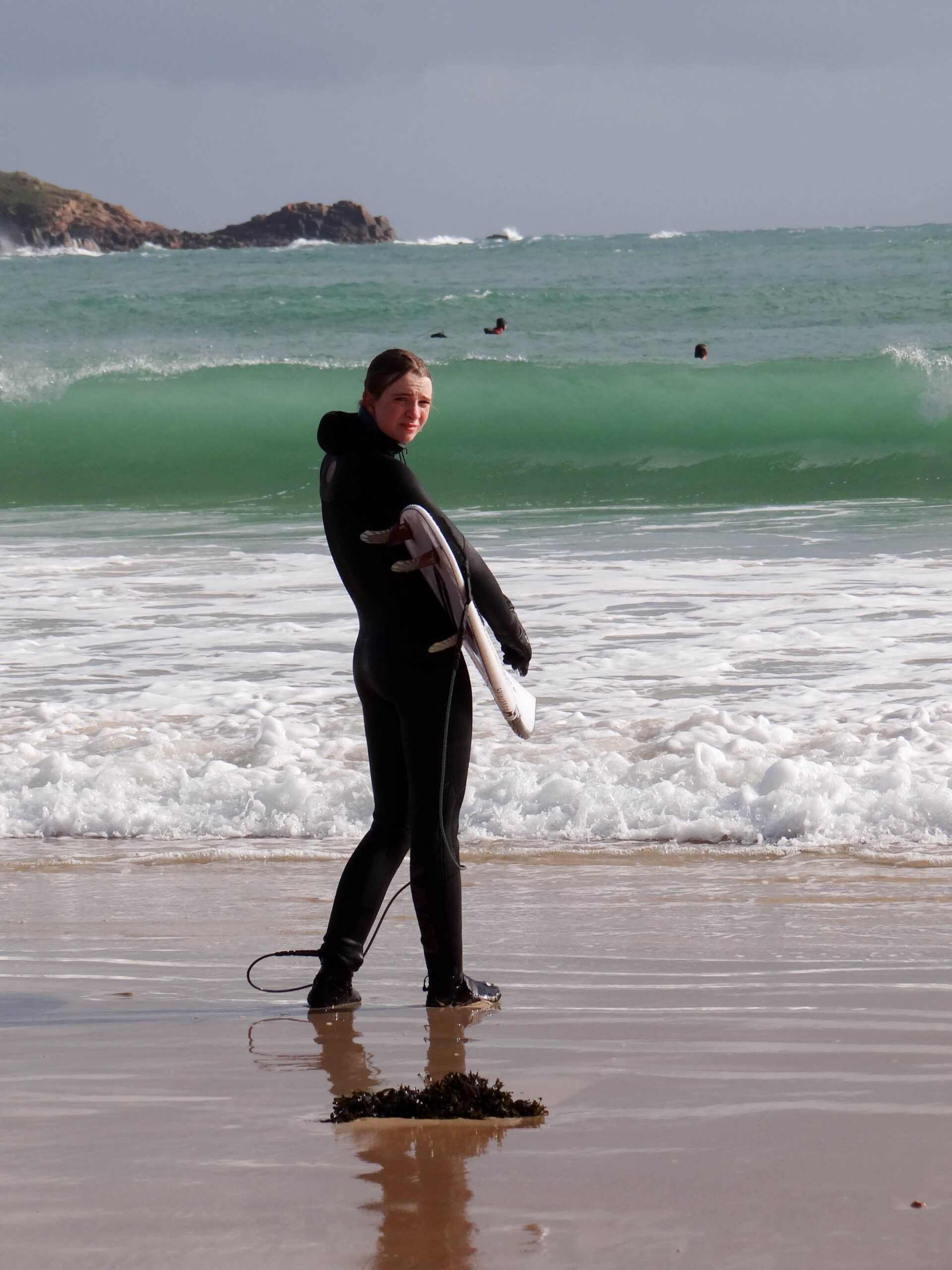
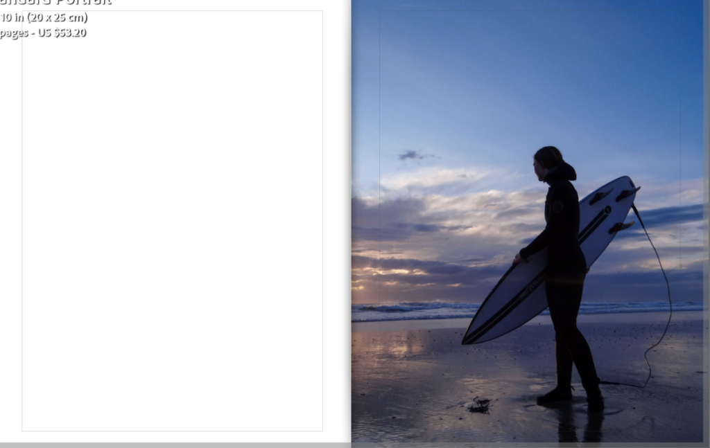
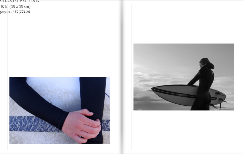
Personally I think both these images are very similar as they’re both walking out in tot he sea with their boards .The only difference would be that my image is more zoomed in than Lodins
If I took this image with a slower shutter speed, it would of come out more like Lodins where the water and wave looks more smooth.


Both these images would be classed as close up shots and both demonstrate two very different people both focusing on something they love weather that may be looking out at the waves or doing your job helping people on a day to day basis.
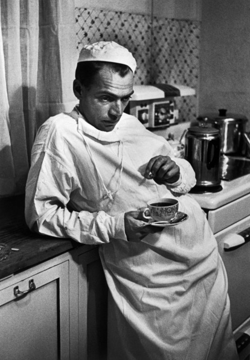
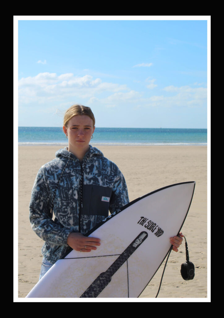
Both of these images composition have the subjects in the left third. They are both looking at the camera and carrying out casual poses. Even though this image wasn’t on of my strongest image I wanted to use it to show the similarities between my work and Eugene Smiths.
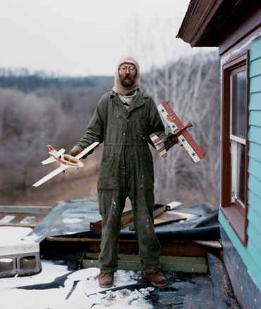

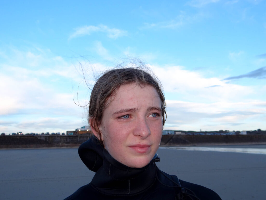
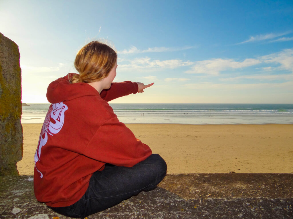
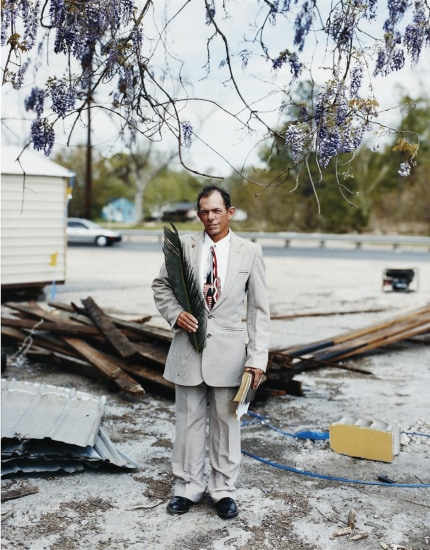
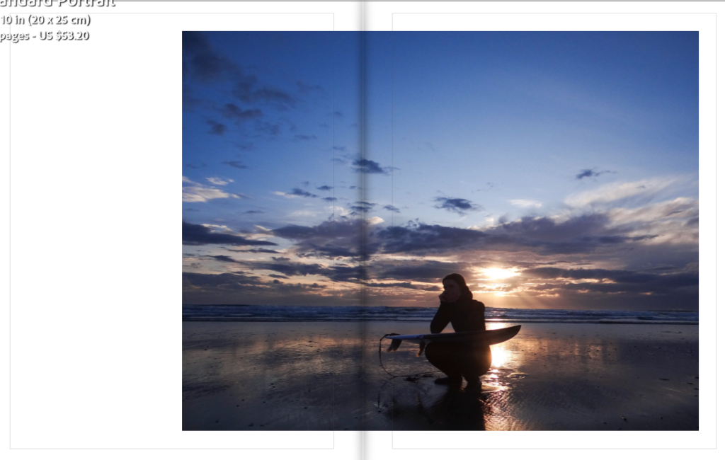
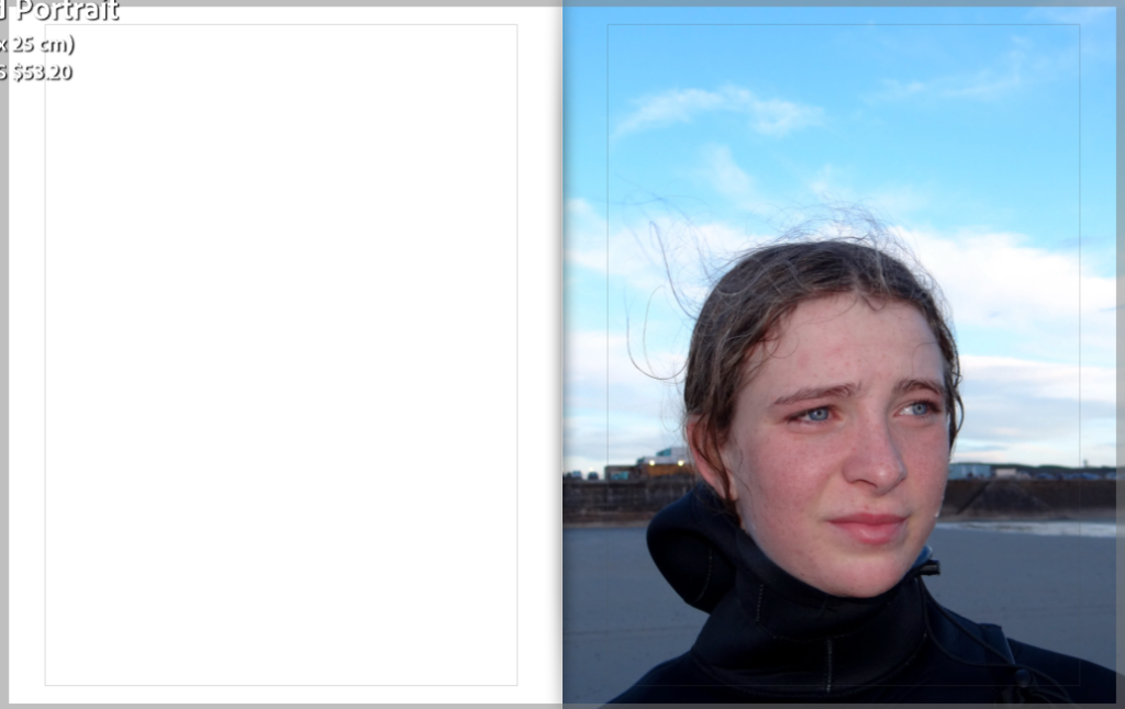
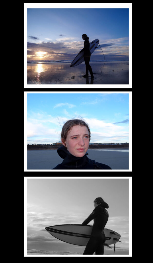
I wanted to take some environmental portraits based off of Alec Soths work. I think I have captured the style of Soths work well as I captured my sister in her ‘natural habitat’. Both these images compose of the subject in their space, looking at the camera.


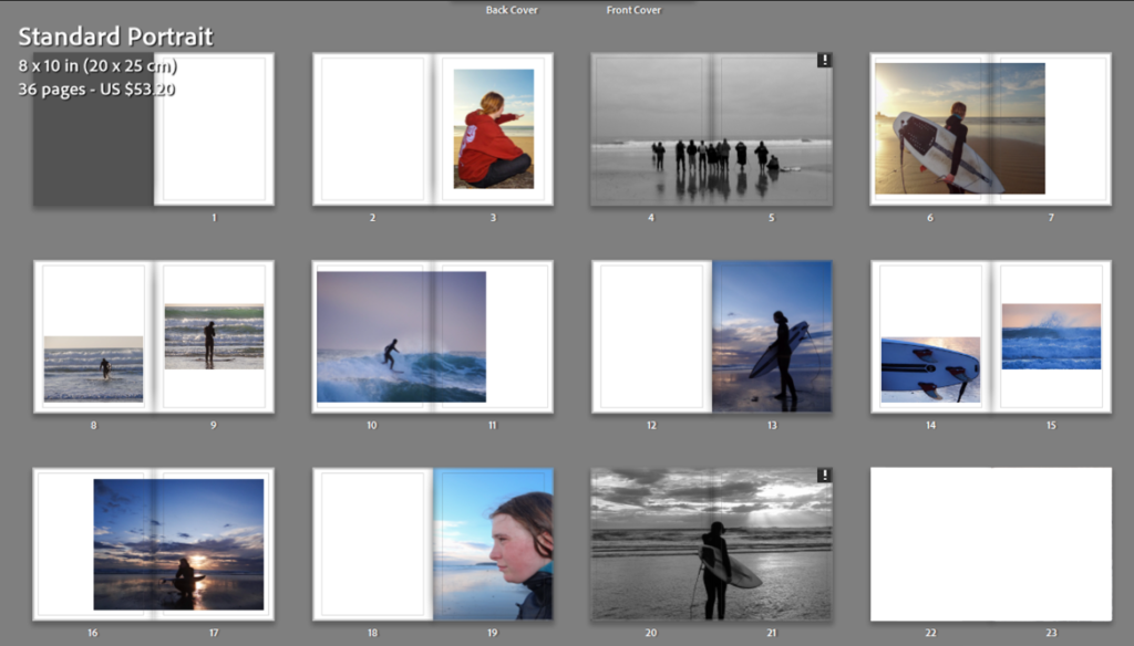
Overall I am happy with the final result of my photobook. I made sure to tell a story/ ‘day in a life’ of my sister surfing by presenting my images in a certain sequence. I also managed to portray the surf culture with the variety of layouts that I used keeping the designs simple.
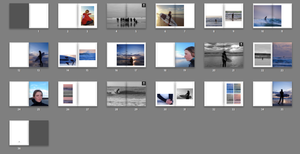
I started by placing my favourite images on each page, using ‘1 page’ layout designs to keep it simple as I was unsure on how I wanted to lay my images out on each page. Once I had the images I wanted I started to experiment with the page designs by adding more than one image on the page and using double page spreads.
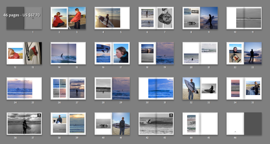
This is my first layout for my photobook. I wasn’t happy with it as it had too many images which made the book feel crowded and busy, which doesn’t fit the laid back approach the surfing community has. I also felt that the book didn’t flow or tell a story as too much was going on with random images placed. I decided to copy this book layout in Lightroom and adjust it to something I was more happy with.
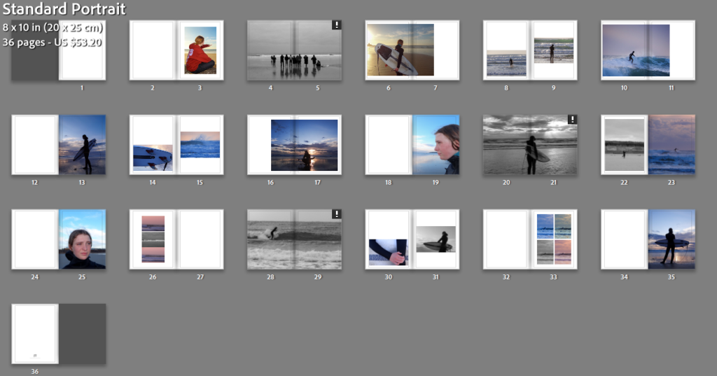
I began by taking out the pages and images I thought were didn’t fit in to the story I was trying to tell or that were irrelevant. Once I had narrowed down my images I started to rearrange the order/ sequence of the images so they told more of a story. I experimented with various page designs until I was happy with how the book flowed.
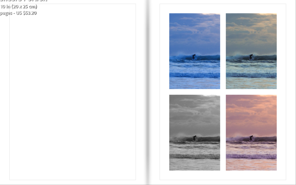
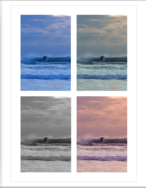
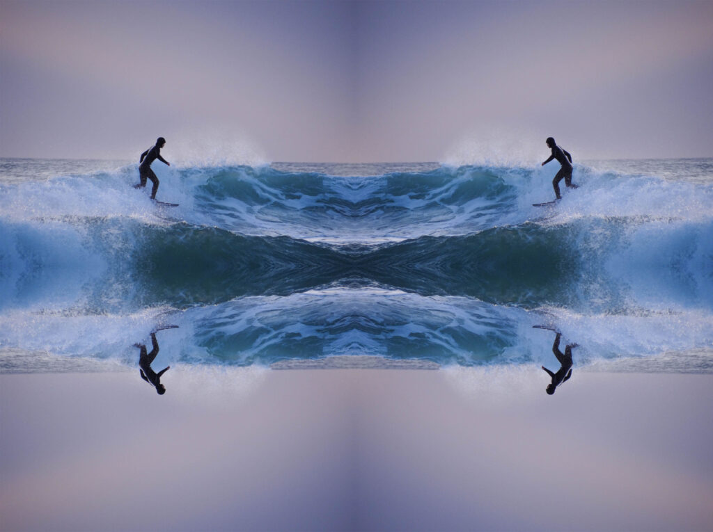
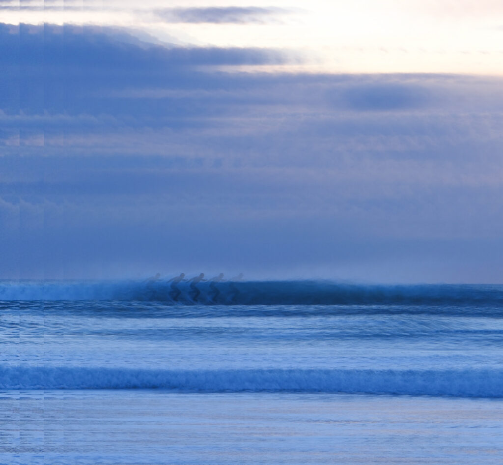
I created some abstract images in the book, while experimenting with various layouts. An example of this is where I used the same image but changed the temp and tint on Lightroom.
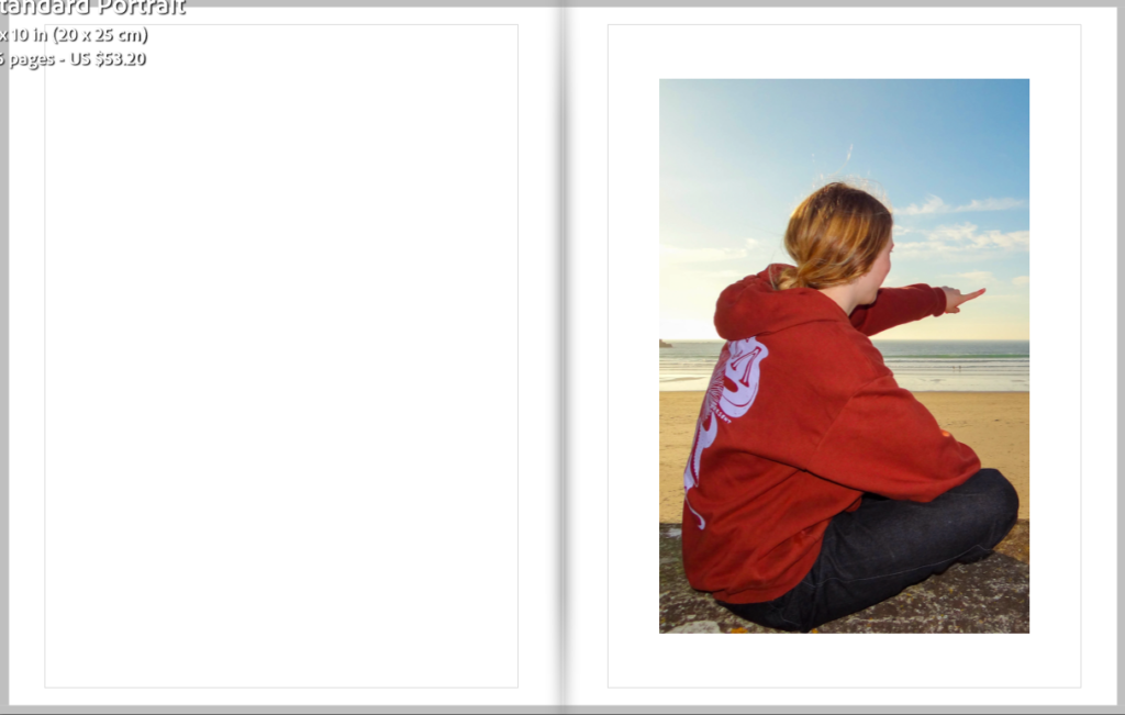
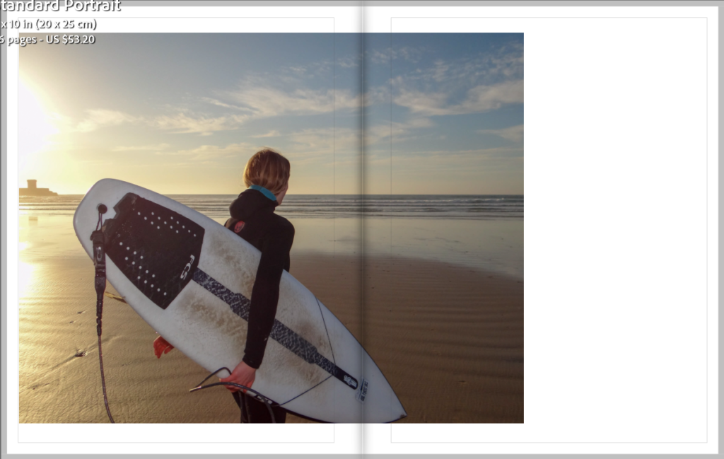
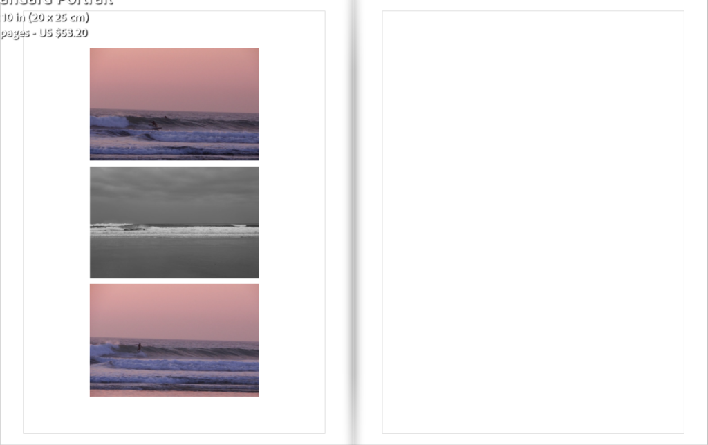
I chose to create pages with a single image on it with a blank page next to it to break the book up so it didn’t get too bust like my first design. It also demonstrates a break in the surf as there are times when you’re waiting for the next set of waves to come.
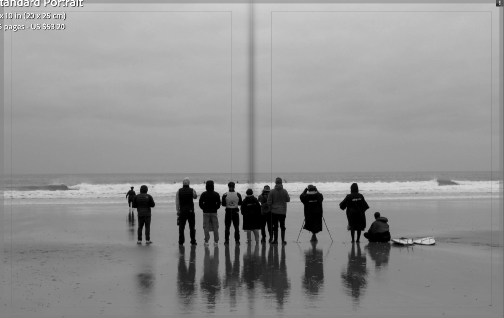
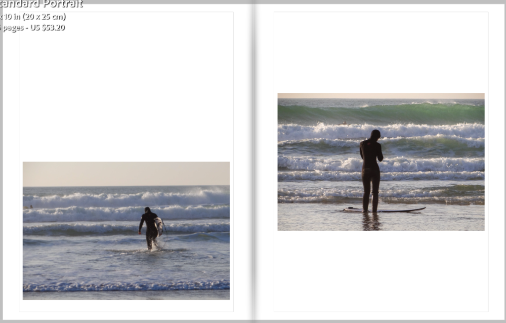
As well as having pages with multiple images on it I wanted to have some double page spreads as they are simple but effective which links to the surf culture of having a simple life.
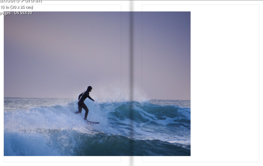
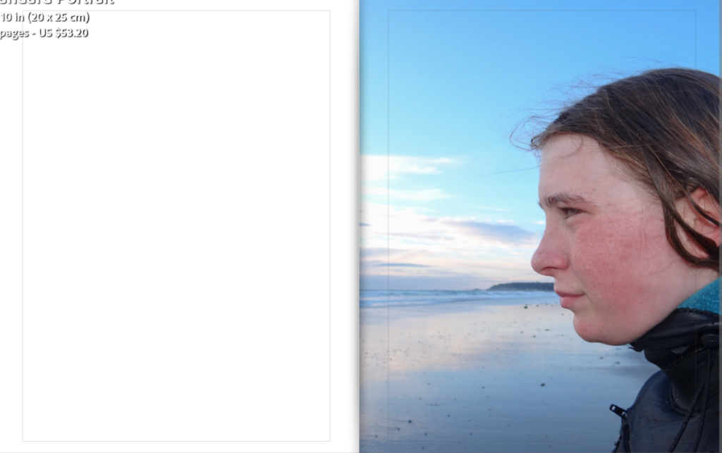
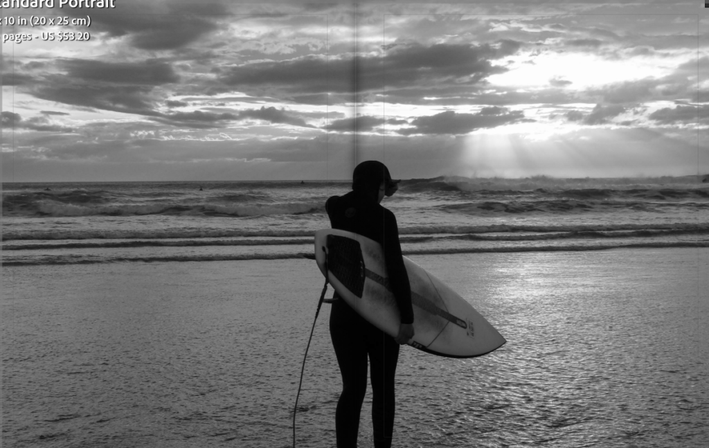
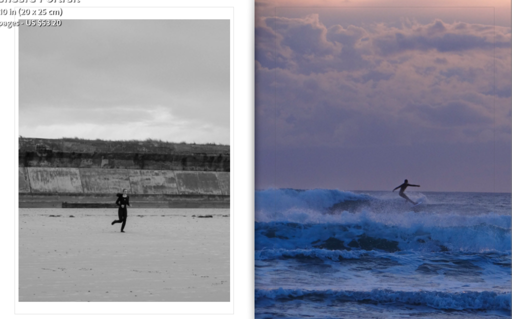
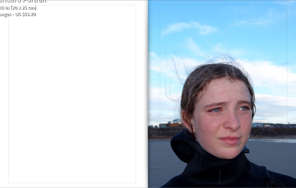
The book tells the story of my sisters day when she surfs. Pages 1-21 demonstrate her first surf of the day.
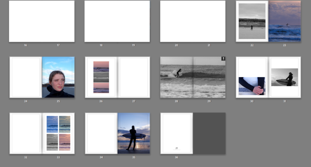
Pages 22-36 demonstrates her second surf.
When choosing the order of my images I had to make sure they suited on another and flowed together to prevent the book looking like a mess of random photos.
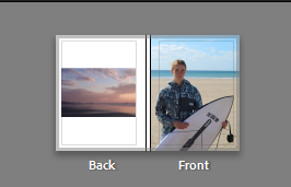
I have put together some ideas for how I am going to present my printed images in photoshop. I have kept images from the same shoot together as I feel as they suited each other best. I have decided to present my images on white foam board before placing them on black card.
Images for print

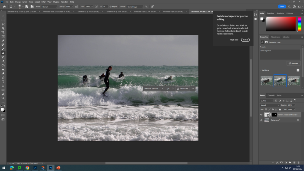
I tried to use AI to remove the people behind my sister but non of the options did it.
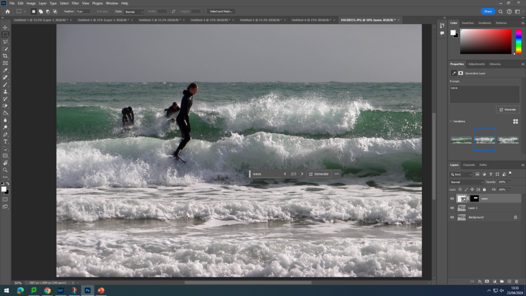
I tried to sue a different command word and I managed to get closer to what I want the final out come to be.
In the end I manged to remove 3/4 people so am happy with the out come.
I also used AI to remove the people in the background to make my sister the main focus of the image as the background objects took away the key focus.

FINL IMAGES


Basic edits
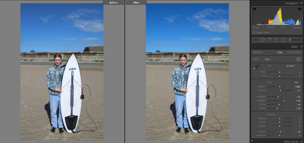
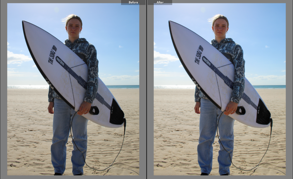
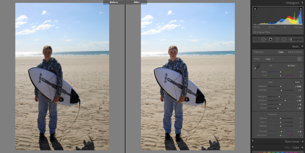
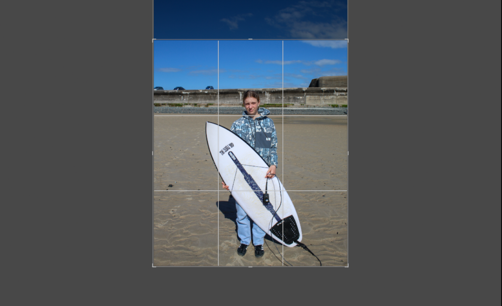
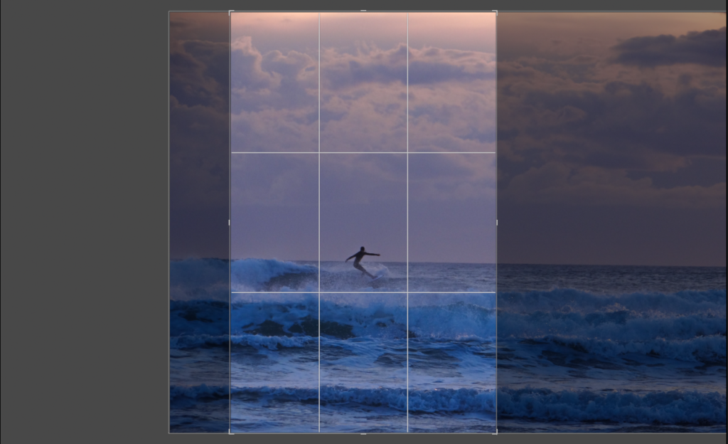
Some of the images were too top heavy or had too much empty space so I cropped them.
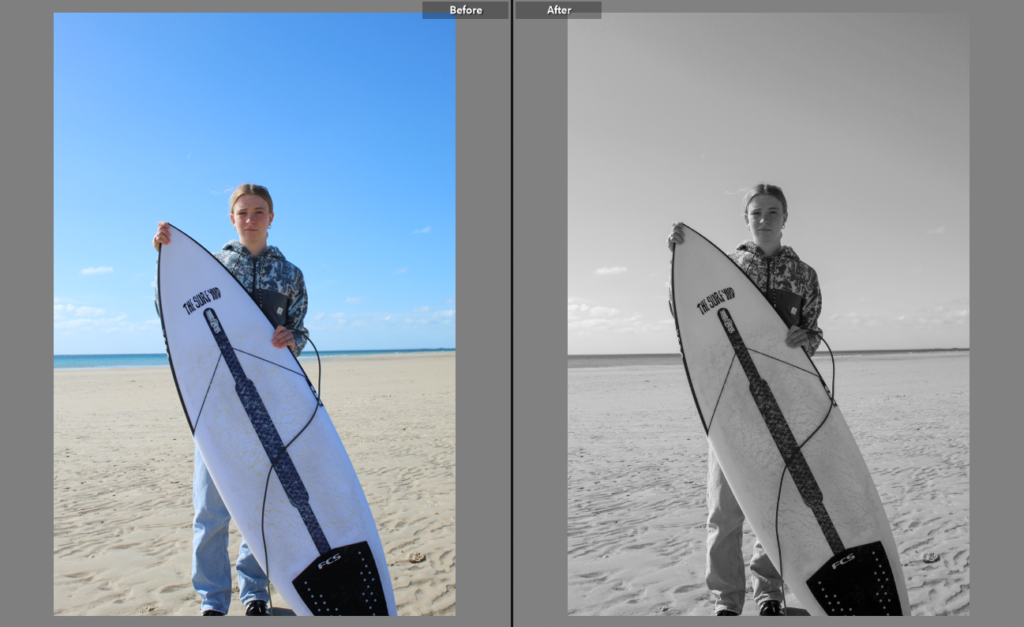
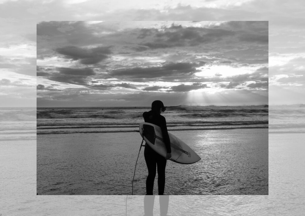
I experimented with putting some of the images in black and white but decided that they looked better in colour.
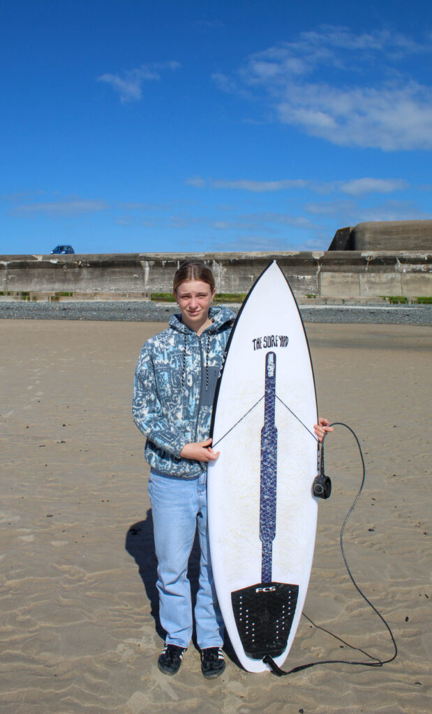
final images
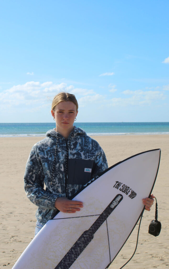
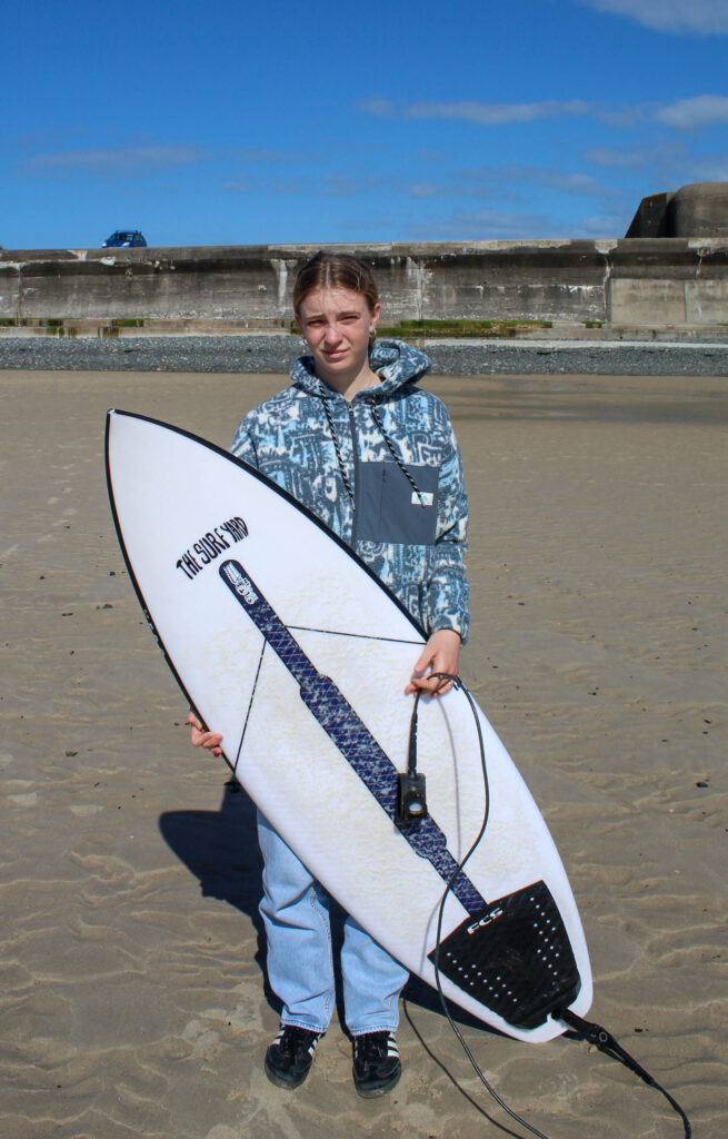

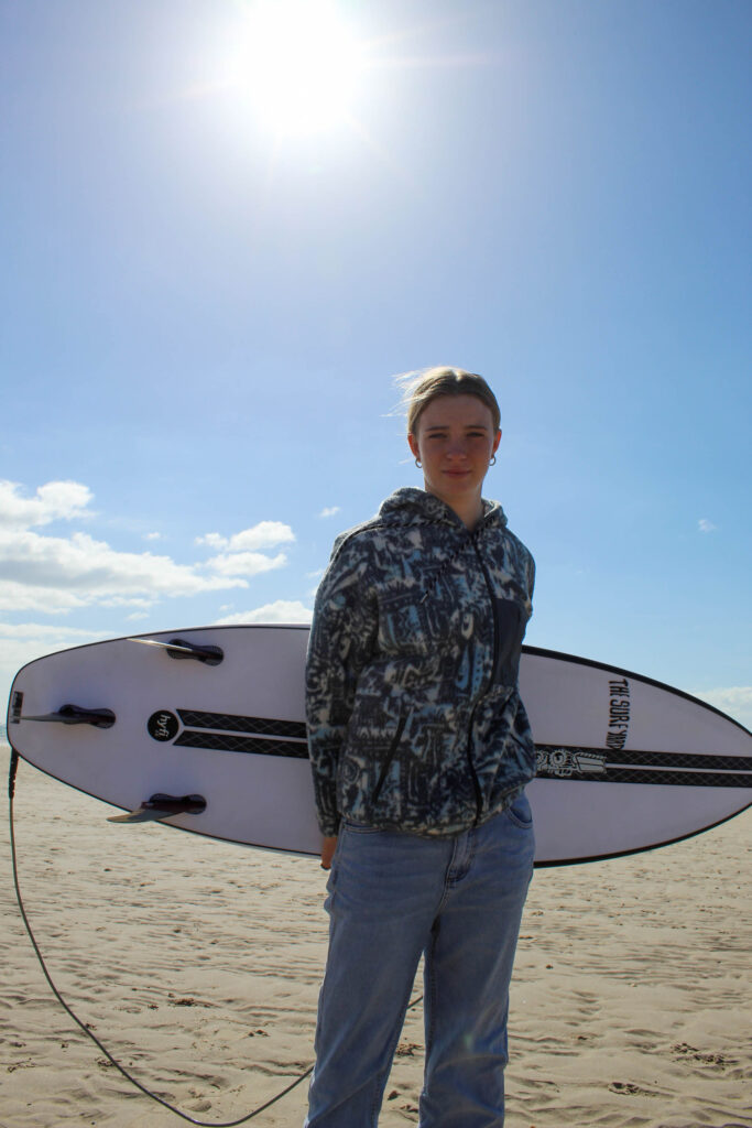
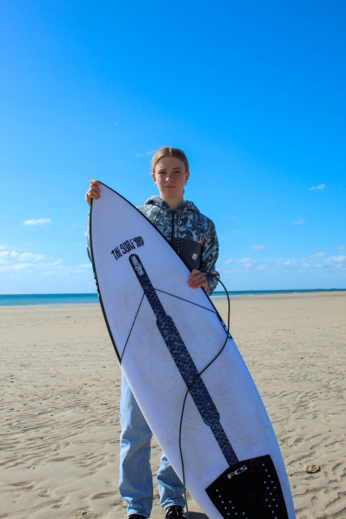
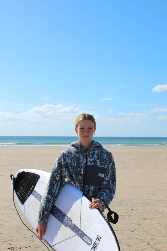
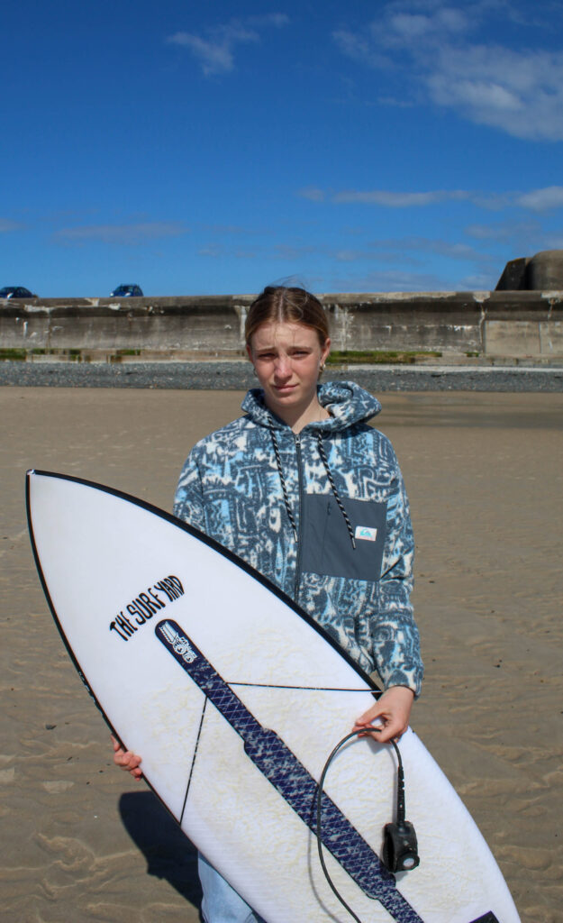
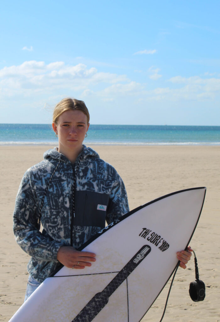
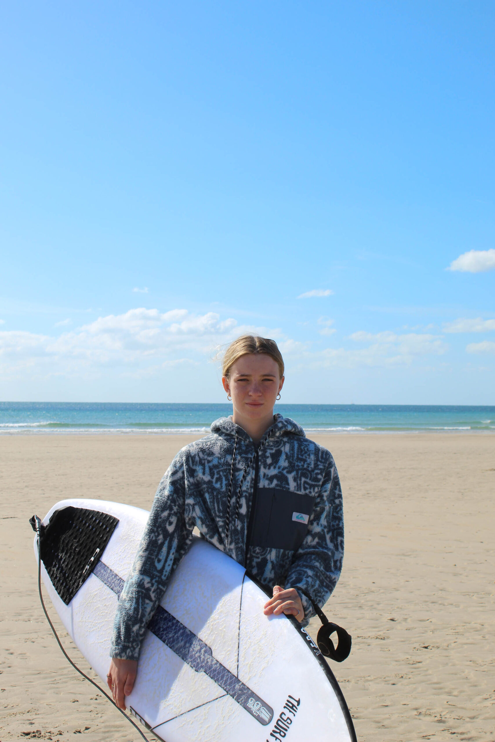
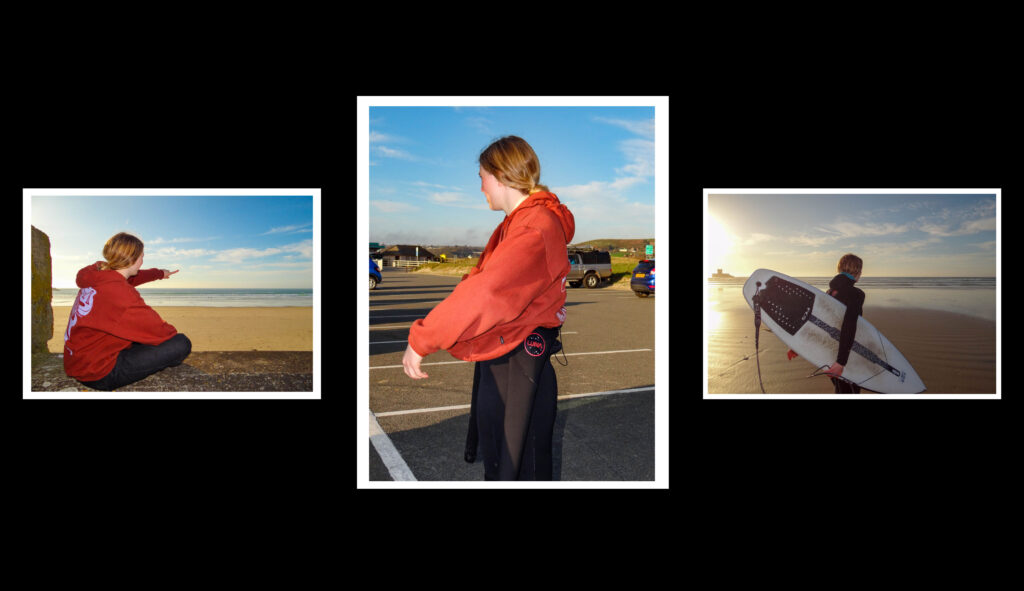
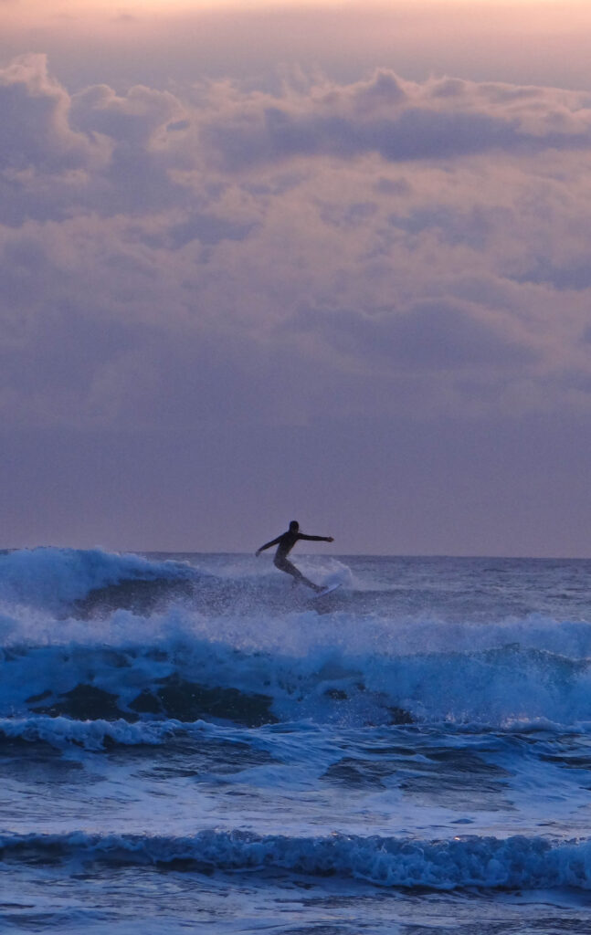
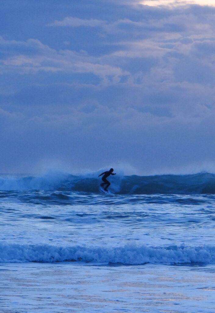
I took these images at St. Ouens bay as I wanted to take some environmental portraits to give me a mix of images that I can add into my book.
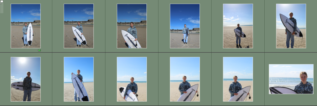
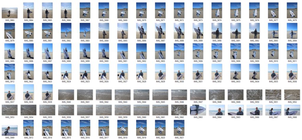
Contact sheet
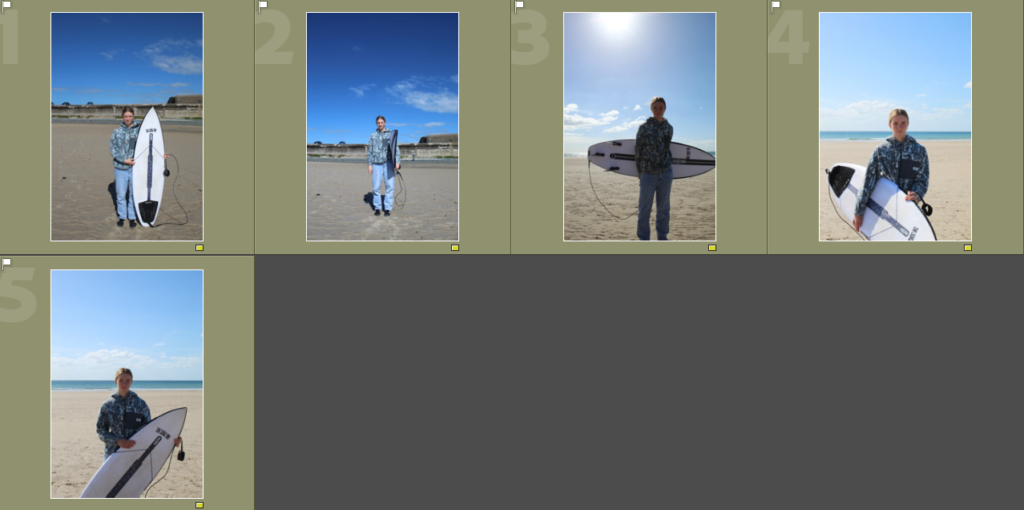
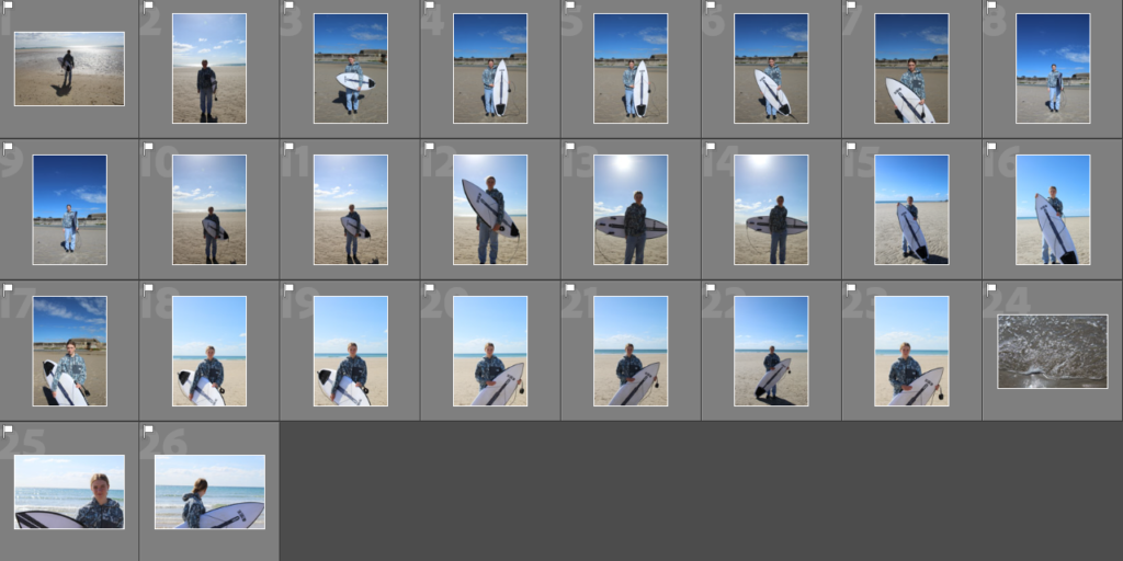
Flagged images
Rating my images