This is a link to an online copy of my book: The Essence of Woman
All posts by Hannah Fernandes
Filters
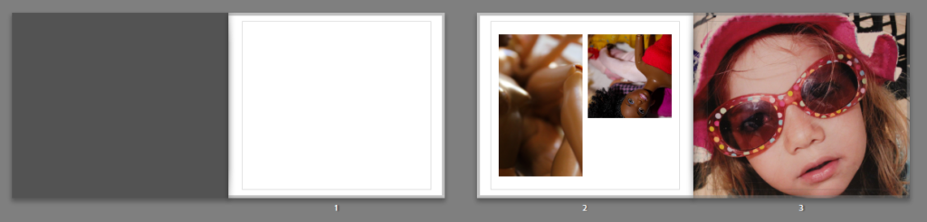
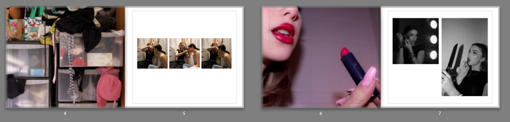
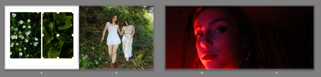
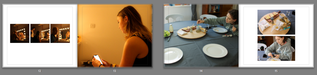
Photobook final layout
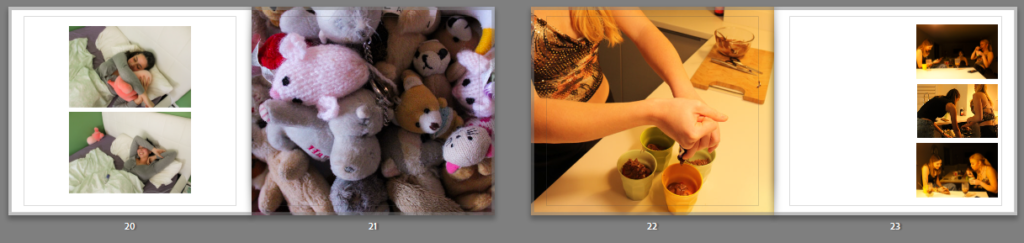
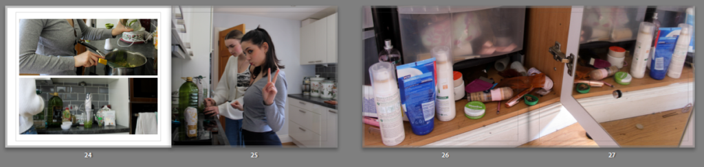
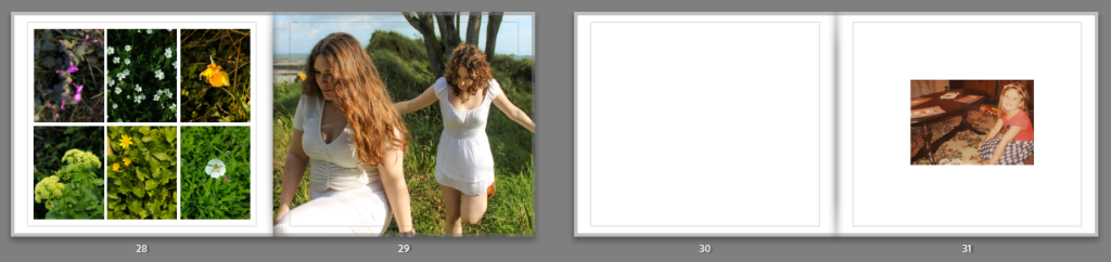
This is the final design of my photobook.
The process of making my photobook was straight forward as I am familiar with the software through making a photobook in the previous project of ‘Nostalgia’. I imported images to edit through Lightroom from my numerous photoshoots, in addition to a few archive pictures I have used in order to portray this idea of girlhood I aimed for, leaning into a nostalgic element from the previous project.
Once I had finished editing my images I simply added my favourite and best outcomes to a collection set which I then used to form the book. Using the templates in the settings, I added in my images to start creating the book. From then on it was easy to complete the book.
I believe my project has been successful, and I have created some strong outcomes for the theme ‘Observe Seek Challenge’. Taking inspiration from artists like Justine Kurland, Tom Wood, Nan Goldin. I have successfully produced an outcome which reflects the perception of femininity and girlhood like I wished. My photobook shows evidence of this outcome.
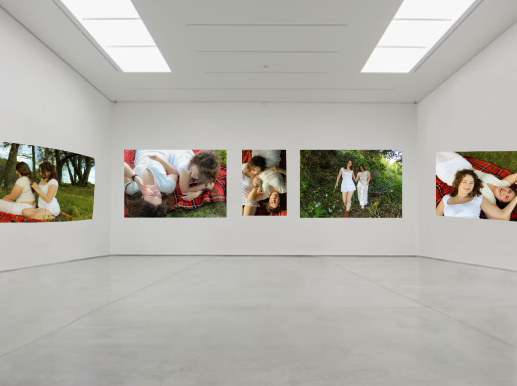
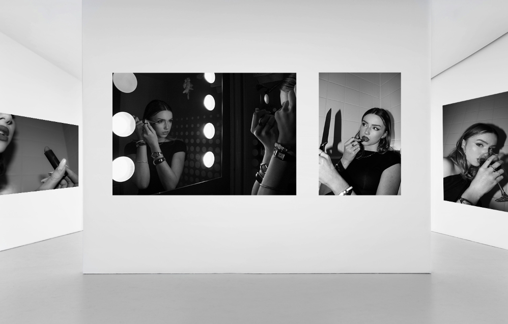
Virtual gallery
I’ve used photoshop to create a virtual gallery. Using the distort tool to fit some of my best outcomes onto and image of an art gallery. This is to show how I would present my final images from this project in a real life gallery.
PRINTS: Final outcomes + presentation
I have selected some of my final images to be printed so that I can frame them. This gives me another physical outcome to provide evidence from this project. These are the photos I have selected:
I have used photoshop to help me plan mock ups of how I want to present my images when framing them. I have organised this into a series of 3 total mock ups.
1
For my first sequence, I have chosen to put these photographs together (one A4 and one A5). I think the compliment each other well and are from the same photoshoot. I will put each photo on an individual piece of foam board, and then use an additional piece of foam board to combine them.
2
I really liked the idea of this photo as a stand alone image. So I have printed it in A3, and will be framing it as a window mount.
3
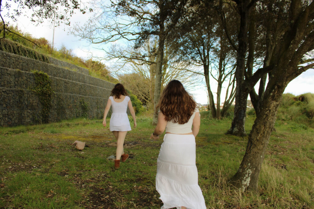
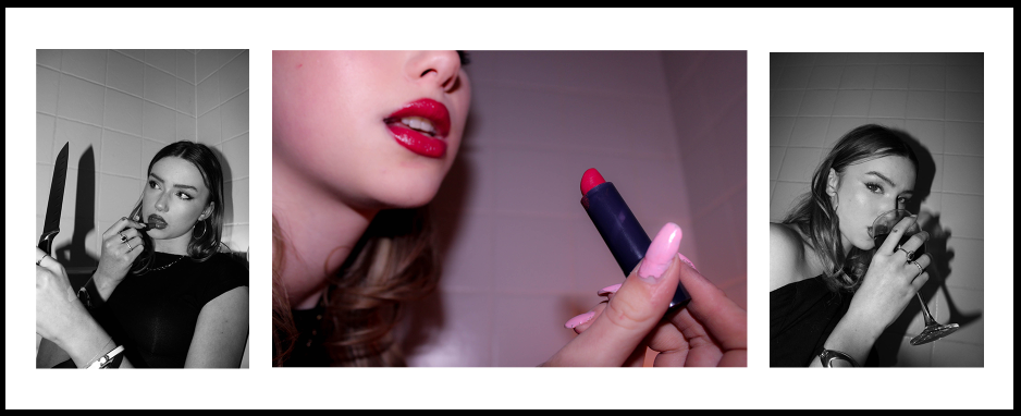
Finally, I have then chosen to put these 3 images together in a sequence as they’re all from the same shoot and compliment each other nicely. This is a combination of one A4 image (centre) and two A5 images (far left and far right). I like the contrast between having the pop of colour in the middle opposed to the two black and white images. The centre image is less focused on the subject, which breaks it up between the black and white portraits. I think this is a strong sequence as they all contain the subject using props, adding to this theme of femininity and what objects are associated with that.
PHOTOBOOK: Concept + Narrative + Design
NARRATIVE
What is your story?
Describe in:
- 3 words
- Girlhood and femininity.
- A sentence
- Creating documentation of what girlhood is through exploring aspects of femininity in teenage girls.
- A paragraph
- Depicting girlhood through themes of femininity and identity. Exploring different forms of gaze to capture what it means to be a woman and creating images which explore the lives of teenage girls.
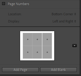
DESIGN: PLAN
How you want your book to look and feel: I want my book to look hyperfeminine and very stereotypically ‘girly’. I want it to create a feeling of nostalgia and comfort. The images vary slightly in terms of how I’m wanting to portray these aspects of femininity, and I want my book to reflex this variation.
Paper and ink: Hardcover book with premium paper and lustre finish
Format, size and orientation: Standard landscape format (25cm x 20cm)
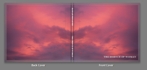
Title: The title of my book “The essence of woman” is something I thought of at the very beginning of this project. I think it portrays my intended look and feel for my book. It communicates that the book is about what it means to be a woman, showing young girls who are developing into womanhood. Yet they still carry their childlike tendencies and appreciating nostalgia.
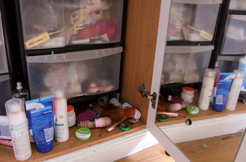
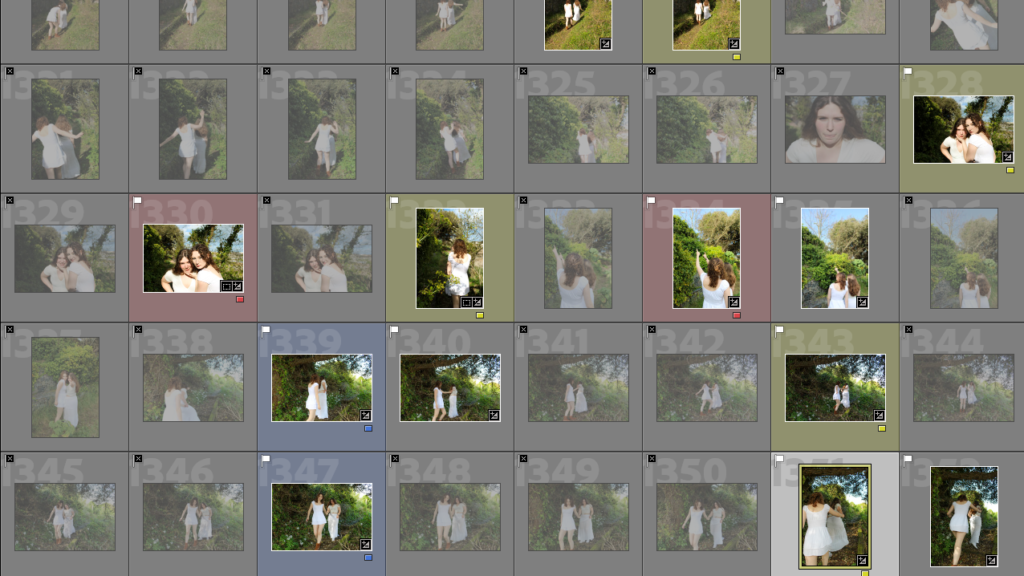
PHOTOSHOOT #8
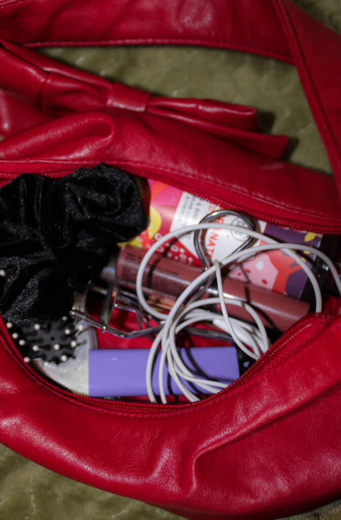
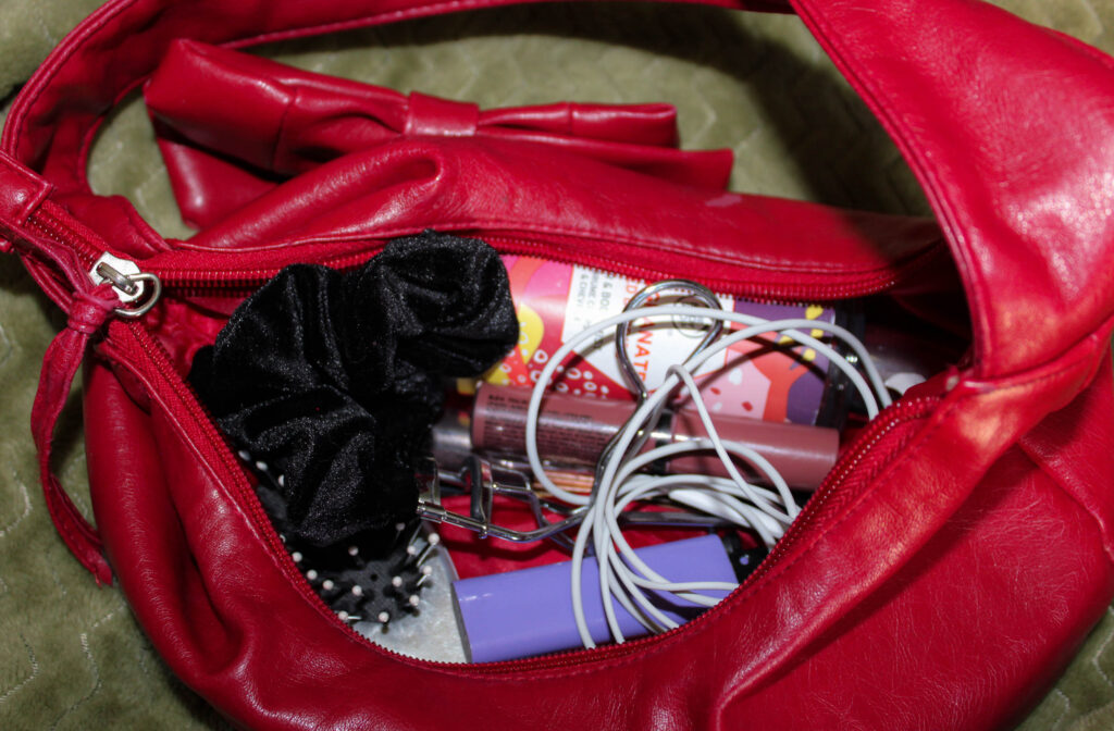
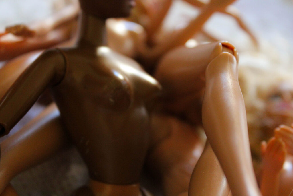
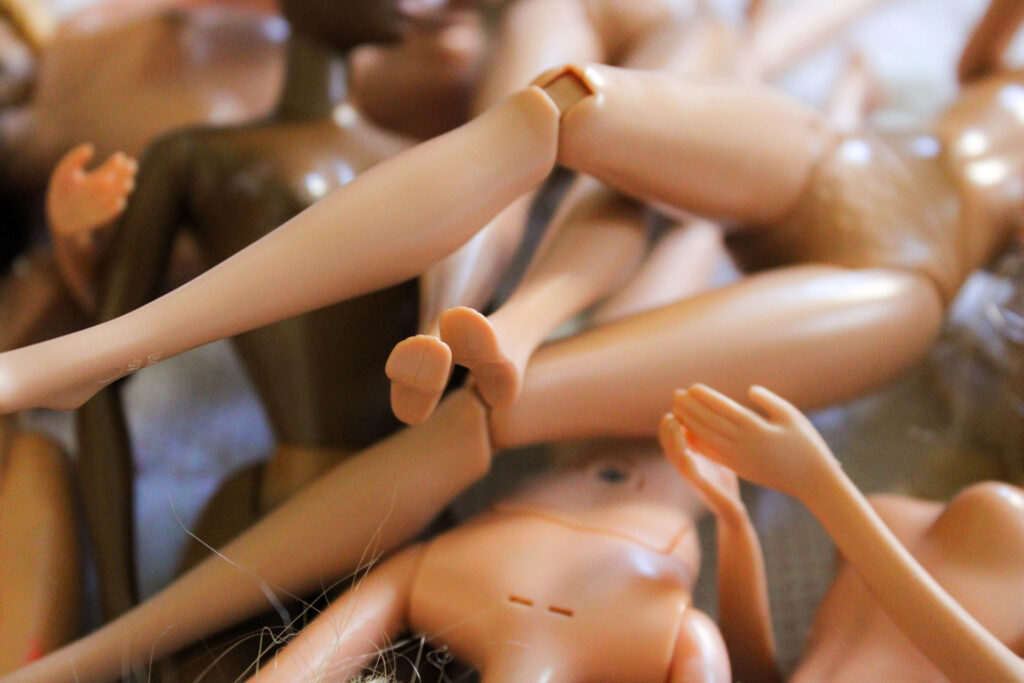
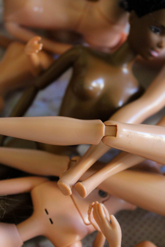
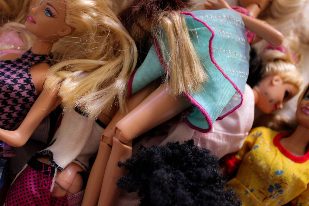
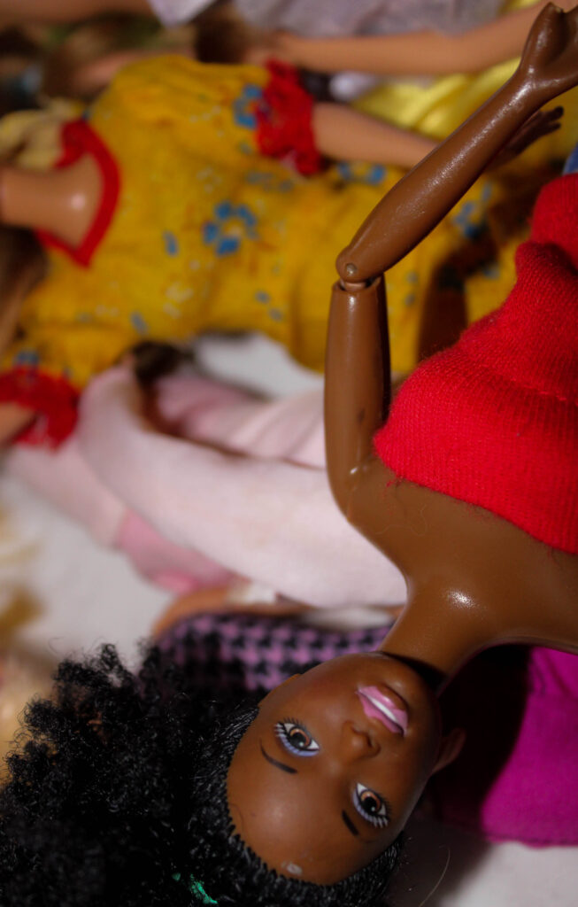
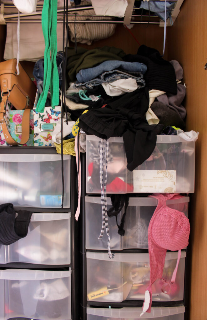
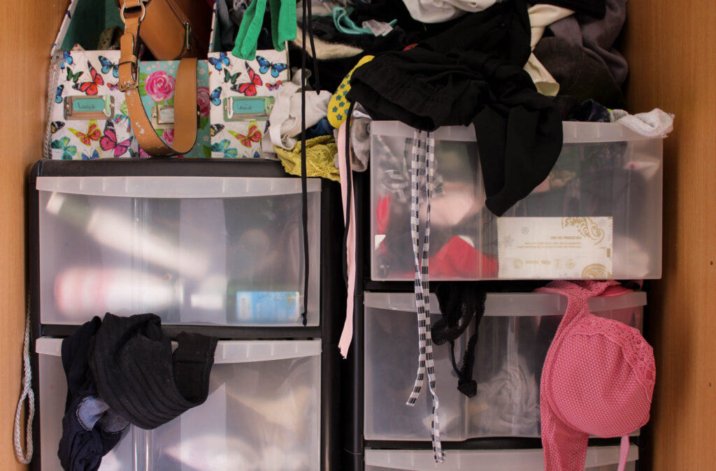
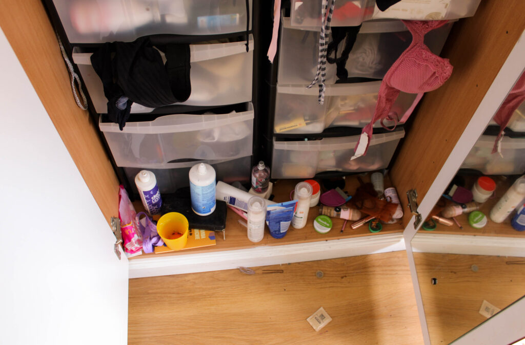
My plan for this photoshoot was to capture pictures of objects. I needed more photographs of objects to balance out with the numerous portraits I’ve taken, and ones that fit with my theme.
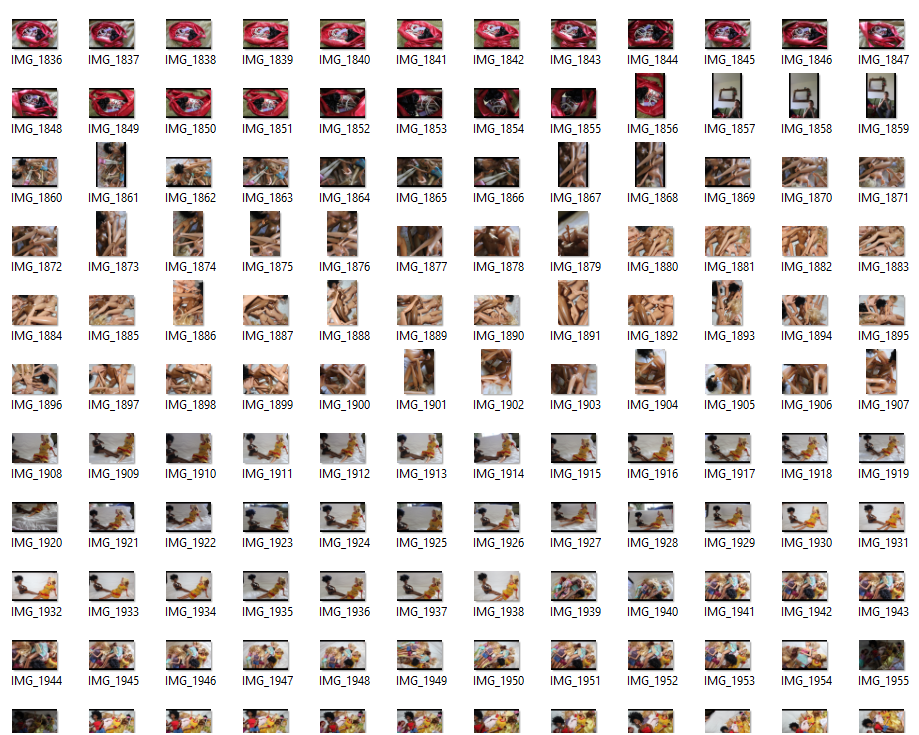
I took pictures of my handbag, old dolls that I would play with when I was younger, and some old stuffed animals. I hoped this would depict elements associated with femininity and girlhood.
IMAGE SELECTION:
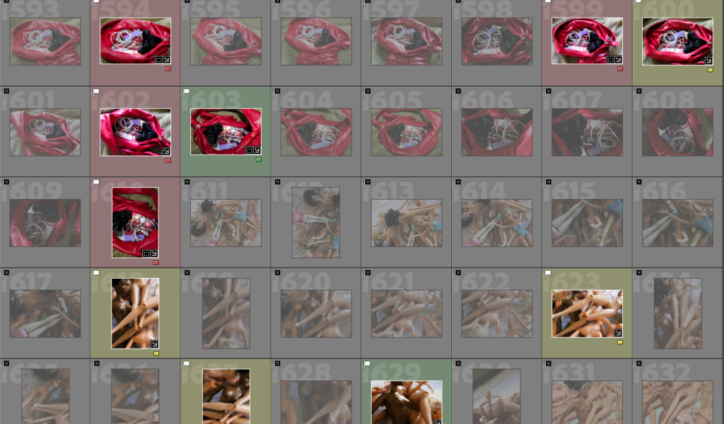
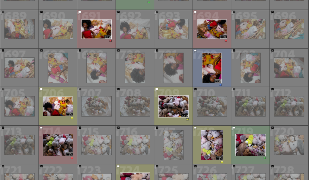
RATING CODE:
RED – Bad quality images
YELLOW – Average images
GREEN – Good images
BLUE – Best outcomes
EDITING OUTCOMES:
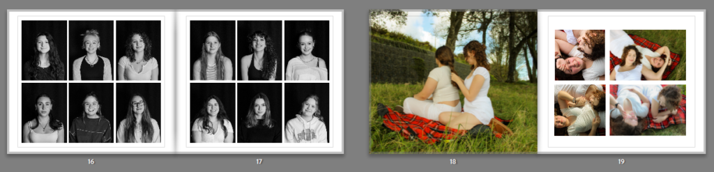
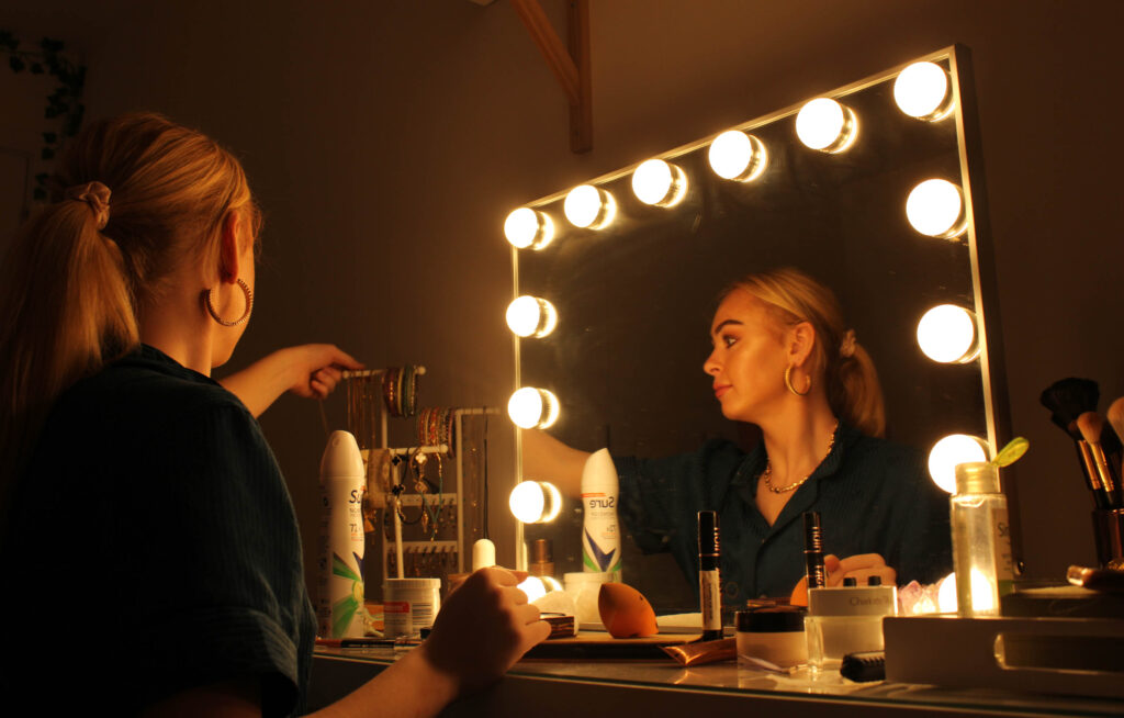
PHOTOSHOOT #7
I used the studio space to take some headshot portraits of some friends.
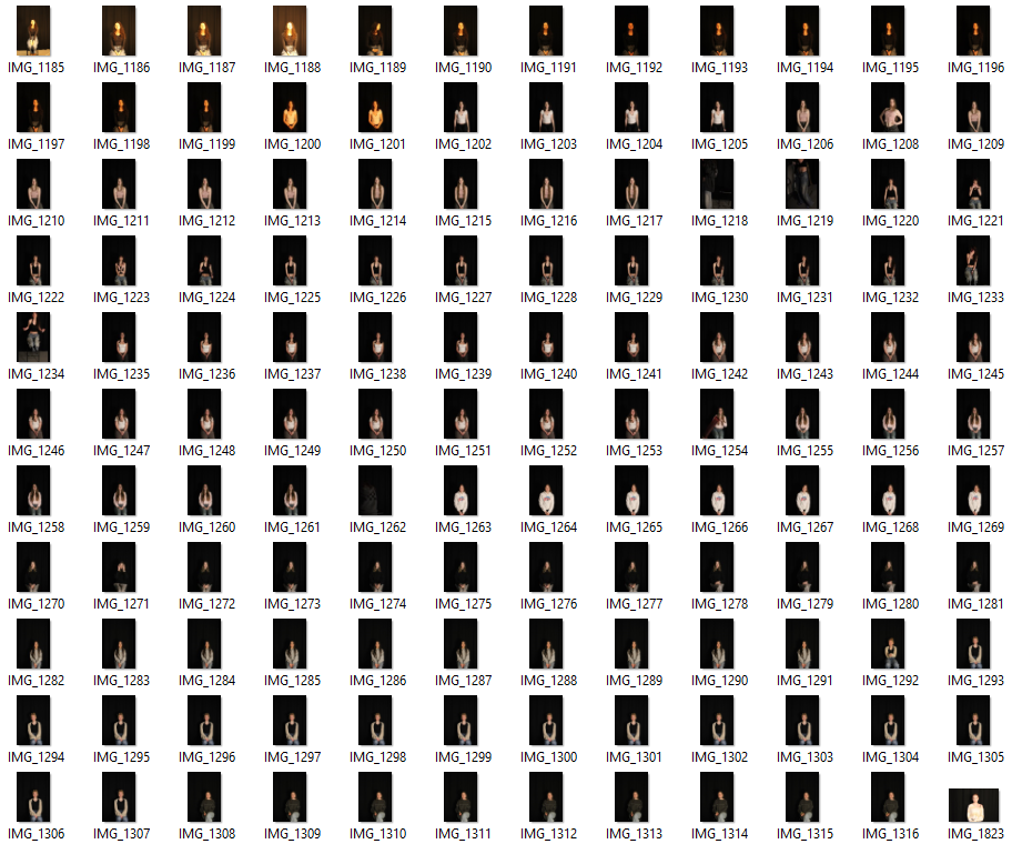
I only took pictures of girls as I want my photobook to communicate a sense of girlhood and what it is to be a woman, exploring aspects of femininity. I asked each subject to project a neutral expression and then to smile, capturing two different expressions. I did this because I wasn’t sure what I wanted from this outcome yet. My plan was to create grid like pages over a double page in my photobook, showing a handful of different girls.
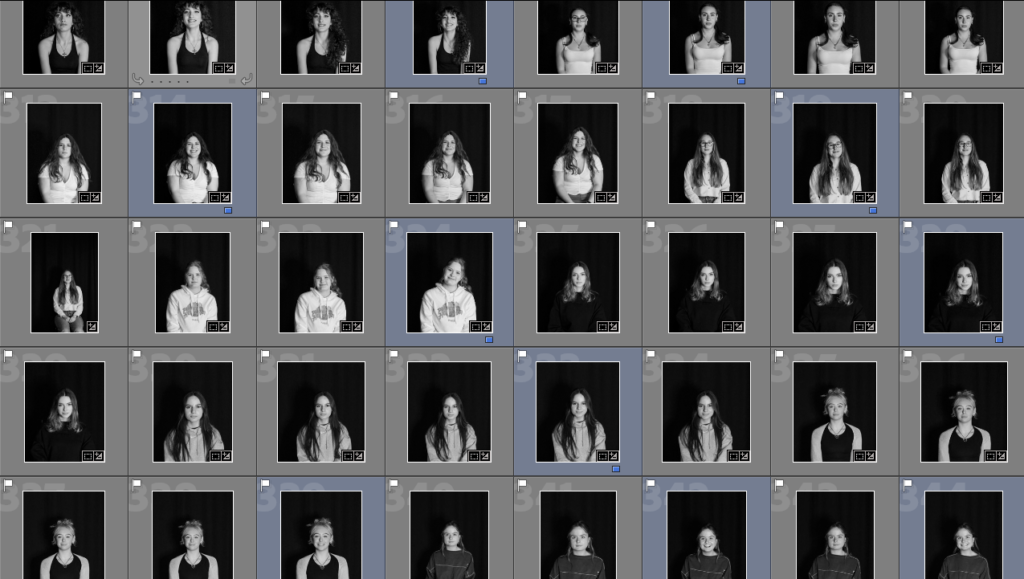
I framed the photos better and edited them to be black and white so they’d look standardised. I rated the ones I liked the most and planned on using as ‘blue’. I decided on using the images of when each girl was smiling, as I like the girly and feminine feeling of fun and happiness being shown.
I then selected Modify Page > Wedding which allowed me to find a suitable grid to put the images into. I didn’t take as many headshots as I would’ve liked, but with this template I had enough for the double page spread I planned on creating.
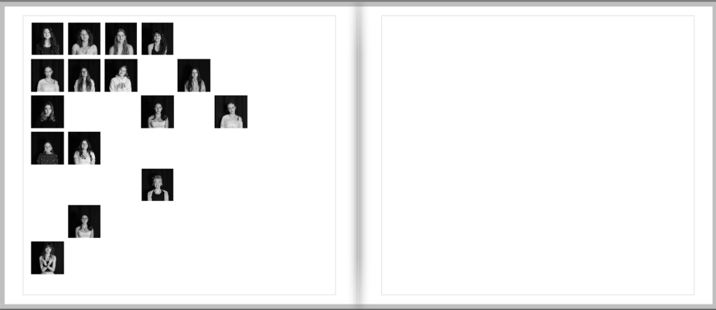
This is some experimentation of presenting the images in the photobook. While this would be quite a creative idea, I don’t have enough images to depict it successfully. The photos also appear quite small on the page, which is not something I was hoping for.
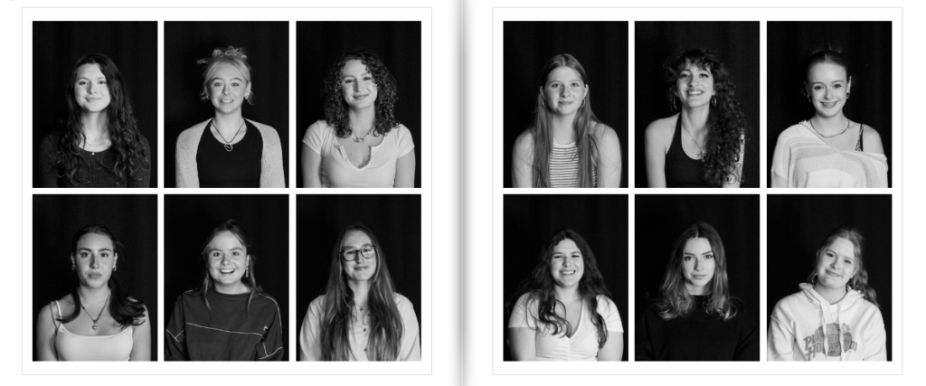
These are the final pages with my headshots in the template. I adjusted and zoomed the images to fit the grid accordingly. I arranged them to show contrast between each girl, showing how we are all different. Everyone expresses themselves and their femininity in different ways.
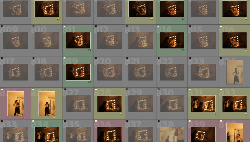
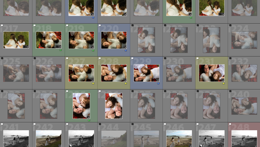
PHOTOSHOOT #6
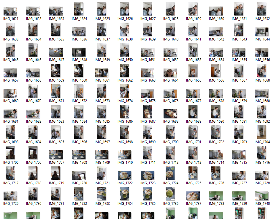
IMAGE SELECTION:
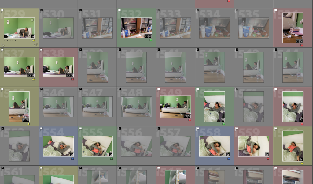
RATING CODE:
RED – Bad quality images
YELLOW – Average images
GREEN – Good images
BLUE – Best outcomes
EDITING OUTCOMES:
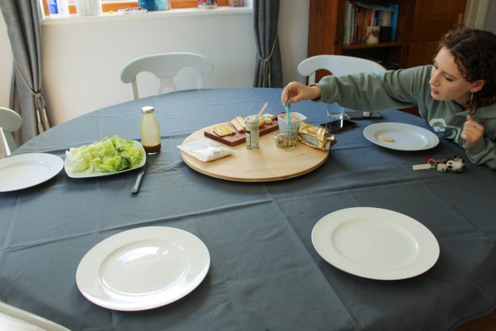
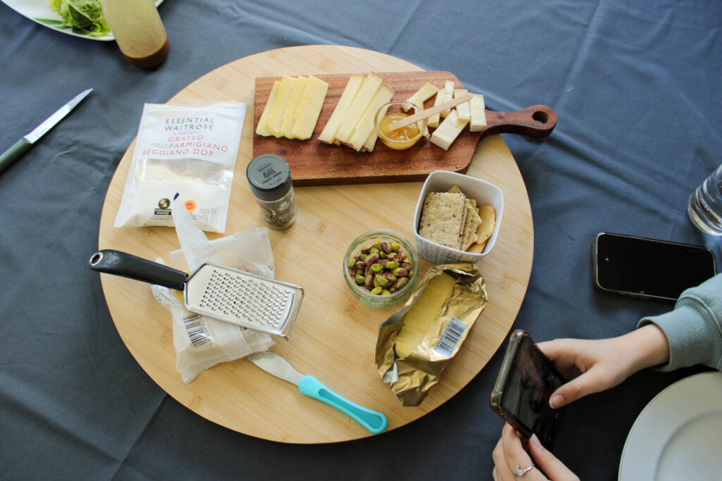
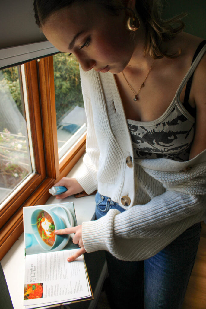
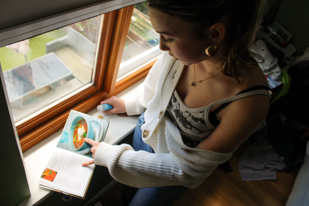
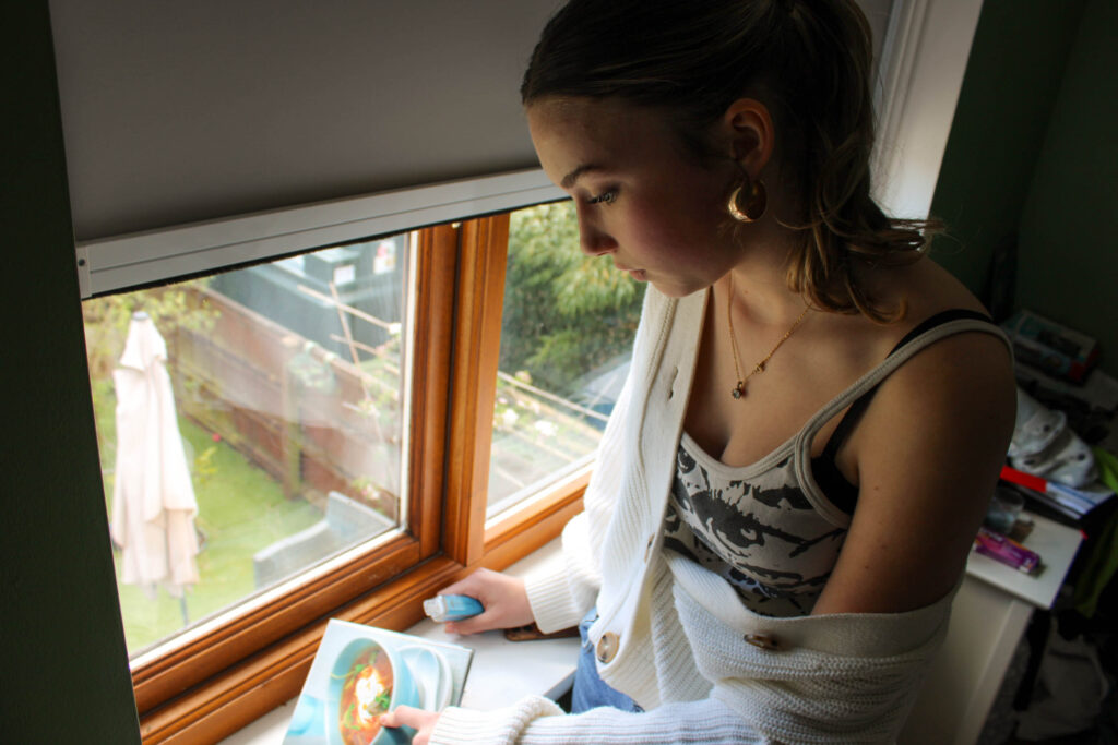
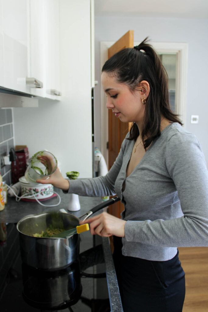
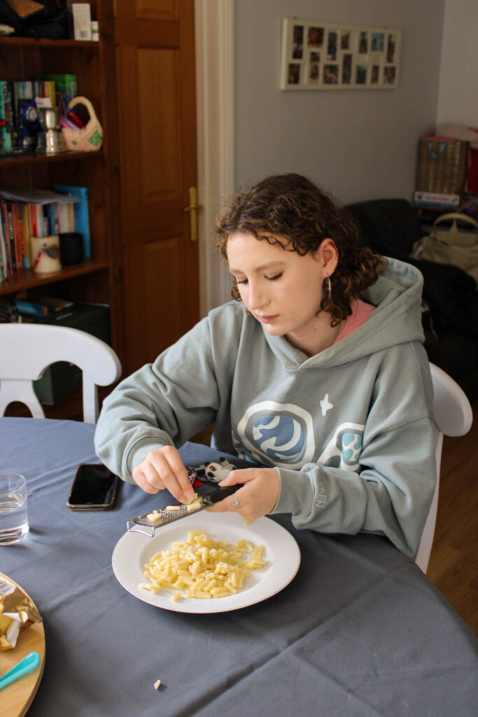
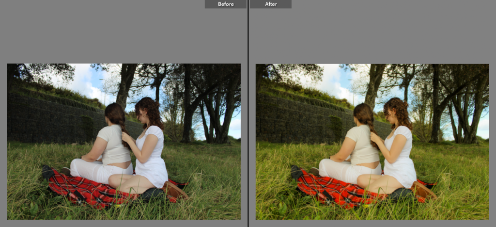
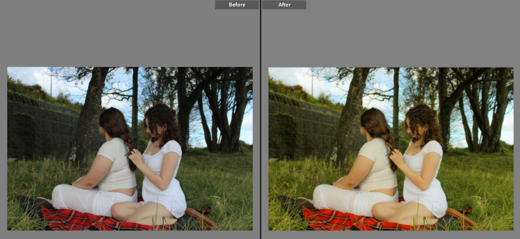
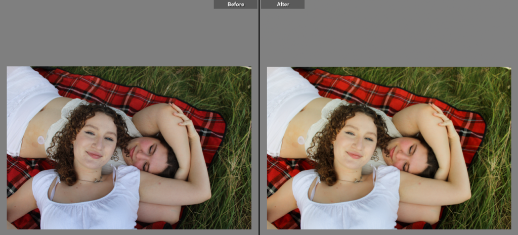
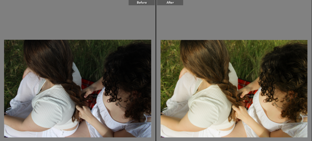
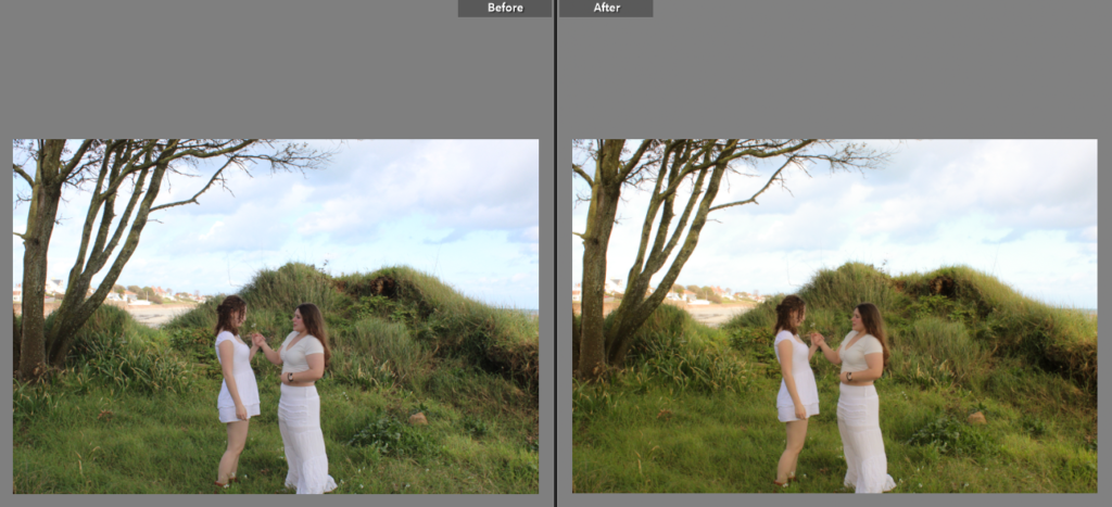
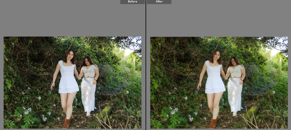
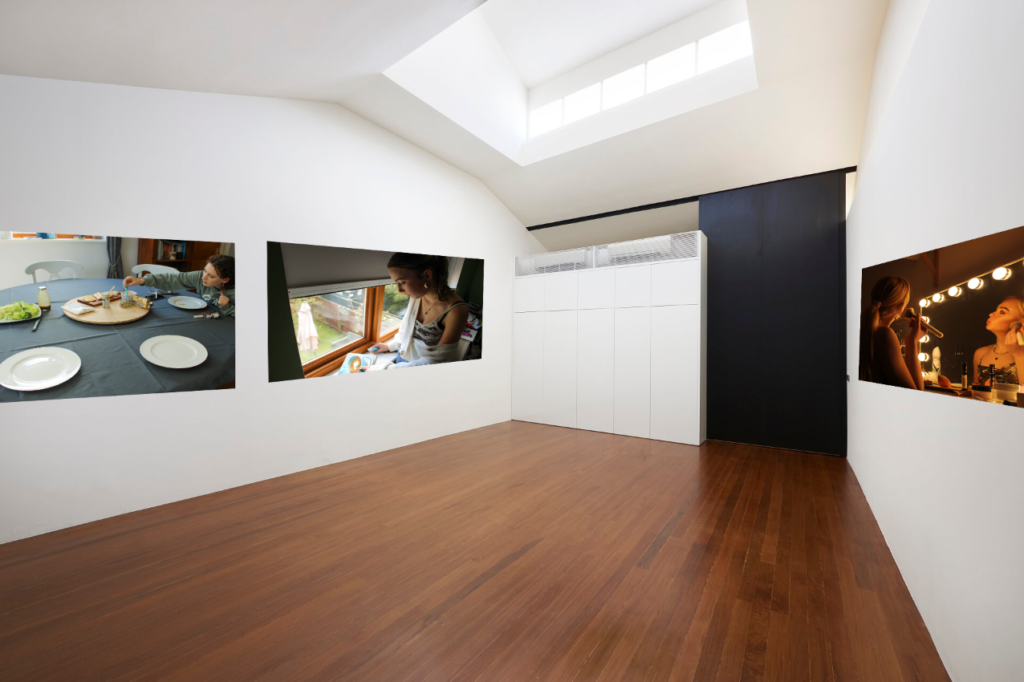
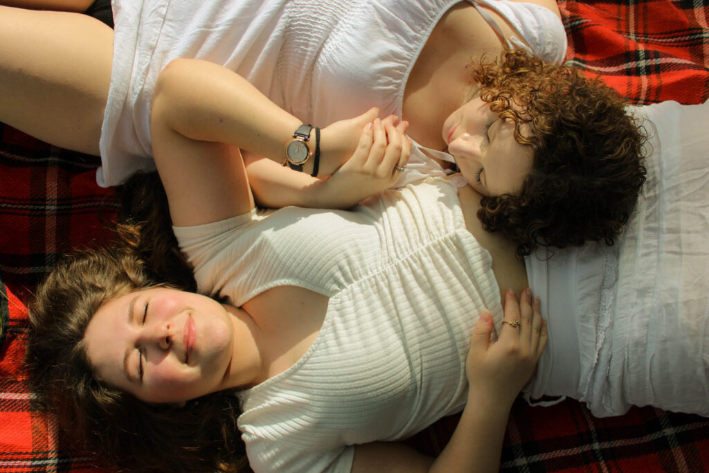
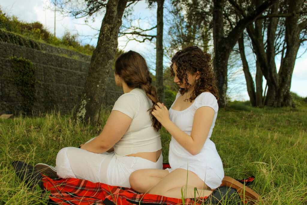
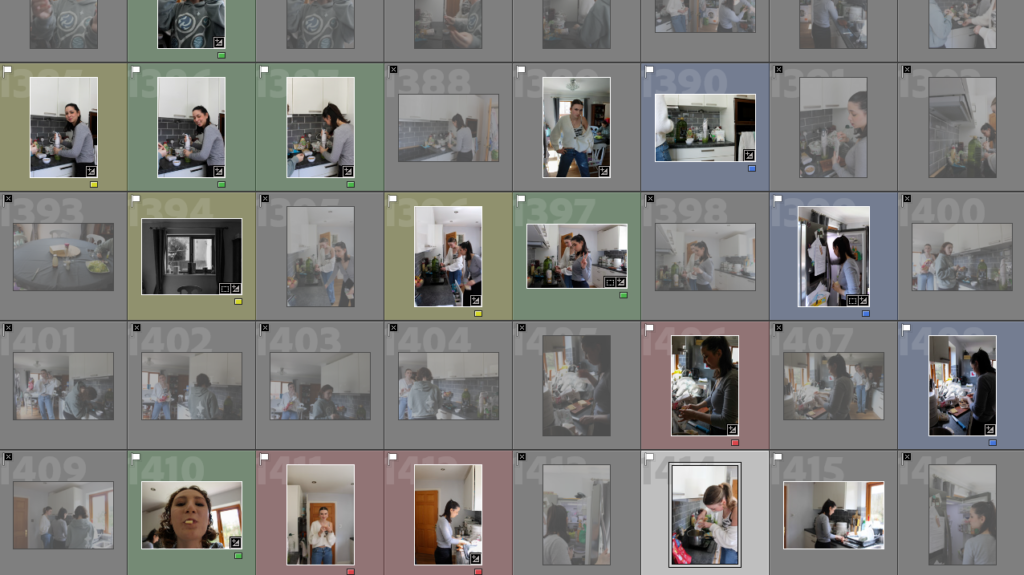
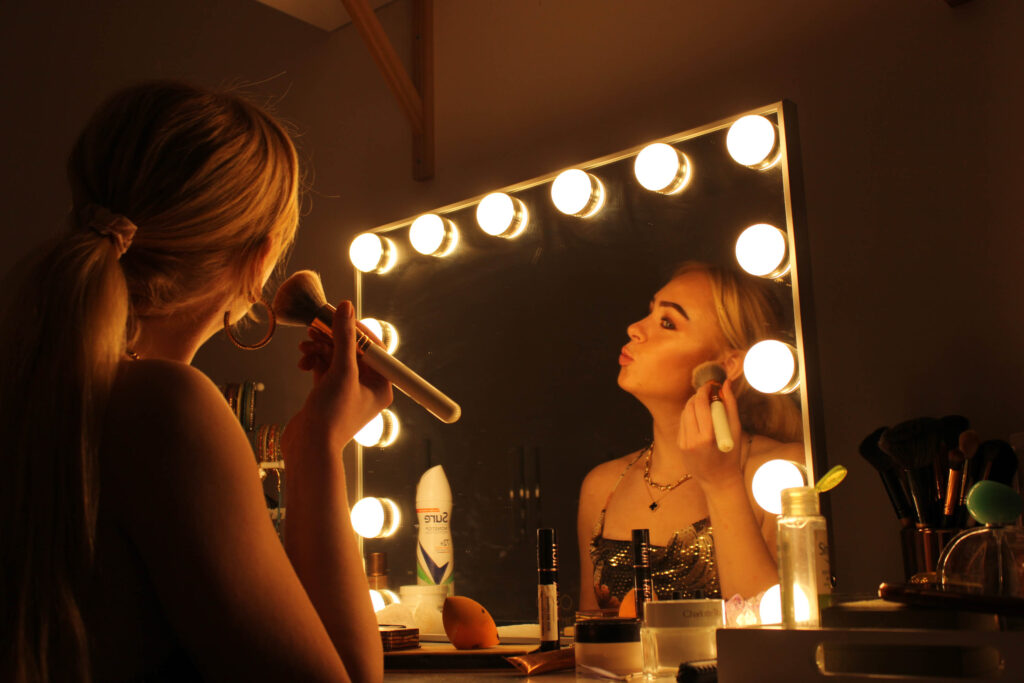
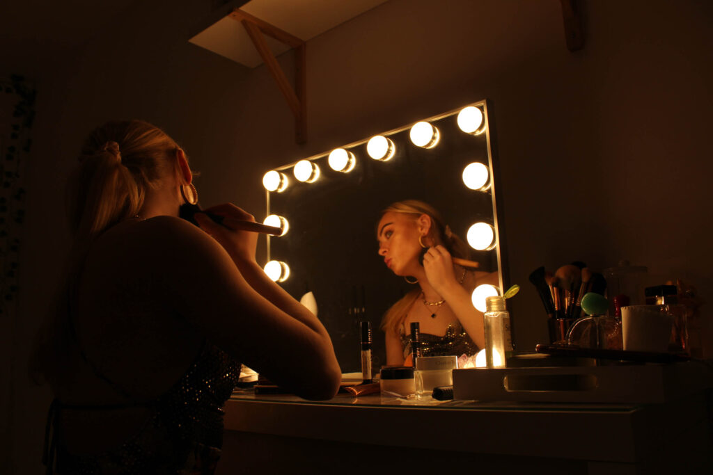
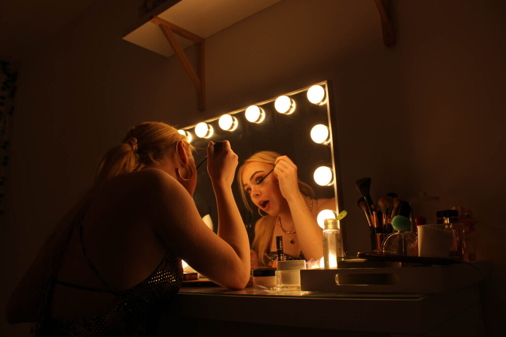
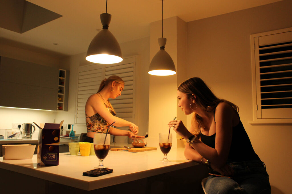
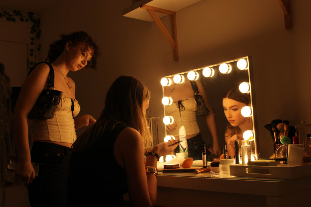
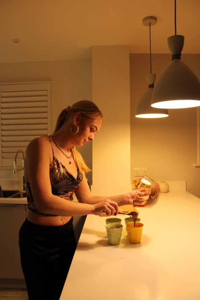
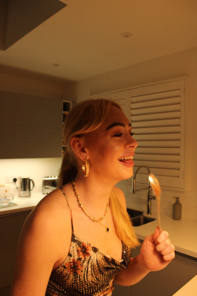
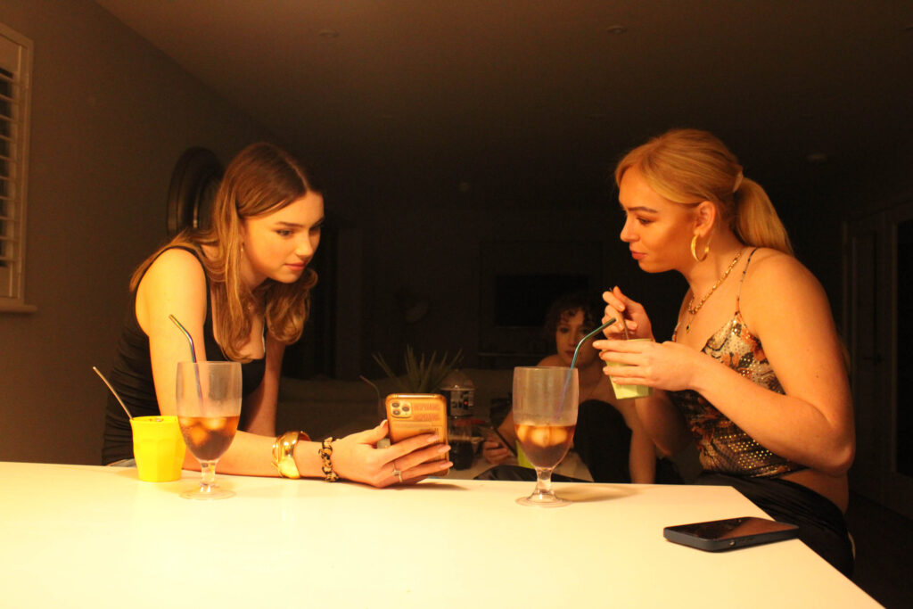
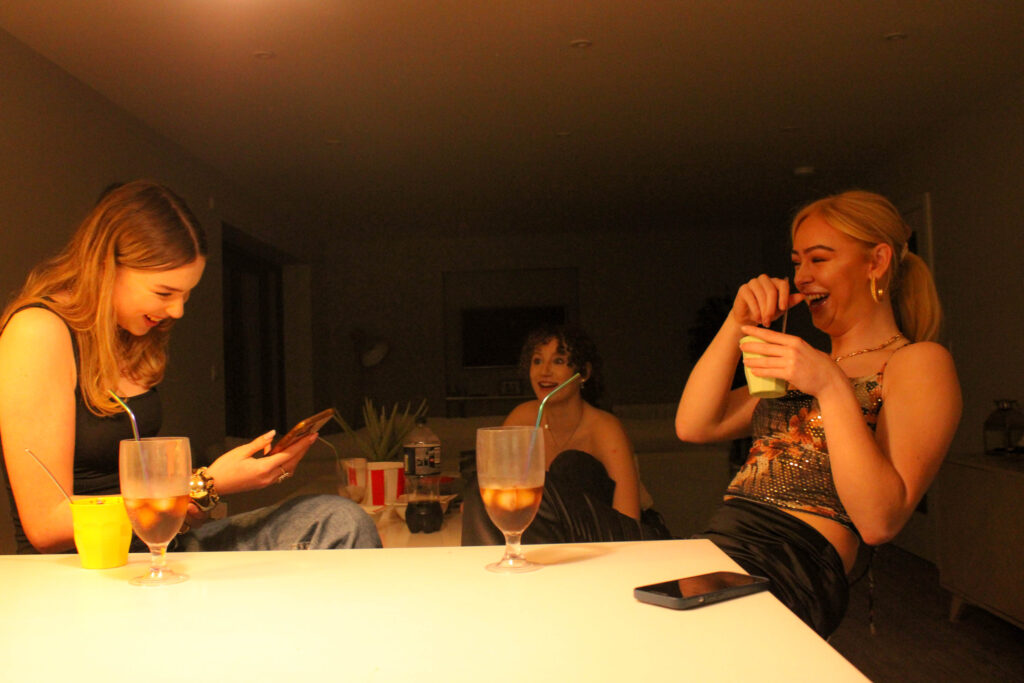
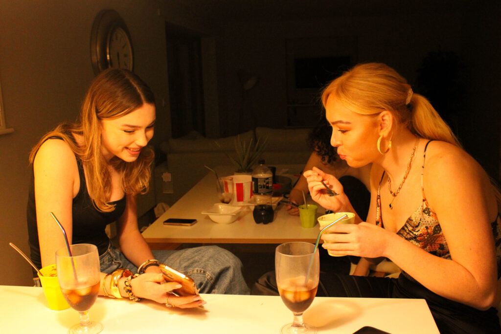
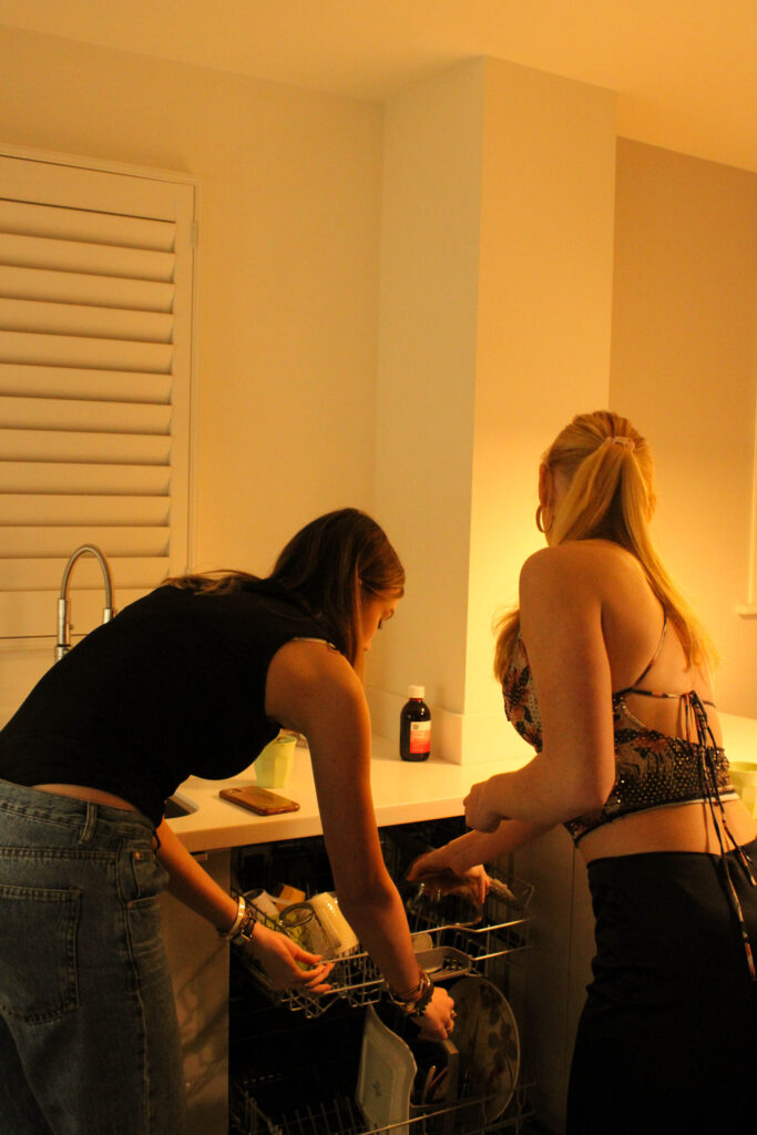
This photoshoot was just of a casual hangout at one of my friend’s houses. The photographs consist of relaxing, some objects, and girls cooking. This photoshoot’s aim was to produce outcomes which are more realistic of day-to-day life.
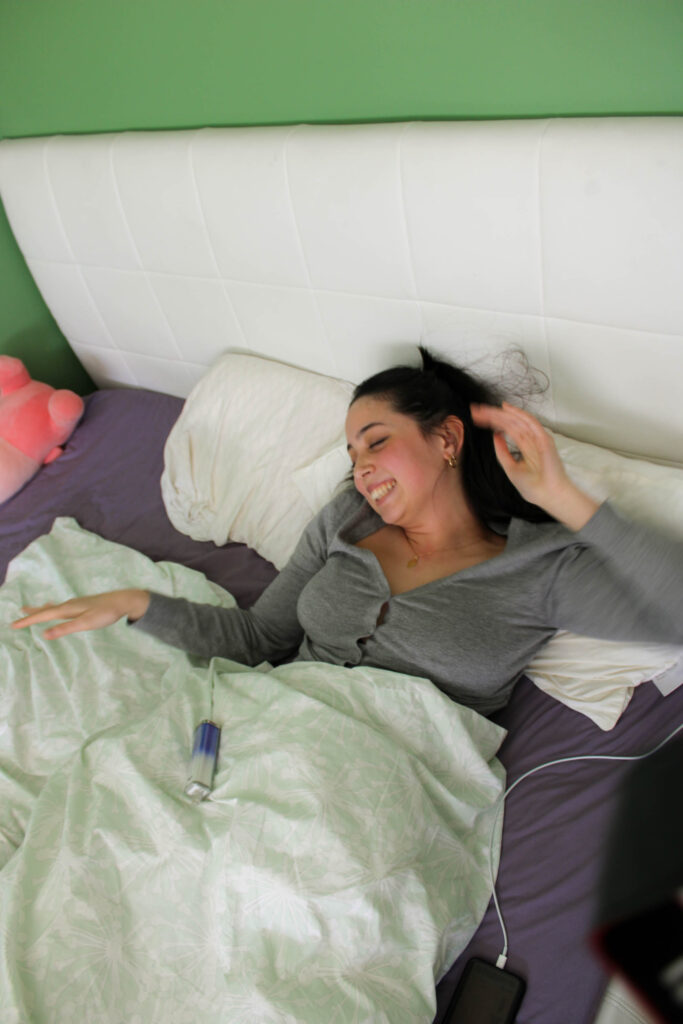
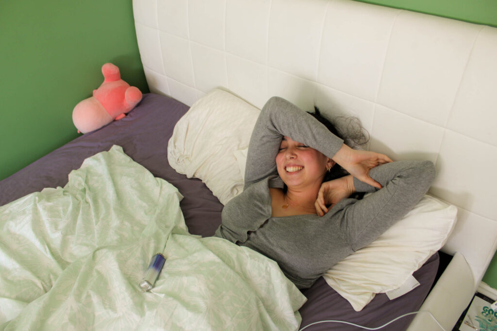
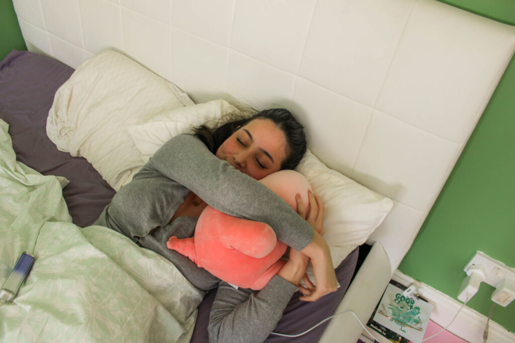
PHOTOSHOOT #5
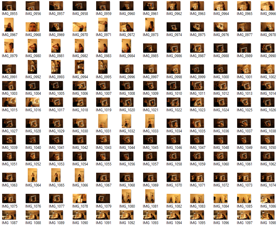
IMAGE SELECTION:
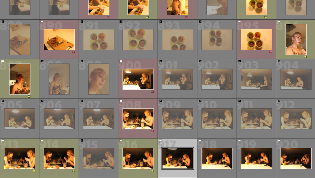
RATING CODE:
RED – Bad quality images
YELLOW – Average images
GREEN – Good images
BLUE – Best outcomes
PHOTOSHOOT OUTCOMES:
PHOTOSHOOT #4
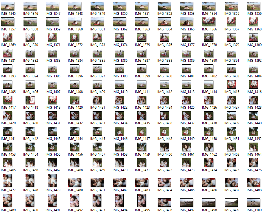
IMAGE SELECTION:
RATING CODE:
RED – Bad quality images
YELLOW – Average images
GREEN – Good images
BLUE – Best outcomes
OUTCOMES: