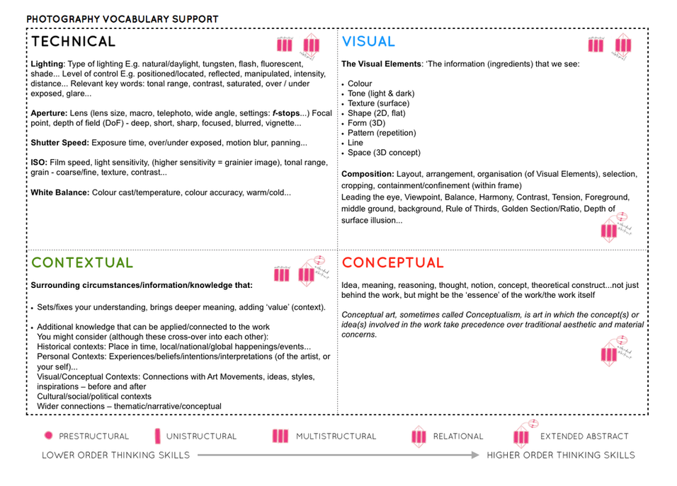
Here is a link to my online photobook; Surfscapes
Here is a link to my online photobook; Surfscapes
Photoshoot
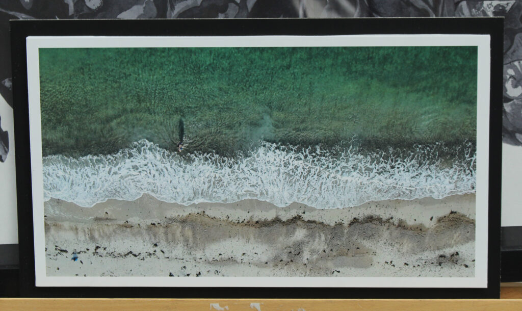
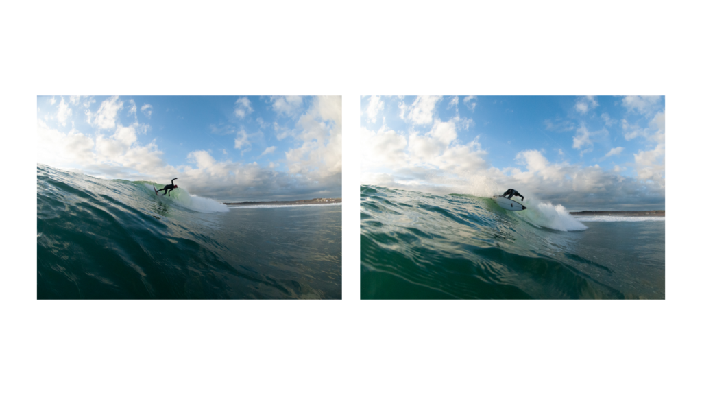
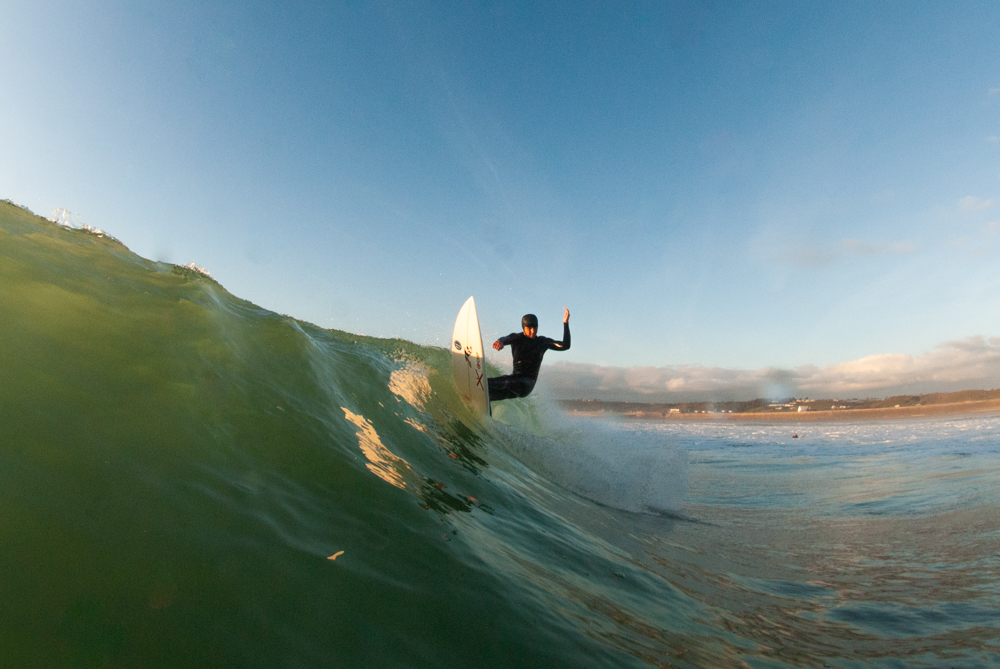
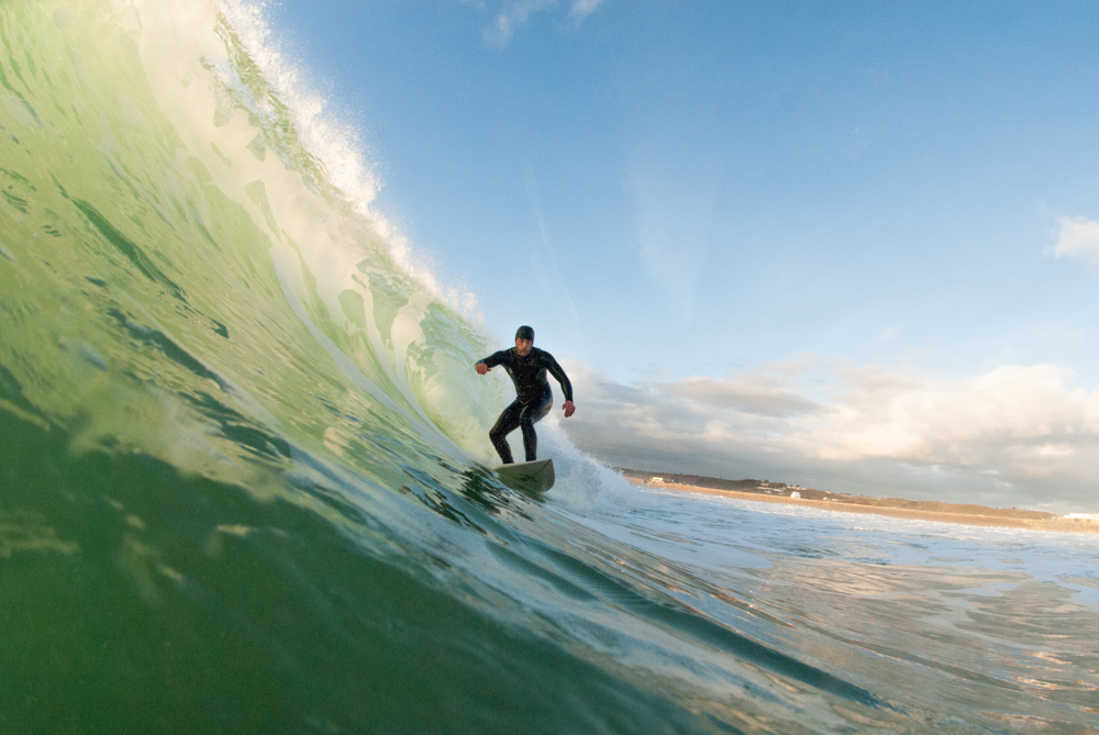
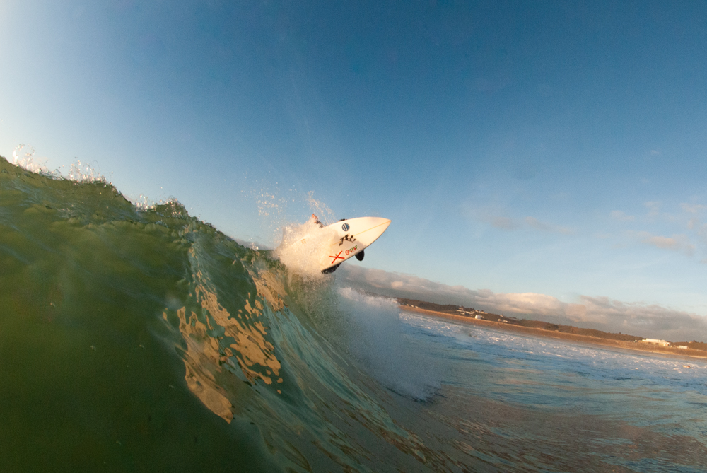
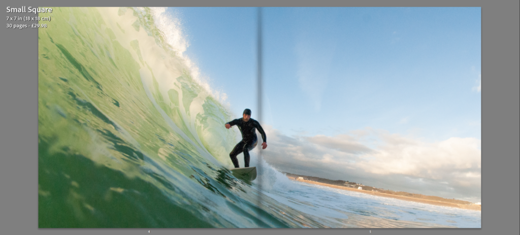
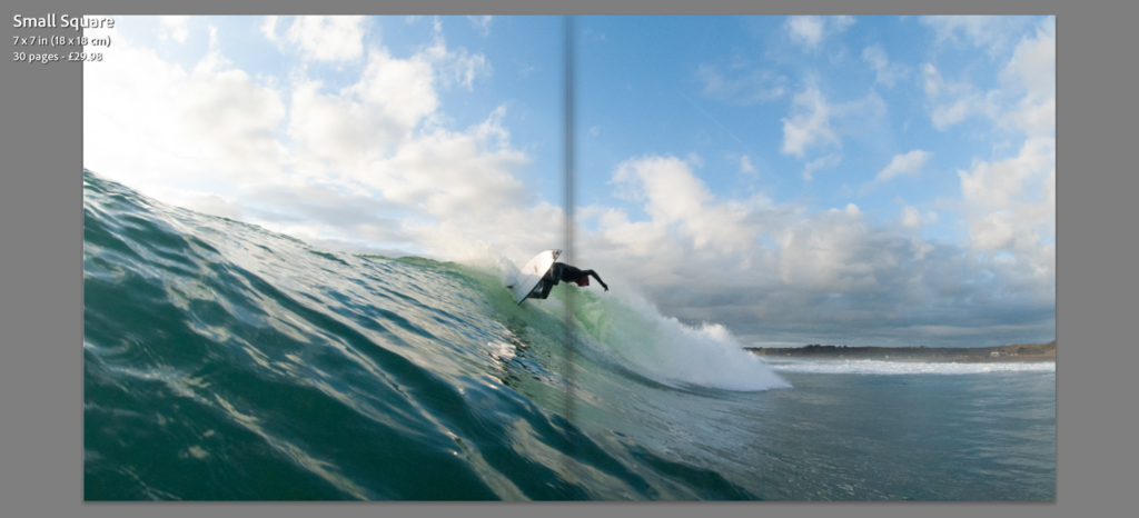
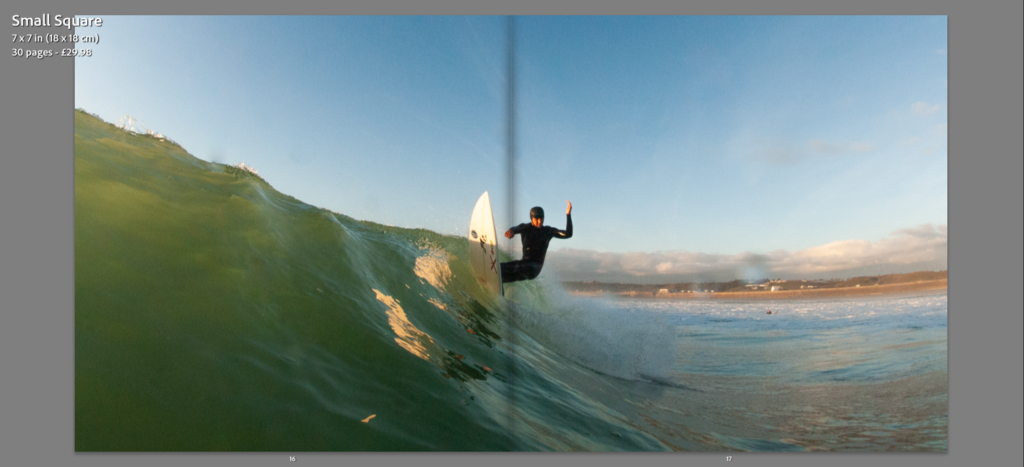
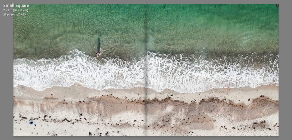
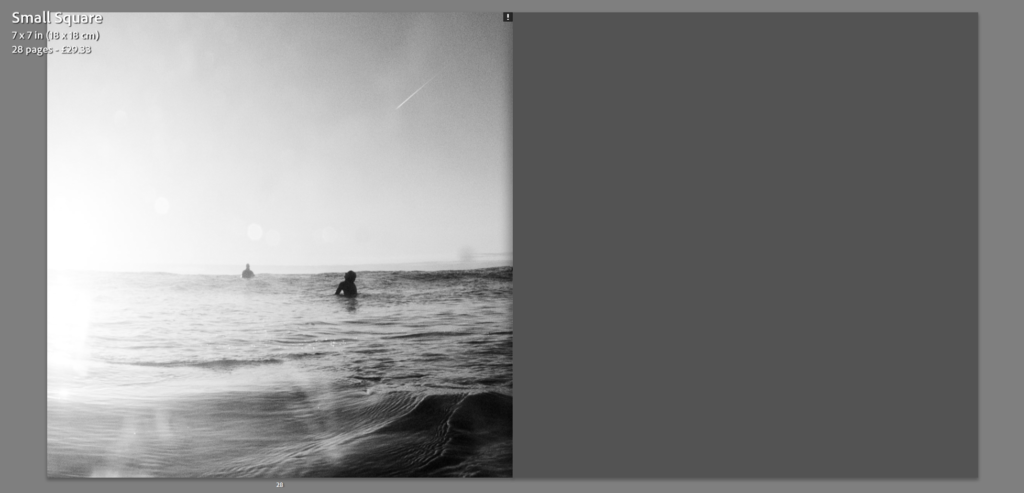
My research into Henri Cartier-Bresson’s concept of the “Decisive Moment” – a picture masterly composed to seize the essence of an impromptu event, saw an undoubted relation to the genre of sports photography. Taking Bresson’s ideas of The Decisive Moment and it’s links to Sports Photography inspired me to undergo a photoshoot with a focus on the practice of surfing. My approach saw me produce a series of images in an attempt to preserve the human body and it’s surrounding elements in motion. The constant change in conditions when undergoing this photoshoot saw the capture of a well composed and visually compelling image a difficulty. Although, A Fast Shutter Speed, Auto-focus and the use of the ”Burst Mode” enabled me to overcome the difficult shooting conditions. The Waterproof housing provided by the JEP saw the opportunity to produce images from the viewpoint of a surfer, allowing for unique often unseen of outcomes due to the pricey equipment necessary. Areas of improvement have been identified from analysis of my outcomes, allowing for an improved response in future photoshoots. Due to the fish eye effect of the dome housing provided, the need to position myself a close distance from the subject was crucial. My affected mobility in the water saw my distance in specific images a necessary area of improvement. Although my past experience in the ocean aided my response, my recent knowledge on certain camera related tricks, such as the removal of water droplets from the lens with saliva, will undoubtedly aid me in future shoots. Physical and Environmental aspects of this in water shoot also affected my response, having already been in the water for hours prior to the photoshoot my levels of fitness and body temperature were seen to be a problem. Overall, I believe this photoshoot was a success.
Editing Process
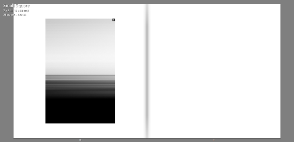
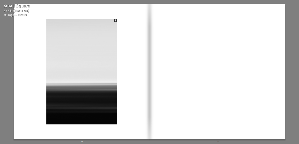
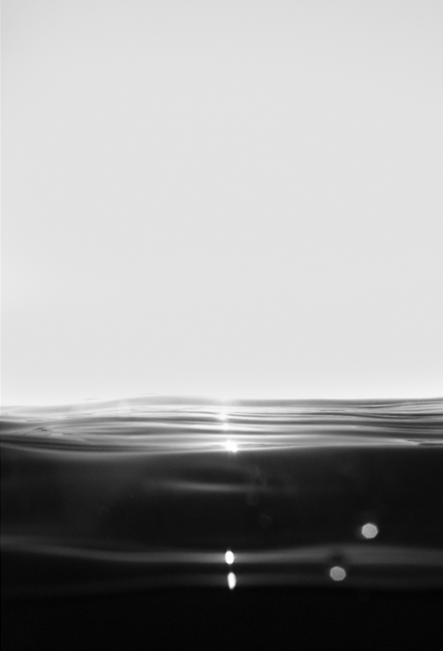
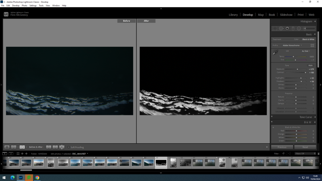
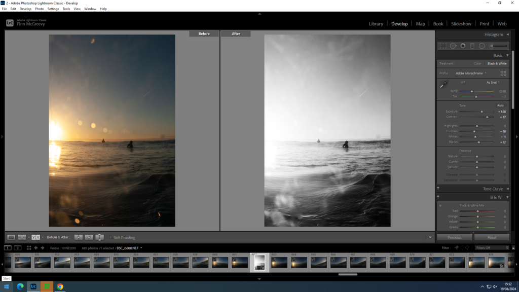
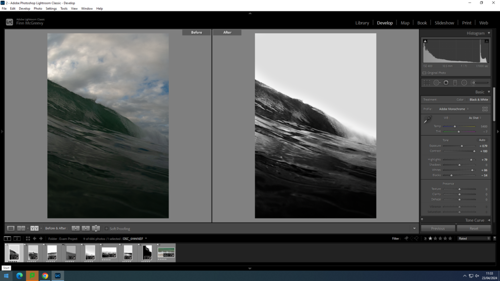
Post Production was necessary for the majority of my images, the inability to manually change settings to adapt to the changing conditions saw post production exposure adjustments crucial. Along with the general tonal adjustments applied to my more complex outcomes, experimentations into images taking on a more minimalist approach saw the use of a punchy black and white setting and heavy cropping to produce an even sea sky split in most outcomes. Post Production saw me successfully uncover images I had believed to be of poor quality, allowing for outcomes in relation to my referenced artists.
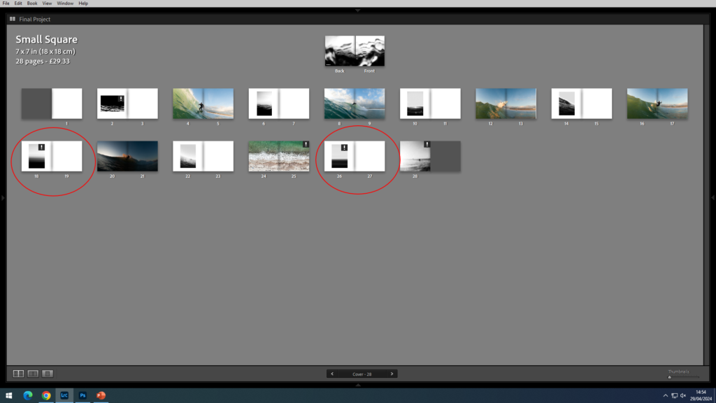
Layout – Photobook

To incorporate a further sense of minimalism into my work, a clean simple layout has be selected, although the photobook only consists of 24 pages, I believe in quality over quantity and see this layout displays my favoured outcomes in their best form. The use of my works , taking on a simpler cleaner approach to break up the more complex ‘fast paced’ imagery effectively contrasts between the differing forms of the ocean.
Layout – Prints
Foamboard Prints
A4
A5
A3

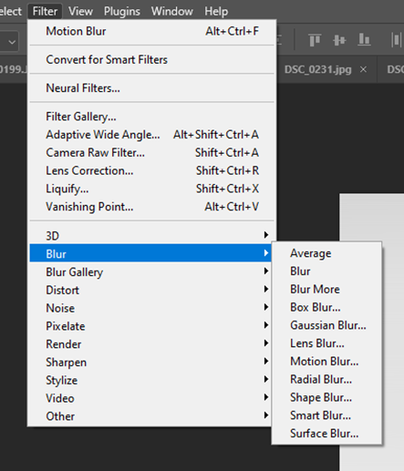
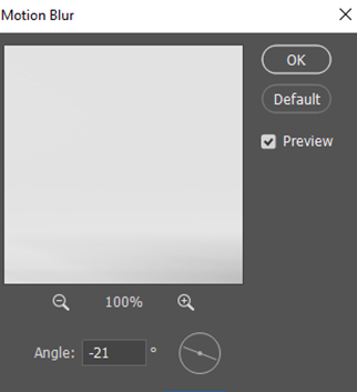
Motion Blur
Hiroshi Sugimoto Inspired Outcomes


Layout in Photobook
Inspiration – Seascapes – Hiroshi Sugimoto
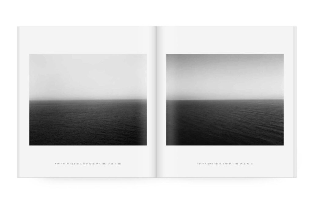
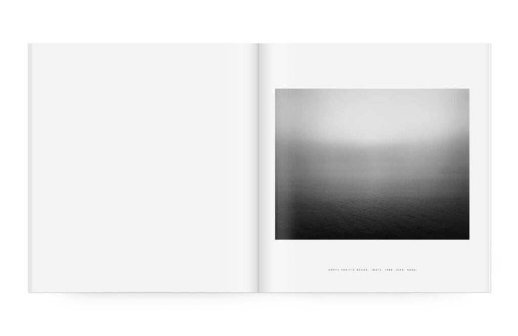
For more than four decades, Hiroshi Sugimoto has been photographing seascapes around the world. “A sharp horizon line and a cloudless sky- here began my consciousness.” writes Sugimoto, “From there my thoughts race to the origins of human consciousness itself. The sea reminds me that within my blood remain traces of human evolution over hundreds of thousands of years.”
His Seascapes series began in 1999. Photographed with cartographic precision, each image shows sea and sky bisected by a seemingly infinite horizon. Rather than taming the subject through repeated documentation, the series grows more awesome and sublime, until the images reveal only the transient atmospherics—the thickness of fog or stillness of the water.
Water and air. These primordial substances, which make possible all life on earth, are the subject of Hiroshi Sugimoto’s Seascapes series. Sugimoto has called photography the “fossilization of time,” and the ‘Seascapes’ photographs simultaneously capture a discrete moment in time but also evoke a feeling of timelessness.
This volume, the second in a series of books on Sugimoto’s art, presents the complete series of over 200 ‘Seascapes’, some of which have never before been reproduced. All are identical in format, with the horizon line precisely bifurcating each image, though at times the sea and sky almost merge into one seamless unit. Each photograph captures a moment when the sea is placid, almost flat. Within this strict format, however, he has created a limitless array of portraits of his subjects.
Seascapes
Size -250 × 277 mm
Pages – 272
Illustrations – 213
Binding – Hardback
Layout
In “Seascapes” by Hiroshi Sugimoto, the layout is intentionally minimalist to enhance the impact of his photographs of the sea. The simple design allows the images to speak for themselves, capturing the essence of the vast ocean and its timeless beauty. The clean layout helps create a sense of tranquillity and contemplation, drawing the viewer into the serene world of Sugimoto’s seascapes.
My Layout
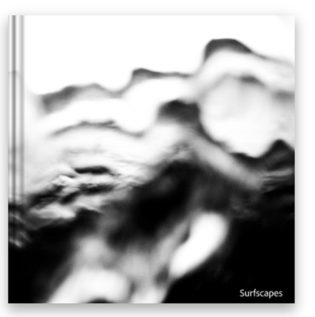
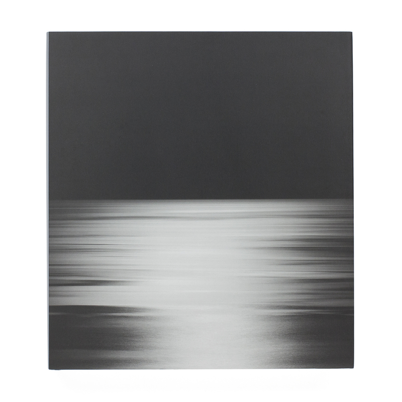
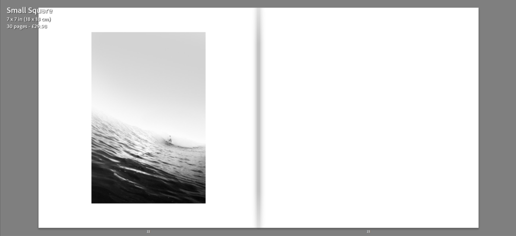
To evoke a similar feel to the works of Hiroshi Sugimoto, the layout of specific images, the ones having taking inspiration from Sugimoto, will be similarly set out to the ones featured in ‘Seascapes’, with a clean, simplistic, uncluttered design. By keeping the design simple, the focus remains on the image, along with continued theme of minimalism. Other, more complex images will be lay out across a double page spread allowing the image to be displayed on a larger scale, enhancing the sense of detail.
Book Settings
Photobook
Visually my outcomes can only be compared to 2 of the 3 artist references, that being the work of Woody Gooch and Hiroshi Sugimoto. Although Cartier Bresson’s ideas can be referenced in terms of the ‘split second’ ideas of the Decisive Moment.
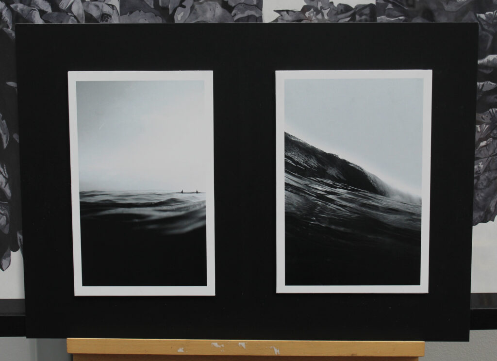
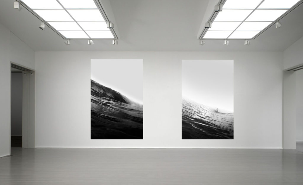
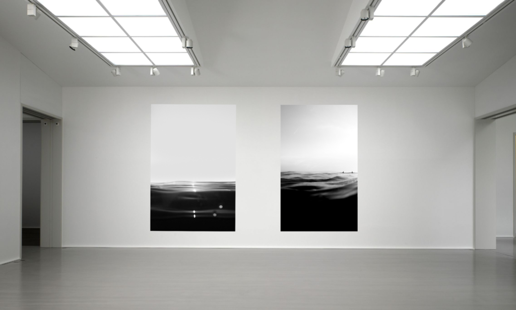
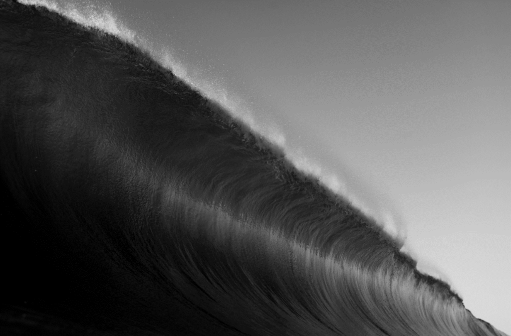
Hiroshi Sugimoto
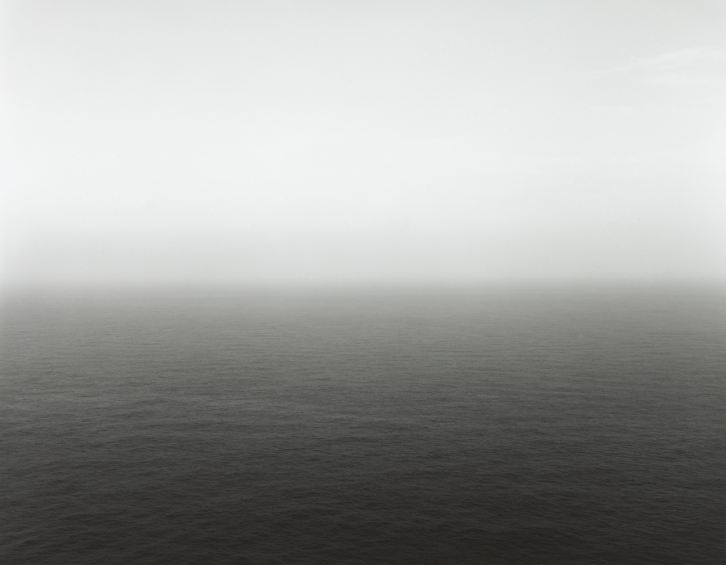
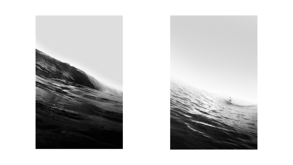
An image from Sugiomoto’s photo series ‘Seascapes’.
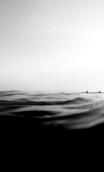
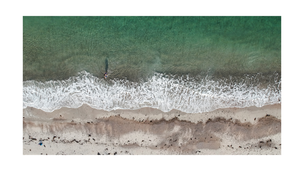
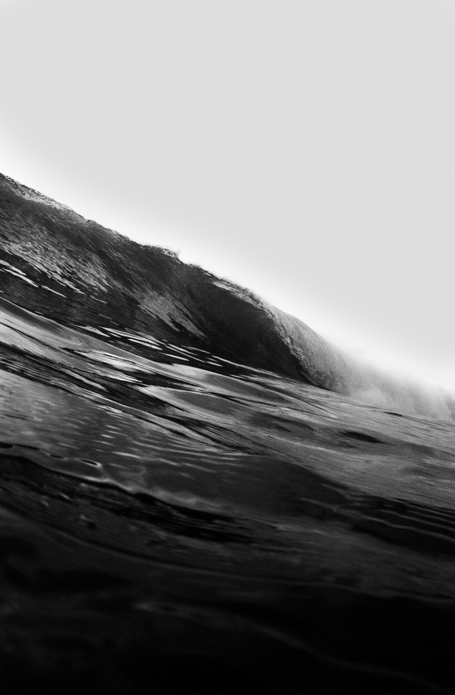
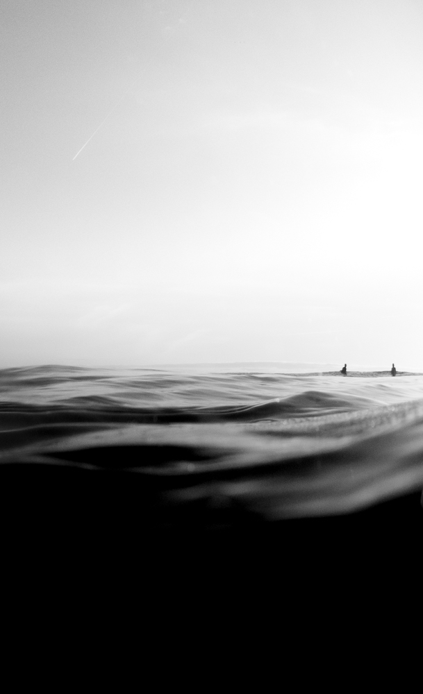
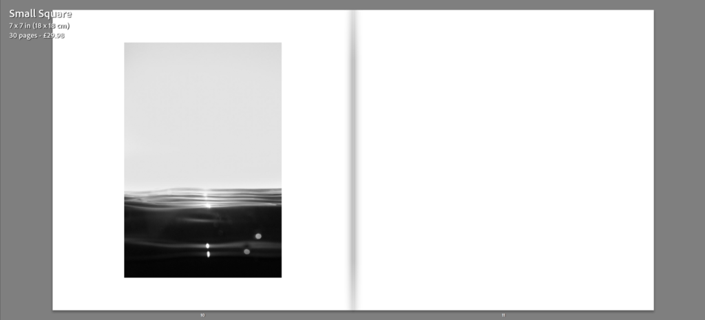
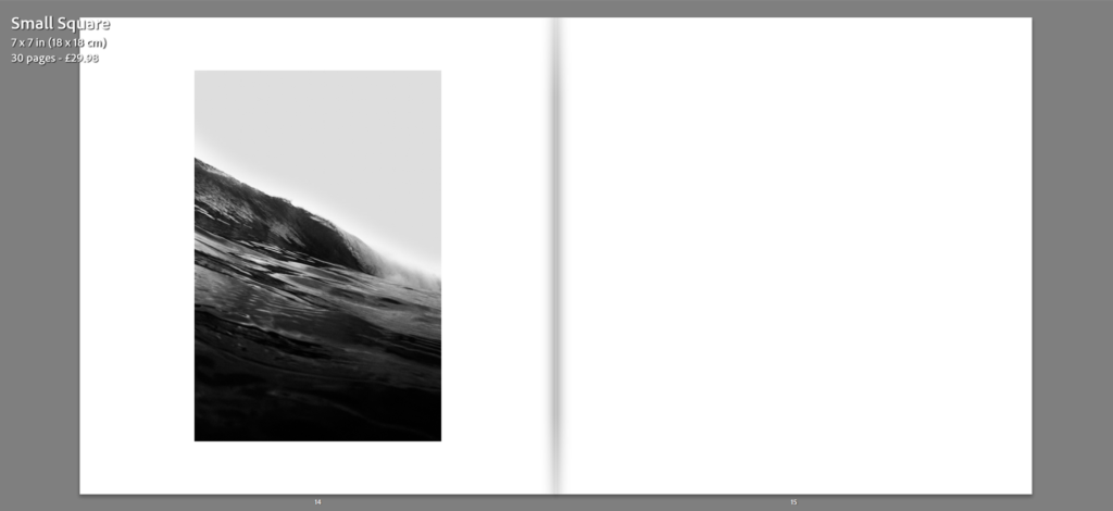
A response of mine taking inspiration from Sugimoto’s work, incorporating Sugimoto’s ideas of minimalism along with an in water/surf photography twist. The two outcomes can be compared in terms of their similar well balanced composition with an evident split between sea and sky, the use of a black and white colour palette and a simple, clean, minimalist approach.
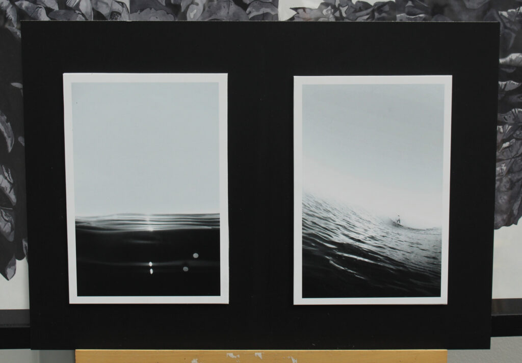
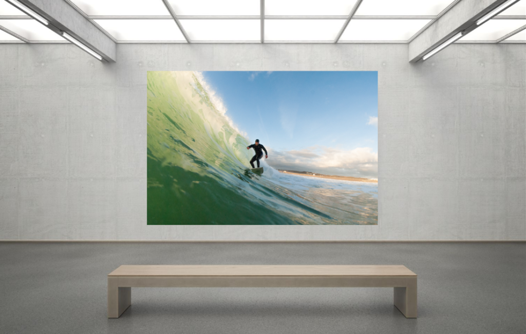
Woody Gooch
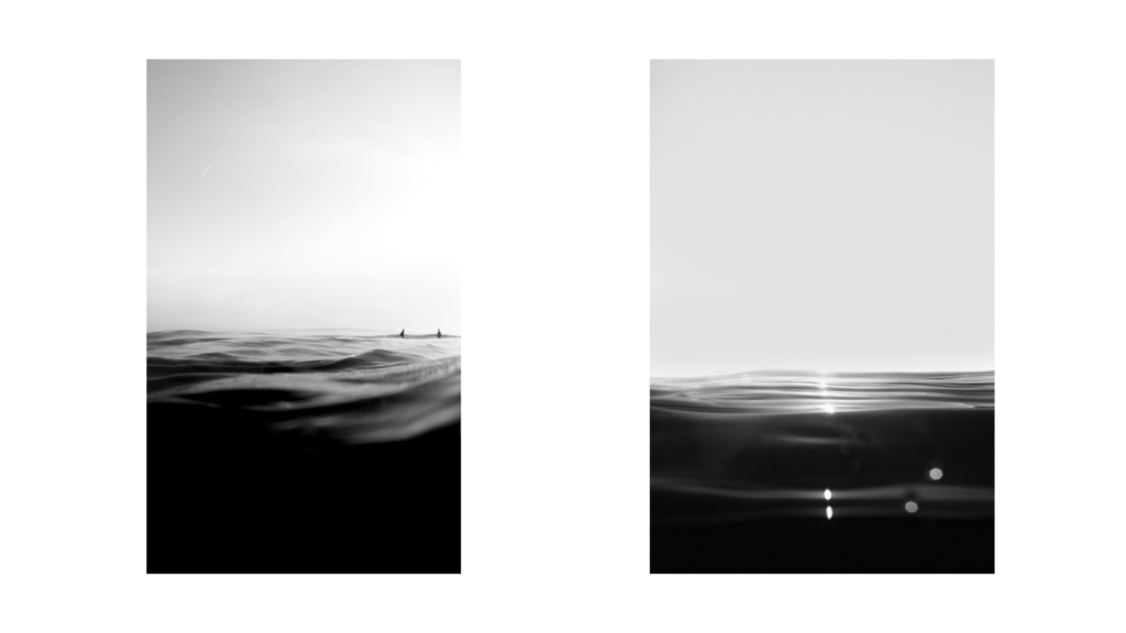
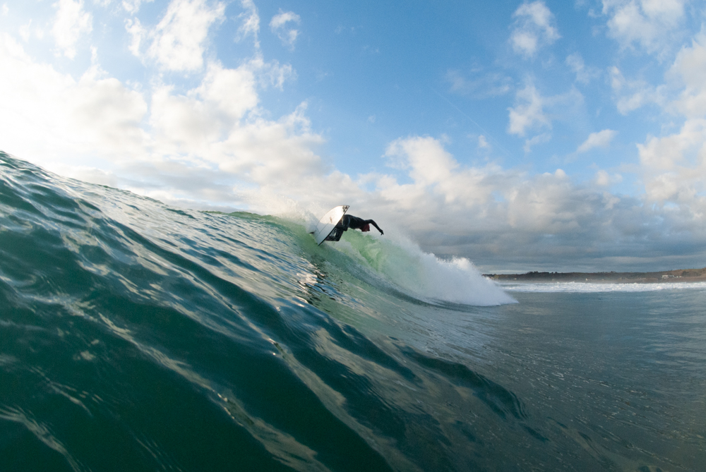
An Image by Woody Gooch
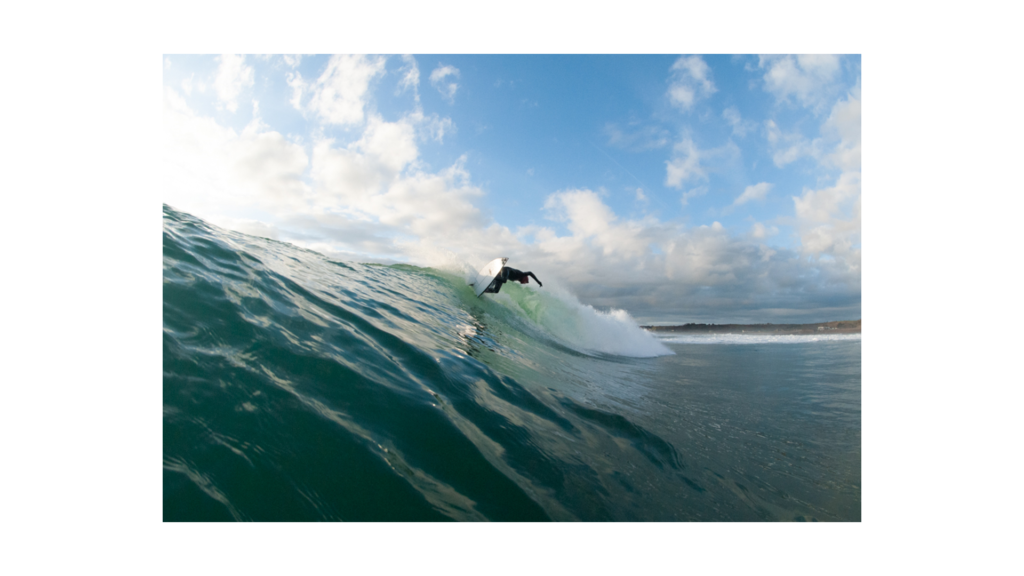
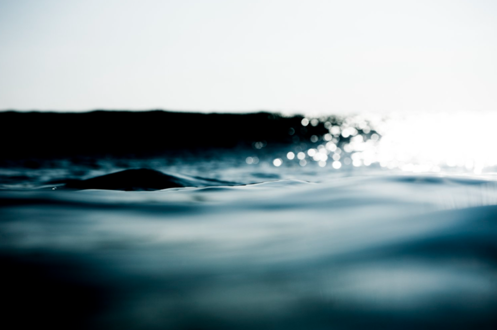
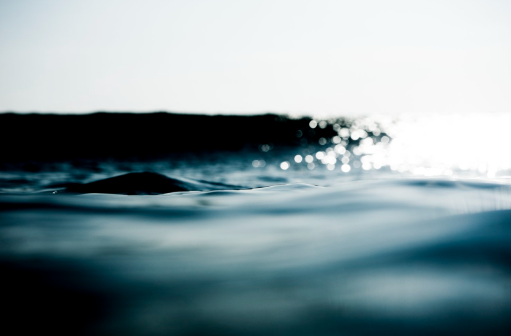
A response of mine taking inspiration from Woody Gooch’s work, incorporating aspects of Gooch’s work. The two images can be compared in terms of their composition and focal point, the focal point being the smooth sea in the foreground with reflections of sunlight. The composition being the even split between sea and sky, once again taking on a minimalist approach.
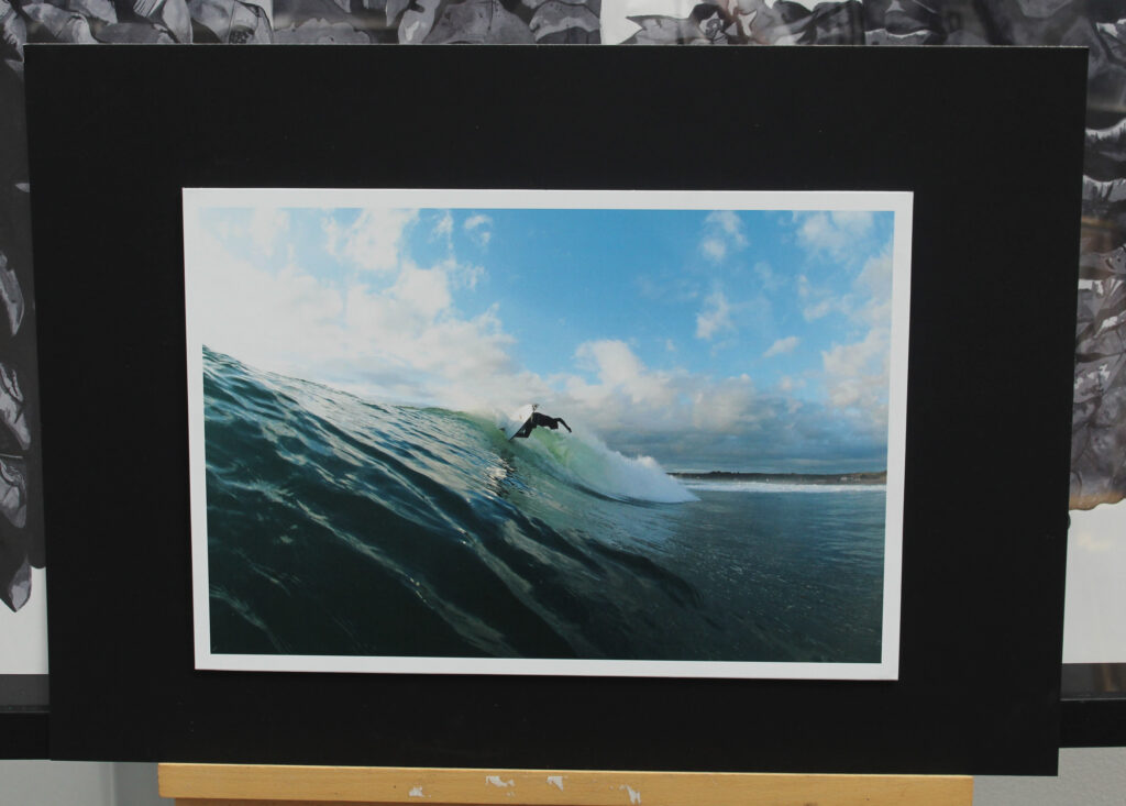
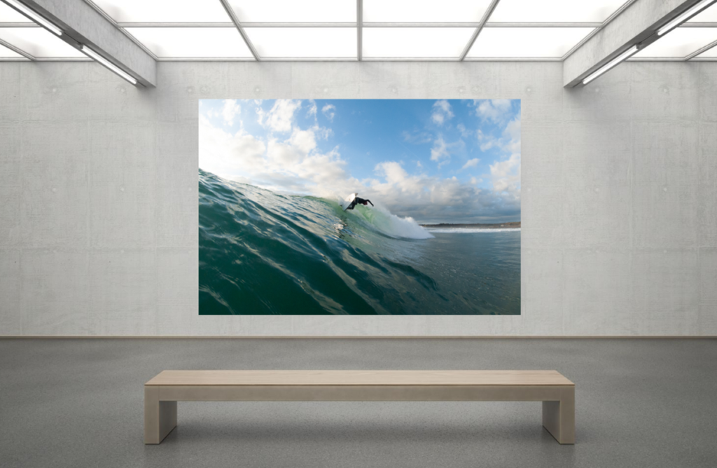
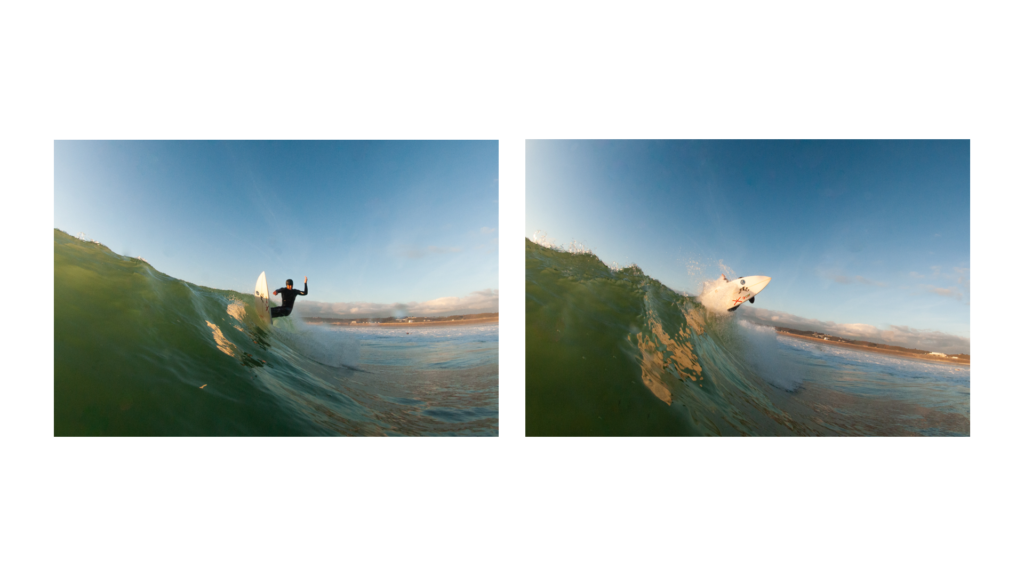
An Image by Woody Gooch
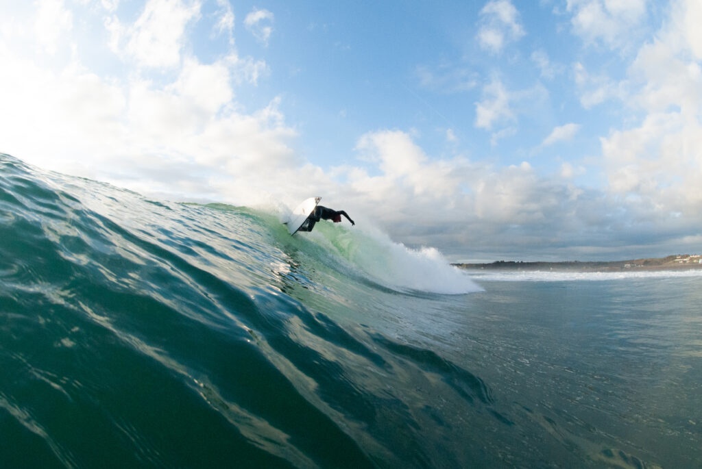
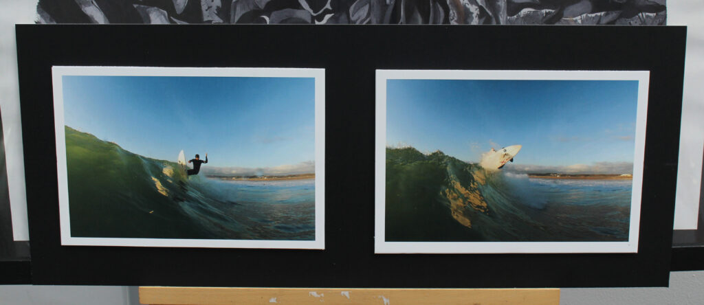
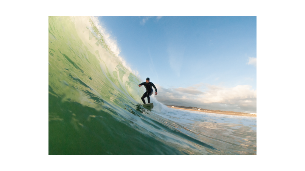
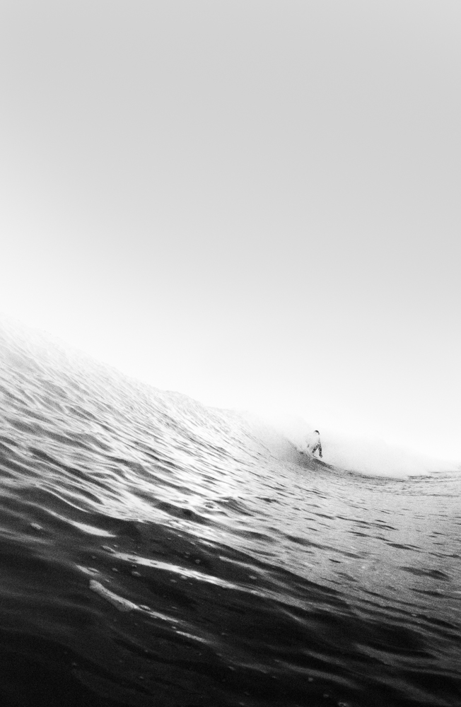
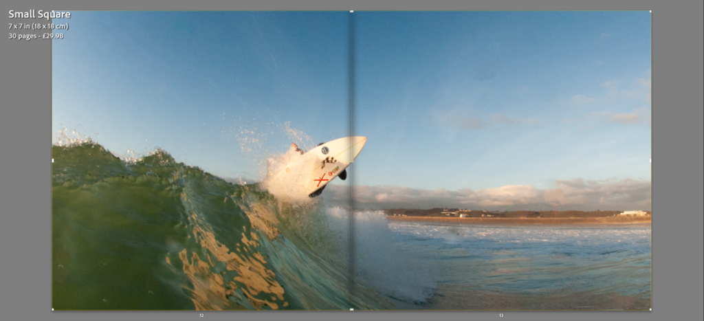
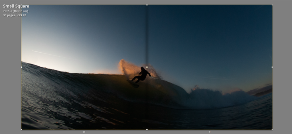
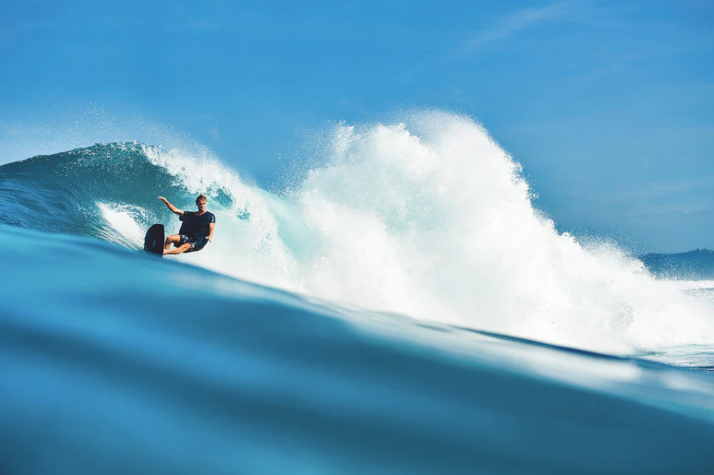
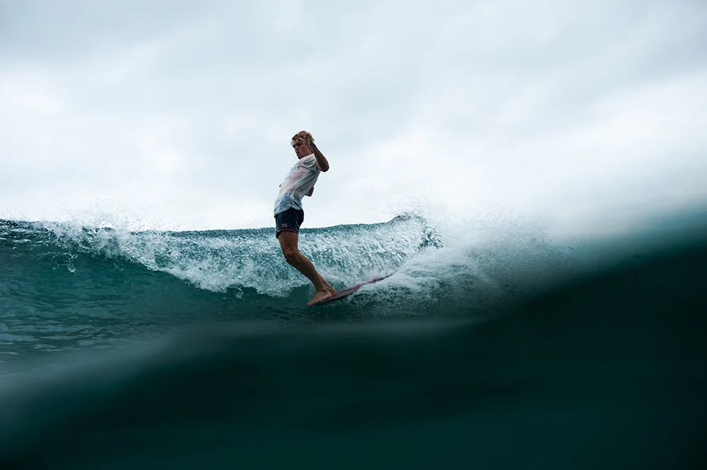
A response of mine taking inspiration from Woody Gooch’s aspects of in water surf photography. The two images can be compared in terms of their similar foregrounds/backgrounds, subject and overall composition. The subject being a surfer in motion followed by a breaking wave in the background and smooth glassy sea taking up the bottom third of the image/foreground.
Due to difficulties accessing the equipment necessary to produce another set of in water outcomes, my singular photoshoot of 600 images will be used to make up my photobook. Experimentations with images I believed to be of poor quality saw me produce outcomes similar to those of the works of Hiroshi Sugimoto.
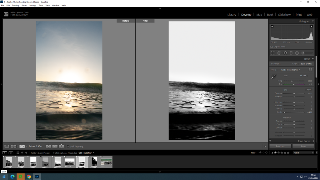
Mass cropping and a change to a punchy black and white setting saw my images evoke a similar feel to works of my two artist references.
Woody Gooch

Background
A young photographer from the Sunshine Coast of Noosa, Queensland. Gooch has been skating and surfing since he was six. It was these sports, plus his love of travel, that ignited his passion for photography. Woody Gooch has become known for his bold, minimal and textural works that cast a fresh and elegant eye over the ocean and its riders. A surfer himself, Gooch captures fleeting moments in the water while honouring the sensual beauty of the waves. In black and white and muted tones, the captivating works of Woody Gooch are the antithesis of high-action, high-zoom imagery often associated with surf photography.
”Viewing his landscapes and oceans is a transcendental experience. One gets the feeling that Gooch is inside the photographs, not merely an observer. His subjects, mostly friends, might be surfing, or carving tracks on dirt bikes in a moonscape, but they move in harmony with the world, with reverence to the earth, to the magic and power of Mother Nature. One stands in awe, breathless at the view.”
Favored Outcomes
Awards
2018 – Finalist, Nikon Surf Photographer Of the Year
2016 – Finalist, Nikon Surf Photographer Of the Year
2015 – Lifestyle Winner – Monster Children
2015 – Finalist, Follow the Light Foundation
2014 – Finalist, Follow the Light Foundation
Inspiration
Woody Gooch’s photography has inspired me to produce images that similarly capture the essence of the ocean and surfing culture. Gooch’s ability to convey raw emotions and the beauty of the sea has motivated me to experiment with differing angles, lighting, and compositions in my own work. By drawing inspiration from Gooch’s style, I aim to develop a unique approach that reflects my similar passion for the ocean and storytelling through photography.
Minimalist Approach
Woody Gooch incorporates aspects of minimalist photography in his work by focusing on essential elements, simplifying compositions, and using negative space effectively. His images often have a clean and uncluttered look, allowing the main subject to stand out prominently. Gooch’s minimalist approach helps draw attention to the beauty of the ocean and the emotions of the surfers without distractions, creating a sense of calm and purity in his photography. I intend to produce outcomes of similar compositions.
Decisive Moment
Woody Gooch captures the decisive moment in his surf photography by expertly timing his shots to freeze the perfect instant when the surfer’s movements, the wave, and the surrounding elements align harmoniously. This approach allows him to convey the dynamic energy and emotion of the surfing experience in a single, powerful image. Gooch’s ability to anticipate and capture these decisive moments adds a sense of drama and intensity to his work, immersing viewers in the exhilarating world of surfing.
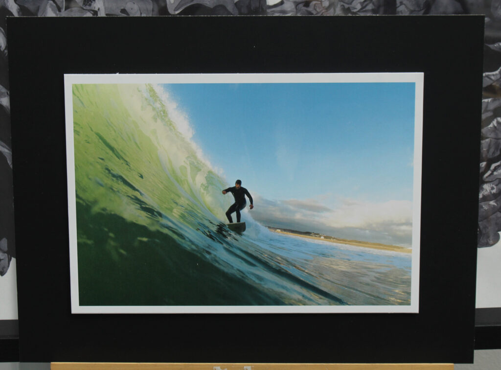
Image Analysis
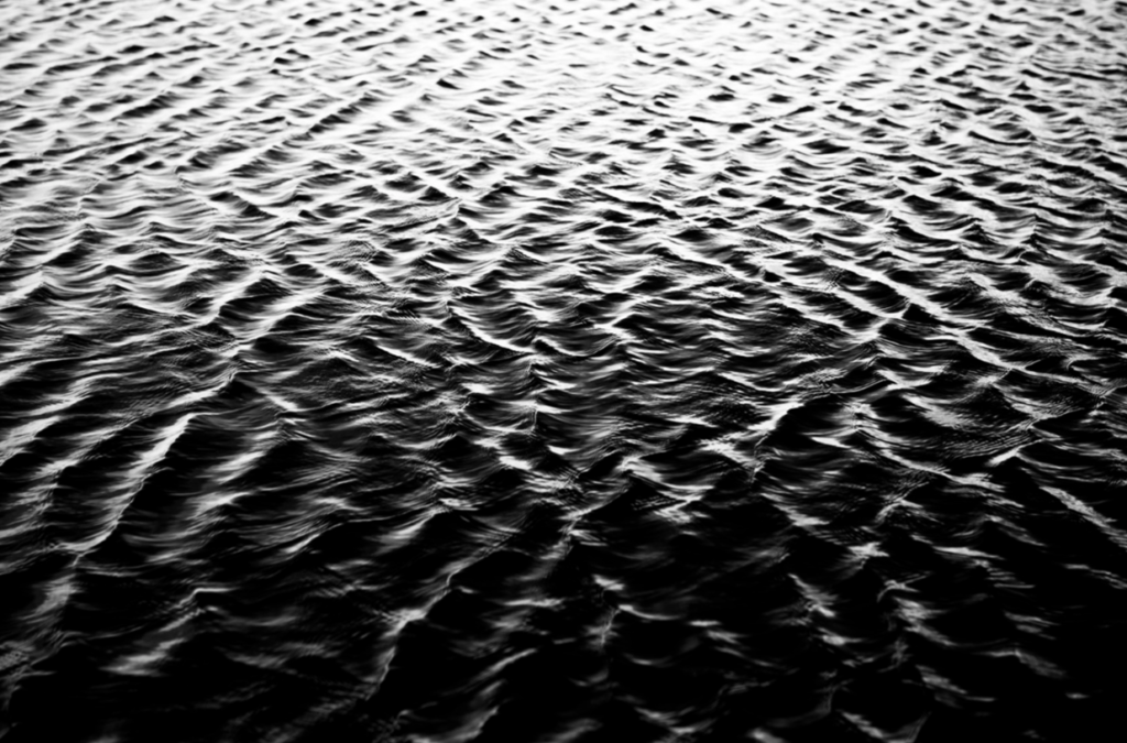
”Weight” – Woody Gooch
Visually – The visual elements seem to capture an essence of heaviness, hence the title, the play of light and shadow adds depth to the image, highlighting the contrast between light and dark.
Technically – Gooch’s composition and framing create a visual balance that enhances the overall impact of the image. The black and white photography choice gives a timeless and moody feel to the piece.
Contextually – “Weight” may reflect themes of struggle, resilience, and the human experience of carrying burdens. The title itself suggests a sense of heaviness and responsibility.