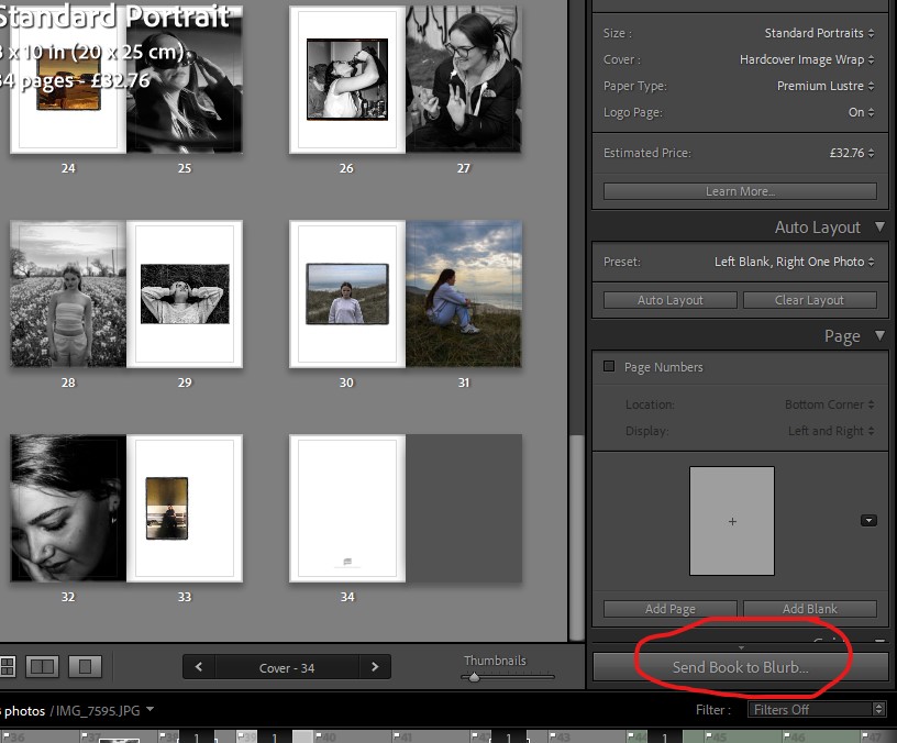
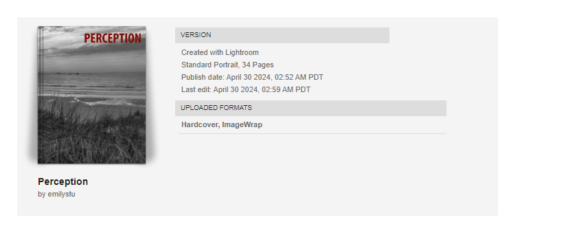
Here is a link to the virtual copy of my book: Perception
All posts by Emily Stubbs
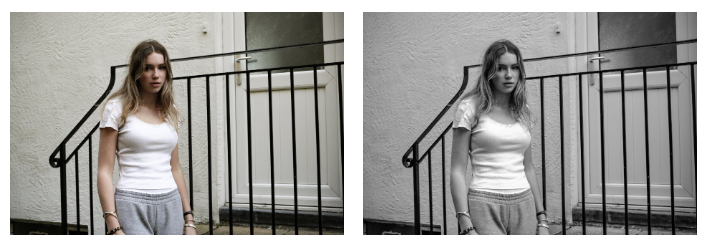
Filters
Evaluation
My Book:
The process of making my book was reasonably simple as I have made a photobook previously for a past project. I ensured I learnt from my mistakes I made with the last book, to create a display of my work that I am proud of. To start the formation of my book I planned shoots and took mostly staged images as this allowed me to be clear about what I was trying to portray. Following that, I imported my images to Lightroom and began selecting/sorting through my most successful photographs and started my editing process there.
X key = Reject Image
P key = Pick Image
Once my initial editing was complete, I moved some of my images onto photoshop to do some final touch-ups and experiment with different aesthetics. However, I ended up not using my experimental images as I couldn’t find a consistent style that would run throughout my book. Once my favourite images were selected I pressed the ‘book’ button on Lightroom and tested out different layouts to see which composition was the most efficient and appealing. I tried multiple different layouts before I was happy with how it looked and then exported my photobook to Blurb ready to order.
My Images:
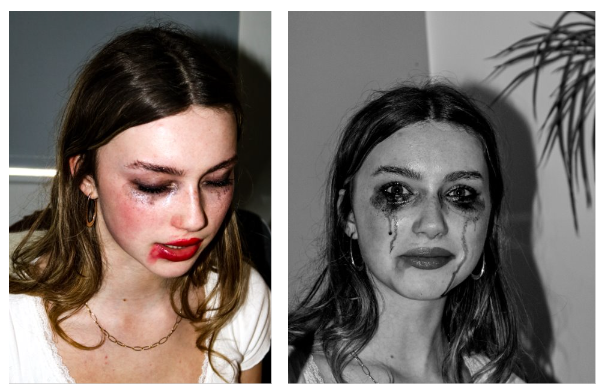
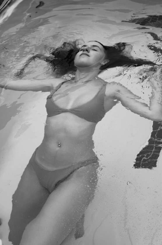
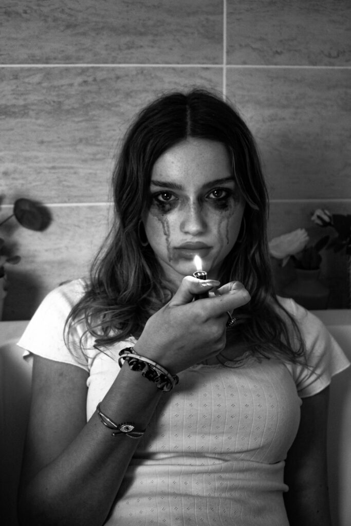
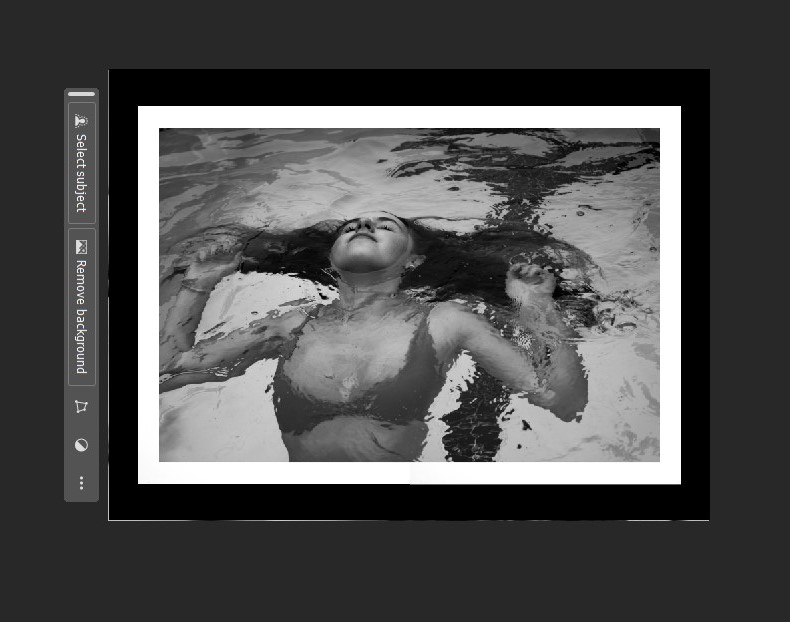
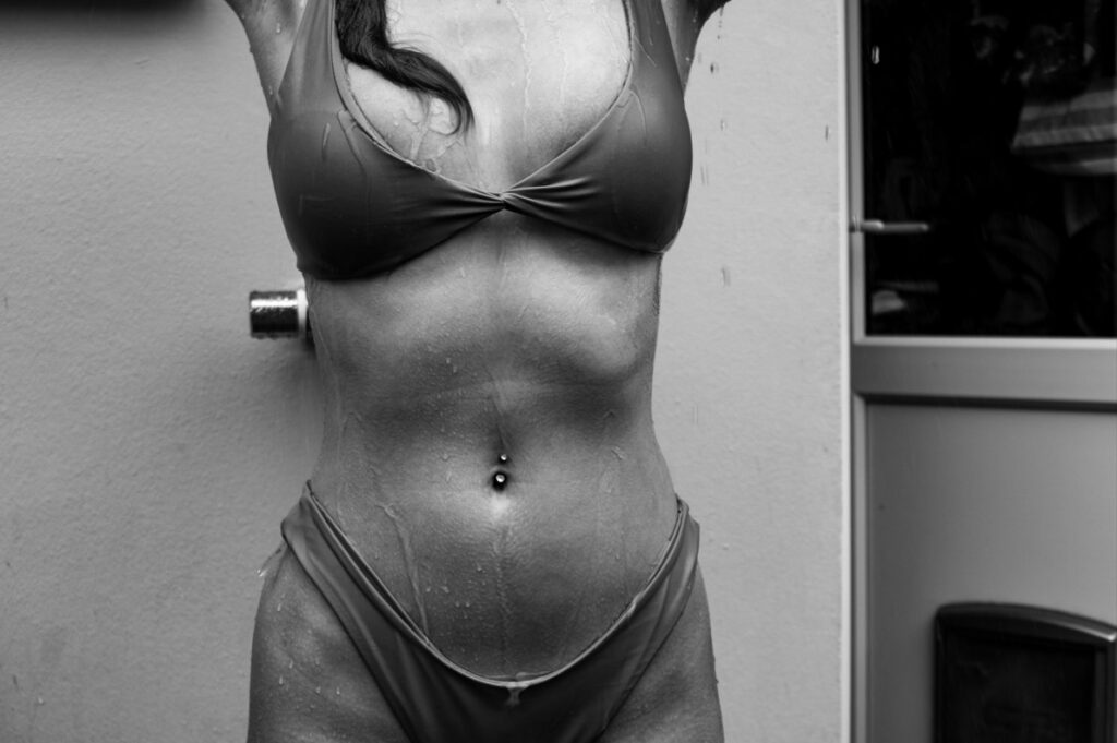
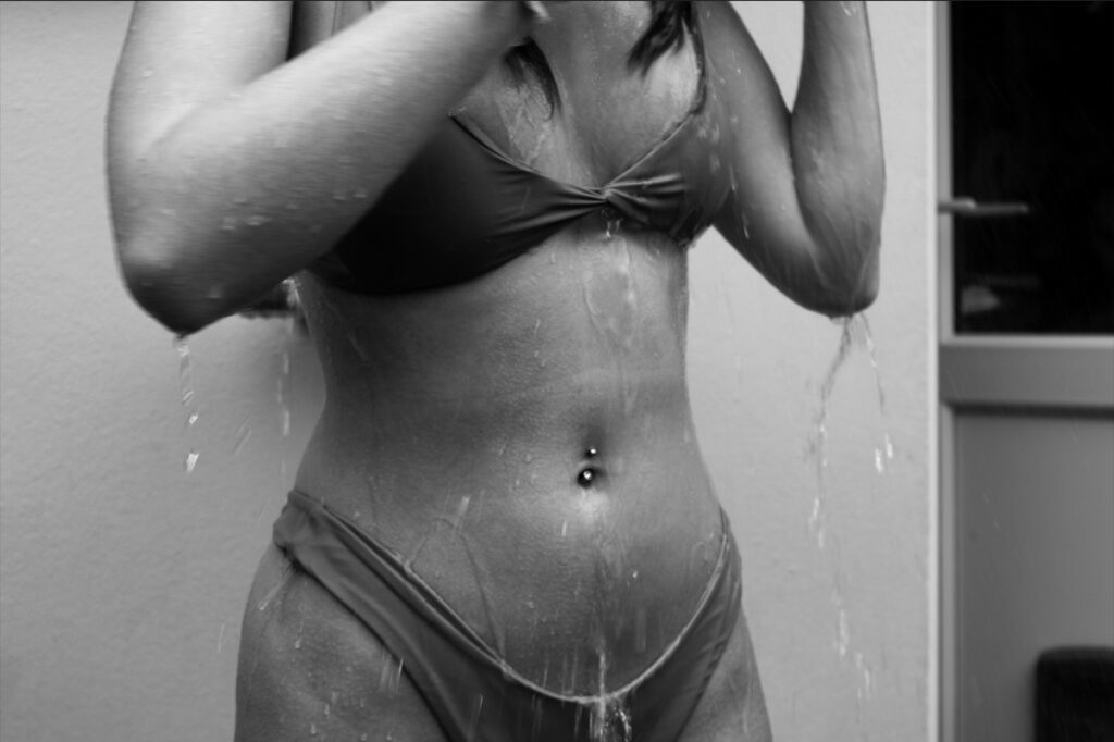
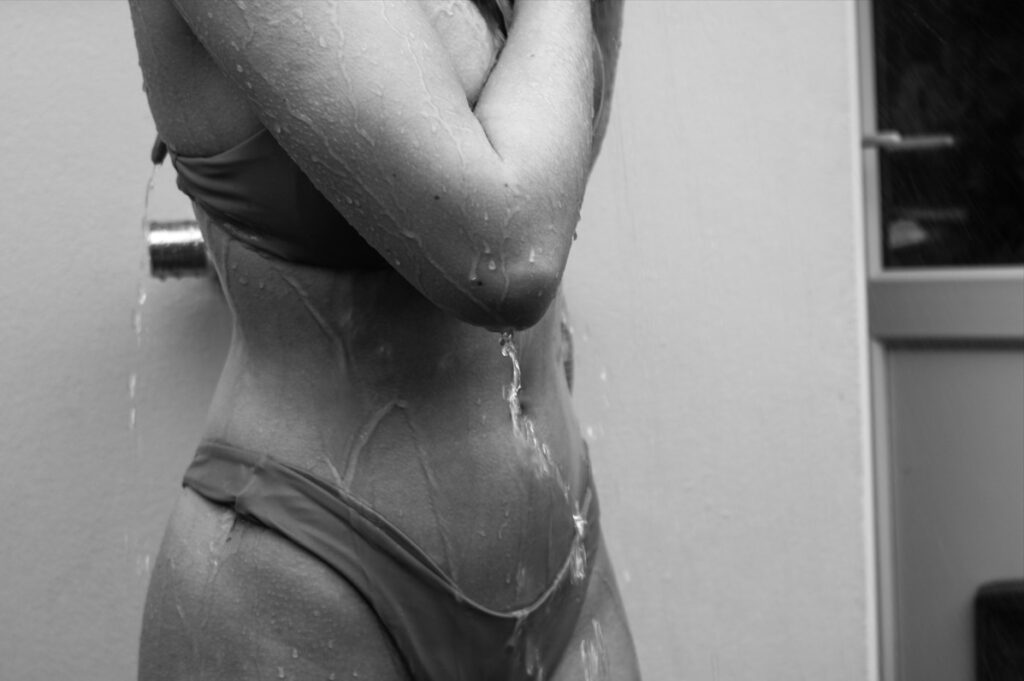
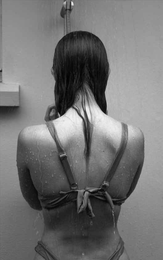
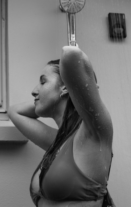
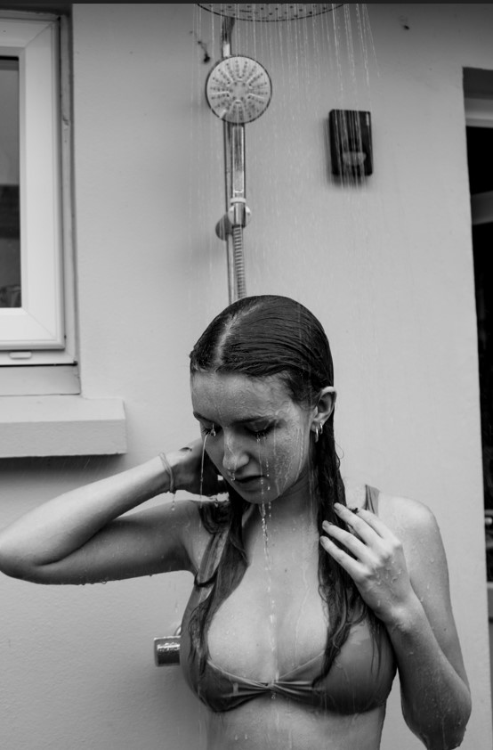
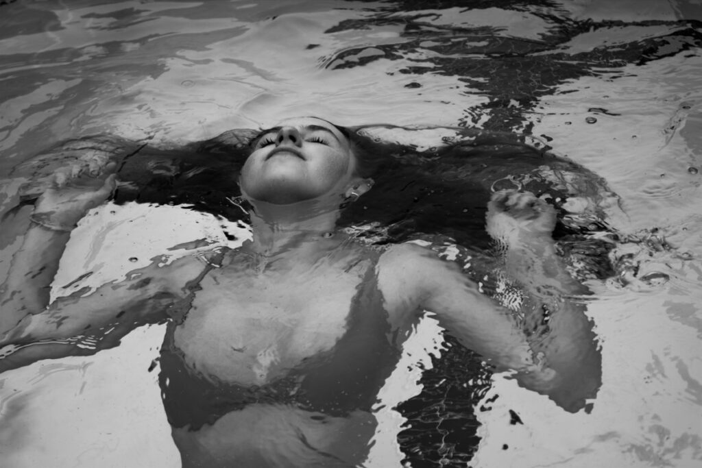
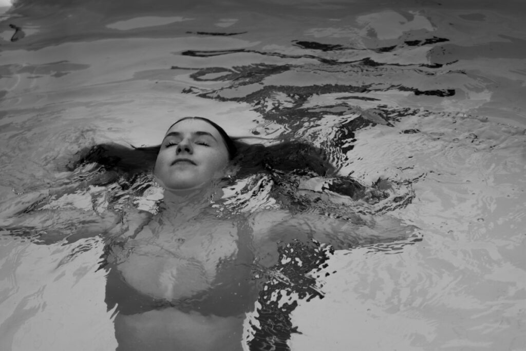
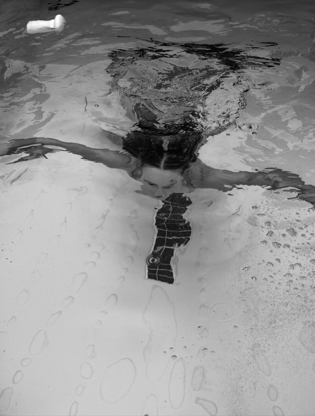
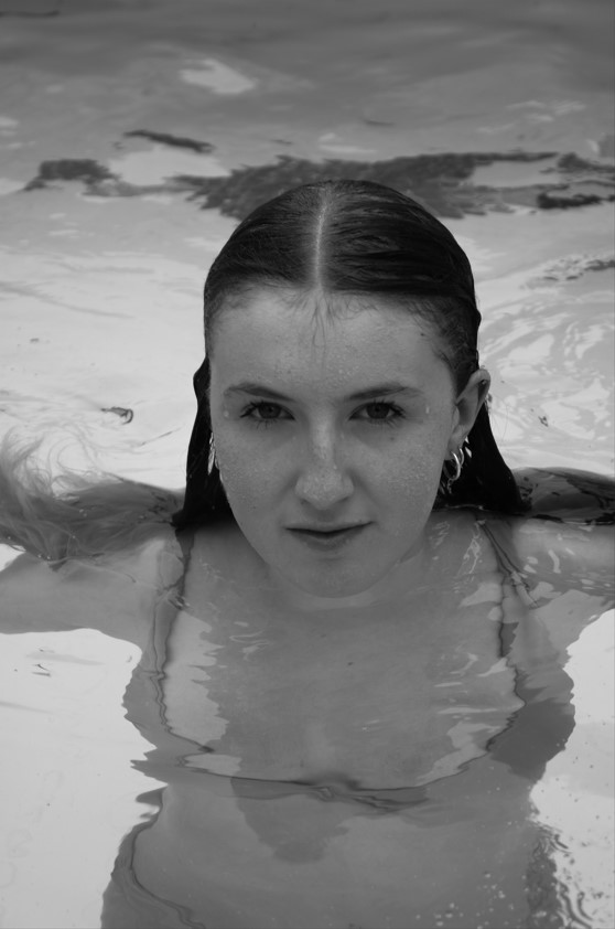
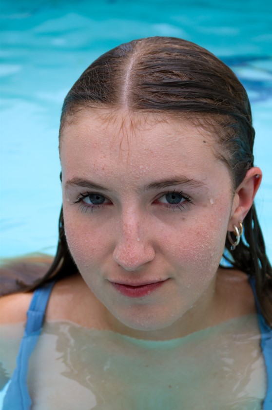
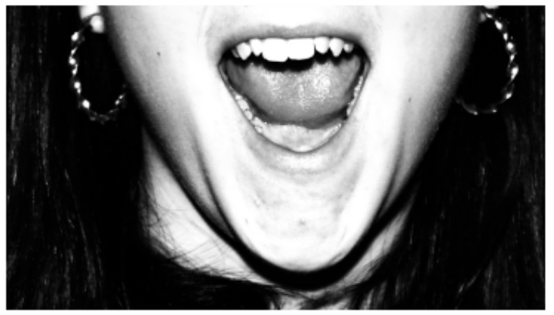
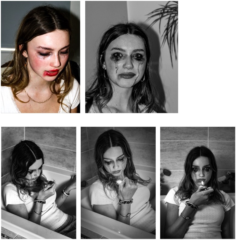
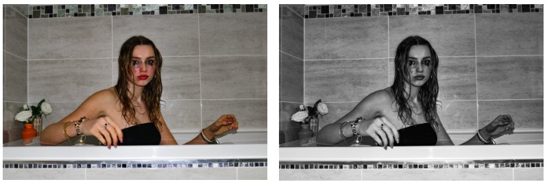
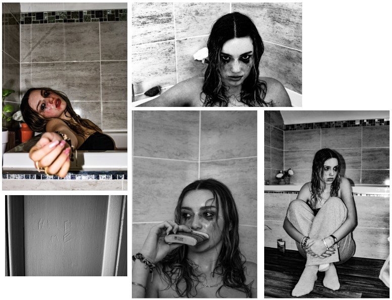
Overall, I think the majority of my outcomes, from this project, were successful setting me up nicely to create my photobook. I especially enjoyed this project as it enabled me to be more creative with my shoots than usual. I experimented more with my shots as the majority of them were staged, for example doing a shoot of in a pool and creating a dramatic look using makeup of tears running down a girls face.
I edited all of my images on Lightroom as, in my opinion, it has all the features for a successful initial edit, while any further altercations were made using photoshop.
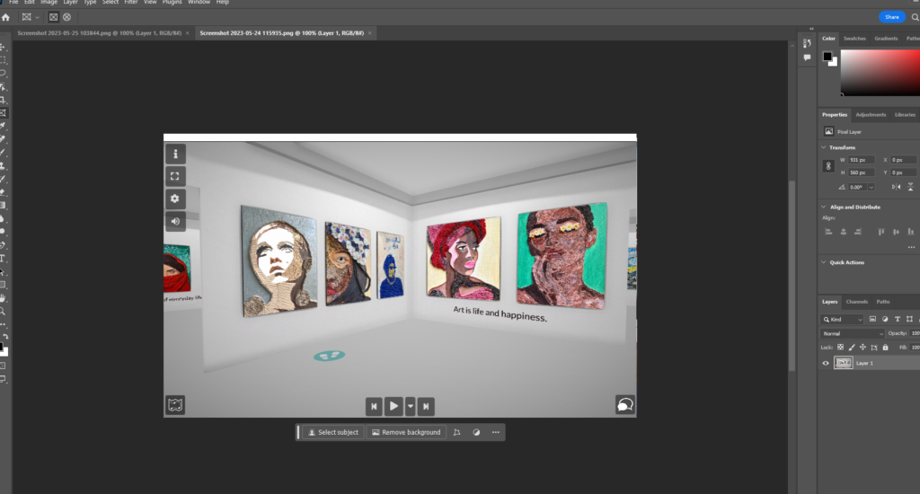
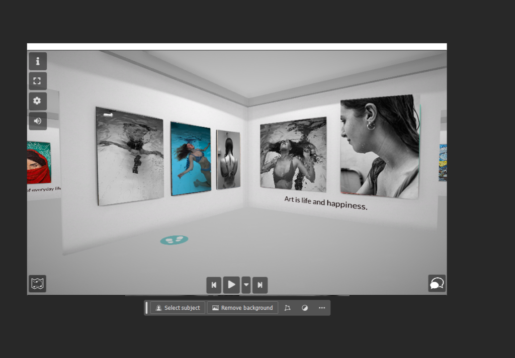
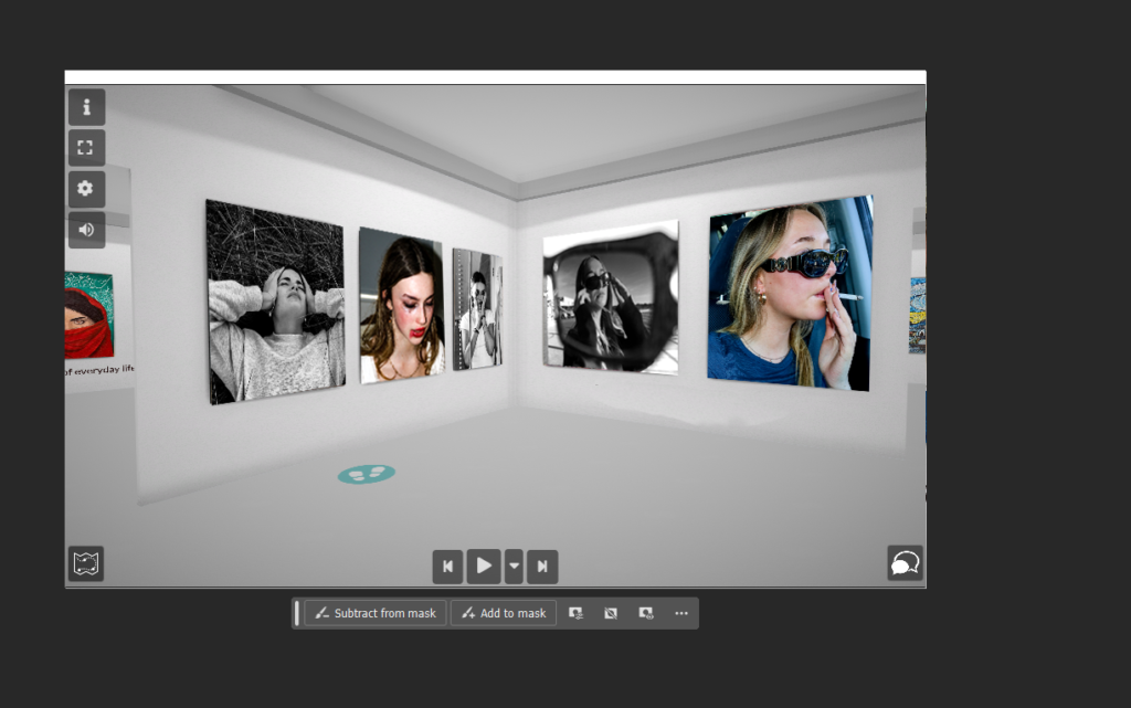
Virtual Gallery:
To display some of my most successful outcomes I created two virtual galleries that present how my images would look if they were in an exhibition.
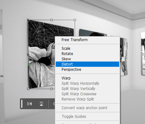
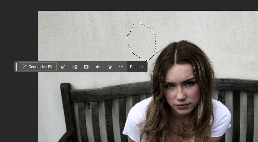
The process of creating a virtual gallery involves exporting the images to Photoshop, as well as your downloaded image of a gallery, and using the gallery as a background, adjusting the images to fit within the frames on the walls as if they were originally there. I find it easiest and most effective to do this with the Distort tool as it allows you to change the angle of the image as well as move the corners around.
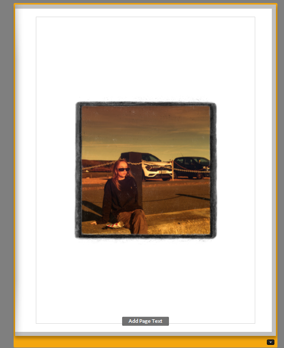
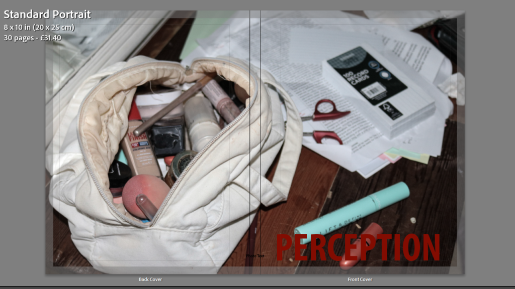
Layout of photobook
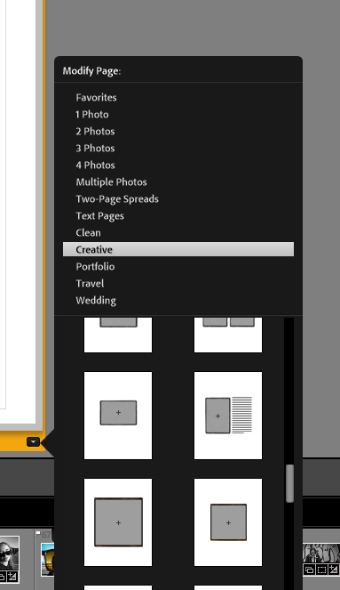
Once all my images were edited to my liking I began to experiment with various layouts on the pages of my photobook.
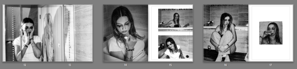
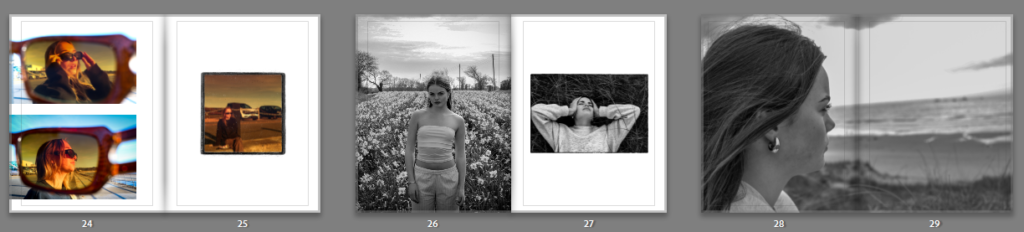
To separate my images from one another I tried using the creative tab to make my images more unique and give the effect of a scrap/sketchbook.
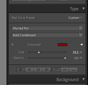
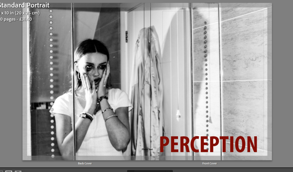
I added text onto the cover for my name and the title of my book:
This is how I changed aspects like the font, size, colour and positioning of the writing.
Final layout:
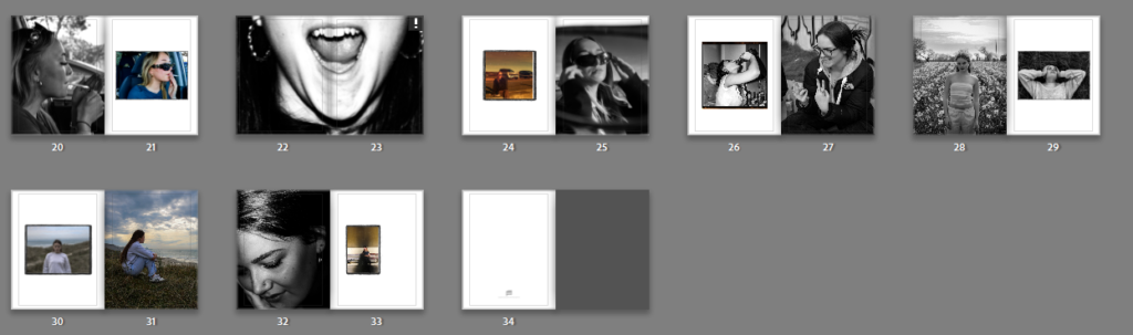
Now that my layout is complete I will export my book to BLURB to order a physical copy.

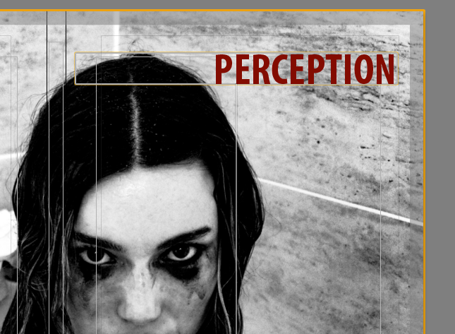
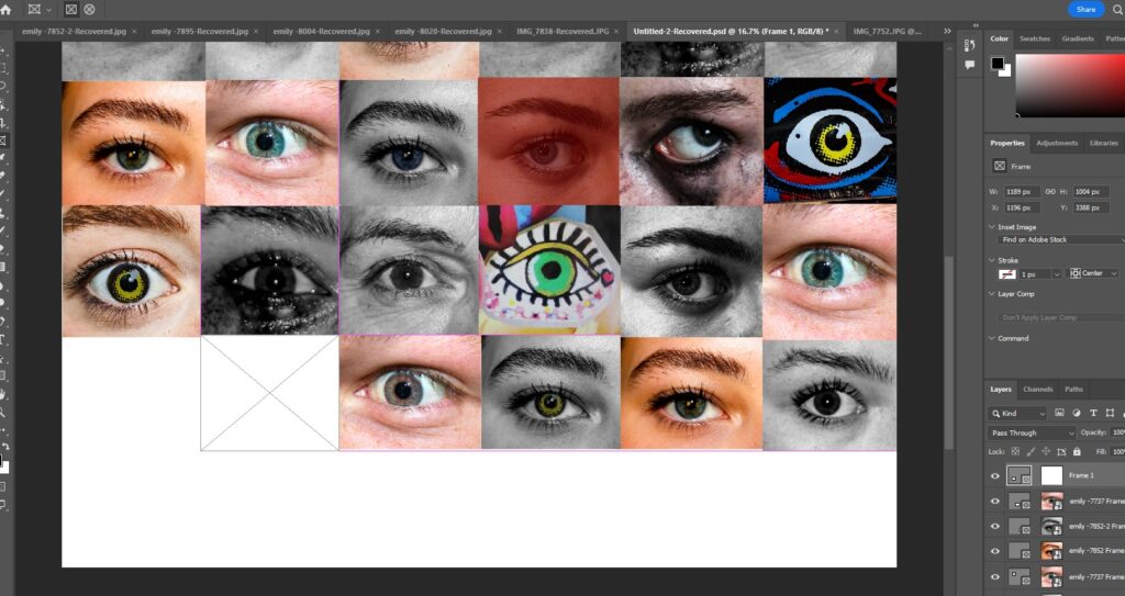
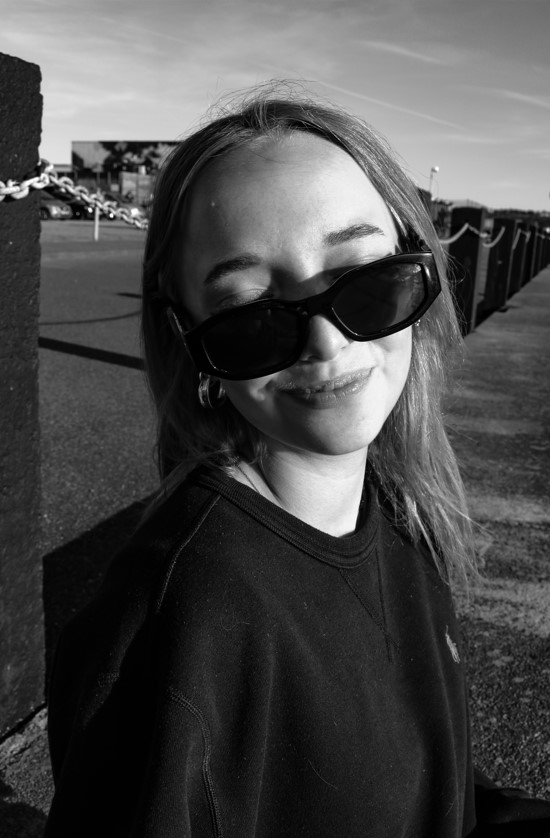
Photobook Cover
For the cover of my photobook I wanted to create something unusual rather then just using a singular image.
I experimented with different images of eyes, edited them differently and made a montage that could be used as a cover.
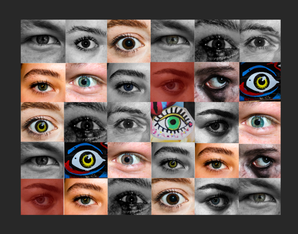
On lightroom I imported it as the cover to see what it would look like.
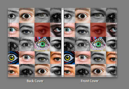
However, I realised this didnt match the contents of my book and felt a bit random so I tried some other options.
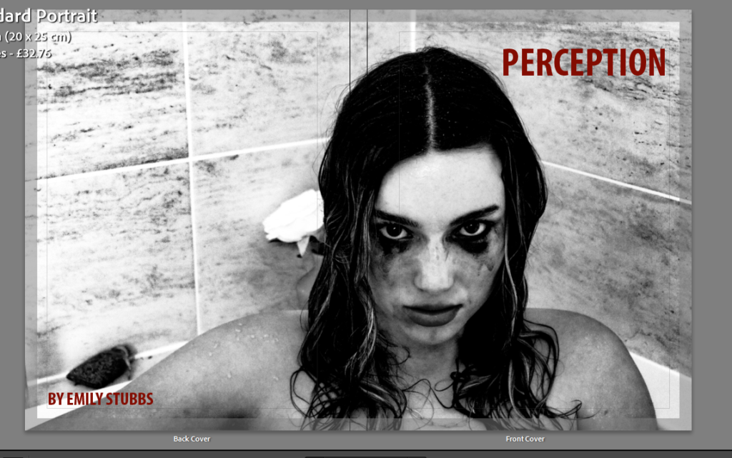
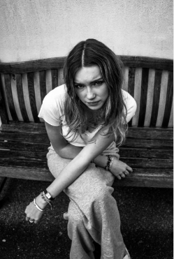
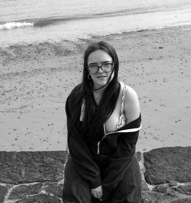
My final decision:
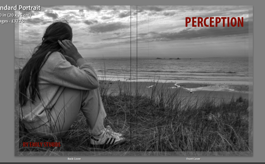
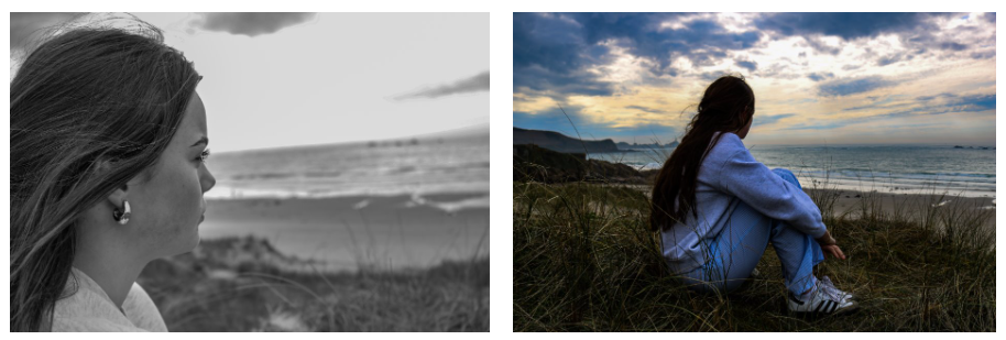
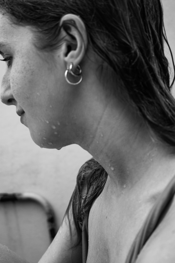
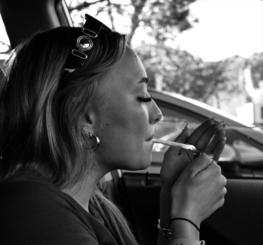
I decided on this image as I liked the way this outcome matched the title as the girl is looking out (perceiving) and how the layout of the image fits the format nicely. The monochrome makes the burgundy text stand out and creates a clear contrast ensuring it is easy to read.
Virtual gallery
Before:
After:
Mounted images
Here is a virtual plan of how I am planning to mount my printed images, however this may change once I receive the physical copy if I think a different layout would be more aesthetically pleasing.
Window mounts:
Window mounts with white boarder surrounding images.
Foam board:
For my A4 print I am going to mount it on white foam board.
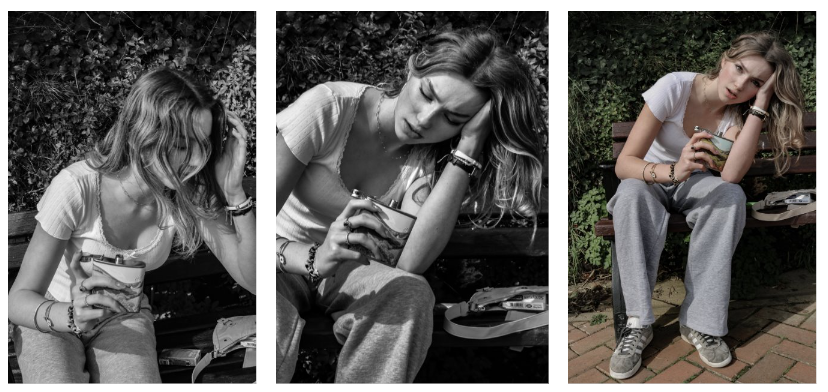
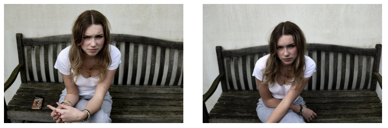
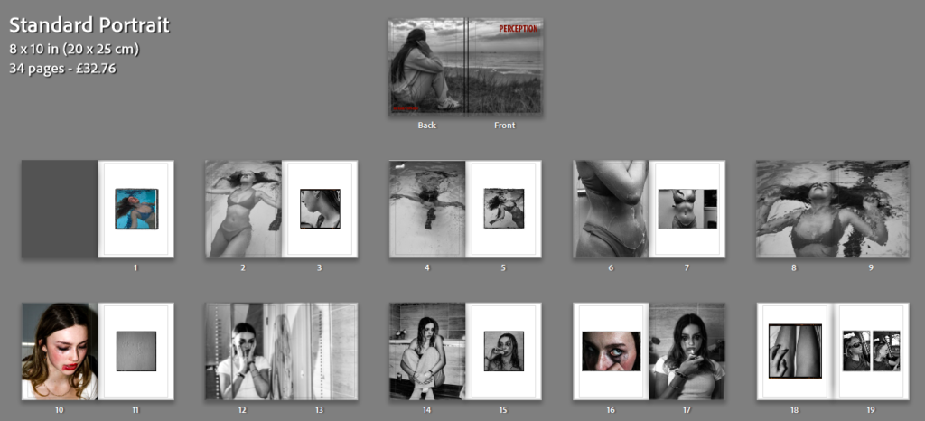
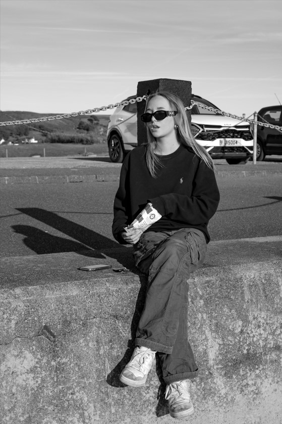
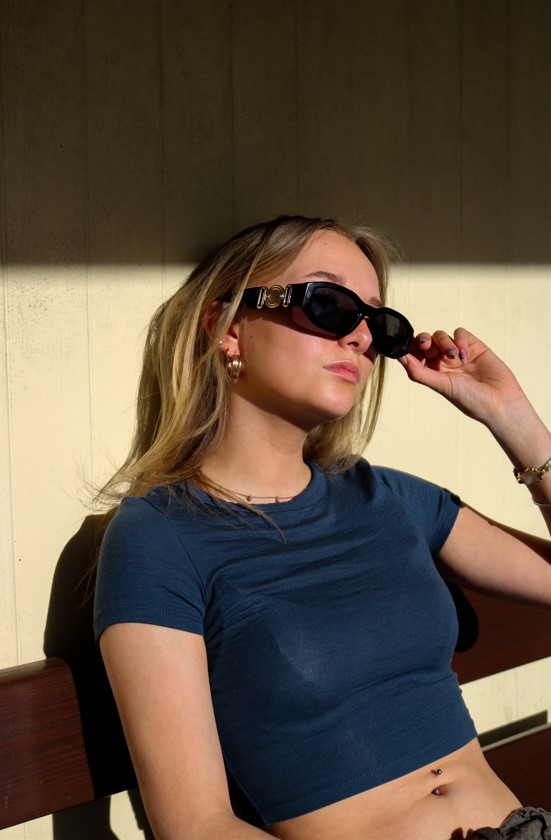
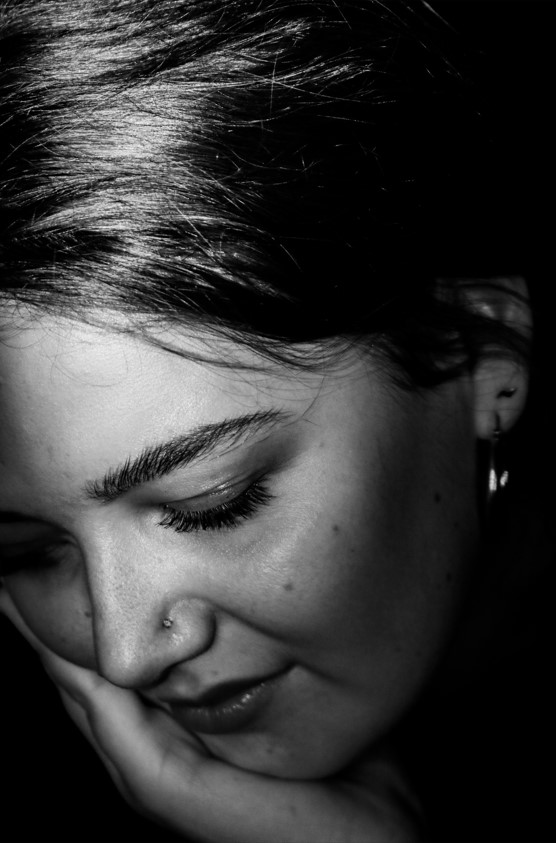
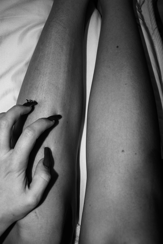
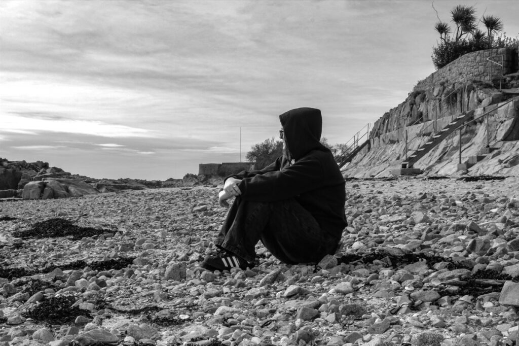
Final Outcomes
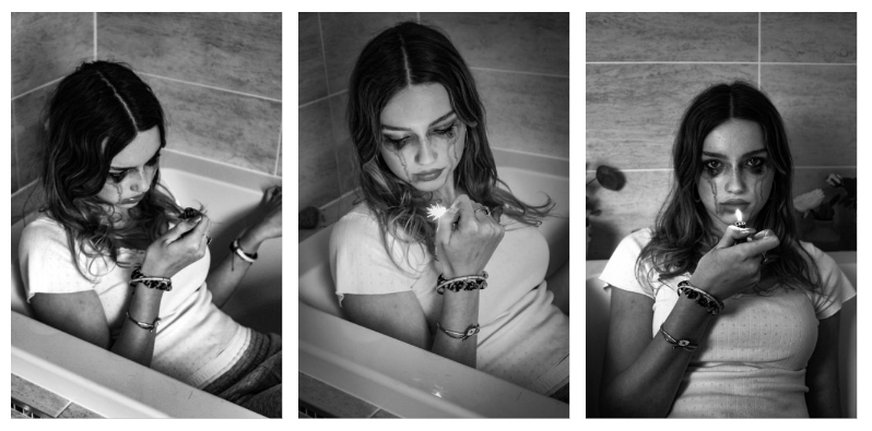
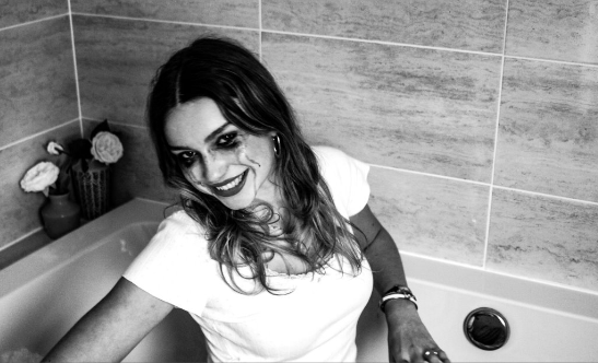
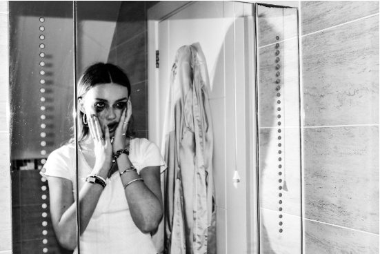
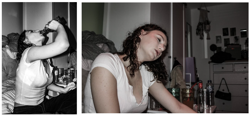
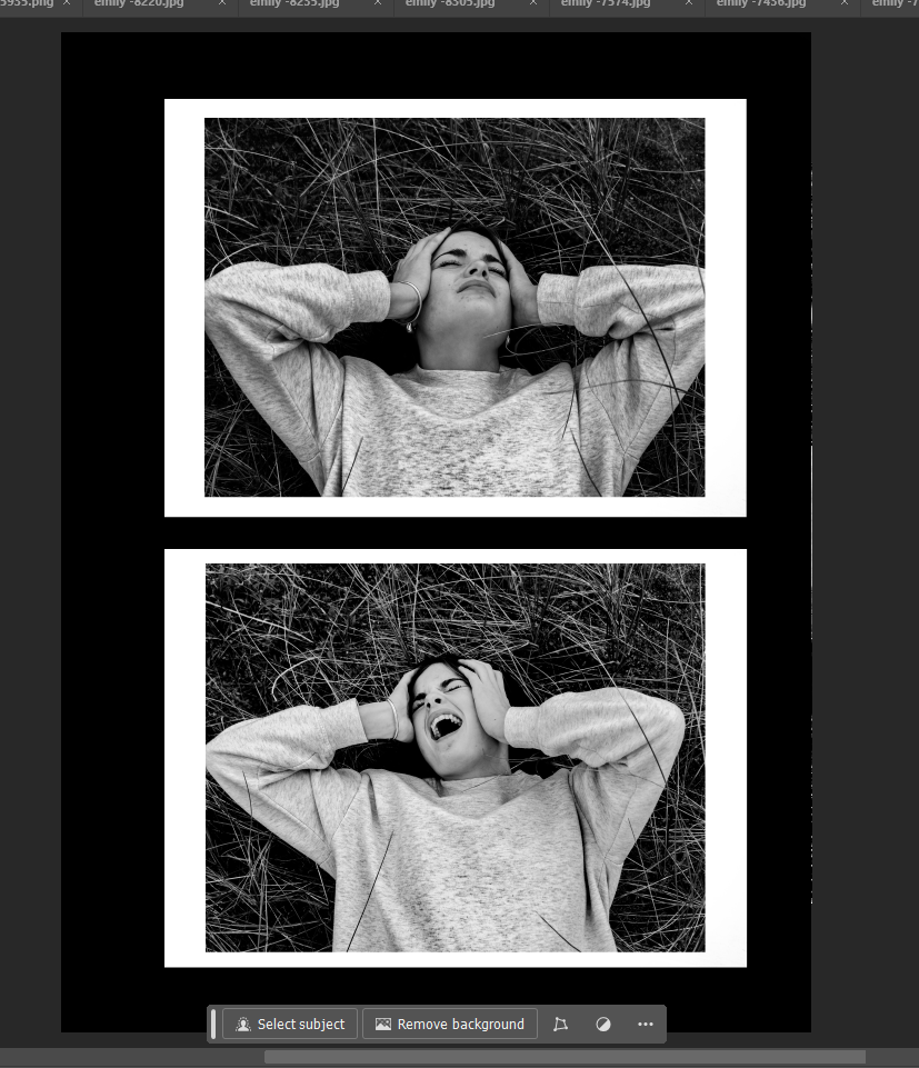
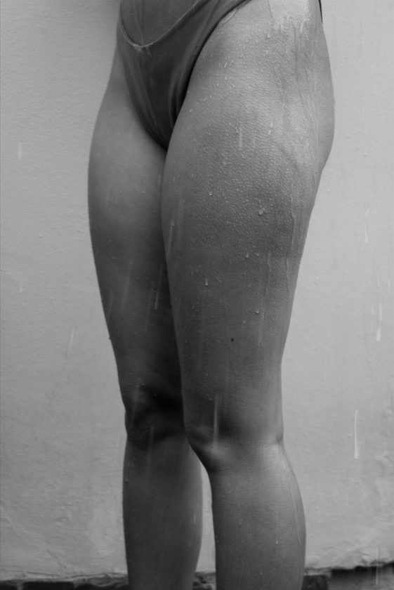
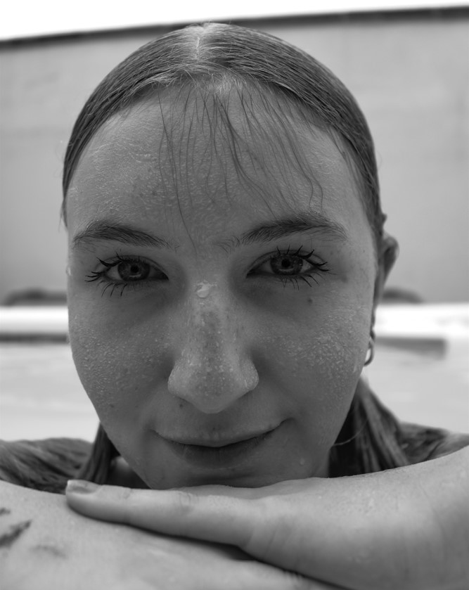
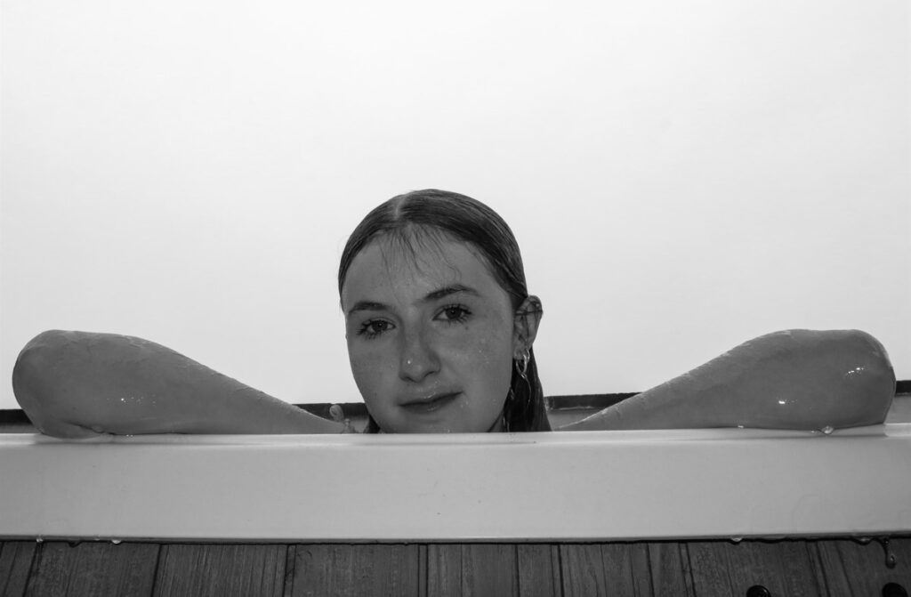
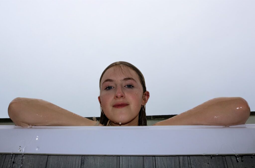
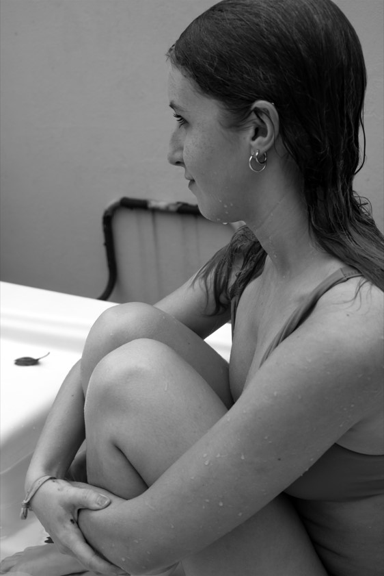
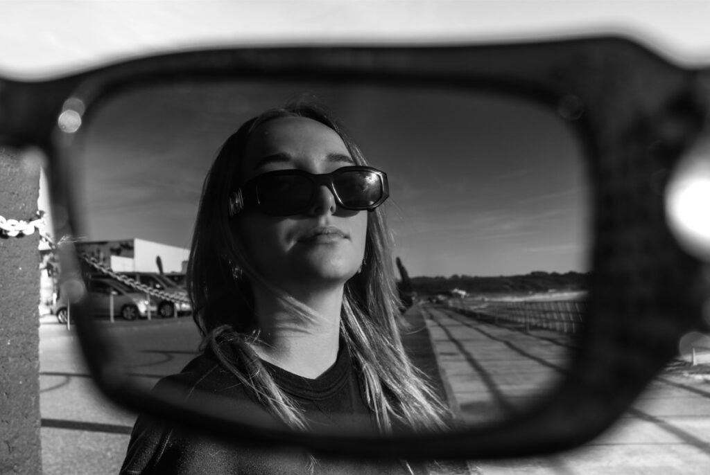
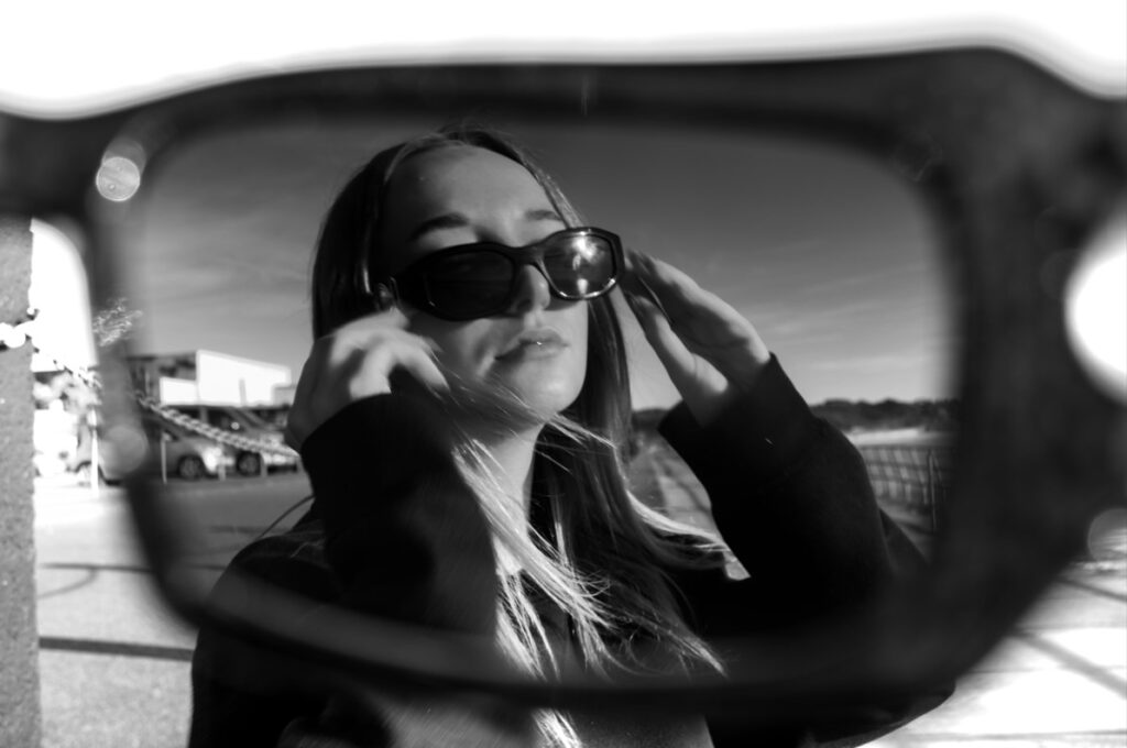
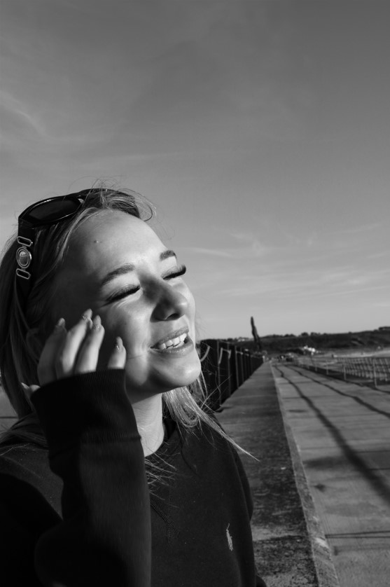
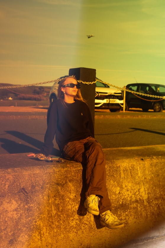
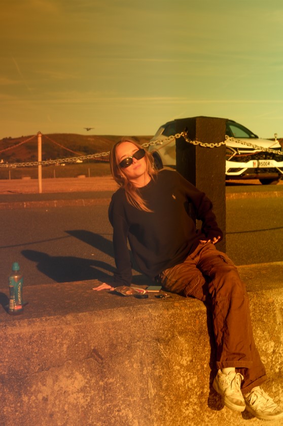
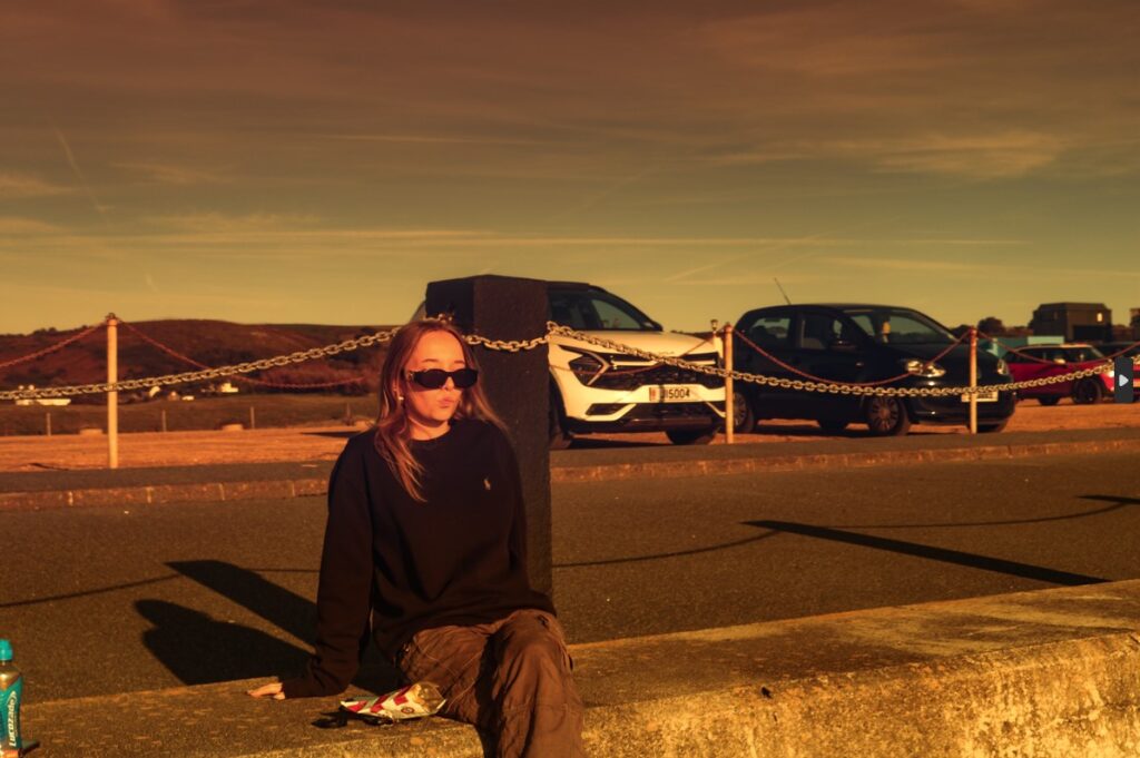
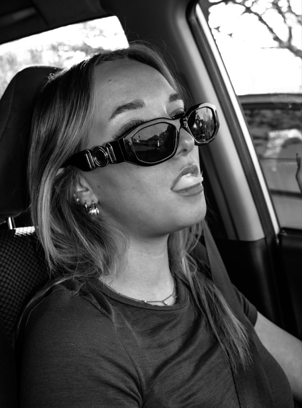
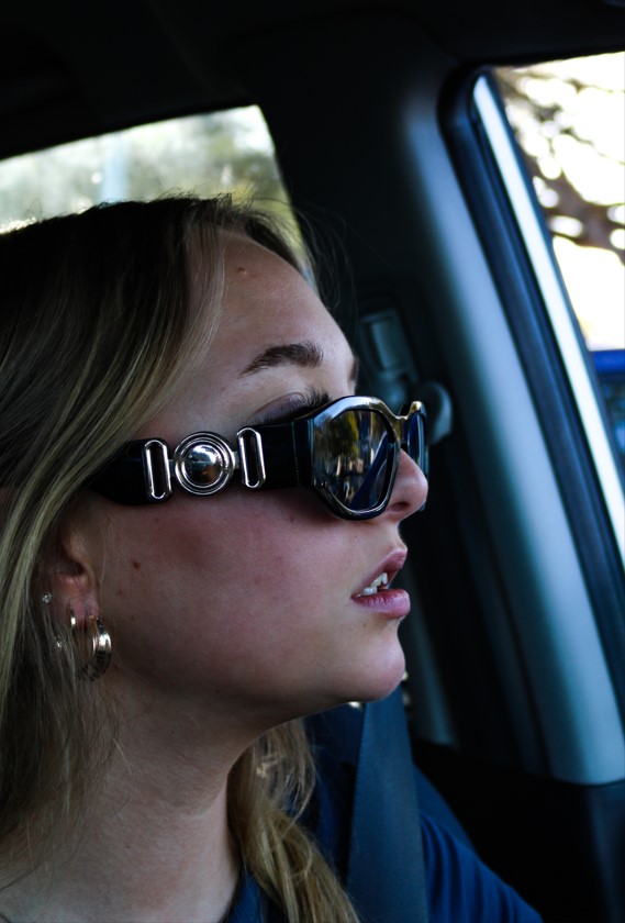
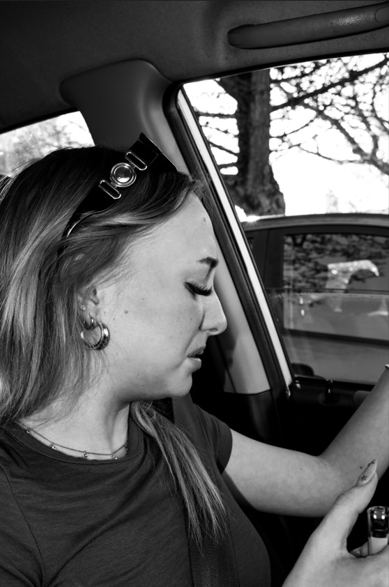
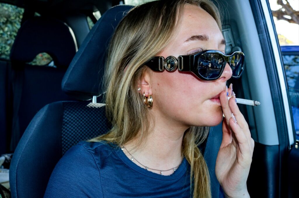
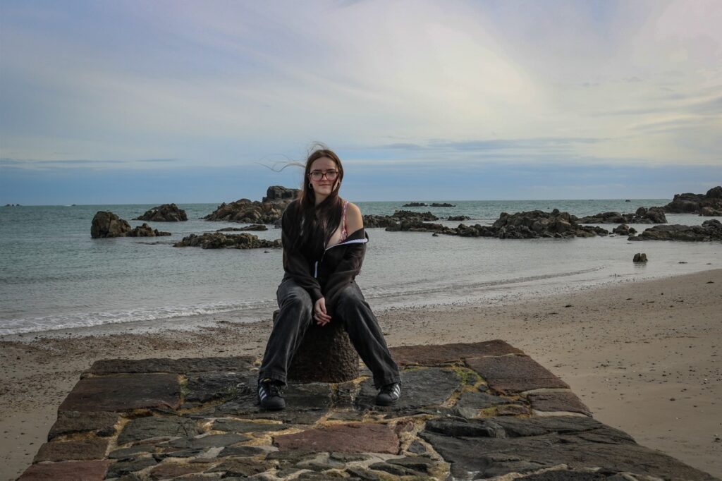
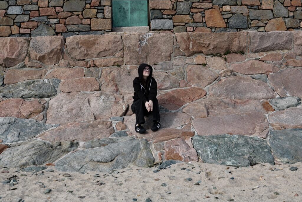
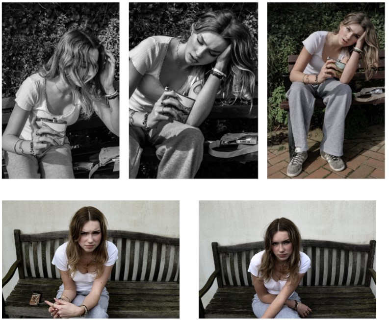
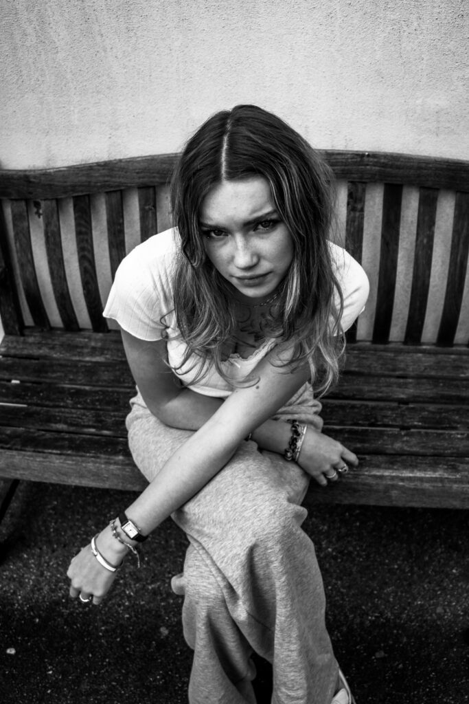
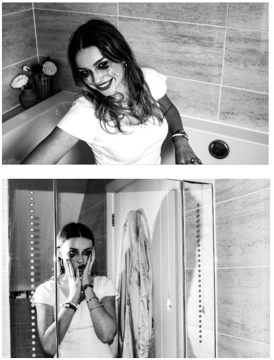
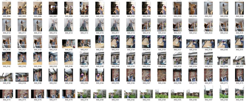
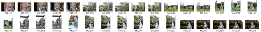
These are my most successful images, from these I will decide which images to use to create my photo book.
experimenting
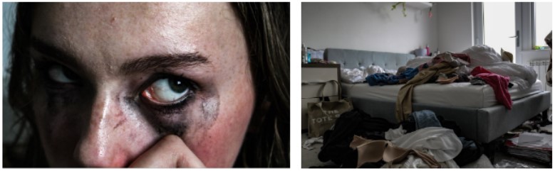
I played around editing and altering my images on photoshop to enhance the outcomes and experiment with different styles.
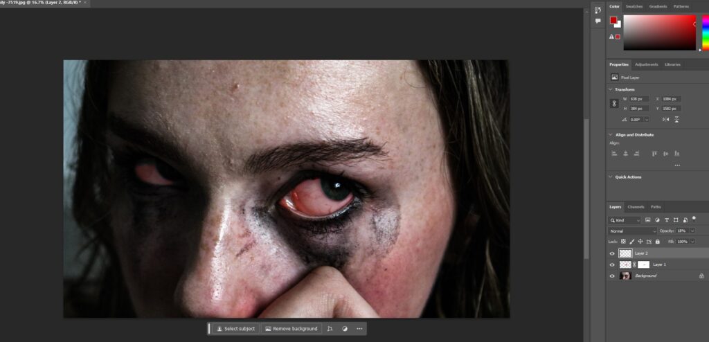
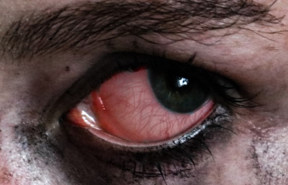
I edited this image to be more visually dramatic and shocking so I made her eyes bloodshot.
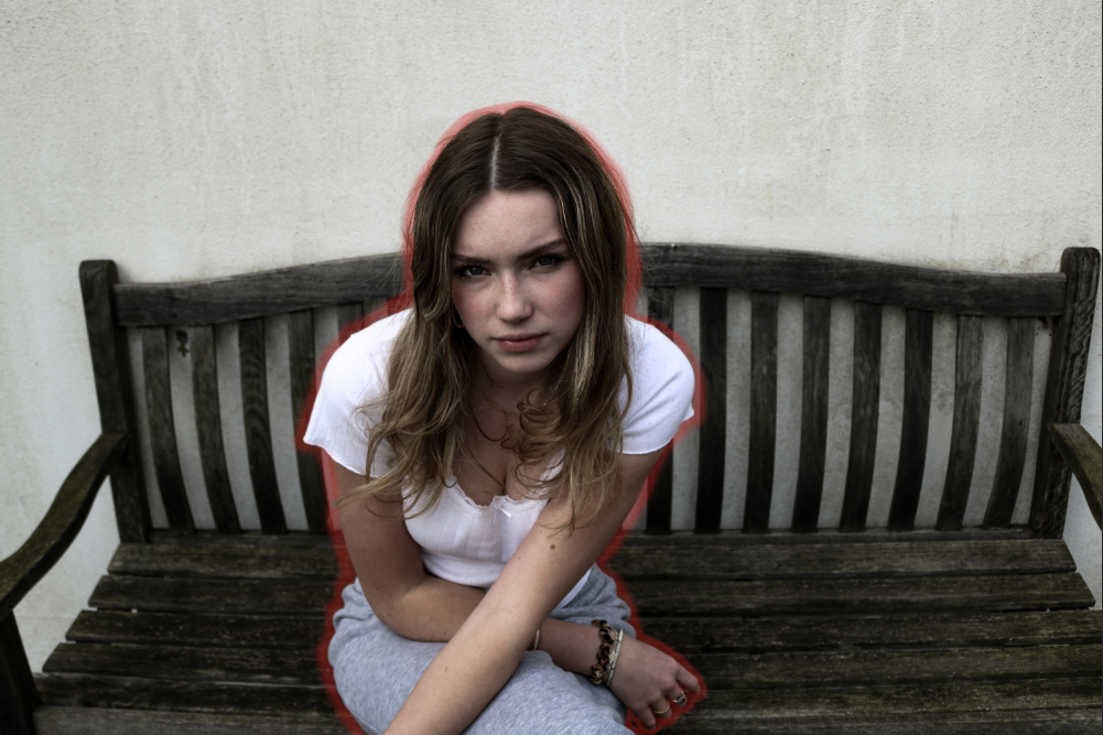
For this image I wanted to outline her however she had some strands of hair making it difficult so using the lasso tool I copied and pasted a different part of the wall on top of it and erased and softened the edges to make it look more natural.
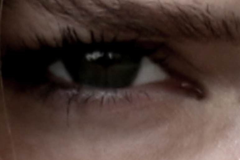
In the image below I whitened the white area of her eye as it was very shadowed and dark in the original copy.
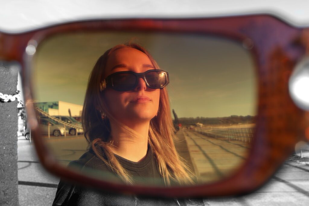
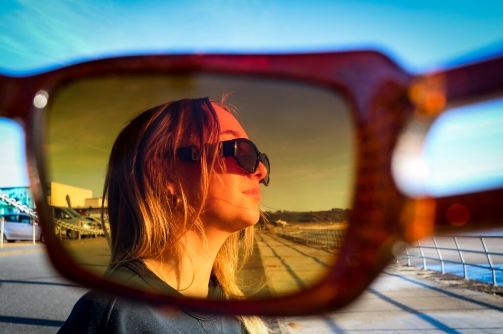
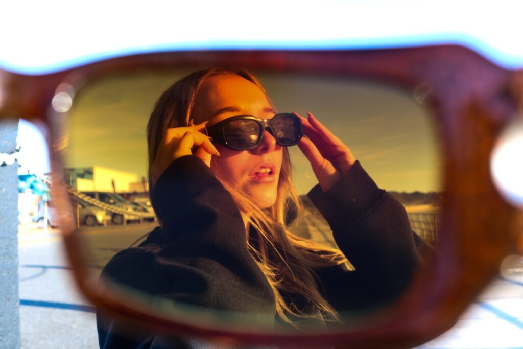
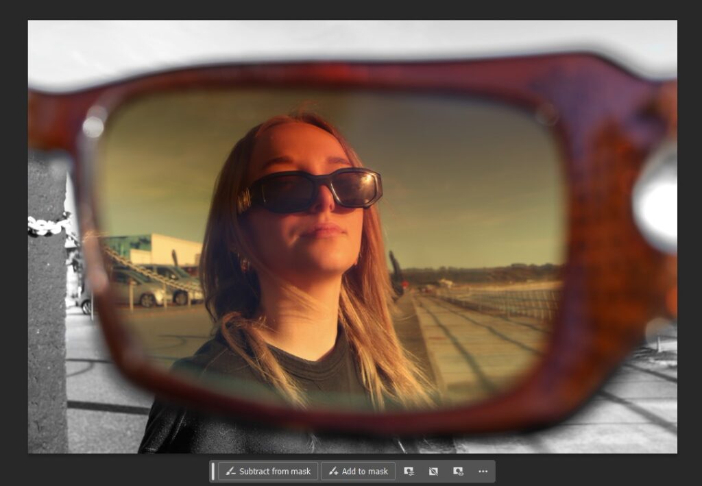
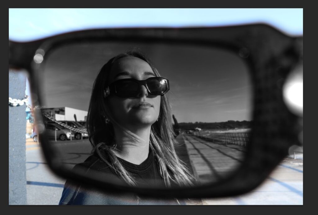
I used this image to create some contrasting images were the surrounding background around the glasses was a different colour to the view from inside the glasses.
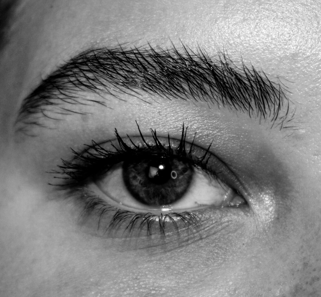
Originally, my book cover was going to be a range of different eyes and so I experimented editing the eyes to be more unique.
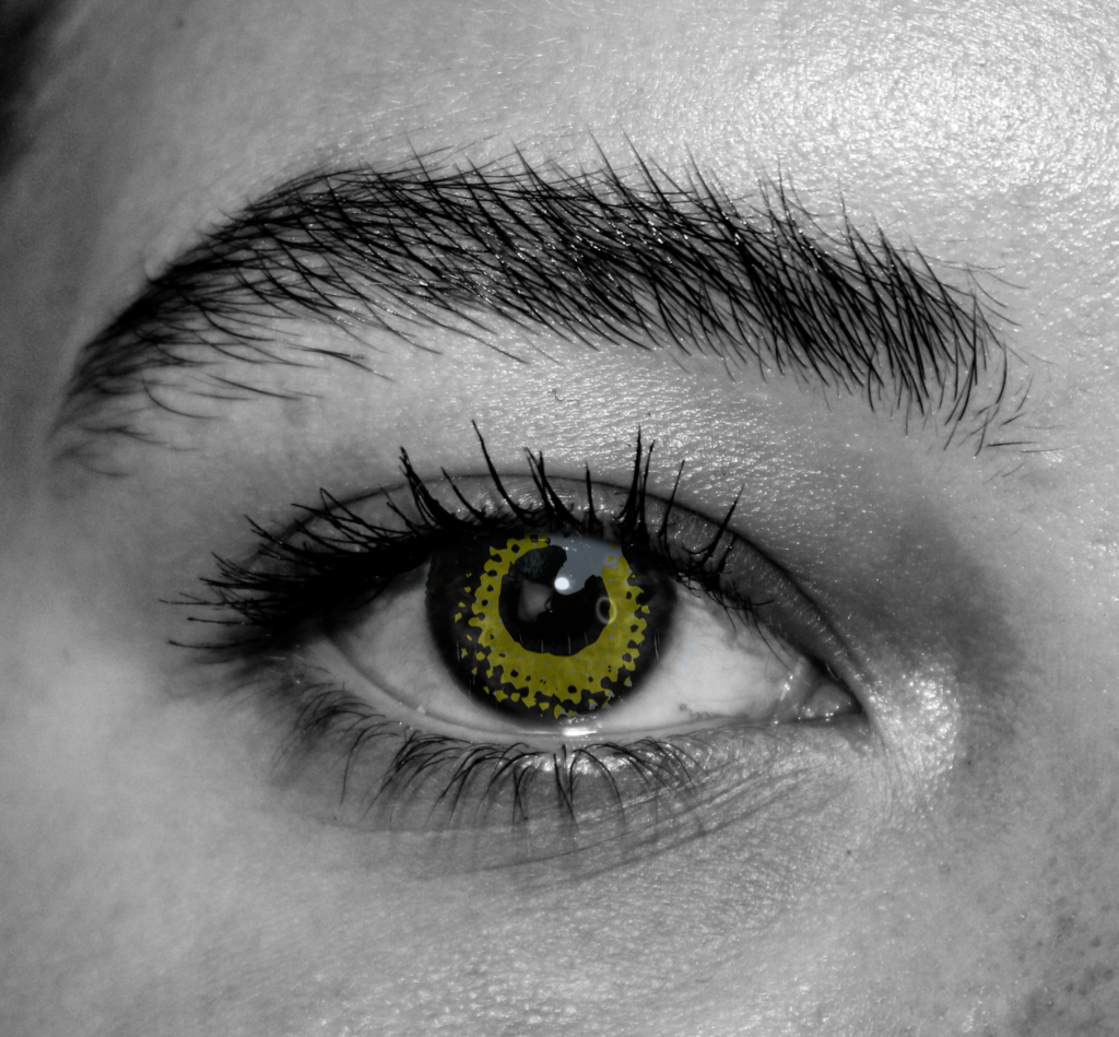
I took a different image of an eye I saw on a skateboard and cut out the iris using the lasso tool on photoshop and layered it on top of this monochrome eye. I neatened it up and kept the iris yellow to add some colour and contrast making the outcome more interesting and unusual.
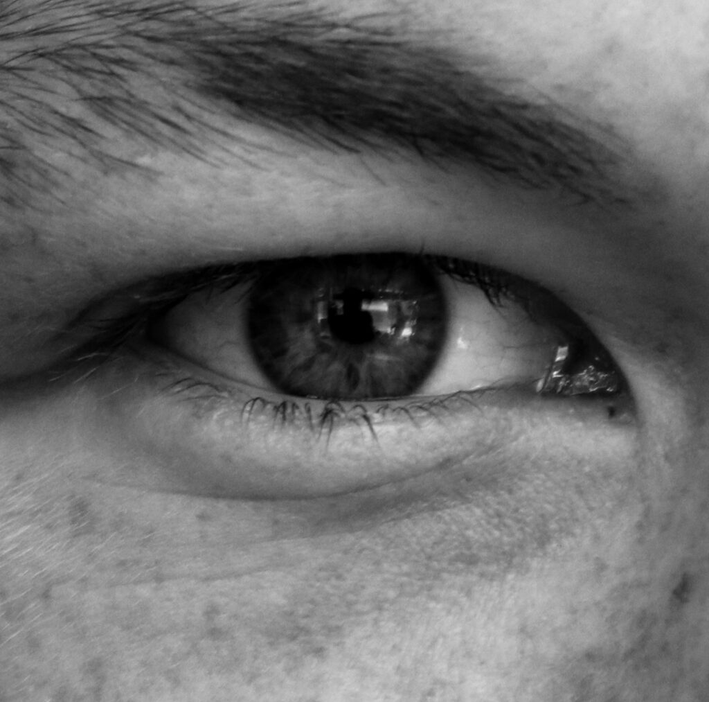
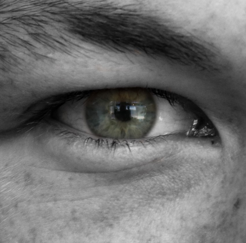
For this image I layered the iris from the original/unedited image on top of the monochrome/edited version to make the colour of the eye stand out more.
cindy sherman inspired shoot
Due to Cindy Sherman’s focus on women through the eyes of the male gaze I decided to take inspiration from her film stills and curate my own:
Here are my edited outcomes:
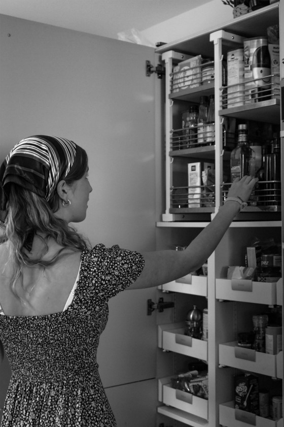

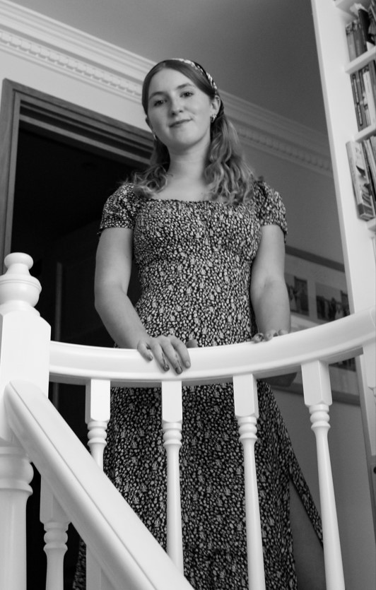
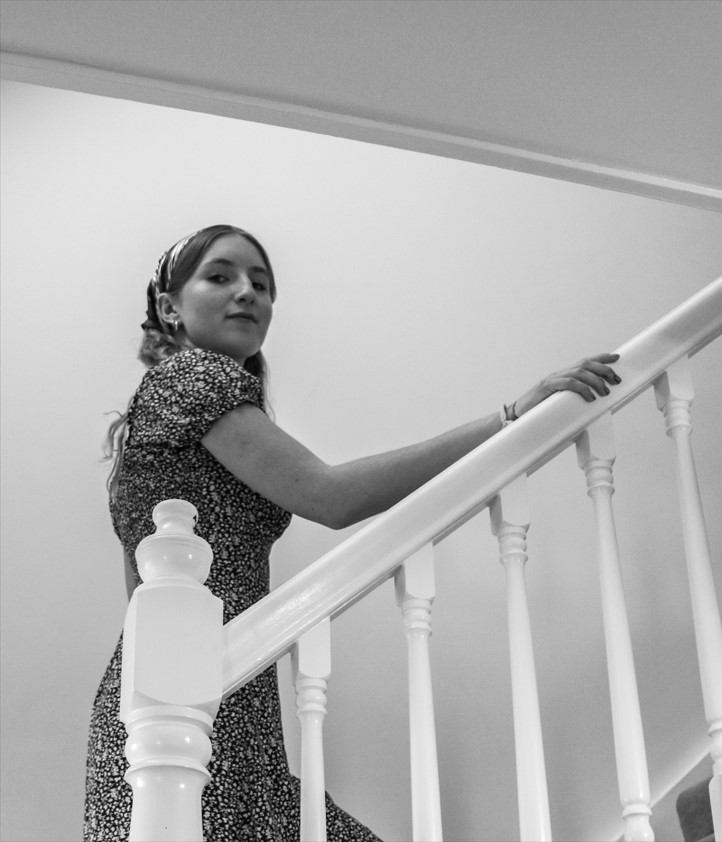
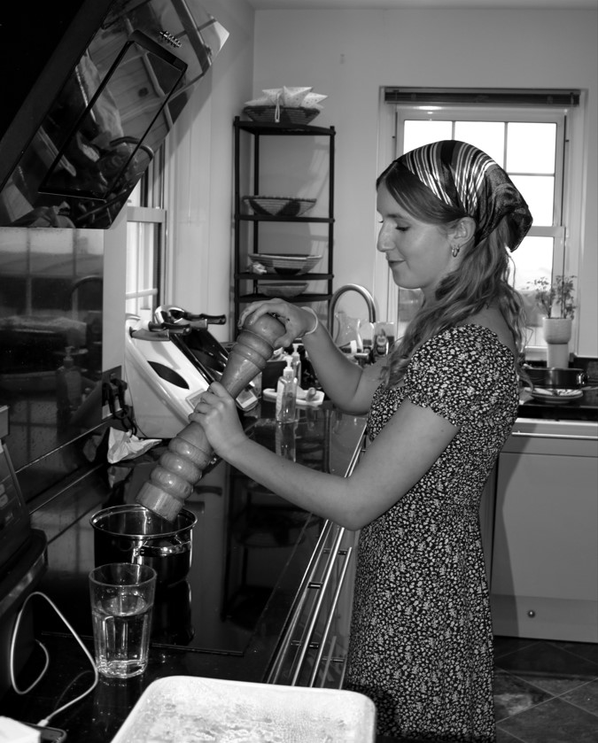
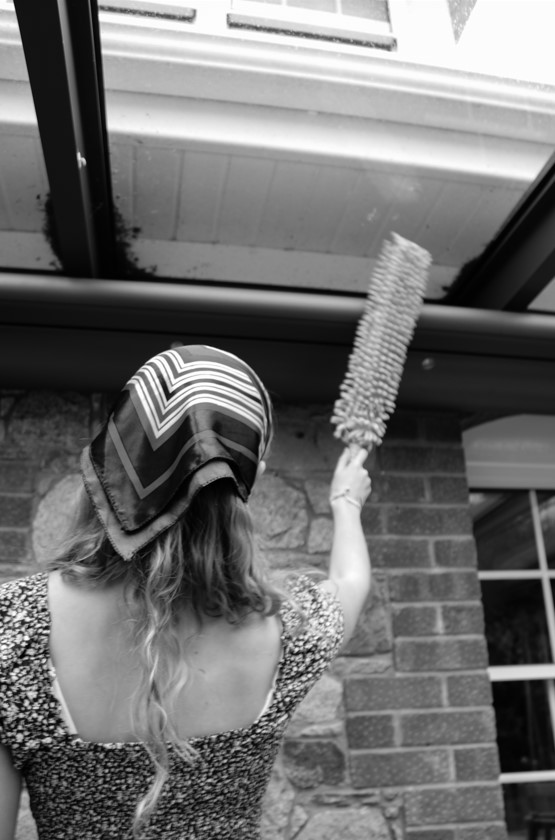
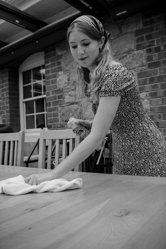
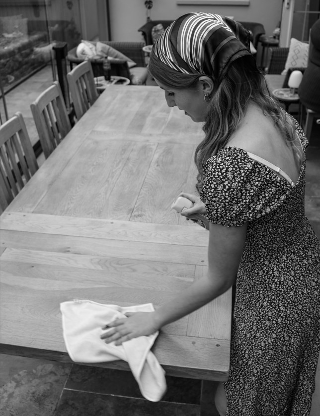
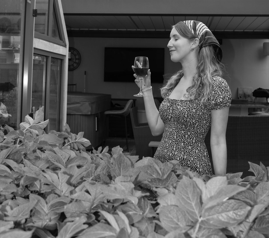
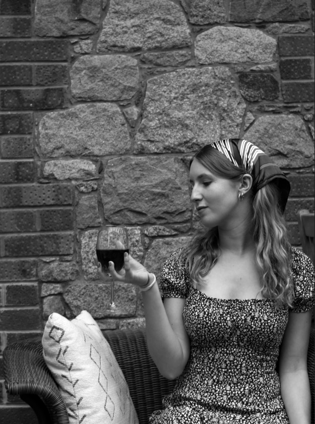
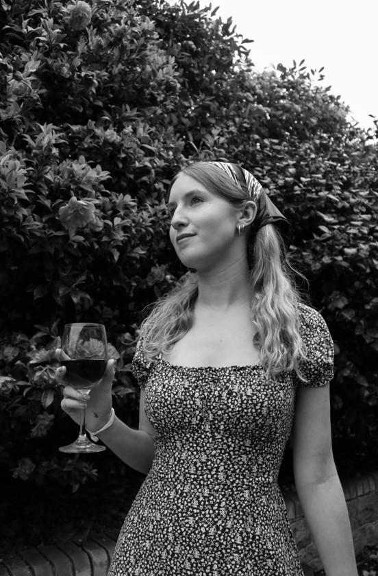
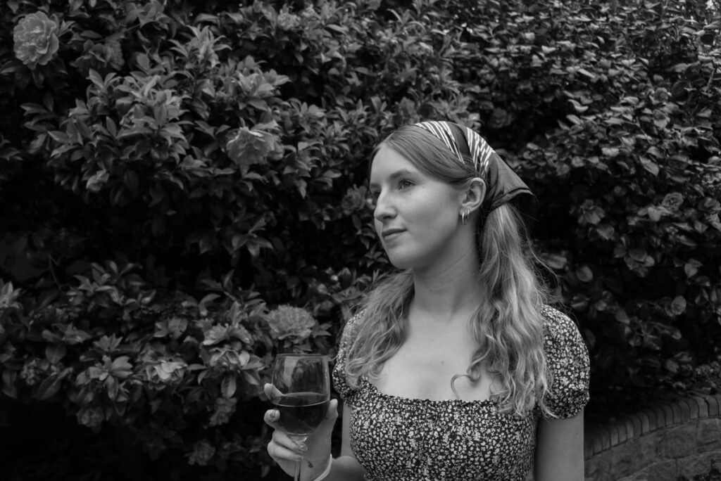
Image comparison:
Left= Cindy Shermans image
Right= My inspired image
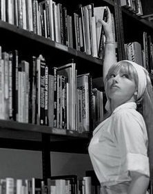
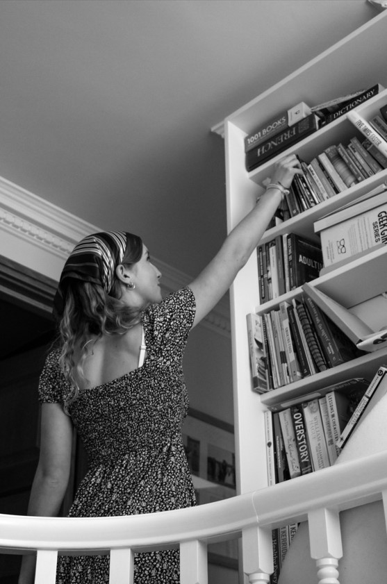
Both mine and Sherman’s images depict a young woman reaching for a book on a bookshelf. Her photographs serve to present the stereotypes of women through the male gaze which is why I chose a dainty and stereotypically feminine dress for the girl in my image to wear, representing her as sweet and innocent following the expectations of the female stereotypes. They are both dressed in stereotypical clothing for women in that time period and both of the layouts are very similar. In Sherman’s image the girl is looking past the camera enabling us to see her face whereas my image has the girl facing the bookshelf. This is one of the few differences between our images that show my image took inspiration from Cindy Sherman but didn’t copy her work.
edited outcomes: