Here is a link to my photobook “Imitation”.
All posts by Daniel Ross
Filters
Final Project evaluation
Overall my project presents a captivating exploration into the black and white world of urban environments, masterfully capturing the interplay of light and shadow. My photographs encapsulate the raw energy and timeless essence of the urban landscape, transforming mundane cityscapes into evocative images that ignite the imagination
The consistent use of black and white in your series demonstrates a clear intentionality and artistic vision. Converting hues to grayscale facilitates a more pronounced emphasis on form and texture. I manipulate contrast to achieve bold imagery that characterizes the essence of each urban setting.
my technical knowledge is evident through the crispness and sharpness of my photography. The exposures are meticulously balanced, ensuring that both highlights and shadows are rendered beautifully within the image. The employment of wide-angle lenses provides an expansive field of view, drawing the viewer into each frame.
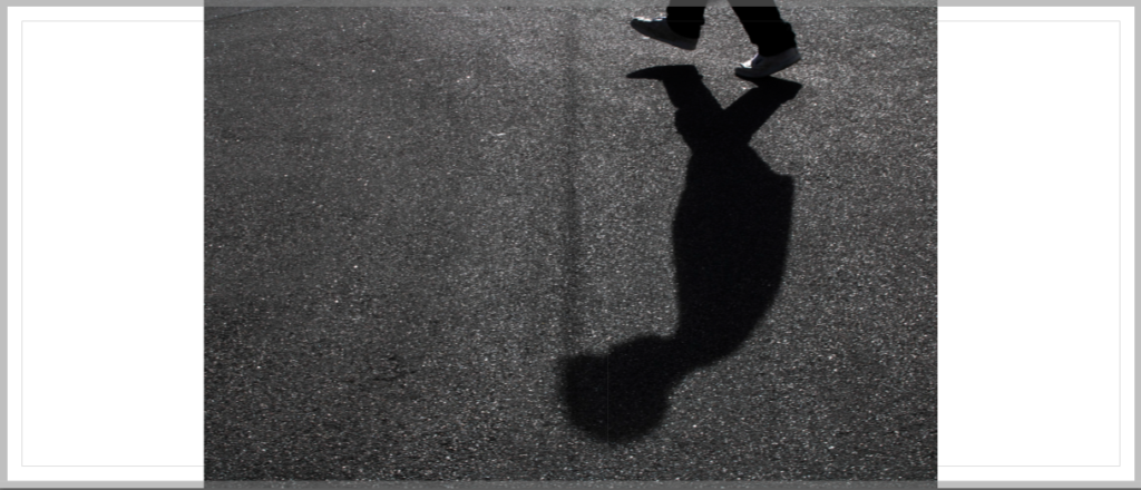
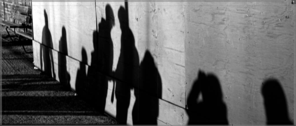
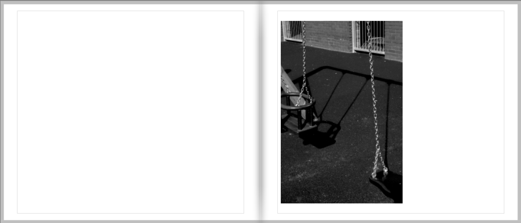
The primary focus of my project lies in the element of shadows. Shadows play a pivotal role in my images, often acting as a visual counterpoint to the contrasting areas of light. They add depth, intrigue, and a sense of mystery to the images. You capture shadows in their diverse manifestations—elongated due to harsh sunlight, solidifying into defined patterns, or completely obscuring the structures they touch.
My images thrive on the interplay between light and shadow. i understand the profound impact of light illuminating urban landscapes, The posts and beams of buildings cast long shadows, while delicate sunlight creates highlights that illuminate textures of exposed brickwork or graffiti. Your photographs highlight the ever-shifting nature of both light and dark competing for visual dominance.
The project demonstrates an extraordinary ability to reveal the rich textures and details embedded within urban settings. This allows viewers to connect with the images on a deeper level, drawing forth an emotional response and, at times, even prompting a sense of nostalgia.
The innovative approach to urban photography showcased in my work is able to forge an undeniable emotional bond between viewers and each image. These monochrome images evoke feelings of melancholy, contemplation, and intrigue, leaving a lasting impression that lingers long after the image has been viewed.
In summary, the project is a bold collection of black and white urban images that effectively captures the essence of cityscapes using subtlety and intention, leaving viewers with a rich and lasting emotional connection. My composition, technical skill , and creative exploration of light and shadow elevates my project to a truly captivating and immersive experience.
Mock up of Mounting
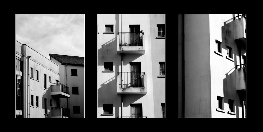
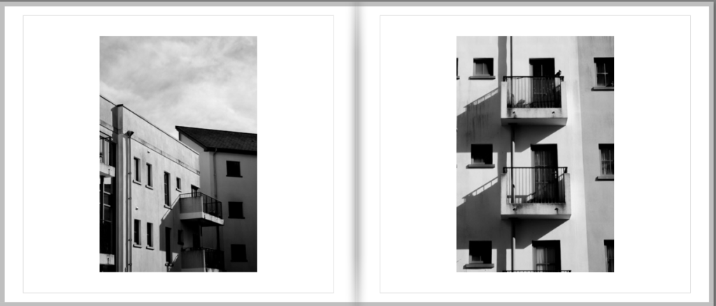
As these images are all of the same building I added them to same board.
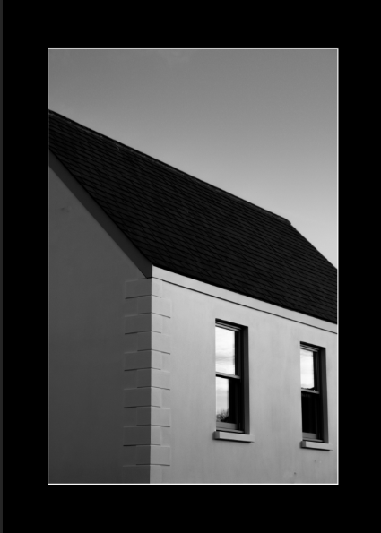
As this image appears quite solitary and i have no similar photos i mounted this by itself.
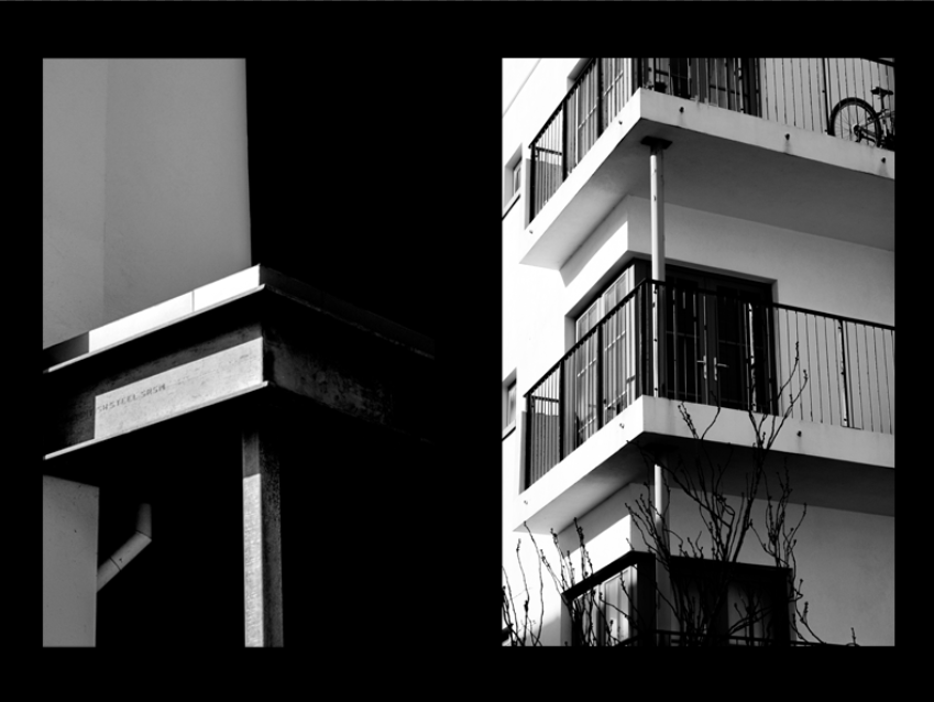
As these two images are both displaying right angle corners horizontally i chose to put them together as they compliment each other well.
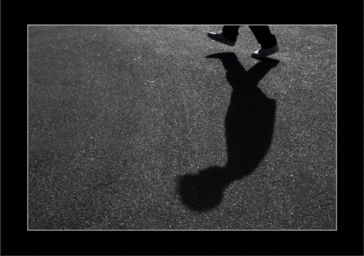
For this image i displayed it on its own as it is the only image which shows a person so it adds more meaning being on its own.
Photobook layout
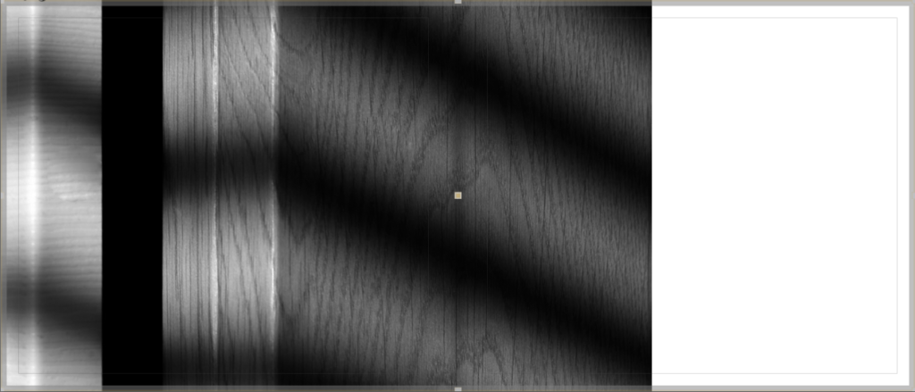
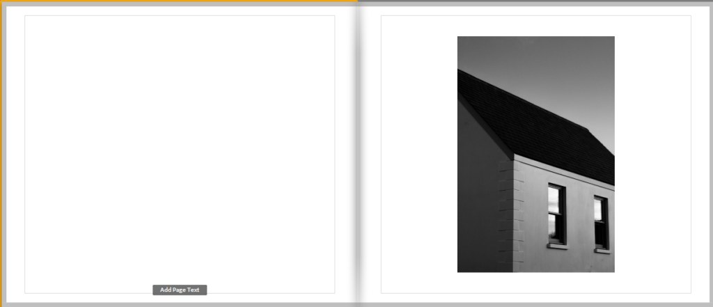
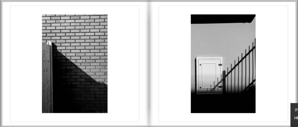
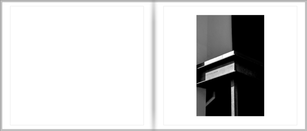
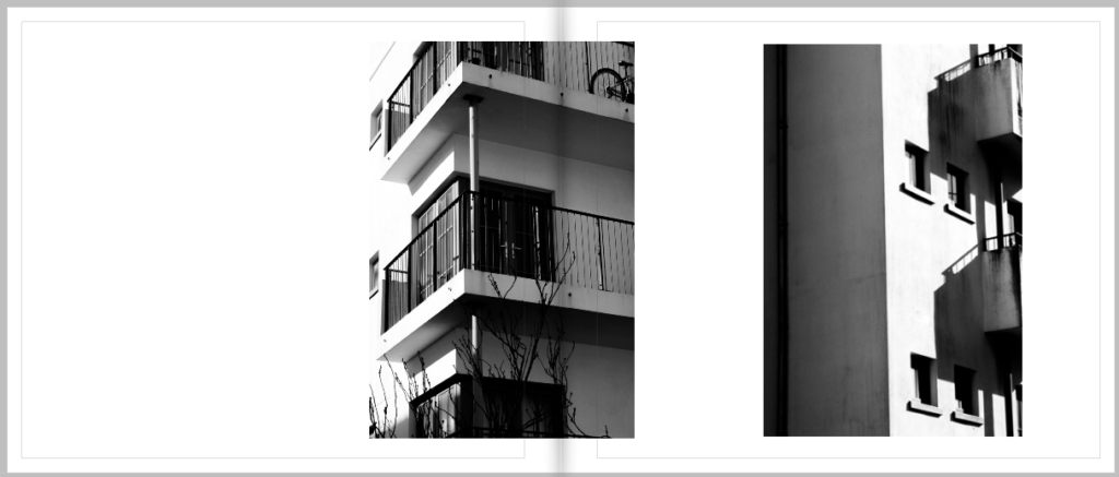
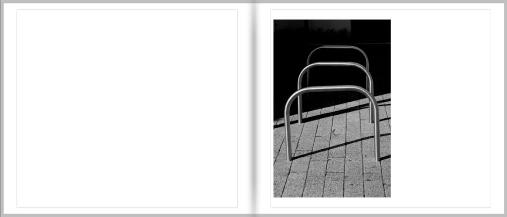
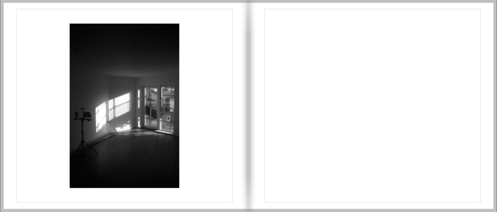
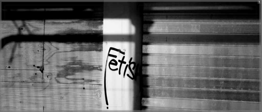
For my Final layout of my photobook I have created a simple design that uses a mixture of cropped images and double page spreads.
- Paper and ink – Premium Matte paper
- Format, size and orientation – Standard Landscape 10 x 8 in (25 × 20 cm)
- Binding and cover – Hard cover image wrap
- Title – Imitation
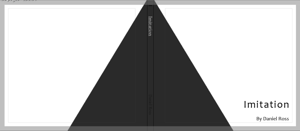
For my front cover I used photoshop and created a dark grey triangle to wrap around my cover and back, this somewhat looks like it could be a shadow which is fitting for the book and is also greyscale, similar to my photos. When designing this book I went through 5 different lay outs before concluding on this one as I wanted it to look perfect to me and the ones I had done previously just didn’t look right to me.
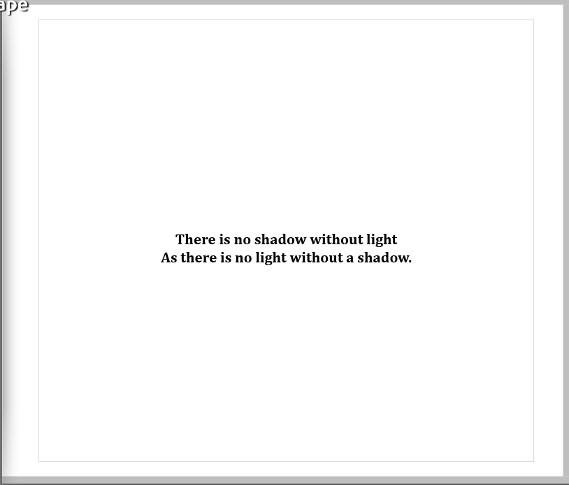
For the opening page I added a quote over plane white as I wanted it to be simple, I’m not 100% sure where the quote is from I just remember hearing it in a movie and it can be put up for interpretation on what the meaning is.
Overall I am very happy with the way my photobook has come out as it is simple and minimalistic as I had hoped for when first starting this project.
Virtual gallery
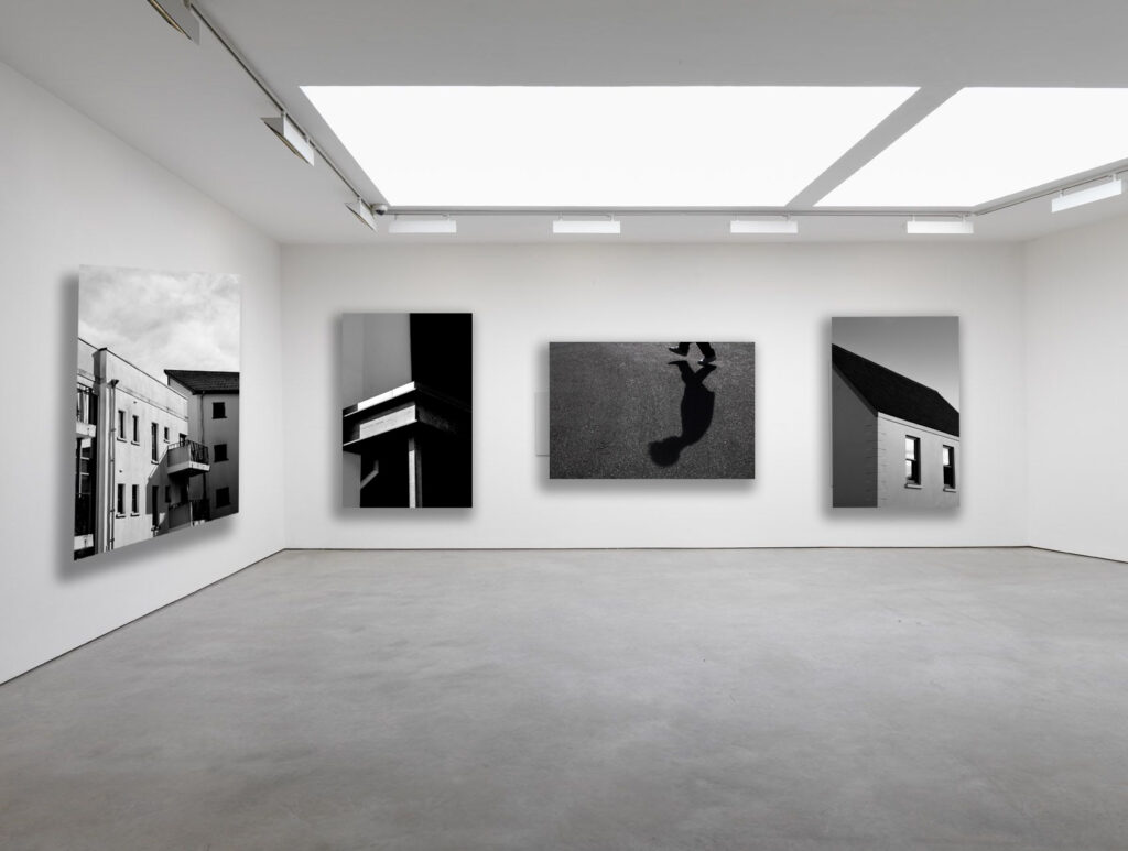
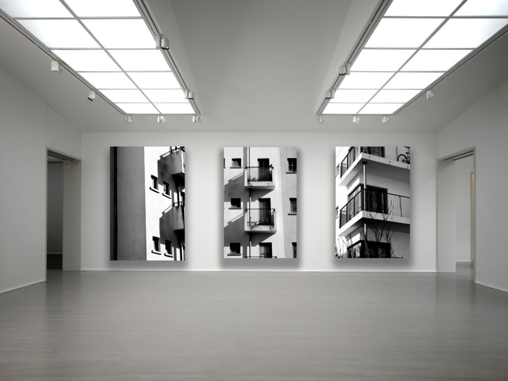
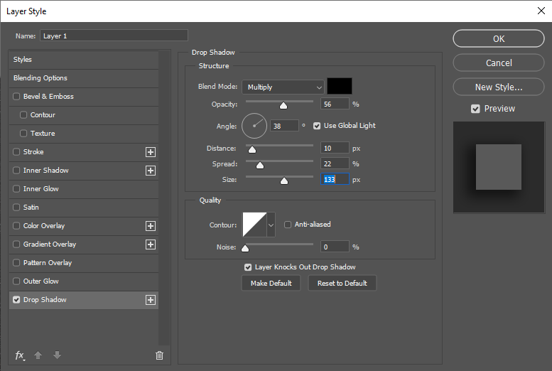
For my Virtual gallery I found a blank image of a studio space and brought in my images. to make it more realistic I added a drop shadow which I angled to match what the natural shadow of the light source would be.
Overall i really like the presentation of this gallery as i believe it greatly compliments my images and allows them to mix together however still stand out as there own.
When mounting my images i will definitely be taking inspiration from the layout of these galleries.
Final Outcomes
Using my inspiration of Ray Metzker and Sean Tucker, through there use of shadows to capture depth and drama whilst leaving an untold story in which the viewer can interpret in their own way, I produced a series of images that implemented portions of my daily life by photographing buildings around where i live and grew up, however my focus for the project was to capture and document the art of shadows using natural sunlight to find interesting images where it is shown how shadows are an imitation of light. Throughout my different photoshoots i have become more immersed into the use of shadow to create art and i believe my final set of images are some of my favourite pieces of work yet, as i personally enjoy and admire this style of work.
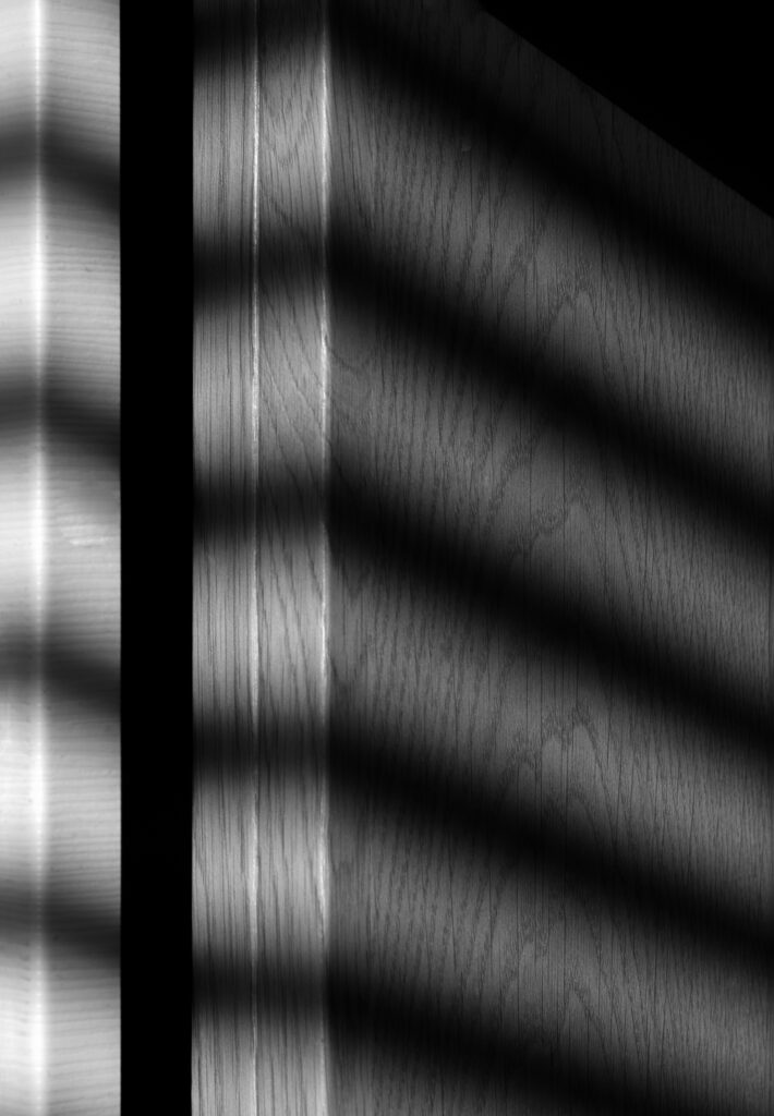
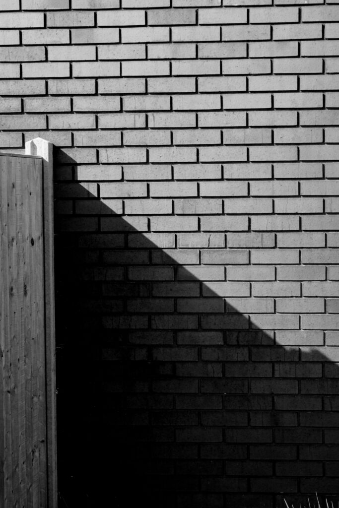
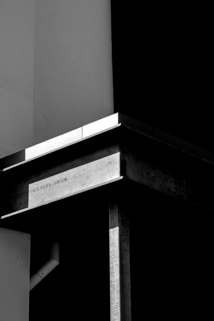
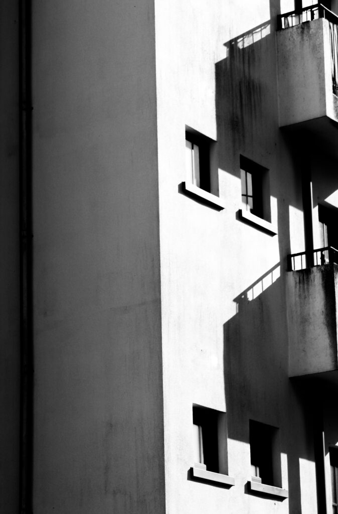
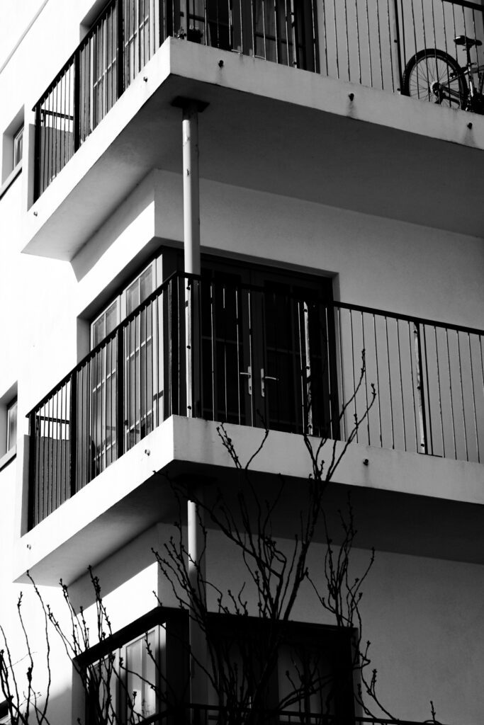
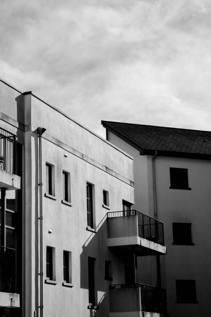
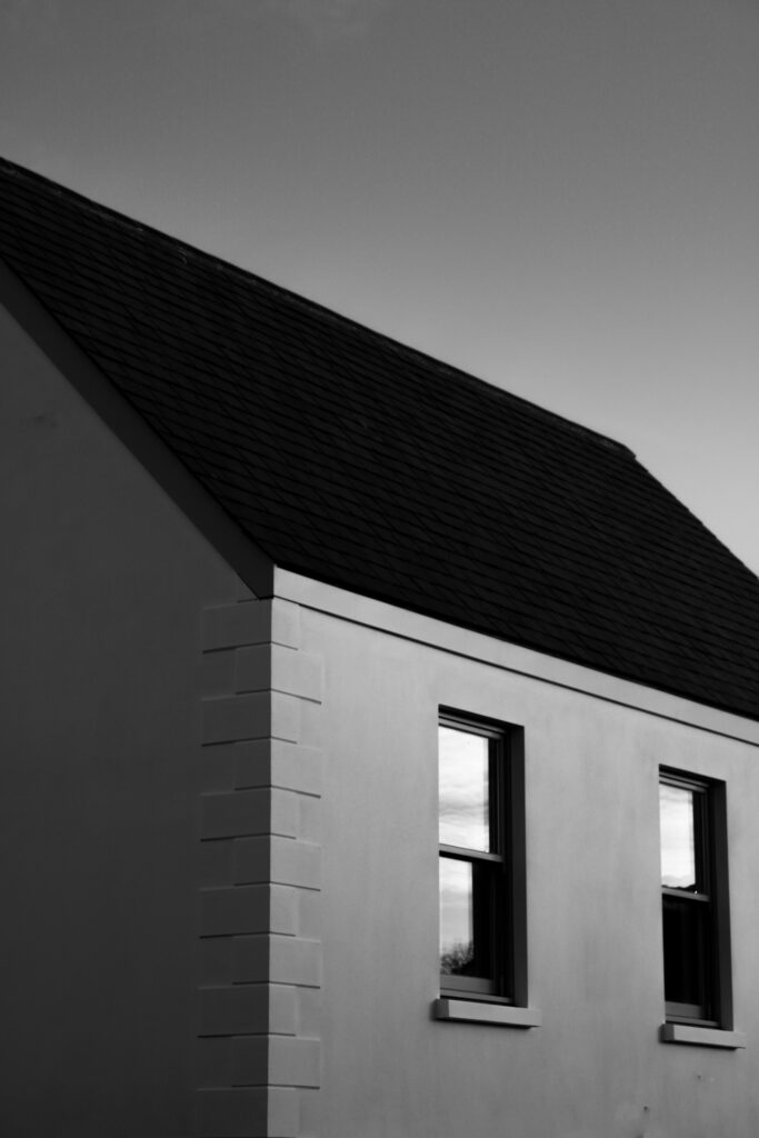
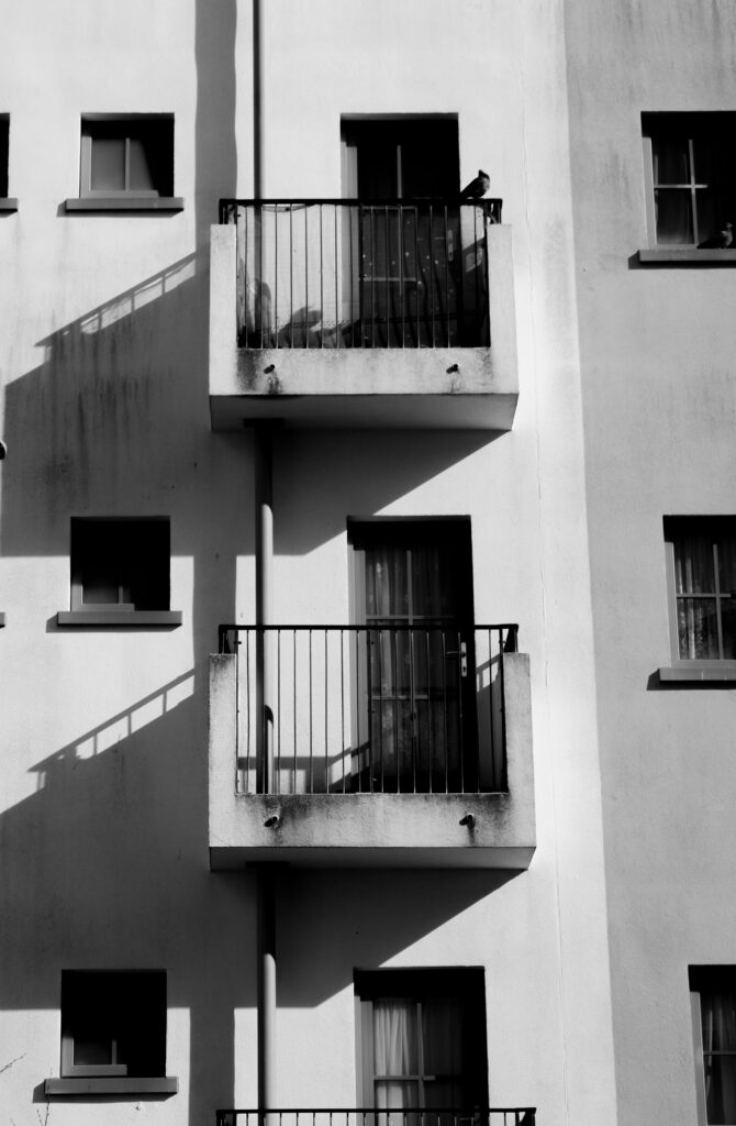
Photo Book analysis
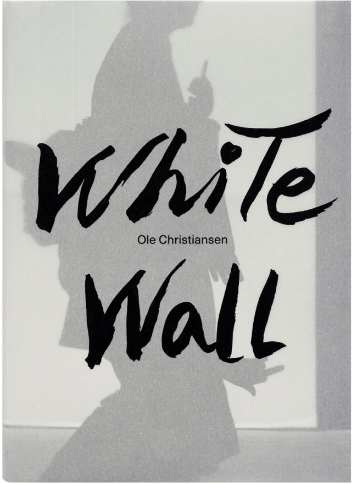
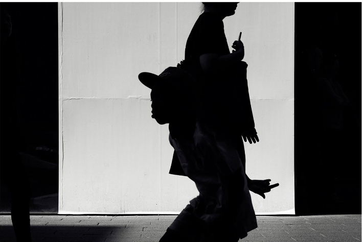
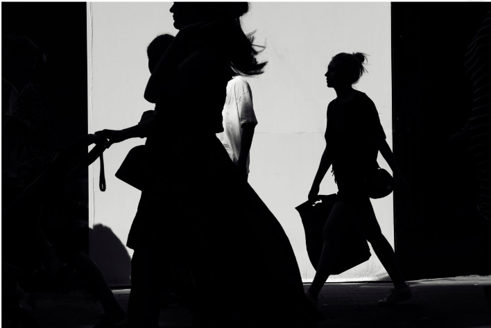
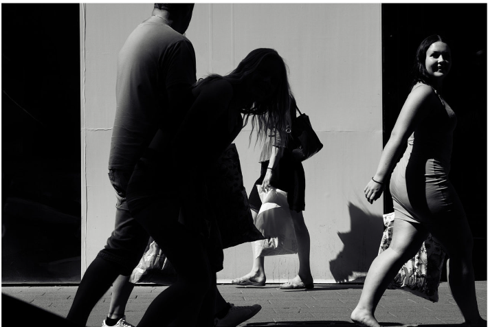
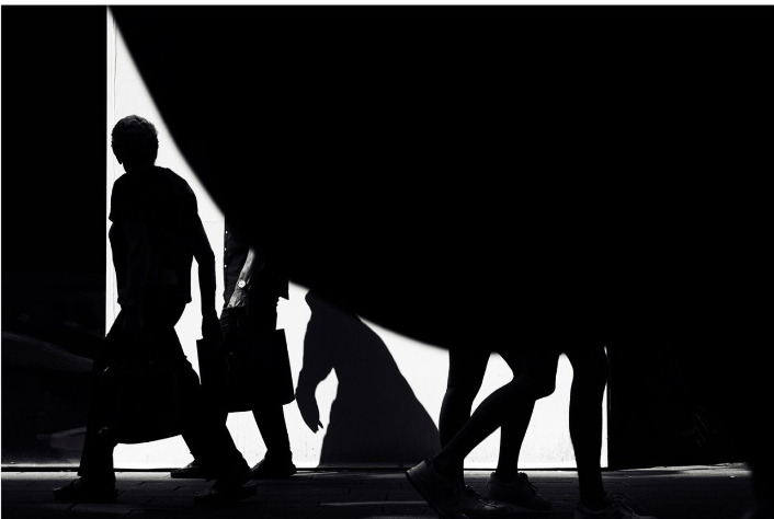
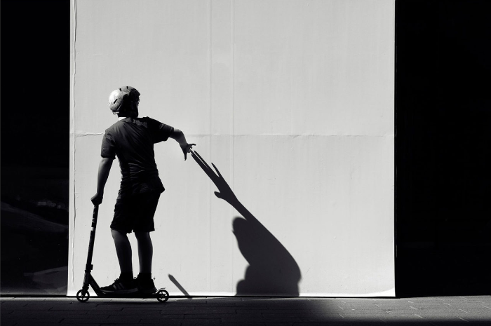
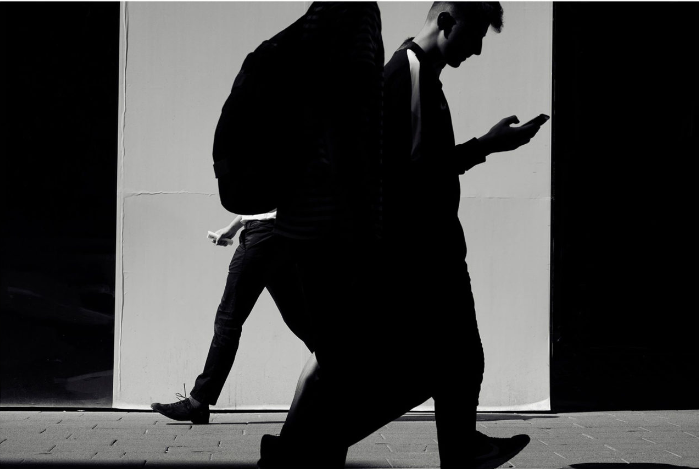
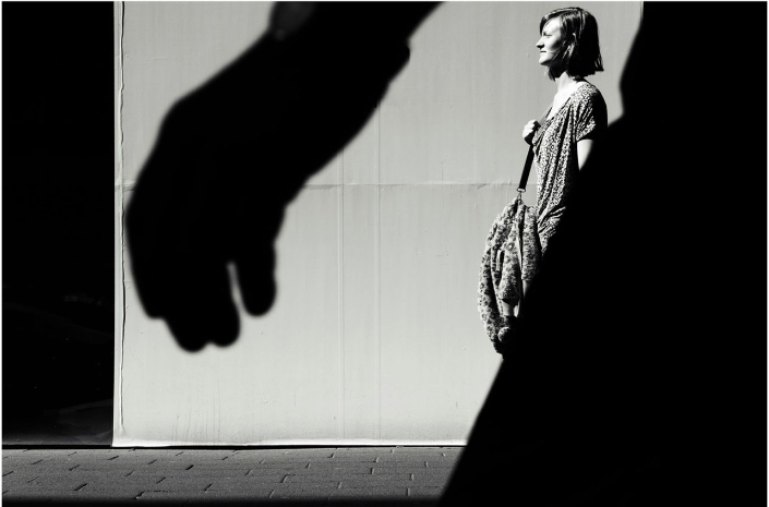
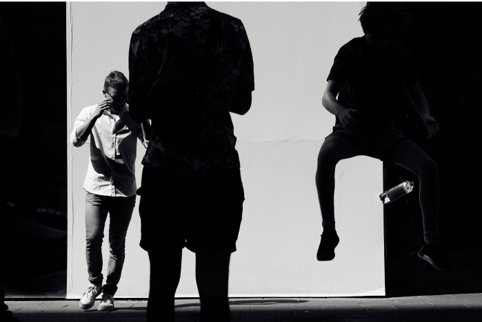
White Wall by Ole Christiansen
‘White Wall’ presents street photography by Ole Christiansen. Unlike many such series of quick snapshots, however, Ole Christiansen’s images are highly orchestrated and graphically framed. All of them were taken at a specific location in the city, where a white wall is the theatrical backdrop against which passers-by perform their one-second acts as marionettes.
Random situations from everyday life unfold while people pass by and through the photographer’s selection, everyday surreal coincidences and photographically blessed crucial moments are isolated. The result become a masterful frieze, a flood of people on their way from one place to another, without purpose or explanations
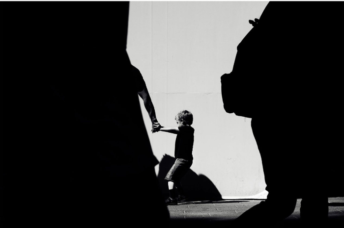
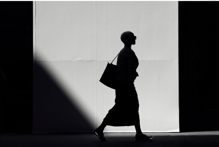
Case study 2 – Ray Metzker
Ray Metzker (1931-2014) was an American photographer, known for his abstract black and white photographs. His work primarily focused on urban landscapes, industrial scenes, and abstract compositions. Metzker’s unique photographic process involved physically manipulating his negatives to create Busnel and Polaroid prints, resulting in varied textures and tones . These experimental techniques, along with his unconventional subject matter, distinguished Metzker’s work from many other photographers of the time. He was an influential figure in the development of abstract photography in the second half of the 20th century.
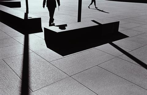
Personally i am a fan of metzker and I am deeply inspired by the captivating and evocative work of his. Known for his unique ability to capture the depth and intensity of the urban environment, his images resonate with me because of their dramatic feel and striking deep shadows. The contrast between the bright highlights and the rich, dark shadows creates a sense of mystery and tension that captivates the viewer’s attention. Metzker’s mastery of light and shadows brings out the hidden beauty and character of his subjects, and his work continues to influence my own photography in countless ways.
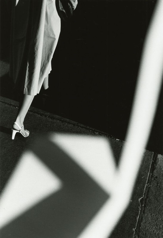
Work by Ray Metzker.
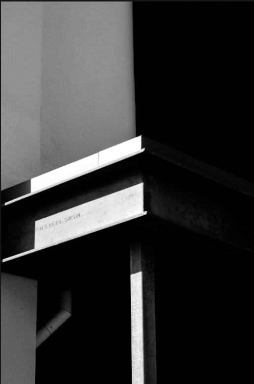
My work inspired by Ray Metzker
Edits 2
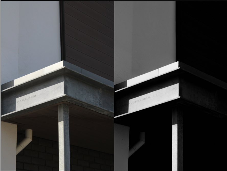
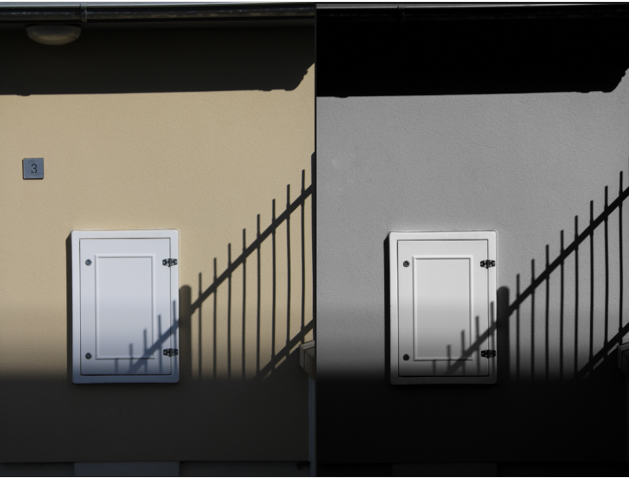
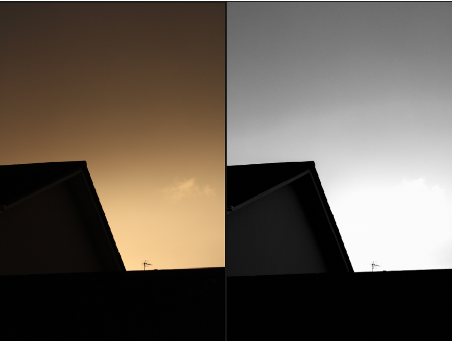
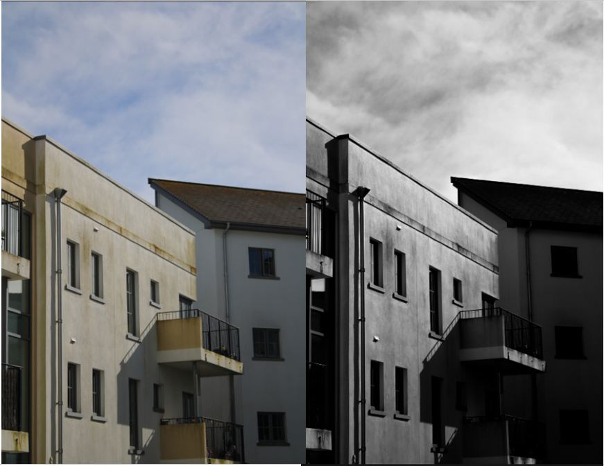
In Lightroom i firstly turn my images to black and white then i play around with the contrast and shadows to increase depth and a dramatic look, i also play around with the blacks and the whites to further increase contrast.
When regarding exposure i like to try keep it well exposed as in past projects i have lowered the exposure too much which results in images that are hard to look at.
Here is an example of how i have edited the images…
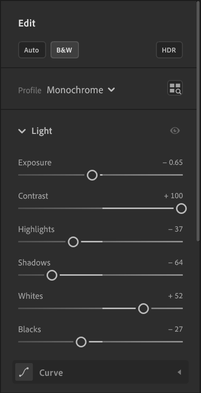
here are some examples of my edits…
Photoshoot 2
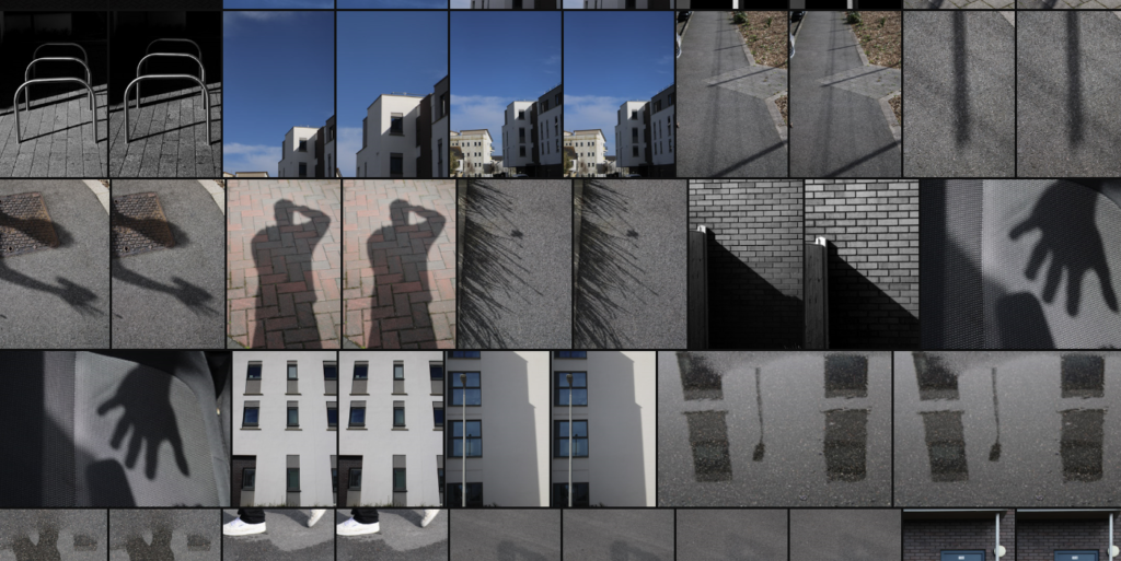
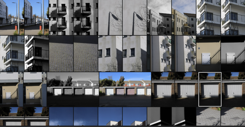
During my second photoshoot in le Squez estate, I explored the captivating interplay of shadows and structures. The sun casted long, dramatic shadows on the buildings’ outlines, emphasizing their geometric shapes and architectural complexities. I framed the shot with the help of deep, contrasting shadows to bring out the distinctive textures and patterns on the walls and windows. These elements created a contrast against the bright, sunlit areas, adding depth and intrigue to the images. This shoot allowed me to capture the unique character and mood of the urban landscape, showcasing the relationship between light and dark in a visual narrative.
