Blurb book
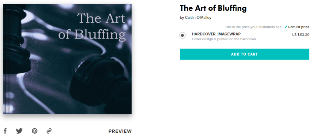
After completing my photobook I published it to blurb, creating a short description to highlight the main theme that is shown throughout it.
Blurb Link
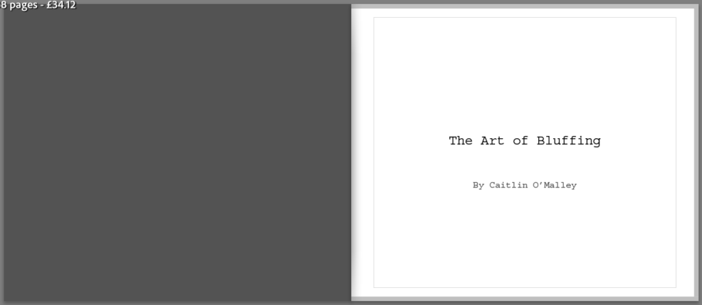
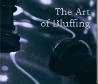
Here is a link to my photobook: The Art of Bluffing
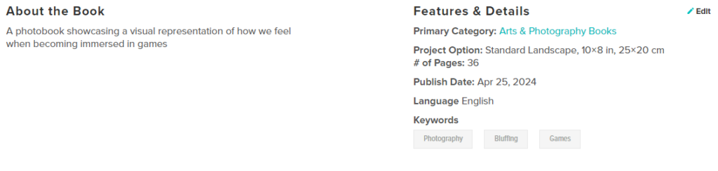
Blurb book
After completing my photobook I published it to blurb, creating a short description to highlight the main theme that is shown throughout it.
Blurb Link
Here is a link to my photobook: The Art of Bluffing
Overall, I really enjoyed this project and am happy with the way I managed to produce my final outcomes, being both my photobook and final prints. I think that I was successful in presenting my idea of games for the theme observe, seek and challenge by producing a wide range of images that link to it.
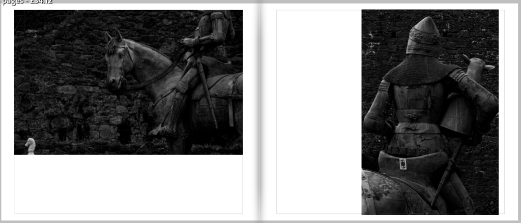
What I feel as though I did well in this project was the actual photographs themselves as I am pleased with the editing as well as the general ideas behind the shoots. I particularly like my castle photos that I did for my second photoshoot as I feel as though they go hand in hand with the concept of games, especially due to the monarchy having a huge influence over them in games like chess or cards which are frequently used throughout my project. Another part of my project that I think turned out well is my photobook as I really like the story told through my photographs as well as how the images link together not only through meaning but through colour and aesthetic too.
While there isn’t anything in particular that I would change about how my project turned out, there are some things that I feel as though could of made it strong if added. For example, including some more photoshoots which merge all of my previous ones. I feel as though this could help enhance my final outcome since it would help make the story behind it more clear to the viewer.
Final prints presentation
About
I think that the presenting and mounting of my final prints turned out well, I stuck with my plan by keeping a 1cm boarder around each of my images which helps to connect them all together as well as making them contrast against the white background. I am also pleased with the size that each of them turned out which, in my opinion, helps to create a nice balance when viewed all together.
The only issue with my final prints is that the images printed out slightly darker than I had originally planned, however, I feel as though this turned out for the better as it helps to make the photos feel more dramatic and mysterious which creates a similar feel to that of my photobook.
Evaluation
Did you realise your intentions? – My intentions towards my final prints stayed the same from my main idea. I had always planned to have an effective yet simple mount, keeping it the same for all my images in order to help highlight the connection between them. I also planned to print out quite a few images in order to help show the range of images throughout my project.
What references did you make to artists references? – I made quite a few links to my artist references with 4 out of 6 of my photoshoots being dedicated to recreating their works in my own style to match the theme of my project. Overall, I think that my artists helped to shape the way my project turned out, both visually and contextually.
How successful was your final outcome? – I think that my final outcome was successful as I managed to mount up all my images in a manner that I’m happy with as well as the overall aesthetic being what I had in mind.
Experiments
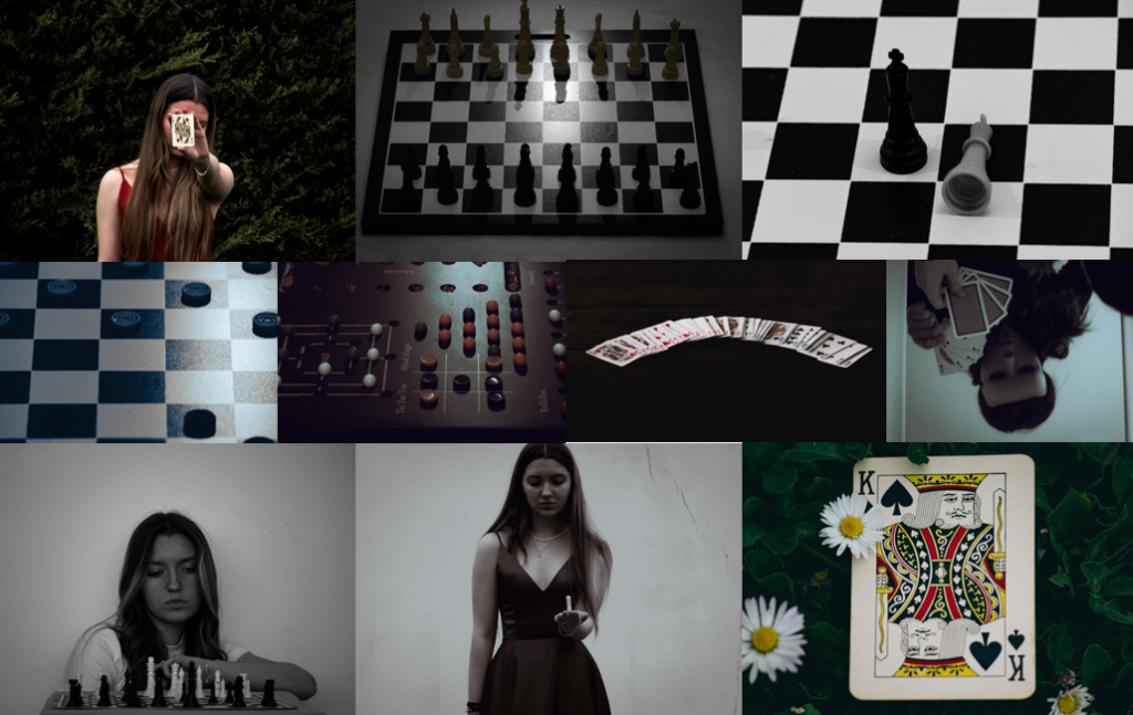
First layout
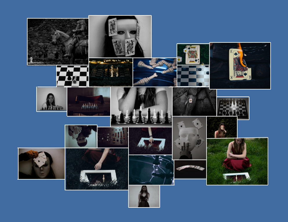
For this layout I decided to lay it out in the way of a mind map, excluding any boarders. If I were to chose this design I would mount all my images on white board so they are all raised from the board while remaining the same height as each other. I like how chaotic the layout makes the images look, all while still displaying the main features of my project.
Second layout
A similar design to my first idea, except the outcome looks more tame and organised. For this idea I would be mounting my images on card since I think having my images flat would go nicer with the design layout.
Third layout
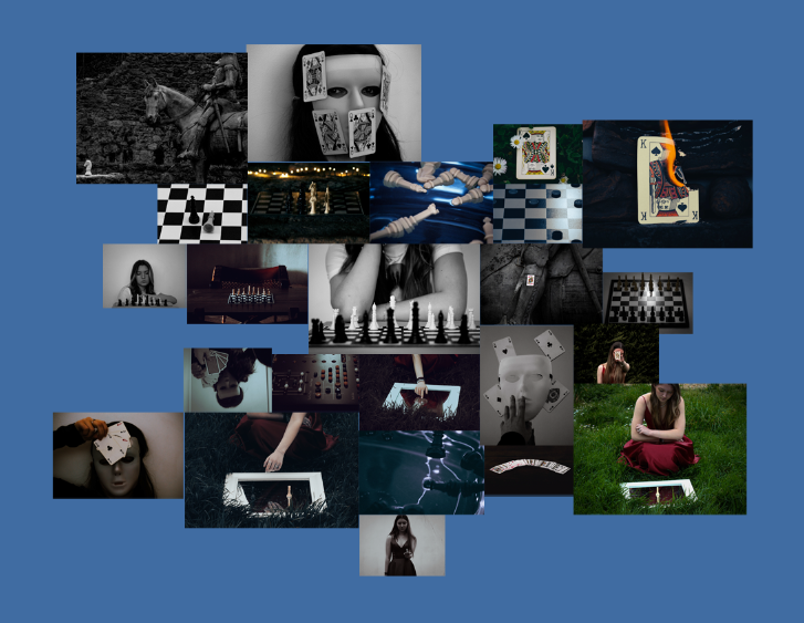
This time around I stuck with the sort of mind map style as my first layout, yet this time decided to see what it would look like with a boarder. To create these mounts I would stick my images to white foam board while making sure to leave a gap from the edge.
Final layout

I chose this as my final layout since I think with each of the photos having a slight boarder helps to create a sense of familiarity among my images, making them connect better and become more visually appealing. I also like the idea of my photos being spread out in a chaotic fashion, yet the closer you look a story starts to show due to all the images branching out from the black and white chess piece in the centre in a similar way to that of my photobook.
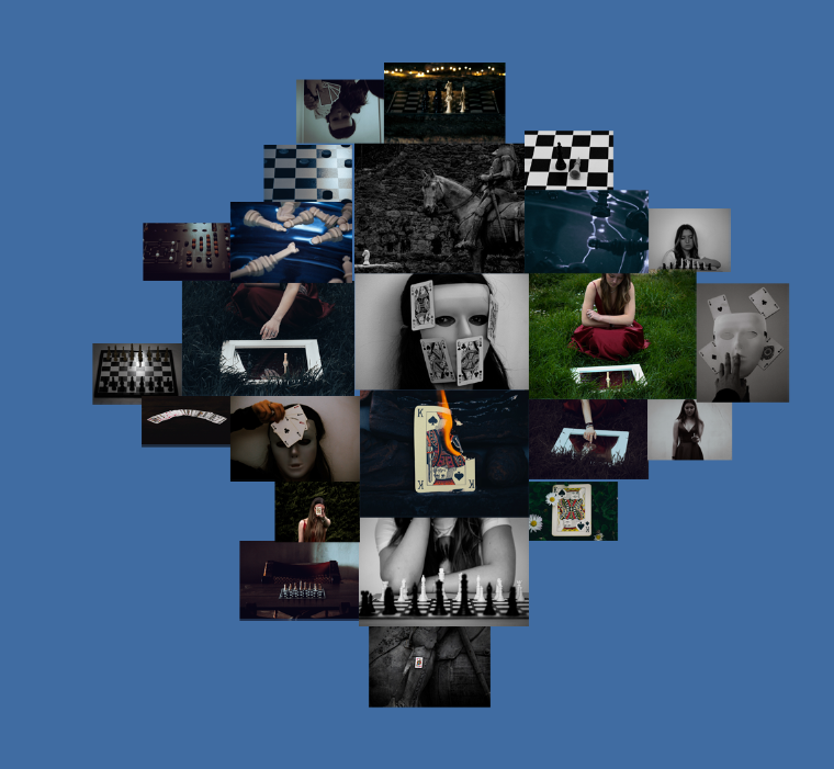
A5
I have selected these images as my A5 prints as I feel as though they will be useful when breaking up the bigger photographs, making the final layout feel less cluttered.
A4
I chose these images for my A4 prints due to them showcasing the main colour scheme of my project, being a lot of muted tones and greyscale. I think that theses will help to bring out similar tones in the other images, linking them together when mounting.
A3
Lastly, these are my A3 photos. The main idea behind making these images the biggest was in order to display the shoots that are involved in my project.
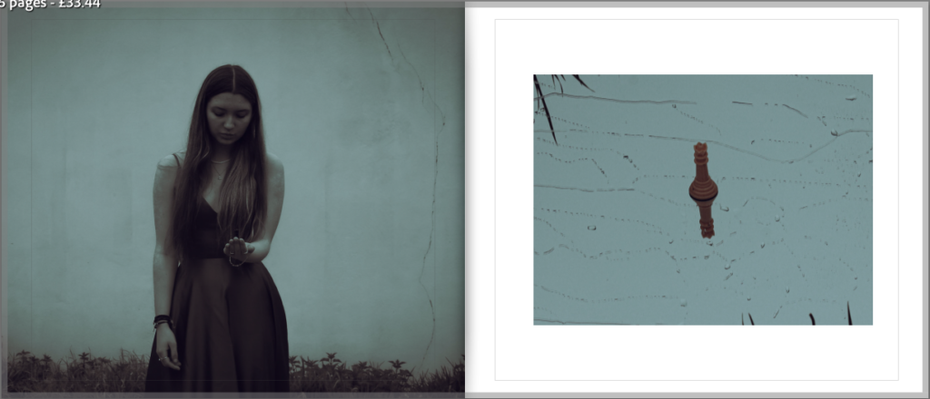
Narrative
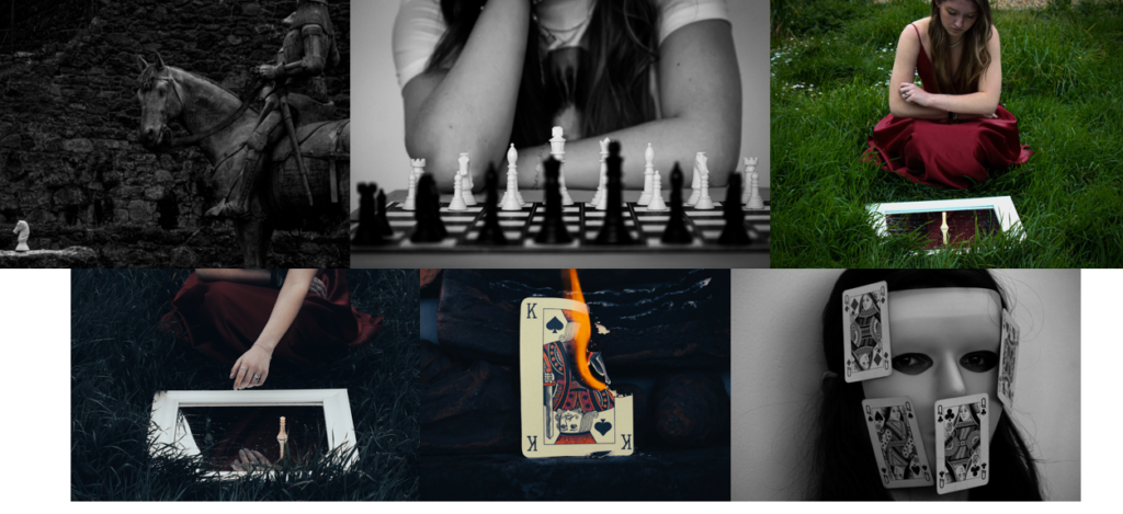
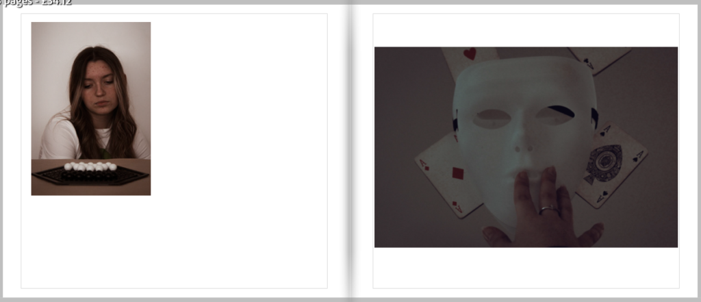
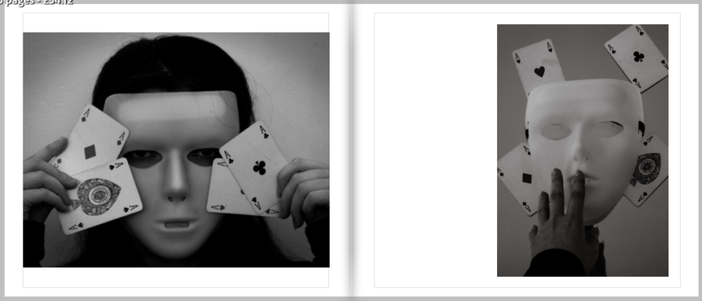
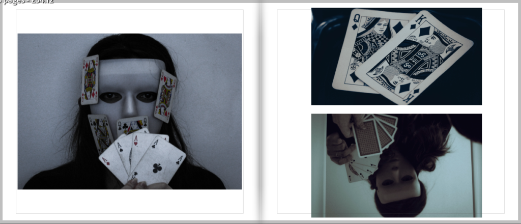
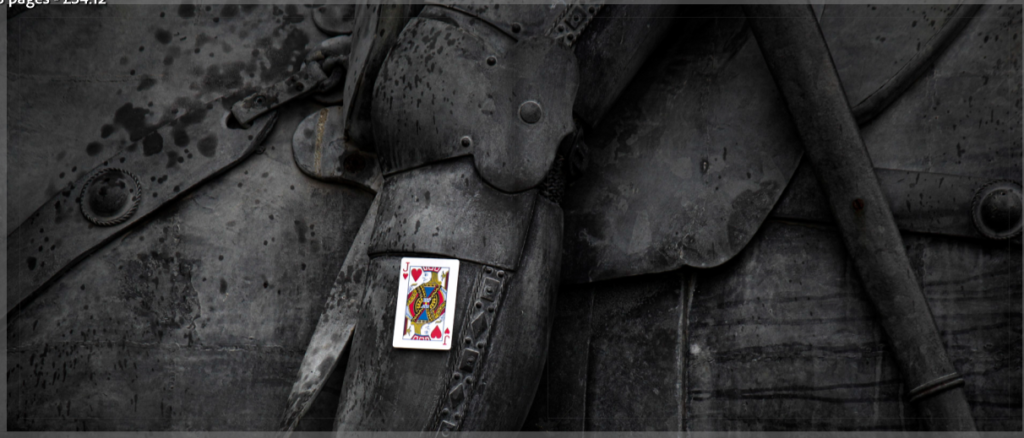
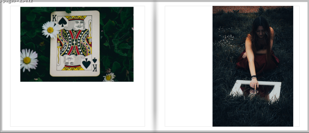
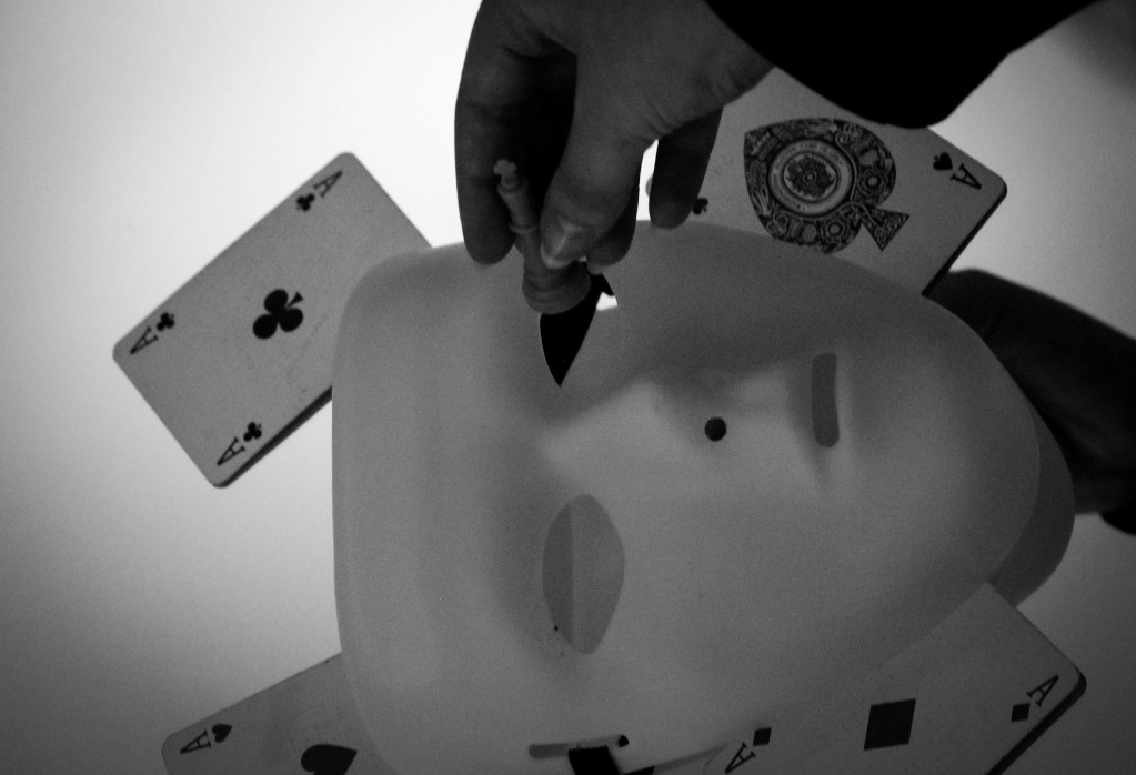
The story told through my photos is of a girl who becomes so immersed through the game she’s playing that she starts to feel as though she a part of it. The images depict the different emotions she has, such as with the mask symbolising how she’s trying to deceive her opponent or the castle photos representing how real the game feels to her.
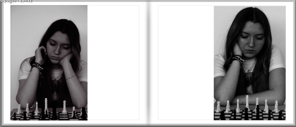
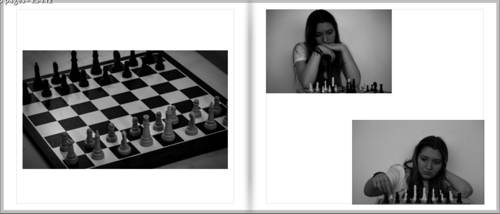
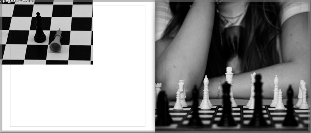
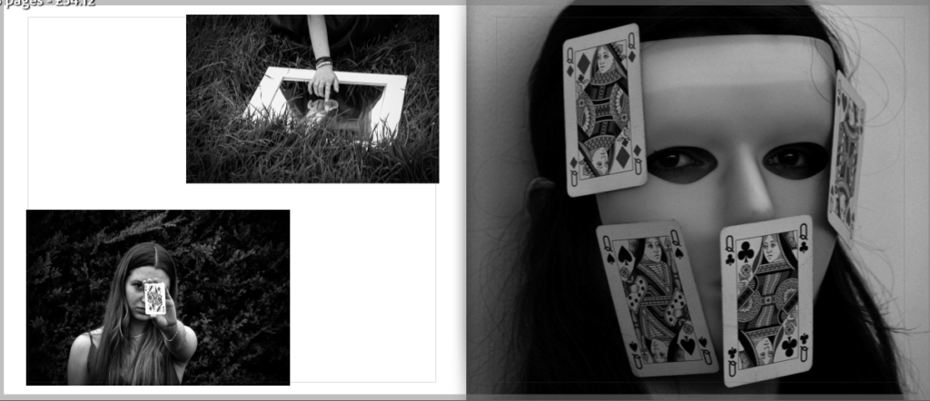
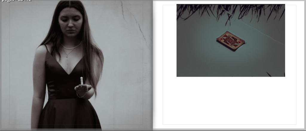
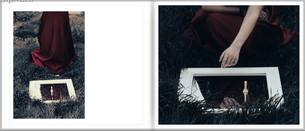
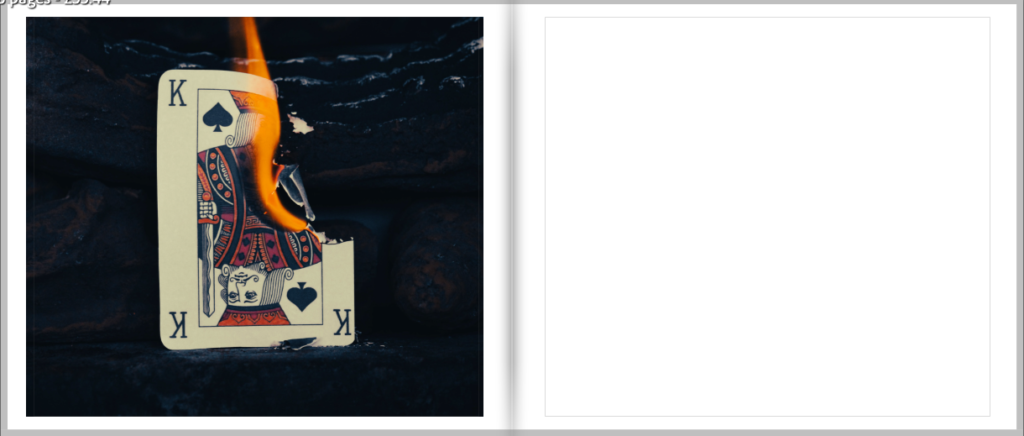
At the start of the book I used my portrait photos, in order to show that she’s playing a game, before connecting them to my mask images which implies that she is hiding her intent from her opposition. The story continues by moving onto the castle photos as well as the photos of herself dressed up, suggesting that she has become so immersed and involved in the game that she feels as though it a sperate reality with the mirror helping to highlight this through the use of reflection. Nearing the end of the book I decided to use the photographs that include the cracks in the wall, showing how the game is coming to an end and reality is breaking back through. I wanted to leave the ending of her story up to interpretation by using the burning card as my final image, which could symbolise that either she’s lost with the king being in check, hence the flames, or her opponent has lost and they flames represent their defeat.
What I like most about my photobook is that there is more than just one story that can be seen through it, while I have the story that I based the layout on, it could be viewed as a way to link to gambling as for many people who struggle with addiction surrounding games, often do so due to how immersed they feel.
Evaluation
Did you realise your intentions? – My intentions towards my book differed slightly from the beginning of creating it. At the start of this project I wanted to go a more strategic route, showing certain moves in different games. However, as I was producing my photos and creating my photobook I realised that my images had the potential to tell a story if used in the correct way, ultimately leading to my final outcome.
What references did you make to artists references? – I made quite a few links to my artist references with 4 out of 6 of my photoshoots being dedicated to recreating their works in my own style to match the theme of my project. Overall, I think that my artists helped to shape the way my project turned out, both visually and contextually.
How successful was your final outcome? – I think that my final outcome was successful as I managed to convey the story across in a way that’s both interesting and visually appealing to the viewer. If I were to make any changes to it I would most likely include more images as well as some text to maybe describe the story at the end.
Cover

Icon layout
Final Layout

Name ideas
For the name of my book I wanted to keep it along the theme of games and tactics since that is the whole theme of my book. Here are the name ideas listed below:
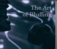
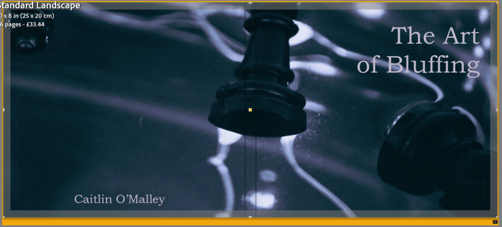
The title that I ended up selecting for my book is ‘The Art of Bluffing‘ as it links perfectly in with some of my images, for example the mask photos, as well as the overall storyline that I plan to display.
Front cover ideas
For my front cover I wanted to use a photo that would hint at what the photobook will be about, but also keep it appealing to the eye so that the viewer would want to read it.
Cover options:
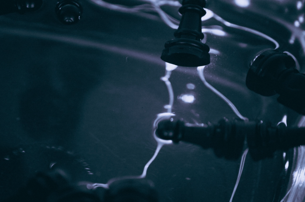
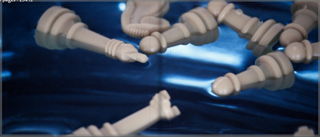
The photo I ended up selecting was the one of the chess pieces in the water as I found it looked the most visually appealing when stretched over two pages. I also think that it has the perfect area to put the title so that it doesn’t take away from the overall feel of the image.
Final cover:

Plan
Narrative – What is your story? Describe in:
3 words – Emotions in games.
A sentence – A series of photographs that depict a visual representation of what its like to be immersed in a game.
A paragraph – My photo book aims to tell the story of a girl who gets so invested in the chess game that she’s playing, its almost as though she becomes a part of it. I plan on keeping the ending up to interpretation so the viewer can decided whether they believe she won or lost through the use of one of my element photos.
Design – Consider the following:
How you want your book to look and feel – I plan for my photobook to look clean with the colours and tones of my images flowing together nicely, creating links between them and making it look overall visually appealing.
Paper and ink – I plan to use a more glossy paper in order to help the photographs shine when viewed on the page, also making it appear more put together. However, I wont be choosing one that increases the contrast due to my images already being highly contrasted.
Binding and cover – The cover of my book will be a hardcover since I find this to be more visually appealing and in my opinion will help to make the book seem more finalized.
Images and text – The text on the front cover of my book will be ‘Bookman old style’ at the size 72.8 as well as making the colour of the text a light lilac colour to ensure that it goes with the background.
Chosen book inspiration
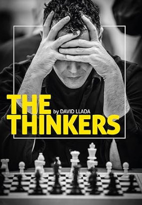
About the book
The Thinkers is a visual tribute to the game of chess, showcasing the emotions, exertions and desires of the players, and conveying the mental intensity only chess can command. It includes some of the most iconic portraits of today’s stars, as well as emotive shots of ordinary players from all over the world, with photos taken over the last five years in venues such as Mombasa, London, Chennai, Las Vegas, Baku and Sao Paulo. Llada’s photographs capture the full richness and drama of the game, making this the most visually stunning book ever devoted to chess.
“David Llada’s pictures are full of life, and they are colourful even if black-and-white. Precisely as the game of chess itself.” – GM Emil Sutovsky, ACP President
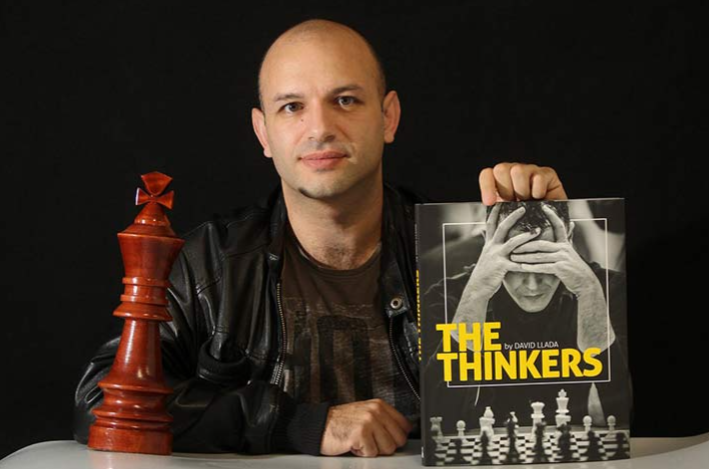
About the photographer
David Llada, born in Spain in 1978, has always been connected to the chess world, first as a professional chess journalist, publishing his contributions in all the world’s major chess magazines. In recent times he has earned a reputation as the chess photographer, working as Official Photographer at the three most recent Olympiads.
Llada’s intention towards creating his book was to help promote chess through his pictures with his main audience being people who were already interested in the game, making it one of the more renowned chess books on the market. The publicity the book got, however, helped to boost the acknowledgement of it with journalist brands like Wired and First Post making articles about him.
‘I am very surprised by the welcome it had, not within the chess community, but in general media.’ – David Llada.
Narrative, concept and design
‘The Thinkers’ is a hardcover book with a mix of photos being in colour and in black and white, overall having 208 pages in total with the paper quality being smooth. The book itself is published by ‘Quality Chess’ on the 16 November 2017 and is 31x24cm.
The thinkers is more of a literal title due to the people being photographed are those concentrating during a chess tournament, showing the emotions each player goes through with their own games.
Links
https://qualitychess.co.uk/products/2/310/the_thinkers_hardcover_by_david_llada
https://en.chessbase.com/post/master-class-with-david-llada
Theses virtual galleries display each of my photoshoots in a more formal setting in order to represent what they would look like if they were to actually be used in a gallery.
In order to create these virtual galleries, I used stock images of empty galleries in photoshop before pasting my own images in them and distorting them in order to make them appear more realistic. To enhance the feel of the images even more I decided to go in with the burn tool to add shadows and depth to them as well as the smooth tool to blend it in.
Gallery 1 – Play pieces
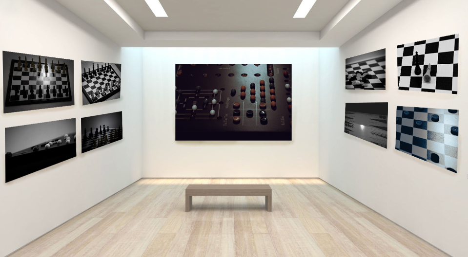
With this gallery I wanted to display some of my best images from my playing pieces shoot. I really like how the images all go together due to the muted colours and black and white tones in them, which is something that I had planned when editing them. I also like the contrast against the light room of the gallery, causing my photos to stand out even more.
Gallery 2 – Castle photos
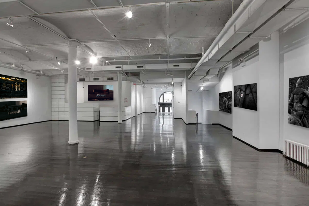
For this gallery I selected a more greyscale one as to link in better with the castle aesthetic of my second photo shoot. I think this one also turned out well and manages to capture the feel of a proper gallery.
Gallery 3 – Costume photos
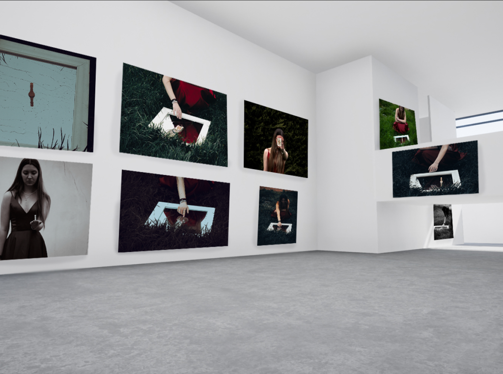
For my third gallery I picked a more plain one as to showcase more of my photographs. While I still like this image overall I feel as though the amount of images makes it feel a little cluttered, especially when compared to the plain flooring.
Gallery 4 – Portraits
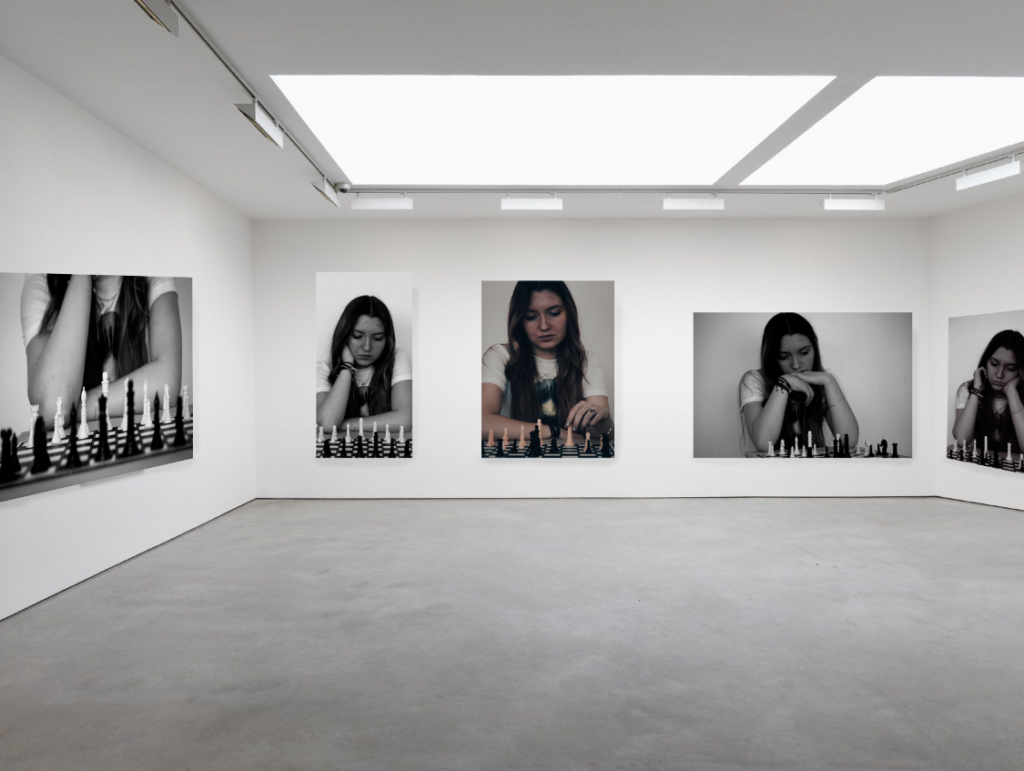
I think that this gallery captures my fourth shoot really well, showcasing my best portrait images, with each of the photos connecting due to the link of chess. I also like how I put the coloured image in the centre, making it stand out among the other black and white images.
Gallery 5 – Masks
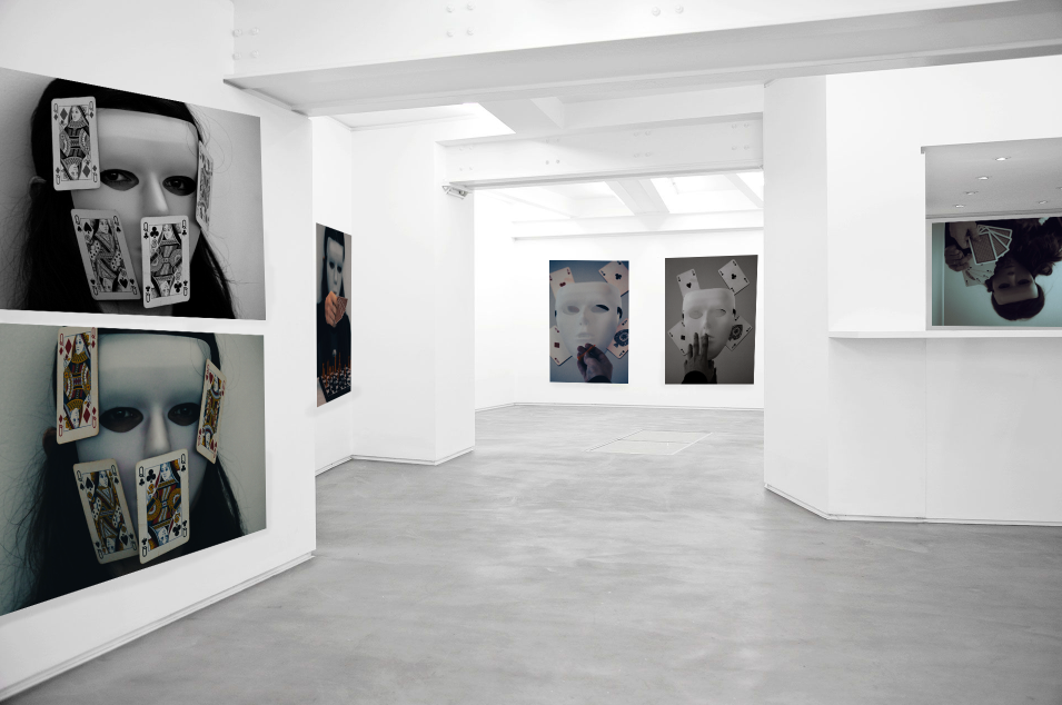
This is my favourite gallery that I have made so far due to the layout as well as the colouring linking the images together. I think the mask photos work well when displayed against a plain background with bright lighting due to the images already being quite dark.
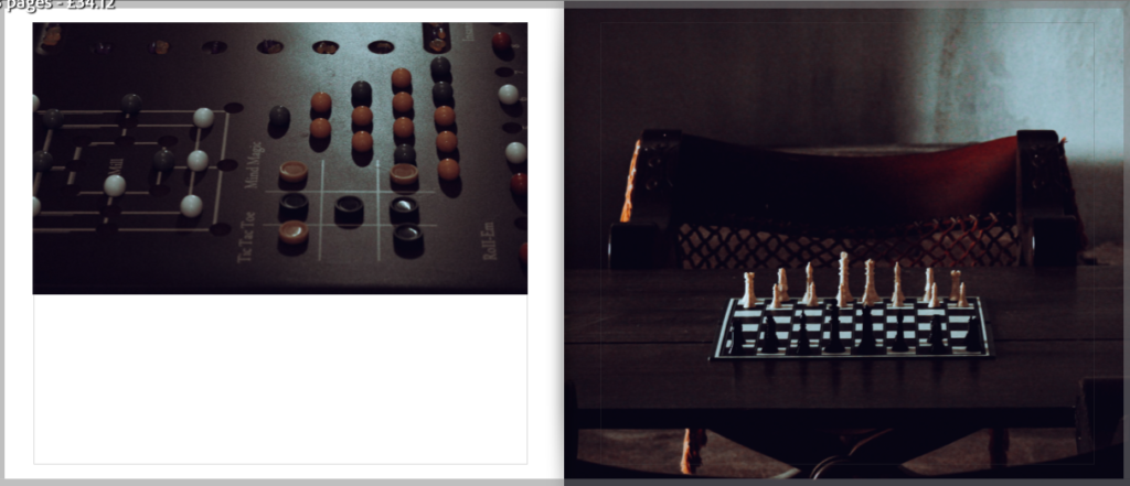
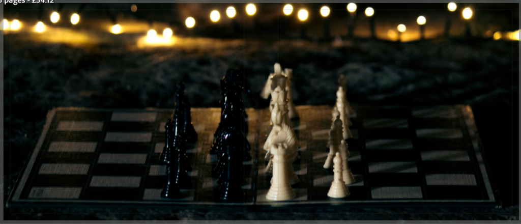
Gallery 6 – Elements
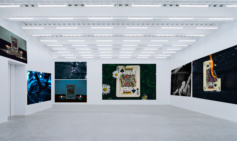
Lastly, for my element shoot I attempted to bulk together the images by colours, creating a sort of gradient from a more vibrant blue to a more muted one. Similarly to my mask shoot I like how the my photos contrast against the white background and lights, helping them to stand out more.