All posts by Charlie Bell

Filters

Author:
Category:

Evaluation

Case studies

When evaluating my work there’s a big range of aspect to evaluate I did 4 case studies before actual doing any of the work and I think my image only look like 2 of the artist I picked I did want to do night photography at the start of this however I changed my mind because I hadn’t done to much daylight photography so in that aspect I think I did ok but my work is unique I guess and doesn’t follow other artists that I know.

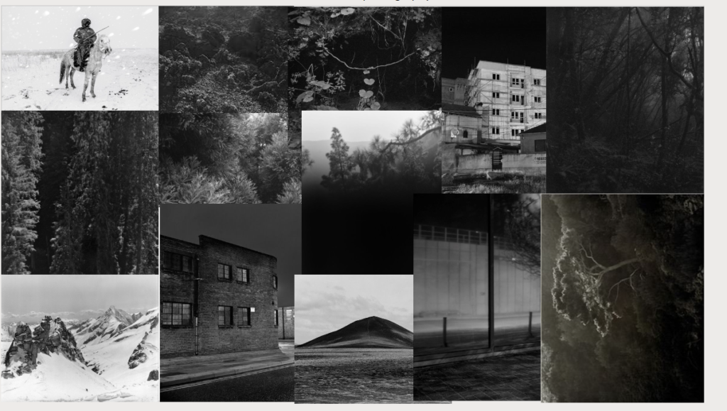
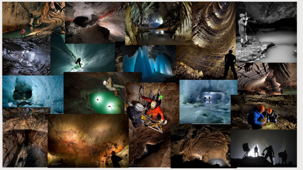
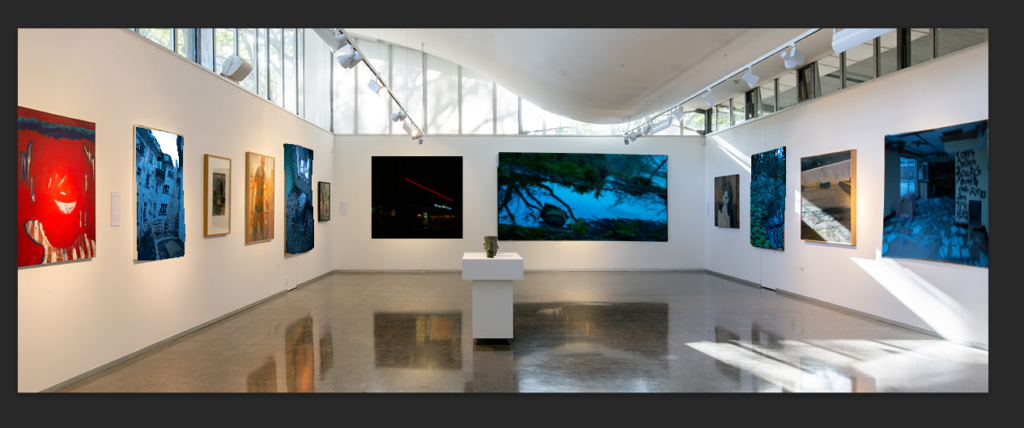
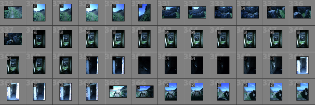
2 of the 4 mood board that I created for the case studies the one on the left is Awoiska Van Der Molen and the one on the right is Robbie Shone.

Photoshoots

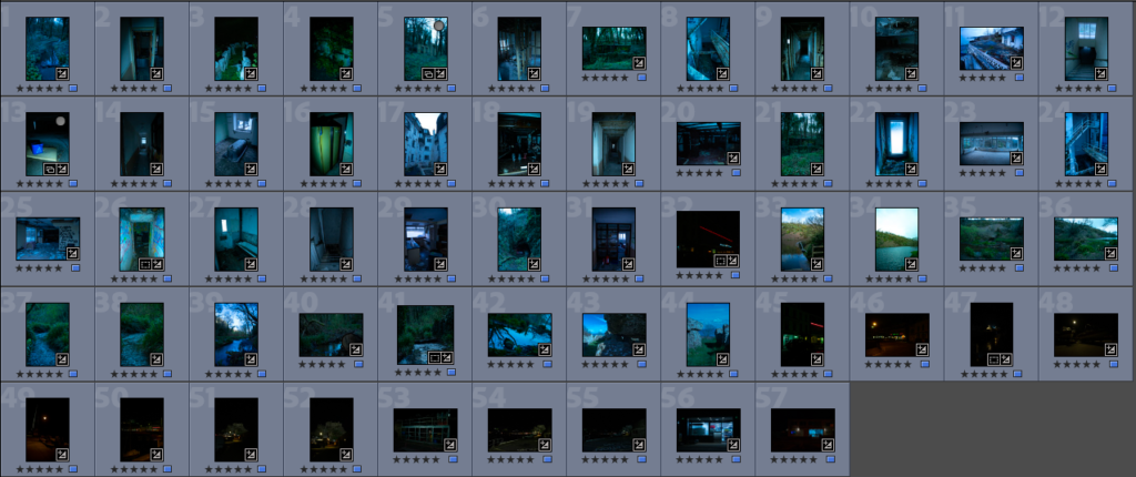
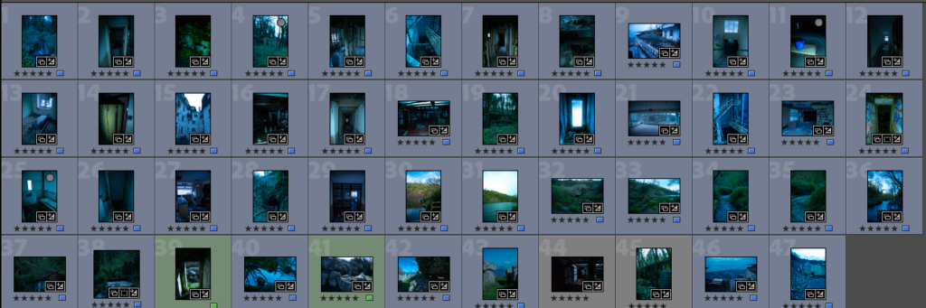
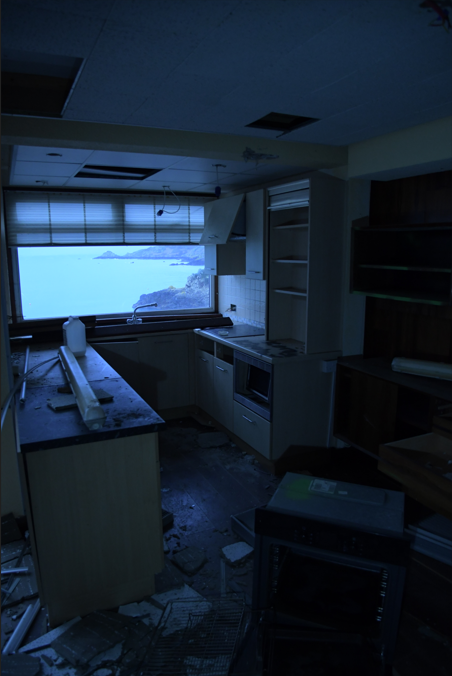
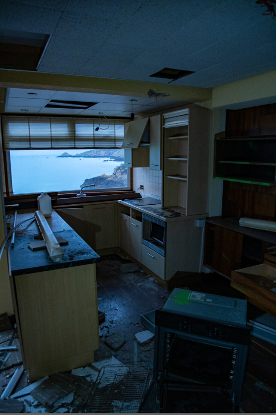
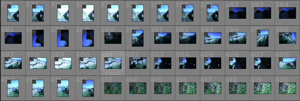
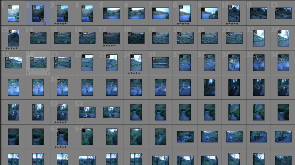
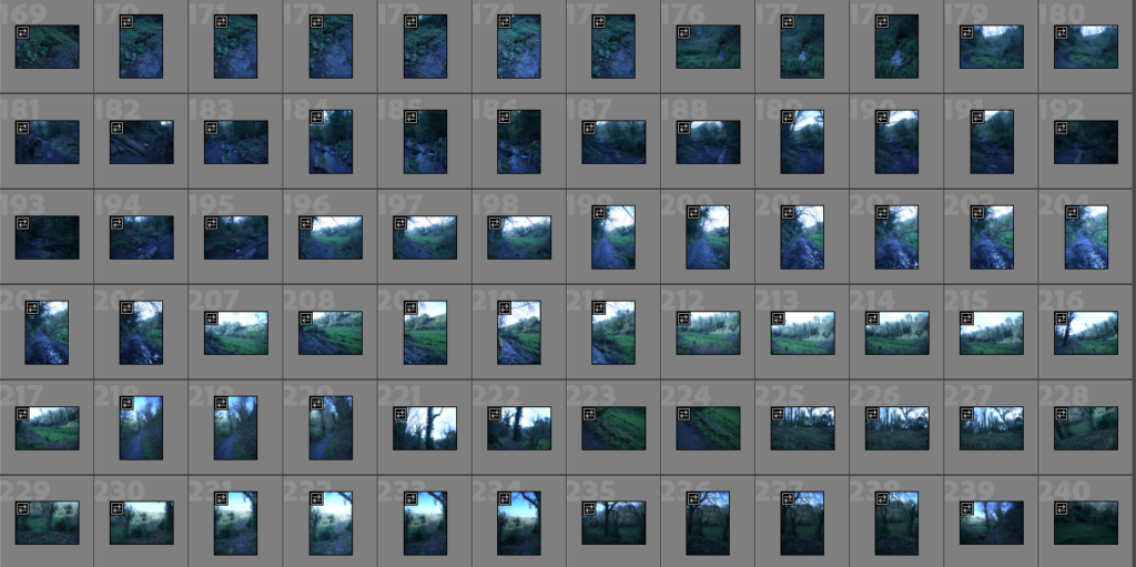
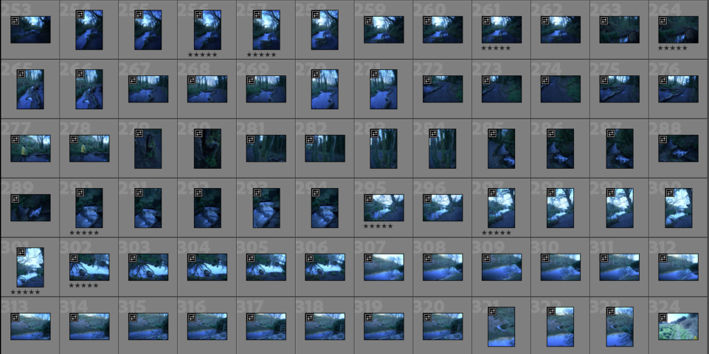
I did 6 photoshoot some I took more photos than others and some that I used more photos than more than other the photoshoot where fun and weren’t really planned however they still turned out great and the photos that have been selected for the photobook an the printed photo turned out really good in editing.

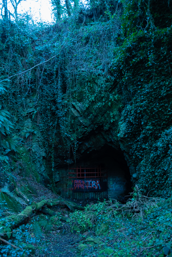
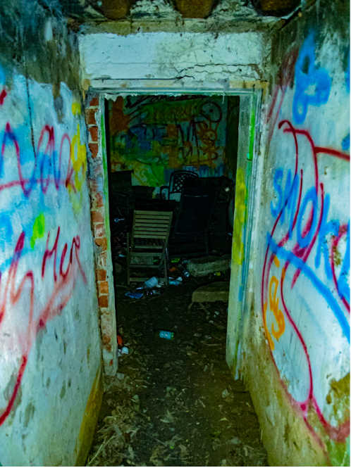
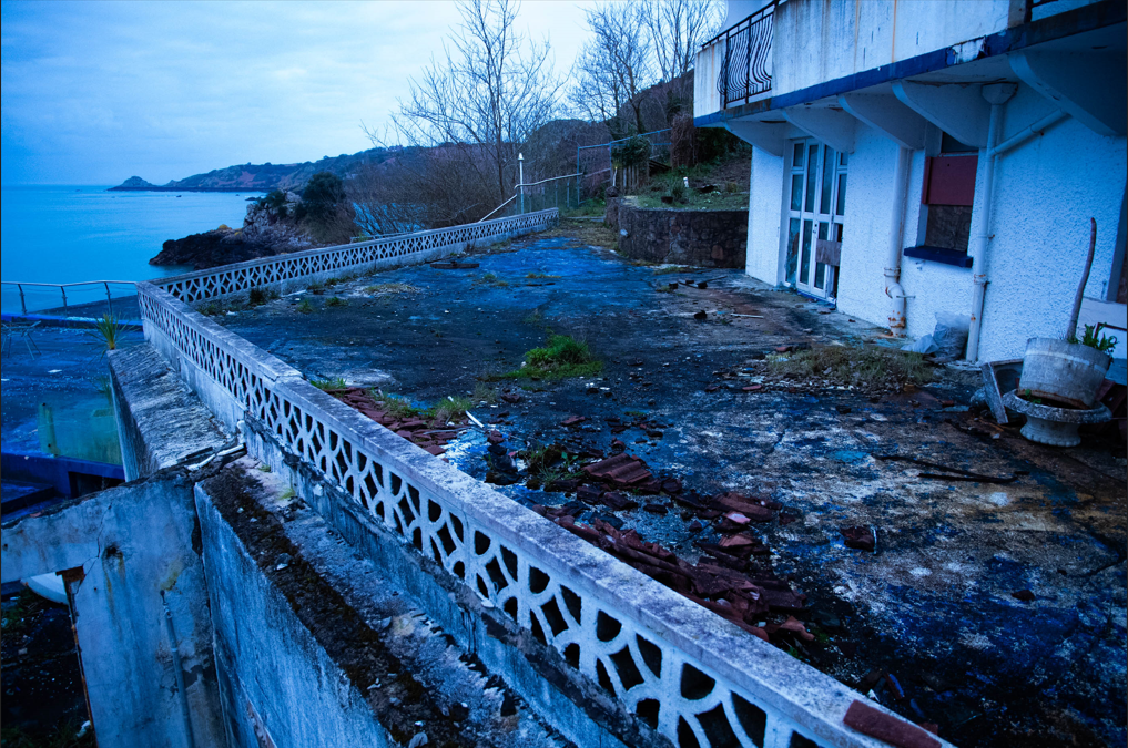
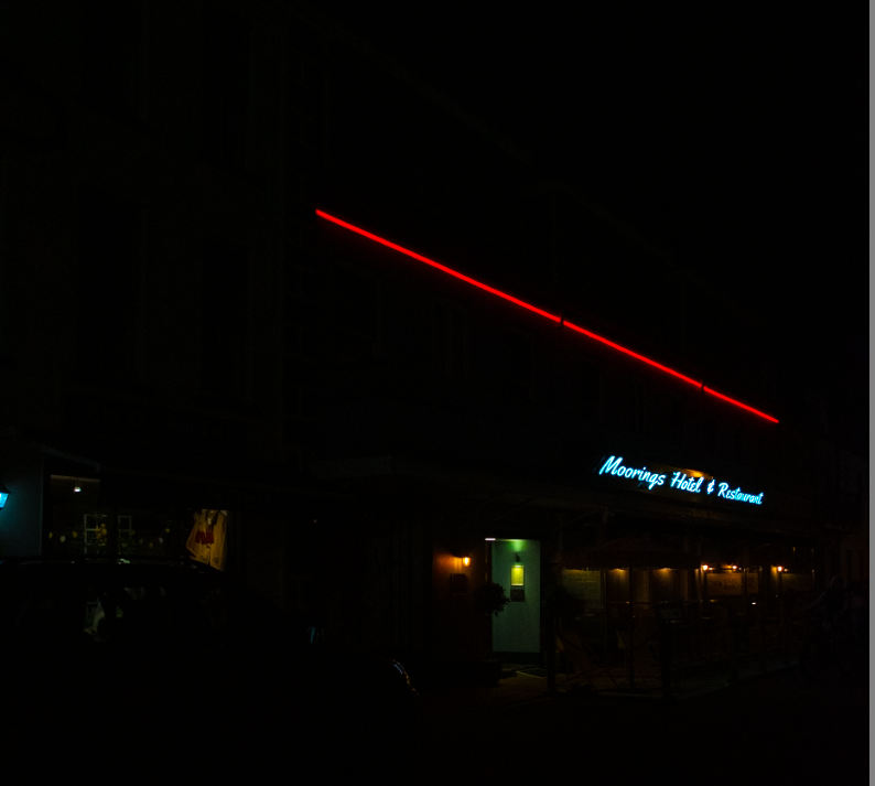
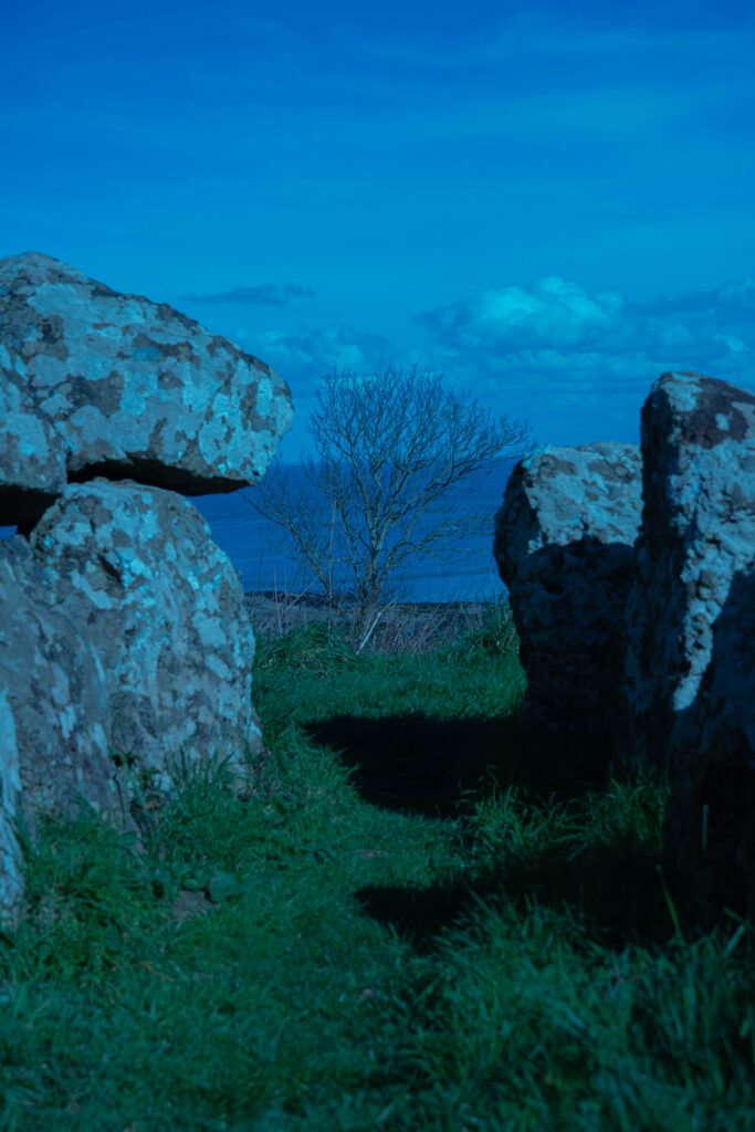
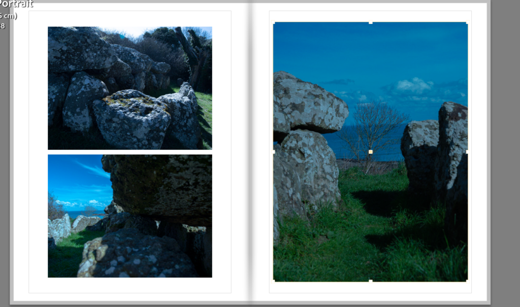
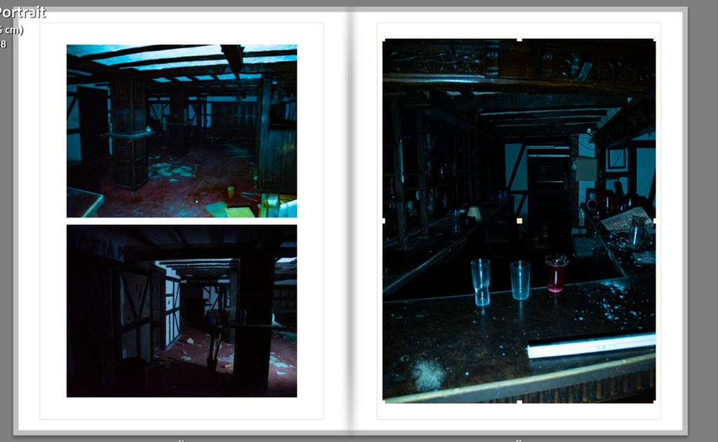
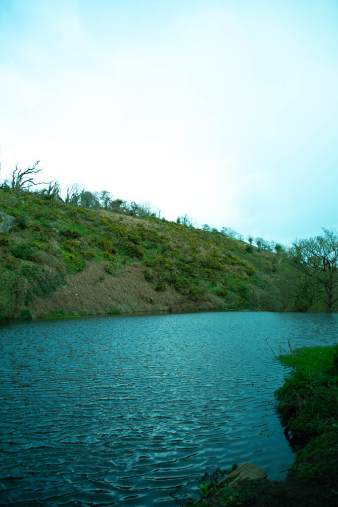
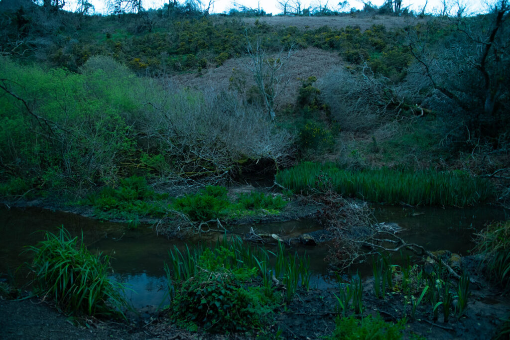
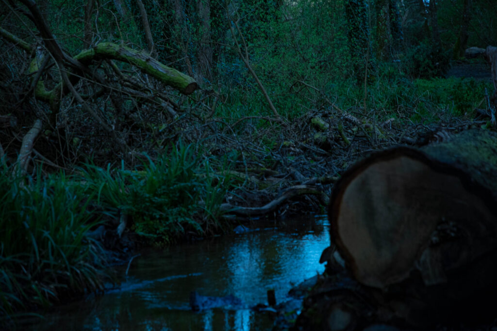
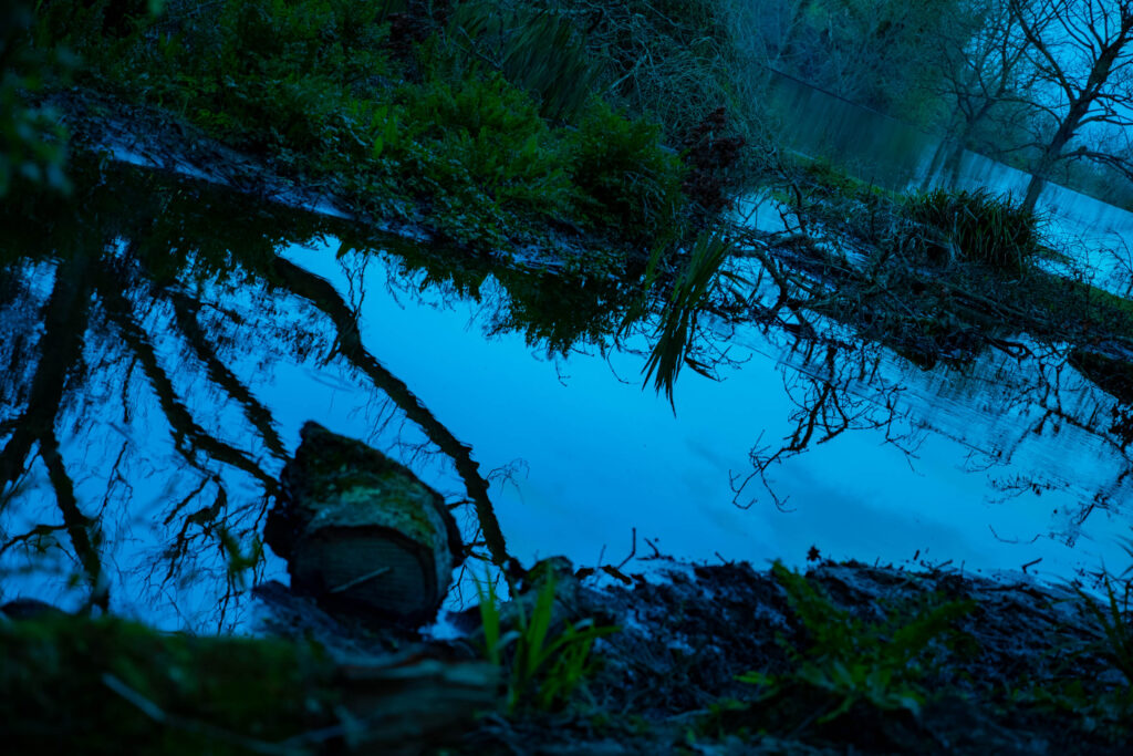
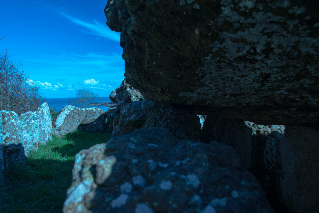
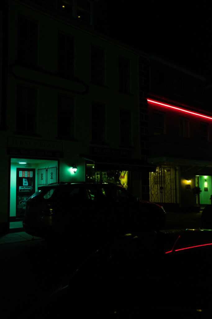
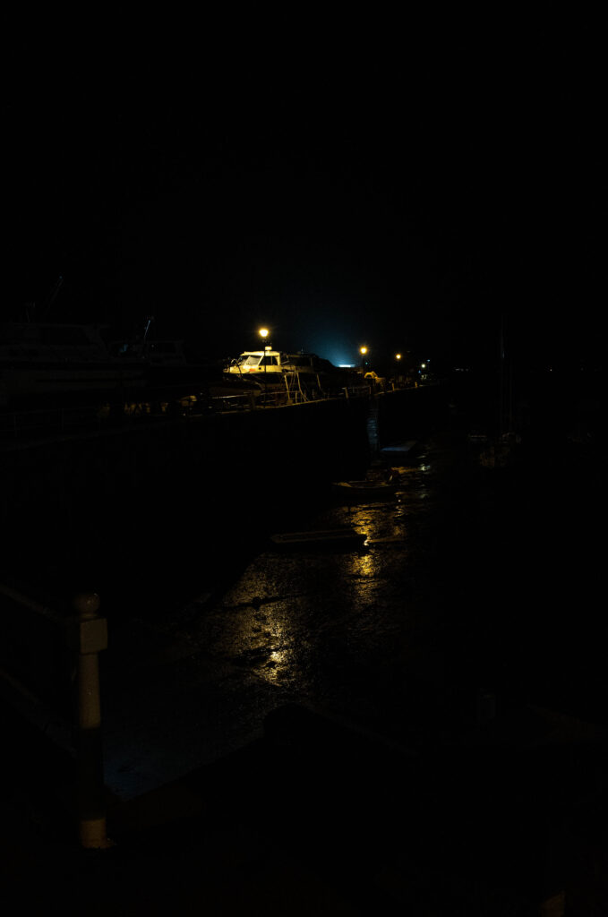
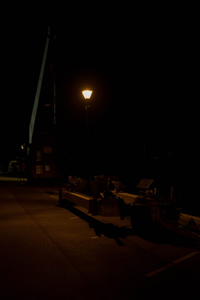
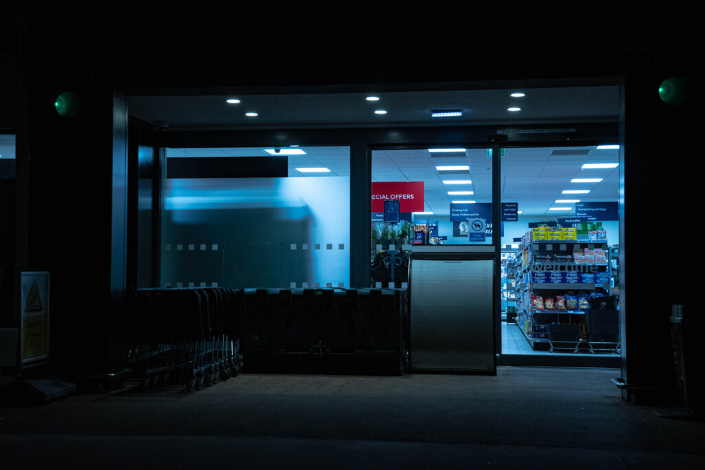
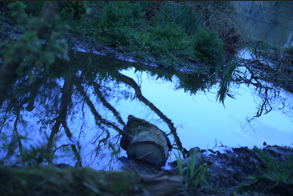
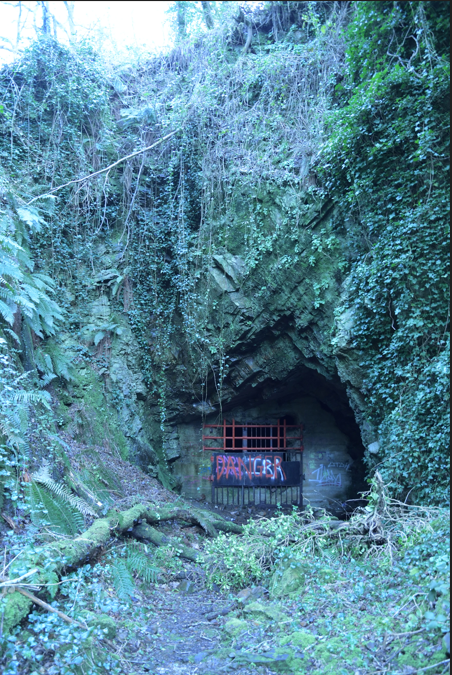
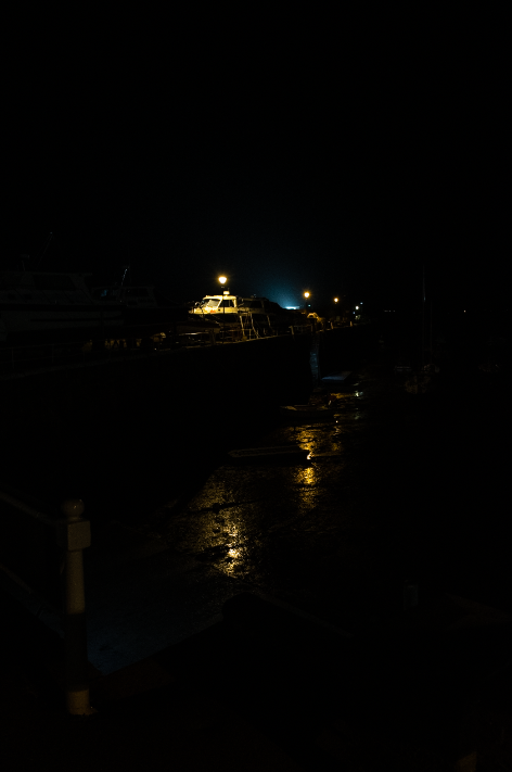
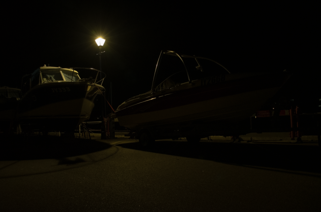
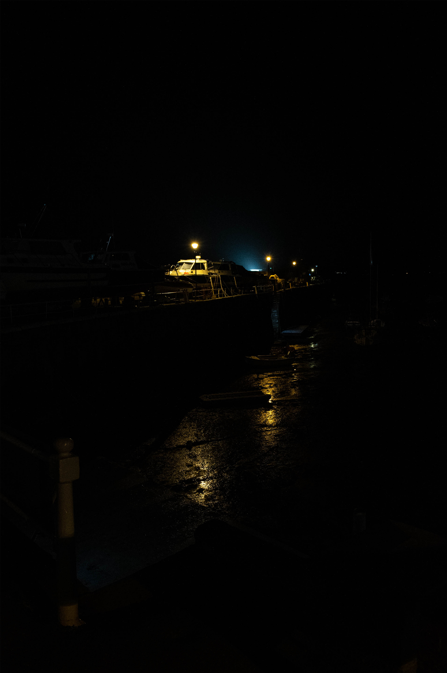
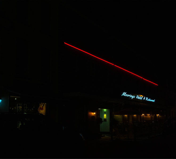
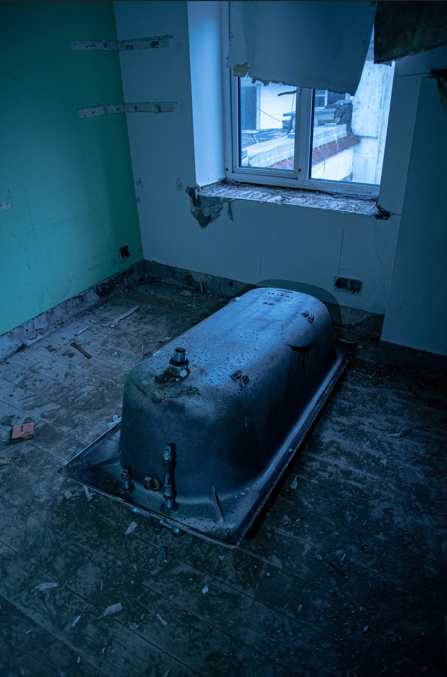
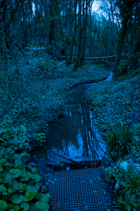
Here’s 1 photo from every photo shoot you can see that there all different themes and feel with the each different photo everyone of them has their own unique feel.
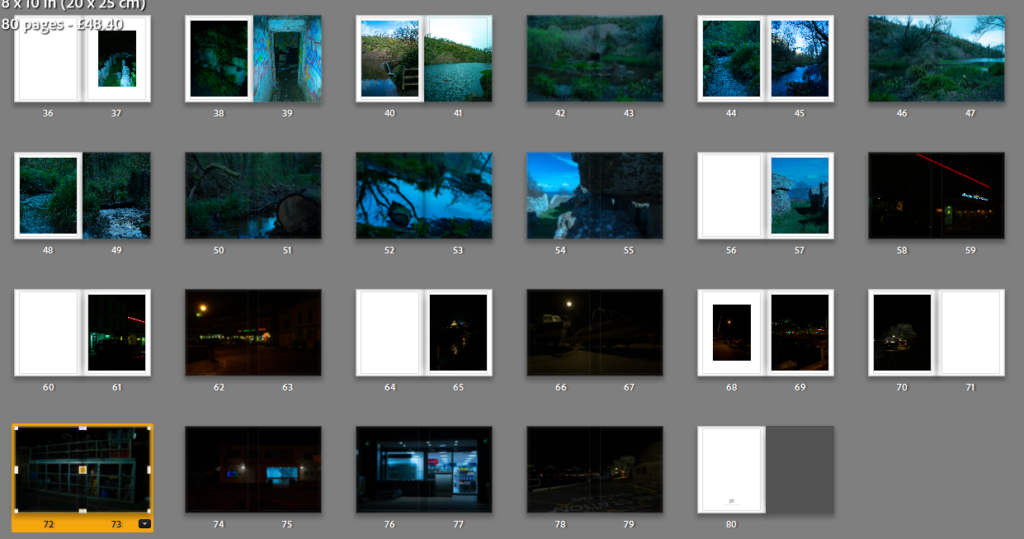
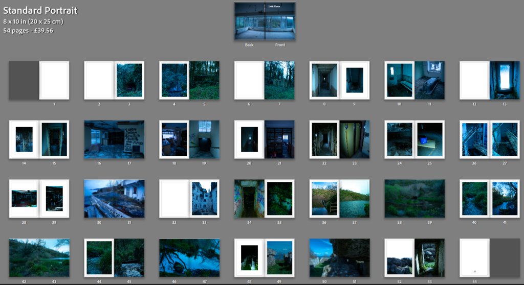
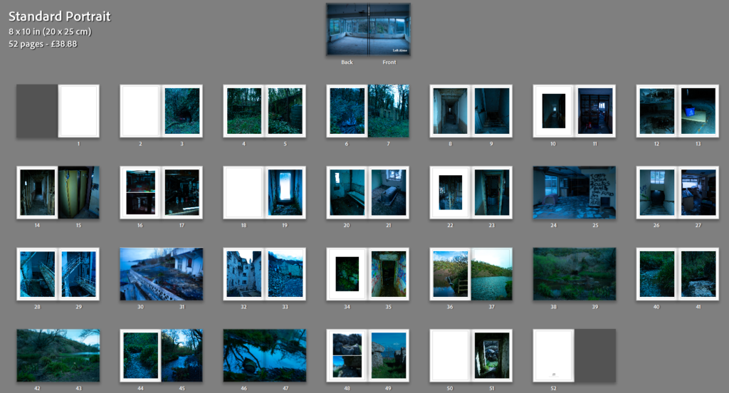
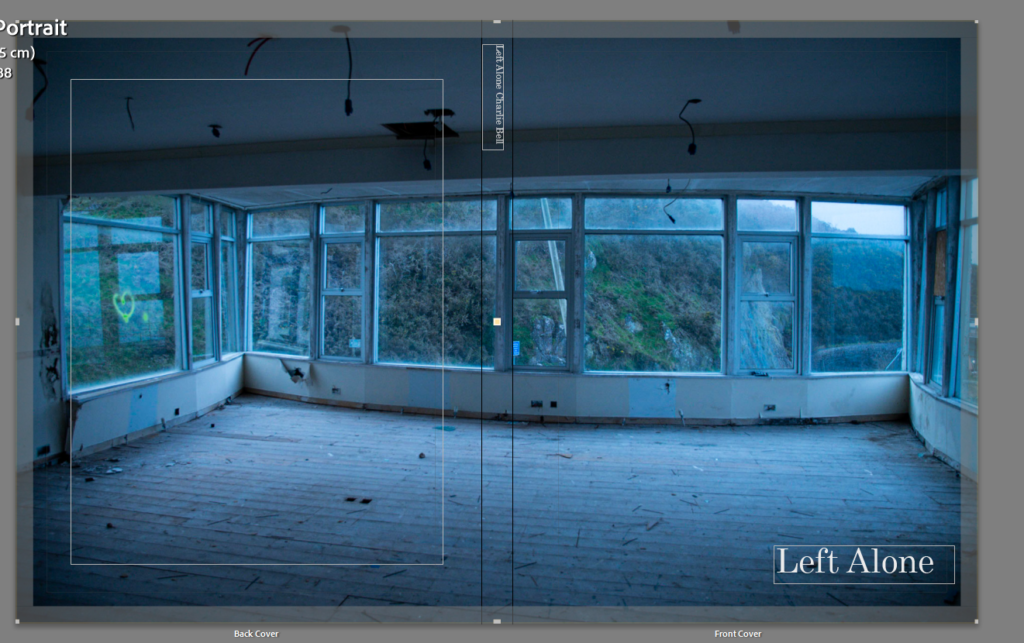
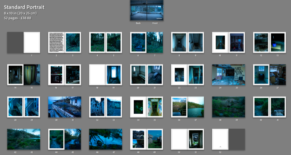
Photobook

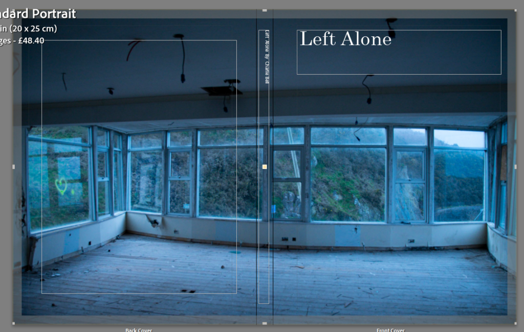
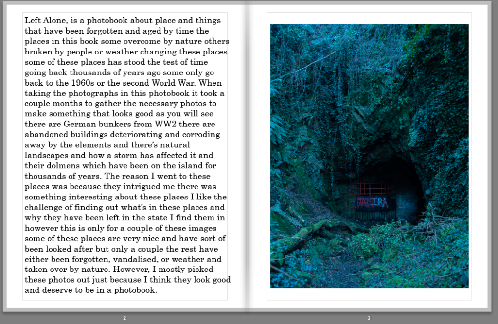
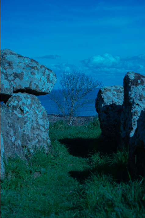
When creating the photobook at the start I did want to do night photography however my ideas shifted and I went towards daylight photography when choosing the layout for the photobook I went with the order that did the photo shoots with so the first set of images are from the first photo shoot and the last set are from the one of the last photoshoot not the last photoshoot as that one was night photography and this book isn’t about night photography, the photo book is about abandoned things and places that have been “left alone” which is the name of the photobook its a bit cliche but it does suit the theme of the photobook and I quiet like how the photo book looks and feel I think it turned out great and I really like how the photo book turned out it and I excited to see it in real life.

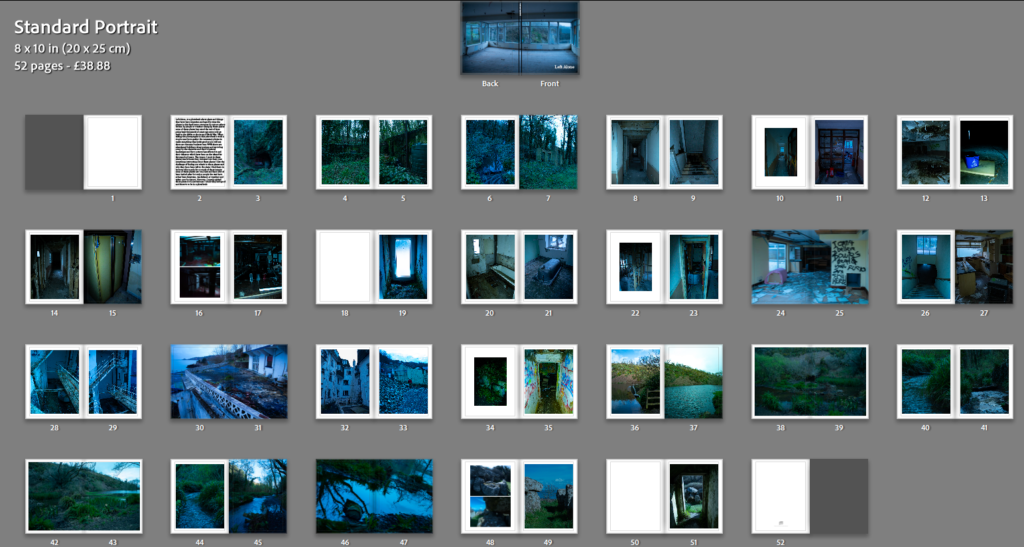
Here is a link to the photobook – Left Alone
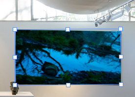
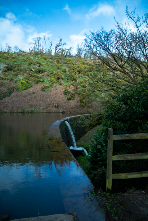
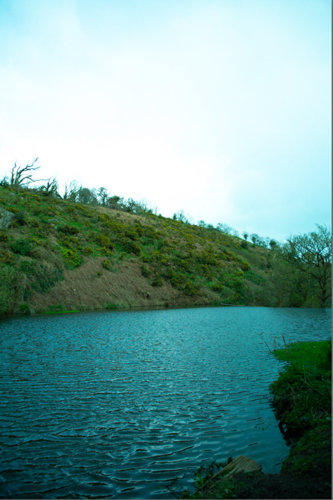
Printed photos

the photos that I had printed turned out alright I am not to happy with the way the night photography turned out however the rest of the prints turned out good all I did with the prints is put them onto some foam board the ones on the foam board look good and I am happy with the way they turned out.

last evaluation

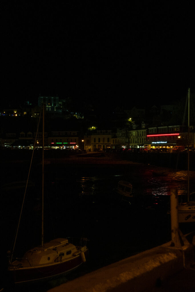
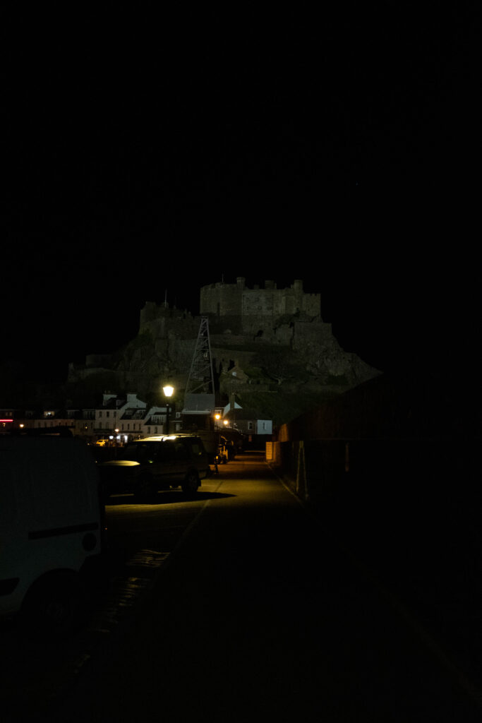
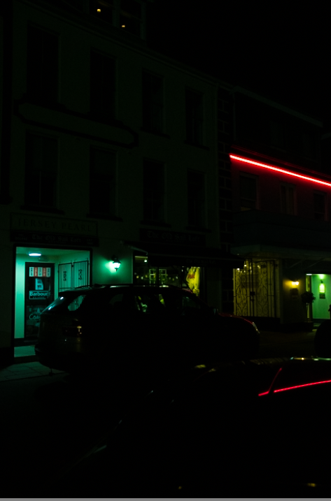
with this whole project I learnt alot about how to take photos that looked good whilst also learning how to edited them to make them compliment each other in a photo book I tired to get the sort of feel of some of the artist case studies i did whilst also getting my own unique style into the photo I also took photos o things I like and what I think looked nice I believe my night photography photo reseblibe Liam Wongs kind of art style maybe a bit darker but still resembles his style. and the forest pictures also kind of resemble Awoiska Van Der Molen’s work however my pictures are not in black and white the reason for this is because I don’t like how overused black and white photo are use and the destail that can be missed out on by using black and white photos however I do get some photo will only look good in black and white and that’s the only time I will probably use black and white on one of my photos, I think this project is one of my best works yet I think that photobook turned out great and should definitely be better than my first one and the final image turned out good and I am proud of what I have produced and made for this project.

Developing the photobook

Here is a link to the final photobook – Left Alone

here I have a basic layout for the book I need to get some more photos and figure out what to write in it and what the title of the book is at this moment of time its just called observer, challenge and seek which I don’t want it to be called that’s just a placeholder for the time being.

later Developed Photobook

At this stage I have added more photos to the photobook the original number before I added the photos was 39 pages now there are 80 pages not all the pages have one photo some might be blank and some are double pages but there’s 57 photo in this book more then my first photo book.

All The Photographs In The Photobook

here are the 57 photos and there a mixture of 6 photoshoots combined to make my photobook

Figuring Out A Title

right now the title of the book is observer, challenge and seek so I want to change it to something that sounds better and that suits the book more the book has a lot of nature in it and abandoned thing there also old things in the book so maybe “left alone” sounds a bit cliche however its the best I have at the moment but it fits the book and the feel of it so I happy with the title.

Re-Doing The Layout

On day 2 of the exam I decided I didn’t like the original layout of the photobook so I changed it I took away photos that didn’t fit with the theme of the photobook and I added some new images that go with the theme of the book

Old photobook layout.
New photobook layout.

the differences of the layout are noticeable most of the photos are the same however I took out all of the night photography photos because they didn’t fit with the theme of the book and added only a couple photos to fill up the book and make it look good the front cover is also different instead of being in the top left its in the bottom right of the cover.

this is what the cover looks like after the changes.

I am using about 45 images in the book a lot less than the original 57 photos and there only 52 pages instead of the original 80 pages however the book makes a lot more sense and I will still be changing and tweaking the book so this isn’t the last change however it is still a big change to the books layout and how its viewed.

What To Write In The Book

I wrote this is in the front of the book it’s mostly talking about what’s in the book and why I took the photos that I did I think it’s good to have a little bit of writing in the book even if it’s not much just something for people to read and to see what the book is about giving the viewer a bit of context however not much as I want to let the viewer use the imagination a little when looks at my photos.

century is the font that I have been using for this photo book I used century for my first photo book the reason is I like the way it looks its very smart and not to flashy,the setting on the screen shot are from the title.

what the books layout looks like after day 2

The photobook will probably not change that much after this I might tweak it on the third day and maybe add a couple more image but nothing to much I am happy with what I have now I might also add some writing and give the images names/title but I don’t know for sure if I will yet.

Final Edit

there’s not really to much changes to the photobook however these 2 screenshots show I just added a different layout to get 2 images on 1 page to make the photo book feel and look more full the images themself look better smaller especially the ones that are showing the bar.

this is the final form of the photobook I think it looks good I might do some miner editing just before printing the book but it looks good and I am happy with my final outcome.

Final photographs

These photographs are no the last of the photographs that I will be takin over the Easter holidays I plan on taking some photographs these photographs are from the mock exam and there the photos that I like the most

All the final photos

these aren’t all the photos there just a selection of images that show what I have added however the photographs look really good with this set of final images instead of just doing night photography I tried to do daylight photography and night I think turned out good and the images look really nice in some of the images I tried to get reflections and different ways to get the light. the night photography will not be in the photobook however some most of the day light ones will be in the photo book

virtual gallery

here is my virtual gallery there are only 5 out of my 12 printed photos in here they look a bit jankey because I had to warp them around already existing paintings
the warp just helps get the photos to actually look like its in a gallery
here I was re seizing a photo to fit a frame in the virtual gallery
here’s the separate layer that are the photo that I have put on to the gallery

the virtual gallery was easy to make and only took 20 mins to make however it doesn’t look th ebest but its good enough to get a idea on what the real thing might look like when framing the real images they will be A3 and on foam board.

Images That Are Being Printed

the reason I choose this image to be printed is because I like the way the reflection in the water looks and how the stream curves round the image this image is one of my favorites and that’s why I am printing it. I took this image in st peters valley it’s quiet a random place however its turned out really good.
I am printing this photograph because the view on the left and the destroyed hotel on the right just looks really nice and I and happy how it turned out in the editing.
this photograph was taken inside the abandoned hotel the reason i took photo is because I thought it looked out of place and weird and I think photo just look really good.
this photograph is my favorite one out of all them sadly it’s not in the book because it doesn’t go with the theme of the book however I love the way it turned out it looks amazing I believe this photo resembles Liam Wongs kind of art style maybe a bit darker but still reaseble his style.
this photograph has to be my second favourite out of all of my images just because I love the way how the water is reflection the scenery around it.
this photo is good its I really like the way it turned out however it might be a bit dark however I really like the way the light look in this photo this photo also resembles Liam Wong sort of work I really like how he plays with light in his photos. and i think I sort of got it in this photo here.

Experimenting and developing photos

The photo on the left is before editing and photo on the left is after editing, when editing this image I wanted to get more light in it so it didn’t print dark when the book was printed I had that problem with my first photobook I also wanted the viewer to see through the window and see the view as clear as possible.

These are the settings I used to get this image to look the way that it does turning down the highlight the exposer up make it easy to see clearly through the window and you can adjust the brightness of the image with the exposure and contrast.

The image on the left is before editing and the one on the right is after editing, when editing this photo I really tried to make the reflection in the pop and look just good because I really like its feature in the image. I made the image blue because the it makes the image just look good and makes everything almost alien for example the plants are a bit greener than usual and the water like silky blue almost like a mirror.

These are the settings to the edited photo when creating the image I just played around with some setting I didn’t really know what I wanted the image to look like but I did know that I wanted the reflections in the water to pop and for the image to look good and I think it turned out alright.

The image on the left is before editing and the one on the right is after editing, when editing this photo I really tried to make it look less bright and get more detail of the rocks around the bunker I also tried to make the plants and wildlife around the bunker. I really like how this photo looks there a lot of wildlife around this concrete structure and it just looks out of place almost not real.

These are the settings for the edited photo when editing I just wanted to turn down the brightness and when I used the exposer I lost a lot of detail when using turing it down to the brightness that I wanted for the photo do I played around with the highlight, shadows, whites and black to get the image I also played around with the colour to make the wild life look slightly unnatural.

Early Evaluation

I have a done a lot of case study just because I am trying to see what I like and what I dislike and then trying to find what works with the way I take photos so most of the case study I probably wont be following the style of however I will be copying some of the photography techniques that they use and applying them to the photos that I will be taking. with the exam I want my finished project to be a book with some really good photo that I am proud to be putting into the photos themselves will be me exploring different areas of the island

photo book early stages

This is just what I have so far on my photobook which will be change photos will be added and some will be taken out the name will change and it will under go some changes that the reason I am making a photobook is that I really liked making my first photobook that I want to make another photobook

photoshoot 6

here are all the photos from photoshoot 6 they were taken at Gorey on the pier/harbour I got some really good images from this photoshoot and some of them are in the photo book

photoshoot 5

this photo was a very short photo just of a dulmen north of the island I don’t know exactly where I was guided there by my mum I got some decent photos and I believe 2 of them made it into the photobook

photoshoot 4

theses are all the images from photoshoot 4 this photoshoot i got a lot of photo and most of them were good and take a big place in my photobook some of my favourite ones are at the bottom of this blog post the lactation of where they tasken is st catherine’s woods