All posts by Briony Holmes

Filters

Author:
Category:

evaluation

Overall I think my final outcomes were very successful, my images are abstract while still being very simple which is what I was aiming for. In the beginning I think it was quite a tricky theme (observe, seek, challenge) but once I knew what path I wanted to go down I realised there were countless opportunities for me to look into. What I liked a lot about this project is that it challenged me to look at the things around me differently and really take the small things into consideration, From this I believe I can see the beauty in things a lot more. A quote that inspired this project from the beginning is “When we stare at people, we’re actually just observing them, trying to better understand them, because there is something we find interesting in that individual!”, I found this really interesting but wanted to focus it more on objects than people.

Rinko Kawauchi was definitely my main inspiration for this project as I loved her use of composition, lighting, colour, and movement in her photos. Her ‘fairy-like’ photos is what influenced my more abstract photographs. Her use of colour is more focused on subtle pastel tones and muted hues so my inspiration behind colour definitely came more from William Eccleston’s bold and vibrant use of colour, the often saturated colours and strong contrasts create visually striking images, exactly how I wanted them to be.

One thing I would do differently next time is take more photos outside, I think natural light and nature is what is missing from my final images and what I think would bring them all together. If I was to continue this project I would also do another focus on humans and the people around me which I think would be an easy and affective way of extending this project.
photobook: concept + narrative + design

Online link to my photobook

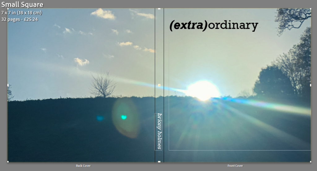
I decided to make my book square shaped with a hardback to fit with the photos that I took.

Cover

I decided on the title (extra)ordinary as it separates the two words ‘extra’ and ‘ordinary’ which I think it think sums up my project quite well. I really liked the simplicity of the image I chose for the cover image as it was abstract while still being casual. I knew I wanted the cover image to wrap around onto the back so this was the perfect image as I liked how the sun rays span across the whole image.

Pages

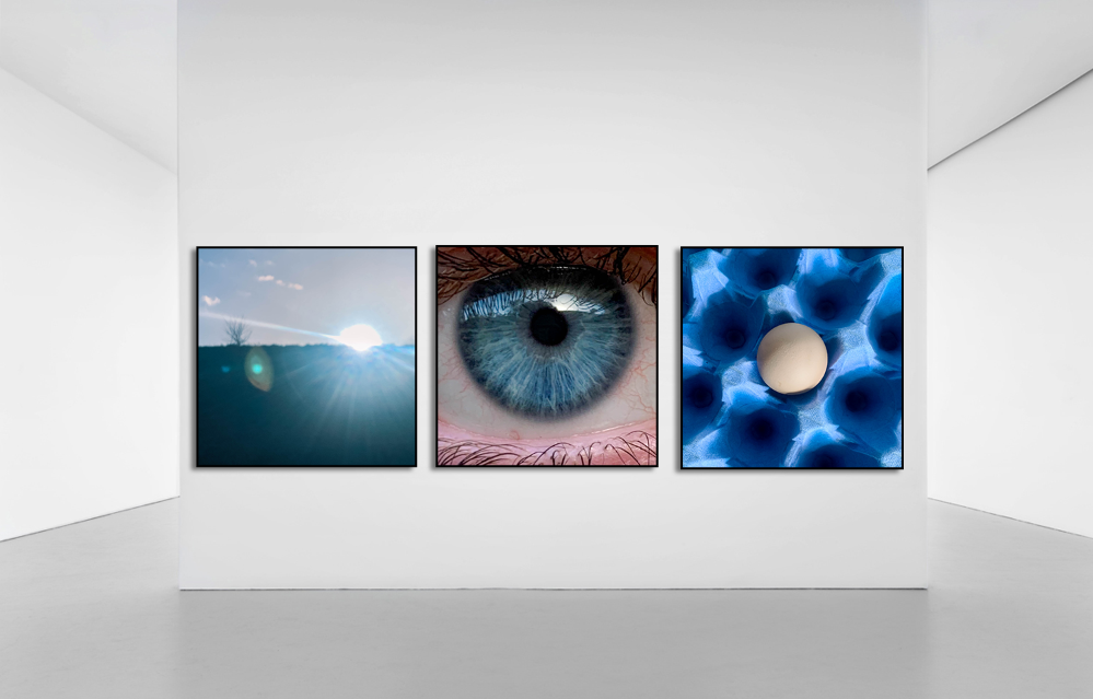
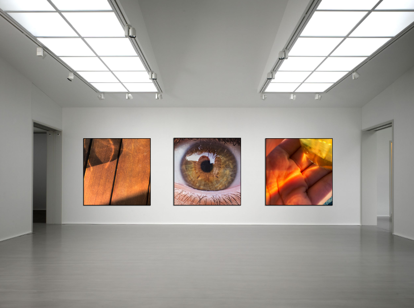
With each page I tried to match the pictures based on similar colours or shapes but making sure not to put images that are too similar together as I wanted there to still be some form of juxtaposition in them. I also didn’t want to put images together that would be next to each other in an everyday setting, this is because I want it to be almost random and unexcepted. My favourite concept was with the eyes as I knew the possibilities were endless. I ended up decided on pairing the blue eye with a close up of bubbles as I liked how they shared a similar shape (circular), the juxtaposition came with the eye having 2 big circles whereas the bubbles has multiple small circles. Similarly, with the brown eye I wanted to focus more on similar colours with the juxtaposition being the difference in shapes (straight lines vs circles).

When designing how my images would appear in the book, I wanted there to be some standardisation with some unexpectancy. I did this by having every other double pages (on the left of the images below) follow the same structure: medium square (e.g. page 4) with a full bleed (e.g. page 5) and then a full bleed image (e.g. page 8) with a small square (e.g. page 9) and it continued in that order. I created the irregularity through the other double pages (on the right) which either featured a double page spread, singular square image with nothing next to it, or a row of 4 images which created a timeline of movement.

photobook research + analysis

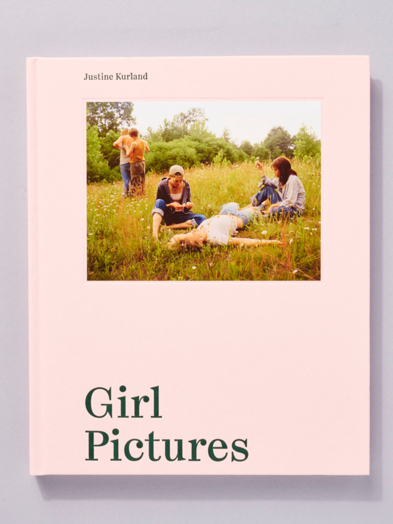
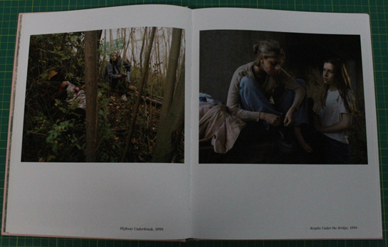
A photobook that I like the layout of is: ‘Girl pictures’ by Justine Kurland.

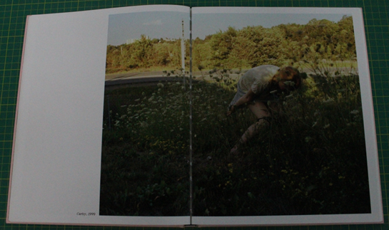
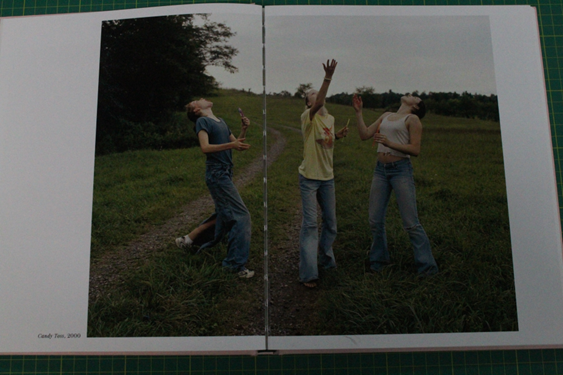
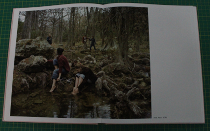
Despite this photobook not matching the theme of my project, I really like Kurland’s use of double page spreads along with the juxtaposition of the standard images (one per page). I think the simplistic yet striking structure helps tell the story as images jump from side to side and span most of the pages.

‘Girl Pictures’ follows American runaway girls as they explore their newfound freedom. The images are visually striking and can allude to a dreamlike aesthetic. Kurland takes natural light and careful composition into consideration as a way of creating a powerful visual narrative that invites viewers to reflect on their own experiences of youth and femininity. All the images were taken between 1997-2002 yet they feel timeless, Justine got young girls to pose as runaways under highway underpasses or next to neglected lakes, she named them her “standing army”.

Double page spreads:

Standard:

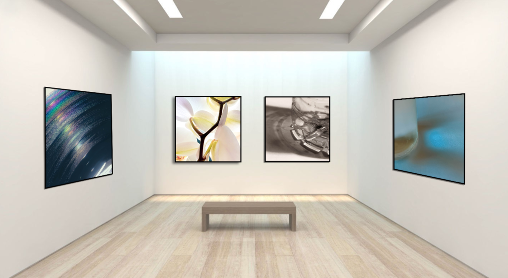
virtual gallery

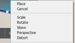
I used the ‘distort’ tool to position some of the pictures as if they are on a sideward wall:

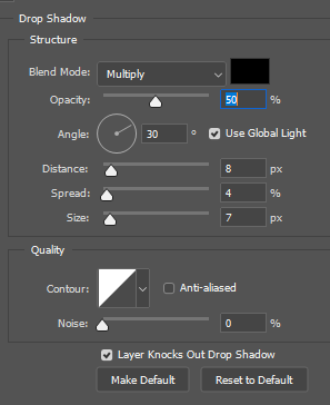
I used the drop shadow tool to create a shadow behind the “frames”:

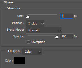
As well as creating a “frame” around the image with the stroke tool:

final prints mock up

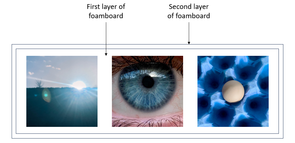
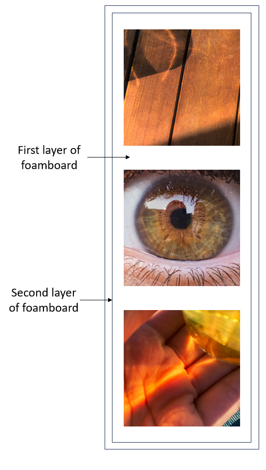
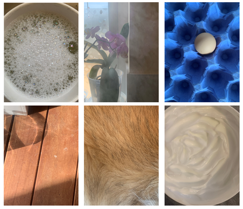
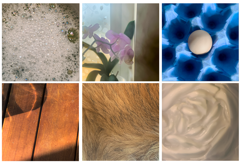
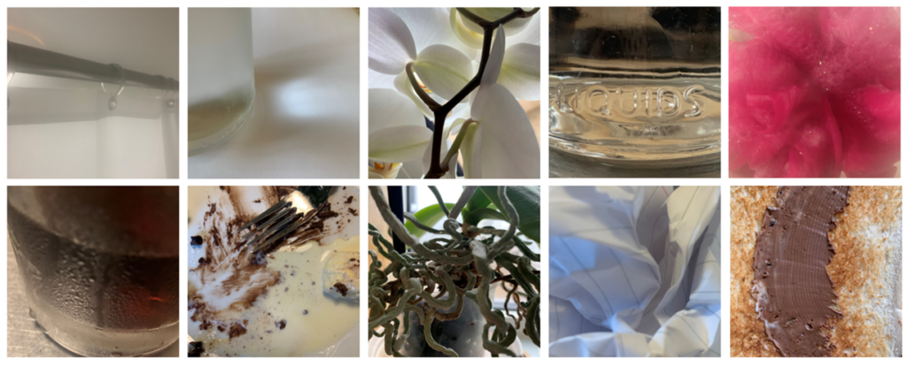
For my final physical prints I wanted to stick to the simplicity of my project theme so I decided to only print of 6 A5 photographs. I picked two trio pictures that I think work together well in terms of colour, shape, light and depth.

This is how I am going to to display the 6 of my final images.

Photoshoot 3: development + experimentation

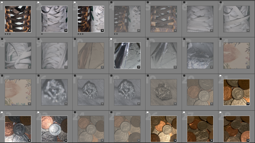
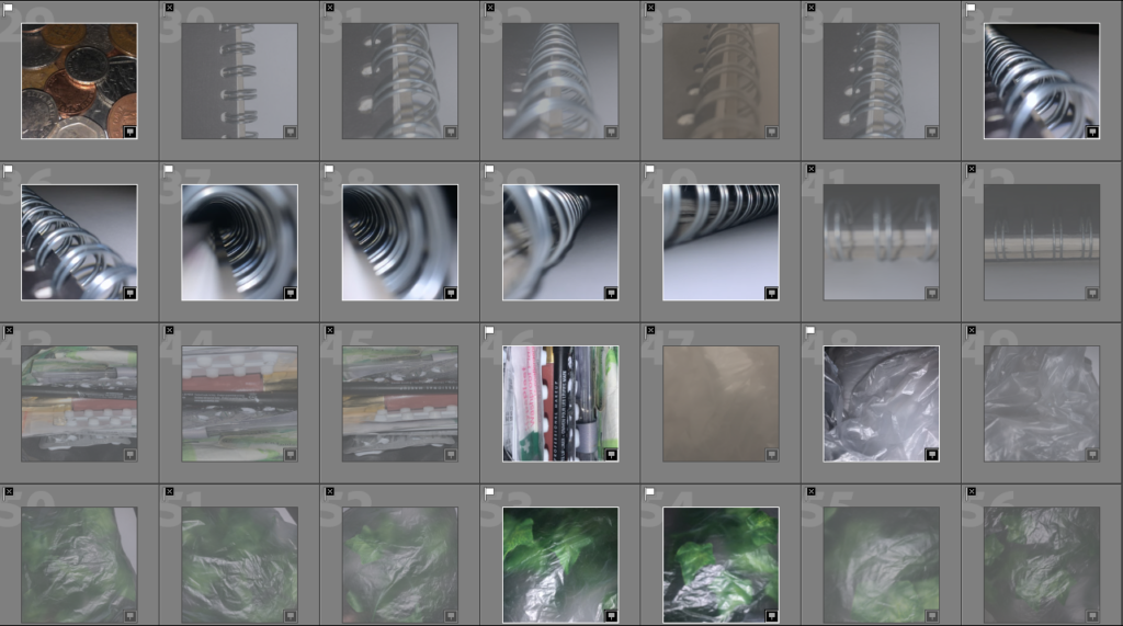
Due to the amount of images I like, I have split them into 3 sets.

First set

Second set

Third set

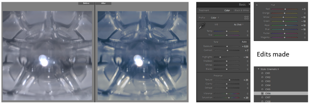
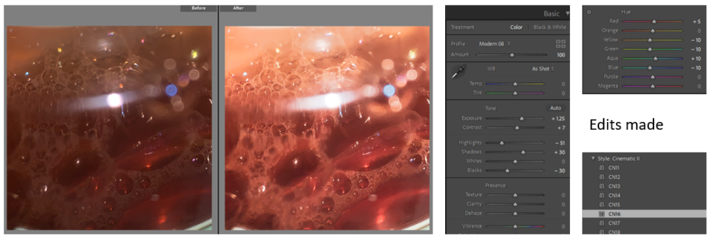
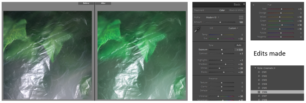
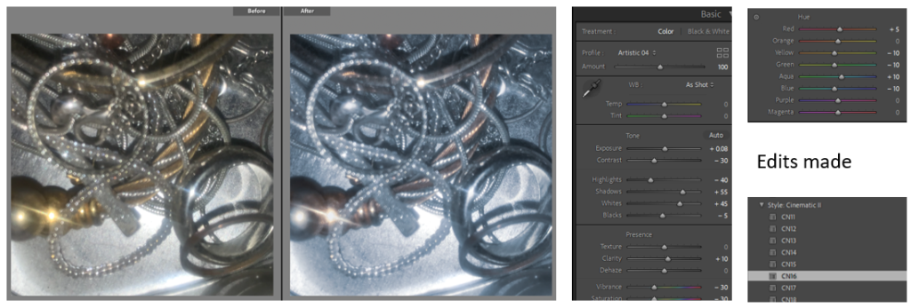
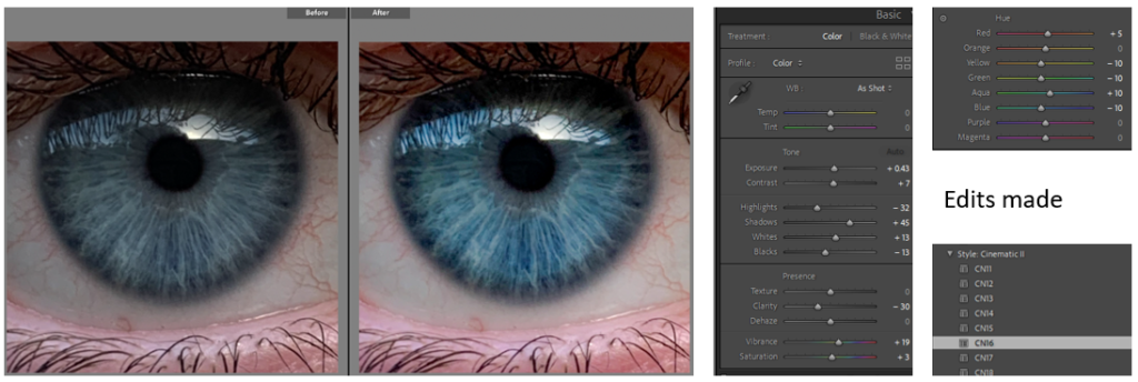
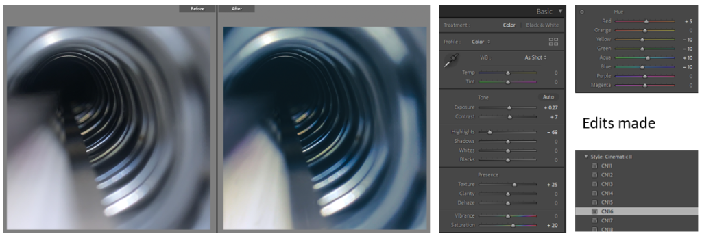
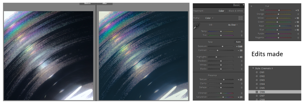
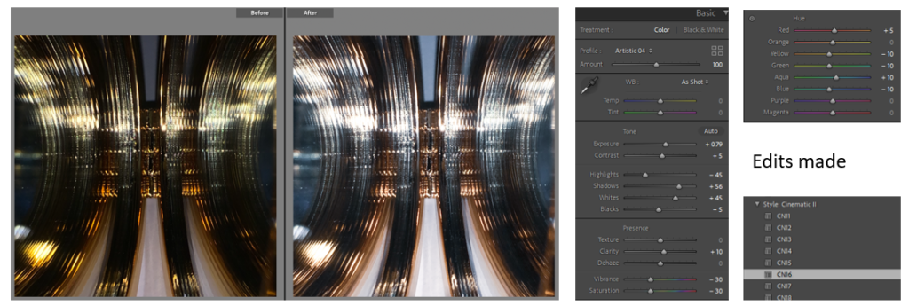
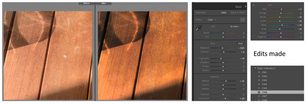
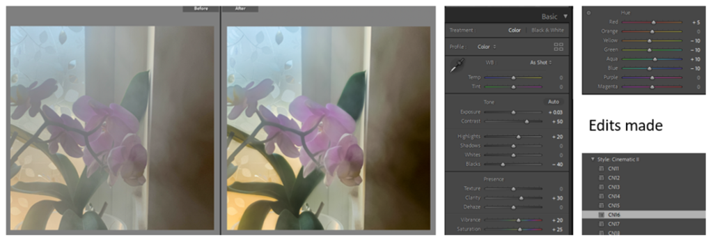
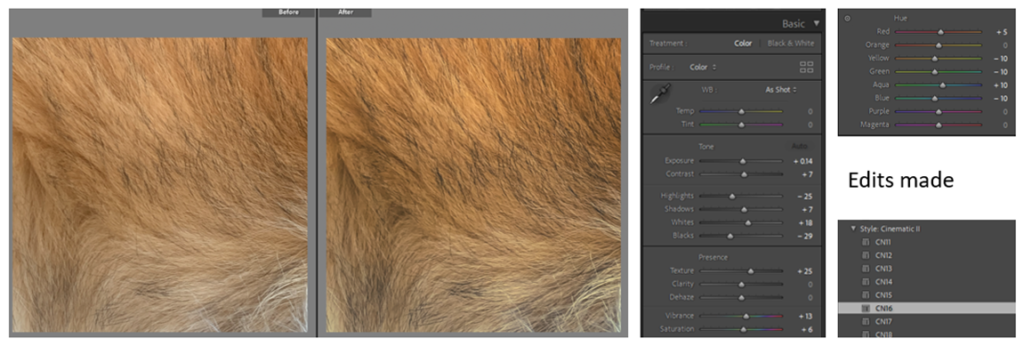
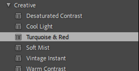
I started off by adjusting the levels of each image (exposure, contrast, highlights, etc.) to emphasis the good qualities of the images. I then chose a pre-set that fitted well with the image by either improving the colour, contrast, lighting, etc (most pre-sets were CN16, colour: high contrast, or creative: cool matte). On certain images I then went in with the brush tool or spot tool to edit or remove certain areas of an image that I think could be improved.

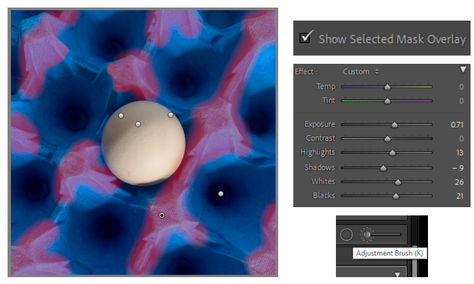
Example of the brush tool:

Here I am enhancing the highlights of each cone separately to ensure that these areas pop out the most.

First

Second

Third

First set

Second set

Third set

Photoshoot 3: planning + recording

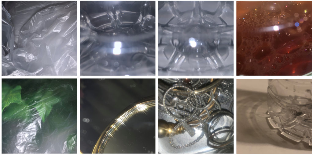
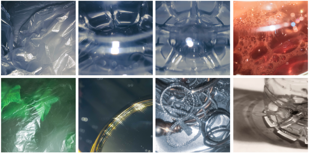
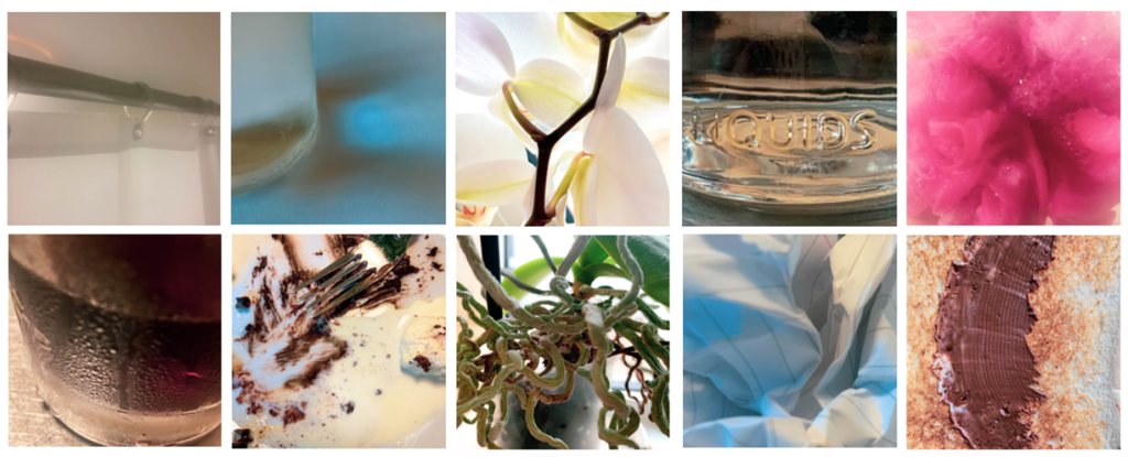
For this photoshoot I wanted to experiment more with flash to create more abstract images, more similar to Rinko Kawauchi’s work. I tried many different ways of photographing one object to try and create the most unusual perspectives that elevate them.

Overall, I think my best images are very strong and illustrates the theme of my project perfectly. I really like the uniqueness of each picture and how they all tell a slightly different story while still being an accurate representation. This photoshoot focuses a lot on colour but also on movement which was something I hadn’t considered before. I think my strong images not only capture everyday objects but more simply, everyday life.

Photoshoot 2: development + experimentation

Unedited best shots

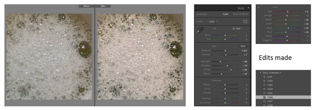
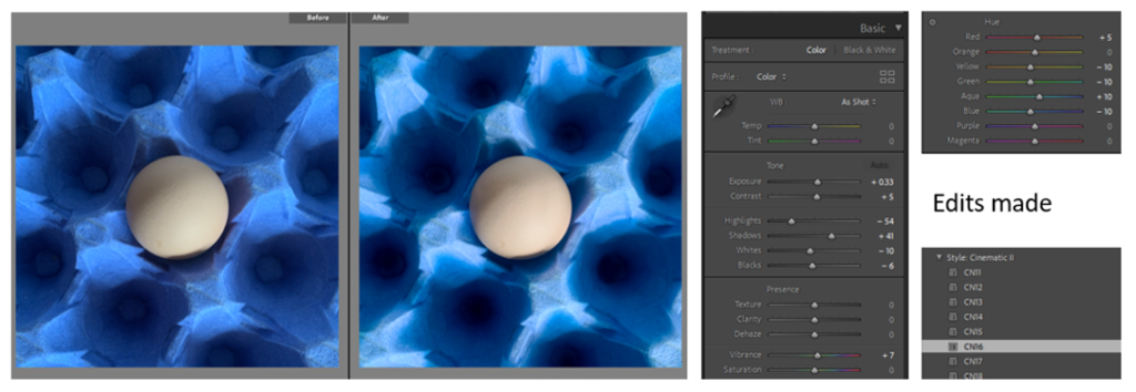
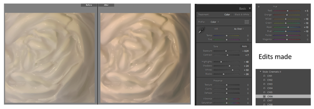
I started off the editing by cropping all the pictures into squares as this is the layout I want all of my images to have. I then started adjusting the different levels (exposure, contrast, highlights, etc) and added a pre-set (CN16) before then editing specific areas using the brush tool to enhance all aspects of the images. On certain images I also used the spot tool to get rid of small imperfections that I didn’t like.

Overall, I think the editing has brought the colour and dimension out even more in these photos. These edits directly link more with my artist reference William Eggleston through his use of vibrant colours and strong contrasts.

Photoshoot 2: planning + recording

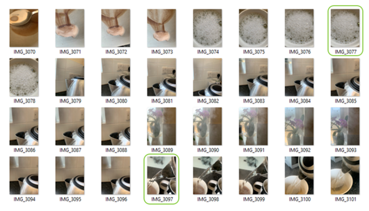
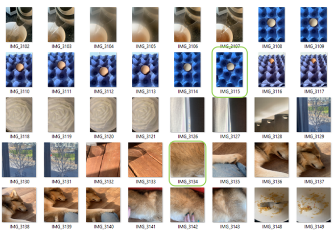
My plan for this photoshoot was to focus more on texture and shapes rather than colour. I once again mostly stuck with the kitchen theme as I thought this was the area that would have the most dynamic range of possibilities. I did the photoshoot in broad daylight as I thought the naturalistic light would look better than artificial.

Overall, I think there are quite a few images that I wouldn’t use but the ones that I will use are very strong and some of my favourites so far. My two best shots from this photoshoot I think are the egg and bubbles ones as I think they have a lot of depth in them (both through colour and shape) while still not losing the simple-ness that my project aims for.

Photoshoot 1: development + experimentation

Unedited best shots

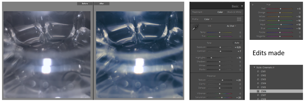
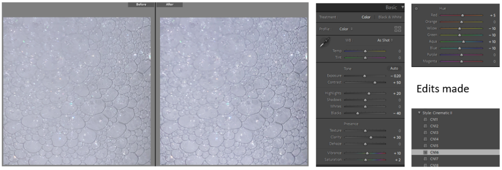
Edits I have made:

The next 4 I want to keep as a collection so I edited them to be very similar. Unedited:

And then finally, I wanted all of the photographs to be similar colour so I added this pre-set to them all: