Here is a link to my final photobook, Lightfall.
All posts by Angus McNamee
Filters
Koyaanisqatsi Comparison and Project Evaluation
Godfrey Reggio’s movie, “Koyaanisqatsi”, was something I held close to when deciding the theme and overall aesthetic for my photobook. While not a movie, I tried to make my photobook almost replicate the same elements from Koyaanisqatsi. These involved camera positions, angles, luminosity, different timeframes and locations and most importantly the subject of each photograph.
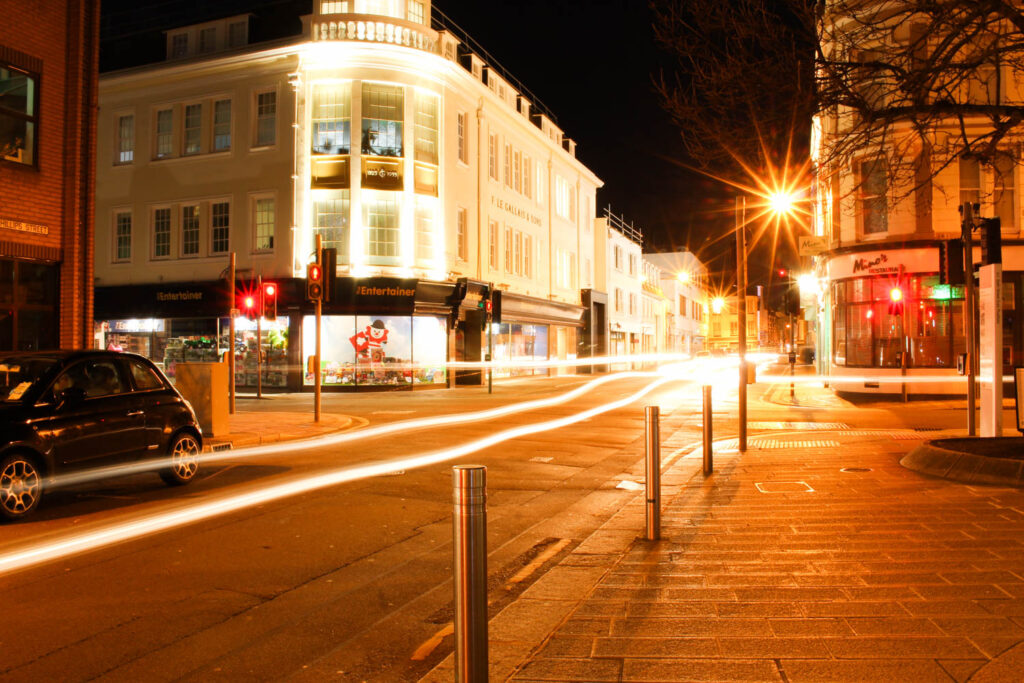
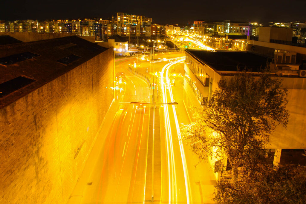
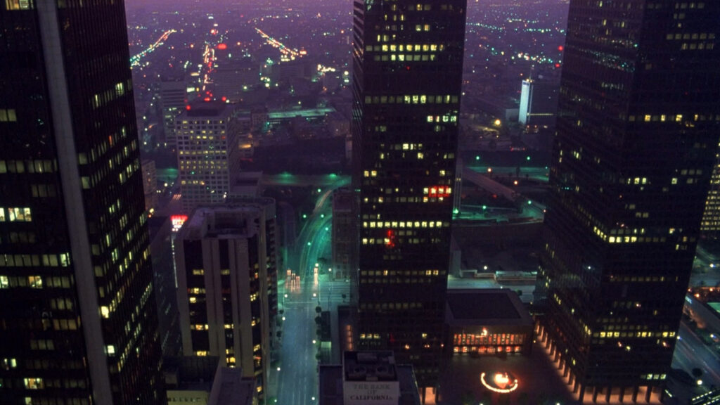
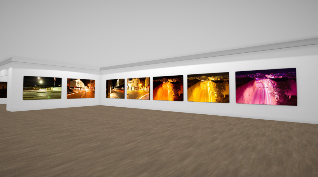
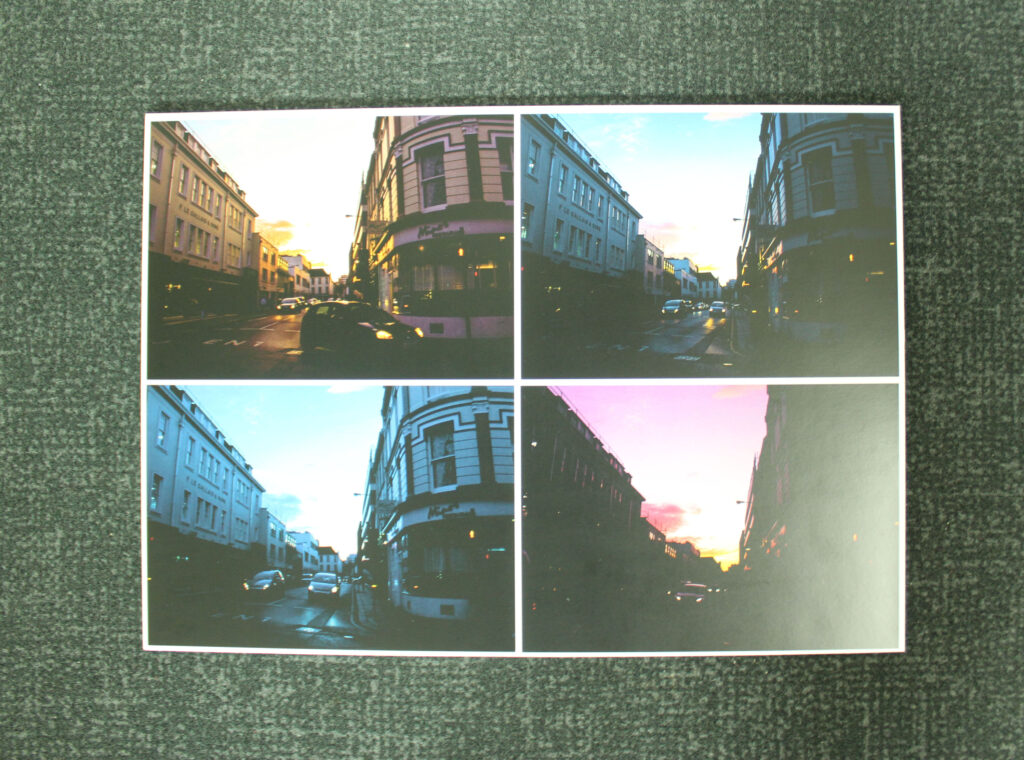
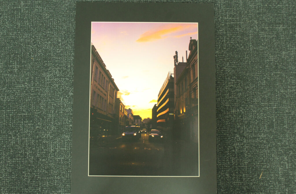
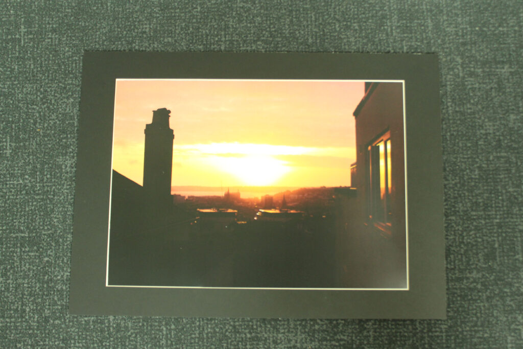
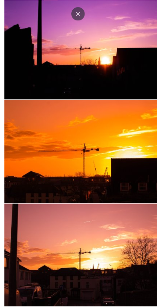
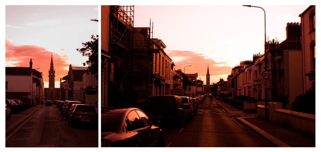
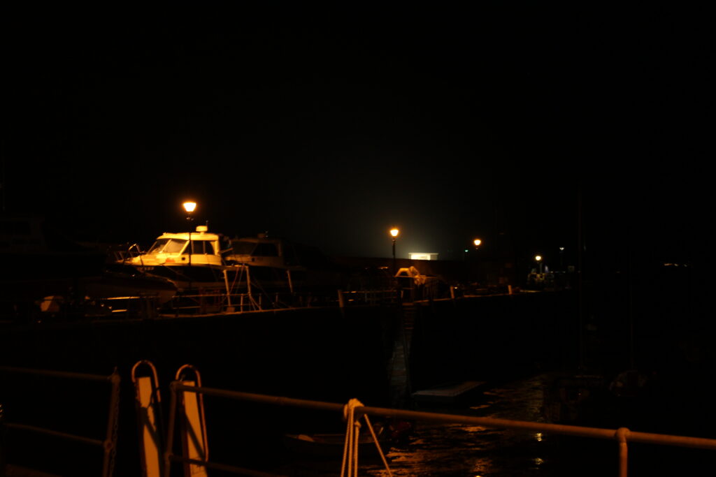
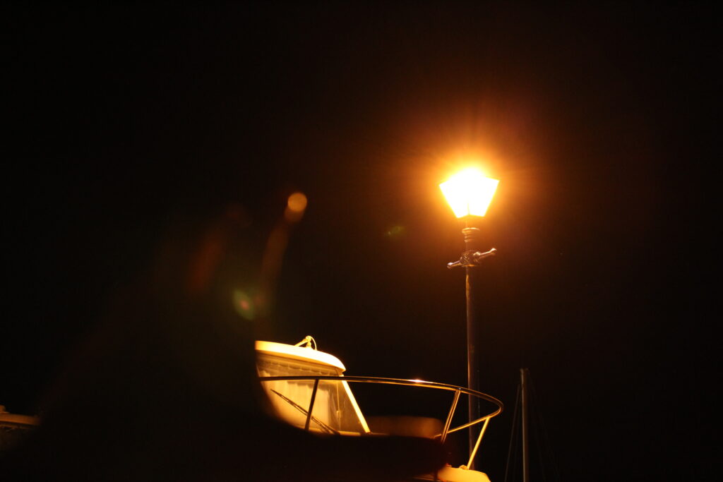
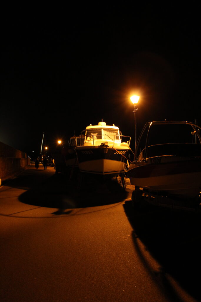
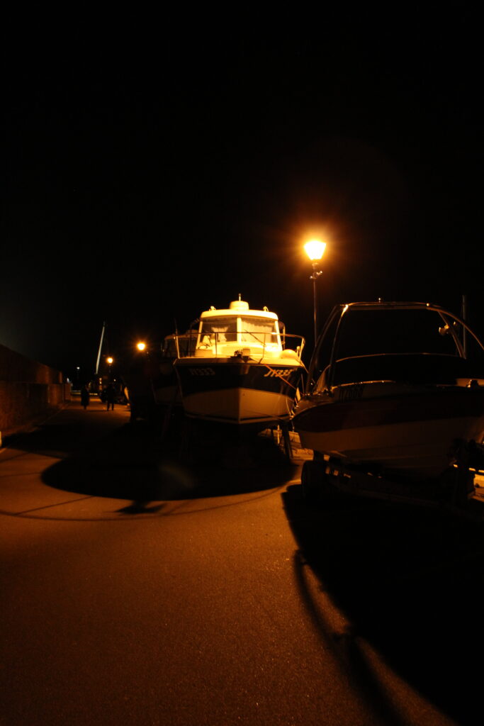
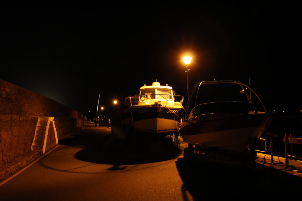
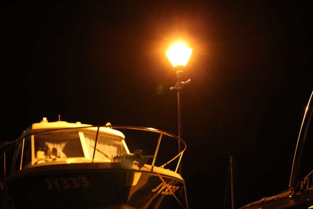
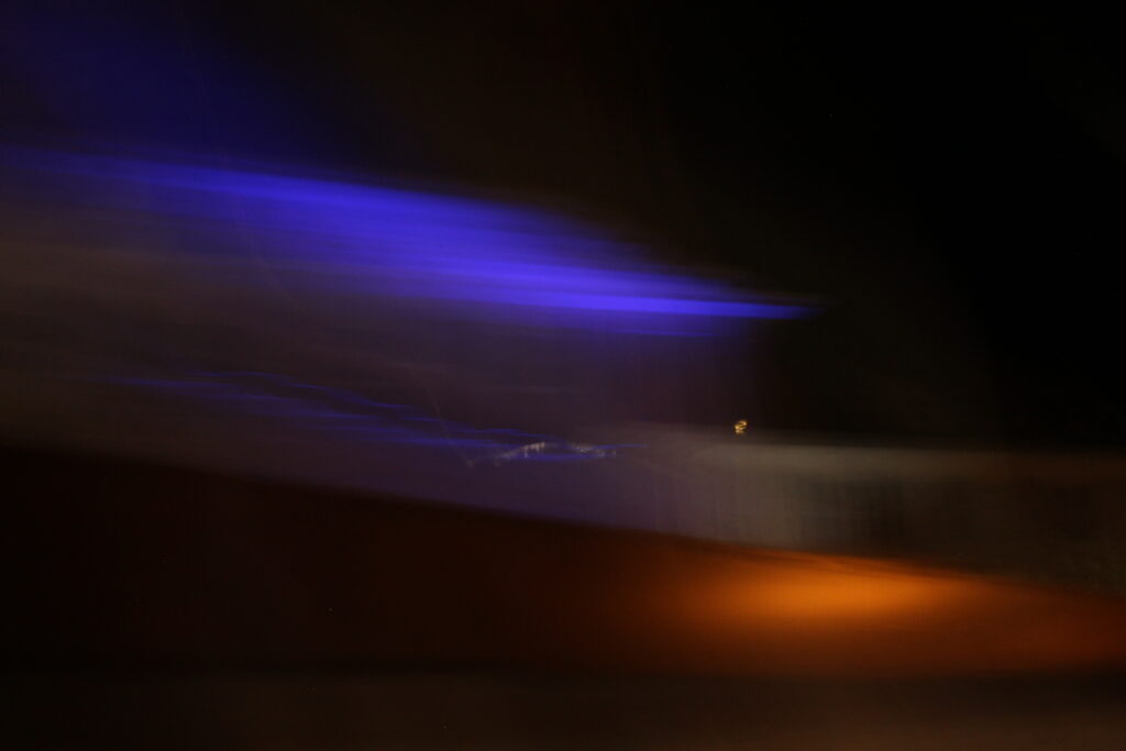
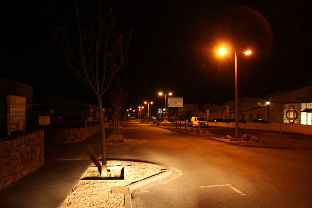
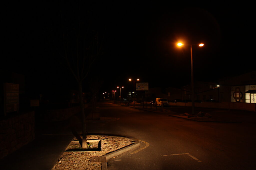
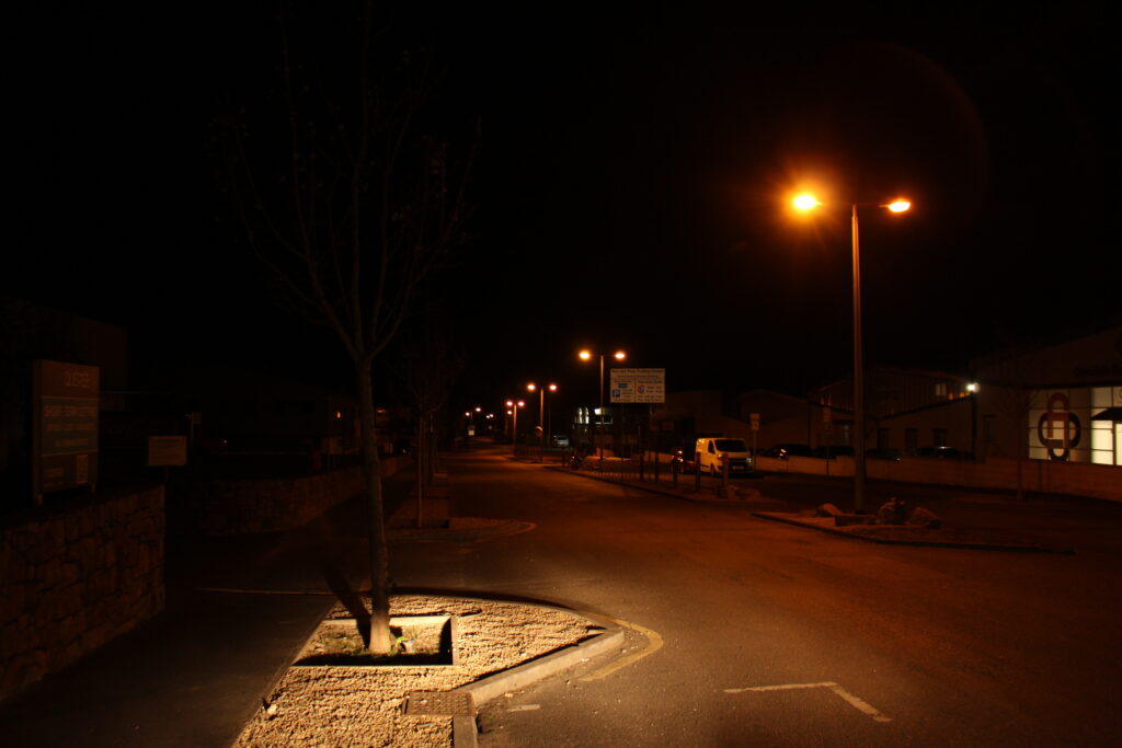
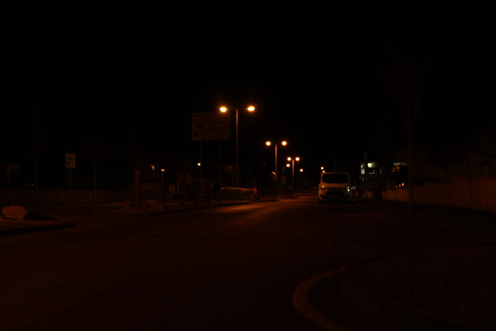
During my night photography photoshoots, I wanted to capture the glows of the street lights, inside or outside the frame to capture the presence of mankind, even when the streets are empty and deserted. The photographs with cars were also attempting this. Because I couldn’t shoot a video time-lapse, I instead made a photo-equivalent one by capturing the moving lights of cars with the open shutter on my camera, these were also to capture the luminosity of the late night roads and I believe they really did capture the same elements that Reggio’s movie had.
Comparison –
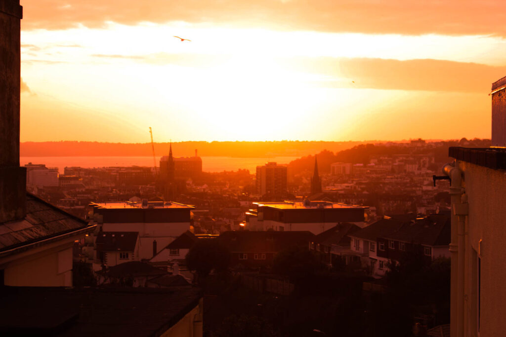
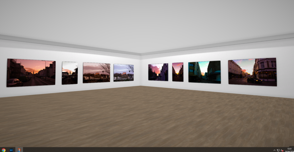
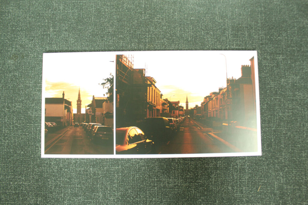
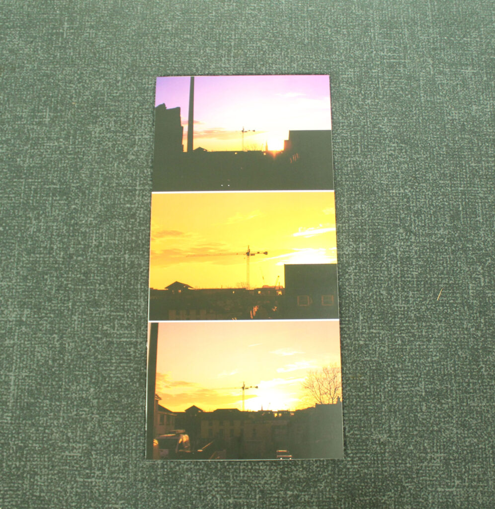
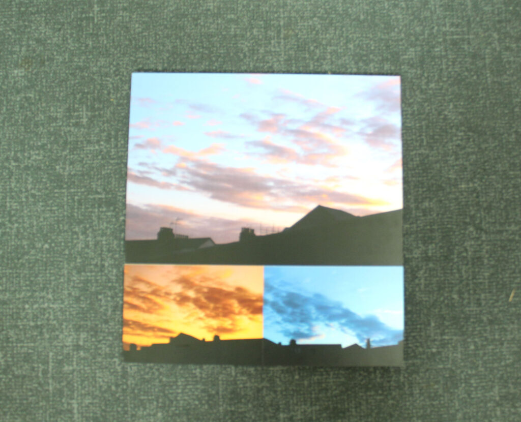
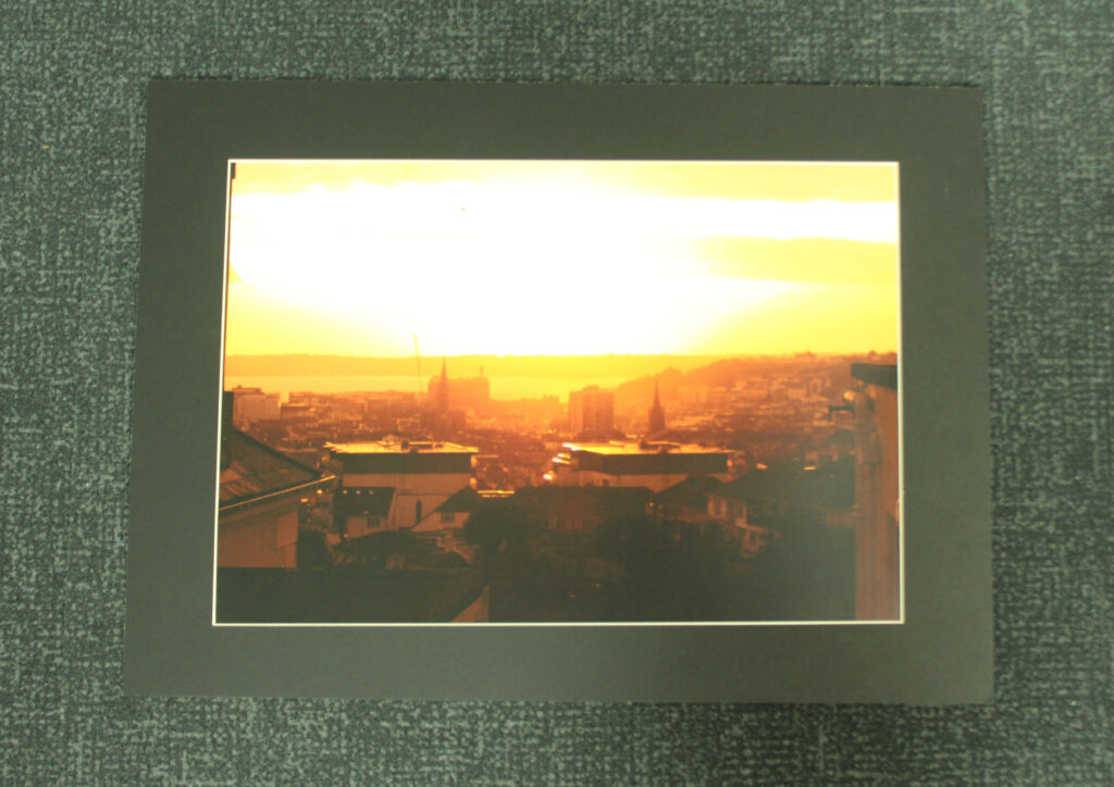
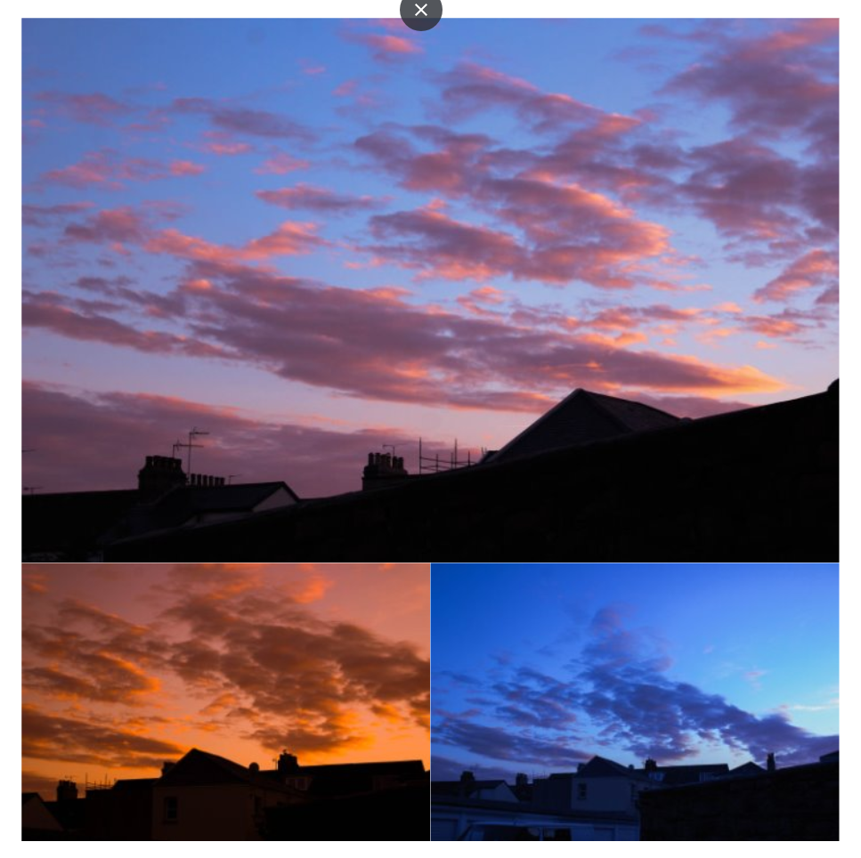
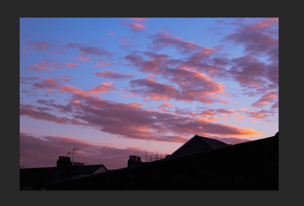
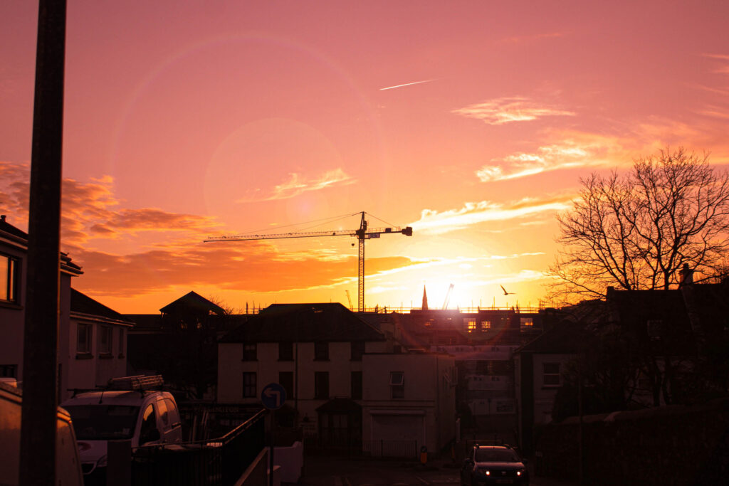
In my day/evening photos I wanted to also involve views from higher places showing big parts of towns and cities just like in the movie, also the lower from-the-ground views of the buildings above on the busy roads. Most of the ones I did had amazing skies too so I involved the many different colours in the skies to add as my own thing to further enhance the overall image.
Comparison –
Reggio’s:
Mine:


In conclusion, I think I did a decent job of replicating themes from Koyaanisqatsi over to my photobook. The overall essence of the movie, I believe, is very present within a large portion of my images and I am very satisfied with my work. In addition, the quality of my photos, I couldn’t be any happier with, especially the sky images with their stunning colours and lighting. They all look professional and cinematic, which was another theme I wanted to target, cinematic photos. The idea of these images, day and night were under the “Observation” topic, as they are observing these areas. The meaning of these images and photobook was to simply show nice cinematic photos and to view Jersey at different times of day.
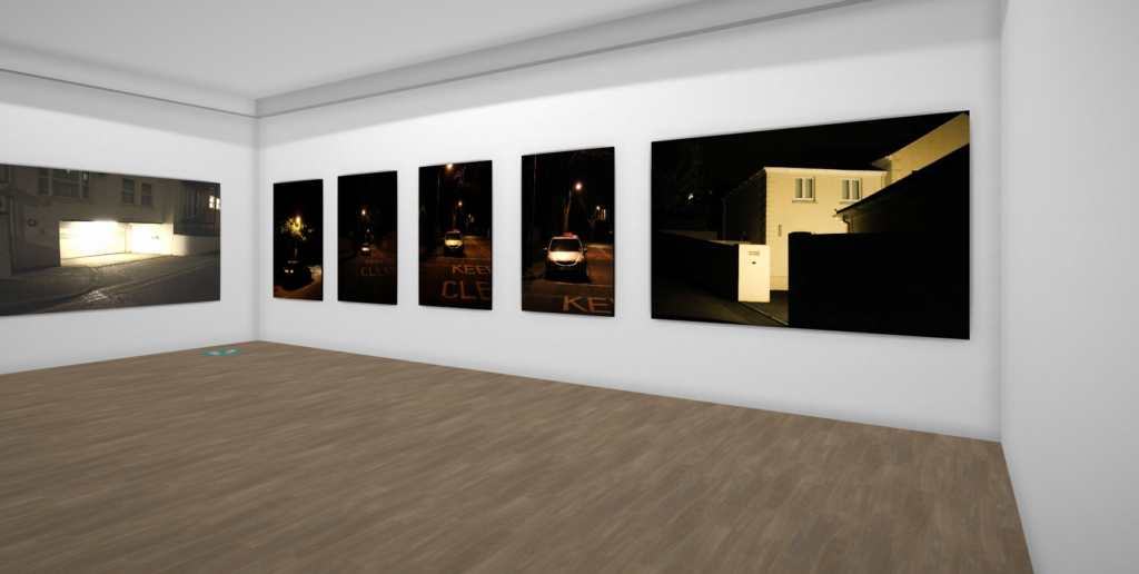
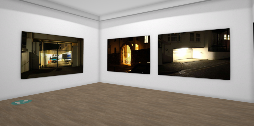
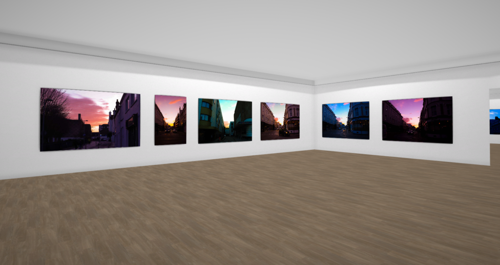
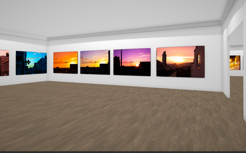
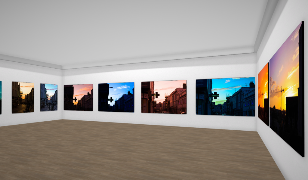
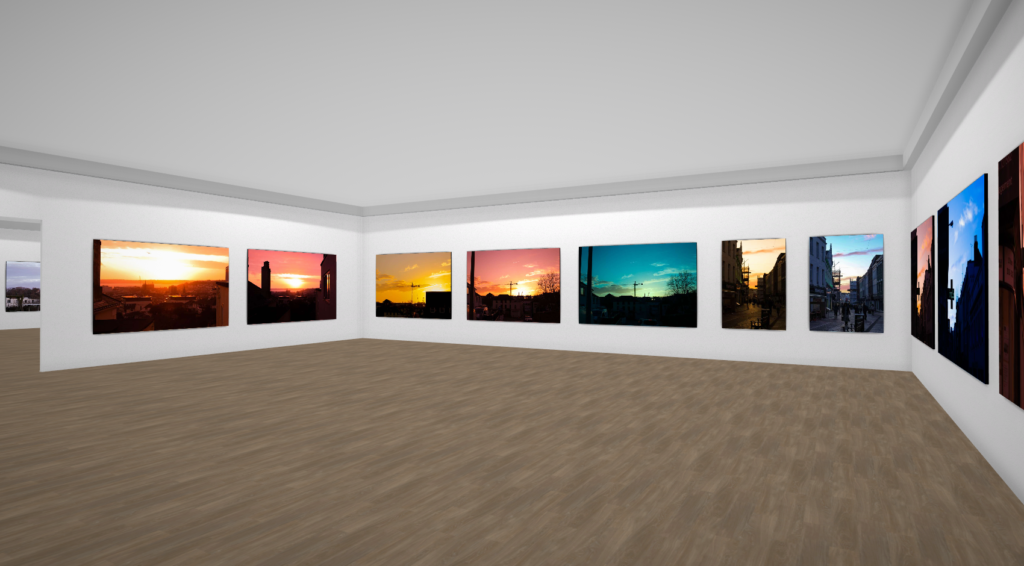
Virtual Gallery
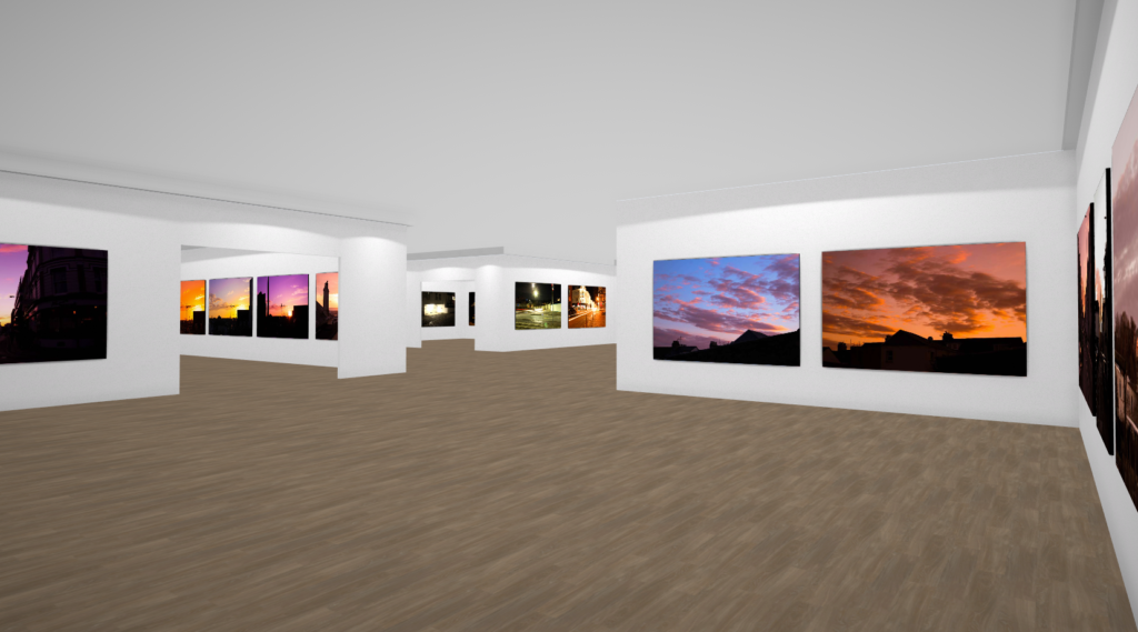
I placed my images in my own custom virtual gallery and presented them on the walls in their own rooms. Very happy with this gallery and collection of photos.
Final Printouts
I followed the ideas I made on a previous blog post and carried them out very nicely, very happy with these images and displays.
Multi Foamboards –
Window Mounts –
Photobook Development
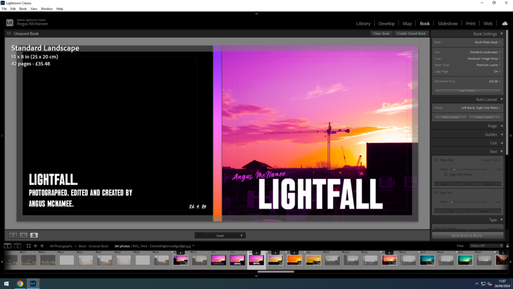
I wanted to have the title “Lightfall” because I thought it was appropriate for my themes and photos, the evenings and night times in Jersey. Also because I think it just sounded cool and interesting.
I wanted the front cover to be eye catching, with the title big and visible and my name seen on it as well. I think that what I came out with was very good. Lightroom didn’t let me add text to the spine for absolutely no reason, so I left it and instead added a nice little gradient that matched the colour palette of the front cover image. And included on the back some details, like the publish date and the author.
My front cover was originally going to be different, it used a different photo and even a different name, “Day and Night”:
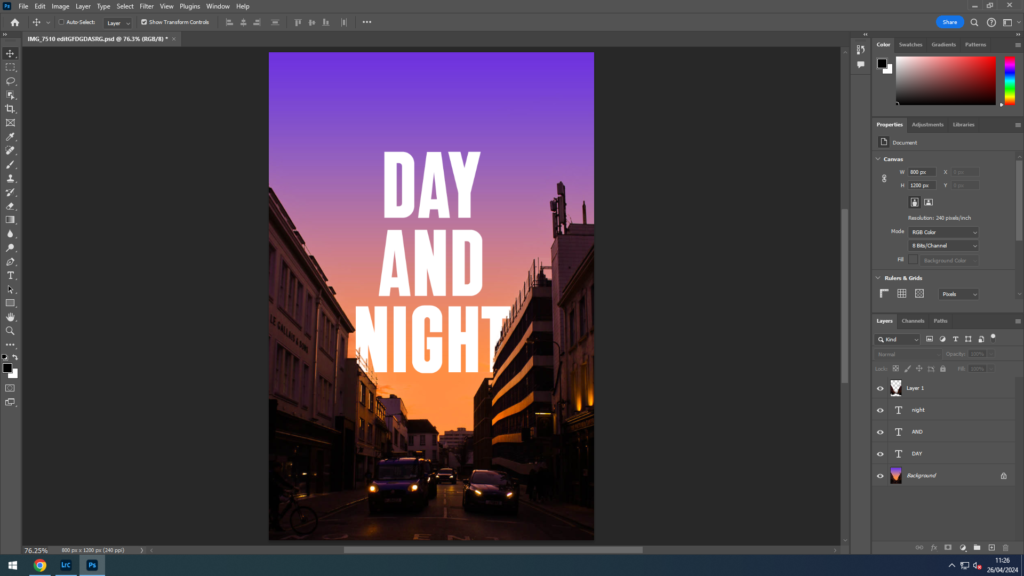
I personally loved this version, the gradient and the text blending in so well together and the buildings below and the text going behind the tops of the buildings. This unfortunately didn’t make the final result as the image, being taken vertically, wasn’t the right size for the page, if I tried to zoom the image in to fill the page it would only make it blurry and pixelated. Also the title “Day and Night” I wasn’t too sure about. I wanted a short name which would roll off the tongue when saying out loud, which is why I settled for “Lightfall”.
The next page tells the viewer a little on the contents of the book and the ideas of it’s origin. Along with some photos underneath.
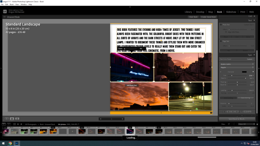
Overall, the 51 photos are all reasonably spaced out from the edges, I chose to do this because I felt it made the photos more professional and better to look at. All sky images have been separated from the night images because I didn’t want the order of photos to be messy. Initially, the collection of night photos were going to be shown first, but because of the title, “Lightfall”, it felt that it would make more sense for the lighter images to be shown first, then to show the darker ones, to follow a sort of day cycle.
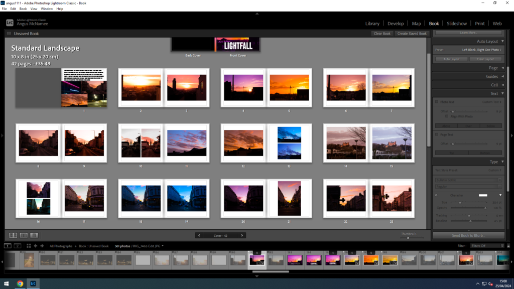
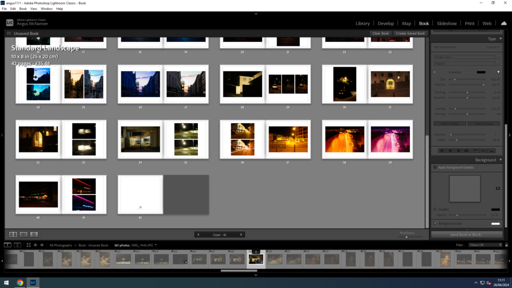
I did the same for my dark photos, spaced them out to professionally present them. I like the way these ones are slightly more contrasting from the white page because they are night photos.
Overall I am very satisfied with my photobook and I can’t wait for it to be printed out. The composition, I couldn’t be any more proud of and I think is great. I wanted to improve on my last photobook, “Left Behind”, as I wasn’t too happy with it and I felt I could do so much better. This new book, I believe I have managed to do that.
Photo Layout ideas
Some ideas for laying out my photos on foamboards, all these photos (including a few more as singles) have been selected to be printed and laid down on board in combination with my book, which will feature all photos.
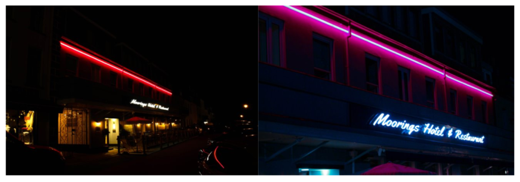
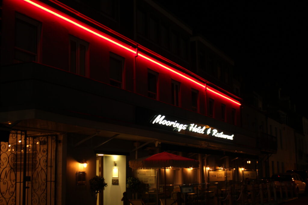
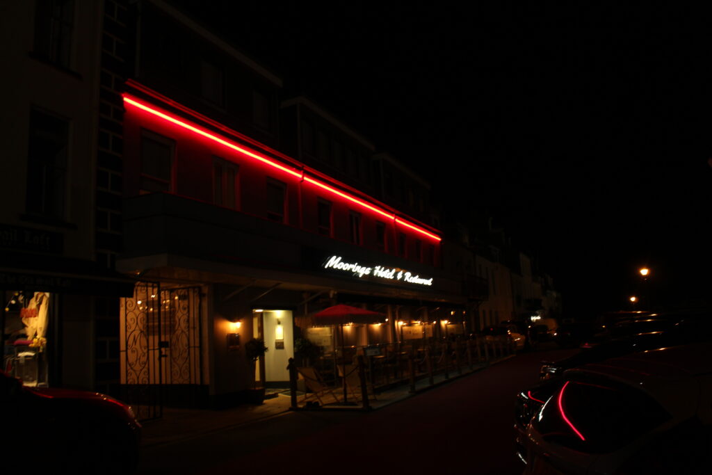
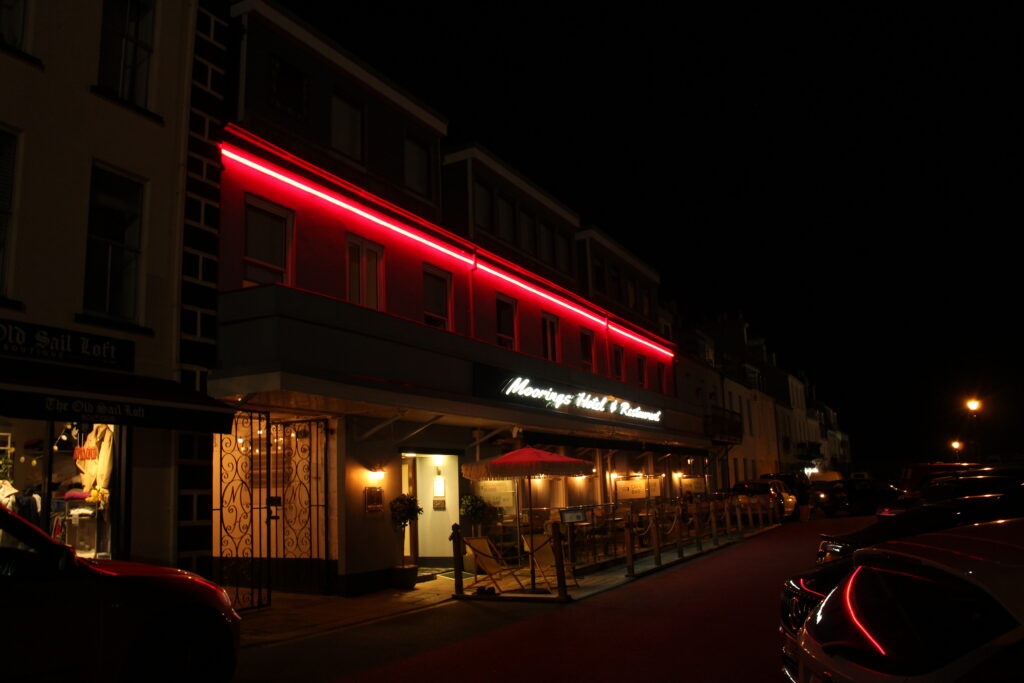
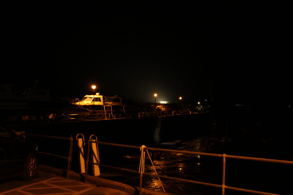
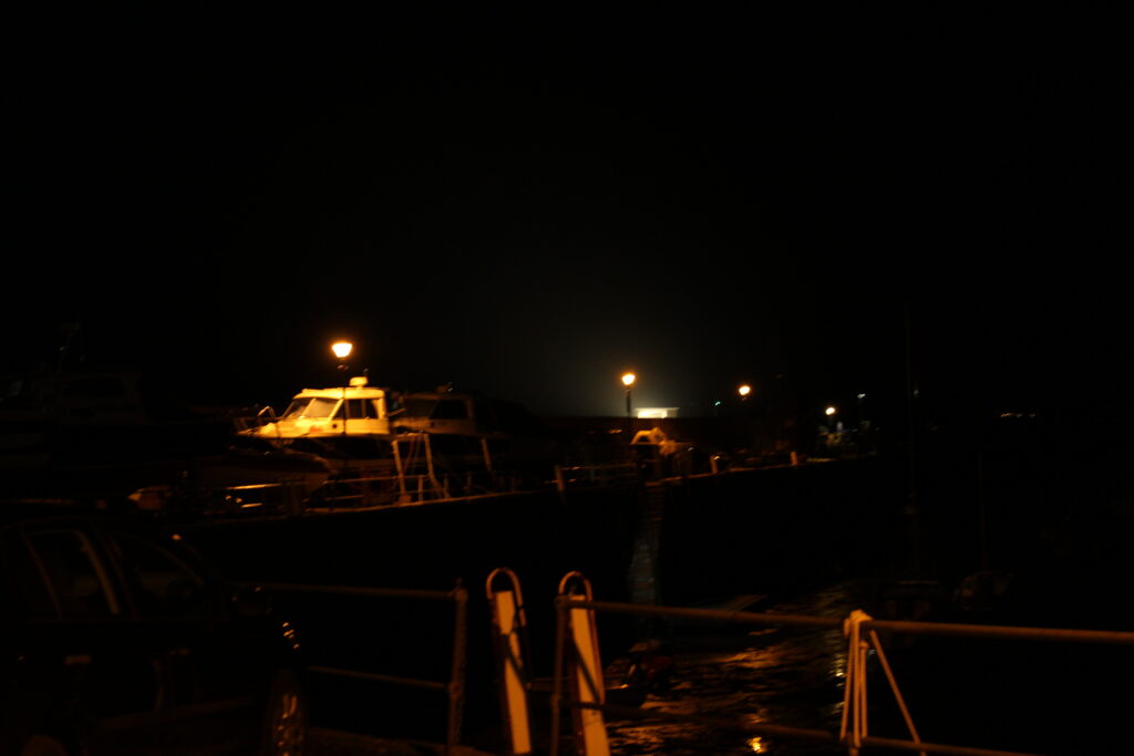
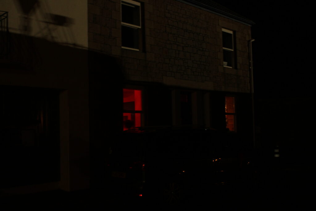
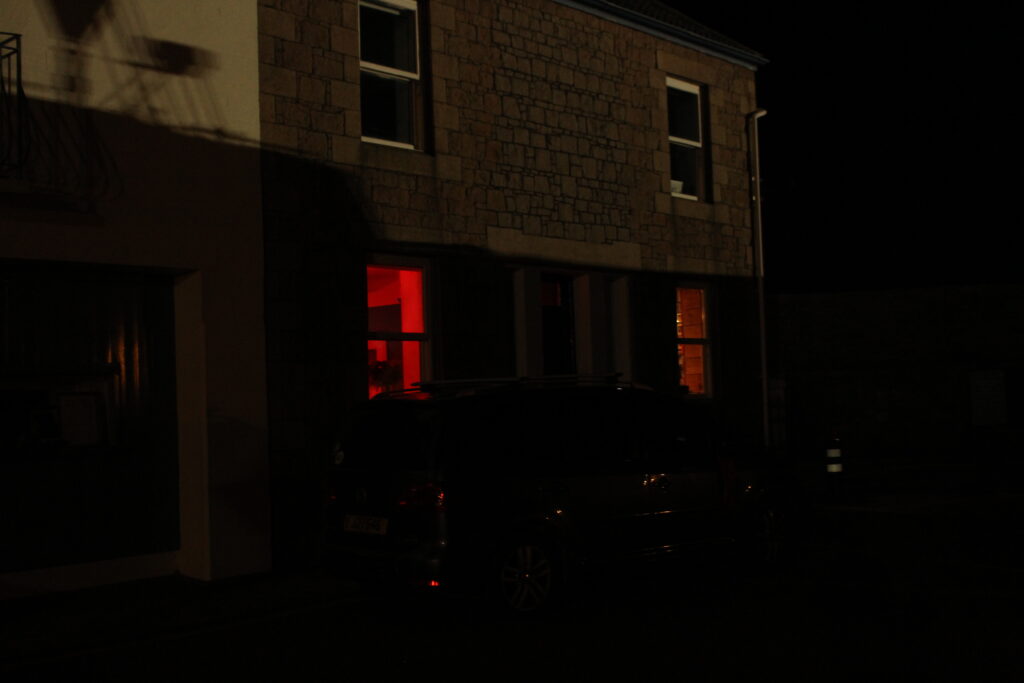
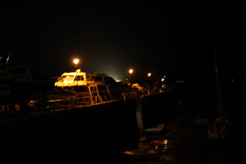
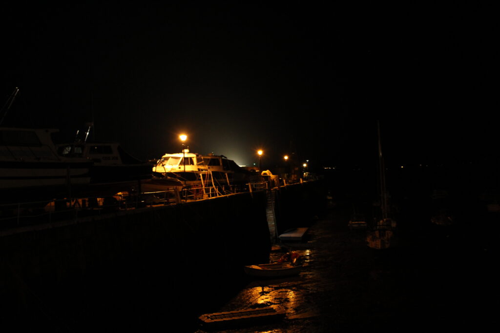
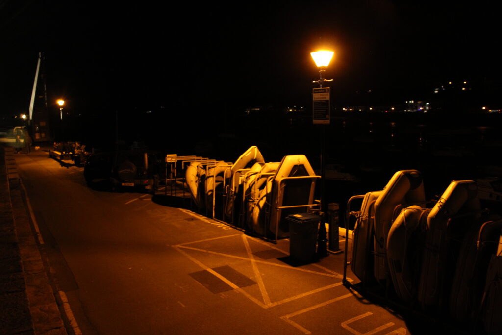
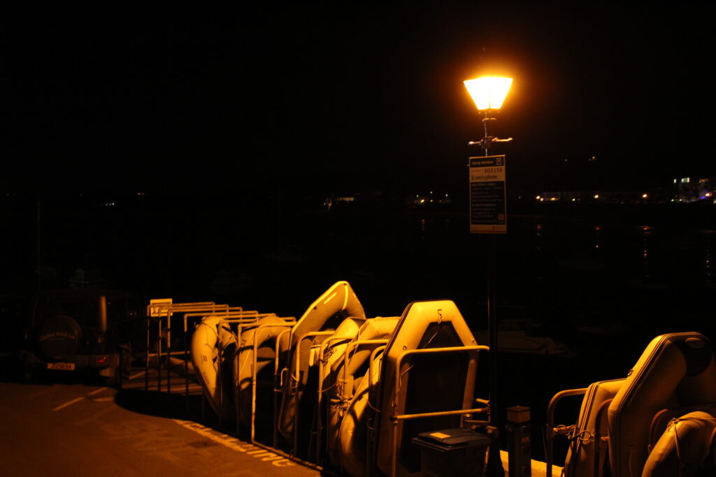
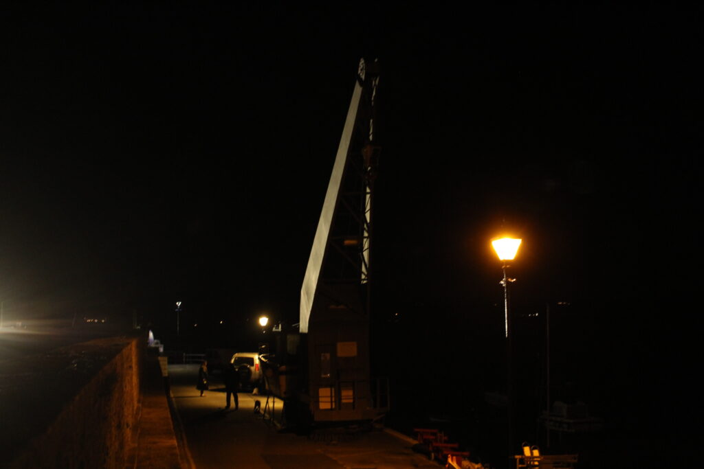
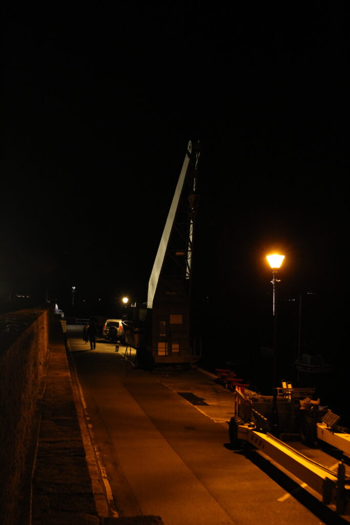
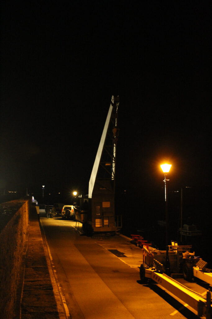
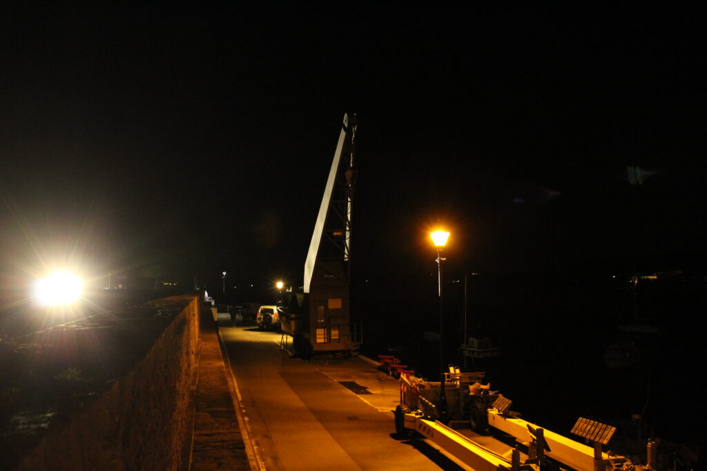
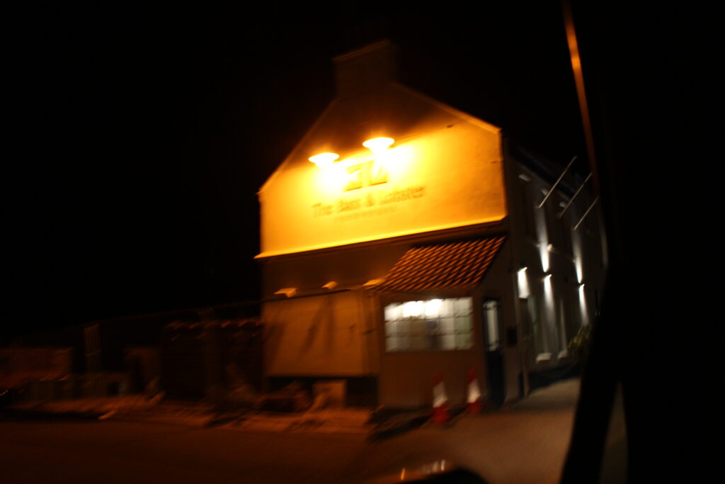
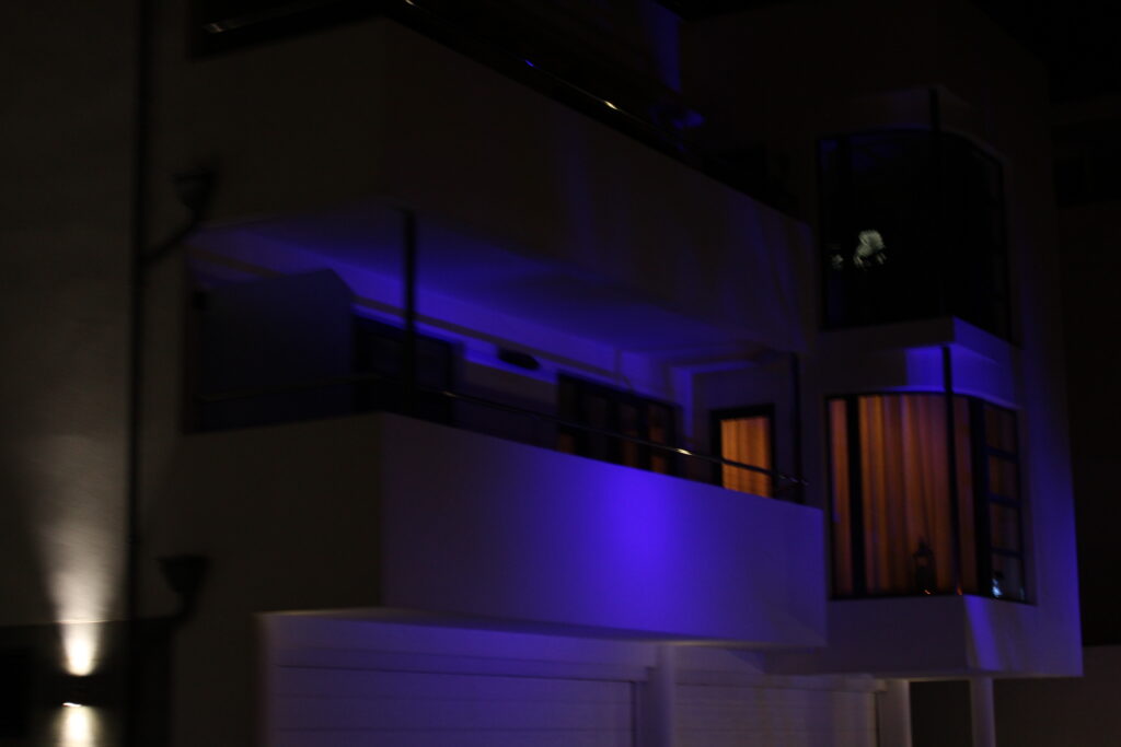
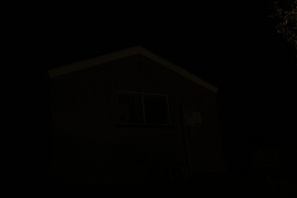
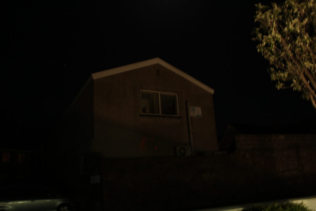
Photoshoot 3 – Night Photography continued
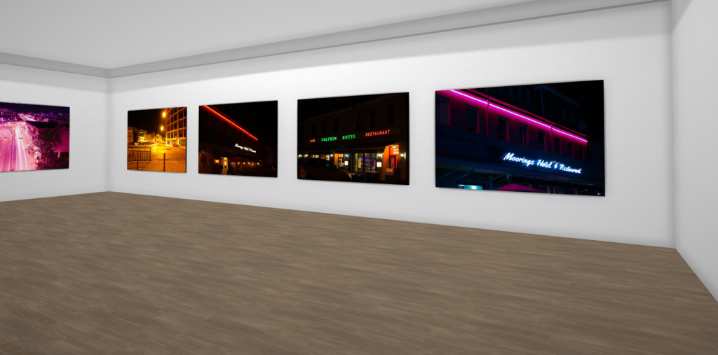
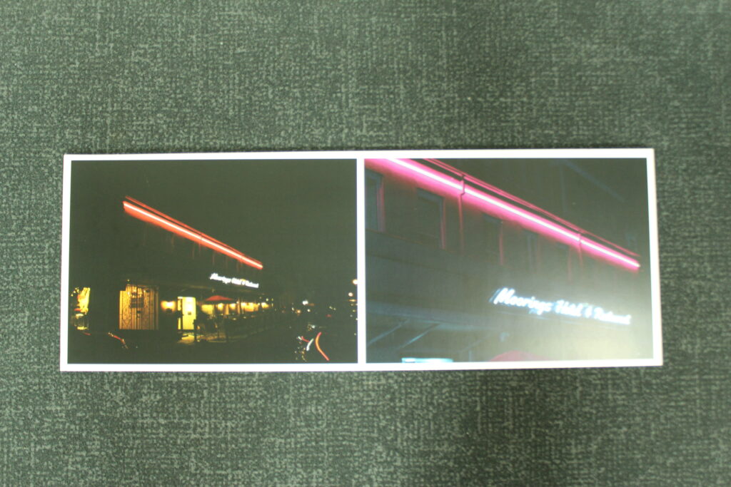
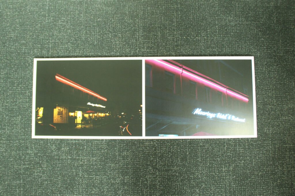
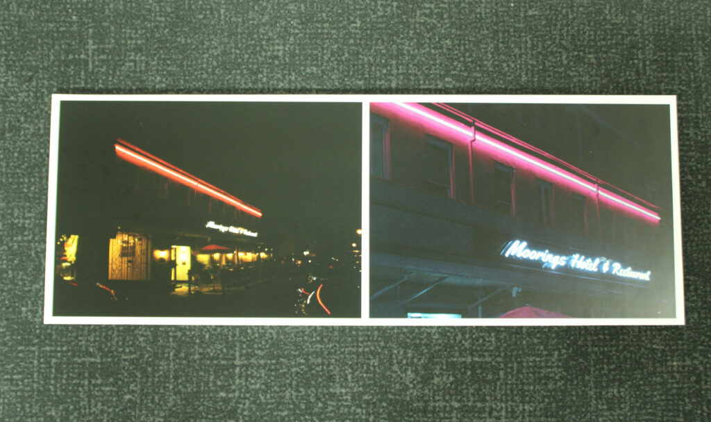
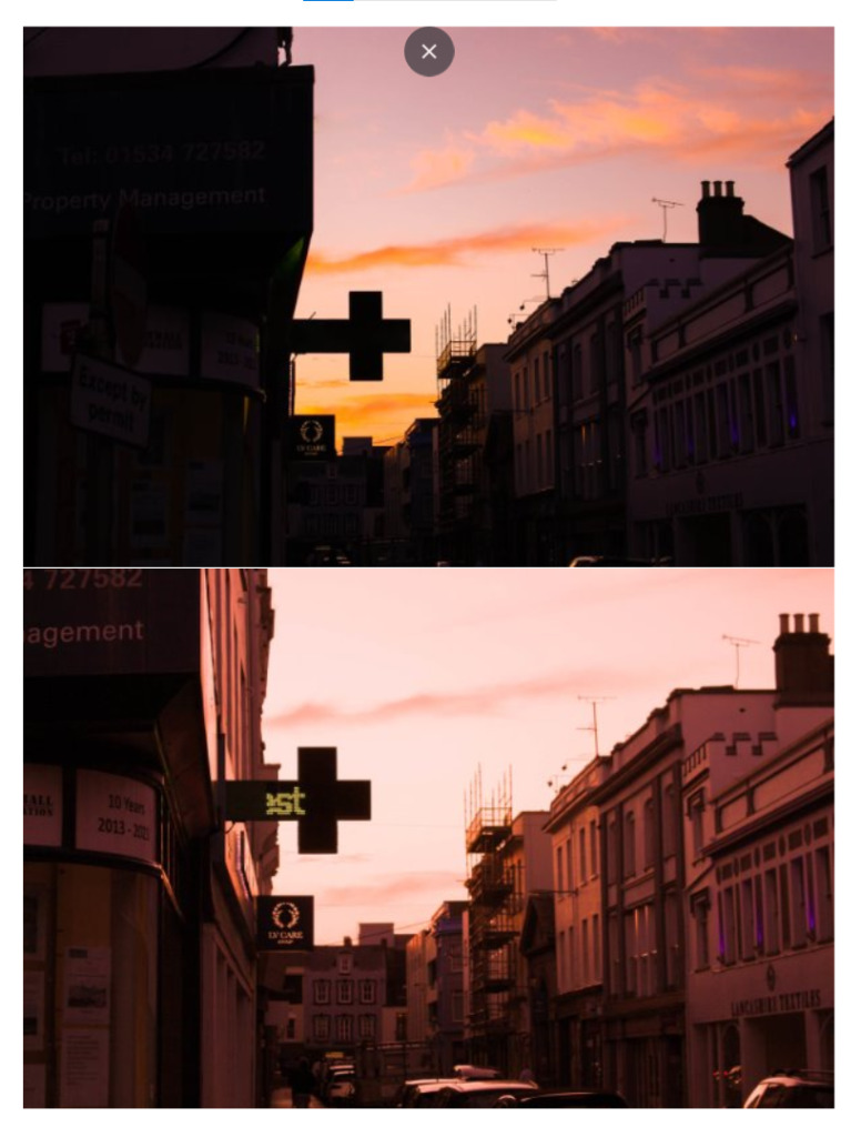
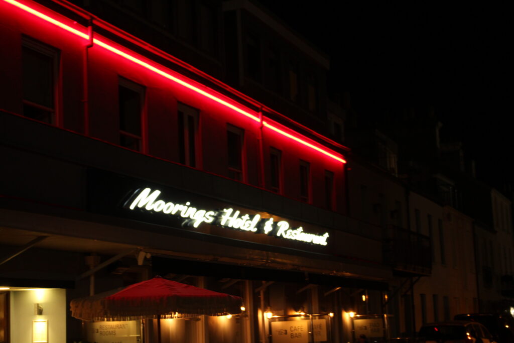
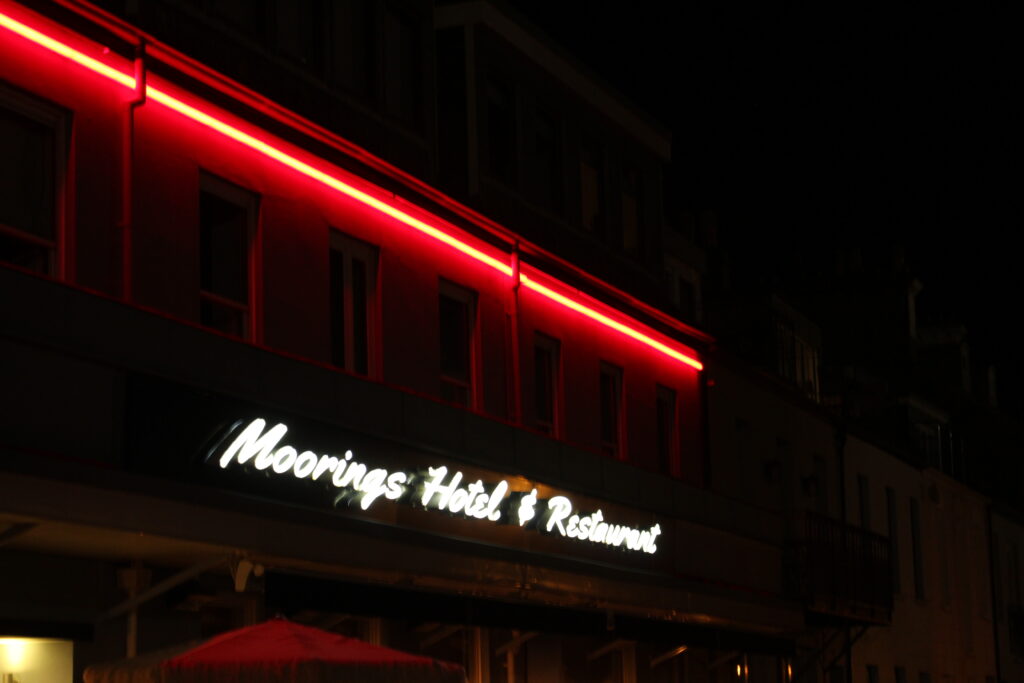
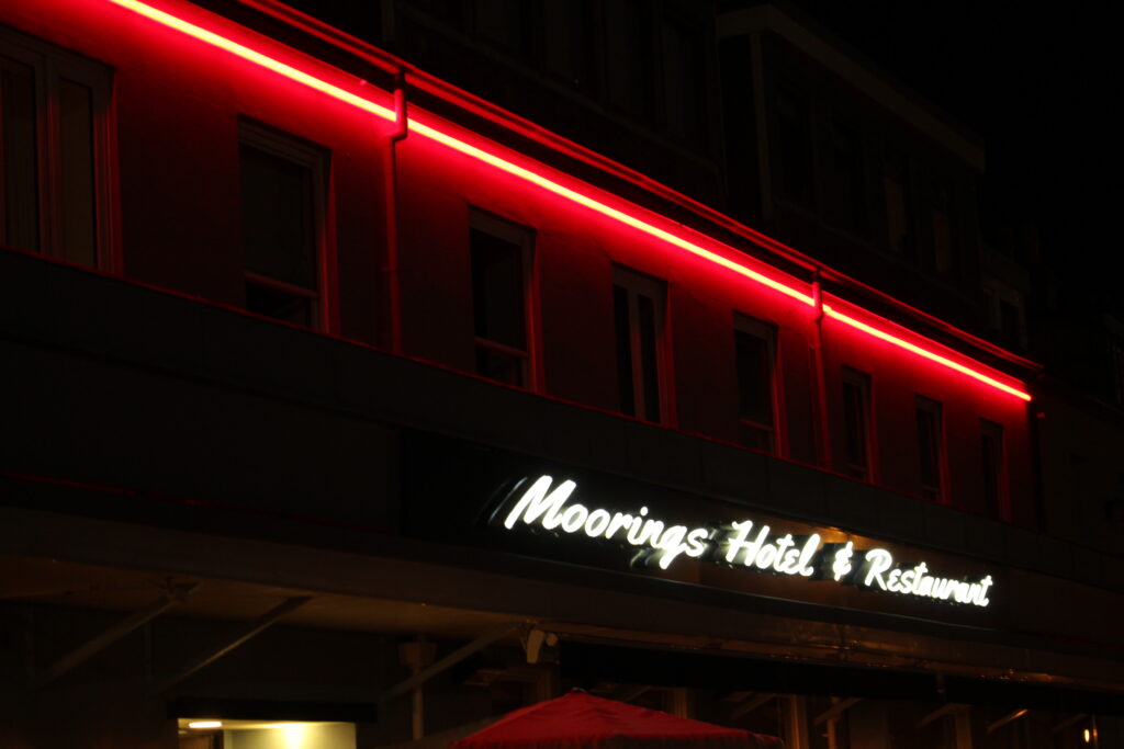
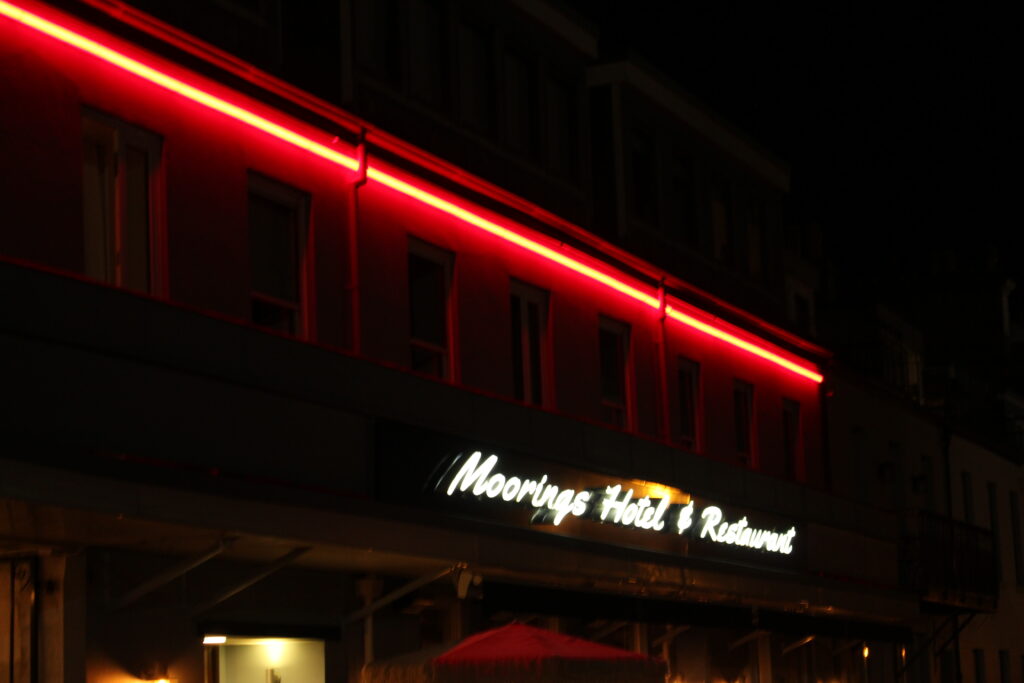
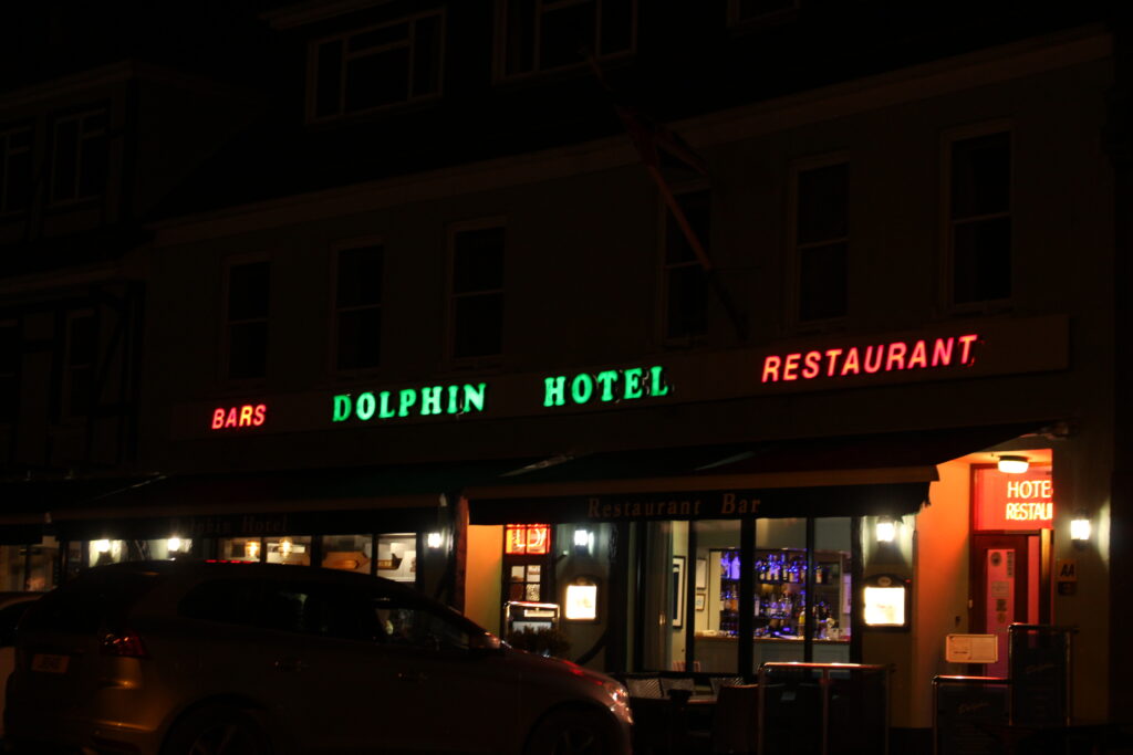
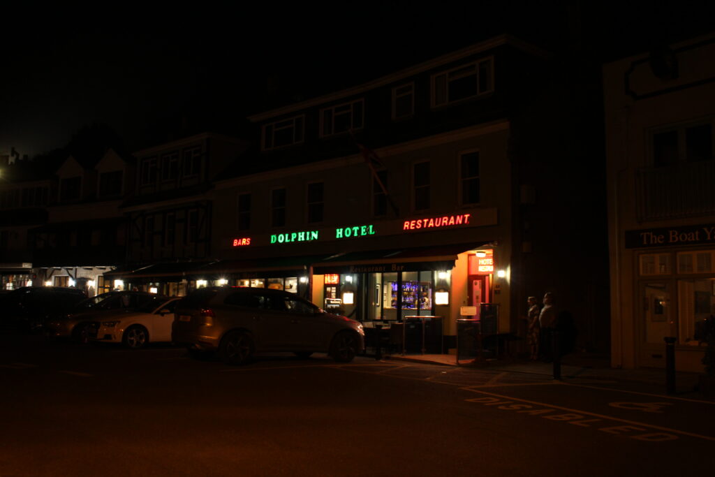
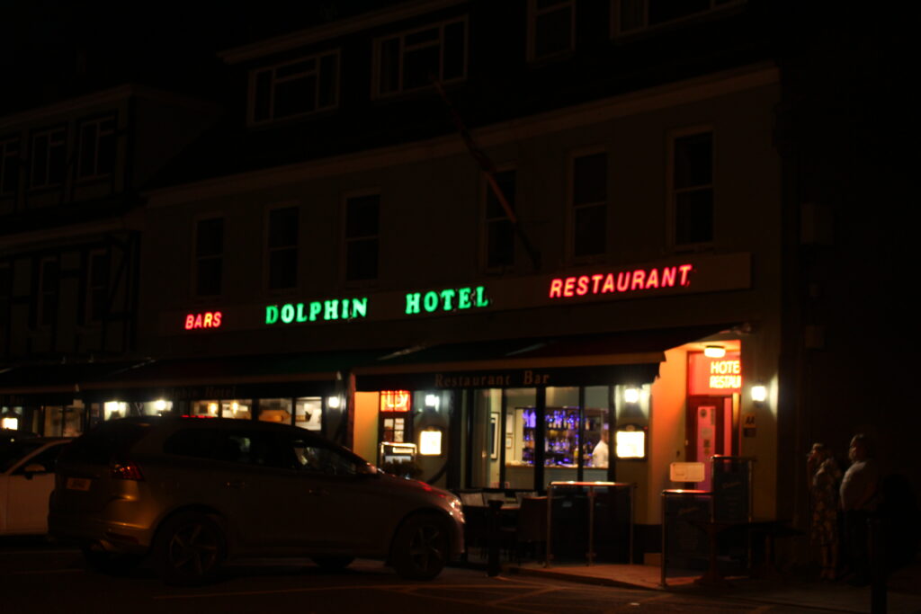
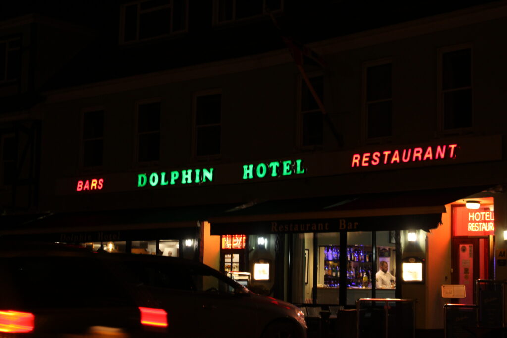
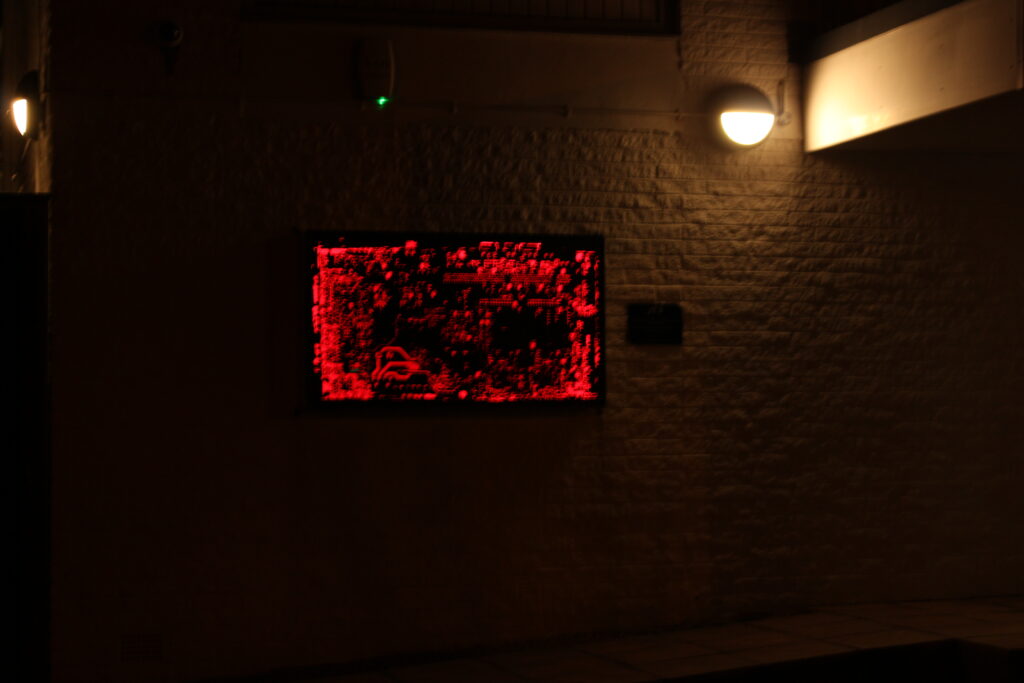
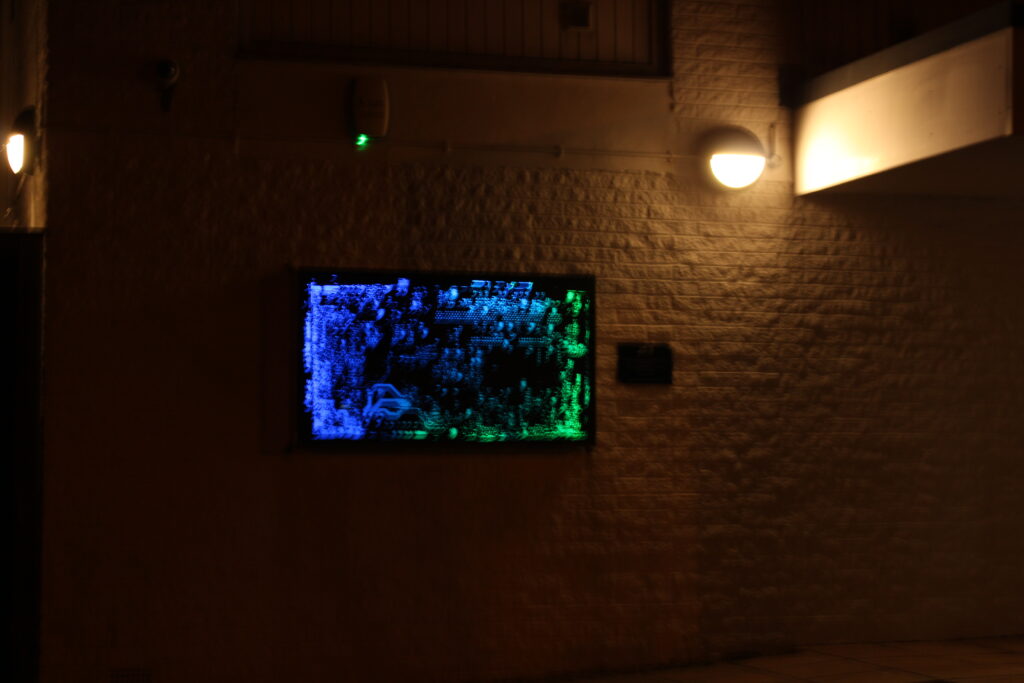
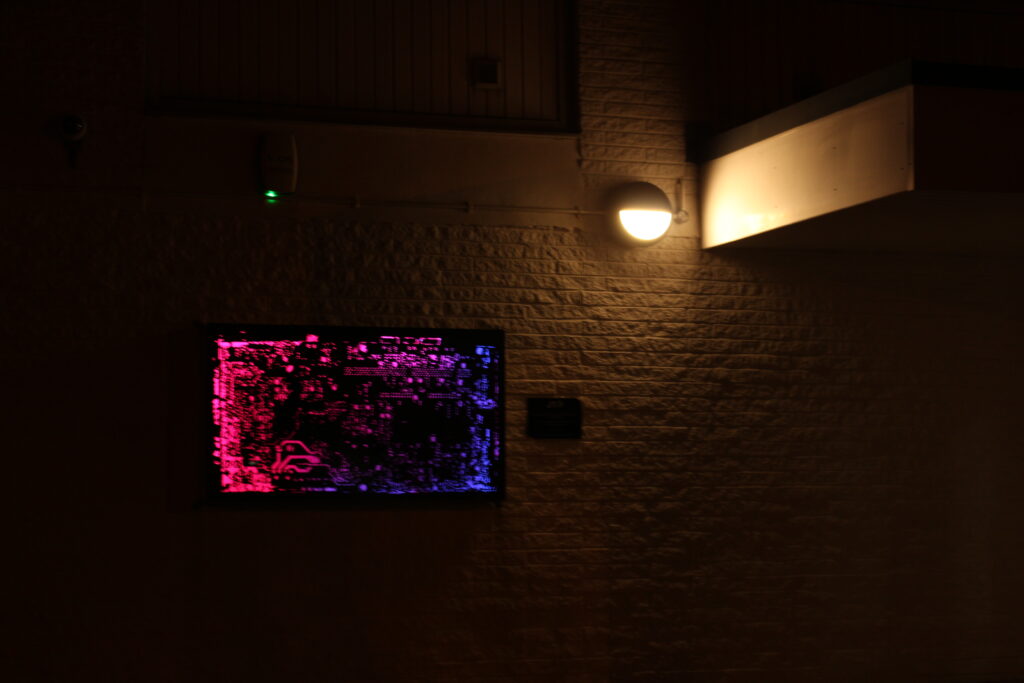
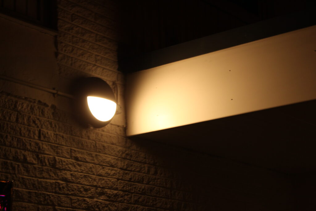
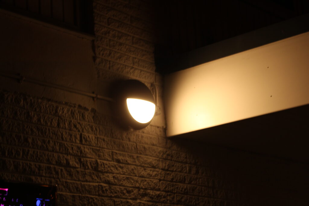
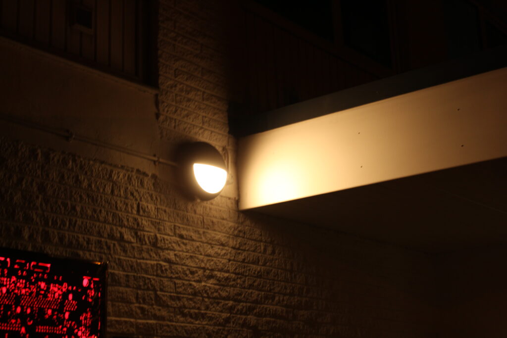
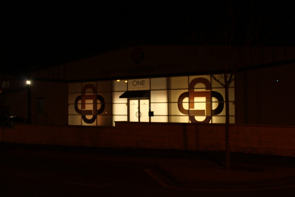
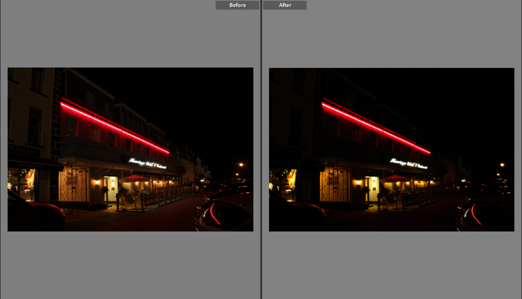
I had the idea of taking pictures of the neon lights outside a few buildings, I like these because the lights are very vibrant and stand out from the darkness and I think they are very cinematic. I added these on the night photography gallery because I thought that it could use a few more photos as many photos that were currently on the gallery weren’t the most interesting.
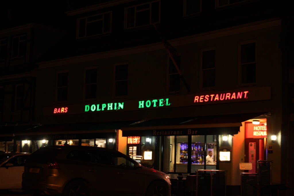
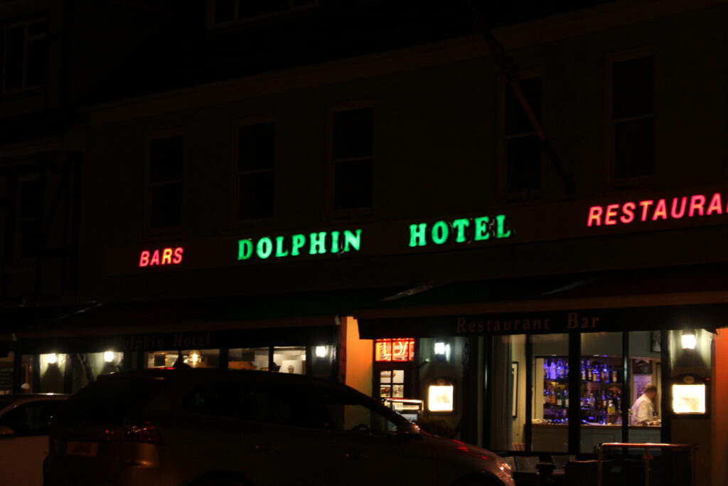
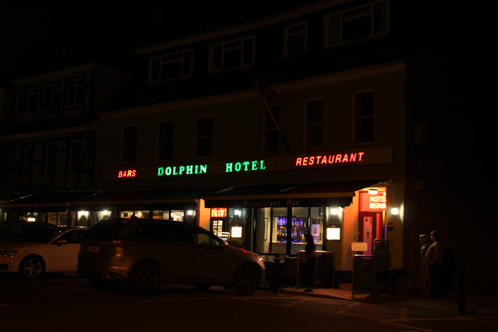
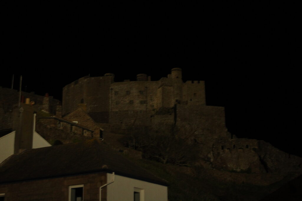
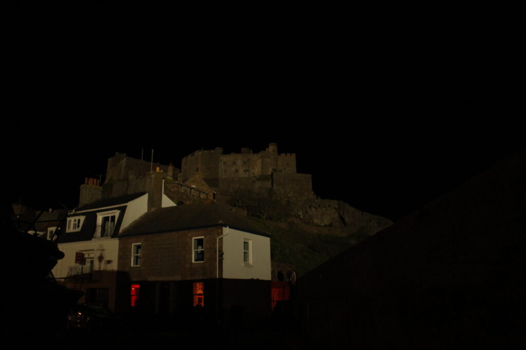
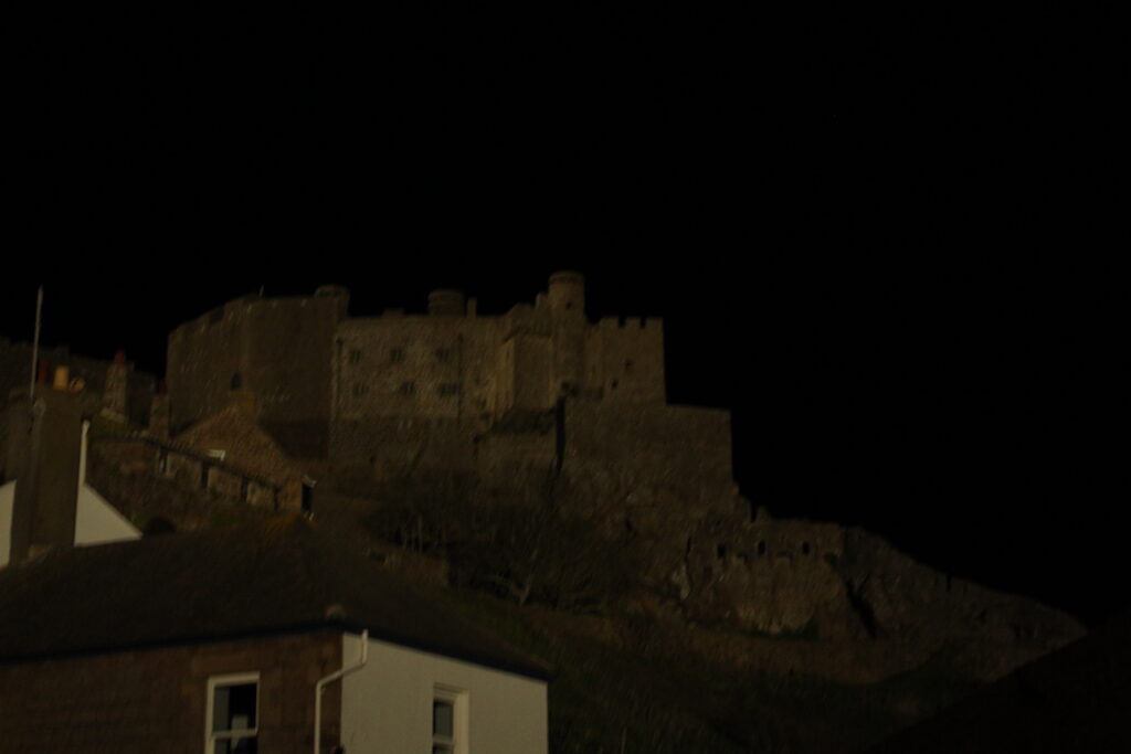
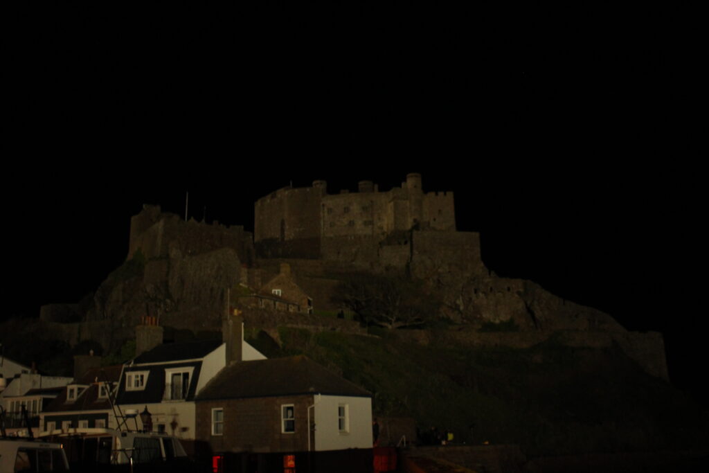
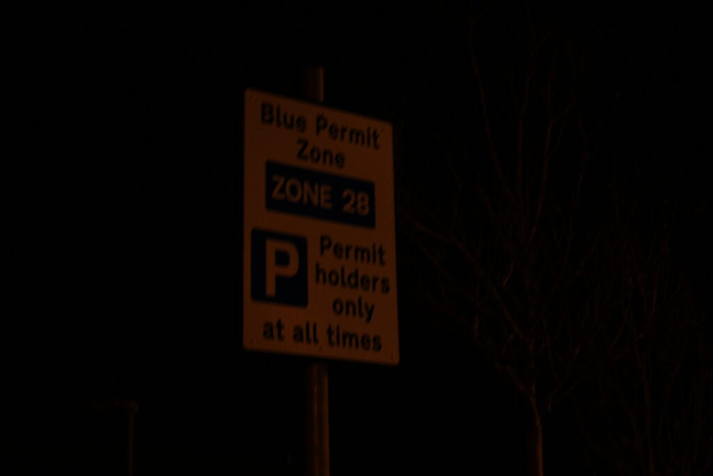
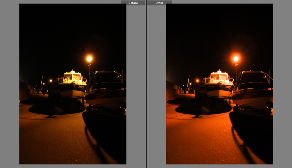
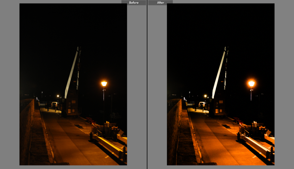
I also tried to get some photos of Gorey Castle, the harbour, some buildings around the place and the crane on the pier. I also took pictures of some road signs and streetlights. The rest of the images below didn’t really spike my interest in the end so I didn’t include them in my photobook.

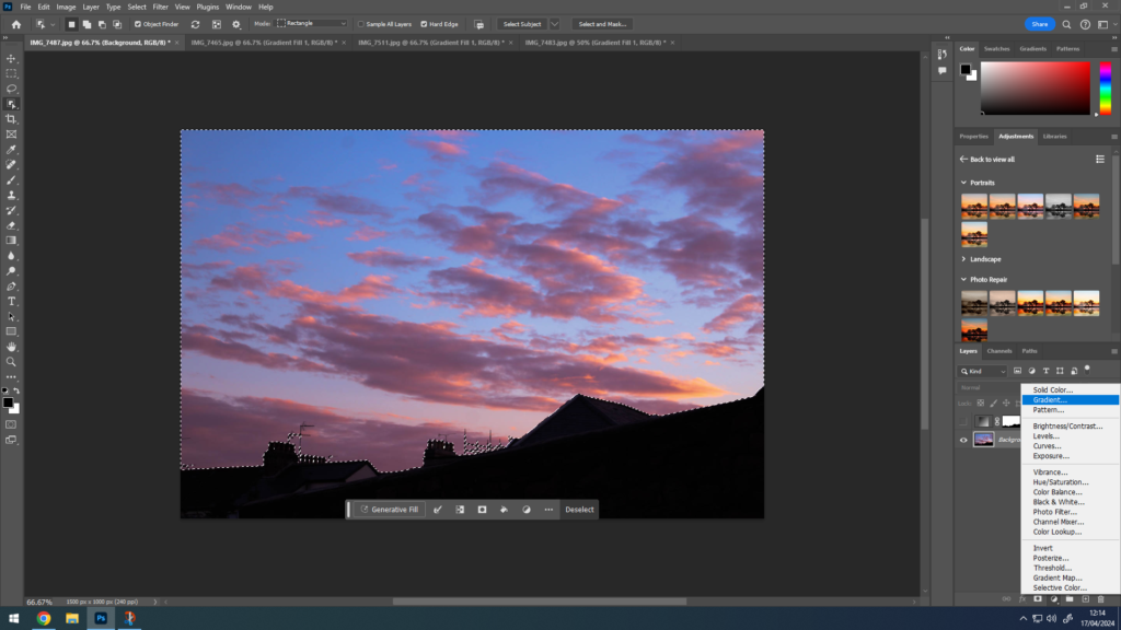
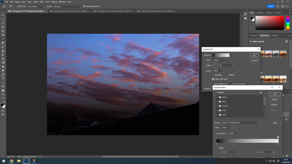
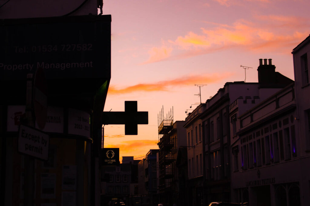
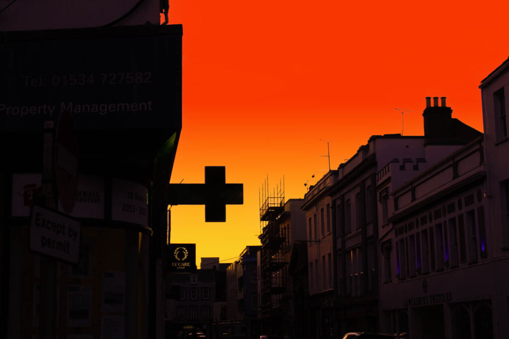
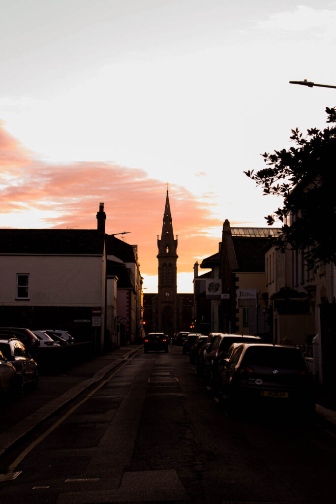
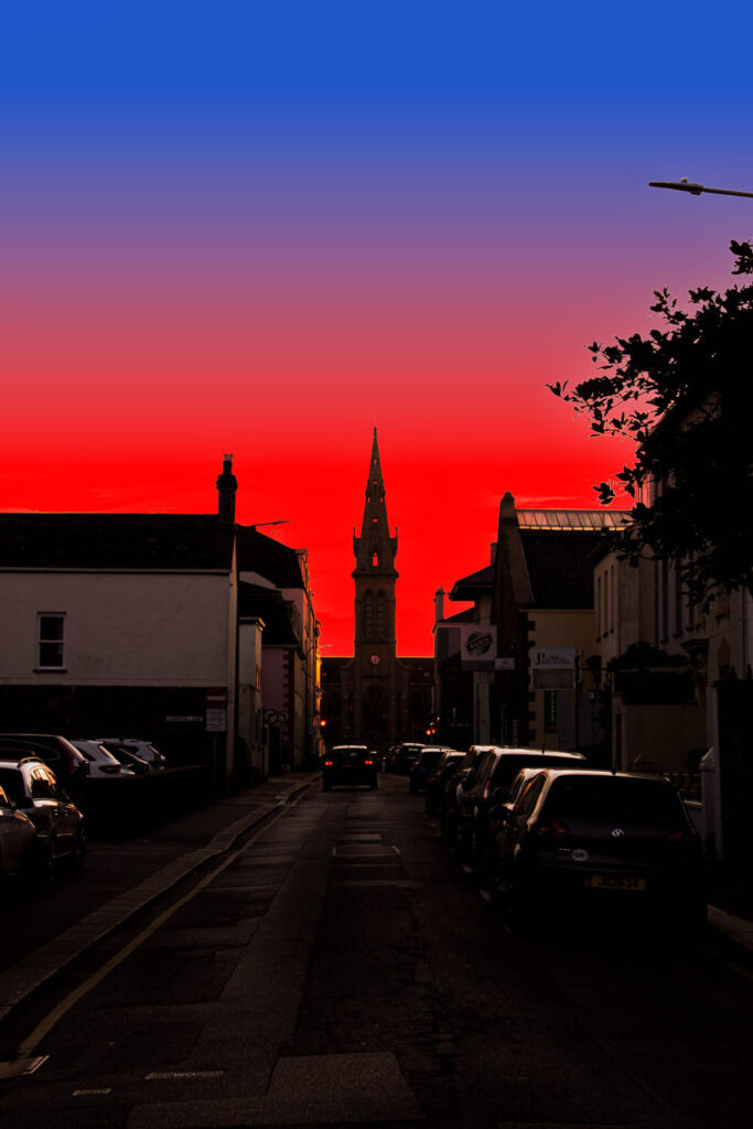
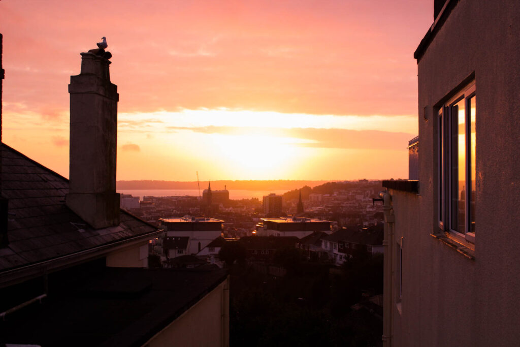
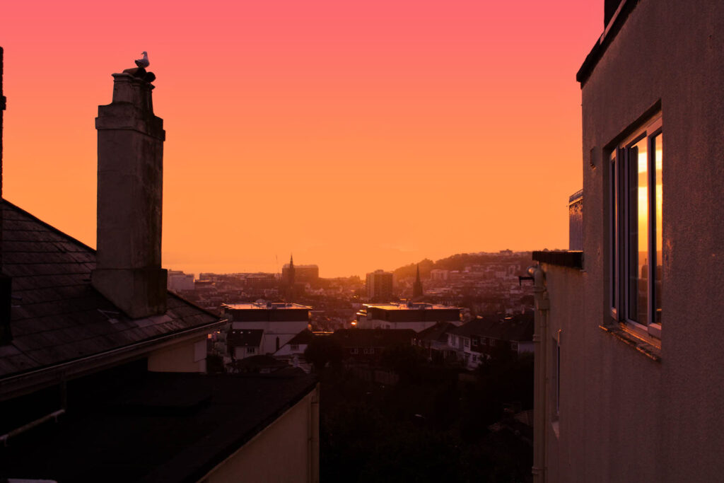
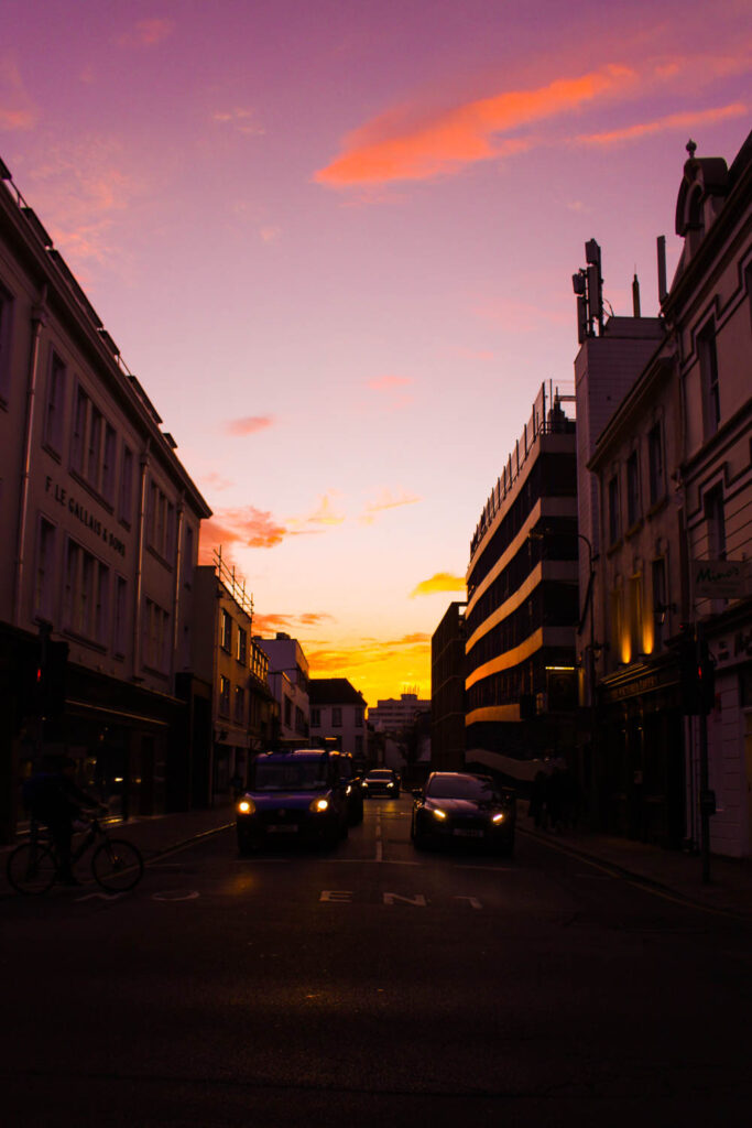
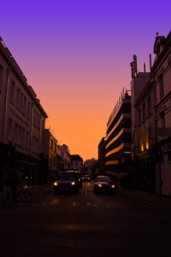
Gradient Experimentation
I was playing around with photoshop and I learned to make a pretty cool edit on some of my sky images.
Process
Here are some results –
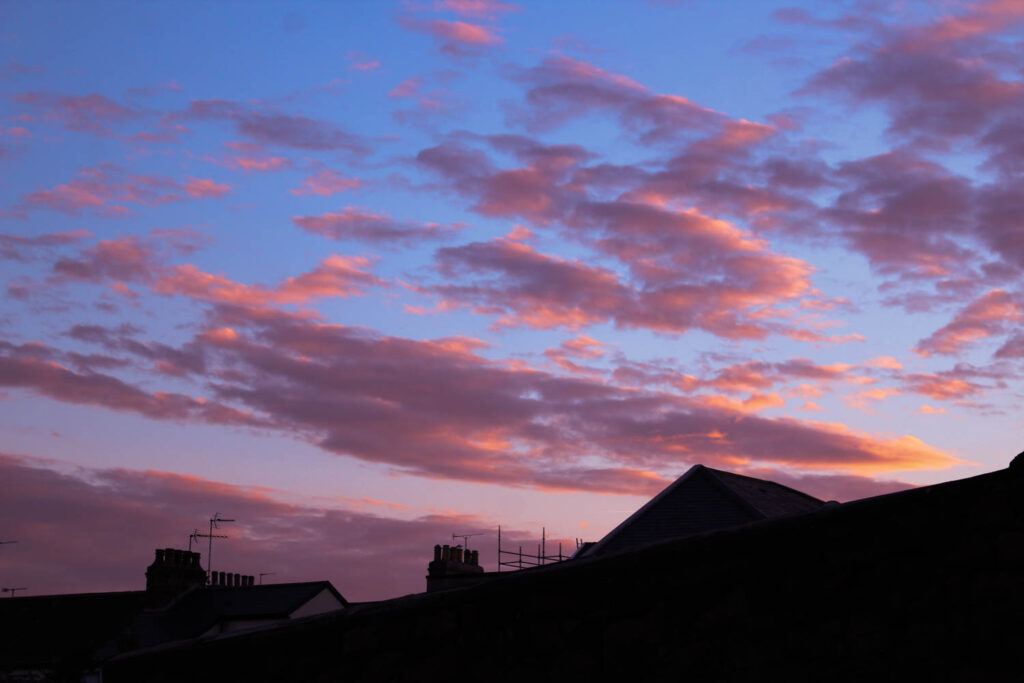
Before
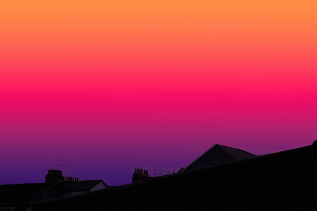
After
Before
After
Before
After
Before
After
Before
After
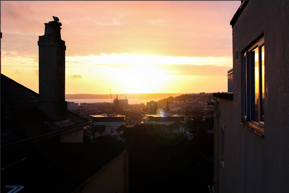
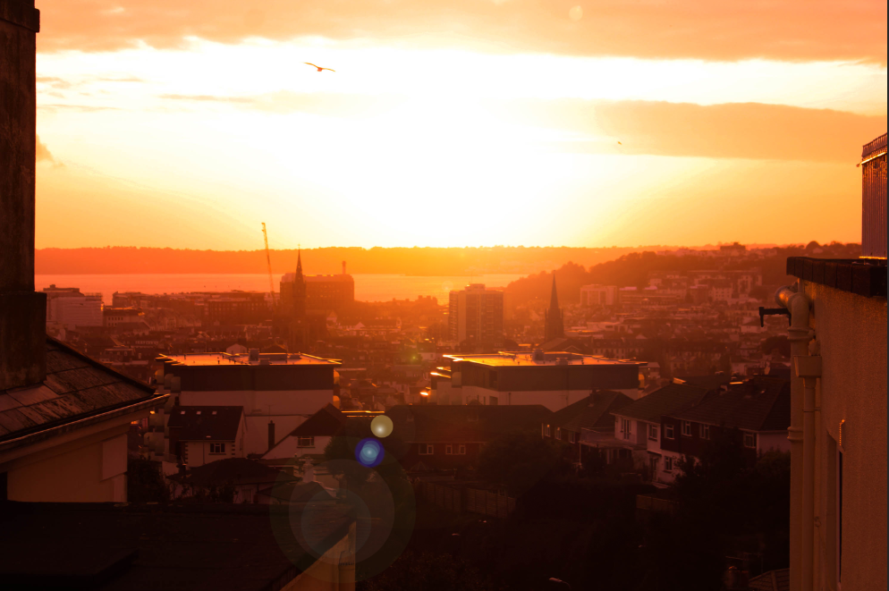
Lens Flare Experimentation
I thought it would be interesting to add a lens flare to my sky images that had the sun in so I decided to bring some photos over to Photoshop to try it.
Process:
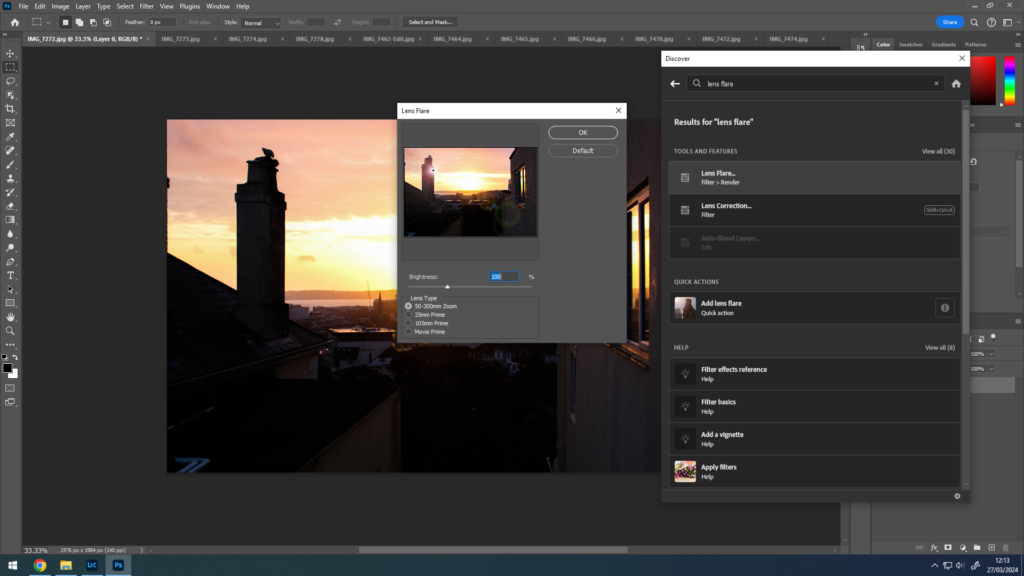
Before –

After –
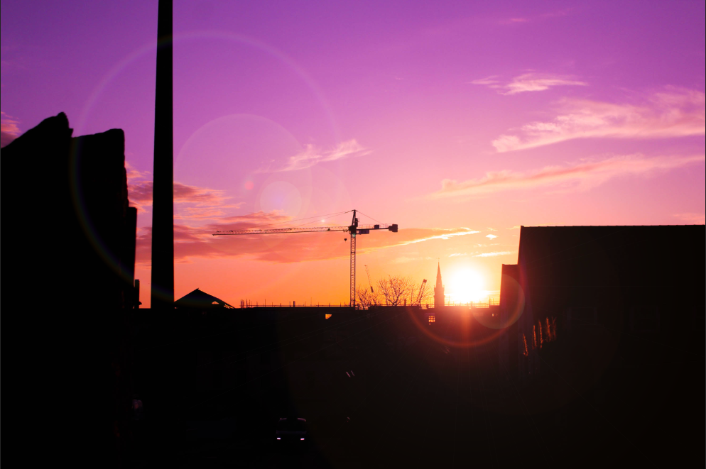
Some more lens flares –

Photoshoot Development
Selections:


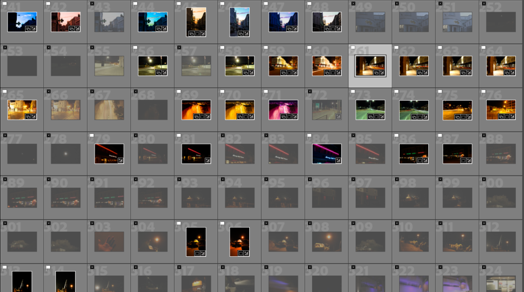
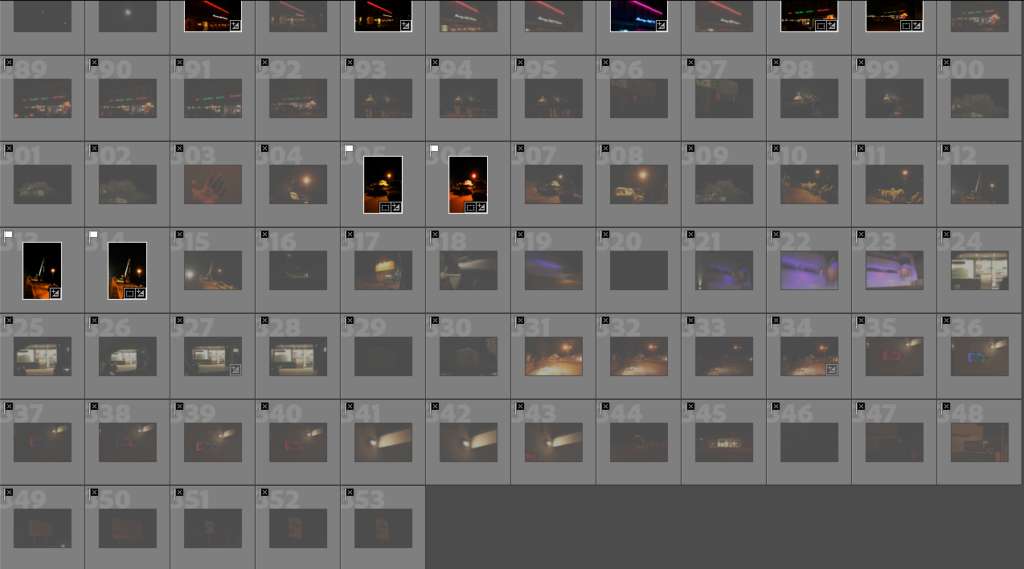
Editing Results:
Some examples:


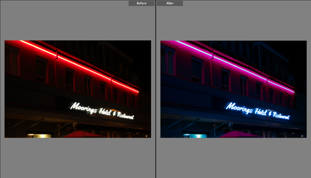


Some sky images, I changed the overall colour for some. I did this by changing the temperature and tint sliders, combined with all the basic sliders too and slight tweaks of the vibrance and saturation bars, these all were used to completely enhance and make the photos so much better:


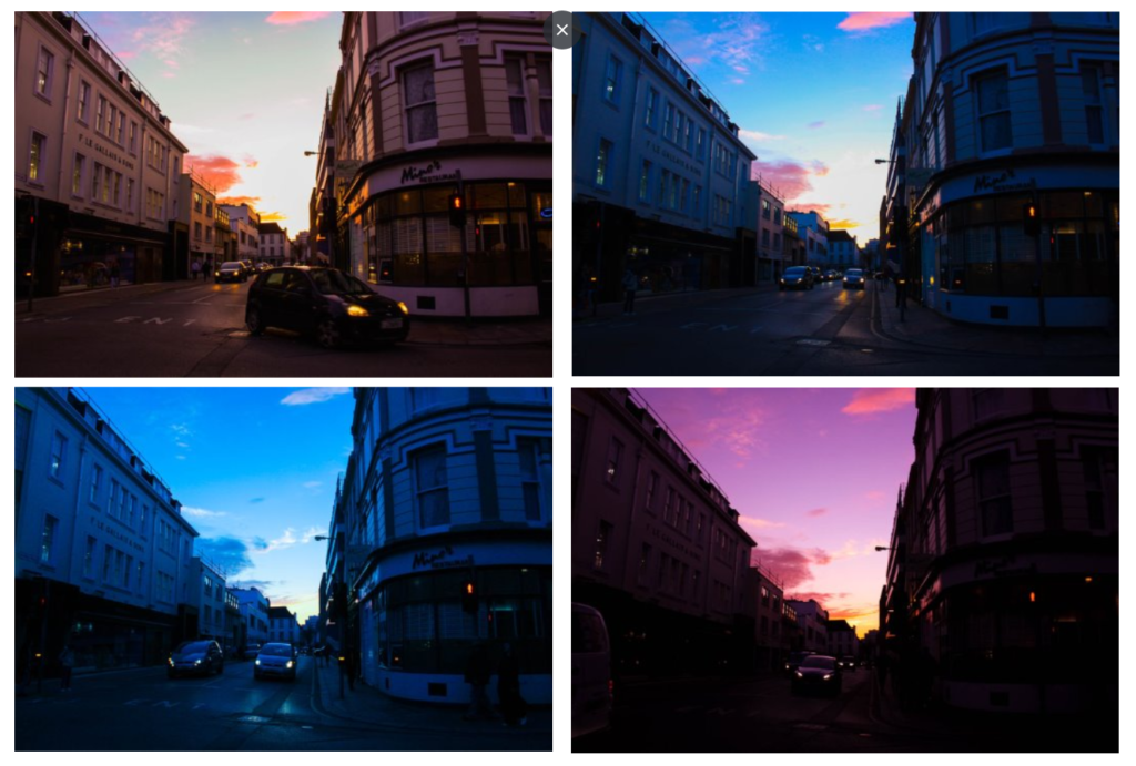
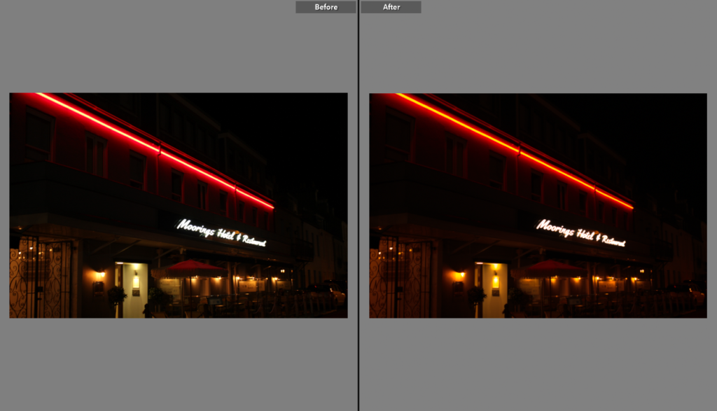
Most of the night images edits were mostly minimal and hard to even notice, as they were mostly toned to the way I saw fit already. The ones that feature the car lights though took a bit more work than the rest of the photographs. These were made by slowing own the shutter speed on the camera, so when a car was about to pass I would press the shoot button and the shutter would stay open, capturing all the lights and movement during that window of time. When the shutter closed, after about 20 seconds, the final image would show the lights from the cars turned into streaks.


