All posts by Alice Jakubowska

Filters

Author:
Category:

VIRTUAL GALLERY + EVALUATION

CREATING THE VIRTUAL GALLERY:

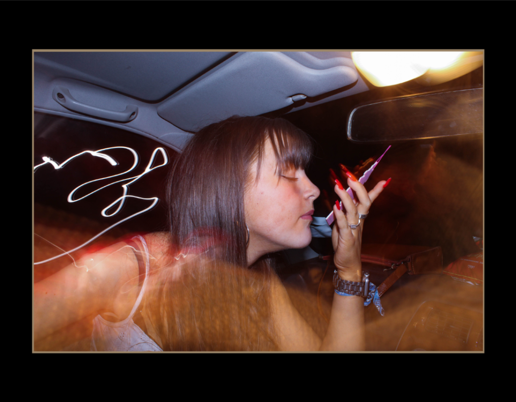
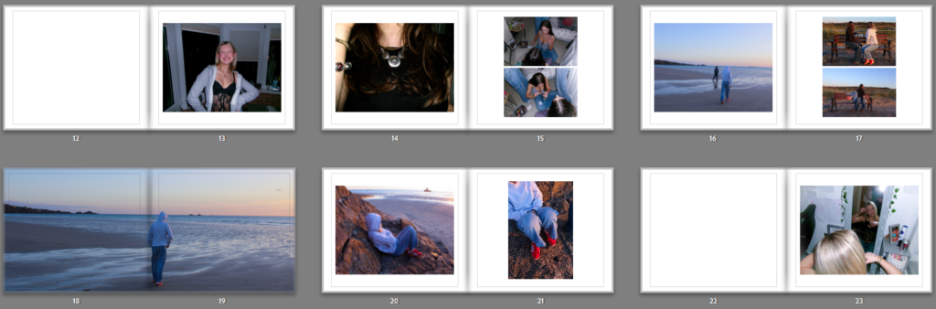
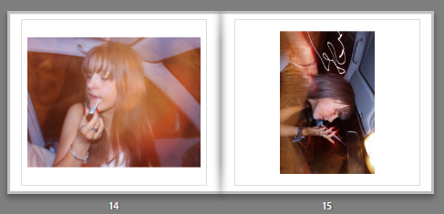
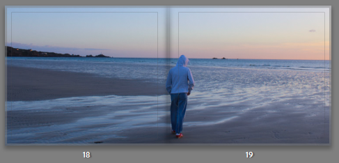
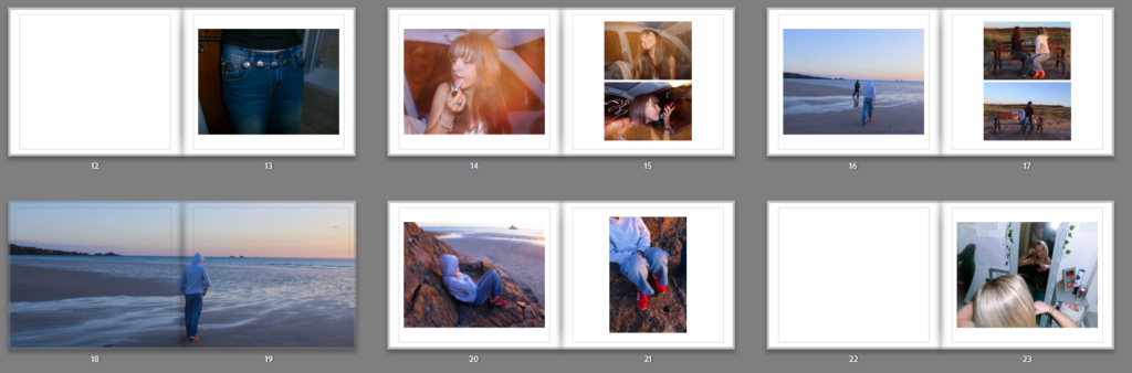
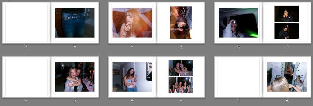
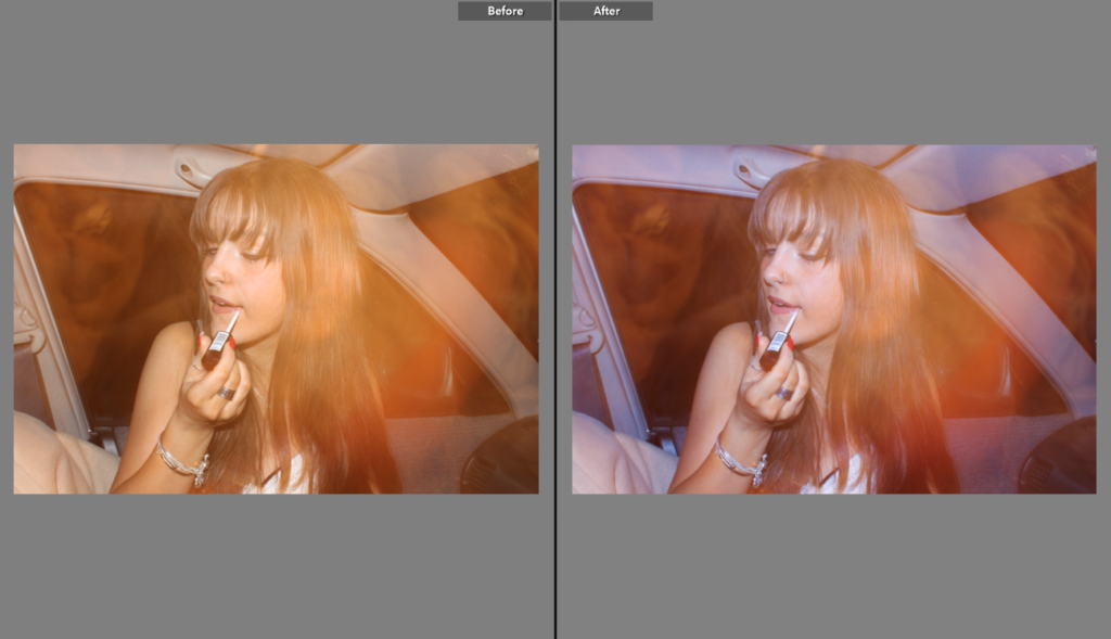
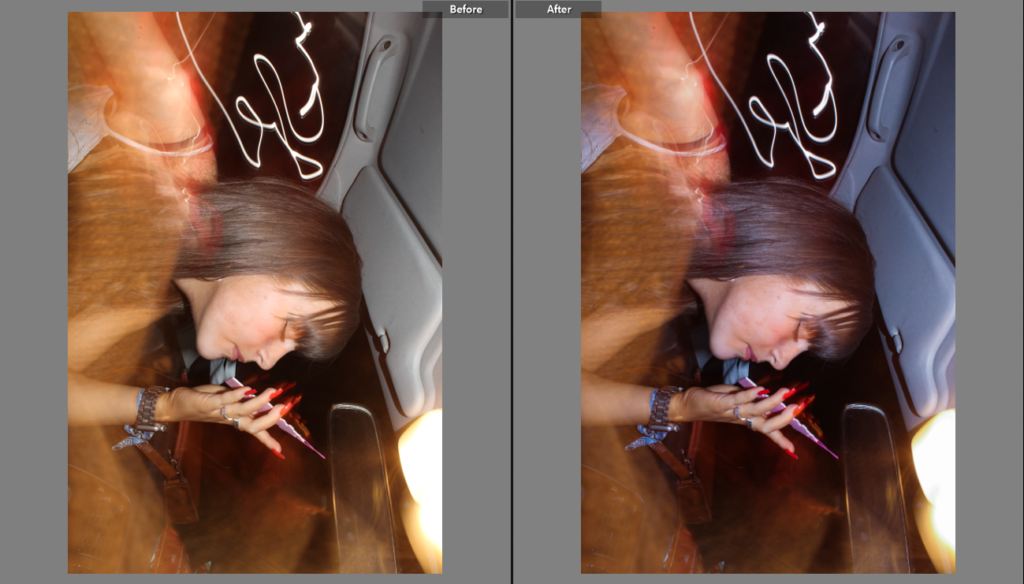
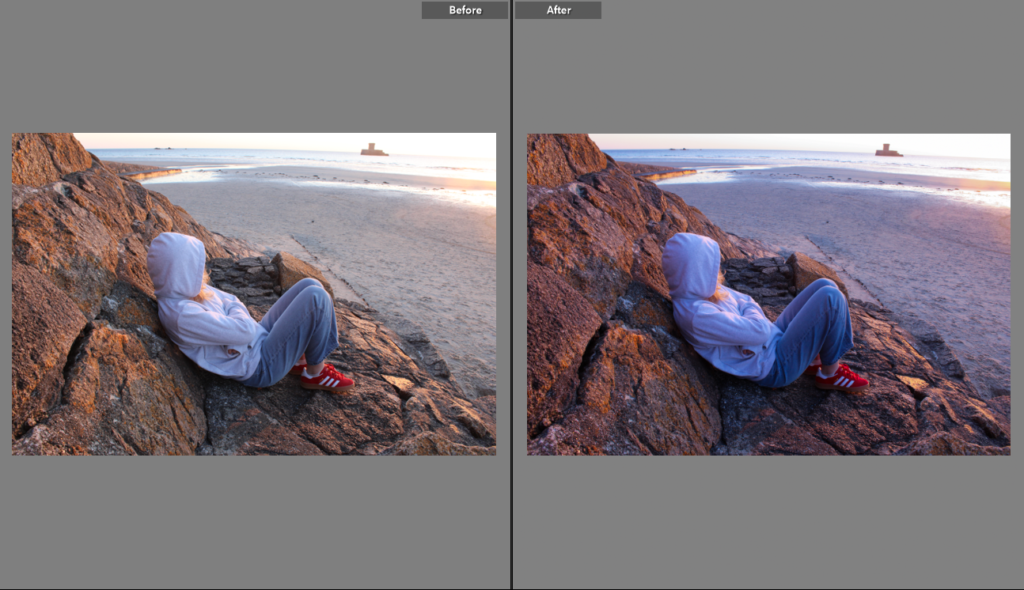
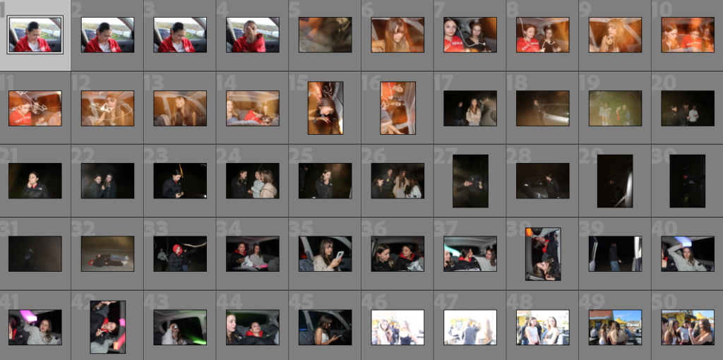
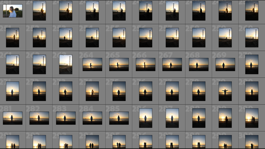
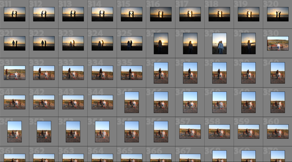
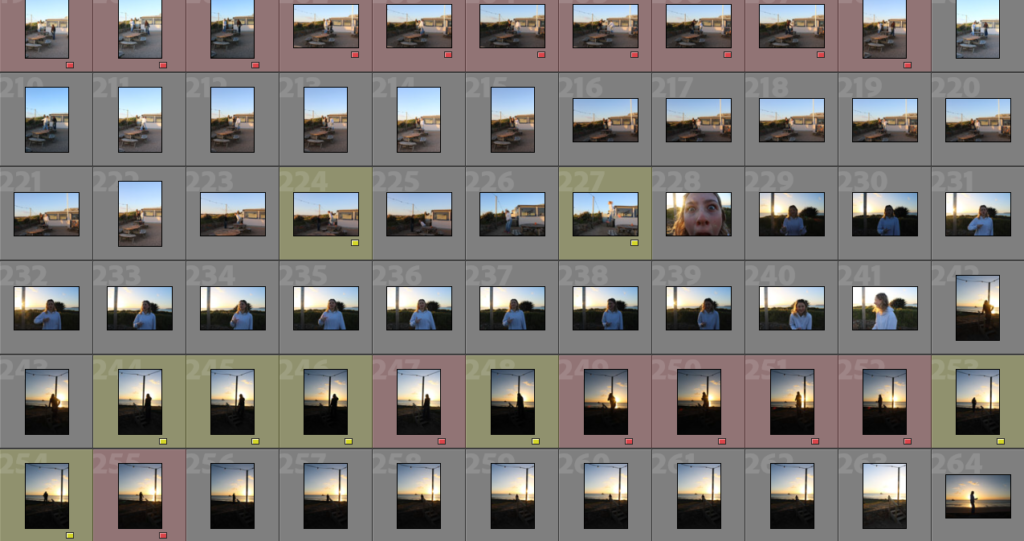
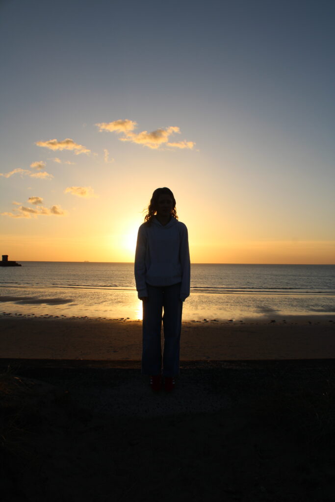
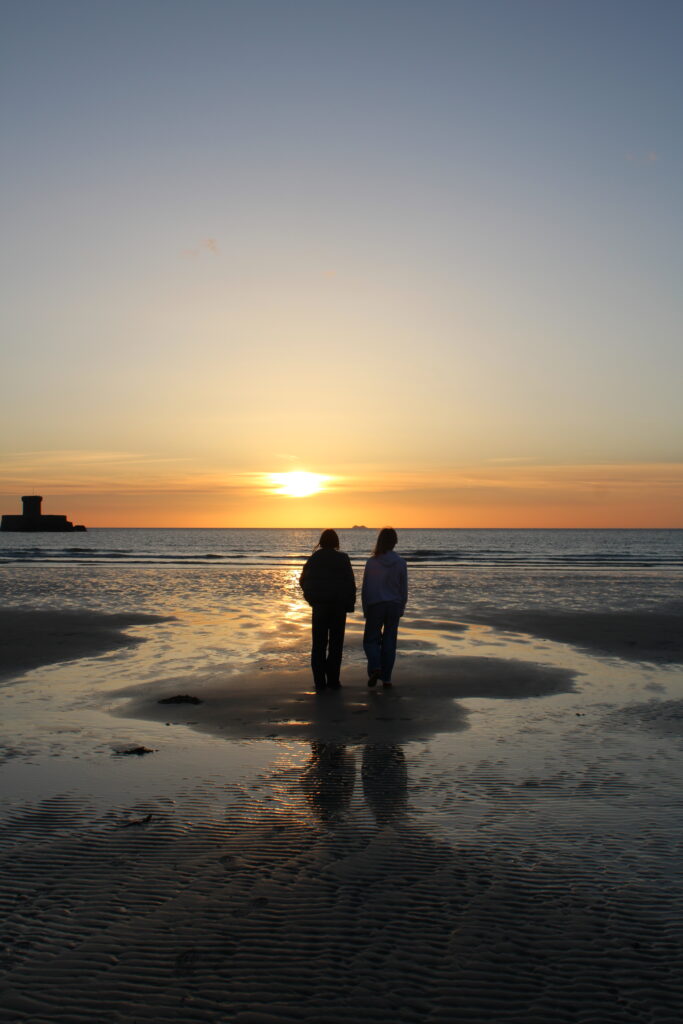
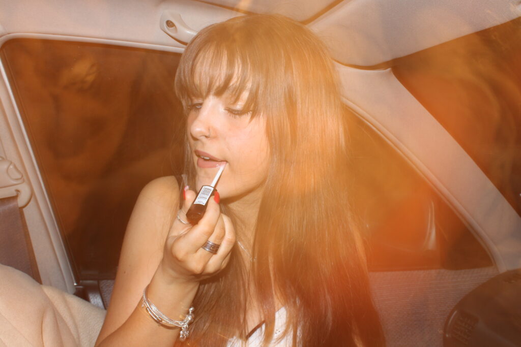
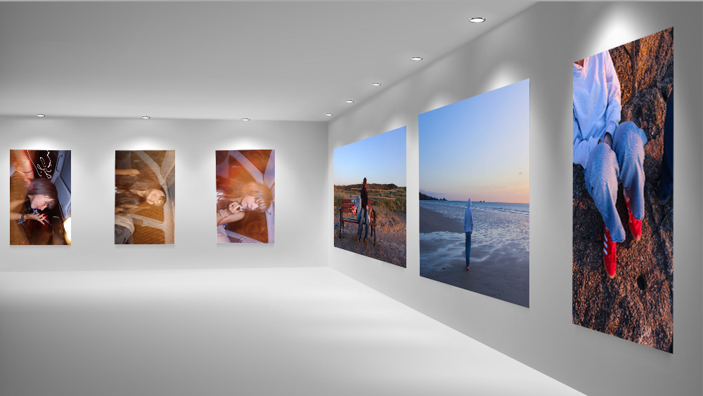
I created the virtual gallery on Photoshop 2024. I had already previously saved the pre-set of the virtual galleries onto my media drive, from my previous attempts at virtual galleries. I decided to do two galleries and use different images so that the presentation of the images flowed. In the first gallery I used images from photoshoot four, I decided to place the three images of Grace in the car in the back, like a trip-tick as they are similar and work together as a three. I put the more yellow toned image in the middle so that the other more blue/purple toned images can be on either side. I also used images from the beach that worked together in order to have a subtle contrast from the dark images in the back.

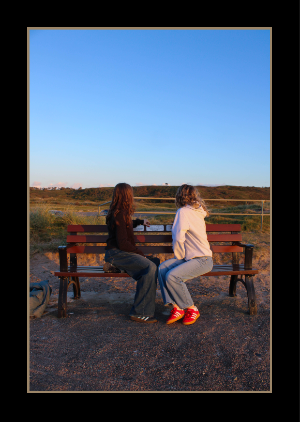
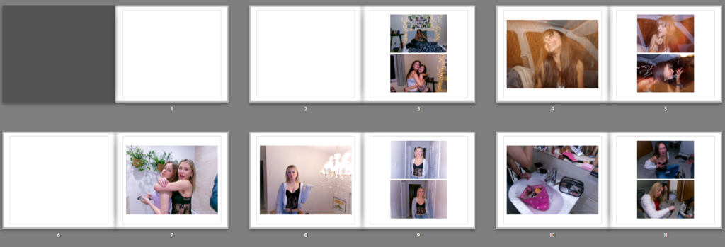
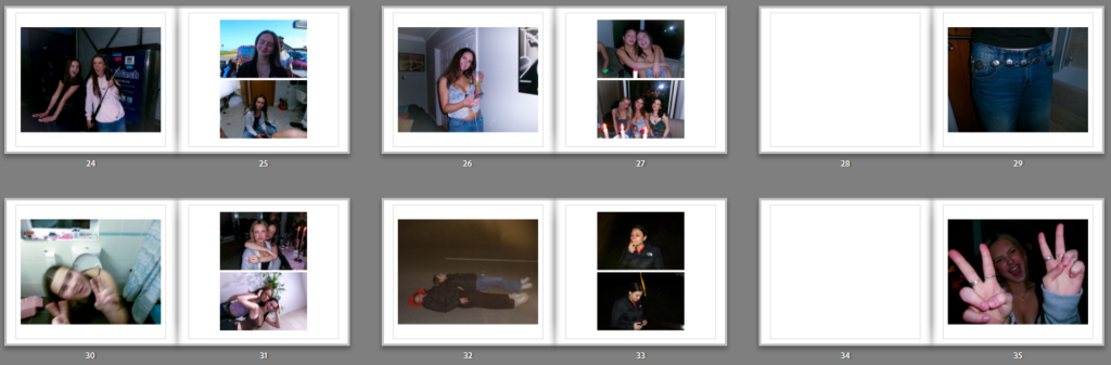
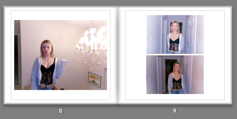
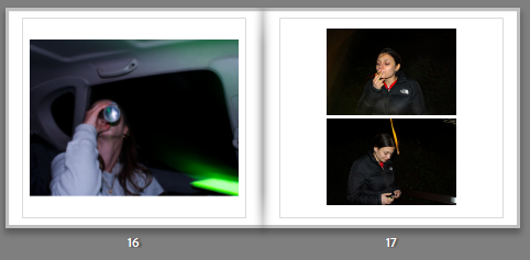
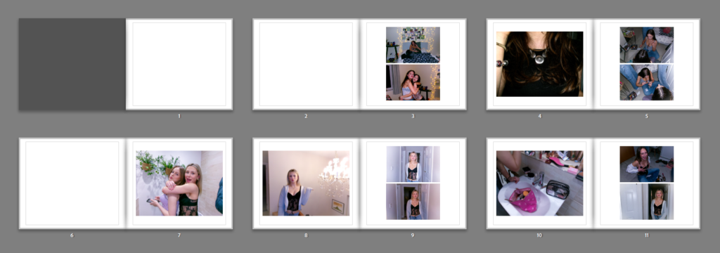
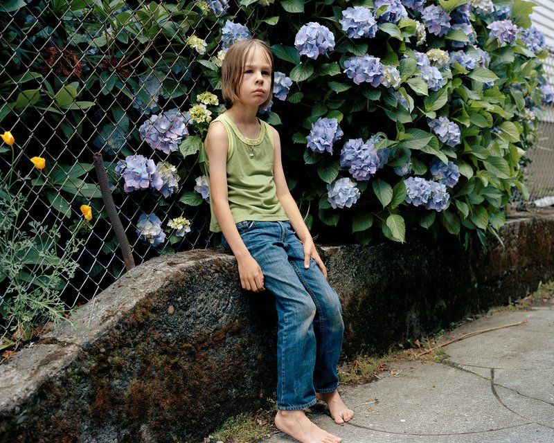
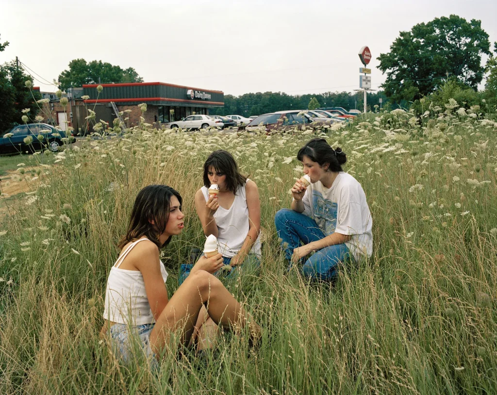
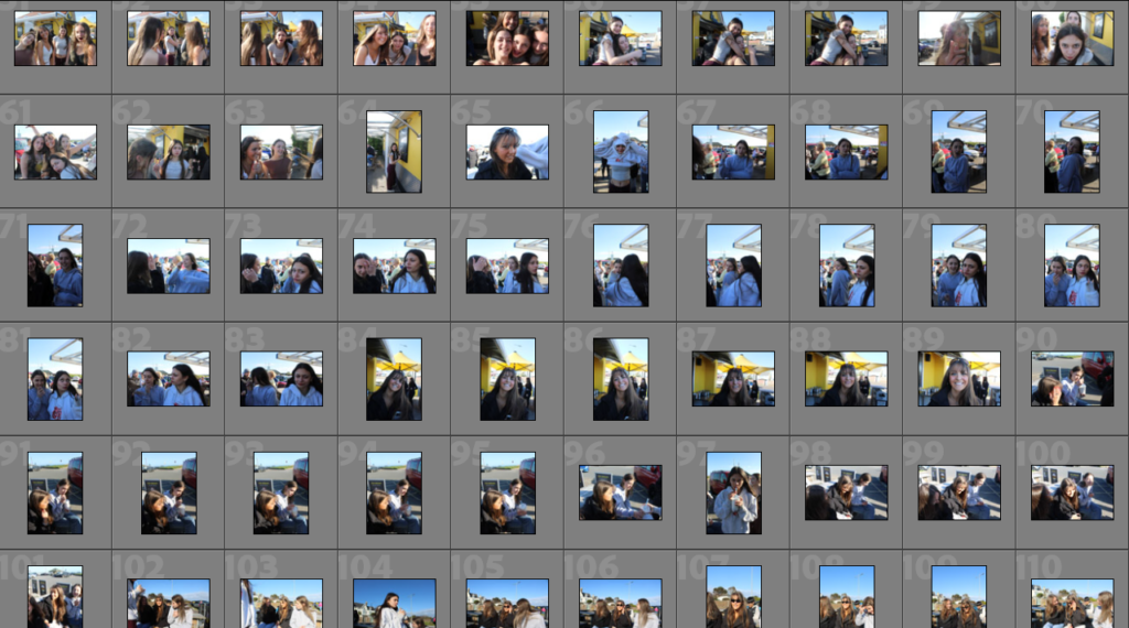
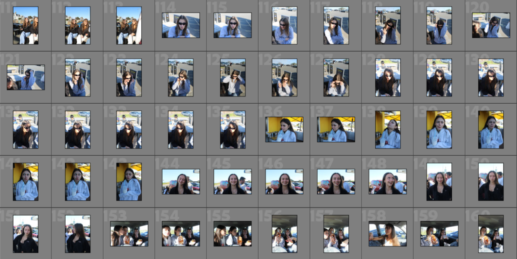
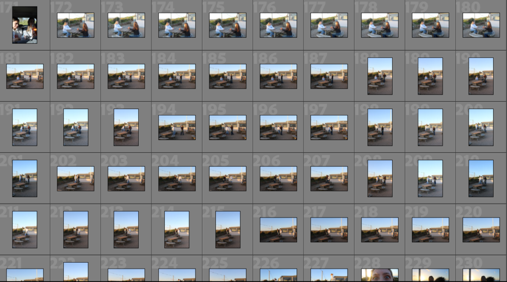
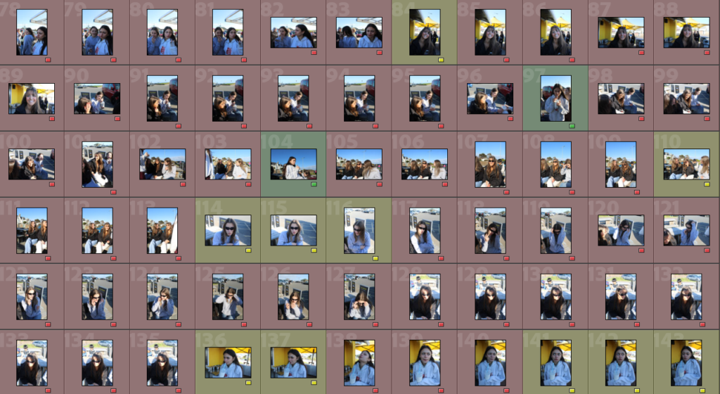
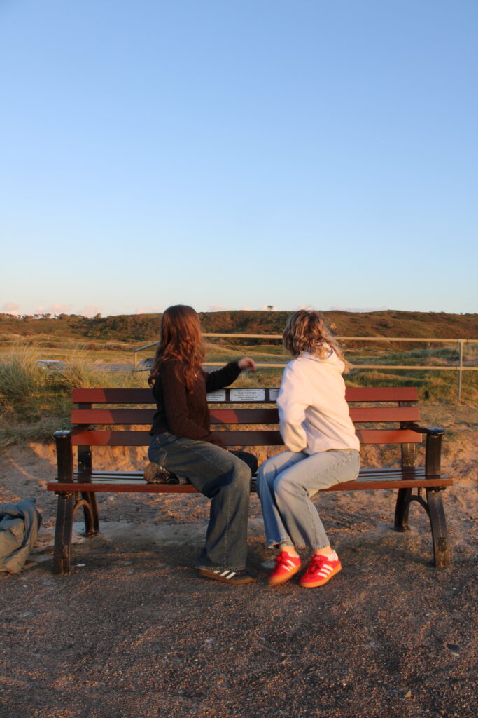
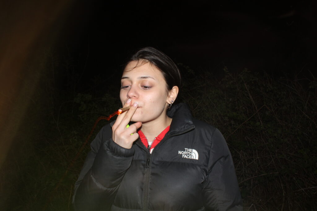
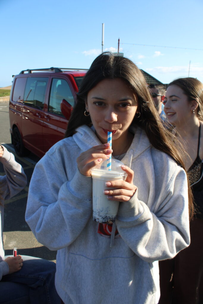
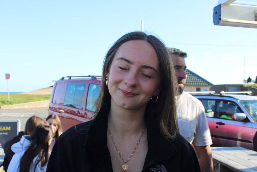
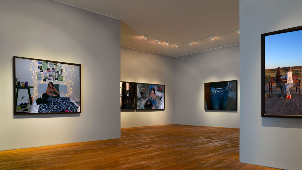
In the second gallery, I used my images from photoshoot one however also used an image from the beach. This gallery shows girls hanging out and portraying stereotypical ideologies of what girls do when they hang out with each other. I added some abstract close up images of belts and necklaces to highlight the stereotypical views of feminine dress code.
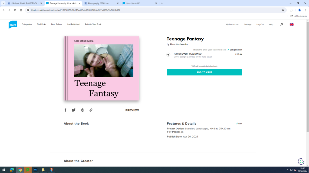
LINK TO PHOTOBOOK

Link to Photobook ‘Teenage Fantasy’ here:

FINAL VIRTUAL GALLERY:

EVALUATION:

– How successful was your final outcomes?
– Did you realise your intentions?
– What references did you make to artists references – comment on technical, visual, contextual, conceptual?
– Is there anything you would do differently/ change etc?

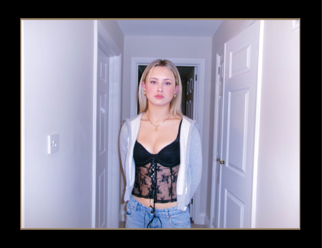
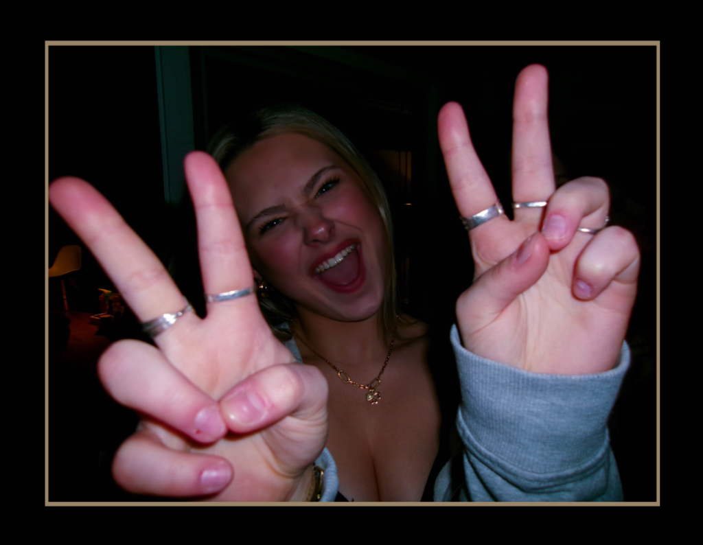
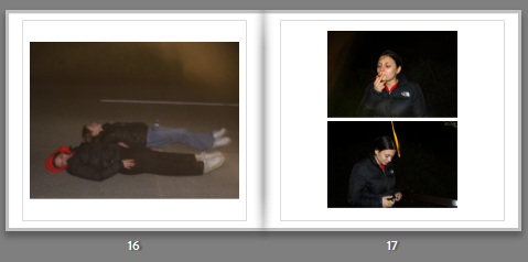
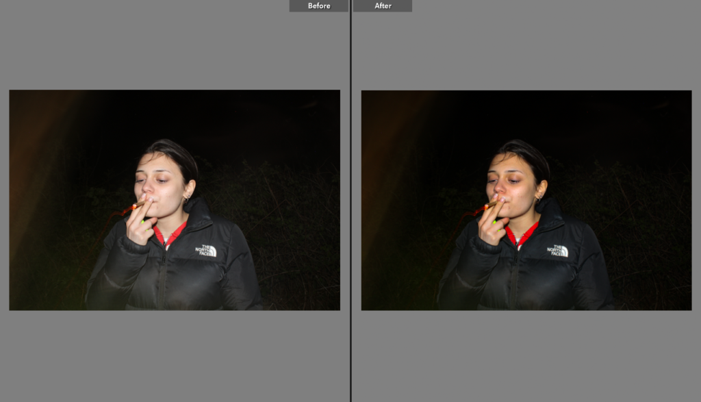
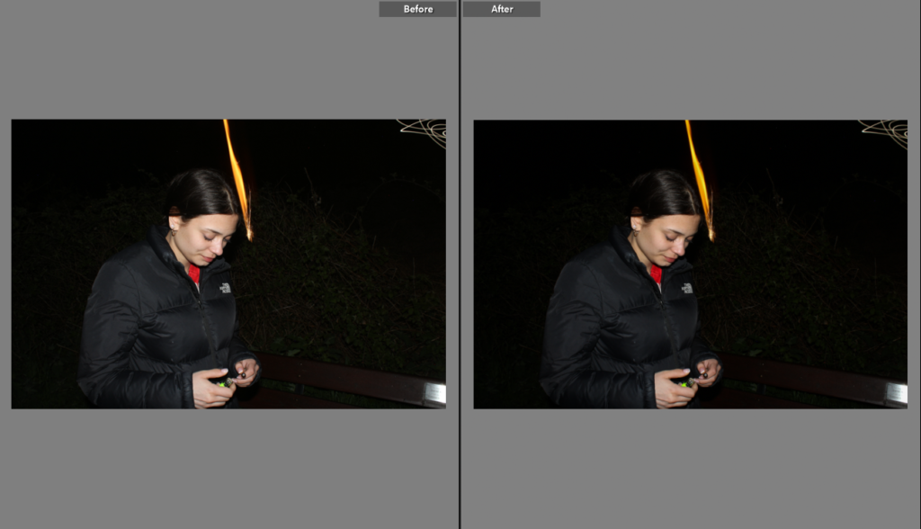
Observe, Seek, and Challenge was presented to us as our 2024 exam theme. My interpretation of this theme was femininity of girlhood and teenage girls. In terms of observing I was observing the behaviour and stereotypical views society has deemed fit for what teenage girls should be doing, therefore I was seeking a way to present these views created. I presented girls in my photobook as hyper feminine and edited my pictures to be hyper realistic too. I made the girls seem very feminine and ‘beautiful’ to create the illusion that society has created. However I also took images of girls smoking and drinking alcohol which would be seemed as a more masculine and anti-feminine to do, which challenges the dominant ideologies in society. My intentions for this project was to highlight these ideologies and show that they clearly affect society and growing teenagers in term of restraining them for allowing to explore their identities and life. Even though I am pleased with my final outcome of the book, I would of like to explore more ideas in terms of challenging the dominant stereotype which was one of my intentions I was hoping I could try, yet wasn’t able explore.

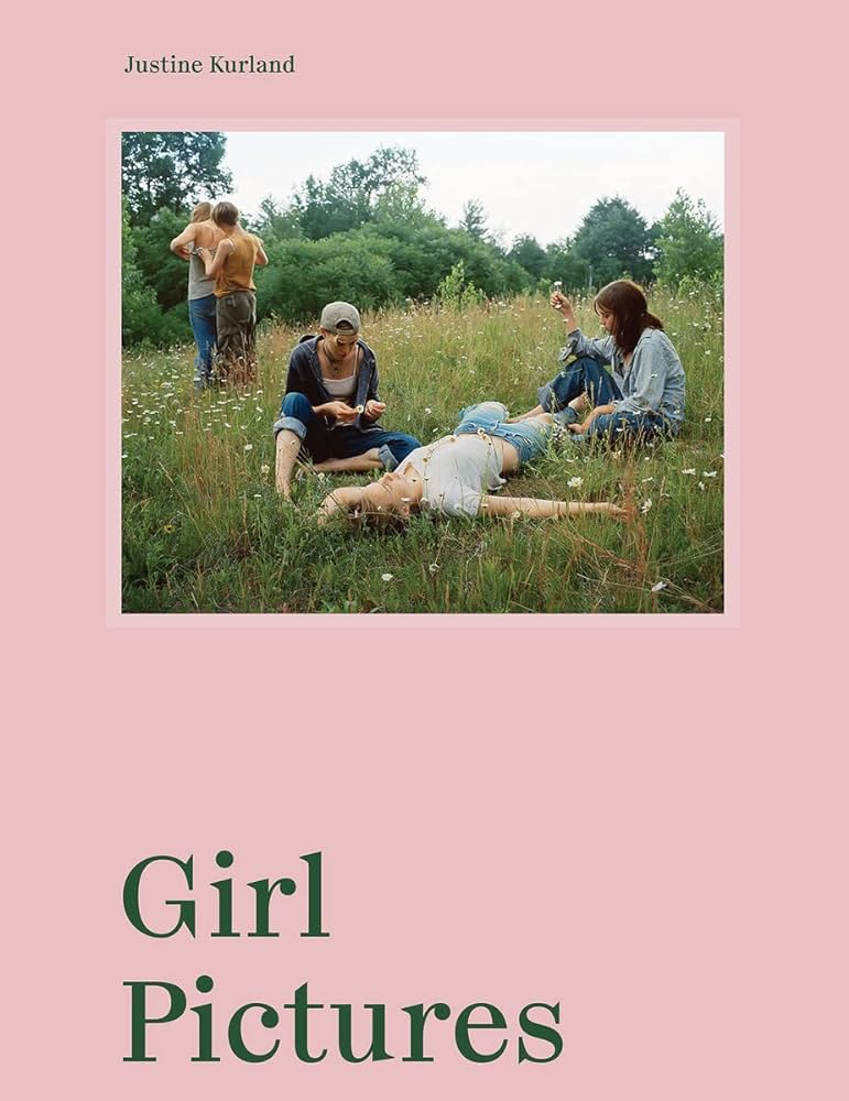
My main artist references that I focused on were Nancy Honey and Cindy Sherman, when exploring ideas for my photobook I started looking into the work of Justine Kurland. Even though my main studied artist’s were Honey and Sherman I ended up focusing more on Honey and Kurland. This is due to the fact I took a photoshoot in the style of Sherman and it didn’t really fit with what my intentions were with the photobook. I explored Honey and Kurland work in a more visual and technical way as I preferred how their images looked visually and that’s how I wanted my photobook to visually look, whereas I studied Sherman’s work in a more contextual and historical context; exploring the idea of stereotypes. In terms in areas to improve would improve in being more organised with my photoshoots so I would be able to have a larger variety of images. Furthermore, I intend in my next project to highlight binary oppositions and show the difference between what society expects vs what society is actually like.

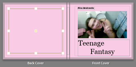
For my final outcomes I created a photobook and created four window mounts. I created a photobook that highlight’s societies stereotypes towards femininity in girls. As I was editing I created a purple, pink tone in my images to really focus of the significance on dominant ideologies and stereotypes, even in terms of colour. Pink is typically a stereotype for femininity and a ‘girl’ colour. Overall I am pleased with the aesthetic and layout of my photobook, however wish I explored more of the counter types and created a photobook with the narrative story by showing binary oppositions. For the window mounts I picked my strongest images that I thought would present well through a window mount. I am overall happy with my final outcomes, but for my prints I would try to create something with multiple images, perhaps a trip tick.

PRINTS FINAL OUTCOMES + PRESENTATION

FINAL PRINTS MOCK UP ON PHOTOSHOP: WINDOW MOUNT

A4 Window Mount
A3 Window Mount
A3 Window Mount
A3 Window Mount

EVALUATION OF FINAL OUTCOMES:

For my final outcomes; in print form, I wanted to do singular window mounts. I wanted to do window mounts because it clearly focuses on the images allowing the audience to focus on the photograph. I decided to do individual window mount in A3 so that the audience looking at the photo appreciate the editing and the message of girlhood, and this utopian teenage girl world. After reviewing the window mounts and my final outcome I am pleased with the way the images look through the window mount. In terms of picking the images I picked my strongest images or images that clearly show the theme observe, seek and challenge. However in future projects I would possibly try to explore how to display my work with multiple images instead of one.

FINAL PHOTOBOOK + EVALUATION

LINK TO PHOTOBOOK:

Here is a link to my photobook: Teenage Fantasy

FRONT + BACK COVER:

PAGES:

EVALUATION:

In the process of making this book I have clearly learned key skills for future projects. After reviewing my final outcome of the photobook I am pleased with the result. My aim for this photobook was to explore the exam topic observe, seek and challenge through the concept of femininity and girlhood. In terms of my focused artist case studies I think I leant towards Nancy Honey; I did take a photoshoot focusing on Cindy Sherman however I concluded that I did not want that to be incorporated into my photobook. My inspiration for the photobook was Justine Kurland’s ‘Girl Pictures’ which I think is clearly shown through my photobook.

Overall during the process of making this photobook I really enjoyed it, I was able to use knowledge from my previous photobook and how to make it better. Even though creating the book was a very similar process it was much more different since I was using coloured images. I enjoyed experimenting with different tones and temperatures and creating a narrative through my images. The placement of the images I learned was very important, the photobook needs to flow without a disrupted pattern. I was able to create this well flowing narrative from my three key photoshoots; a party, girls watching the beach, girls together in a car and outside. By placing the images in that order I was really able to highlight the different ways in which girls spend time together. I the process of picking out the design I wanted to add more picture from my previous photobook, yet I also wanted to find a design I was able to repeated in order to still keep the photobook organised. Looking back at my photobook I am content with the final product and overall think that it clearly states and shows femininity through observe, seek and challenge.

In terms of improvement I believe I could have done slightly more shoots. I did two shoots more in the style of Sherman however didn’t like the pictures and didn’t have enough time to do a last minute shoot. Overall, I think what was needed in this photobook was some more creativity in a more hyper realistic way. I wasn’t able to do some of the shoots I wanted to do due to personal reasons however I still am pleased with my final result. Even though all my images used in the photobook fit with the aesthetic and compliment each other, I wish I had a few photos which clearly show hyper-realistic femininity in inspiration to Sherman works like hyper realistic makeup.

CREATING THE PHOTOBOOK

As clearly shown in the screenshot, this is a double page from my photobook. Here you can see a clear layout of images, from the same photoshoot. Even though the images are very similar, they seem to compliment each other well, through the editing style. This slide is showing a narrative of the blonde girl, which highlights the stereotypical femininity radiating through the page, from the editing and clothing style. In my photobook there are a few slides which highlight certain girls in the book, where there are multiple photos that compliment each other.

This double page in the photobook is supposed to reflect an idea of getting ready, and girls applying make-up and reinforcing stereotypes. However in later editing of the photobook I changed the bottom, right image to a girl straightening her hair, in order to make the narrative flow slightly better. The left image of the makeup bag is used as a filler image, however still supporting the idea of observing femininity, through makeup and the pink colours which often have connotations of femininity.

When placing this images together, it clearly had a different aesthetic to my other images, I wasn’t able to take many images in the dark so therefore the two pages that contain night photography and equally spaced apart in the correct order. Later I was able to find another image that worked and added a second image to the right side, in order to keep the layout of the book the same. When creating the book, I knew I wanted to keep these images together, as the composition works with the aesthetic and the abstract lighting.

This page, I struggled to find an image that would work with the other images, what I needed was another picture of the girl smoking or a group photo which I was later able to add an image of two of the girl lying on the road. This therefore allowed the narrative to flow better, showing girls ‘seeking‘ nature and girlhood.

CHANGES MADE:

This screenshot shows the change in photo, from the previous screenshot. The image works better then the previous one as it is in a outside location, however it would look better if the image came out darker, so it would look more similar to the other images. As well as the image being on the right side of the page, which is were filler images are usually used it gives a nice contrast to the dark surrounding in the other images.

For the middle of the book I put in a bleed image, this is so there was a defined place in the book to show the middle. I chose an image from the beach photoshoot as it looked more calm and serene contrasted next to the other images. In order to make the bleed image work within the photobook, I also added images from the photoshoot in the previous pages and the page after. This is so the photobook contained more than one images from the shoot and for it to have a narrative within the storybook, while also trying to portray the exam theme ‘Observe, Seek, and Challenge.’

PHOTOBOOK: CONCEPT + NARRATIVE + DESIGN

Narrative: What is your story?
Describe in:

  • 3 words

Documenting utopian girlhood

  • A sentence

Documenting this idea of feminine utopian through the idea of girlhood, and friendship.

  • A paragraph

Through the documentation of feminine utopia, I will be exploring this stereotypical idea of girlhood and the stereotypical view of a teenage fantasy. As well as taking inspiration from Kurland and Honey I will be allowing to explore and interpret this in my own view and the reality of girlhood.

Design: Consider the following

  • How you want your book to look and feel
  • Paper and ink
  • Format, size and orientation
  • Binding and cover
  • Title 
  • Structure and architecture
  • Design and layout
  • Editing and sequencing
  • Images and text

DESIGN OF PHOTOBOOK:

In my photo book I want to try and achieve a feminine aesthetic by editing the tones to more pink and blue, which often has connotations of femininity. In order of the layout I will be alternating between landscape and portrait images, however I will be exploring how the images will look together so I can try and create a narrative, therefore the in terms of the layout of images I will be experimenting and seeing what works. The editing of the images will be unique for each image depending on the location and time taken for example; night or day, outside or inside. In terms of the title, I am planning on naming my book ‘Teenage Fantasy’ which cis clearly portrayed in my photobook. My photobook will clearly show the narrative of teenage girls and what is looks and feels like to be a teenage girl, part of girlhood and strong bonds with your friends. In my photobook you will be able to see the different ways in which girls ‘seek‘ girlhood and stereotypes and where girls ‘challenge‘ he typical stereotypes. For my front cover I am still unsure if I want an image or material, however I will experiment will multiple options and come to a conclusion, however if use a image from my front cover I would use a calm sunset in order to keep the front cover minimalistic. The sequencing of the images will be repeated as I like an organised aesthetic in my photobook, like I did in my coursework. I will possibly add small text, by naming the images or adding dates however I will not be right adding any narrative text.

In terms of the exam theme my photobook clearly has a range of series of images, that show me observing, seeking and challenging femininity and teenage girlhood. I believe my images have a good interpretation of my artist case studies while also creating my own work from my own creativity.

SCREENSHOT OF PHOTOBOOK; UNFINISHED:

FOR MY FRONT AND BACK COVER, I AM STILL DECIDING WHETHER I WANT A PHOTO OR A PLAIN MATERIAL COVER, LIKE THE ONE FOR MY COURSEWORK.

THIS IS A SCREENSHOT OF THE BEGINNING OF MY PHOTOBOOK, WHICH SHOWS THE AESTHETIC AND LAYOUT OF MY IMAGES, HOWEVER THIS IS ONLY A DRAFT AND THE IMAGE COULD GET MOVED AROUND.

LAYOUT:

This layout will be repeated throughout my photobook. Seen through the screenshot, the page seen a the start has a black page this is because the first page could possibly have a title on it depending how I want my front page to be displayed. Then through it alternates between one landscape on the left, and two on the right page or a portrait image. This is so I could include both landscape and portrait images.

PHOTOBOOK RESEARCH + ANALYSIS

PHOTOBOOK: GIRL PICTURES – JUSTINE KURLAND

“The girls were surrogates for myself, from a time before I had made certain choices and accepted responsibilities. It’s a time when all things are still possible and being wayward is a form of rebellion, even freedom,” explains photographer Justine Kurland on why she focused on young women and teenage girls for her now-iconic series Girl Pictures.

RESEACHING THE PHOTOBOOK:

‘In the late 1990s, I staged photographs of teenage girls as surrogates for myself in a fantasy of a coming world, one where solidarity between girls offered intimacy and protection, where girls were made stronger through the presence of other girls. I focused on teenagers because of their perpetual state of becoming – a latency that resounds with the freedoms and simple joys of childhood. I wanted to foreground girls’ lives, centring them by creating an all-female society.’ Kurland wanted to present this idea of young teenage girls and how this sense of girlhood is connected by strong bonds and trust girls feel within each other during this period in their lives, where friendship is strong. Kurland used real people as subjects rather then models to try and recreate her childhood fantasy, whereas usually with models you are trying to present something rather then telling.

While Kurland is trying to reinforce this feminine utopian world she is also trying to show the impact of female intimacy and how girls are able to strengthen and support each other whereas individually they are seen as vulnerable and weak, the feminine stereotype. While Kurland trying to highlight this teenage fantasy and support the girls she is playing into the dominant ideology of females. Laura Mulvey states that women are represented for the visual pleasure for the male sex, Kurland supports this theory by representing the girls in a hyper-feminine stereotype; playing in flower fields which have connotations of pure and delicate, girls getting ready in the bathroom perhaps for a night out makeup is stereotypically products for females and they are wearing elegant, earthy colours which men would not stereotypically seen in. This shoot may target a wide range of audiences including: paedophiles, advertisers, recruiters, social-media influencers, fashion magazines, due to the fact they all traffic in photo media. 

IMAGES INCLUDED IN PHOTOBOOK:

HOW DID KURLAND MAKE HER IMAGES:

Kurland stated in an article that she ‘photographed on extended road trips across the US, scouting locations and finding girls along the way. The girls would collaborate in staging the scenes. The landscape offered its own drama: the dense undergrowth in the South, the gentle roll of the Midwestern prairie, the shrill light of the Southwest and the expansive vistas of the West.’ Kurland took inspiration from utopian ideals as well as genre paintings, and the photography of Julia Margaret Cameron and Mathew Brady, while also illustrations from fairy tales.

PHOTO ANALYSIS:


Emotional Response:

In this picture Kurland presents femininity through teenage girls and coming of age girls. This image brings nostalgia through looking back reminiscing when at some point all girls were this young. The young girl present this idea of growing up and exploring her identity and how she experiences girlhood as an individual. The use of the colours green and blue, allow the audience to feel a sense of new beginnings and growth as well as freedom and sensitivity.

Visual – what we can see in the image

The mise-en-scene in this image shows a young girl sitting on a rock wall surrounded by hydrangeas. The girl is placed in the centre third of the image, clearly making her the focal point. The connotations of green are new beginnings and growth which can be symbolic of how young the girl is and she is not growing into herself and embracing her personal identity, furthermore the blue/purple hydrangeas bring connotations of wisdom, inspiration, mystery and femininity. The image seems to be taken with natural lighting in an secluded alley which gives an isolated aesthetic and feel to the image.

Contextual – who, when, where etc…the story, background, impact:

Kurland took these pictures as part of her project ‘Girl Pictures’ which have created a large impact for teenage girls. Kurland used these girls as a surrogate for herself so she could present her fantasy of her interpretation of girlhood. Kurland took many road trips in a van and she stated in the Vanity Fair article “I could find girls wherever I stopped, but they went home after we made photographs, while I kept driving, my road trips underscored the pictures I staged—the adventure of driving west a performance in itself.”

BIBLIOGRAPHY:

https://www.frieze.com/article/justine-kurland-girl-picture-problem

Creative Review, Justine Kurland, By Rebecca Fulleylove 07/07/2020

https://www.vanityfair.com/style/2020/05/justine-kurland-new-book-girl-pictures

https://www.all-about-photo.com/photographers/photographer/1535/justine-kurland

https://www.icp.org/browse/archive/constituents/justine-kurland?all/all/all/all/0

PHOTOSHOOT THREE: EDITING

EDITING PROCESS:

These images were taken throughout the day and different points, in order to show the behaviour of girls through the day. In this photoshoot I was able to meet a bunch of girls which allowed me to get that variety of pictures with different people. There are a range of different portraits in different landscapes and environments which shows the stereotypical views of girls, by the beach and going for lunch. However during my night photoshoot, I was able to explore countertypes of femininity such as smoking which is seen as more masculine and not feminine, even though in present society many smokers are women.

In the editing process I changed some of the images into black and white since it fit more with the aesthetic of the picture, this will mean I will have to go through past photoshoot and possibly edit more in black and white to have a larger quantity. In terms of the coloured images, I was intending to enhance the colour, by enhancing the vibrancy and saturation. During editing the sunset images, as well as increasing the vibrancy and saturation I also increased the temp to create a more coloured image.

PHOTOSHOOT THREE: CONTACT SHEET

REFLECTION:

In this photoshoot I explored many types of natural lighting to get a variety of images. I explored night photography, an day photography including golden hour. During my photoshoot at night, exploring the idea of night photography I struggled with the setting and how to create a good outcome therefore as a result there was not as much images as I originally wanted to take. However, through rating my images , I was able to pick a couple images that I believe could be used in my final outcome as a photobook, or even as my analogue final pieces. I also explored the idea of ‘golden hour’ photography with the sunset. I took these images at the beach (St. Ouens) to show how girls hang out at the beach watching the sunset. This part of the photoshoot I really enjoyed because the colours of the sunset reinforced this idea of femininity with the pink colours, which reinforce this connotation.

Overall this photoshoot allowed me to explore many types of photography and lighting settings, while giving me experience in different fields it also allowed me to have a range of images. During the editing process my intention is to enhance the colours of the sunset in order to dominant this idea of femininity, while also trying to define and sharpen feature on the girls.

COLOUR RATING:

RED: BAD QUALITY IMAGES

YELLOW: RELATIVLY GOOD IMAGES, COULD BE IMPROVED

GREEN: GOOD IMAGES, THAT FIT WELL WITH ARTIST STUDY

PURPLE: BEST IMAGES, FIT WITH ARTIST STUDY, CREATIVE

PHOTOSHOOT THREE PLAN:

WHAT?

In this photoshoot I intend to portray the difference in how girls socialise for different events for example how girl act different for day life and night life. There will be a range of portraits which can be used to tell a narrative for my photobook.

WHERE?

This photoshoot will be taken outside, during the day, golden hour and night, which shows how girls act during the day and the binary opposition of how girls socialize and what activities they do during the day and night.

LOCATIONS:

  • BEACH: ST BRELADES
  • ST JOHNS: ROAD
  • CAR
  • KIOSK

HOW?

I will be using a camera from school so I am able to create higher quality images. I will be taking a series of landscape and portrait images to see which fit best with the photobook and what layout will go best.

WHY?

This photoshoot intends to present the idea of girls socially hangout and having fun. Some images are more stereotypical then others such as watching the sunset, which would be stereotypically feminine, contrasted to the dark sky and girls smoking and being more ‘party animals’.

GALLERY OF MY IMAGES:

PHOTOSHOOT TWO: EDITING

EDITING PROCESS:

These images were taken during a night out with the girls that started with a car wash which led to going out clubbing. This photoshoot was to reflect this idea of ‘girlhood’ and the stereotypical view of how girls present themselves for a night out, specifically for the male gaze. In these images there are a range of portraits of girls getting ready and girls challenging the stereotype with knowledge about cars. During the editing process I kept the aesthetic of the digital camera, reinforcing the style of my artist reference Nancy Honey. Honey photographed this idea of ‘girlhood’ in a sense documenting how femininity is expressed through female identity. During the process of editing the pictures, I adjusted the tone of the images to more cooler blues and purples, which has connotations of calm, relaxed, and reserved, then warmer yellow tones.

Furthermore, I adjusted the images to cool tones in order to fit with the previous photoshoot editing style. However I also intend to edit the previous photoshoot with more warmer tones so there can be a contrast between warm and cool tones in the editing style. This photoshoot easily adjusted to the cooler tones as some of these images were taken in the dark, and moreover the coloured clothes of the girls simply works with the cool undertone of the image.