All posts by Ari Gamble

Filters

Author:
Category:

Evaluation of Zine

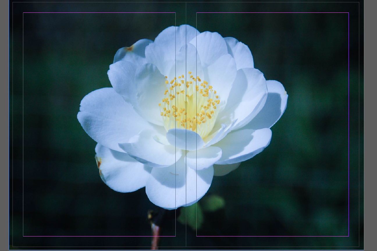
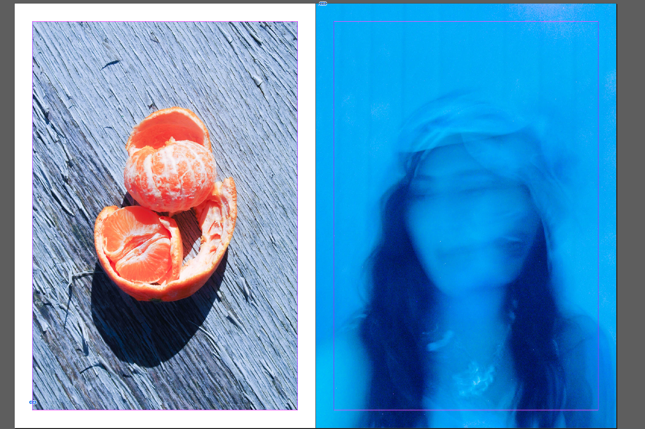
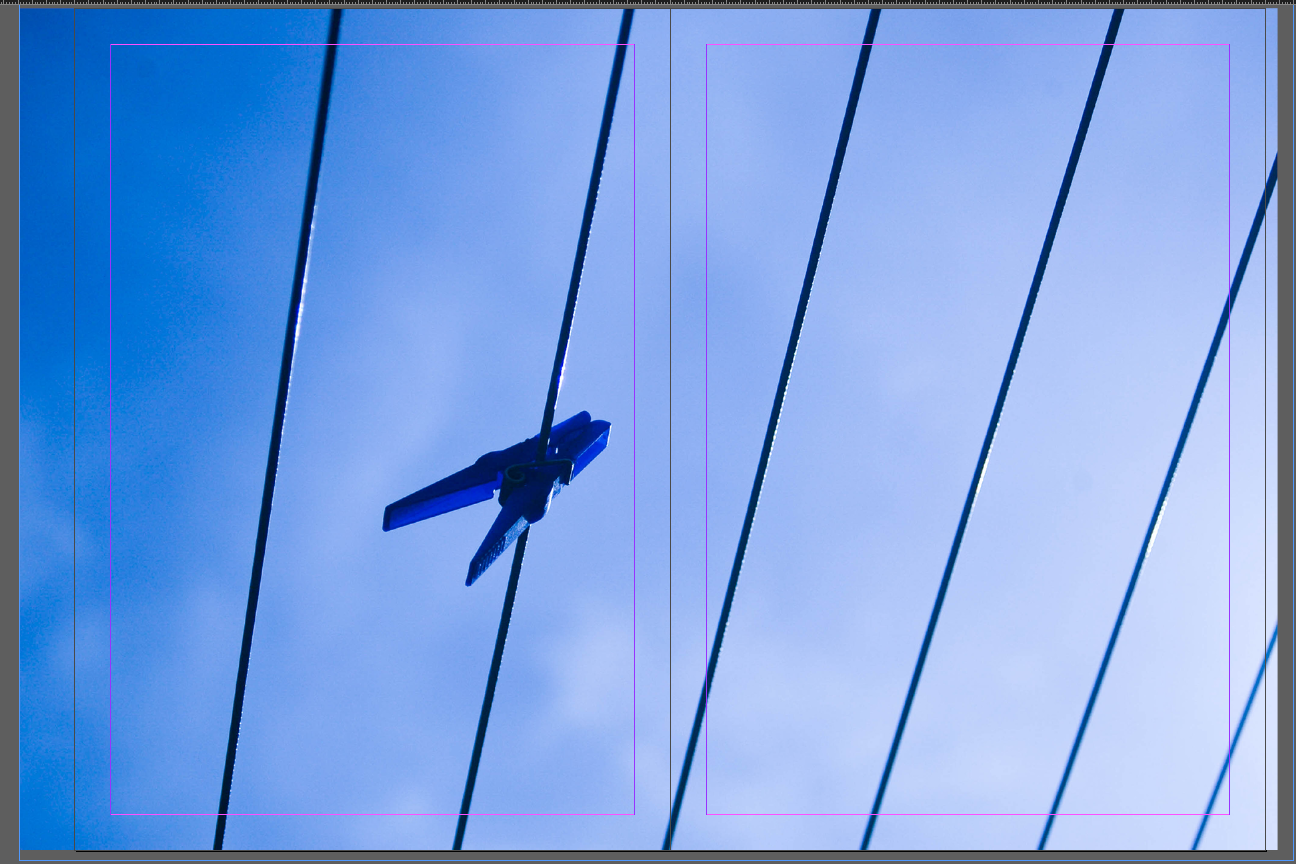
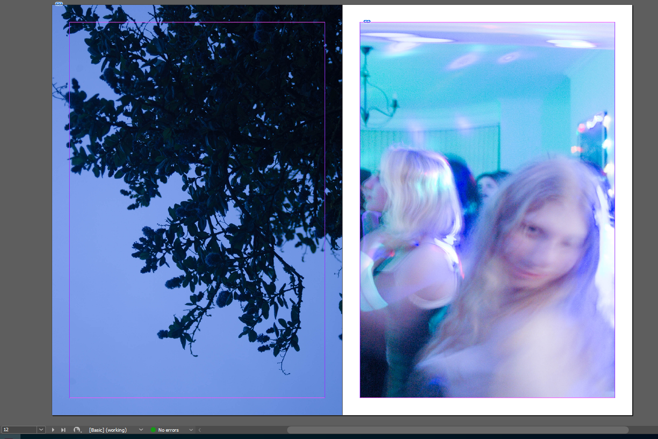
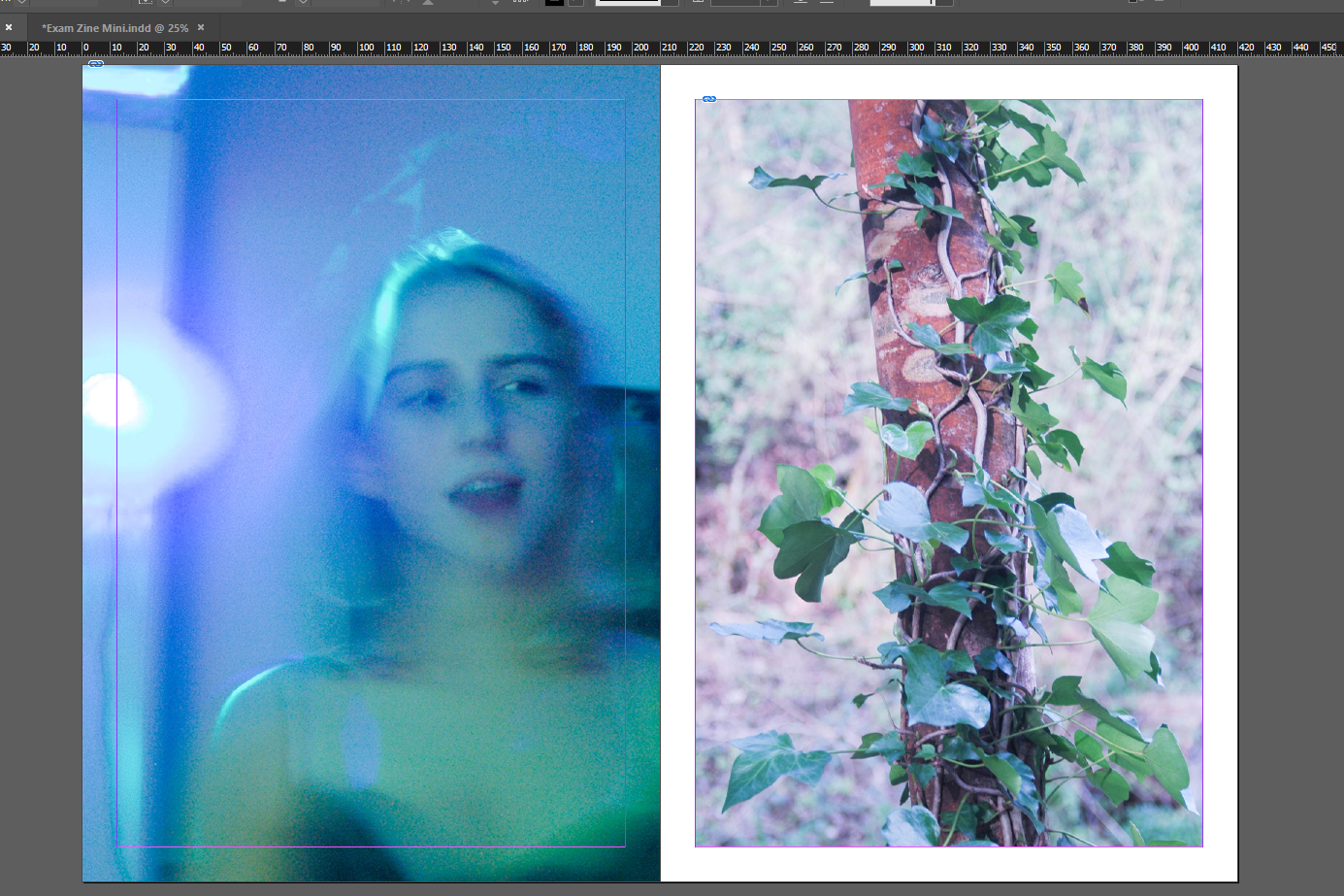
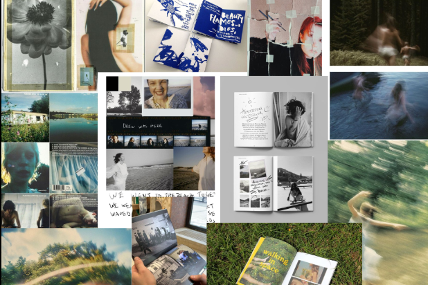
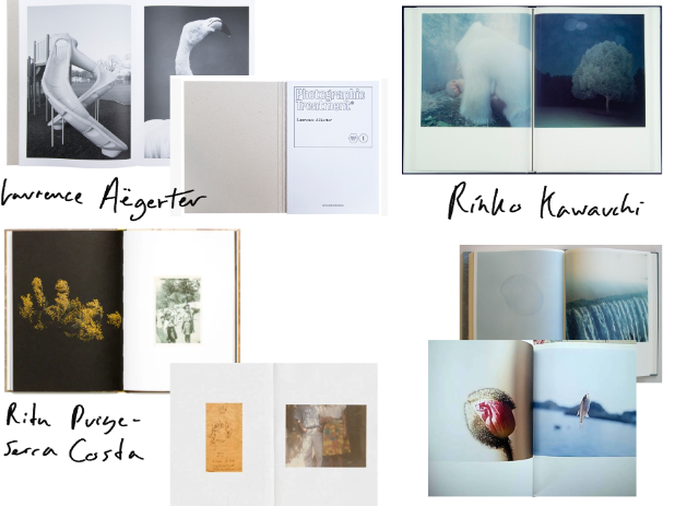
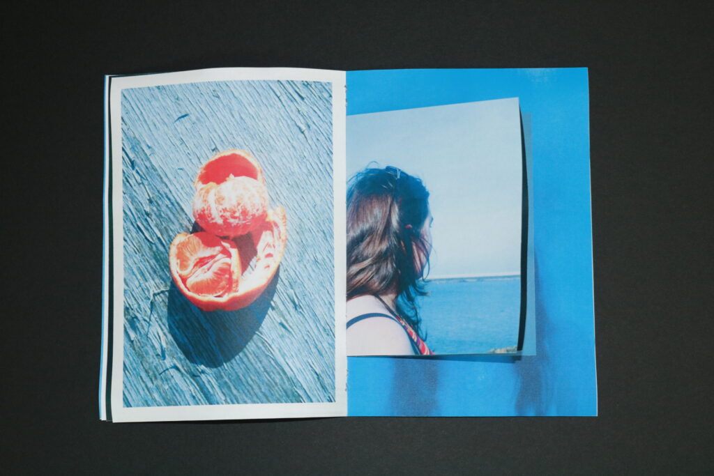
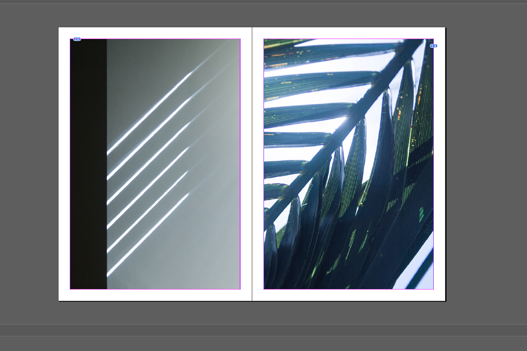
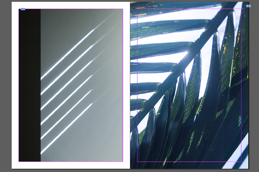
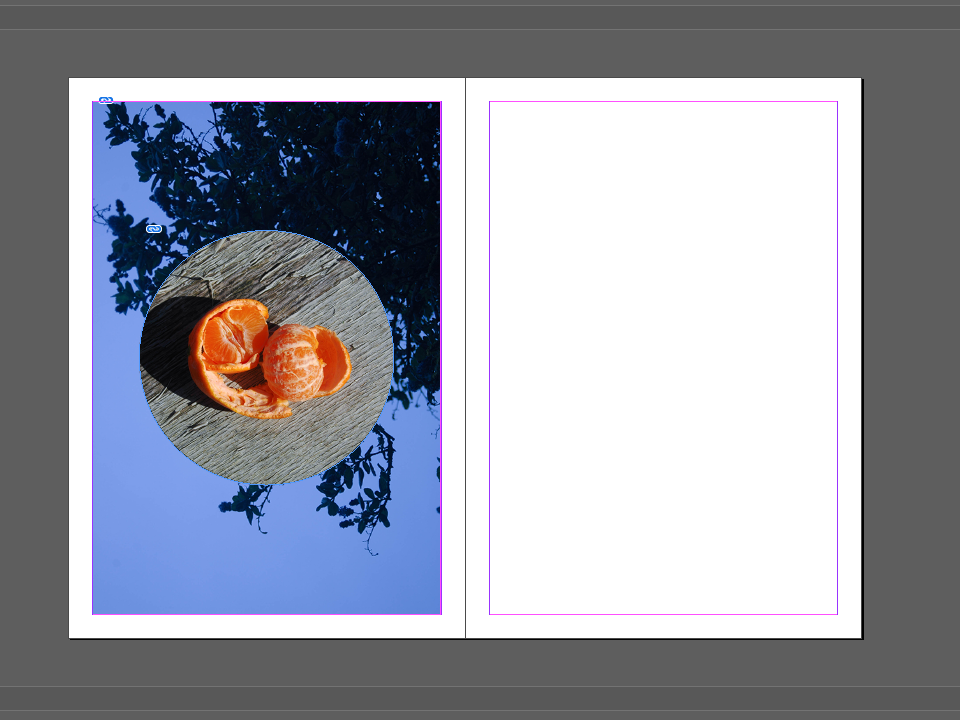
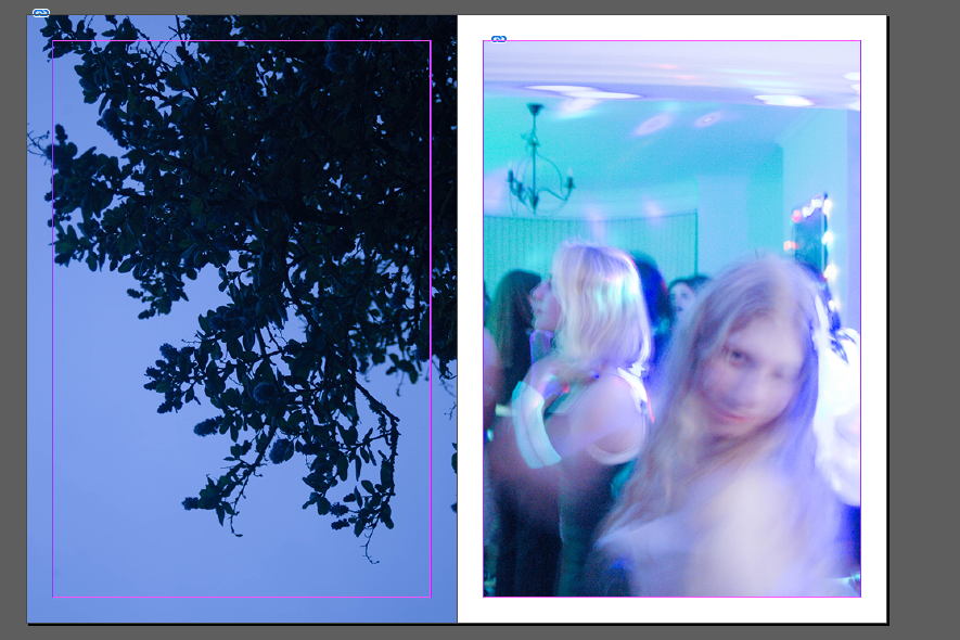
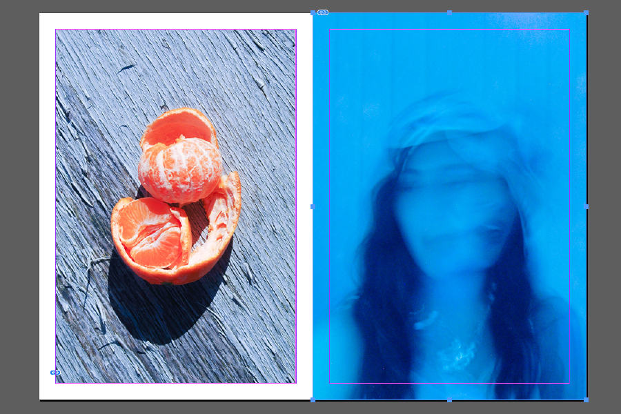
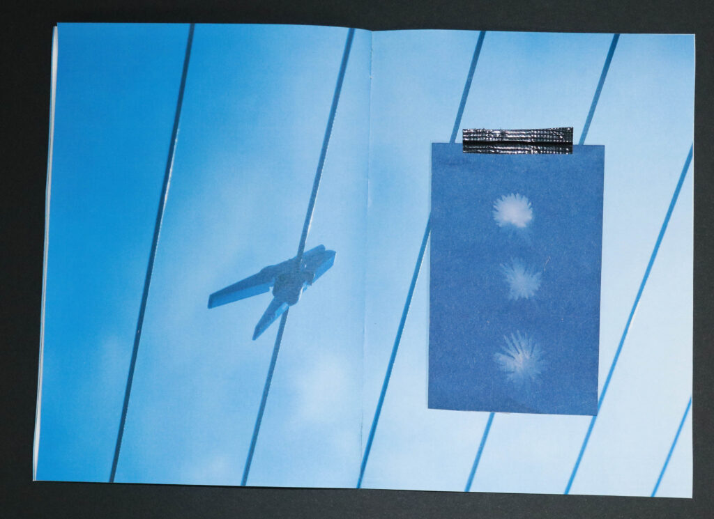
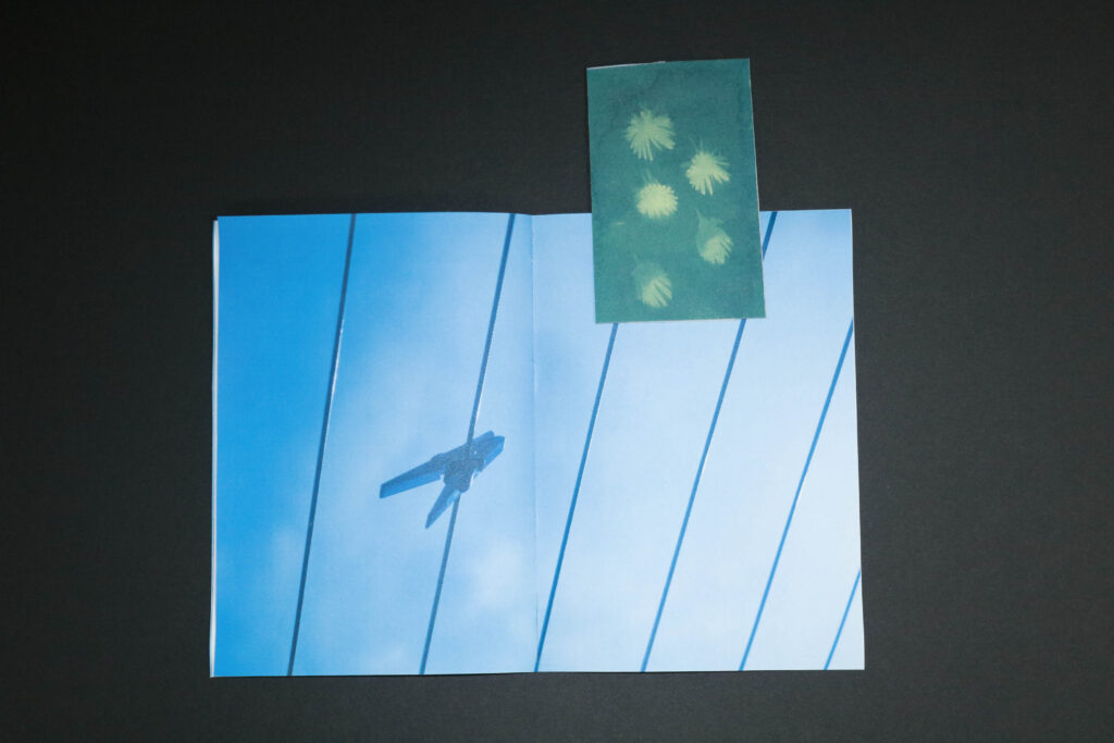
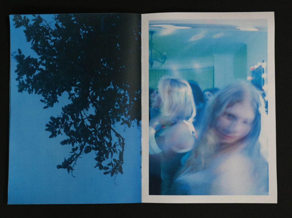
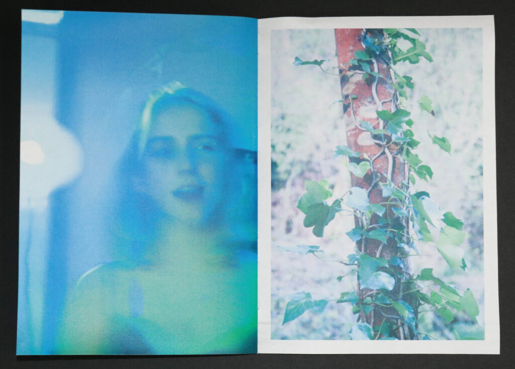
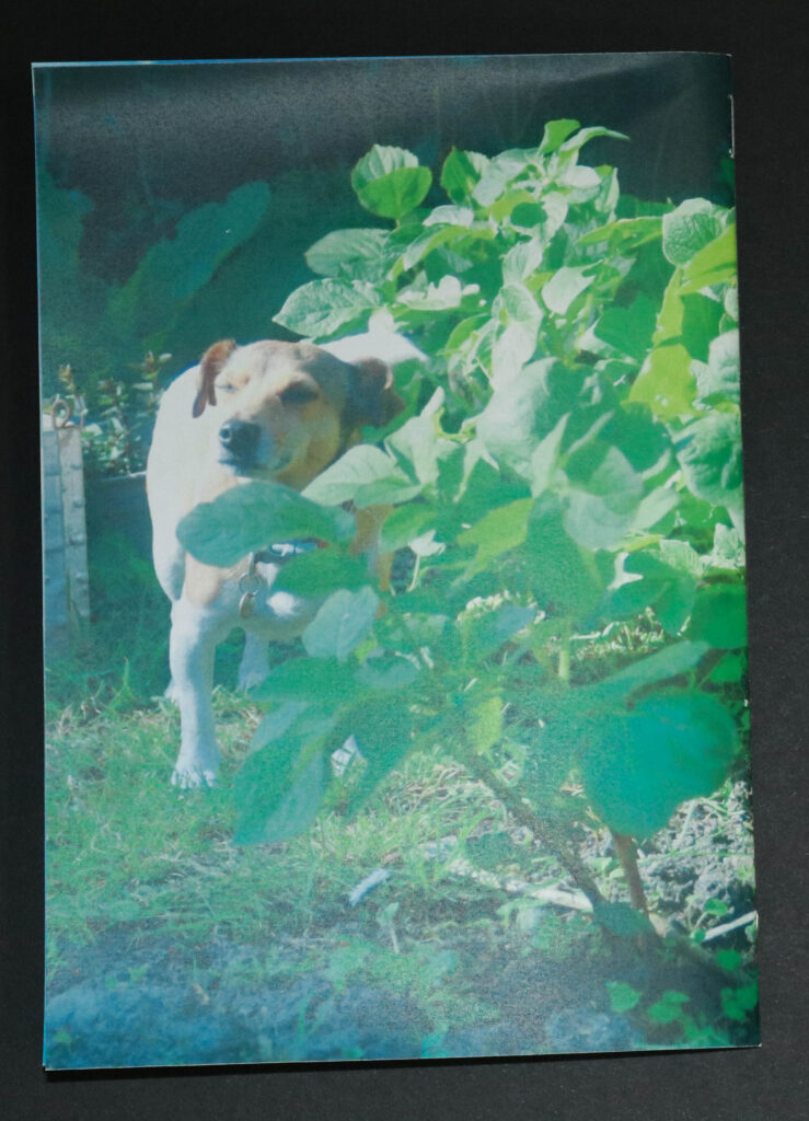
I am overall very happy with the Zine I produced from this project. I think it represents my them of beauty in the mundane well. I think I was successful with my sequencing of work – taking a lot of inspiration from Rinko Kawauchi’s approach to juxtaposition.

for the front cover I wanted to focus on light and abstraction so I found several images I had with a solar flare.
I am particularly proud of the diptych as they both mirror each other in horizontal leading lines and i think werfe a strong start for this book.
I think the ‘ zine within a zine’ worked well and added texture to an otherwise very linear booklet. If I were to do it again I think I would try to make more abstract images and include more photomanipulation.
In future I think it would be interesting to do more work with cyanography as the small insert was effective in conveying my theme of light and beauty.
Examples of my attempts to juxtapose more unnatural images next to natural ones.

.

I am overall very happy with the Zine I produced from this project.

Making Cyanotypes

I attempted to create cyanotypes for this project to add into my zine as page inserts.

Final Images + Presentation

Displaying Images

A3 Mounted on foam board
Diptych Mounted on foam and then display board

Paris Film Tryptic

Zine Final

.

Zine Final

.

Zine One – Final Layout

Zine – Planning

I want to create an A5 zine in a booklet format with a smaller A6 zine inside. I want the zine to explore our receptions of beauty and flow visually throughout the book. I plan to use more unnatural images from the party photoshoot beside my Rinko Kawauchi inspired photographs of nature. I plan on calling this zine ‘Irridiant’ – meaning to emit light as a lot of my photos focused on light. Alongside to smaller zine insert I will also add my cyanotype experiments to help break up the pages and serve as visual and formatting differentiation keeping the zine interesting.

Mimosa’s in Bloom by Rita Costa was an inspiration for this zine as I enjoy her use of negative space to frame her images – the themes behind her images also interest my and I think fit well with my over all project.

Photographic Treatment is a series of 5 photobooks by Laurence Aegerter I like her approach to juxtaposing her images and creating pages spreads that both flow visually and tell a story.

Zine Two – Mini

I made a smaller second zine to fit inside my larger main one This Zine is printed at A6 as opposed to A5 so I can slot it in-between pages, I also plan on adding my Paris film prints and cyanotypes into the pages.

I considered horizontal formatting but decided that it would fit less well in the overall zine.
Smaller zine in centre pages.

Video Collage – Final

Here is my final short animation film

Video Collage – Making

Using Premiere Pro to sequence images.

I had to reduce the time of each frames for more complicated sections like this being about 3 frames per second to look slightly smoother when compared to the other sections being about 2fps .
Changing the sequence of the video I much preferred the longer clips in the middle.

Here is my completed short animation film

Zine One – Layout + Experimentation

I plan on making a single section zine – adding smaller inserts into the pages via stitching + Collage. I plan to bind the back of this book myself so I have the freedom to add pages and new images.

Creating Juxtapositions

When thinking about the layout of my zine I want to take inspiration from Kawauchi’s Photobooks specifically her juxtapositions and parallels between pages. She often pairs images by shapes as I have attempted to do here by paring two photographs that have multiple diagonal leading lines.

Framing – I decided to have one image bleed over the edge instead of both having equal framing as I think it makes it more visually interesting and better splits the photos apart.
Experimenting with square format

I decided that the square format images would be too small on an already small Zine – I feel it leave too much empty space.

Looking at layouts for writing on first few pages.

Experimenting with different images formatting.

Whilst I like this Experiment I feel it looks unrealistic and almost ‘pop art’ I think it moves too far from the idea of natural and mundane beauty.

Experimenting with matching and contrasting photos by colour;
Experimenting with colour Grading – I was attempting to create a grey background. – Decided that this looked a litle too unrealistic and i much preferred a more natural colour scheme.