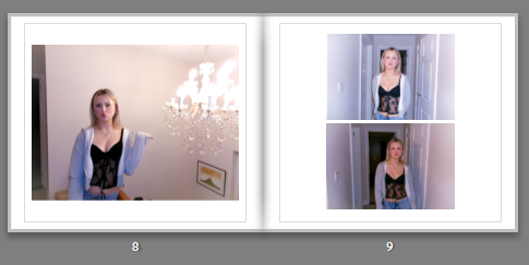
As clearly shown in the screenshot, this is a double page from my photobook. Here you can see a clear layout of images, from the same photoshoot. Even though the images are very similar, they seem to compliment each other well, through the editing style. This slide is showing a narrative of the blonde girl, which highlights the stereotypical femininity radiating through the page, from the editing and clothing style. In my photobook there are a few slides which highlight certain girls in the book, where there are multiple photos that compliment each other.
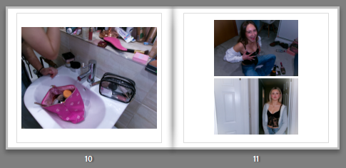
This double page in the photobook is supposed to reflect an idea of getting ready, and girls applying make-up and reinforcing stereotypes. However in later editing of the photobook I changed the bottom, right image to a girl straightening her hair, in order to make the narrative flow slightly better. The left image of the makeup bag is used as a filler image, however still supporting the idea of observing femininity, through makeup and the pink colours which often have connotations of femininity.
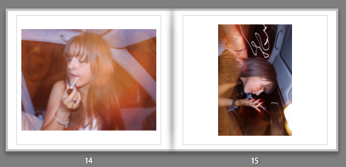
When placing this images together, it clearly had a different aesthetic to my other images, I wasn’t able to take many images in the dark so therefore the two pages that contain night photography and equally spaced apart in the correct order. Later I was able to find another image that worked and added a second image to the right side, in order to keep the layout of the book the same. When creating the book, I knew I wanted to keep these images together, as the composition works with the aesthetic and the abstract lighting.
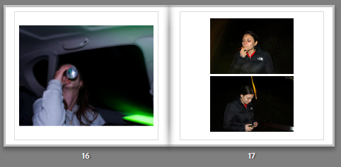
This page, I struggled to find an image that would work with the other images, what I needed was another picture of the girl smoking or a group photo which I was later able to add an image of two of the girl lying on the road. This therefore allowed the narrative to flow better, showing girls ‘seeking‘ nature and girlhood.
CHANGES MADE:
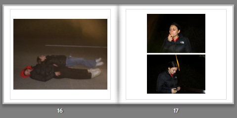
This screenshot shows the change in photo, from the previous screenshot. The image works better then the previous one as it is in a outside location, however it would look better if the image came out darker, so it would look more similar to the other images. As well as the image being on the right side of the page, which is were filler images are usually used it gives a nice contrast to the dark surrounding in the other images.
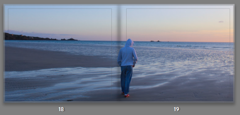

For the middle of the book I put in a bleed image, this is so there was a defined place in the book to show the middle. I chose an image from the beach photoshoot as it looked more calm and serene contrasted next to the other images. In order to make the bleed image work within the photobook, I also added images from the photoshoot in the previous pages and the page after. This is so the photobook contained more than one images from the shoot and for it to have a narrative within the storybook, while also trying to portray the exam theme ‘Observe, Seek, and Challenge.’