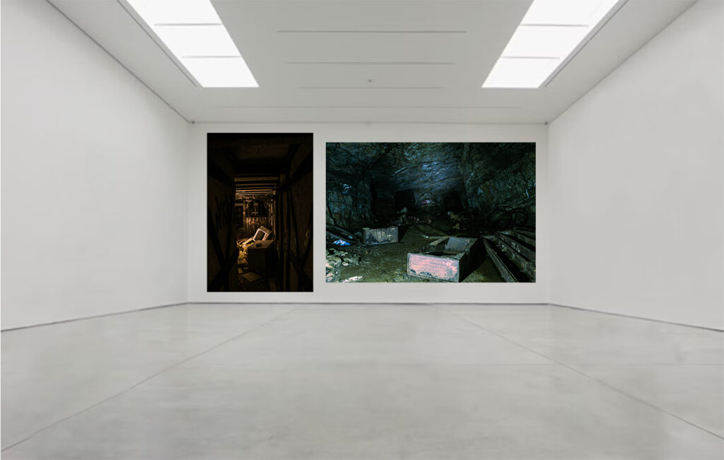
These are personally my most eye catching images, which show strong texture and colour grading. I contrasted these two images on here because one has a perspective of observing through a hallway, like a frame, and the other has a wider point of view which observes fully though the lens. Both of them include a type of style to the image, and are using similar subjects of broken decaying equipment, both include high contrast between the lights and the darks.

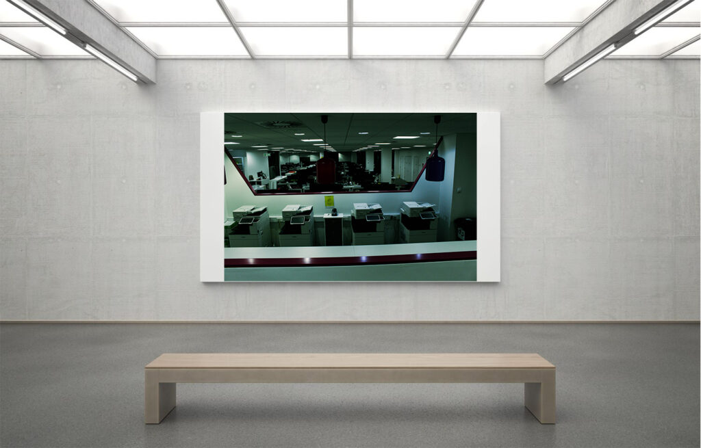
I like this one because of its intense contrast between light and dark colours, but also how the depth of view is strong and uses repetitive features, like the printers, desks, and lights. The depth of view gives a very disorienting feel to the image, but because of its dark features at the end of the office, it can create an unsettling feeling for people.

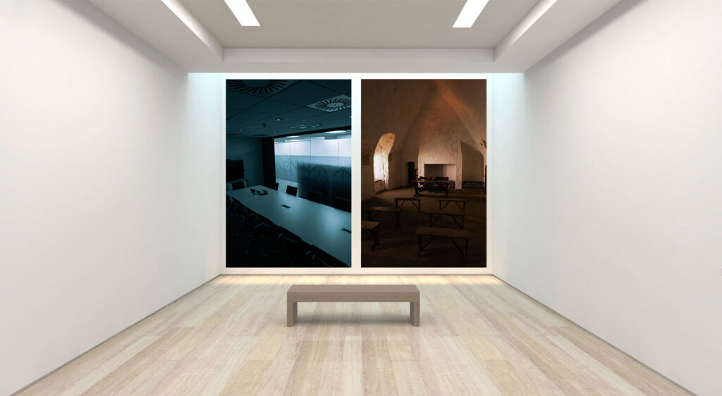
These Images contrast each other very well with their feeling they present. Both I believe are capturing the environment perfectly, where the cold image shows an empty conference room, and the warm image shows an empty church like, dome environment. They both contrast in the type of lighting they use, the cold one with artificial, and the warm one with natural lighting.

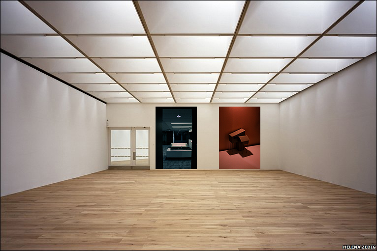
These images work well because of its use of lighting, and high contrast. I think that in the colder image it shows more of a professional area, and uses high contrast and depth through a “window” like view. And the other is very docile, has lots of shadows, in an empty area, as if it is, and isn’t supposed to be there at the same time.
