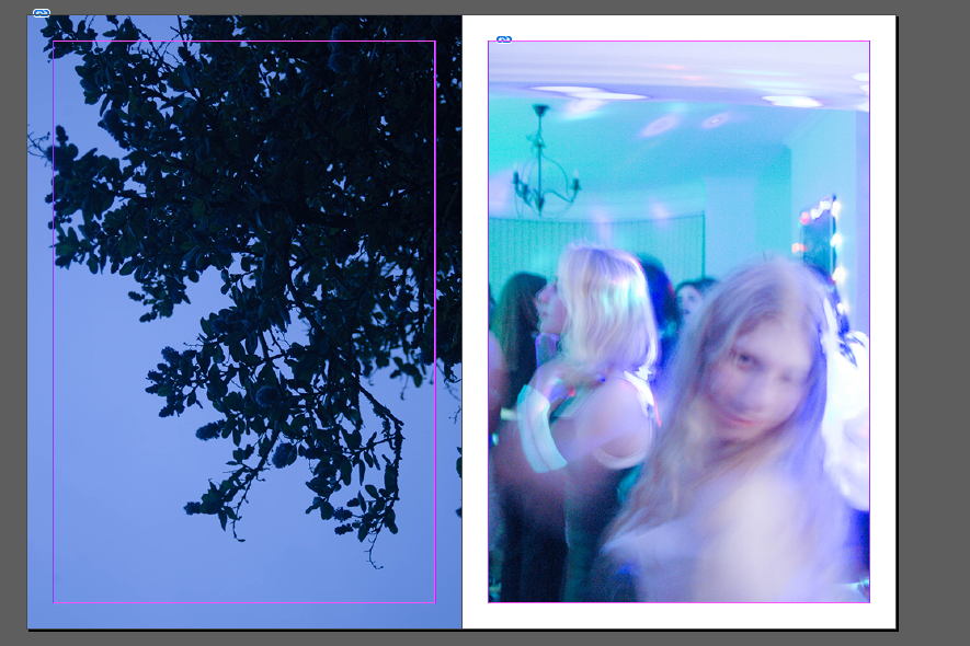
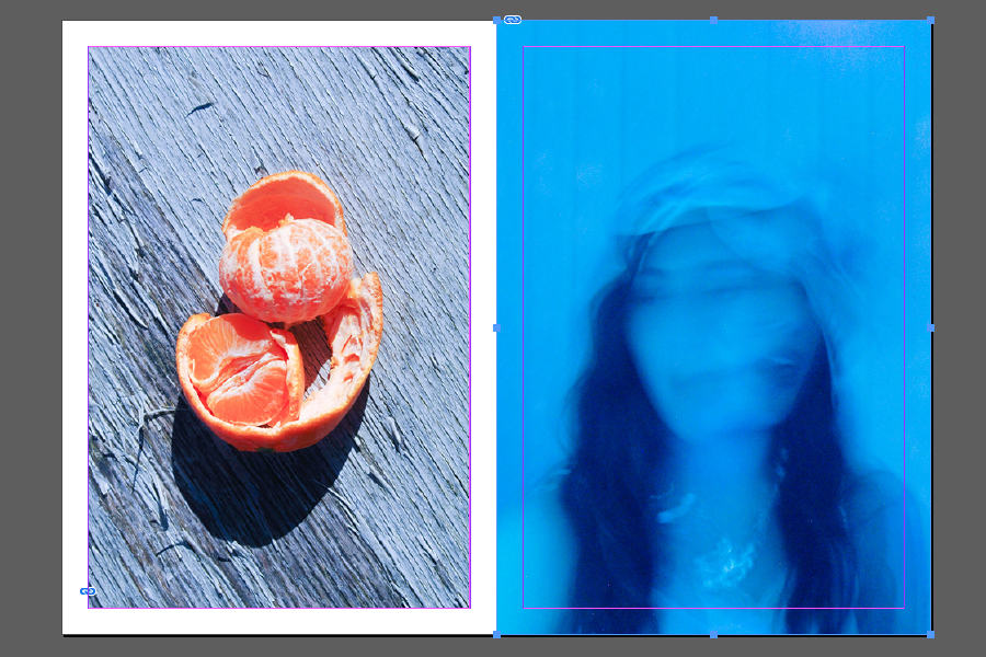
I plan on making a single section zine – adding smaller inserts into the pages via stitching + Collage. I plan to bind the back of this book myself so I have the freedom to add pages and new images.
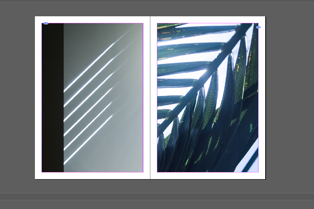
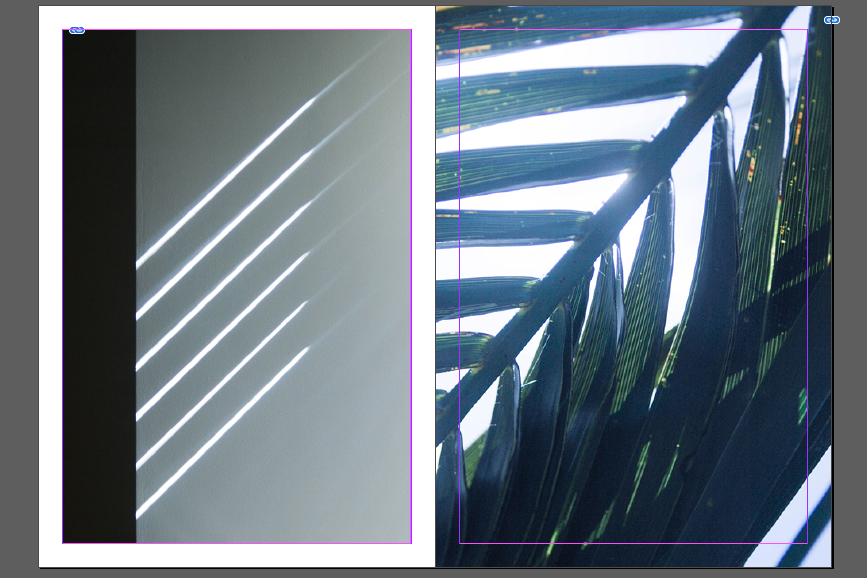
When thinking about the layout of my zine I want to take inspiration from Kawauchi’s Photobooks specifically her juxtapositions and parallels between pages. She often pairs images by shapes as I have attempted to do here by paring two photographs that have multiple diagonal leading lines.
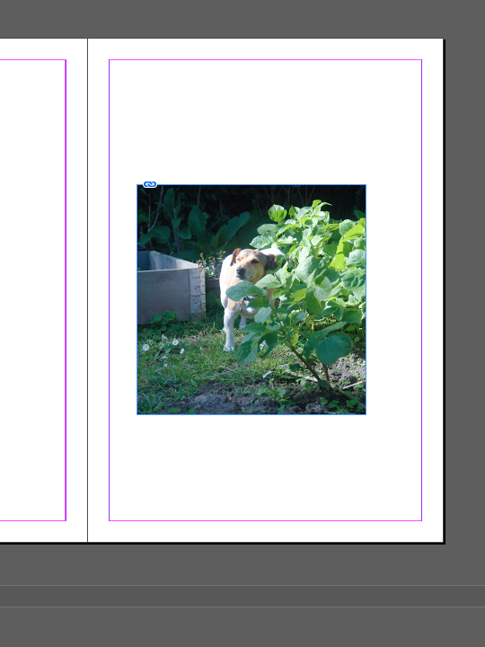
I decided that the square format images would be too small on an already small Zine – I feel it leave too much empty space.
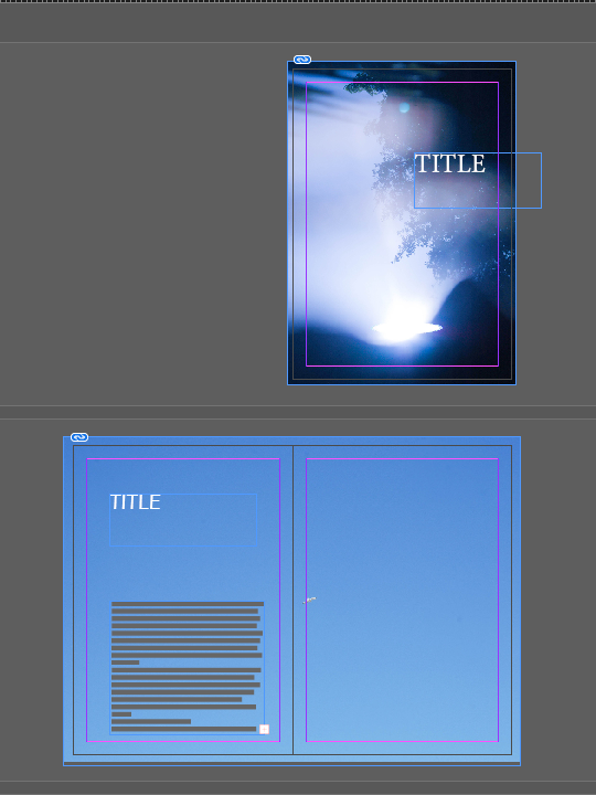
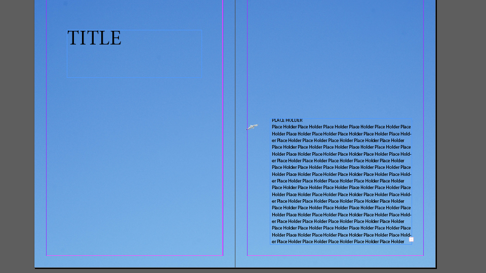
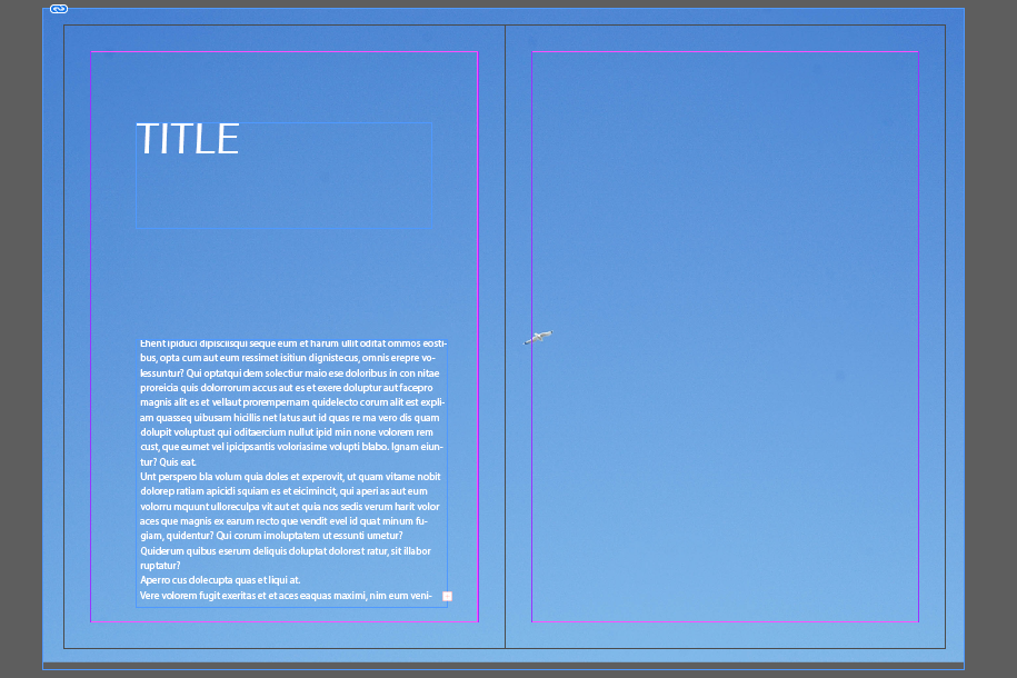
Looking at layouts for writing on first few pages.
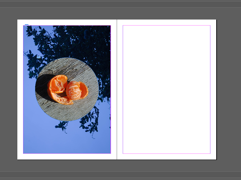
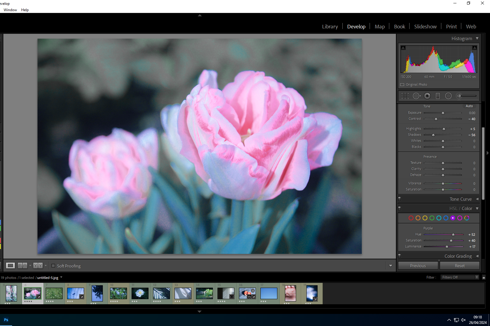
Whilst I like this Experiment I feel it looks unrealistic and almost ‘pop art’ I think it moves too far from the idea of natural and mundane beauty.
