final layout:
evaluation:
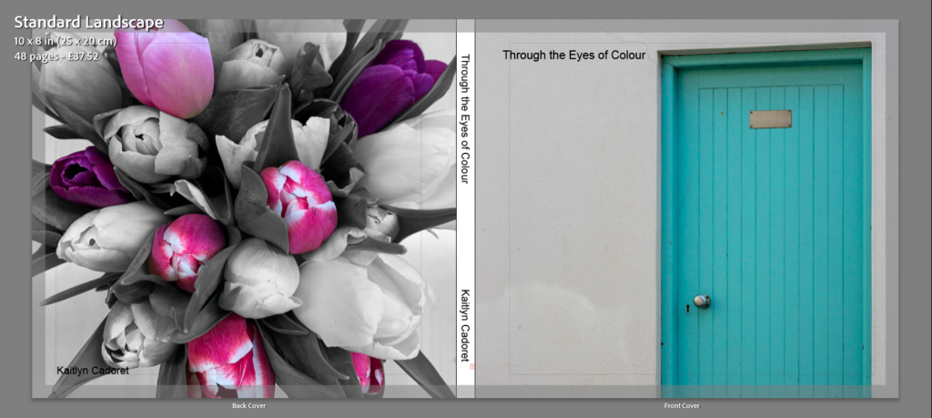
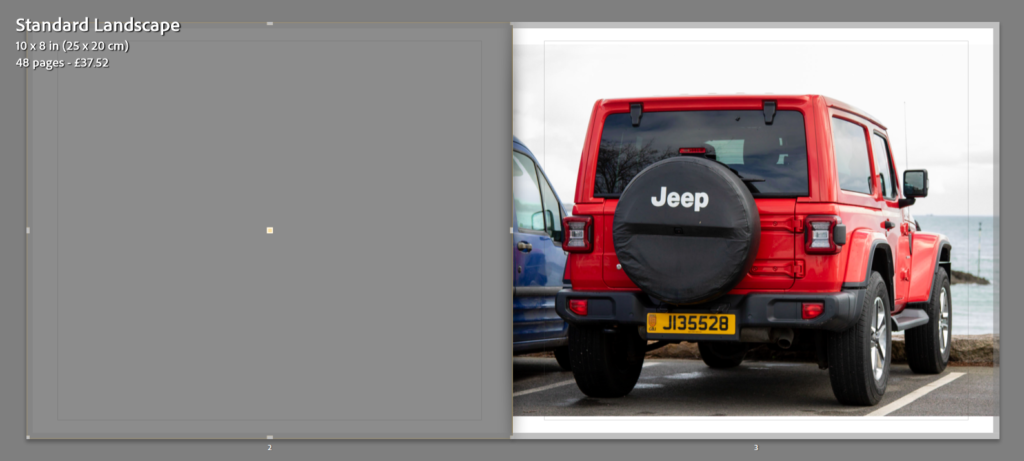
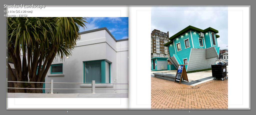
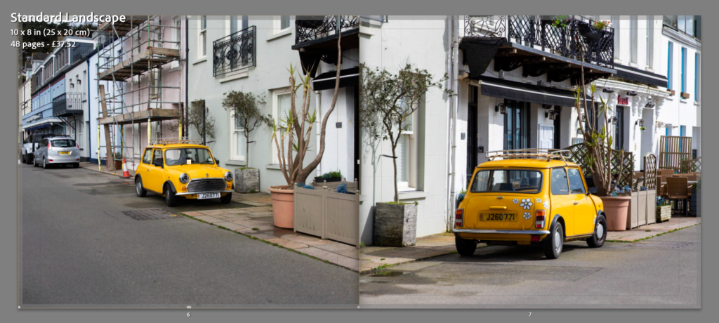
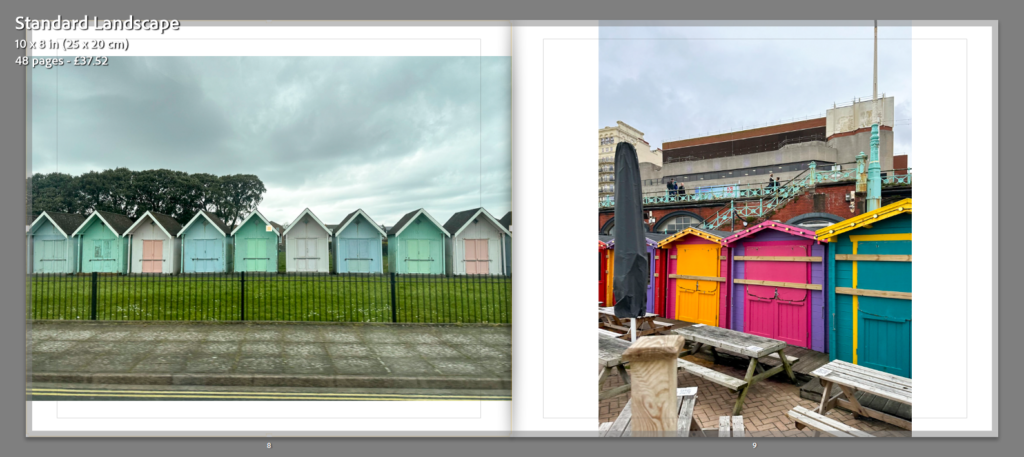
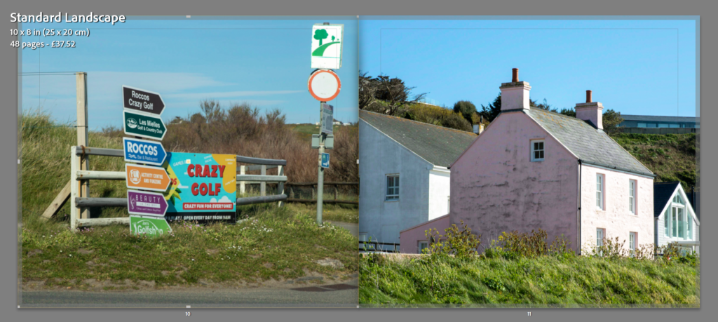
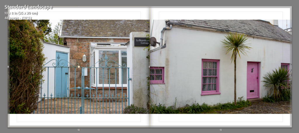
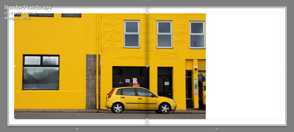
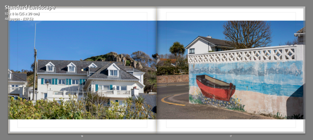
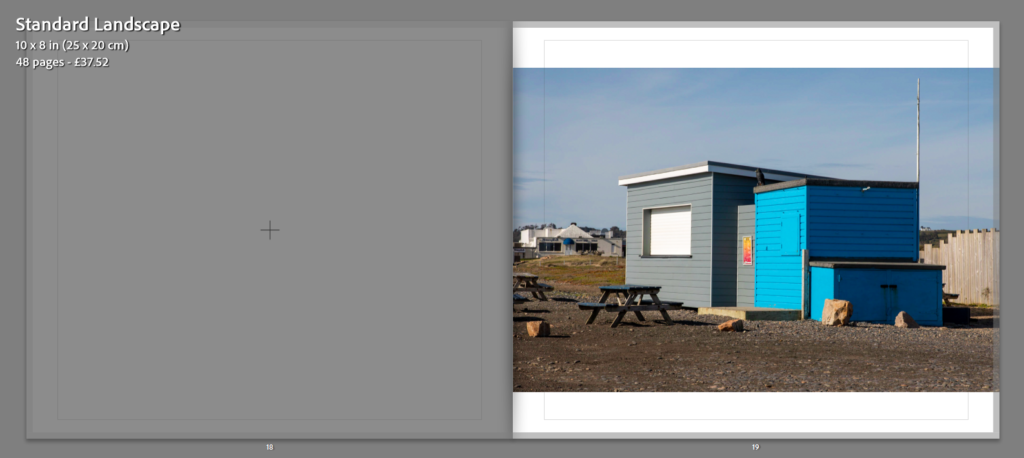
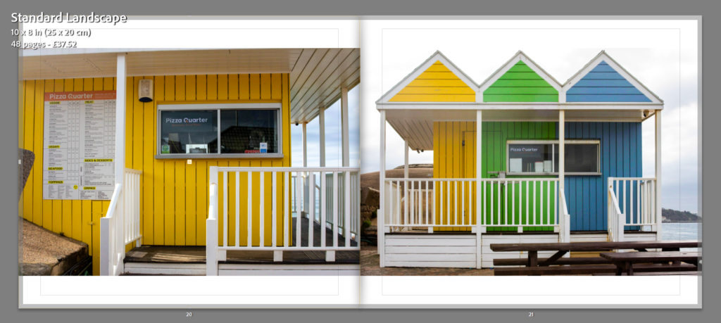
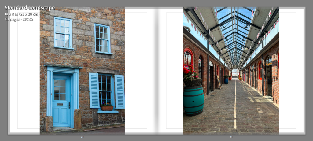
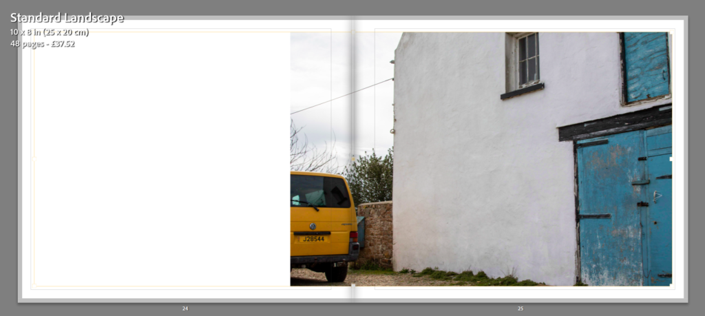
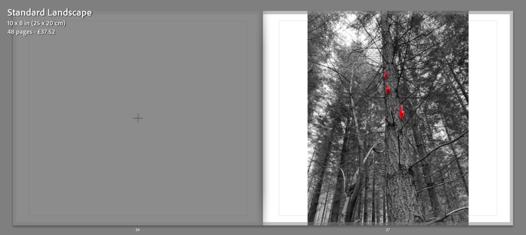
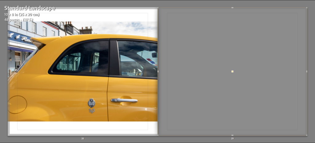
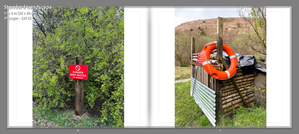
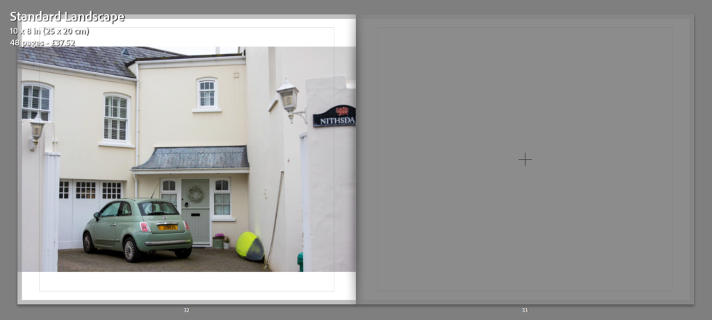
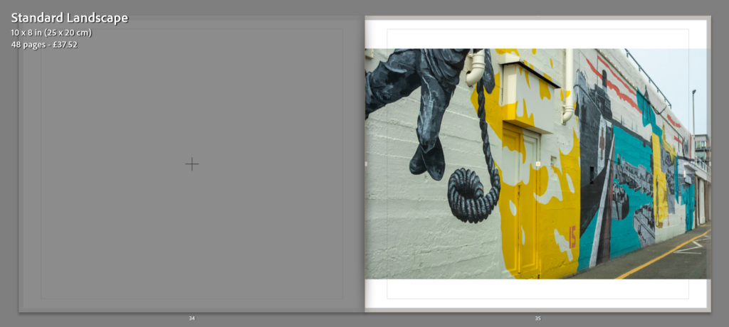
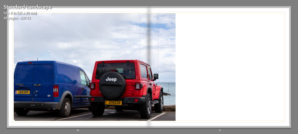
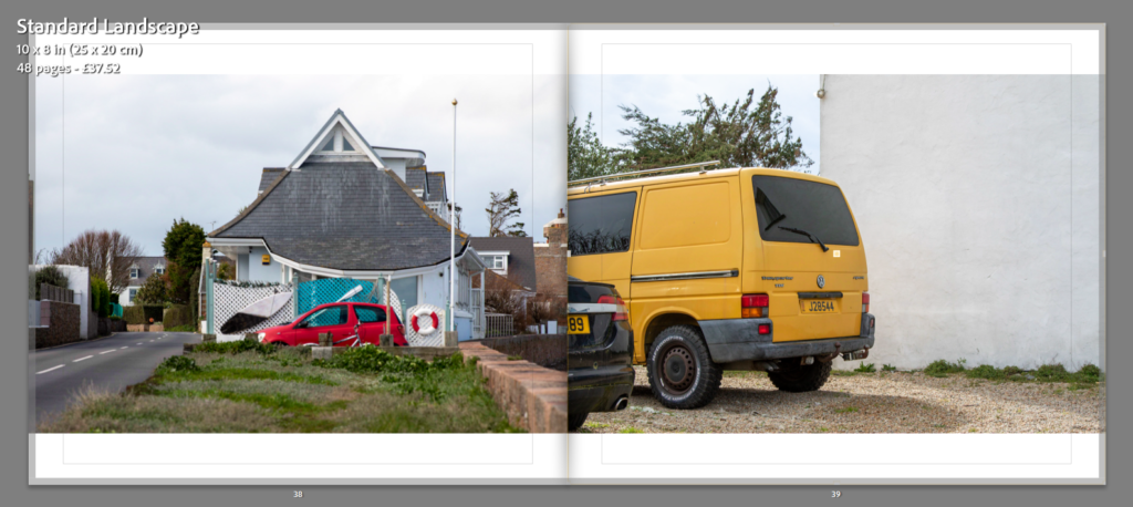
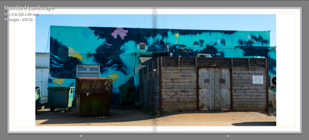
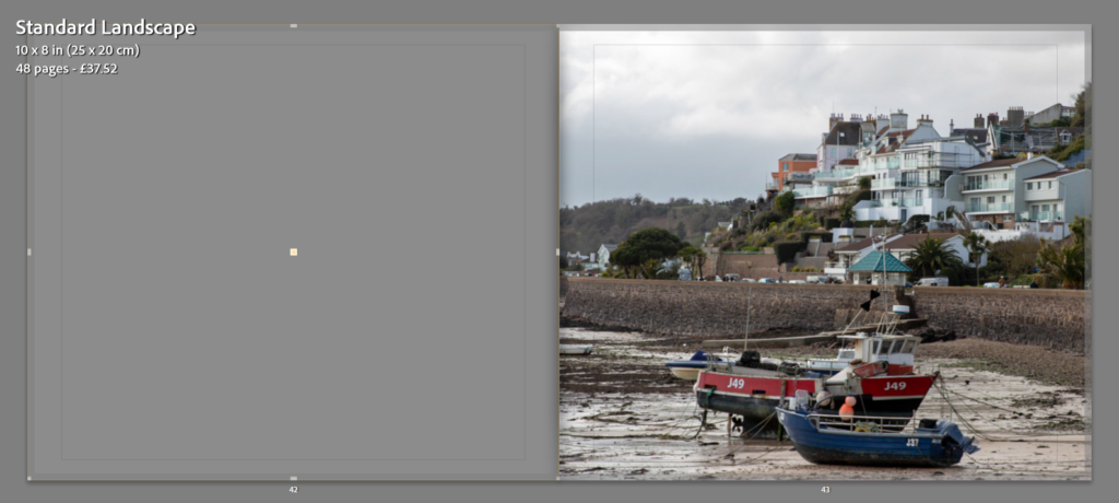
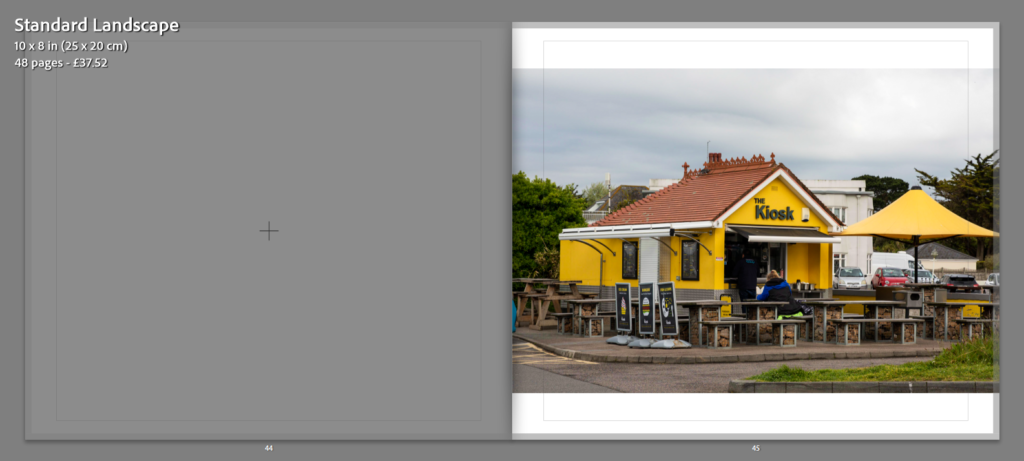
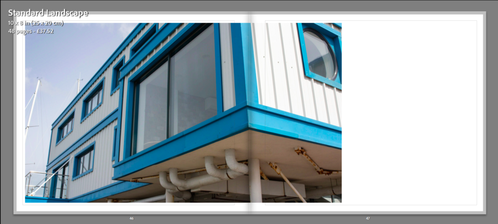
Once I had picked out my final images that I thought were my best and I wished to use in my final photobook I moved them all into one collection and began making my book. I wanted to make sure that the way I placed my images together would work and that there wasn’t too much of one colour at a time. When it came to the front and back cover I wanted to make sure that I used to bright and contrasting images to draw people in. I think the images I chose work well as one is a warmer tone and the other is cooler. I also think as they are so bright and colour are almost opposite they work well. I think they the way I have laid them out works well and that the colours aren’t too much but they contrast nicely together. Once I was happy with how they were laid out, I began to think of a suitable title that would describe my book nicely. I chose to call it ‘Through the Eyes of Colour’. I think that this name fits with my book and immediately tells the viewer what my book is all about which is one of the main things I wanted to achieve. As a whole am am very happy with my project and I think that my final book is a very clear way of showing viewers what I focused my project on.