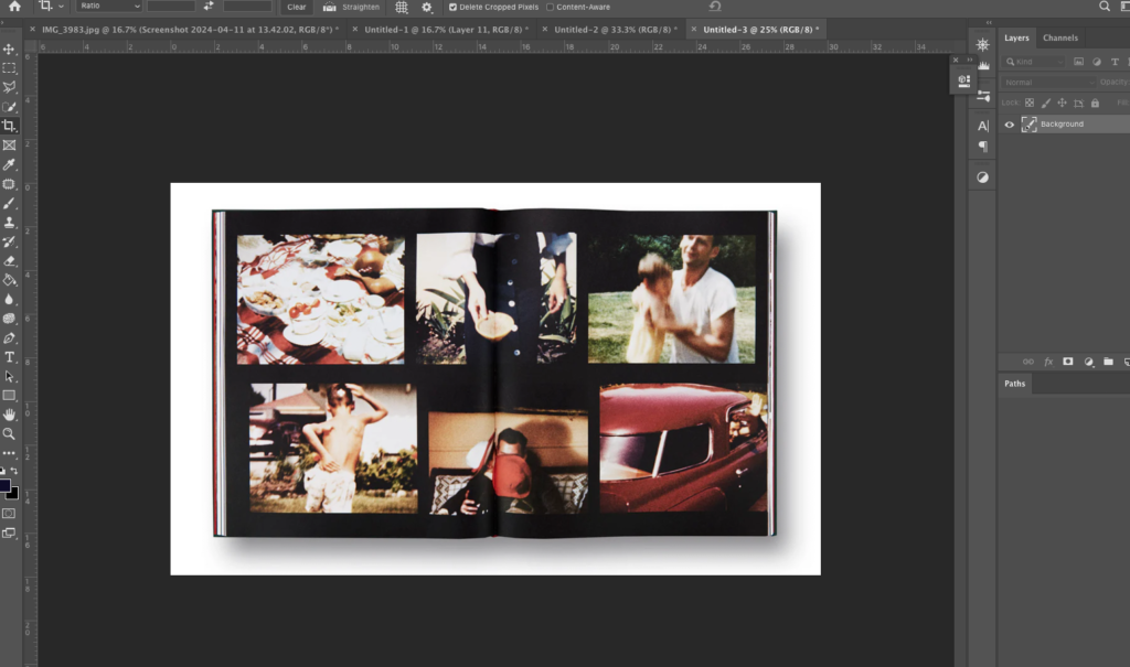
I began by placing a download of this page of his book in Photoshop. I am going to place my images over his as a practise run to see if I like the design with my archives.
I wanted to use coloured images, similar to Sultan. His images have some subtle vibrancy so I chose to include coloured images with similar colour tones.
To create this I took the size of the images Sultan had used, and cropped mine to that size. I then organised the images into place and added a slight shadow down the middle to make it look like the book still.
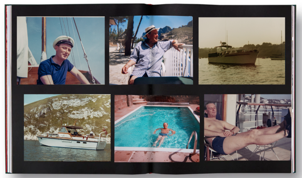
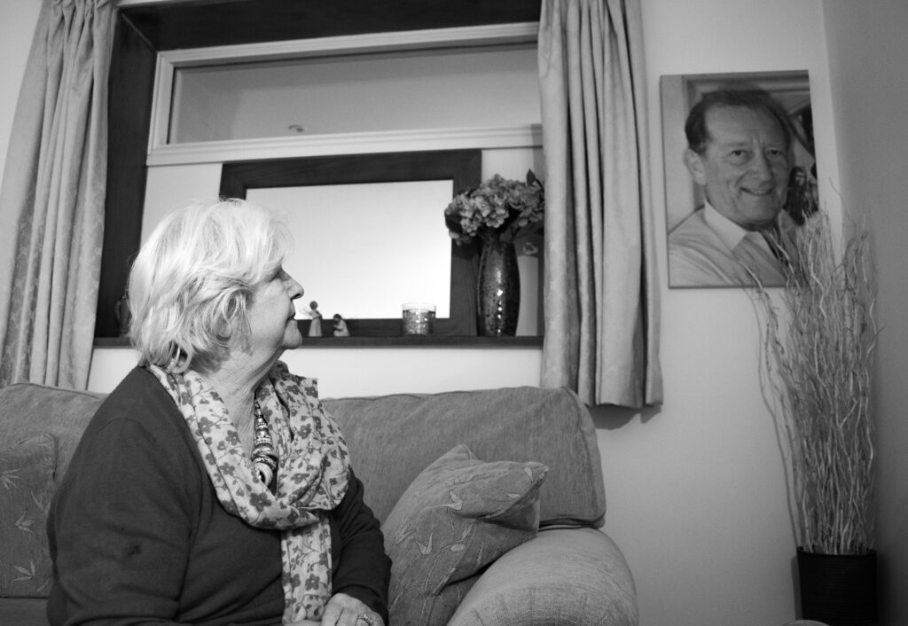
I want to vary the images, and include some of my gran too because I feel like it may be too centred around my grandfather.
I like this although I prefer the collage of my grandad, I am going to incorporate my gran in a different layout of Sultan’s.
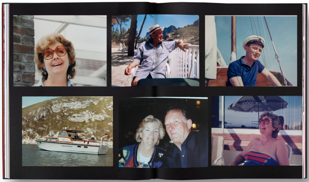
I like this collage because it shows the change in time quite ambiguously. There is a young image of the grandfather, then my gran slightly older, then I contrast the portraits with a landscape. It is a picture of the gardens where my grandfather passed, show it unobviously presents the loss of him and change that time causes.
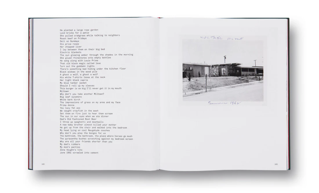
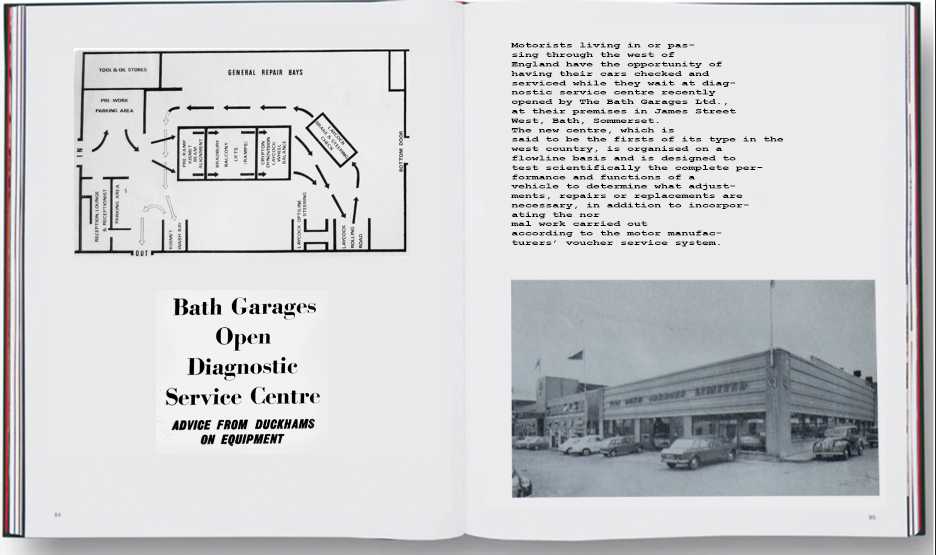
I also like the way he lays out his writing, and I have created some rough ideas on how I am going to incorporate this into my photo book to add context to my grandfather’s life. He owned a car garage and a boat business and kep scraps from the newspapers. I have edited some of these in photoshop in a similar way to Sultan.
Some of the backgrounds were yellowed newspaper, so in Photoshop I lowered the saturation, increased the brightness and contrast and then pasteurized it. I then readjusted the contrast and managed to make the writing stand out on a white background. They didn’t fully fit the shadowed page I am experimenting on but it is a rough idea.
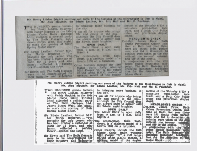
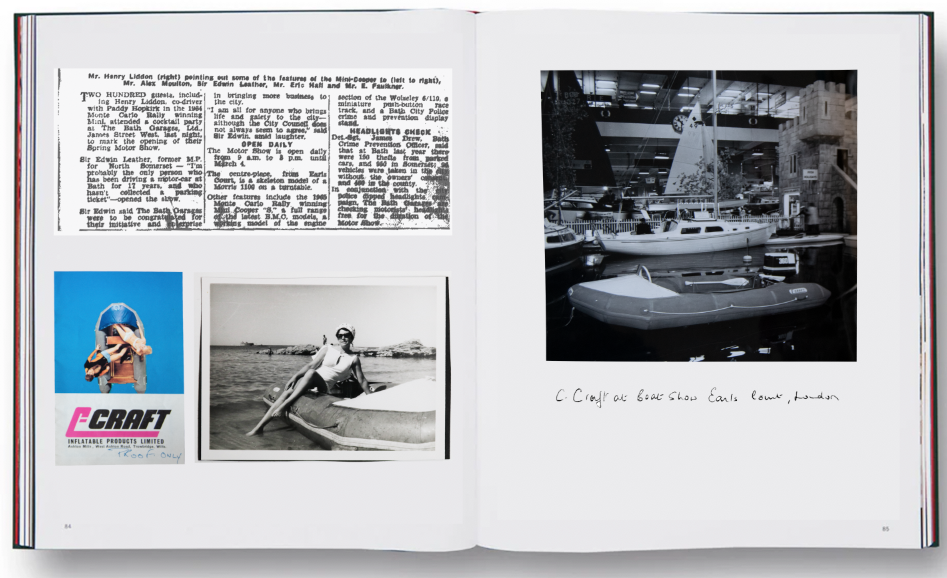
I focused one of these on his boat company and the other on his car garage company. I chose to include archives of my gran and an old car. I think they compliment the composition and are subtle, similar to the ambiguous link between Sultan’s images and his archived.
I created another idea, completely focused on archival material from his scrapbooks. I used a similar font to Sultan because I find it quite retro looking, linking into the overall look of the archives.
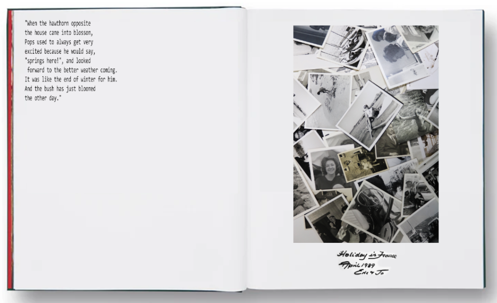
For this layout I included dialogue that I took from a recording of my Grand talking about my grandad’s interest in the hawthorn bush. I don’t like this layout because I think the composition isn’t right, and the images on the right don’t connect to the dialogue.
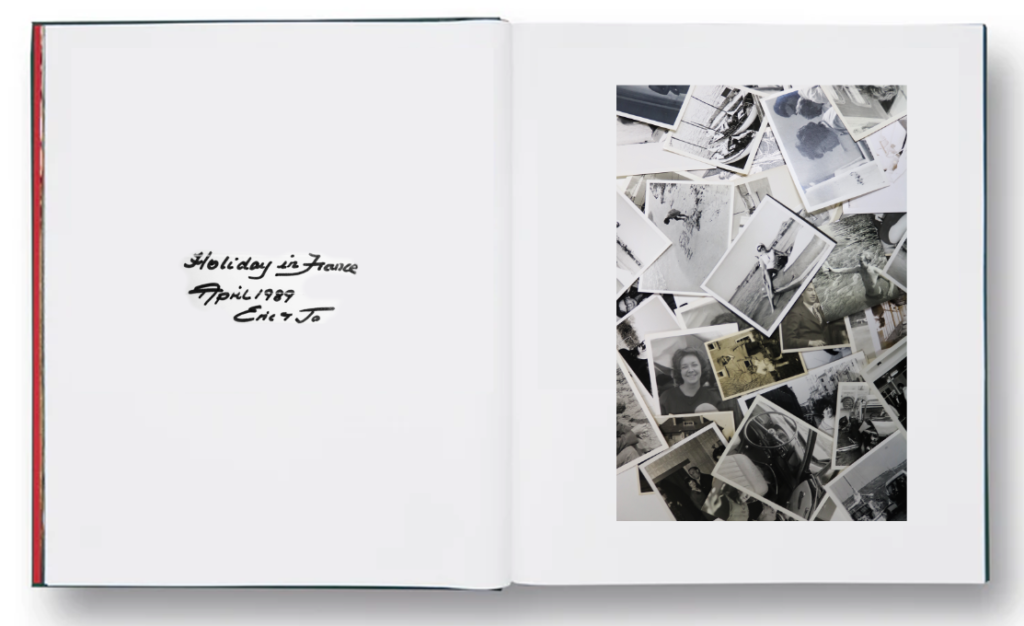
I quite like this layout, and it has given me ideas about naming the book ‘Holiday in France April 1989 Eric and Jo’. If I don’t I think I will use the same front or writing style for it. I quite like this as an opening page.
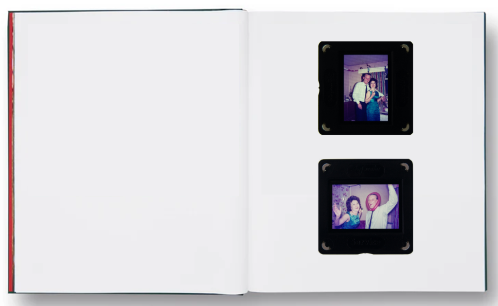
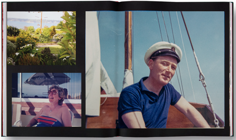
I quite like this basic composition as a page because the images are so colourful they make the page spread simple but interesting. I think if I did a page like this I would only do 1 or 2. I would put my new images after it such as this one because it presents a juxtaposition in the situation.
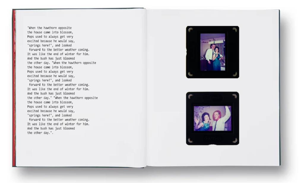
I put some example text next to it and like the look of it. I will need to record more dialogue of my gran to do this.