Contact Sheet
I flagged the images I wanted to edit
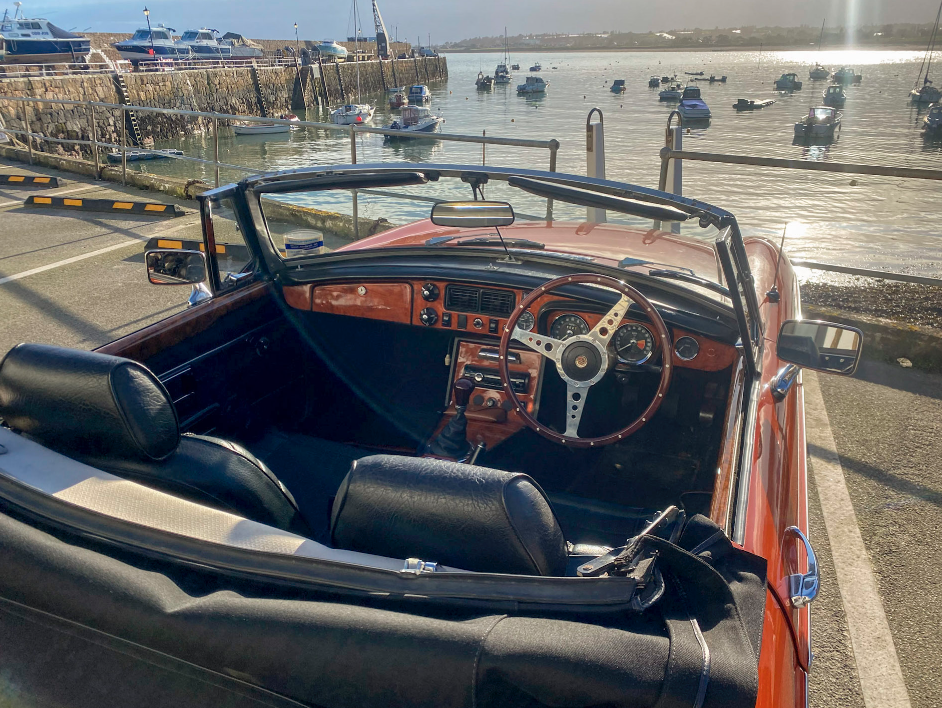
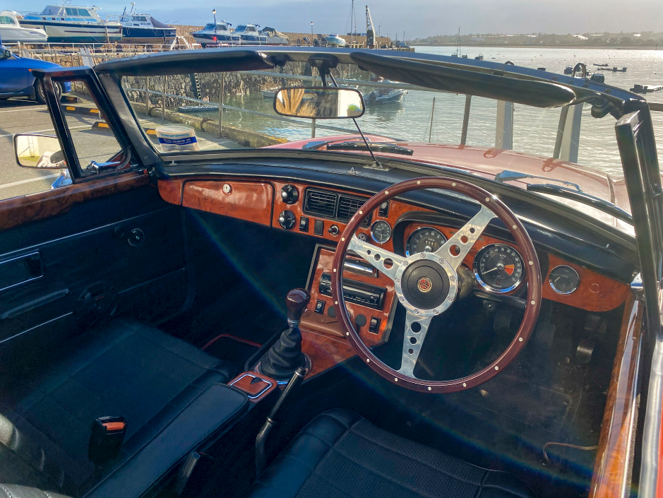
I wanted to edit them with a retro look, so I increased the temperature a bit.
Basic Edits
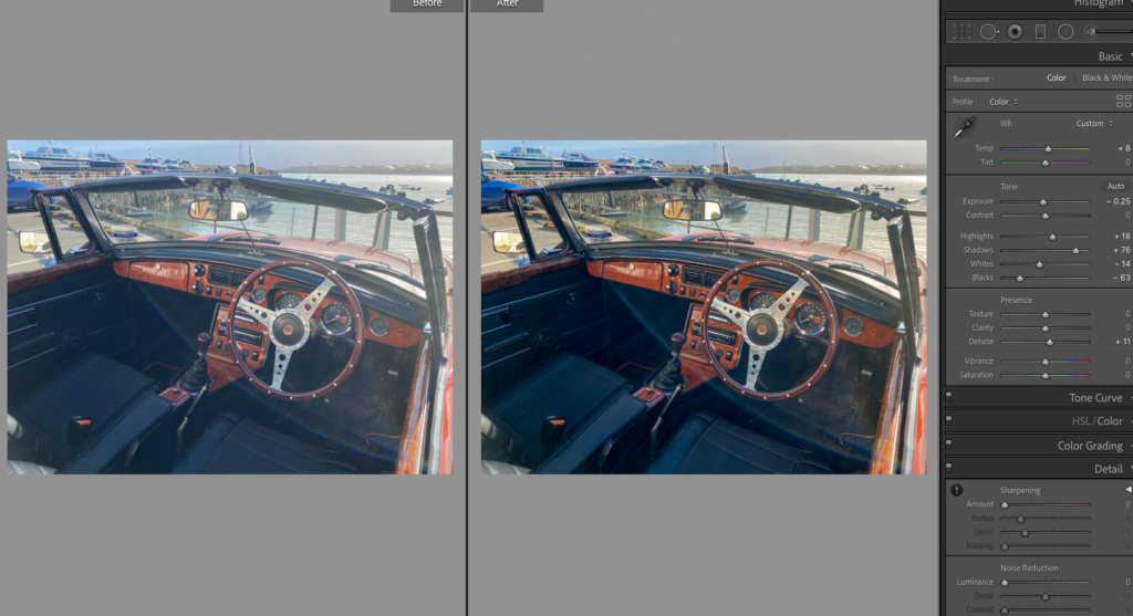
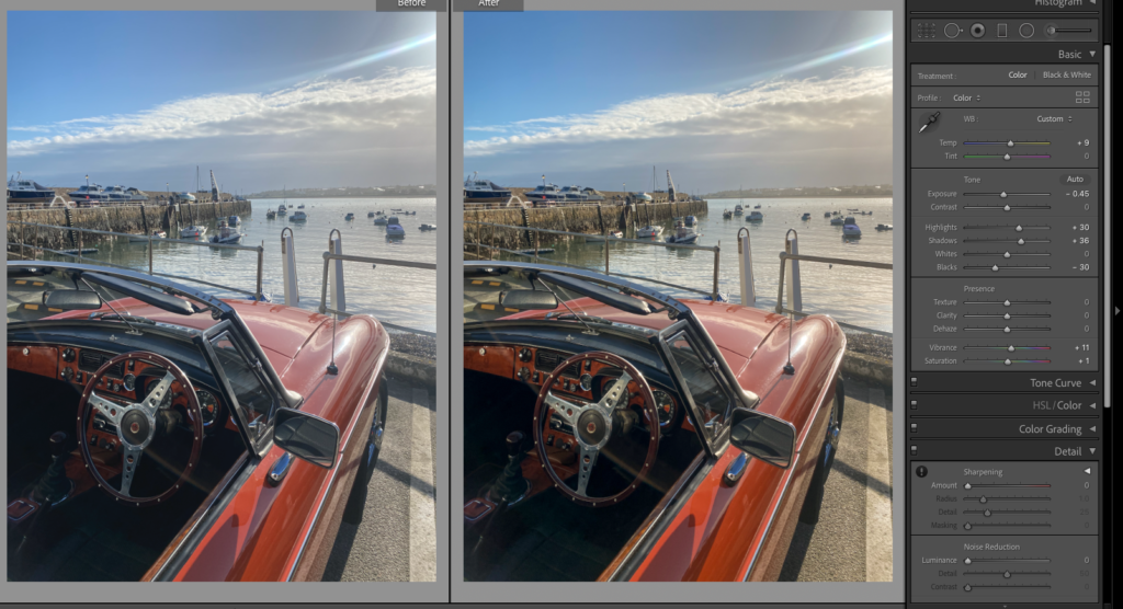
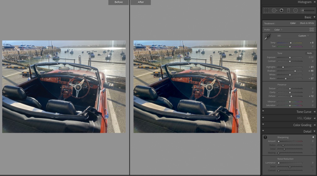
I brought the highlights up and lowered the whites, similar with the shadows and blacks. I then added dehaze to add more strength and depth to the image. After then adding temperature I felt like the images looked retro, but are obviously new.
I have done this to link with these archived photos, that include a similar looking car.
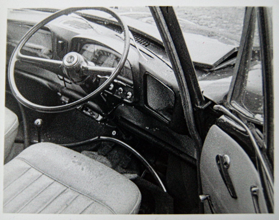
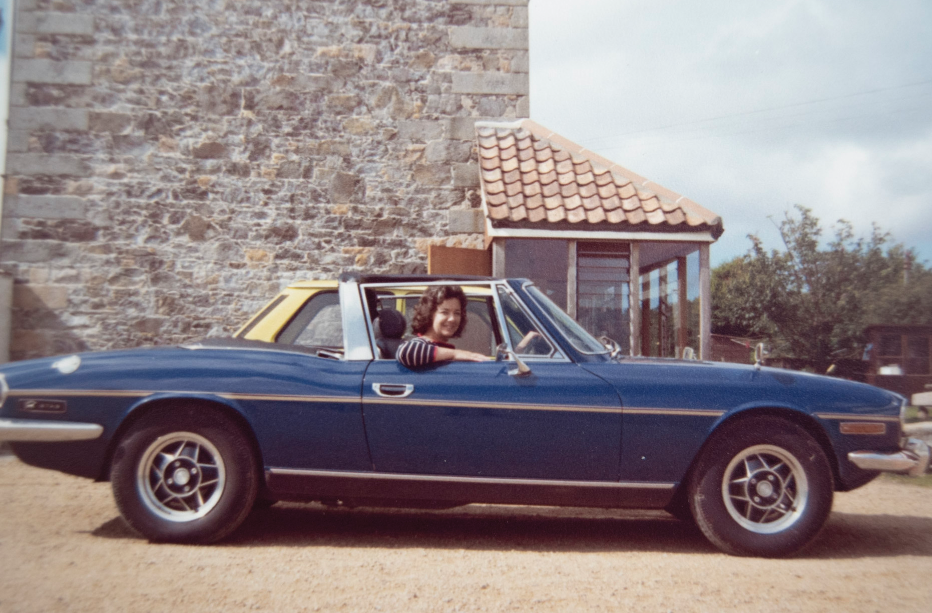
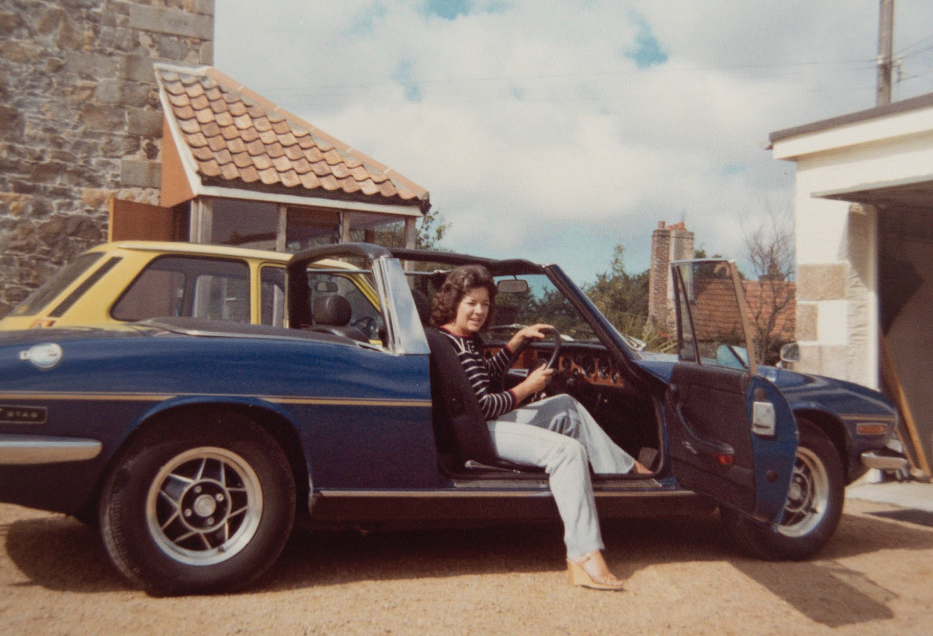
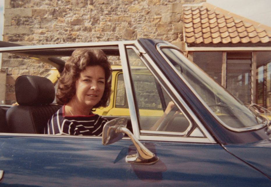
I want to choose the best composition that includes the boats (because my grandfather owned boats and I can make this comparison too) and the car. I also need to decide which of the archived images I will compare them with.
The best two
COMPARISON
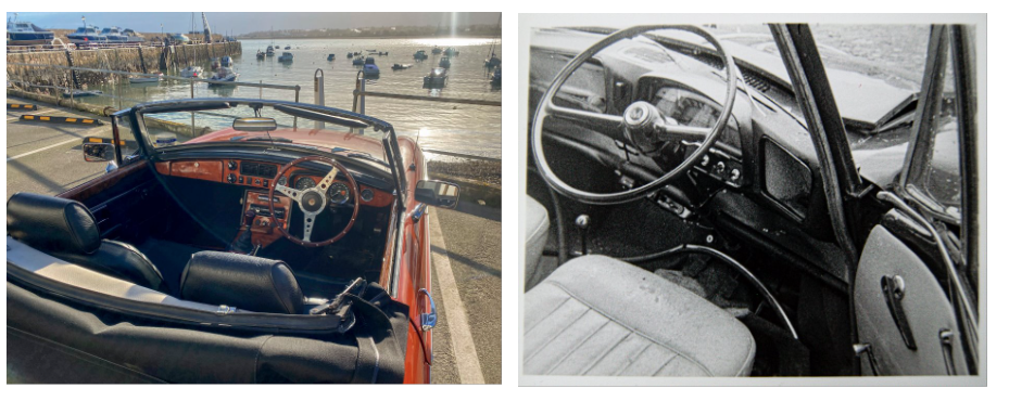
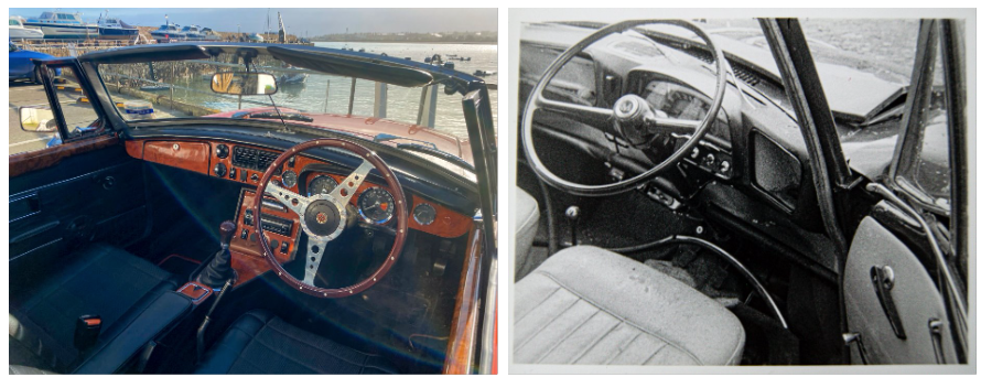
After comparing the images I am still unsure of which to choose, so I will decide when putting my photobook together.