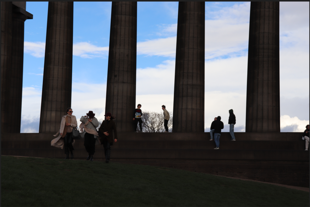
When editing these photos, I wanted to capitalise on the gothic, dark nature of the city and its architecture. The drama of the landscape is amplified by the high contrast, sharp shadows, and faint vignette. I feel that I have certainly created this effect and I am happy with the outcomes. They exemplify the feel of the city and its buildings.

This was the original image. This is too dark and needs to be more exposed.
I therefore increased exposure and added a black and white filter. I think that the outcome is suitably moody and dramatic.

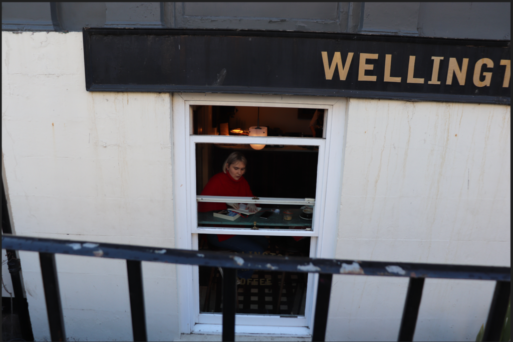
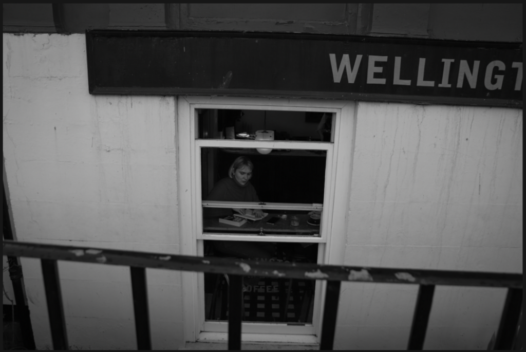
The original image I liked because of its darkness and I was debating whether to keep the colour or not because I liked the red of the girl’s jumper.
The final image, however, in order to be in keeping with the black and white edits of the other images, did turn out black and white. I also made it a little darker to add atmosphere.
