Narrative: What is your story?
Describe in:
- 3 words: Hysteria in Women
- A sentence: An exploration of hysteria and madness of women, challenging the stereotypes of women’s mental well-being
- A paragraph: My photobook will be an investigation of hysteria through self- portraits and landscapes, taking apart the idea of madness and portraying it in a personal way. My photos create an unnerving atmosphere that can be attributed to hysteria and madness, challenging historical views surrounding these issues.
- How you want your book to look– I want my book to be simple, including both text and photographs. My photos are all in black and white, so I would like to follow this theme of simple tones.
Designing my Photobook in Lightroom Classic
- Paper and ink– Premium lustre paper- it is semi glossy which is suitable for my photobook.
- Format, size and orientation– Standard landscape format (10 x 8 inches)
- Binding and cover– Hard cover image wrap
- Title– Hysterikos (the suffering of the womb in Greek)
- Images and text– I will use images from all my photoshoots, starting with photoshoot one, following with photoshoot 4 and ending with photoshoot 2. The landscape images of St. Saviour’s hospital will be scattered throughout, with a spread of two images between each photoshoot. As for text, I will include an introduction to my project at the beginning of the photobook, this being:
Hysteria. Taken from the Greek word ‘hystera’ for uterus. Greek thinkers believed that when a woman experienced delirium, excessive emotion and lack of self-control, it was due to her uterus moving freely throughout her body, negatively effecting her mental well-being in the process. They believed that when the womb was empty for too long after puberty, it became distressed, disturbed: beginning to move around the body out of irritation. The threat of sexual deprivation and barrenness sending women crazy, spurred the myth of the wandering womb, solidifying the position of women as strictly child-bearers. Thus young women were expected to be quick in occupying their womb, anchoring it in place. This expectation is what stripped young women of their childhood, the pact of marriage and creation of family thrown in their face. Nothing else mattered.
Through my series of photographs, I am seeking the true meaning of hysteria and challenging the inaccuracy of it’s origins.
My body and my mind are not one.
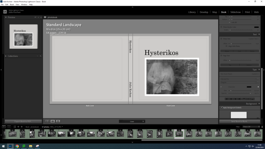
Cover layout
Idea 1
For this idea, I wanted to keep the cover simple, with one of my faceless pictures present on the front cover.

Idea 2
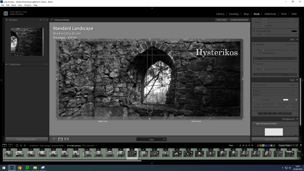
I experimented with a double spread for my cover however I don’t think this is a suitable or effective idea for this photobook.
Final Idea
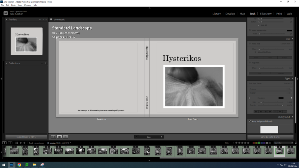
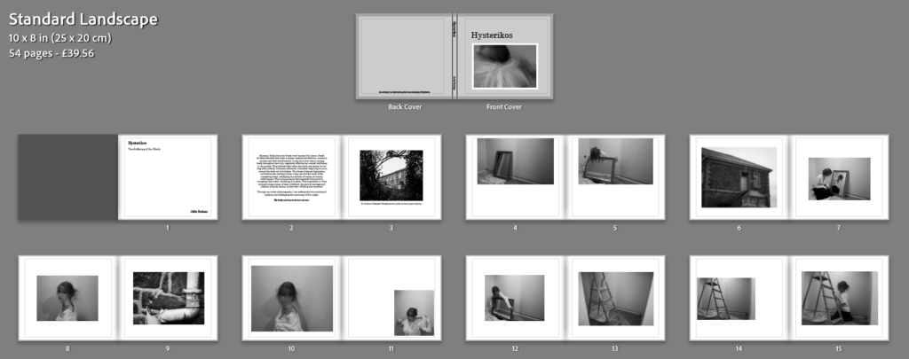
I decided to go with idea 1 for my final cover, sticking with the initial picture I put. I chose this faceless image to give a taste of what my photobook contains without giving away too much. I made the title clear and aligned it with the edge of the image. For the spine, I simply put the title and my name (in a slightly smaller font). However, I added a sentence to the back cover, acting as a short blurb, reading: An attempt at discovering the true meaning of hysteria. This adds a purpose for the back cover while still maintaining simplicity.
Image Layout
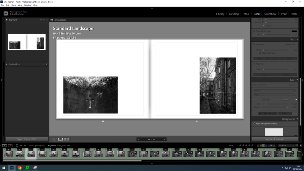
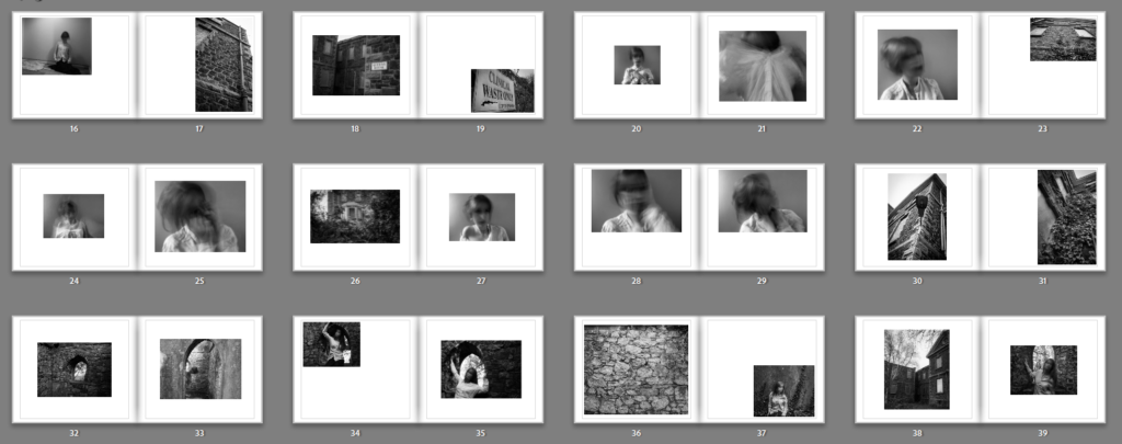
I decided to lay my photos out in order of photoshoot, with landscape photos separating them. For instance, I put photos from my first photoshoot first, with photos of the hospital appearing on some spreads. After I put photoshoot 4 and lastly photoshoot 2. This way it is organised with very different pictures every so often. I have decided to only do one picture per page, keeping a clean and simple layout throughout.
I decided to try out different layouts throughout, keeping the arrangement simple however placing the photos in different areas around each page. For instance in the spread above, I decided to put the first image in the bottom left corner and the second image in the bottom right corner.
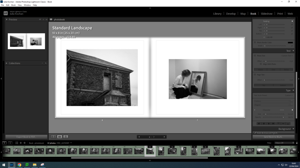
I did also do some more traditional layouts, putting each picture in the centre of the page. This layout is showing a image of the hospital contrasting with a self-portrait.
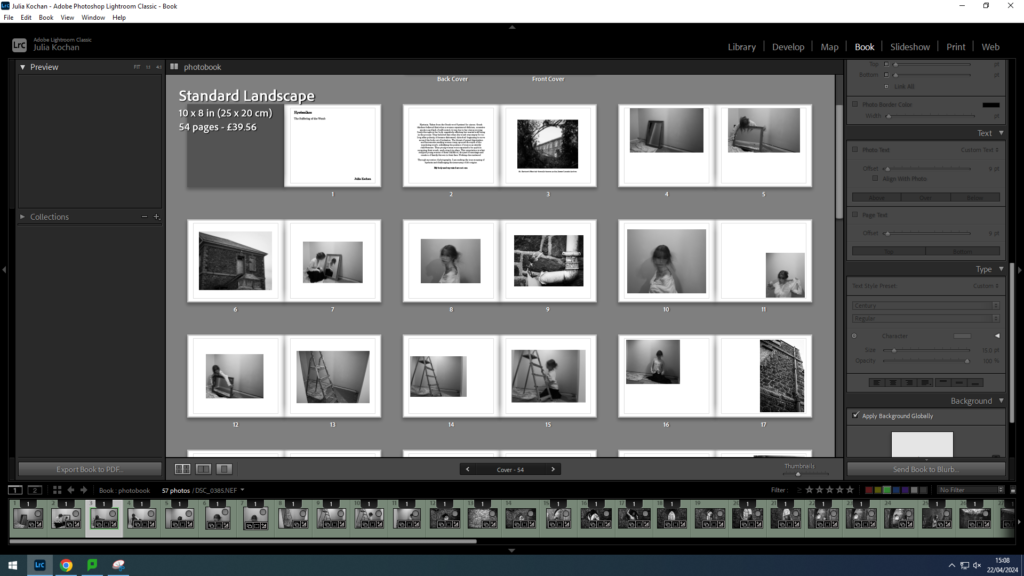
This is a screenshot of the layout so far- presenting a mix of photographs from photoshoot 1 as well as some landscape images scattered throughout.
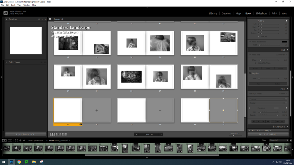
A screenshot of the layout of photoshoot 4, beginning with a spread of landscapes.
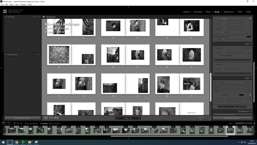
A screenshot of the layout of photoshoot 2, beginning with a spread of landscapes.
Text Layout
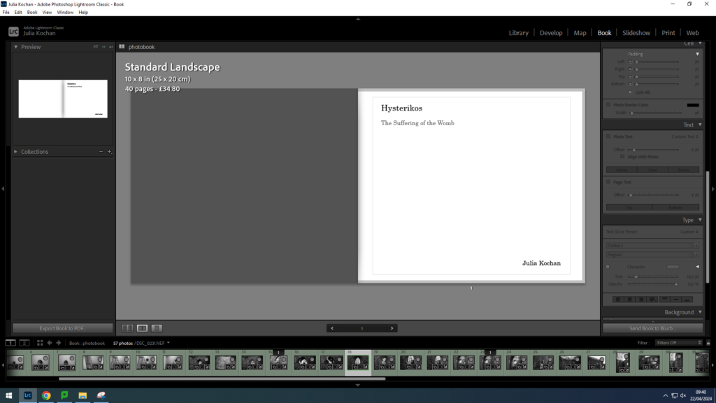
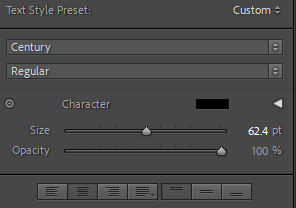
The first page of my book is going to be the title page. I decided to keep the text small and in the corner. The title, Hysterikos, is size 25, the translation size 18 and my name size 19. I also made the translation a grey, to indicate that it is not part of the main title.
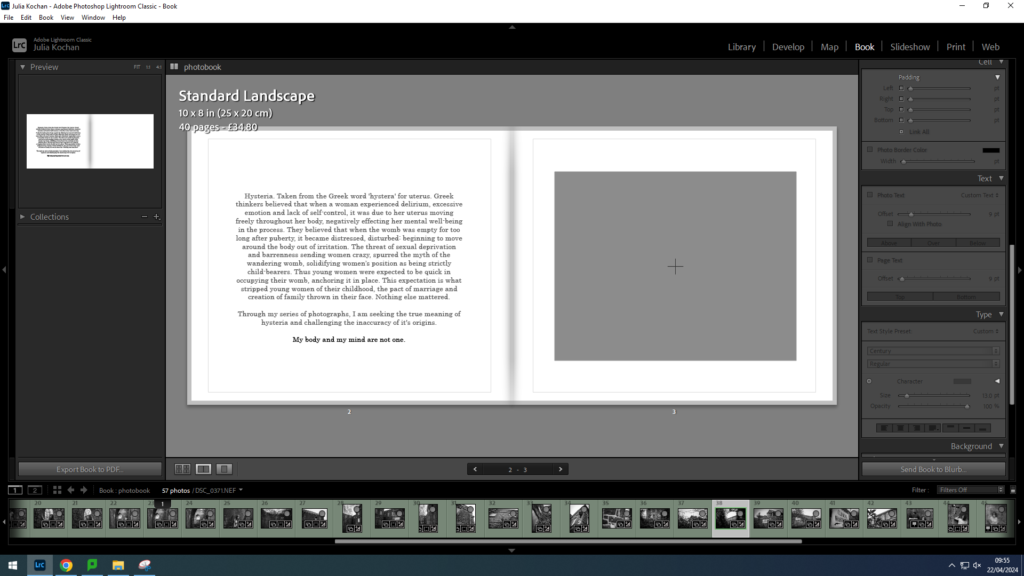
I wanted my second page to have the main body of text- a short introduction to my project. It will be accompanied by a photo on the second page. I decided on size 15 so that it would be easily legible without taking over the entire spread. I decided to write the text in grey, except the last sentence which is in black since I wanted it to stand out.
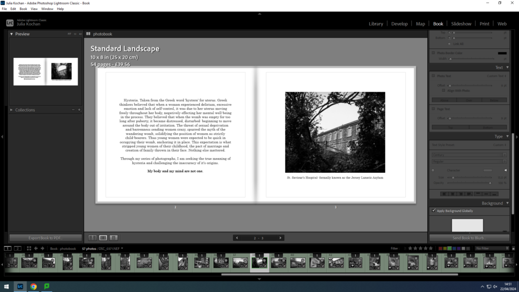
On the opposite page, I inserted the first picture- which I decided to caption with the name of the place- hopefully giving insight to the significance of the place when considering my project. I wrote this in grey and size 13 so that it wouldn’t be distracting.
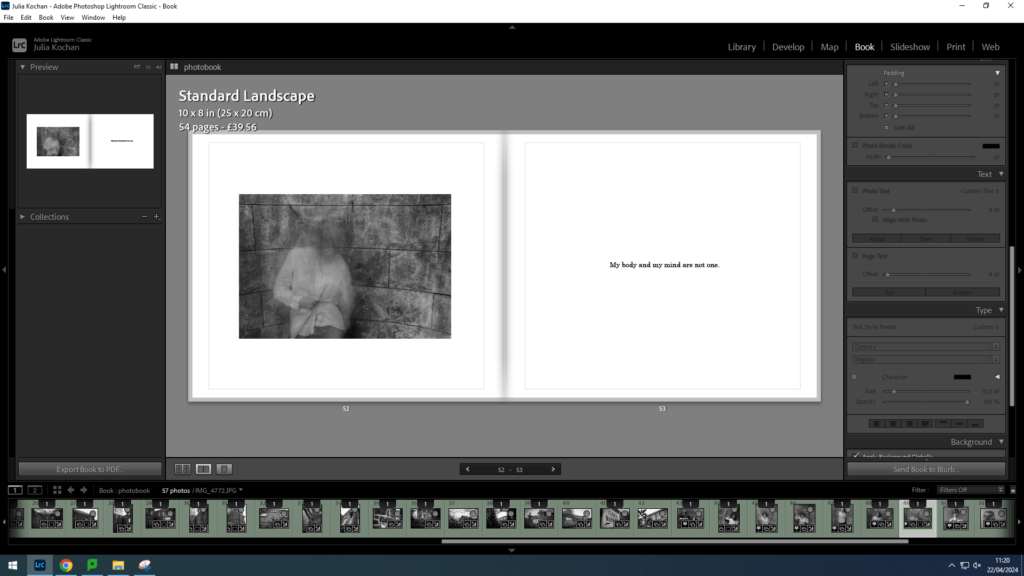
I also repeated the last line on the final page, once again in black and size 13. This will act as the ending, reemphasising the message in my photos.
Final Layout
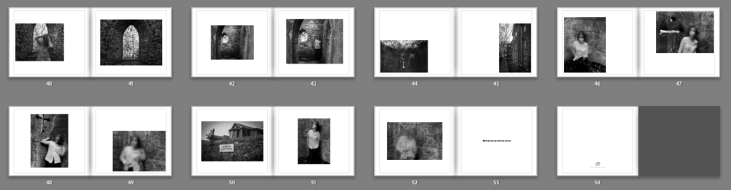
I ended up with 54 pages and I think my layout is effective. The pictures are quite abstract so I think it was a good decision keeping the layout simple. I made sure to try to arrange the photos in many different positions around the page, yet still keeping it to only one photo per page. I think the sequencing worked well, as I separated each photoshoot with the landscape pictures from photoshoot 3. Other than that, I decided to lay them out in the order of photoshoot 1, photoshoot 4 and lastly photoshoot 2.