This photoshoot was carried out at L’Etacquerel Fort, a Jersey heritage site. Built in the mid-19th century on a cliff side overlooking Bouley Bay, the fort isn’t abandoned, however it does show clearly how over time nature takes over buildings. It displays vines of leaves that are crawling up the building and overgrown bushes, over walls, that haven’t be attended to, although I originally wanted to base my project around mostly abandoned and derelict buildings, I thought this resembles that in a different way. After-all, it has technically been abandoned from its original purpose when built in the mid- 19th century.
Contact Sheet


The weather was foggy and overcast on the day I did this photoshoot. This effected the lighting and tones in my images as I was working of purely natural lighting. This caused my images to all be quite dull and not reach the highest potential of quality they could have. However, I think the distant fog and grey tones added an eerie feel to the images. It emphasised the derelict theme I’m going for. People usually connect the thought of abandoned buildings to sinister maybe even supernatural places, fog and mist portrays these themes quite well.
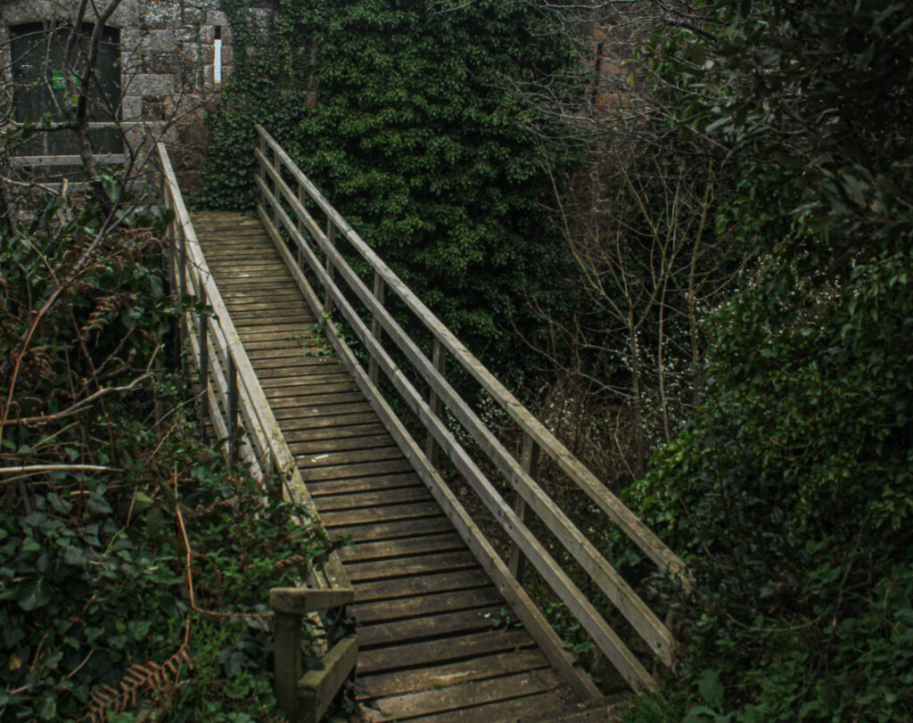
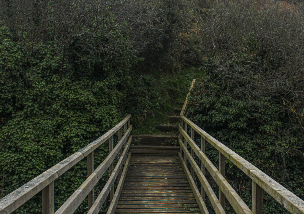
When taking this photo, to have the outcome of a good composition, I placed myself carefully. From this angle I was able to capture the three main elements of my surroundings, the fort, the bridge and the trees. The bridge falls into the centre and is also the brightest feature of the image, this creates an immediate focal point; as a viewer it is the first thing you are drawn to look at. The overcrowding trees add depth to the image, they are of a darker colour and tone then everything else; they sort of add a natural vignette around the image. I think this image successfully represents my theme of ‘seek’, where does the bridge lead to? With the contrast of the overgrown trees showing how this area has been left to rot.
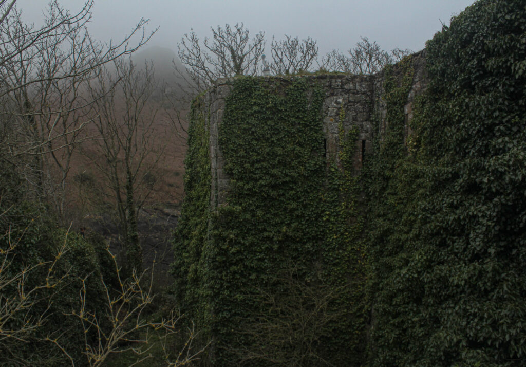
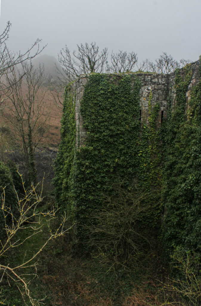
The two images above are very similar, almost the same. The difference being one was taken on a landscape scale and the other portrait. I like them both as final outcomes, however I will make the decision of choosing just one of them during my photobook image selection process. I think the composition of the portrait image is stronger as it displays a full top to bottom view of how the overgrown foliage has taken over the building, however I like the tone and layout of the landscape image. It is clearly layed out as the foreground on the right of the emerging leaves, mid-ground is the top of the remaining building submerged in the leaves and the background being the misty sky over the hills in the background.
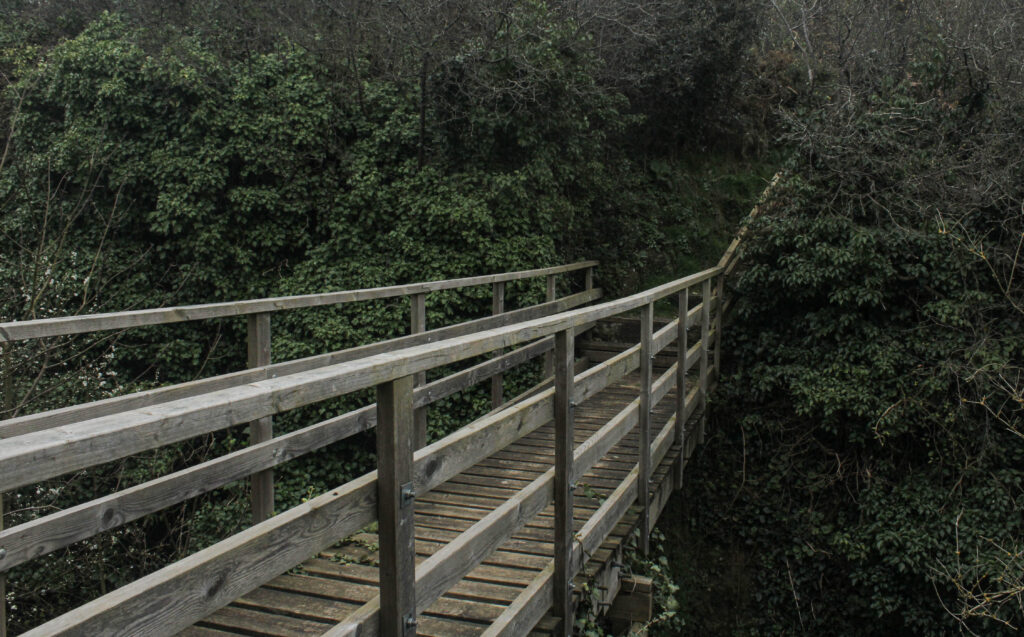
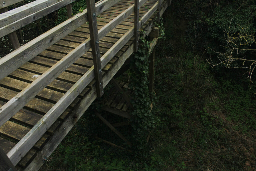
I have put these two images next to each other to compare them in a way as I’m not sure if both of them are worth being final outcomes for my photobook. They have both been edited to enhance certain parts of the image. I like the left image as the bridge starts from the bottom left corner and flows throughout the image to the top right corner as it gets further away. The image on the right I like the composition as it was taken from above, birds-eye view.
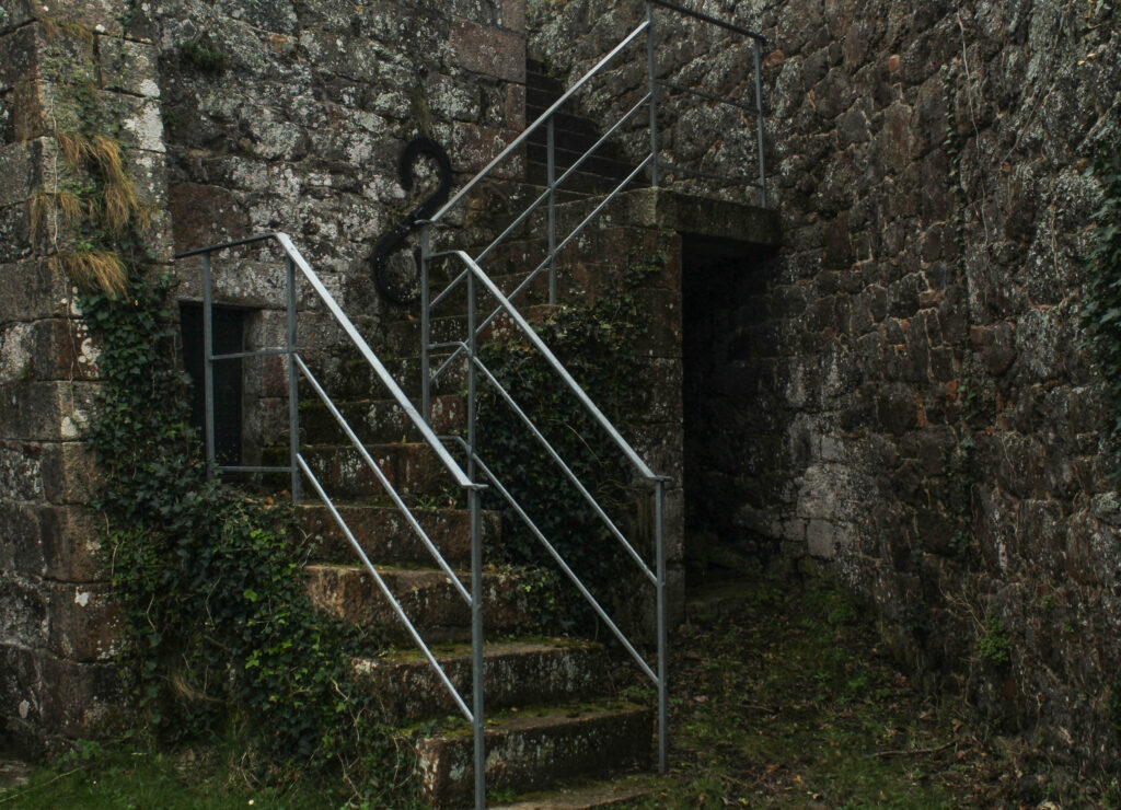
Comparing work
My Image:
Matt Emmetts image:
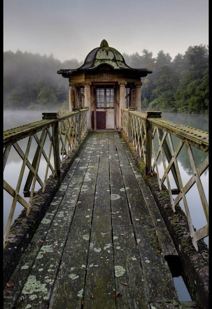
I chose to compare my image with this one of Matt Emmett’s as I think they resemble each other in a few ways. Firstly, the most obvious element being the old, mossy bridges in the centre of both images. In Emmett’s photo, the bridge leads to a very run down, rotting hut. It appears abandoned and worn out. On the other hand, in my image, the bridge ends and leads to a flight of stairs. In Emmetts image there seems to be a backstory to the image because of the leading bridge to the hut, whereas my image is more discreet, not showing where the stairs lead to. In Emmetts image, the surrounding background consists of a misty lake with the sky reflecting onto the water, bringing a lot more lighter tones in. My image is covered in the dark green leaves which create darker tones.