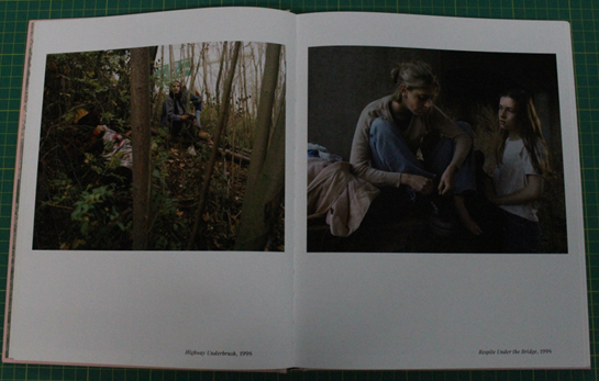
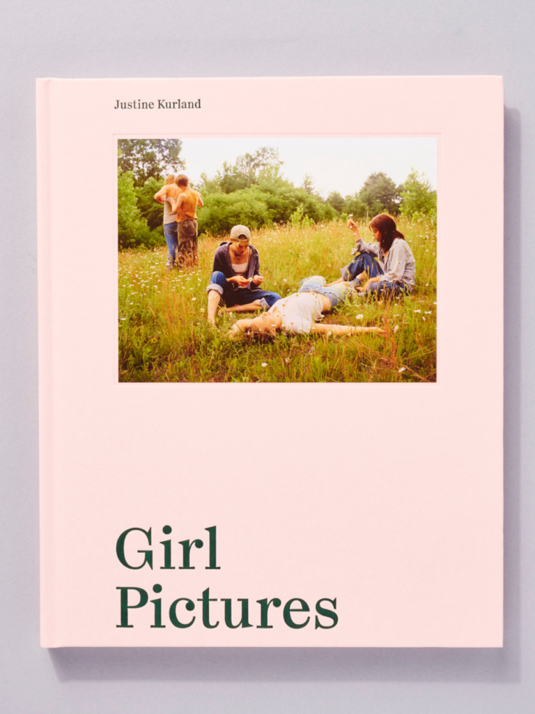
A photobook that I like the layout of is: ‘Girl pictures’ by Justine Kurland.
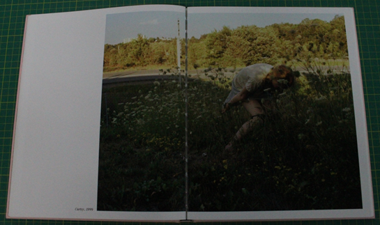
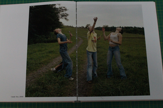
Despite this photobook not matching the theme of my project, I really like Kurland’s use of double page spreads along with the juxtaposition of the standard images (one per page). I think the simplistic yet striking structure helps tell the story as images jump from side to side and span most of the pages.
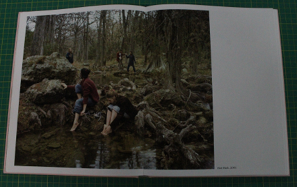
‘Girl Pictures’ follows American runaway girls as they explore their newfound freedom. The images are visually striking and can allude to a dreamlike aesthetic. Kurland takes natural light and careful composition into consideration as a way of creating a powerful visual narrative that invites viewers to reflect on their own experiences of youth and femininity. All the images were taken between 1997-2002 yet they feel timeless, Justine got young girls to pose as runaways under highway underpasses or next to neglected lakes, she named them her “standing army”.
Double page spreads:
Standard: