Overall i created five final outcomes – alongside my photobook which i am yet to order… i am happy with the way i have presented my images as i feel i have done it in the most appropriate and suitable way for these particular images.
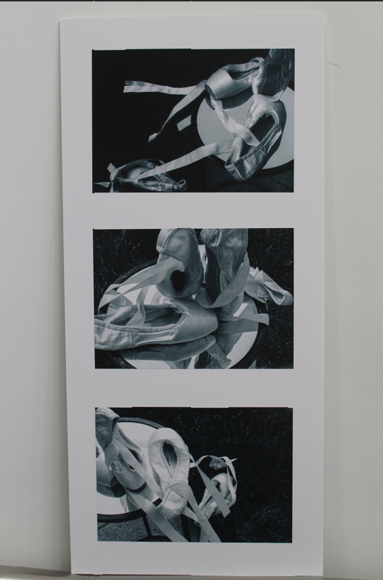
I decided to mount these images up on phone board as i like the contrast of black and white. Considering the background of the pictures had came out particularly black i feel the images stand out and are more visible with the foam board.
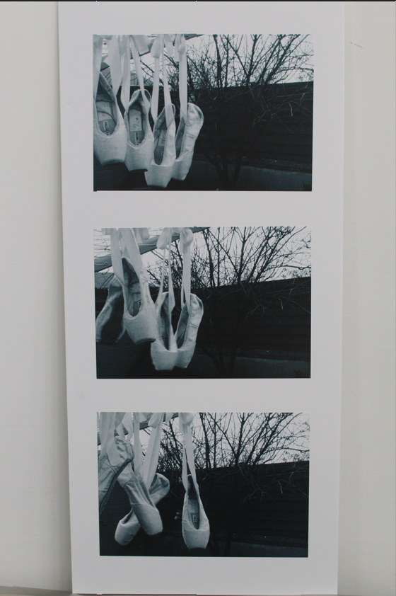
I decided to mount these images up on phone board as i like the contrast of black and white. Considering the background of the pictures had came out particularly black i feel the images stand out and are more visible with the foam board.
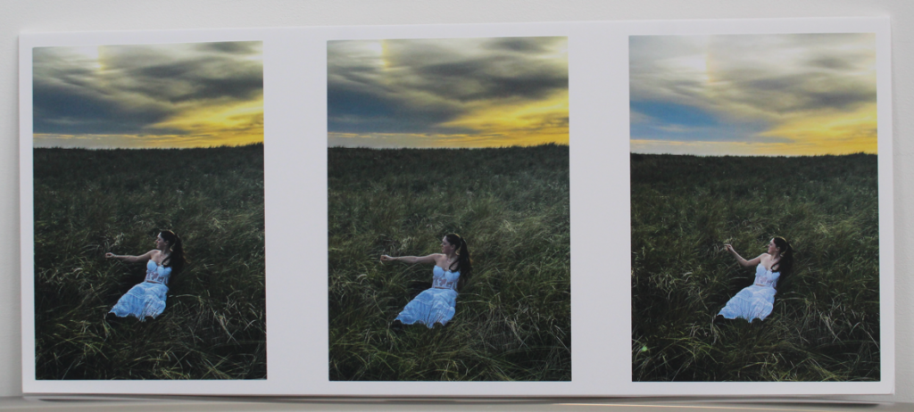
I chose foam board for these images as it looks simplistic and the sky blends in well with the white compared to if i had it on black i feel as though it would be quite harsh.
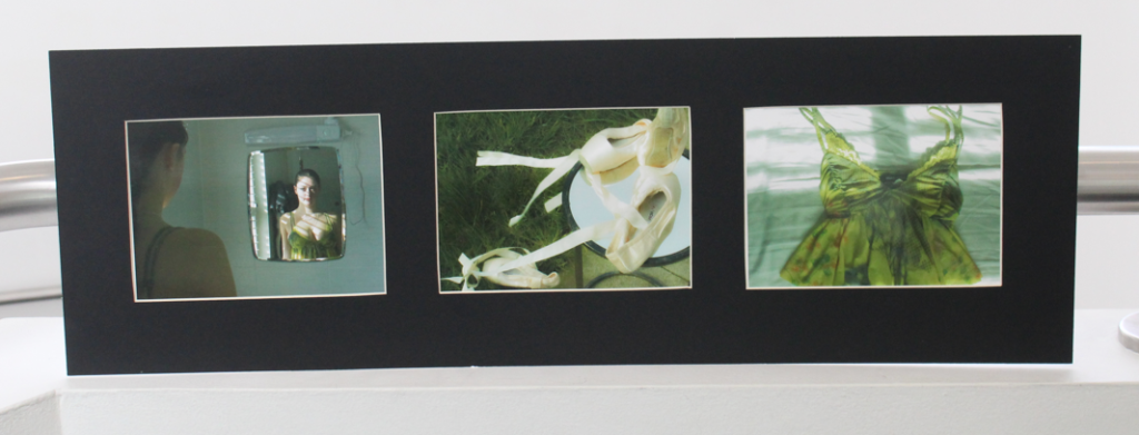
To recreate Nancy honeys style i wanted a well kept, neat tidy layout when it came to mounting these images. Rather than them just being quickly stuck onto foam board. Black suits the colour theme for these images anyway and frames them well.
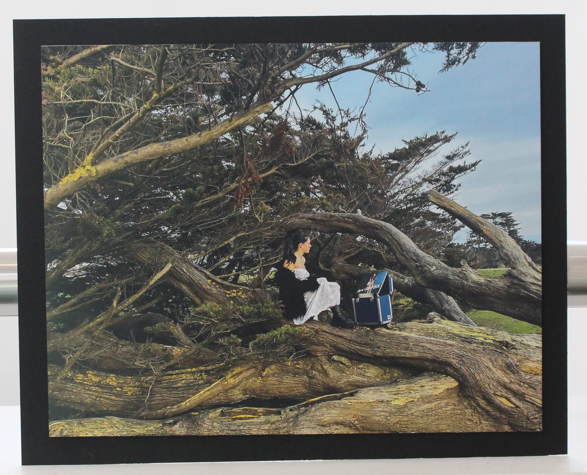
I stuck this image on foam board first before then sticking it onto black card. I wanted it to stand out a bit more and create levels as the image itself has a lot of texture and depth. The tree and branches almost swallows up the entire image and can look too busy/overwhelming. That’s why i think having the picture stand out on the foam board with a small black border perfectly mutes and tidies the framing of the image making the image appear kept together and even factors of simplicity.