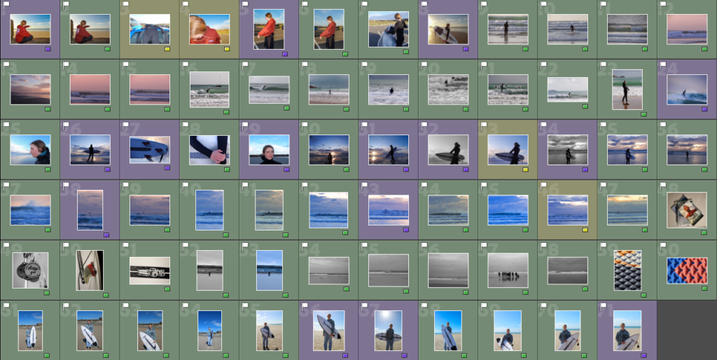
I started by placing my favourite images on each page, using ‘1 page’ layout designs to keep it simple as I was unsure on how I wanted to lay my images out on each page. Once I had the images I wanted I started to experiment with the page designs by adding more than one image on the page and using double page spreads.
Layout1
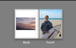
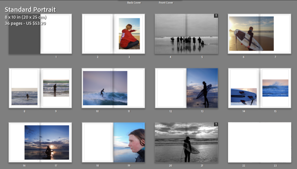
This is my first layout for my photobook. I wasn’t happy with it as it had too many images which made the book feel crowded and busy, which doesn’t fit the laid back approach the surfing community has. I also felt that the book didn’t flow or tell a story as too much was going on with random images placed. I decided to copy this book layout in Lightroom and adjust it to something I was more happy with.
Layout 2
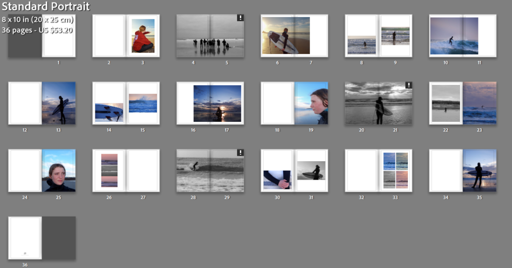
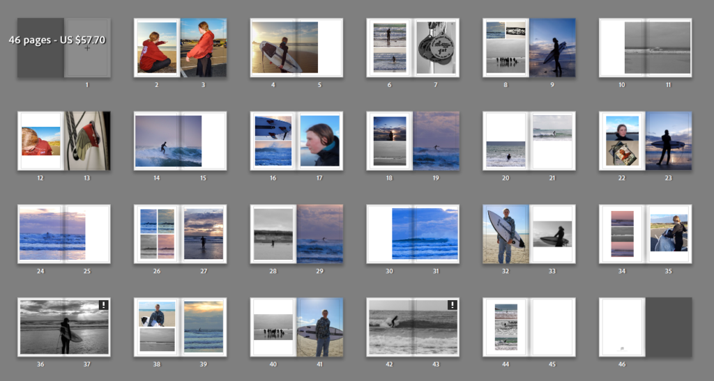
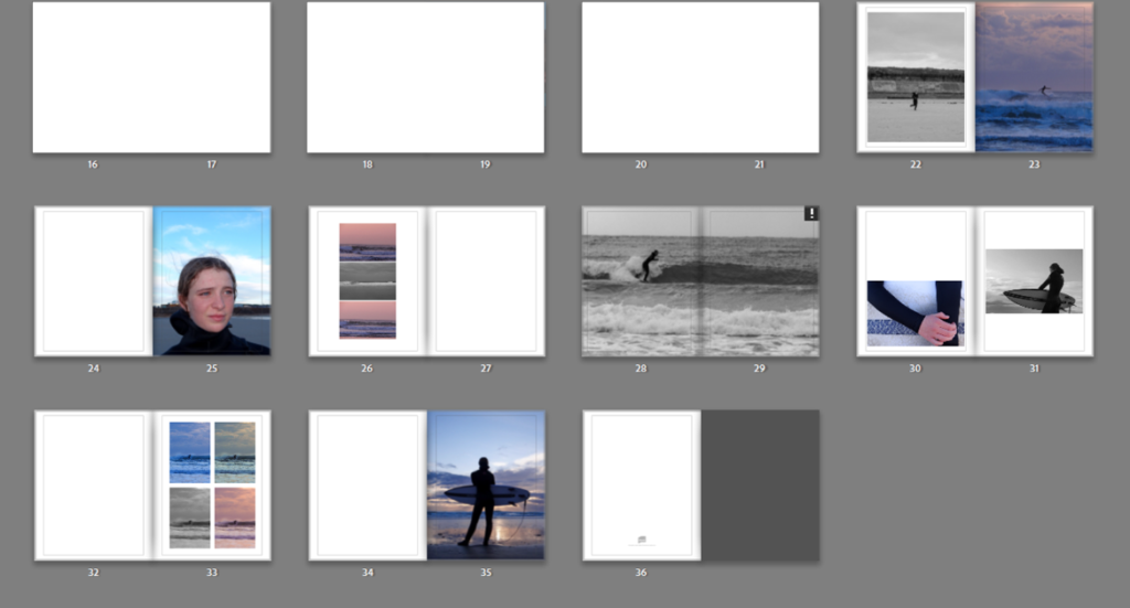
I began by taking out the pages and images I thought were didn’t fit in to the story I was trying to tell or that were irrelevant. Once I had narrowed down my images I started to rearrange the order/ sequence of the images so they told more of a story. I experimented with various page designs until I was happy with how the book flowed.
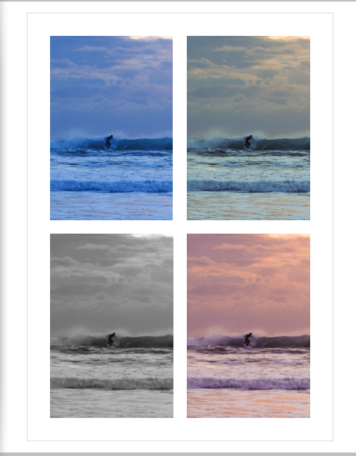
I created some abstract images in the book, while experimenting with various layouts. An example of this is where I used the same image but changed the temp and tint on Lightroom.

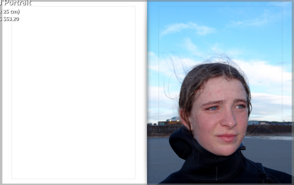
I chose to create pages with a single image on it with a blank page next to it to break the book up so it didn’t get too bust like my first design. It also demonstrates a break in the surf as there are times when you’re waiting for the next set of waves to come.
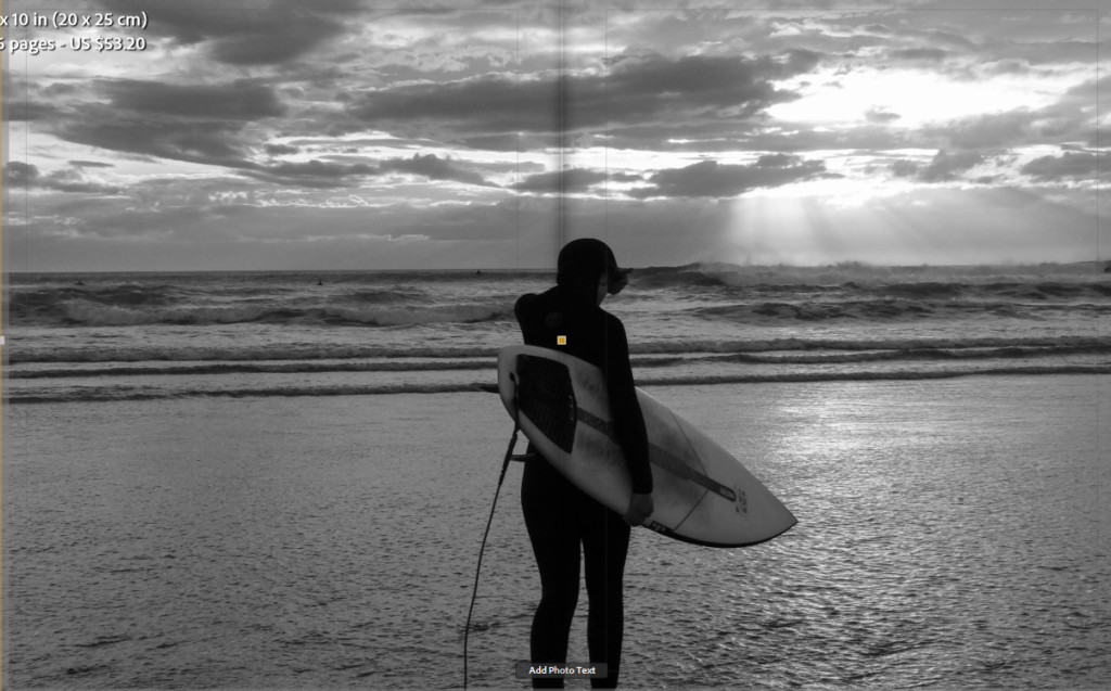
As well as having pages with multiple images on it I wanted to have some double page spreads as they are simple but effective which links to the surf culture of having a simple life.
The book tells the story of my sisters day when she surfs. Pages 1-21 demonstrate her first surf of the day.
Pages 22-36 demonstrates her second surf.
When choosing the order of my images I had to make sure they suited on another and flowed together to prevent the book looking like a mess of random photos.