Koyaanisqatsi Comparison and Project Evaluation

Godfrey Reggio’s movie, “Koyaanisqatsi”, was something I held close to when deciding the theme and overall aesthetic for my photobook. While not a movie, I tried to make my photobook almost replicate the same elements from Koyaanisqatsi. These involved camera positions, angles, luminosity, different timeframes and locations and most importantly the subject of each photograph.

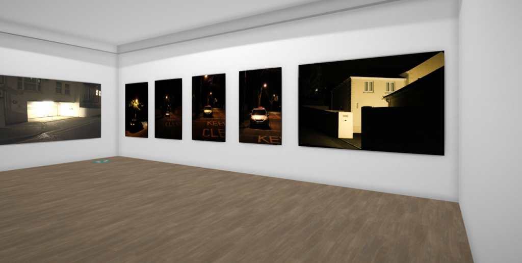
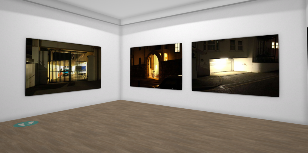
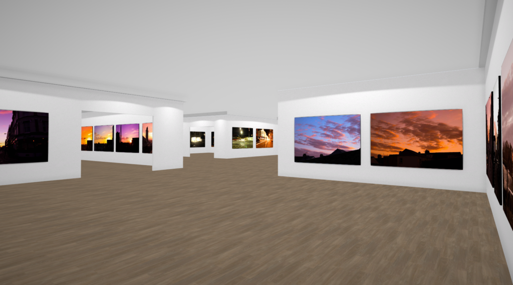
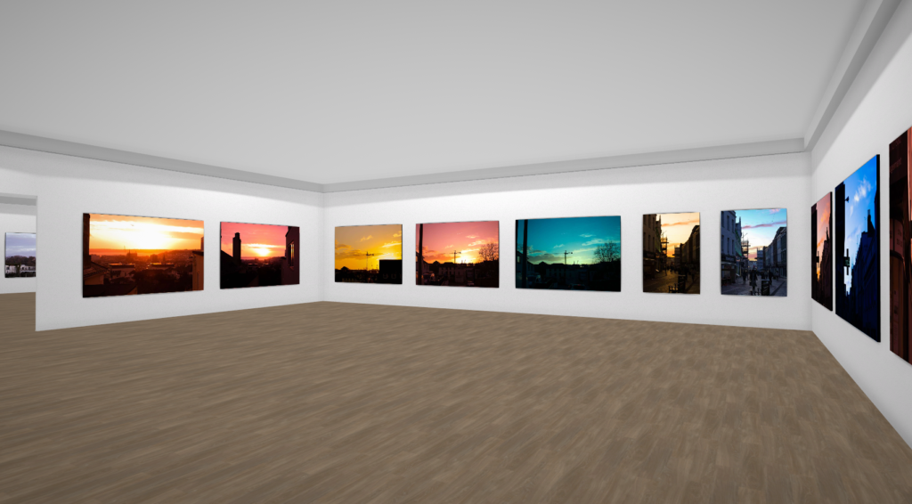
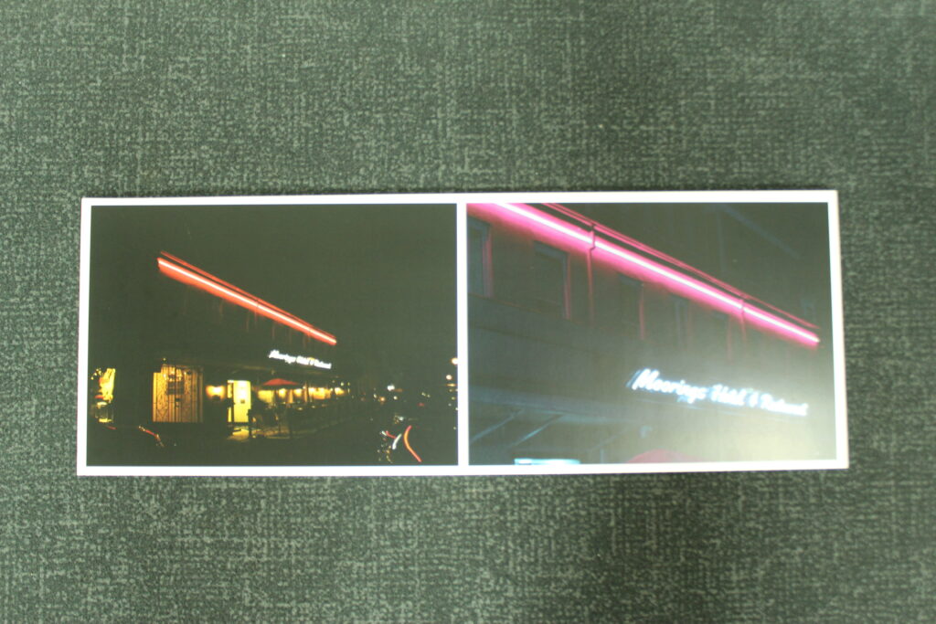
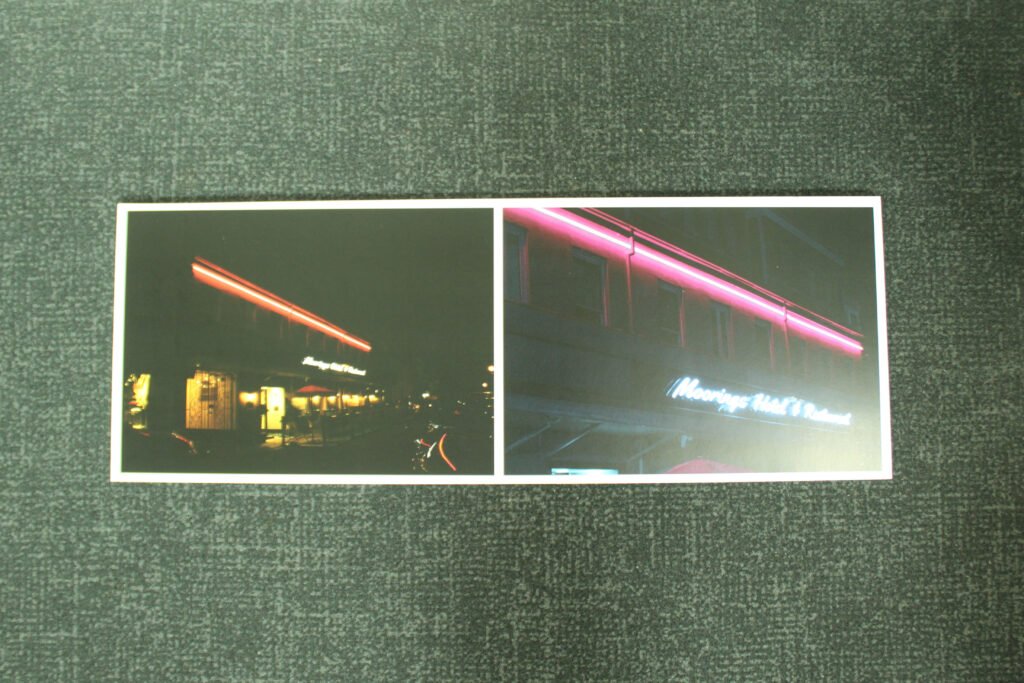
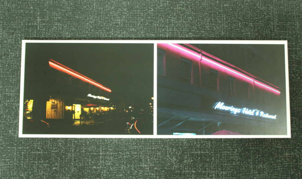
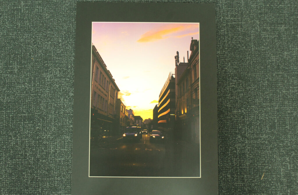
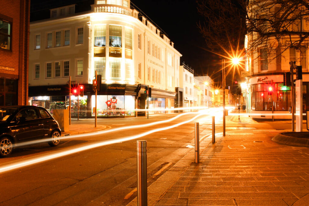
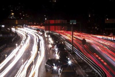
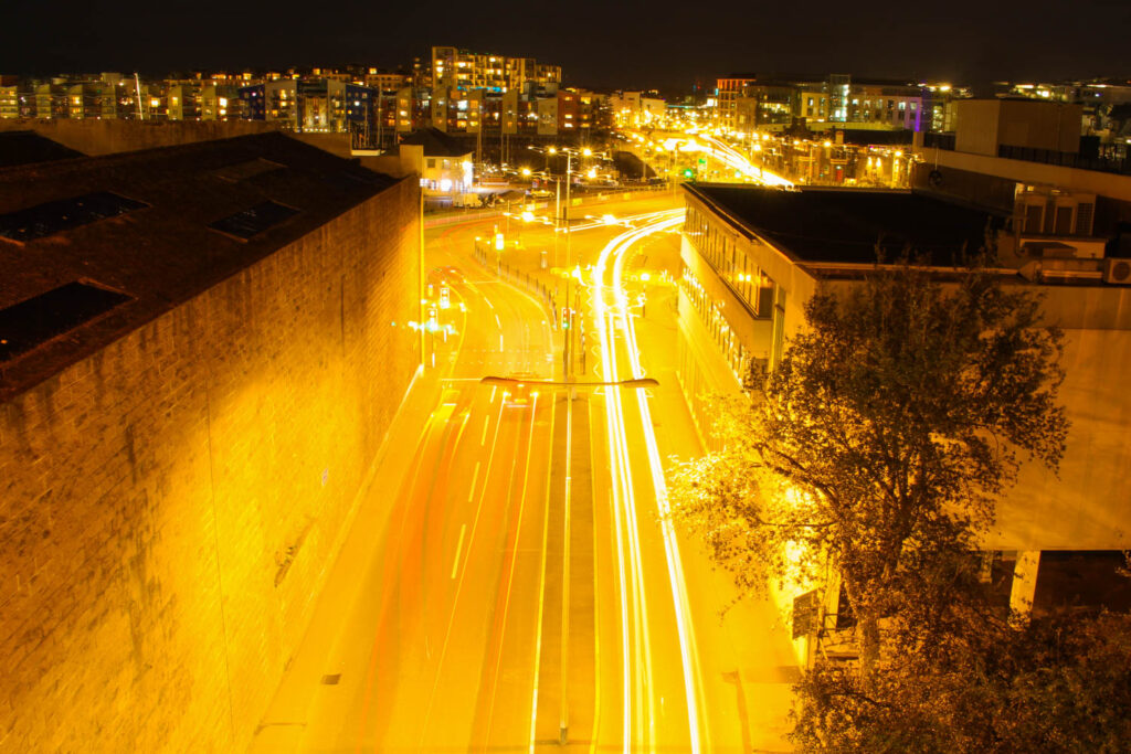
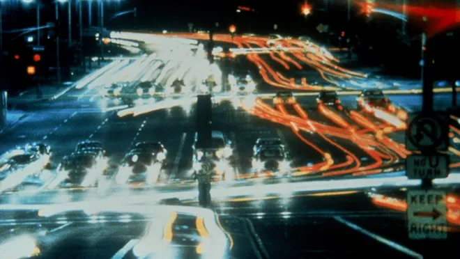
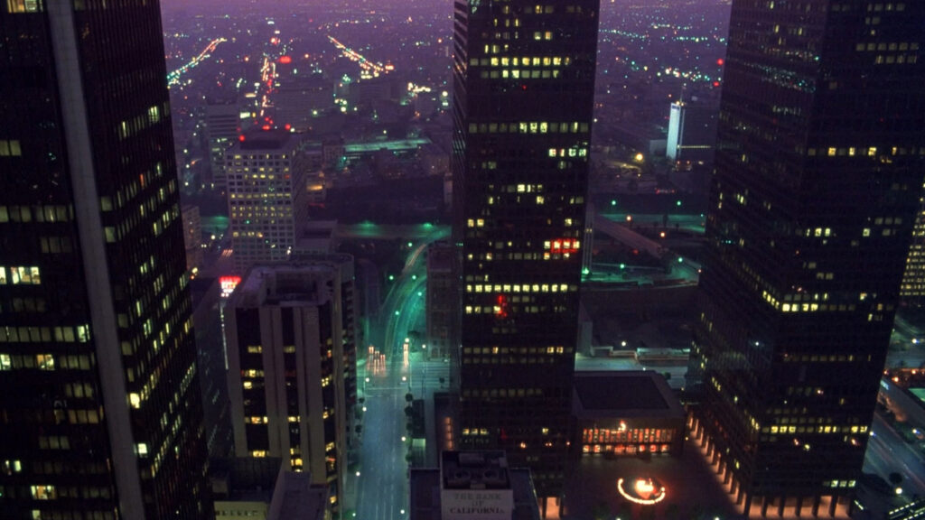
During my night photography photoshoots, I wanted to capture the glows of the street lights, inside or outside the frame to capture the presence of mankind, even when the streets are empty and deserted. The photographs with cars were also attempting this. Because I couldn’t shoot a video time-lapse, I instead made a photo-equivalent one by capturing the moving lights of cars with the open shutter on my camera, these were also to capture the luminosity of the late night roads and I believe they really did capture the same elements that Reggio’s movie had.

Comparison –

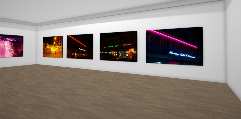
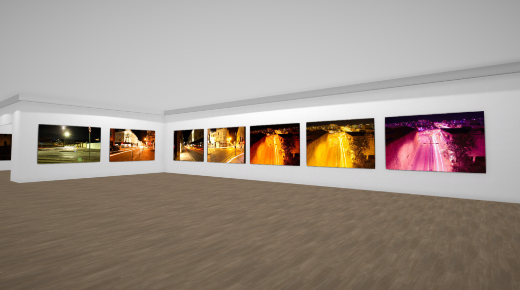
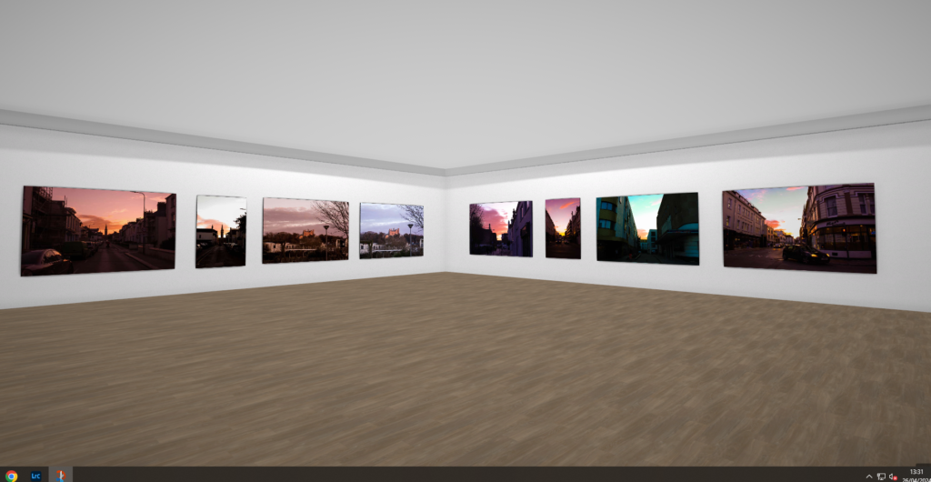
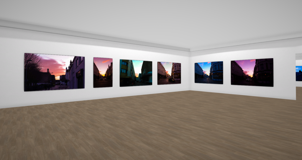
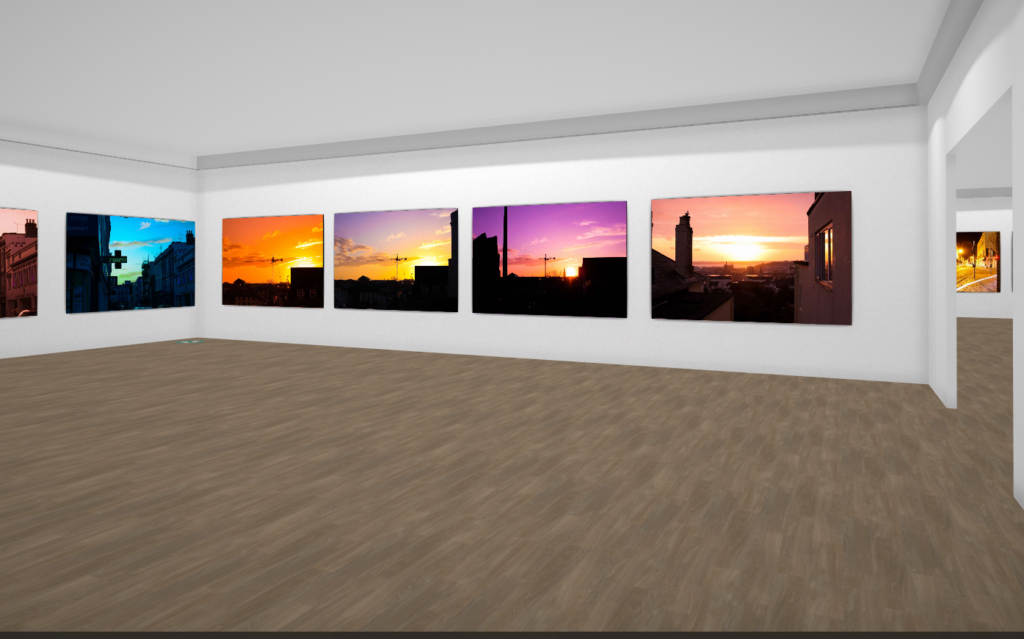
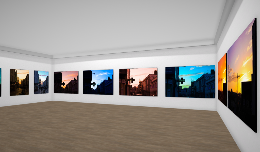
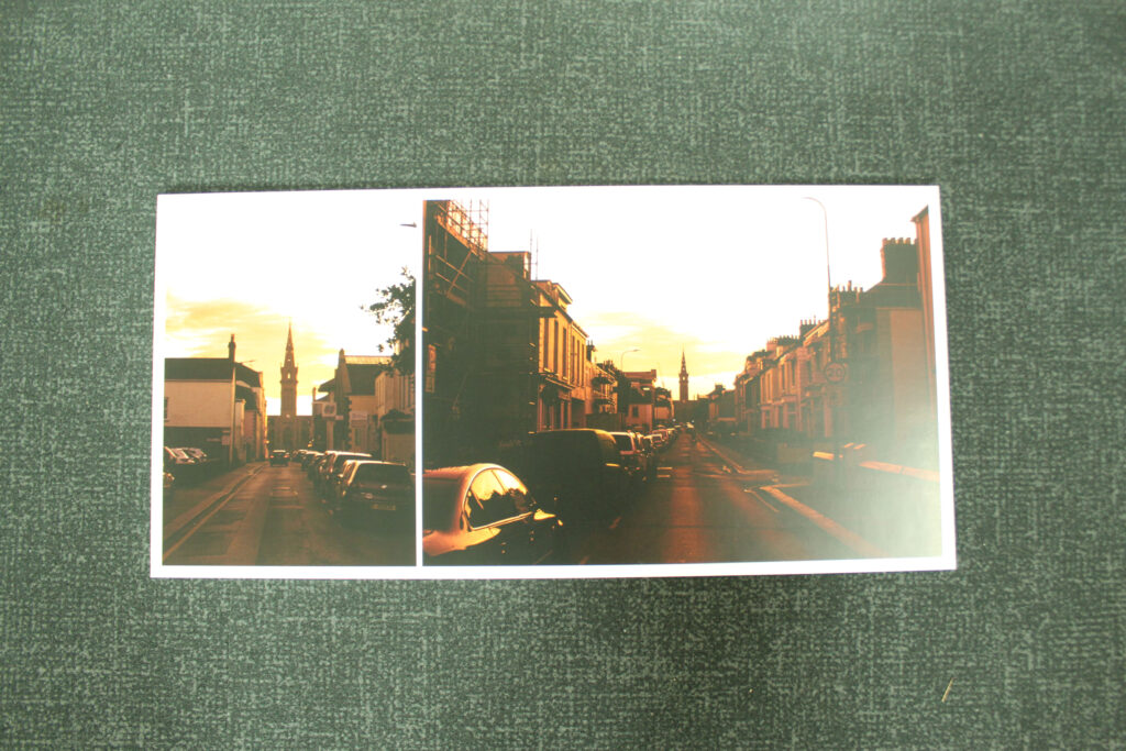
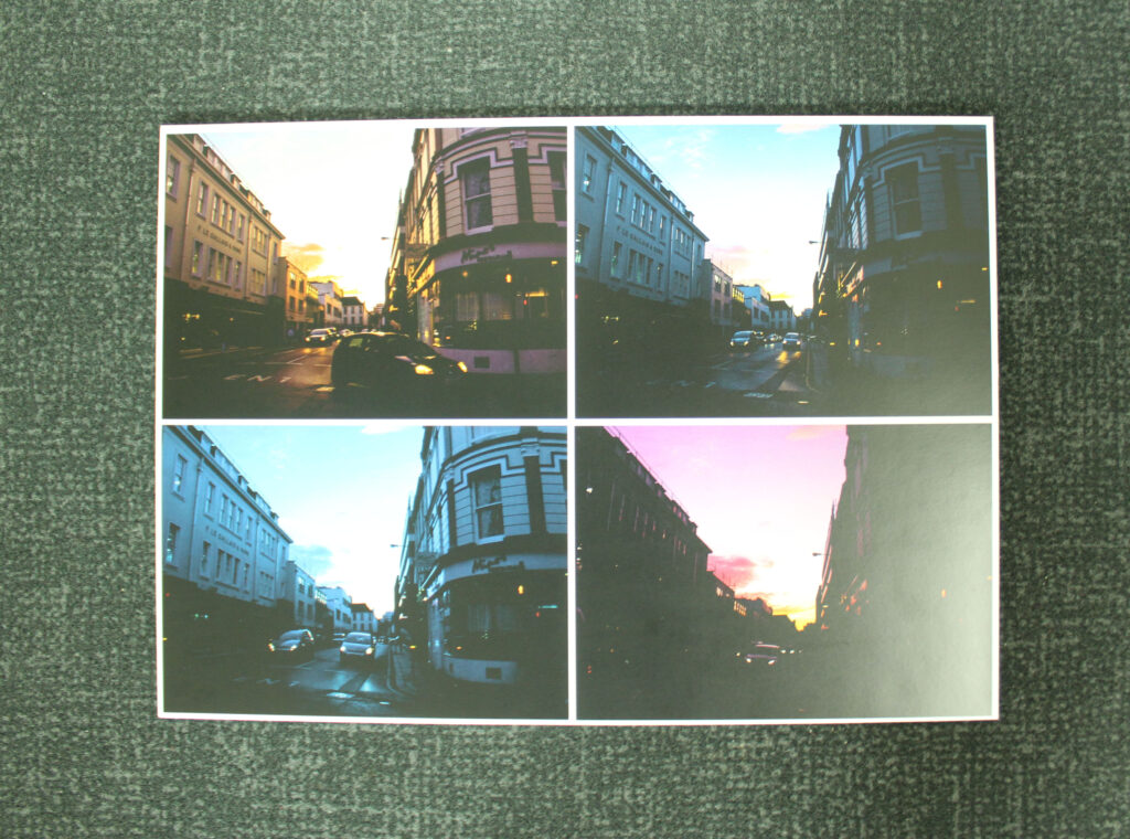
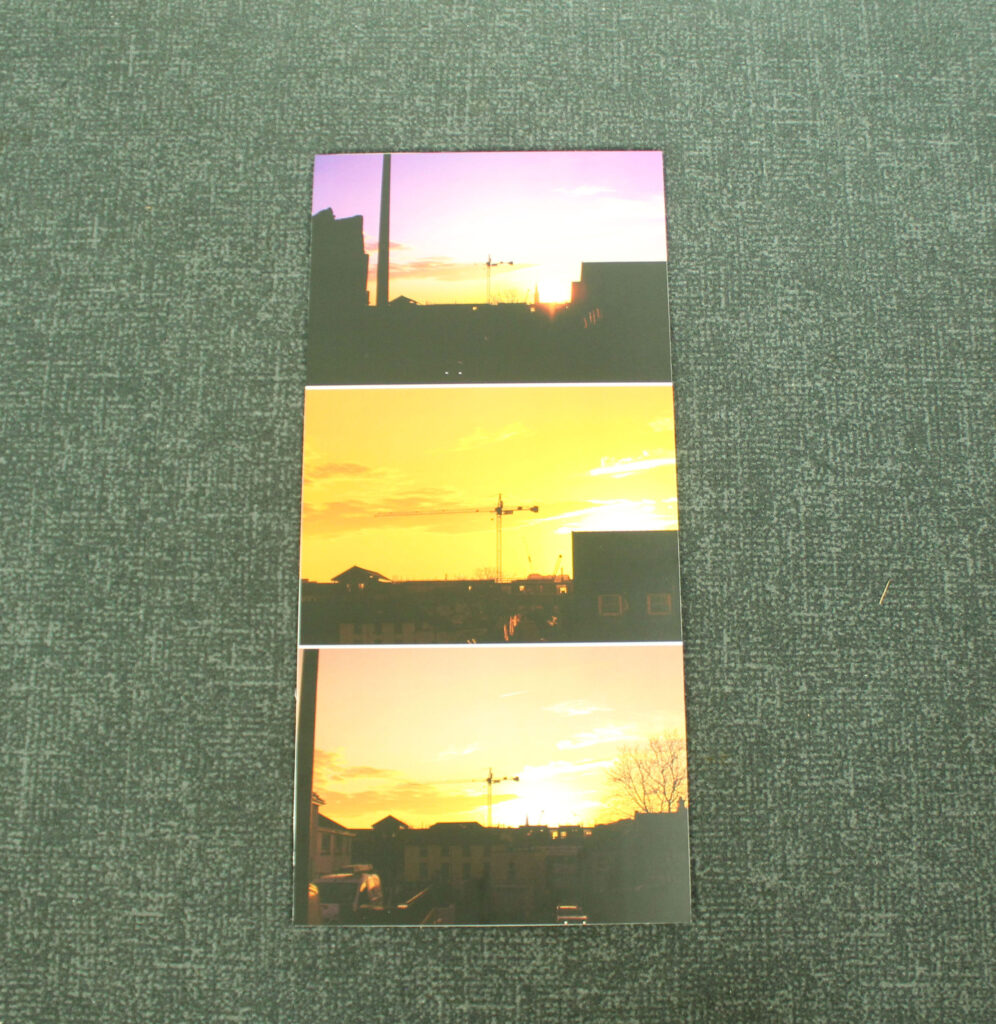
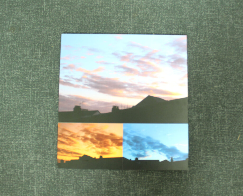
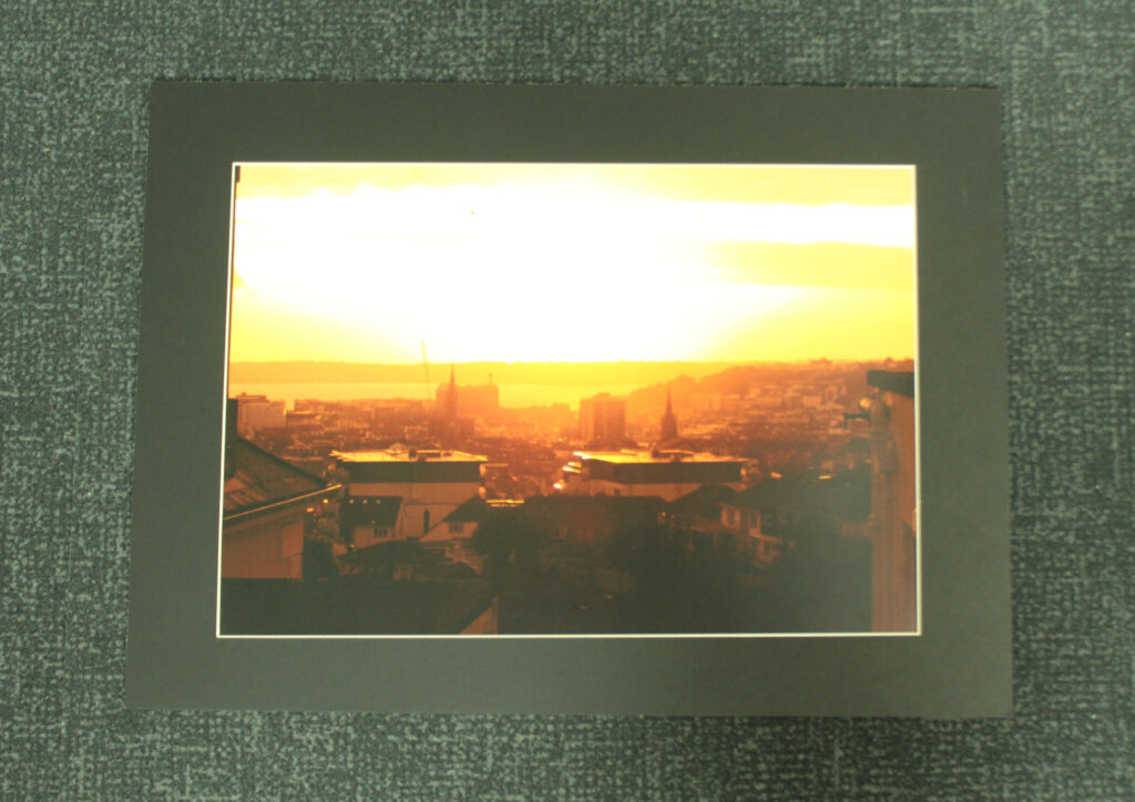
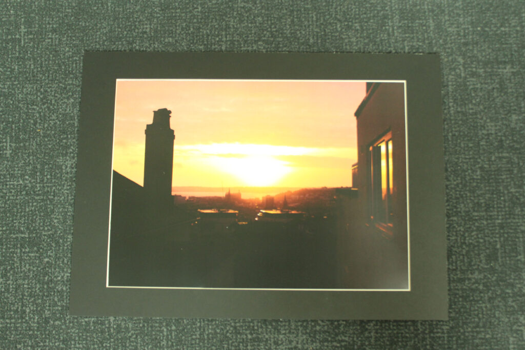
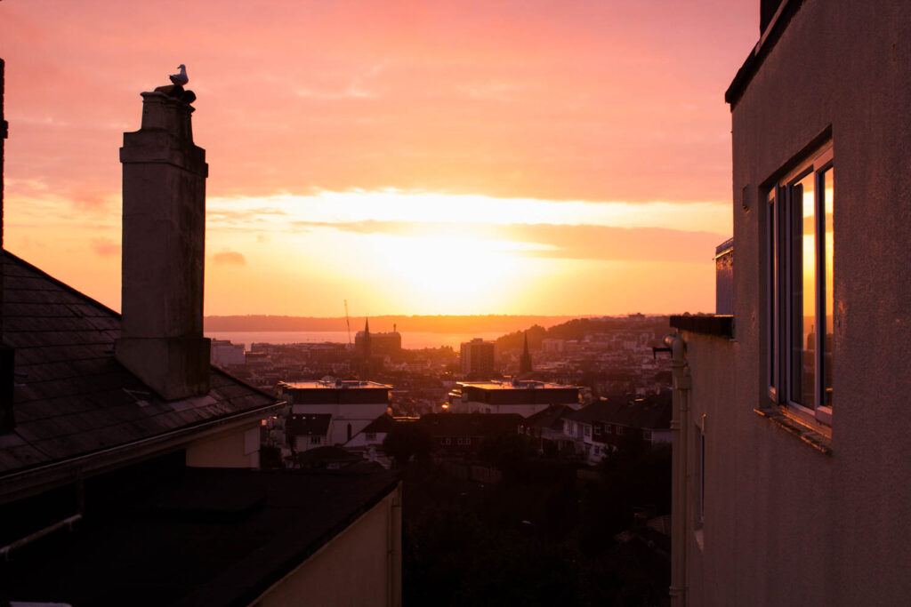
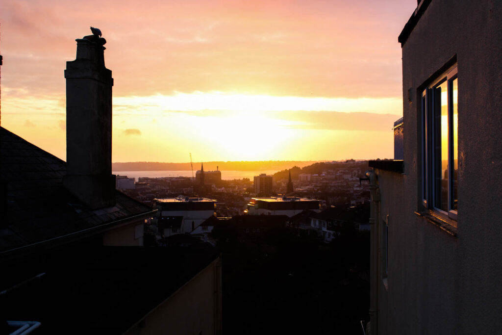
In my day/evening photos I wanted to also involve views from higher places showing big parts of towns and cities just like in the movie, also the lower from-the-ground views of the buildings above on the busy roads. Most of the ones I did had amazing skies too so I involved the many different colours in the skies to add as my own thing to further enhance the overall image.

Comparison –

Reggio’s:

Mine:

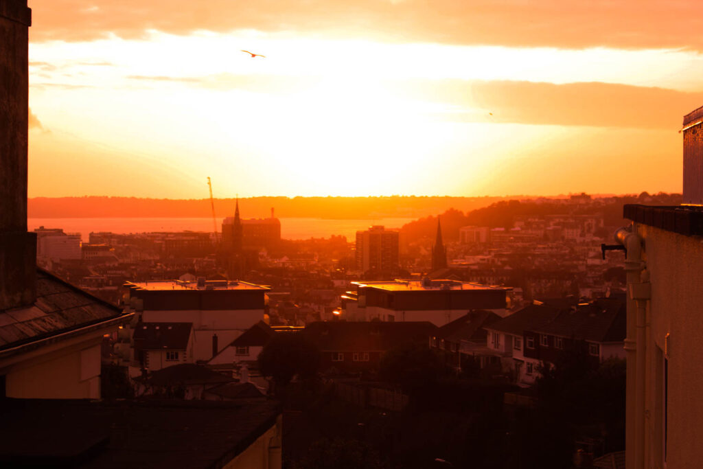
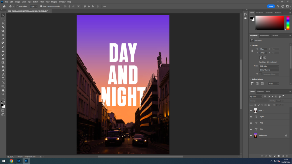
In conclusion, I think I did a decent job of replicating themes from Koyaanisqatsi over to my photobook. The overall essence of the movie, I believe, is very present within a large portion of my images and I am very satisfied with my work. In addition, the quality of my photos, I couldn’t be any happier with, especially the sky images with their stunning colours and lighting. They all look professional and cinematic, which was another theme I wanted to target, cinematic photos. The idea of these images, day and night were under the “Observation” topic, as they are observing these areas. The meaning of these images and photobook was to simply show nice cinematic photos and to view Jersey at different times of day.

Virtual Gallery

I placed my images in my own custom virtual gallery and presented them on the walls in their own rooms. Very happy with this gallery and collection of photos.

Video Collage – Making

Using Premiere Pro to sequence images.

I had to reduce the time of each frames for more complicated sections like this being about 3 frames per second to look slightly smoother when compared to the other sections being about 2fps .
Changing the sequence of the video I much preferred the longer clips in the middle.

Here is my completed short animation film

Zine One – Layout + Experimentation

I plan on making a single section zine – adding smaller inserts into the pages via stitching + Collage. I plan to bind the back of this book myself so I have the freedom to add pages and new images.

Creating Juxtapositions

When thinking about the layout of my zine I want to take inspiration from Kawauchi’s Photobooks specifically her juxtapositions and parallels between pages. She often pairs images by shapes as I have attempted to do here by paring two photographs that have multiple diagonal leading lines.

Framing – I decided to have one image bleed over the edge instead of both having equal framing as I think it makes it more visually interesting and better splits the photos apart.
Experimenting with square format

I decided that the square format images would be too small on an already small Zine – I feel it leave too much empty space.

Looking at layouts for writing on first few pages.

Experimenting with different images formatting.

Whilst I like this Experiment I feel it looks unrealistic and almost ‘pop art’ I think it moves too far from the idea of natural and mundane beauty.

Experimenting with matching and contrasting photos by colour;
Experimenting with colour Grading – I was attempting to create a grey background. – Decided that this looked a litle too unrealistic and i much preferred a more natural colour scheme.

Evaluation

Overall, I am happy with how this project turned out, and I am proud of the personal journey it has taken me on. I have learnt about the history of my grandparents and made personal memorabilia of their love. 

I found certain parts of the project challenging, such as when putting my photobook together. When I started, I realised that it would be difficult to make the images flow into a story because they were all so different. I had to make myself insert my own photos, and not just archives because I struggled to create connections. However, after persevering, I found ways in which I could present them and connect the pages to create the personal journey I wanted it to. 

After completing the book, I realised that I was drawn to the archived images, especially the retro look of the worn away images, the yellow tones and saturated colours. It has inspired me to think about working with archives in the future.  

When exploring photographers, it took me a while to find the right ones that would work for me. I was really inspired by Carolle Bénitah, and I created multiple edits based off her. However, when creating my photobook, I decided it didn’t fit, and I chose not to use them. Researching her work was still beneficial for me, and I am still happy with the outcomes from her work. Other artists such as Alec Soth, Nan Goldin and Jessa Fairbrother all inspired me to create and edit in certain ways. Without researching Soth’s work, I wouldn’t not have been inspired to create the dramatic portraits of my gran. Overall, the most inspiring artist for me was Larry Sultan, influencing some of my images and most of my book layout. The way he presents his images in such a variety caught my eye because he managed to create such an interesting book, also presenting archives and new images. The photos of his parents also influenced me to take photos of my gran in posed situations, but still with a serious face. His work got me thinking about lighting and angles too. 

Example of our work compared:

The editing process was helpful for me, and I learnt more about Lightroom Classic. I got to experiment with colour correcting the archived images that were too orange and working out ways to create structure and quality through adding texture and clarity. Some of my images also challenged me, such as the one above, because I wanted to create impactful images, using light to draw emotion. Even with my black and whites I have always been inspired by Ansel Adams ability to create bright whites and dark blacks. I attempted to achieve this in my work because I find it adds more depth and makes an image powerful. 

Mounting my images was the most time consuming. I chose to mount them all similarly, however I met a challenge when some of my images turned out different sizes to what I ordered. However, I managed to find ways around it, and I am happy with the way they are put together to present parts of my gran’s life. 

Overall, I have learnt a lot from this project, understanding that photobooks can include archives to alongside my images, and not just my own photos. I have understood the bookmaking process more too, because this book took me longer to piece together than my previous one. There was a lot of depth to creating it, and I spent more time shaping meanings through the pages. Surprisingly, it felt like an emotional journey, learning about my family’s life, and I am glad I have created this project to present it. 

My work compared to my artist references

I took Larry Sultan’s almost note taking pages, and created my own in a scrapbook form. I am happy with how it turned out, because these pages were created by my grandfather, and it looks like he has put this page together.

I wanted to recreate the ‘staged’ but in action shot. I find its almost like environmental photography, because my nan spends so much time in the garden, and I have photographed her in her space, using Sultan’s formal style.

I combined Alec Soth’s style with Sultan’s. I find they have similar styled images and compositions, and I think I have captured the same approach to image taking.

Final Printouts

I followed the ideas I made on a previous blog post and carried them out very nicely, very happy with these images and displays.

Multi Foamboards –

Window Mounts –

Video Collage – Images + Editing

I upped the contrast of my images to make the added collage standout against the background and avoid the dull grey that the paper made the images.
Reordering images to make it easier when I put them into Premiere Pro.

VIRTUAL GALLERY + EVALUATION

CREATING THE VIRTUAL GALLERY:

I created the virtual gallery on Photoshop 2024. I had already previously saved the pre-set of the virtual galleries onto my media drive, from my previous attempts at virtual galleries. I decided to do two galleries and use different images so that the presentation of the images flowed. In the first gallery I used images from photoshoot four, I decided to place the three images of Grace in the car in the back, like a trip-tick as they are similar and work together as a three. I put the more yellow toned image in the middle so that the other more blue/purple toned images can be on either side. I also used images from the beach that worked together in order to have a subtle contrast from the dark images in the back.

In the second gallery, I used my images from photoshoot one however also used an image from the beach. This gallery shows girls hanging out and portraying stereotypical ideologies of what girls do when they hang out with each other. I added some abstract close up images of belts and necklaces to highlight the stereotypical views of feminine dress code.

LINK TO PHOTOBOOK

Link to Photobook ‘Teenage Fantasy’ here:

FINAL VIRTUAL GALLERY:

EVALUATION:

– How successful was your final outcomes?
– Did you realise your intentions?
– What references did you make to artists references – comment on technical, visual, contextual, conceptual?
– Is there anything you would do differently/ change etc?

Observe, Seek, and Challenge was presented to us as our 2024 exam theme. My interpretation of this theme was femininity of girlhood and teenage girls. In terms of observing I was observing the behaviour and stereotypical views society has deemed fit for what teenage girls should be doing, therefore I was seeking a way to present these views created. I presented girls in my photobook as hyper feminine and edited my pictures to be hyper realistic too. I made the girls seem very feminine and ‘beautiful’ to create the illusion that society has created. However I also took images of girls smoking and drinking alcohol which would be seemed as a more masculine and anti-feminine to do, which challenges the dominant ideologies in society. My intentions for this project was to highlight these ideologies and show that they clearly affect society and growing teenagers in term of restraining them for allowing to explore their identities and life. Even though I am pleased with my final outcome of the book, I would of like to explore more ideas in terms of challenging the dominant stereotype which was one of my intentions I was hoping I could try, yet wasn’t able explore.

My main artist references that I focused on were Nancy Honey and Cindy Sherman, when exploring ideas for my photobook I started looking into the work of Justine Kurland. Even though my main studied artist’s were Honey and Sherman I ended up focusing more on Honey and Kurland. This is due to the fact I took a photoshoot in the style of Sherman and it didn’t really fit with what my intentions were with the photobook. I explored Honey and Kurland work in a more visual and technical way as I preferred how their images looked visually and that’s how I wanted my photobook to visually look, whereas I studied Sherman’s work in a more contextual and historical context; exploring the idea of stereotypes. In terms in areas to improve would improve in being more organised with my photoshoots so I would be able to have a larger variety of images. Furthermore, I intend in my next project to highlight binary oppositions and show the difference between what society expects vs what society is actually like.

For my final outcomes I created a photobook and created four window mounts. I created a photobook that highlight’s societies stereotypes towards femininity in girls. As I was editing I created a purple, pink tone in my images to really focus of the significance on dominant ideologies and stereotypes, even in terms of colour. Pink is typically a stereotype for femininity and a ‘girl’ colour. Overall I am pleased with the aesthetic and layout of my photobook, however wish I explored more of the counter types and created a photobook with the narrative story by showing binary oppositions. For the window mounts I picked my strongest images that I thought would present well through a window mount. I am overall happy with my final outcomes, but for my prints I would try to create something with multiple images, perhaps a trip tick.

Photobook Development

I wanted to have the title “Lightfall” because I thought it was appropriate for my themes and photos, the evenings and night times in Jersey. Also because I think it just sounded cool and interesting.

I wanted the front cover to be eye catching, with the title big and visible and my name seen on it as well. I think that what I came out with was very good. Lightroom didn’t let me add text to the spine for absolutely no reason, so I left it and instead added a nice little gradient that matched the colour palette of the front cover image. And included on the back some details, like the publish date and the author.

My front cover was originally going to be different, it used a different photo and even a different name, “Day and Night”:

I personally loved this version, the gradient and the text blending in so well together and the buildings below and the text going behind the tops of the buildings. This unfortunately didn’t make the final result as the image, being taken vertically, wasn’t the right size for the page, if I tried to zoom the image in to fill the page it would only make it blurry and pixelated. Also the title “Day and Night” I wasn’t too sure about. I wanted a short name which would roll off the tongue when saying out loud, which is why I settled for “Lightfall”.

The next page tells the viewer a little on the contents of the book and the ideas of it’s origin. Along with some photos underneath.

Overall, the 51 photos are all reasonably spaced out from the edges, I chose to do this because I felt it made the photos more professional and better to look at. All sky images have been separated from the night images because I didn’t want the order of photos to be messy. Initially, the collection of night photos were going to be shown first, but because of the title, “Lightfall”, it felt that it would make more sense for the lighter images to be shown first, then to show the darker ones, to follow a sort of day cycle.

I did the same for my dark photos, spaced them out to professionally present them. I like the way these ones are slightly more contrasting from the white page because they are night photos.

Overall I am very satisfied with my photobook and I can’t wait for it to be printed out. The composition, I couldn’t be any more proud of and I think is great. I wanted to improve on my last photobook, “Left Behind”, as I wasn’t too happy with it and I felt I could do so much better. This new book, I believe I have managed to do that.