Creating the photobook

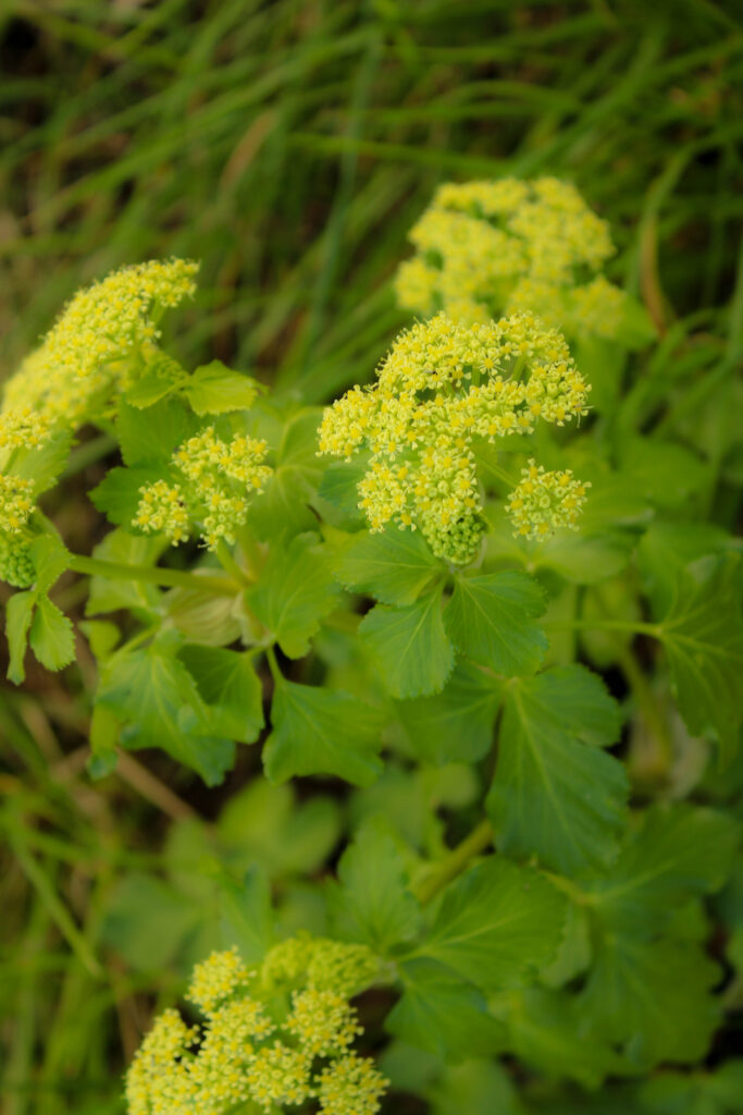
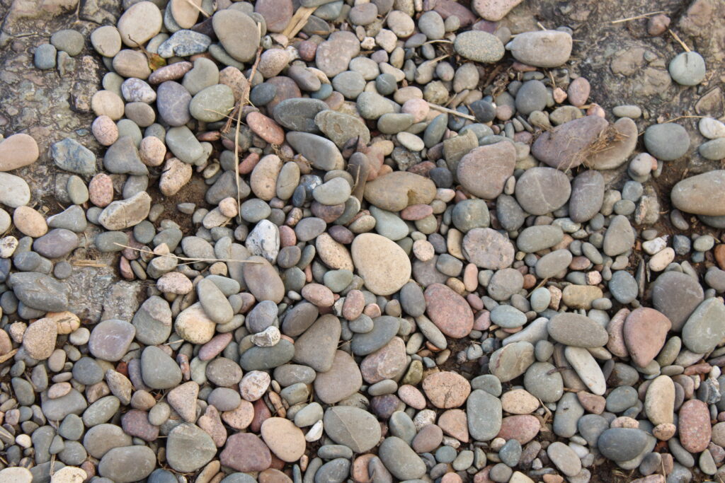
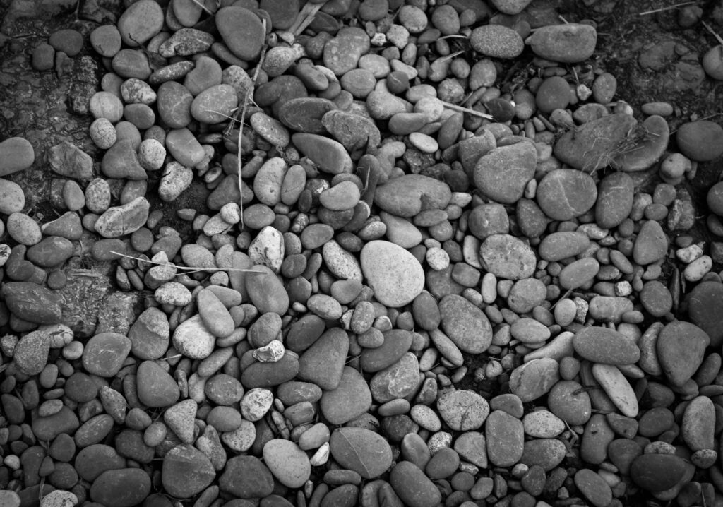
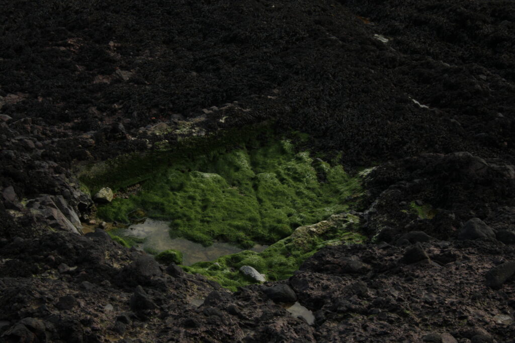
Overall I am Very happy with the result of my photobook. My aim was to create a clear story of the contrast between technology and nature and I think That I achieved this. Starting this project I had a clear visual representation in my mind of how I wanted to lay it out, which was every couple of dystopian, technology images I wanted to include a double page spread of nature to contrast the two worlds and really open the viewers eyes. I am excited to see how the book looks in person.

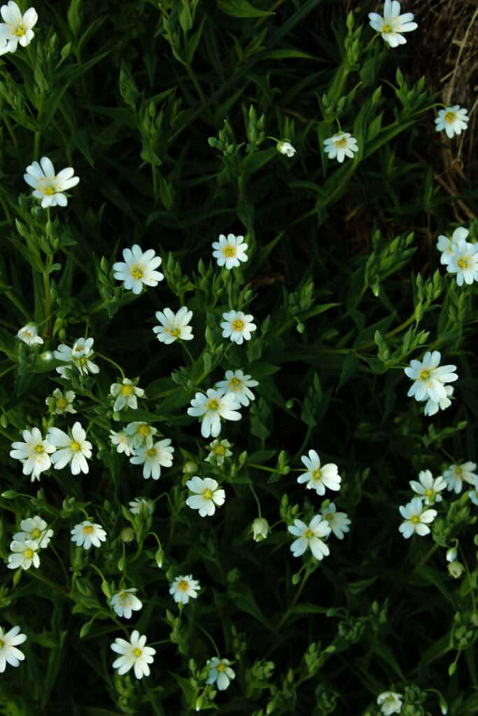
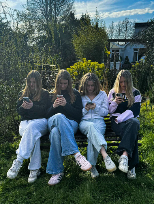
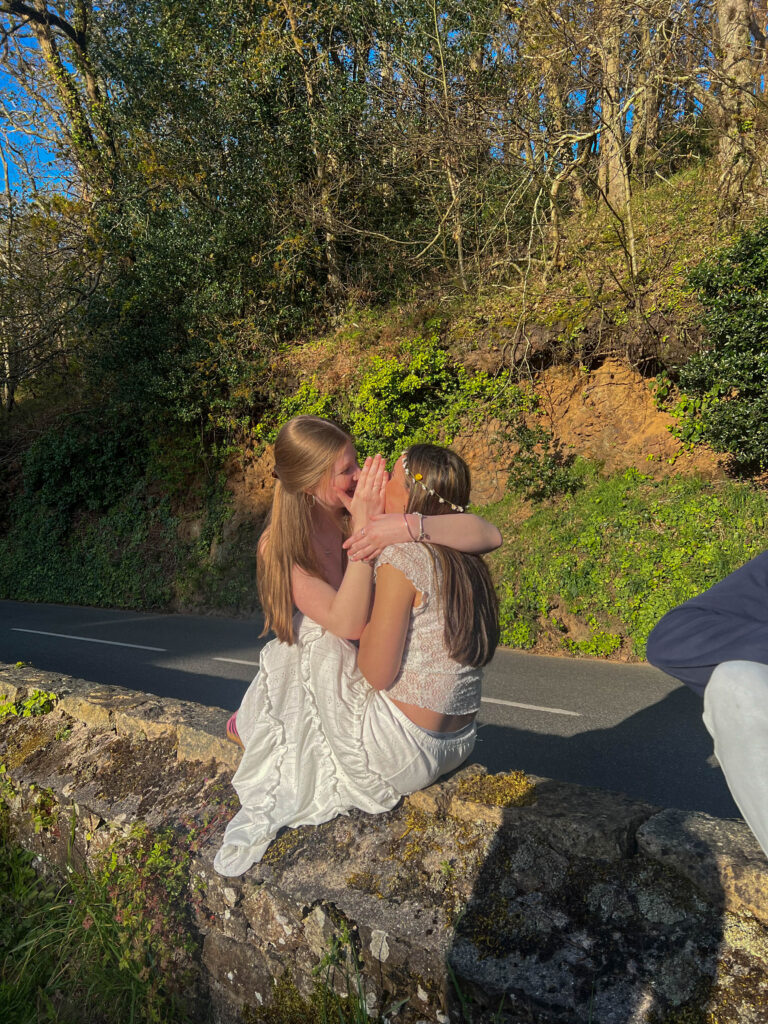
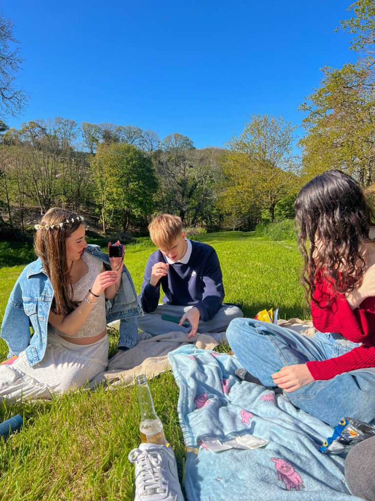
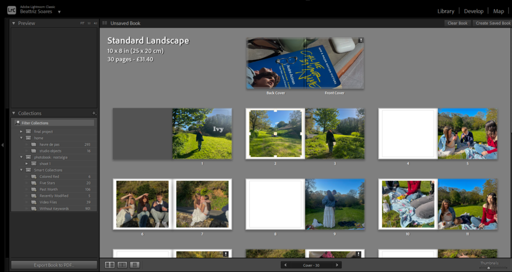
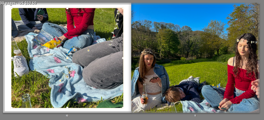
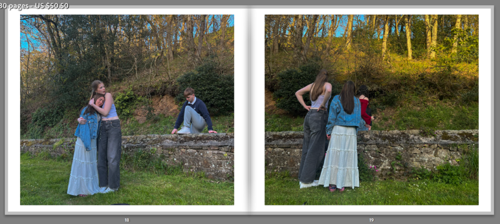
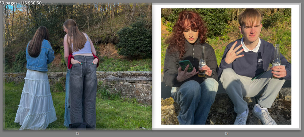
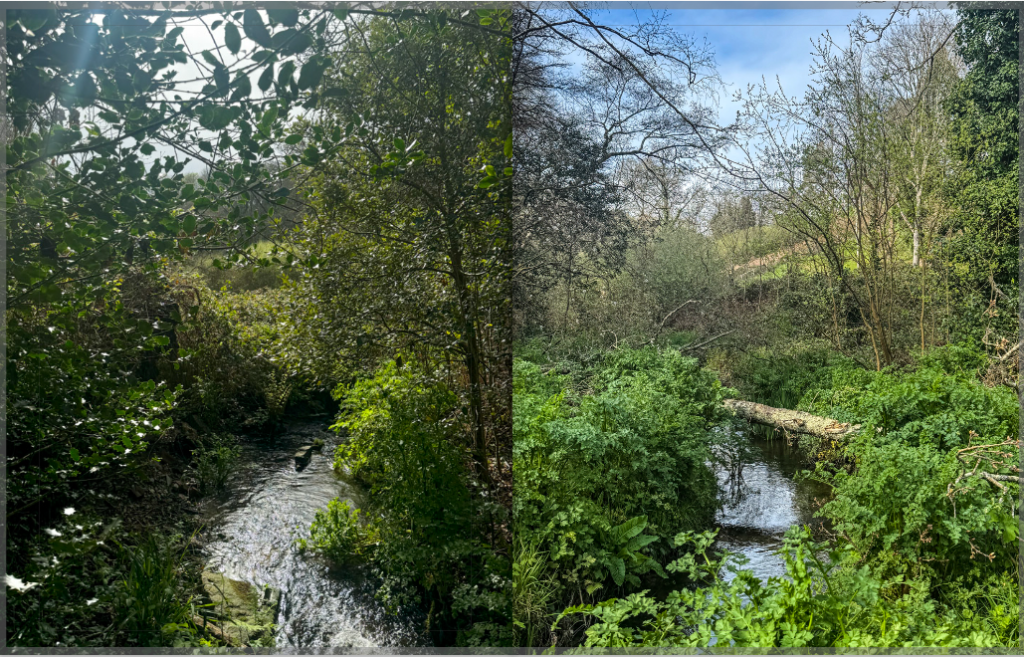
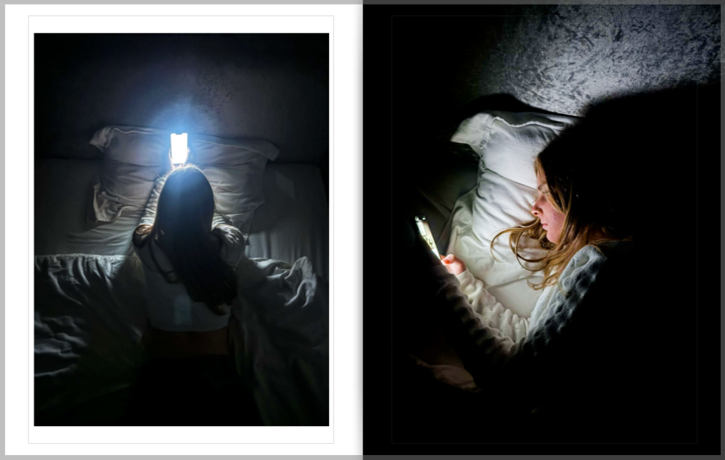
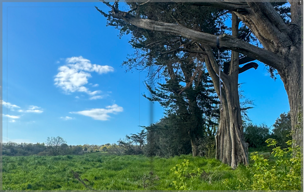
Throughout the book I chose various lay outs to give my pictures more personality. I managed to to this by pressing the drop down button below my page and then choosing from the various layouts that I have been given. I only did this for my images of technology as I wanted all my images of nature to be on a double page spread.

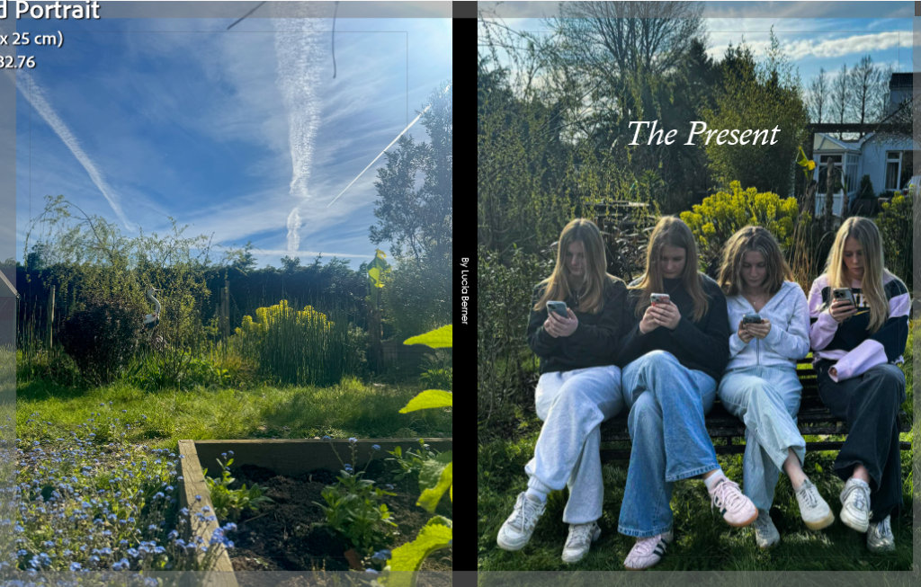
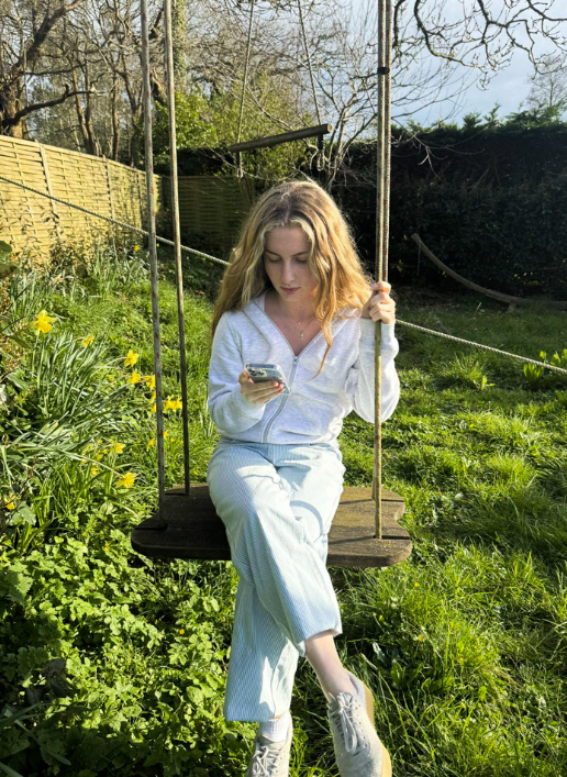
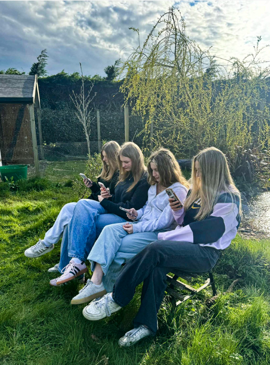
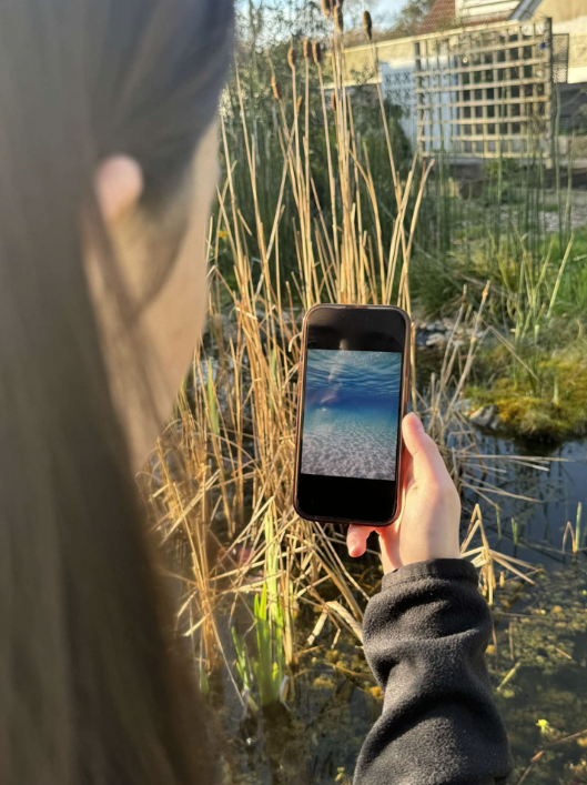
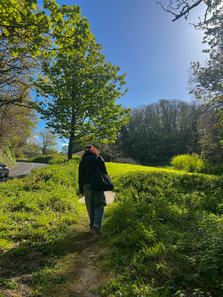
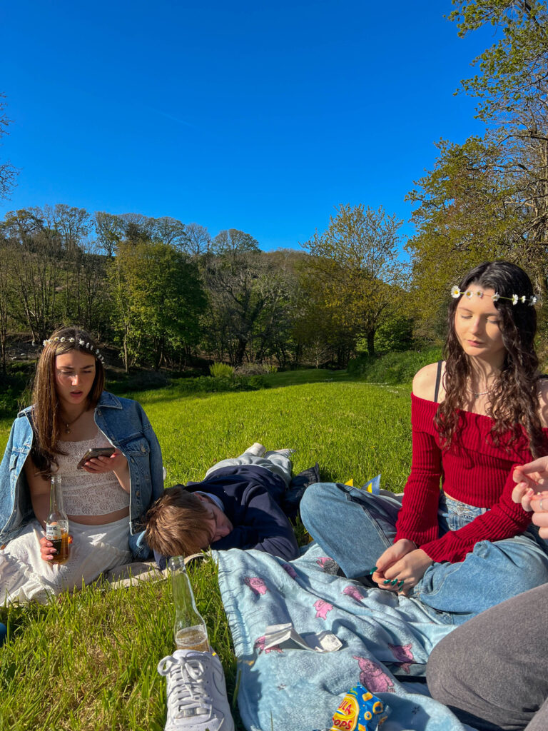
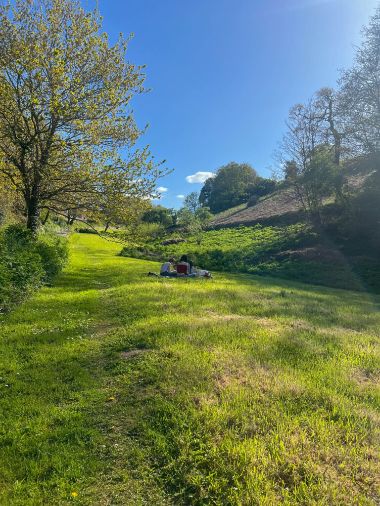
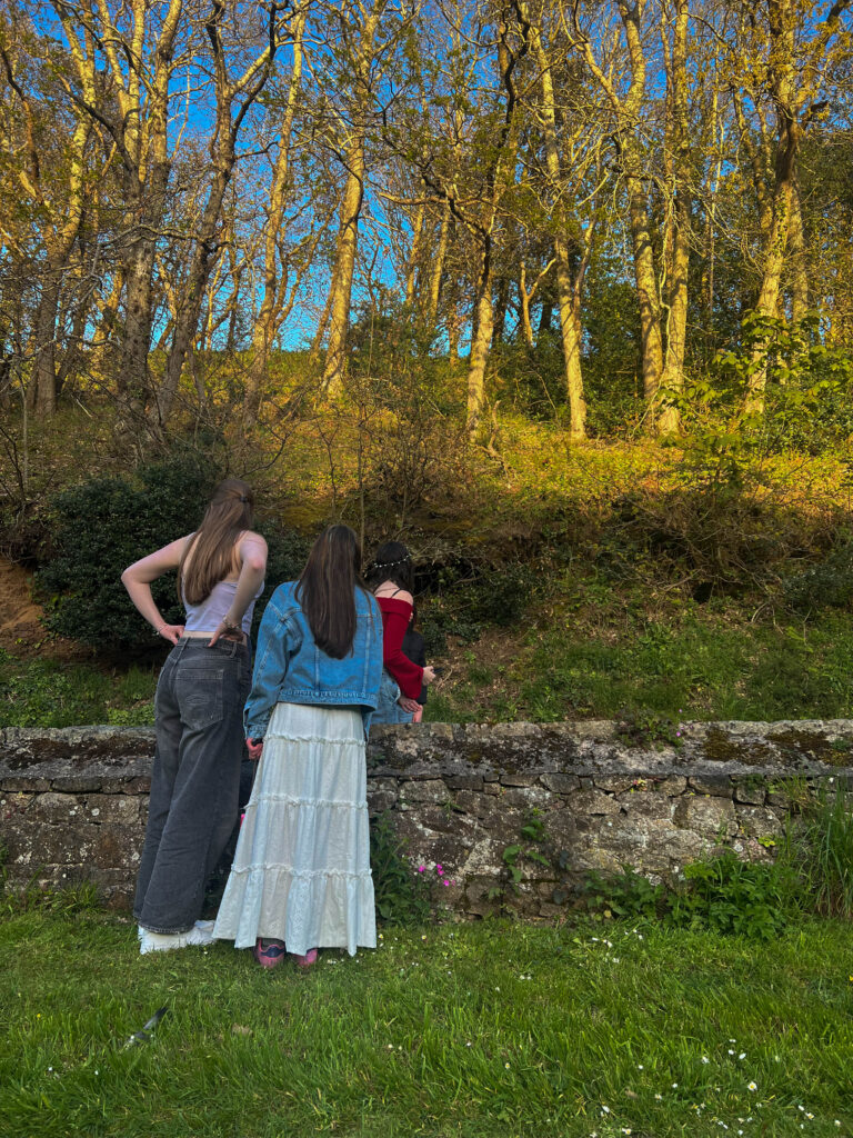
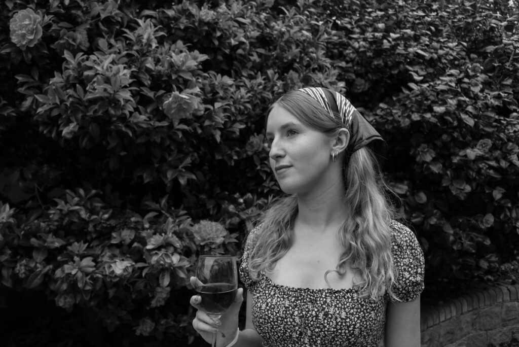
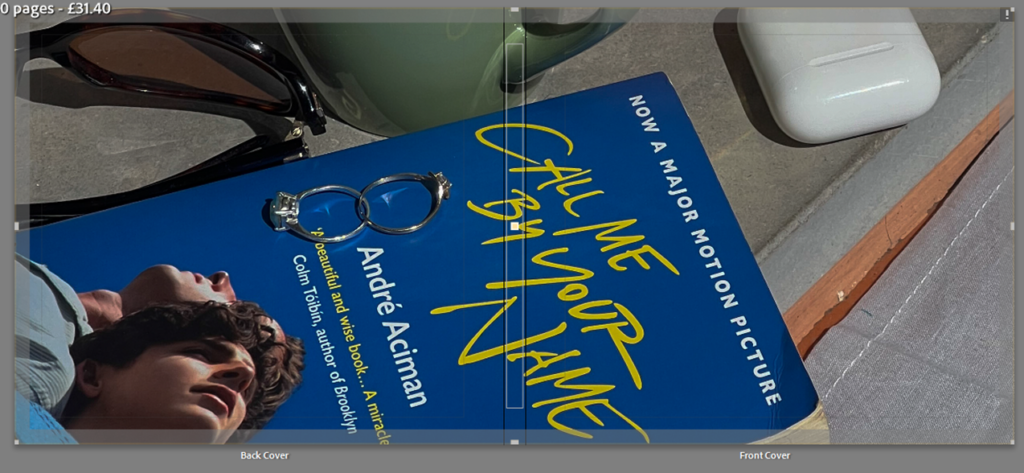
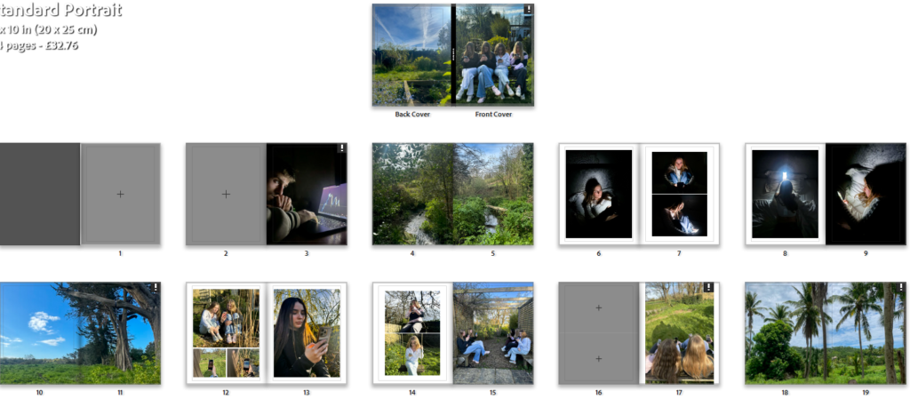
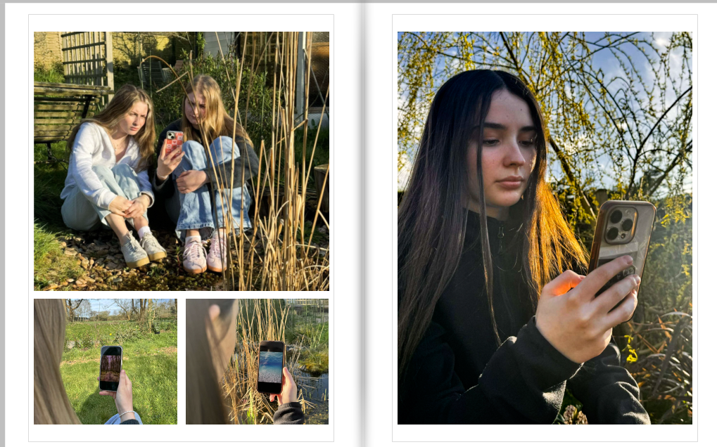
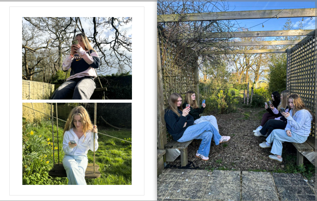
I chose this image as my front cover as I feel like its the best photo I have taken that expresses the story I want to tell. Due to the mixture of the female models attention being on their iPhone when Surrounded by nature. Originally I wanted this image to cover the front and back of the book but due to the size of it being too small I needed to select an old image for the back of my book.

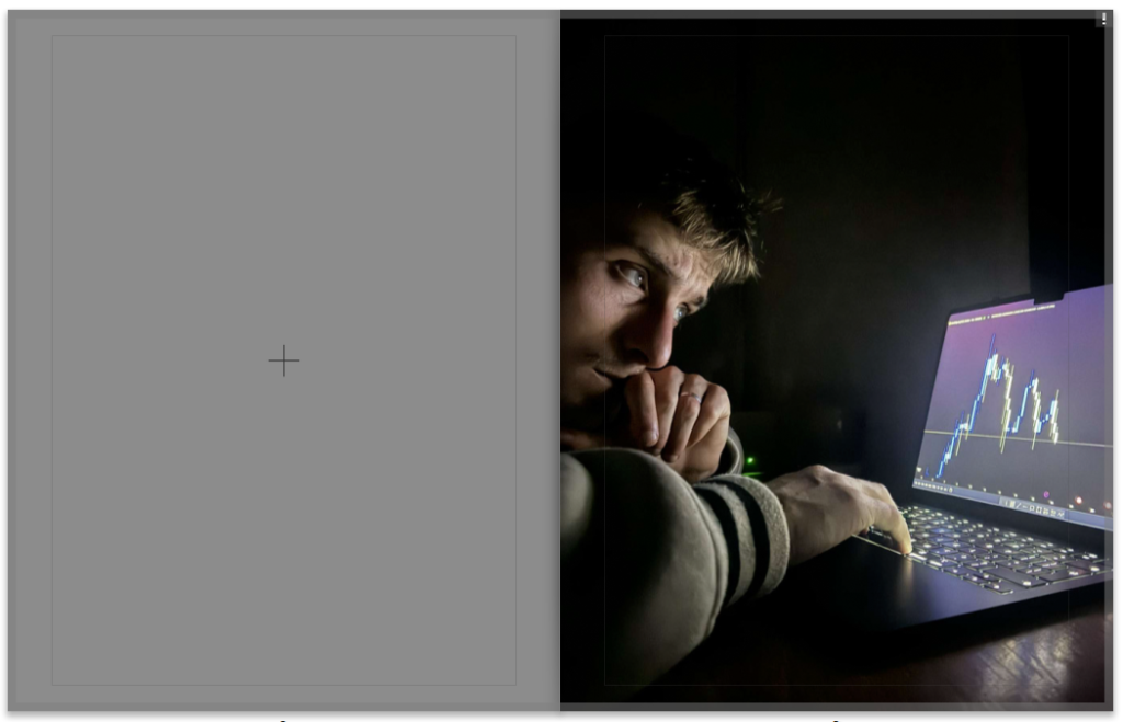
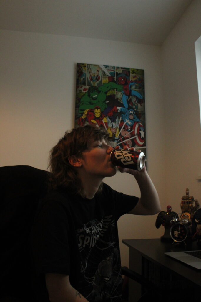
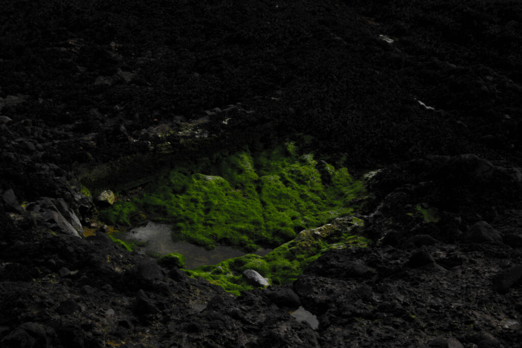
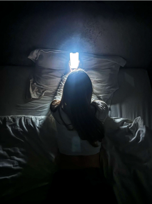
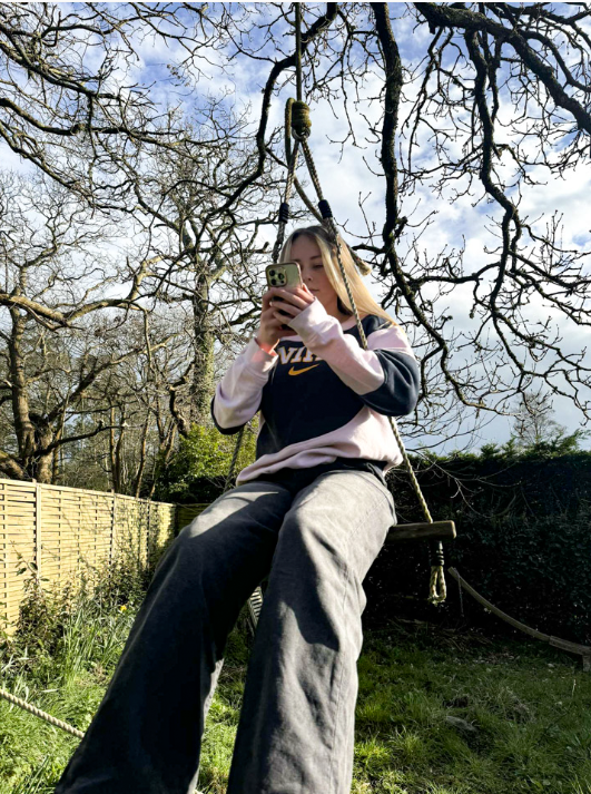
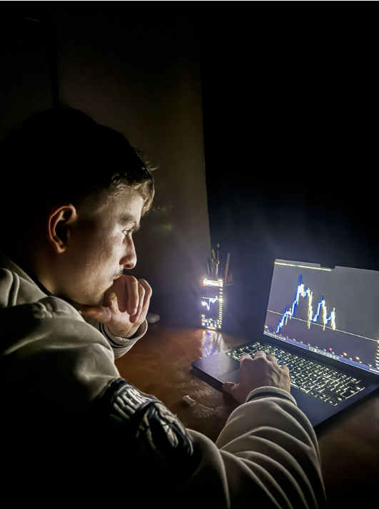
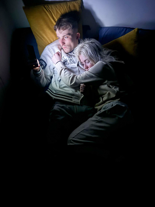
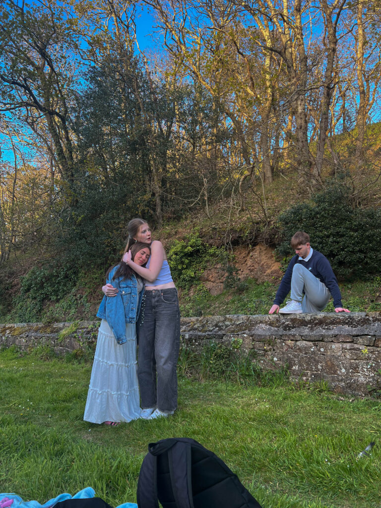
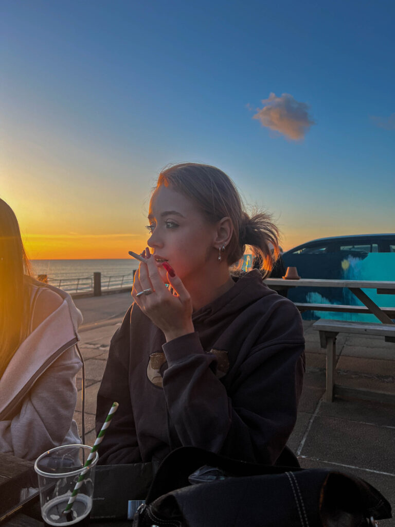
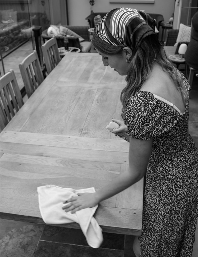
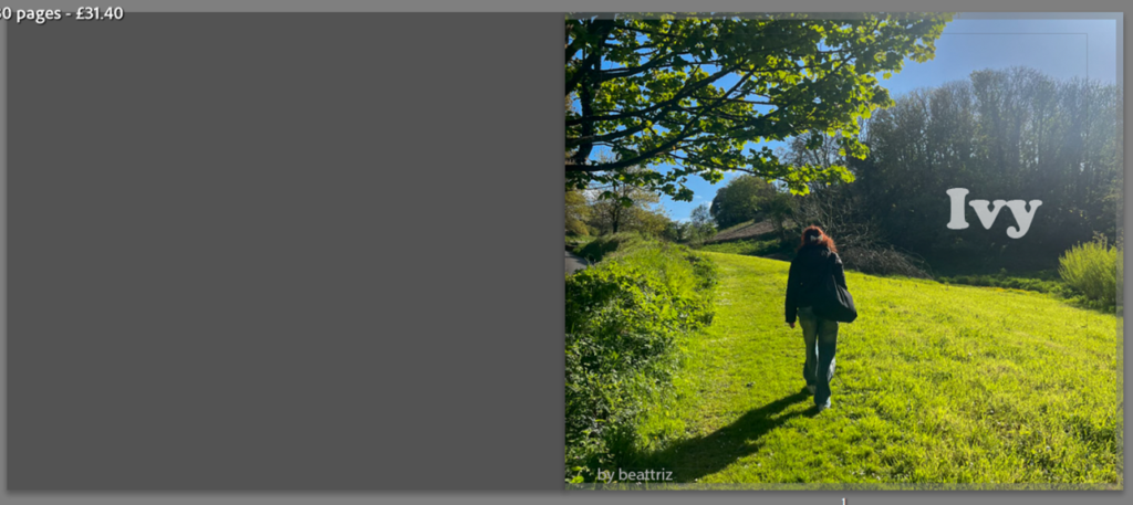
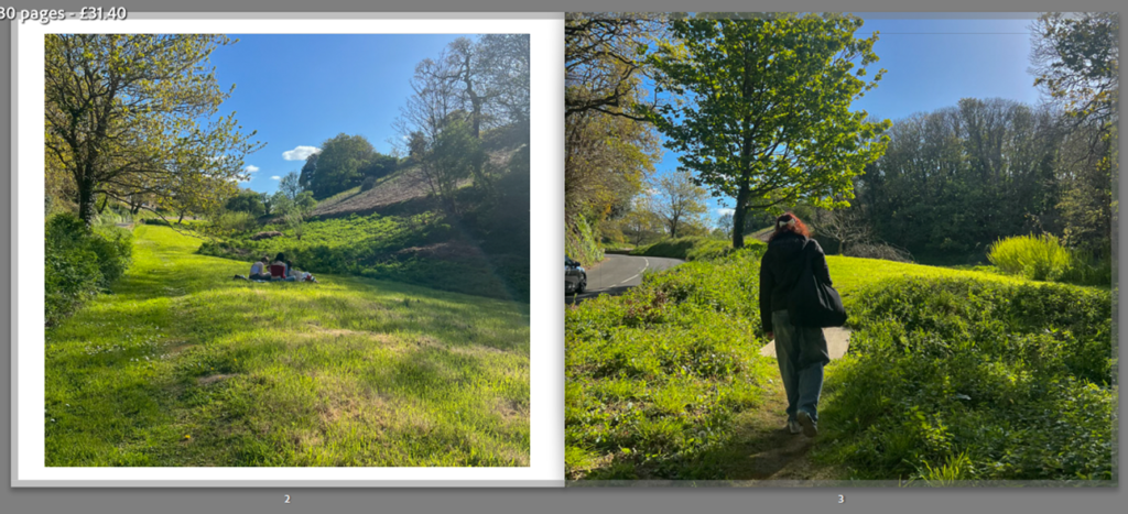
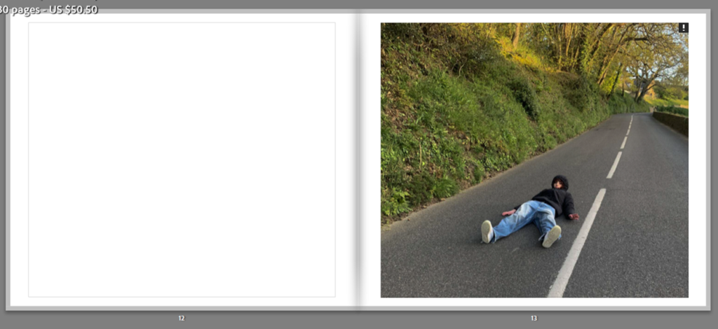
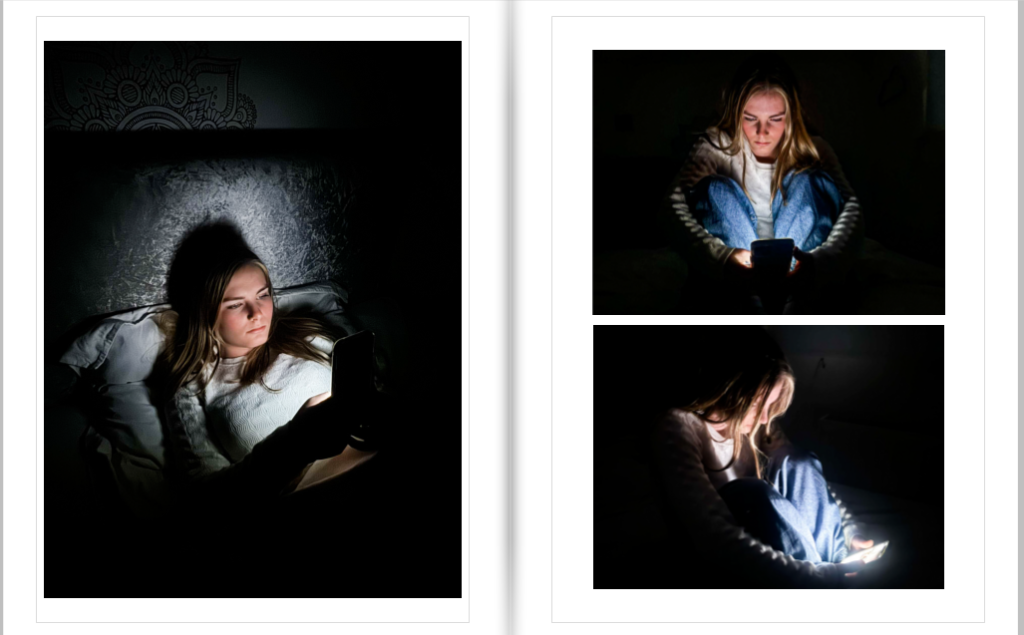
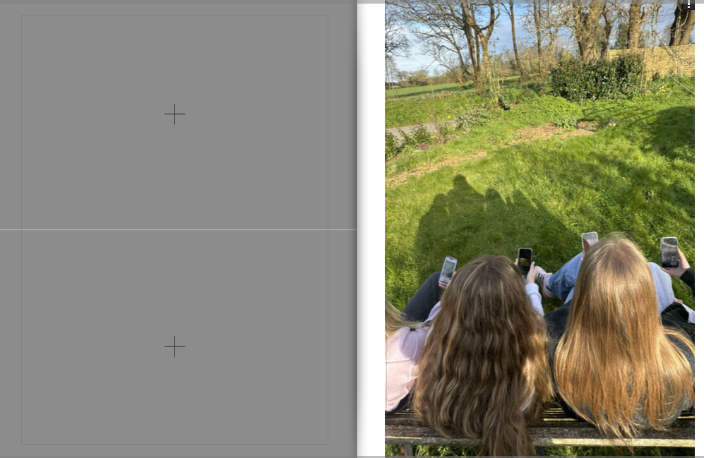
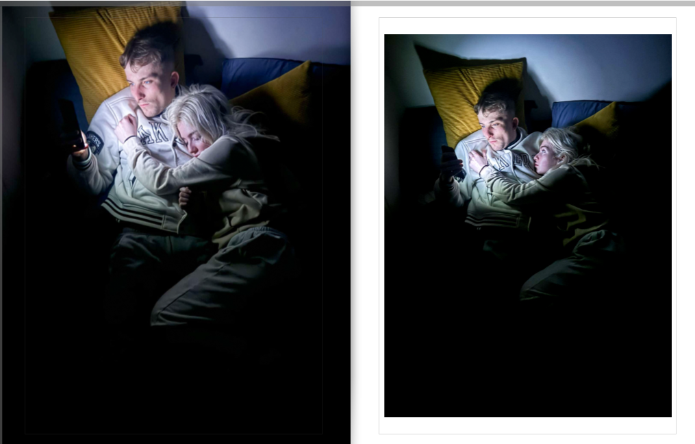
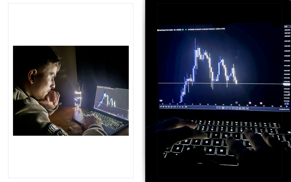
For my first page I wanted to have this darker, more dystopian image on a double page spread due to it being one of the most captivating photos I have produced, But again due to the image size I was unable to do this as it would come out pixelated. So instead I choses to have the image covering only one side leaving the other side blank so the main focus is still on that one singular image.

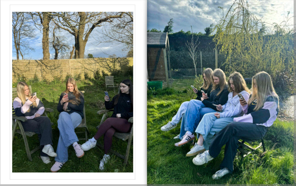
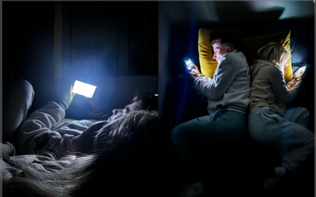
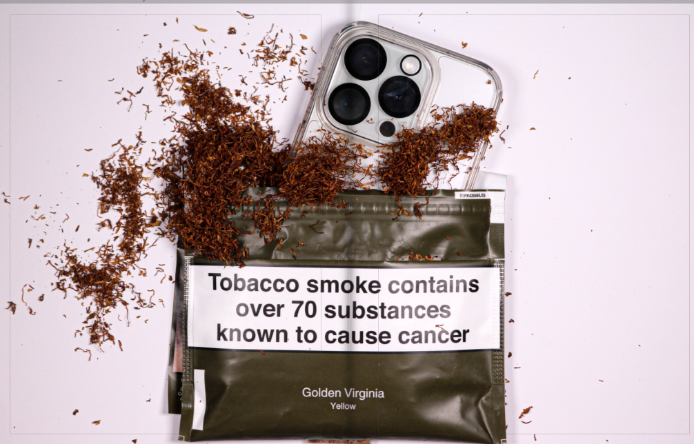
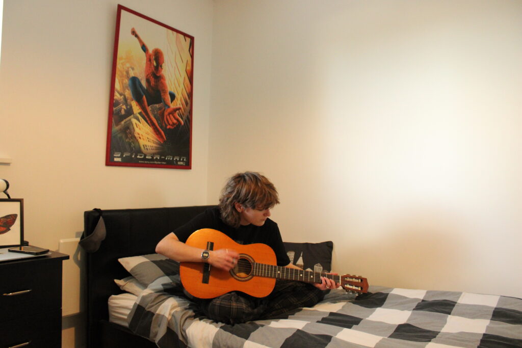
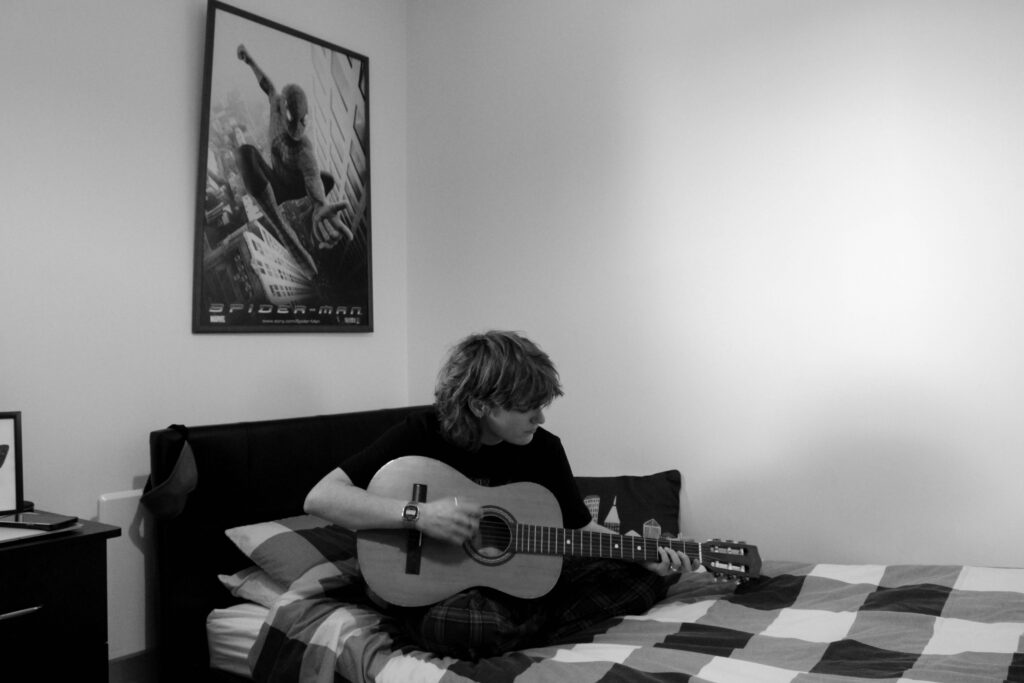
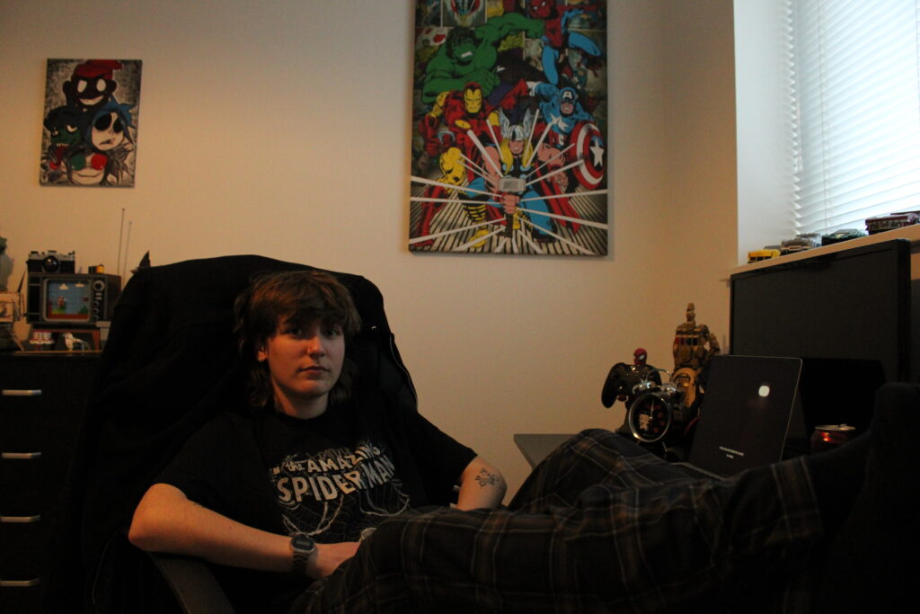
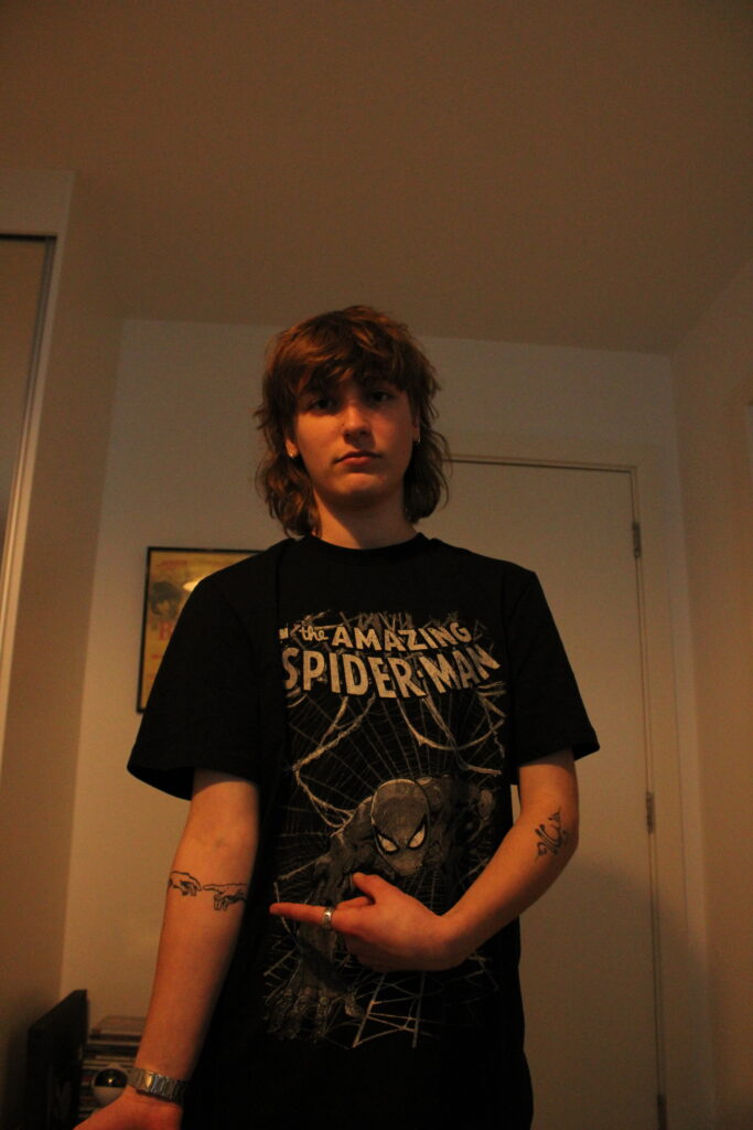
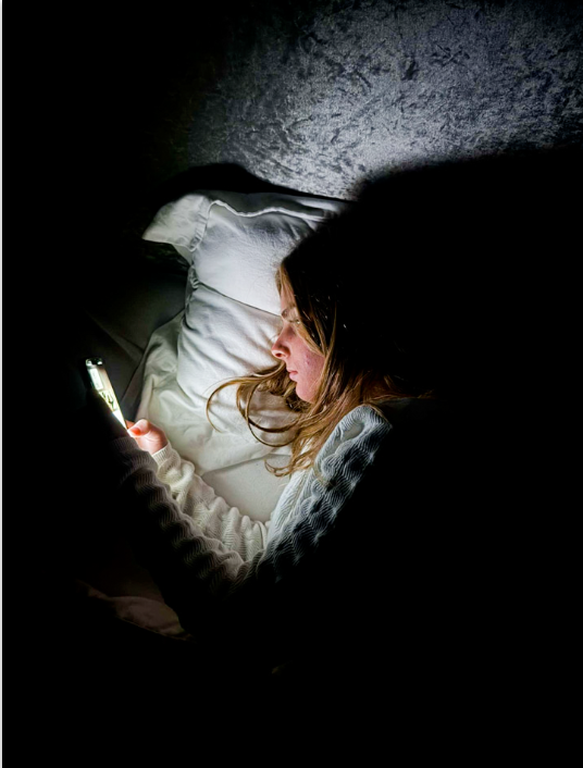
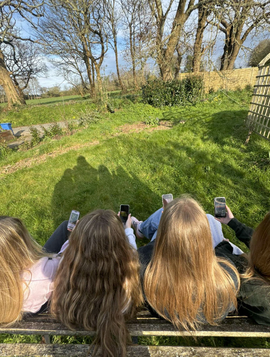
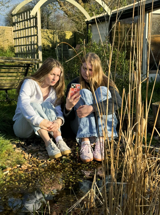
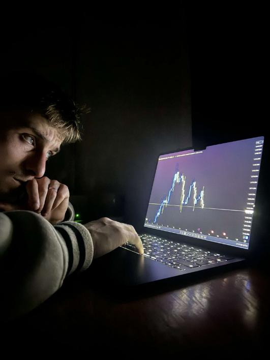
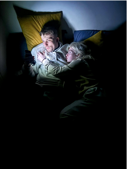
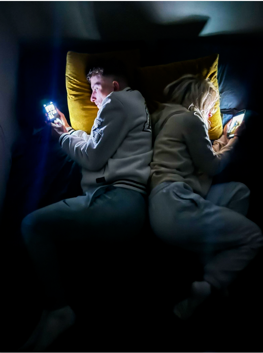
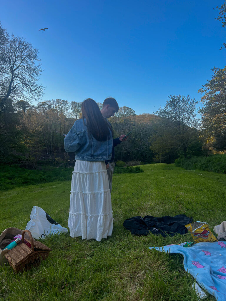
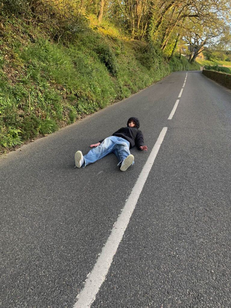
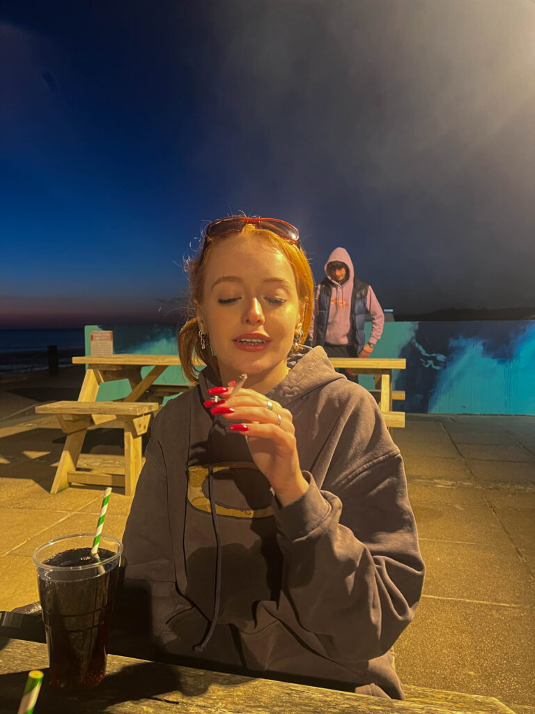
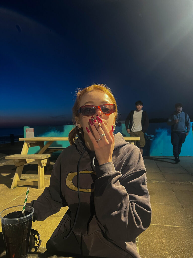
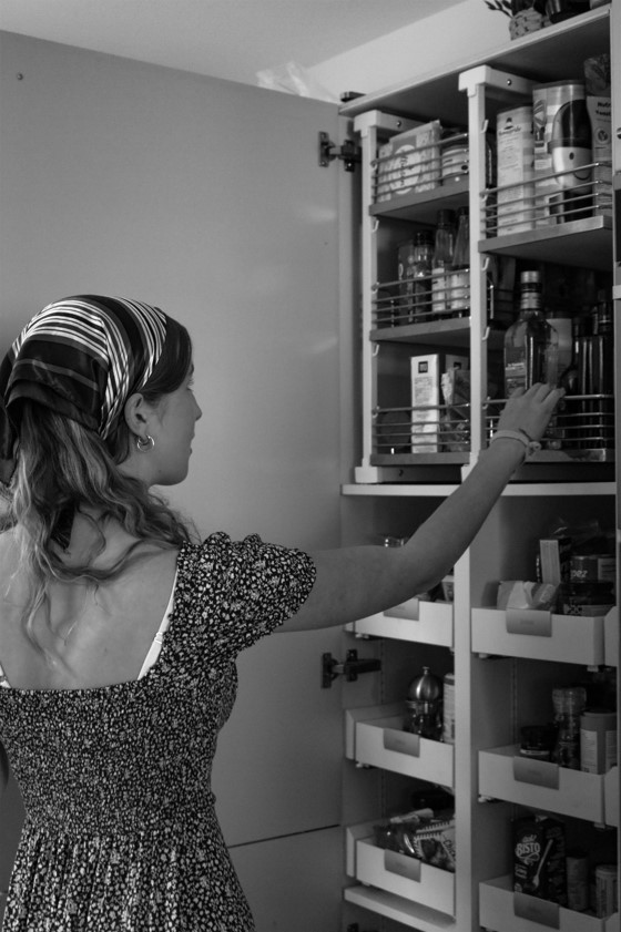
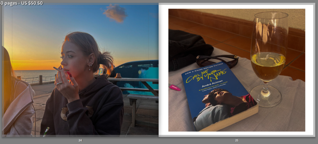
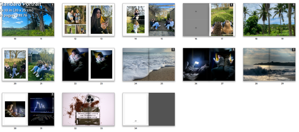
For my Last image in my photobook I chose this one due to its difference to the others but yet conveys a strong, powerful message of how addictive technology is. I also did this to leave the viewers of my photobook with the distinctive message. Overall I wanted my photobook to related to all 3 of the verbs given such as, Observing: observing the destructive use of technology around us. Seeking: Seeking nature in todays society and Challenge: Challenging technology addiction. This image relates to the last point of challenging addictive behaviours that are frequently seen in todays society.

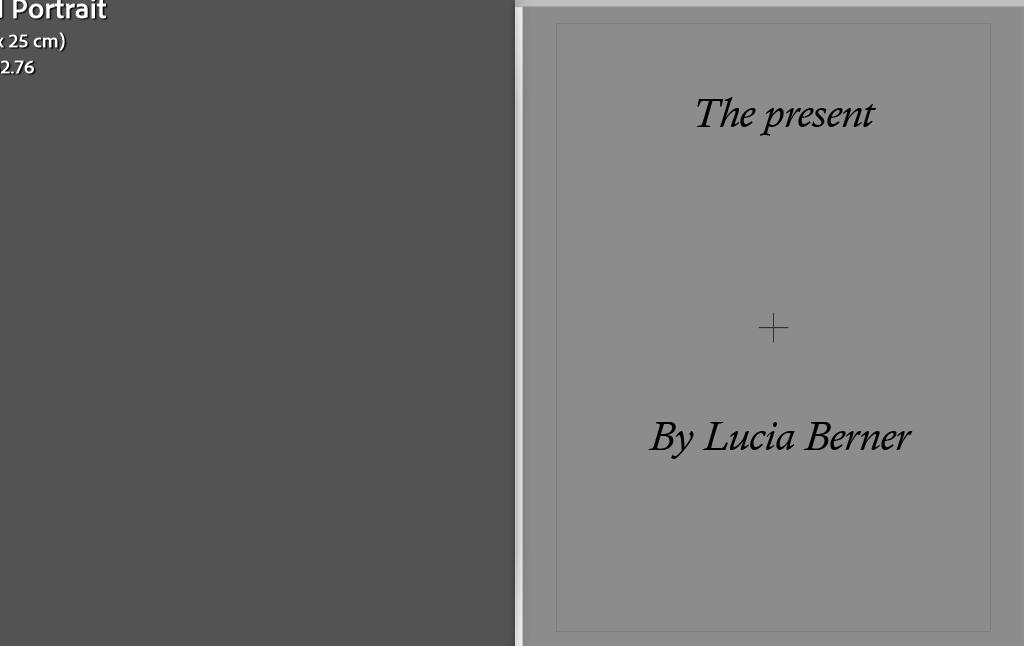
For my title I decided to name my book “The present” Firstly because of the irony of it as my photobook is basically describing how people are not living in the present on their mobile phones and secondly because this is the reality of the present time and how most people live their life glued to their phone.

PHOTOSHOOT #2

Rating code:

I think this photoshoot produced some good quality images. My aim of this photoshoot was to reflect a sense of identity through the environmental portraits of my friend in his room. I wanted to show elements of being a teenager, and show what life is like through the lens of a teenage boy. However, I have slightly changed my project idea to focus on aspects of femininity and life as a teenage girl in different forms of expression. So these outcomes show some element of my experimentation, but I will not be using them in my final photobook outcome as they no longer fit my intended theme.

PHOTOSHOOT #1

IMAGE SELECTION:

Rating code:

Photobook concept and narrative

For my photobook I narrowed down the 327 images that I took for this project into only 31

I decided to only use 31 images as I didn’t want my photobook to be too big and just a repetition of the same pictures. This helps make my final book more clear and gets the point across better. Each of my final images have a distinctive meaning.

All of the above are my photos that represent nature. I tried to euphemise them by increasing the vibrancy to make them more captivating and appealing then my other photos to really show the beauty of nature. These photos have significant meaning to me due to them all being taken in importance places such as my garden, places I used to go with family as a child and the places where I haver travelled to.

The set of images above are also important to me and my project. The meaning the I was trying to convey behind these images as how attached teenagers are on their iPhone. while blocking out reality and the world that surrounds them. The positions that I made my model sit, lay in are the natural positions that many of this generation goes in with their full attention being on their devices. The outcome of these Images where really powerful as it shows how many people are missing out on real life and while in these conditions they are not really “Living”.

The set of images again are Important to my project due to the important meaning behind them. They show how even while surrounded by nature many of this generation will still have their full attention on their phones. In two of the images I asked my models to display online images of nature while sat in similar environments, This emphasises the oblivious nature of people while on their phones and always seeking the virtual world rather than reality. These images are representations of what I see everyday in public, though in real life this type of behaviour is now considered “Normal”

The set of images above are again important to my photobook due to the meaning they convey. I produced them to show the dystopian realities of business that rely purely on technology. To help portray this I asked my male model to start working for his online business and told him to pose how he normally did. This inevitably shows the dangerous effects of spending all day on technology as it could impact an individuals mental health, I feel that the message behind these images are clearly evident to the viewer of my book which has been helped by the way I edited these images.

Lastly the set of images above are important to my photobook as it shows the effect that technology can have on relationships. To convey this message I asked my models to go on their devices ignoring and giving no attention the other model. These sets of images will inevitably also have a powerful impact on the viewer as in reality the impact technology has on relationships is often very overlooked by many which could result in separations in the future.

final images

These are the final images in which I have edited and chosen

statement of intent

I am going to explore teen gaze in my course study, the significance behind teen gaze is to present the real meaning of youth life and to experience it through their eyes among photographs. Teen gaze images are often taken as candid photos, the reason is that this is able to capture the raw moment in youth. The motivation as to why I picked teen gaze as my focus on the study is to display to the audience how adolescence get misunderstood and mistreated, it’s to also present how majority of people experience the same phases during their youth. Teen gaze can open the eyes of the people in adulthood and help them understand the emotions in teens. I wish to produce a photobook with the photos I have in the field, splash Sunday event and when I was in Madeira, the reason I have taken multiple shots during a long period of time is to properly present the teen gaze.

How I wish to take the photographs is by taking snapshots I will be doing this by randomly taking candid photos, how I will be doing this is by using my phone to take photos at any point during the events. The reason for this is because teenagers rarely take staged photos unless they wish to post them, teen gaze is mainly evolved around seeing the life through a teenagers eyes to show how people mistake them for this reason I will be using my phone to present the idea more clearly about teens and seeing it through my eyes.

What I will be including in my project are multiple snapshot of my friends and two still life photos. The aesthetic and style I will be producing is warm and comforting. The people that will be included in the photos are my friends as my theme is teen gaze. The images will be taken as a documentary in a natural environment outside as these are the type of places teenagers mainly spend their time especially during warmer periods. How I wish to produce the photobook is starting with the images taken at on the field the reason behind this is because the photos were during the day, the colours are more vibrant and it present what teens typically do during the day to socialise outside in the sun with their friends. I will then use the images of Emily during the Splash Sunday event at the end of my photobook as these were taken in the evening, and also presents what teens do during that time which is to go out and socialise while having some drinks. The photos of Emily will be paired with the two still life images of the wine and book.

final prints mock up

For my final physical prints I wanted to stick to the simplicity of my project theme so I decided to only print of 6 A5 photographs. I picked two trio pictures that I think work together well in terms of colour, shape, light and depth.

This is how I am going to to display the 6 of my final images.

cindy sherman inspired shoot

Due to Cindy Sherman’s focus on women through the eyes of the male gaze I decided to take inspiration from her film stills and curate my own:

Here are my edited outcomes:

Image comparison:

Left= Cindy Shermans image

Right= My inspired image

Both mine and Sherman’s images depict a young woman reaching for a book on a bookshelf. Her photographs serve to present the stereotypes of women through the male gaze which is why I chose a dainty and stereotypically feminine dress for the girl in my image to wear, representing her as sweet and innocent following the expectations of the female stereotypes. They are both dressed in stereotypical clothing for women in that time period and both of the layouts are very similar. In Sherman’s image the girl is looking past the camera enabling us to see her face whereas my image has the girl facing the bookshelf. This is one of the few differences between our images that show my image took inspiration from Cindy Sherman but didn’t copy her work.

book design, concept and narrative

final images:

layout:

Narrative: What is your story?
Describe in:

  • 3 words

colour, history, bold

  • A sentence

My book is a way of showing that we seem to take colour for granted and don’t appreciate it as much anymore.

  • A paragraph

Through my book, I hope to show that as colour has become such a regular thing in our everyday life, we don’t think of it the same way as people used to back then. I think that when colour film first came about it was such a big thing for not only photographers but also people generally. Now it isn’t seen as a big ting as technology is evolving everyday and taking images in colour is something everyone one can do whether it is on a phone or a camera etc. I am hoping that my images a have produced make us realise how beautiful colour is and also makes people spot things they maybe haven’t seen before when on a walk or driving. I have also took like on my lay out of my book so that not only do the images fit together but the colours within each image contrasts with one another. Personally, through out my project I discovered many hidden gems from housed to restaurants of bring colours/ containing bring colours that I did not know where there. Hopefully, after viewing my book, other will be able to look out more and discover new places and appreciate the colour in our world.

Design: Consider the following

  • How you want your book to look and feel
  • Paper and ink
  • Format, size and orientation
  • Binding and cover
  • Title 
  • Structure and architecture
  • Design and layout
  • Editing and sequencing
  • Images and text

When designing my book, I wanted it to look neat as there was a lot of colour, however I also wanted the colour to be the main component that everyone focuses on. I chose to use ‘Premium Lustre’ paper so that my images have a nice finish on them and makes the colour bright. To go with this I chose to have a hard back cover with an image wrap meaning the two images on the front and back cover with be printed straight onto the cover. For my title, I wanted to use something that describes my project so viewers immediately have an idea of what it is about. I decided to keep the text minimal in my book and only have it on the front and back cover. I chose to do this so that viewers aren’t distracted from my images and can take the colour in fully, as well as adding their own interpretation along the way. This also means that my images can be bigger filling more of the page so that the detail throughout them is clear.

photobook: final layout