For the photoshoot I plan on going out during the evening with a friend. my idea for this photoshoot is to expose the experience of going out as a teen at night. The photoshoot will include socialising while having a couple of drinks and smoking to present the experience of going out as a teen in the evening, the reason I am including this is because majority of teens go out in the evening to socially drink with friends, some adults may see this as a bad thing so I will be presenting to them what it looks like through our eyes. I that I am able to capture
the outcome
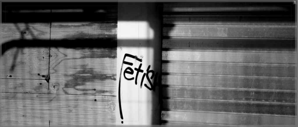
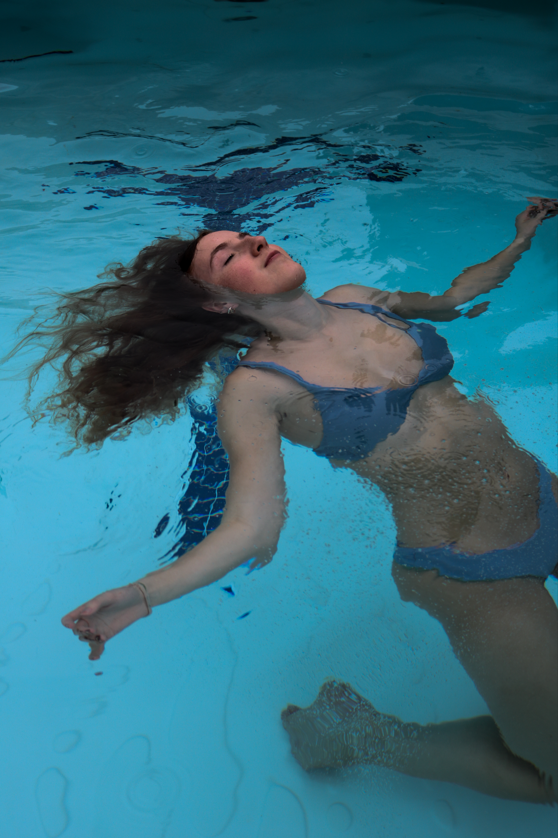
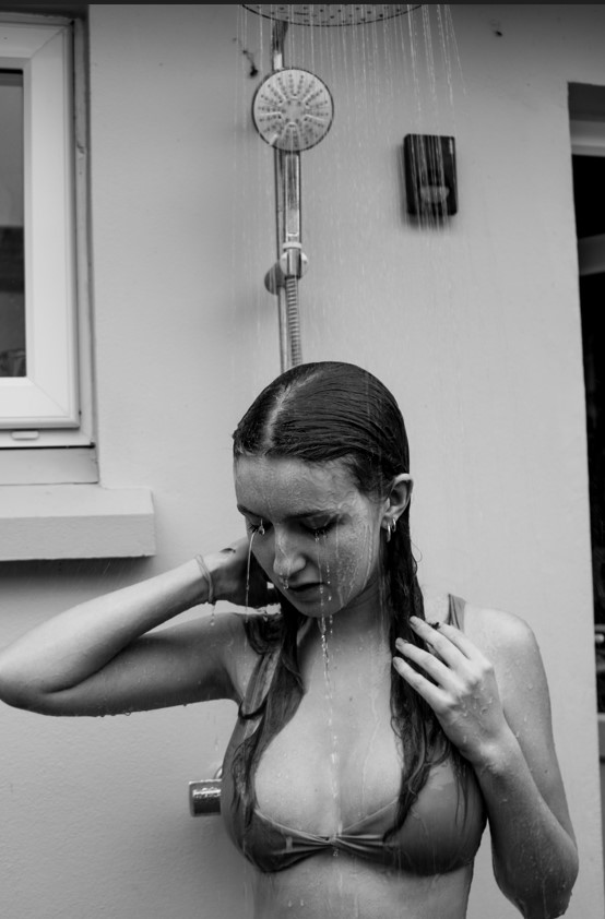
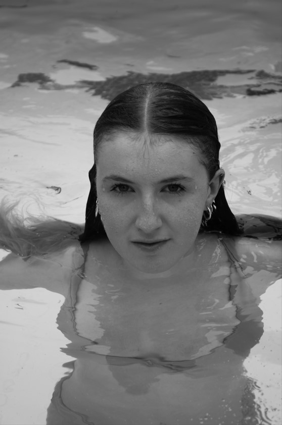
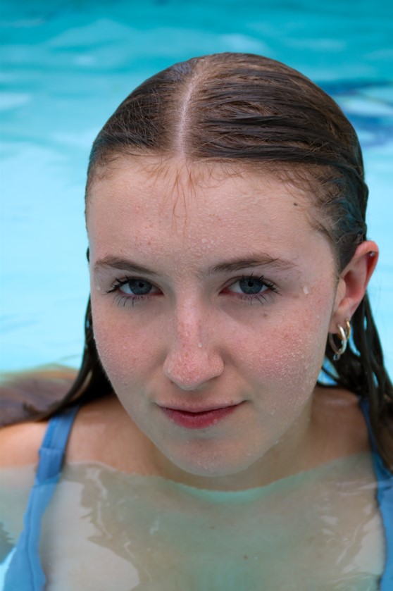
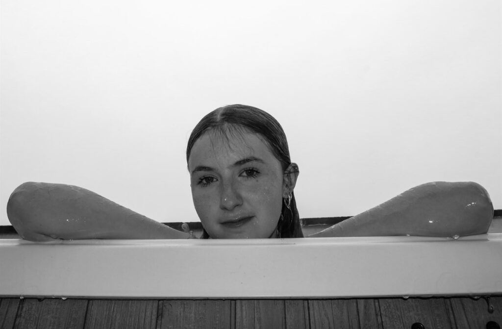
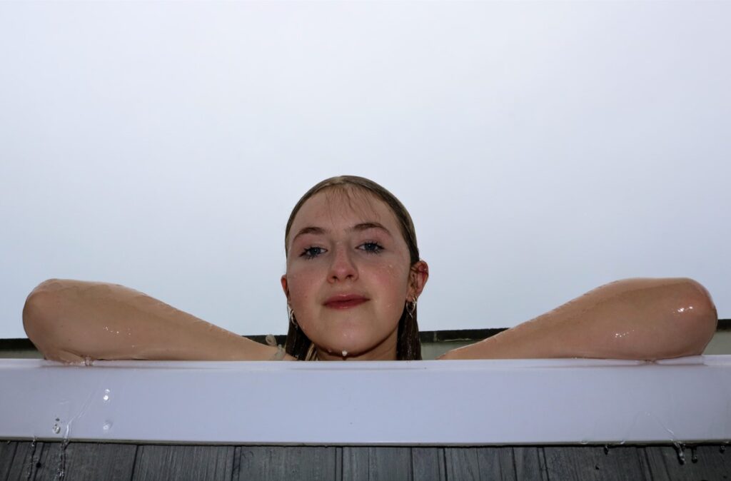
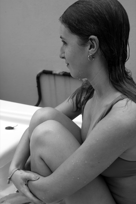
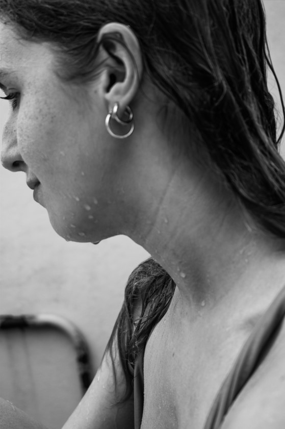
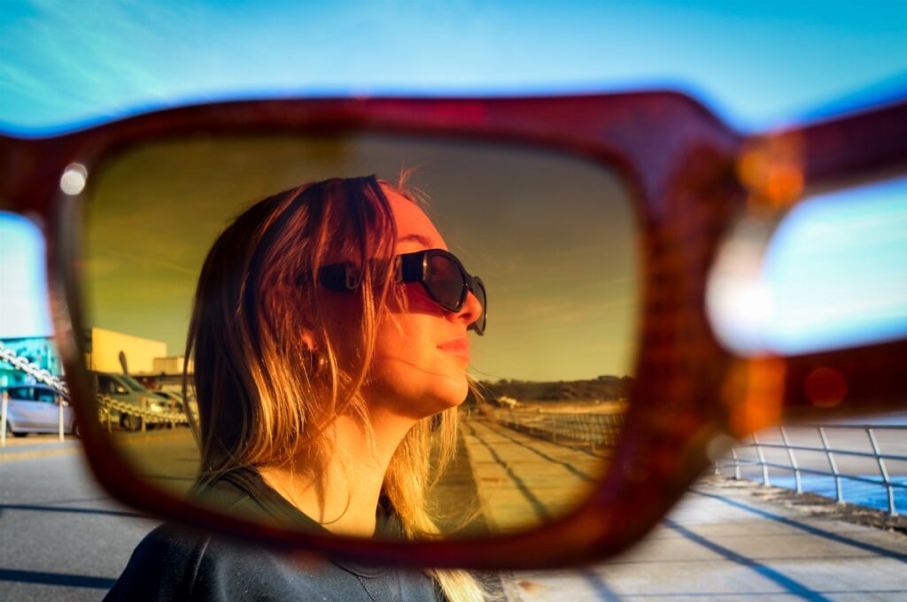
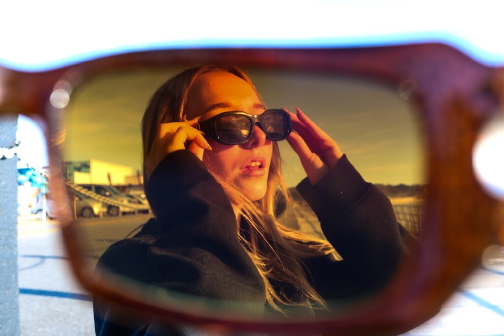
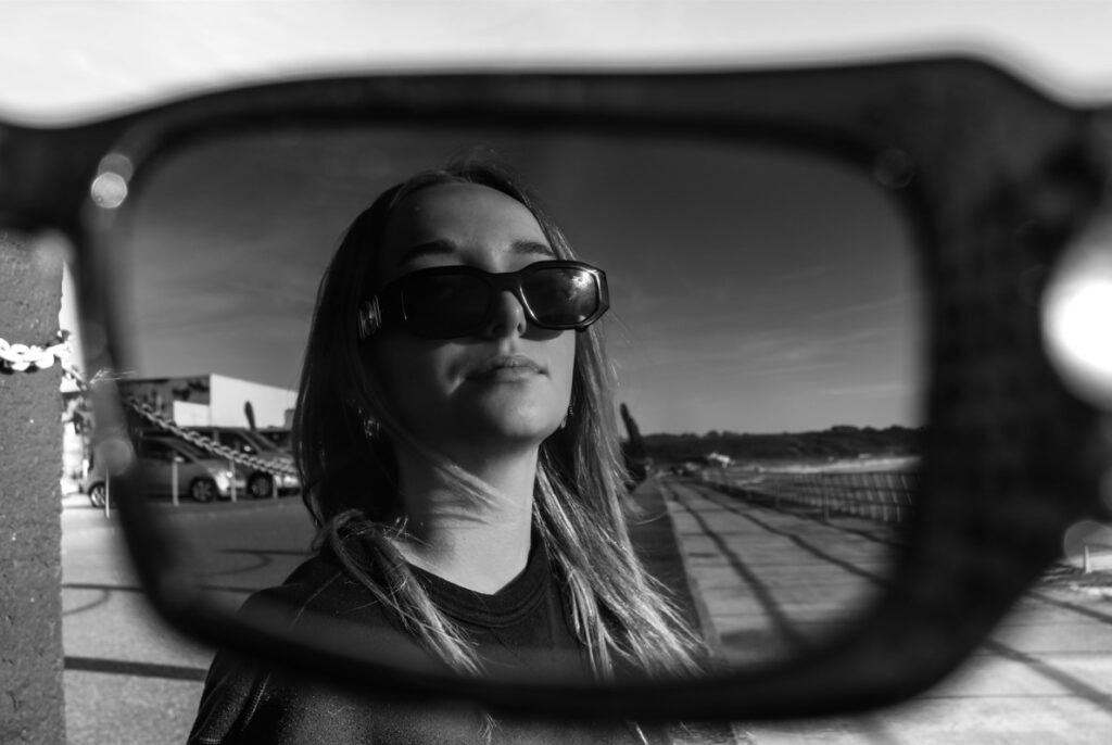
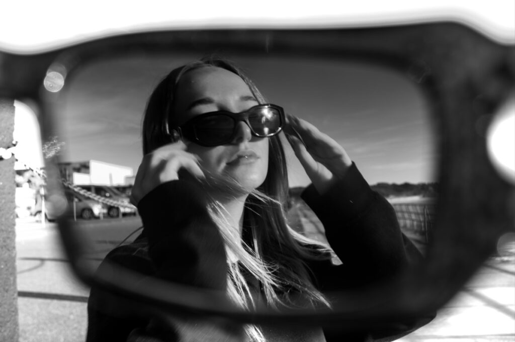
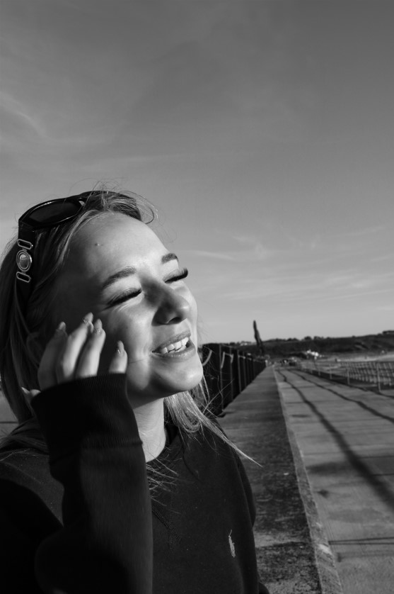
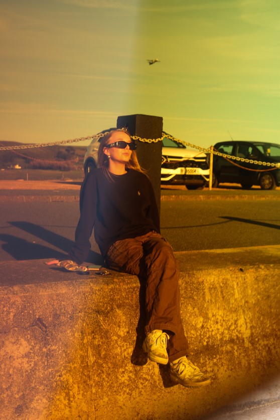
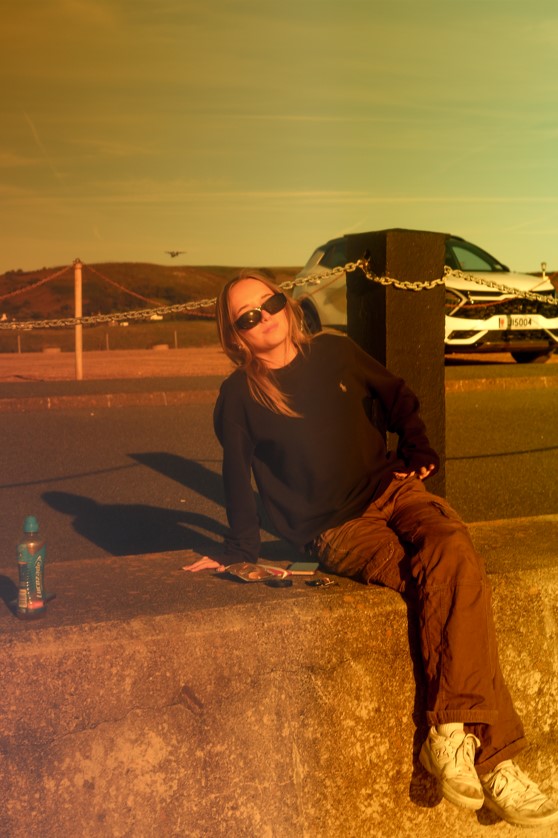
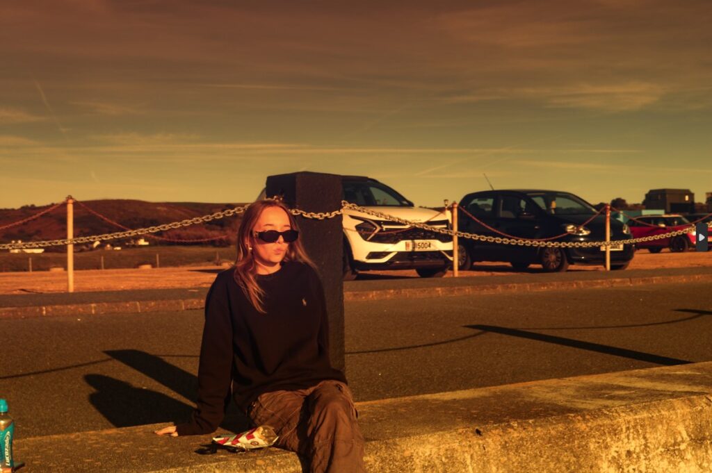
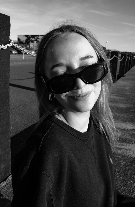
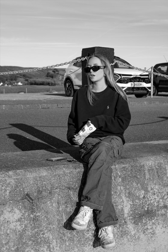
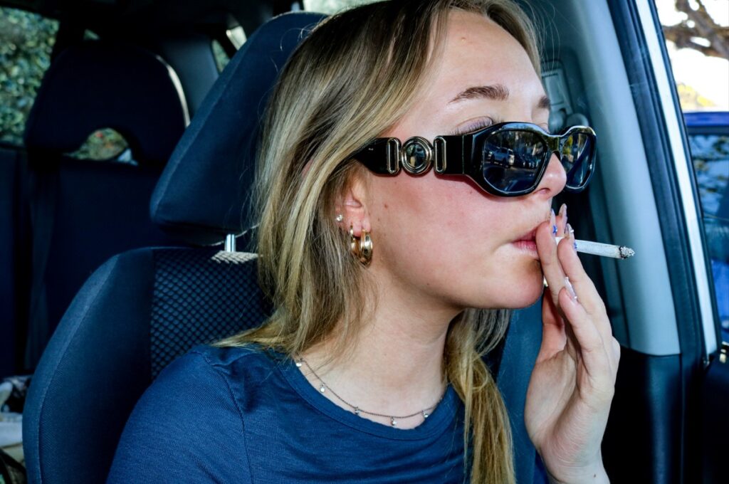
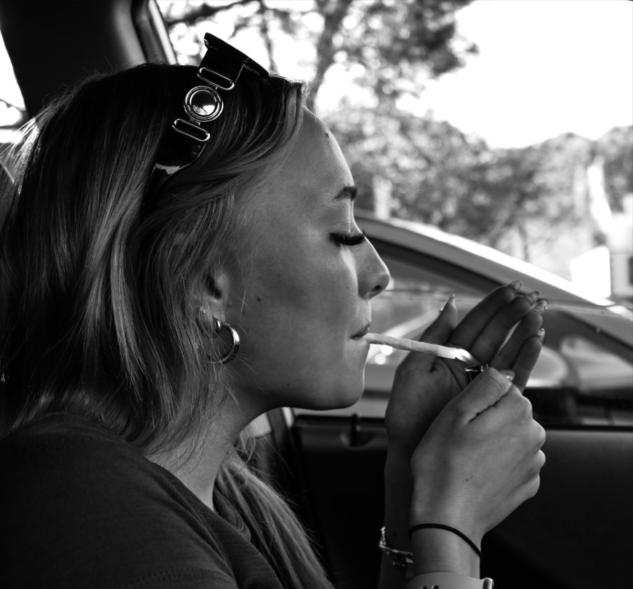
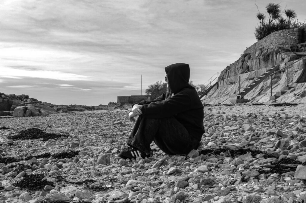
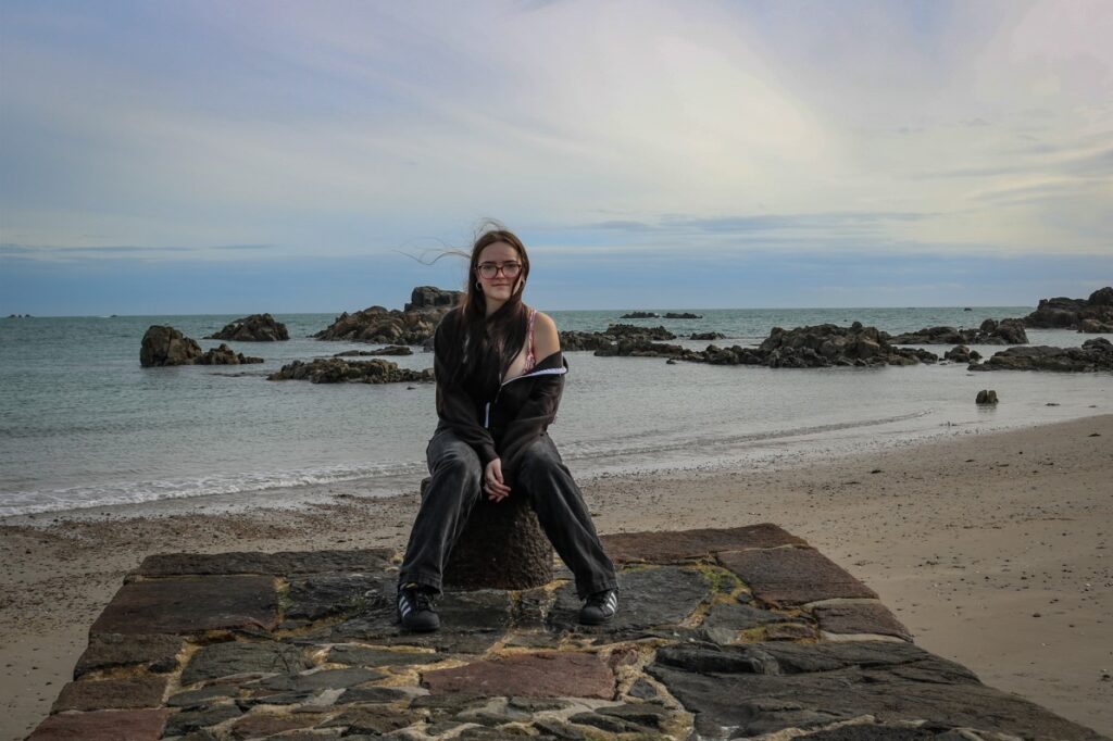
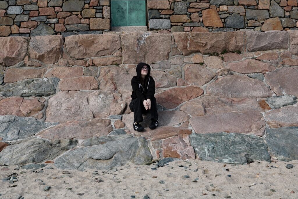
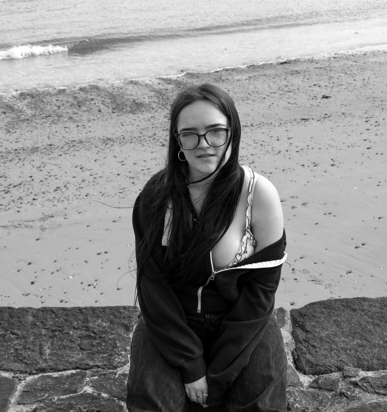
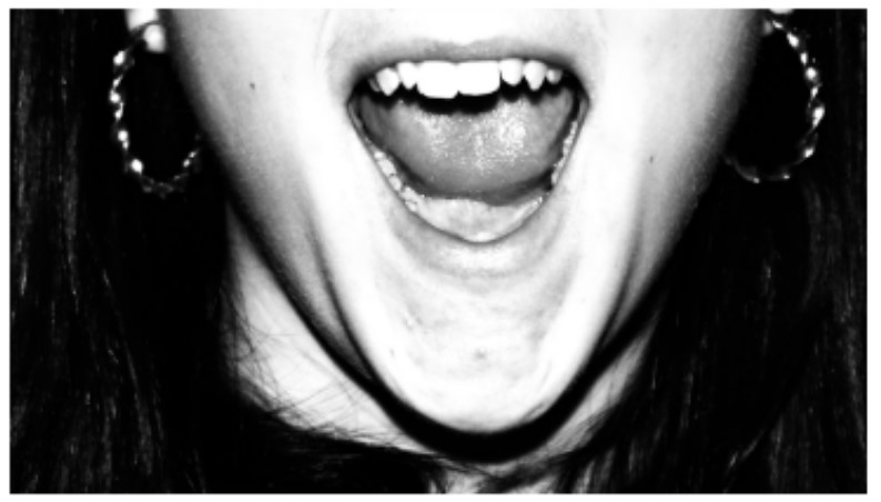
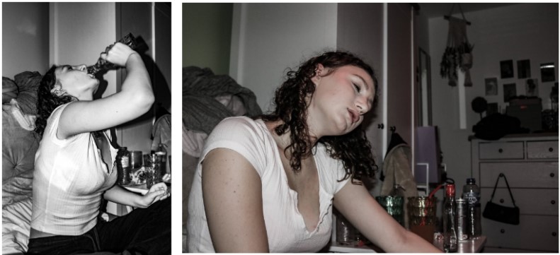
For the outcome of my second photoshoot Emily and I went out during the evening to an event Splash Sunday which is held for teens and young adults at the Watersplash in St Ouens from 6-9pm. The photoshoot includes socialising while having a couple of drinks and smoking, I have used these photos to expose the two sides of what its like for teens to go out, both photoshoots contain the same theme to socialise, have some drinks and listen to music however the experience between the two is quite different. The photos contain soft colours of yellow and orange as the sun sets which then goes into light and dark blue with some white/grey tones from the smoke, at first when the sun is starting the set the tone is warm and light but then turns dark that give a cold tone.
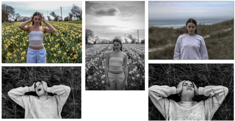
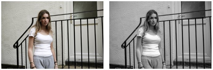
For the first photoshoot I plan to have a picnic with my friends on a field. I wish to capture candid photos throughout the day on my phone to create a more raw lifelike teen scenery instead of creating stages shots, I did this to present a teen theme as teenagers tend to take candid photos on their phone. I plan on making the first photoshoot the opposite to the second photoshoot to show both sides of a teenagers life. The reason I plan on making my first photoshoot the opposite to the second is to expose the two sides of what it’s like for teenagers to go out, both shoots will contain the same theme to socialise with friends. The aesthetic I will be looking for is warm and comforting with some bold colours.
The outcome
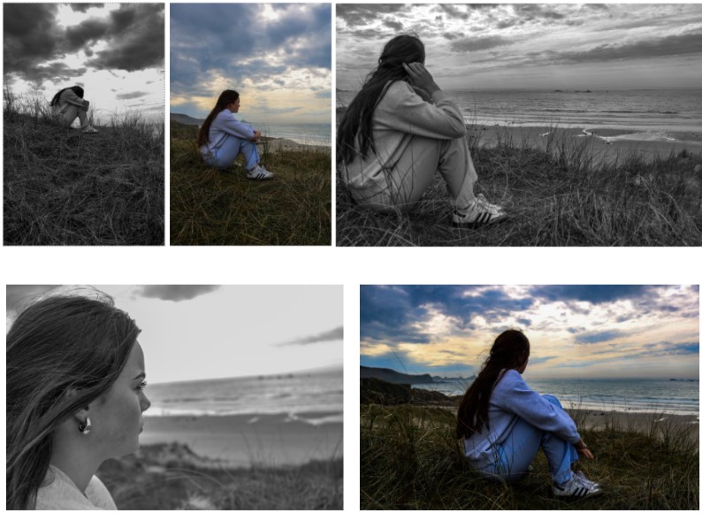
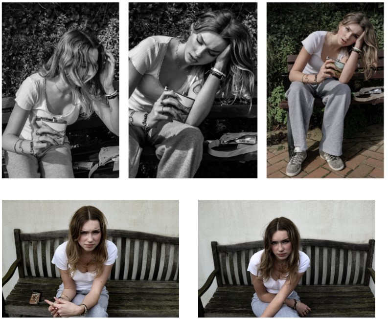
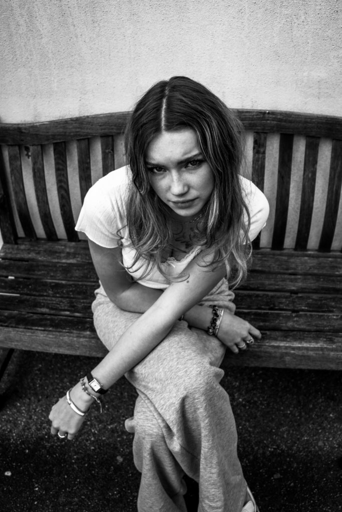
The outcome of my first photoshoot went as planned my friends and I went up to a field in Greve de lecq on the north coast of Jersey and had a picnic 3 minutes from the beach, I captured candid photos throughout the day on my phone of random points during the event. The colours in the shoot was vibrant with the main bright colours of green, red, blue and pink. There was a clear sky so the sun was out which made the grass and scenery lighter, the photos were taken at eye level some from a distance and some up close. I took multiple shoots of many thing so I was able to chose different images which I thought would fit the aesthetic more.
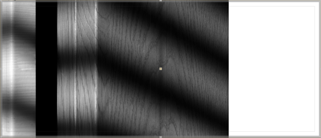
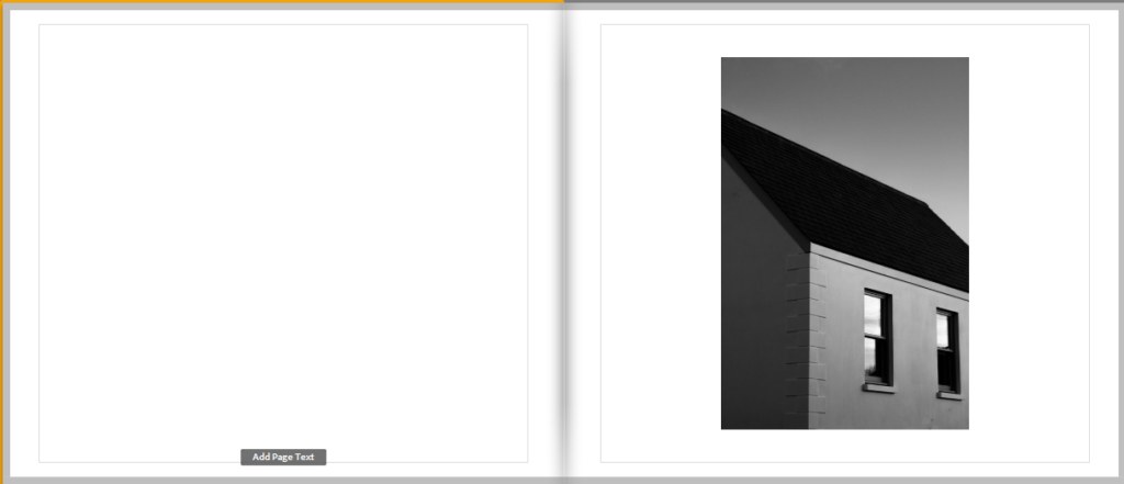
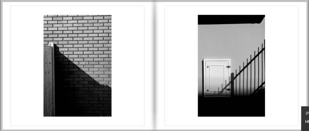
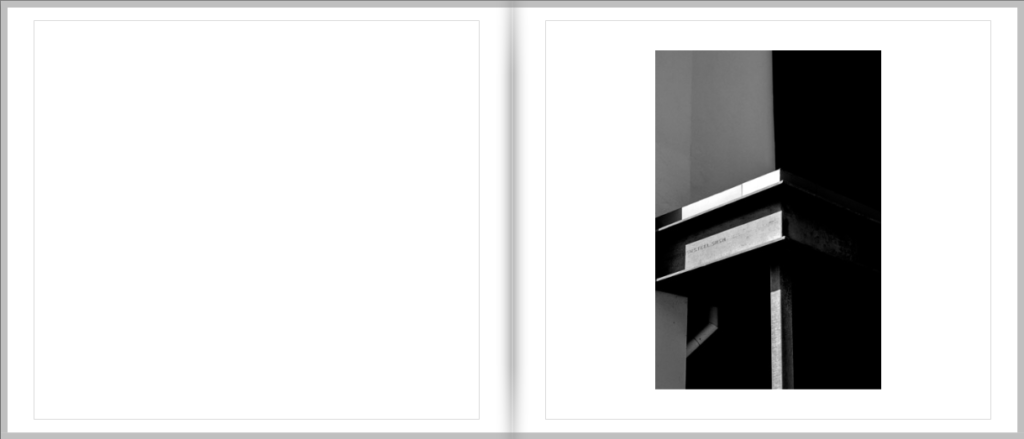
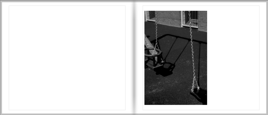
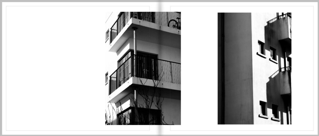
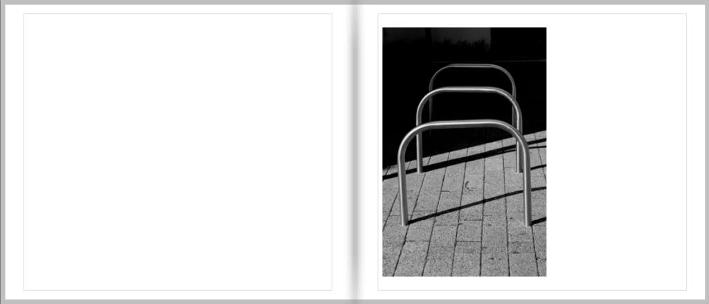
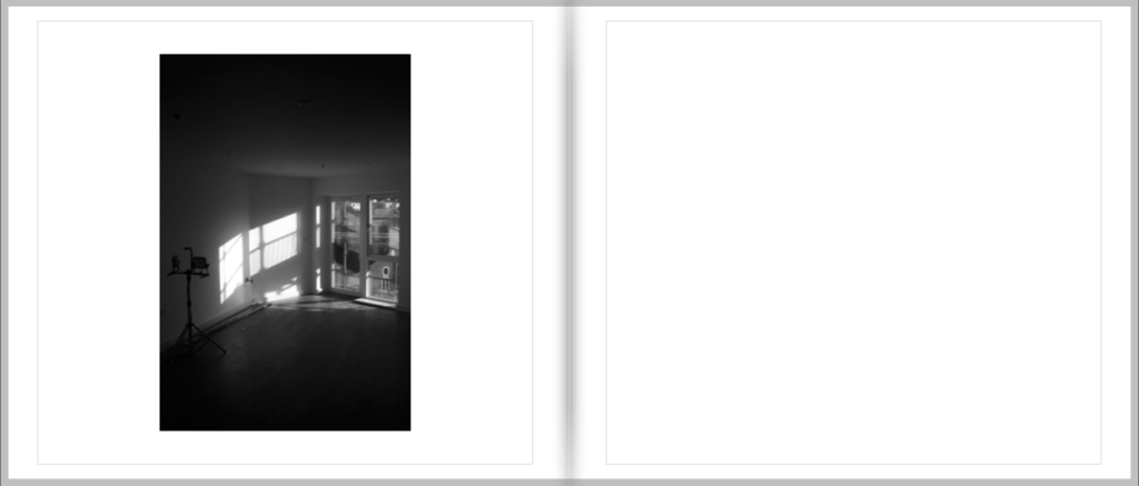
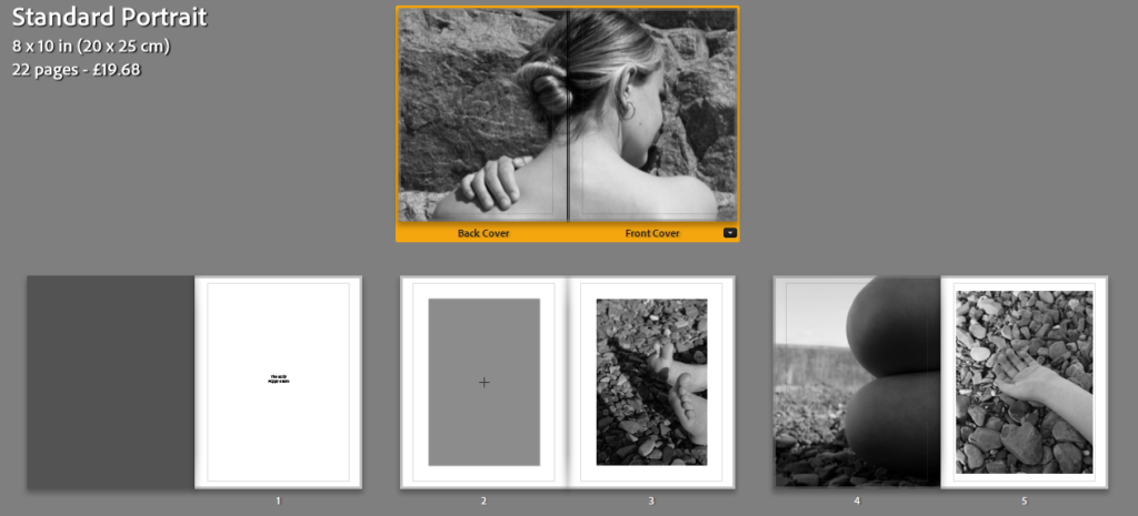
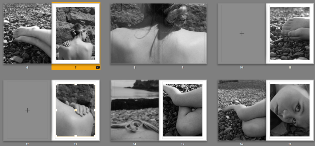
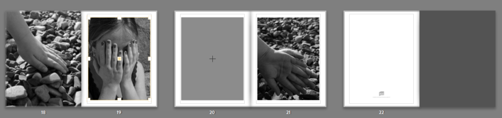
For my Final layout of my photobook I have created a simple design that uses a mixture of cropped images and double page spreads.
Paper and ink – Premium Matte paper
Format, size and orientation – Standard Landscape 10 x 8 in (25 × 20 cm)
Binding and cover – Hard cover image wrap
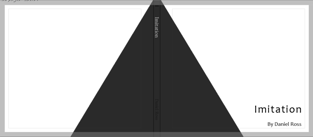
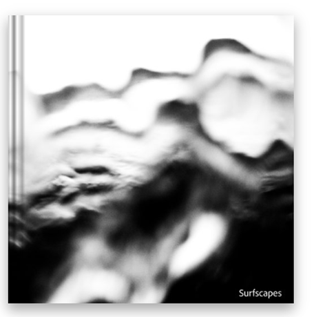
Title – Imitation
For my front cover I used photoshop and created a dark grey triangle to wrap around my cover and back, this somewhat looks like it could be a shadow which is fitting for the book and is also greyscale, similar to my photos. When designing this book I went through 5 different lay outs before concluding on this one as I wanted it to look perfect to me and the ones I had done previously just didn’t look right to me.
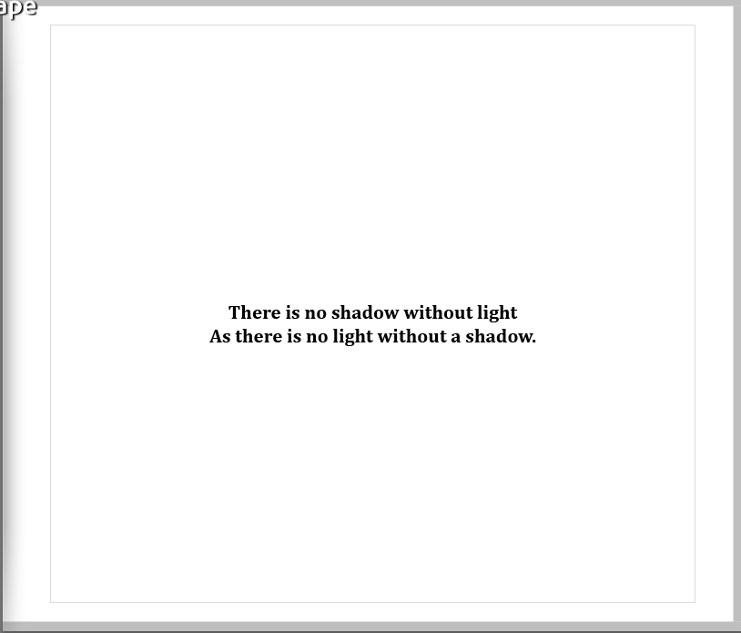
For the opening page I added a quote over plane white as I wanted it to be simple, I’m not 100% sure where the quote is from I just remember hearing it in a movie and it can be put up for interpretation on what the meaning is.
Overall I am very happy with the way my photobook has come out as it is simple and minimalistic as I had hoped for when first starting this project.
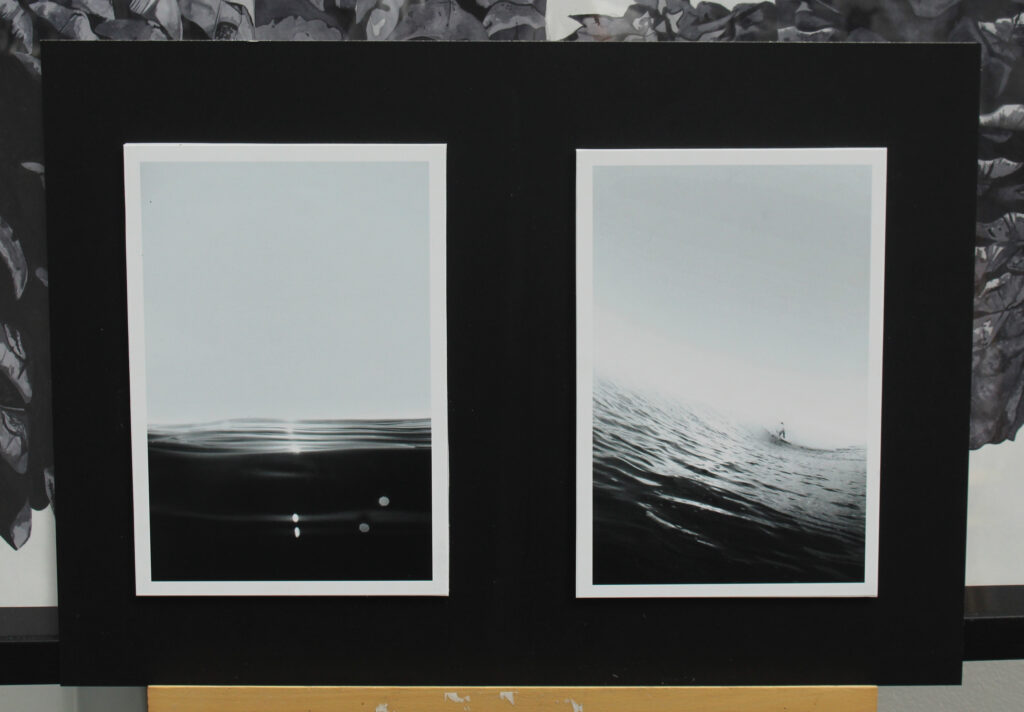
Here is a virtual plan of how I am planning to mount my printed images, however this may change once I receive the physical copy if I think a different layout would be more aesthetically pleasing.
Window mounts:
Window mounts with white boarder surrounding images.
Foam board:
For my A4 print I am going to mount it on white foam board.
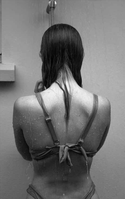
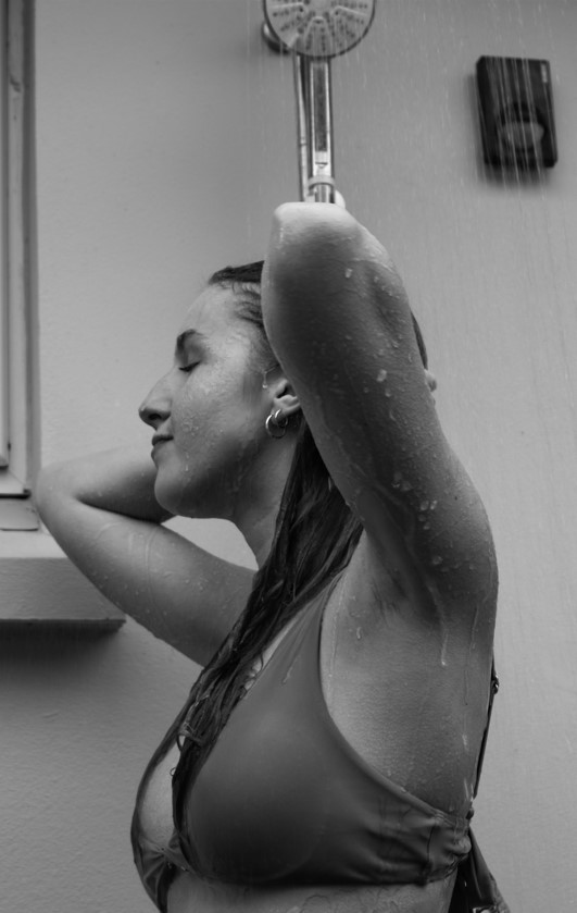
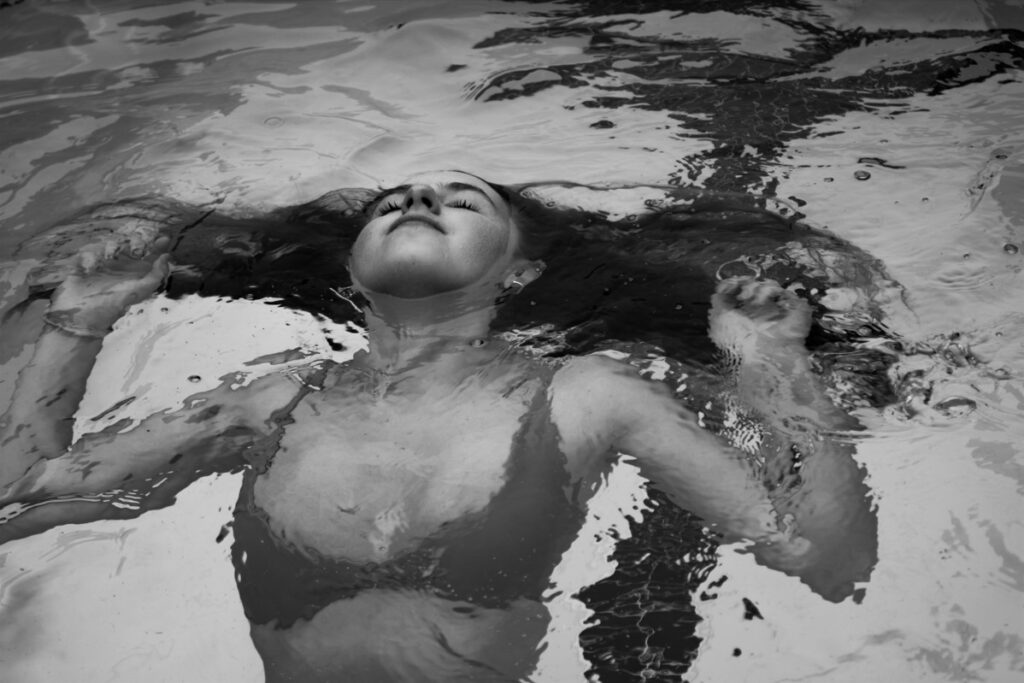
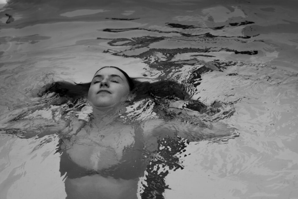
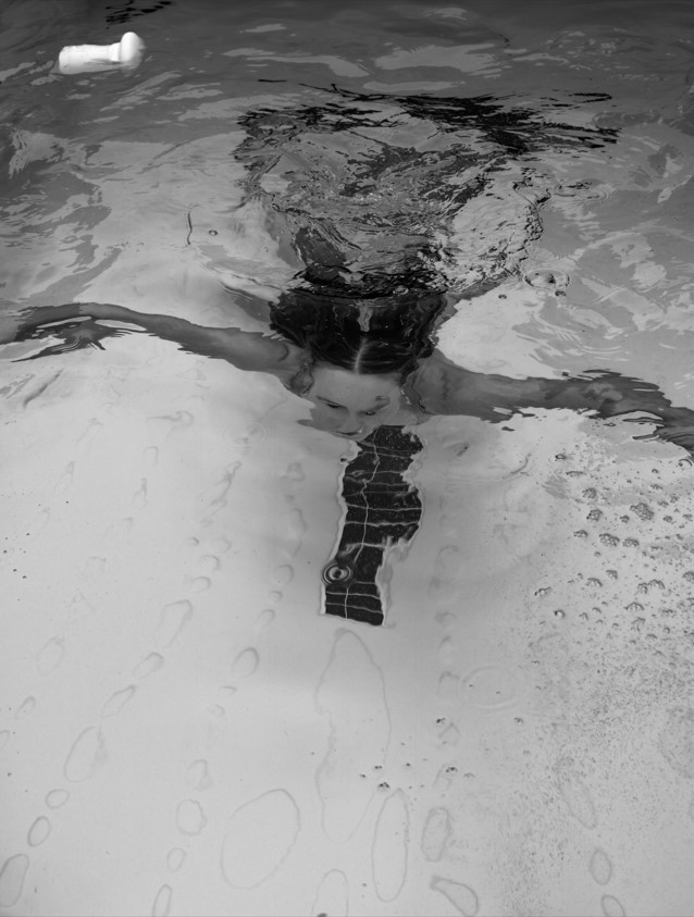
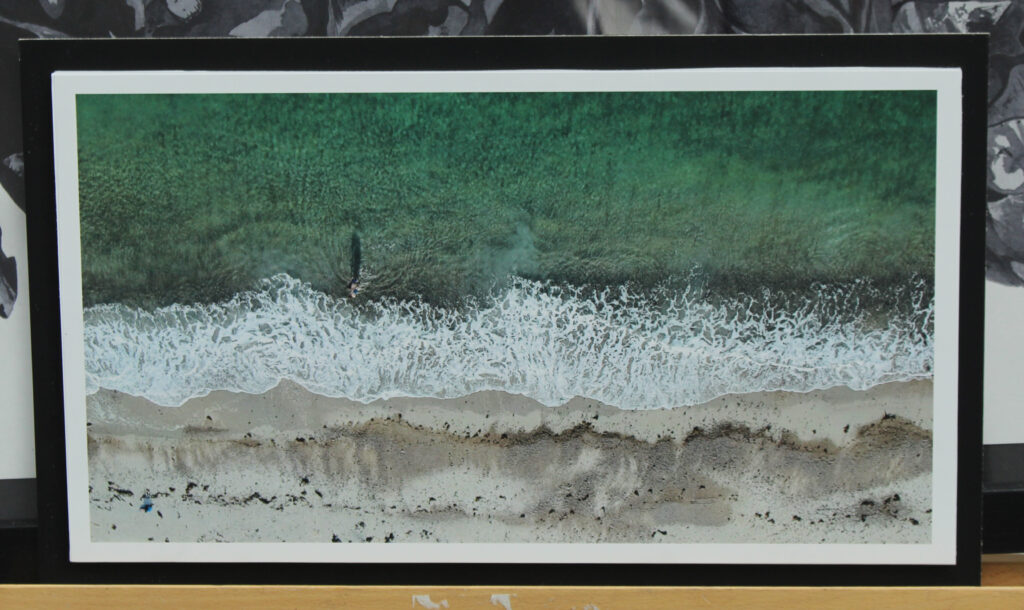
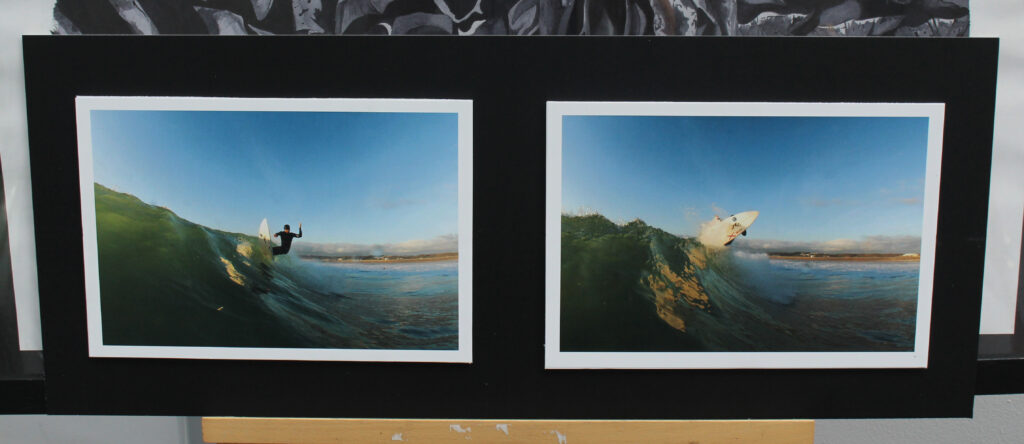
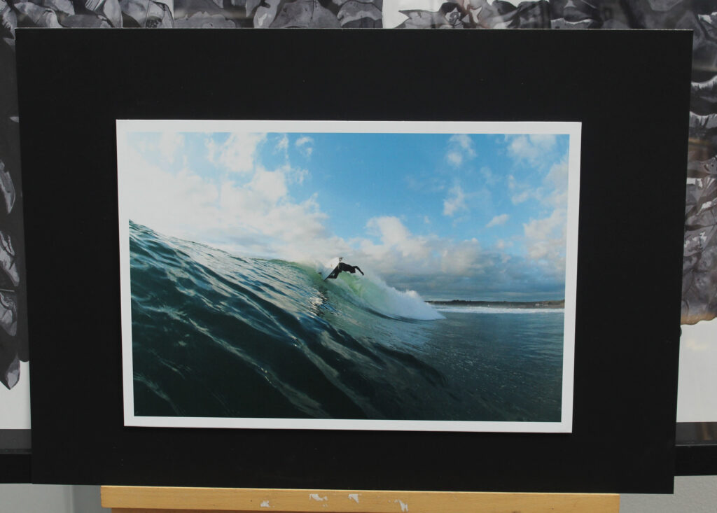
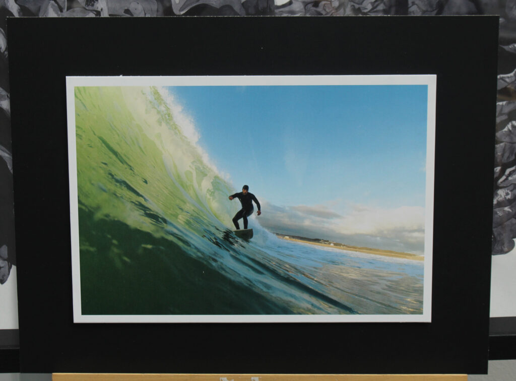
My research into Henri Cartier-Bresson’s concept of the “Decisive Moment” – a picture masterly composed to seize the essence of an impromptu event, saw an undoubted relation to the genre of sports photography. Taking Bresson’s ideas of The Decisive Moment and it’s links to Sports Photography inspired me to undergo a photoshoot with a focus on the practice of surfing. My approach saw me produce a series of images in an attempt to preserve the human body and it’s surrounding elements in motion. The constant change in conditions when undergoing this photoshoot saw the capture of a well composed and visually compelling image a difficulty. Although, A Fast Shutter Speed, Auto-focus and the use of the ”Burst Mode” enabled me to overcome the difficult shooting conditions. The Waterproof housing provided by the JEP saw the opportunity to produce images from the viewpoint of a surfer, allowing for unique often unseen of outcomes due to the pricey equipment necessary. Areas of improvement have been identified from analysis of my outcomes, allowing for an improved response in future photoshoots. Due to the fish eye effect of the dome housing provided, the need to position myself a close distance from the subject was crucial. My affected mobility in the water saw my distance in specific images a necessary area of improvement. Although my past experience in the ocean aided my response, my recent knowledge on certain camera related tricks, such as the removal of water droplets from the lens with saliva, will undoubtedly aid me in future shoots. Physical and Environmental aspects of this in water shoot also affected my response, having already been in the water for hours prior to the photoshoot my levels of fitness and body temperature were seen to be a problem. Overall, I believe this photoshoot was a success.
Editing Process
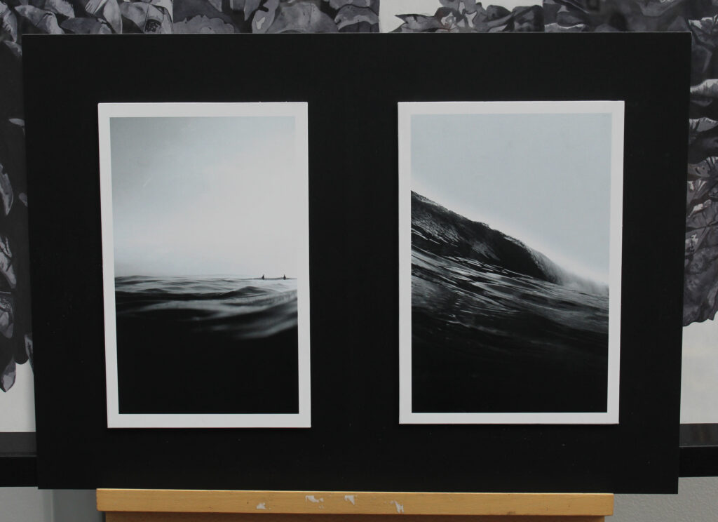
Post Production was necessary for the majority of my images, the inability to manually change settings to adapt to the changing conditions saw post production exposure adjustments crucial. Along with the general tonal adjustments applied to my more complex outcomes, experimentations into images taking on a more minimalist approach saw the use of a punchy black and white setting and heavy cropping to produce an even sea sky split in most outcomes. Post Production saw me successfully uncover images I had believed to be of poor quality, allowing for outcomes in relation to my referenced artists.
Layout – Photobook
To incorporate a further sense of minimalism into my work, a clean simple layout has be selected, although the photobook only consists of 24 pages, I believe in quality over quantity and see this layout displays my favoured outcomes in their best form. The use of my works , taking on a simpler cleaner approach to break up the more complex ‘fast paced’ imagery effectively contrasts between the differing forms of the ocean.
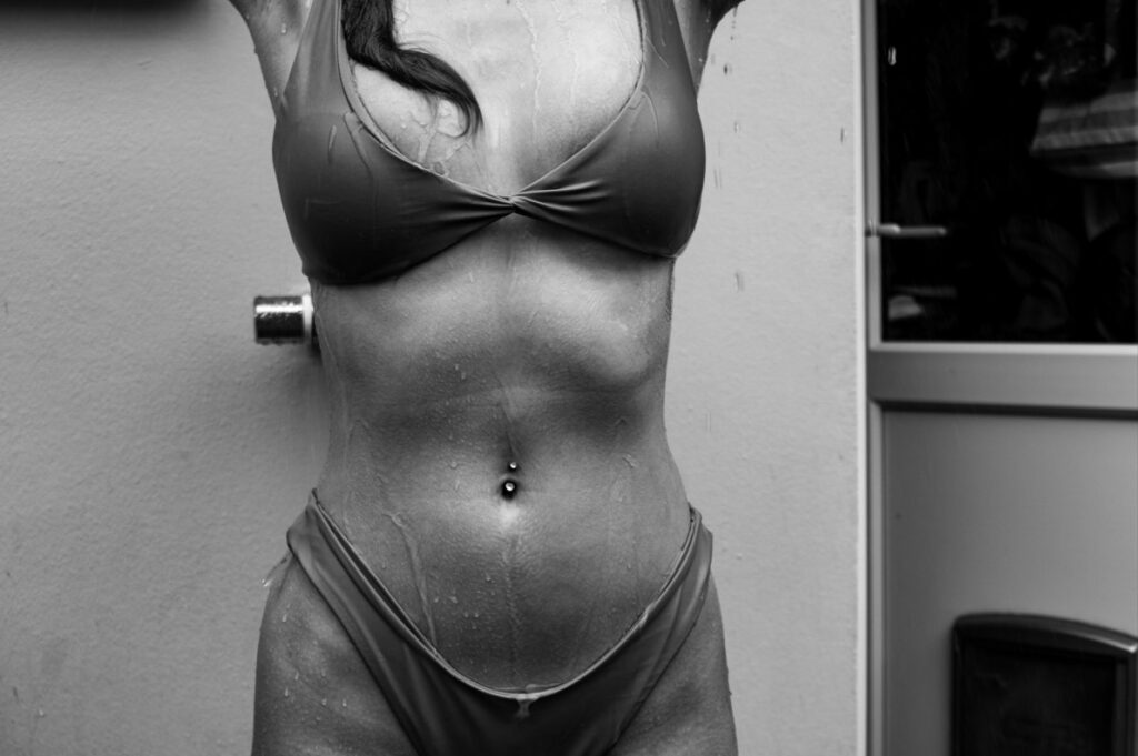
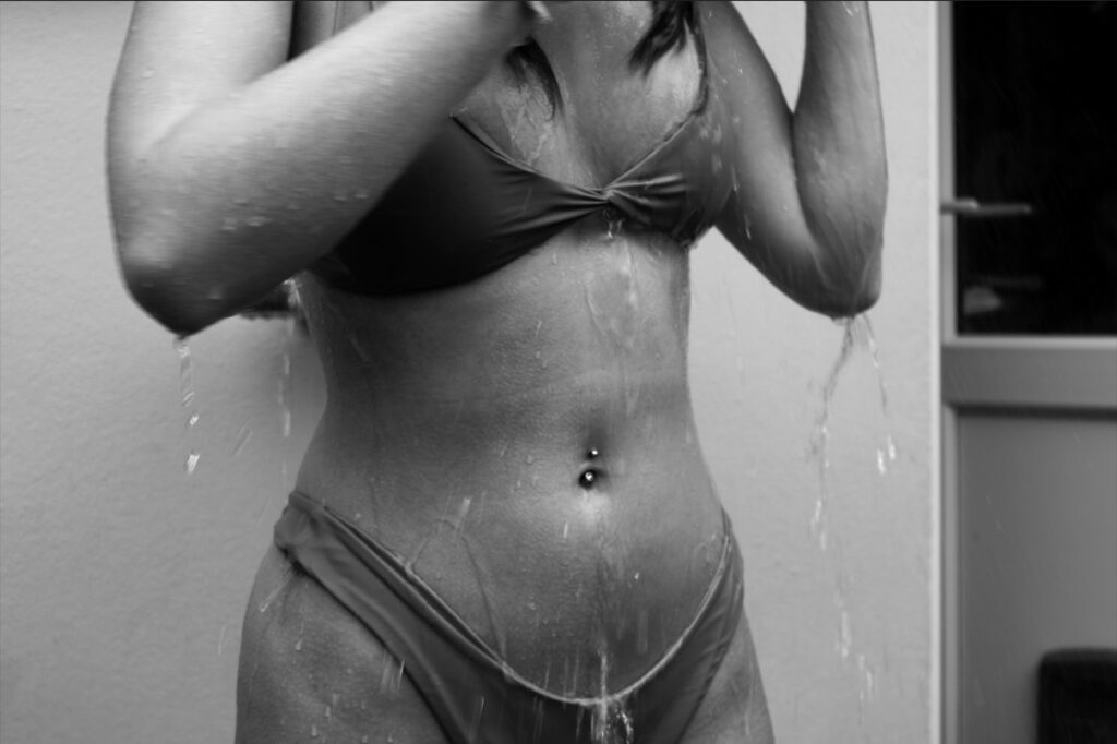
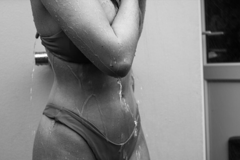
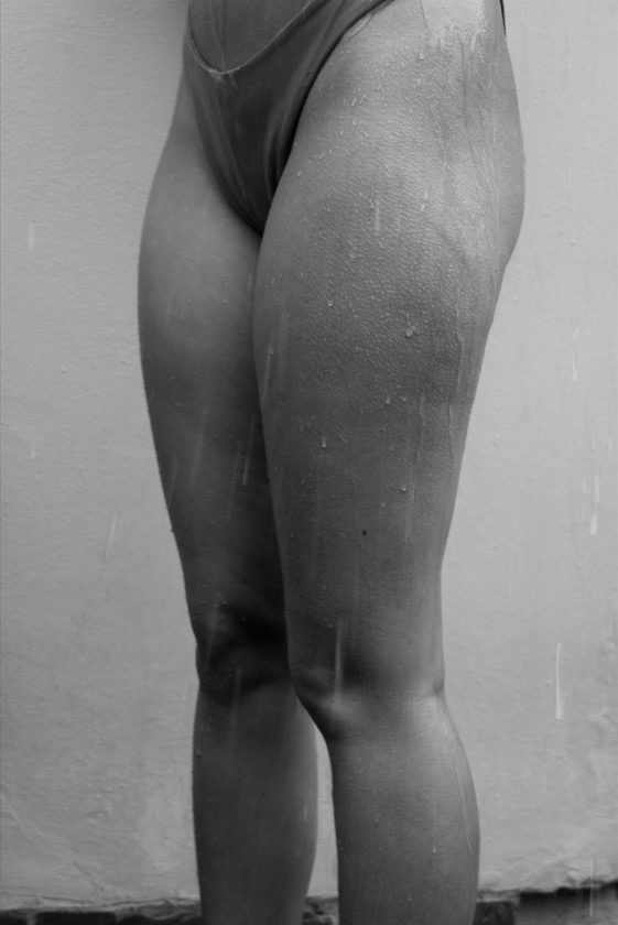
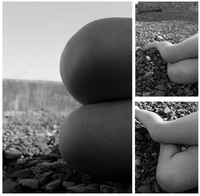
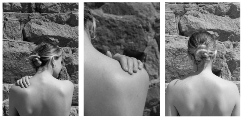
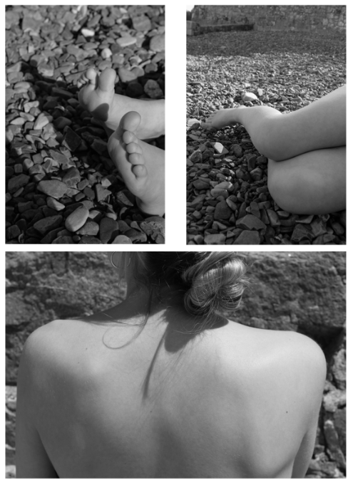
Overall I am really happy with my final outcomes. They show some of my best images in a neat and simple but effective way. By creating a mock up before hand ensured that I had a plan and could choose the sizing of the images rather than just choosing random sized images and deciding on the day which could have meant my outcomes wouldn’t have worked. I realised my intentions as I already had the concept of abstract images of body parts with a background inspired by Bill Brandt. I also had an image in my head of what I wanted my outcomes to look like. I used different sized paper A3, A4 and A5 which helps to create more contrast and variety in my work. My references to the artists Bill Brandt and Barbra Kruger link more into Brandt work as the visual and conceptual aspects of my work carry the same themes and ideas as his work. Some of the things I mainly took from his work was the lighting as well as positioning of the camera and the details of the body parts. I think that visually my images came out very well and work nicely as a set. Technically they are not very difficult images to make in fact they are very simple but do create a good image. If I was to change or do anything differently I would make sure to do some more shoots and create different types of images which still carry the same theme but create a bit of contrast. I would also try and bring in one of the other themes as I mainly focused ‘observe’. I also created a photobook which contains all of my final selected images from my shoot. Having a photobook allows for me to create a story from my images.
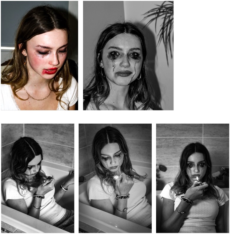
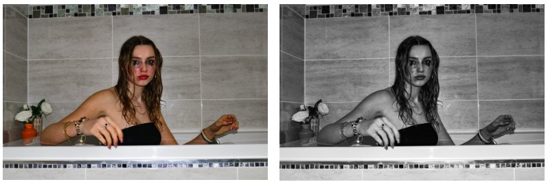
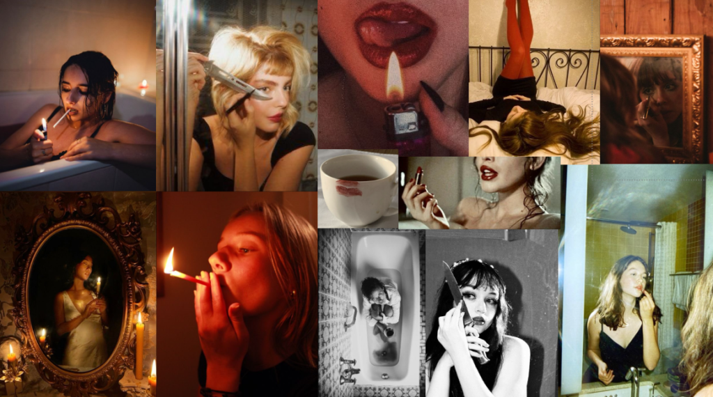
I want to create images of my subject performing ideals which are inherently feminine, like doing makeup.
WHERE
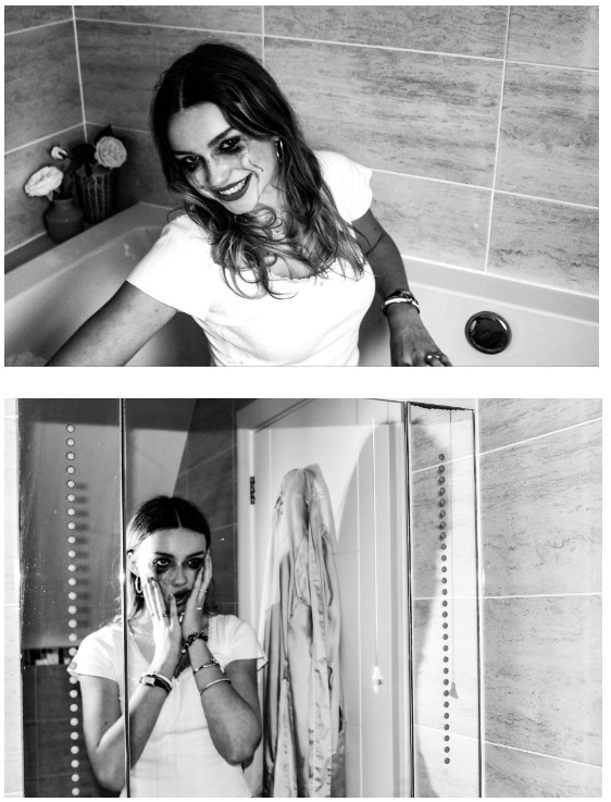
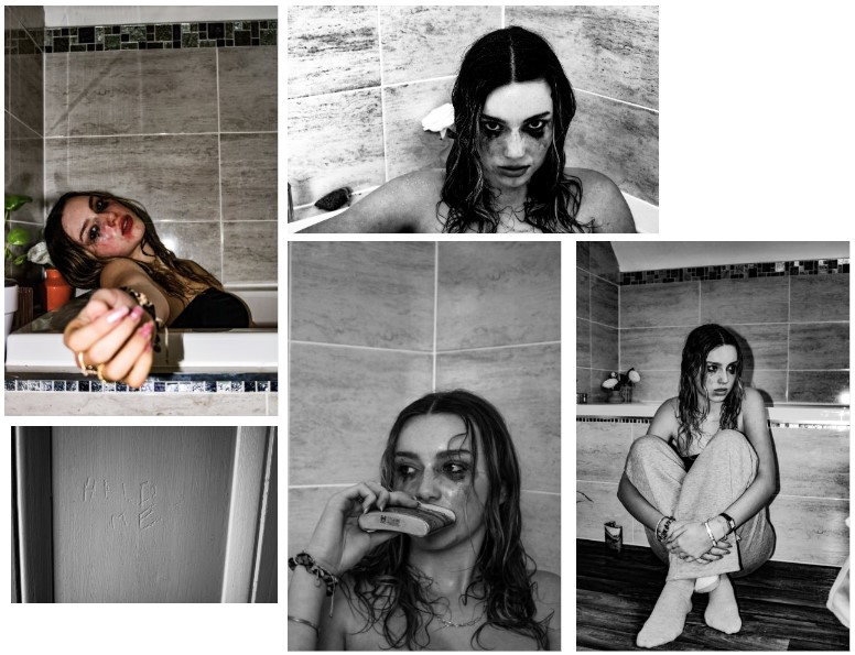
I will be using my own house, using my bedroom and bathroom for image making.
WHY
I want to show different aspects of femininity, as I have researched different gazes. I want to explore these and show contrasting ideas of what it means to be feminine. This photoshoot will reflect more dark and divine feminine aspects.
HOW
I’m going to use a camera to create photographs of her doing makeup, lighting candles, posing in different lightings, etc. I will have her wear all black and specifically a skirt or dress, as well as do her makeup so that she expresses an image of femme fatal.
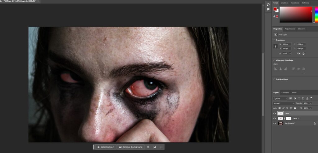
I played around editing and altering my images on photoshop to enhance the outcomes and experiment with different styles.
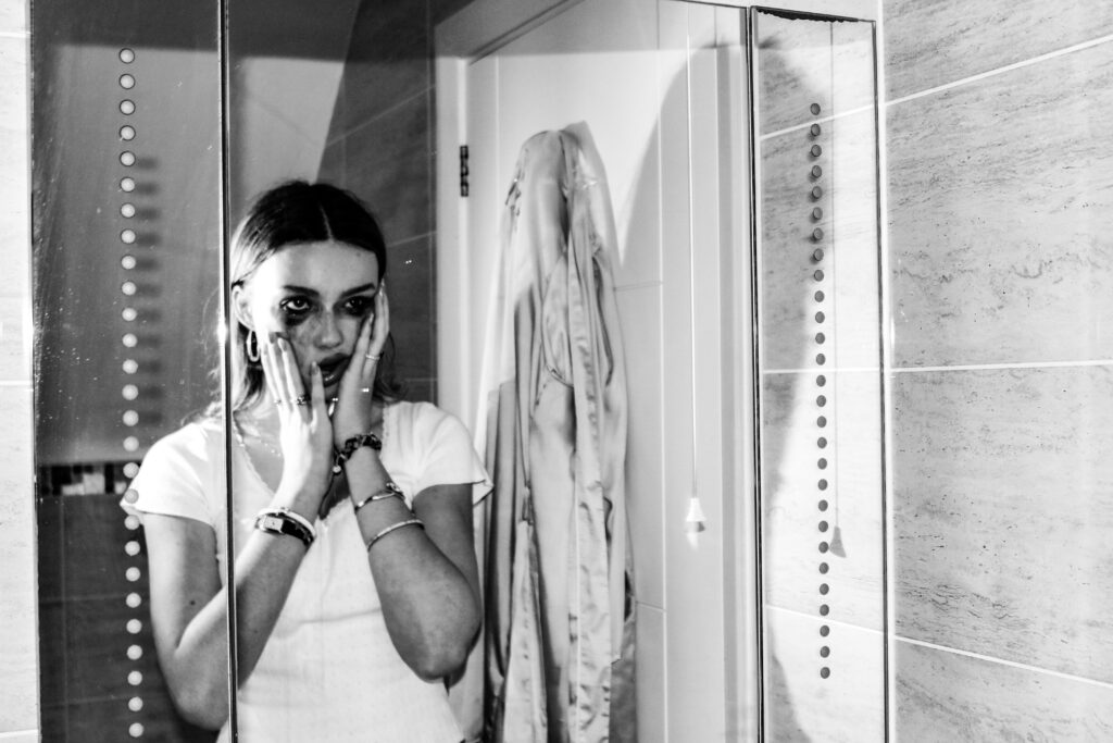
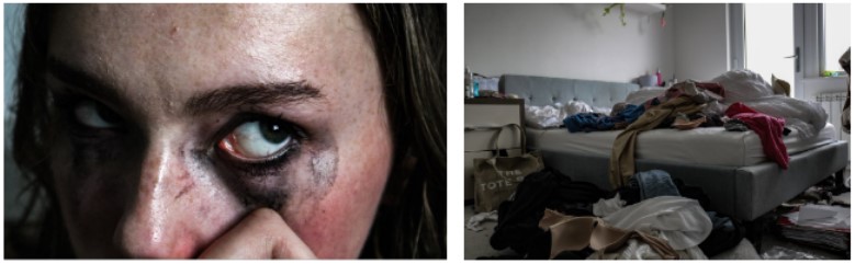
I edited this image to be more visually dramatic and shocking so I made her eyes bloodshot.
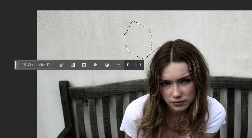
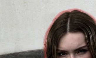
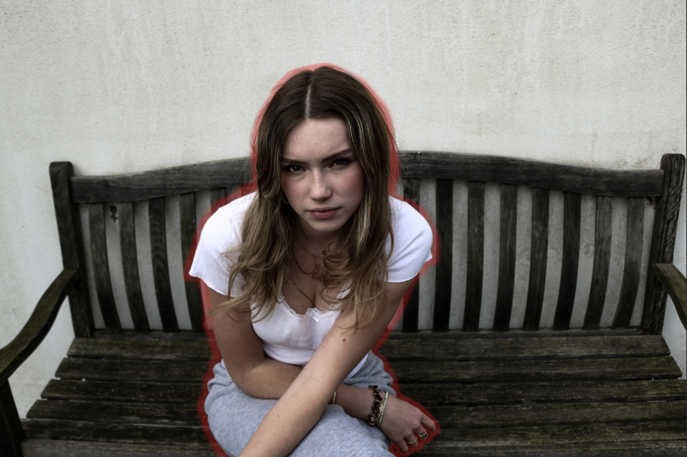
For this image I wanted to outline her however she had some strands of hair making it difficult so using the lasso tool I copied and pasted a different part of the wall on top of it and erased and softened the edges to make it look more natural.
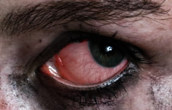
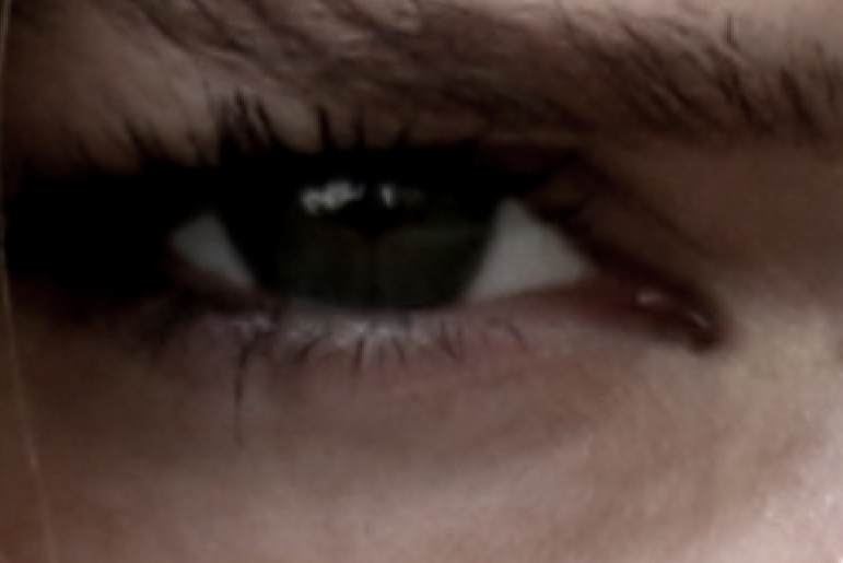
In the image below I whitened the white area of her eye as it was very shadowed and dark in the original copy.
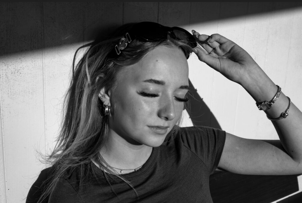
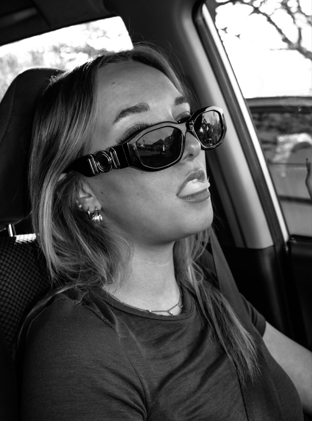
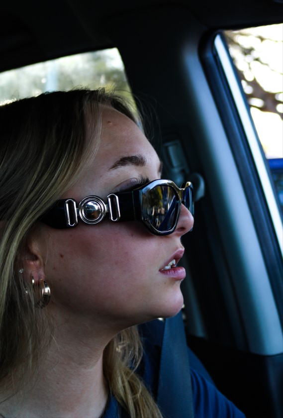
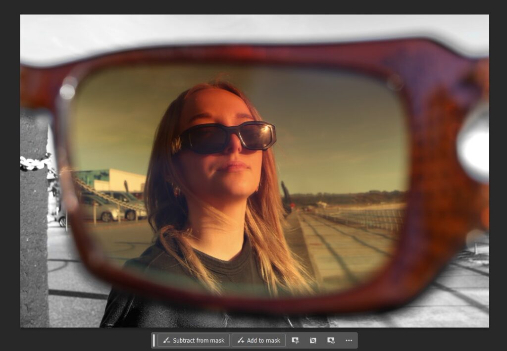
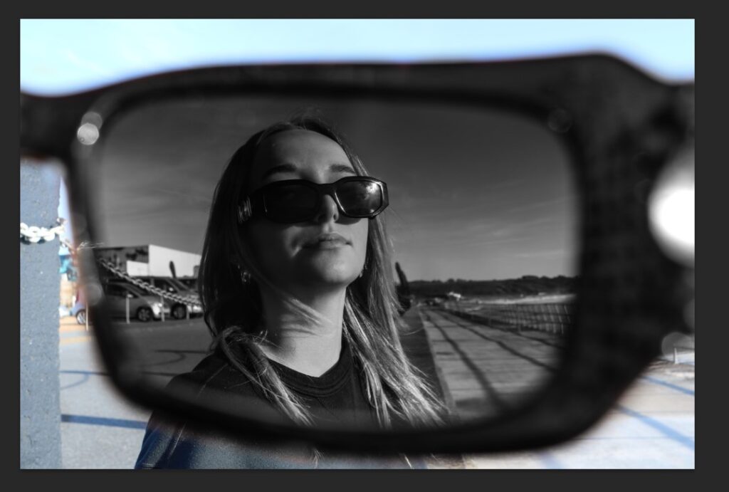
I used this image to create some contrasting images were the surrounding background around the glasses was a different colour to the view from inside the glasses.
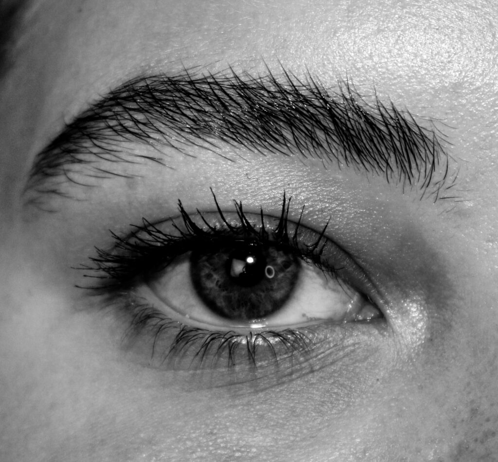
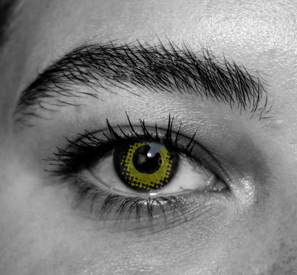
Originally, my book cover was going to be a range of different eyes and so I experimented editing the eyes to be more unique.
I took a different image of an eye I saw on a skateboard and cut out the iris using the lasso tool on photoshop and layered it on top of this monochrome eye. I neatened it up and kept the iris yellow to add some colour and contrast making the outcome more interesting and unusual.
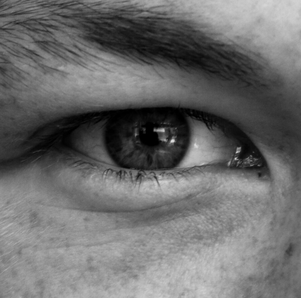
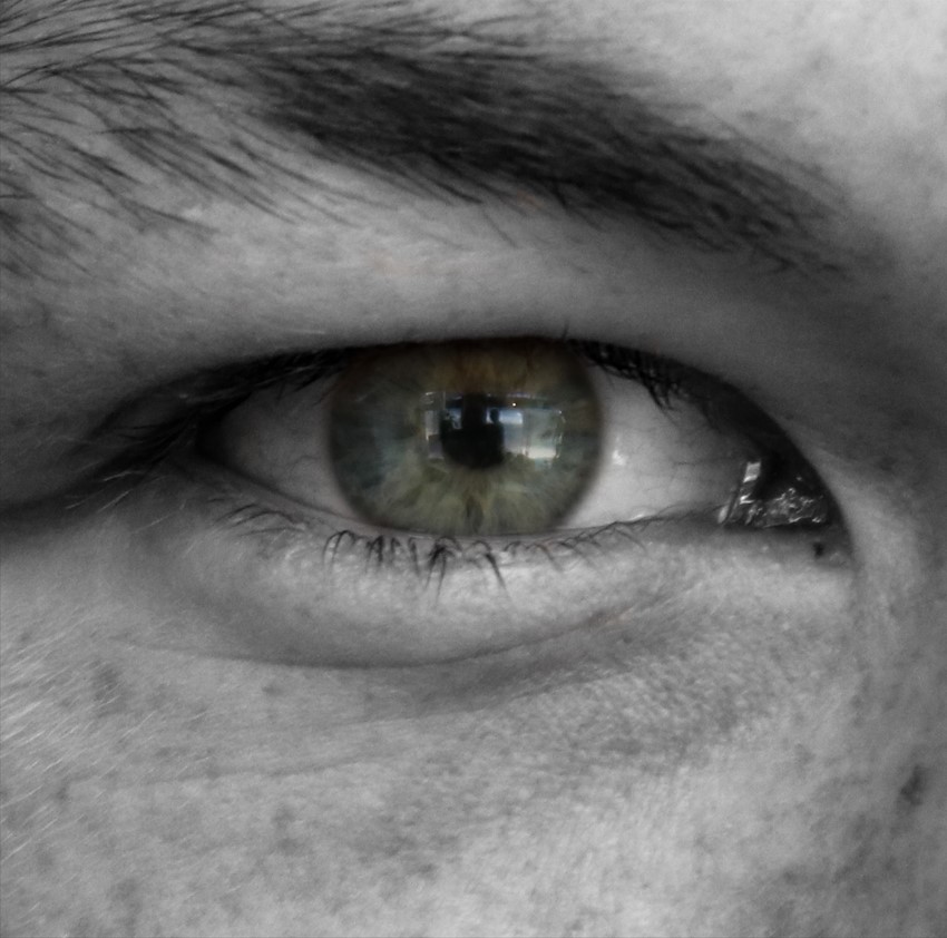
For this image I layered the iris from the original/unedited image on top of the monochrome/edited version to make the colour of the eye stand out more.