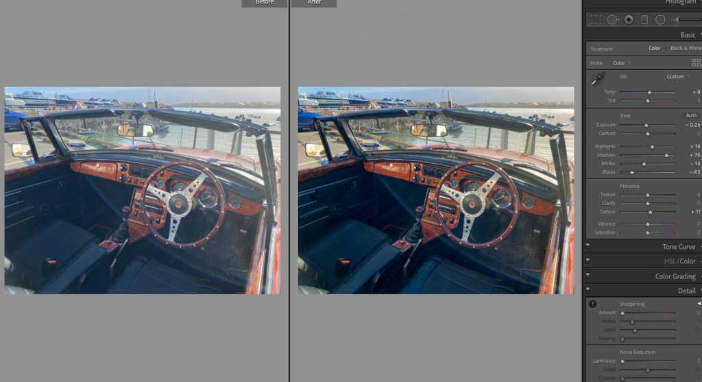
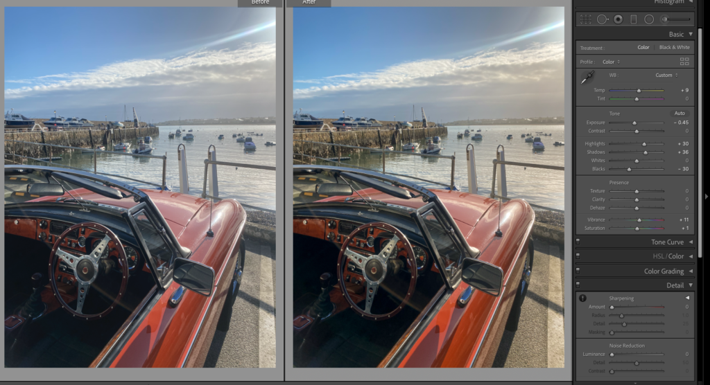
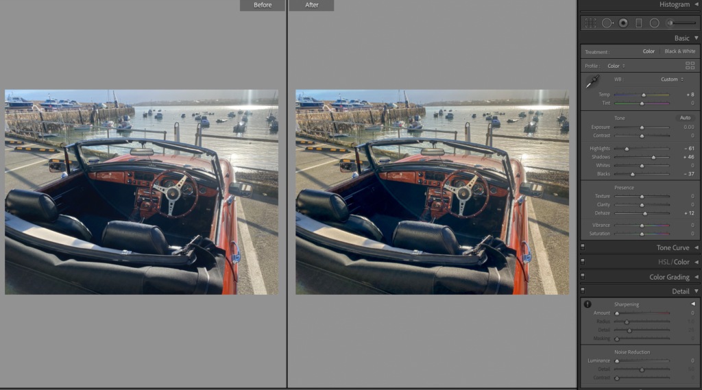
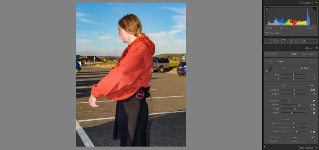
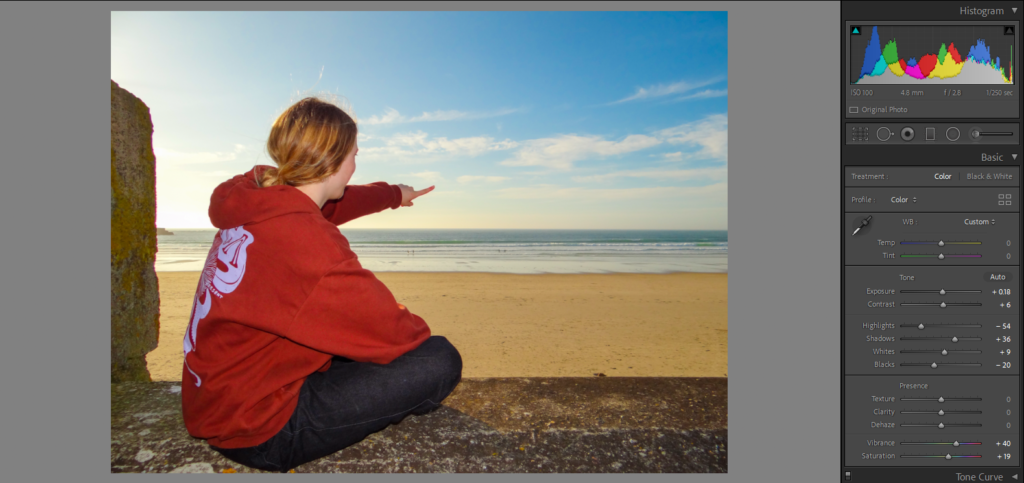
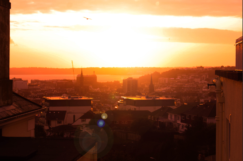
I wanted to edit them with a retro look, so I increased the temperature a bit.
Basic Edits
I brought the highlights up and lowered the whites, similar with the shadows and blacks. I then added dehaze to add more strength and depth to the image. After then adding temperature I felt like the images looked retro, but are obviously new.
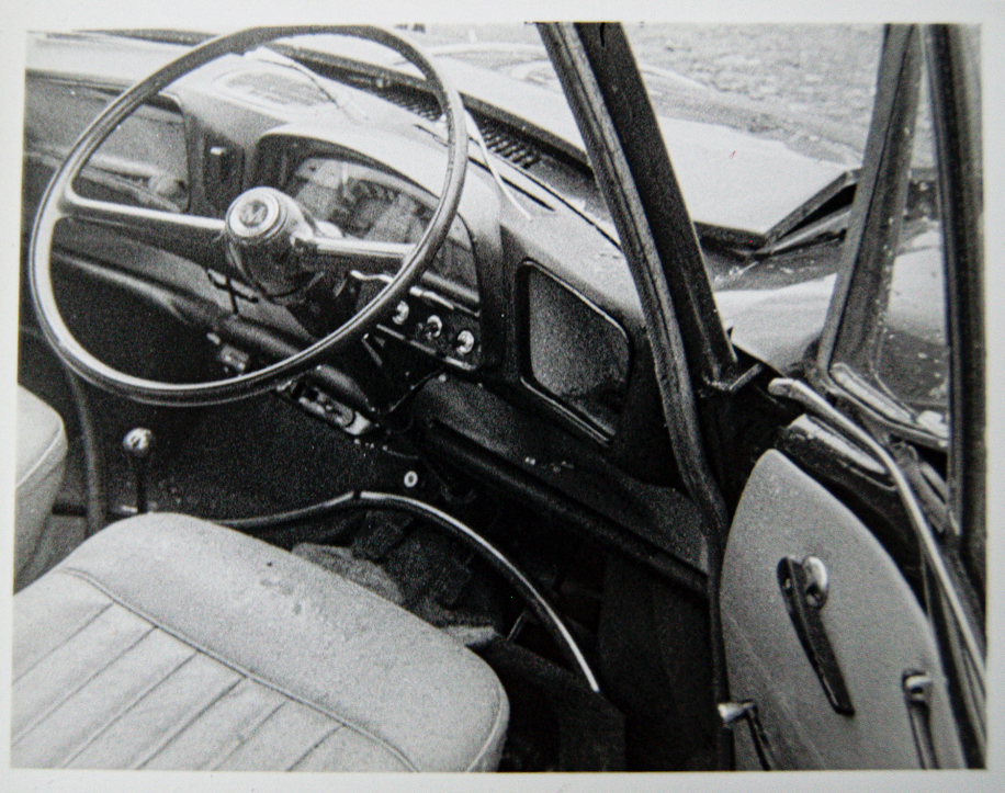
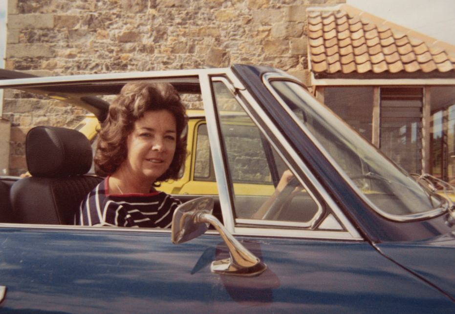
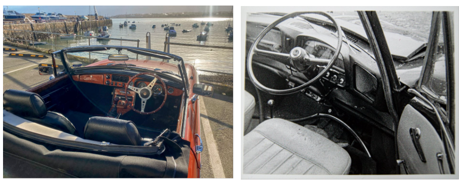
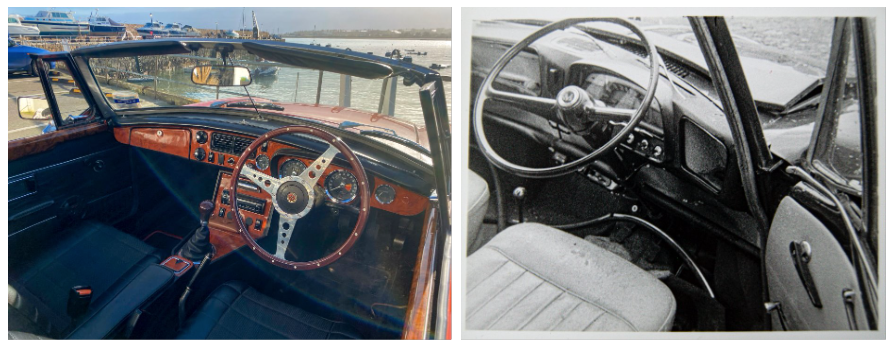
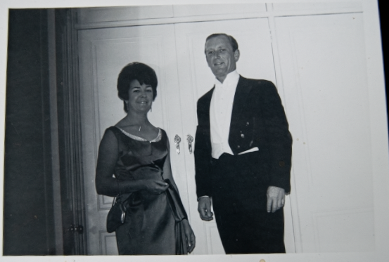
I have done this to link with these archived photos, that include a similar looking car.
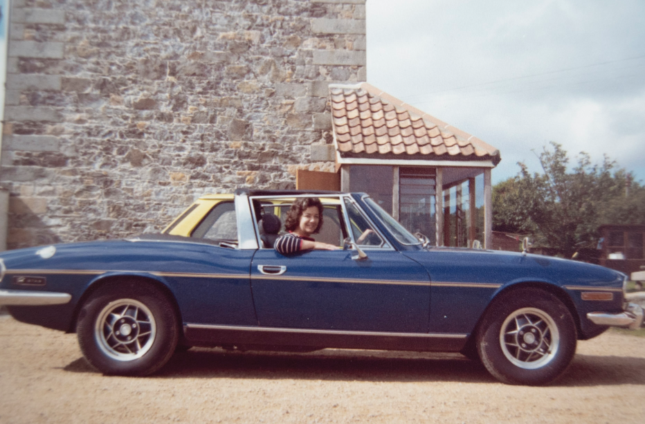
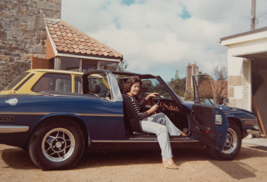
I want to choose the best composition that includes the boats (because my grandfather owned boats and I can make this comparison too) and the car. I also need to decide which of the archived images I will compare them with.
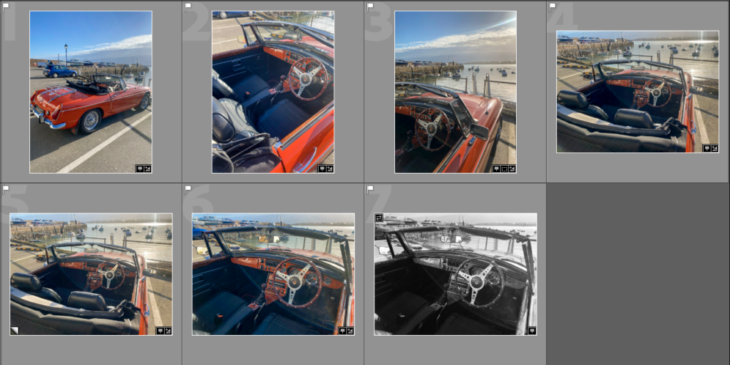
The best two
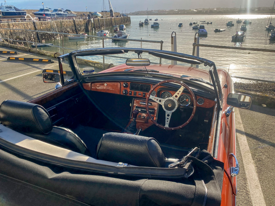
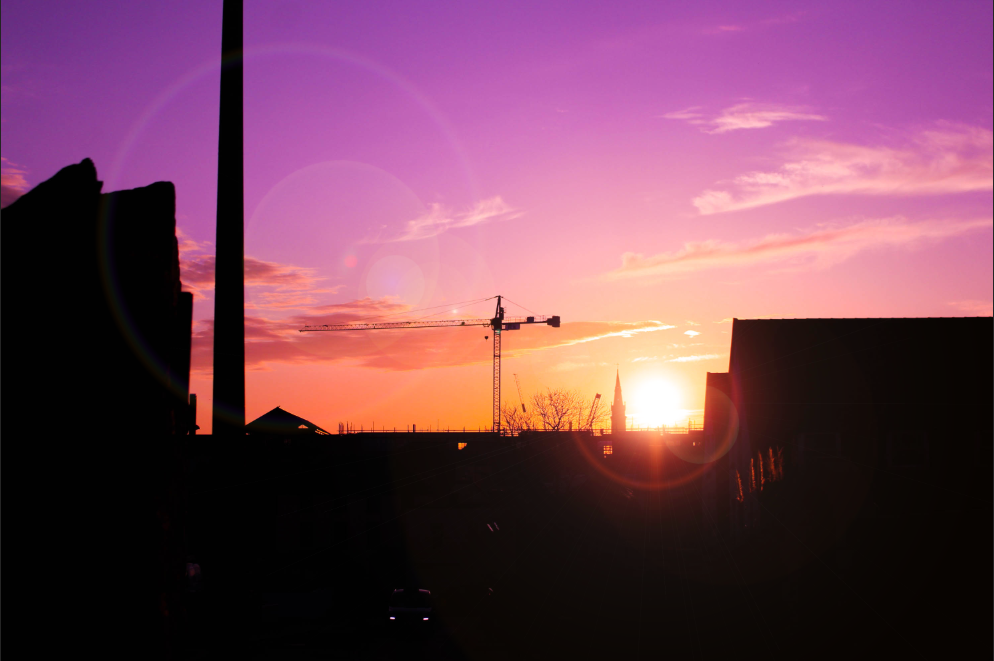
I don’t think this image has as good of a composition, although the boats are visible.
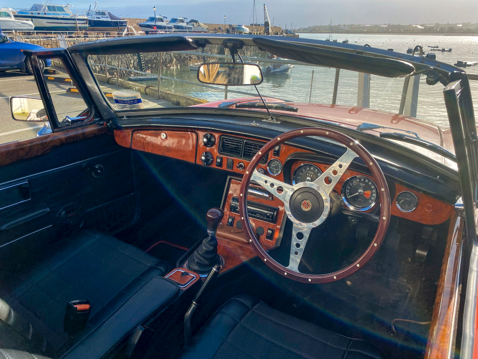
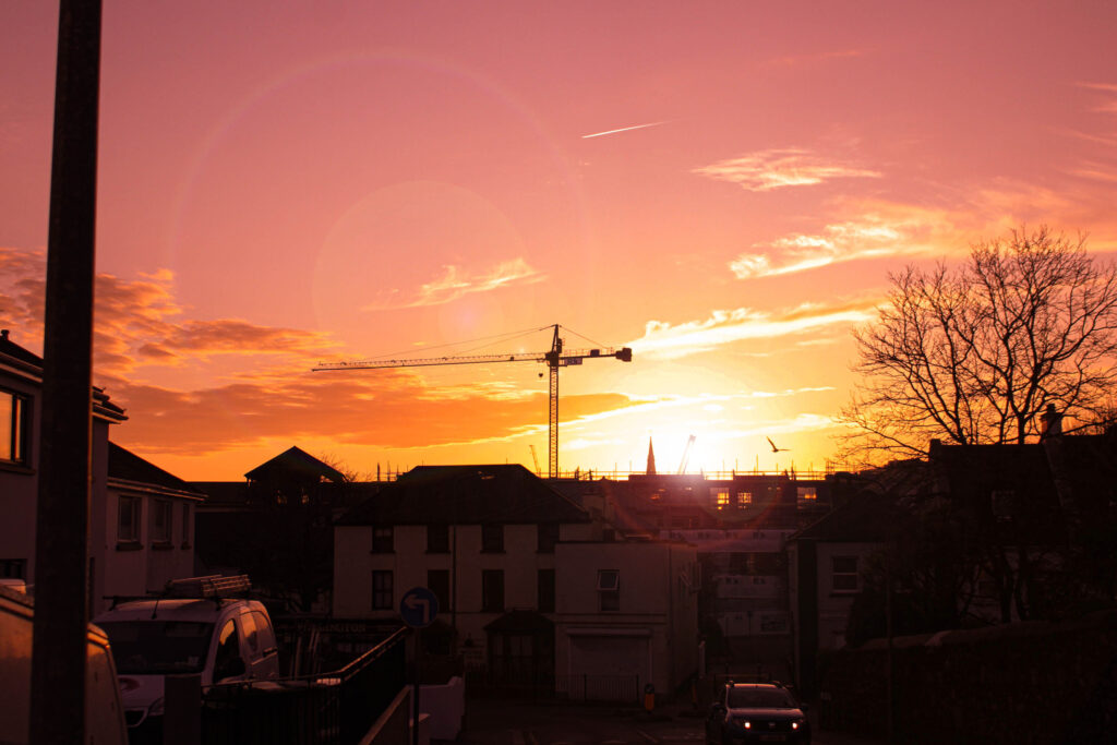
I think this is the most similar to the black and white archived image,however the boats aren’t fully visible – I think this one is a better composition.
COMPARISON
After comparing the images I am still unsure of which to choose, so I will decide when putting my photobook together.
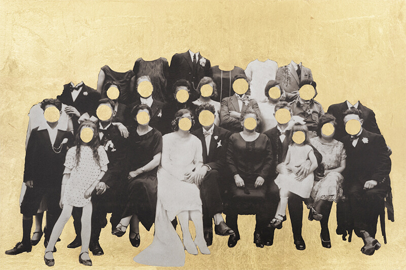
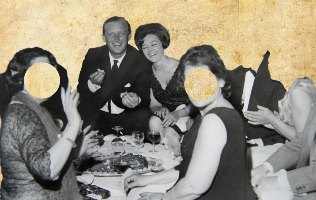
I want to edit some of my archived images in the style o f Benitah because I find her work can present feelings and storied through her editing process. I am going to experiment with her ideas in my own style to present loss and highlight my grandparents in images. Here is some of Benitah’s work that has inspired me:
Rather than prints, I am going to experiment in photoshop because it leaves more room for experimentation and I can produce multiple outcomes.
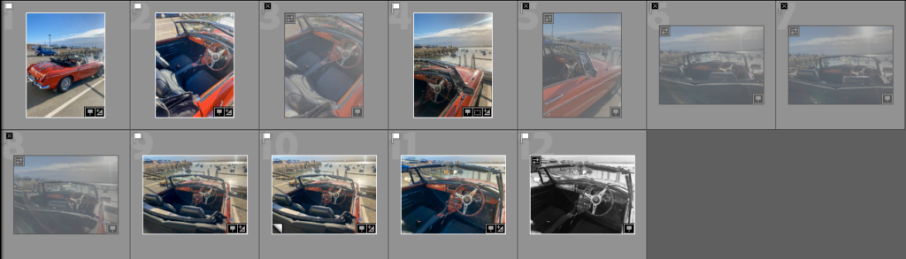
I selected the images I want to use for these edits in Lightroom using the colour selection, and rating them green.
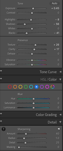
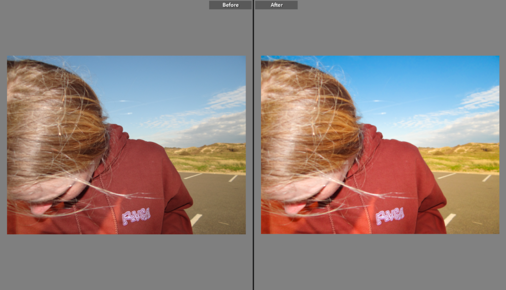
Basic edits
The two main things in the images that I focused on was blacks/ whites and detail. I didn’t edit them too much apart from correcting the amount of shadow and highlights. I then sharpened the images a bit, adding some noise reduction to reduce grain. I also added texture and clarity to define some images and make the details more prominent. Whilst editing I had to think about the quality for printing, and I know (from my previous prints) that adding too much clarity/ texture/ sharpening can cause the image to look worse when printing.
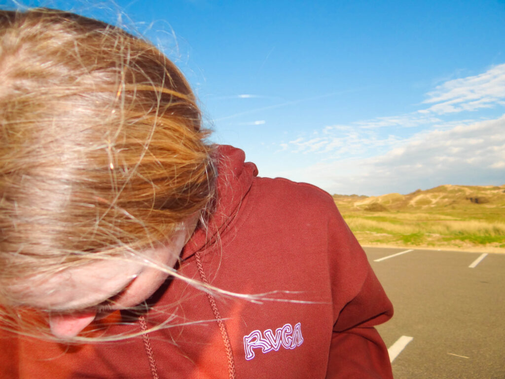
example of basic image
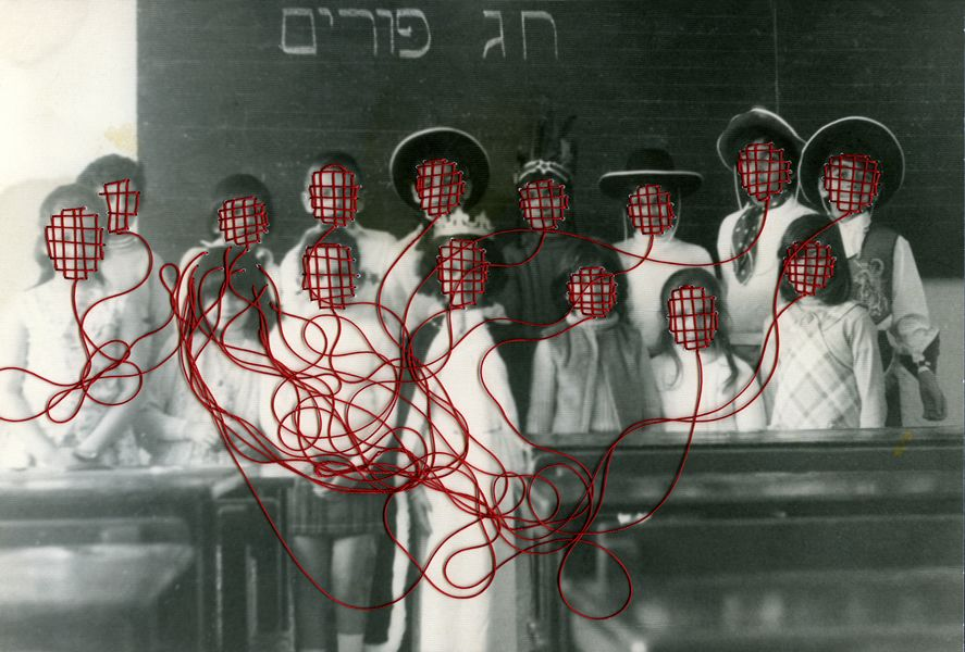
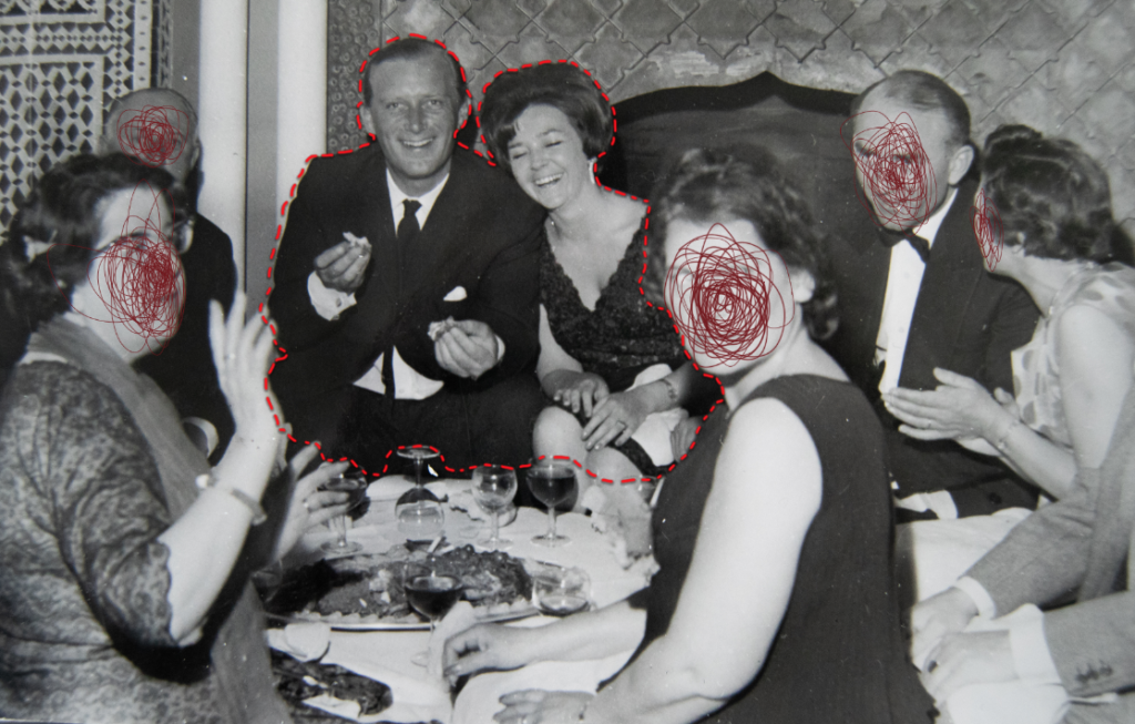
I began editing an image in photoshop in the style of Benitah, focusing on the different shapes she uses to cut out the faces, the tones of red, and how she constructs her edits.
inspiration image
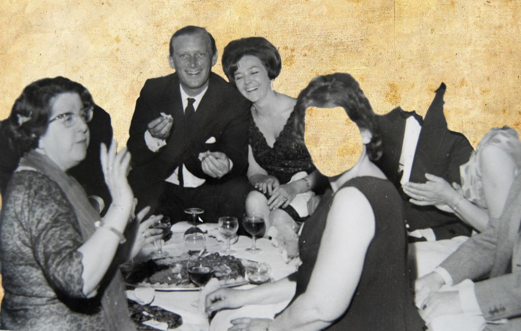
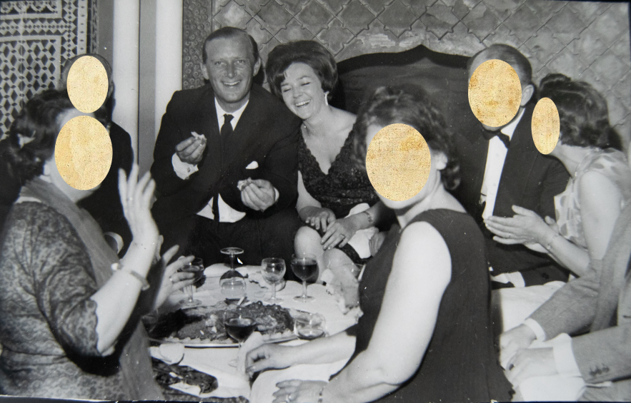
I tried removing the face using the quick selection tool to cut completely along the lines on the face. However I felt this didn’t look right and tried circles – like Benitah.
I selected circles, and selected ‘create layer via cut’ to show the background through. However I feel like this would work better with an image with more faces in, so I experimented more.
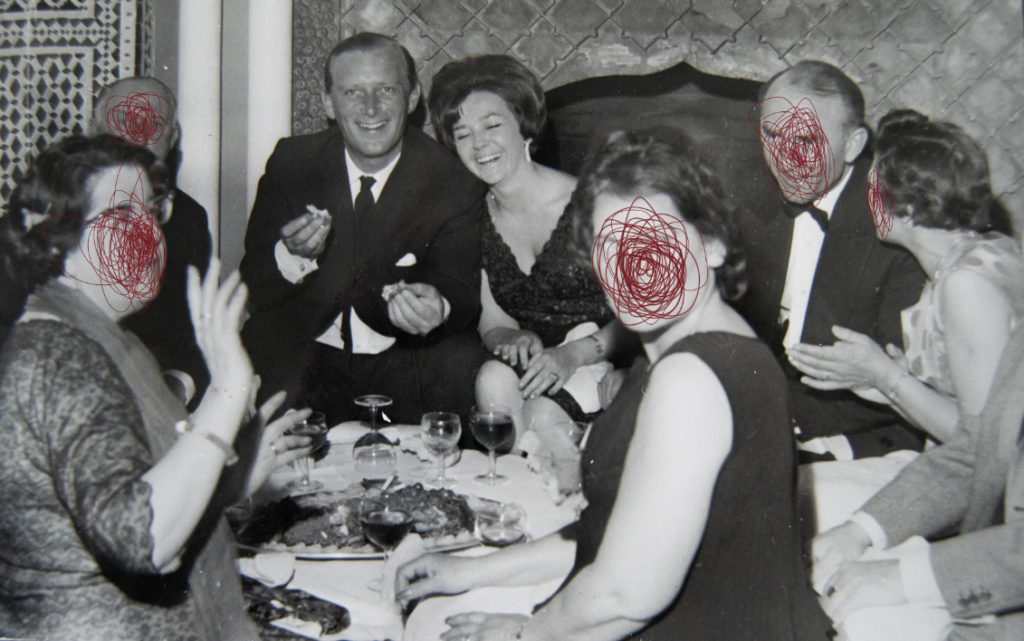
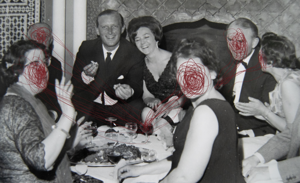
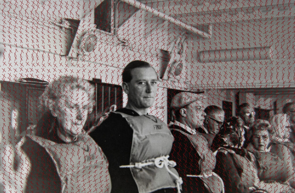
I tried adding the red thread sewing technique that she uses, but with the pen tool. I added a drop shadow to make it slightly more realistic.
I tried drawing with a darker red on their faces, and made it coe from the wine glass. I have seen Benitah do this a few times in her work, giving the ‘string’ a place where it has come from. I like this edit more than removing the faces, and feel like it fits the tones more.
More edits- I experimented with different editing for these images until I found a final result that I liked. I want to keep some subtle because when putting the book together overall I don’t want it to be too much.
quick select subject, create layer via copy, new layer, colour fill – red, low opacity, bring copy layer forward.
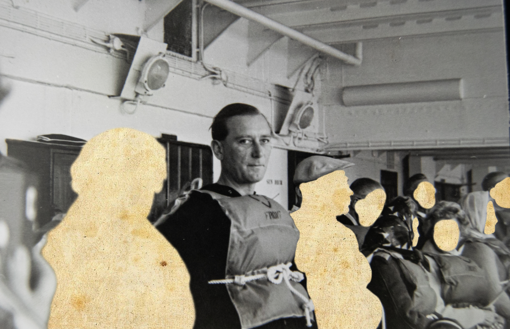
place image over old paper, erase chosen areas.
Draw a row of ‘x’ in pen, duplicate to make a large amount, combine layers, duplicate the combine layers, erase area over subject.
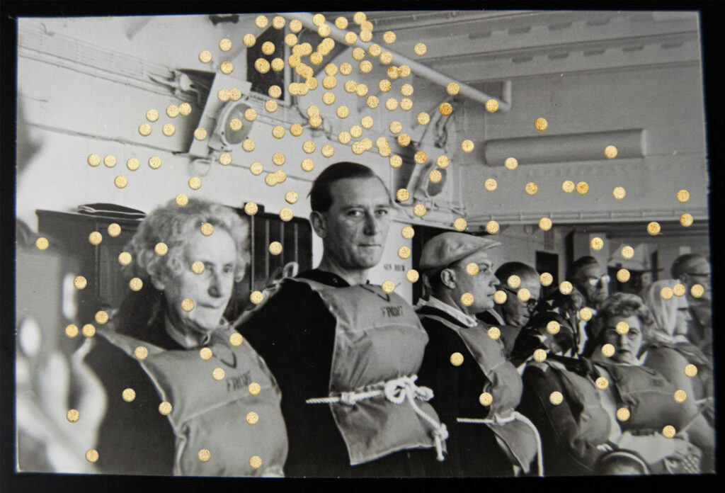
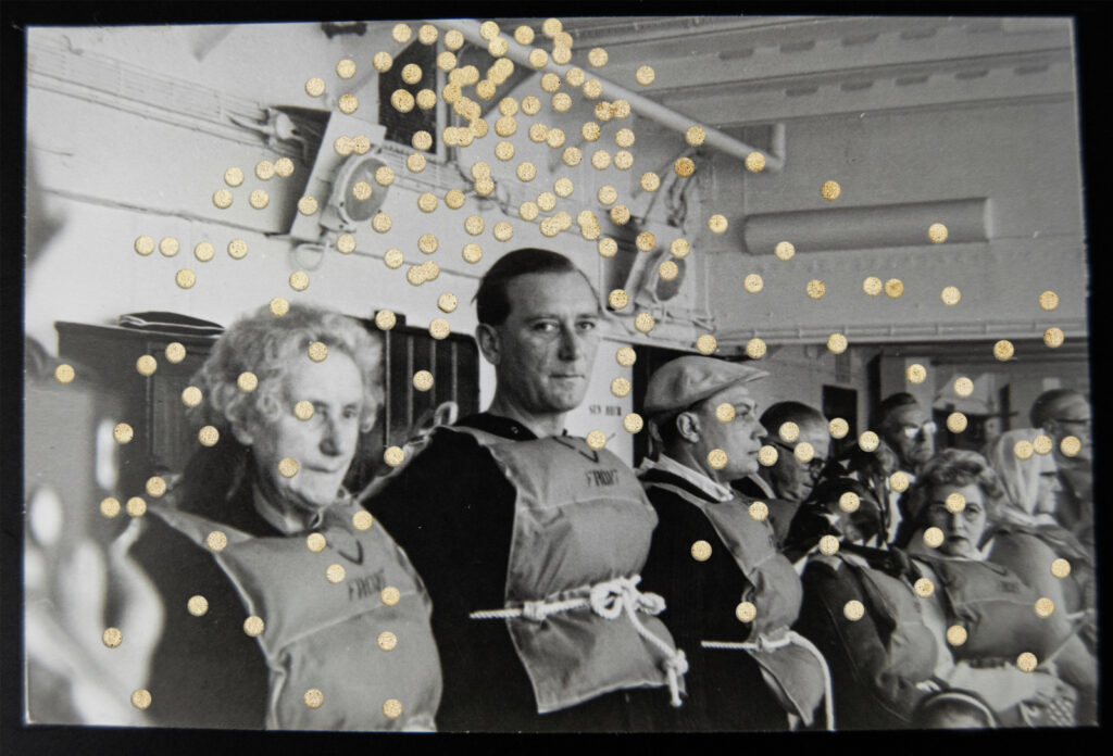
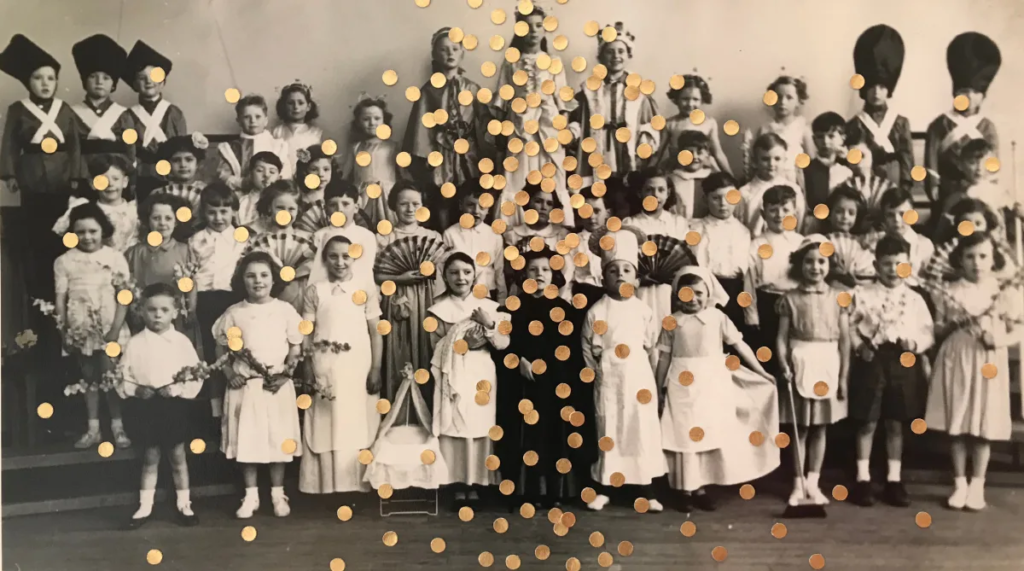
place image over old paper, erase in dots, add a drop shadow to look like leftovers from a hole punch – similar to Benitah’s work. I decided the paper was too saturated so I lowered the saturation.
Carolle Benitah’s work
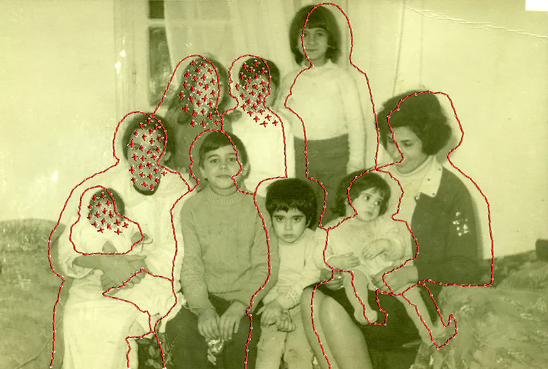
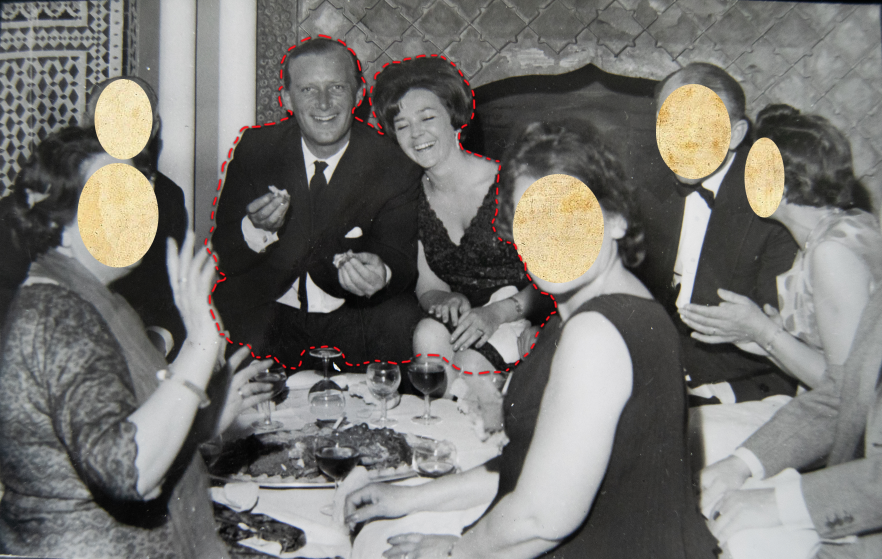
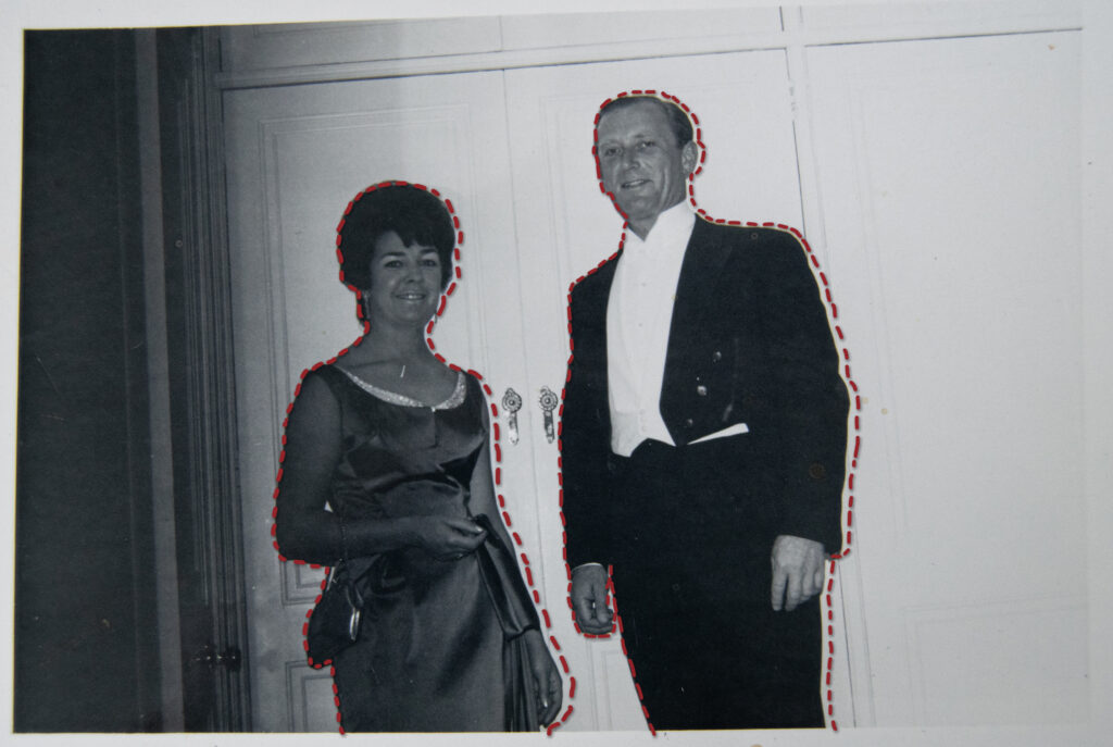
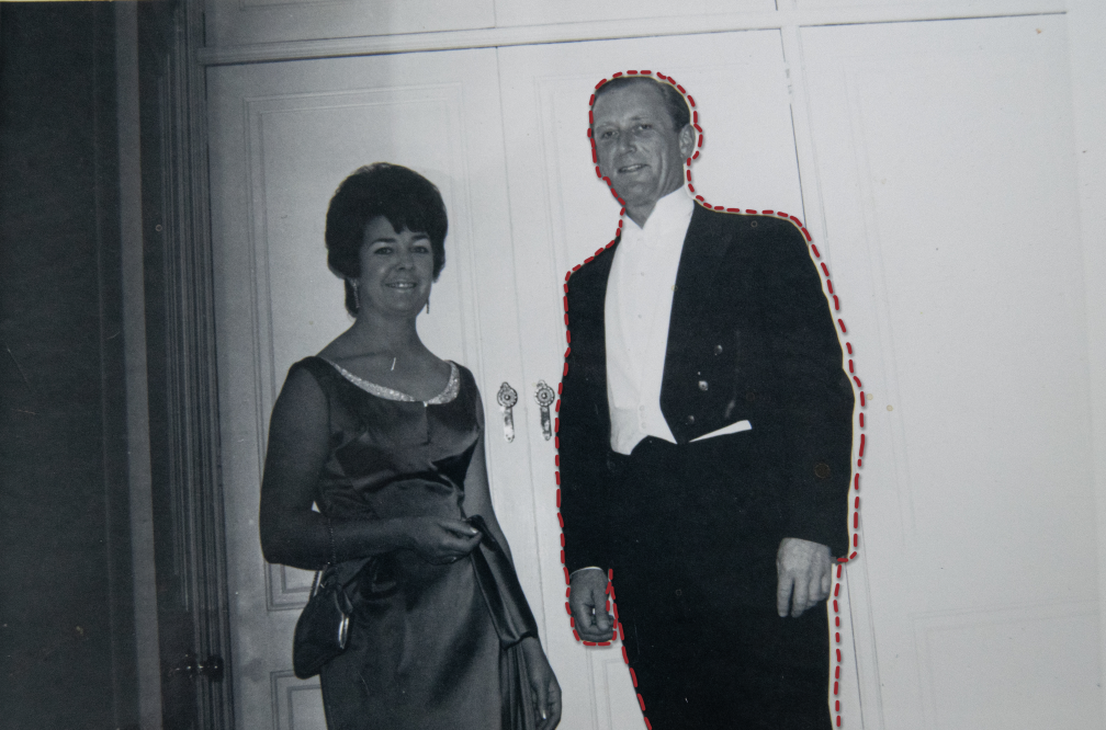
For this image I’m not sure if I should have the thread around just my grandad to emphasise his loss, or if it creates a better composition with them both outlined.
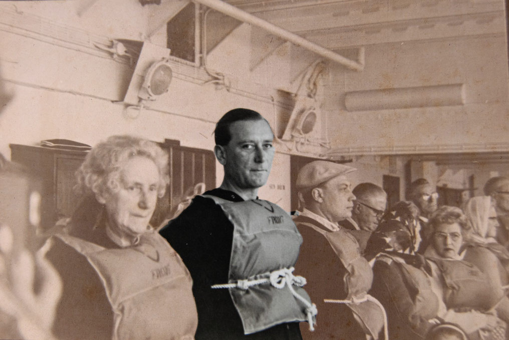
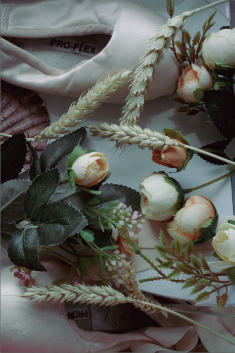
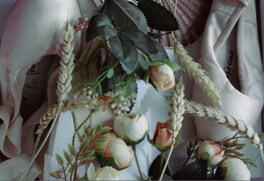
I want some basic edits so I made this image look like burnt paper – inspired by Jessa Fairbrother
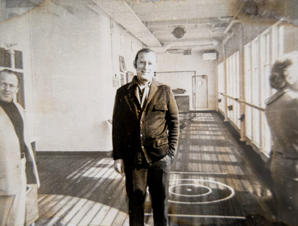
I edited this image of my grandad and his sister, attempting to focus the image on him, however I don’t like the edit and I decided it doesn’t link to the project.
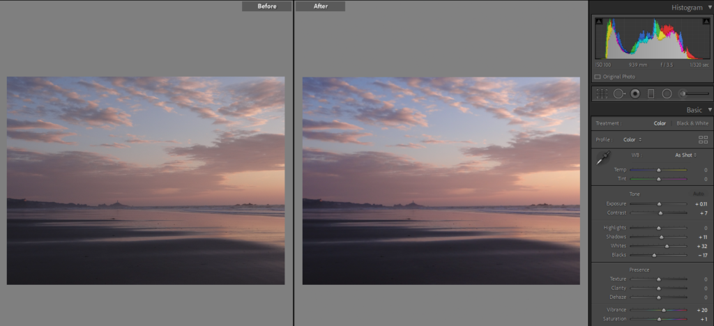
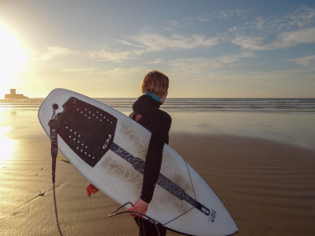
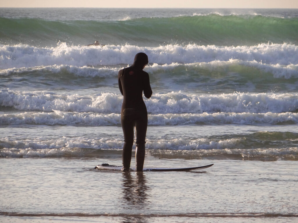
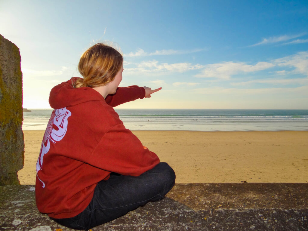
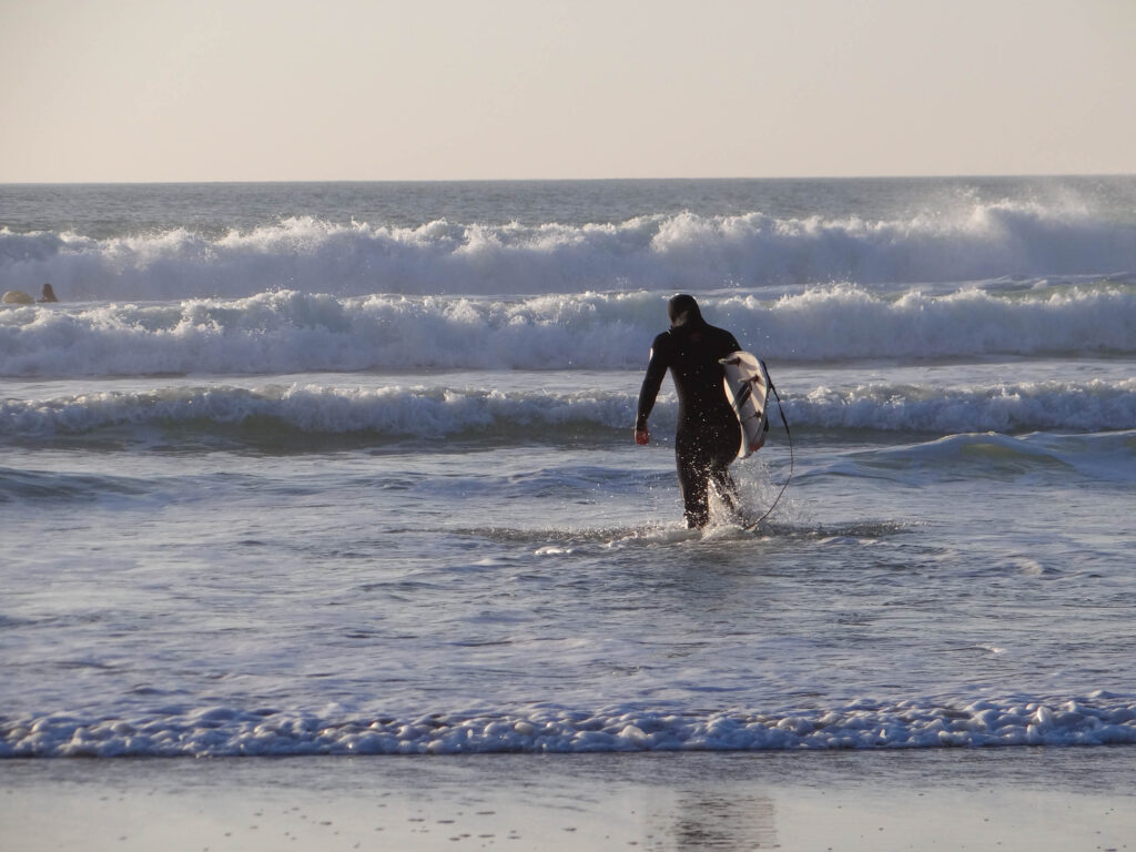
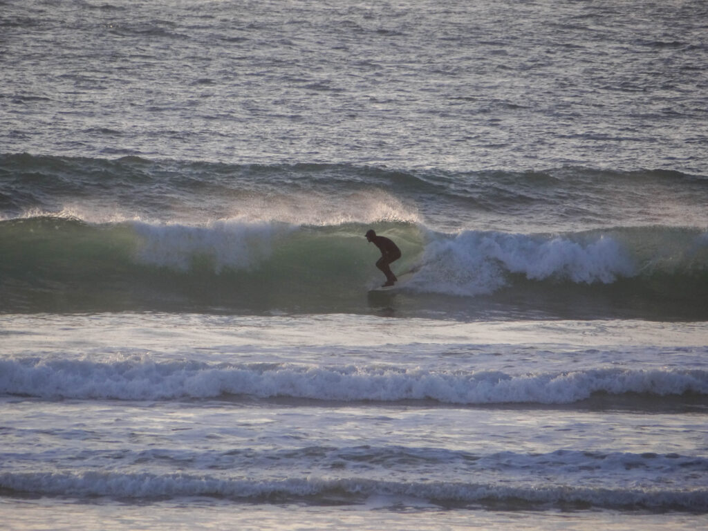
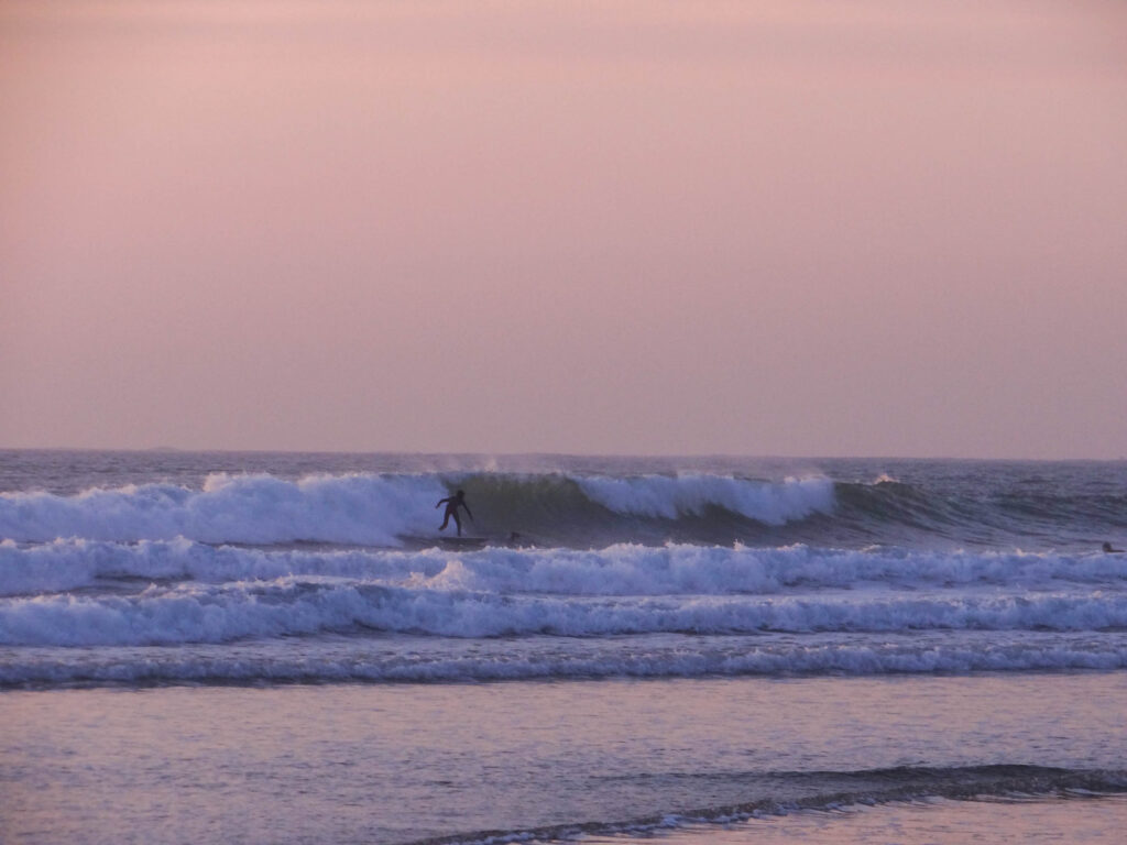
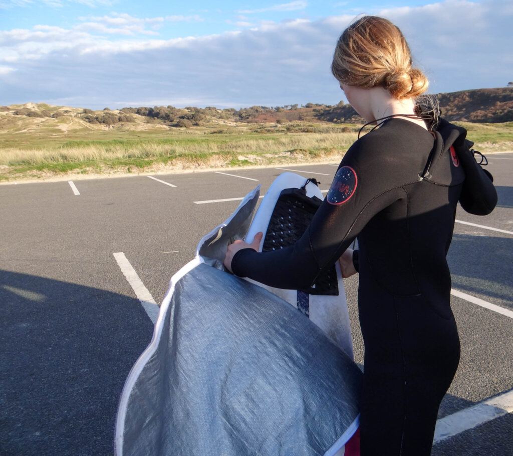
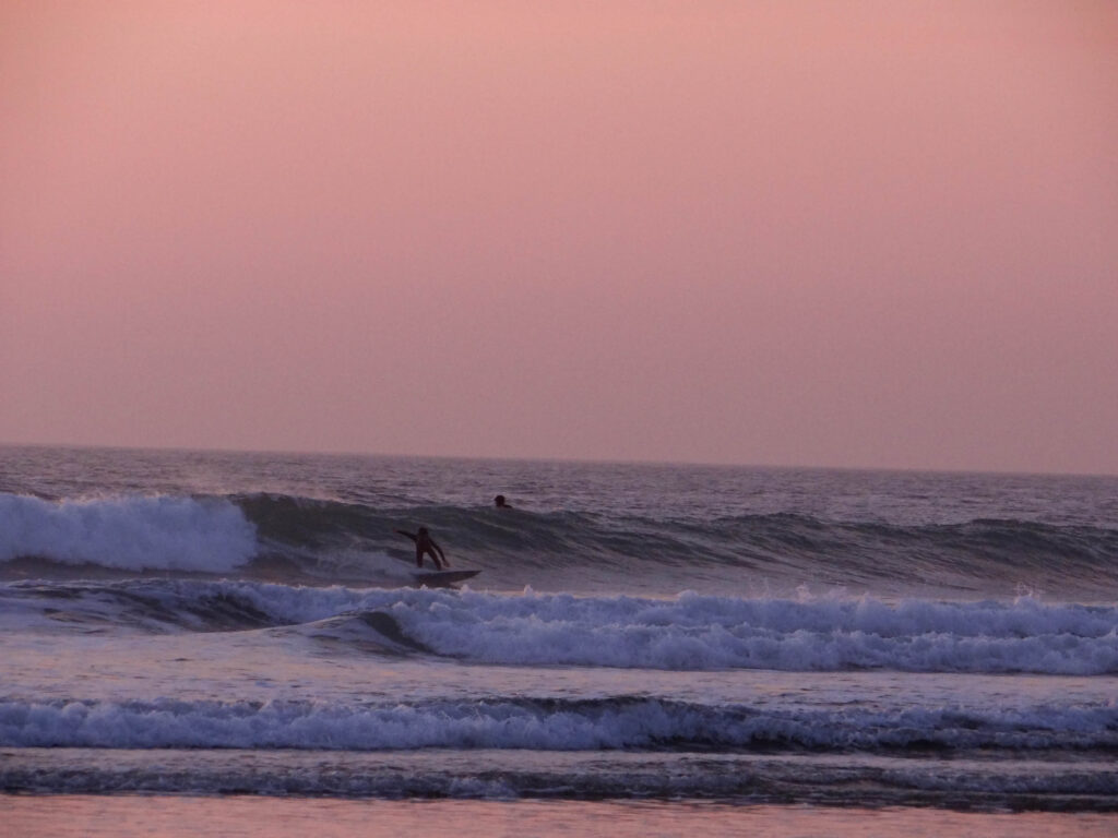
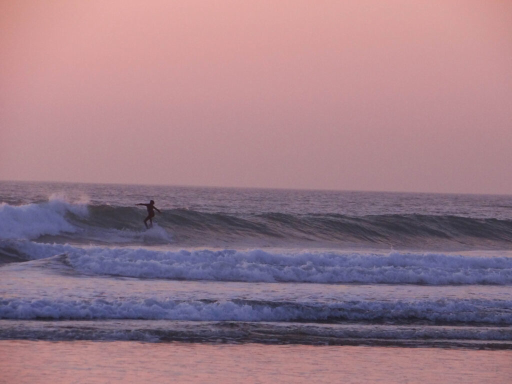
This was the first shoot that I took with the zoom camera so I was learning whilst taking the images. At first I found it quite challenging to identify which surfer was my sister but once I had identified it was easier.
Basic edits
final iamges
Best images:
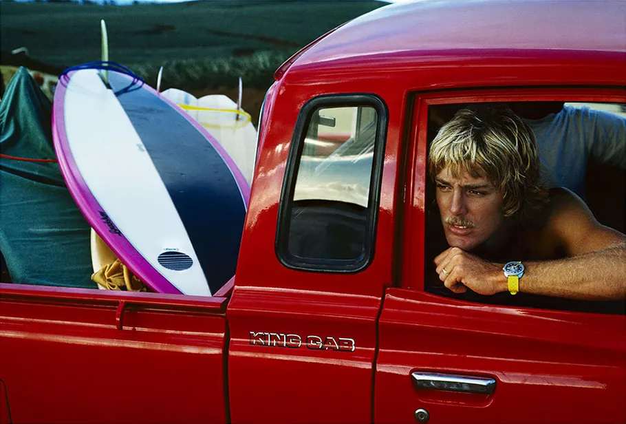
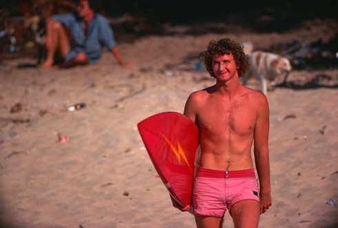
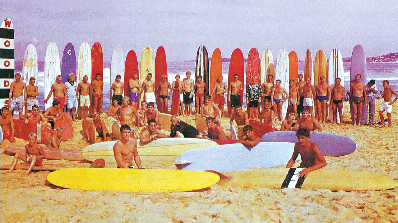
I wanted to experiment with editing some of my images in the style of ‘indie surf culture’ and the 70’s. These image were highly saturated and vibrant often containing the colour red or yellow.
My edits
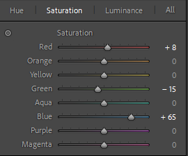
When editing these photos, I experimented with changing the saturation and luminance of each colours. Mainly focusing on the red, blue and yellow.
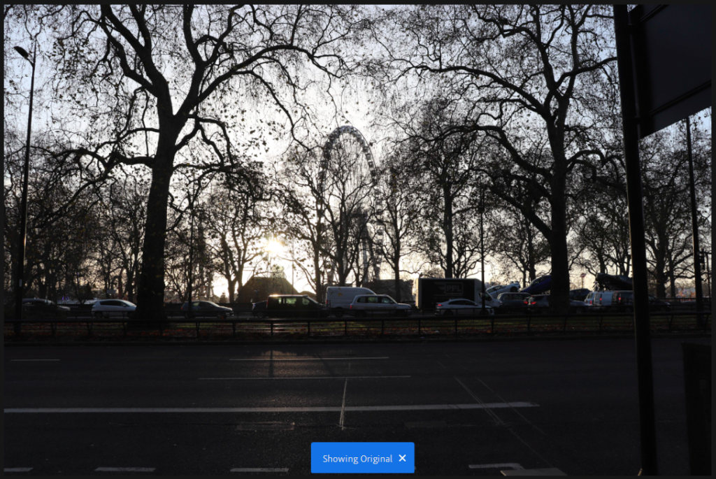
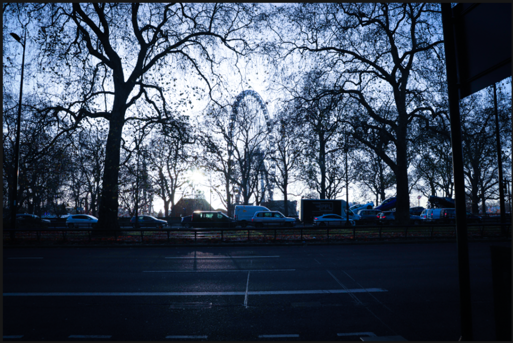
There were very few images that I decided to edit from this shoot and I chose to edit them by lowering the temperature slightly to show the wintry scenes without just leaving them as grey. I think that the lack of images from this city means that there is a chance that I am not going to include it as there would just be too much of a disparity.
I think the original image was good but in order to fit in with the other images from London, I had to decrease temperature and create more of a contrast between light and dark.
I like the way this came out because I think it looks cinematic and wintry.
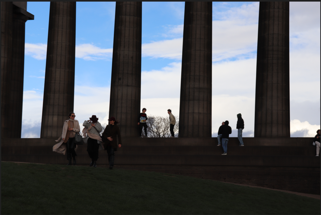
When editing these photos, I wanted to capitalise on the gothic, dark nature of the city and its architecture. The drama of the landscape is amplified by the high contrast, sharp shadows, and faint vignette. I feel that I have certainly created this effect and I am happy with the outcomes. They exemplify the feel of the city and its buildings.
This was the original image. This is too dark and needs to be more exposed.
I therefore increased exposure and added a black and white filter. I think that the outcome is suitably moody and dramatic.
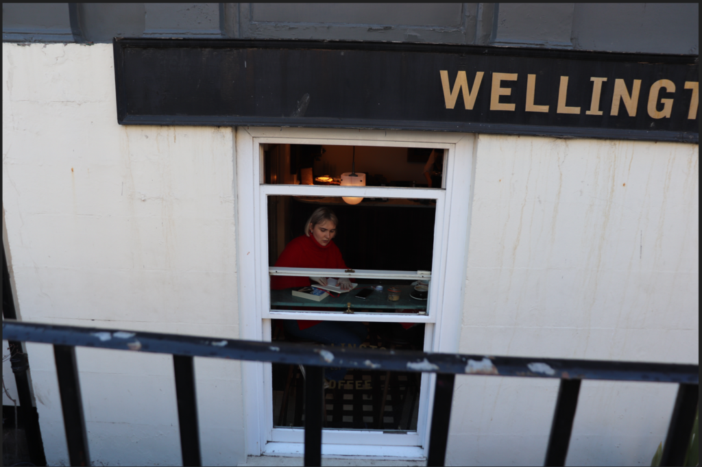
The original image I liked because of its darkness and I was debating whether to keep the colour or not because I liked the red of the girl’s jumper.
The final image, however, in order to be in keeping with the black and white edits of the other images, did turn out black and white. I also made it a little darker to add atmosphere.
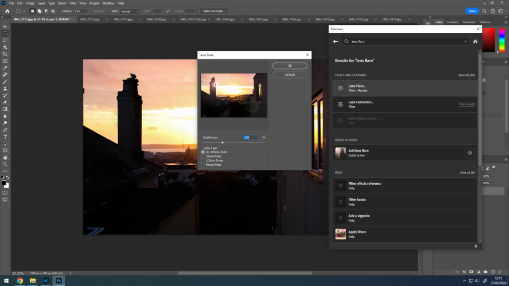
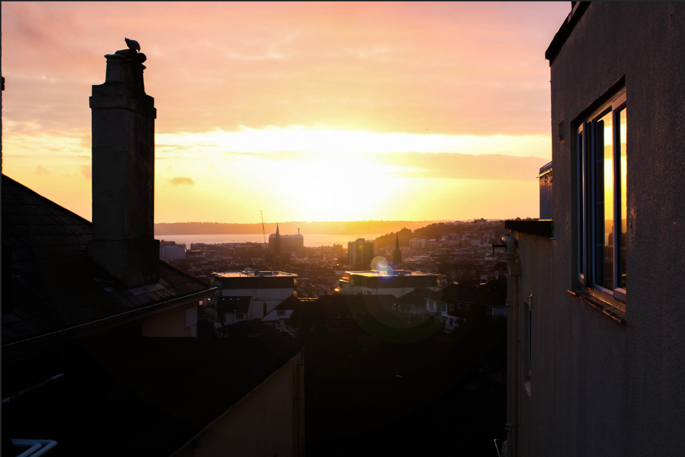
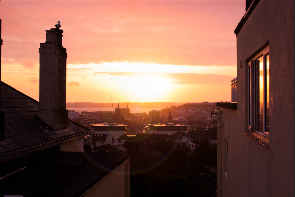
I thought it would be interesting to add a lens flare to my sky images that had the sun in so I decided to bring some photos over to Photoshop to try it.
Process:
Using Photoshop, I searched up for the “lens flare” edit, this allowed me to place and rotate the flare to what I saw fit. It even let me change the brightness and type of flare too.
Before –
After –
While it is rather minor, it still makes the photo look a lot better in detail.
How does this photoshoot fit into the theme: Observe, Seek and Challenge?
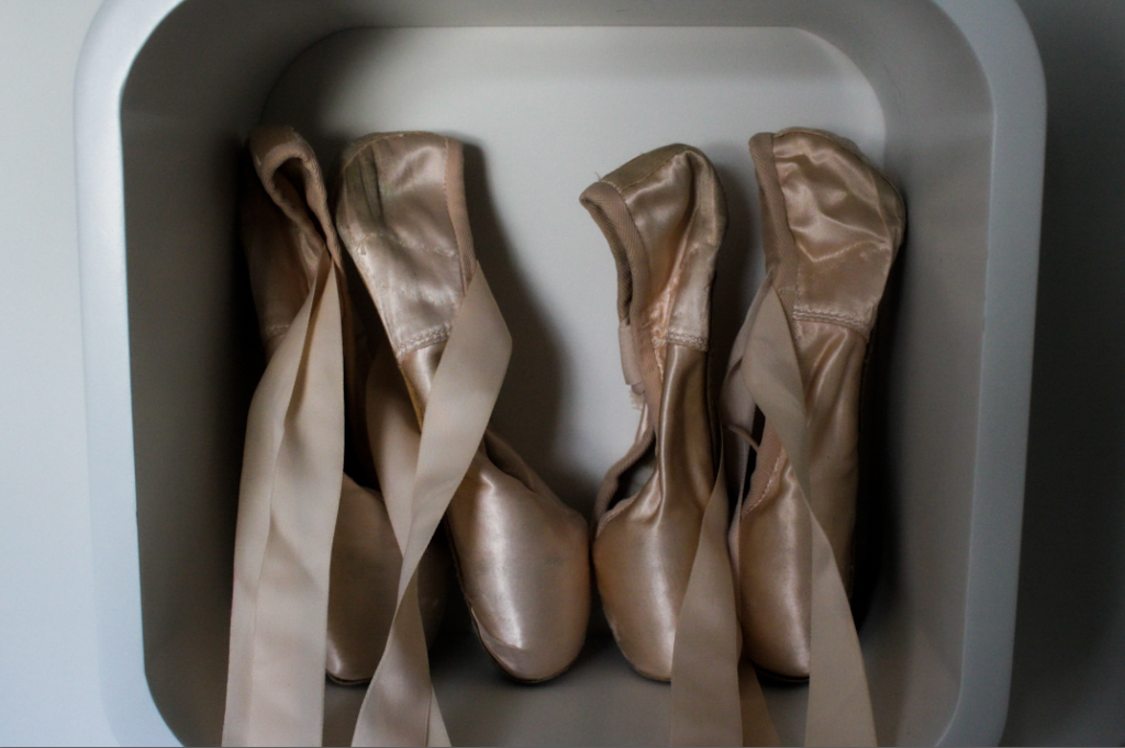
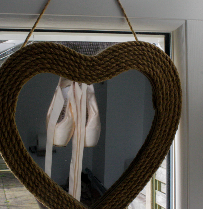
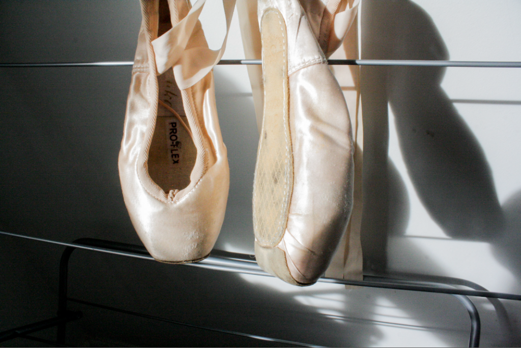
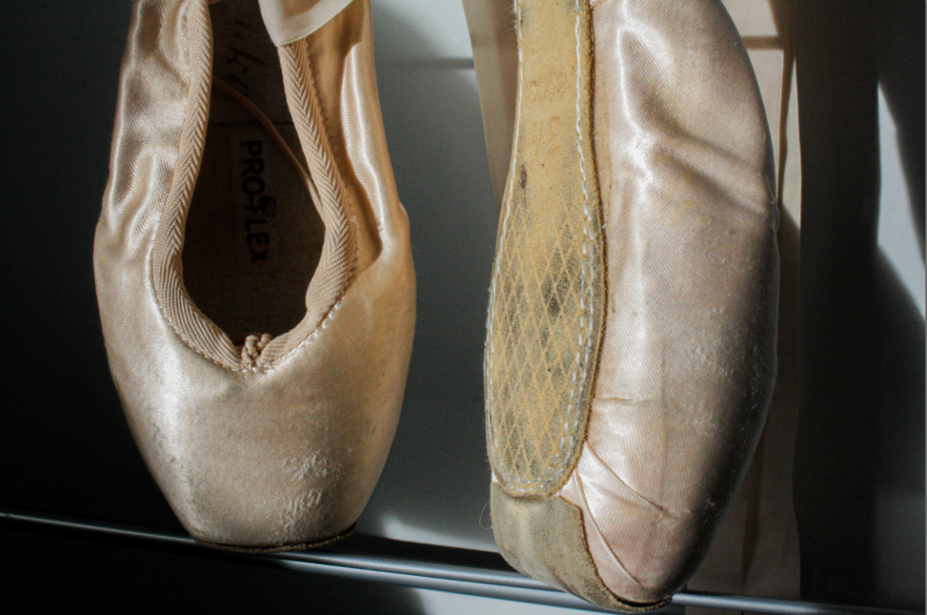
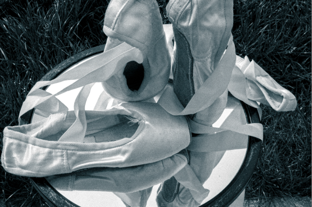
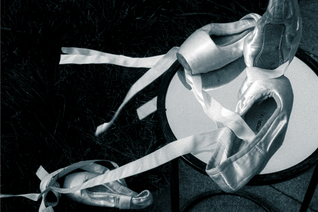
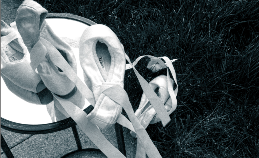
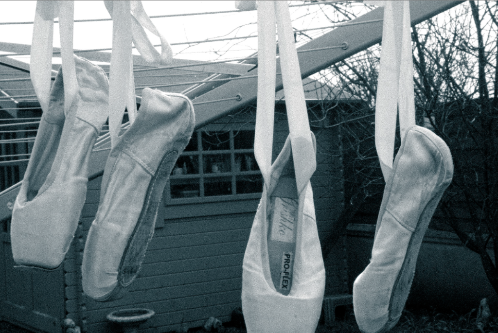
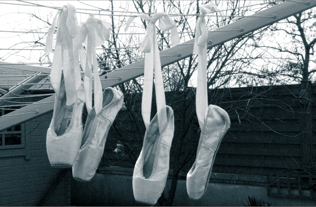
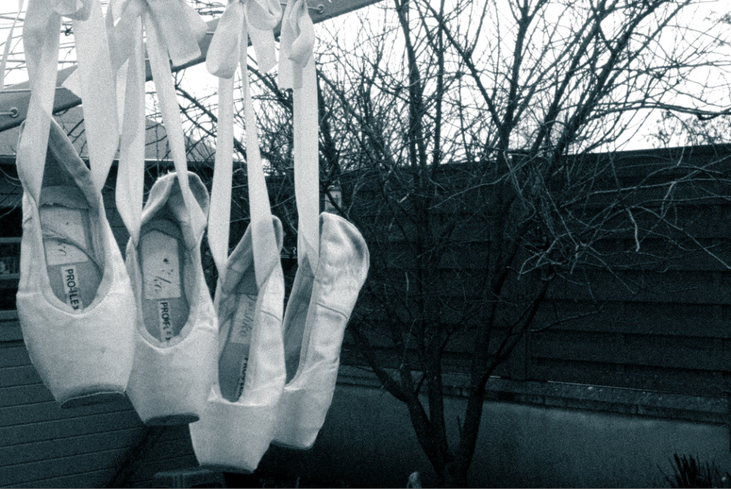
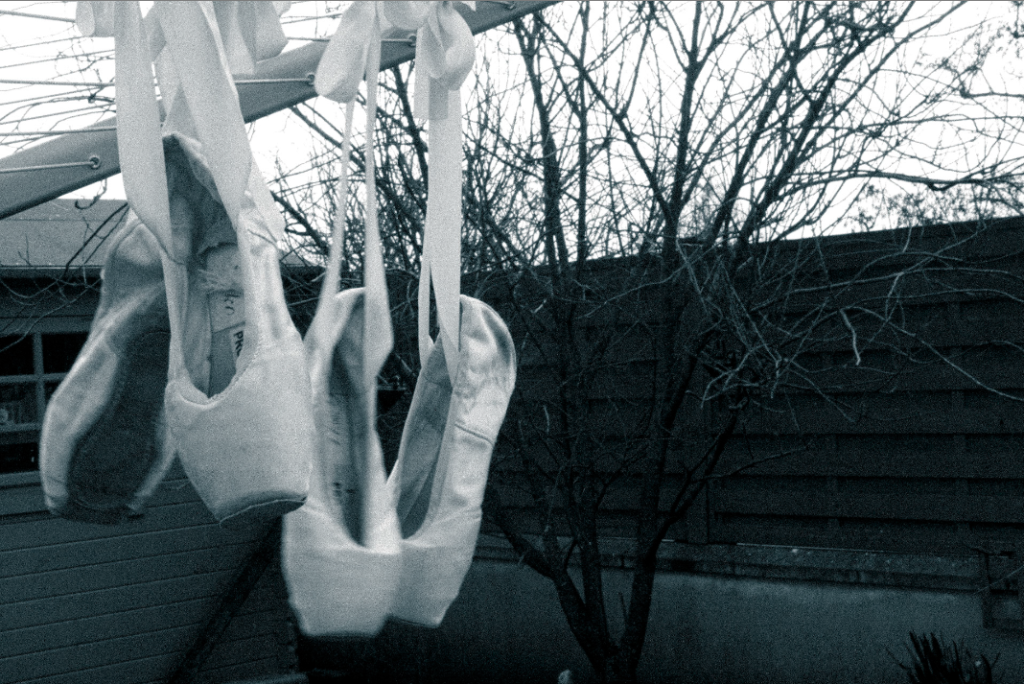
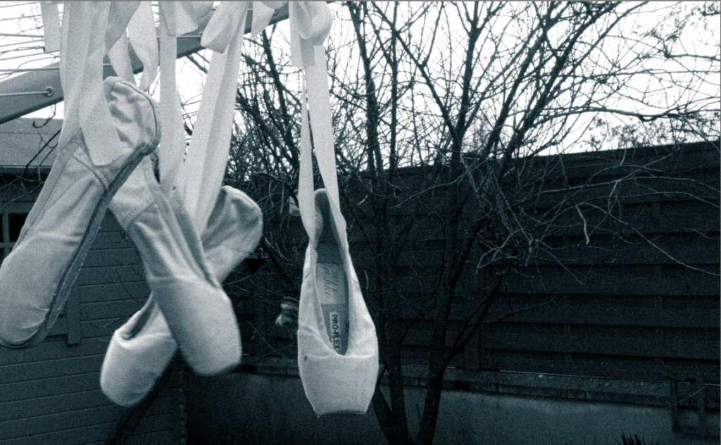
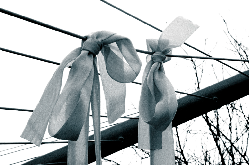
Alongside my visual response to Cindy Sherman’s work I created some other images. I wanted to explore something that relates to me and femininity, however I wanted to fit the theme observe, seek and challenge. The way I did this was I decided to explore my childhood and specifically ballet which I used to do. I wanted to ‘seek’ and focus on simply ballet pointe shoes (to start off with), this then allowed me to be ‘challenged’ as I had to experiment with different ways to photograph the shoes, I wanted to try make something that started off looking simple to then making them look interesting. The main way I achieved this was by playing around with the ribbons attached to the shoes, I also took advantage of the fact I had two pairs meaning I could create composition by adding and taking away shoes and lastly making sure I used different locations to show me observing my surroundings.
Improvements to be made and developed into this photoshoot:
To expand and diversify this photoshoot i am going to continue creating images surrounding this topic of dance/ballet. As so far i have only photographed the shoes as an object on their own, i aim to make images where it involves peoples silhouettes. For example, acting out/ standing in a position which links to ballet, this could mean simply extending, bending legs. When photographing this i will make sure the subject (person) is dark to highlight the silhouette and specifically focus on the outline of the legs – you can find pictures like this in the girl on girl book. Not only will this relate to my ballet theme for femininity/ nostalgia it will also fit perfectly in with Observe, seek and challenge as I’m taking a small subject (ballet) and seeking deeper ways to present this in photographic forms so not just the shoes but the actions/movements which come with ballet. I will take this images in several different settings including random fields, cliff paths and mainly unique locations which would make the image look slightly unusual with the silhouette in the middle.
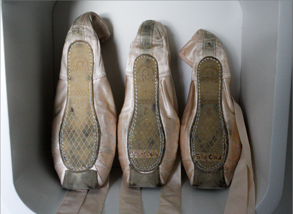
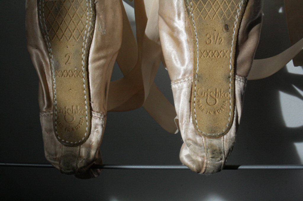
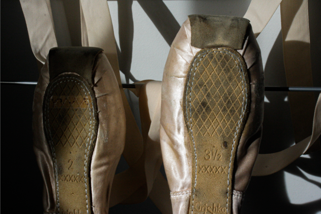
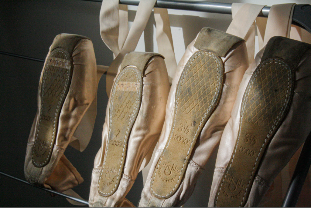
BALLET SHOES – OBJECT SHOOT 1/2 OUT OF PHOTOSHOOT THREE
CONTACT SHEET:
Around 60 images, 4 different location settings/backgrounds.
First location images:
Selecting and rating best images out of these 8 ^ :
RED = BAD
YELLOW = OKAY
GREEN = GOOD
Second location images:
Selecting and rating best images out of these 17 ^ :
Third location images:
Selecting and rating best images out of these 9^:
Fourth location images:
Selecting and rating best images out of these 22^:
Other experimenting:
Don’t need to colour code these as I like them all.
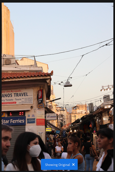
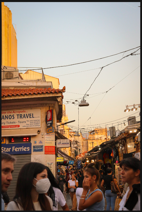
A lot of these images are charming because of the colours in them. The sandy, warm tones of the architecture alludes to the exotic nature of the city and transports the viewer back in time to when these ancient buildings were originally built. Therefore, I chose to edit these images accordingly and to use a black and white filter fairly minimally. To create this effect, I used much the same edits throughout – lowering exposure slightly and increasing shadows to create an even tone, adding saturation very slightly and warming the image, and adding a slight vignette and increasing texture a little. I’ve included some examples below.
This is the original image. I felt that the colours were a bit bland because of the shadow so I wanted to brighten it as well as make the people’s faces clearer.
In the final image, you can see that I have increased exposure and warmth to make a brighter and more vibrant composition.
In the original image, I liked the light and composition but I think it needed more vibrancy again
Therefore, I again increased contrast and warmth which made a more warm image.
I copy and pasted edit settings for a lot of these images as I felt that they worked well for most of them.
As planned earlier I have gone out to photograph frog habitat which involved in getting quite close to frogs and their colonies. To do this I needed to have larger wellies to get into the ponds. I took a few pictures over 1hour. I focused on photographing the trip as well as what I found and experienced.
Photoshoot
Sub Selection
I have selected photographs of the best quality, and ones I though were showing the experience in the best way .
Editing
When it comes to editing I was able to copy the same editing style throughout the images, the main features I did change depending on the subject of the photograph was the exposure, as most were either over or under exposed. The main featured I did highlight were the exposure, sharpness and clarity.
Final Photographs
After editing I narrowed down my selection further depending on the photographs quality, what is was showing and checking is it wasn’t “repetitive”, meaning showing the same or similar thing. I wanted to have a good range of the photographs, and I think I achieved that.