Pictures from Home Larry Sultan

‘This is one of the most significant American photobooks of the 1990s‘ Parr + Badger Vol. II

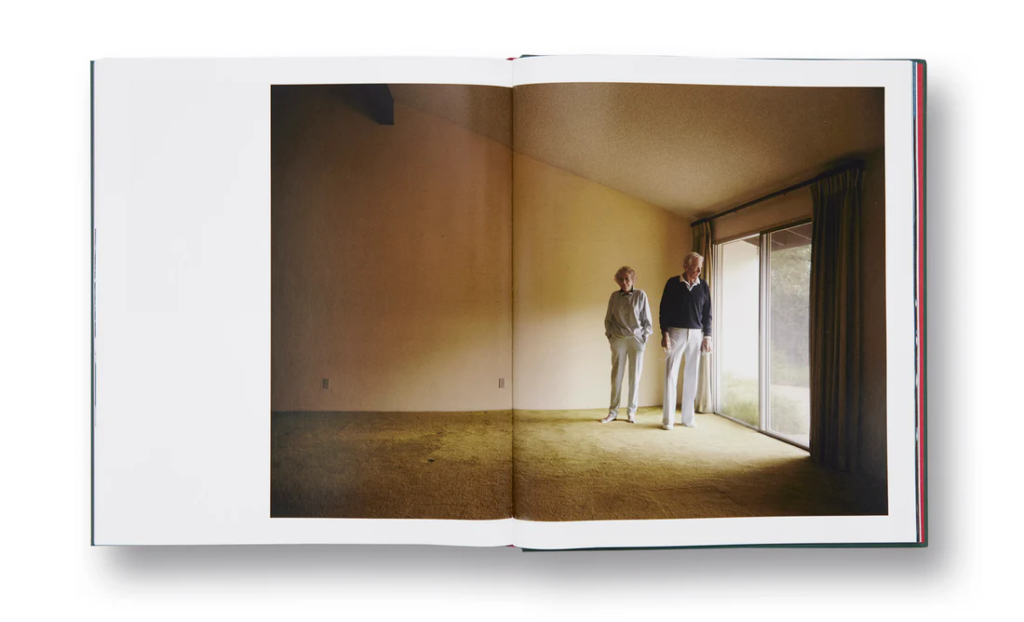
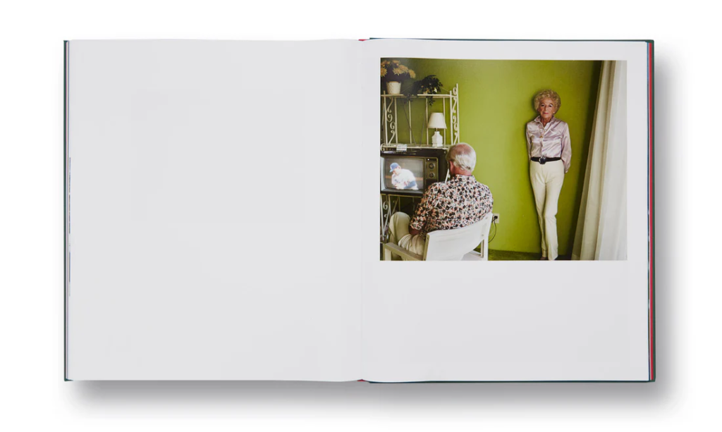
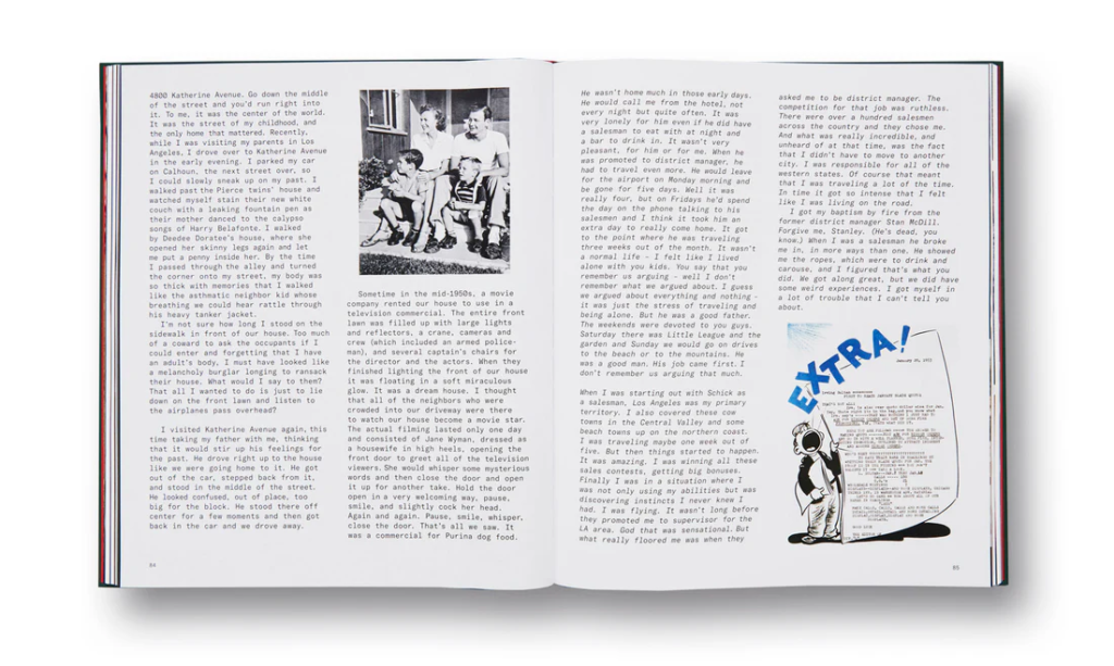
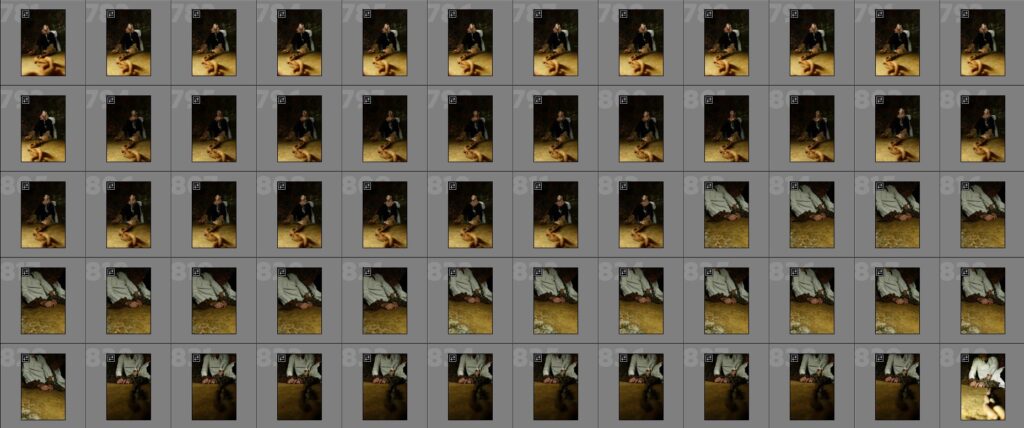
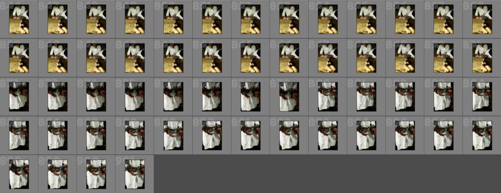
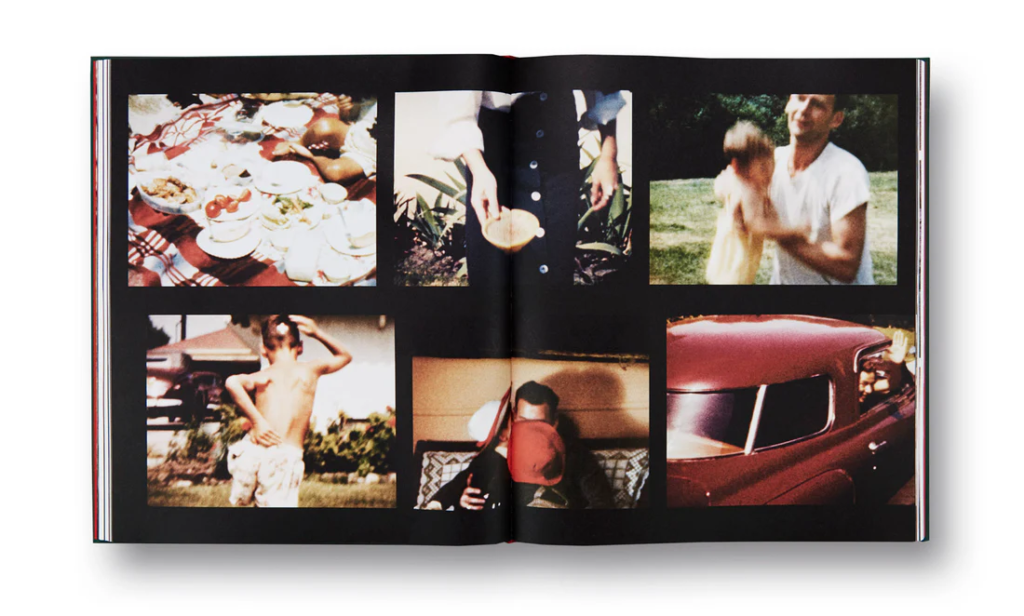
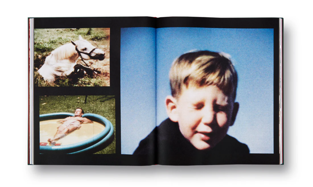
Pictures From Home was one of his projects that took a decade, featuring his mother and father as the main subjects. It is a pendant to his parents, and was published in 1992. Over the years from the 1980s to the 1990s, Sultan frequently returned home to Southern California. Being a narrative collage, this photo book holds various mediums. It includes contemporary photographs, film stills from home movies, parts of conversation, and his own writings as well as other mementos. Sultan has created it to leave ambiguity in understanding the difference between the documentary and the staged.

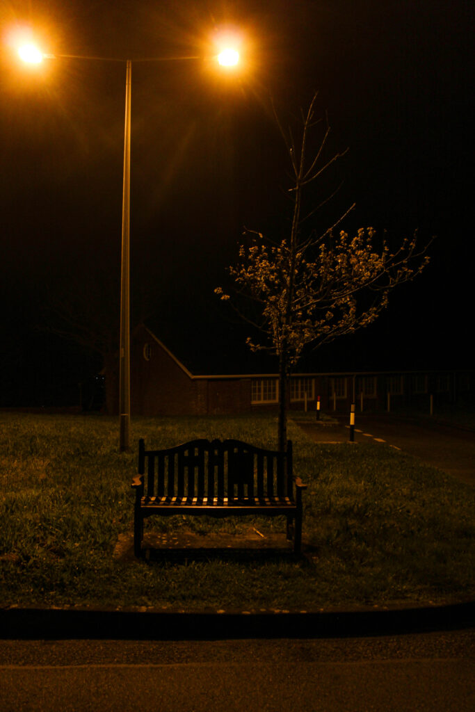
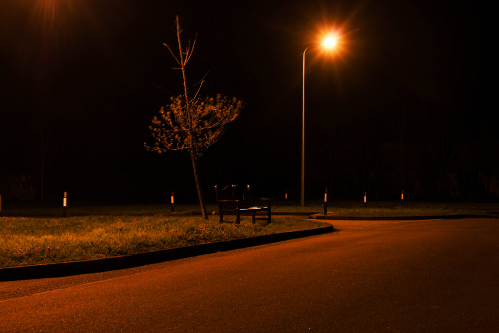
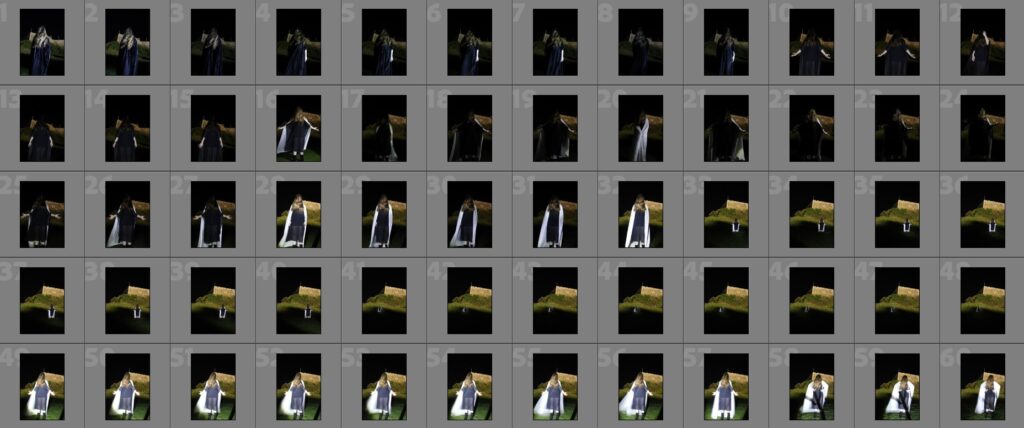
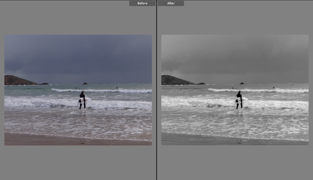
I like the way that Sultan has collected memorabilia from archives, similar to my project, and linked the two so they become one. I want to include a small level of this in my work, however I still want to present the difference. I am influenced by his ability to capture his parents doing daily tasks in the moment, but still managing to make it look staged. I find there is a sort of environmental photography linked with this, presenting the subjects in their environment and having them look at the camera. I feel like I have done this in my work, however it could be improved by placing my gran in situations where she is completing an activity or daily task.

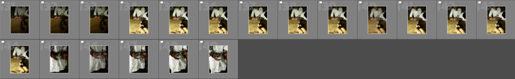
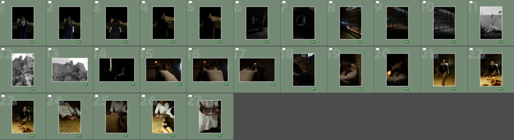
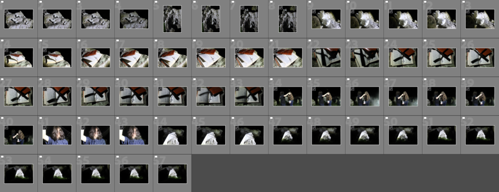
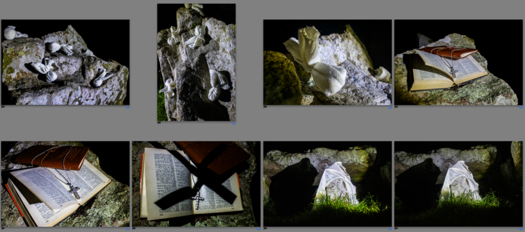
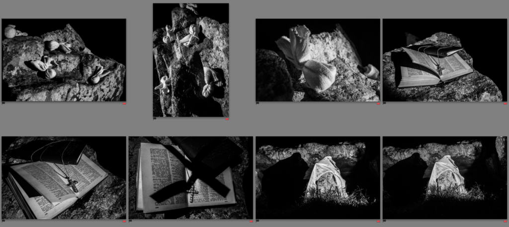
As a result of looking into Sultan’s work I have been inspired to photograph my gran looking at archives and old objects with sentimental meaning of my grandfather. My gran tends to enjoy revisiting old memories through photo books so I will photograph her doing so.

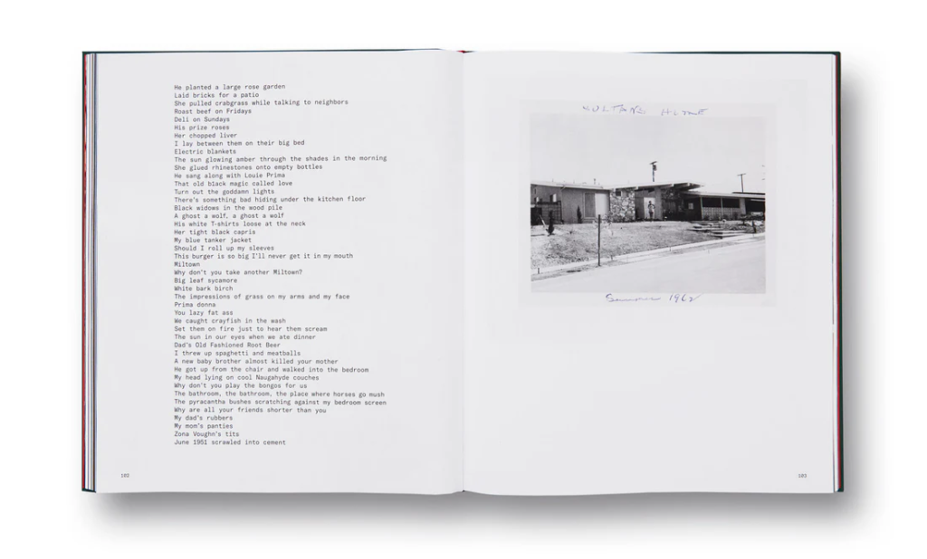
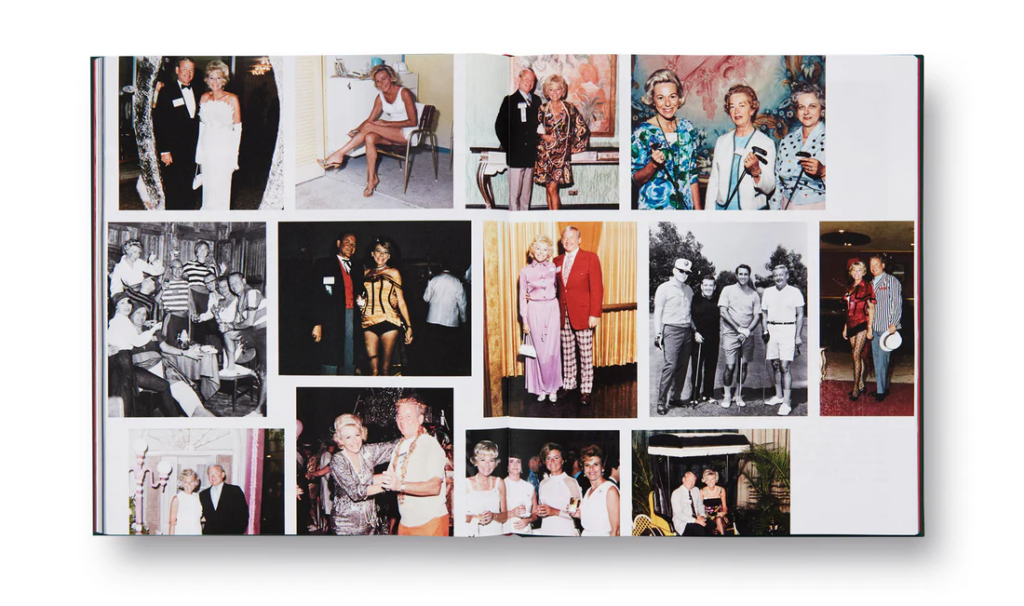
I have also been inspired by the way he lays out his archived images in Pictures From Home. These page has particularly inspired me to experiment with a layout like this.

The pages including his writing and memorabilia has given me ideas on how to include my grandfathers scrap books, possibly rewriting the news paper articles or enlarging the images and reorganising it to fit a page in Photoshop. I will experiment with this later.

Edits for photoshoot #8 – St Malo

For these images, I decided to edit them all in Black and White to emulate the style of my artists and the history of the town. I increased contrast to highlight the light and shadow created by the high city walls. These images were largely successful as the touristic nature of the town pairs nicely with the sunlight, and I certainly captured some characters.

This image is slightly cloudy and it is clear that the scene is stereotypically British/Northern French.

I wanted to edit it in a similar way to my other images, which I had edited with the style of my chosen artists in mind. Therefore, I used a black and white filter and increased contrast and vignette to create a more cinematic and meaningful shot.

Edits for photoshoot #7 – Plane

For these images, I increased warmth a little to remove the coolness of the light and allude a little to the excitement and positivity of a plane journey to your destination. I think this created some really strong outcomes that will work well as intersections for each chapter.

The original image, whilst having good lighting, is slightly bland in colour due to the cold morning sunshine.

Therefore, to edit, I increased warmth and brightness to create a more inviting image. The warmth suggests the possibilities of what a holiday may hold and the excitement of the traveller.

Edits for photoshoot #6 – Paris

When I took these images, the weather was largely grey and cloudy so I wanted to ensure that this did not make them boring. Therefore I used the Black and White tool in a lot of them, similar to the style of my artists who have photographed the city fairly widely. In the post-rain sky, there were a lot of blues and purples and I wanted to make sure these were highlighted, and for images taken by night, I wanted to highlight the skyline and its tiny distant lights. I am happy with how this turned out but I do think the weather could have been better at the time.

The original image is nice because of its colouring but I felt that it would benefit from a black and white filter to make it more dramatic, especially after rain.

I think that the final outcome is good because its contrast creates a dramatic cloudscape and has a cinematic feel to it.

Edits for photoshoot #5 – New York

The images I have chosen from this shoot are some of my favourites. I was very lucky to get a majority of sunlight for my trip and so the scenes are full of light and blue skies, which is very important in image making in order to capture colours. I therefore wanted to focus on the colours in the city, with the vibrance tool, instead of the traditionally black and white street photography of New York. I think, especially with the Autumnal colours and crisp blue skies, that this has been effective and I am happy with the results.

The original image is good because of the light, but I think that it could do with a little brightening and increased saturation.

The final image is subtly different, but better as it is brighter and more lively in my opinion. You can see the clearness and crispness in the cold air.

I think the original image is good, but the presence of the graphic adverts and lights of Times Square suggests a vibrant and bright environment, so I wanted to increase this with both vibrancy and saturation.

I think the final image achieved this. The screens are bright and their light shines over the people below.

Shoot nine

Shoot nine was a lot about the space and environment, rather a narrow hall way its more of a deserted textured place.

Mont Orgueil Castle Contact Sheets

First Decisions

Second Decisions

Final Edits

Faldouet Contact Sheets

First Decisions

Second Decisions

Final Edits

Shoot Eight

Shoot eight I went to Fort Region, and found some creepy old places in my opinion, which does convey nostalgia

Editing shoot 2

I decided to crop these image as I felt that it would make the the composition of the image better as it directs the focus towards the subject more instead of the surroundings.

I decided to to put this photo in black and white as I personally think it is quite a dramatic photo as my sister fights through the wave. The black and white adds a cinematic feel tot he image.

I experimented with the saturation and saturation of the image.

I experimented with putting this image in black and white as I couldn’t decide which looked better. Personally, I think the image is quite cinematic as my sister is the focal point within the image.

final images

Best images: