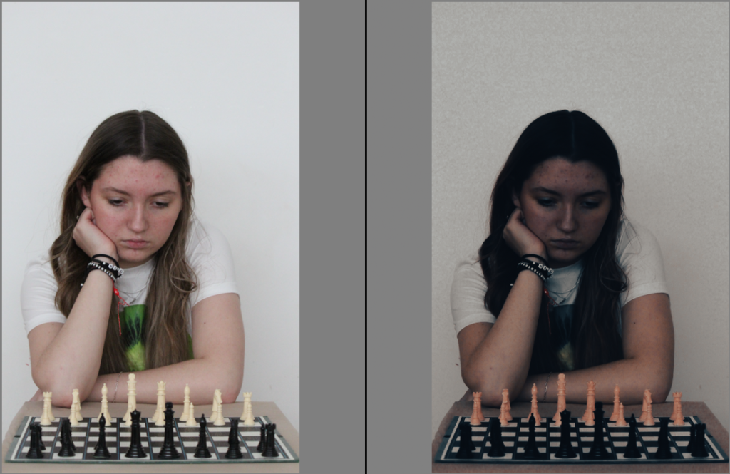
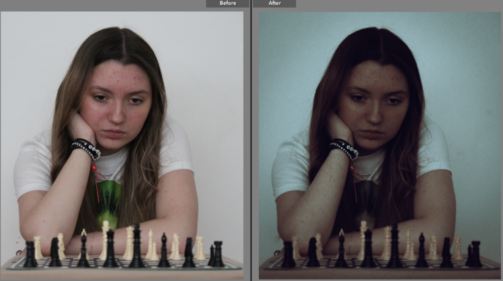
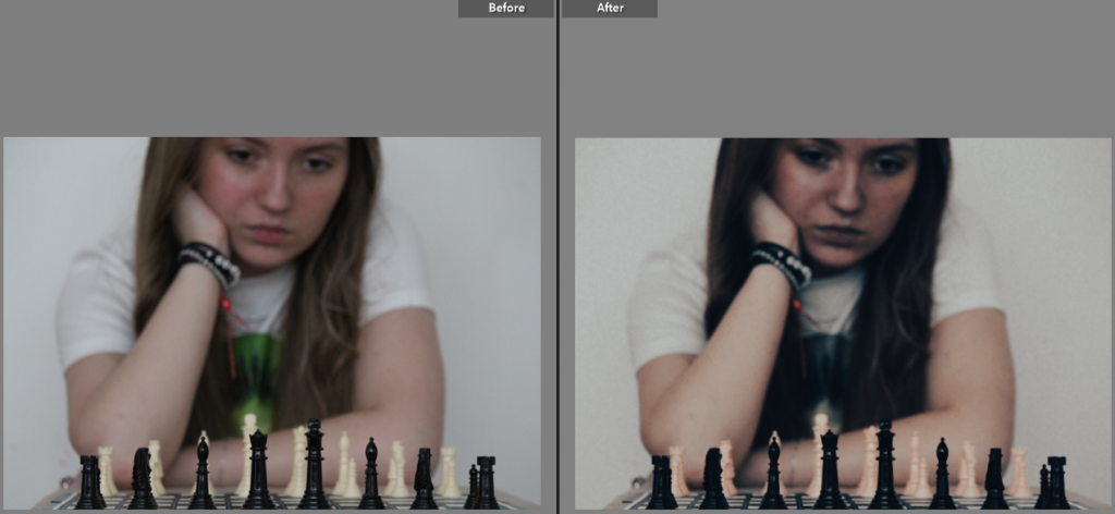
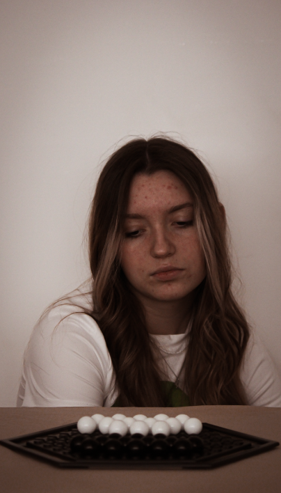
This shoot was inspired by my artist reference, David Llada, who take photographs of players during a chess tournament. I aim to show focus and concentration through my photographs in order to display how we observe the game while coming up with strategies.
I took this shoot at home, creating a small game set up while making sure to keep a blank background to make my friend the main focus of the image. In order to capture her natural expressions we ended up playing a small match against each other, which i found also helped to make the set up of the board game look more realistic.
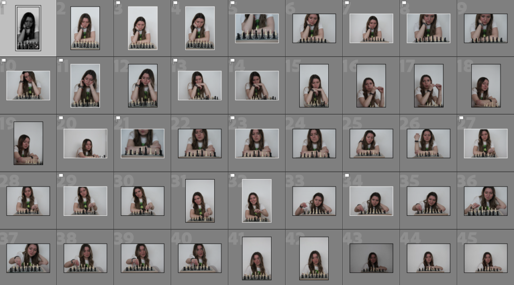
Images
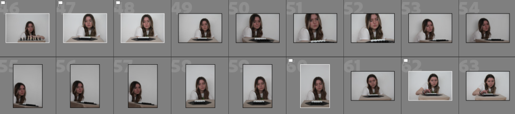
Edits
Best photos
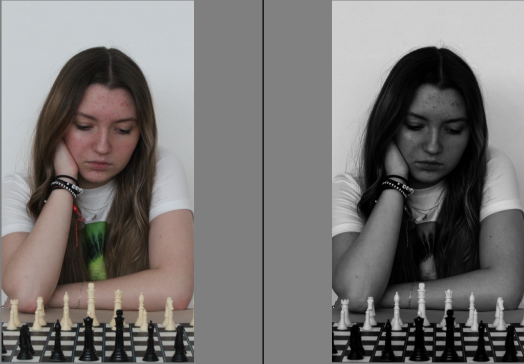
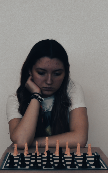
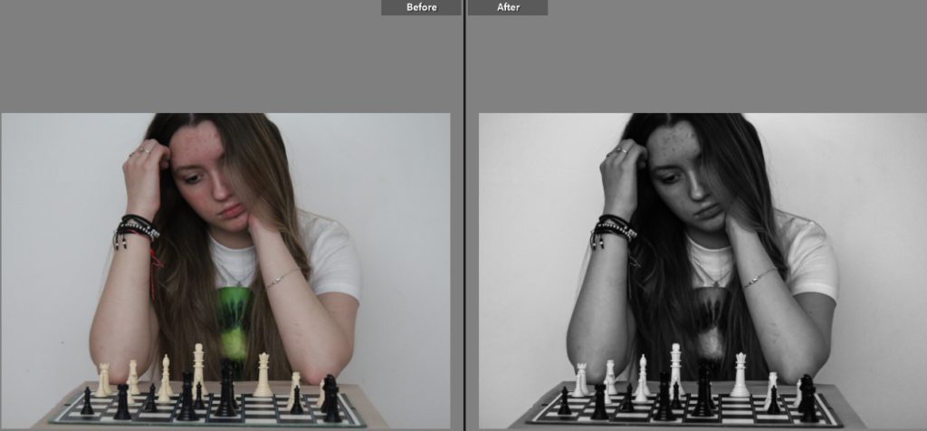
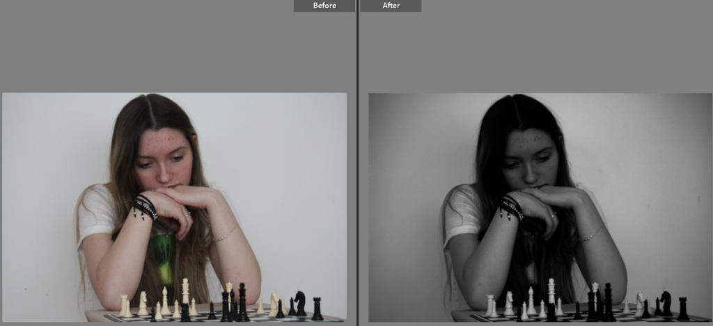
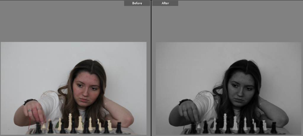
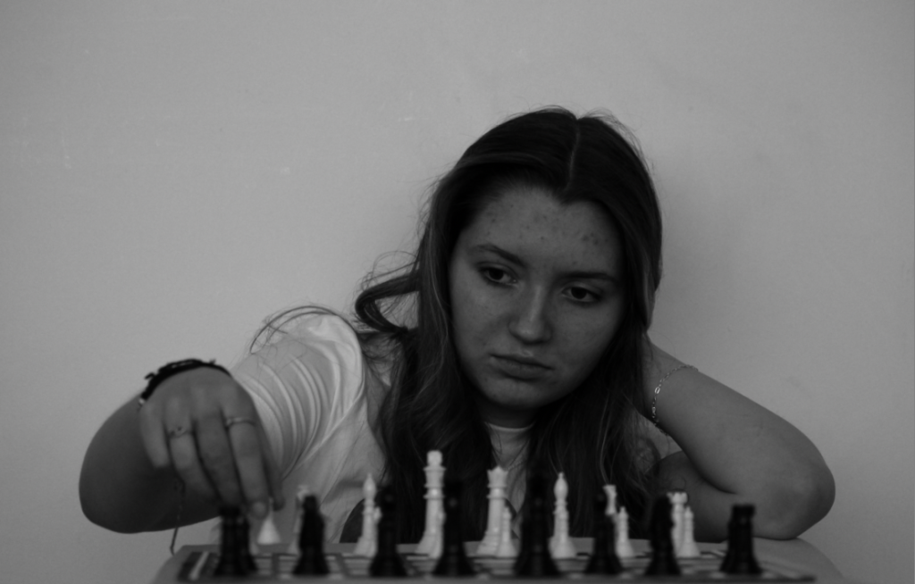
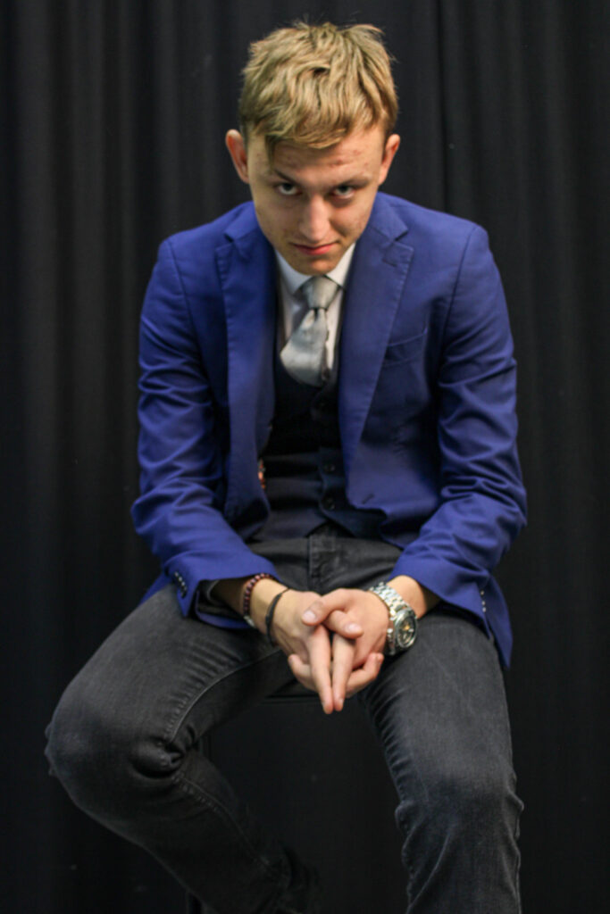
I turned this image to grey scale as it helps to highlight the light and darkness of the image, bringing our attention to the playing pieces. I also am fond of the body language presented in this image, with her head in her hand suggesting that shes stumped as to what move to make while her other hand is preparing to reach out and move a piece.
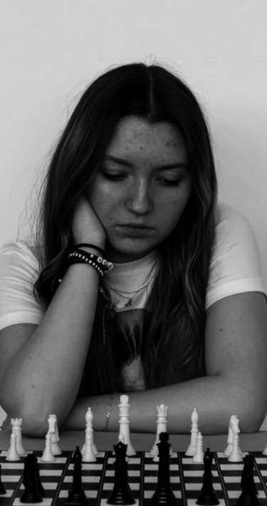
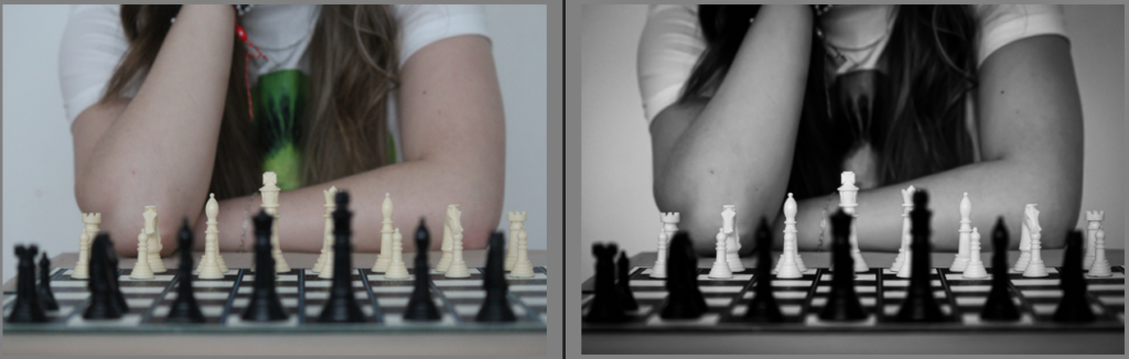
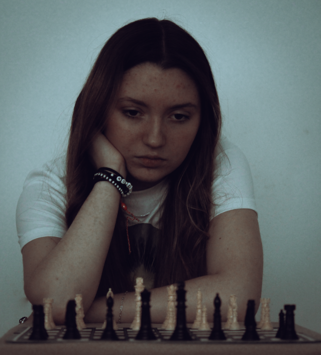
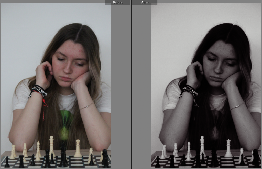
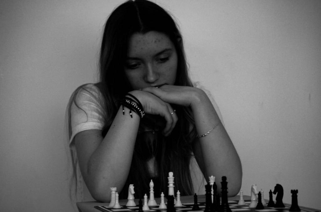
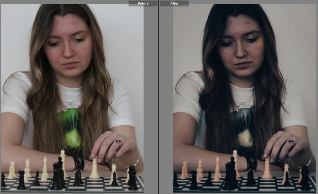
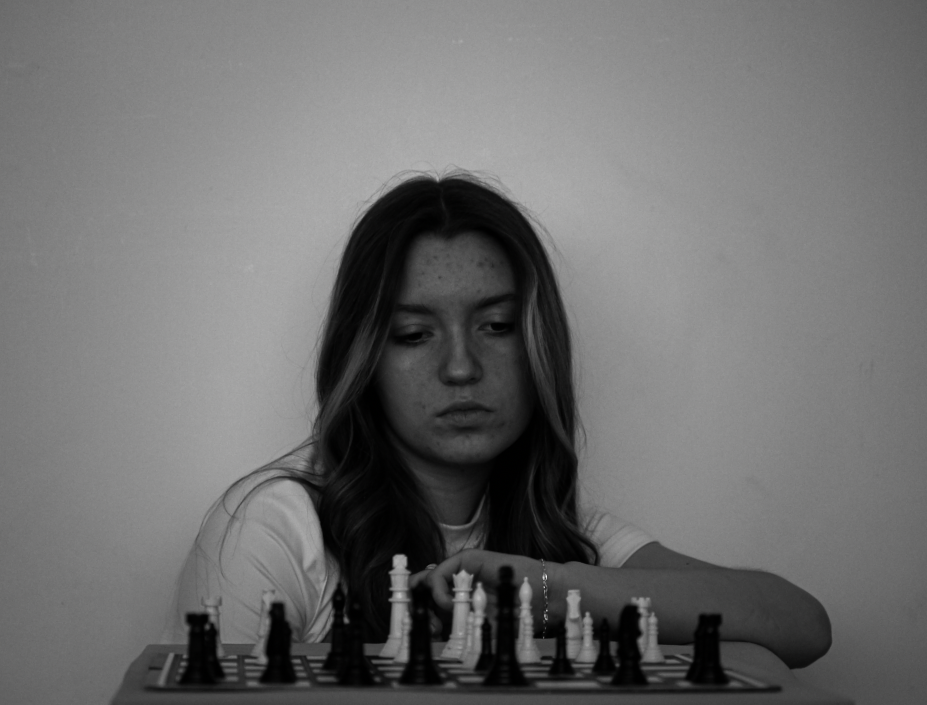
Similarly to the photo before, I think that this image displays her body language really well, conveying across to the viewer that she’s concentrating hard on what move to make next. Additionally, I am fond of the composition of the image and the way that it was taken from a slight angle, making it one of my best images overall.
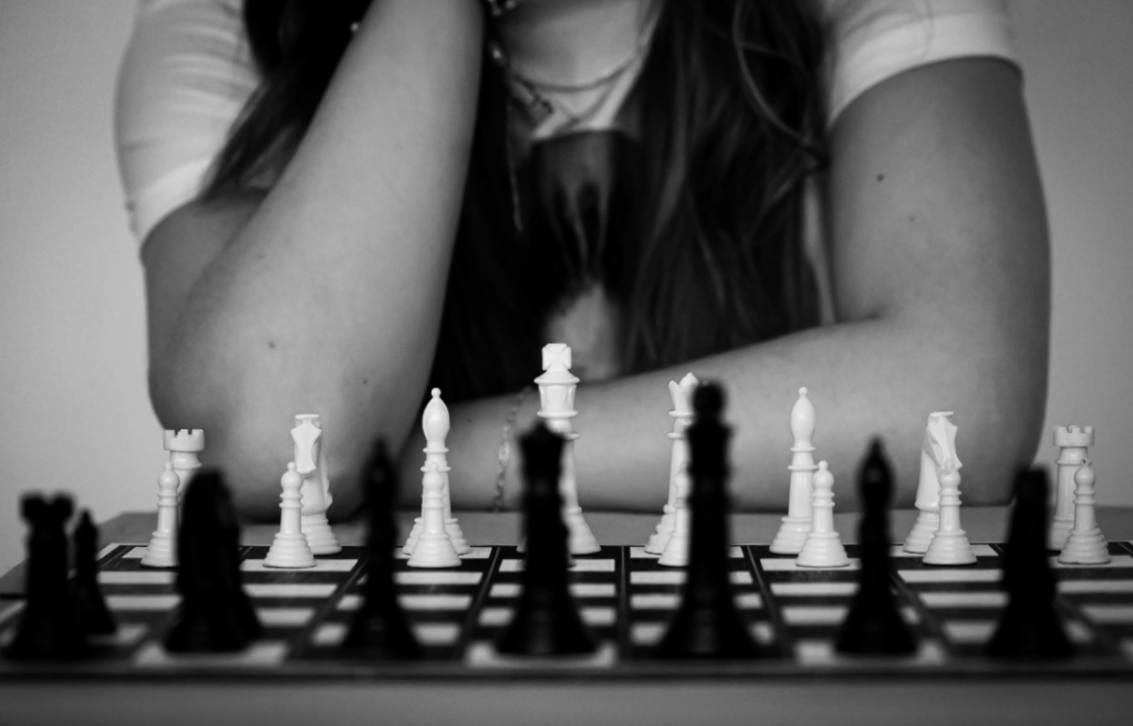
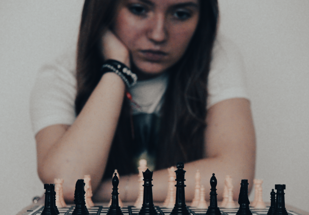
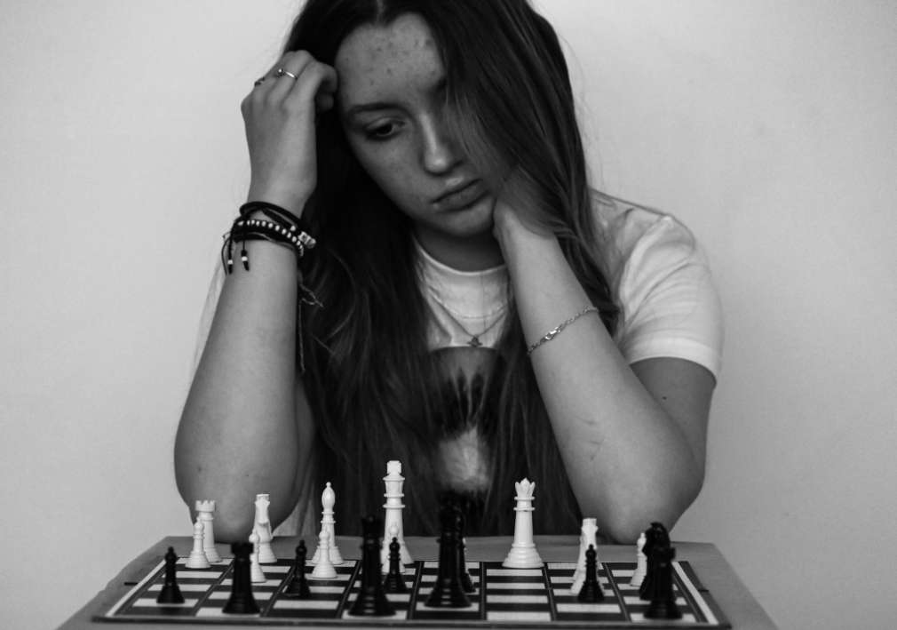
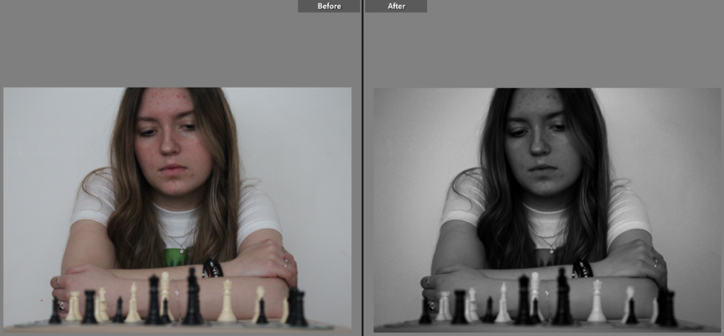
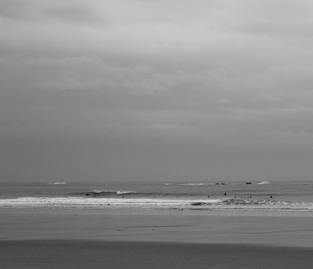
Lastly, I think that this image provides us with a good idea of what its like to observe, seek and challenge through chess with her body language once again showing how she is observing the game in front of her. The more determined look on her face also suggests to us that the game is difficult but she is still looking for a way to win.
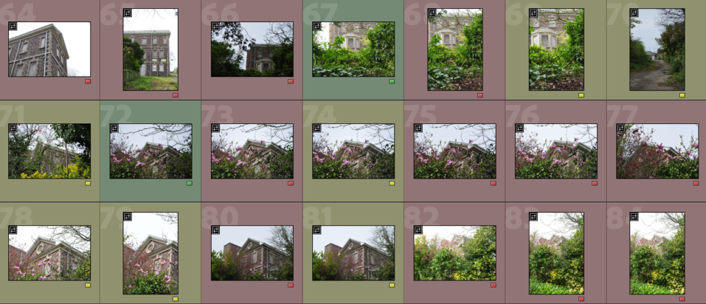
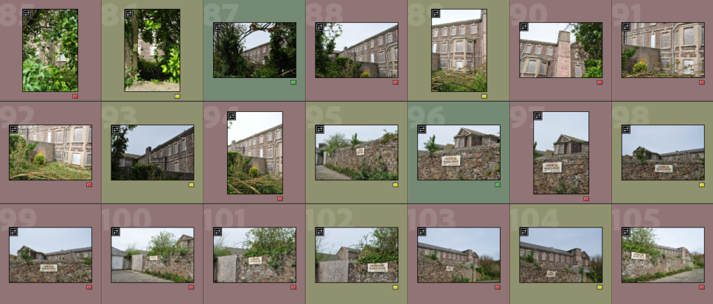
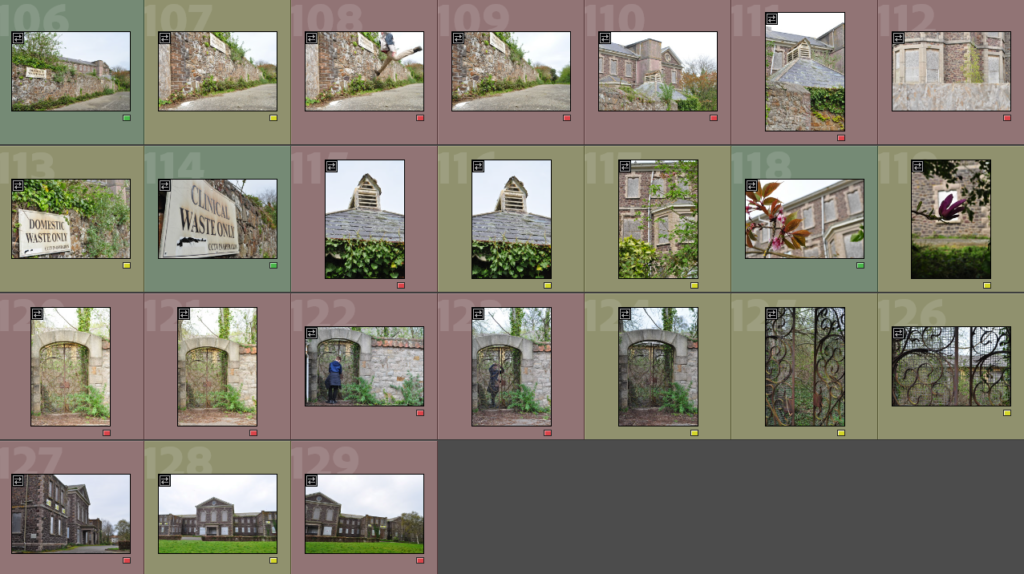
green- will edit, yellow- might decide to edit (if more edits are needed), red- won’t edit
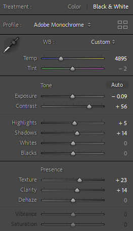
Editing in Lightroom
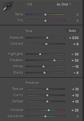
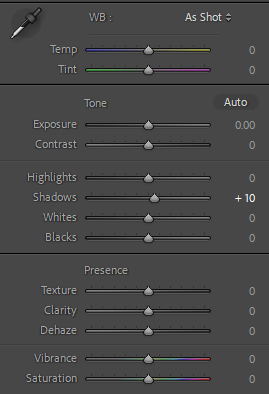
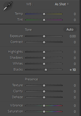
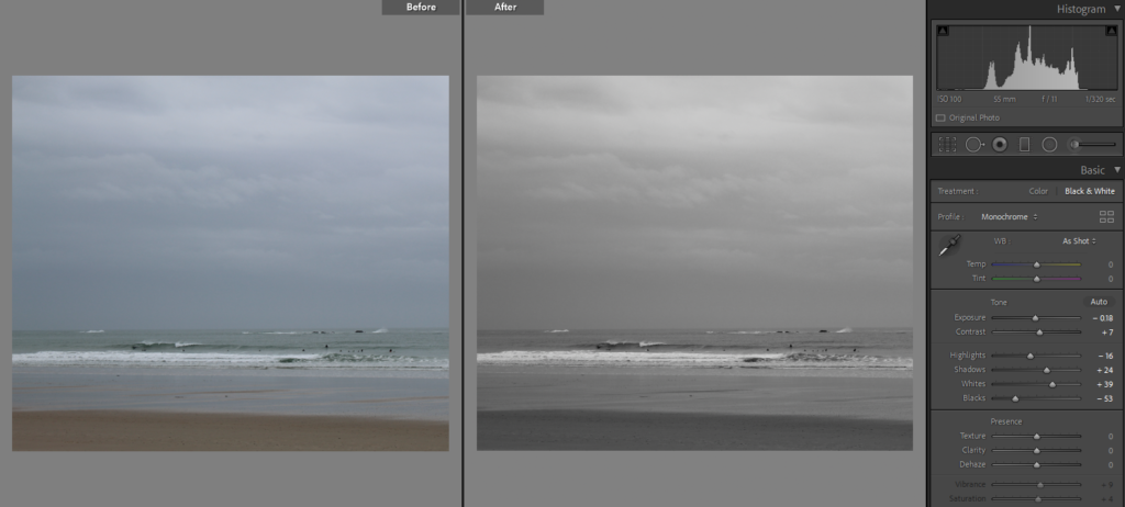
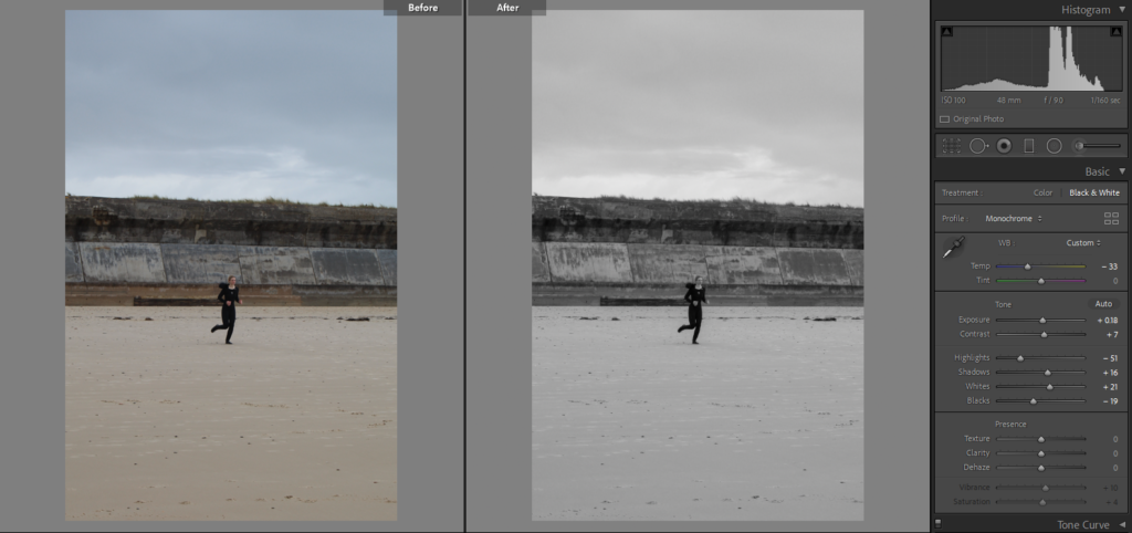
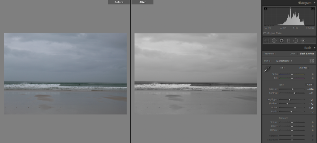
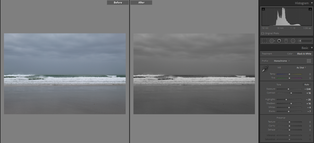
the settings for the editing- used similar settings for each picture
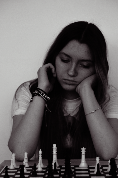
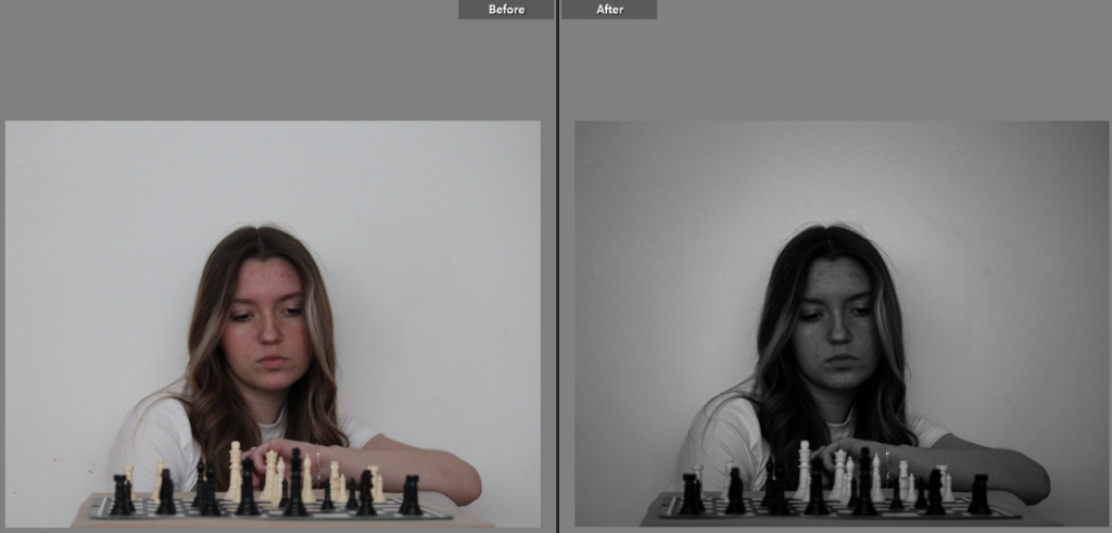
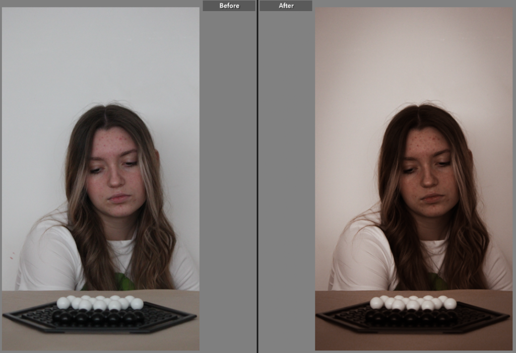
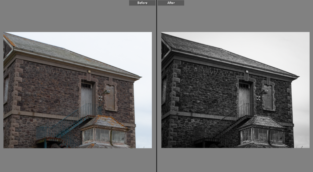
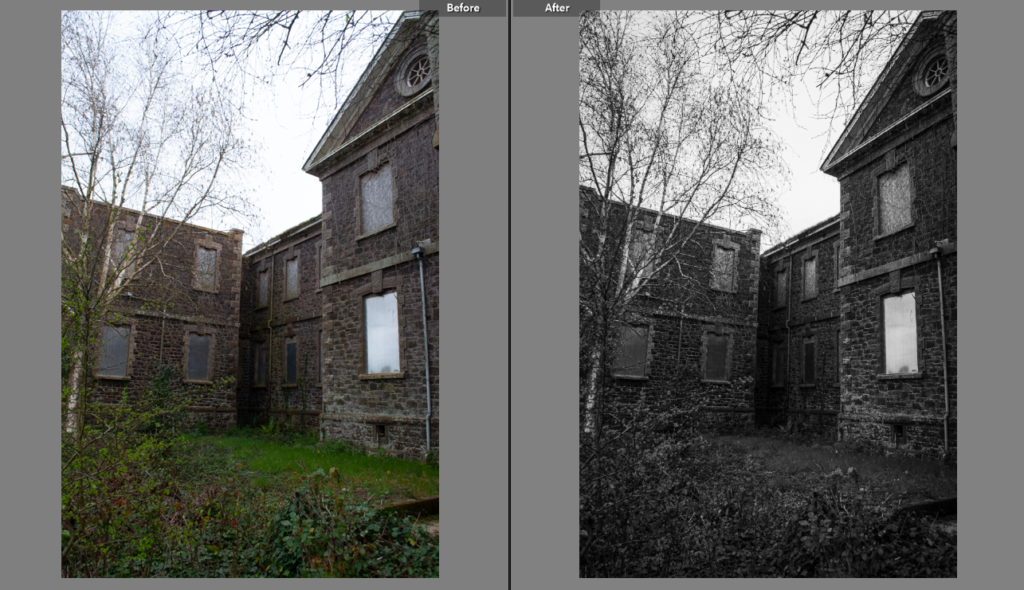
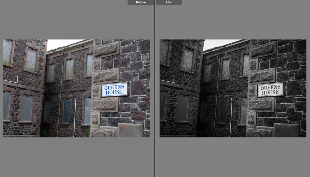
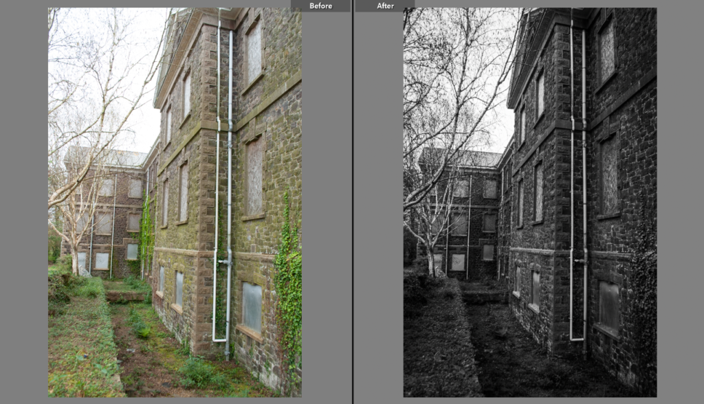
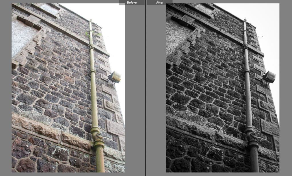
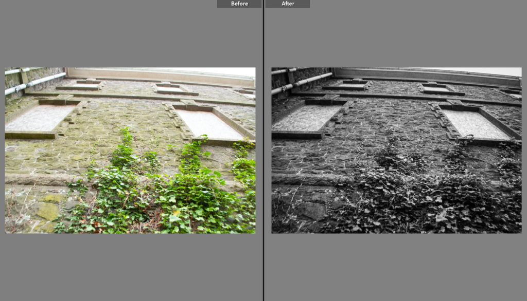
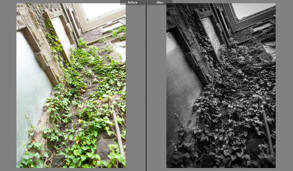
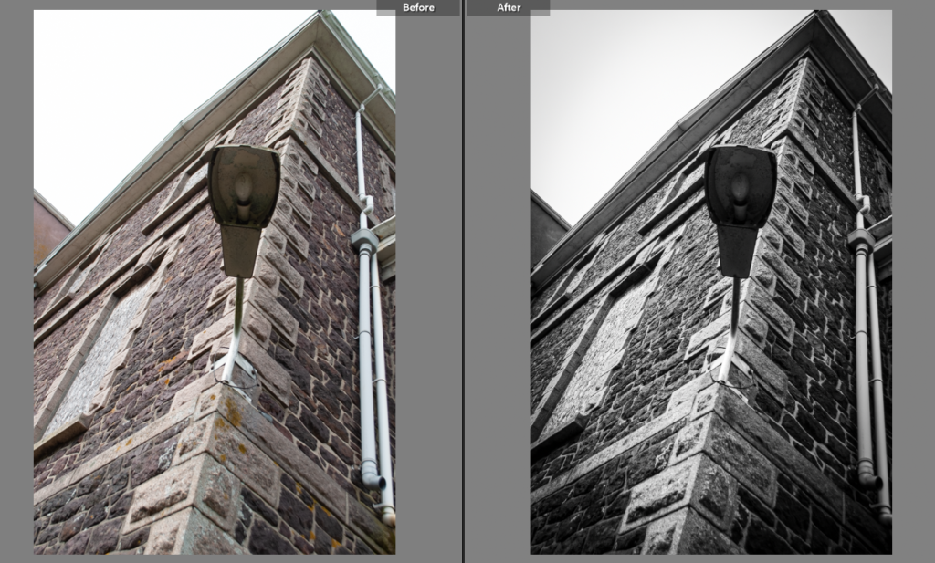
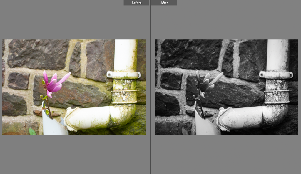
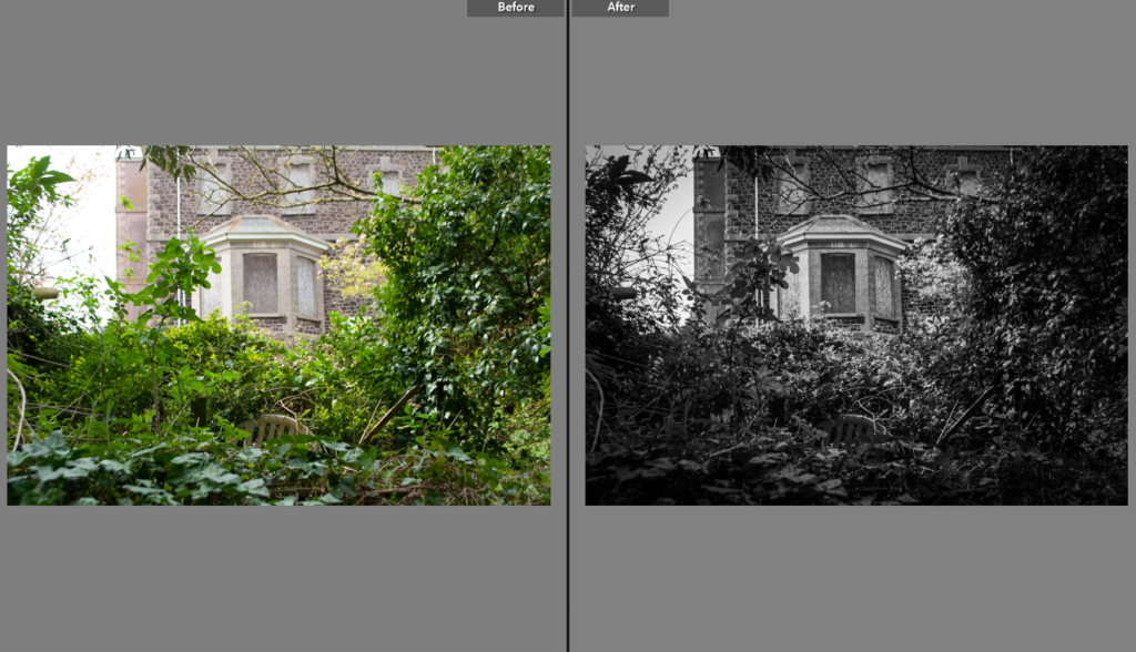
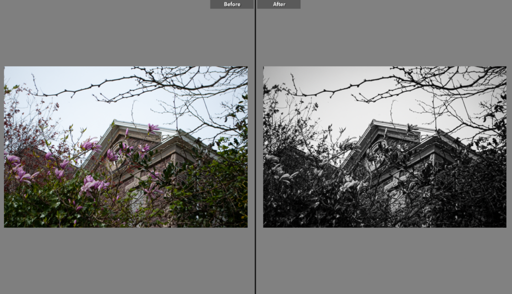
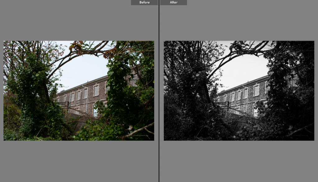
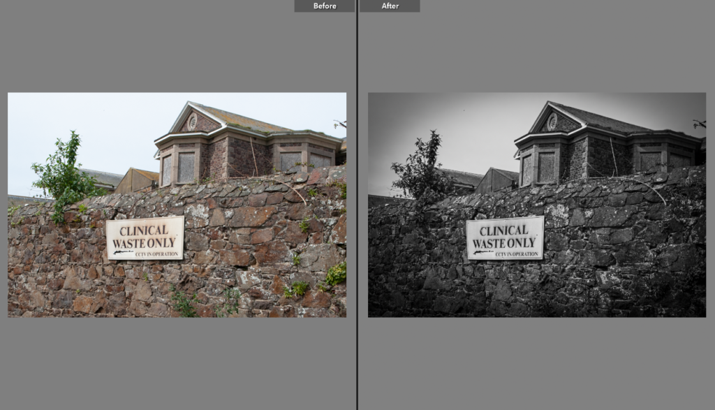
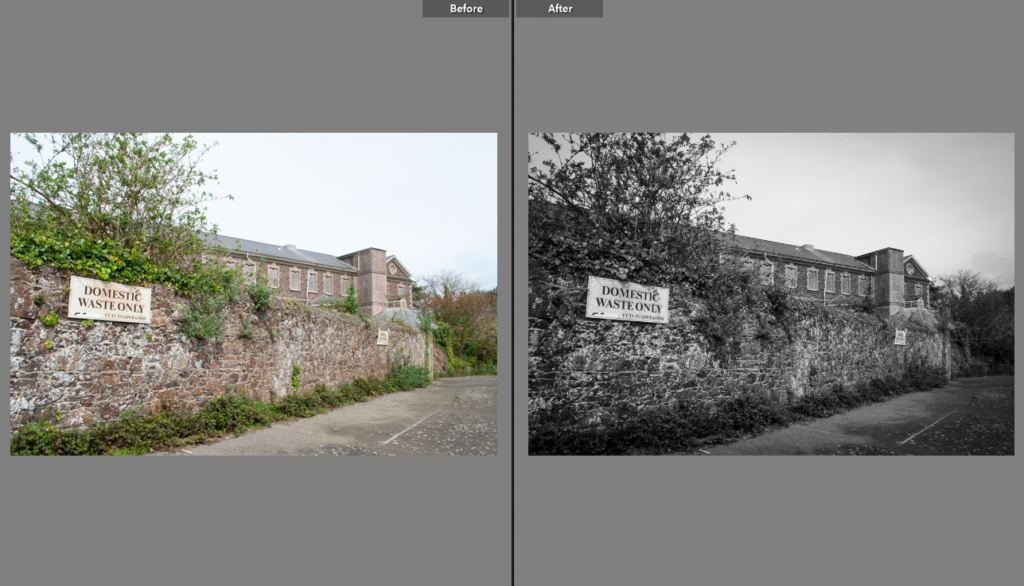
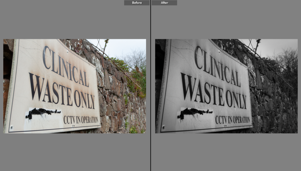
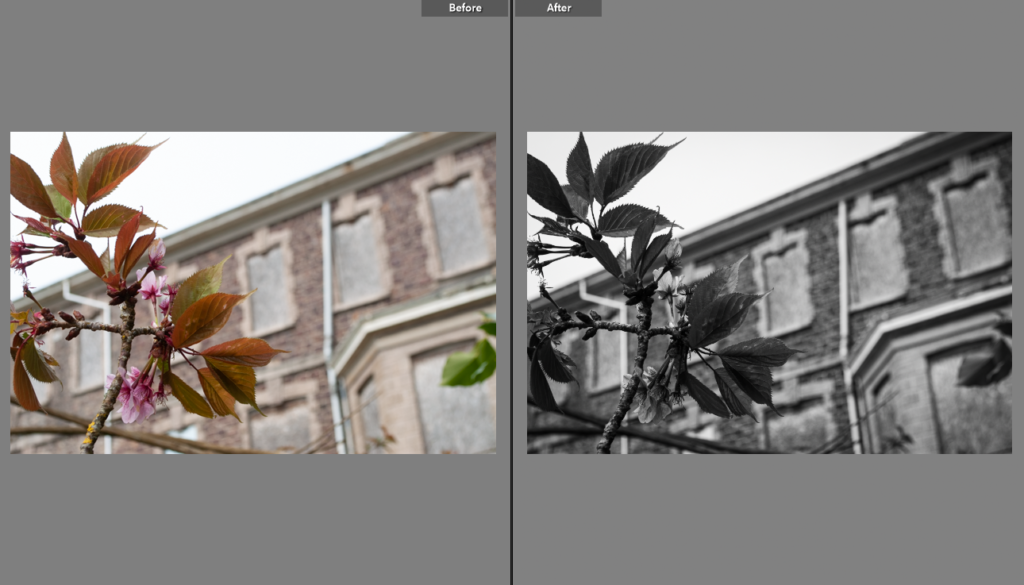
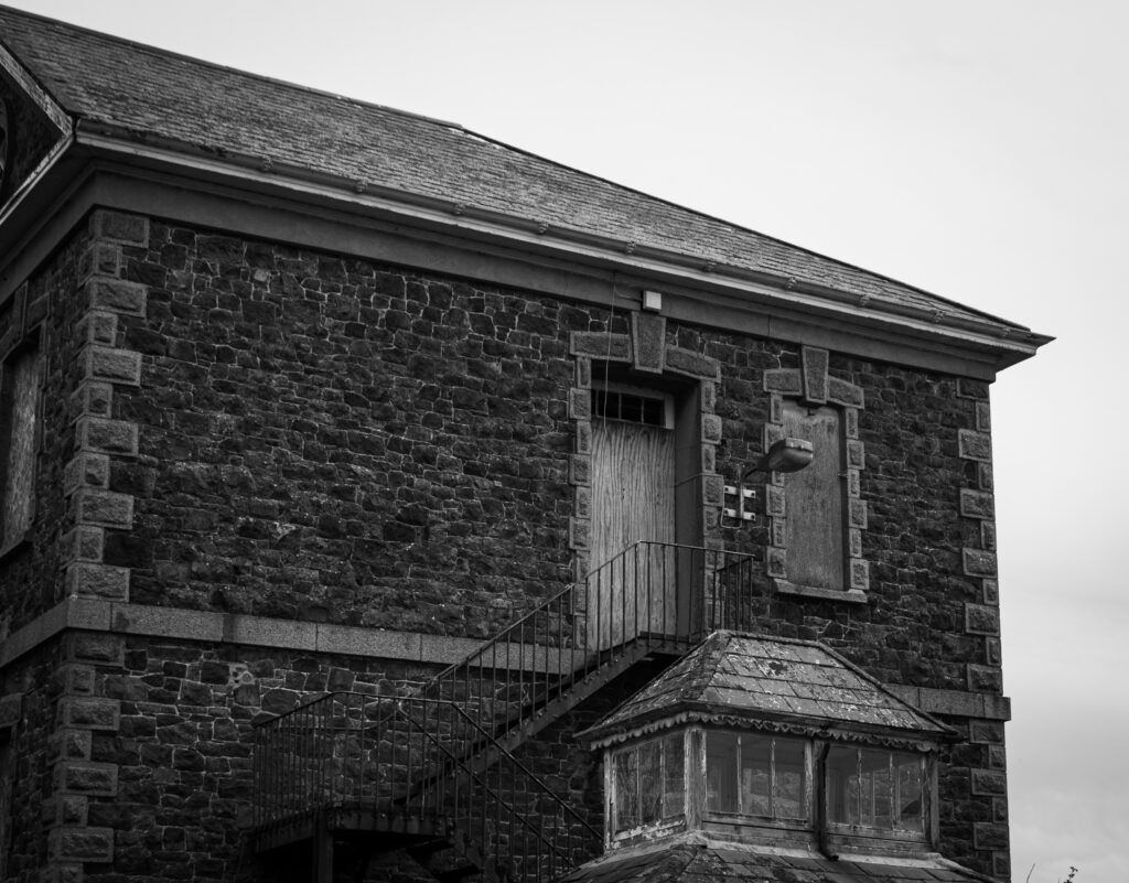
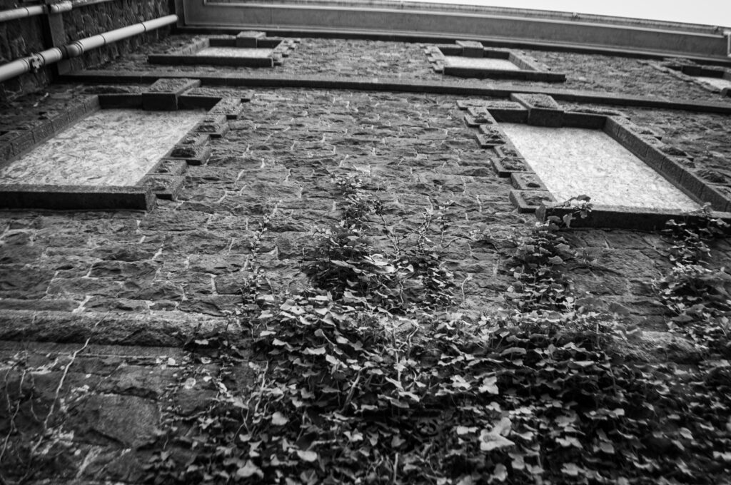
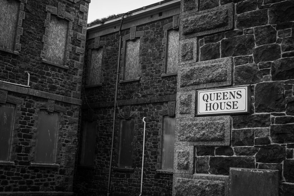
I increased the contrast, texture and clarity of the image, after making it black and white.
Edit 1
Edit 2
Edit 3
Edit 4
Edit 5
Edit 6
Edit 7
Edit 8
Edit 9
Edit 10
Edit 11
Edit 12
Edit 13
Edit 14
Edit 15
Edit 16
Final Edits
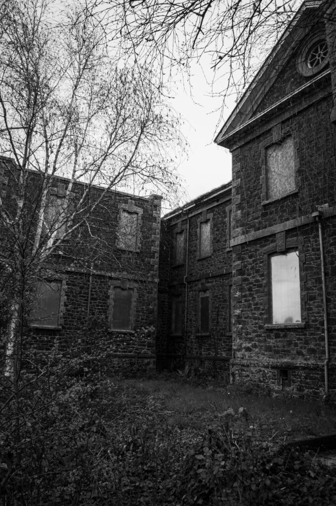
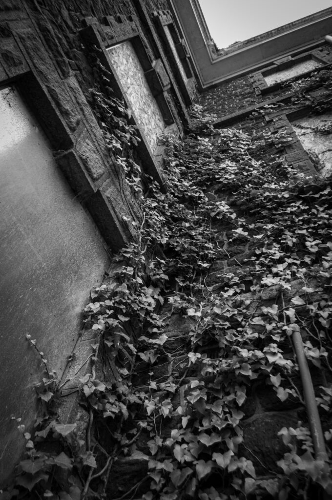
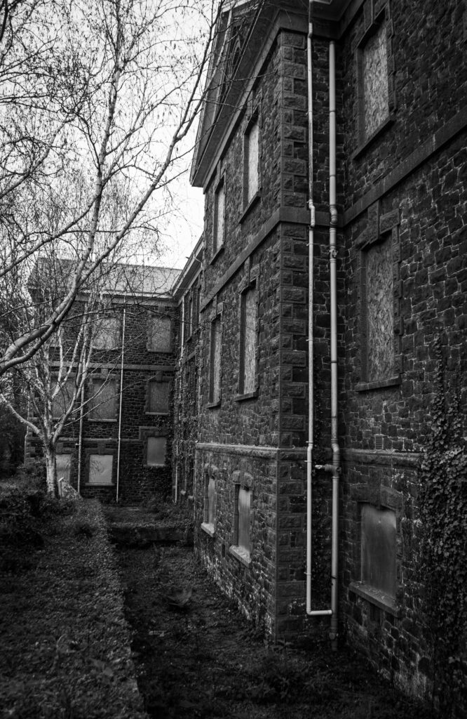
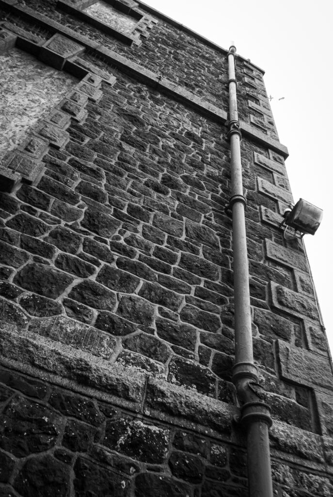
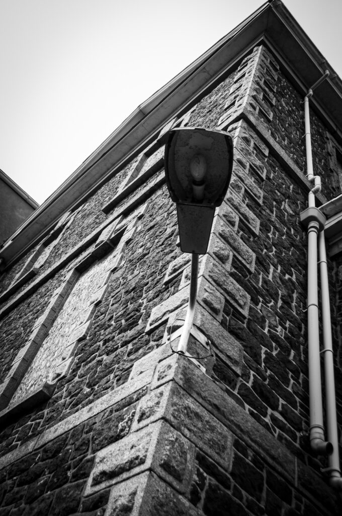
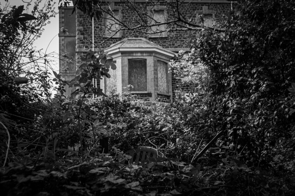
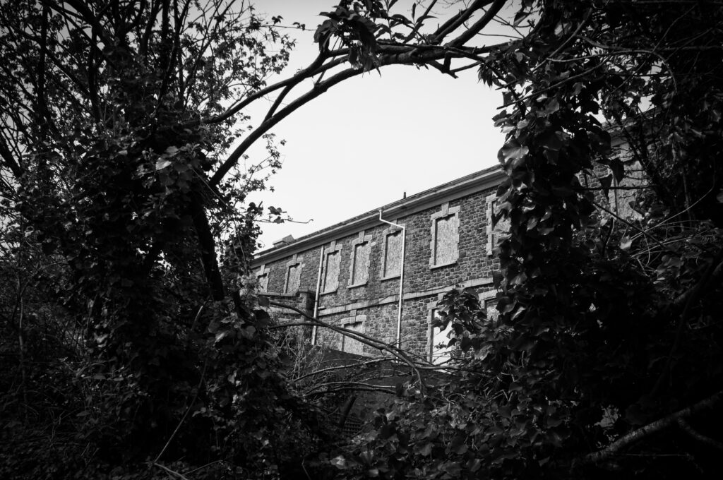
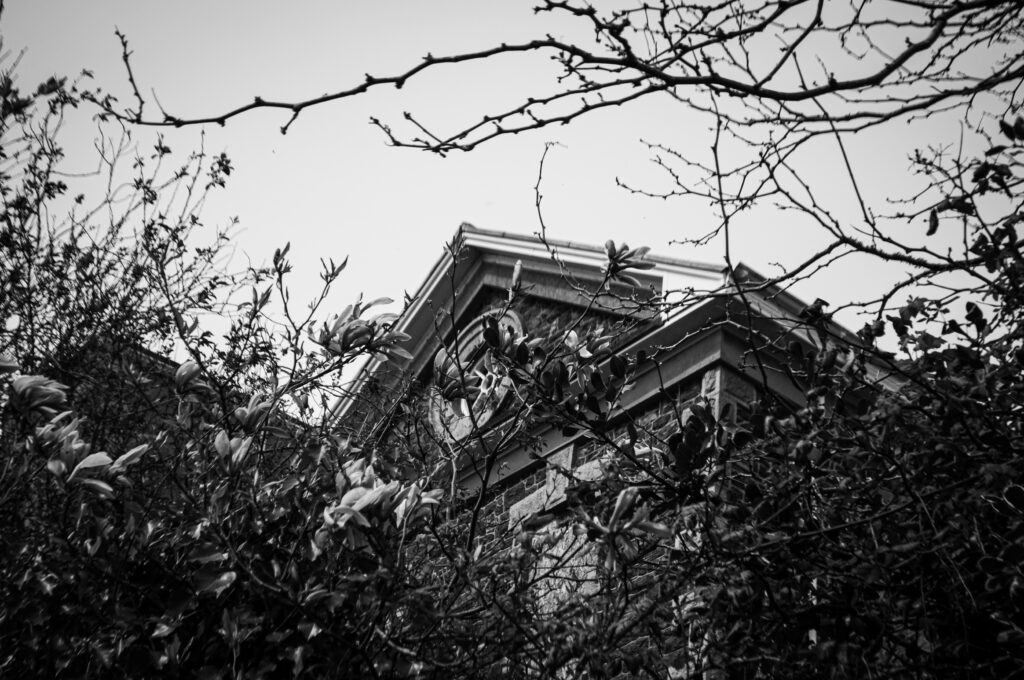
I think these edits are effective, as the black and white causes the photos to look sharper and not be as distracting. My inspiration, Matt Emmett, mostly created coloured images but I still think the overall style of the pictures is the same.
I will present my images in a handmade photobook instead of a Blurb photobook as I feel that this will create a more personal and nostalgic feel. I will stick in my physical prints using photo corners.
Therefore, I will need to make my final selections soon so I can print everything and purchase the appropriate book. I will print the images about A6 size and arrange them variably on each page in the centre of each.
In order to decide the order of everything, I am going to arrange all my prints in various orders on a table so I can see what looks best and in what configuration. I plan to arrange the images in separate cities, as they often have similar colour themes across each, and perhaps with cover pages in between that I can customise.
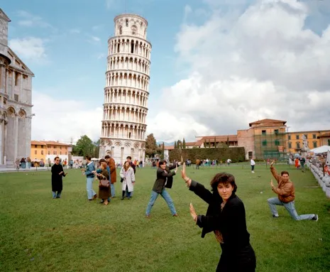
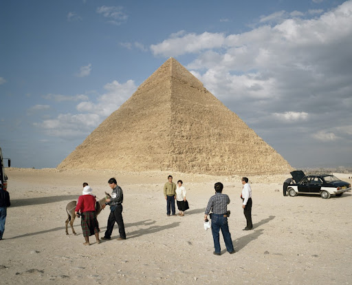
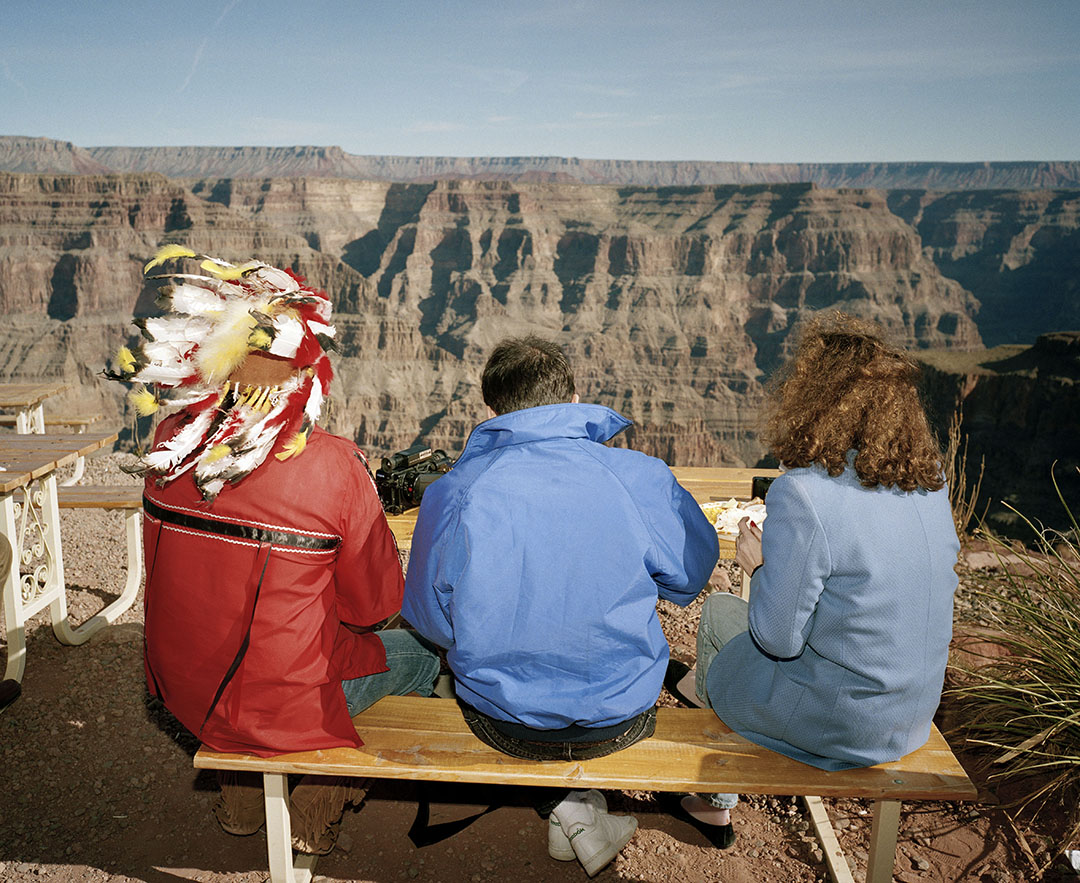
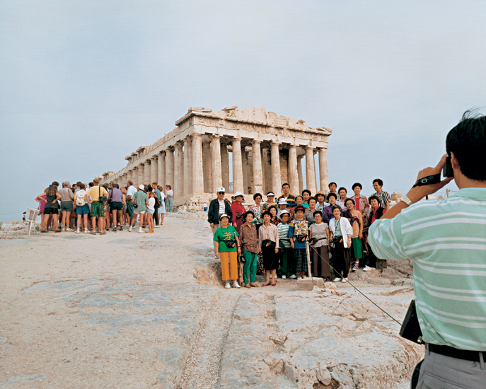
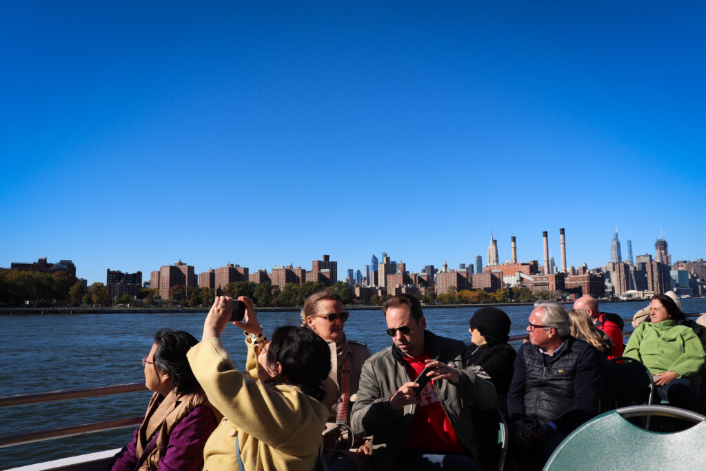
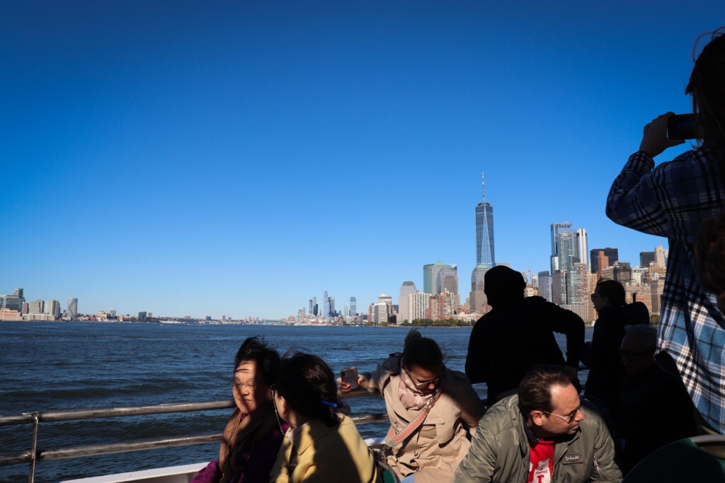
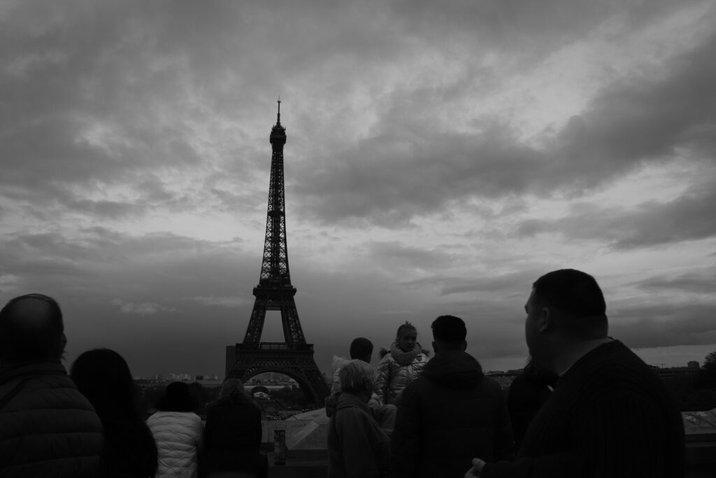
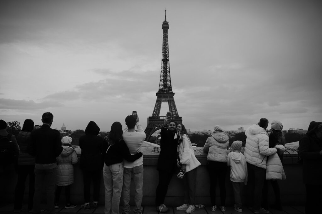
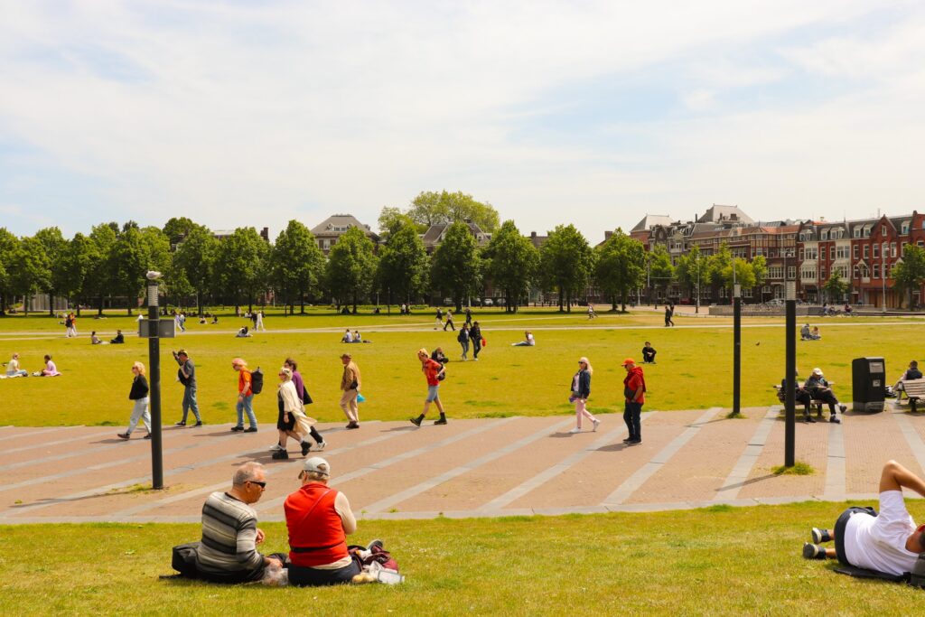
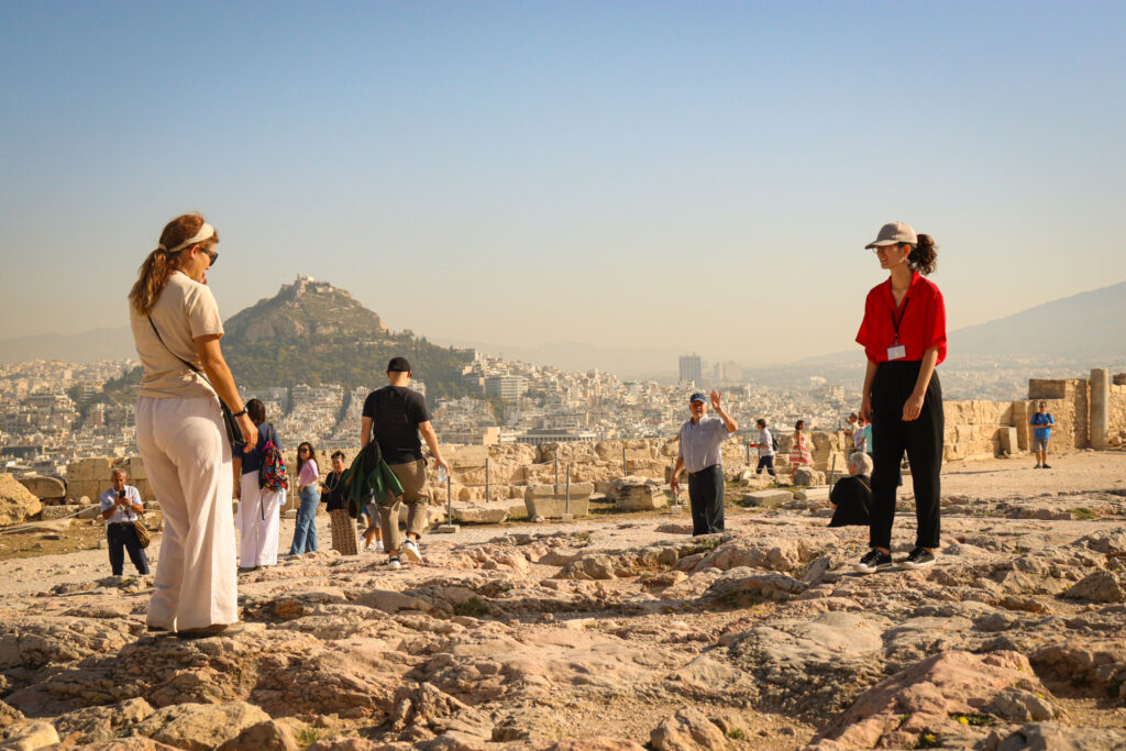
Small World by Martin Parr
I have drawn comparisons between my work and that of Martin Parr’s project Small World (published 2007). This book explores tourists in an affectionate case study of their stereotypes and intricacies.
Some of my images have a similar colourful and playful aspect to them I feel, and capture similar subject matter.
Images I took that I feel are similar to Parr’s work.
Therefore, I intend to replicate the simplicity and colours of his publication in my photobook, as I think his images are intriguing and endearing.
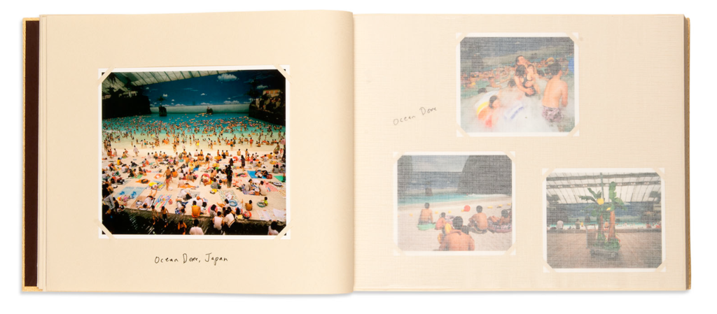
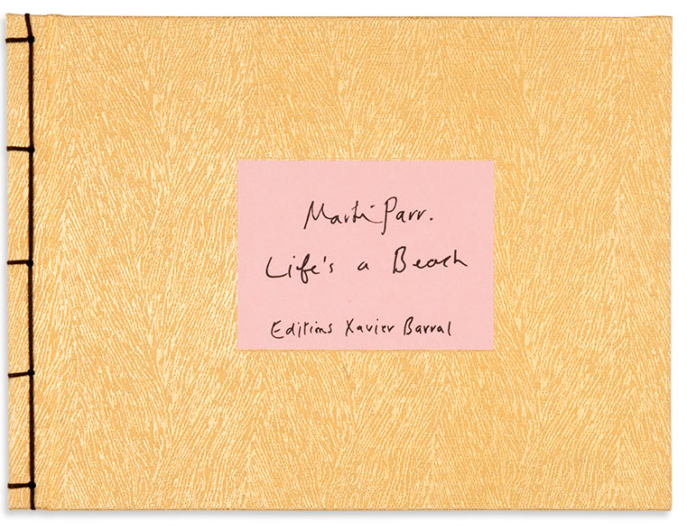
Life’s a Beach by Martin Parr
I am also going to take inspiration from Parr’s 2012 publication Life’s a Beach, as he uses photo corners in this book to make a more homemade and rustic feel.
Examination dates: 15 hrs controlled test over 3 days Group 13A: 22. 25 & 26 April Group 13B: 23, 29 & 30 April 15 hours controlled test Photography classroom
RULES: No use of mobile phones. No talking to each other or ask teachers for help.
You will have access to the blog to produce blog posts, BUT no access to the internet.
The blog will only be available for you to access during exam times each day between 09:00 – 15:20. In other words, you will not be able to make any changes/ improve work outside of exam times.
It essential therefore, that you have done must of the preparatory work – research/ artist case studies/ photo-shoots/ evidence of creativity, development and experimentation of images – before the exam period begins on day 1.
Work to be done 1. PRINTS: Final selection of images in print folder above (ready by end of Day 1 22 & 23 April of the Exam) 2. PRESENTATION: Complete mounting all final prints 3. VIRTUAL GALLERY: Present final images using templates here: M:\Radio\Departments\Photography\Students\Image Transfer\EXAM 2024\Gallery mock-ups 3. PHOTOBOOK: Complete design and evaluate 4. BLOG: Review and complete all supporting blogposts 5. FOLDER: Label all final outcomes and put in Exam folder 6. SIGN: Student authentication form
DEADLINE: LAST DAY OF YOUR EXAM FINAL PRINTS > PHOTOBOOK > BLOG POSTS
IN PREPARATION FOR YOUR EXAM MAKE SURE THE FOLLOWING IS READY BY THE END OF THIS WEEK:
Complete and upload new photoshoots and begin to edit in Lightroom – make sure to produce blog posts showing selection process and experimentation of images.
A draft layout of your photobook using BLURB templates in Lightroom – exam time is used to fine tune design with teacher’s approval
Review Checklist on blog for overview of work that must be completed – improve, complete and publish missing blogposts.
Structure your 3 day Exam as follows:
DAY 1: PRINTS: Complete editing photoshoots, select and prepare final prints. Make sure you have produced blogposts for each photoshoot with a clear progression of selection and editing.
BLOG: Produce blog post showing presentation ideas and create mock-up in Photoshop. Consider appropriate sizes and ways of presenting images as singles, diptych, triptych, multiple grids/ collages/ combinations in window mounts or foamboard etc.
You must save final images (see guidelines below) in print folder here by end of the day: M:\Radio\Departments\Photography\Students\Image Transfer\PRINTS EXAM 2024
DAY 2: Photobook: Experiment with photobook design using BLURB in Lightroom – show variation of layouts and creativity.
Blog:Evidence of photobook process 1. Research and deconstruct photobook used as inspiration. Comment on different design element such as: feel of the book, paper, binding, format, size, cover, title, design, narrative (if appropriate), editing, sequencing, image and text.
2. Write a book specification and describe in detail what your book will be about in terms of narrative, concept and design with reference to the same elements of bookmaking as above.
3. Produce a blog post showing your layout and design process in Lightroom using a combination of print screens + annotation.
4. Final layout of every spread and write an evaluation.
5. Upload book design in Lightroom to Blurb and order your book via Blurb account. Once uploaded produce an hyperlink to book browser – see below for more details.
6. Once you have received book in the post bring into school.
Those who are not making a photobook can begin to mount up final prints and follow instruction below for Day 3.
DAY 3 PRESENTATION: Begin to mount your final prints as per your mock-up plans. Each final outcome must be labelled and velcro attached too. Make sure all your final images are presented in a folder with your name.
BLOG: Produce a virtual gallery and write a final evaluation of the exam module and your final outcome. Consider the following:
– How successful was your final outcomes? – Did you realise your intentions? – What references did you make to artists references – comment on technical, visual, contextual, conceptual? – Is there anything you would do differently/ change etc?
FINAL CHECK: Finish and publish any missing blog posts as per Checklist/ Go4School Tracking sheet and comments from teachers.
No students is allowed to leave until an authentication form is signed and teacher has signed off too.
PHOTOBOOK Make sure you have a made a blog post that charts your design decisions, including prints screens of layout with annotation and write an ongoing evaluation. Final book design must be checked and signed off by teacher.
BLURB – ORDER BOOK Inside Lightroom upload book design to BLURB, log onto your account on their website, pay and order the book.
Consider spending a few extra pounds on choosing better paper, such as Premium Lustre or Premium Matte in check-out, change colour on end paper or choose different cloth/ linen if needed.
LINK TO ONLINE BLURB BOOK
Your final blog post should be an online link to you BLURB book with an evaluation. If you have already written an evaluation as part of another blog post on your book design then add the online link to that blog post and change the date to make sure it sits at the top.
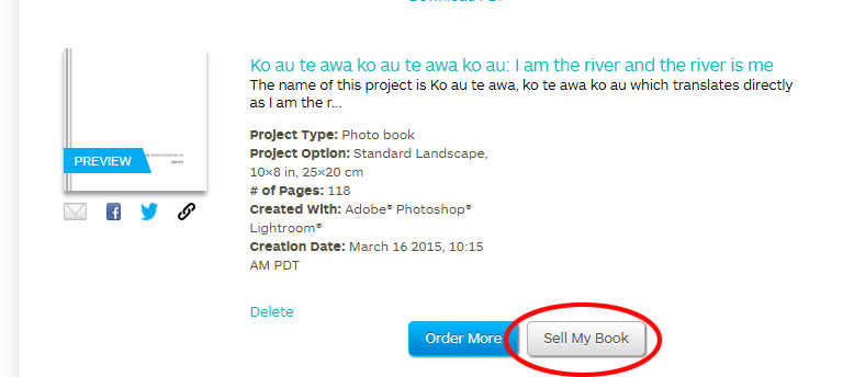
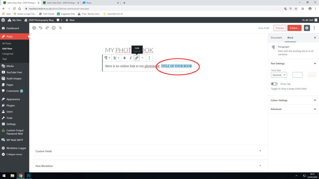
Log into your blurb account and click on Sell my book
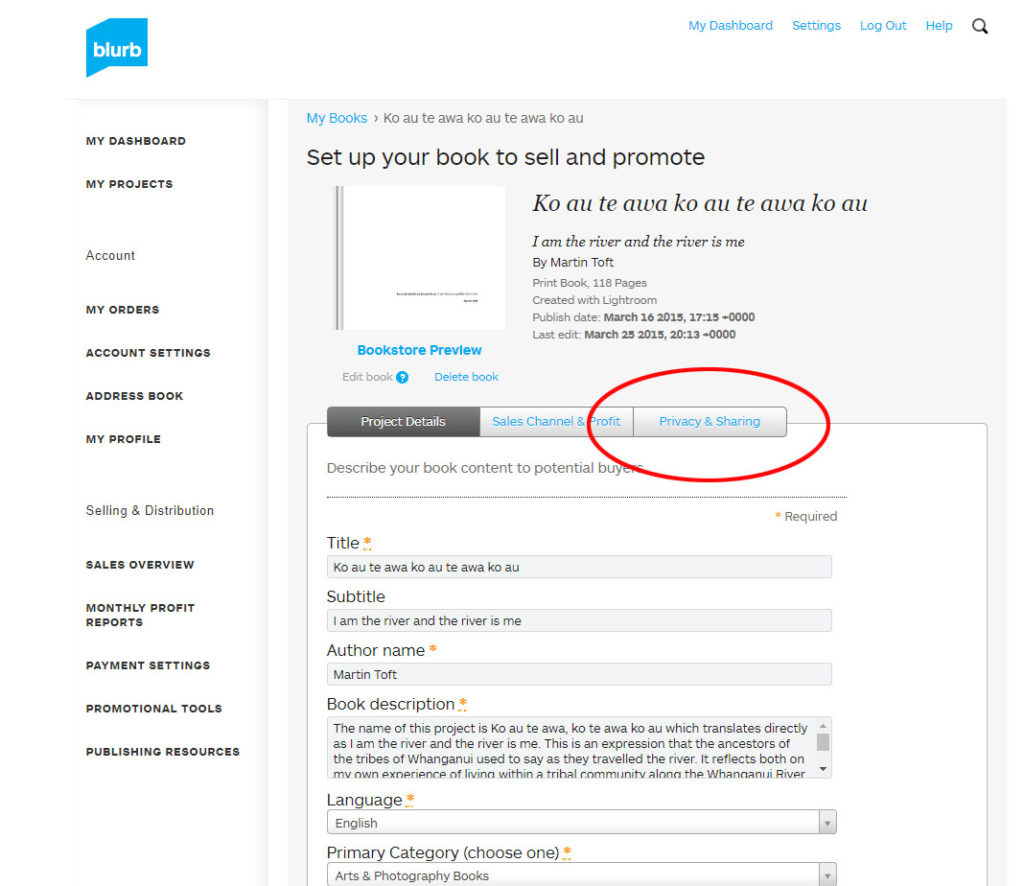
Click on Privacy & Sharing
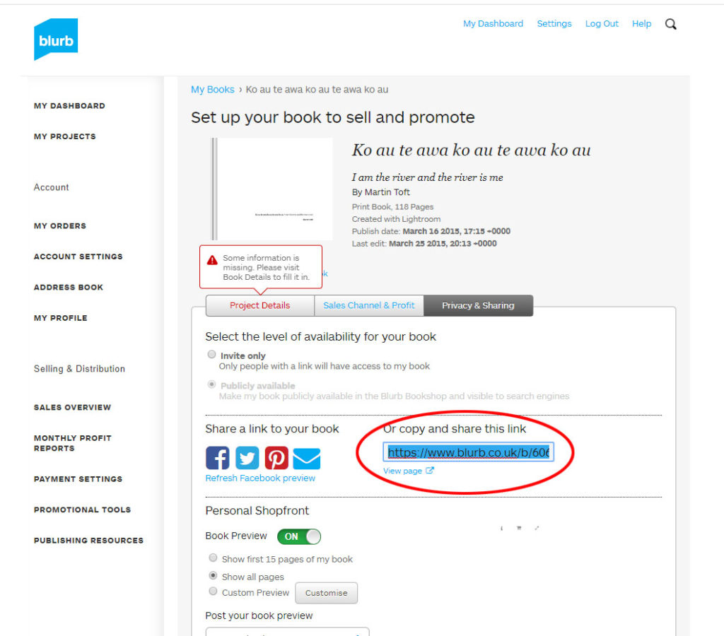
Copy link circled in red above.
Make a new blog post: MY PHOTOBOOK and copy in link from Blurb into the title of your book using Link button above.
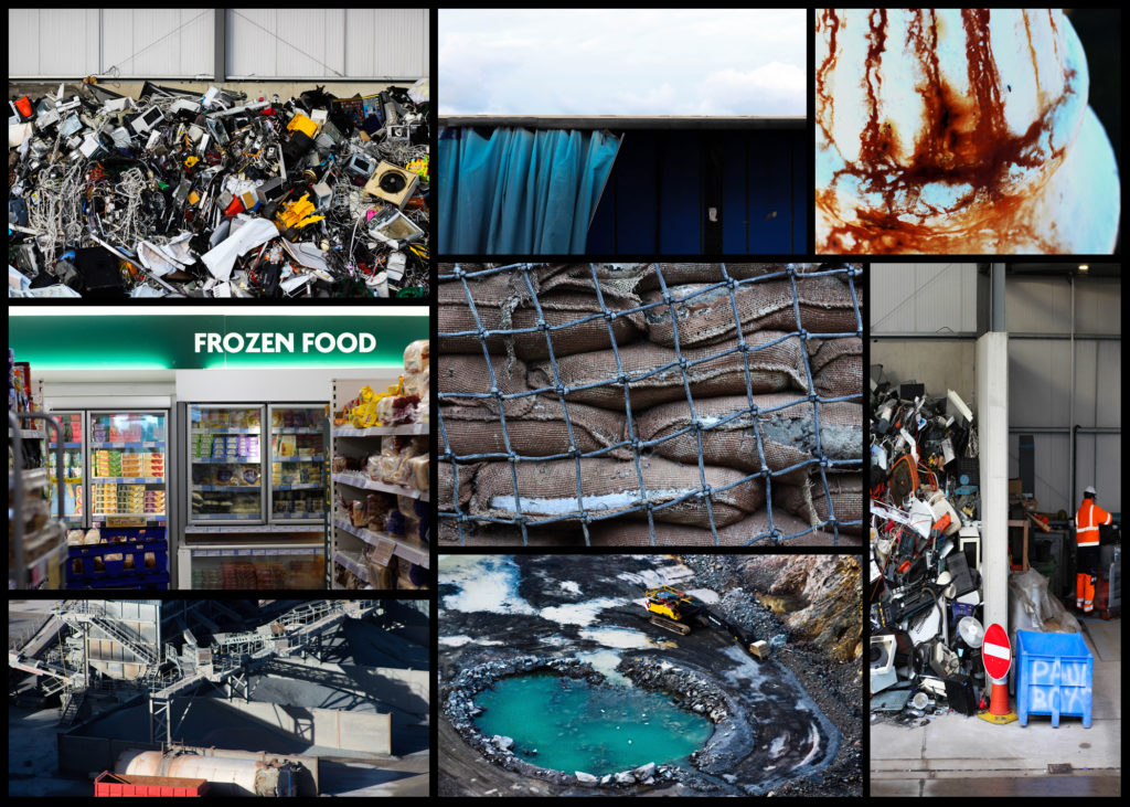
FINAL PRINTS Select your final prints (5-10) from various photoshoots or photobook and make a blog post showing ideas about how to present them.
In photoshop produce a mock display (create new document size A1: 594 x 841mm) using different image sizes, for example: A3 x 2, A4 x 2, A5 x 3
PREPARE AND SAVE IMAGES FOR PRINTING:
Add your images to the print folder here…M:\Radio\Departments\Photography\Students\Image Transfer\Yr 13 Exam
Complete any unfinished work from last term if you have time, For example check your coursework portfolio and mount up any prints from previous projects.
File Handling and printing...
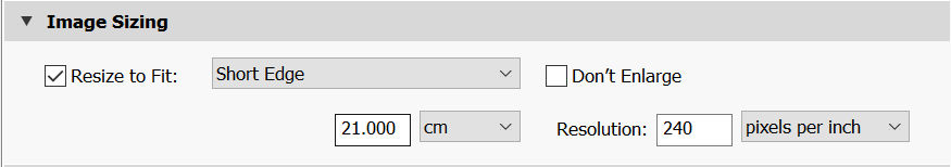
Remember when EXPORTING from Lightroom you must adjust the file size to 1000 pixels on the Short edge for “blog-friendly” images (JPEGS)
BUT…for editing and printing when EXPORTING from Lightroom you must adjust the file size to Short edge for “high resolution” images (JPEGS) like this…
A5 Short Edge = 14.8 cm
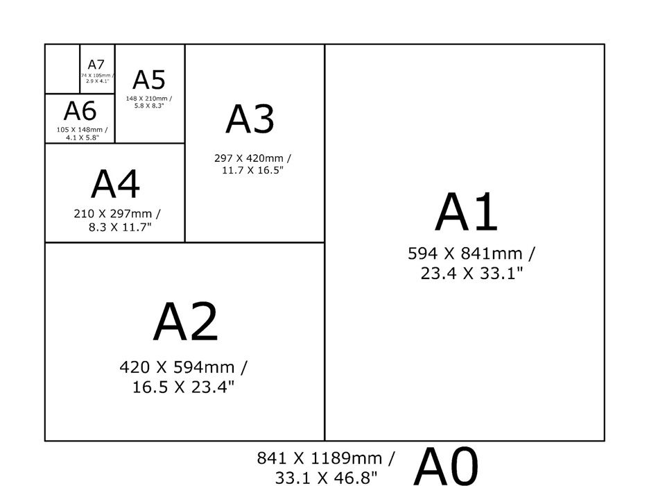
A4 Short Edge = 21.0 cm
A3 Short Edge =29.7 cm
This will ensure you have the correct ASPECT RATIO
Ensure you label and save your file in you M :Drive and then copy across to the PRINT FOLDER in IMAGE TRANSFER:
For a combination of images, or square format images you use the ADOBE PHOTOSHOP > NEW DOCUMENT + PRINT PRESETS on to help arrange images on the correct size page (A3, A4, A5)
You can do this using Photoshop, Set up the page sizes as templates and import images into each template, then you can see for themselves how well they fit… but remember to add an extra 6mm for bleed (3mm on each side of the page) to the original templates. i.e. A4 = 297mm x 210 but the template size for this would be 303mm x 216mm.
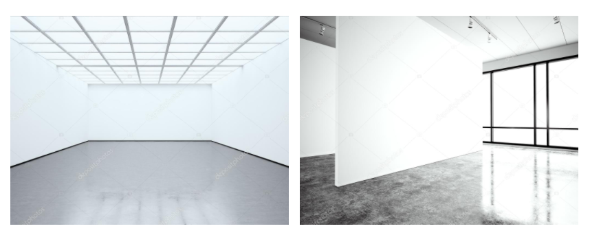
Making a Virtual Gallery in Photoshop
Download an empty gallery file…then insert your images and palce them on the walls. Adjust the perspective, size and shape using CTRL T (free transform) You can also add things like a drop shadow to make the image look more realistic…
Here is a selection of Gallery mock-ups that you can use to superimpose your own final images onto walls using Free transform tool in Photoshop.
I wasn’t very happy with the outcomes from shoot 3 as I didn’t have a zoom camera to capture action shots. It was also a training camp so their were heats going on so I only had a short window to capture my sister on a wave. I ended up taking more landscape images.
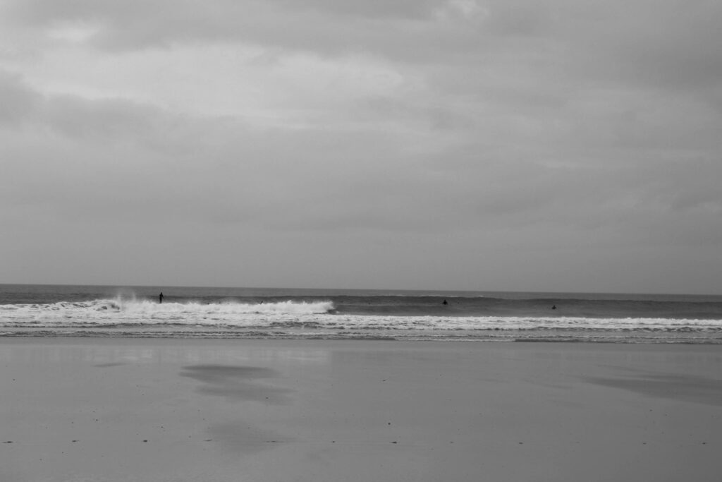
I decided to edit these images in black and white as I wanted to try recreate some old retro surf images.
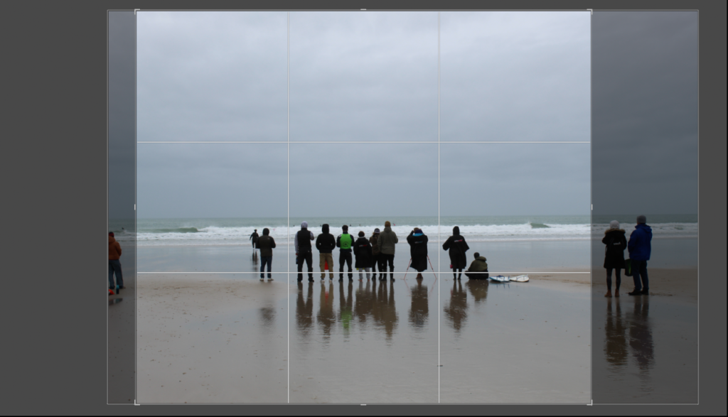
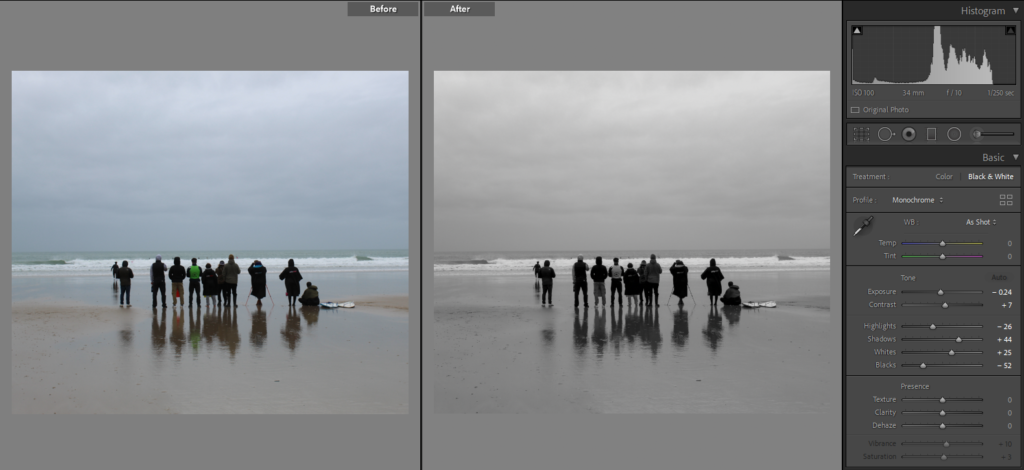
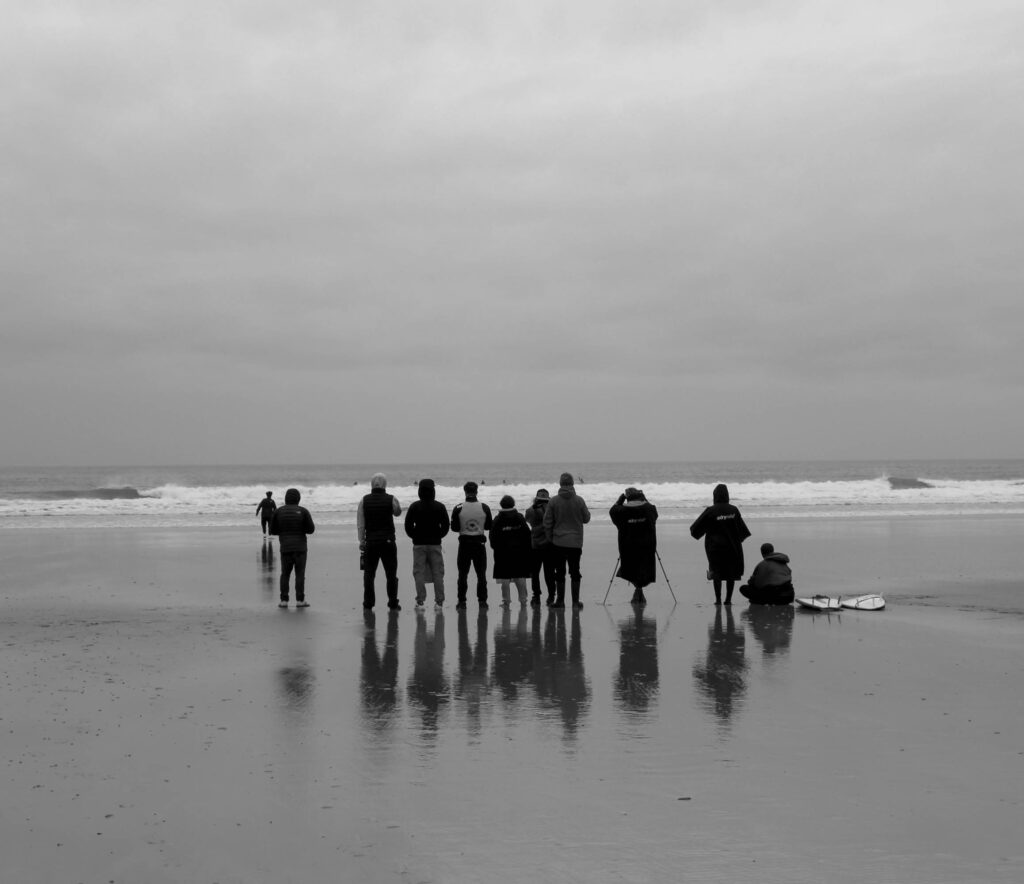
I cropped this image as I didn’t like how there were extra people on the side and thought it would suit the composition better if it was just the group of people within the image.
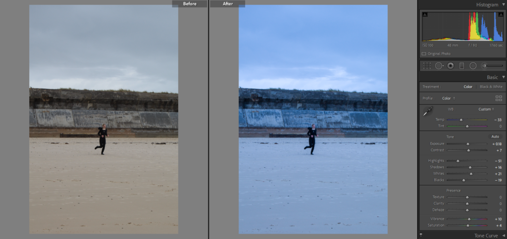
I experimented with the adjusting the temp of this image.
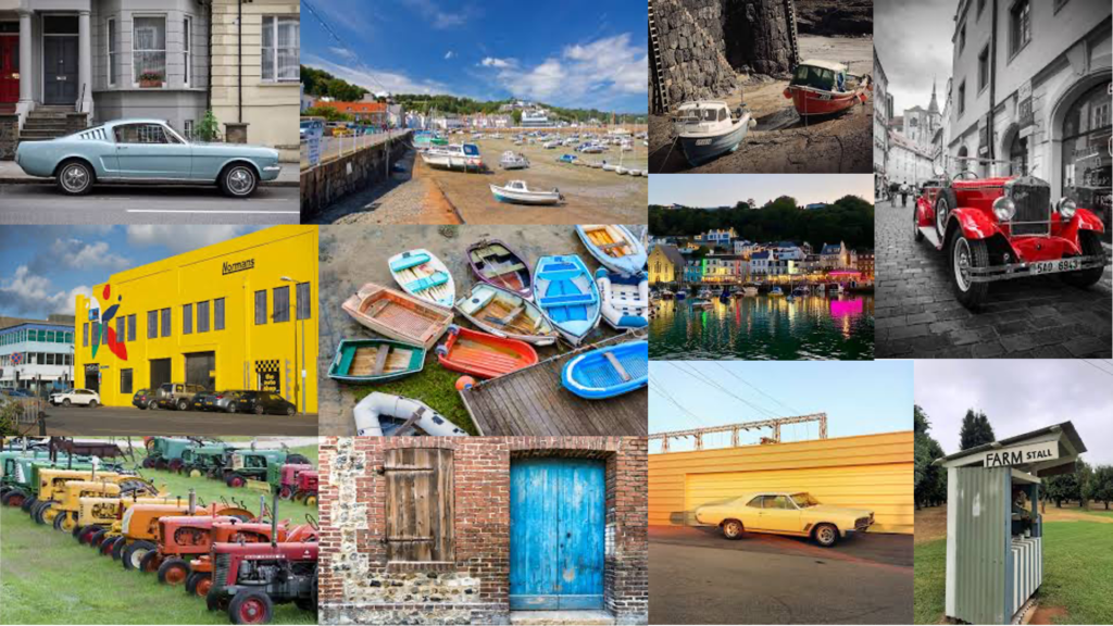
For my third photoshoot, I am going to go down to St Aubins and photograph various things to do with the harbour, as well as houses around there are there are more built up areas that will be different from other parts of the island. I also think that the architecture in that area is less modern than other places which will link to my project more.
I managed to take a small amount of images in town and I think they aren’t as good as I would like. This was because of the lack of crowds around. I plan to go out and take more images in other locations such as St Ouen’s bay and Corbiere lighthouse.
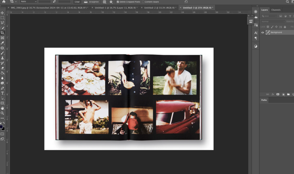
I began by placing a download of this page of his book in Photoshop. I am going to place my images over his as a practise run to see if I like the design with my archives.
I wanted to use coloured images, similar to Sultan. His images have some subtle vibrancy so I chose to include coloured images with similar colour tones.
To create this I took the size of the images Sultan had used, and cropped mine to that size. I then organised the images into place and added a slight shadow down the middle to make it look like the book still.
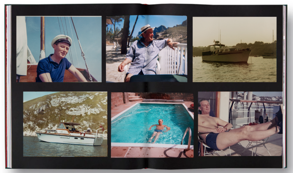
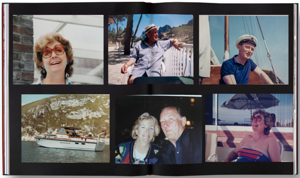
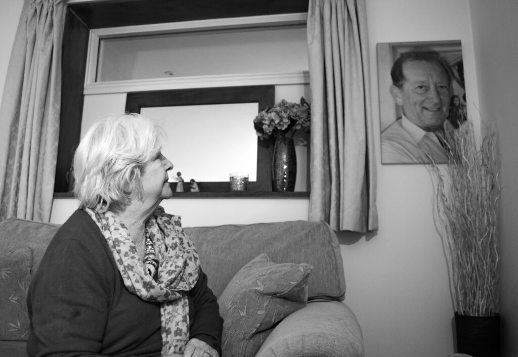
I want to vary the images, and include some of my gran too because I feel like it may be too centred around my grandfather.
I like this although I prefer the collage of my grandad, I am going to incorporate my gran in a different layout of Sultan’s.
I like this collage because it shows the change in time quite ambiguously. There is a young image of the grandfather, then my gran slightly older, then I contrast the portraits with a landscape. It is a picture of the gardens where my grandfather passed, show it unobviously presents the loss of him and change that time causes.
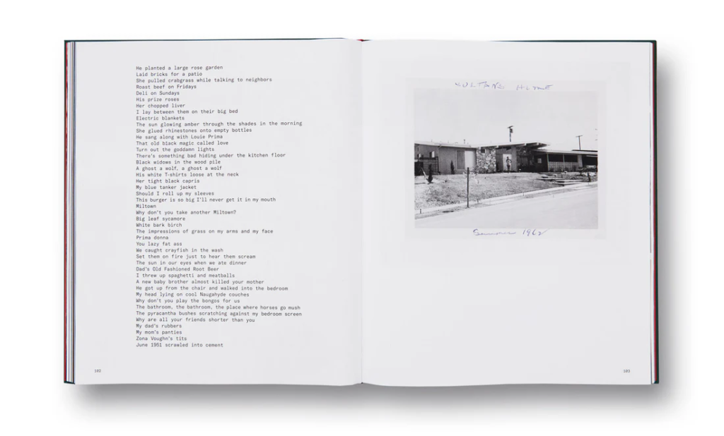
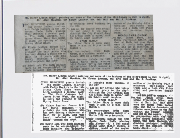
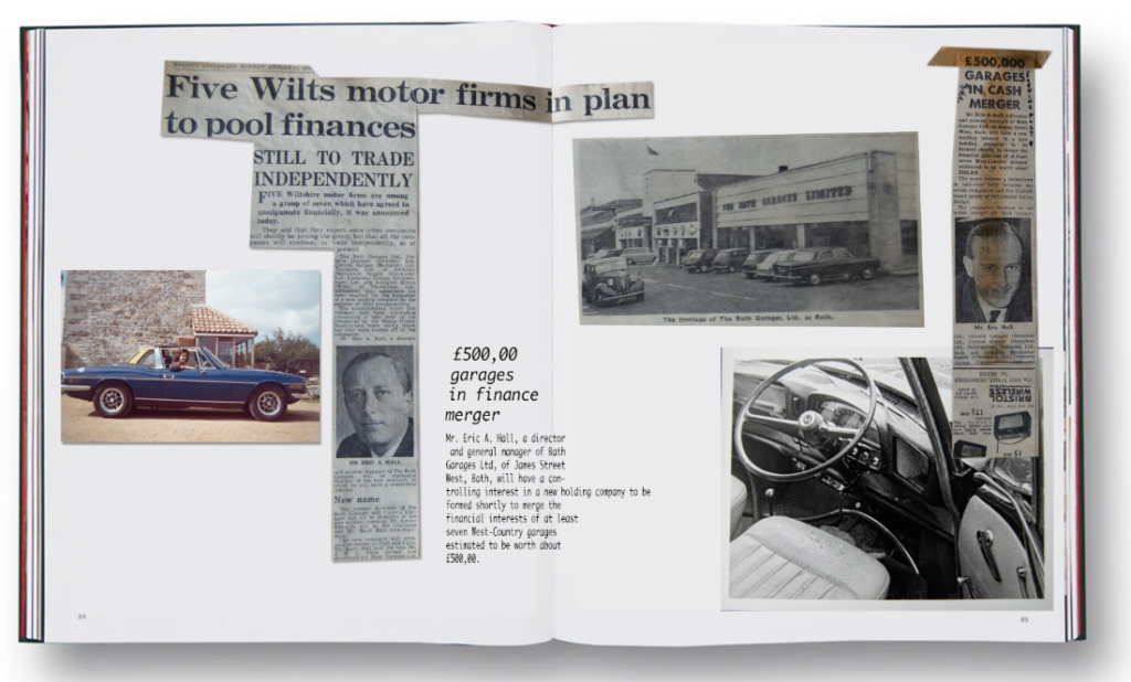
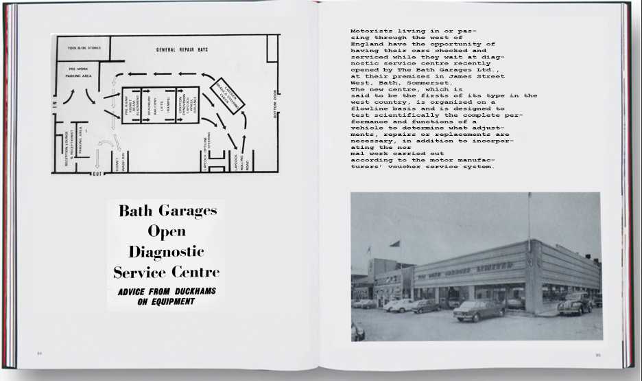
I also like the way he lays out his writing, and I have created some rough ideas on how I am going to incorporate this into my photo book to add context to my grandfather’s life. He owned a car garage and a boat business and kep scraps from the newspapers. I have edited some of these in photoshop in a similar way to Sultan.
Some of the backgrounds were yellowed newspaper, so in Photoshop I lowered the saturation, increased the brightness and contrast and then pasteurized it. I then readjusted the contrast and managed to make the writing stand out on a white background. They didn’t fully fit the shadowed page I am experimenting on but it is a rough idea.
I focused one of these on his boat company and the other on his car garage company. I chose to include archives of my gran and an old car. I think they compliment the composition and are subtle, similar to the ambiguous link between Sultan’s images and his archived.
I created another idea, completely focused on archival material from his scrapbooks. I used a similar font to Sultan because I find it quite retro looking, linking into the overall look of the archives.
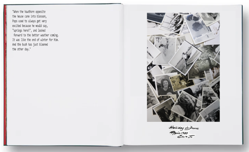
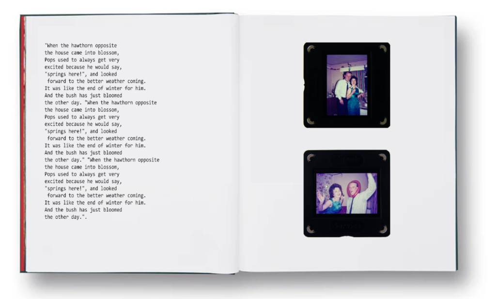
For this layout I included dialogue that I took from a recording of my Grand talking about my grandad’s interest in the hawthorn bush. I don’t like this layout because I think the composition isn’t right, and the images on the right don’t connect to the dialogue.
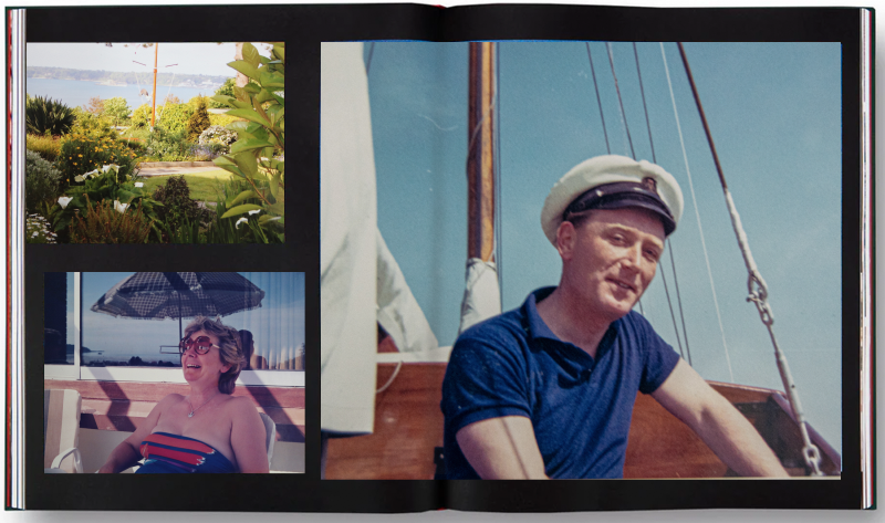
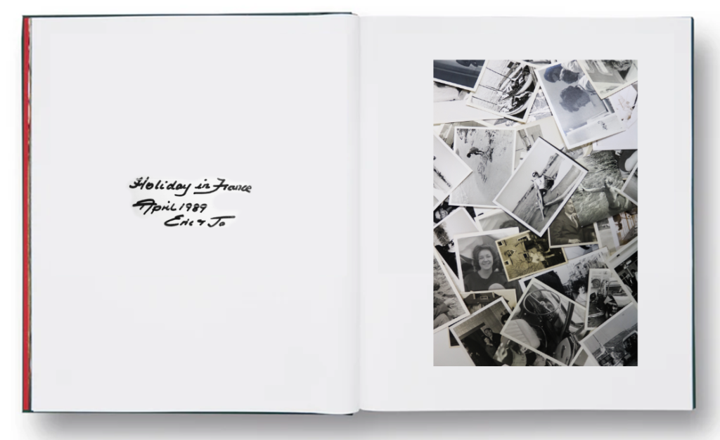
I quite like this layout, and it has given me ideas about naming the book ‘Holiday in France April 1989 Eric and Jo’. If I don’t I think I will use the same front or writing style for it. I quite like this as an opening page.
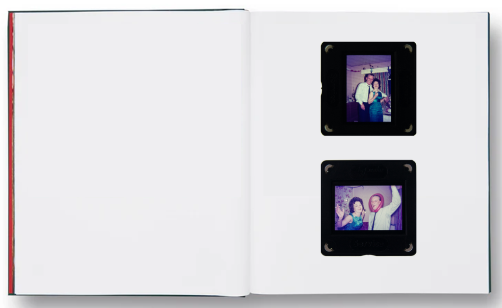
I quite like this basic composition as a page because the images are so colourful they make the page spread simple but interesting. I think if I did a page like this I would only do 1 or 2. I would put my new images after it such as this one because it presents a juxtaposition in the situation.
I put some example text next to it and like the look of it. I will need to record more dialogue of my gran to do this.
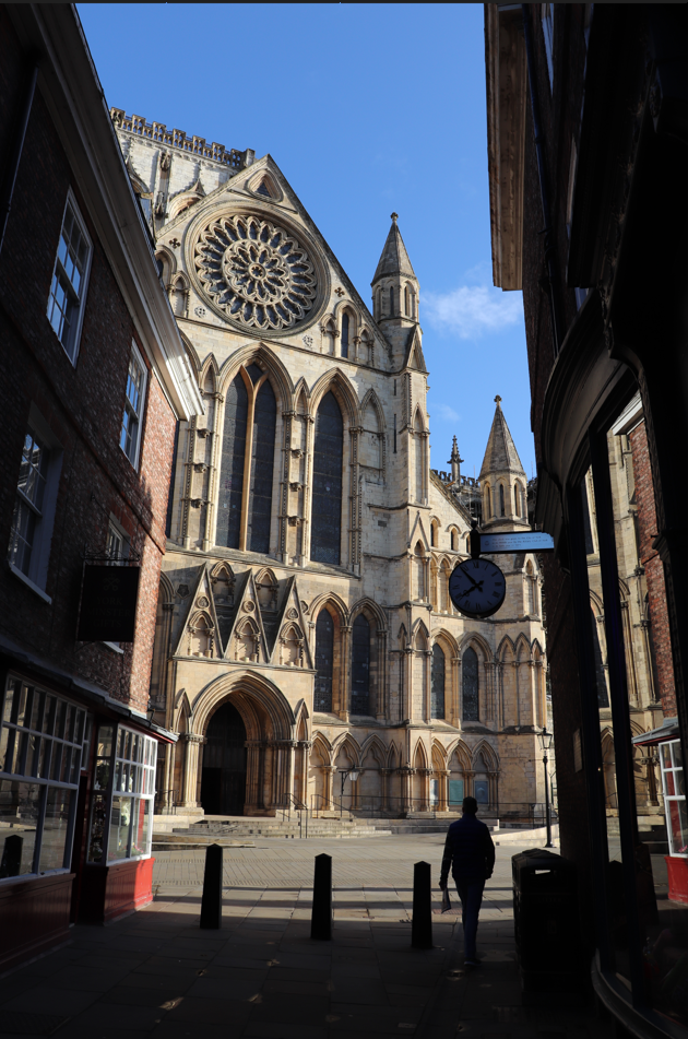
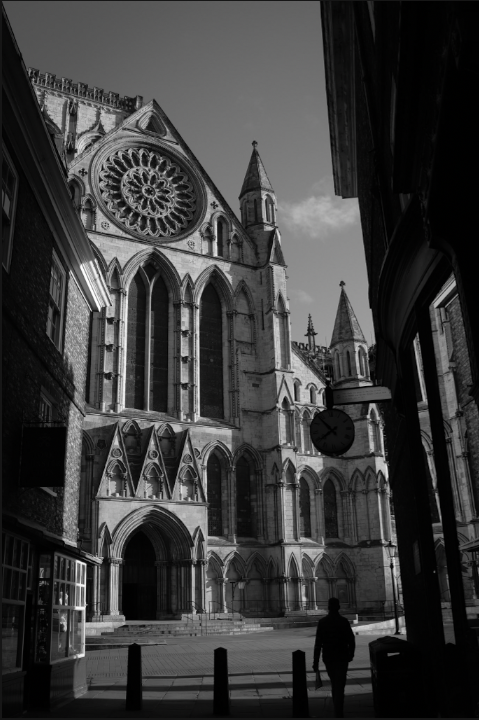
Overall, there aren’t many images that I have selected from this shoot due to the emptiness of the city in the early morning. However the morning light meant that sharp shadows and silhouettes characterise these images. Therefore, when editing these, I decided to use Black and White and increase contrast for the shadows. I think these are strong images, however, there are very few, meaning there is less likelihood that I can use them.
The original image is strong, however I wanted to use the extreme contrast between light and shadow and the intensity of these shadows to create a dark and moody image.
To do this, I used a black and white filter and increased contrast, vignette, and texture. I am happy with the outcome and applied similar settings to the other images.