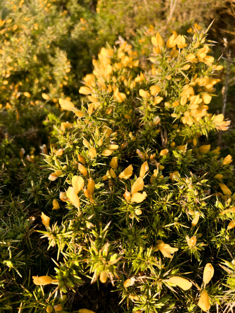
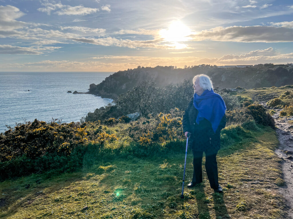
Plemont Photoshoot

Photoshoot

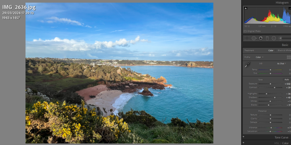
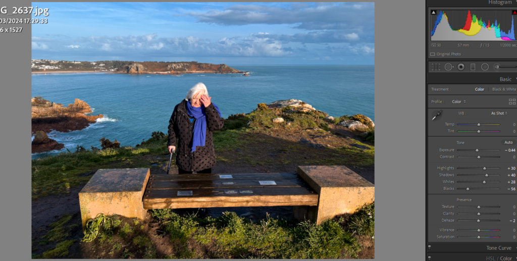
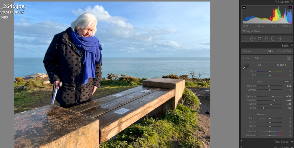
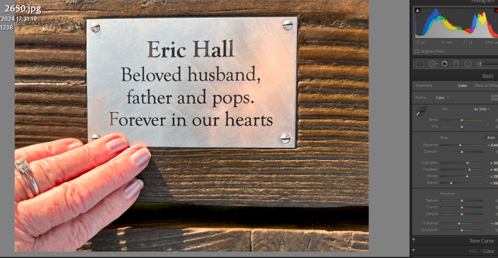
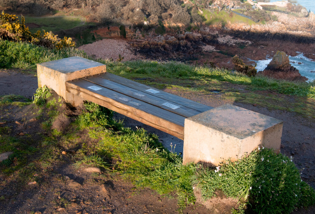
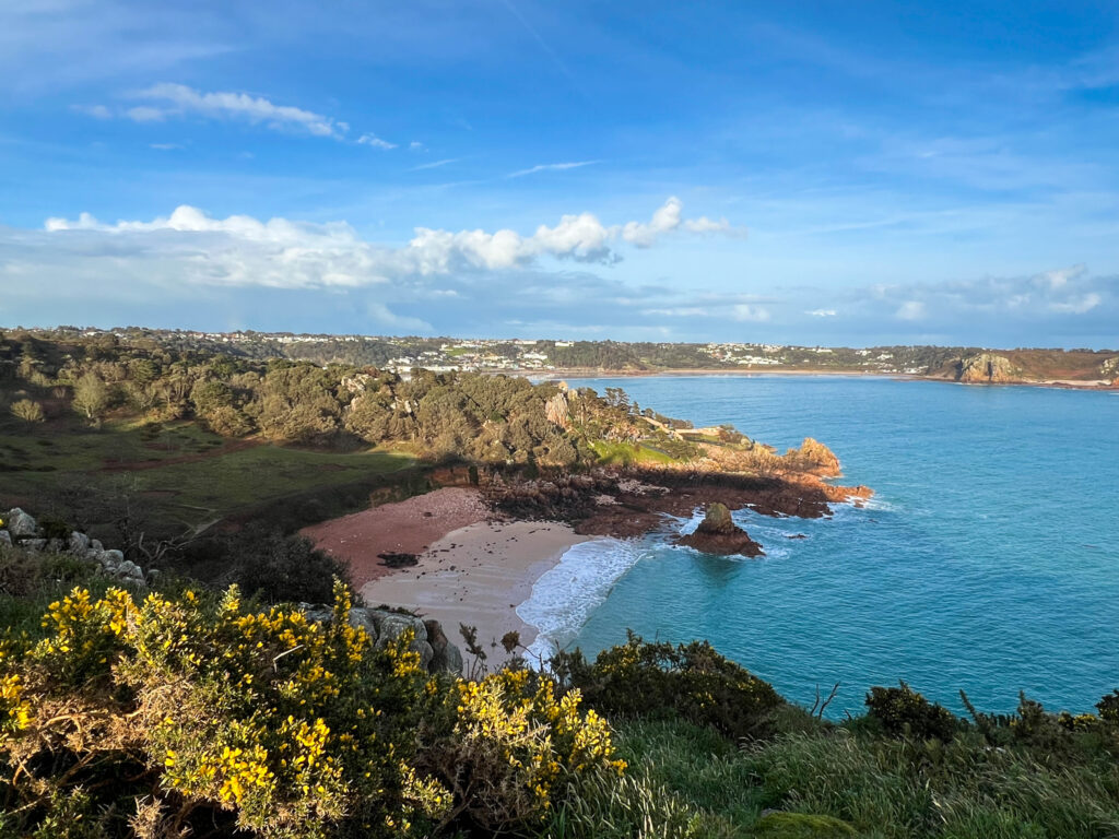
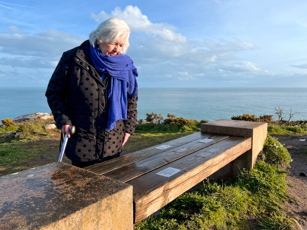
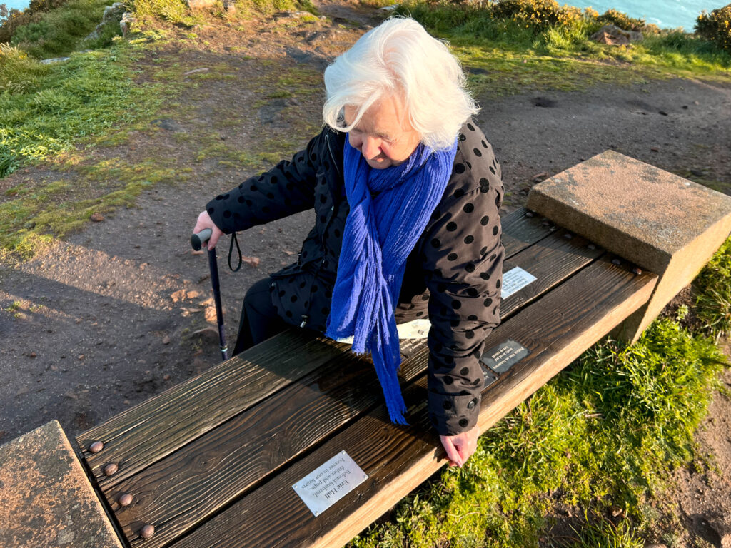
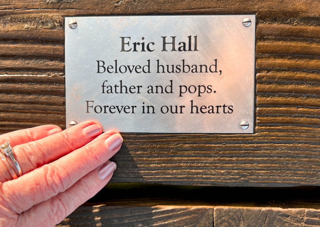
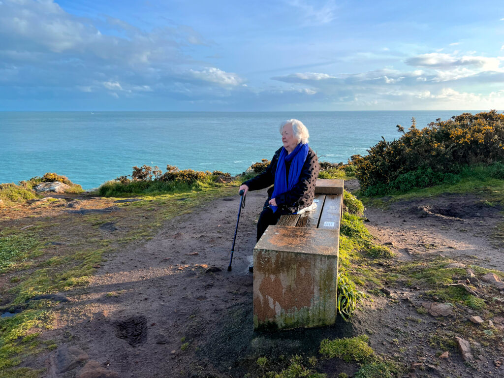
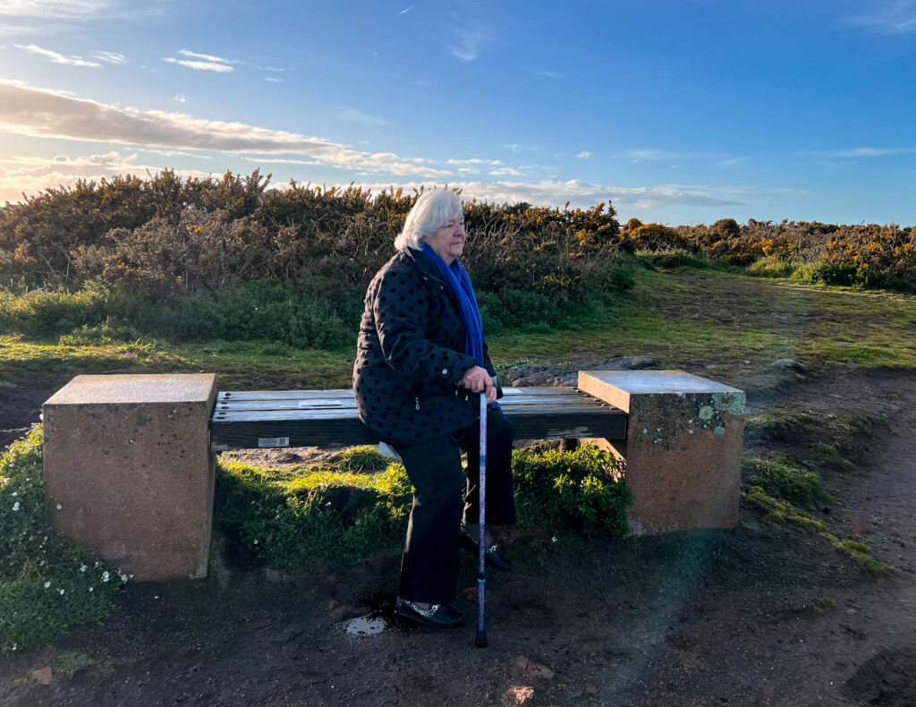
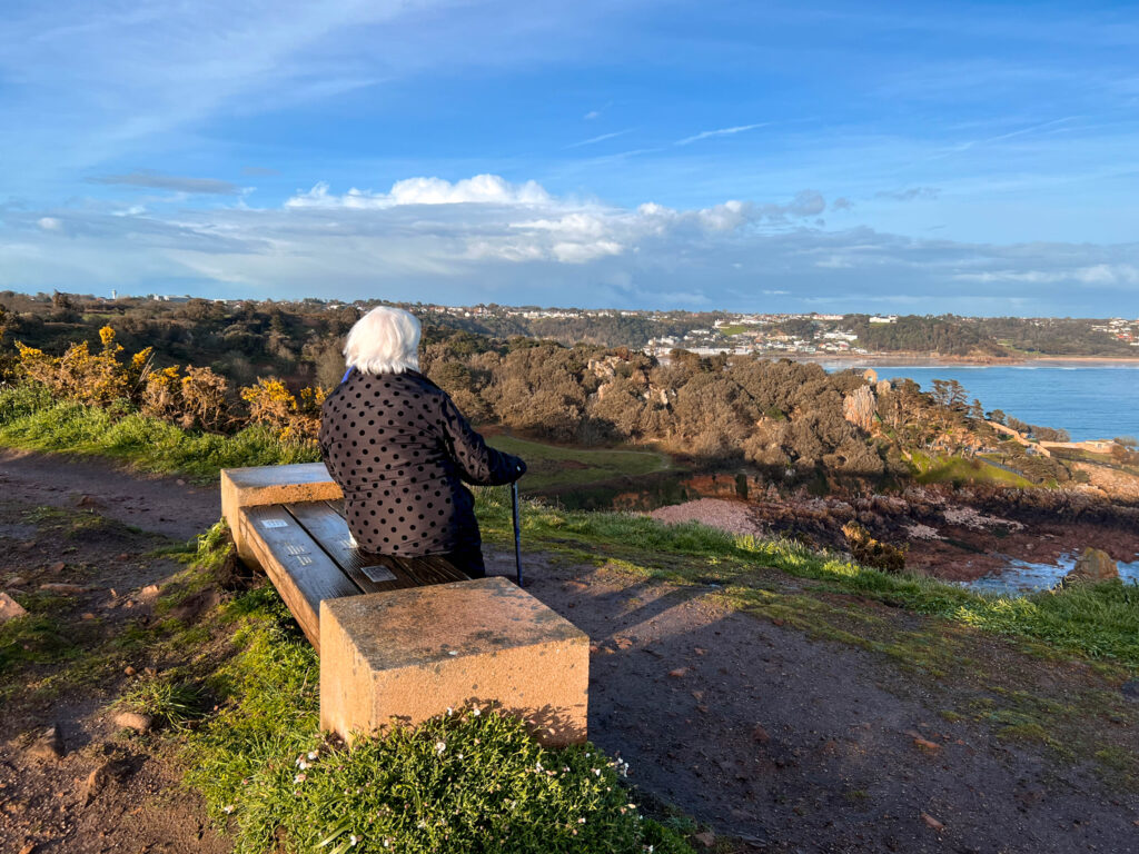
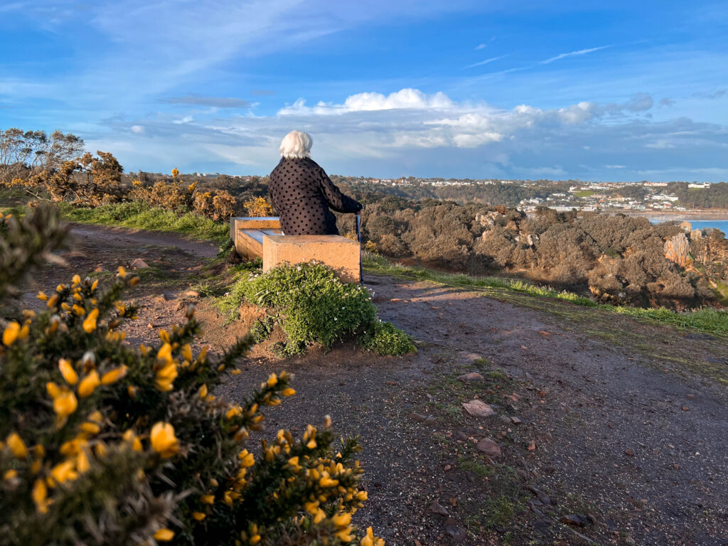
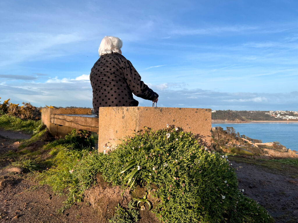
This was a spontaneous photoshoot, therefore I did not create a plan for it, I happened to be driving nearby to Plemont and I took the opportunity to take photographs documenting my trip. Since I had no plan of what to focus on, I decided to focus on ideas of exploring the place as if I were a tourist. When I got there, I noticed that the tide was very high, therefore I was limited to how much movement I could do around the bay. This is why I did not produce many images, however a couple that were my favourites are higher quality.

Sub-Selection

I have selected photographs of the best quality, and ones I thought were showing the experience in the best wa .

Editing

Due to the variety of colours in the images, I wanted to act on that and enhance them. Therefore, main editing qualities were of clarity saturation as well as exposure.

Final Images

Overall, I did not have many outcomes that I was happy with, however there are a few images that I am very proud of. Due to this, I am glad I went to Plemont that day and took photographs.

Norway Photoshoot

Photoshoot

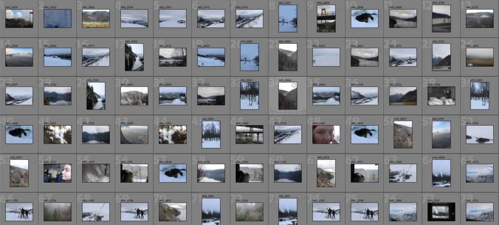
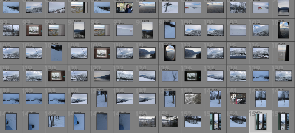
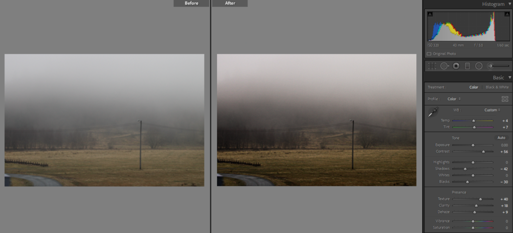
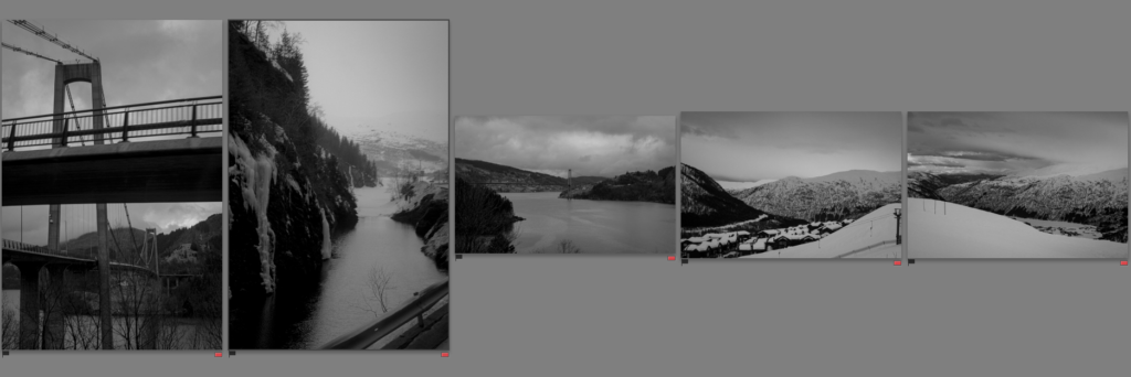
One of the main things I have gathered from this photoshoot is that compared to the plan, I have far less opportunities to take the photographs than I had expected. A lot of the imagery that I really liked, came from travelling from one place to another, for example, on coaches, busses, planes etc… I also think images that show movement related more to what I was trying to communicate through the images. When it came to taking the photos I have to use many different settings in my camera, as the subjects varied dramatically.

Sub-Selection

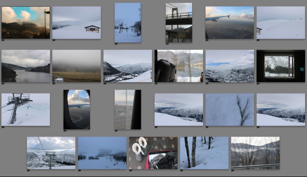
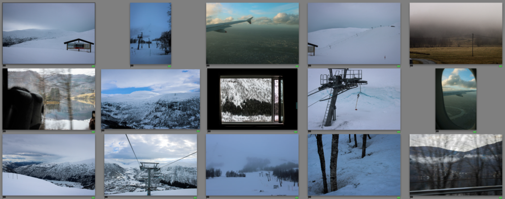
I have selected photographs of the best quality, and ones I thought were showing the experience in the best way.

Editing

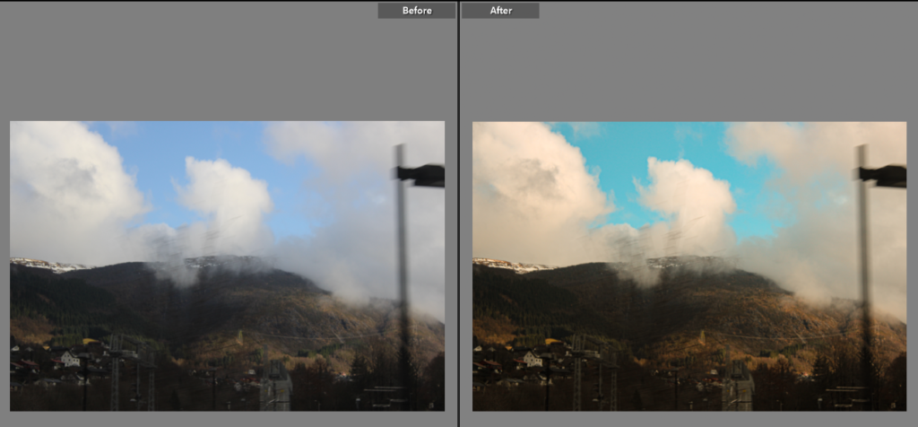
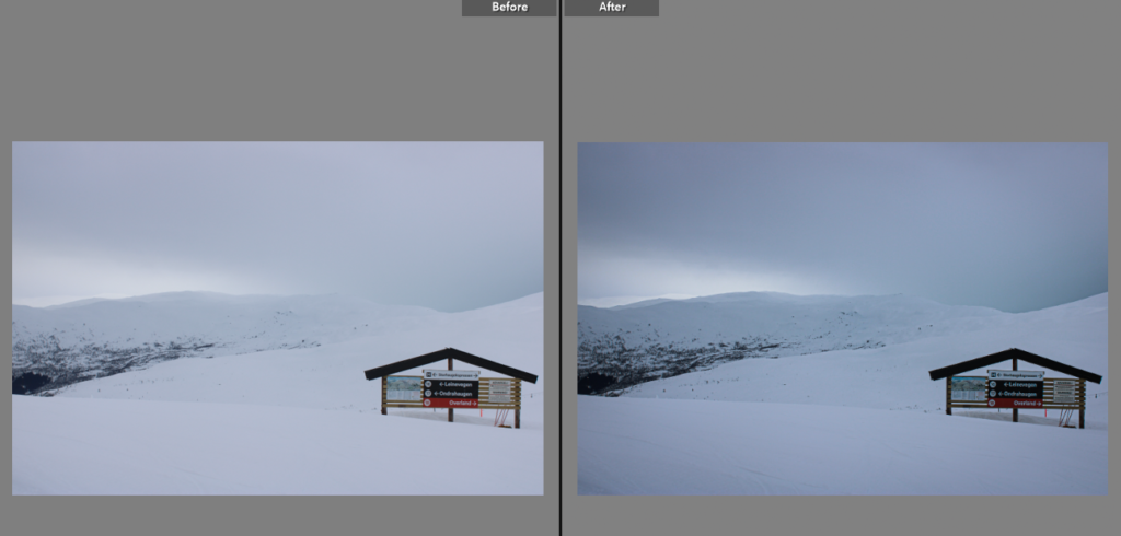
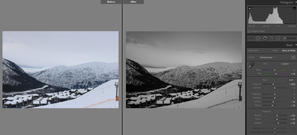
When it came to editing, I first separated the images that I knew I would want to keep in colour from those I wanted to edit into black and white. The reason behind choosing black and white is that the images had very little colour, so I thought having them in black and white can also relate to romanticism and the similarities to Ansel Adams.

Final images

Overall, I expected to produce a higher amount of successful outcomes throughout this photoshoot due to having such a wide timeframe. I also think that the editing of the images has helped massively, as many of them were out of focus, and due to the lack of sun and the time of year, there were not many colours to fall back on. I am extremely happy that this link between mine and Ansel Adams’ images is clear to see. And I am glad that the overall photoshoot as well as images challenged me, to take, as well as to edit. I also think this photoshoot relates to the main themes, observe, seek, challenge, as well as relating to my own targets.

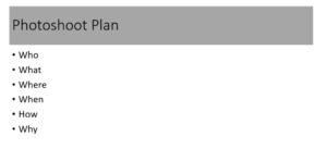
Photoshoot Plan-Norway

  • Who – because I am travelling with family, some photographs may be of them or may include them, however they will not be my main focus. I plan to capture the travels in the best way possible, but focusing more on romanticised landscapes
  • What – due to the place we are staying in, the landscape surrounding us will consist heavily with trees, mountains and much snow. Therefore, that will be what the images will consist of.
  • Where – as I want to capture not only where we are staying, but also the journey to and from the area. I will start photographing whenever I can from the plane, hotel, train, or any other transports we take.
  • When – The trip is planned for the dates 27th March until the 3rd April. Therefore, I will try my best to photograph as often as I can throughout that timeframe.
  • How – because I have such as wide timeframe as well as different subjects, and locations, I will adjust my settings on my camera according to the situation.
  • Why – This photoshoot responds to my key ideas extremely well, as the main themes are travel and exploring.

Tunnel Photoshoot

Photoshoot –

Compared to my plan, the photoshoot turned out slightly different, as instead of doing both of the trips in one day, my friends and I split it between two separate days. Therefore, on the second day I was more aware of how the trip goes and was able to prepare myself with more equipment such as a stronger torch to aid with lighting as there was no natural light at the time of this shoot. Even though I knew we would not take long on the trip, I brought extra clothes as I was aware the temperature inside the tunnel would be drastically lower than the temperature outside.

Sub-Selection

I have selected photographs of the best quality, and ones I thought were showing the experience in the best way.

Editing

When it comes to editing I was able to copy the same editing style throughout the images, the main features I did change depending on the subject of the photograph was the exposure, as most were under exposed. The main feature I did highlight were the exposure, sharpness and clarity. Editing these picture was more difficult, as due to the under exposure of them, their sharpness and focus deteriorated. However, I tried my best to increase the black as well as the shadows in lightroom, to brighten the image.

Final Images

Overall, due to the flash photography I was required to use, the images appear alike each other. But because this photoshoot, like the rest of them, focuses on discovery, I think the final images depict subject that had the most effect on me due to their uniqueness.

Deconstructing a Photobook

Photobook: Larry Sultan’s ‘Pictures From Home’

Research and deconstruct photobook used as inspiration. Comment on different design element such as: feel of the book, paper, binding, format, size, cover, title, design, narrative (if appropriate), editing, sequencing, image and text.

Pictures from home was published in 1992, around the time that Ronal Reagan was president, and wanting to reinforce the traditional family values in America. This photo book is a visual memoir made up of snapshots form home movies, his own images, and his own writings. Sultan said that he “wanted to puncture this mythology of the family and to show what happens when we are driven by images of success. And I was willing to use my family to prove a point.” because “the institution of the family was being used as an inspirational symbol by resurgent conservatives.” However, the book did move from this original motivation, to a more personal and self-questioning piece of work. It resulted in leaving him confused about its true meaning, but he came to the conclusion that it was because he wanted to stop time. “I want my parents to live for ever.” he stated. He took the images over a decade when visiting his parents who were living in Palm Spring, and in the final chapters of their lives. They seemed to live the idealised American Dream, making compositions interesting, vibrant and have an overall wealthy motif.

The book is a hardcover, making it strong, and the title is letter pressed. This almost adds to the idea that he is photographing the wealthy, because hardcovers make a book feel more expensive; and they are. The cover is a deep green, which links to the vivid greens in his images throughout the book. The inside page is a vibrant red which connects to the opening image of him as a child, with a red hula hoop. It adds a childish note to the book, possibly suggesting how he has tension with his father. In the Guardian article it states ‘Throughout, Sultan’s often painful reflections – on his upbringing, his parents, his photography, and the wisdom of this project – are undercut with his father’s more macho, matter-of-fact monologues on the same. The tension between the two is the classic generational tension between father and son; the one seeking affirmation of his work, the other baffled by it.’

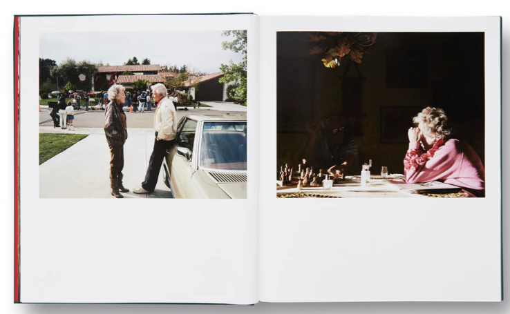
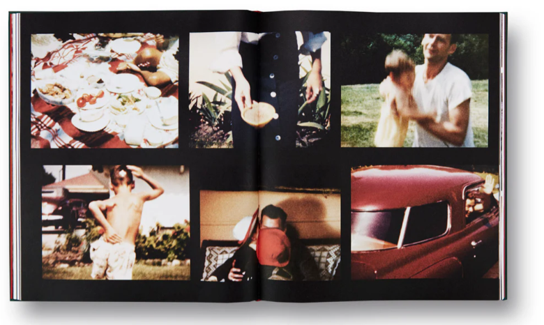
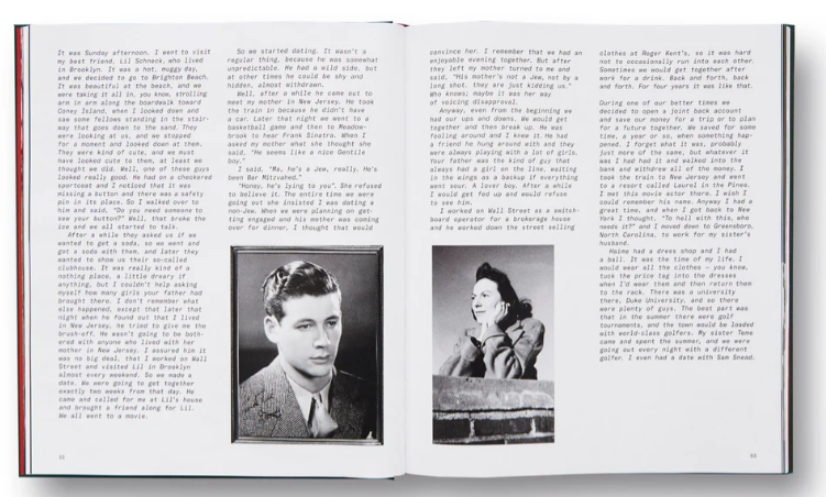
The book varies from still from home movies, to his recent images, to his writing. Each page is different, however he makes it link throughout by using similar layouts for each of these subjects. For example, he tends to place an archived image next to his writing, his new images landscape at the top of a page, and his stills from movies in a collage.

Examples:

He tends to use darker backgrounds for old images, possibly adding to the reflection that these memories are in the past.

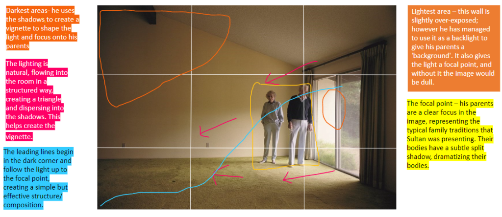
Image analysis

My Inspiration

Sultan’s photobook has inspired me to vary my usage of archived and text, adding in notes from my grandmother’s memories of my grandfather. I also have been inspired by his simple layout for his new images. I am going to create some collages similar to his as well.

Hotel Photoshoot

When it comes to the photoshoot compared to the photoshoot plan, it was harder to plan ahead what I would come across as it was a new place that I had never been to or experienced before. To my surprise, inside the hotel, the rooms were much darker than I had expected, and most of the picture required a flash, either from the camera itself or a handheld torch. While photographing, there were much more risks than I had expected, and I had to be extremely careful to not touch anything, but also to capture as much as I could.

Sub-Selection

I have selected photographs of the best quality, and ones I though were showing the experience in the best way . I selected those which I thought best described the storyline and turn of events, so those which showed both the exterior and interior points of view.

Editing

When it comes to editing I was able to copy the same editing style throughout the images, the main features I did change depending on the subject of the photograph was the colour , as I wanted to enhance the dramatic effects of the colours in order to make the photographs look like how they felt for me to experience. This feeling was eerie and unsettling, so I tried to recreate this within the images. The main featured I did highlight were the exposure, sharpness and clarity.

Final Images

Overall, I was left with far less final images than from my sub selection, however, the ones I was left with, in my opinion, showed more of the subjects rather than the experience, this is because the subjects I did come across and discover had a big impact on me. Like seeing so many moldy pieces of furniture. I feel as if the final outcomes have an eerie nature to them, and I did a good job editing in a way to enhance this unnerving atmosphere. On top of this, the idea of discovery links back to my key theme, which to me is a success.

Photoshoot Plan- Tunnel&hotel

Plan:

  • Who- Since I am planning on going to both of the locations with my friends, some images might include them, however it wouldn’t be my main focus
  • What- Both of the locations are within a limited space, therefore they aren’t open spaces, I would focus on the subjects within them. because I have never been to these locations so I will approach it in an exploring way, and capture my discovery experience.
  • Where- this photoshoot consists of 2 different locations which are quite far apart from each other, one is near the centre of the island where the war tunnels were built, however some are closed of and dangerous due to rack falls, therefore we will need to be careful, next location is an abandoned hotel near the bay, which is in a closed space rather than an opened one, with this location we should be careful of broken glass, mold etc.
  • When- inside the tunnels there wont be any other light course except the ones we bring ourselves, however when it comes to the hotel we will have to do it preferably during daytime so we can get the most we can of the external light
  • How- using the digital camera I will have to use flash as it will be very dark in the tunnels and for most of the hotel rooms etc. except from a camera flash we have a limited amounts of torches.
  • Why– It will be a great adventure and will get me out of my comfort zone, I also think that the outcomes will be quite discovery photographs, due to me exploring places I have never been to this links to my main idea of adventure and travel.

Photo Book Design So far

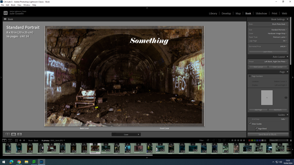
Front cover:

so far I am finding a suitable font and name for my book. I have chosen this type of image, as I think caves with a lot of mess attracts peoples eyes into what they are looking at, and where they might have or have not seen it before.

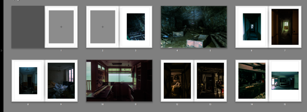
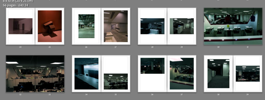
I have used a good consistency of page designs whilst not having a clustered look. I kept the nice look of warm and warm images or warm and cold which contrast each other and work well together.

All the images I have used here use the same context as each other, for example what subject is in the image and what is included in the images, like the use of lines and their direction. My choice in double page spreads was to do with how strong the image is.

Overall how Lay out my images and what type of images I used, work good together, and I like how they all flow with how the reader is viewing them.

Photoshoot 2

Abandoned hospital

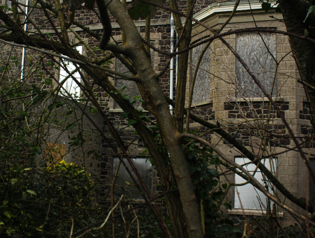
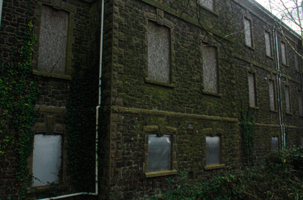
I went to St Saviours abandoned hospital to attempt to capture how nature has taken over the building over time. This was challenging as it is a restricted area so I just had to take pictures from outside/ far away and work with what I could.

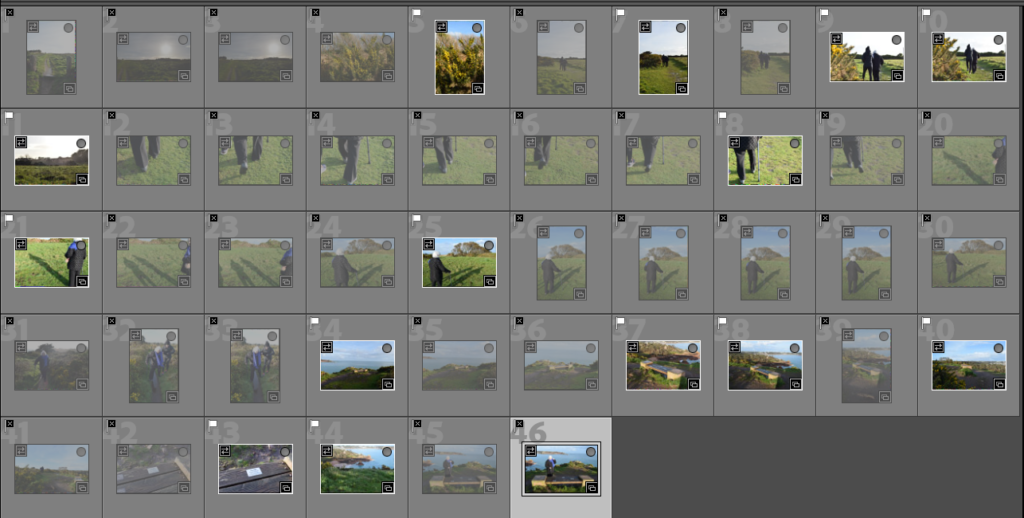
Contact sheet:

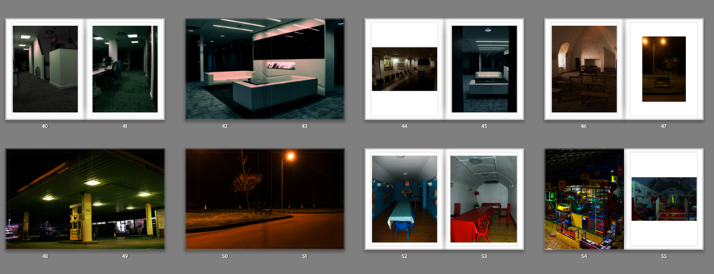
I didn’t manage to take many photos as the weather was very overcast and the images just appeared cluttered from a lot of angles. However I regret not taking lots as I would of had a range of images to choose from.

Although I didn’t have a lot to choose from, these are the images I chose to edit, I used the flagging system on Lightroom to separate the images I thought had potential to edit and those that didn’t.

Image Analysis

These are the outcomes from this shoot. I wont necessarily use all of these in my final photo book they are just the outcomes from this specific shoot.

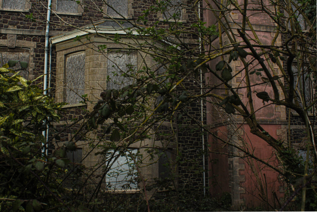
I think the compositions of these images display the theme of my project well. I positioned myself so that the camera would be looking through the trees through to the abandoned building; portraying the theme of seek. I like how the foreground is of the branches and leaves, however the camera has focused on the background of the building as that is my aimed focal point of the images.

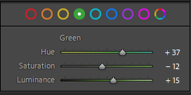
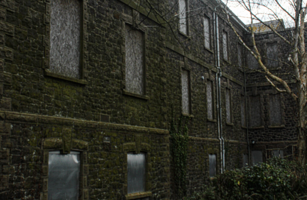
The tone of this image correlates with the theme of my project. Abandoned places have usually been taken over my nature and naturally rotting. This building was covered in a layer of moss, which I then tempered with in the editing process; I increased the hue, saturation and luminance of the colour green (as shown below) to enhance the vibrancy in the image.

Evaluation

Overall, this photoshoot didn’t go exactly as I planned, there wasn’t many successful outcomes and the weather effected my images a lot. However I did get those few outcomes which I think fit my theme perfectly and represent the overall theme of seek well.

Shoot – Beauport

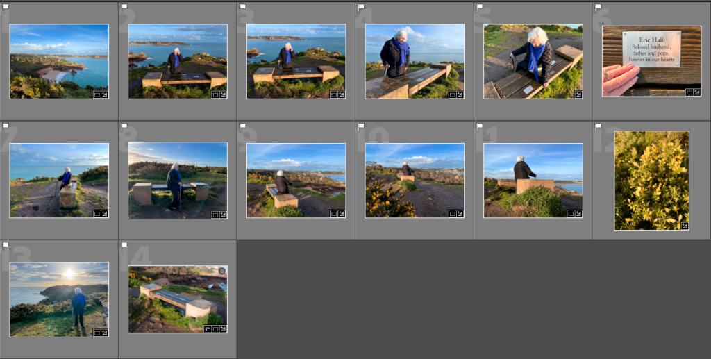
Contact Sheet

I flagged the images I wanted to edit – these are the selection

I chose images which I may want to use – I won’t use every image in my photo book because I don’t want a repetition of images throughout. However, having this variety means I can compare and contrast which images go best and make the best composition in the book.
I created a preset for all my images to achieve the same tones and exposures throughout. I then went back and adjusted anything that was over saturated or the lighting wasn’t bright enough.

Here are some of the edits:

Final Images