These are my presentation ideas for my printed images. I want to make sure I chose a range that can link to each other, and when they are presented that they make sense. I am also going to print some collages of my grandad’s scrapbooks and archives.
Images for print
I want all my images to be presented the same so that they are organised, and similar. To do this I am gong to place them all on white foam board so they have a white frame, then I will place them on black card.
A5
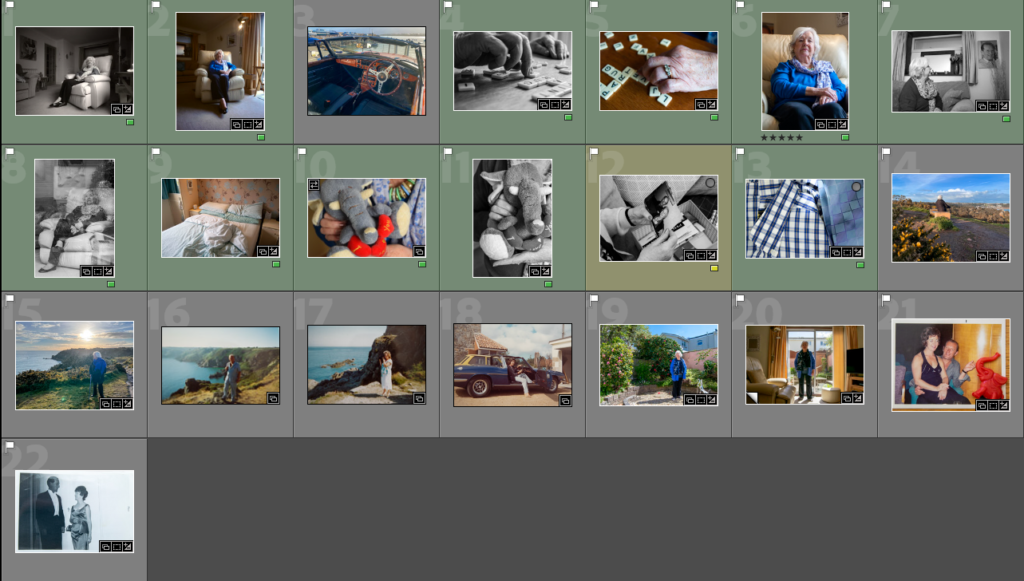
I chose to place a new image in the middle of two archived photos because it reflects the change, and they are similar. At a first glance I don’t think it’s obvious, but it makes a good juxtaposition of time.
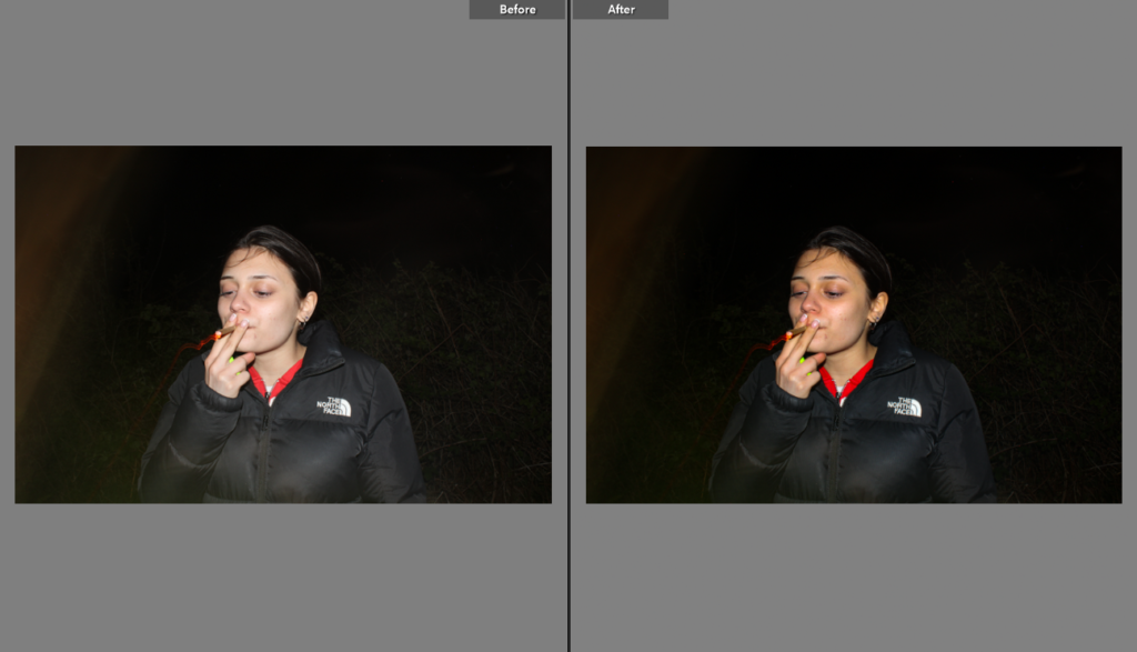
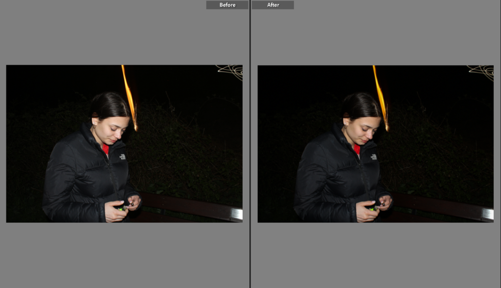
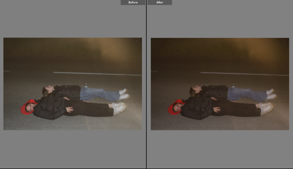
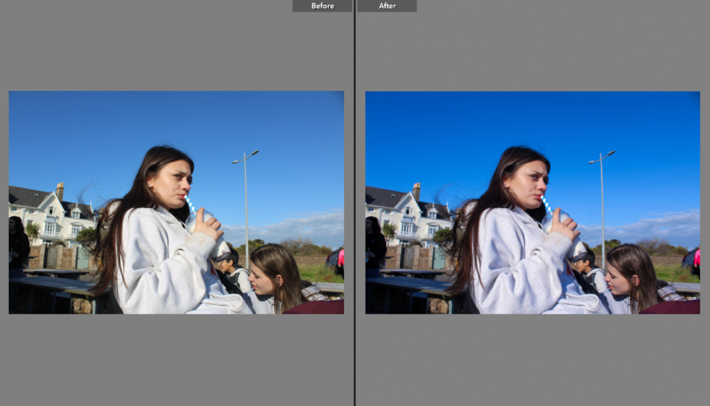
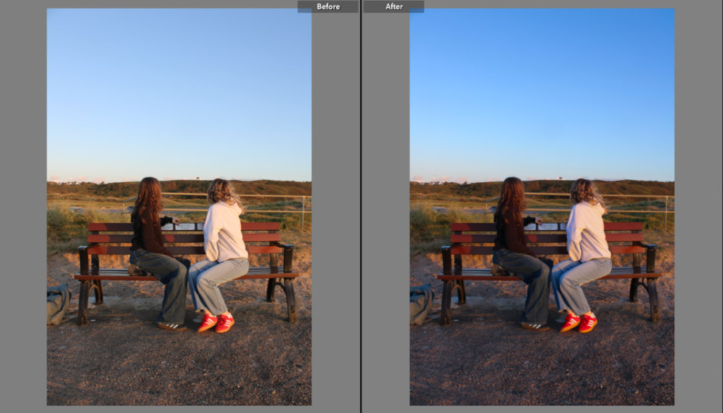
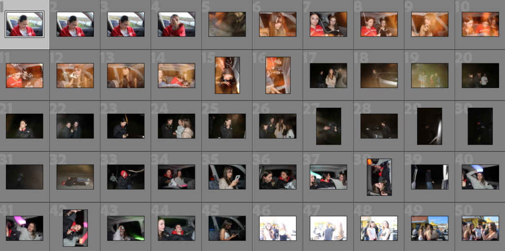
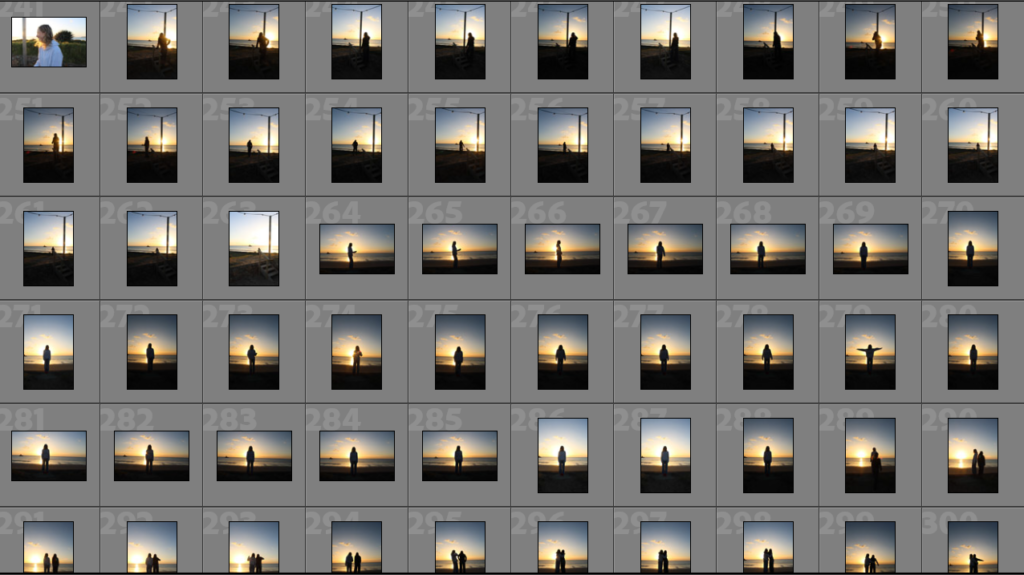
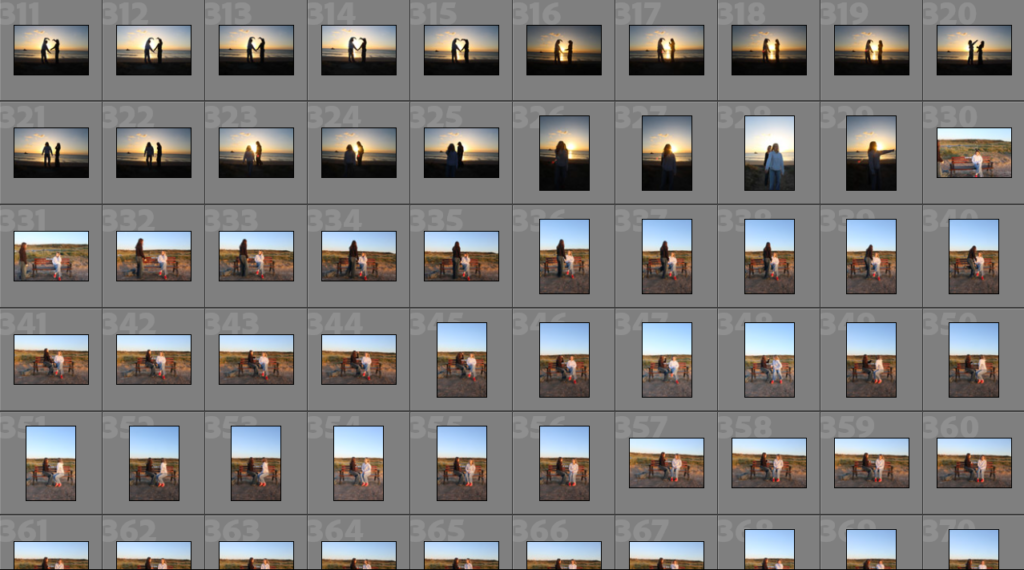
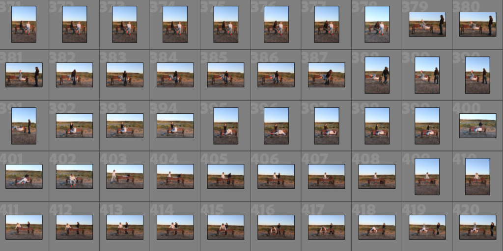
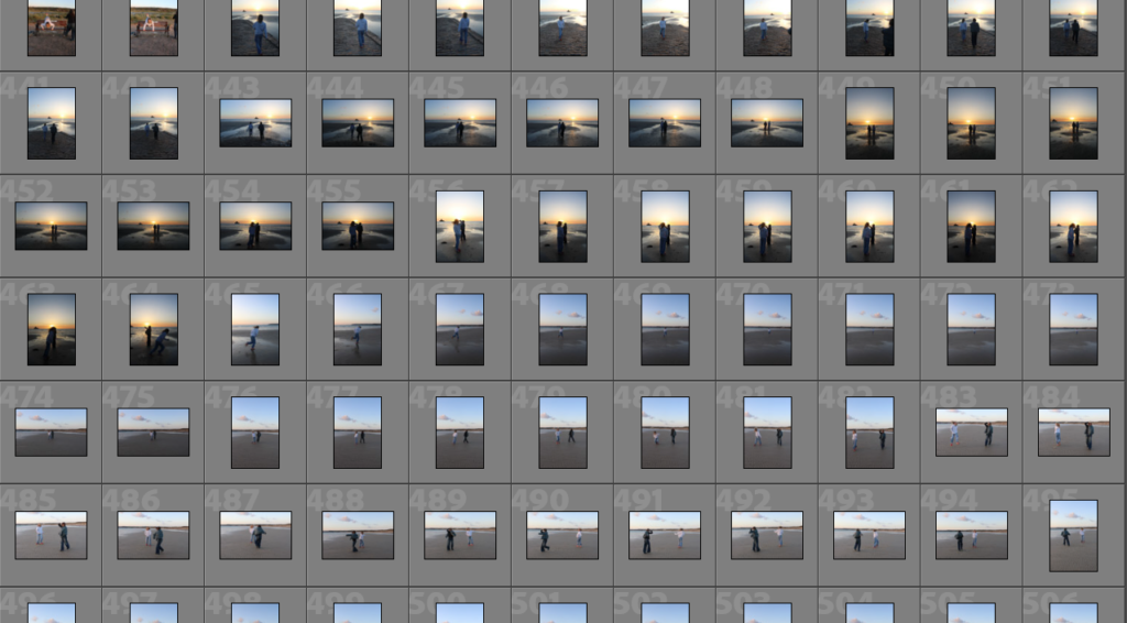
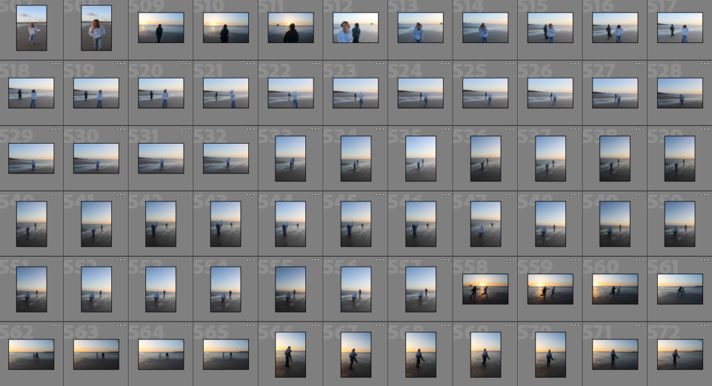
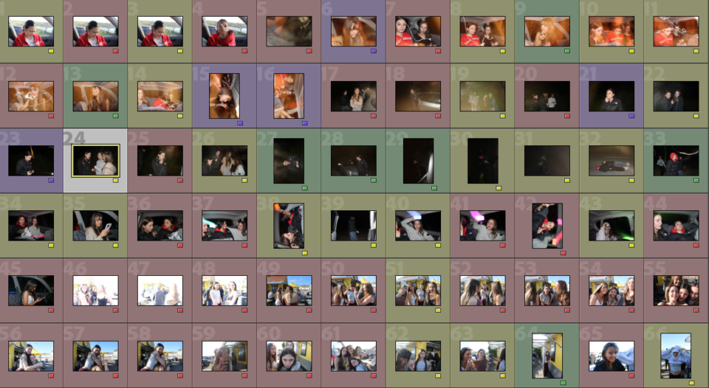
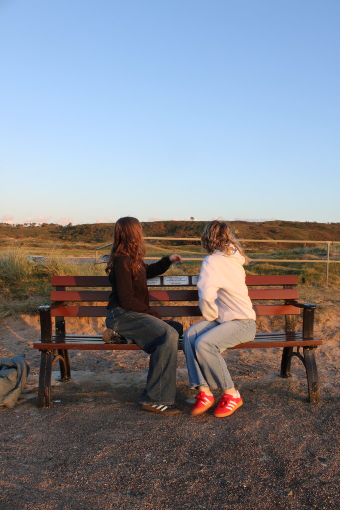
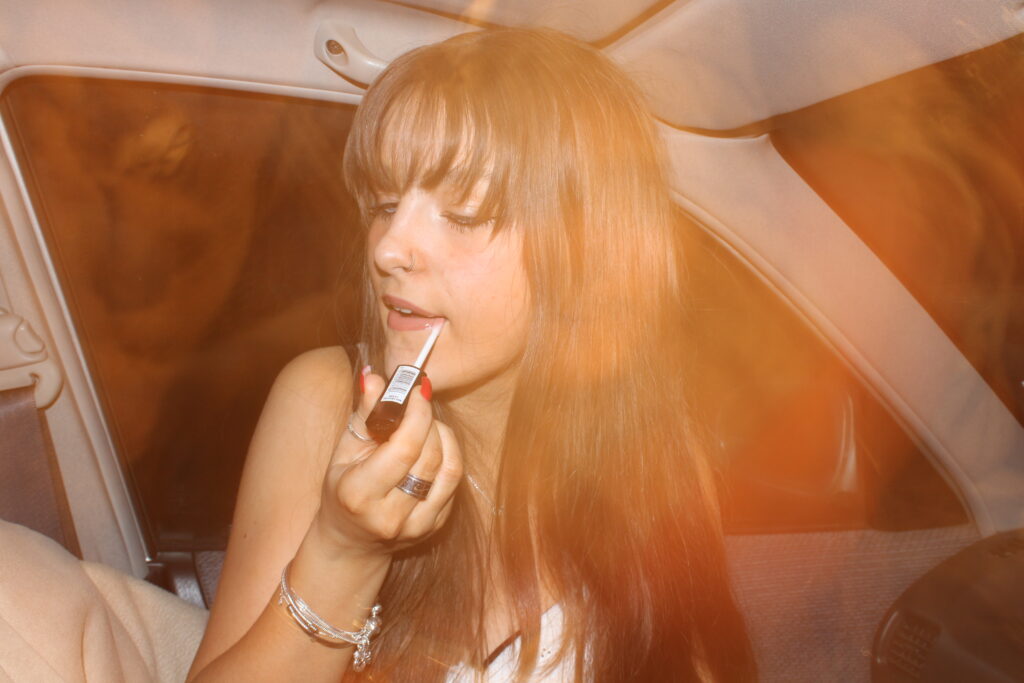
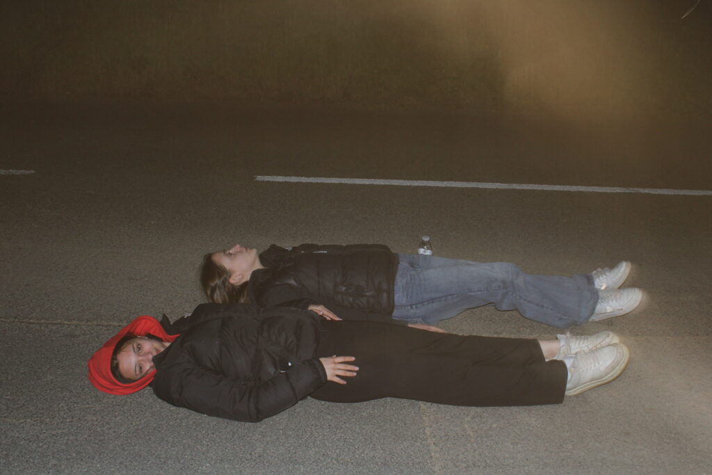
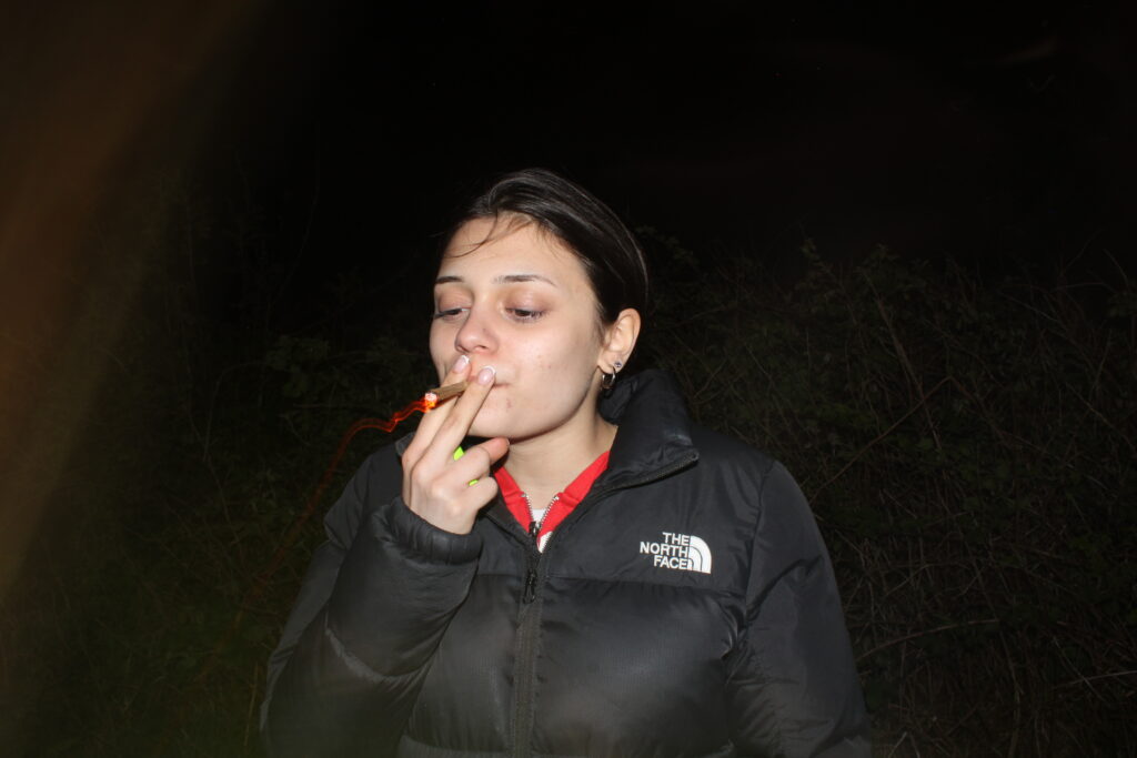
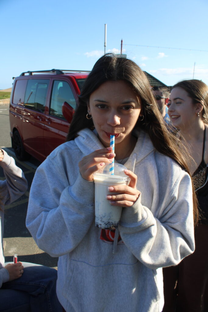
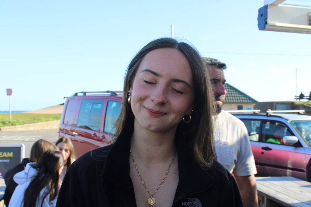
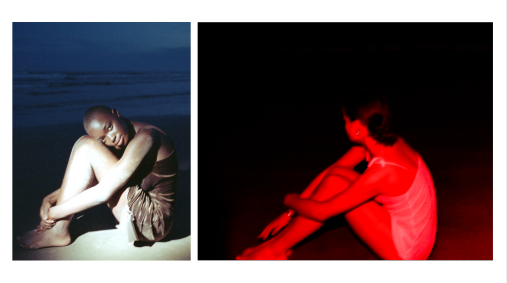
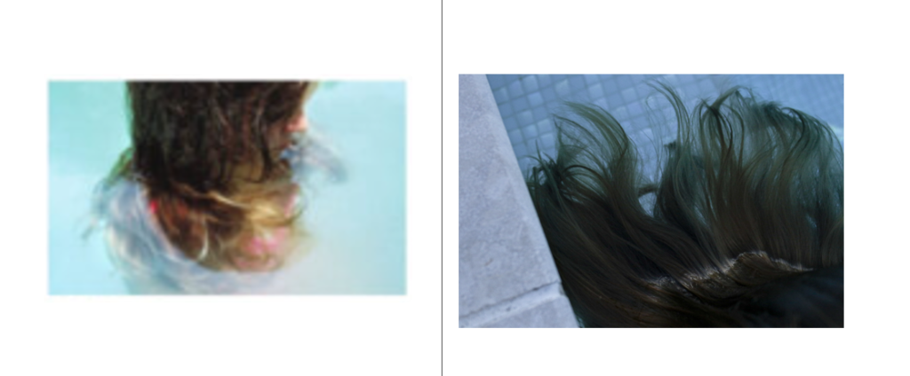
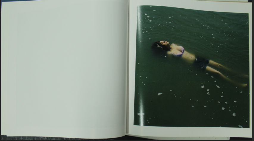
These images were taken throughout the day and different points, in order to show the behaviour of girls through the day. In this photoshoot I was able to meet a bunch of girls which allowed me to get that variety of pictures with different people. There are a range of different portraits in different landscapes and environments which shows the stereotypical views of girls, by the beach and going for lunch. However during my night photoshoot, I was able to explore countertypes of femininity such as smoking which is seen as more masculine and not feminine, even though in present society many smokers are women.
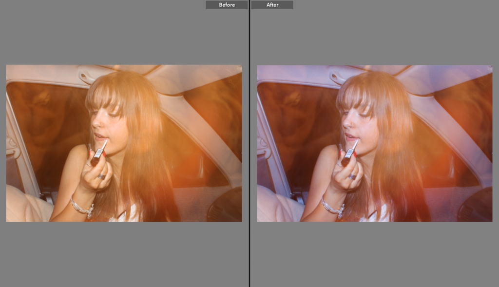
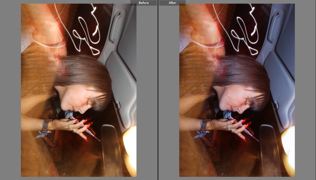
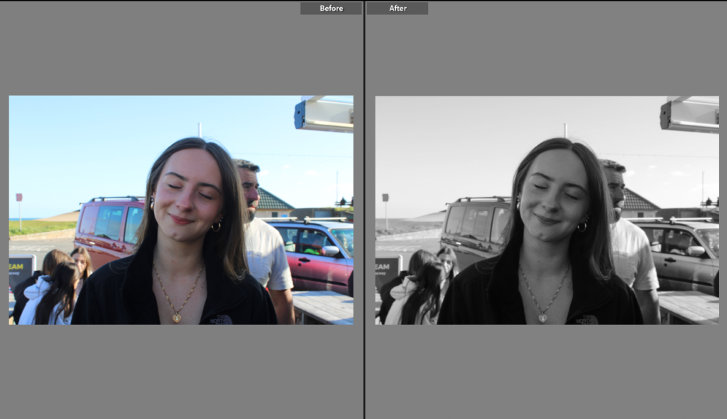
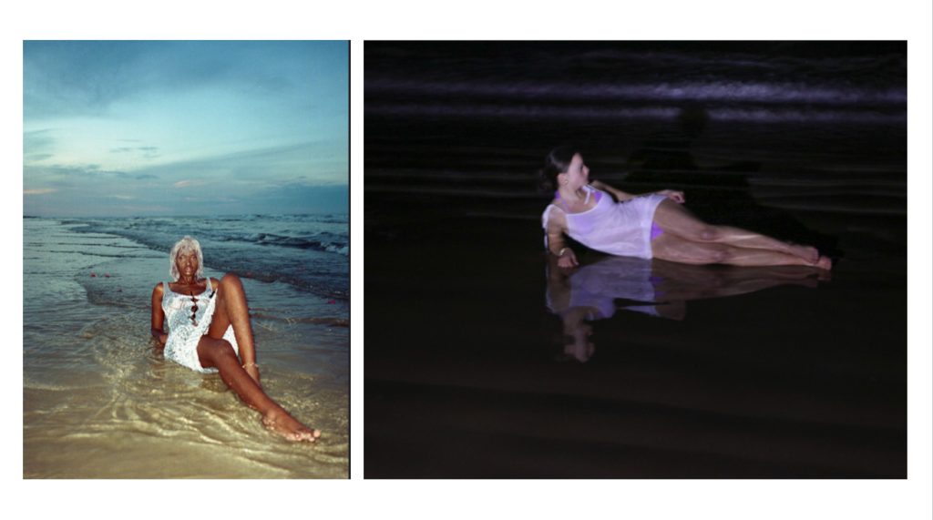
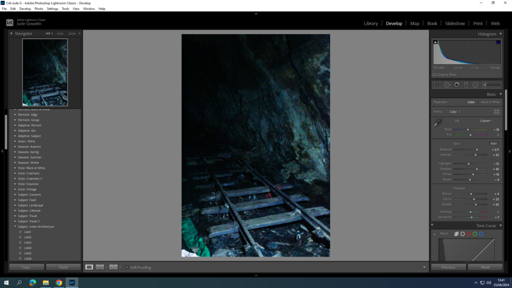
In the editing process I changed some of the images into black and white since it fit more with the aesthetic of the picture, this will mean I will have to go through past photoshoot and possibly edit more in black and white to have a larger quantity. In terms of the coloured images, I was intending to enhance the colour, by enhancing the vibrancy and saturation. During editing the sunset images, as well as increasing the vibrancy and saturation I also increased the temp to create a more coloured image.
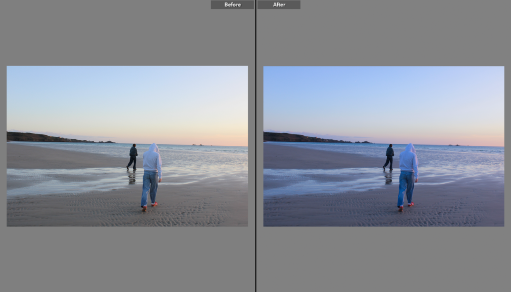
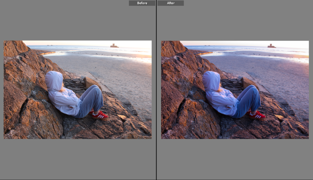
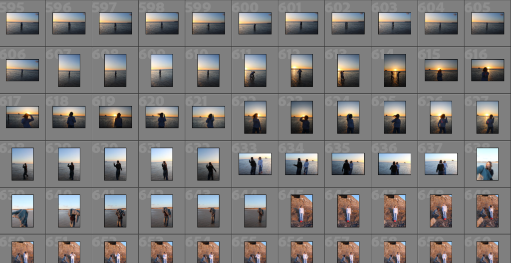
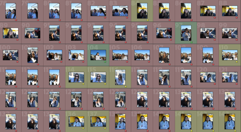
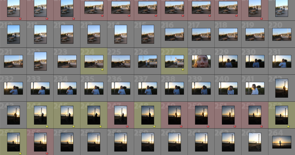
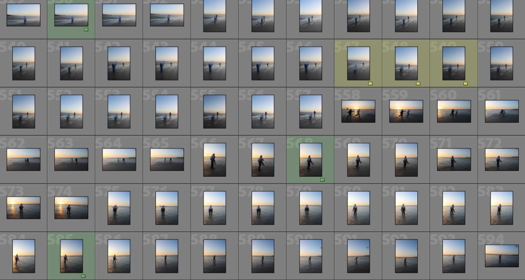
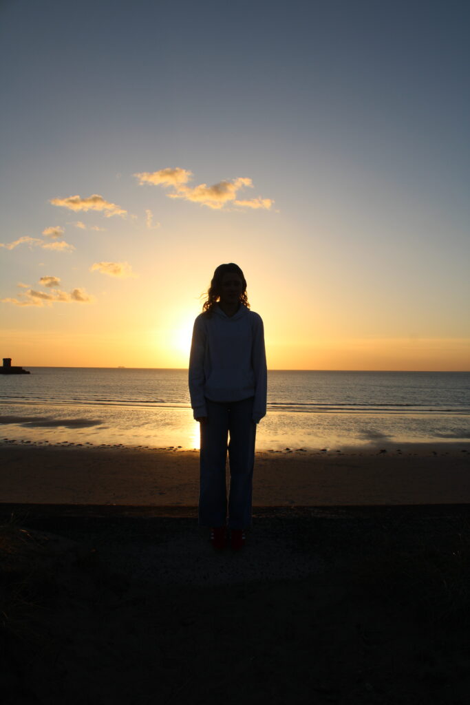
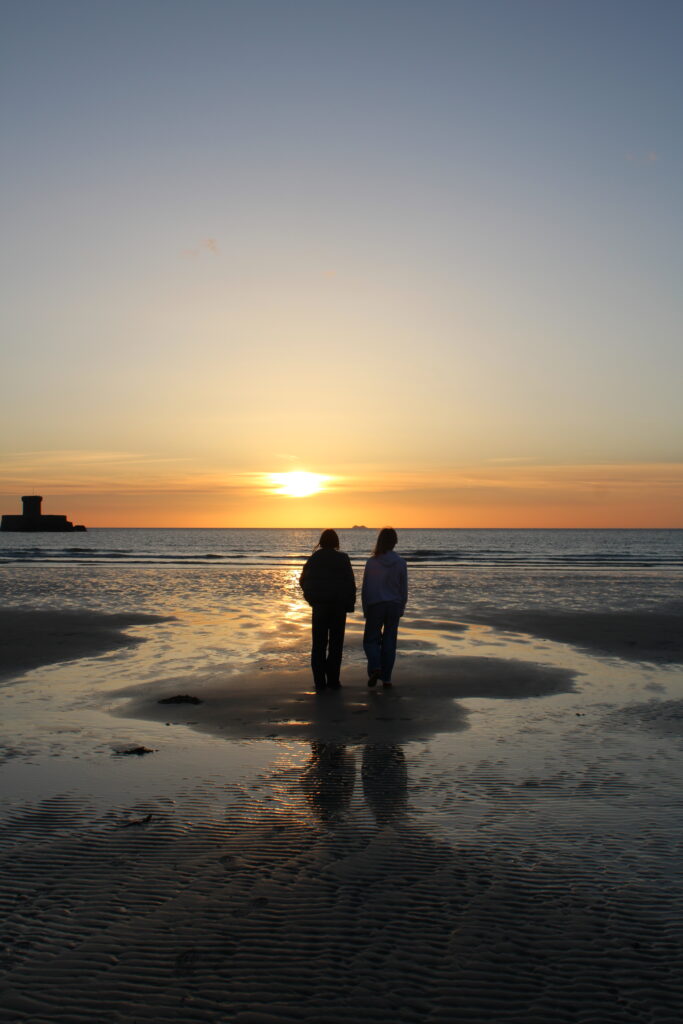
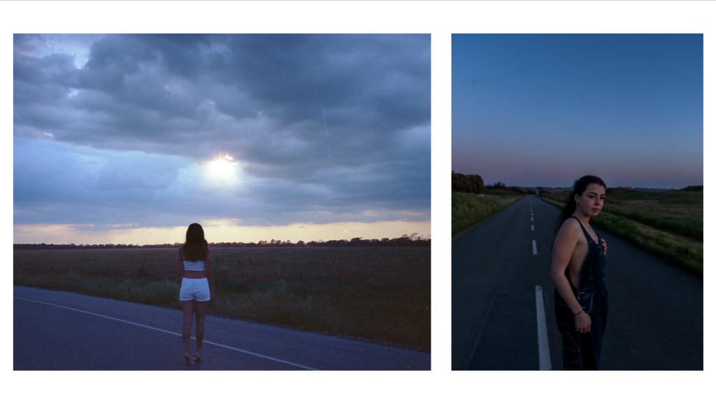
In this photoshoot I explored many types of natural lighting to get a variety of images. I explored night photography, an day photography including golden hour. During my photoshoot at night, exploring the idea of night photography I struggled with the setting and how to create a good outcome therefore as a result there was not as much images as I originally wanted to take. However, through rating my images , I was able to pick a couple images that I believe could be used in my final outcome as a photobook, or even as my analogue final pieces. I also explored the idea of ‘golden hour’ photography with the sunset. I took these images at the beach (St. Ouens) to show how girls hang out at the beach watching the sunset. This part of the photoshoot I really enjoyed because the colours of the sunset reinforced this idea of femininity with the pink colours, which reinforce this connotation.
Overall this photoshoot allowed me to explore many types of photography and lighting settings, while giving me experience in different fields it also allowed me to have a range of images. During the editing process my intention is to enhance the colours of the sunset in order to dominant this idea of femininity, while also trying to define and sharpen feature on the girls.
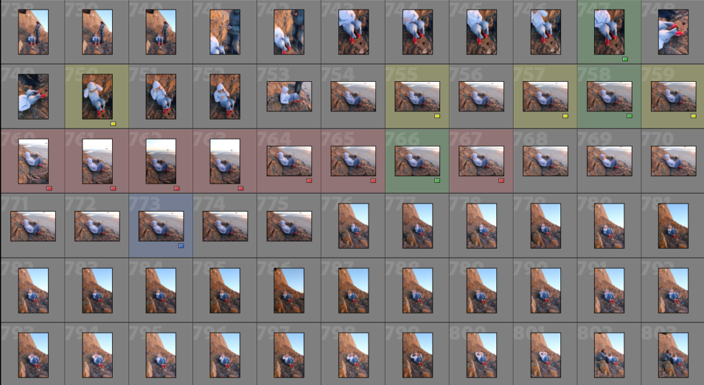
COLOUR RATING:
RED: BAD QUALITY IMAGES
YELLOW: RELATIVLY GOOD IMAGES, COULD BE IMPROVED
GREEN: GOOD IMAGES, THAT FIT WELL WITH ARTIST STUDY
PURPLE: BEST IMAGES, FIT WITH ARTIST STUDY, CREATIVE
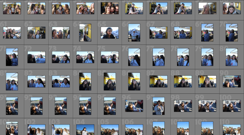
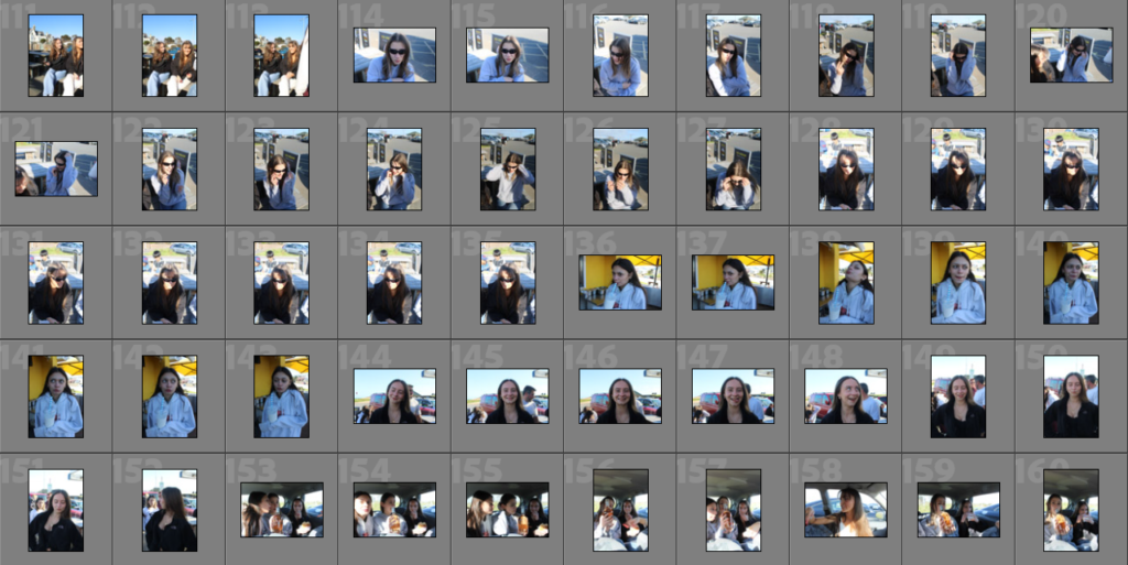
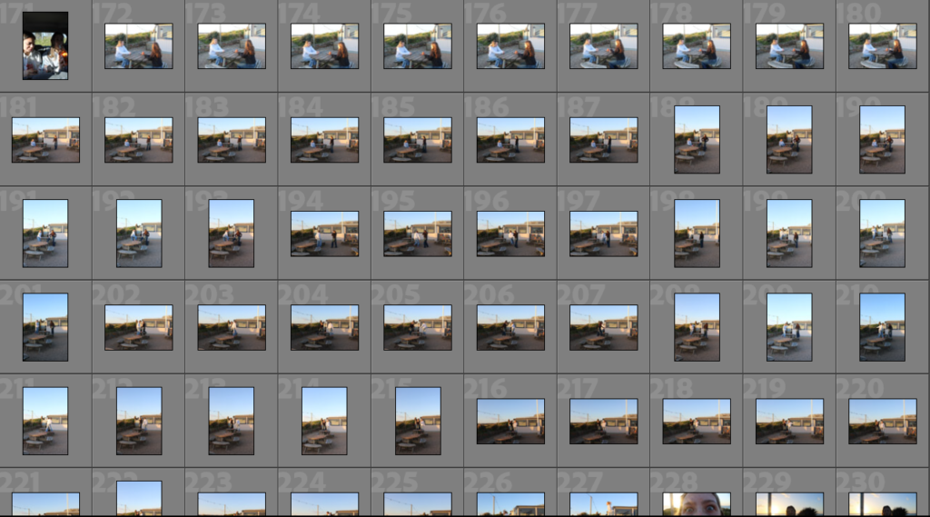
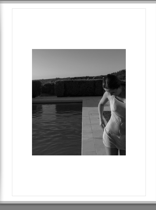
In this photoshoot I intend to portray the difference in how girls socialise for different events for example how girl act different for day life and night life. There will be a range of portraits which can be used to tell a narrative for my photobook.
WHERE?
This photoshoot will be taken outside, during the day, golden hour and night, which shows how girls act during the day and the binary opposition of how girls socialize and what activities they do during the day and night.
LOCATIONS:
BEACH: ST BRELADES
ST JOHNS: ROAD
CAR
KIOSK
HOW?
I will be using a camera from school so I am able to create higher quality images. I will be taking a series of landscape and portrait images to see which fit best with the photobook and what layout will go best.
WHY?
This photoshoot intends to present the idea of girls socially hangout and having fun. Some images are more stereotypical then others such as watching the sunset, which would be stereotypically feminine, contrasted to the dark sky and girls smoking and being more ‘party animals’.
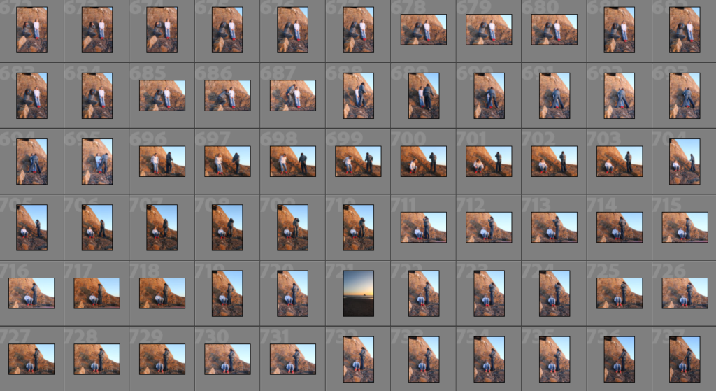
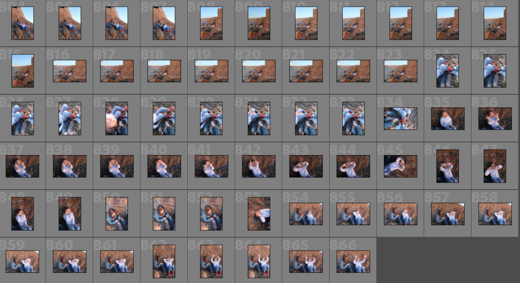
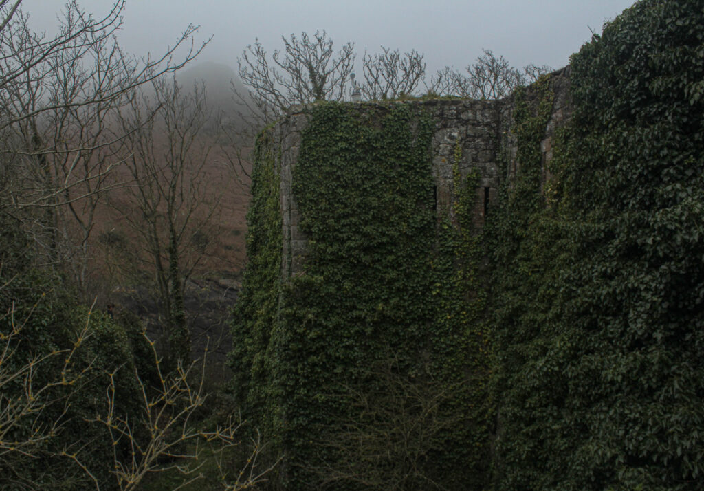
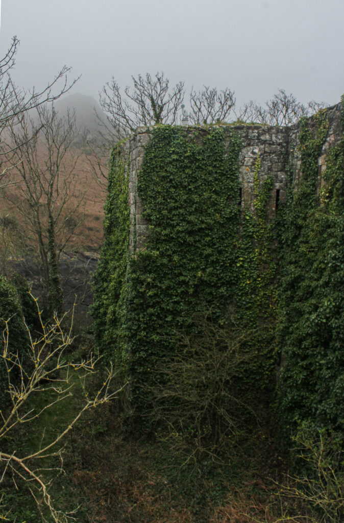
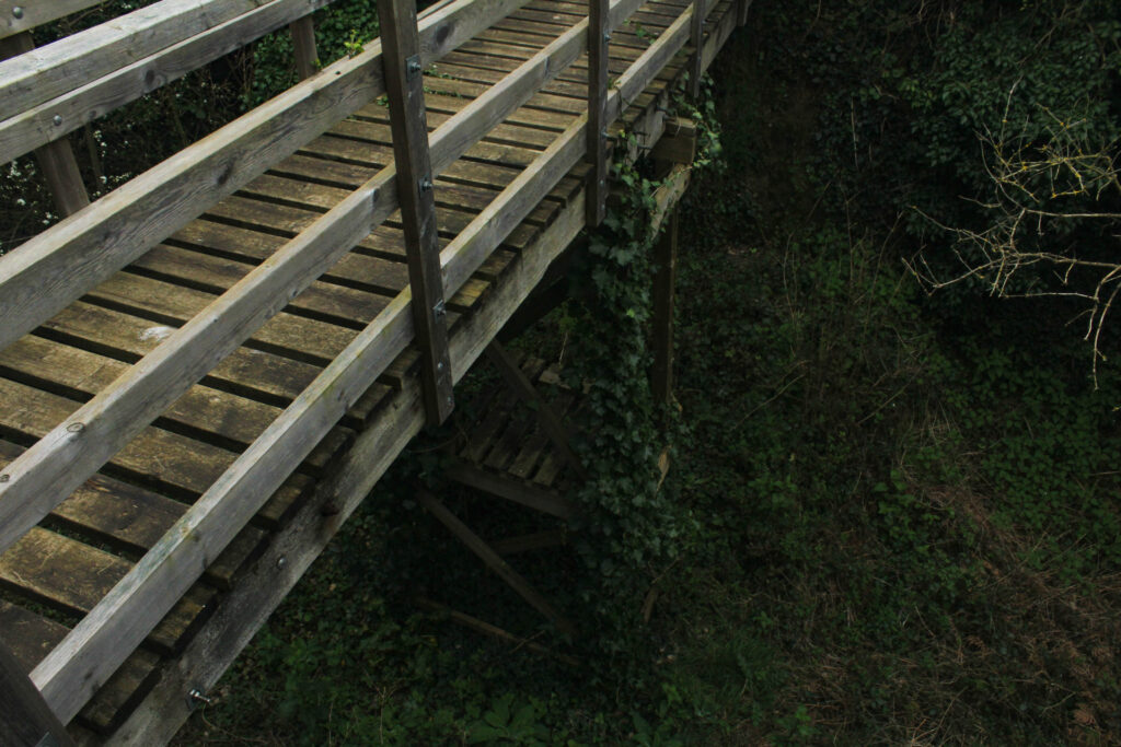
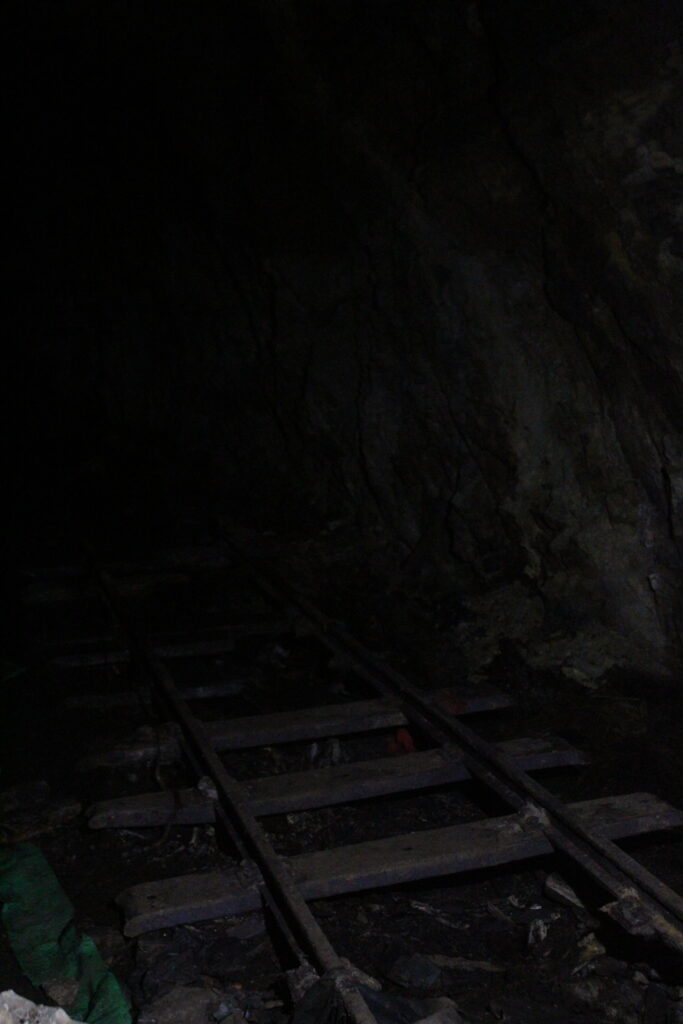
This photoshoot was carried out at L’Etacquerel Fort, a Jersey heritage site. Built in the mid-19th century on a cliff side overlooking Bouley Bay, the fort isn’t abandoned, however it does show clearly how over time nature takes over buildings. It displays vines of leaves that are crawling up the building and overgrown bushes, over walls, that haven’t be attended to, although I originally wanted to base my project around mostly abandoned and derelict buildings, I thought this resembles that in a different way. After-all, it has technically been abandoned from its original purpose when built in the mid- 19th century.
Contact Sheet
The weather was foggy and overcast on the day I did this photoshoot. This effected the lighting and tones in my images as I was working of purely natural lighting. This caused my images to all be quite dull and not reach the highest potential of quality they could have. However, I think the distant fog and grey tones added an eerie feel to the images. It emphasised the derelict theme I’m going for. People usually connect the thought of abandoned buildings to sinister maybe even supernatural places, fog and mist portrays these themes quite well.
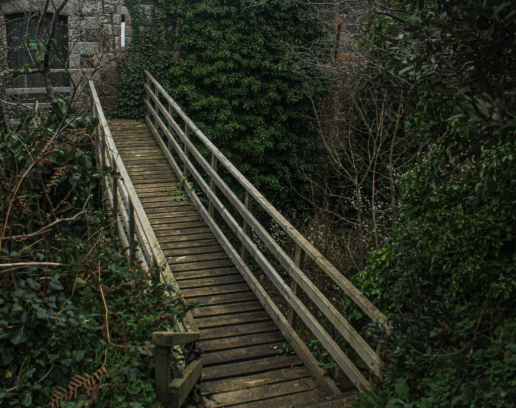
When taking this photo, to have the outcome of a good composition, I placed myself carefully. From this angle I was able to capture the three main elements of my surroundings, the fort, the bridge and the trees. The bridge falls into the centre and is also the brightest feature of the image, this creates an immediate focal point; as a viewer it is the first thing you are drawn to look at. The overcrowding trees add depth to the image, they are of a darker colour and tone then everything else; they sort of add a natural vignette around the image. I think this image successfully represents my theme of ‘seek’, where does the bridge lead to? With the contrast of the overgrown trees showing how this area has been left to rot.
The two images above are very similar, almost the same. The difference being one was taken on a landscape scale and the other portrait. I like them both as final outcomes, however I will make the decision of choosing just one of them during my photobook image selection process. I think the composition of the portrait image is stronger as it displays a full top to bottom view of how the overgrown foliage has taken over the building, however I like the tone and layout of the landscape image. It is clearly layed out as the foreground on the right of the emerging leaves, mid-ground is the top of the remaining building submerged in the leaves and the background being the misty sky over the hills in the background.
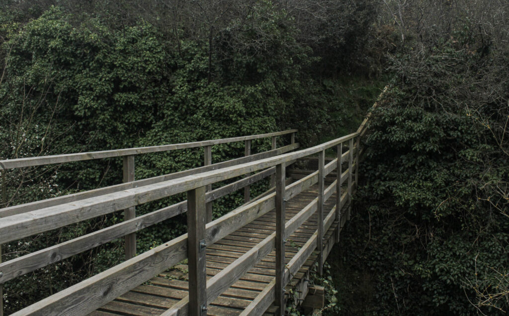
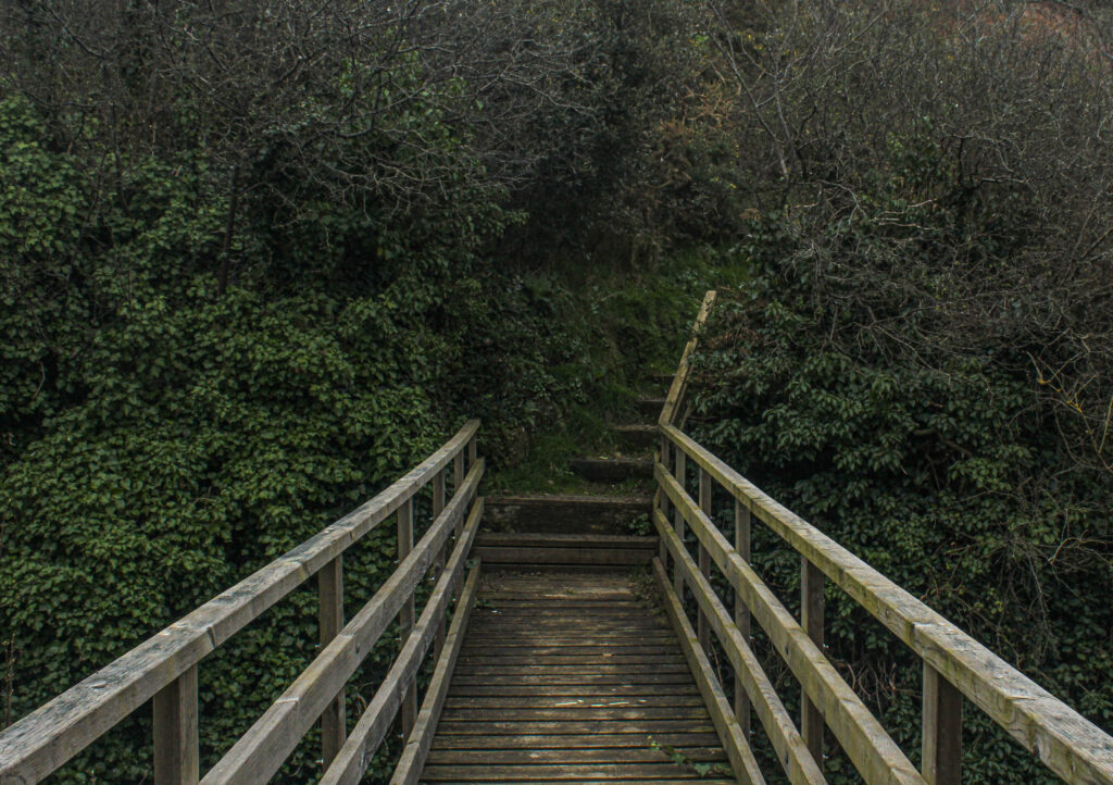
I have put these two images next to each other to compare them in a way as I’m not sure if both of them are worth being final outcomes for my photobook. They have both been edited to enhance certain parts of the image. I like the left image as the bridge starts from the bottom left corner and flows throughout the image to the top right corner as it gets further away. The image on the right I like the composition as it was taken from above, birds-eye view.
Comparing work
My Image:
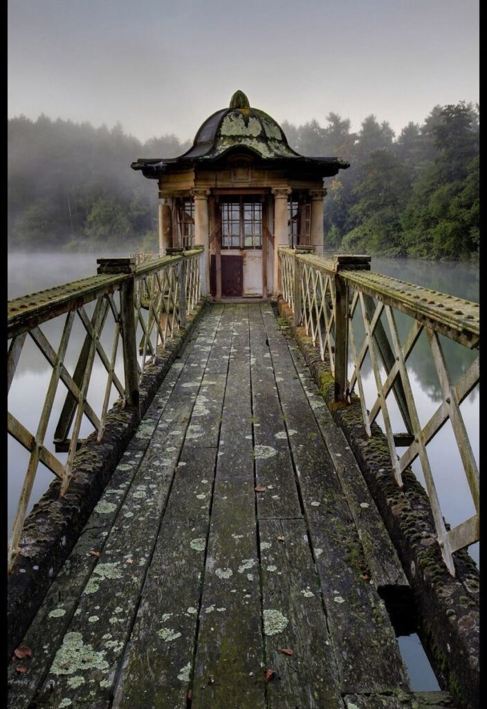
Matt Emmetts image:
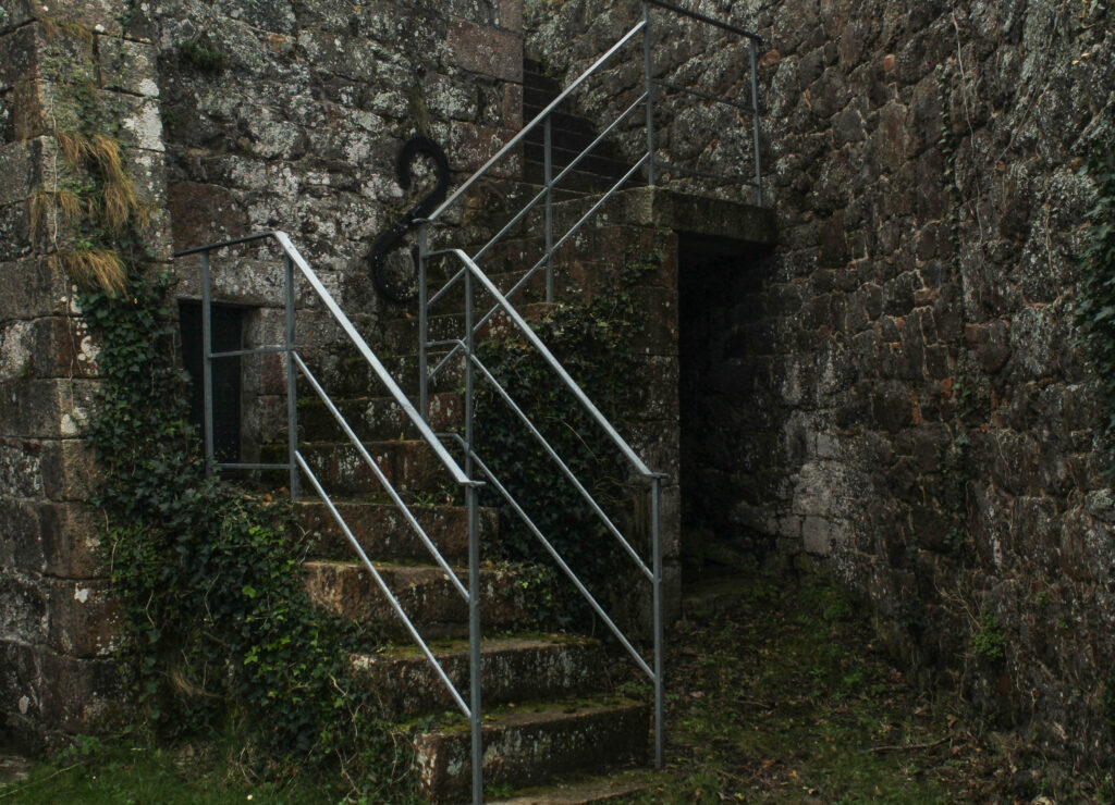
I chose to compare my image with this one of Matt Emmett’s as I think they resemble each other in a few ways. Firstly, the most obvious element being the old, mossy bridges in the centre of both images. In Emmett’s photo, the bridge leads to a very run down, rotting hut. It appears abandoned and worn out. On the other hand, in my image, the bridge ends and leads to a flight of stairs. In Emmetts image there seems to be a backstory to the image because of the leading bridge to the hut, whereas my image is more discreet, not showing where the stairs lead to. In Emmetts image, the surrounding background consists of a misty lake with the sky reflecting onto the water, bringing a lot more lighter tones in. My image is covered in the dark green leaves which create darker tones.
My photo book layout is inspired ‘The Illusion Of An Ever Lasting Summer’ by Alessandra Sanguinetti. I like how in her book there is mostly only one photo on one page of a spread as i think it allows the viewer to really look and focus on the image which is in front of them and to appreciate the image without getting distracted by another. Furthermore, all the images in this book have a white boarder around them. This is something that I have taken inspiration from, however, don’t want for all of my images as I would like to add some differentiation into my book by using a handful of double page spreads and some images in ‘full bleed’ meaning that it will cover a whole page with no boarder. I am further taking inspiration from the hard copy from Alessandra Sanguinetti’s book.
Alessandra Sanguinetti- The Illusion Of An Everlasting Summer
My Book
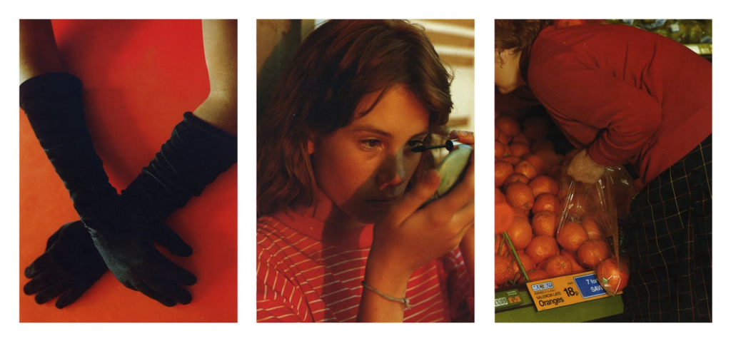
In addition, I have also taken inspiration from Nancy Honey’s book ‘Woman To Woman’ as she sets her images out in tryptic formats, therefore I have some one of my final print lay outs in a tryptic format.
For example this image was originally dull, dark, and doesn’t have anything really clear to look at in the image.
By exposing and contrasting the images features a lot more, with adjustments of highlights and a bit of clarity the image started to look visible and more aggressive. This was one of the type of styles I was aiming for:
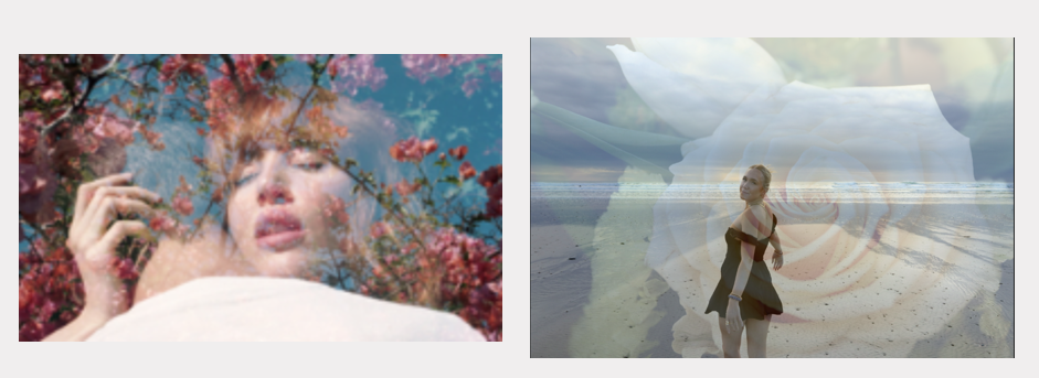
Here I used the same features as I did with the first photoshoot edits, as I did this throughout most the images. The other type of style I was aiming for was, a soft, grainy, hazy feeling.
By increasing sharpness and “noise” of the image it created a type of “memory” affect, where you would have an unclear look and feeling about what the image is or where it came from, but is recognisable.
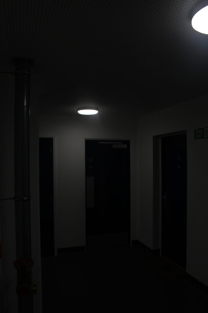
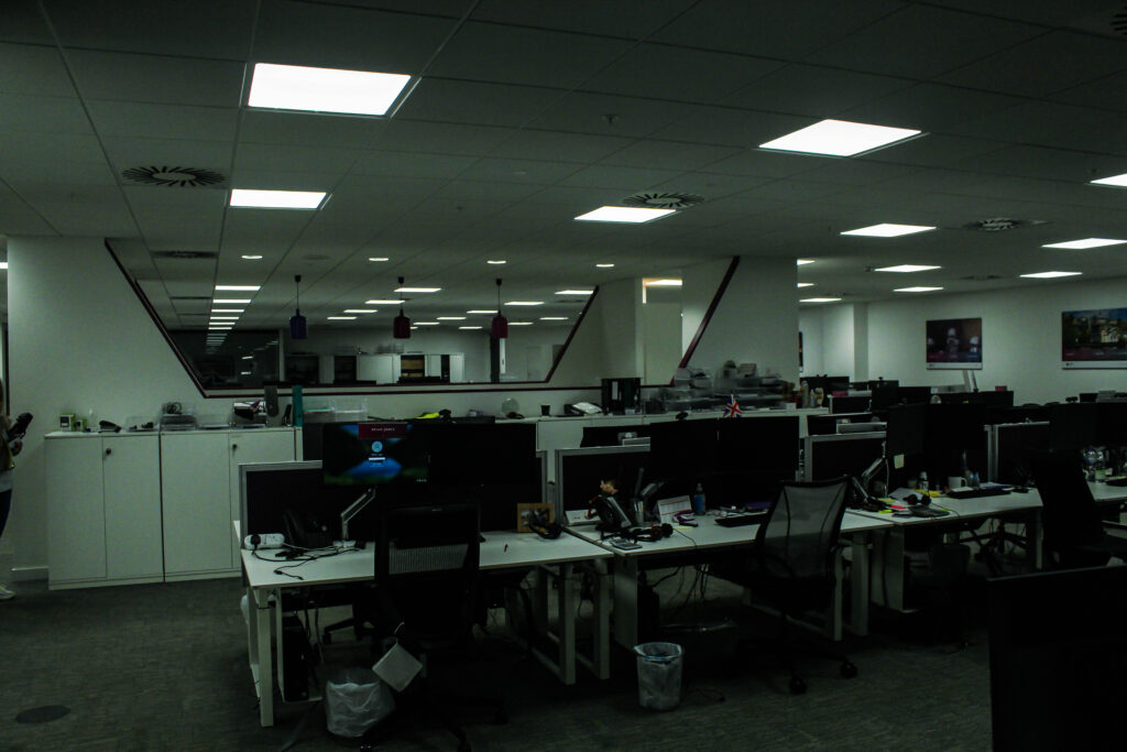
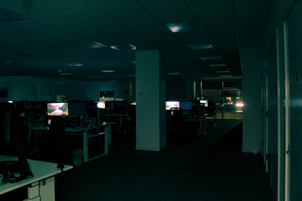
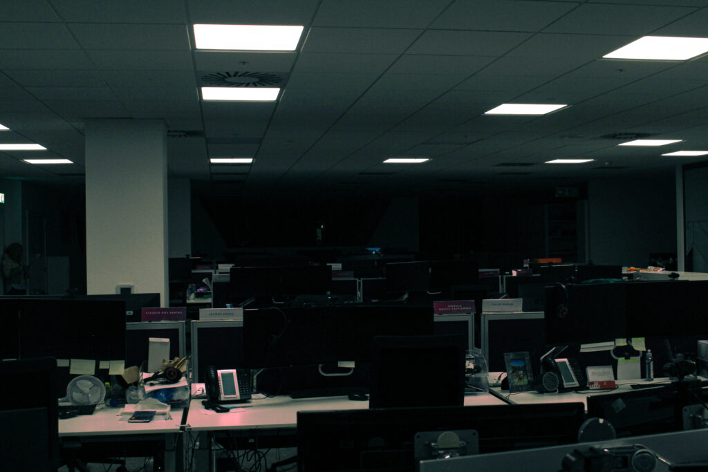
My images switch from abandoned areas which aren’t accessible, to slightly more accessible familiar places like office buildings, which people don’t really see during the night or closing hours, which will make the space seem uncomfortably familiar because of its empty essence.
A theme of editing that I held consistently in my images was a type of “vintage” or “Distant memory” style, by simply using high contrast, and making the Mid-tones slightly green, and the shadows slightly baby blue. This would create a cold vintage look. However with my warm images:
I would use more Red, pink, and orange colours for the Mid-tones, shadows, and highlights.
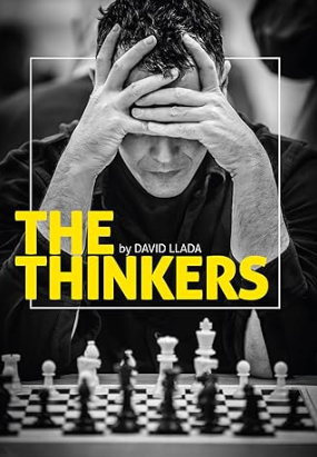
The Thinkers is a visual tribute to the game of chess, showcasing the emotions, exertions and desires of the players, and conveying the mental intensity only chess can command. It includes some of the most iconic portraits of today’s stars, as well as emotive shots of ordinary players from all over the world, with photos taken over the last five years in venues such as Mombasa, London, Chennai, Las Vegas, Baku and Sao Paulo. Llada’s photographs capture the full richness and drama of the game, making this the most visually stunning book ever devoted to chess.
“David Llada’s pictures are full of life, and they are colourful even if black-and-white. Precisely as the game of chess itself.” – GM Emil Sutovsky, ACP President
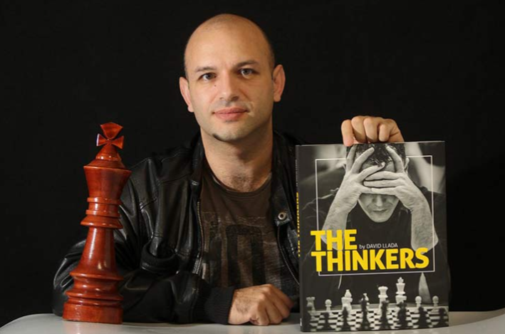
About the photographer
David Llada, born in Spain in 1978, has always been connected to the chess world, first as a professional chess journalist, publishing his contributions in all the world’s major chess magazines. In recent times he has earned a reputation as the chess photographer, working as Official Photographer at the three most recent Olympiads.
Llada’s intention towards creating his book was to help promote chess through his pictures with his main audience being people who were already interested in the game, making it one of the more renowned chess books on the market. The publicity the book got, however, helped to boost the acknowledgement of it with journalist brands like Wired and First Post making articles about him.
‘I am very surprised by the welcome it had, not within the chess community, but in general media.’ – David Llada.
Narrative, concept and design
‘The Thinkers’ is a hardcover book with a mix of photos being in colour and in black and white, overall having 208 pages in total with the paper quality being smooth. The book itself is published by ‘Quality Chess’ on the 16 November 2017 and is 31x24cm.
The thinkers is more of a literal title due to the people being photographed are those concentrating during a chess tournament, showing the emotions each player goes through with their own games.
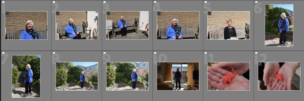
These are the images I have flagged and chosen to edit
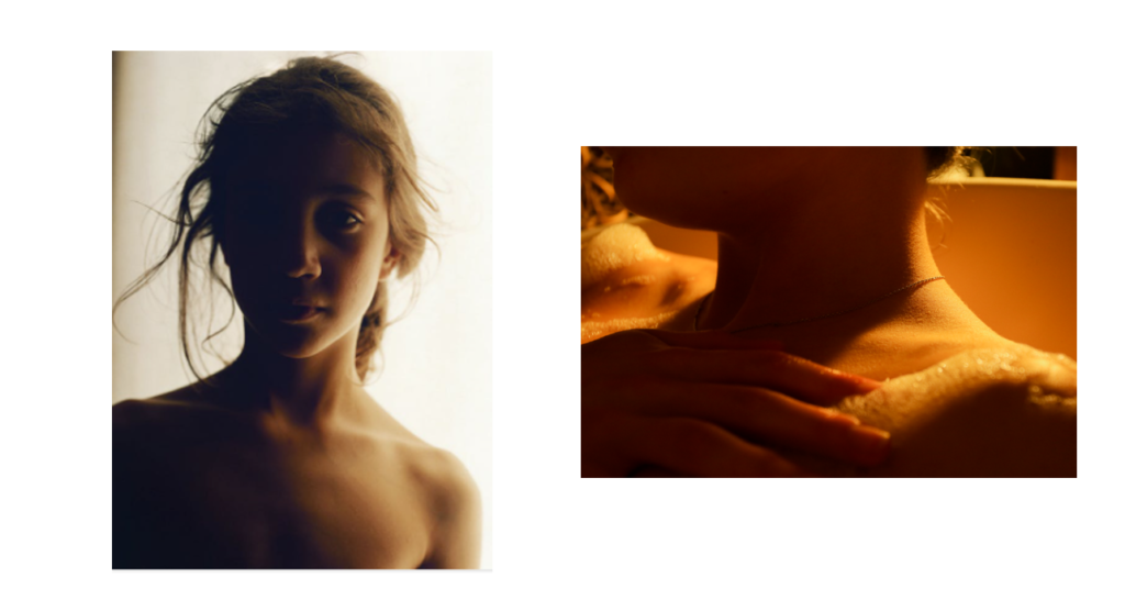
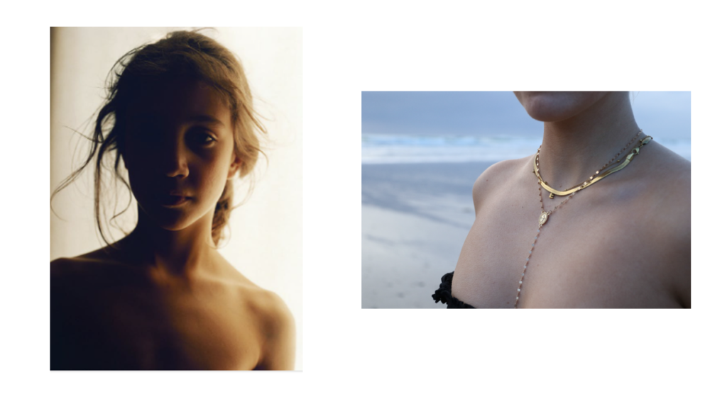
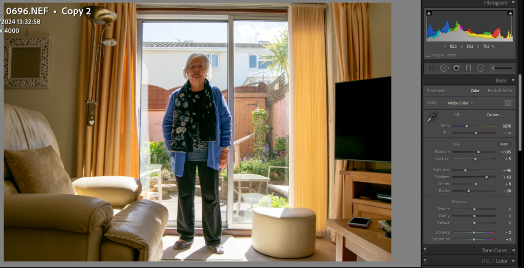
When editing these images, I chose to place her on the right third to create a better composition than if she was slightly too far to the right. Larry Sultan did this in his work and it inspired me to try it.
Image before editing
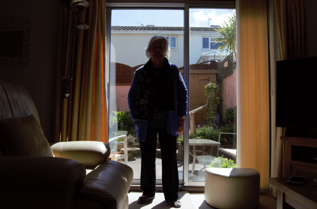
I struggled to edit this image because of it shadows and under exposure. However, after making three virtual copies and comparing and contrasting what was best to adjust, such as exposure, lifting shadows and lowering highlights, I came to this edit as a conclusion. I still don’t think the image is quite right because there is so much backlighting, however I find it cerates a vignette around her and the lighting adds a sense of drama, similar to Sultan’s images.
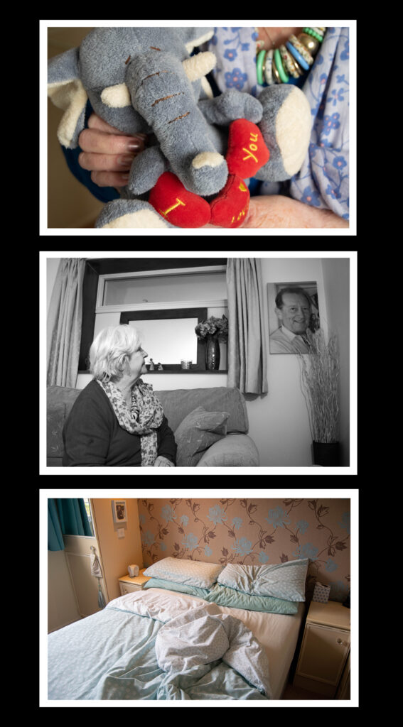
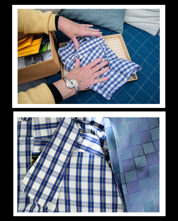
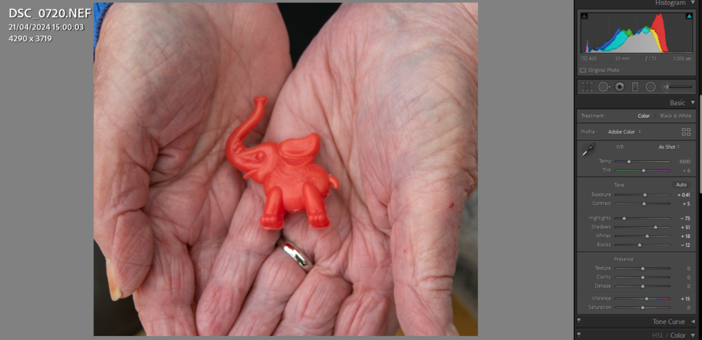
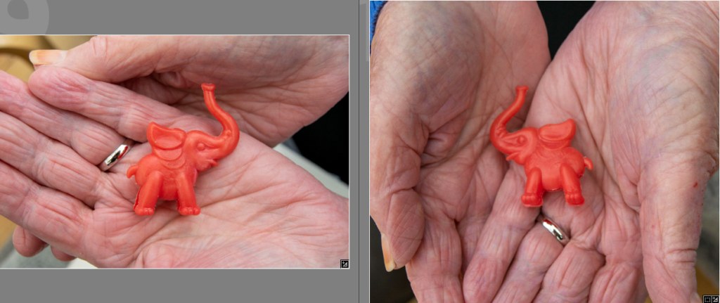
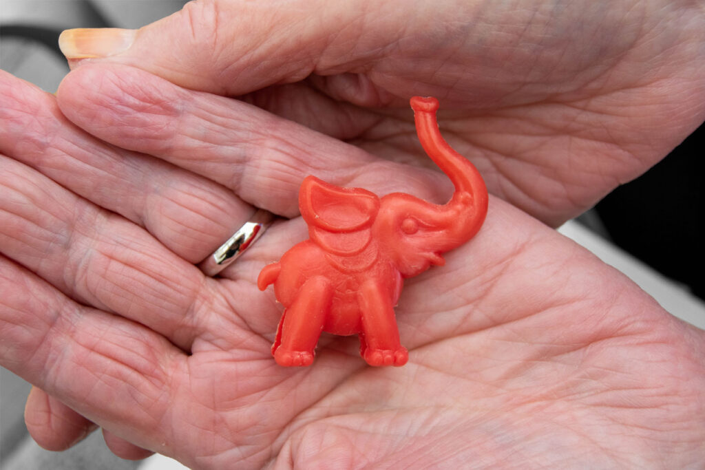
I wanted to take an image of this elephant, however I struggled to find a way to frame it because it is so small. I decided that photographing it in my gran’s hand would be the best because it shows whose it is, and links to my other hand images.
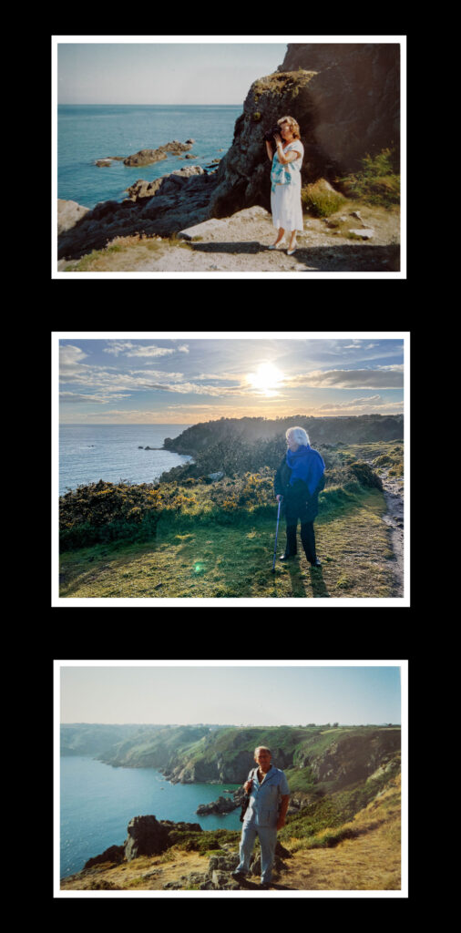
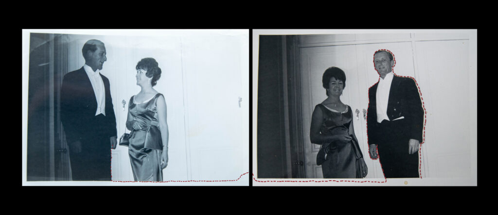
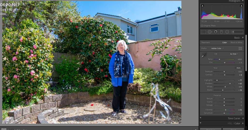
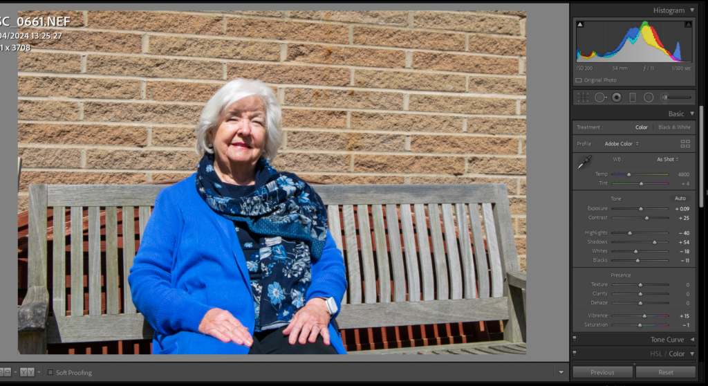
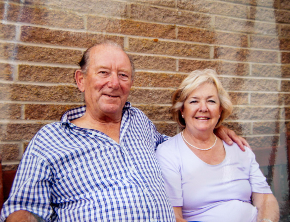
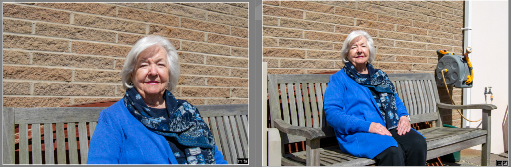
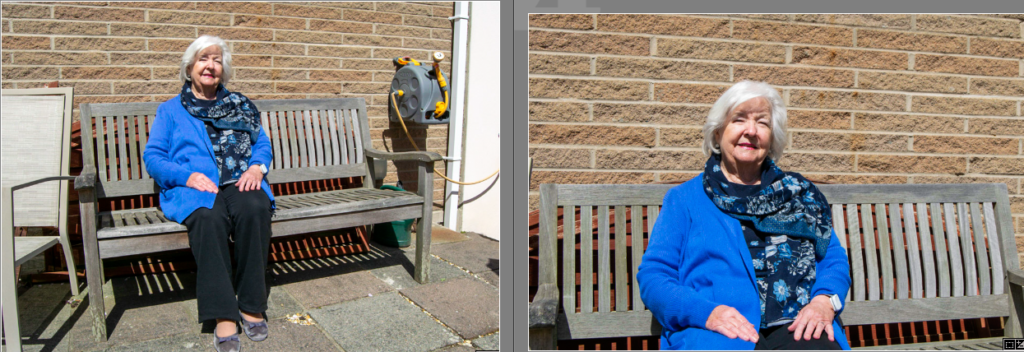
I took this image to compare with another image of my gran sat on this bench with my grandad. I think it is nice to show how she is still happy even though he is no longer here, and I may start with the photo of them both, and end with this one. The lighting was natural in this, so for editing I focused on correcting the exposure, adding a small amount of shadow for the depth, and brightening up her jumper with colour correction.
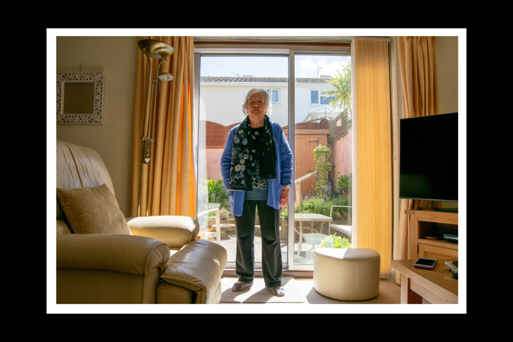
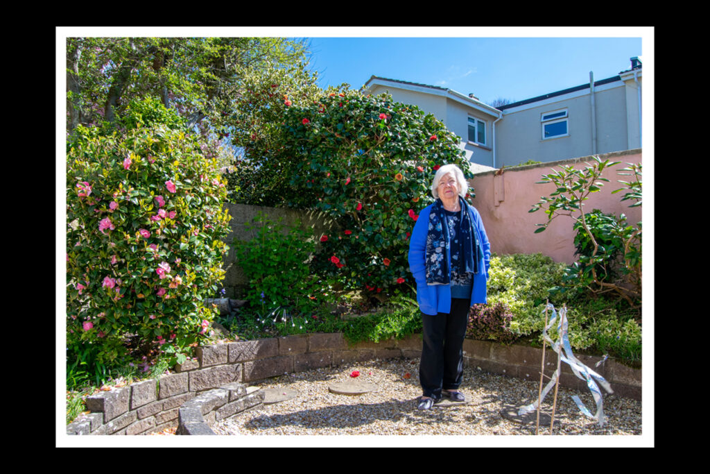
All images – I won’t be using ever image here, but the images that fit best on the pages and with other photos.
Photoshop editing:
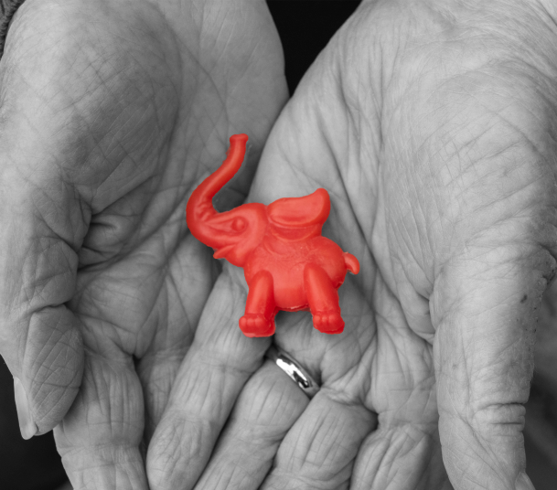
I experimented with turning everything black and white, apart from the elephant. However I don’t like it.
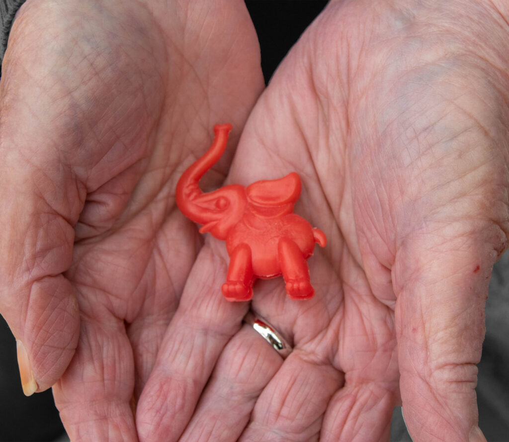
This edit is more subtle as only the background is black and white. I will try it with my other image.
I prefer it with this image because you can see more of a difference when the background is black and white.