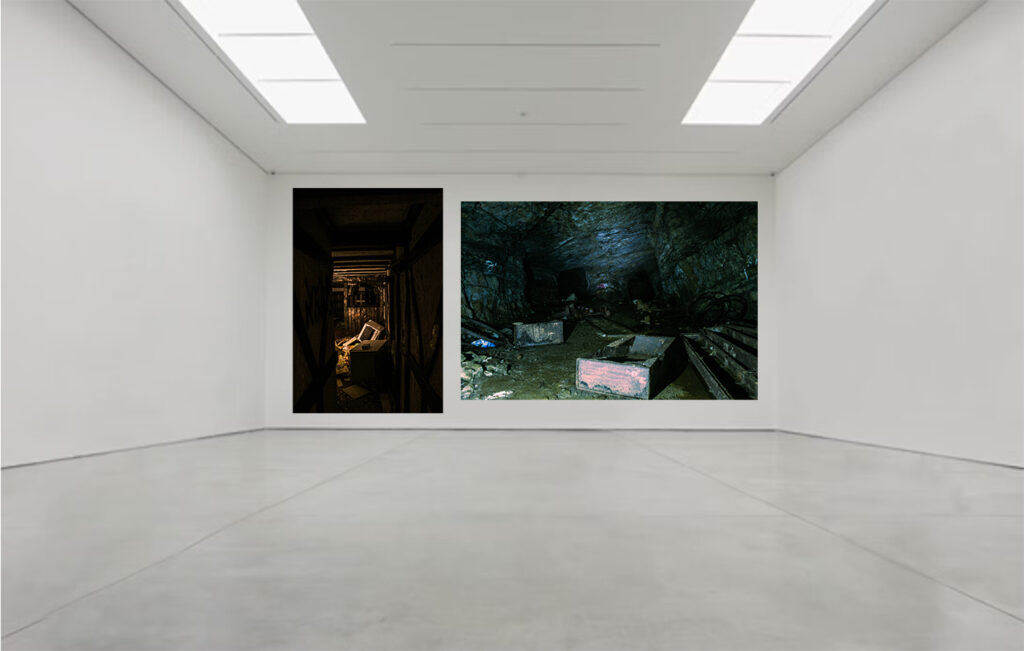
These are personally my most eye catching images, which show strong texture and colour grading. I contrasted these two images on here because one has a perspective of observing through a hallway, like a frame, and the other has a wider point of view which observes fully though the lens. Both of them include a type of style to the image, and are using similar subjects of broken decaying equipment, both include high contrast between the lights and the darks.
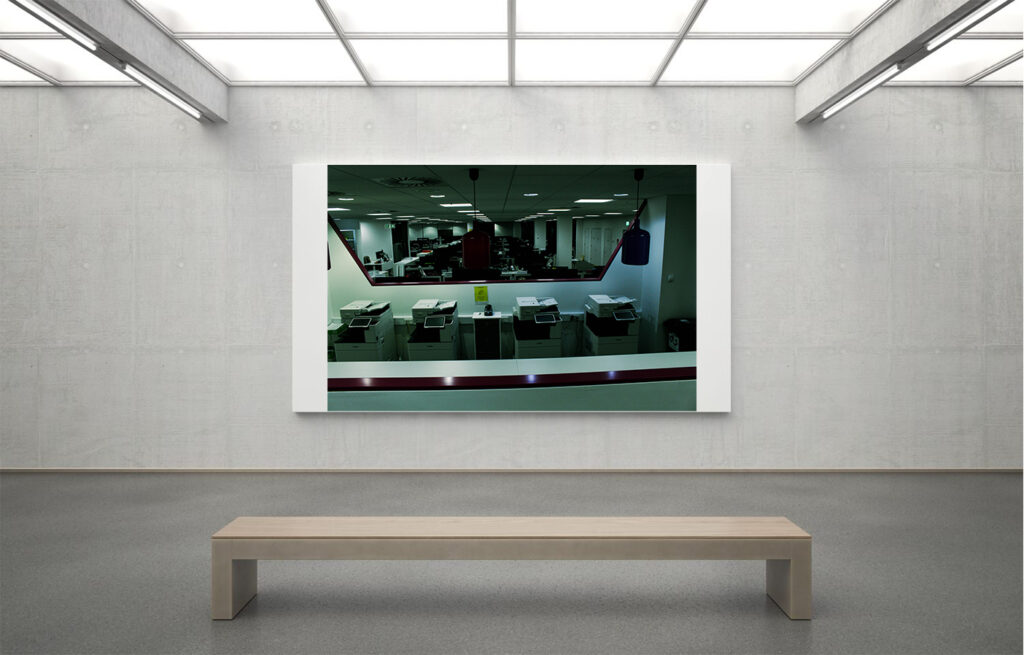
I like this one because of its intense contrast between light and dark colours, but also how the depth of view is strong and uses repetitive features, like the printers, desks, and lights. The depth of view gives a very disorienting feel to the image, but because of its dark features at the end of the office, it can create an unsettling feeling for people.
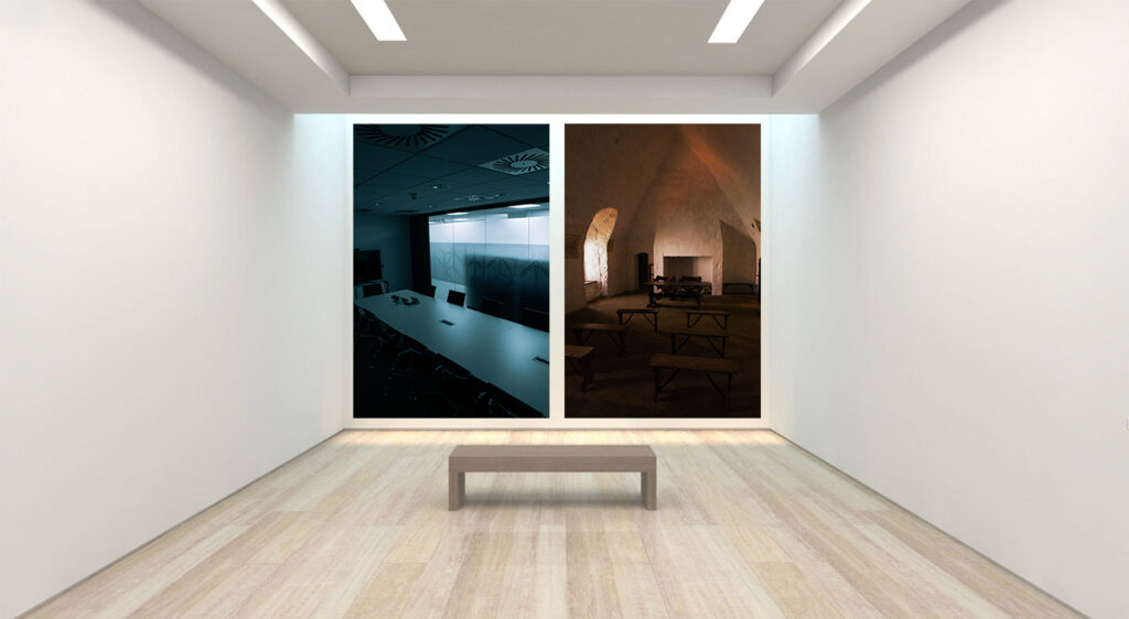
These Images contrast each other very well with their feeling they present. Both I believe are capturing the environment perfectly, where the cold image shows an empty conference room, and the warm image shows an empty church like, dome environment. They both contrast in the type of lighting they use, the cold one with artificial, and the warm one with natural lighting.
These images work well because of its use of lighting, and high contrast. I think that in the colder image it shows more of a professional area, and uses high contrast and depth through a “window” like view. And the other is very docile, has lots of shadows, in an empty area, as if it is, and isn’t supposed to be there at the same time.
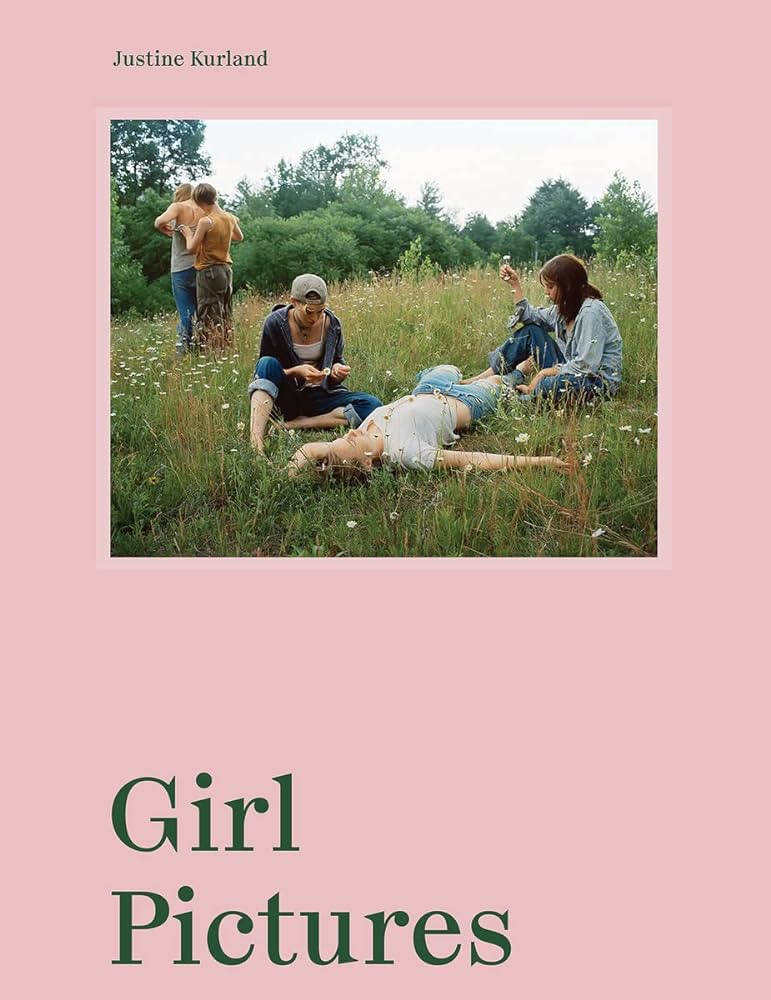
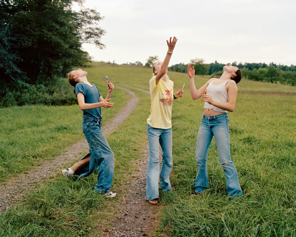
“The girls were surrogates for myself, from a time before I had made certain choices and accepted responsibilities. It’s a time when all things are still possible and being wayward is a form of rebellion, even freedom,” explains photographer Justine Kurland on why she focused on young women and teenage girls for her now-iconic series Girl Pictures.
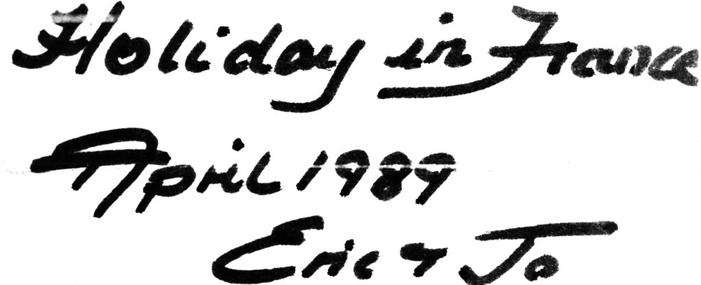
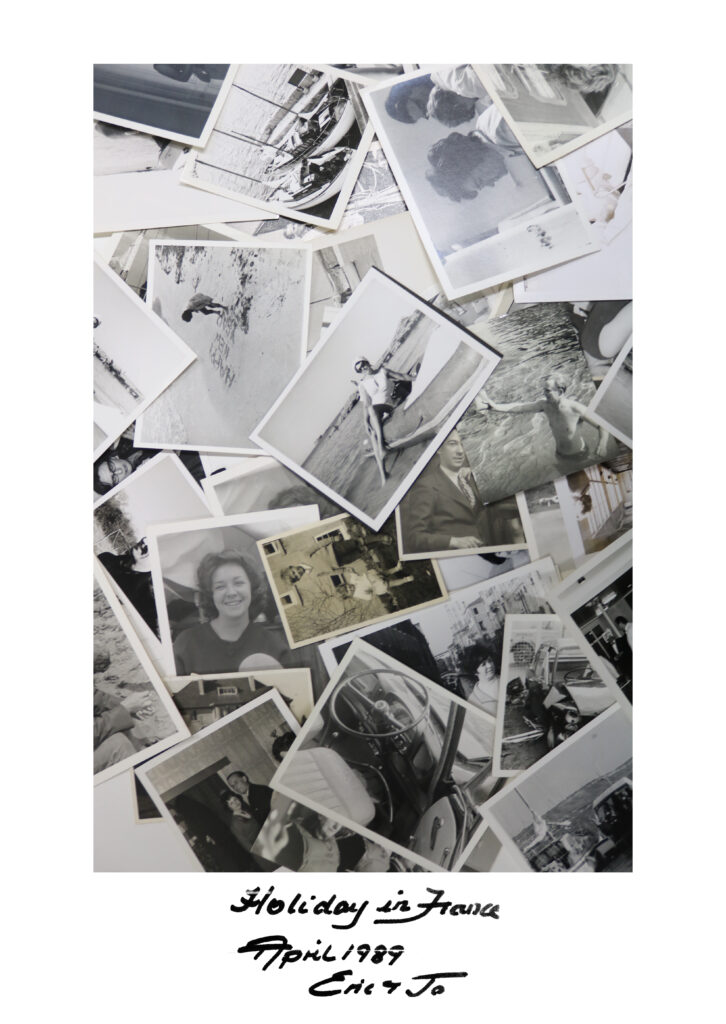
RESEACHING THE PHOTOBOOK:
‘In the late 1990s, I staged photographs of teenage girls as surrogates for myself in a fantasy of a coming world, one where solidarity between girls offered intimacy and protection, where girls were made stronger through the presence of other girls. I focused on teenagers because of their perpetual state of becoming – a latency that resounds with the freedoms and simple joys of childhood. I wanted to foreground girls’ lives, centring them by creating an all-female society.’ Kurland wanted to present this idea of young teenage girls and how this sense of girlhood is connected by strong bonds and trust girls feel within each other during this period in their lives, where friendship is strong. Kurland used real people as subjects rather then models to try and recreate her childhood fantasy, whereas usually with models you are trying to present something rather then telling.
While Kurland is trying to reinforce this feminine utopian world she is also trying to show the impact of female intimacy and how girls are able to strengthen and support each other whereas individually they are seen as vulnerable and weak, the feminine stereotype. While Kurland trying to highlight this teenage fantasy and support the girls she is playing into the dominant ideology of females. Laura Mulvey states that women are represented for the visual pleasure for the male sex, Kurland supports this theory by representing the girls in a hyper-feminine stereotype; playing in flower fields which have connotations of pure and delicate, girls getting ready in the bathroom perhaps for a night out makeup is stereotypically products for females and they are wearing elegant, earthy colours which men would not stereotypically seen in. This shoot may target a wide range of audiences including: paedophiles, advertisers, recruiters, social-media influencers, fashion magazines, due to the fact they all traffic in photo media.
IMAGES INCLUDED IN PHOTOBOOK:
HOW DID KURLAND MAKE HER IMAGES:
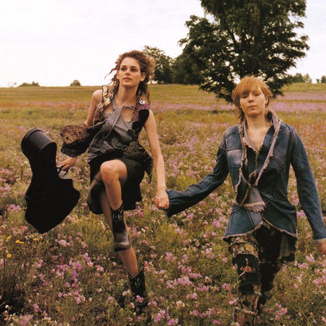
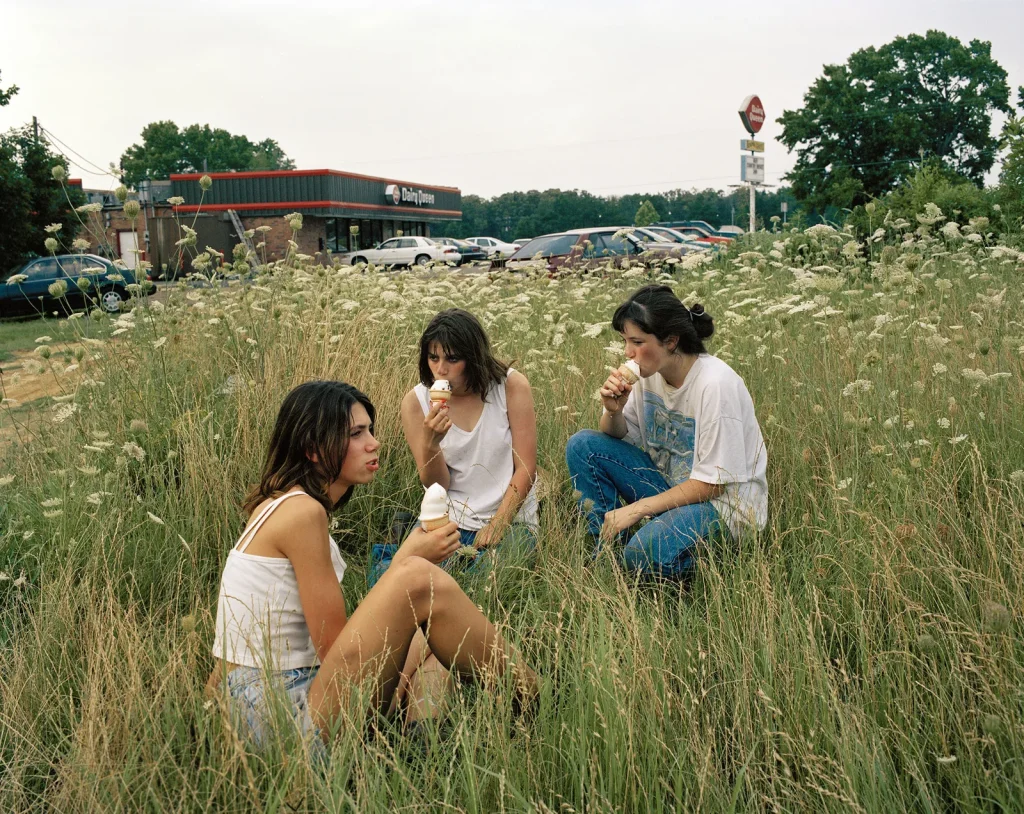
Kurland stated in an article that she ‘photographed on extended road trips across the US, scouting locations and finding girls along the way. The girls would collaborate in staging the scenes. The landscape offered its own drama: the dense undergrowth in the South, the gentle roll of the Midwestern prairie, the shrill light of the Southwest and the expansive vistas of the West.’ Kurland took inspiration from utopian ideals as well as genre paintings, and the photography of Julia Margaret Cameron and Mathew Brady, while also illustrations from fairy tales.
PHOTO ANALYSIS:
Emotional Response:
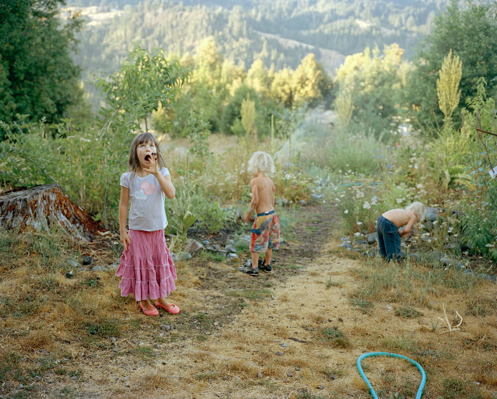
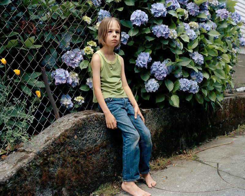
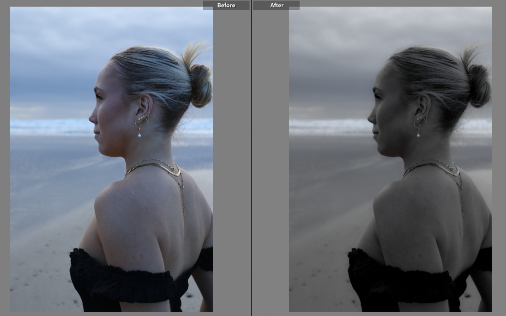
In this picture Kurland presents femininity through teenage girls and coming of age girls. This image brings nostalgia through looking back reminiscing when at some point all girls were this young. The young girl present this idea of growing up and exploring her identity and how she experiences girlhood as an individual. The use of the colours green and blue, allow the audience to feel a sense of new beginnings and growth as well as freedom and sensitivity.
Visual – what we can see in the image
The mise-en-scene in this image shows a young girl sitting on a rock wall surrounded by hydrangeas. The girl is placed in the centre third of the image, clearly making her the focal point. The connotations of green are new beginnings and growth which can be symbolic of how young the girl is and she is not growing into herself and embracing her personal identity, furthermore the blue/purple hydrangeas bring connotations of wisdom, inspiration, mystery and femininity. The image seems to be taken with natural lighting in an secluded alley which gives an isolated aesthetic and feel to the image.
Contextual – who, when, where etc…the story, background, impact:
Kurland took these pictures as part of her project ‘Girl Pictures’ which have created a large impact for teenage girls. Kurland used these girls as a surrogate for herself so she could present her fantasy of her interpretation of girlhood. Kurland took many road trips in a van and she stated in the Vanity Fair article “I could find girls wherever I stopped, but they went home after we made photographs, while I kept driving, my road trips underscored the pictures I staged—the adventure of driving west a performance in itself.”
A sentence: An exploration of hysteria and madness of women, challenging the stereotypes of women’s mental well-being
A paragraph: My photobook will be an investigation of hysteria through self- portraits and landscapes, taking apart the idea of madness and portraying it in a personal way. My photos create an unnerving atmosphere that can be attributed to hysteria and madness, challenging historical views surrounding these issues.
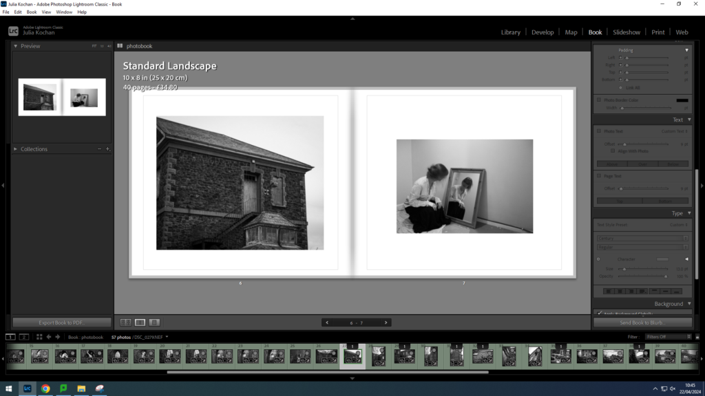
How you want your book to look– I want my book to be simple, including both text and photographs. My photos are all in black and white, so I would like to follow this theme of simple tones.
Designing my Photobook in Lightroom Classic
Paper and ink– Premium lustre paper- it is semi glossy which is suitable for my photobook.
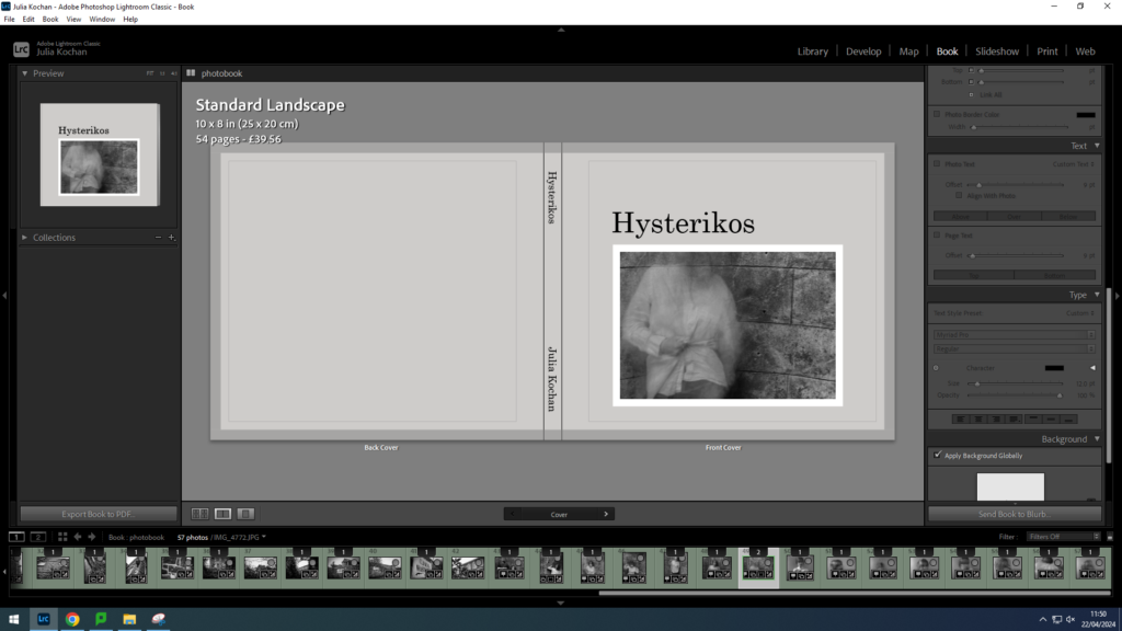
Format, size and orientation– Standard landscape format (10 x 8 inches)
Binding and cover– Hard cover image wrap
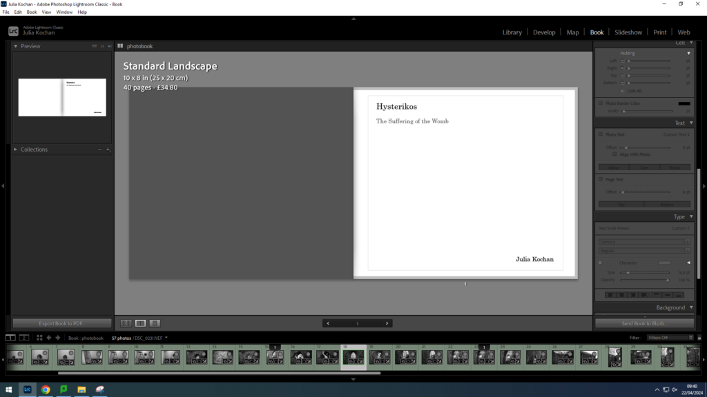
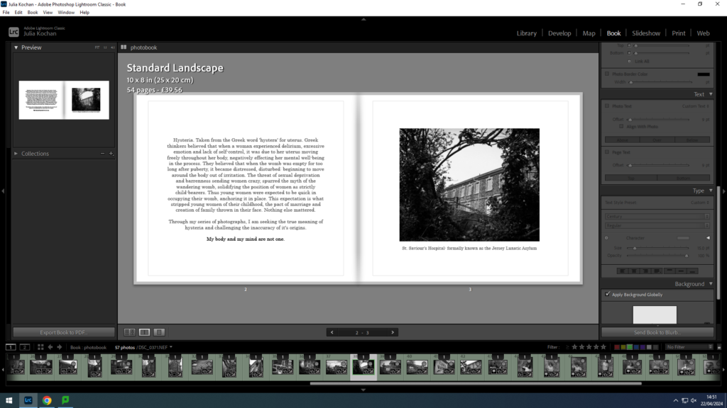
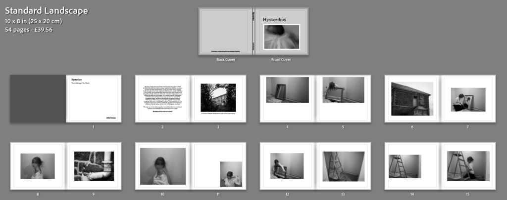
Title– Hysterikos (the suffering of the womb in Greek)
Images and text– I will use images from all my photoshoots, starting with photoshoot one, following with photoshoot 4 and ending with photoshoot 2. The landscape images of St. Saviour’s hospital will be scattered throughout, with a spread of two images between each photoshoot. As for text, I will include an introduction to my project at the beginning of the photobook, this being:
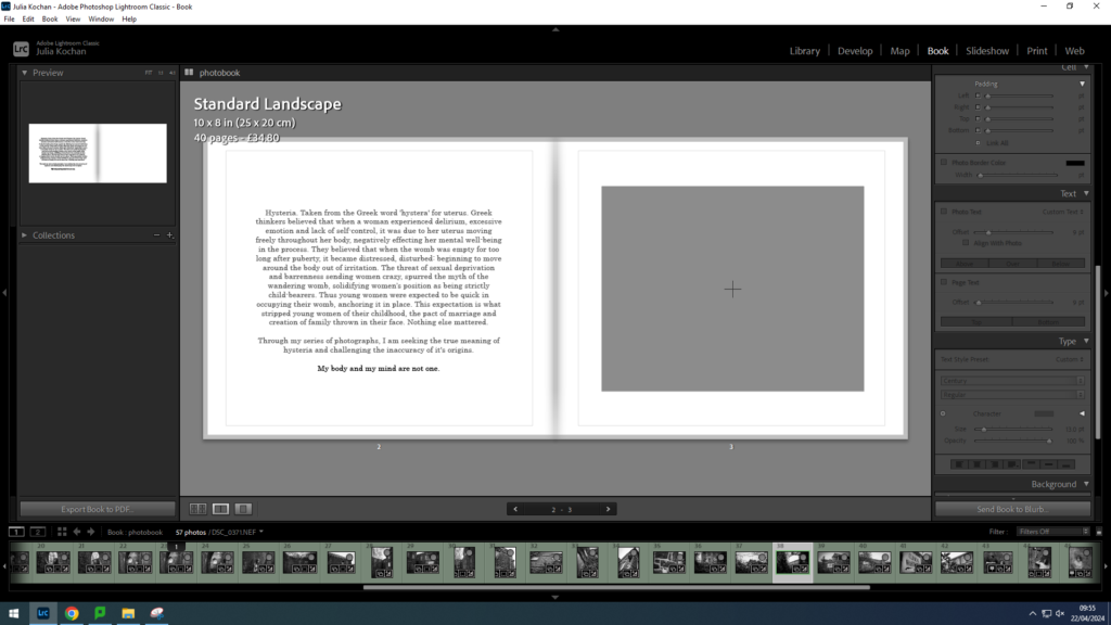
Hysteria. Taken from the Greek word ‘hystera’ for uterus. Greek thinkers believed that when a woman experienced delirium, excessive emotion and lack of self-control, it was due to her uterus moving freely throughout her body, negatively effecting her mental well-being in the process. They believed that when the womb was empty for too long after puberty, it became distressed, disturbed: beginning to move around the body out of irritation. The threat of sexual deprivation and barrenness sending women crazy, spurred the myth of the wandering womb, solidifying the position of women as strictly child-bearers. Thus young women were expected to be quick in occupying their womb, anchoring it in place. This expectation is what stripped young women of their childhood, the pact of marriage and creation of family thrown in their face. Nothing else mattered.
Through my series of photographs, I am seeking the true meaning of hysteria and challenging the inaccuracy of it’s origins.
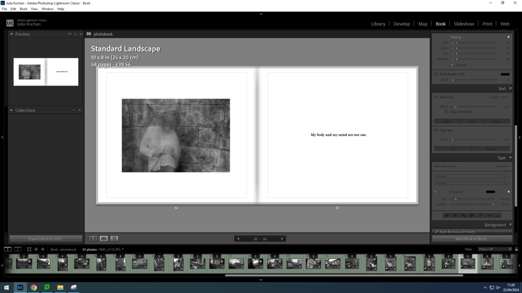
My body and my mind are not one.
Cover layout
Idea 1
For this idea, I wanted to keep the cover simple, with one of my faceless pictures present on the front cover.
text settings for the title
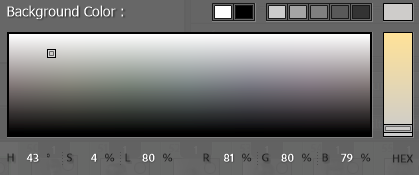
the delicate grey colour I used for the background
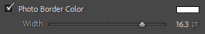
I decided to add a white border to the photo
Idea 1
Idea 1 with a different picture- would mean same picture is used for the ending and beginning
Idea 2
I experimented with a double spread for my cover however I don’t think this is a suitable or effective idea for this photobook.
Idea 2
Final Idea
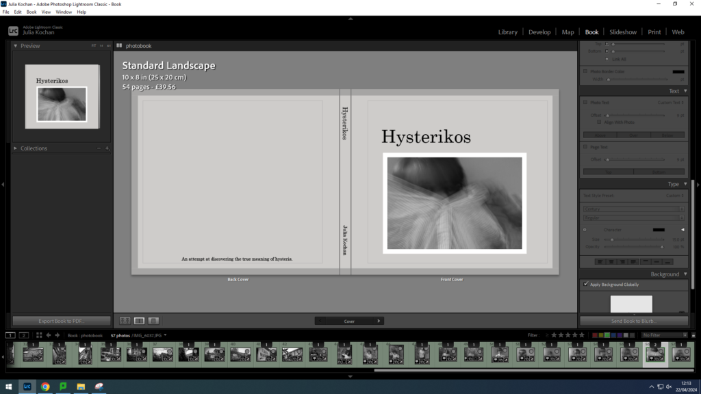
I decided to go with idea 1 for my final cover, sticking with the initial picture I put. I chose this faceless image to give a taste of what my photobook contains without giving away too much. I made the title clear and aligned it with the edge of the image. For the spine, I simply put the title and my name (in a slightly smaller font). However, I added a sentence to the back cover, acting as a short blurb, reading: An attempt at discovering the true meaning of hysteria. This adds a purpose for the back cover while still maintaining simplicity.
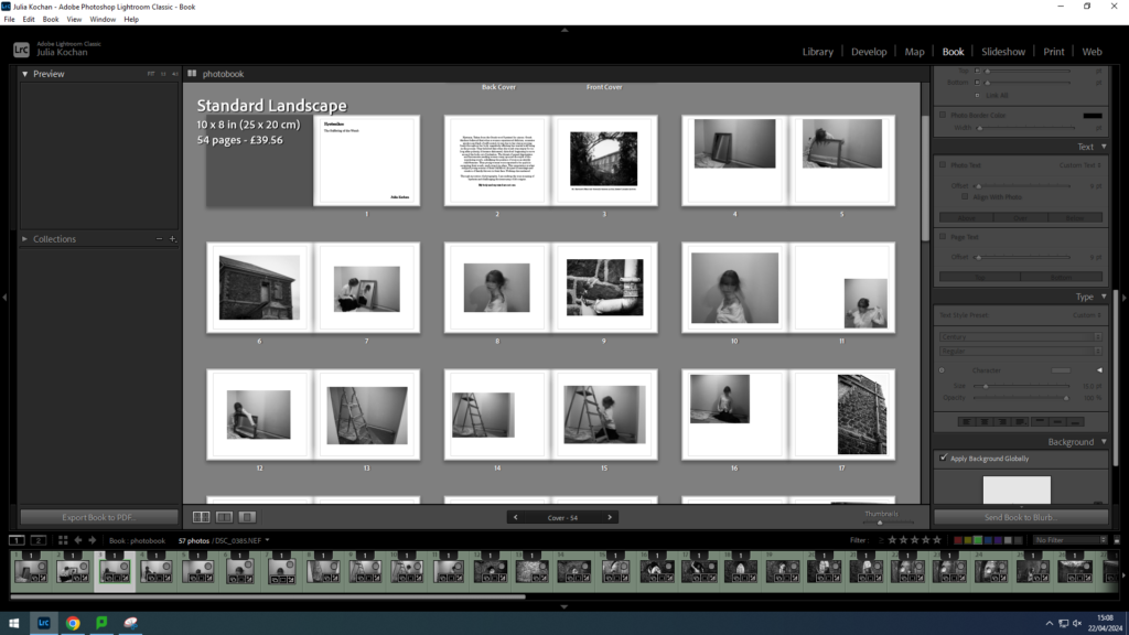
Image Layout
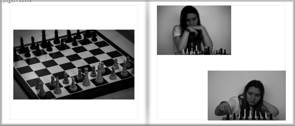
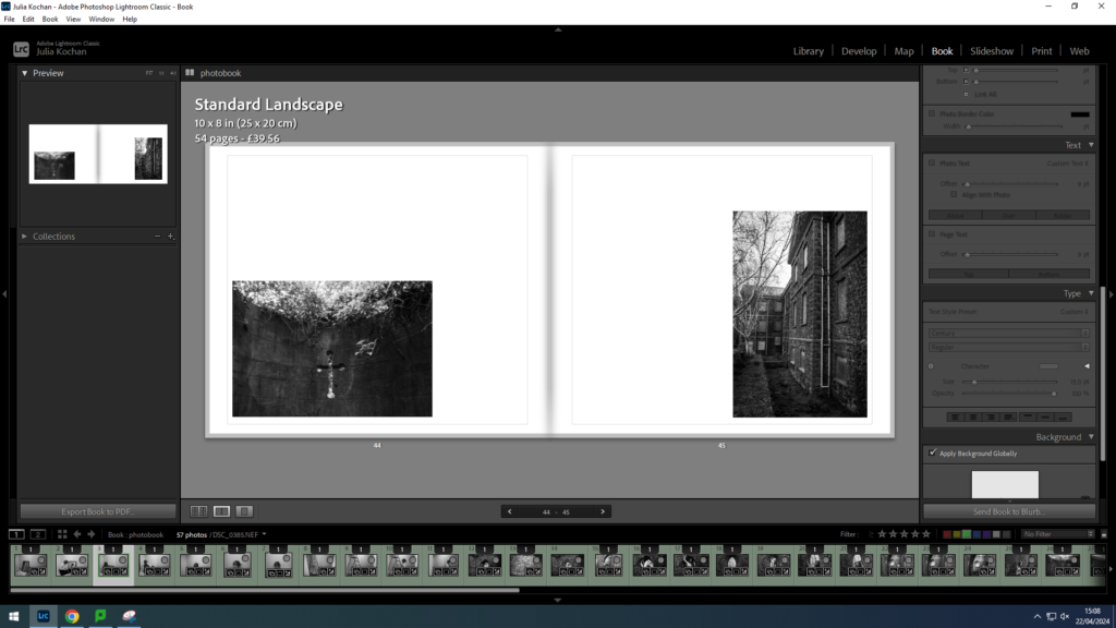
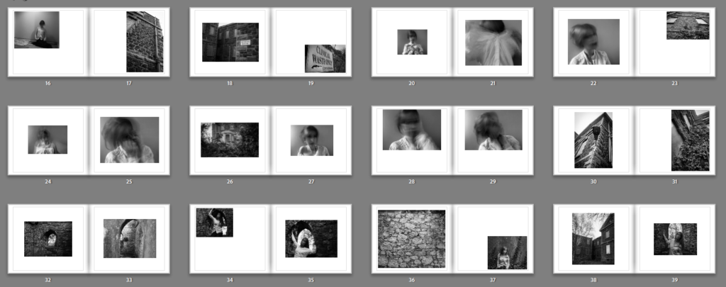
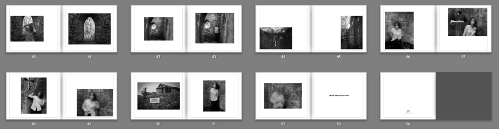
I decided to lay my photos out in order of photoshoot, with landscape photos separating them. For instance, I put photos from my first photoshoot first, with photos of the hospital appearing on some spreads. After I put photoshoot 4 and lastly photoshoot 2. This way it is organised with very different pictures every so often. I have decided to only do one picture per page, keeping a clean and simple layout throughout.
example of page spread with a non-traditional layout
I decided to try out different layouts throughout, keeping the arrangement simple however placing the photos in different areas around each page. For instance in the spread above, I decided to put the first image in the bottom left corner and the second image in the bottom right corner.
example of page spread with a more ‘organised’ layout
I did also do some more traditional layouts, putting each picture in the centre of the page. This layout is showing a image of the hospital contrasting with a self-portrait.
overall layout
This is a screenshot of the layout so far- presenting a mix of photographs from photoshoot 1 as well as some landscape images scattered throughout.
overall layout
A screenshot of the layout of photoshoot 4, beginning with a spread of landscapes.
overall layout
A screenshot of the layout of photoshoot 2, beginning with a spread of landscapes.
Text Layout
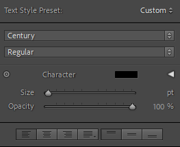
pre-sets for text- all text in font Century.
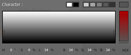
colour used for grey text, other text simply in solid black.
The first page of my book is going to be the title page. I decided to keep the text small and in the corner. The title, Hysterikos, is size 25, the translation size 18 and my name size 19. I also made the translation a grey, to indicate that it is not part of the main title.
I wanted my second page to have the main body of text- a short introduction to my project. It will be accompanied by a photo on the second page. I decided on size 15 so that it would be easily legible without taking over the entire spread. I decided to write the text in grey, except the last sentence which is in black since I wanted it to stand out.
On the opposite page, I inserted the first picture- which I decided to caption with the name of the place- hopefully giving insight to the significance of the place when considering my project. I wrote this in grey and size 13 so that it wouldn’t be distracting.
I also repeated the last line on the final page, once again in black and size 13. This will act as the ending, reemphasising the message in my photos.
Final Layout
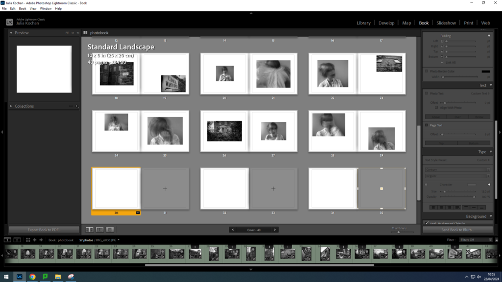
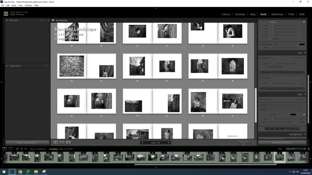
I ended up with 54 pages and I think my layout is effective. The pictures are quite abstract so I think it was a good decision keeping the layout simple. I made sure to try to arrange the photos in many different positions around the page, yet still keeping it to only one photo per page. I think the sequencing worked well, as I separated each photoshoot with the landscape pictures from photoshoot 3. Other than that, I decided to lay them out in the order of photoshoot 1, photoshoot 4 and lastly photoshoot 2.
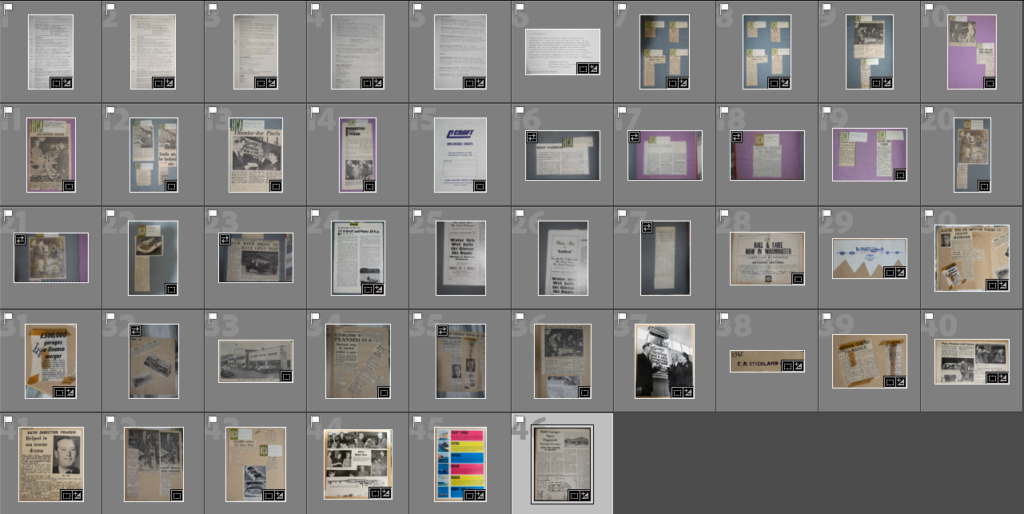
I retook images of my grandfathers scrapbook because I need clear photo to edit with. I experimented with flash and no flash to workout which gave the sharpest result. These are the selection of the best images.
For non shiny surfaces, flash gave the best result.
flash
no flash
Final selection of images – basic edits for photoshop edits
Photoshop edits
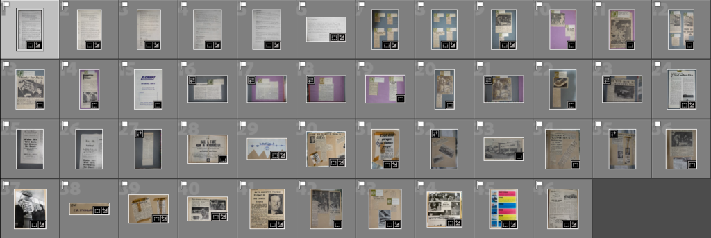
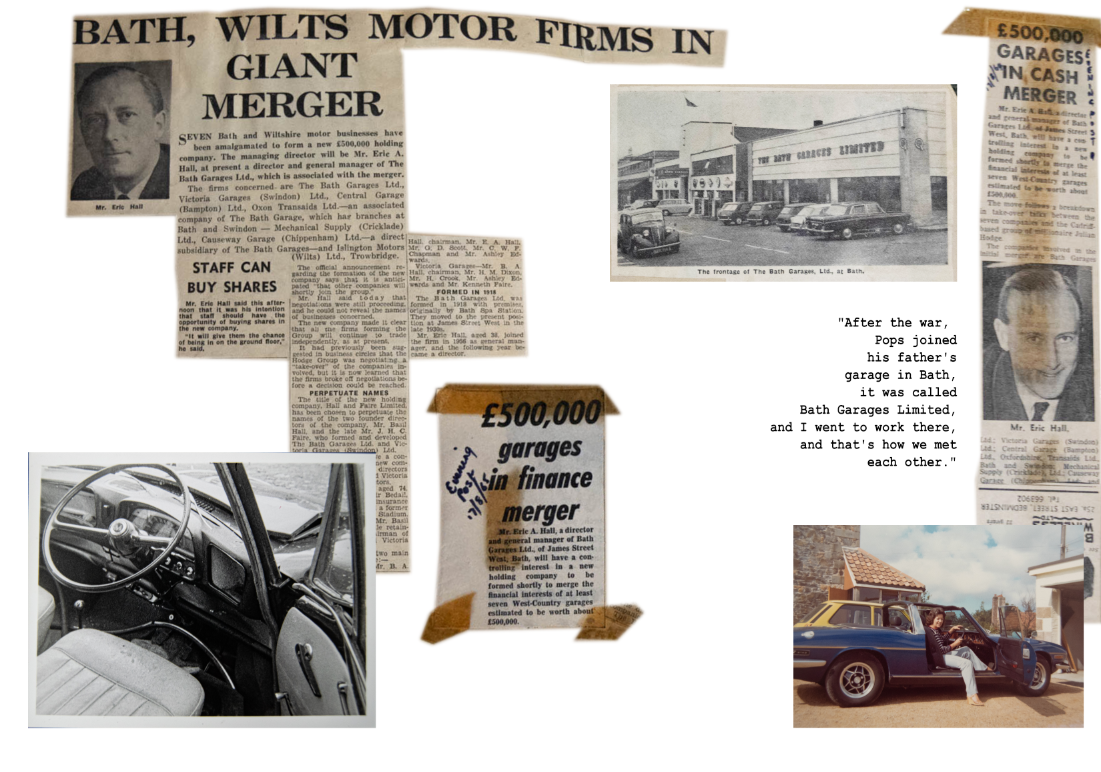
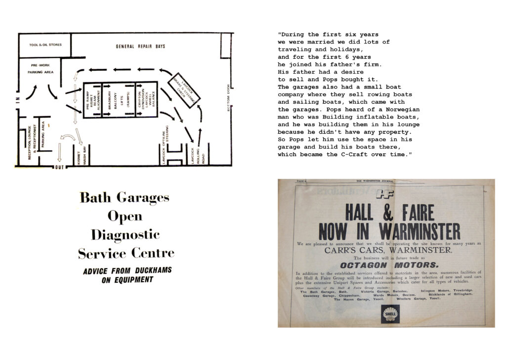
I want to make around 3-4 scrapbook pages because it tells the story of my grandad’s life, giving the viewer context. HIs work was also a key role in their life to providing them and influencing them to move to Jersey.
I will (roughly) make 2 on his garages, and 2 on his boat company.
When editing writing, I crop the section that I am going to use. I then remove the saturation, increase the brightness and contrast so that the background is whiter and the pen is as dark as it can go. Then I posturize it, which removes most of the background. I then re-adjust the brightness and contrast and it leaves just the writing.
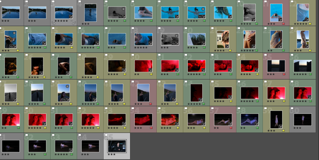
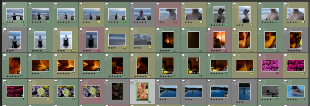
For the selection process I have flagged all the photos I like and them rate them on how good they are followed up by rating them with a colour on the probability of me using the image. This gives me a clear picture on how many photos I have and saves me from looking through all my photos.
Out of the 1000 photographs I took for this project I managed to cut the photographs down to 100 and then to a further 27 final photographs.
All my images have either been edited on Lightroom Classic or on Adobe Photoshop. When it has come to editing I have taken my time on them to make sure that I am editing them in a way in which reflects well on the photograph and and complements it.
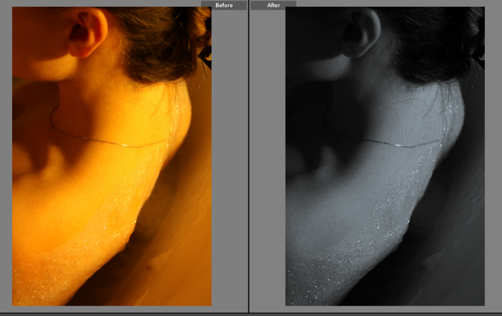
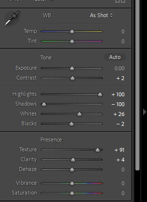
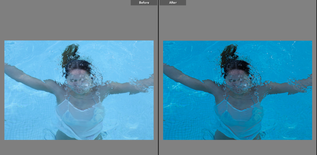
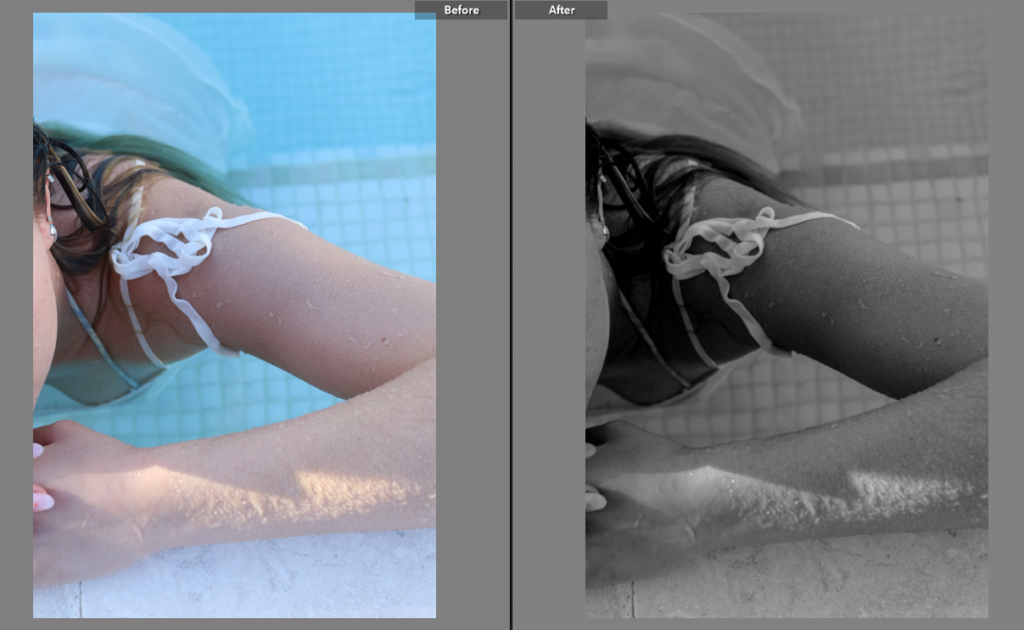
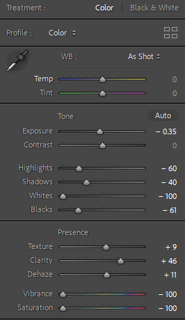
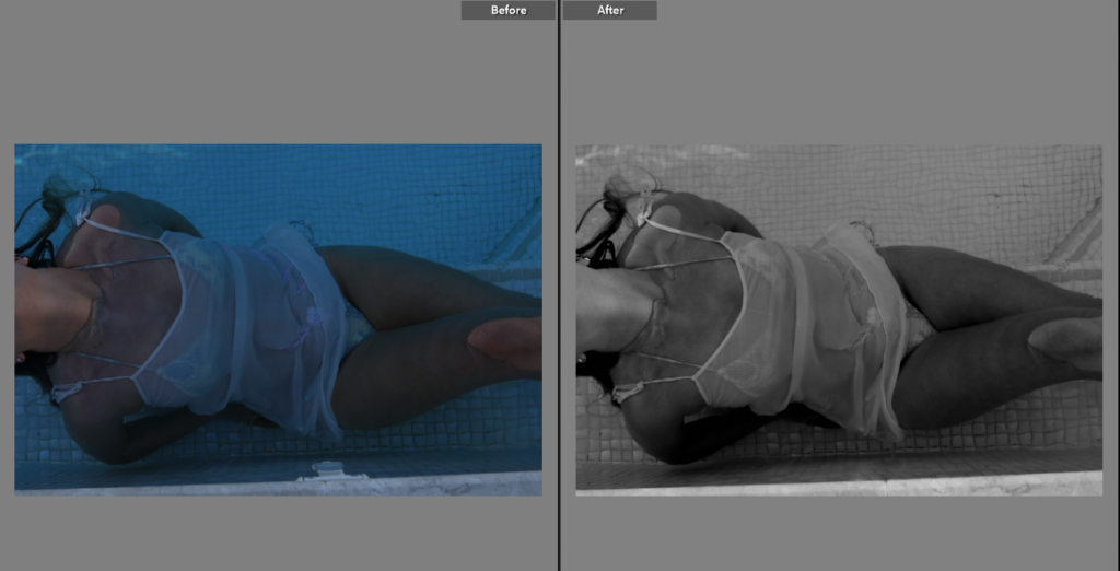
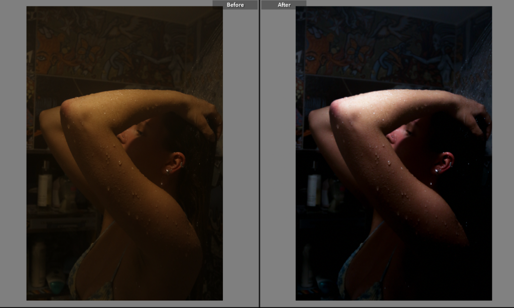
The photographs below except the last two photographs were edited on Lightroom with the majority of the photographs I was focusing on the highlights and shadows on the the people to highlight textures primarily on the skin and cracks in the body. On some of the photographs I used the spot correction tool on Lightroom to get rid of unwanted things like the pool clips and dirt in the bottom of the pool.
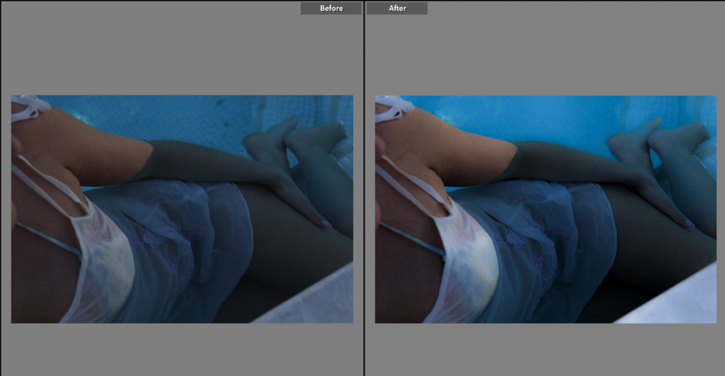
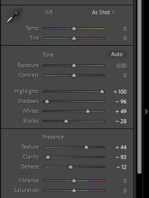
I used Photoshop to edit these images I used the wetting which adjusts the sky, I did this to add more depth to the photograph as the sky was dull that day making the photos gloomy after I adjusted the sky I then brightened up the photo to make it match with the sky.
I did the same thing to this photograph as the one above, changing the sky and adjusting the brightness which changed the whole mood of the photograph.
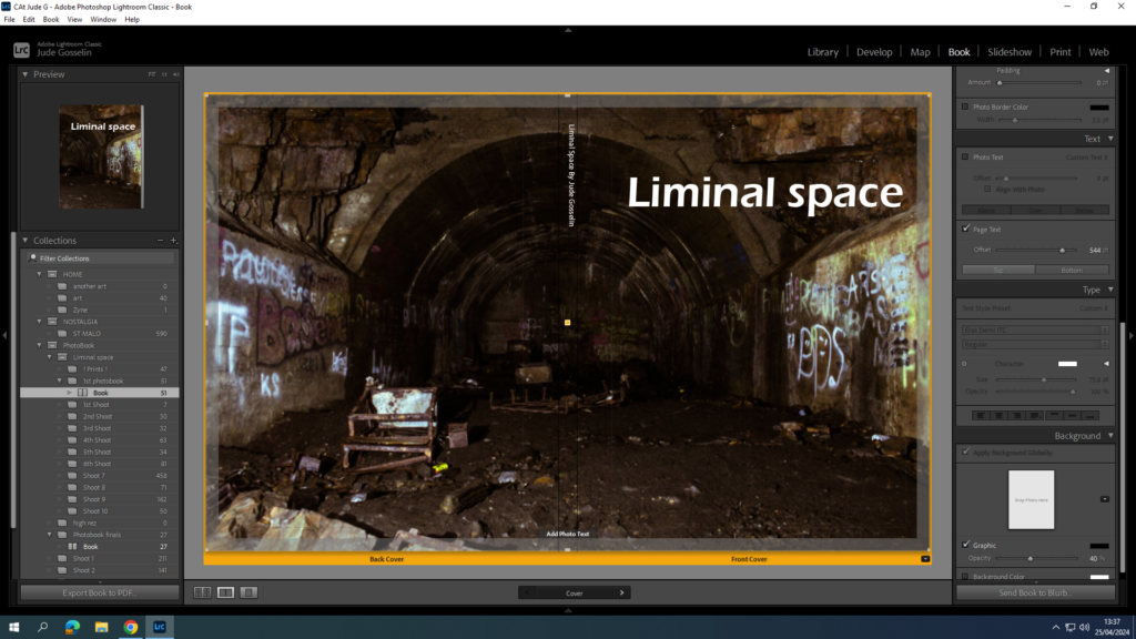
For my front cover I chose to stay with a simple look with the title being bold and clear for what it is. I also think the font suits the name well but isn’t fancy or over complicated which suits the theme of liminal space.
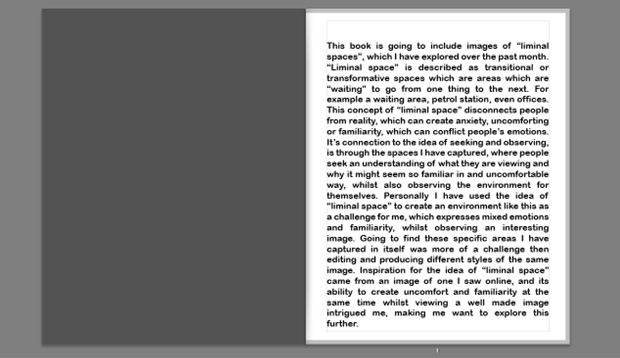
I then decided for my first page I would give a description/introduction to what my photobook is going to present and how it relates to the theme of “observe, seek and challenge”.
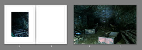
This leads into the old, empty, abandoned areas which starts off with the caves where not many people have recently been in to see or even know about its existence. This is to show Old liminal spaces where people used to explore decades ago and even use during WWII, and is perfect because the areas I Imaged where transitional which show depth.
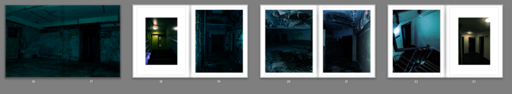
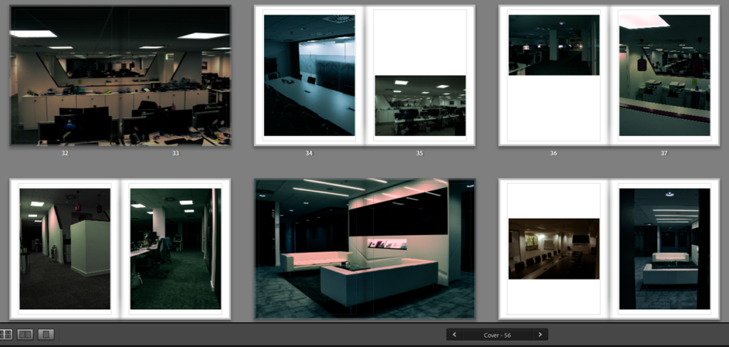
My idea of my photo book layout is to have it seem like you are the photographer wondering through interesting spaces, where you start with the oldest most untouched, to then gradually transition into the newer, more common areas. Places like this abandoned hotel had broken rooms, rubbish left everywhere, and showed a trace of people, or templates for where people used to be, which I liked a lot and found the space in itself very uncomfortable but interesting.
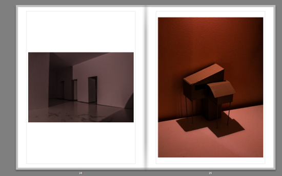
I also had inspiration from some other artists like Thomas Demand who created models and photographed them in very unique ways, so I created my own and wanted to try different angles and lighting to capture a sense of liminality, the first image looking like a hallway, but is a bit of folded paper with some doors cut into it, and the image on the right where I made a model of a type of house out of cardboard, and wooden sticks.
I used contrasting layouts which use warm and cold images opposite each other, with some warm and warm, and some cold and cold. I like thought about where the readers eyes go to and from when they open the next page, and used specific images which would make someone’s eyes flow on the page, especially in the office buildings, it switches up some of the layouts so it doesn’t seem boring.
Overall I Like how my photo book is laid out because of how it transitions from older areas to newer and modern areas, meaning in itself the photo book is being a liminal space as a “state of being” . Moreover, the templates I have used for each of my images work very well, as most of them are bold and eye catching, and the ones which are smaller, are more interesting for the viewer, as it makes them look closer, but also feels nice to look at. My choice in the double page spreads are well used because of the bold more ominous images are right in your face which puts you more into the “situation” I was in.
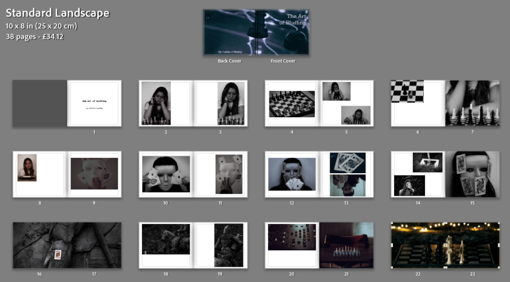
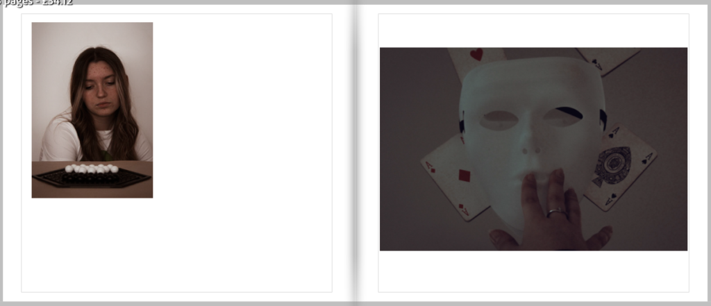
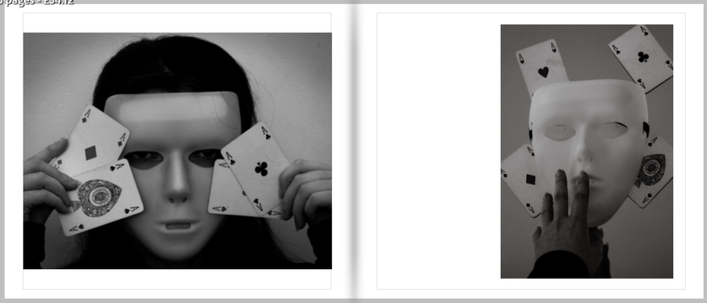
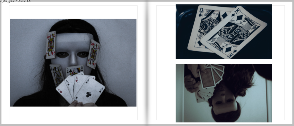
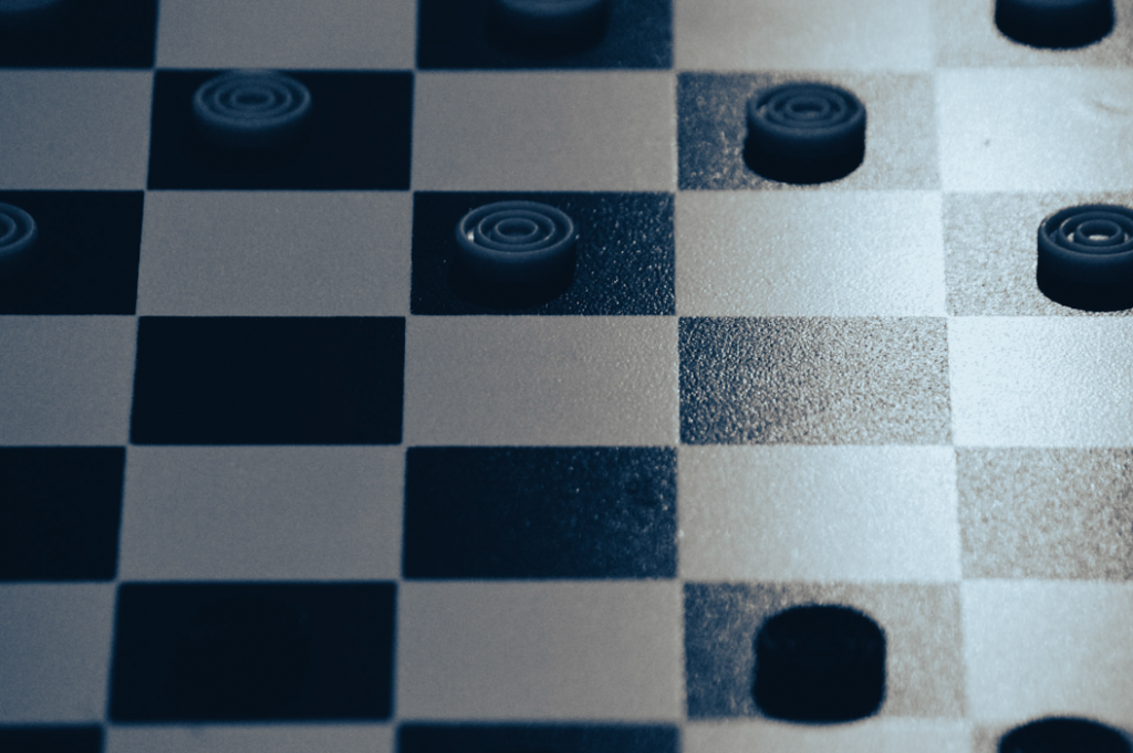
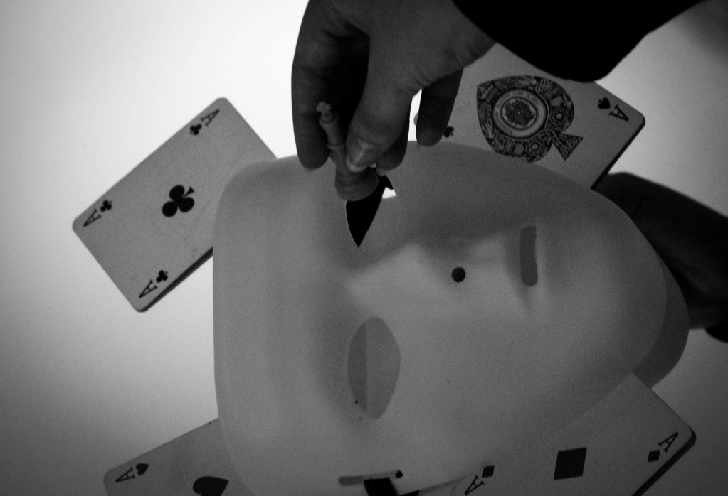
For the name of my book I wanted to keep it along the theme of games and tactics since that is the whole theme of my book. Here are the name ideas listed below:
The Mask
Reflections
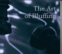
The Art of Bluffing
Strategies
Rolling the dice
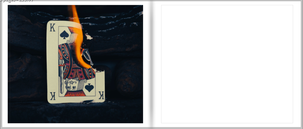
The title that I ended up selecting for my book is ‘The Art of Bluffing‘ as it links perfectly in with some of my images, for example the mask photos, as well as the overall storyline that I plan to display.
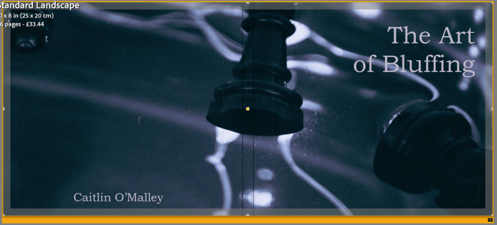
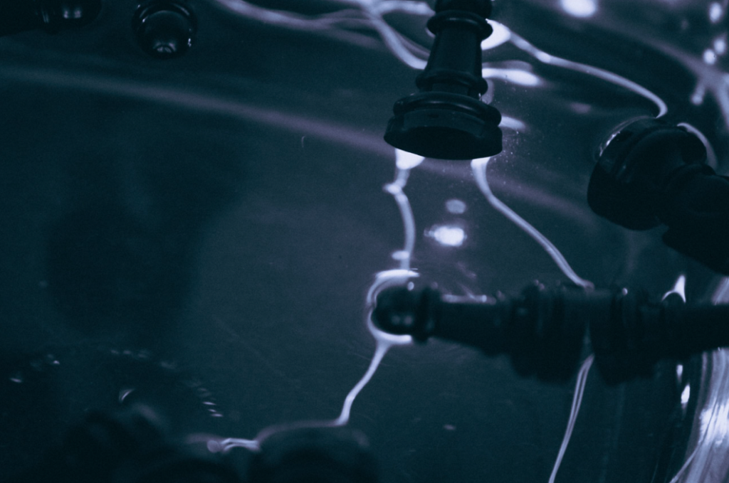
Front cover ideas
For my front cover I wanted to use a photo that would hint at what the photobook will be about, but also keep it appealing to the eye so that the viewer would want to read it.
Cover options:
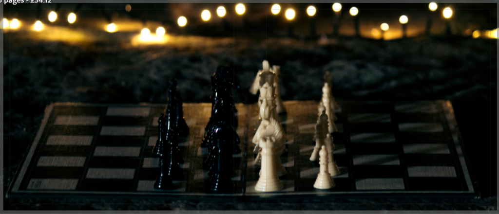
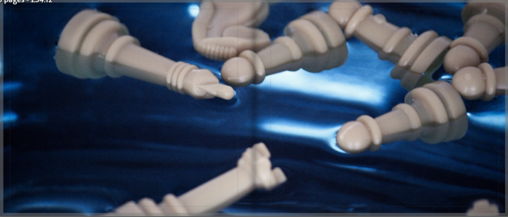
The photo I ended up selecting was the one of the chess pieces in the water as I found it looked the most visually appealing when stretched over two pages. I also think that it has the perfect area to put the title so that it doesn’t take away from the overall feel of the image.
Final cover:
Plan
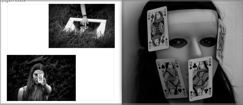
Narrative – What is your story? Describe in:
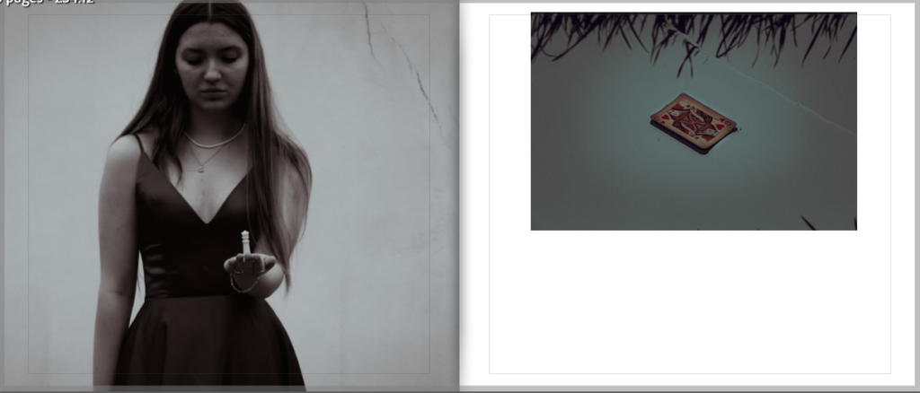
3 words – Emotions in games.
A sentence – A series of photographs that depict a visual representation of what its like to be immersed in a game.
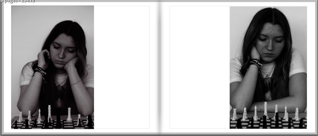
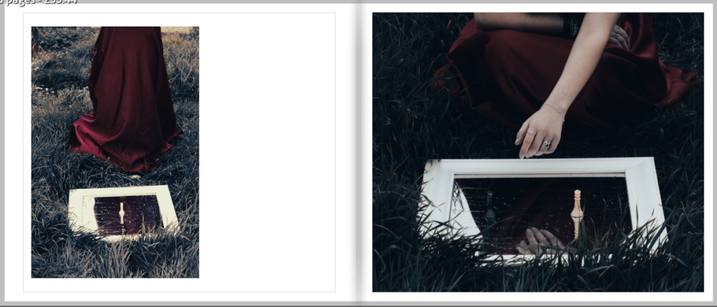
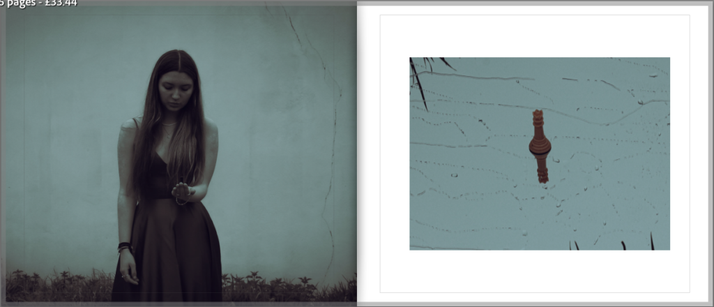
A paragraph – My photo book aims to tell the story of a girl who gets so invested in the chess game that she’s playing, its almost as though she becomes a part of it. I plan on keeping the ending up to interpretation so the viewer can decided whether they believe she won or lost through the use of one of my element photos.
Design – Consider the following:
How you want your book to look and feel – I plan for my photobook to look clean with the colours and tones of my images flowing together nicely, creating links between them and making it look overall visually appealing.
Paper and ink – I plan to use a more glossy paper in order to help the photographs shine when viewed on the page, also making it appear more put together. However, I wont be choosing one that increases the contrast due to my images already being highly contrasted.
Binding and cover – The cover of my book will be a hardcover since I find this to be more visually appealing and in my opinion will help to make the book seem more finalized.
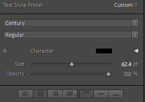
Images and text – The text on the front cover of my book will be ‘Bookman old style’ at the size 72.8 as well as making the colour of the text a light lilac colour to ensure that it goes with the background.
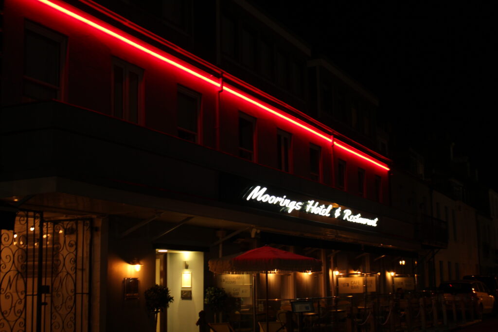
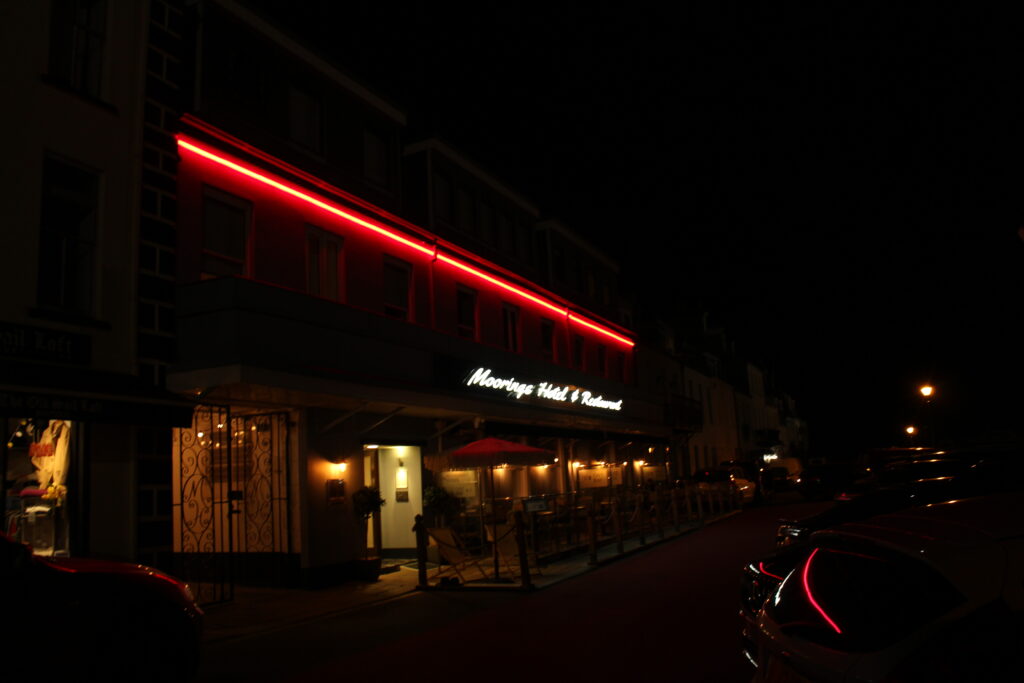
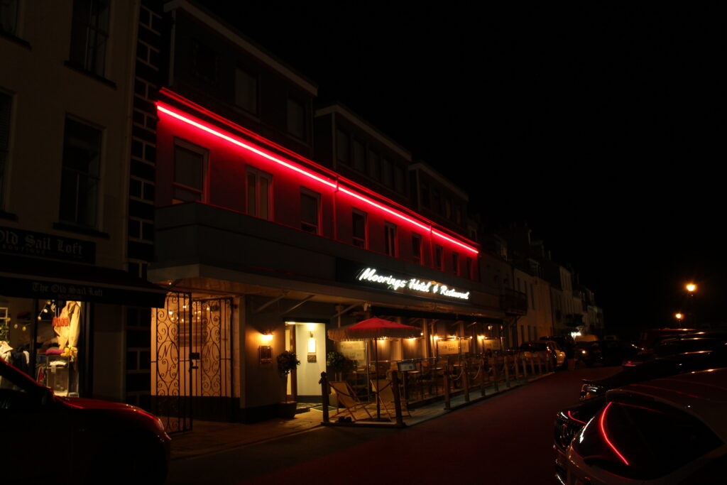
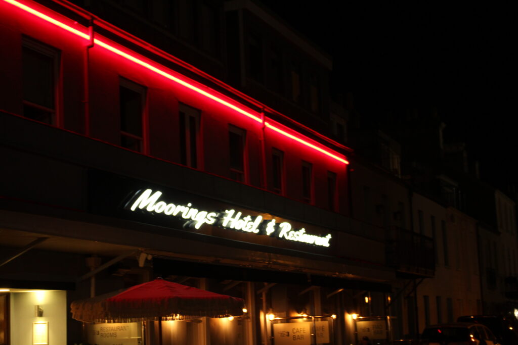
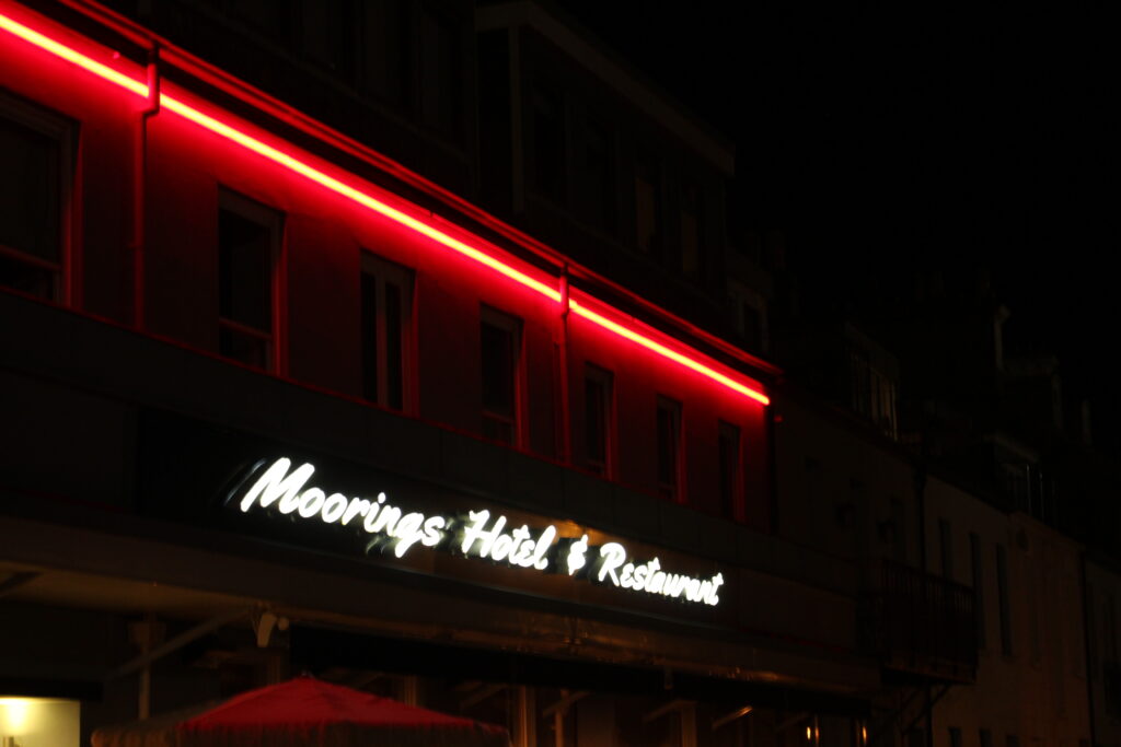
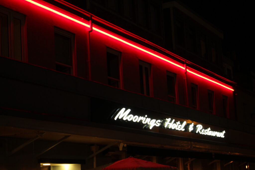
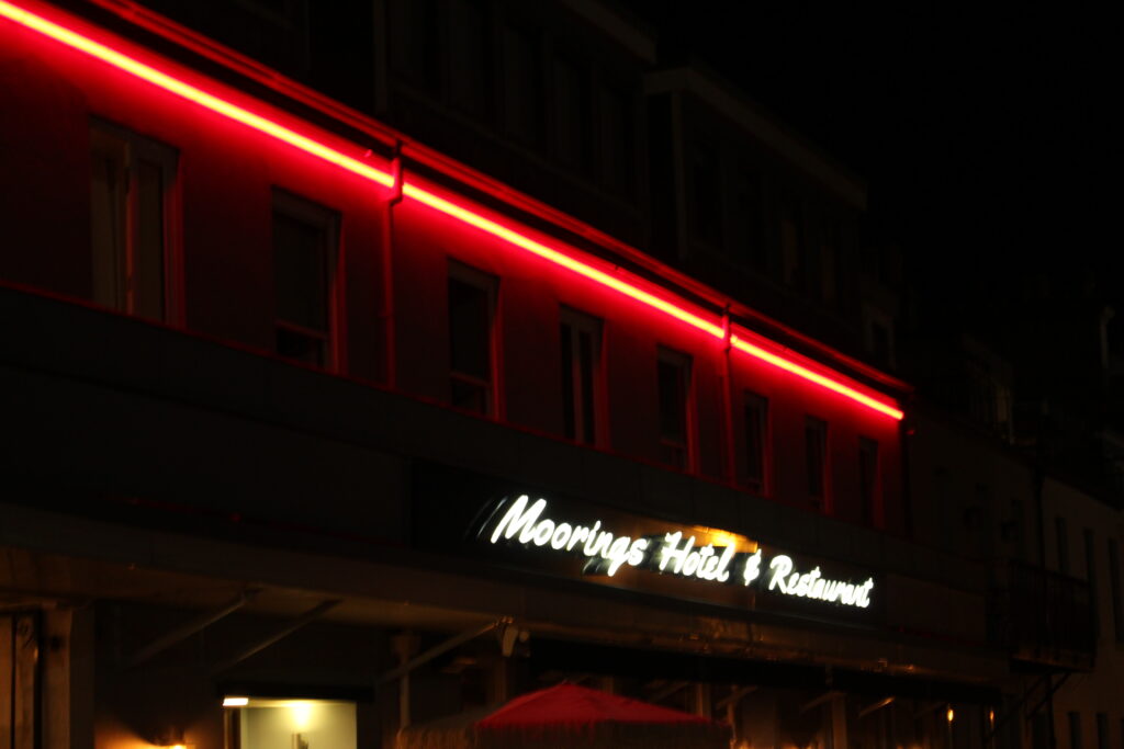
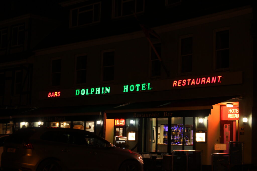
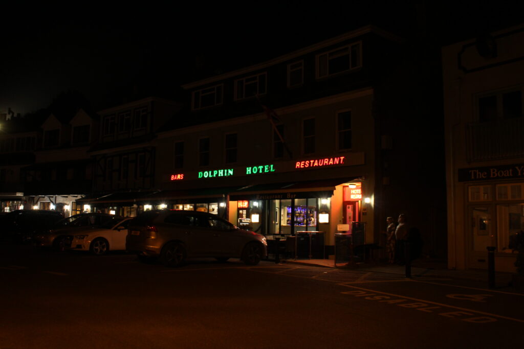
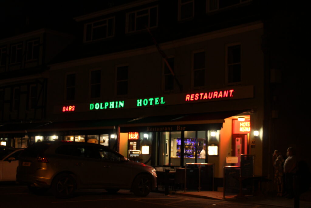
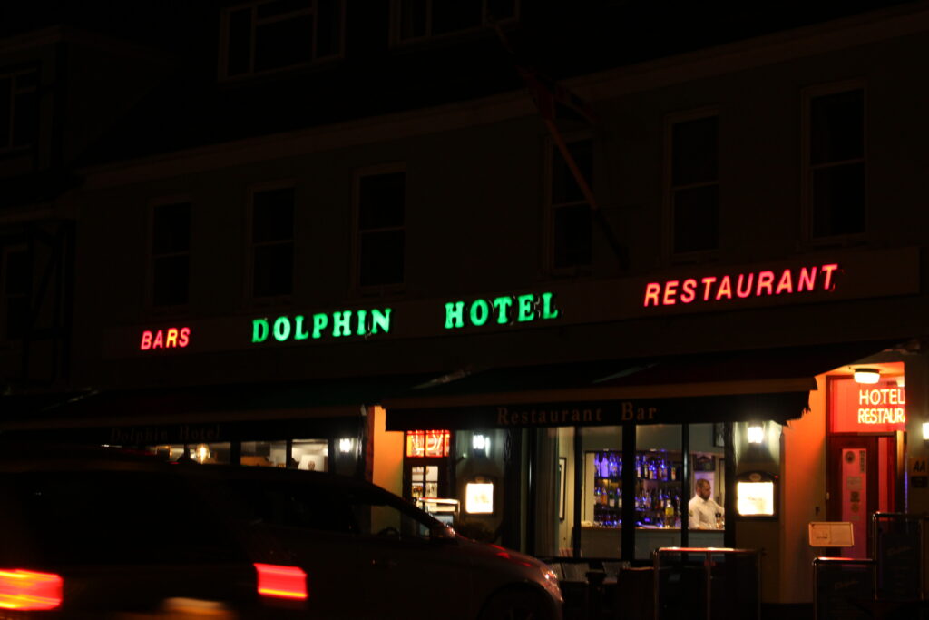
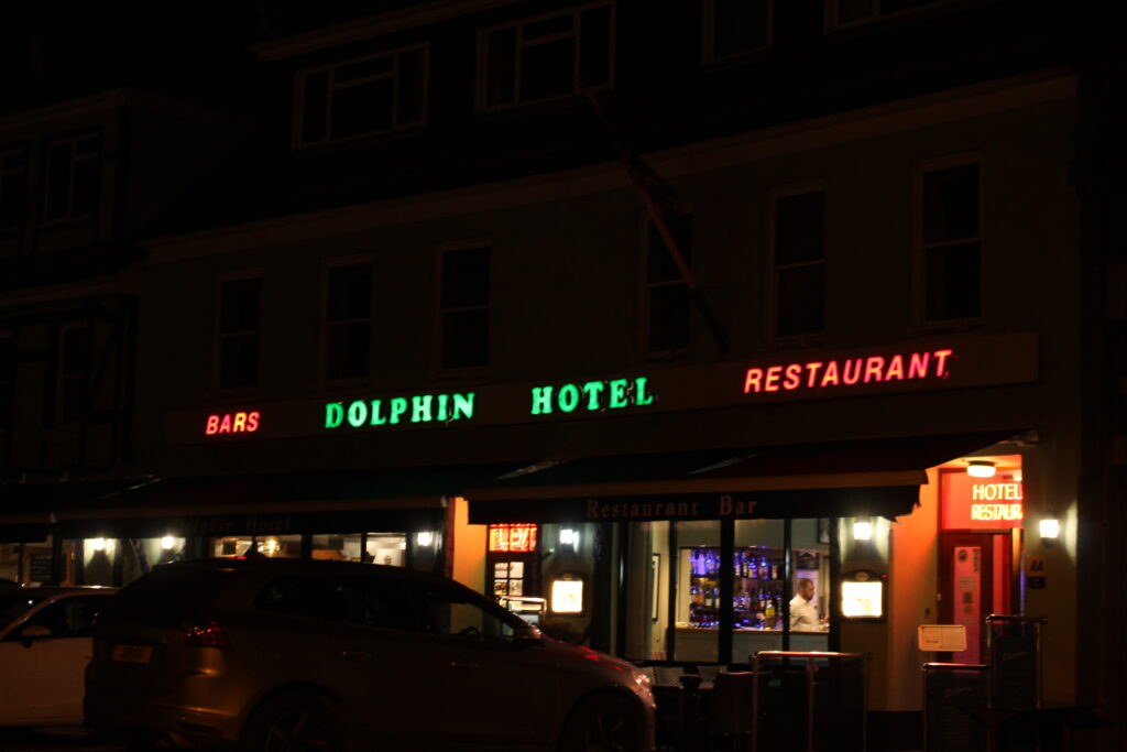
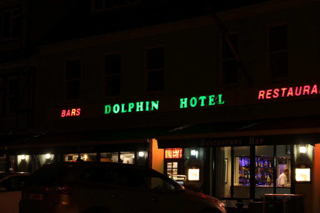
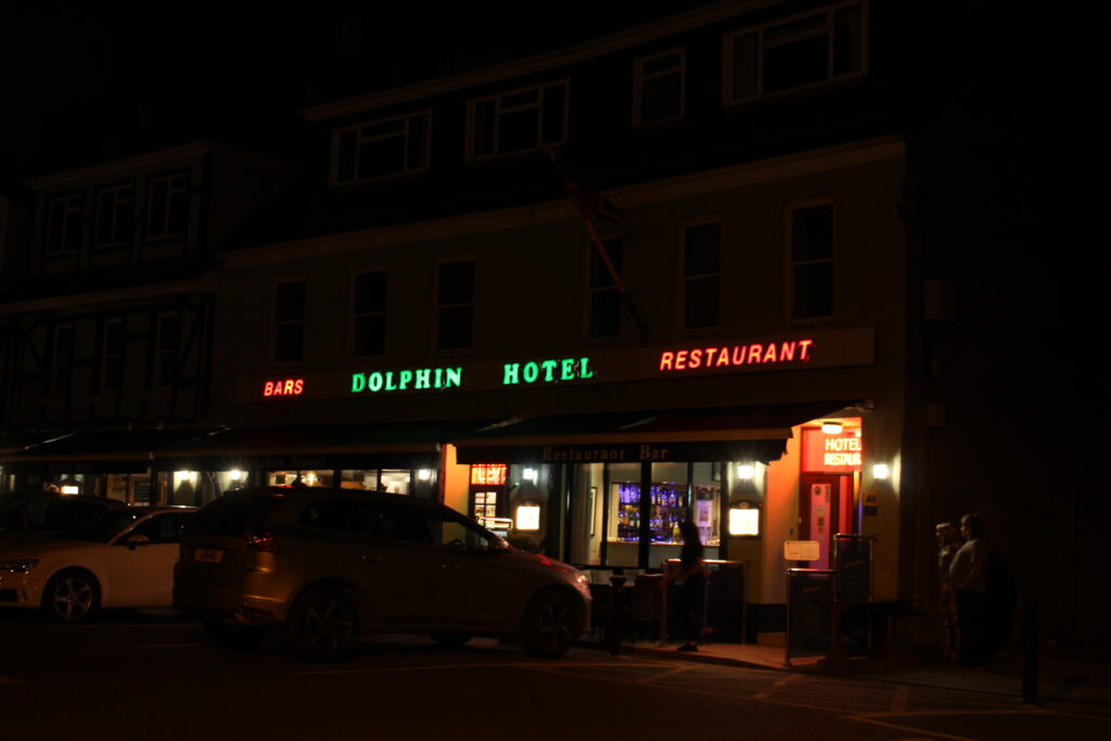
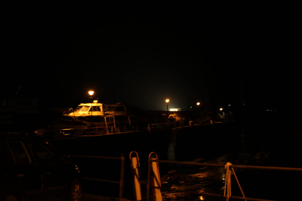
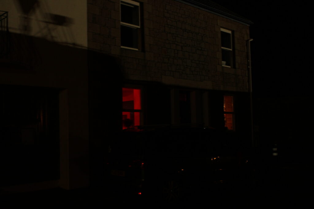
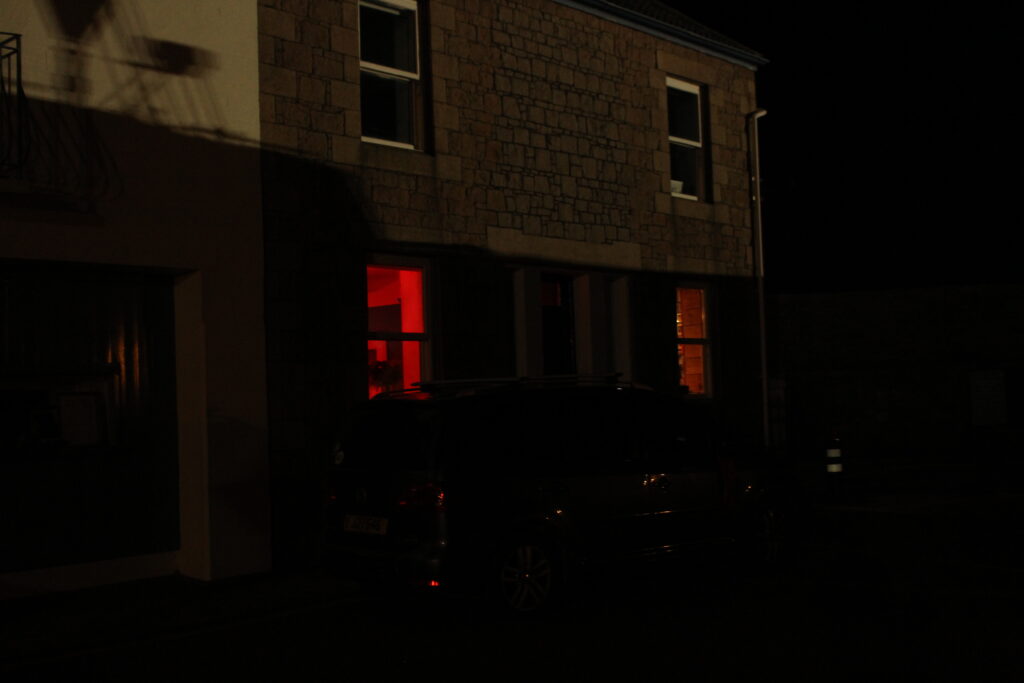
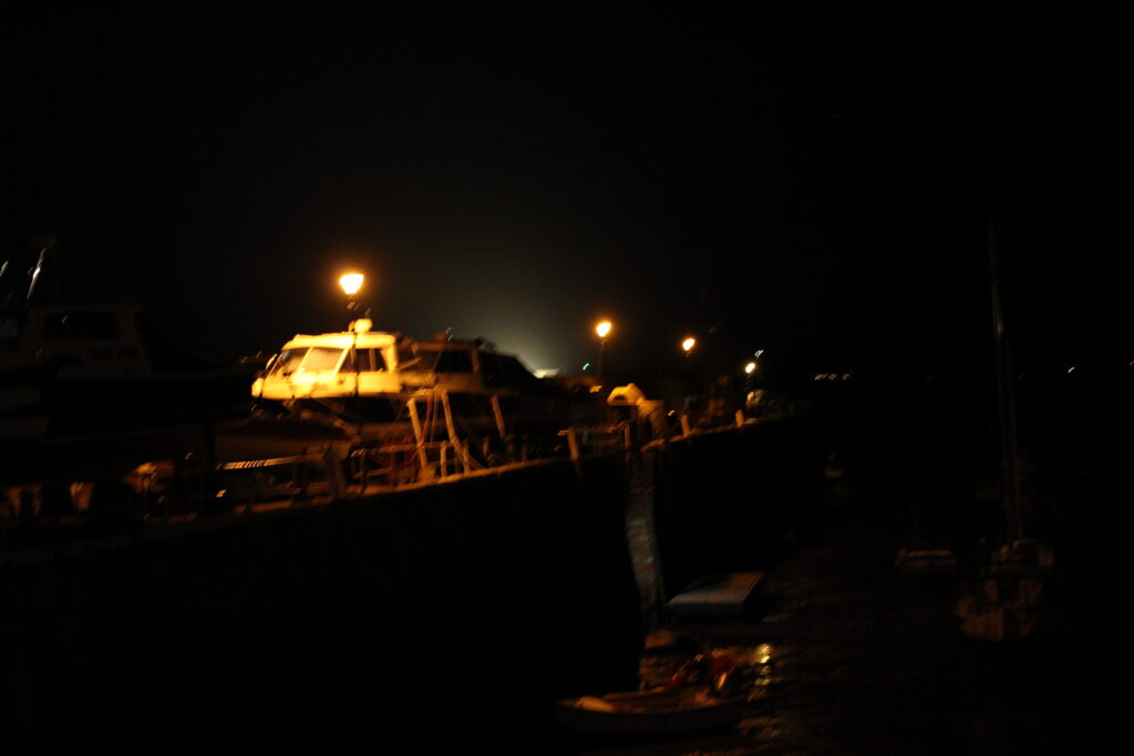
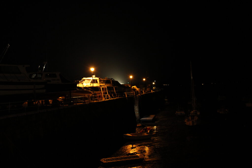
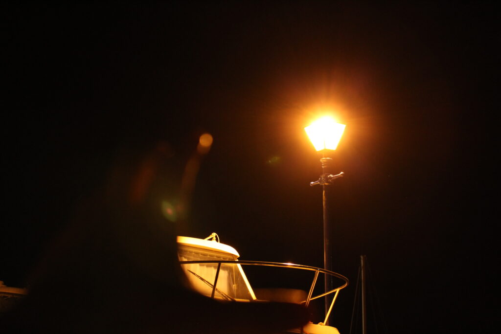
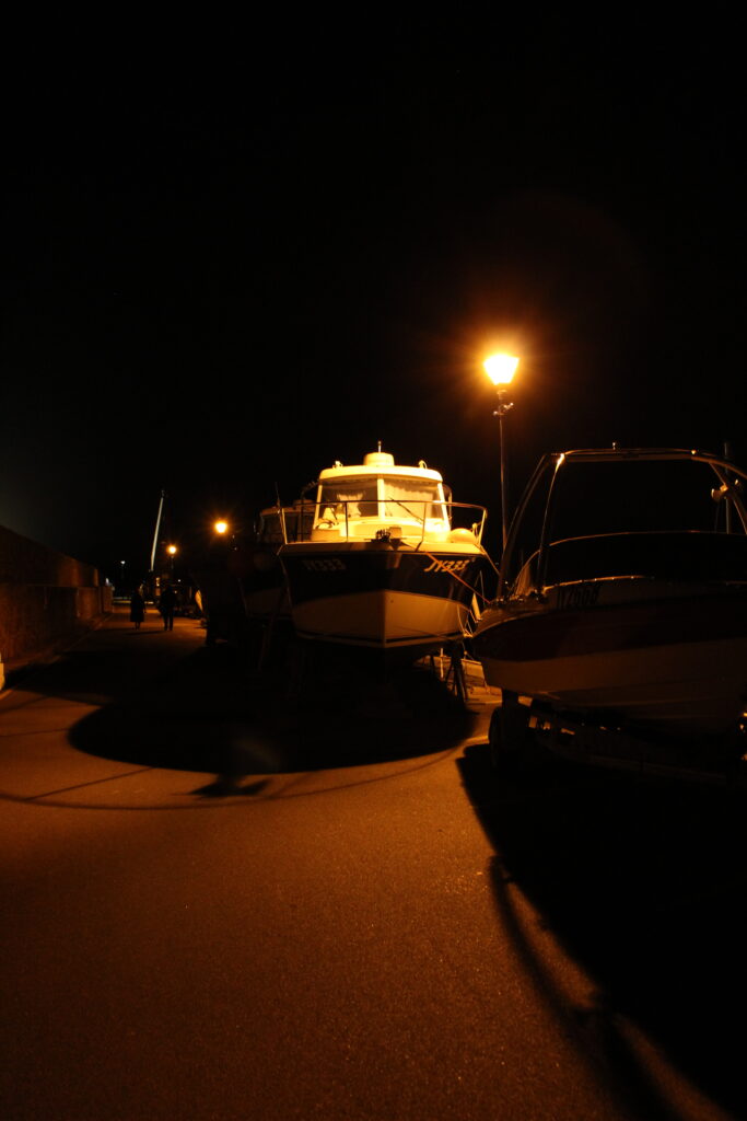
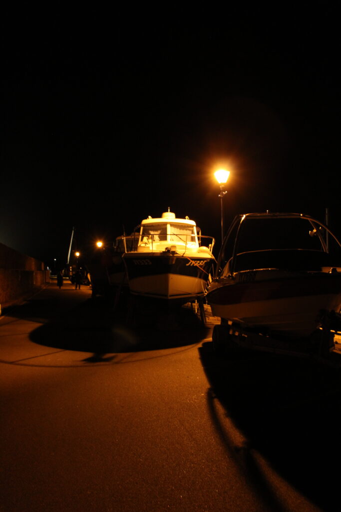
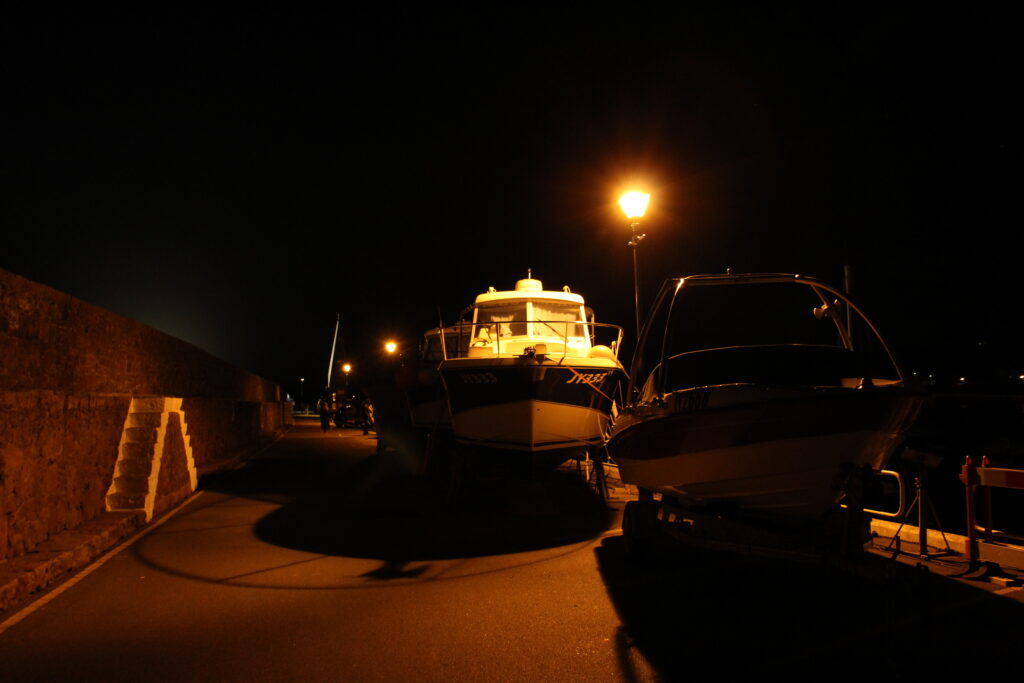
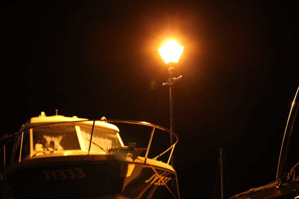
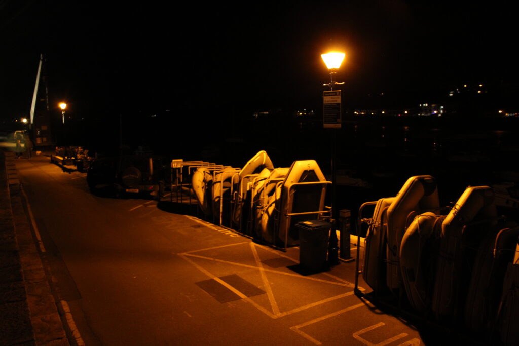
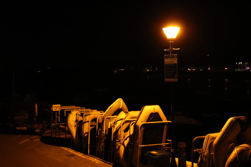
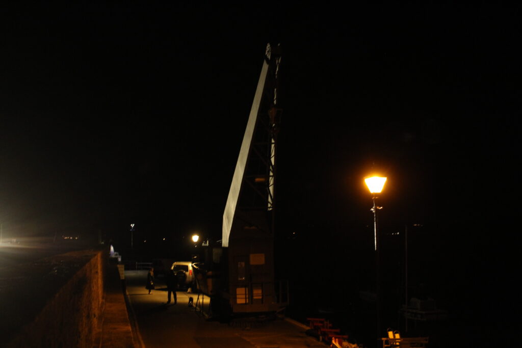
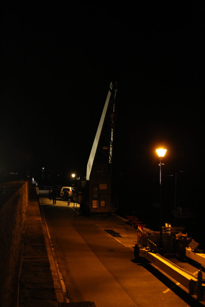
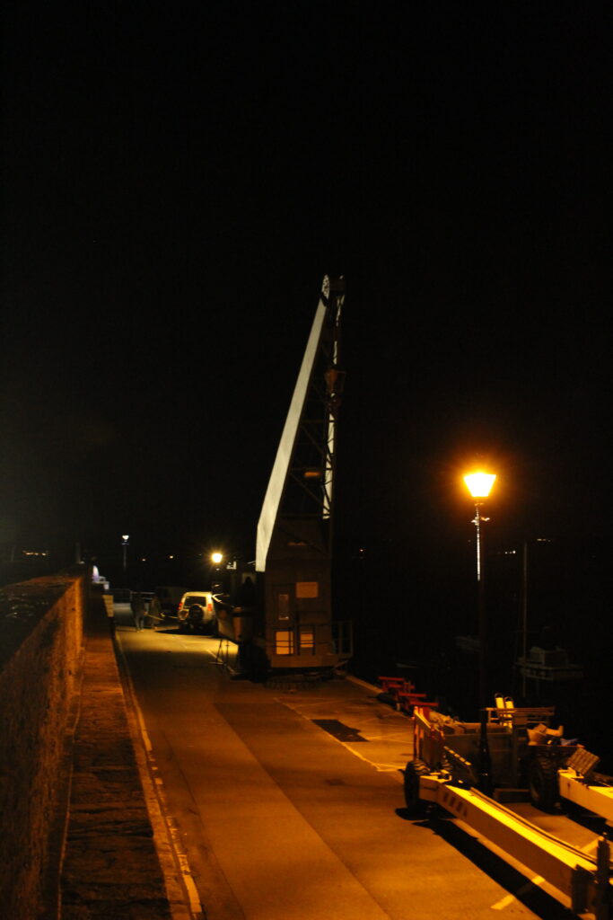
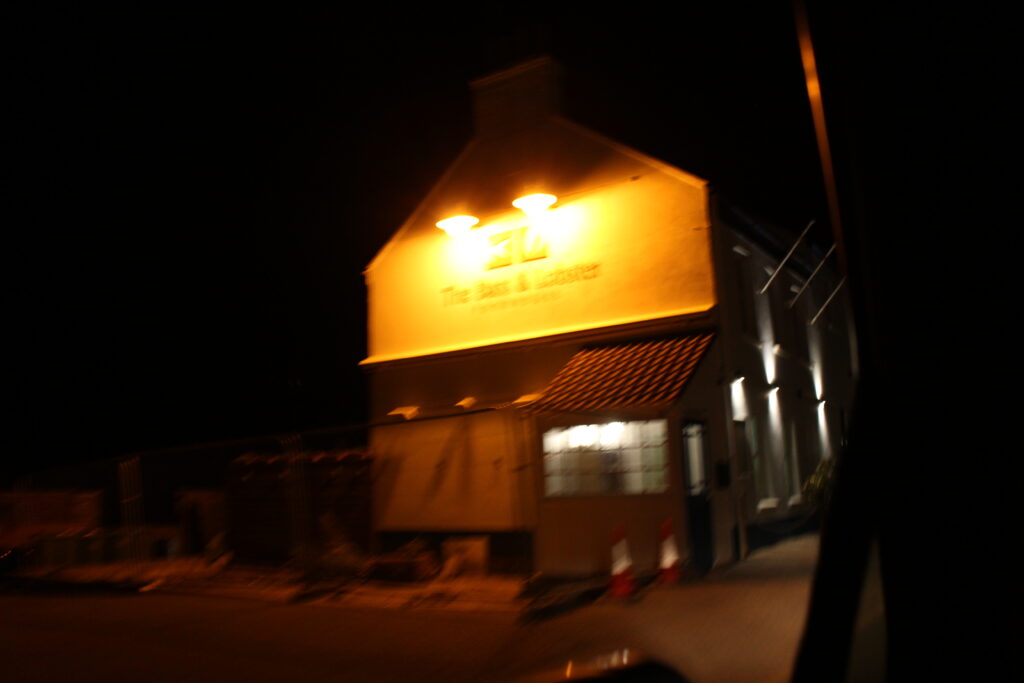
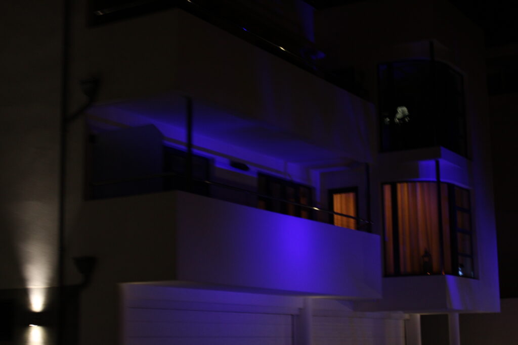
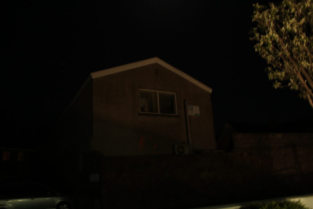
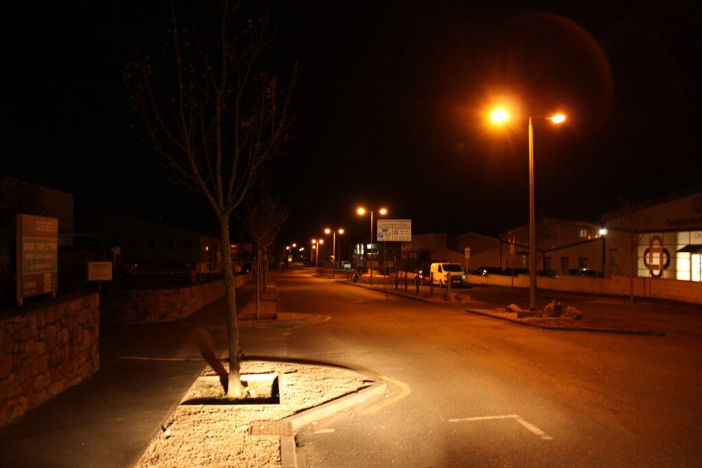
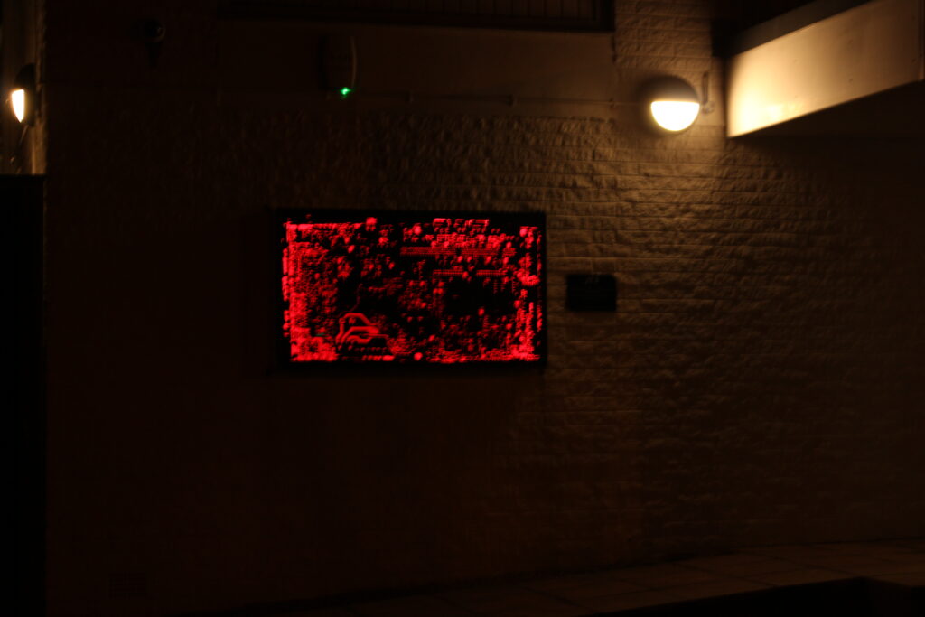
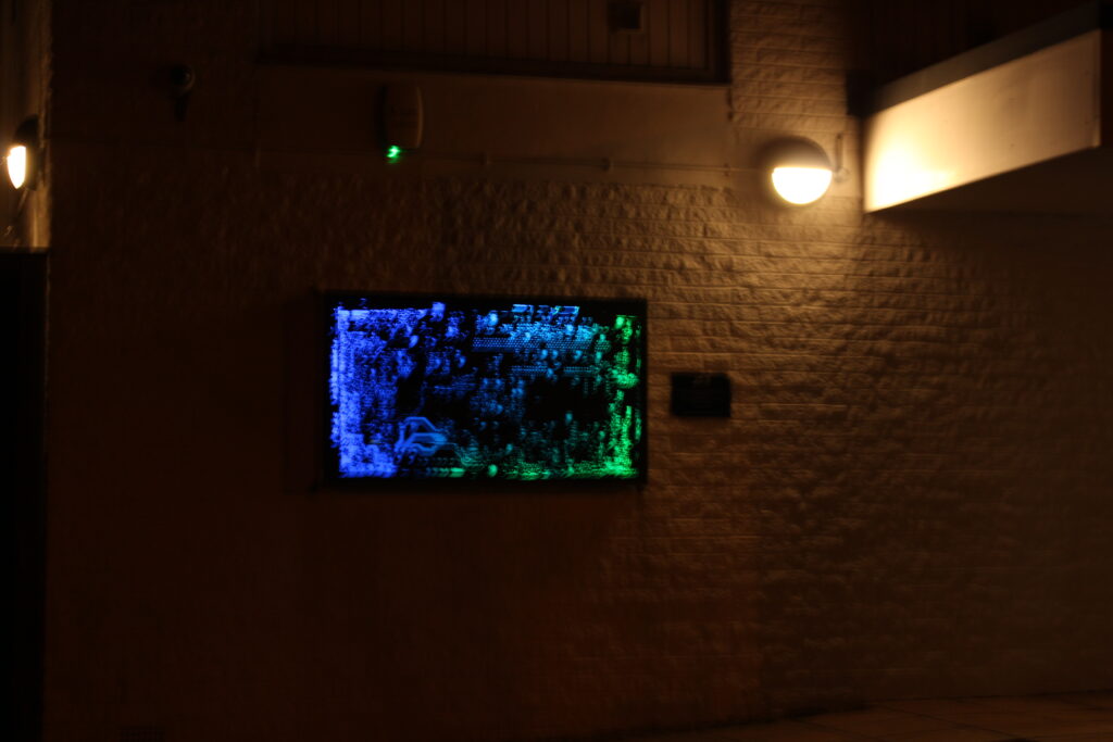
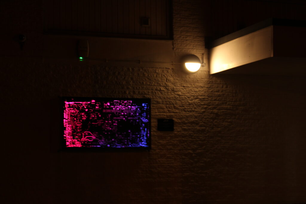
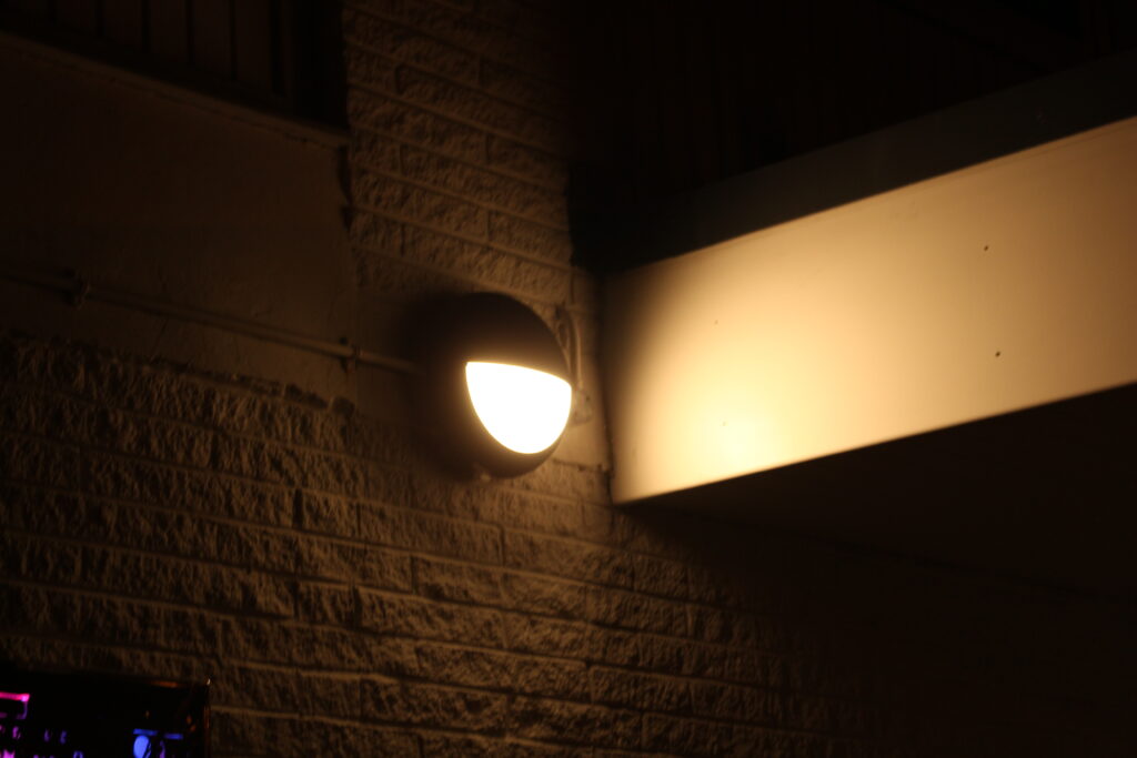
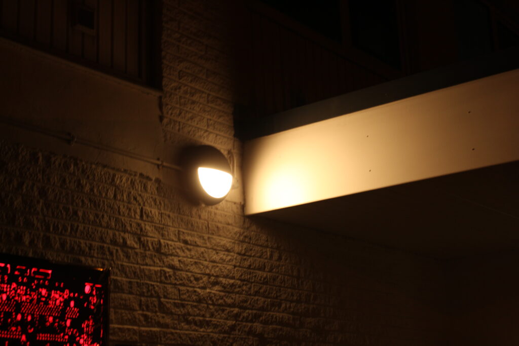
I had the idea of taking pictures of the neon lights outside a few buildings, I like these because the lights are very vibrant and stand out from the darkness and I think they are very cinematic. I added these on the night photography gallery because I thought that it could use a few more photos as many photos that were currently on the gallery weren’t the most interesting.
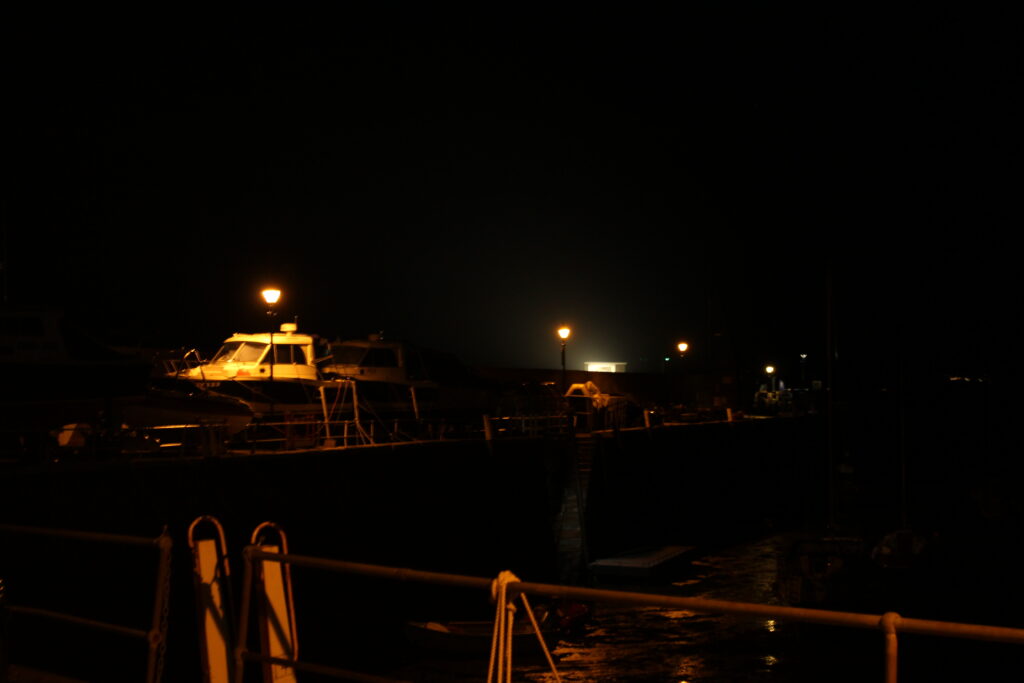
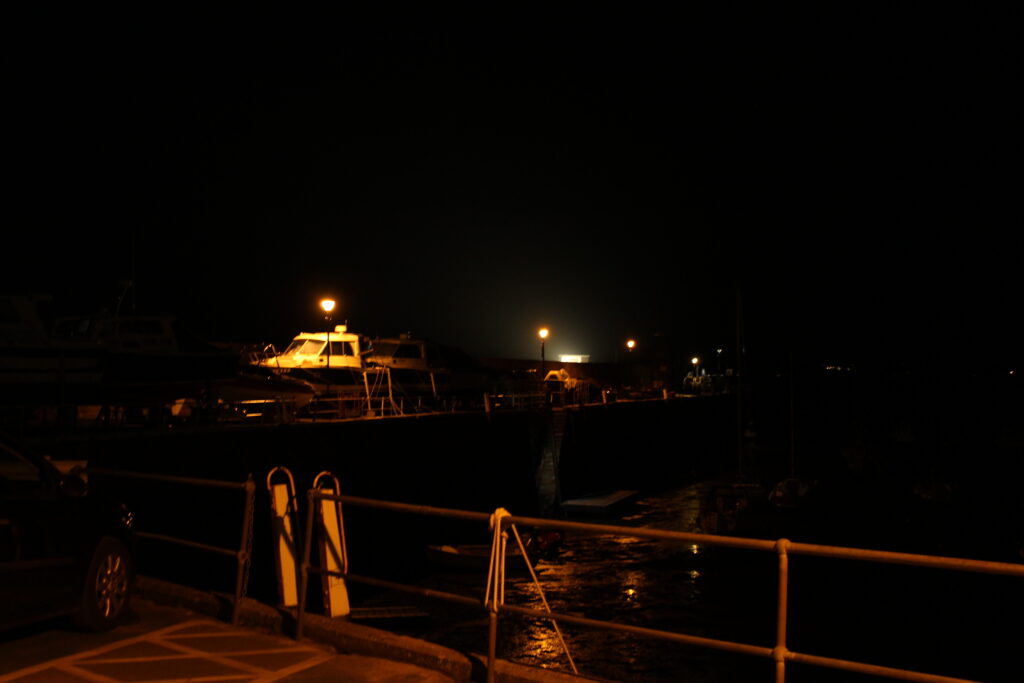
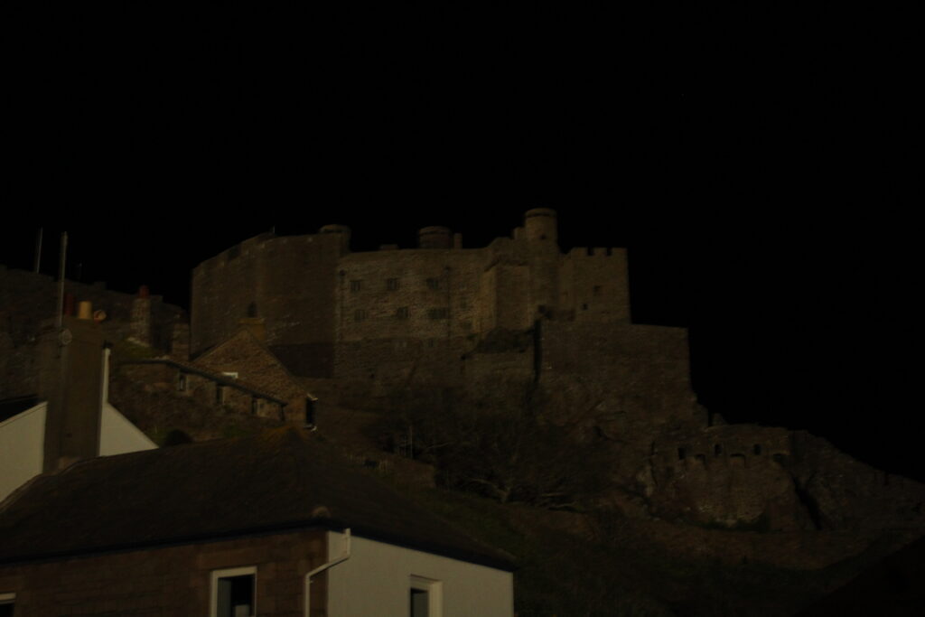
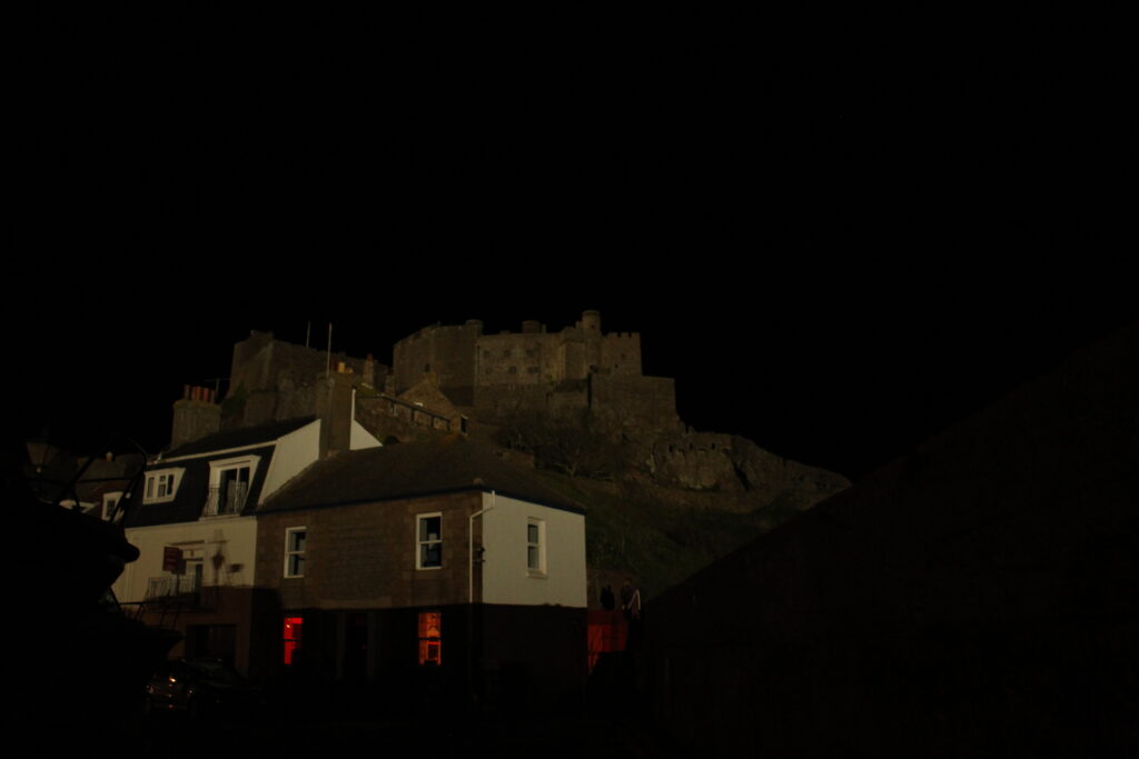
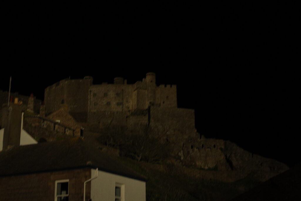
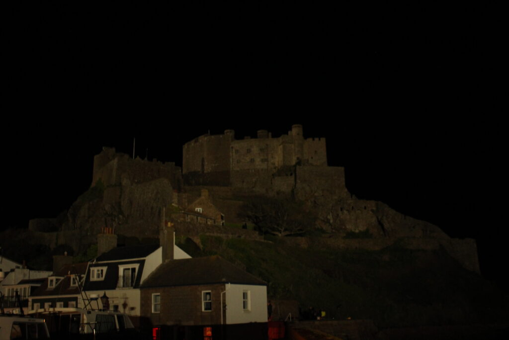
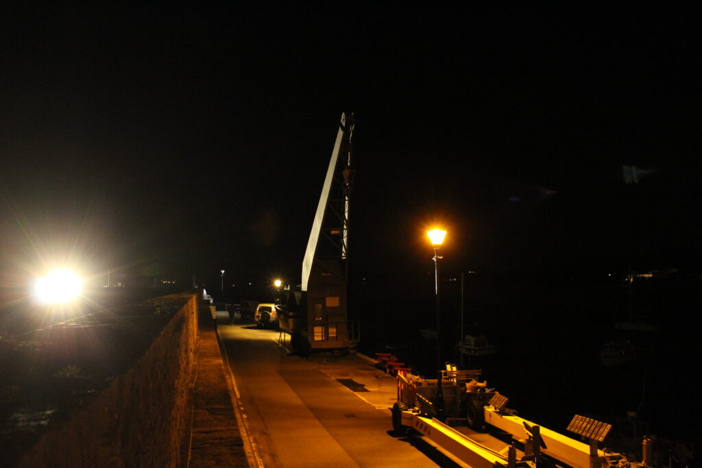
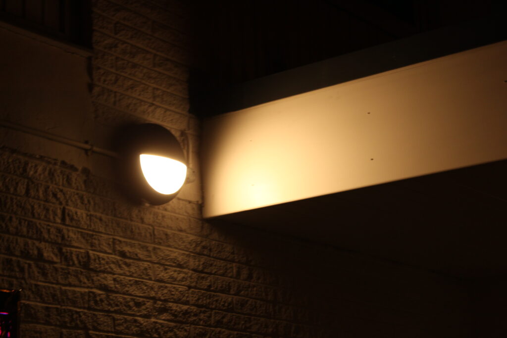
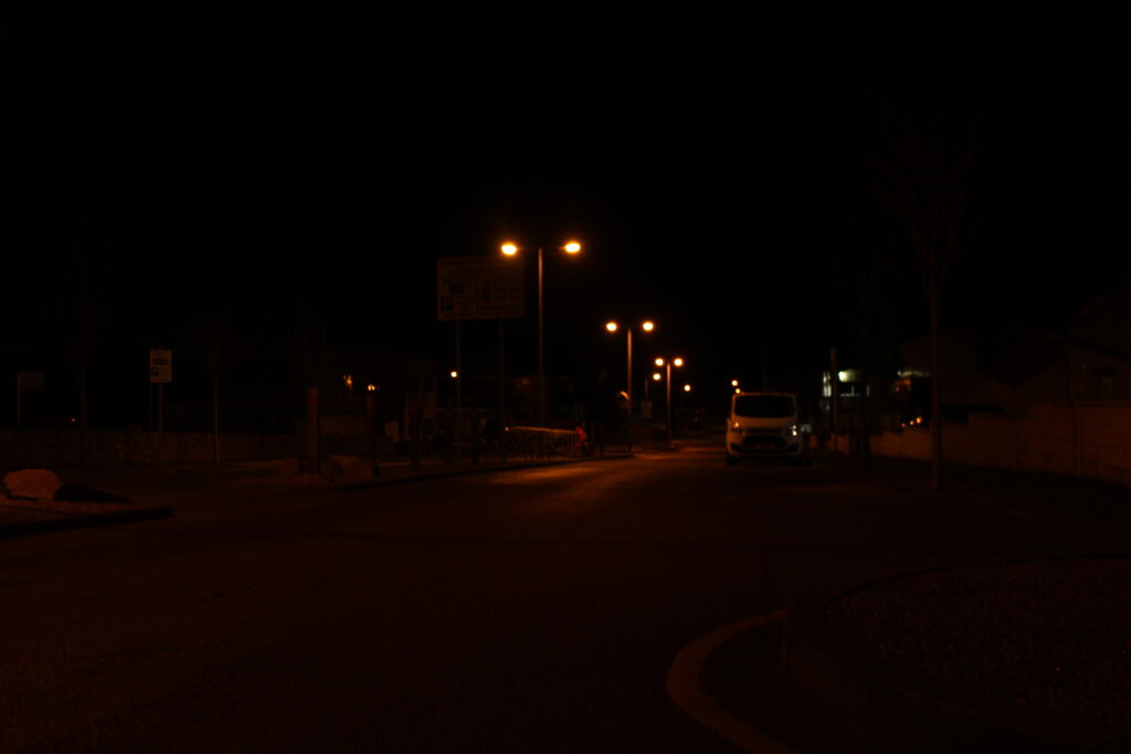
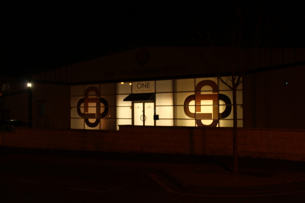
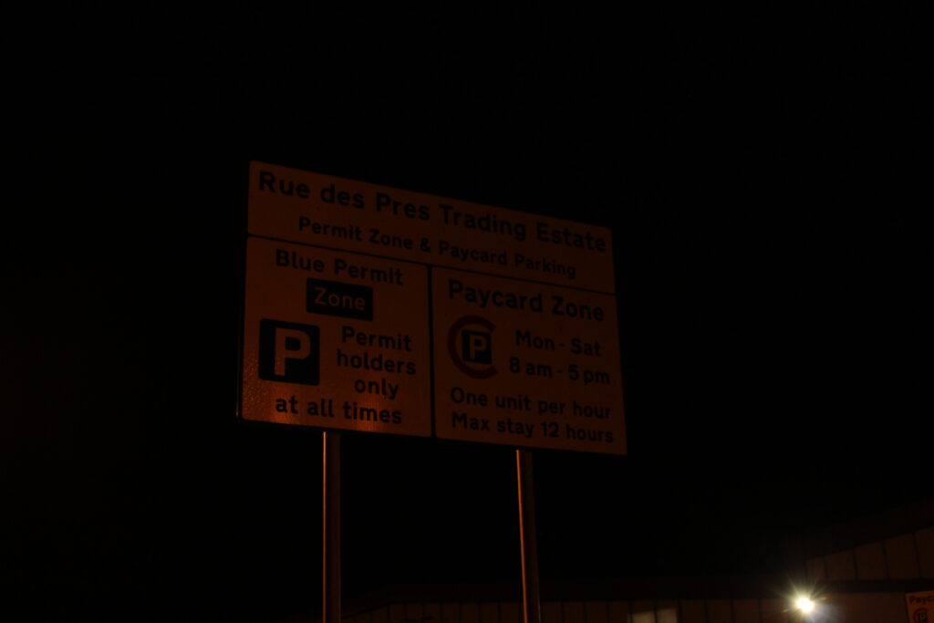
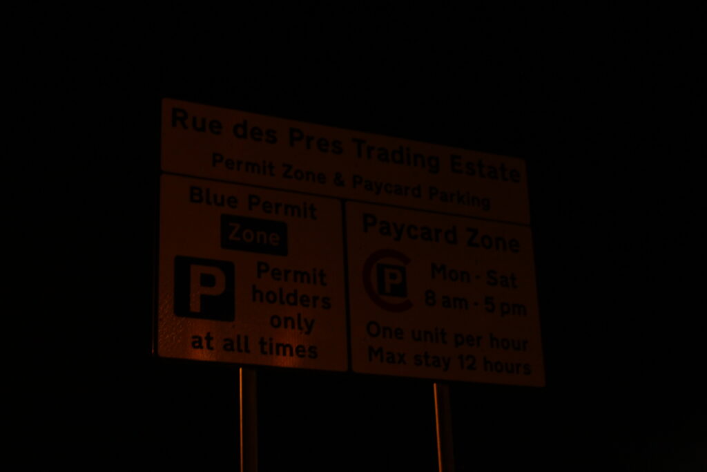
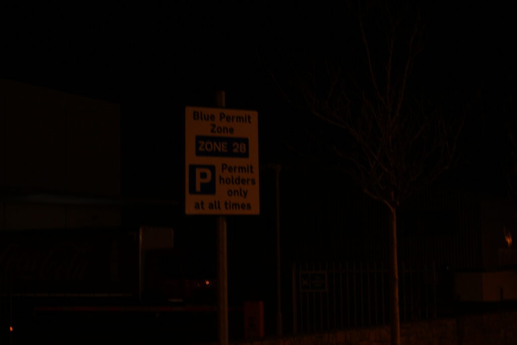
I also tried to get some photos of Gorey Castle, the harbour, some buildings around the place and the crane on the pier. I also took pictures of some road signs and streetlights. The rest of the images below didn’t really spike my interest in the end so I didn’t include them in my photobook.