Basic edits
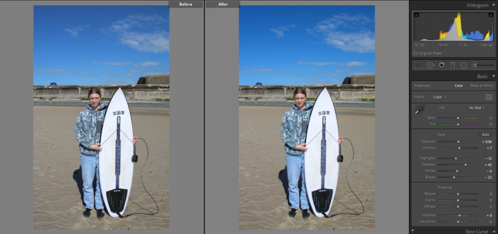
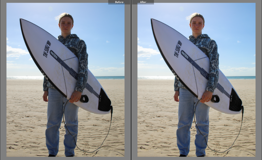
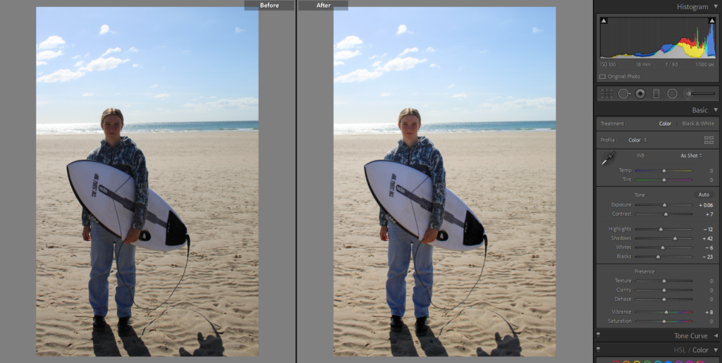
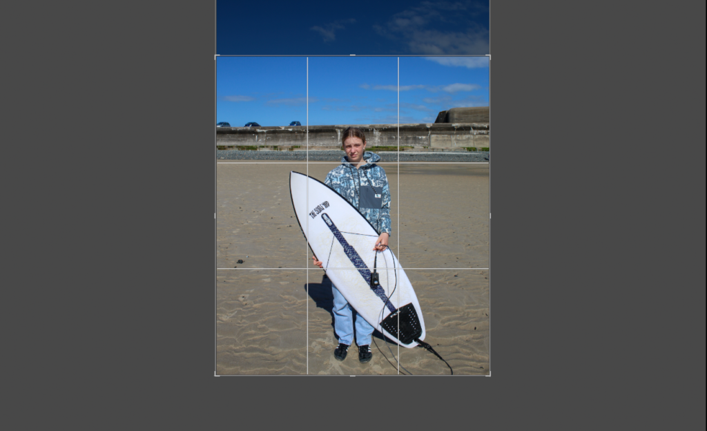
Some of the images were too top heavy or had too much empty space so I cropped them.
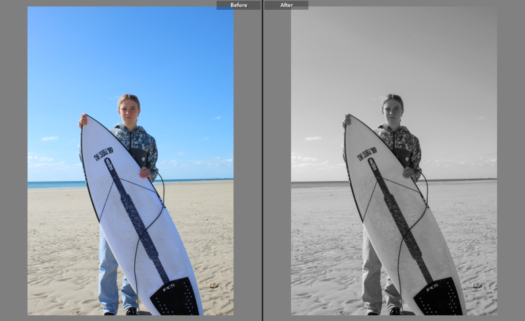
I experimented with putting some of the images in black and white but decided that they looked better in colour.
final images
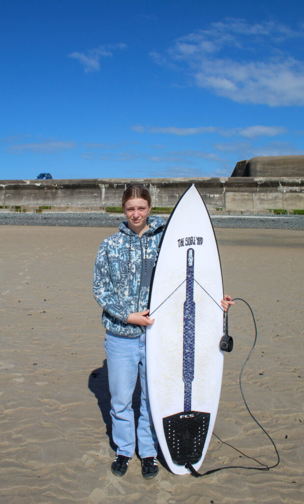
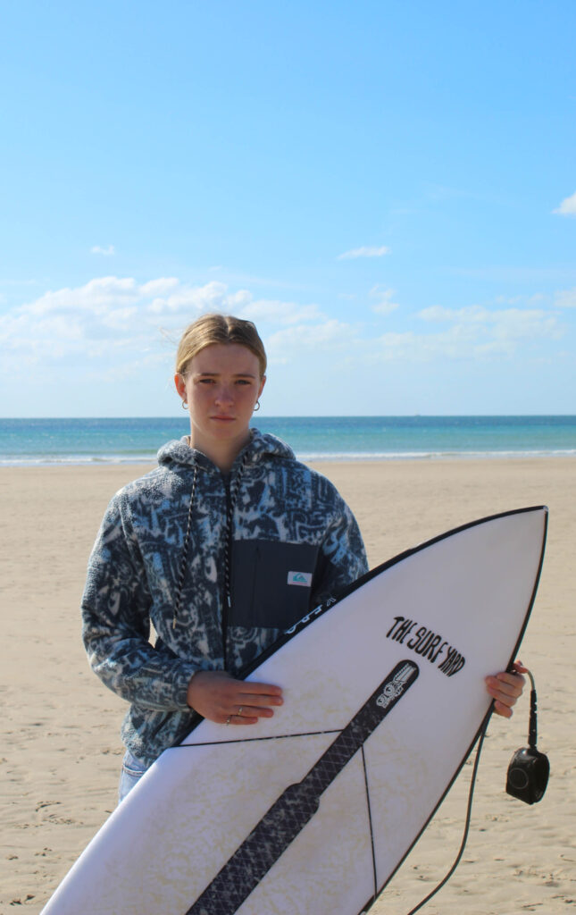
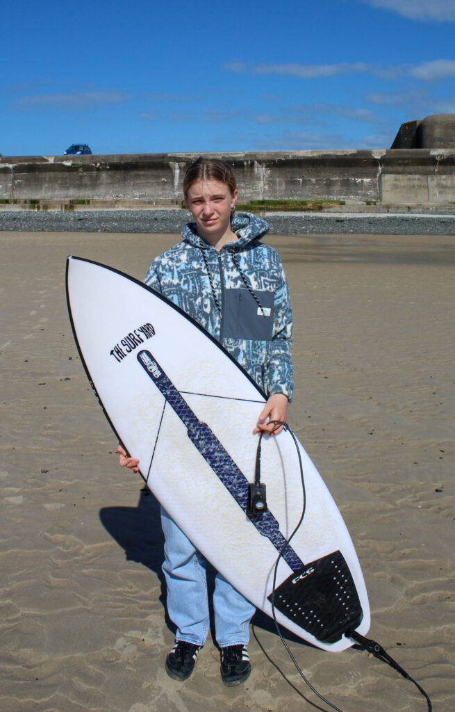
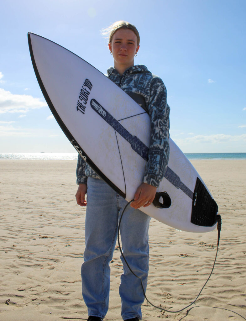
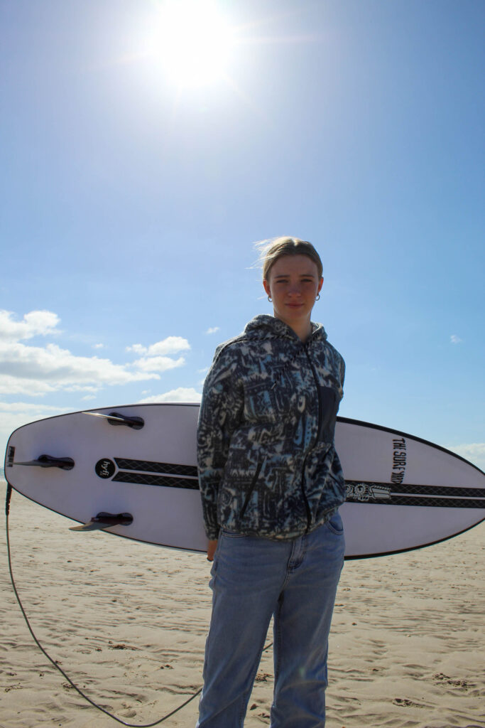
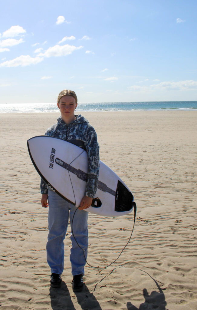
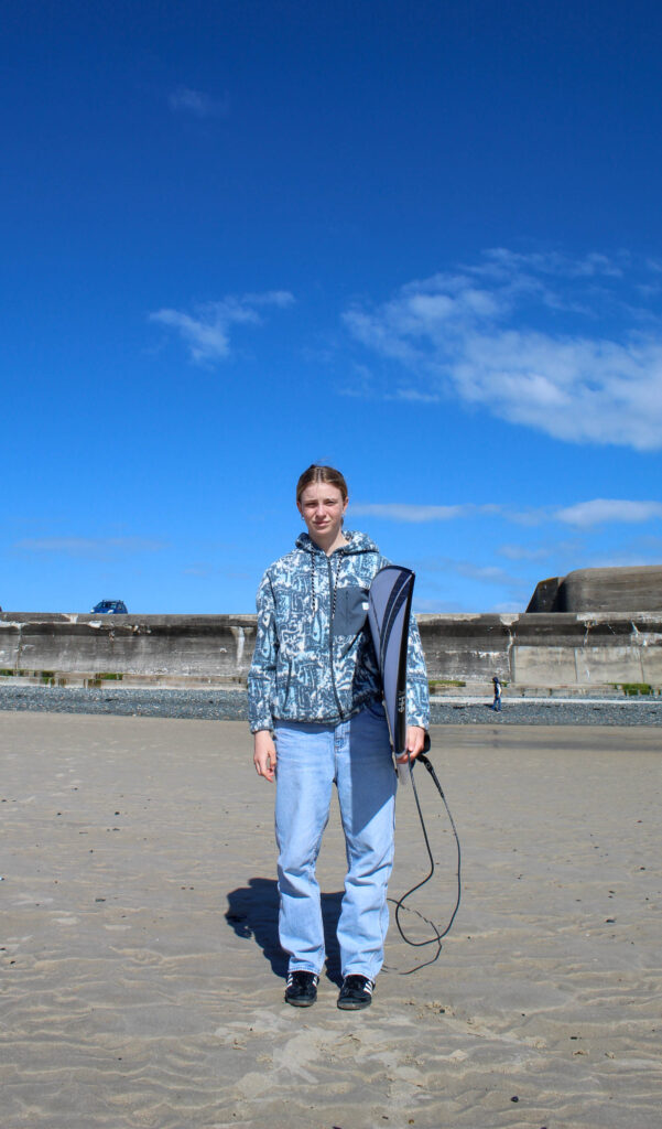
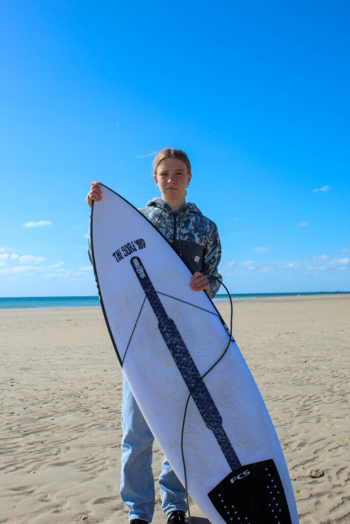
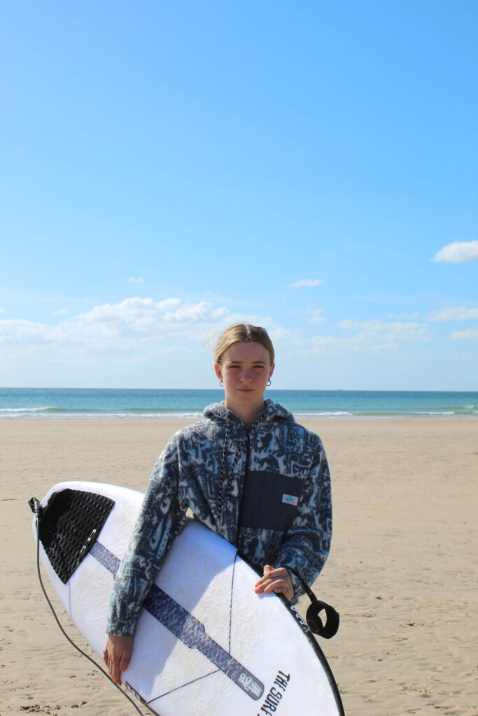
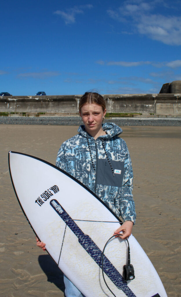
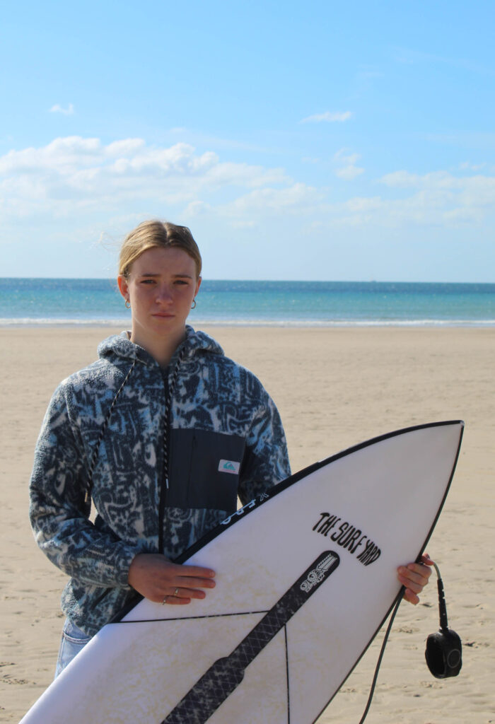
Basic edits


Some of the images were too top heavy or had too much empty space so I cropped them.

I experimented with putting some of the images in black and white but decided that they looked better in colour.
final images


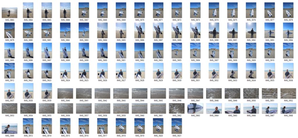
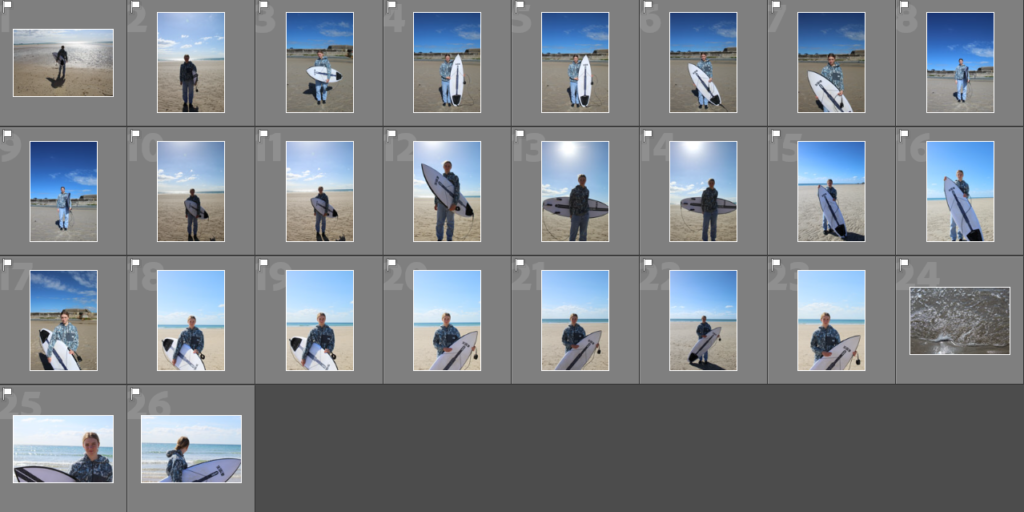
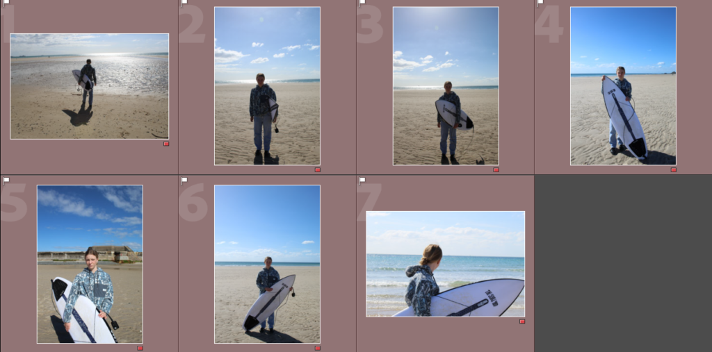
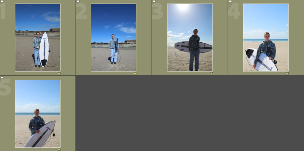
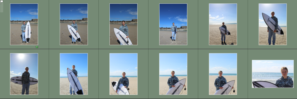
I took these images at St. Ouens bay as I wanted to take some environmental portraits to give me a mix of images that I can add into my book.
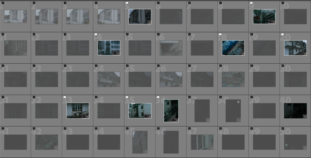
Contact sheet
Flagged images
Rating my images
OBSERVE
VERB
SYNONYMS: spectator, onlooker, watcher, voyeur, looker-on, fly on the wall, viewer, witness, eyewitness, bystander, sightseer, commentator, onlooker, reporter, blogger, monitor.
SEEK
VERB
CHALLENGE
NOUN
VERB
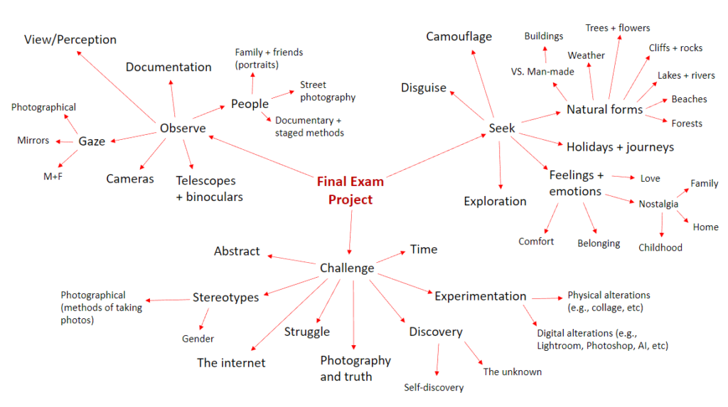
MINDMAP
MOODBOARD

INITIAL IDEAS
OBSERVE: I want to create photographs as a form of observation; observing individuals like my friends and documenting them in a way that captures teenage life. I also want to explore capturing photographs of my family and nostalgic environments to communicate a sense of myself, drawing upon the previous nostalgia project.
SEEK: I will explore the ‘seek’ aspect of the project theme through the concept of teenage life. Drawing upon past projects of identity and femininity vs. masculinity, I want to show exploration of finding yourself during your teenage years and finding a sense of belonging within friendships. I will explore aspects of exploration and disguise through documenting teenage girls challenging elements of the male gaze.
CHALLENGE: Through my project I could aim to challenge gender stereotypes; particularly those directed upon girls and femininity. Challenging these stereotypes by creating sets of images showing typical views of femininity on teenage girls contrasting against atypical behaviours which oppose these ideas of femininity.
Narrative: What is your story?
Describe in:
Documenting utopian girlhood
Documenting this idea of feminine utopian through the idea of girlhood, and friendship.
Through the documentation of feminine utopia, I will be exploring this stereotypical idea of girlhood and the stereotypical view of a teenage fantasy. As well as taking inspiration from Kurland and Honey I will be allowing to explore and interpret this in my own view and the reality of girlhood.
Design: Consider the following
DESIGN OF PHOTOBOOK:
In my photo book I want to try and achieve a feminine aesthetic by editing the tones to more pink and blue, which often has connotations of femininity. In order of the layout I will be alternating between landscape and portrait images, however I will be exploring how the images will look together so I can try and create a narrative, therefore the in terms of the layout of images I will be experimenting and seeing what works. The editing of the images will be unique for each image depending on the location and time taken for example; night or day, outside or inside. In terms of the title, I am planning on naming my book ‘Teenage Fantasy’ which cis clearly portrayed in my photobook. My photobook will clearly show the narrative of teenage girls and what is looks and feels like to be a teenage girl, part of girlhood and strong bonds with your friends. In my photobook you will be able to see the different ways in which girls ‘seek‘ girlhood and stereotypes and where girls ‘challenge‘ he typical stereotypes. For my front cover I am still unsure if I want an image or material, however I will experiment will multiple options and come to a conclusion, however if use a image from my front cover I would use a calm sunset in order to keep the front cover minimalistic. The sequencing of the images will be repeated as I like an organised aesthetic in my photobook, like I did in my coursework. I will possibly add small text, by naming the images or adding dates however I will not be right adding any narrative text.
In terms of the exam theme my photobook clearly has a range of series of images, that show me observing, seeking and challenging femininity and teenage girlhood. I believe my images have a good interpretation of my artist case studies while also creating my own work from my own creativity.
FOR MY FRONT AND BACK COVER, I AM STILL DECIDING WHETHER I WANT A PHOTO OR A PLAIN MATERIAL COVER, LIKE THE ONE FOR MY COURSEWORK.
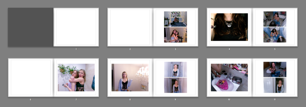
THIS IS A SCREENSHOT OF THE BEGINNING OF MY PHOTOBOOK, WHICH SHOWS THE AESTHETIC AND LAYOUT OF MY IMAGES, HOWEVER THIS IS ONLY A DRAFT AND THE IMAGE COULD GET MOVED AROUND.
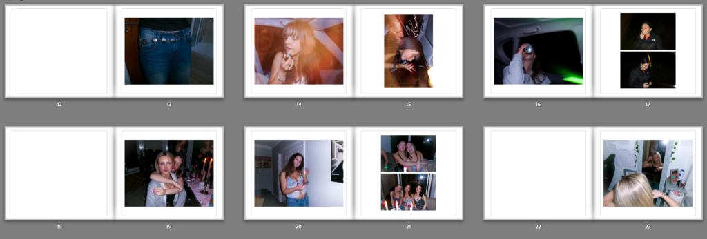
This layout will be repeated throughout my photobook. Seen through the screenshot, the page seen a the start has a black page this is because the first page could possibly have a title on it depending how I want my front page to be displayed. Then through it alternates between one landscape on the left, and two on the right page or a portrait image. This is so I could include both landscape and portrait images.
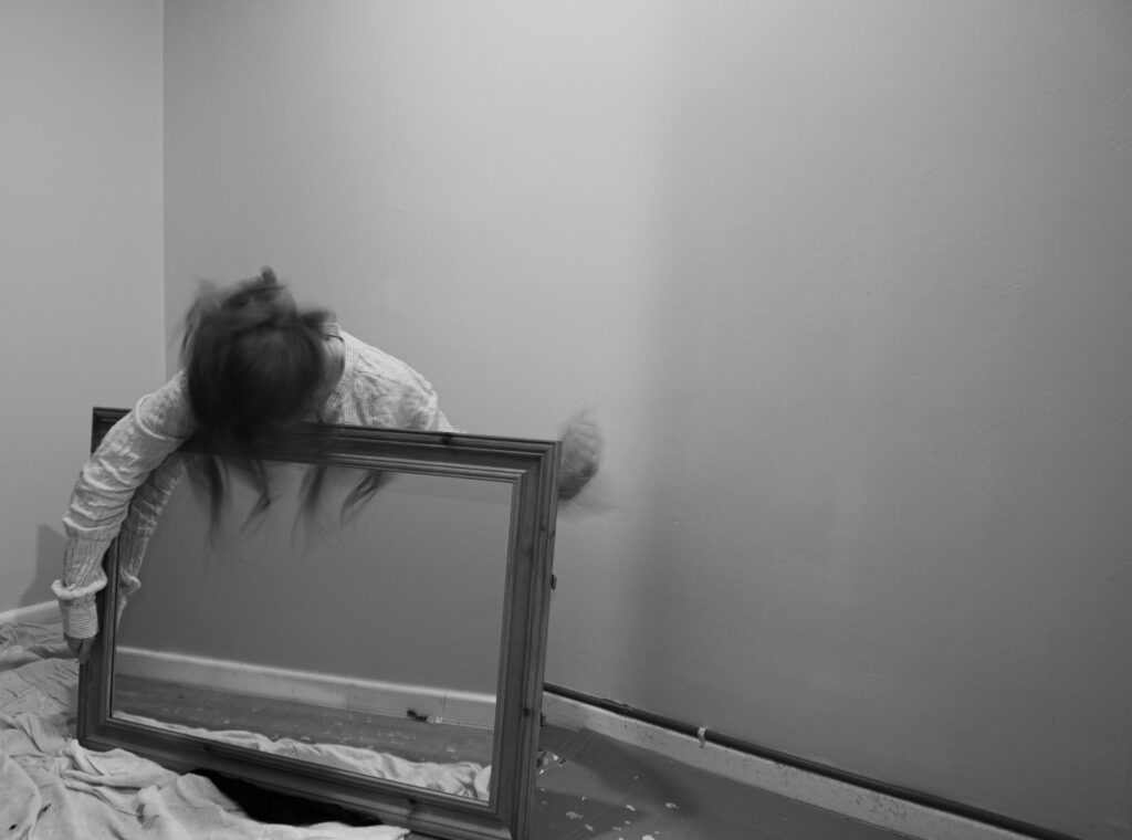
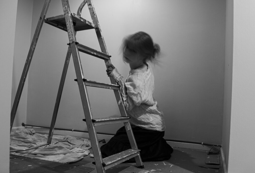
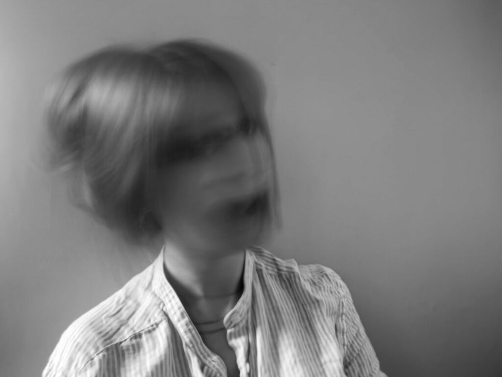
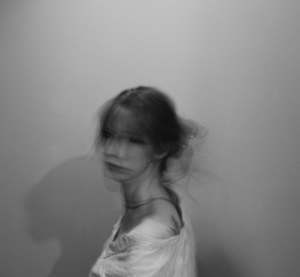
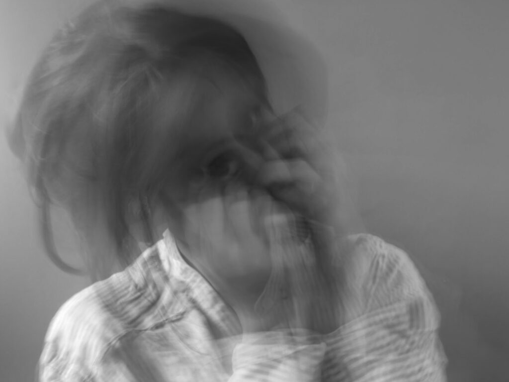
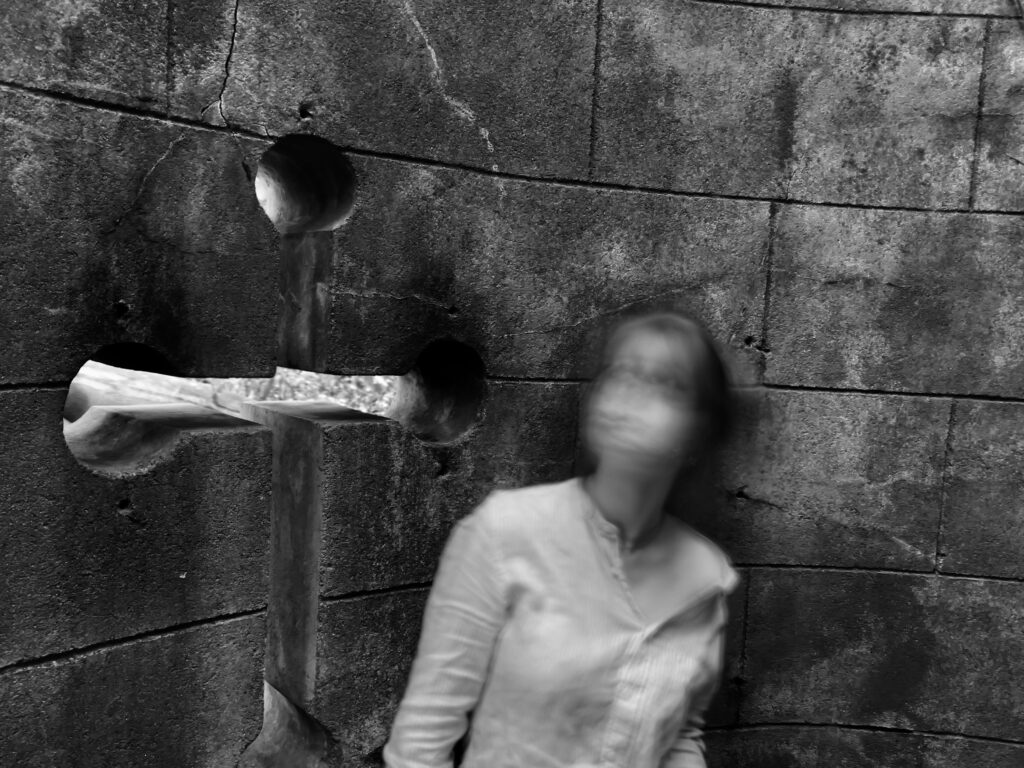
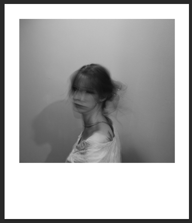
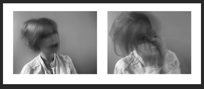
Motion Blur
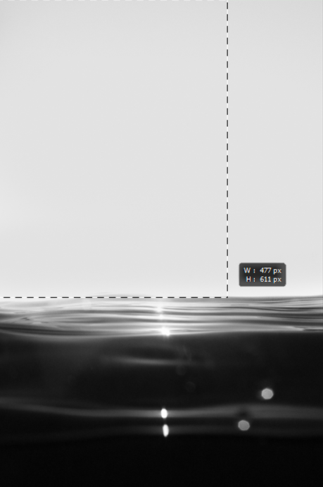
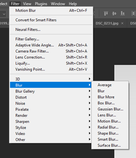
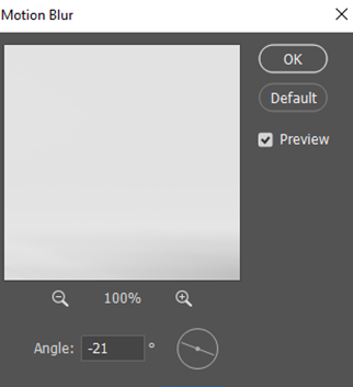
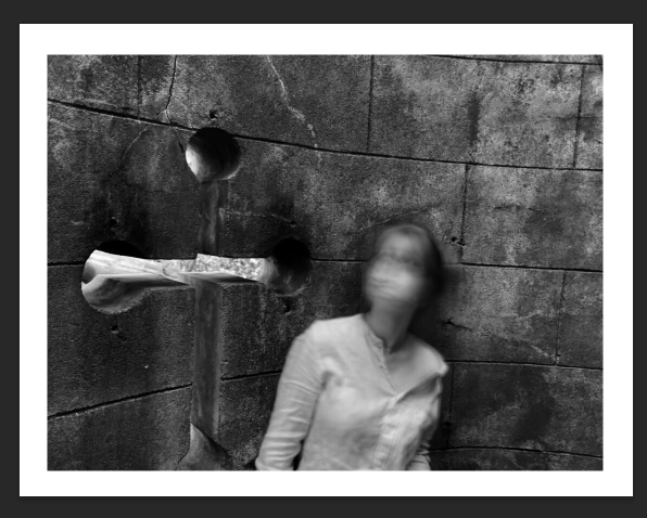
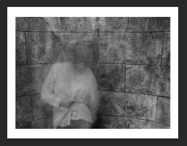
Hiroshi Sugimoto Inspired Outcomes
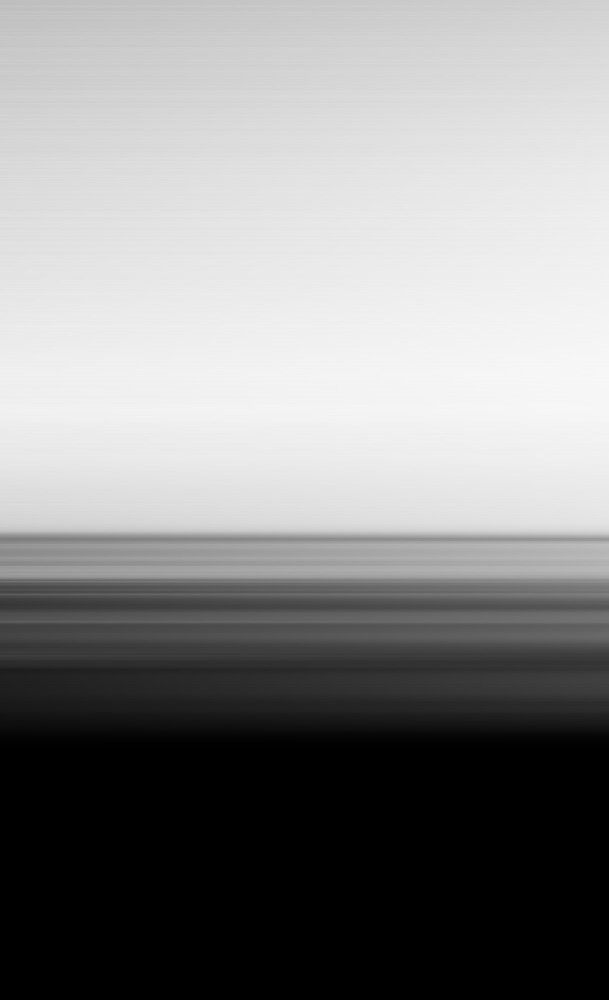
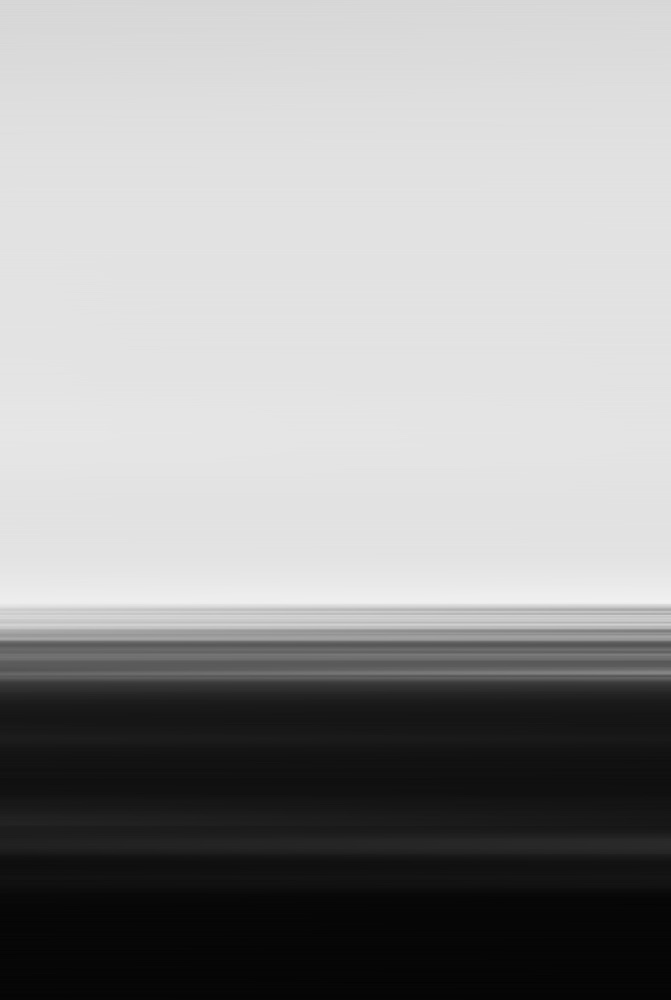
Layout in Photobook
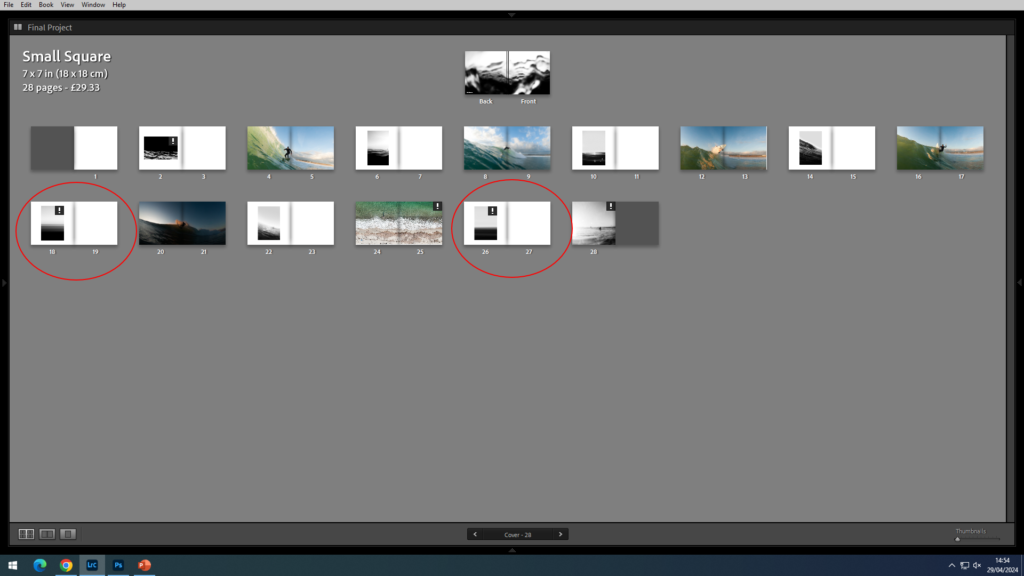
I decided to make a hardback photobook as my images are all documentary and I thought that with the overall outcome it would be more fitting to my theme.
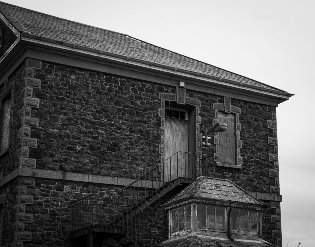
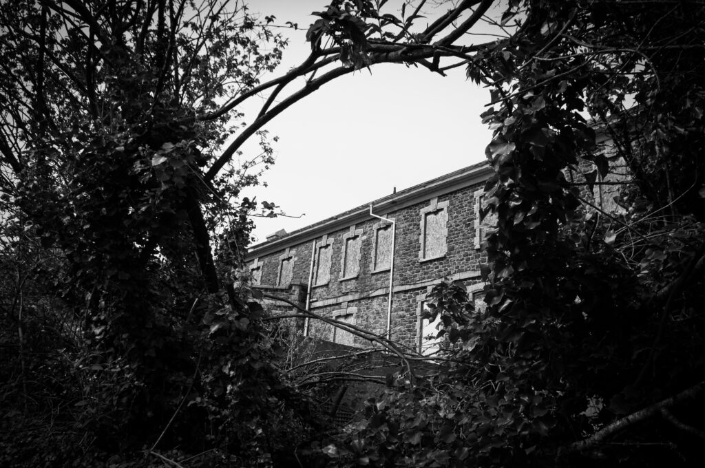
I want my photobook to show the unseen, more underground sides to Jersey that people don’t know or have forgotten about. The aim of my photos was to show viewers these places and how they have been left but also to show the brighter sides to them, how nature has taken over the majority of buildings like this and brought more life to them. I was strongly inspired by the works of Matt Emmett, he photographs derelict, abandoned buildings and places from all over the world; although it was challenging as I didn’t think there was many abandoned places in Jersey, after researching and exploring there is actually lots of places here that have just been left. This is also why I chose the theme of seek because it relates to exploring and finding out about these places, seeking the unknown.
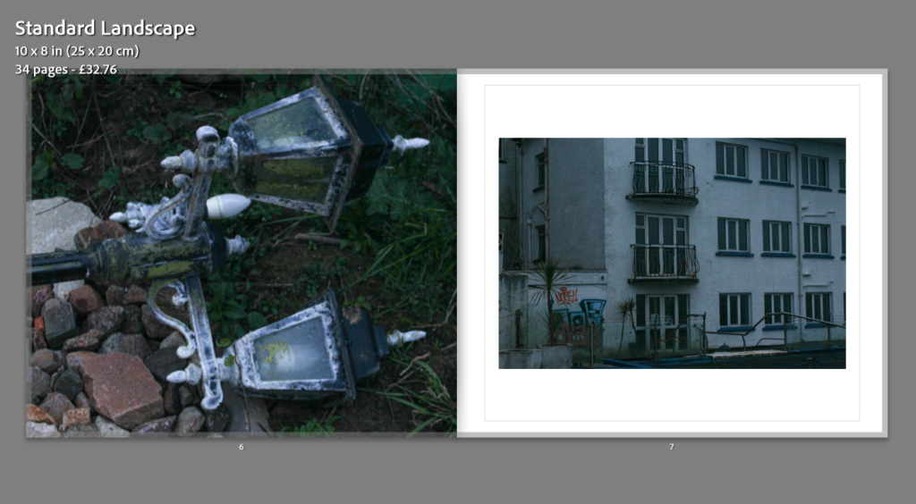
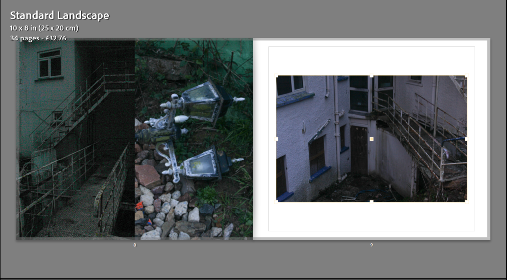
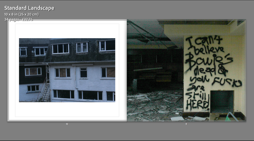
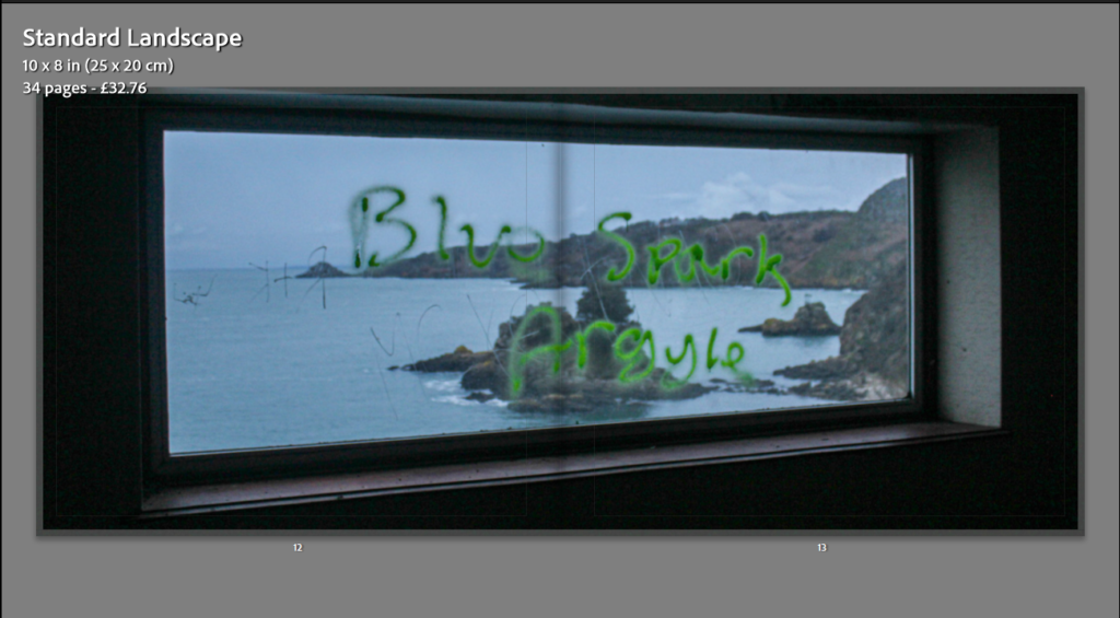
Here is a preview of the layout for my final photobook. I tried to display my images differently from page to page to make it more interesting to the eye. Throughout the process of creating my book I used one of three options, of presenting my images on a page, all the way through; this was one image, two images, or one image as a double page spread. I had multiple options for the layout of my images, which I have screenshot and displayed below.
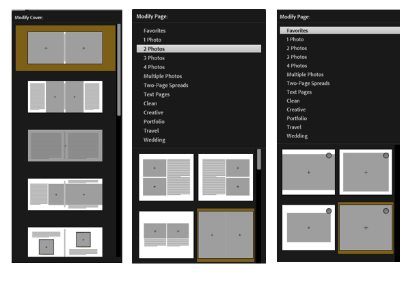
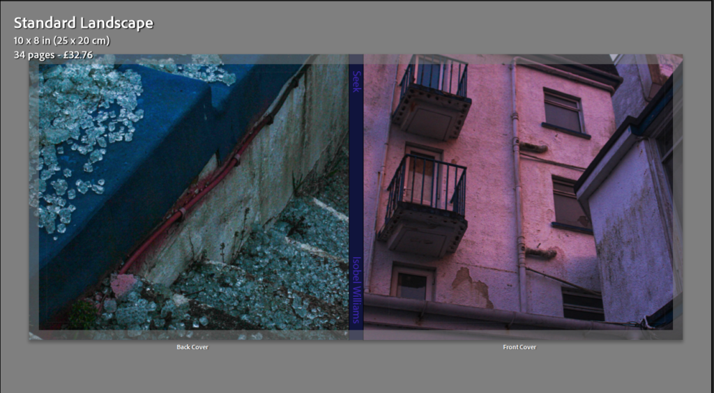
Front and back cover
Page 1
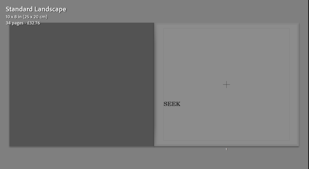
Pages 2&3
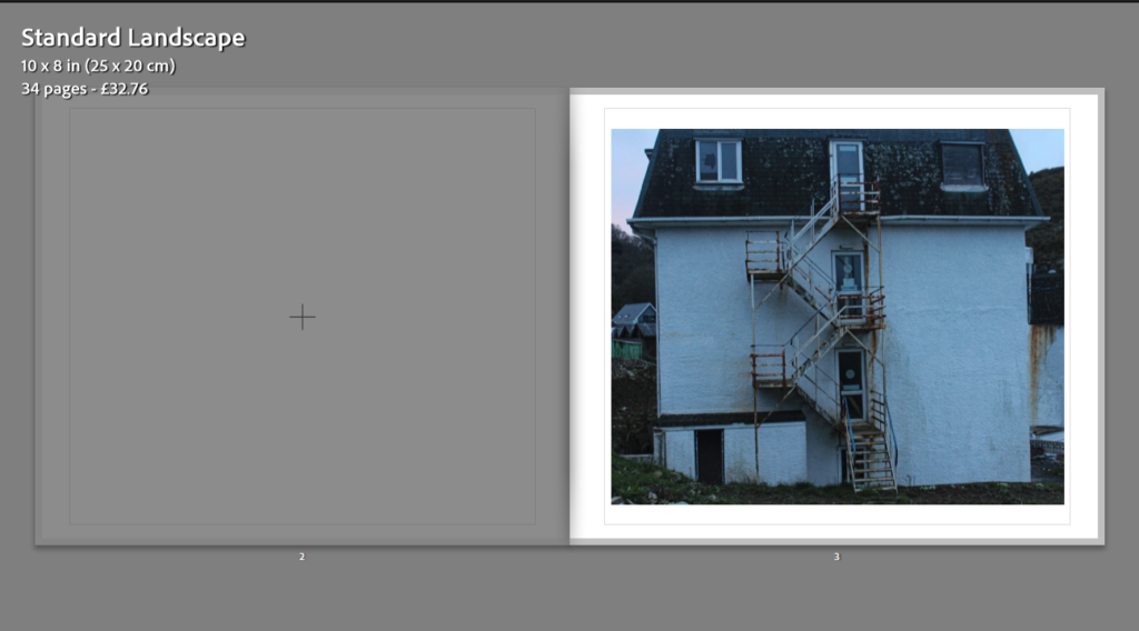
Pages 4&5
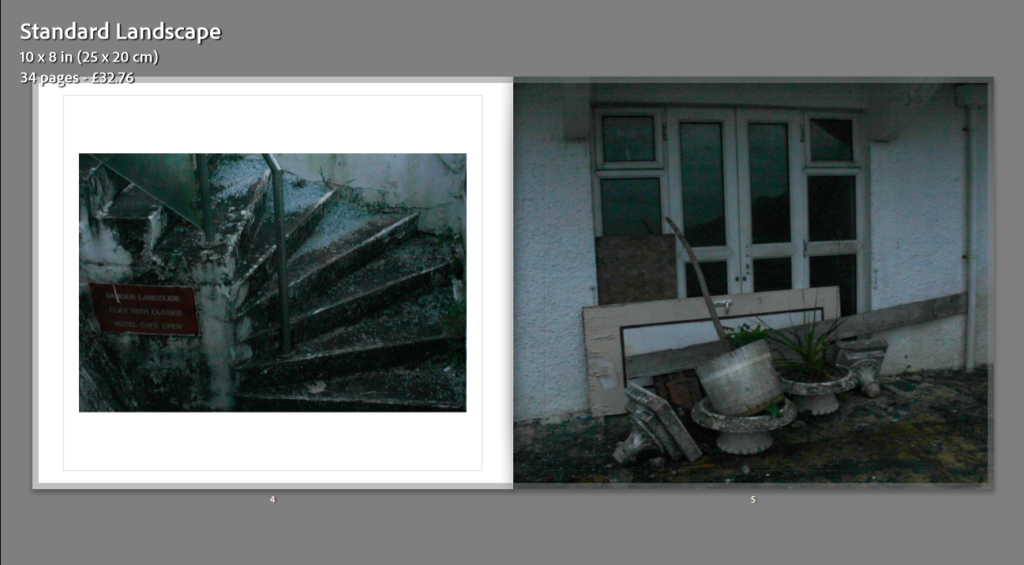
Pages 6&7
Pages 8&9
Pages 10&11
Pages 12&13
Pages 14&15
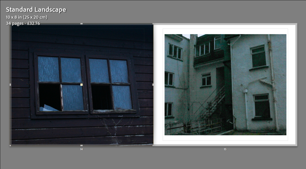
Pages 16&17
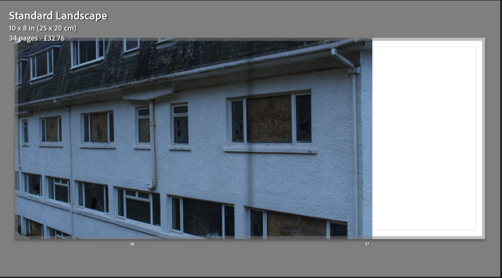
Pages 18&19
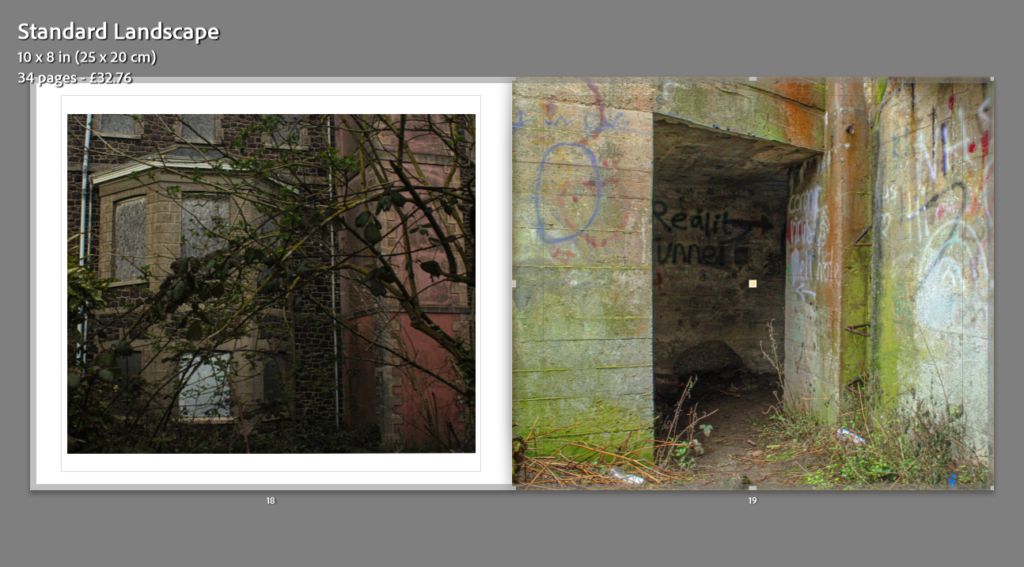
Pages 20&21
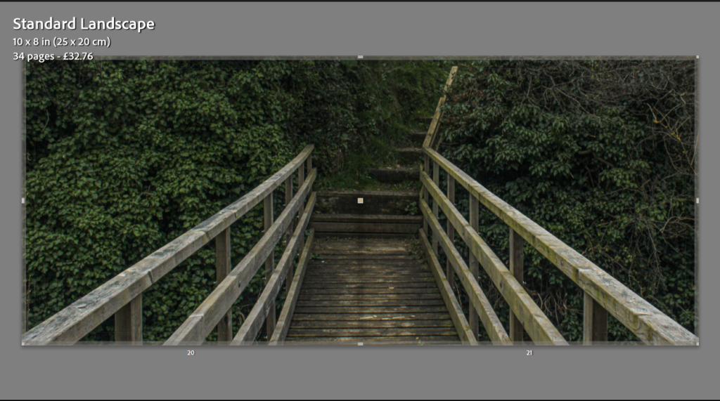
Pages 22&23
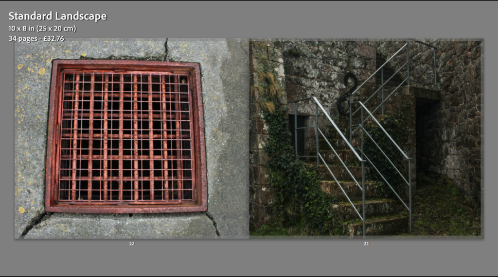
Pages 24&25
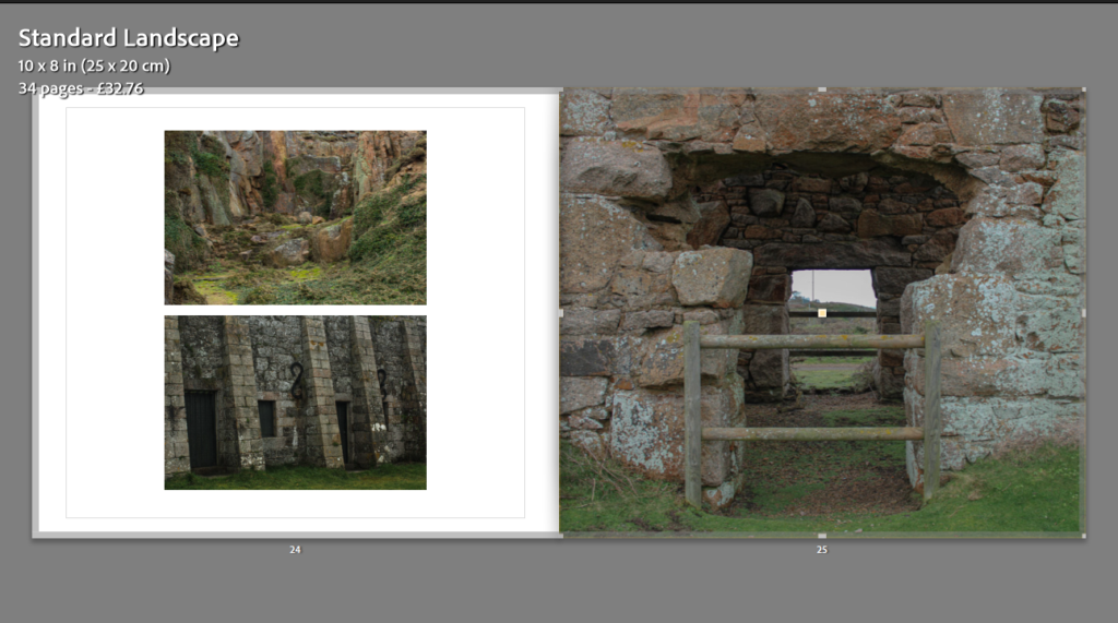
Pages 26&27
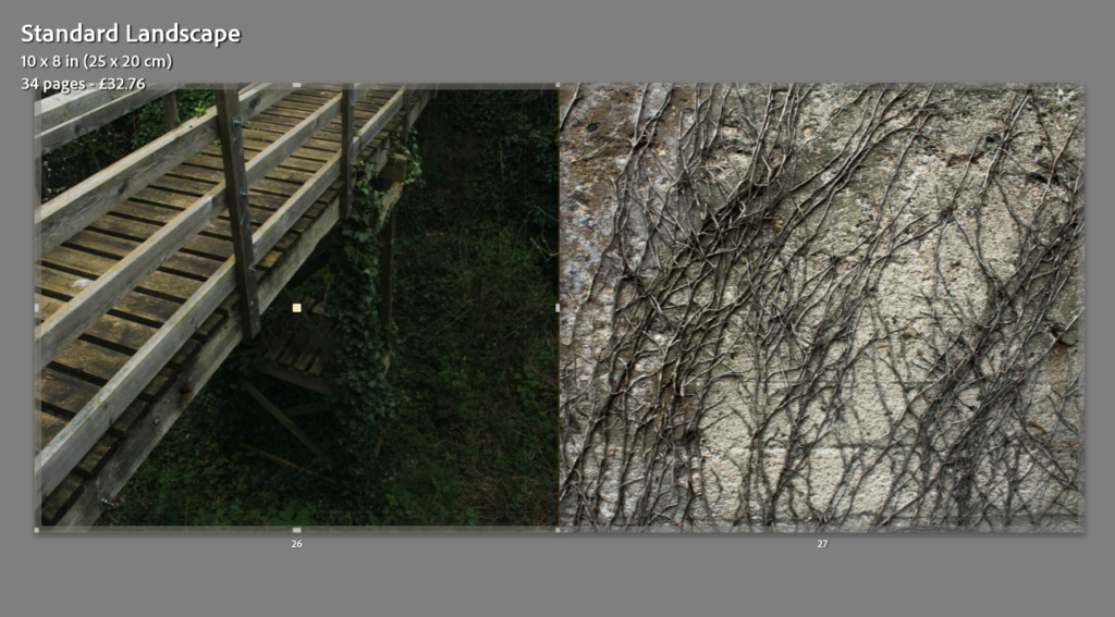
Pages 28&29
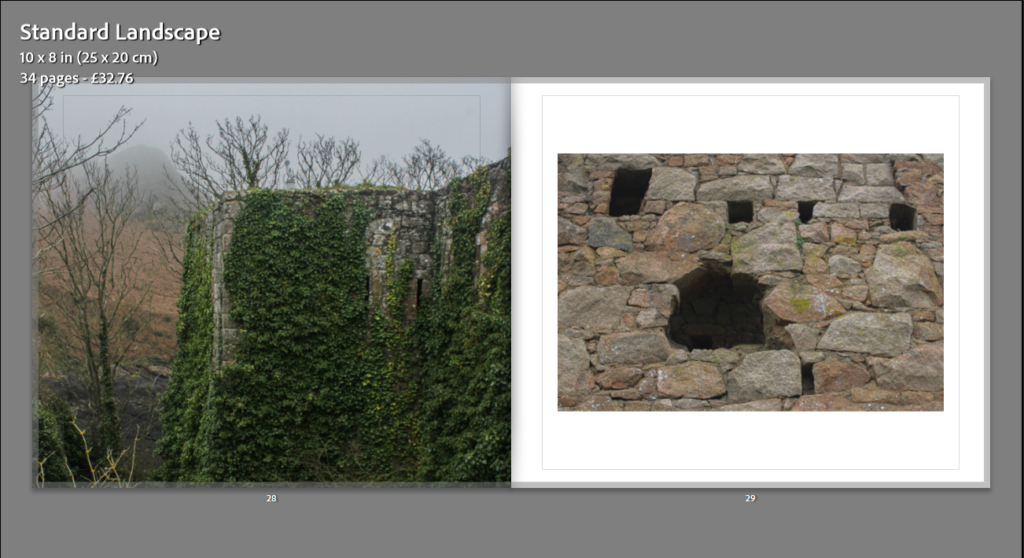
Pages 30&31
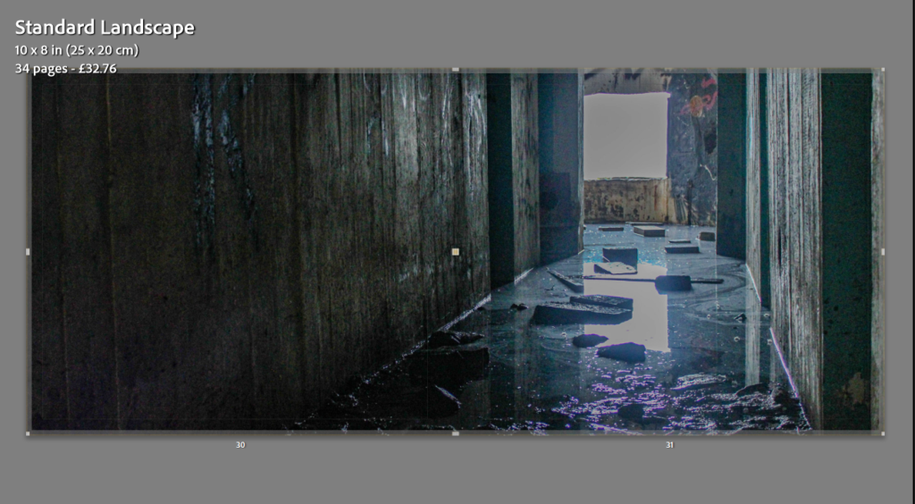
Pages 32&33
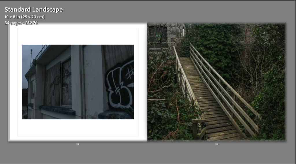
Page 34
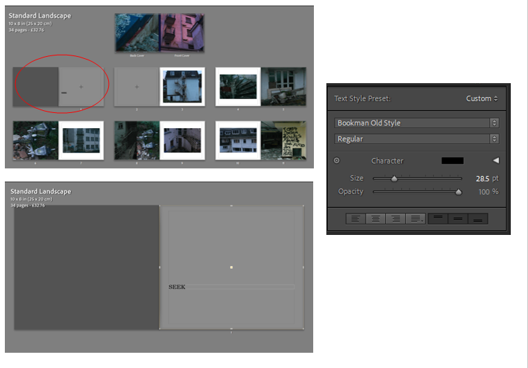
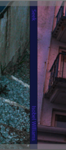
After constructing my photobook, I decided to add text to the front cover and first page. I did this by inserting text and using the tools I’ve shown above on the right to change the colour, size and font of the text. I made the spine of the book this dark purple colour as it blended more with the more popular colours of pink and blue from the front and back page; when I added text to the spine ( the title and my name) I edited it to be a slightly lighter purple then the one on the spine. This was because any other colours like white were too harsh. I decided to make the first page blank and add the title of my book as a title page when you first open my book. This is just to bring my book together.
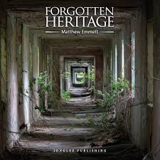
‘Forgotten Heritage’ is a photography project that uncovers the brutal beauty of abandoned Buildings and derelict industry. Emmett displays all his images that I have previously studied and are inspired by. Emmett shows a vast variety of images, from abandoned buildings and sites in the middle of forests and jungles; surrounded by the beauty of nature that has began to take over these sites, to derelict work industry buildings, rusty and broken down.
The front cover of his book is eye catching. In that image he used the repetitive technique of shape to draw viewers in. He has carefully positioned himself so that he’s central and can get the perfect composition. The natural lighting in the image creates an illusion of the square shape running right the way down this creepy hallway. This technique forces a focal point that falls at what looks like the smallest square, but also the end of the hallway; it leaves viewers wondering what is at the end of this path, what is beyond?
Forgotten Heritage is a documentary book, he reports real life settings, using photos, these derelict areas for the rest of the world to see.
I was inspired by the book when designing my own photobook, not only because I used Emmett’s work to base my work off of, but also the layout and design of his book. There is no text in his book from page to page, just his straight up photos. I like this as it is forward, there are no distractions just a display of all his work, as mine is as well. I like the fact he doesn’t try to show the dark side of these places, he almost try’s to show that although these places are very derelict, there is also a lot of beauty to them. I think I successfully did this in my work by taking images such as, the abandoned hotel with the bright sunset reflecting off the wall, or a derelict heritage sight with bunches of colourful green leaves covering and surrounding it.
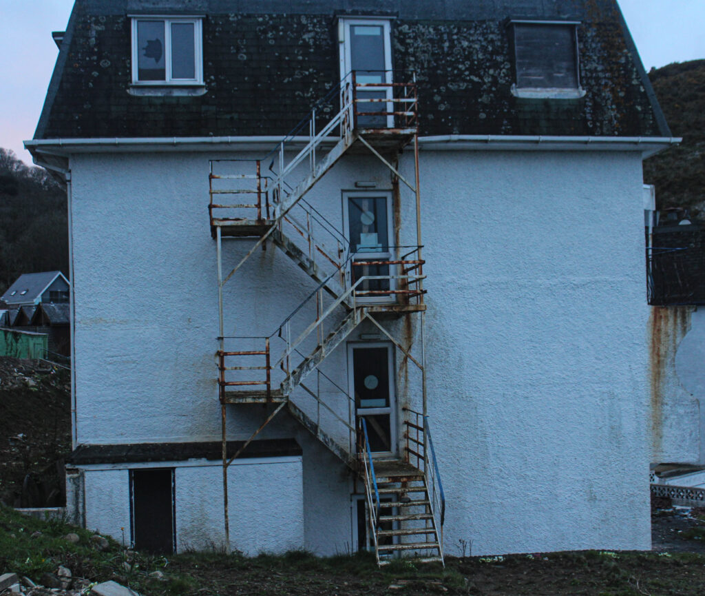
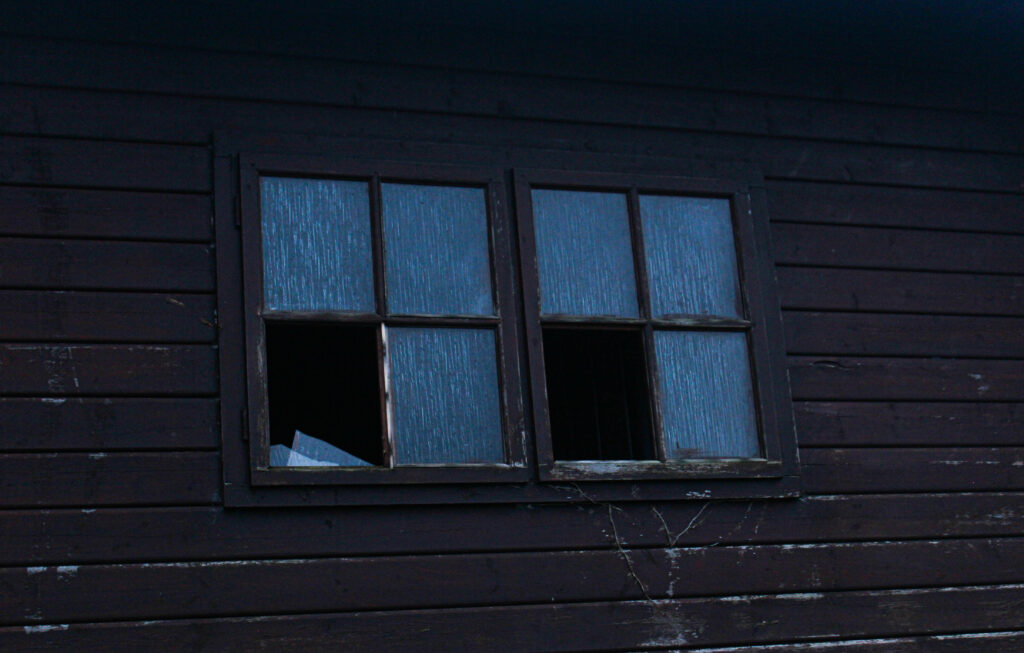
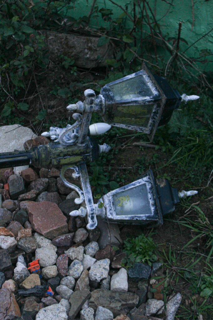
This photoshoot was carried out at the abandoned hotel at Bouley Bay. This was perfect material for my project as there was smashes glass, broken railings, smashes windows. rusty metal, boarded-up doors, graffiti, random furniture that had been left and more. This was my most successful photoshoot out of them all, however a massive problem was that half the time I had my camera on the wrong setting. This was because I was taking photos both inside and out and forgot to adjust the aperture to fit the setting and lighting. Therefore, a lot of my images were either heavily under exposed to the point where I couldn’t temper with it in Lightroom or just fully black. Although that happened, I still had a good few successful images that will make final outcomes.
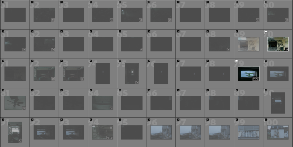
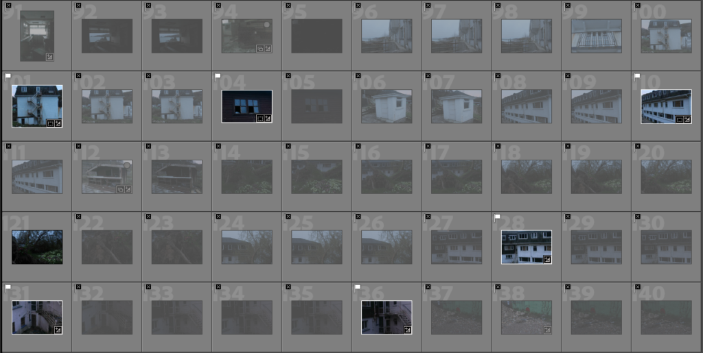

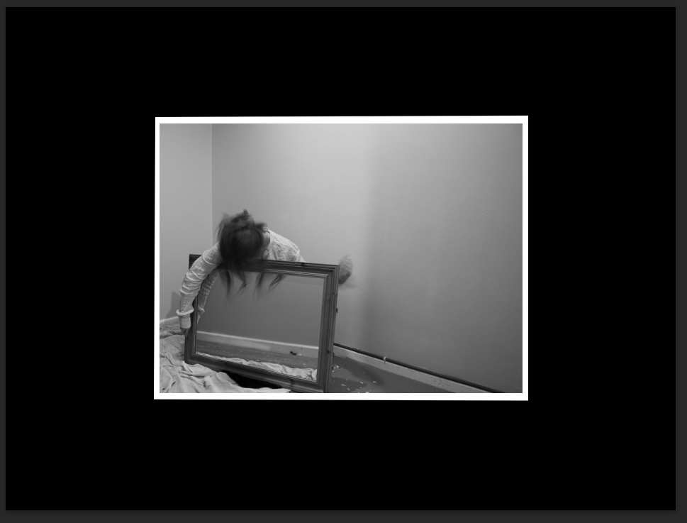
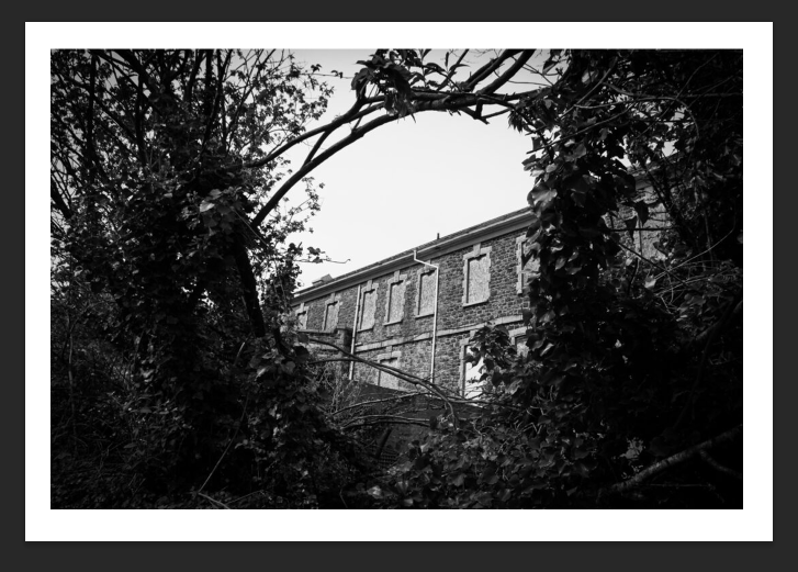
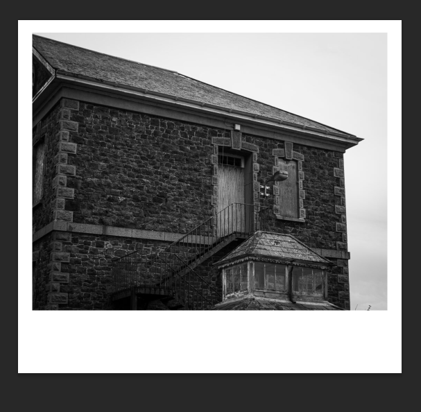
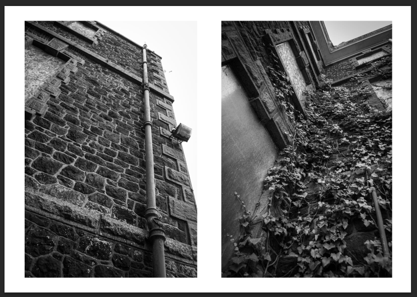
Although a lot of my images were underexposed here are all the successful outcomes which I’ve edited and experimented with.
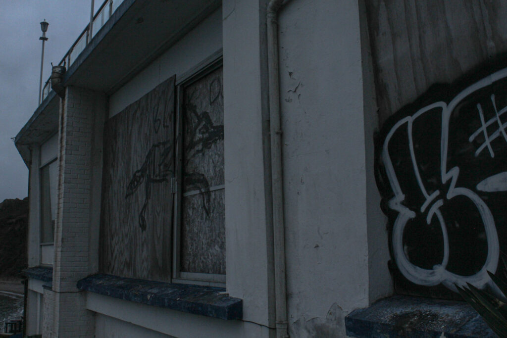


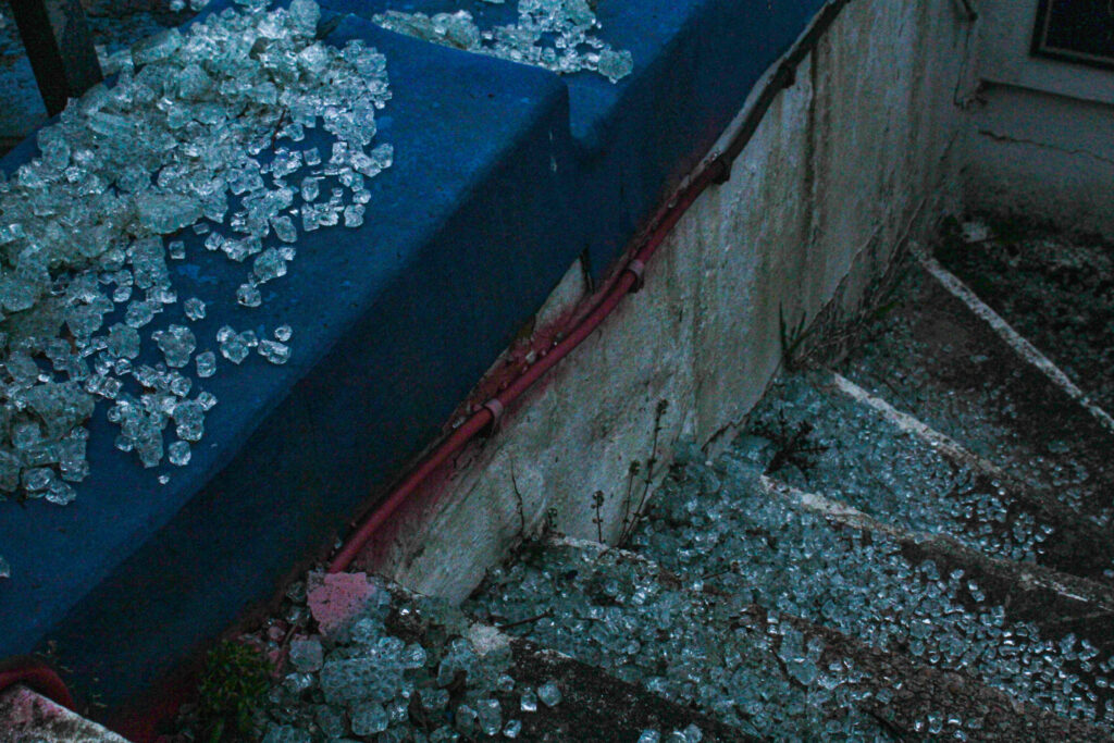

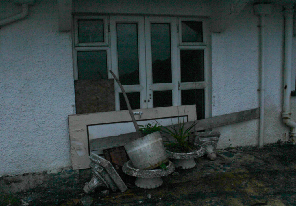
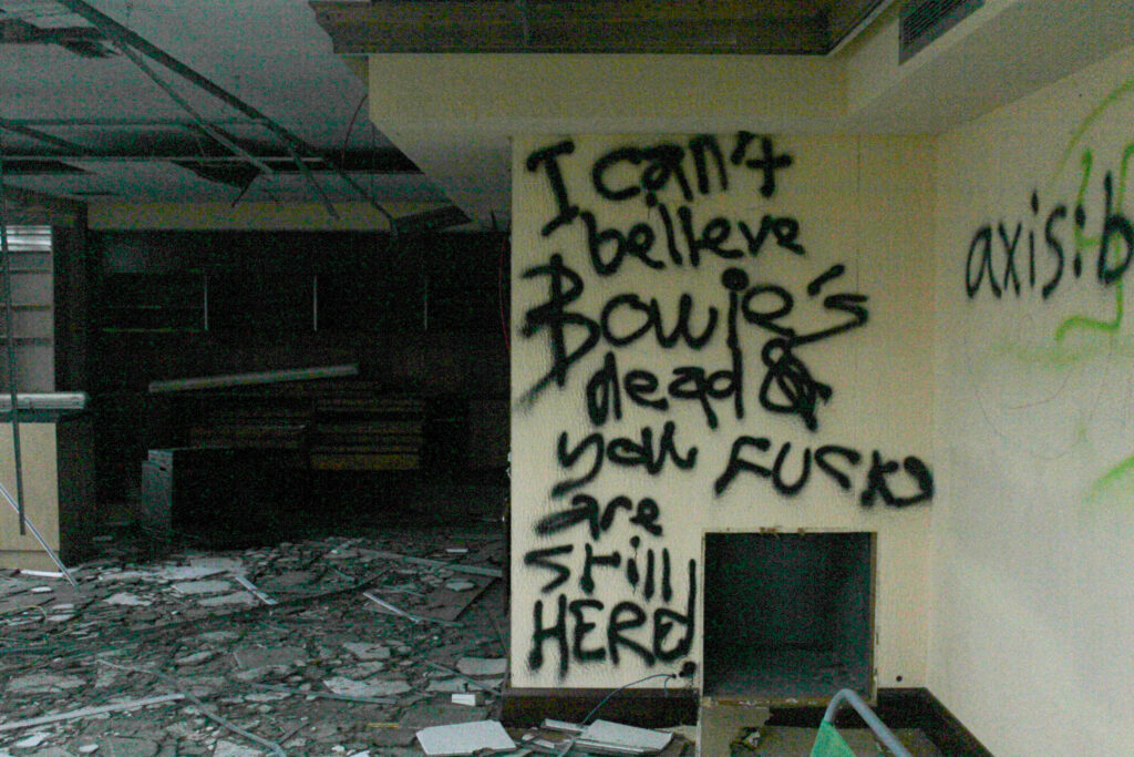
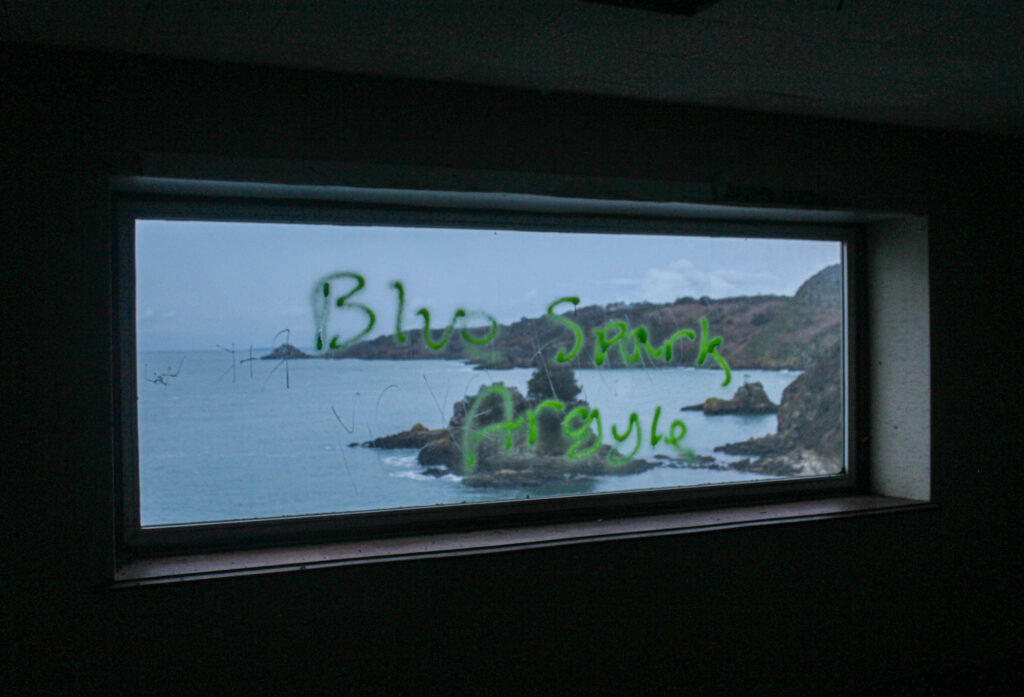
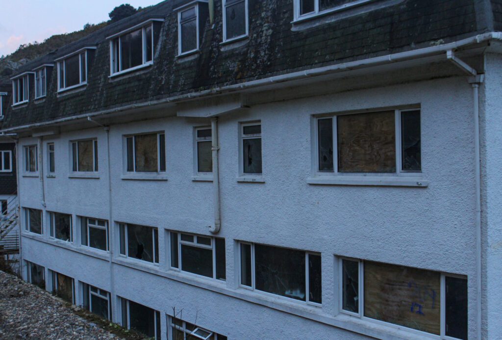
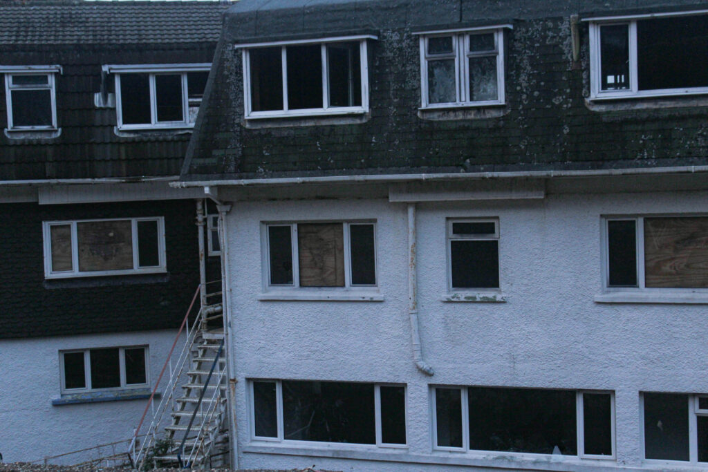
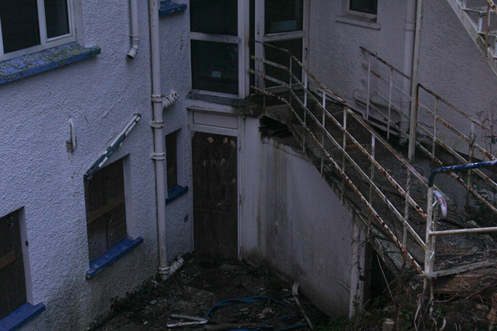
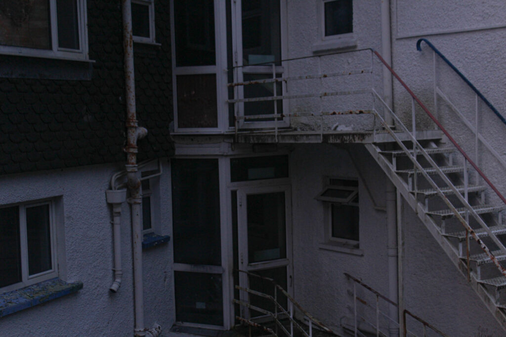
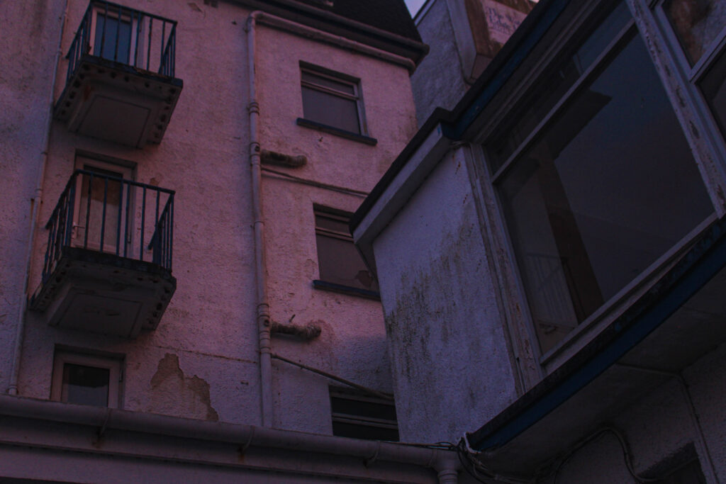
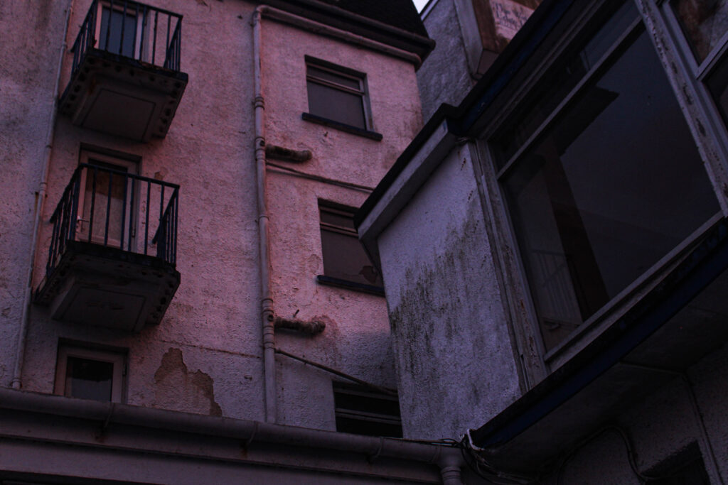

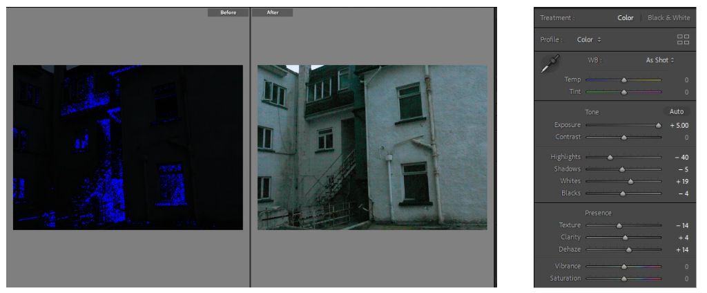
The two images above were completely black when I first transferred them onto light room. Ive shown below the before and after as an example of how just changing the elements to an image slightly can change the whole thing. Exposure is the main element in this image and as shown, I increased it fully along with the shadows and whites. I did this to bring more light to the images.
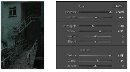
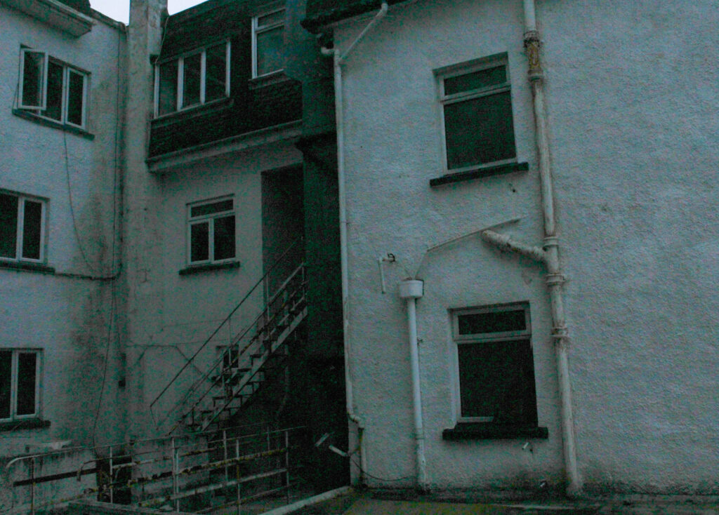
This Image was very blurry so I increased the texture to stop this slightly. Although the outcomes are very grainy and have this green, aqua haze over them, I really like the outcome and I think it sort of looks like images of footage from a security camera; which correlates with my theme of seeking, eerie abandoned buildings perfectly
Here are some examples of the editing process I went through to create some of my final outcomes.

This image was also very underexposed so I increased the exposure and also experimented with exaggerating the colours and tones a bit. I changed the colour green’s hue and liked the outcome of the bluey haze over the image so I did the same with the aqua colour to get this outcome.
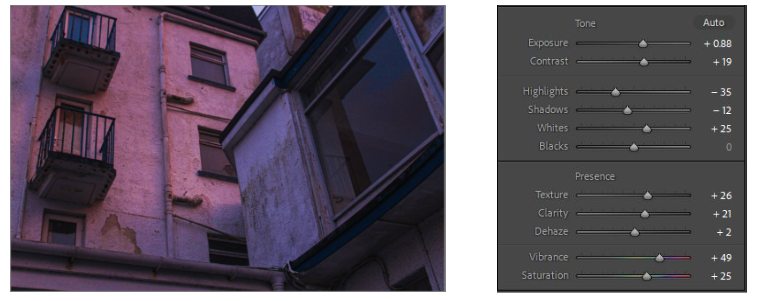
I took this image as the sun was setting, that explains the pink lighting in the image. I like this as it contrasts the rusting, run down building which is not a very pretty thing, with the bright pink light from the sunset which is usually seen as an aesthetic feature.
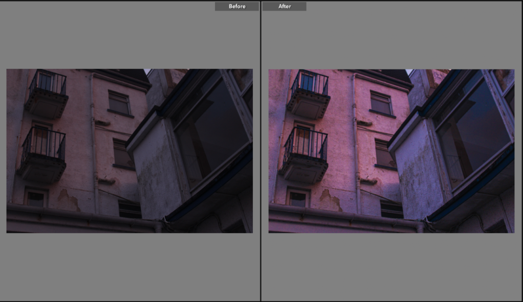
I didn’t do as much to this image as the others as the quality was high, but the image on a whole was quite dull. Therefore I increased the whites, clarity and exposure. By decreasing the highlights a bit, this enabled the image to look smoother.
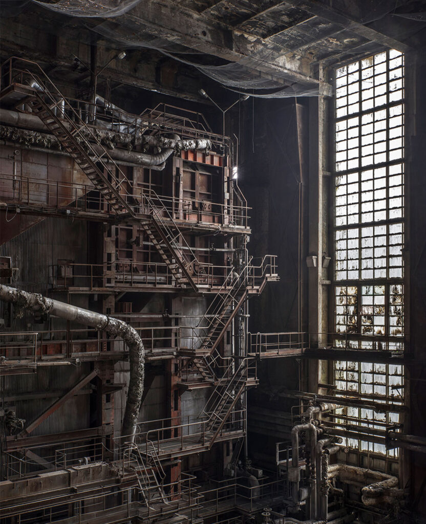
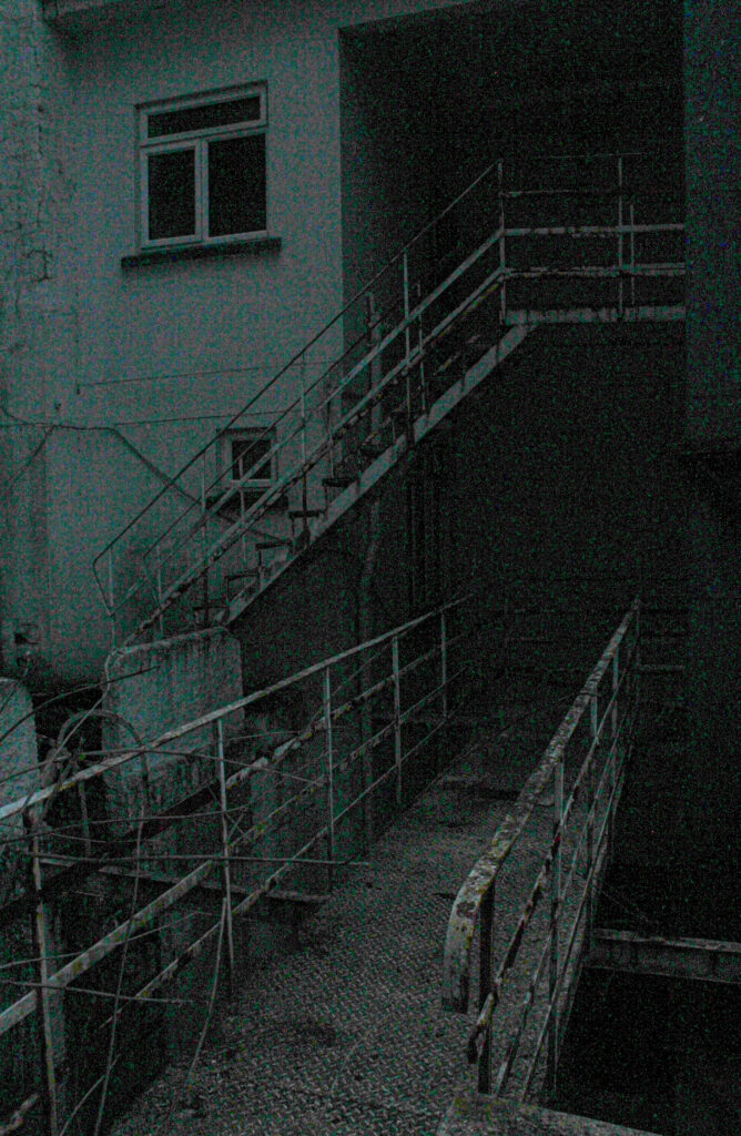
This image I took (right) reminded me of the image on the left, taken by Matt Emmett, when I developed and edited it. I think the significant similarity is the metal barrier stairs that are rusting and appearing unstable. Both were taken in abandoned, run down buildings. Emmetts photo is a lot lighter then mine, he has more natural lighting coming in which brightens the tones of the image. As mine was edited to be brighter then it originally was, it appears quite grainy and has darker tones. I like that you can’t fully see the background, I think it adds depth and contrast to the lighter parts of the image. When I increased parts of my image such as the exposure, whites and highlights, it also changed the tone of the image; through tempering with a few things it created this aqua haze over the image. This to viewers may look like not as good quality, compared to Emmetts image, however, I think it makes it more interesting and eerie.
Below are the 9 images I have sent off to the print folder, I have six images in A5, two in A4 and one in A3. I plan on making two boards presenting my images with the different sized images in different layouts.
My plan is to make two outcomes with images. Both of which will be mounted up on black board, one will have the first 5 images below on. This is because they were all from the same photoshoot, taken in the same area and also all have the same theme of this abandoned building so I feel it makes sense to put those together. On the second board will have the last 4 images shown below. These are more rural places, they aren’t from the same photoshoot, however they all have a common feature which is nature and showing how its taken over these places.
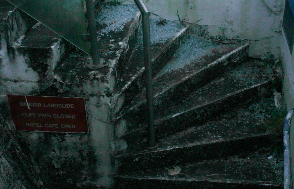
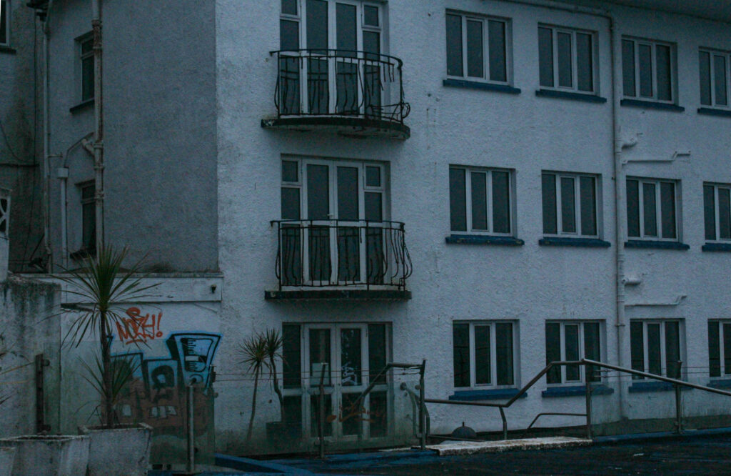
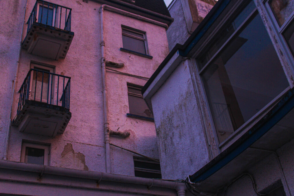

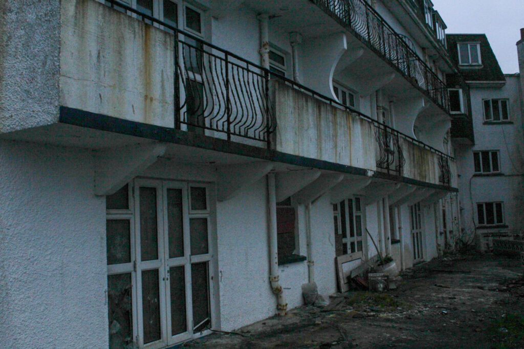
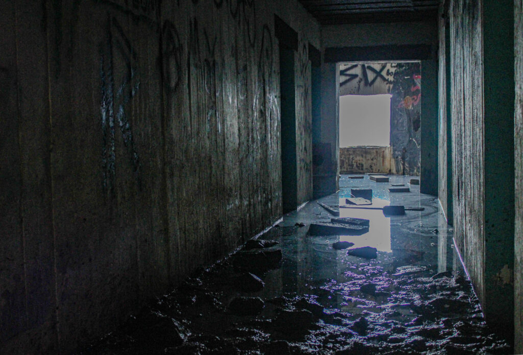
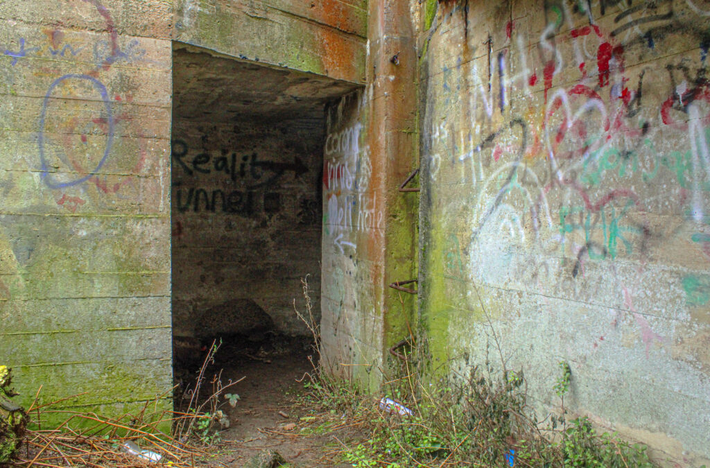
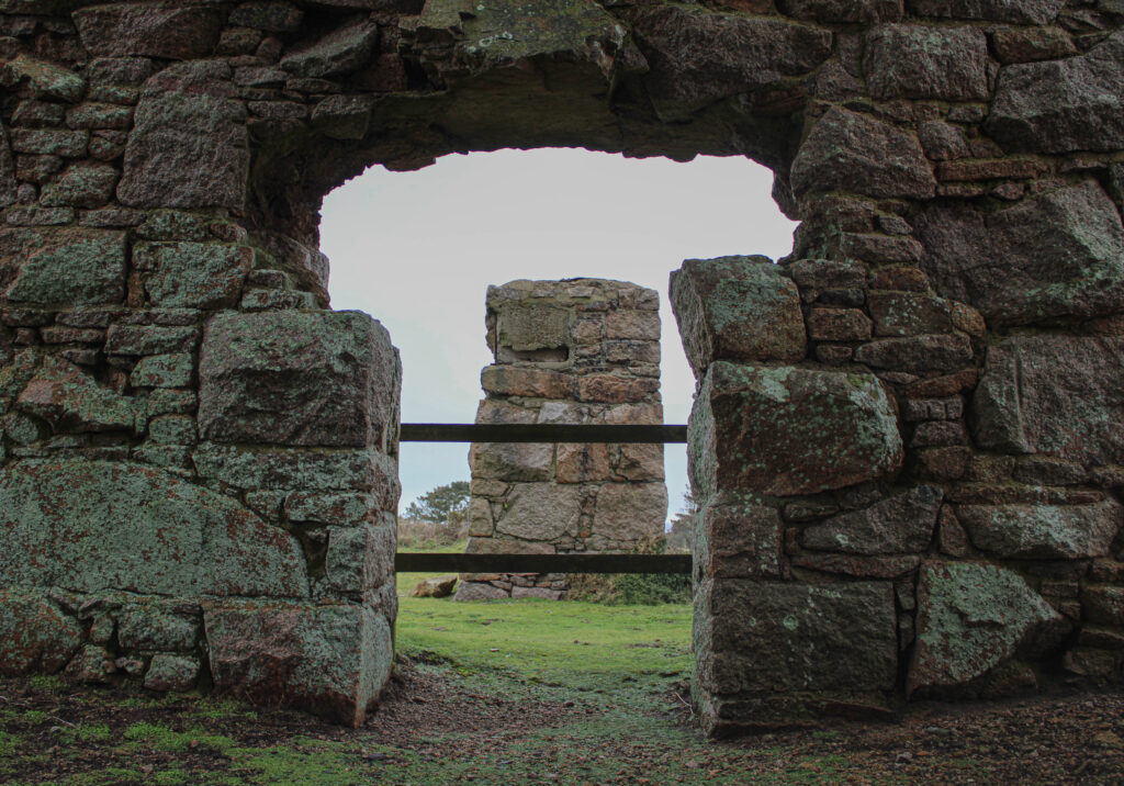
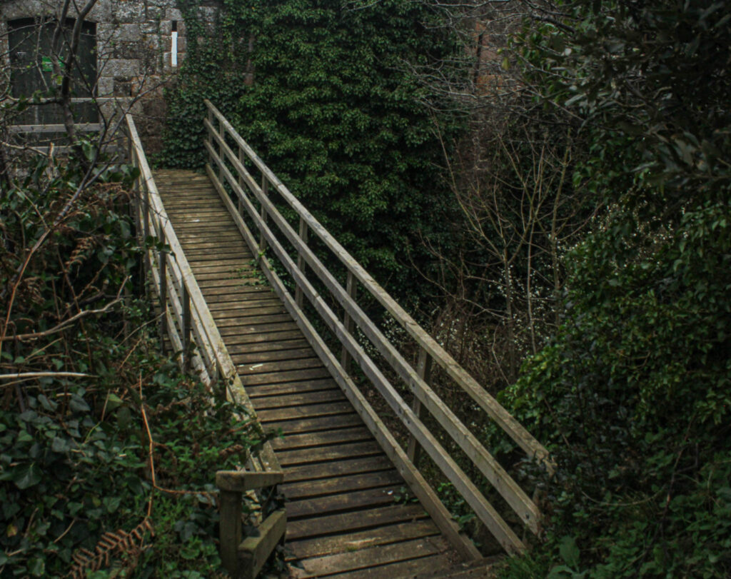
I decided to print these images as I feel they are the most successful from my shoots and strongly represent my theme of seek in multiple ways. Also, as the theme of my project was abandoned/derelict buildings and places, a lot of my images were either very green coloured, as nature tends to grow over these places; or just dull in general. However, these images were the brightest and most interesting out of them all, therefore I’m boarding up these ones.
After analysing, editing and reviewing all my image from the photoshoots I’ve carried out, I’ve gathered the successful outcomes from each shoot and now have my options of images for my photobook.

I plan on making my photobook 30-35 pages long. Therefore, I may not use all of my chosen final images but it also gives me more options to choose from. A few of the images are very similar anyway so this may help to have more of a variety of different images.
