Overall I think my final outcomes were very successful, my images are abstract while still being very simple which is what I was aiming for. In the beginning I think it was quite a tricky theme (observe, seek, challenge) but once I knew what path I wanted to go down I realised there were countless opportunities for me to look into. What I liked a lot about this project is that it challenged me to look at the things around me differently and really take the small things into consideration, From this I believe I can see the beauty in things a lot more. A quote that inspired this project from the beginning is “When we stare at people, we’re actually just observing them, trying to better understand them, because there is something we find interesting in that individual!”, I found this really interesting but wanted to focus it more on objects than people.
Rinko Kawauchi was definitely my main inspiration for this project as I loved her use of composition, lighting, colour, and movement in her photos. Her ‘fairy-like’ photos is what influenced my more abstract photographs. Her use of colour is more focused on subtle pastel tones and muted hues so my inspiration behind colour definitely came more from William Eccleston’s bold and vibrant use of colour, the often saturated colours and strong contrasts create visually striking images, exactly how I wanted them to be.
One thing I would do differently next time is take more photos outside, I think natural light and nature is what is missing from my final images and what I think would bring them all together. If I was to continue this project I would also do another focus on humans and the people around me which I think would be an easy and affective way of extending this project.
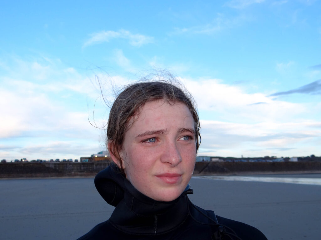
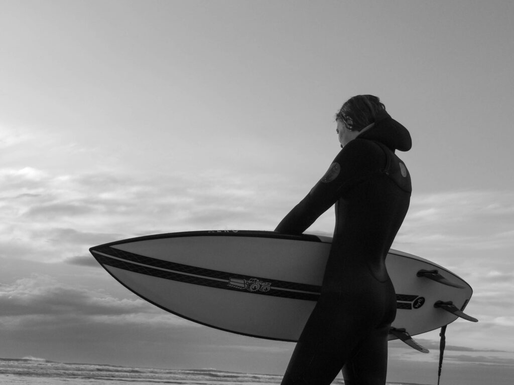
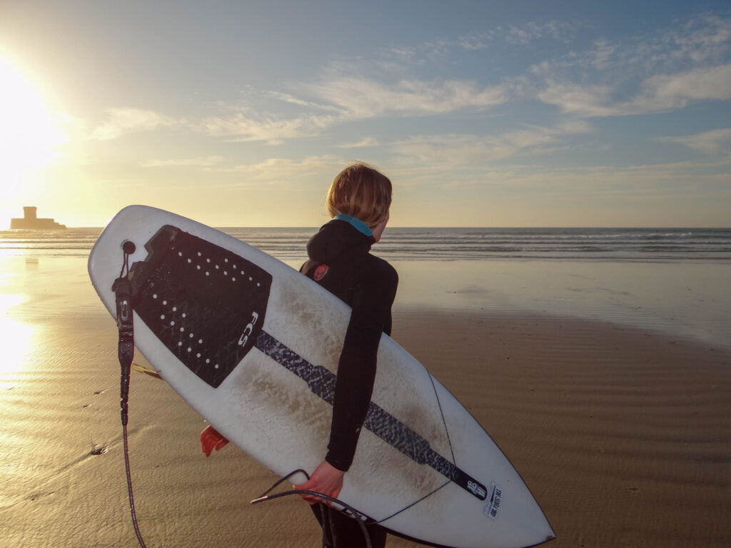
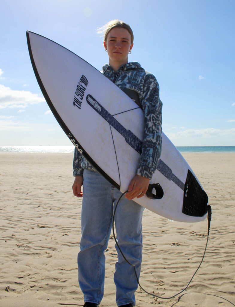
Overall, I am very happy with how my project turned out. I feel as if my photobook really captures the feeling of the surf aesthetic and culture and demonstrates the bond my sister has with surfing.
Whilst making my photobook I overcame many challenges as at first I found it hard to put the photos in an order that flowed and told a story. I also found it hard to narrow down the images I wanted to have in my photobook as I originally wanted images from each shoot but sooner realised that the book flowed better once I had removed certain images. The book started to come together once I had managed to get the images in the order and layout I wanted. After completing the photobook I realised that the book told more of a story than I first thought. I personally think the final out come of my book is successful as there is a clear flow to the book as it consists of a range of images and layouts throughout. I made sure to keep the layouts simple but not repeat them too often to prevent the book being boring. I also think the way I have presented my images within the book links to the theme of surf culture and shows my sisters journey and passion for surfing.
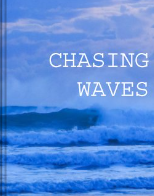
I decided to name my book ‘Chasing Waves’ because it is essentially what my sister does as she always wants to be in the sea surfing.
Mounting up my prints was time consuming, even though I had made mock-ups of how I was going to present my images, as I was very precise with the sizing and placement of my images to make them look professional. I decided to present all my images in a similar way on foam board and black card as I feel the simplicity of presenting my images in this way lets the images speak for them selves. When deciding what images to mount together I wanted them to all link together which is why I made mock-ups of how I was going to mount my images on photoshop. Overall, I am happy with the way I put my images together as I feel they all link with one another and present my sisters love for surfing.
I think that I partially realised my intentions when making my photobook once I had overcome the thought of needing to include images from all my shoots in the book. Whereas I 100% knew my intentions when mounting up my images as I had pre made mock-ups.
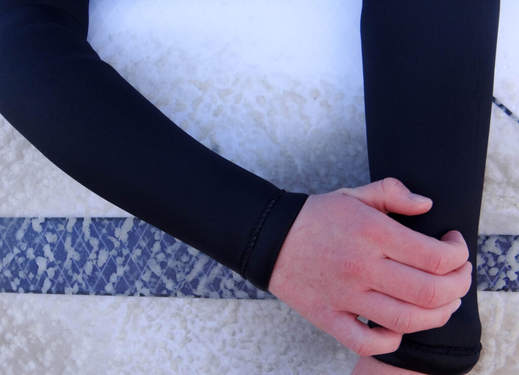
When I first started this project I struggled with finding photographer to link my work to. I found the work of Thomas Lodin and W. Eugene Smith and was inspired by the work they had done and wanted to used their ideas within my project. I think that I made good references to all my case studies in particular W. Eugene Smith. When studying ‘The Country Doctor‘ it was clear that Smith took a range of different images such as establishing shots, detailed shots, environmental portraits, formal portraits, observed portraits, relationship shots and person at work shots. I took this on board when carrying out my photoshoots and made sure that I also got a variety of different shots.
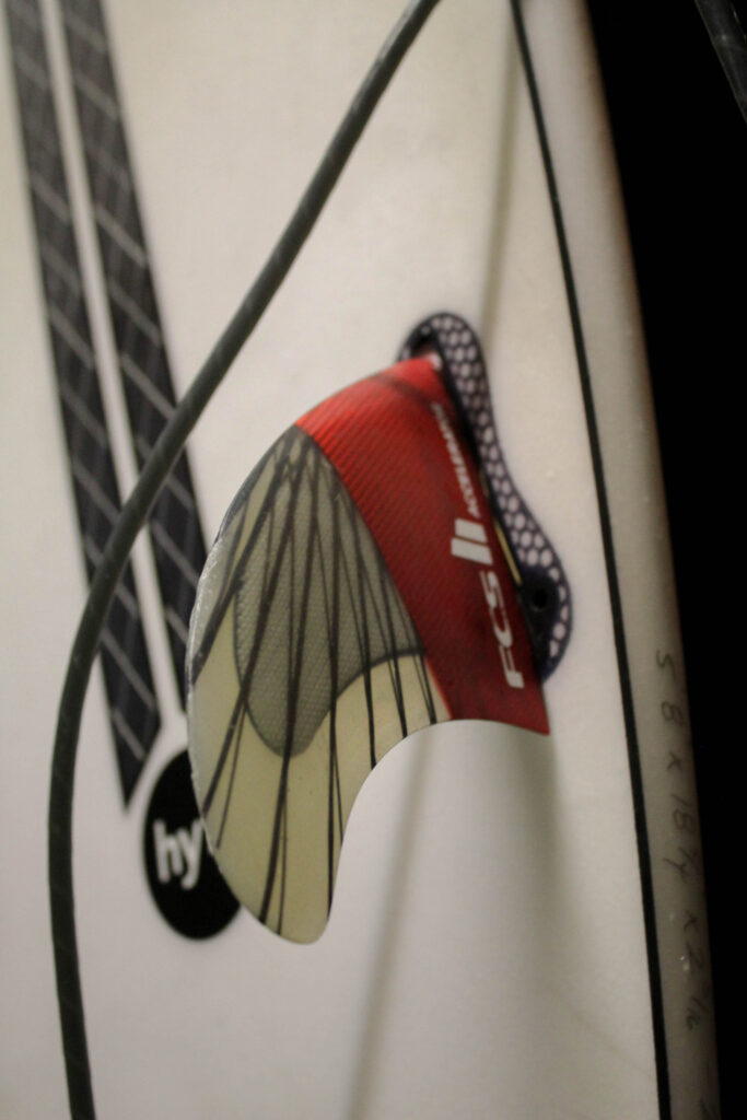
There were some connections to the work of my artist references but I feel as if I could of made more links to the work of Thomas Lodin if I had the equipment he used to take his in water images.
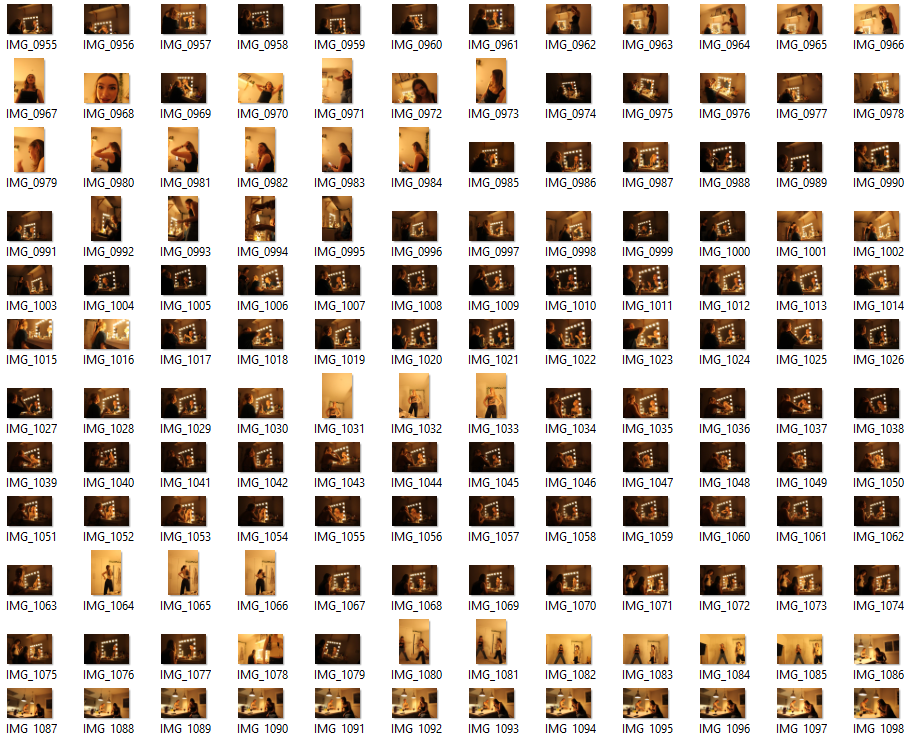
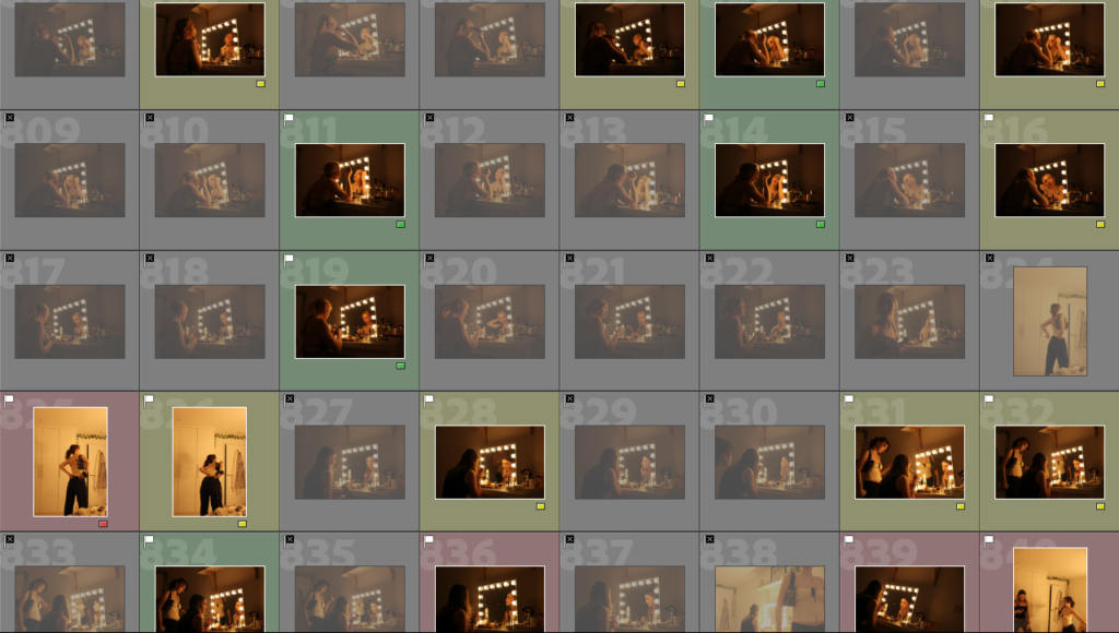
Examples of the different types of images I took
When putting together my virtual galleries I had to carefully choose where to place my images and what images I wanted to group together, similar to when mounting up my images. I tried to group images from the same shoot together as they had strong connections with one another. I also experimented by grouping images from different shoots together as they linked well and could tell a story when being looked at by the viewers.
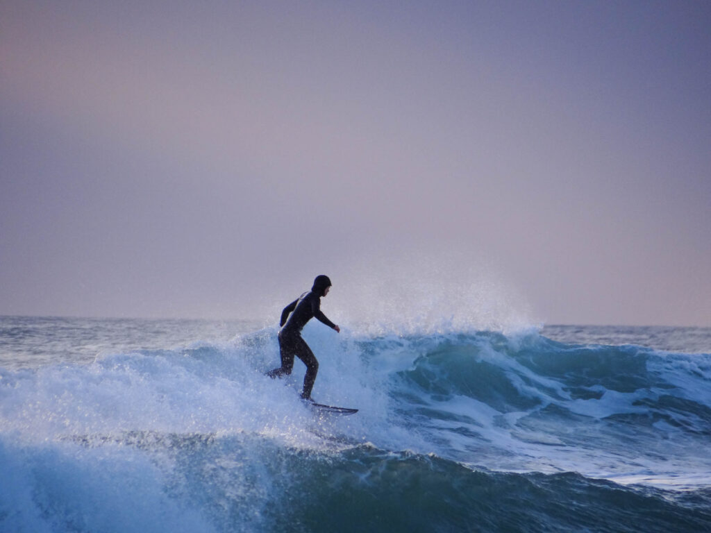
If I was to do this project again I would like to experiment with taking in-water shots to enable me to get more interesting and close up action shots. However, I do feel as my outcomes have been successful and that I have learnt a lot within the process of making my photobook. I surprised myself with some of my images as you don’t know if you’ve managed to get the shot you wanted when the surfer is on the wave until you come to edit them. Therefore I am pleased with the images I have taken and how I have presented them.
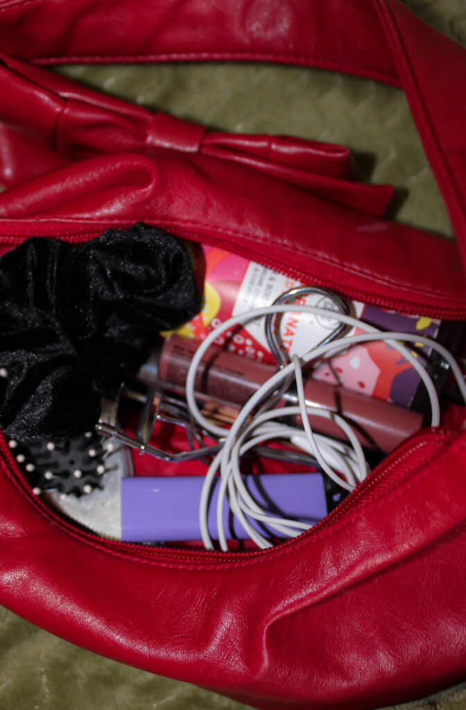
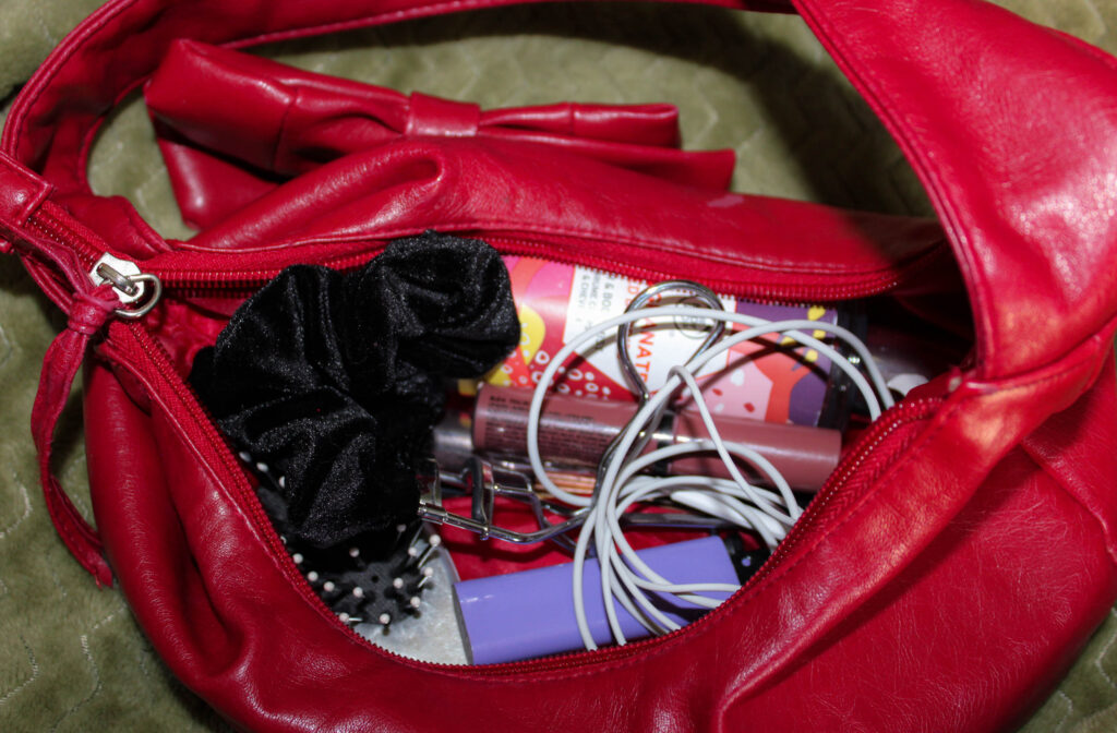
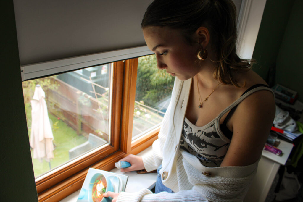
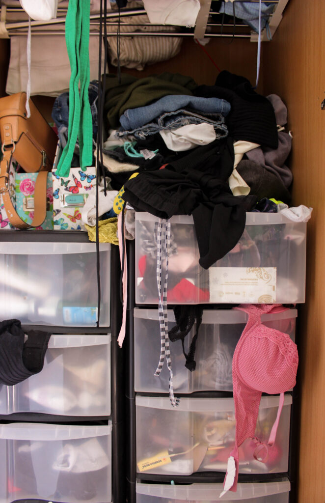
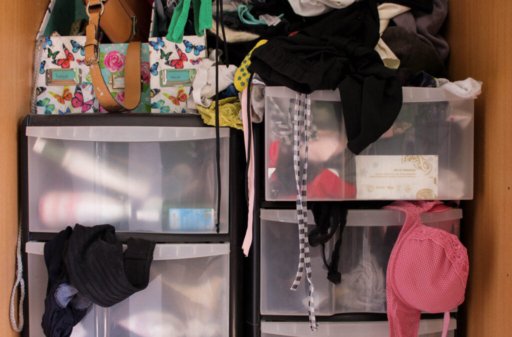
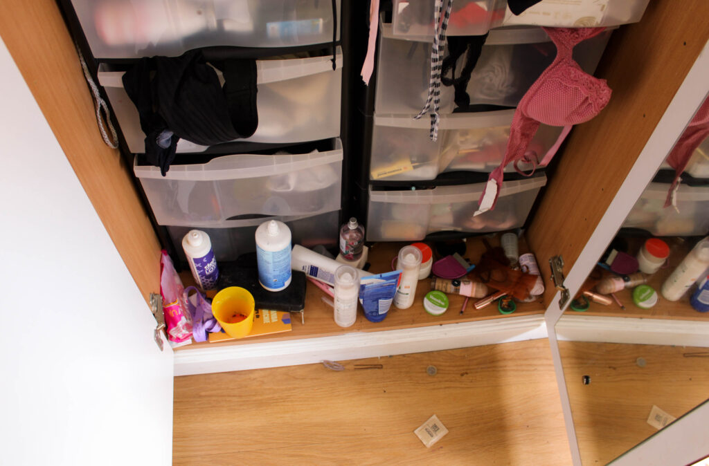
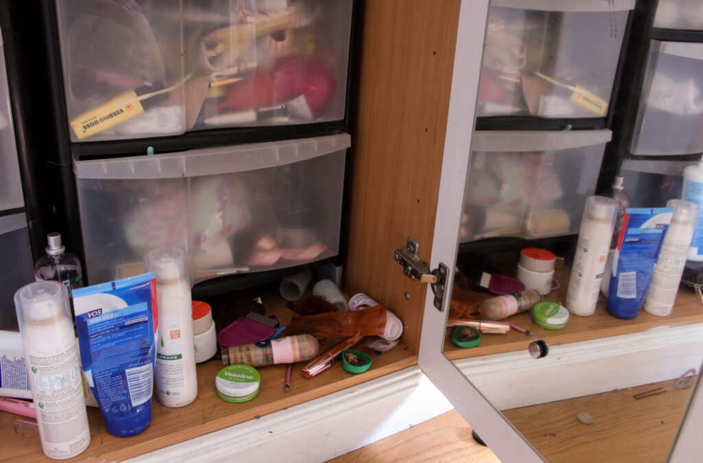
My plan for this photoshoot was to capture pictures of objects. I needed more photographs of objects to balance out with the numerous portraits I’ve taken, and ones that fit with my theme.
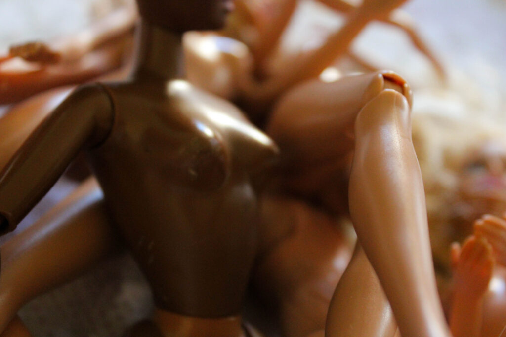
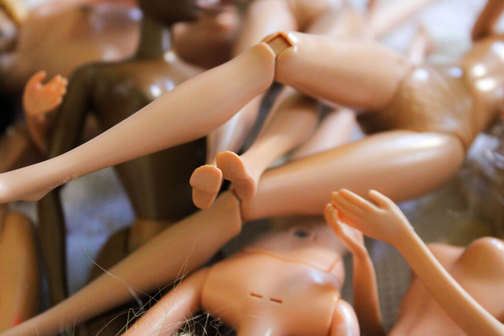
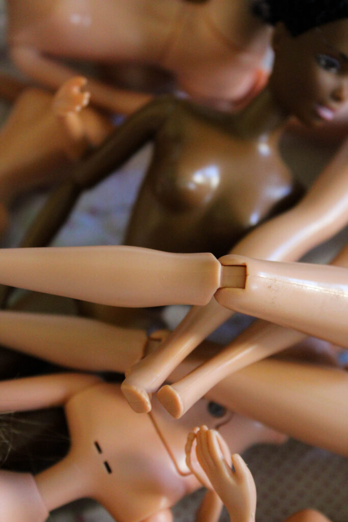
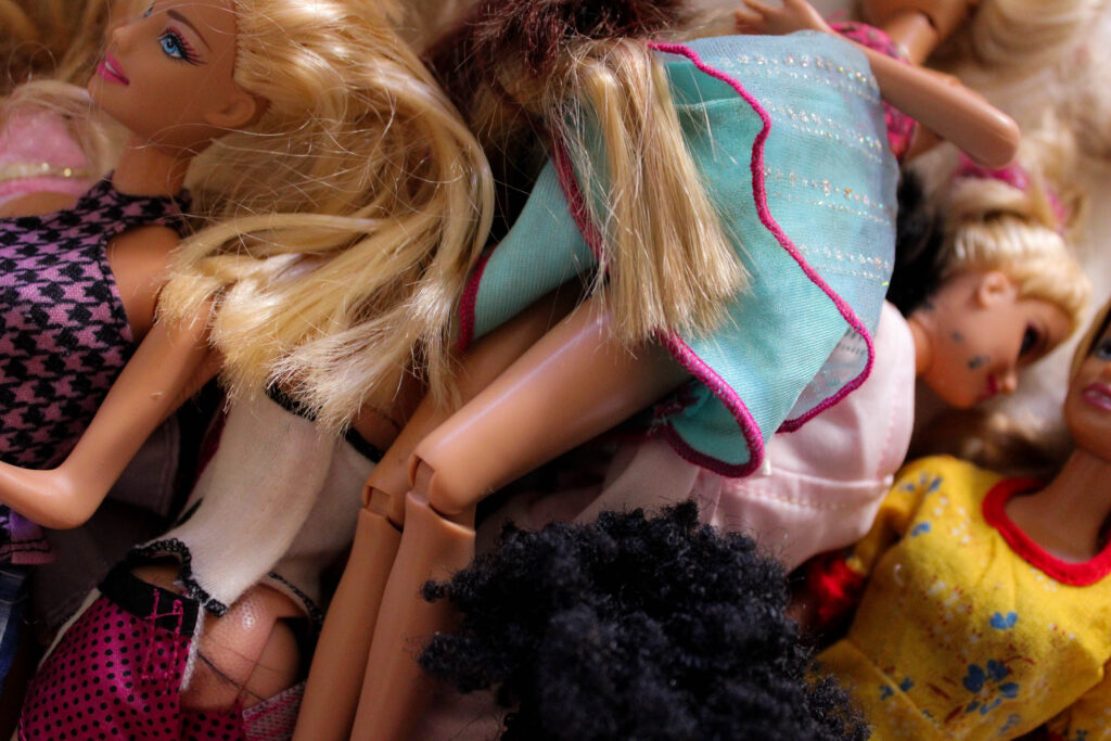
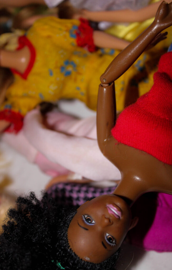
I took pictures of my handbag, old dolls that I would play with when I was younger, and some old stuffed animals. I hoped this would depict elements associated with femininity and girlhood.
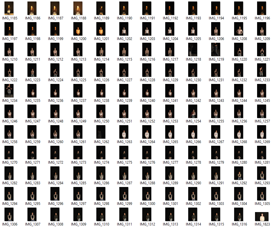
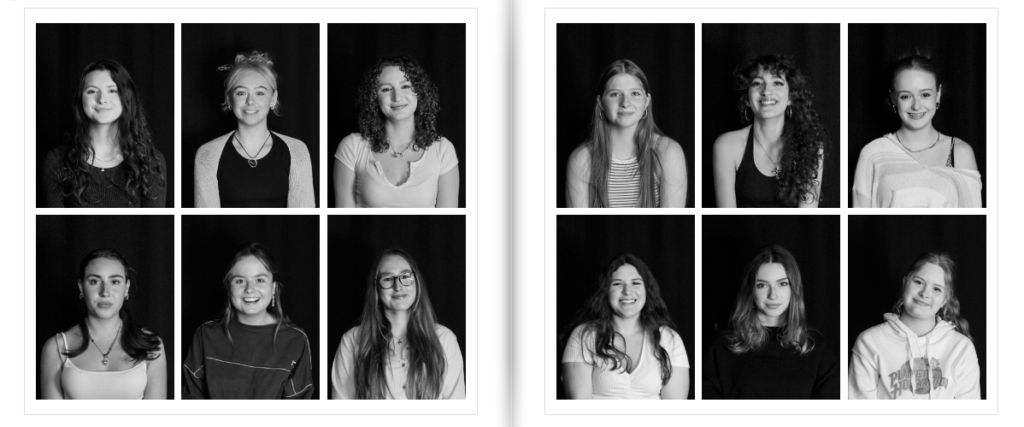
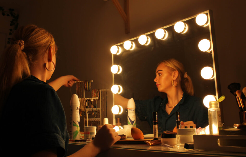
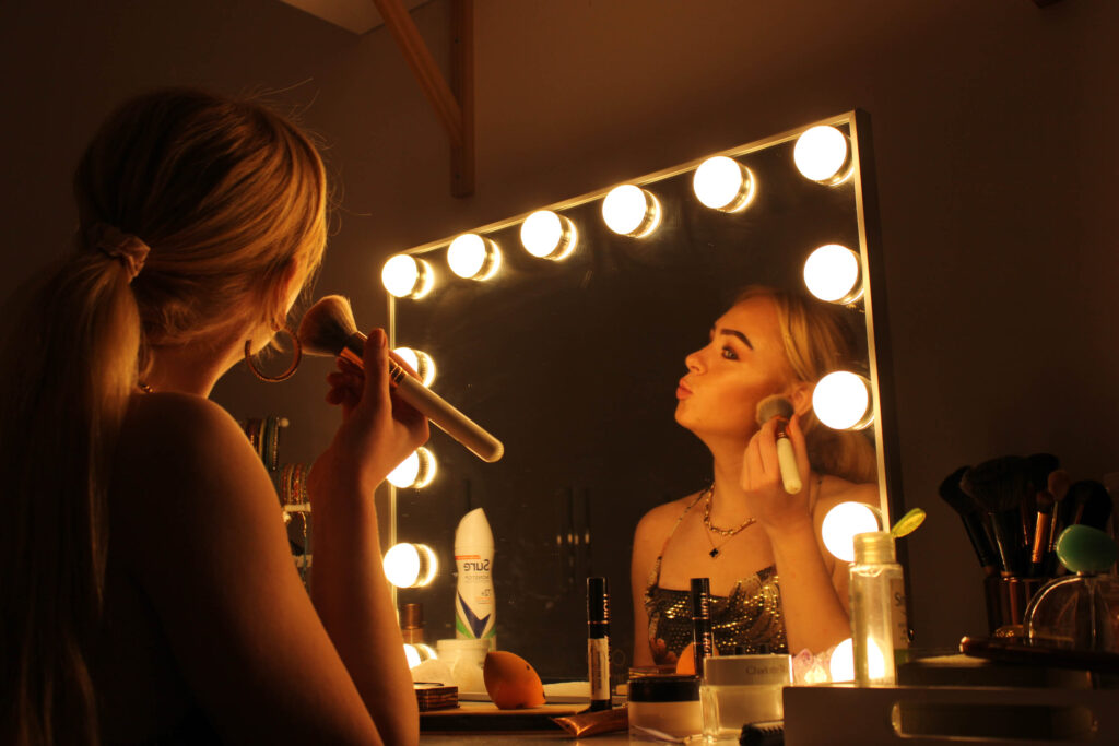
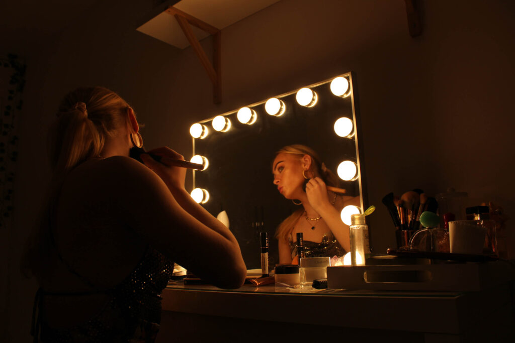
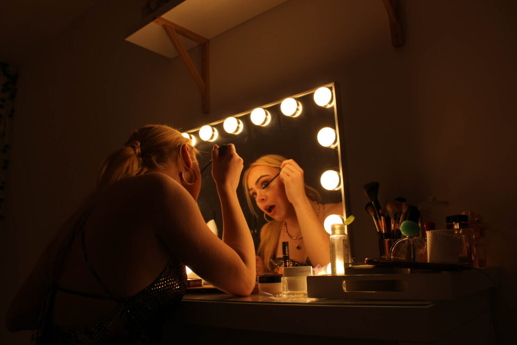
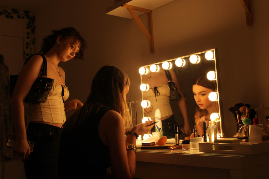
I used the studio space to take some headshot portraits of some friends.
I only took pictures of girls as I want my photobook to communicate a sense of girlhood and what it is to be a woman, exploring aspects of femininity. I asked each subject to project a neutral expression and then to smile, capturing two different expressions. I did this because I wasn’t sure what I wanted from this outcome yet. My plan was to create grid like pages over a double page in my photobook, showing a handful of different girls.
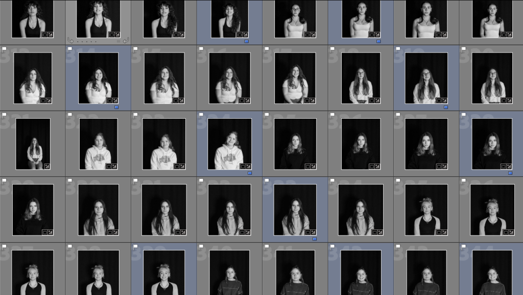
I framed the photos better and edited them to be black and white so they’d look standardised. I rated the ones I liked the most and planned on using as ‘blue’. I decided on using the images of when each girl was smiling, as I like the girly and feminine feeling of fun and happiness being shown.
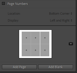
I then selected Modify Page > Wedding which allowed me to find a suitable grid to put the images into. I didn’t take as many headshots as I would’ve liked, but with this template I had enough for the double page spread I planned on creating.
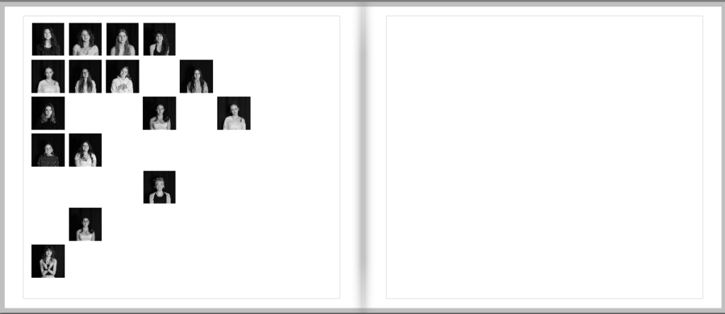
This is some experimentation of presenting the images in the photobook. While this would be quite a creative idea, I don’t have enough images to depict it successfully. The photos also appear quite small on the page, which is not something I was hoping for.
These are the final pages with my headshots in the template. I adjusted and zoomed the images to fit the grid accordingly. I arranged them to show contrast between each girl, showing how we are all different. Everyone expresses themselves and their femininity in different ways.
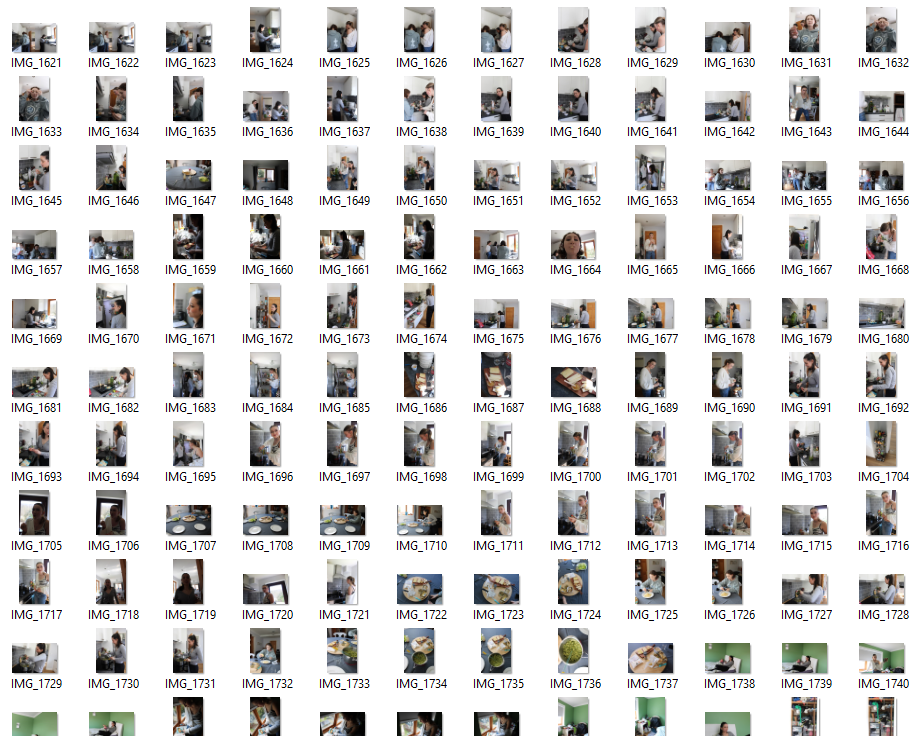
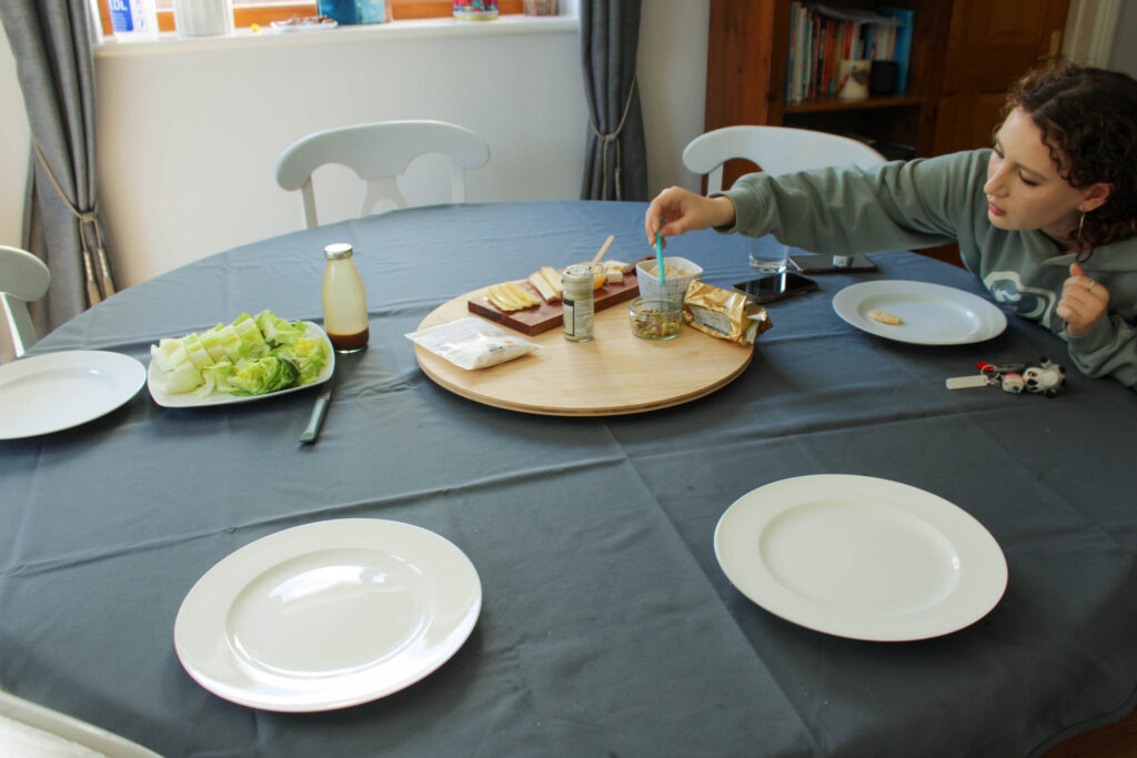
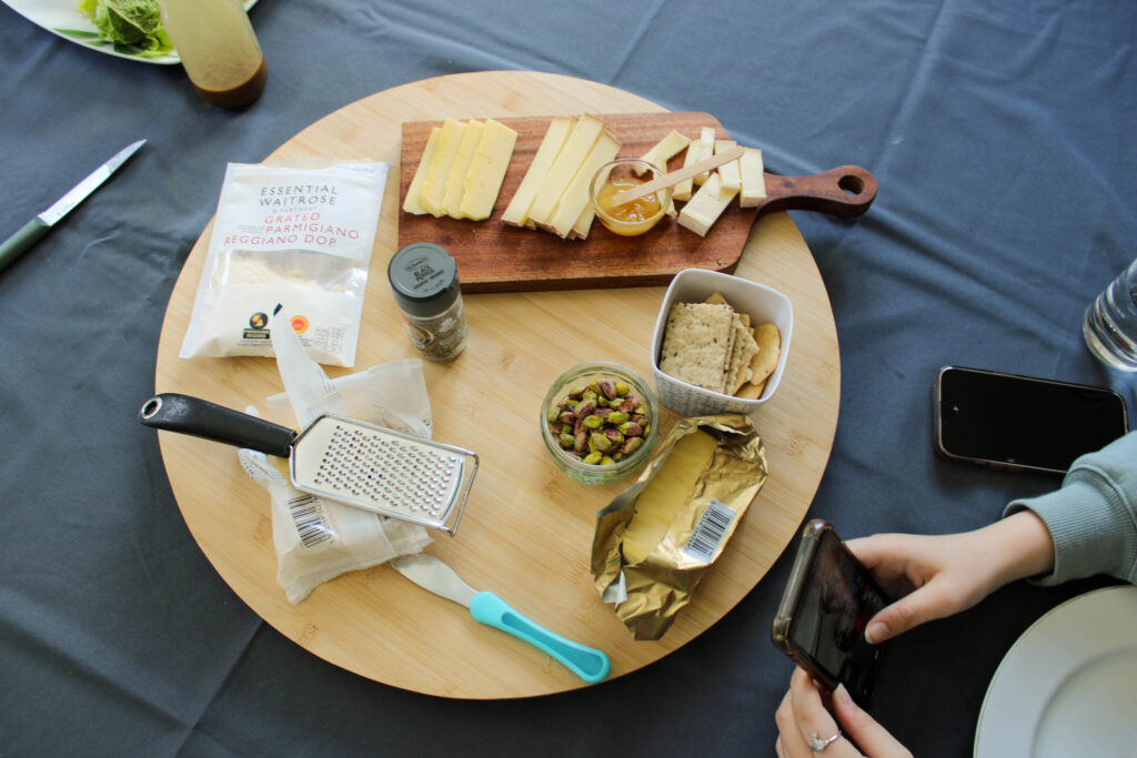
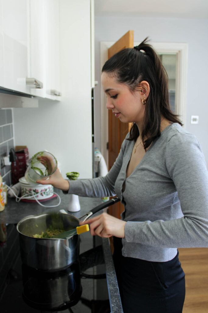
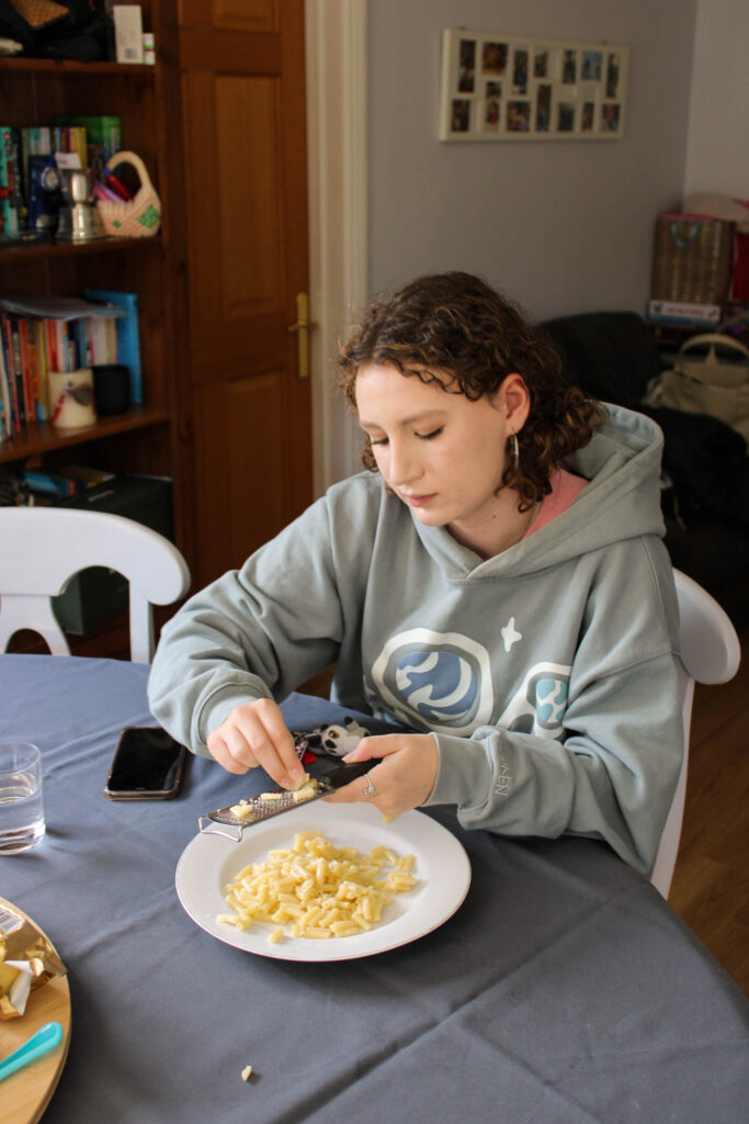
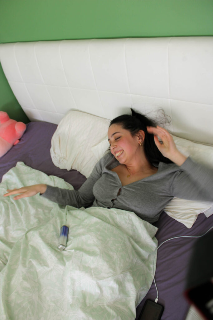
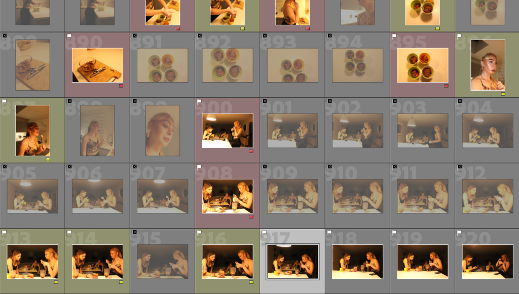
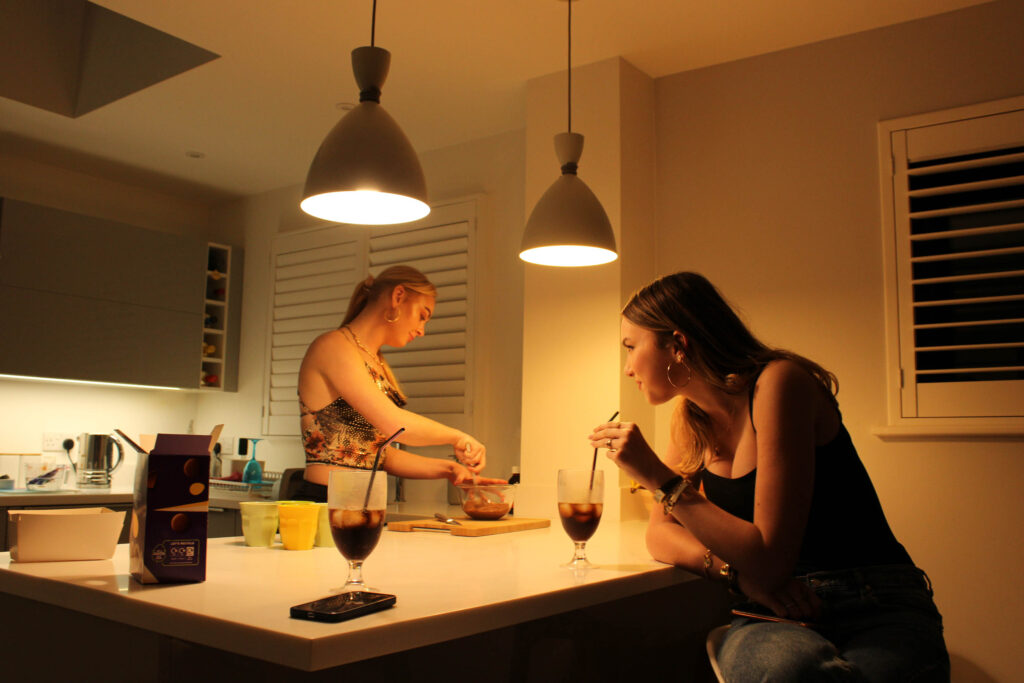
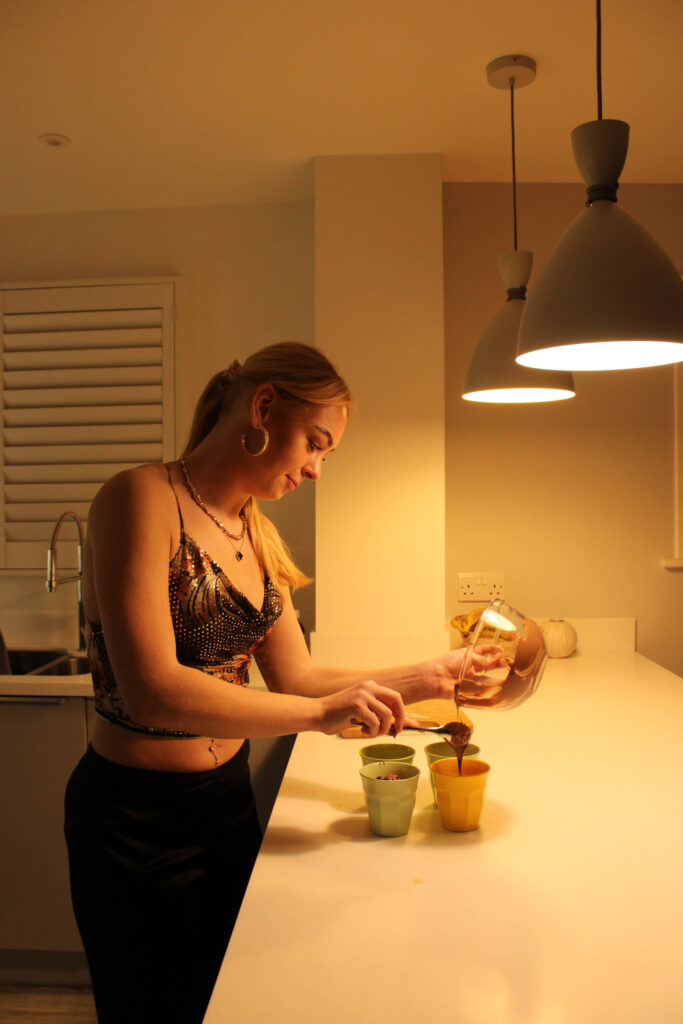
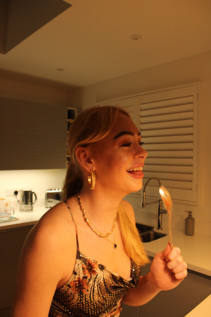
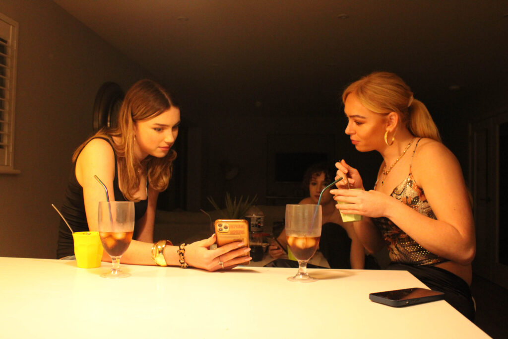
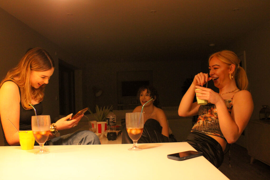
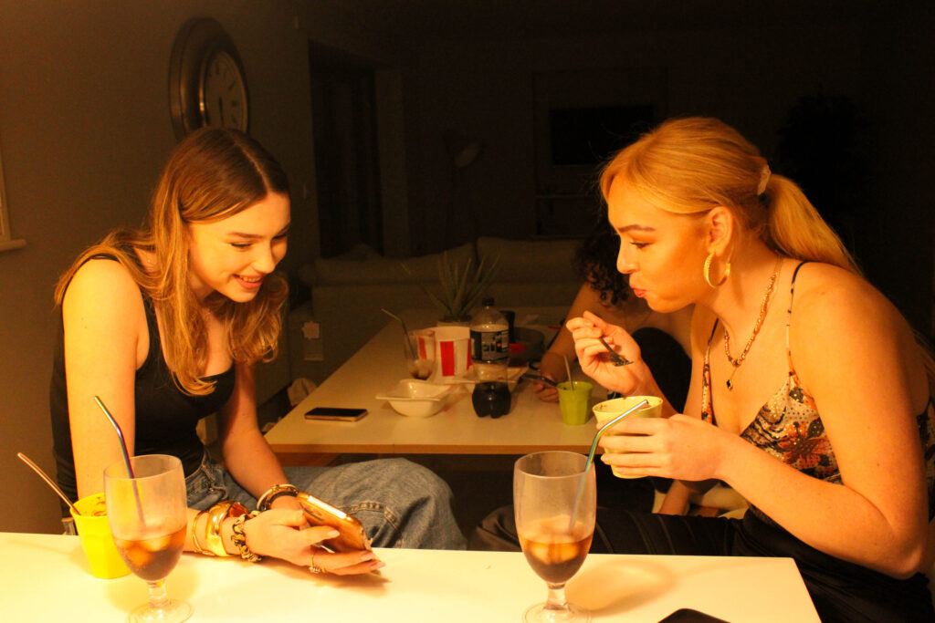
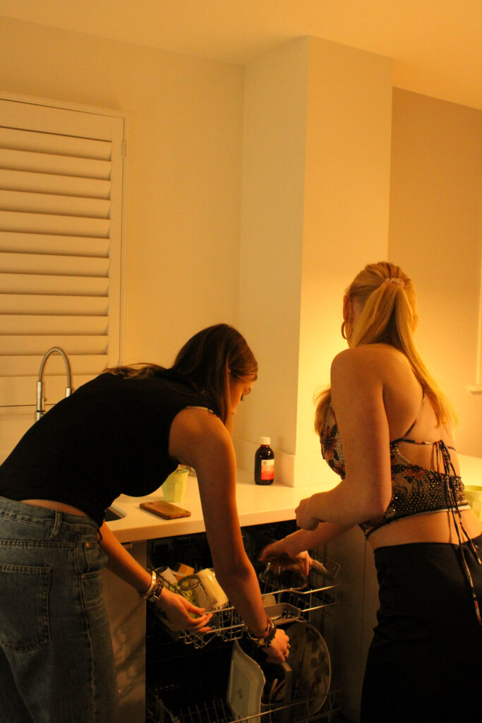
This photoshoot was just of a casual hangout at one of my friend’s houses. The photographs consist of relaxing, some objects, and girls cooking. This photoshoot’s aim was to produce outcomes which are more realistic of day-to-day life.