Photoshoot 5

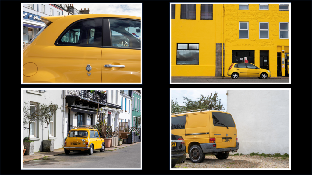
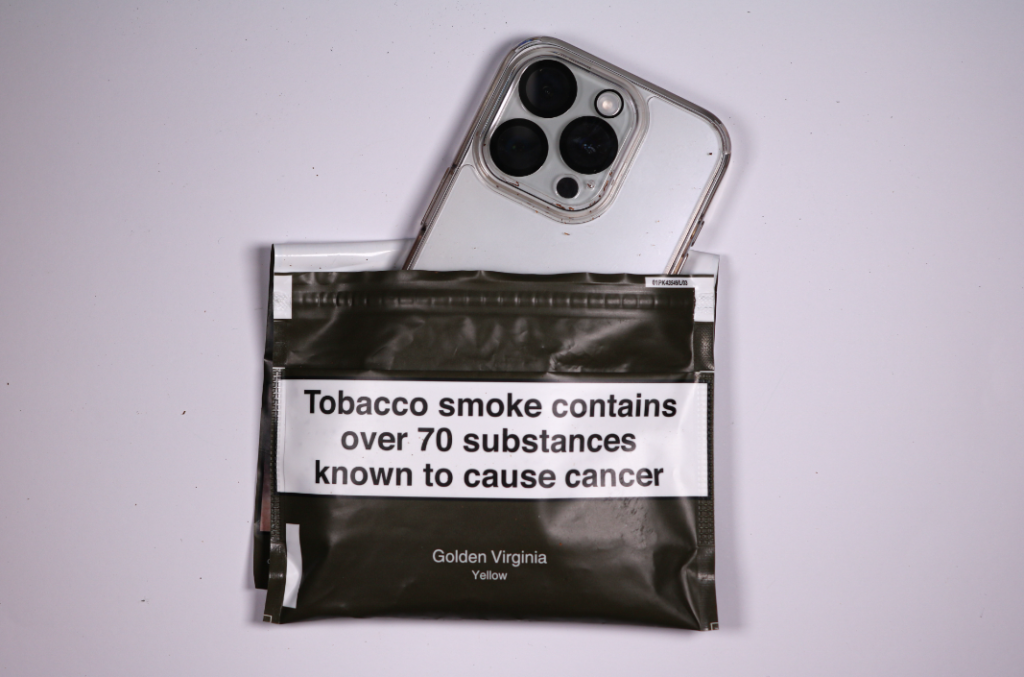
For this photoshoot I was inspired by Andreas Varro though I took a different turn on his style there is definitely a resemblance of our images. I tried to follow the aspect of the addiction of mobile phones in todays society

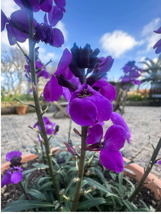
For this photoshoot Due to it being still life I decided to do it in the schools studio for the best potential lighting as I wanted to used overhead artificial lighting to evenly distribute it throughout my image. I also used an overhead camera holder as I wanted a overhead views of my objects to create the persona of someone looking down at them. My reasoning for this photoshoot is to show the increasing addiction of mobile phones in todays society and to compare it with a well known, common addiction which is Tobacco. I feel that my use of this contrast will have eye opening effects on the viewers due to the lack of knowledge in people about how addicting mobile phones can actually be.
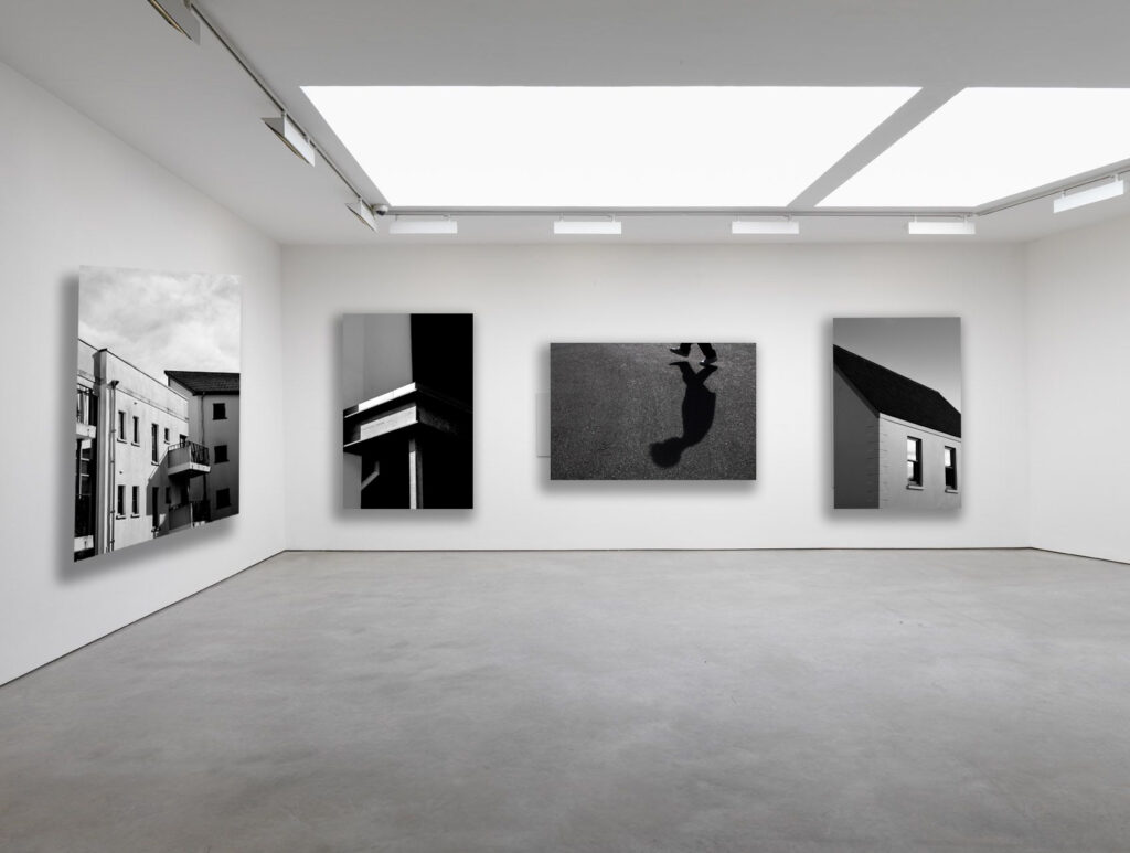
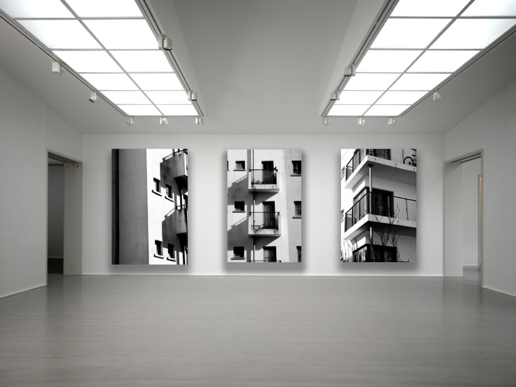
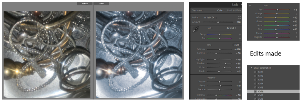
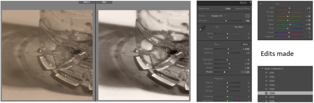
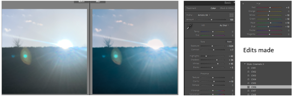
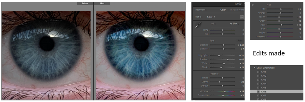
Final edited images

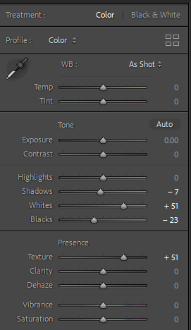
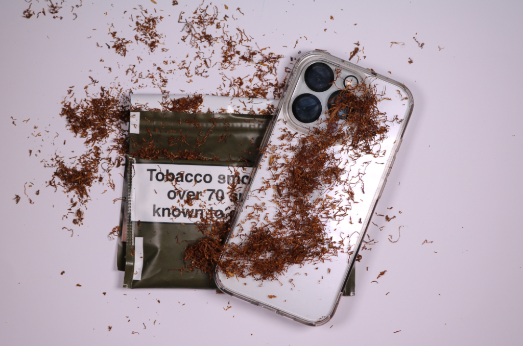
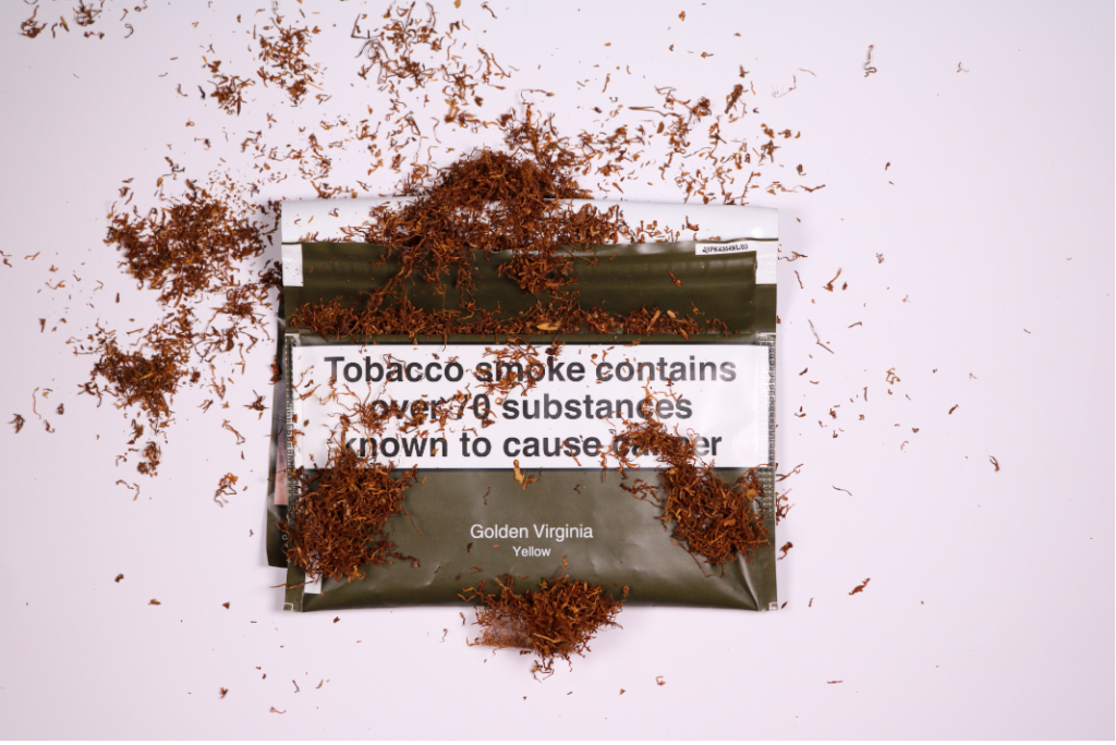
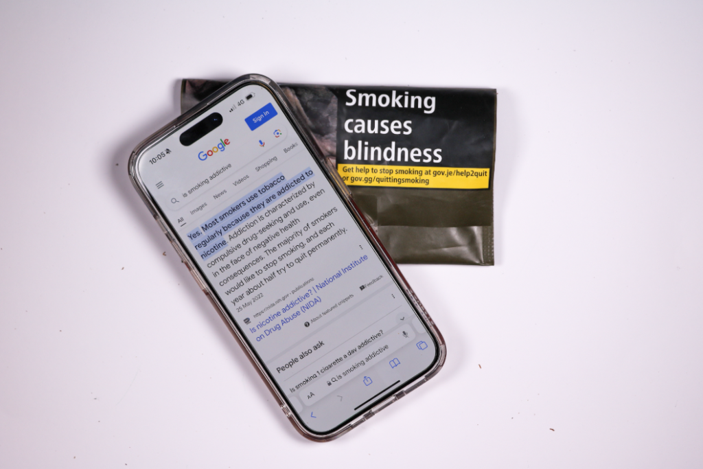
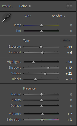
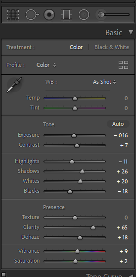
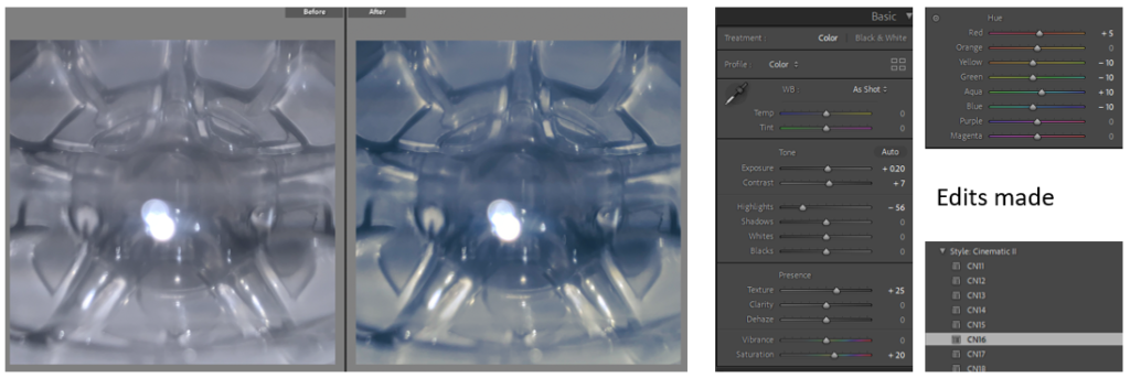
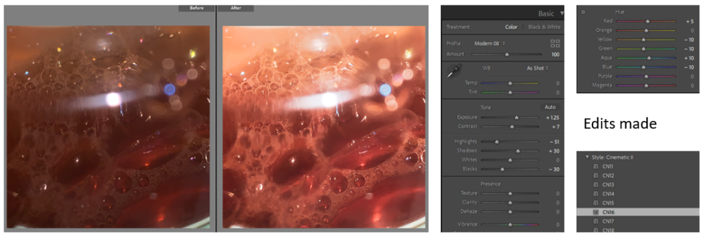
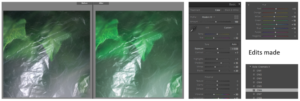
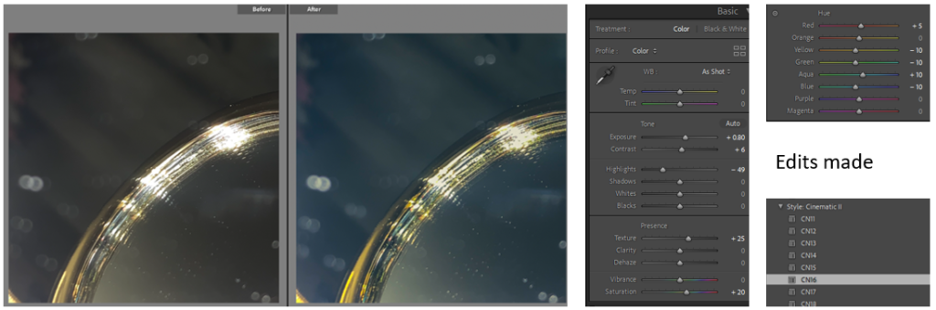
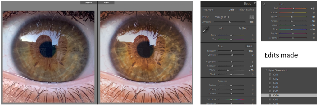
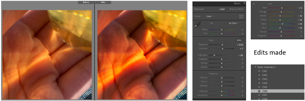
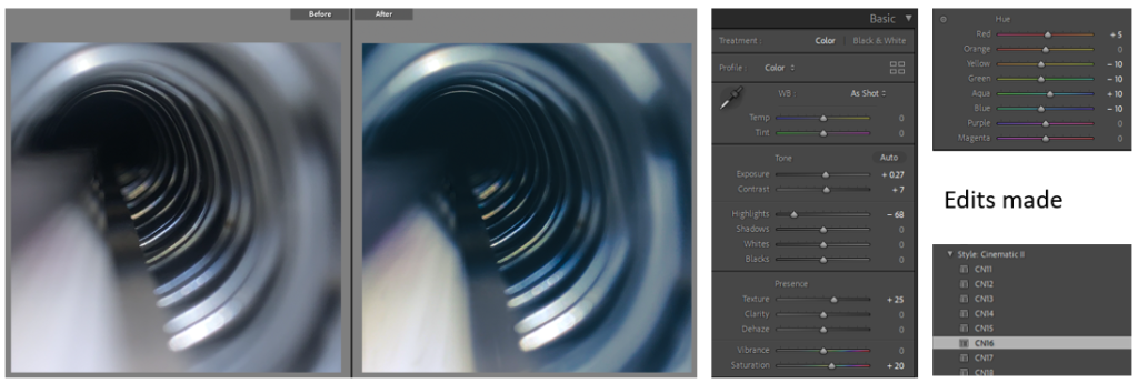
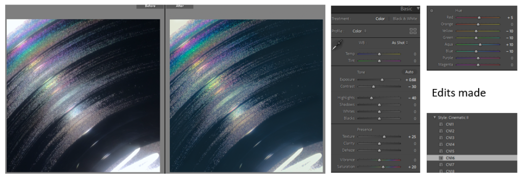
I edited all of the images above on Lightroom classic while mainly playing with the highlights, whites, exposure and shadows to give them a cool tone with the darkness of the tobacco, tobacco packet and the lenses of the camera to really standout and be the vocal point of the images, this is due to these dark tones having negative connotations to the viewer to really enhance the negative and deadly impacts of addiction which overall elevates the dystopian society I am trying to represent in my photobook.

Conclusion

In conclusion I am happy with how this set of images turned out, originally I wasn’t going to do this photoshoot but as I progressed with the others I felt that it would fit the story that I was trying to tell in my photobook. Though I don’t normally like doing still-life images I did enjoy doing this photoshoot and playing with different angles and ways to position my objects.

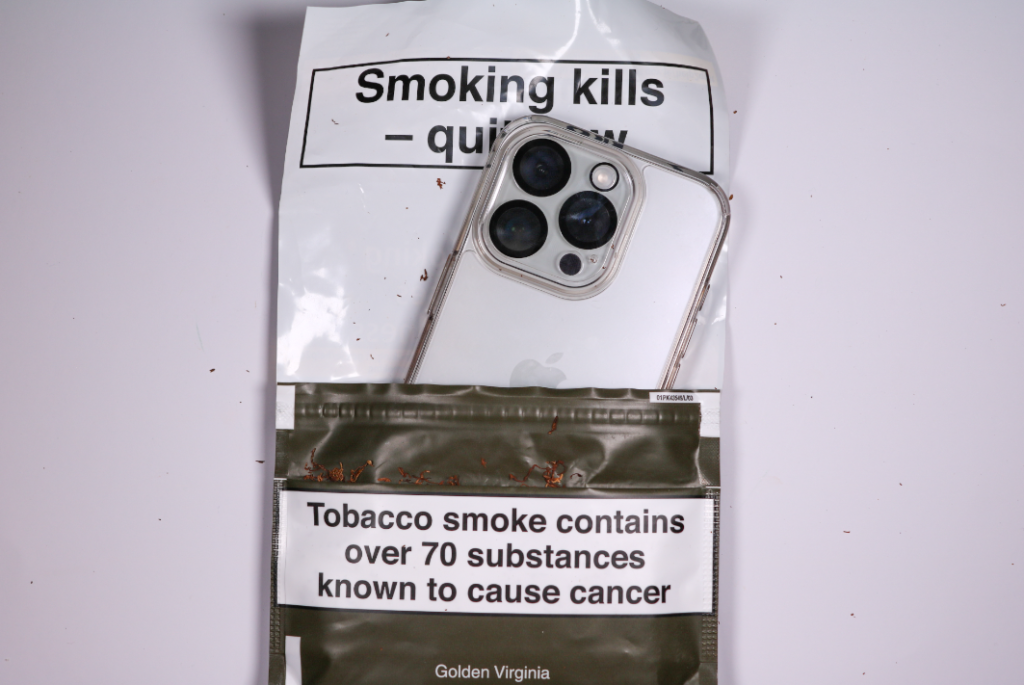
Image analysis with Andreas Varro

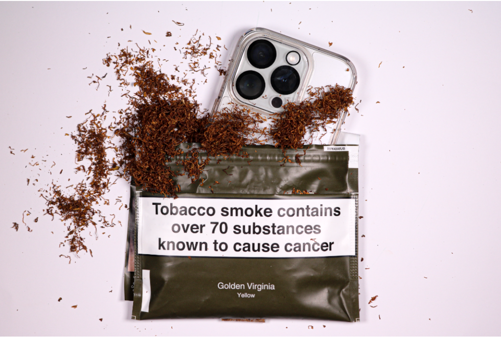
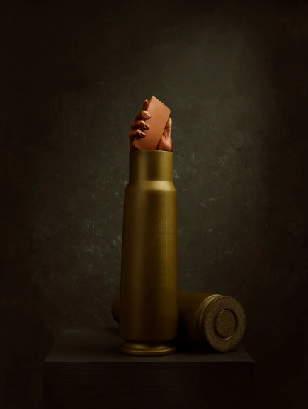
The image that I made and developed on the left shares some similarities between the image on the right made by Andreas Varro. One of the similarities between the images is the use of mobile phones and combing them with other objects. The image on the right contains a hand coming out of a bullet and holding a mobile phone to symbolise how technology in todays society can be related to the death of nature and the death of socialisation between two individuals which is similar to the concept of my image where I used an addictive substance which is tobacco and but a mobile phone in its package to symbolise how addictive they both are relating back to death. The differences between our images are the lighting as Varro used dark lighting which is projecting off of the fake bullet to create the illusion of a spotlight in comparison to my image where I used continuous overhead lighting to that it was evenly distributed throughout the entirety of the image.

Virtual Gallery

To create my virtual Gallery I used the templates saved in the media folder, then uploading them to photoshop. I then imported the images I wanted to be presented. By placing them and resizing them to the correct size I created a black border around them. Creating a virtual gallery helped me I with creating mock ups for my final outcomes.

Statement of intent

What you want to explore?

I want to explore the contrast of nature and technology though a documentary.

Why it matters to you?

It matters to me since I was born in 2006 and the first iPhone was released in 2007 so I have basically grown up with technology and watched it develop over time. Even though it has made a positive impact on todays society such as medicine and businesses, It has become a world wide addiction debilitating multiple people with how much time they spend in nature which has decreased more than half since the 1980s. The use of technology is also causing a world wide epidemic with the eyesight condition ‘Myopia’ which effects peoples Near-sightedness, this has gone up 26.9% since the year 2000 and is still continuing to increase. The addiction of technology is often ignored or not looked at by most people comparatively to other addictions such as tobacco, alcohol and Caffeine due to it not being perceived as ‘harmful’. It is also disregarded due to it being society’s norm. Its also something that I’m trying to improve on as I spend multiple hours a day on my phone which distracts me from real life. Every day we are surrounded by people generally hypnotised by technology and ignoring that actual real world.

How you wish to develop your project?

For my project I am planning to take pictures of people using different types of technology but in a dystopian setting with artificial lighting, and then contrast it with pictures of wildlife such as plants and wild animals which have been undisturbed by humans, to do this I am going to use natural lighting in my garden.

When and where you intend to begin your study?

To begin this study I am going to use some old pictures that I have taken over the years of different types of wide life that I haven’t used in previous projects. In the next few weeks I am going to be taking multiple images of my brother, friends using most the most common forms of technology inside and outside. and then I am going to take pictures in my garden of wildlife such as fish, birds, squirrels, plants etc. To combine the two themes I am going to take pictures of people using their mobile phones while sat in nature such as sat around a pond and under trees ect. This will also be done in my garden.

Photoshoot 4

For this natural photo shoot my inspiration was Marsel van, This is due to us both taking images of wildlife in its natural state and the natural lighting that we both used.

For this photoshoot I decided to do it mid-day, I did this to make sure that it was bright outside while taking my images to highlight the shadows of the plants that I took images of, I did this photoshoot in my front garden due to its natural setting and unique nature. We have a large variety of wildlife in my garden such as multiple plants and animals.

Final edited pictures

I edited all of the above images using Lightroom classic to develop the pictures into the tones that I was looking for. All of my images of nature throughout my photobook have warm and vibrant tone and I achieved this by increasing the highlights, shadows and clarity.  Due to my Previous images of technology being dystopian I wanted to make my landscape images of nature more appealing in the photobook so that the viewer automatically gets drawn to them hence the seeking nature part in my Ideas.

Image comparison with Marsel van

The image that I made and developed on the right was produced to share some similarities to the image on the left made by Marsel van, These similarities consist of the vocal points of the images which is the water. Both mine and Vans images have warm and cool tones such as the oranges in the rainbow and the sunset and the darkness of the clouds, and we both used only natural lighting due to the photoshoots being outside and focusing on nature. Though they also have multiple differences such as the calmness of the water on the right compared to the waves and breaks in the water on the left, it is clear that they where taken in two very different settings to tell two very different stories.

Conclusion

In conclusion I am happy with the overall result of this photoshoot and I feel that I gathered a good collection of images that represent the beauty of nature in Jersey Ci.

My selection of images.

I selected the images that I wanted to use on Lightroom classic by flagging them. I also used the X and Y tool to compare similar images and help me decide on what ones I should use.

Virtual gallery

For my Virtual gallery I found a blank image of a studio space and brought in my images. to make it more realistic I added a drop shadow which I angled to match what the natural shadow of the light source would be.


Overall i really like the presentation of this gallery as i believe it greatly compliments my images and allows them to mix together however still stand out as there own.

When mounting my images i will definitely be taking inspiration from the layout of these galleries.

Photoshoot 3: development + experimentation

Due to the amount of images I like, I have split them into 3 sets.

First set

Second set

Third set

I started off by adjusting the levels of each image (exposure, contrast, highlights, etc.) to emphasis the good qualities of the images. I then chose a pre-set that fitted well with the image by either improving the colour, contrast, lighting, etc (most pre-sets were CN16, colour: high contrast, or creative: cool matte). On certain images I then went in with the brush tool or spot tool to edit or remove certain areas of an image that I think could be improved.

Example of the brush tool:

Here I am enhancing the highlights of each cone separately to ensure that these areas pop out the most.

First

Second

Third

First set

Second set

Third set

final prints presentation plan

For my first final print I am going to print out four of my images on A4 glossy photo paper. I am then going to take a piece of black card and am going to measure my images ad the card to place the images an equal distance away from each other. Once I have my measurements I am going to use an angled knife that attaches to a ruler to cut out four squares in the card which will have a white boarder around them because of the angled knife. I will then use masking tape to hold my images in place, facing through the cut outs.

For my second final piece, I am going to follow the same method as my first, however this time I am going to print just one image out on A3 glossy photo paper meaning I will only need to make one cut out.

For my third final piece I am again going to follow the same method as my first and second, however this one will be on A4 glossy photo paper. I have chosen to do them different sizes as I think that some of them will be more clear in a bigger size, however some of them will look better a bit smaller as they are all ready very bold.

For my fourth final piece, I am going to print out two of my images which I think go well together on A5 glossy photo paper. I am going to use spray mount to mount them onto a piece of foam board and then double sided sticky tape to mount them onto a piece of black card. I am also going to do that same method for my fifth however, it will be printed on A3 glossy photo paper and my sixth final pieces which will be A4 glossy photo paper.

Fifth final piece

Sixth final piece

Print Layouts

Foamboard Prints

A4

diptych option 1
diptych option 2
diptych option 3

A5

diptych option 1

A3

single option 1
single option 2
single option 3

Final Image Mock-ups

How I will be presenting the images on:

A3:

Foamboard Mount
Window Mount
Foamboard Mount

A4:

Foamboard Mount
Foamboard and Card Mount

A5:

Foamboard and Card Mount

Final Images

The images I have picked to be printed and presented:

A3: I will present my A3 images singularly as I feel like these images are stronger alone than in a group of images.

A4: I will present all my A4 images as diptychs, these images come in pairs so are stronger presented in that way.

A5: These image, in my opinion, will work better in a group which is why I will be presenting them as a triptych.